Embed Size (px)
Citation preview
OCR – Level 3 Cambridge Introductory Diploma in
Media
Unit 13: Planning and Pitching a Print based Media
Product P1 Evidence
Name: Rhia DecarloCandidate Number: Center Name: St. Andrew’s Catholic SchoolCenter Number: 64135
Set Brief - Print
Project/Brief –
Music Magazine & Promotion
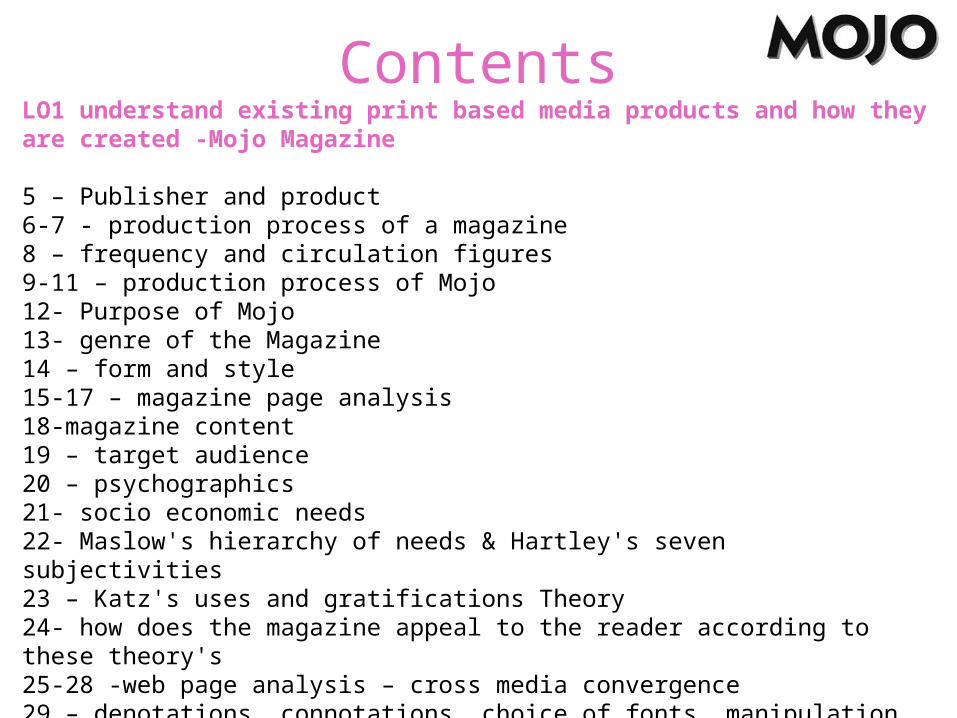
ContentsLO1 understand existing print based media products and how they are created -Mojo Magazine
5 – Publisher and product6-7 - production process of a magazine8 – frequency and circulation figures9-11 – production process of Mojo12- Purpose of Mojo 13- genre of the Magazine14 – form and style15-17 – magazine page analysis 18-magazine content19 – target audience 20 – psychographics 21- socio economic needs22- Maslow's hierarchy of needs & Hartley's seven subjectivities 23 – Katz's uses and gratifications Theory24- how does the magazine appeal to the reader according to these theory's 25-28 -web page analysis – cross media convergence 29 – denotations, connotations, choice of fonts, manipulation of images
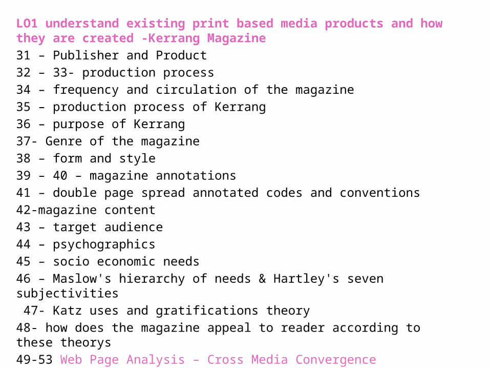
LO1 understand existing print based media products and how they are created -Kerrang Magazine 31 – Publisher and Product32 – 33- production process34 – frequency and circulation of the magazine35 – production process of Kerrang36 – purpose of Kerrang37- Genre of the magazine38 – form and style39 – 40 – magazine annotations41 – double page spread annotated codes and conventions42-magazine content43 – target audience 44 – psychographics 45 – socio economic needs46 – Maslow's hierarchy of needs & Hartley's seven subjectivities 47- Katz uses and gratifications theory 48- how does the magazine appeal to reader according to these theorys49-53 Web Page Analysis – Cross Media Convergence54- denotations, connotations, choice of fonts, manipulation of images
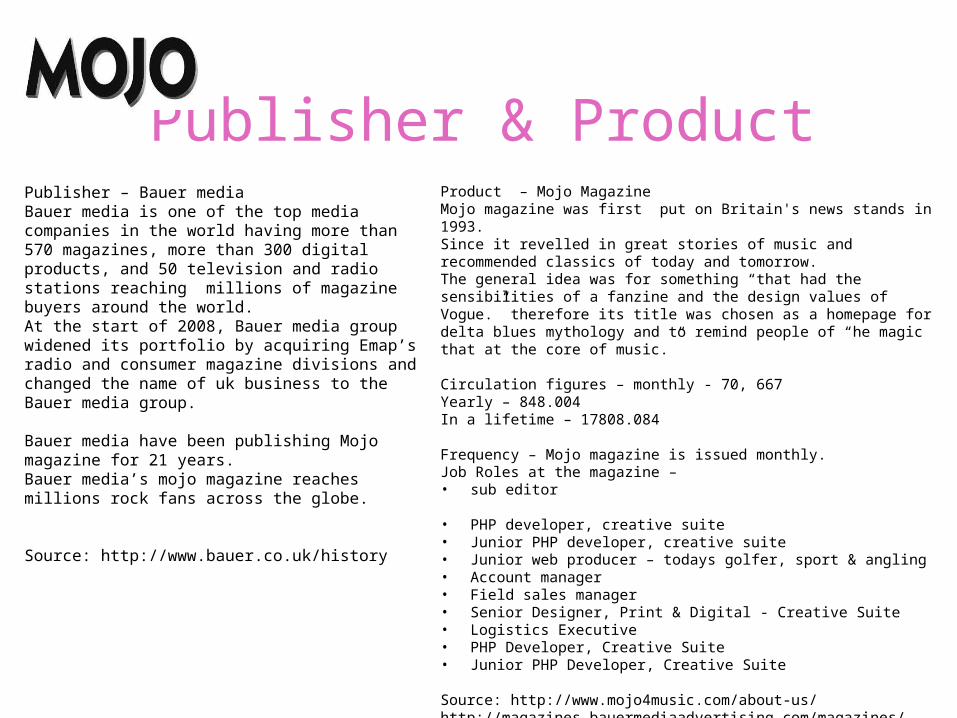
Publisher & ProductPublisher – Bauer media Bauer media is one of the top media companies in the world having more than 570 magazines, more than 300 digital products, and 50 television and radio stations reaching millions of magazine buyers around the world.At the start of 2008, Bauer media group widened its portfolio by acquiring Emap’s radio and consumer magazine divisions and changed the name of uk business to the Bauer media group.
Bauer media have been publishing Mojo magazine for 21 years.Bauer media’s mojo magazine reaches millions rock fans across the globe.
Source: http://www.bauer.co.uk/history
Product – Mojo Magazine Mojo magazine was first put on Britain's news stands in 1993.Since it revelled in great stories of music and recommended classics of today and tomorrow.The general idea was for something “that had the sensibilities of a fanzine and the design values of Vogue.” therefore its title was chosen as a homepage for delta blues mythology and to remind people of “he magic that at the core of music.”
Circulation figures – monthly - 70, 667Yearly – 848.004In a lifetime – 17808.084
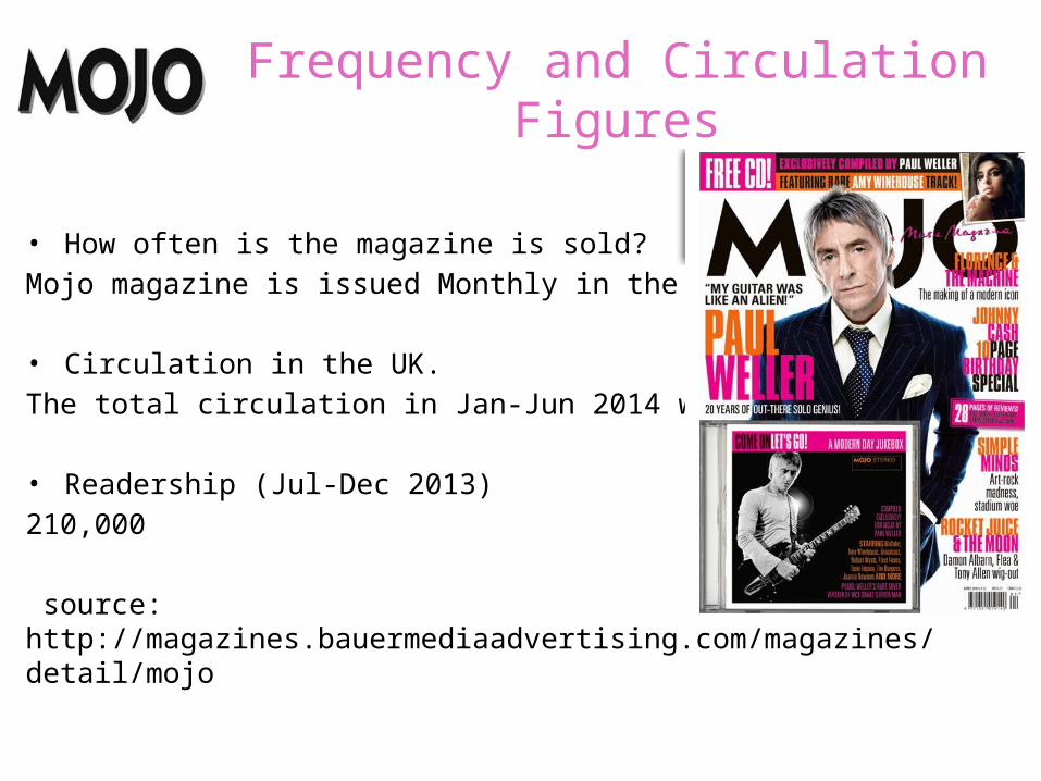
Frequency – Mojo magazine is issued monthly.Job Roles at the magazine – • sub editor • PHP developer, creative suite • Junior PHP developer, creative suite• Junior web producer – todays golfer, sport & angling • Account manager • Field sales manager • Senior Designer, Print & Digital - Creative Suite• Logistics Executive• PHP Developer, Creative Suite• Junior PHP Developer, Creative Suite
Source: http://www.mojo4music.com/about-us/http://magazines.bauermediaadvertising.com/magazines/detail/mojo
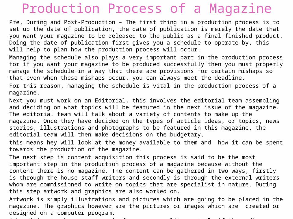
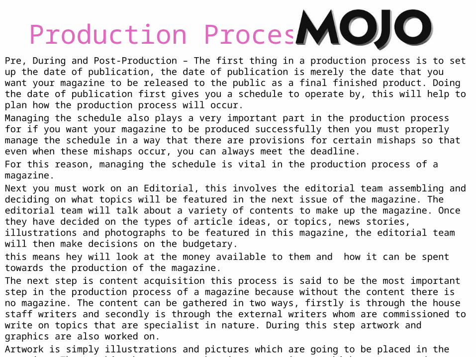
Production Process of a MagazinePre, During and Post-Production – The first thing in a production process is to set up the date of publication, the date of publication is merely the date that you want your magazine to be released to the public as a final finished product. Doing the date of publication first gives you a schedule to operate by, this will help to plan how the production process will occur.Managing the schedule also plays a very important part in the production process for if you want your magazine to be produced successfully then you must properly manage the schedule in a way that there are provisions for certain mishaps so that even when these mishaps occur, you can always meet the deadline.For this reason, managing the schedule is vital in the production process of a magazine.Next you must work on an Editorial, this involves the editorial team assembling and deciding on what topics will be featured in the next issue of the magazine. The editorial team will talk about a variety of contents to make up the magazine. Once they have decided on the types of article ideas, or topics, news stories, illustrations and photographs to be featured in this magazine, the editorial team will then make decisions on the budgetary. this means hey will look at the money available to them and how it can be spent towards the production of the magazine.The next step is content acquisition this process is said to be the most important step in the production process of a magazine because without the content there is no magazine. The content can be gathered in two ways, firstly is through the house staff writers and secondly is through the external writers whom are commissioned to write on topics that are specialist in nature. During this step artwork and graphics are also worked on.Artwork is simply illustrations and pictures which are going to be placed in the magazine. The graphics however are the pictures or images which are created or designed on a computer program.Sub editing is the next step, it focuses on quality control, if the media organisation is big enough to have sub editor the he shall be responsible for this job, if not then the editor will do this job which involves Checking of the accuracy of all facts in the articles, Making sure that words are properly spelled,Making sure that grammar and punctuation are used correctly ,Making sure that all articles follow the house-style, Working on the page layout…..
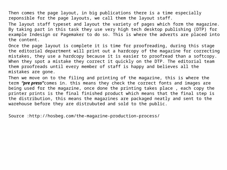
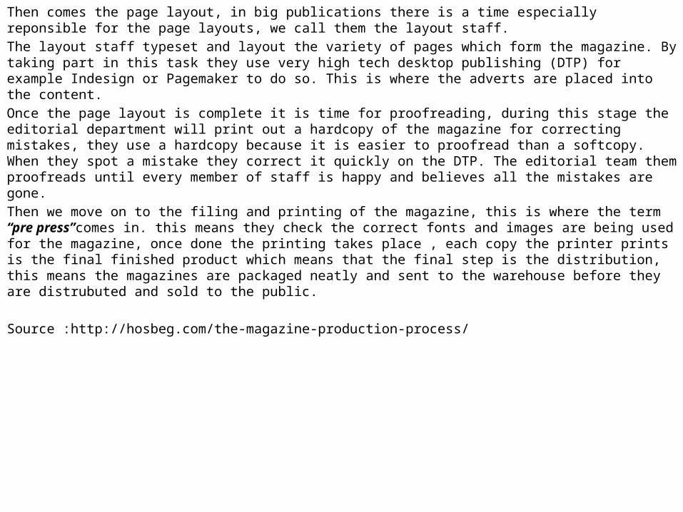
Then comes the page layout, in big publications there is a time especially reponsible for the page layouts, we call them the layout staff.The layout staff typeset and layout the variety of pages which form the magazine. By taking part in this task they use very high tech desktop publishing (DTP) for example Indesign or Pagemaker to do so. This is where the adverts are placed into the content.Once the page layout is complete it is time for proofreading, during this stage the editorial department will print out a hardcopy of the magazine for correcting mistakes, they use a hardcopy because it is easier to proofread than a softcopy. When they spot a mistake they correct it quickly on the DTP. The editorial team them proofreads until every member of staff is happy and believes all the mistakes are gone.Then we move on to the filing and printing of the magazine, this is where the term “pre press”comes in. this means they check the correct fonts and images are being used for the magazine, once done the printing takes place , each copy the printer prints is the final finished product which means that the final step is the distribution, this means the magazines are packaged neatly and sent to the warehouse before they are distrubuted and sold to the public.
Source :http://hosbeg.com/the-magazine-production-process/
Frequency and Circulation Figures
• How often is the magazine is sold? Mojo magazine is issued Monthly in the UK.
• Circulation in the UK. The total circulation in Jan-Jun 2014 was 70,667.
• Readership (Jul-Dec 2013)210,000
source: http://magazines.bauermediaadvertising.com/magazines/detail/mojo
Production Process ofPre, During and Post-Production – The first thing in a production process is to set up the date of publication, the date of publication is merely the date that you want your magazine to be released to the public as a final finished product. Doing the date of publication first gives you a schedule to operate by, this will help to plan how the production process will occur.Managing the schedule also plays a very important part in the production process for if you want your magazine to be produced successfully then you must properly manage the schedule in a way that there are provisions for certain mishaps so that even when these mishaps occur, you can always meet the deadline.For this reason, managing the schedule is vital in the production process of a magazine.Next you must work on an Editorial, this involves the editorial team assembling and deciding on what topics will be featured in the next issue of the magazine. The editorial team will talk about a variety of contents to make up the magazine. Once they have decided on the types of article ideas, or topics, news stories, illustrations and photographs to be featured in this magazine, the editorial team will then make decisions on the budgetary. this means hey will look at the money available to them and how it can be spent towards the production of the magazine.The next step is content acquisition this process is said to be the most important step in the production process of a magazine because without the content there is no magazine. The content can be gathered in two ways, firstly is through the house staff writers and secondly is through the external writers whom are commissioned to write on topics that are specialist in nature. During this step artwork and graphics are also worked on.Artwork is simply illustrations and pictures which are going to be placed in the magazine. The graphics however are the pictures or images which are created or designed on a computer program.Sub editing is the next step, it focuses on quality control, if the media organisation is big enough to have sub editor the he shall be responsible for this job, if not then the editor will do this job which involves Checking of the accuracy of all facts in the articles, Making sure that words are properly spelled,Making sure that grammar and punctuation are used correctly ,Making sure that all articles follow the house-style, Working on the page layout…..
Then comes the page layout, in big publications there is a time especially reponsible for the page layouts, we call them the layout staff.The layout staff typeset and layout the variety of pages which form the magazine. By taking part in this task they use very high tech desktop publishing (DTP) for example Indesign or Pagemaker to do so. This is where the adverts are placed into the content.Once the page layout is complete it is time for proofreading, during this stage the editorial department will print out a hardcopy of the magazine for correcting mistakes, they use a hardcopy because it is easier to proofread than a softcopy. When they spot a mistake they correct it quickly on the DTP. The editorial team them proofreads until every member of staff is happy and believes all the mistakes are gone.Then we move on to the filing and printing of the magazine, this is where the term “pre press”comes in. this means they check the correct fonts and images are being used for the magazine, once done the printing takes place , each copy the printer prints is the final finished product which means that the final step is the distribution, this means the magazines are packaged neatly and sent to the warehouse before they are distrubuted and sold to the public.
Source :http://hosbeg.com/the-magazine-production-process/
Production Process of
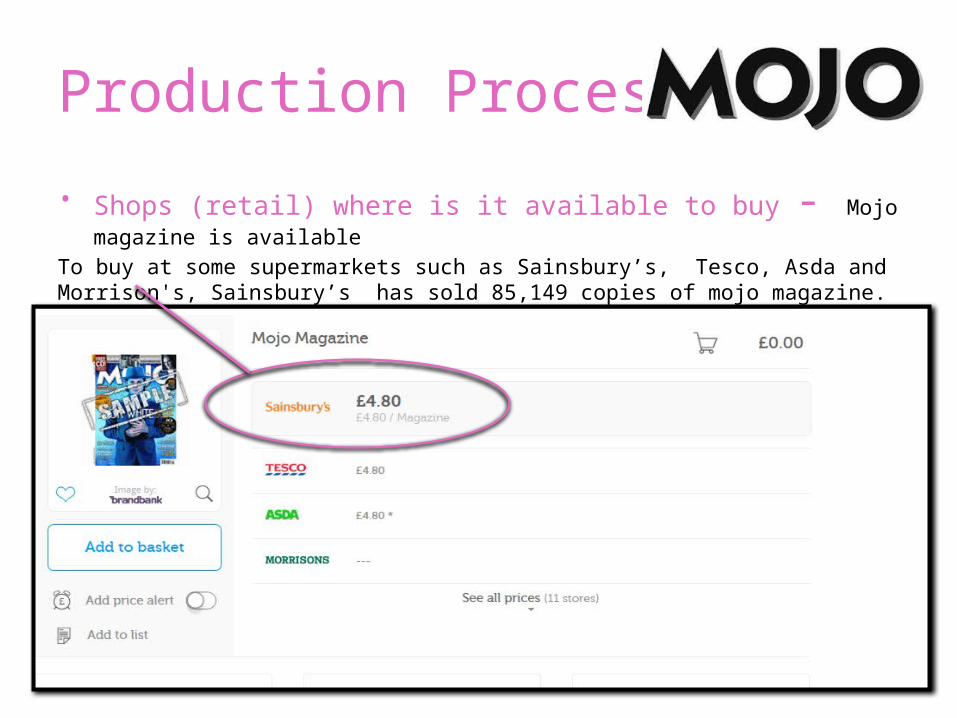
• Shops (retail) where is it available to buy - Mojo magazine is available
To buy at some supermarkets such as Sainsbury’s, Tesco, Asda and Morrison's, Sainsbury’s has sold 85,149 copies of mojo magazine.
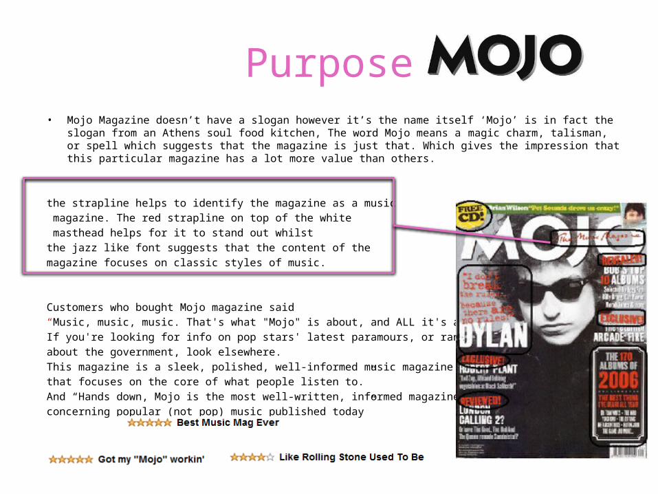
Purpose• Mojo Magazine doesn’t have a slogan however it’s the name itself ‘Mojo’ is in fact the slogan from
an Athens soul food kitchen, The word Mojo means a magic charm, talisman, or spell which suggests that the magazine is just that. Which gives the impression that this particular magazine has a lot more value than others.
the strapline helps to identify the magazine as a music magazine. The red strapline on top of the white masthead helps for it to stand out whilst the jazz like font suggests that the content of the magazine focuses on classic styles of music.
Customers who bought Mojo magazine said “Music, music, music. That's what "Mojo" is about, and ALL it's about. If you're looking for info on pop stars' latest paramours, or rants about the government, look elsewhere. This magazine is a sleek, polished, well-informed music magazine that focuses on the core of what people listen to.”And “Hands down, Mojo is the most well-written, informed magazine concerning popular (not pop) music published today”
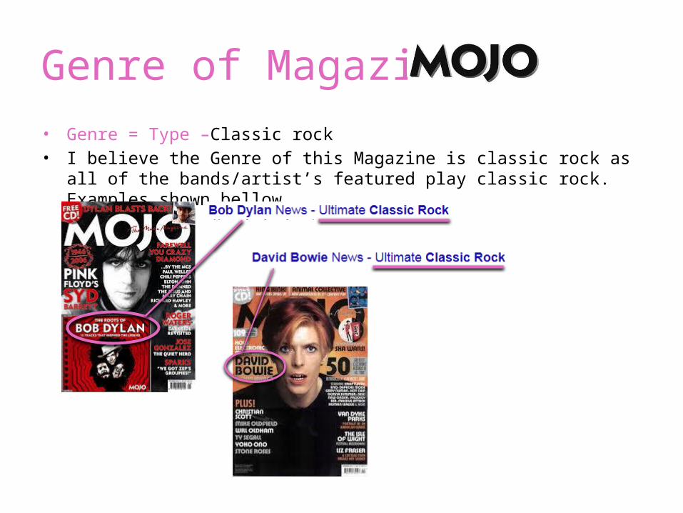
Genre of Magazine• Genre = Type –Classic rock• I believe the Genre of this Magazine is classic rock as all of the
bands/artist’s featured play classic rock. Examples shown bellow.
Form & Style
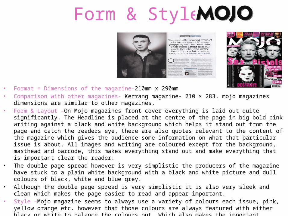
• Format = Dimensions of the magazine–210mm x 290mm• Comparison with other magazines- Kerrang magazine- 210 × 283, mojo magazines dimensions
are similar to other magazines.• Form & Layout –On Mojo magazines front cover everything is laid out quite significantly, The
Headline is placed at the centre of the page in big bold pink writing against a black and white background which helps it stand out from the page and catch the readers eye, there are also quotes relevant to the content of the magazine which gives the audience some information on what that particular issue is about. All images and writing are coloured except for the background, masthead and barcode, this makes everything stand out and make everything that is important clear the reader.
• The double page spread however is very simplistic the producers of the magazine have stuck to a plain white background with a black and white picture and dull colours of black, white and blue grey.
• Although the double page spread is very simplistic it is also very sleek and clean which makes the page easier to read and appear important.
• Style –Mojo magazine seems to always use a variety of colours each issue, pink, yellow orange etc. however that those colours are always featured with either black or white to balance the colours out. Which also makes the important imformation stand out from the page. On every page there is a small Mojo logo, normally in the bottom corner along with the page number. Having the magazines logo on each page shows the magazines Identity throughout the magazine
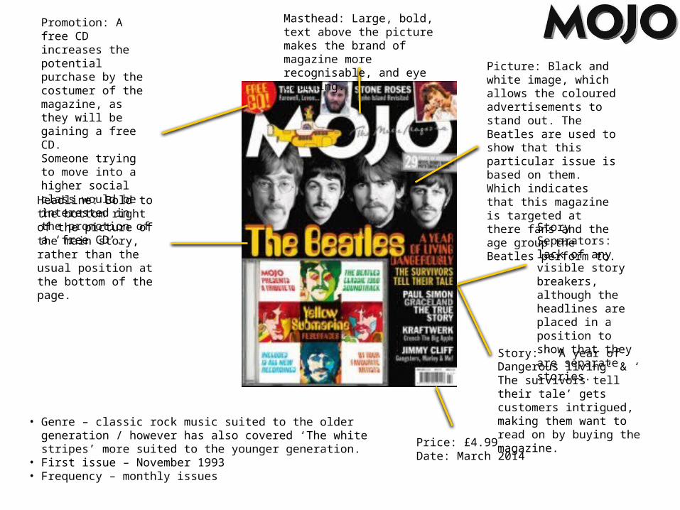
Promotion: A free CD increases the potential purchase by the costumer of the magazine, as they will be gaining a free CD. Someone trying to move into a higher social class would be interested in the promotion of a ‘free CD’.
Headline: Bold to the bottom right of the picture of the main story, rather than the usual position at the bottom of the page.
Picture: Black and white image, which allows the coloured advertisements to stand out. The Beatles are used to show that this particular issue is based on them.Which indicates that this magazine is targeted at there fans and the age group the Beatles perform to.
Story: ‘ A year of Dangerous living’ & ‘ The survivors tell their tale’ gets customers intrigued, making them want to read on by buying the magazine.
Price: £4.99Date: March 2014
Masthead: Large, bold, text above the picture makes the brand of magazine more recognisable, and eye catching.
Story Separators: lack of any visible story breakers, although the headlines are placed in a position to show that they are separate stories.
• Genre – classic rock music suited to the older generation / however has also covered ‘The white stripes’ more suited to the younger generation.
• First issue – November 1993• Frequency – monthly issues
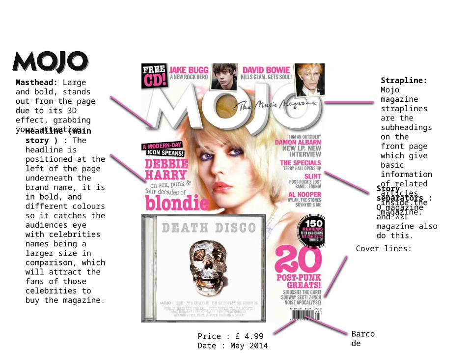
Headline (main story ) : The headline is positioned at the left of the page underneath the brand name, it is in bold, and different colours so it catches the audiences eye with celebrities names being a larger size in comparison, which will attract the fans of those celebrities to buy the magazine.
Story separators : Q magazine and XXL magazine also do this.
Cover lines:
BarcodePrice : £ 4.99 Date : May 2014
Masthead: Large and bold, stands out from the page due to its 3D effect, grabbing your attention.
Strapline: Mojo magazine straplines are the subheadings on the front page which give basic information of related articles inside the magazine.
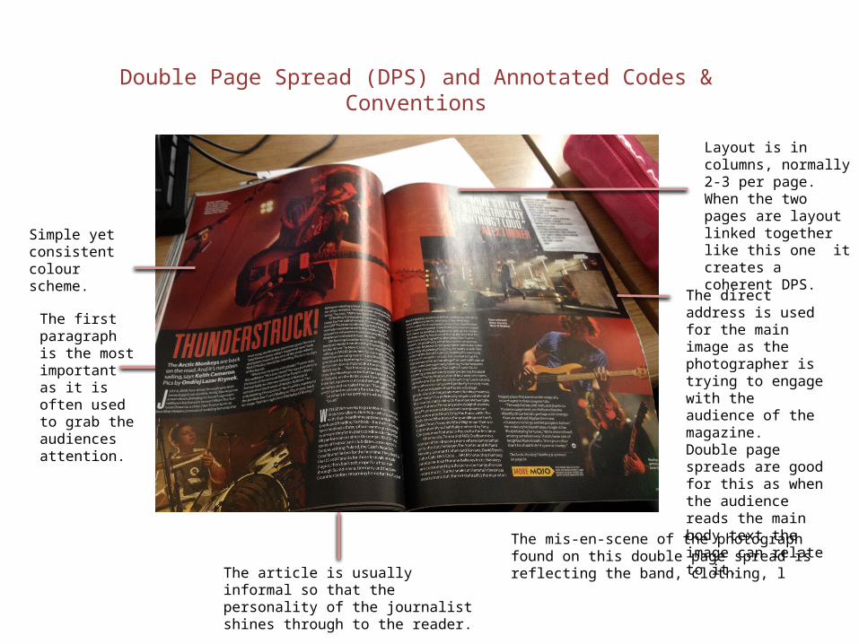
Double Page Spread (DPS) and Annotated Codes & Conventions
The first paragraph is the most important as it is often used to grab the audiences attention.
The article is usually informal so that the personality of the journalist shines through to the reader.
Simple yet consistent colour scheme.
Layout is in columns, normally 2-3 per page. When the two pages are layout linked together like this one it creates a coherent DPS.
The direct address is used for the main image as the photographer is trying to engage with the audience of the magazine.Double page spreads are good for this as when the audience reads the main body text the image can relate to it.
The mis-en-scene of the photograph found on this double page spread is reflecting the band, clothing, l
Magazine Content• Analyse a Contents Page from
the magazine – What sections are there? What stories are there? Appeal to the reader?
• Analyse a story from the issue – Language techniques/devices? Imagery? Captions?
• Synergy with social media – twitter links? Why?
• Web Page at the bottom of each page – WHY?
• Editorial – Language? Welcoming? Interact with the editor – HOW? Can the audience build a ‘personal relationship’ (Katz) with the magazine? WHERE? Evidence
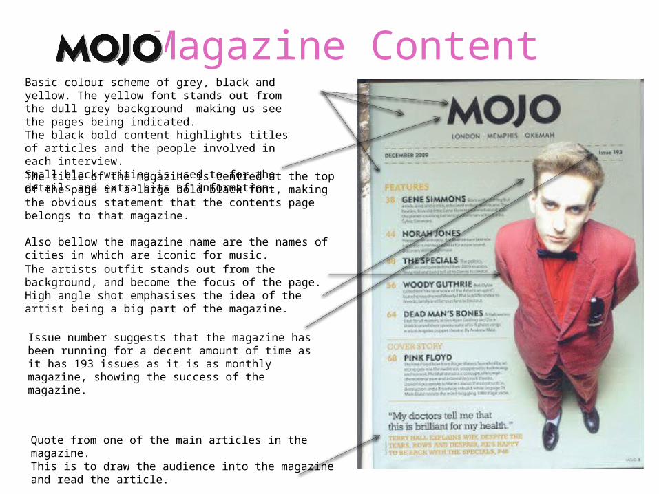
Basic colour scheme of grey, black and yellow. The yellow font stands out from the dull grey background making us see the pages being indicated.The black bold content highlights titles of articles and the people involved in each interview. Small black writing is used to for the details and extra bits of information. The title of the magazine is centred at the top of the page in a large bold black font, making the obvious statement that the contents page belongs to that magazine.
Also bellow the magazine name are the names of cities in which are iconic for music.
Quote from one of the main articles in the magazine.This is to draw the audience into the magazine and read the article.
The artists outfit stands out from the background, and become the focus of the page.High angle shot emphasises the idea of the artist being a big part of the magazine.
Issue number suggests that the magazine has been running for a decent amount of time as it has 193 issues as it is as monthly magazine, showing the success of the magazine.
Target Audience
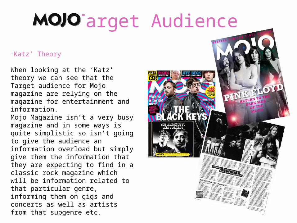
‘Katz’ Theory
When looking at the ‘Katz’ theory we can see that the Target audience for Mojo magazine are relying on the magazine for entertainment and information. Mojo Magazine isn’t a very busy magazine and in some ways is quite simplistic so isn’t going to give the audience an information overload but simply give them the information that they are expecting to find in a classic rock magazine which will be information related to that particular genre, informing them on gigs and concerts as well as artists from that subgenre etc.
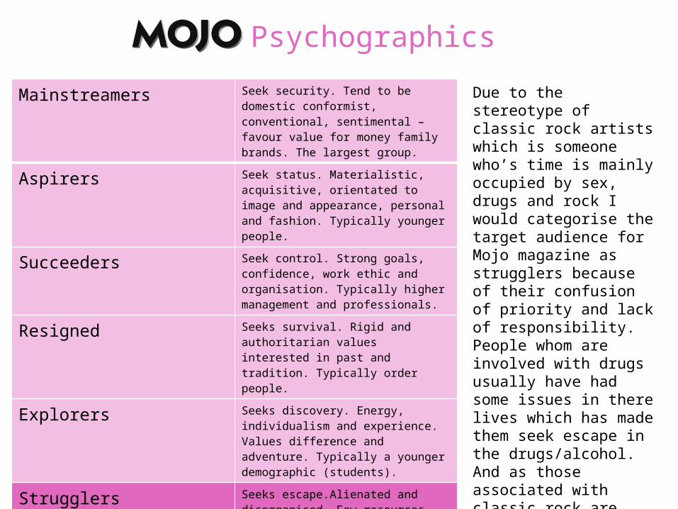
Psychographics
Mainstreamers Seek security. Tend to be domestic conformist, conventional, sentimental – favour value for money family brands. The largest group.
Aspirers Seek status. Materialistic, acquisitive, orientated to image and appearance, personal and fashion. Typically younger people.
Succeeders Seek control. Strong goals, confidence, work ethic and organisation. Typically higher management and professionals.
Resigned Seeks survival. Rigid and authoritarian values interested in past and tradition. Typically order people.
Explorers Seeks discovery. Energy, individualism and experience. Values difference and adventure. Typically a younger demographic (students).
Strugglers Seeks escape.Alienated and disorganised. Few resources beyond physical skills. Buys alcohol, junk food, lottery tickets. Typically lower demographics.
Reformers Seeks enlightenment. Freedom of restrictions and personal growth. Social awareness and independent judgement. Anti-materialistic but aware of good taste.
Due to the stereotype of classic rock artists which is someone who’s time is mainly occupied by sex, drugs and rock I would categorise the target audience for Mojo magazine as strugglers because of their confusion of priority and lack of responsibility. People whom are involved with drugs usually have had some issues in there lives which has made them seek escape in the drugs/alcohol. And as those associated with classic rock are stereotyped as drug lovers I think that strugglers is the category most suitable.
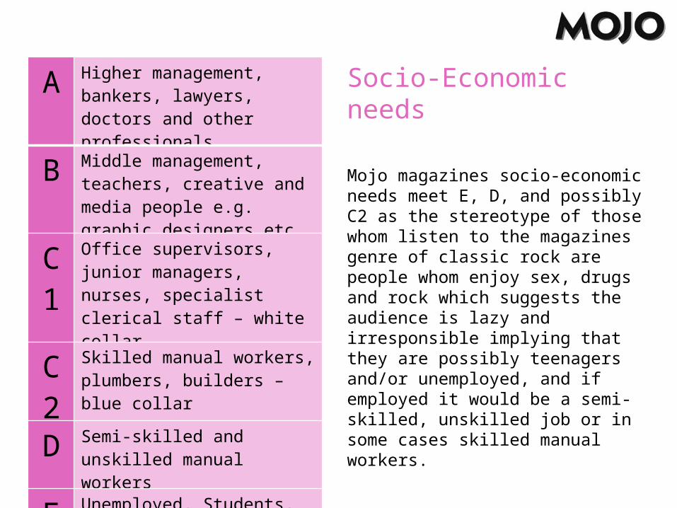
Socio-Economic needs
Mojo magazines socio-economic needs meet E, D, and possibly C2 as the stereotype of those whom listen to the magazines genre of classic rock are people whom enjoy sex, drugs and rock which suggests the audience is lazy and irresponsible implying that they are possibly teenagers and/or unemployed, and if employed it would be a semi-skilled, unskilled job or in some cases skilled manual workers.
A Higher management, bankers, lawyers, doctors and other professionals
B Middle management, teachers, creative and media people e.g. graphic designers etc.
C1
Office supervisors, junior managers, nurses, specialist clerical staff – white collar
C2
Skilled manual workers, plumbers, builders – blue collar
D Semi-skilled and unskilled manual workers
E Unemployed, Students, pensioners, casual workers
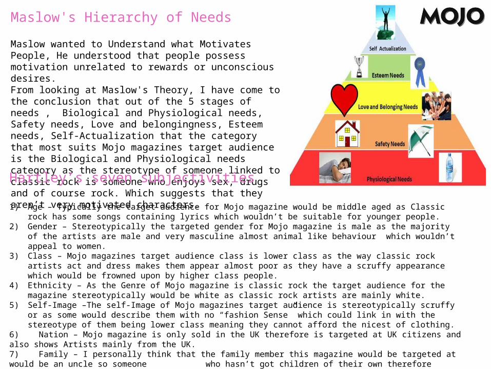
Maslow's Hierarchy of Needs
Maslow wanted to Understand what Motivates People, He understood that people possess motivation unrelated to rewards or unconscious desires. From looking at Maslow's Theory, I have come to the conclusion that out of the 5 stages of needs , Biological and Physiological needs, Safety needs, Love and belongingness, Esteem needs, Self-Actualization that the category that most suits Mojo magazines target audience is the Biological and Physiological needs category as the stereotype of someone linked to classic rock is someone who enjoys sex, drugs and of course rock. Which suggests that they aren’t very motivated characters.Hartley’s seven subjectivities
1) Age – Typically the target audience for Mojo magazine would be middle aged as Classic rock has some songs containing lyrics which wouldn’t be suitable for younger people.
2) Gender – Stereotypically the targeted gender for Mojo magazine is male as the majority of the artists are male and very masculine almost animal like behaviour which wouldn’t appeal to women.
3) Class – Mojo magazines target audience class is lower class as the way classic rock artists act and dress makes them appear almost poor as they have a scruffy appearance which would be frowned upon by higher class people.
4) Ethnicity – As the Genre of Mojo magazine is classic rock the target audience for the magazine stereotypically would be white as classic rock artists are mainly white.
5) Self-Image –The self-Image of Mojo magazines target audience is stereotypically scruffy or as some would describe them with no “fashion Sense” which could link in with the stereotype of them being lower class meaning they cannot afford the nicest of clothing.
6) Nation – Mojo magazine is only sold in the UK therefore is targeted at UK citizens and also shows Artists mainly from the UK.7) Family – I personally think that the family member this magazine would be targeted at would be an uncle so someone who hasn’t got children of their own therefore hasn’t got much responsibility.
Katz 'Uses & Gratifications Theory
• Through conative and denotive and denotive analysis I have researched the uses of gratifications theory in Mojo magazine in order to gain further conventions of how a music magazine fulfils the role of a consumer magazine.
• The target audience for mojo magazine is the older generation which is shown by the use of old photographs and photographs of older people throughout the magazine.
• The typography used in the magazine is a san serif font with a drop shadow which stands out from the magazine.
• The writing on top of the mast head which says "The music magazine "in a handwritten font also shows age.
• Diversion • Mojo magazine uses Diversion to take the target audience away from everyday life
and gives them an escape from reality.• The target audience is shown through the mode of address with the use of
colloquial language and genre reverences of old bands to show diversion as the cover lines are of subject such as “the boys are back in town” and “we’ve been to the dark side!” these create a diversion as the audience is reading into someone else's life rather than their own, allow them escape.
• Surveillance • The magazine uses surveillance to group together information from the magazine.
This is because specific cover lines advertise information they have retrieved for the audience to gain information from on artists or topics they may be interested in.
How does the Magazine appeal to the reader according to these Theories?
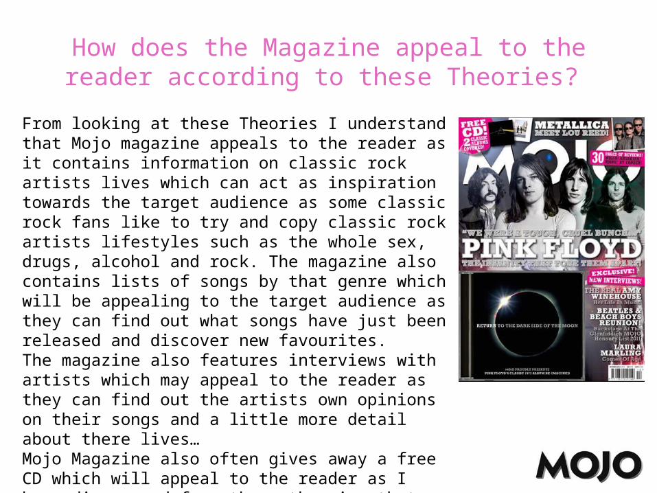
From looking at these Theories I understand that Mojo magazine appeals to the reader as it contains information on classic rock artists lives which can act as inspiration towards the target audience as some classic rock fans like to try and copy classic rock artists lifestyles such as the whole sex, drugs, alcohol and rock. The magazine also contains lists of songs by that genre which will be appealing to the target audience as they can find out what songs have just been released and discover new favourites.The magazine also features interviews with artists which may appeal to the reader as they can find out the artists own opinions on their songs and a little more detail about there lives… Mojo Magazine also often gives away a free CD which will appeal to the reader as I have discovered from these theories that the target audience is of lower class and will not be able to constantly buy CD’s.
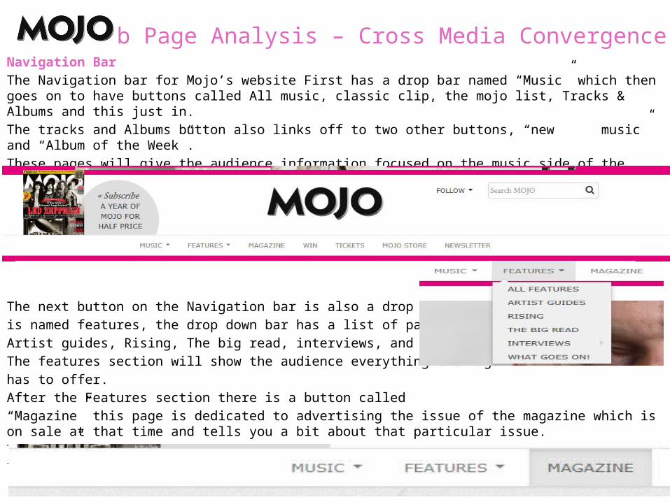
Web Page Analysis – Cross Media ConvergenceNavigation Bar The Navigation bar for Mojo’s website First has a drop bar named “Music” which then goes on to have buttons called All music, classic clip, the mojo list, Tracks & Albums and this just in. The tracks and Albums button also links off to two other buttons, “new music” and “Album of the Week”.These pages will give the audience information focused on the music side of the magazine, which will inform them of latest songs etc.
The next button on the Navigation bar is also a drop bar which is named features, the drop down bar has a list of pages, All features, Artist guides, Rising, The big read, interviews, and what goes on!,The features section will show the audience everything the magazinehas to offer. After the Features section there is a button called “Magazine” this page is dedicated to advertising the issue of the magazine which is on sale at that time and tells you a bit about that particular issue.The “win” button is a competition page which allows you to win anything from theatre tokens to IPad’s.
This is a good way of attracting the audience as they will be receiving more from the magazine than just the magazine itself.
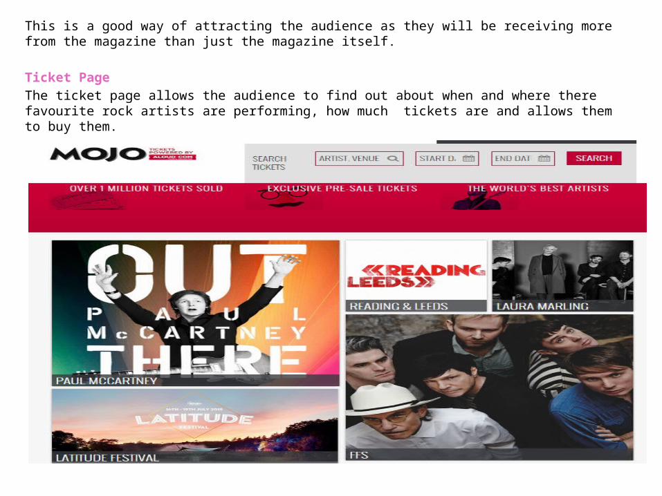
Ticket Page The ticket page allows the audience to find out about when and where there favourite rock artists are performing, how much tickets are and allows them to buy them.
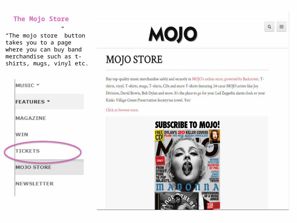
The Mojo Store
“The mojo store” button takes you to a page where you can buy band merchandise such as t-shirts, mugs, vinyl etc.
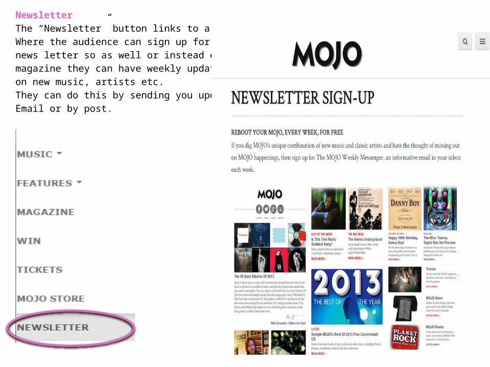
Newsletter The “Newsletter” button links to a page Where the audience can sign up for a weekly news letter so as well or instead of the magazine they can have weekly updates on new music, artists etc.They can do this by sending you updates via Email or by post.
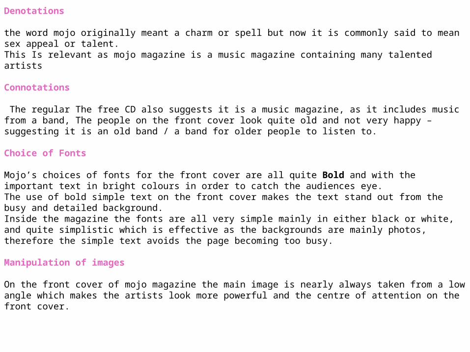
Denotations
the word mojo originally meant a charm or spell but now it is commonly said to mean sex appeal or talent. This Is relevant as mojo magazine is a music magazine containing many talented artists
Connotations
The regular The free CD also suggests it is a music magazine, as it includes music from a band, The people on the front cover look quite old and not very happy – suggesting it is an old band / a band for older people to listen to.
Choice of Fonts
Mojo’s choices of fonts for the front cover are all quite Bold and with the important text in bright colours in order to catch the audiences eye.The use of bold simple text on the front cover makes the text stand out from the busy and detailed background. Inside the magazine the fonts are all very simple mainly in either black or white, and quite simplistic which is effective as the backgrounds are mainly photos, therefore the simple text avoids the page becoming too busy.
Manipulation of images
On the front cover of mojo magazine the main image is nearly always taken from a low angle which makes the artists look more powerful and the centre of attention on the front cover.
2nd Magazine - KerrangPublisher and product
Publisher – Bauer media Bauer media is one of the top media companies in the world having more than 570 magazines, more than 300 digital products, and 50 television and radio stations reaching millions of magazine buyers around the world.At the start of 2008, Bauer media group widened its portfolio by acquiring Emap’s radio and consumer magazine divisions and changed the name of uk business to the Bauer media group.
Bauer media have been publishing Mojo magazine for 21 years.Bauer media’s mojo magazine reaches millions rock fans across the globe.
Source: http://www.bauer.co.uk/history
Product – Kerrang MagazineKerrang will ensure that they are constantly appealing to there spectrum of readers. From the younger teenage readers who are more open to different genres of rock music, from emo to thrash etc., to the readers who respect Kerrang! as an authority when it comes to there scene’s heritage bands. Each issue will include a balance of bands and scenes to guarantee that they are providing for the readers’ need for variety and their passionate appetite for their favourite bands as well as their desire to be introduced to new music within the world of Kerrang. They focus on the BIGGEST things that are going on in their world each week, as well as guaranteeing that they are giving there main base of younger readers everything they need to get into, on top of this the interest in older, harder bands, cementing our role as an educator.
http://magazines.bauermediaadvertising.com/magazines/detail/kerrang
Production process of
The production process for Kerrang Magazine is much like the production process for Mojo magazine.Pre, During and Post-Production – The first thing in a production process is to set up the date of publication, the date of publication is merely the date that you want your magazine to be released to the public as a final finished product. Doing the date of publication first gives you a schedule to operate by, this will help to plan how the production process will occur.Managing the schedule also plays a very important part in the production process for if you want your magazine to be produced successfully then you must properly manage the schedule in a way that there are provisions for certain mishaps so that even when these mishaps occur, you can always meet the deadline.For this reason, managing the schedule is vital in the production process of a magazine.Next you must work on an Editorial, this involves the editorial team assembling and deciding on what topics will be featured in the next issue of the magazine. The editorial team will talk about a variety of contents to make up the magazine. Once they have decided on the types of article ideas, or topics, news stories, illustrations and photographs to be featured in this magazine, the editorial team will then make decisions on the budgetary. this means hey will look at the money available to them and how it can be spent towards the production of the magazine.The next step is content acquisition this process is said to be the most important step in the production process of a magazine because without the content there is no magazine. The content can be gathered in two ways, firstly is through the house staff writers and secondly is through the external writers whom are commissioned to write on topics that are specialist in nature. During this step artwork and graphics are also worked on.Artwork is simply illustrations and pictures which are going to be placed in the magazine. The graphics however are the pictures or images which are created or designed on a computer program.
Sub editing is the next step, it focuses on quality control, if the media organisation is big enough to have sub editor the he shall be responsible for this job, if not then the editor will do this job which involves Checking of the accuracy of all facts in the articles, Making sure that words are properly spelled, Making sure that grammar and punctuation are used correctly ,Making sure that all articles follow the house-style, Working on the page layout…..Then comes the page layout, in big publications there is a time especially responsible for the page layouts, we call them the layout staff.The layout staff typeset and layout the variety of pages which form the magazine. By taking part in this task they use very high tech desktop publishing (DTP) for example InDesign or PageMaker to do so. This is where the adverts are placed into the content.Once the page layout is complete it is time for proofreading, during this stage the editorial department will print out a hardcopy of the magazine for correcting mistakes, they use a hardcopy because it is easier to proofread than a softcopy. When they spot a mistake they correct it quickly on the DTP. The editorial team them proofreads until every member of staff is happy and believes all the mistakes are gone.Then we move on to the filing and printing of the magazine, this is where the term “pre press "comes in. this means they check the correct fonts and images are being used for the magazine, once done the printing takes place , each copy the printer prints is the final finished product which means that the final step is the distribution, this means the magazines are packaged neatly and sent to the warehouse before they are distributed and sold to the public.
Source :http://hosbeg.com/the-magazine-production-process/
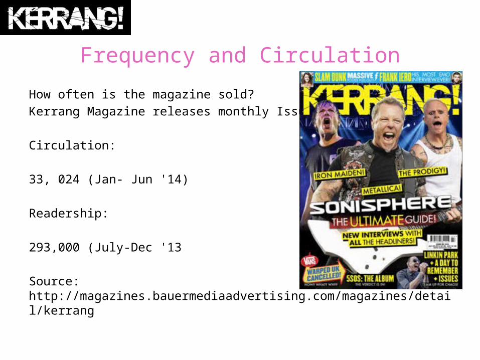
Frequency and Circulation
How often is the magazine sold?Kerrang Magazine releases monthly Issues.
Circulation:
33, 024 (Jan- Jun '14)
Readership:
293,000 (July-Dec '13
Source: http://magazines.bauermediaadvertising.com/magazines/detail/kerrang
Production process of
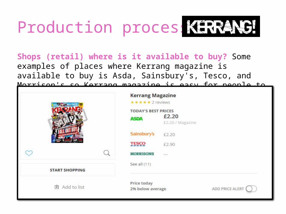
Shops (retail) where is it available to buy? Some examples of places where Kerrang magazine is available to buy is Asda, Sainsbury's, Tesco, and Morrison's so Kerrang magazine is easy for people to get hold of.
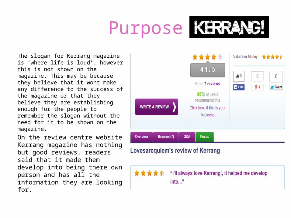
PurposeThe slogan for Kerrang magazine is ‘where life is loud’, however this is not shown on the magazine. This may be because they believe that it wont make any difference to the success of the magazine or that they believe they are establishing enough for the people to remember the slogan without the need for it to be shown on the magazine.
On the review centre website Kerrang magazine has nothing but good reviews, readers said that it made them develop into being there own person and has all the information they are looking for.
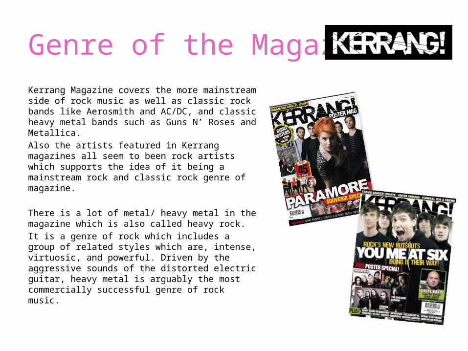
Genre of the MagazineKerrang Magazine covers the more mainstream side of rock music as well as classic rock bands like Aerosmith and AC/DC, and classic heavy metal bands such as Guns N’ Roses and Metallica. Also the artists featured in Kerrang magazines all seem to been rock artists which supports the idea of it being a mainstream rock and classic rock genre of magazine.
There is a lot of metal/ heavy metal in the magazine which is also called heavy rock.It is a genre of rock which includes a group of related styles which are, intense, virtuosic, and powerful. Driven by the aggressive sounds of the distorted electric guitar, heavy metal is arguably the most commercially successful genre of rock music.
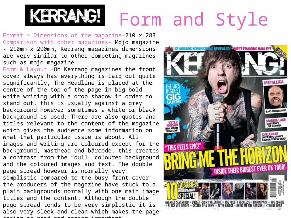
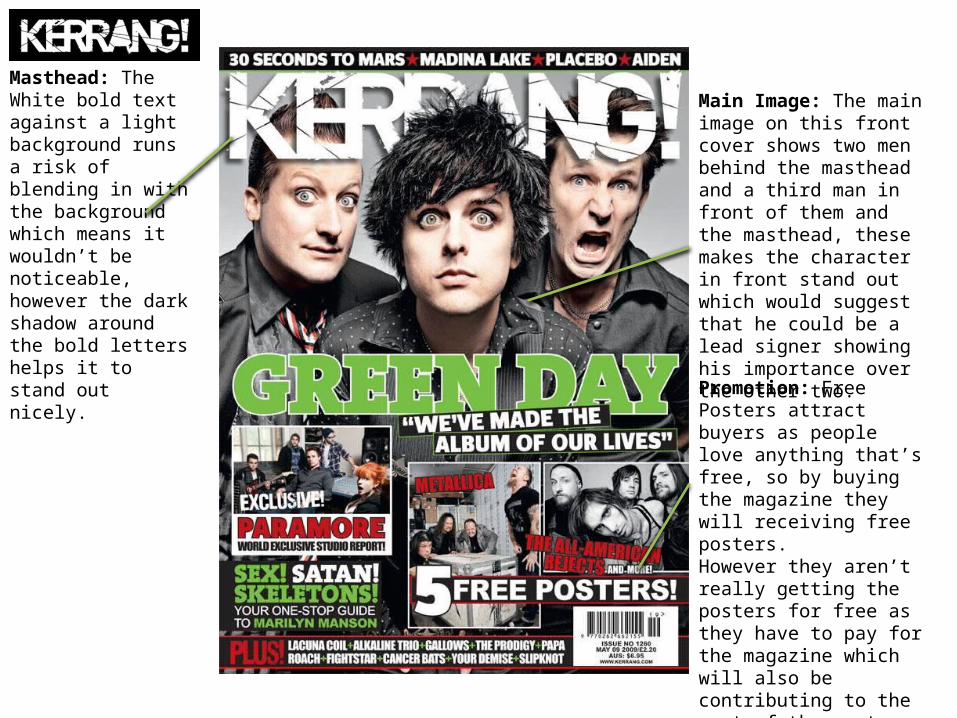
Form and StyleFormat = Dimensions of the magazine–210 x 283Comparison with other magazines- Mojo magazine - 210mm x 290mm, Kerrang magazines dimensions are very similar to other competing magazines such as mojo magazine.Form & Layout –On Kerrang magazines the front cover always has everything is laid out quite significantly, The Headline is placed at the centre of the top of the page in big bold white writing with a drop shadow in order to stand out, this is usually against a grey background however sometimes a white or black background is used. There are also quotes and titles relevant to the content of the magazine which gives the audience some information on what that particular issue is about. All images and writing are coloured except for the background, masthead and barcode, this creates a contrast from the “dull” coloured background and the coloured images and text. The double page spread however is normally very simplistic compared to the busy front cover the producers of the magazine have stuck to a plain backgrounds normally with one main image titles and the content. Although the double page spread tends to be very simplistic it is also very sleek and clean which makes the page easier to read and appear important.Style – Kerrang magazine seems to always use a variety of colours each issue, pink, yellow, orange, blue etc. however that those colours are always featured with either black, grey or white to balance the colours out. Which also makes the important information stand out from the page.
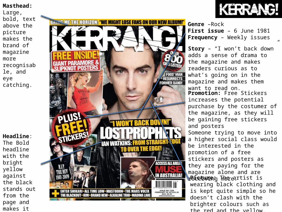
Masthead: Large, bold, text above the picture makes the brand of magazine more recognisable, and eye catching.
Headline: The Bold headline with the bright yellow against the black stands out from the page and makes it more noticeable.
Promotion: Free Stickers increases the potential purchase by the costumer of the magazine, as they will be gaining free stickers and postersSomeone trying to move into a higher social class would be interested in the promotion of a free stickers and posters as they are paying for the magazine alone and are receiving more.Picture: The artist is wearing black clothing and is kept quite simple so he doesn’t clash with the brighter colours such as the red and the yellow.
Genre –RockFirst issue – 6 June 1981Frequency – Weekly issues
Story – “I won’t back down” adds a sense of drama to the magazine and makes readers curious as to what’s going on in the magazine and makes them want to read on.
Promotion: Free Posters attract buyers as people love anything that’s free, so by buying the magazine they will receiving free posters. However they aren’t really getting the posters for free as they have to pay for the magazine which will also be contributing to the cost of the posters.
Main Image: The main image on this front cover shows two men behind the masthead and a third man in front of them and the masthead, these makes the character in front stand out which would suggest that he could be a lead signer showing his importance over the other two.
Masthead: The White bold text against a light background runs a risk of blending in with the background which means it wouldn’t be noticeable, however the dark shadow around the bold letters helps it to stand out nicely.
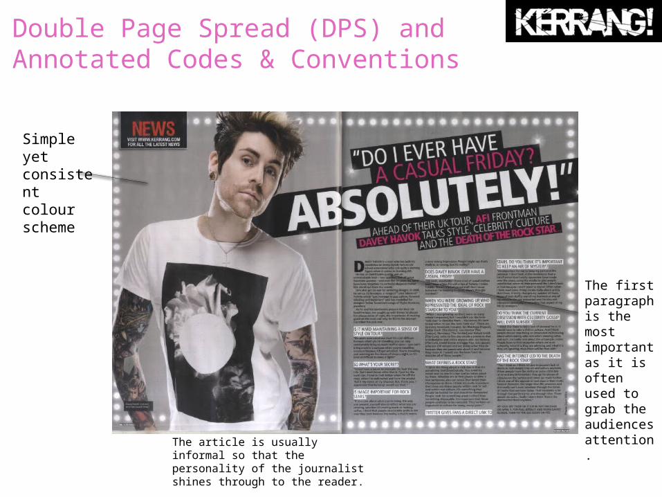
Double Page Spread (DPS) and Annotated Codes & Conventions
Simple yet consistent colour scheme
The first paragraph is the most important as it is often used to grab the audiences attention.
The article is usually informal so that the personality of the journalist shines through to the reader.
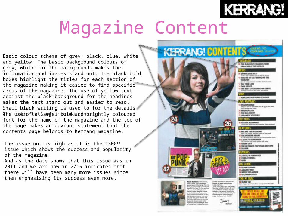
Magazine ContentBasic colour scheme of grey, black, blue, white and yellow. The basic background colours of grey, white for the backgrounds makes the information and images stand out. The black bold boxes highlight the titles for each section of the magazine making it easier to find specific areas of the magazine. The use of yellow text against the black background for the headings makes the text stand out and easier to read. Small black writing is used to for the details and extra bits of information.
The use of a large, bold and brightly coloured font for the name of the magazine and the top of the page makes an obvious statement that the contents page belongs to Kerrang magazine.
The issue no. is high as it is the 1300th issue which shows the success and popularity of the magazine. And as the date shows that this issue was in 2011 and we are now in 2015 indicates that there will have been many more issues since then emphasising its success even more.
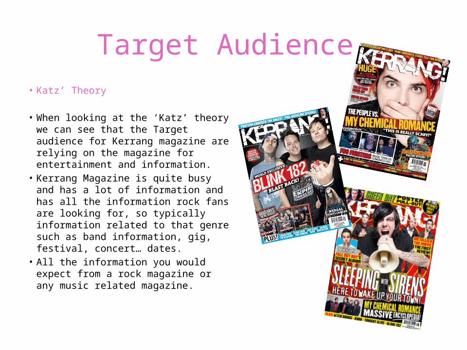
Target Audience • Katz’ Theory
• When looking at the ‘Katz’ theory we can see that the Target audience for Kerrang magazine are relying on the magazine for entertainment and information.
• Kerrang Magazine is quite busy and has a lot of information and has all the information rock fans are looking for, so typically information related to that genre such as band information, gig, festival, concert… dates.
• All the information you would expect from a rock magazine or any music related magazine.
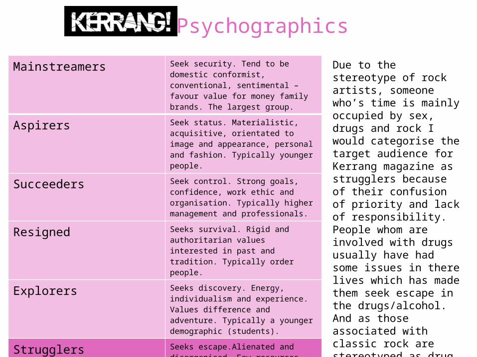
Psychographics
Mainstreamers Seek security. Tend to be domestic conformist, conventional, sentimental – favour value for money family brands. The largest group.
Aspirers Seek status. Materialistic, acquisitive, orientated to image and appearance, personal and fashion. Typically younger people.
Succeeders Seek control. Strong goals, confidence, work ethic and organisation. Typically higher management and professionals.
Resigned Seeks survival. Rigid and authoritarian values interested in past and tradition. Typically order people.
Explorers Seeks discovery. Energy, individualism and experience. Values difference and adventure. Typically a younger demographic (students).
Strugglers Seeks escape.Alienated and disorganised. Few resources beyond physical skills. Buys alcohol, junk food, lottery tickets. Typically lower demographics.
Reformers Seeks enlightenment. Freedom of restrictions and personal growth. Social awareness and independent judgement. Anti-materialistic but aware of good taste.
Due to the stereotype of rock artists, someone who’s time is mainly occupied by sex, drugs and rock I would categorise the target audience for Kerrang magazine as strugglers because of their confusion of priority and lack of responsibility. People whom are involved with drugs usually have had some issues in there lives which has made them seek escape in the drugs/alcohol. And as those associated with classic rock are stereotyped as drug lovers I think that strugglers is the category most suitable.
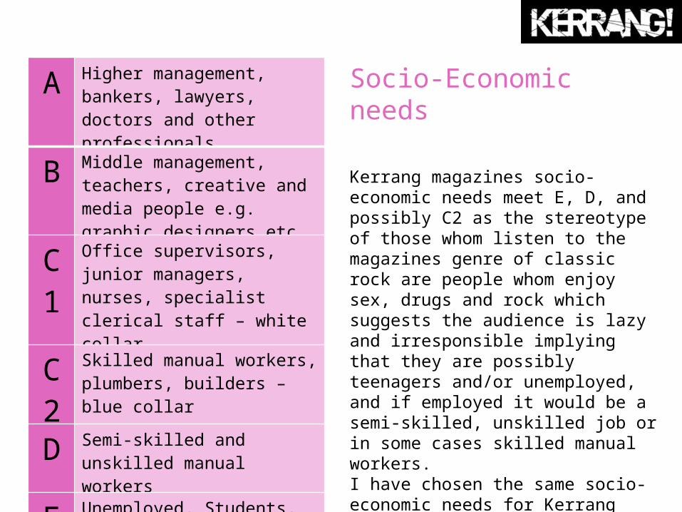
Socio-Economic needs
Kerrang magazines socio-economic needs meet E, D, and possibly C2 as the stereotype of those whom listen to the magazines genre of classic rock are people whom enjoy sex, drugs and rock which suggests the audience is lazy and irresponsible implying that they are possibly teenagers and/or unemployed, and if employed it would be a semi-skilled, unskilled job or in some cases skilled manual workers.I have chosen the same socio-economic needs for Kerrang magazine as I did for Mojo magazine as they are from the same genre and therefore the same stereotype applies.
A Higher management, bankers, lawyers, doctors and other professionals
B Middle management, teachers, creative and media people e.g. graphic designers etc.
C1
Office supervisors, junior managers, nurses, specialist clerical staff – white collar
C2
Skilled manual workers, plumbers, builders – blue collar
D Semi-skilled and unskilled manual workers
E Unemployed, Students, pensioners, casual workers
Maslow's Hierarchy of Needs
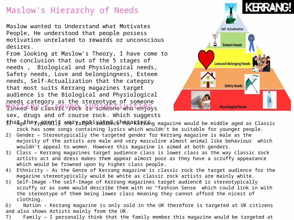
Maslow wanted to Understand what Motivates People, He understood that people possess motivation unrelated to rewards or unconscious desires. From looking at Maslow's Theory, I have come to the conclusion that out of the 5 stages of needs , Biological and Physiological needs, Safety needs, Love and belongingness, Esteem needs, Self-Actualization that the category that most suits Kerrang magazines target audience is the Biological and Physiological needs category as the stereotype of someone linked to classic rock is someone who enjoys sex, drugs and of course rock. Which suggests that they aren’t very motivated characters.Hartley’s seven subjectivities
1) Age – Typically the target audience for Kerrang magazine would be middle aged as Classic rock has some songs containing lyrics which wouldn’t be suitable for younger people.
2) Gender – Stereotypically the targeted gender for Kerrang magazine is male as the majority of the artists are male and very masculine almost animal like behaviour which wouldn’t appeal to women. However this magazine is aimed at both genders.
3) Class – Kerrang magazines target audience class is lower class as the way classic rock artists act and dress makes them appear almost poor as they have a scruffy appearance which would be frowned upon by higher class people.
4) Ethnicity – As the Genre of Kerrang magazine is classic rock the target audience for the magazine stereotypically would be white as classic rock artists are mainly white.
5) Self-Image –The self-Image of Kerrang magazines target audience is stereotypically scruffy or as some would describe them with no “fashion Sense” which could link in with the stereotype of them being lower class meaning they cannot afford the nicest of clothing.
6) Nation – Kerrang magazine is only sold in the UK therefore is targeted at UK citizens and also shows Artists mainly from the UK.7) Family – I personally think that the family member this magazine would be targeted at would be an uncle so someone who hasn’t got children of their own therefore hasn’t got much responsibility.
Katz 'Uses & Gratifications Theory
• Through conative and denotive analysis I have researched the uses of gratifications theory in Kerrang magazine in order to gain further conventions of how a music magazine fulfils the role of a consumer magazine.
• The target audience for Kerrang magazine is the younger generation which is shown by the use of newer looking photographs and photographs of younger people throughout the magazine.
• The typography used in the magazine is a san serif font with a drop shadow, Making the text stand out from the page.
• Diversion • Kerrang magazine uses Diversion to take the target audience away from
everyday life and gives them an escape from reality.• The target audience is shown through the mode of address with the use of
colloquial language and genre reverences of younger bands to show diversion as the cover lines are of subject such as “This is really scary "these create a diversion as the audience is reading into someone else's life rather than their own, which allows them escape.
• Surveillance • The magazine uses surveillance to group together information from the
magazine. This is because specific cover lines advertise information they have retrieved for the audience to gain information from on artists or topics they may be interested in.
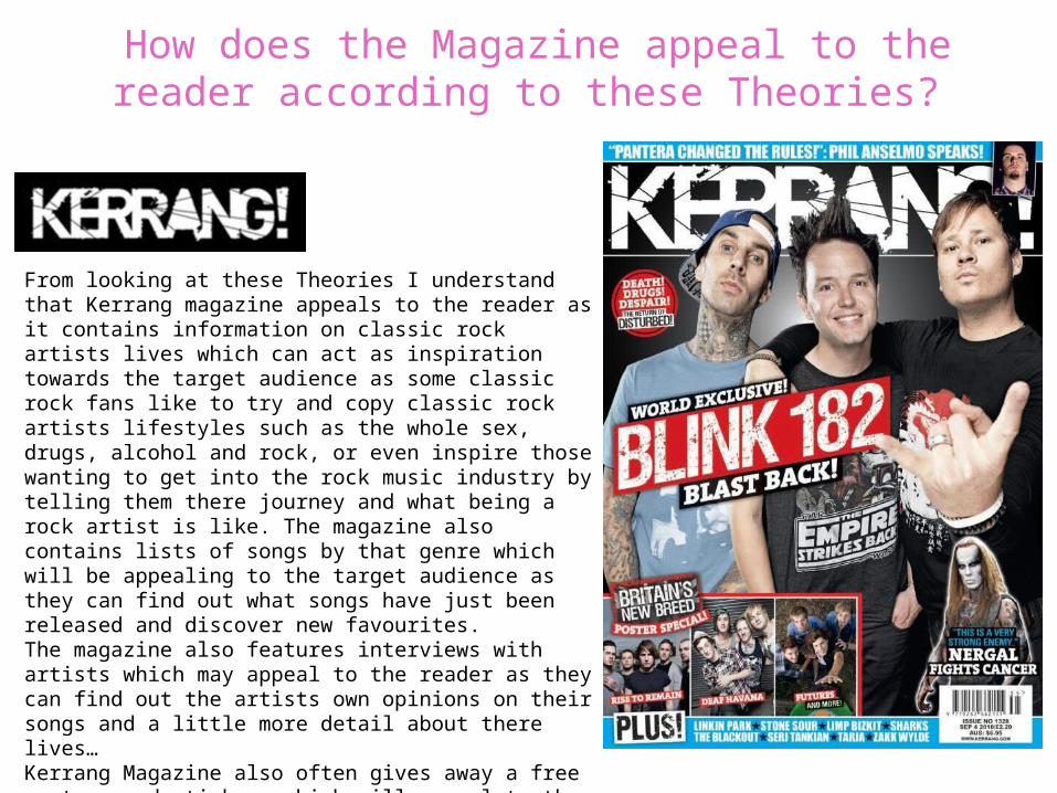
How does the Magazine appeal to the reader according to these Theories?
From looking at these Theories I understand that Kerrang magazine appeals to the reader as it contains information on classic rock artists lives which can act as inspiration towards the target audience as some classic rock fans like to try and copy classic rock artists lifestyles such as the whole sex, drugs, alcohol and rock, or even inspire those wanting to get into the rock music industry by telling them there journey and what being a rock artist is like. The magazine also contains lists of songs by that genre which will be appealing to the target audience as they can find out what songs have just been released and discover new favourites.The magazine also features interviews with artists which may appeal to the reader as they can find out the artists own opinions on their songs and a little more detail about there lives… Kerrang Magazine also often gives away a free posters and stickers which will appeal to the readers as the readers feel like they are getting more than just the magazine.
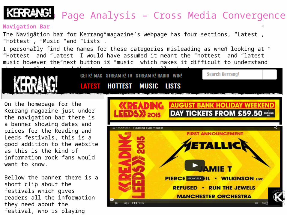
Web Page Analysis – Cross Media ConvergenceNavigation Bar The Navigation bar for Kerrang magazine’s webpage has four sections, “Latest”, “Hottest”, “Music "and “Lists”.I personally find the names for these categories misleading as when looking at “Hottest” and “Latest” I would have assumed it meant the “hottest” and “latest” music however the next button is “music” which makes it difficult to understand what the “latest” and “hottest” pages are actually about.
On the homepage for the Kerrang magazine just under the navigation bar there is a banner showing dates and prices for the Reading and Leeds festivals, this is a good addition to the website as this is the kind of information rock fans would want to know.
Bellow the banner there is a short clip about the festivals which gives readers all the information they need about the festival, who is playing etc. This will help rock fans who are new to festivals. To know what to expect.
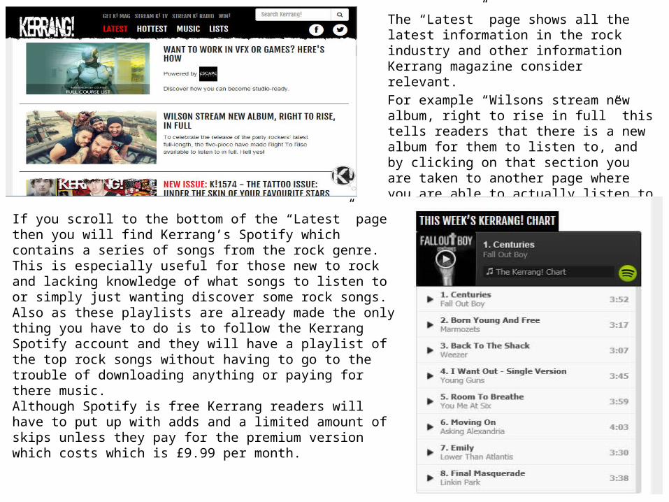
The “Latest” page shows all the latest information in the rock industry and other information Kerrang magazine consider relevant. For example “Wilsons stream new album, right to rise in full” this tells readers that there is a new album for them to listen to, and by clicking on that section you are taken to another page where you are able to actually listen to the full song. This is a nice addition as you are not able to do this with the magazine.
If you scroll to the bottom of the “Latest” page then you will find Kerrang’s Spotify which contains a series of songs from the rock genre. This is especially useful for those new to rock and lacking knowledge of what songs to listen to or simply just wanting discover some rock songs.Also as these playlists are already made the only thing you have to do is to follow the Kerrang Spotify account and they will have a playlist of the top rock songs without having to go to the trouble of downloading anything or paying for there music.Although Spotify is free Kerrang readers will have to put up with adds and a limited amount of skips unless they pay for the premium version which costs which is £9.99 per month.
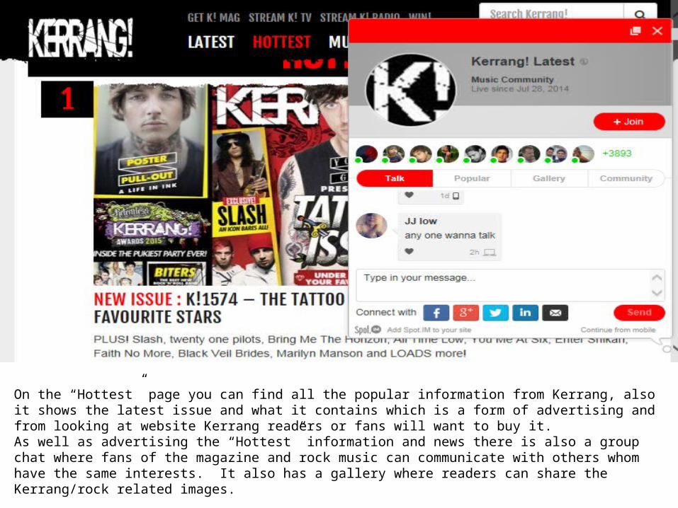
On the “Hottest” page you can find all the popular information from Kerrang, also it shows the latest issue and what it contains which is a form of advertising and from looking at website Kerrang readers or fans will want to buy it.As well as advertising the “Hottest” information and news there is also a group chat where fans of the magazine and rock music can communicate with others whom have the same interests. It also has a gallery where readers can share the Kerrang/rock related images.
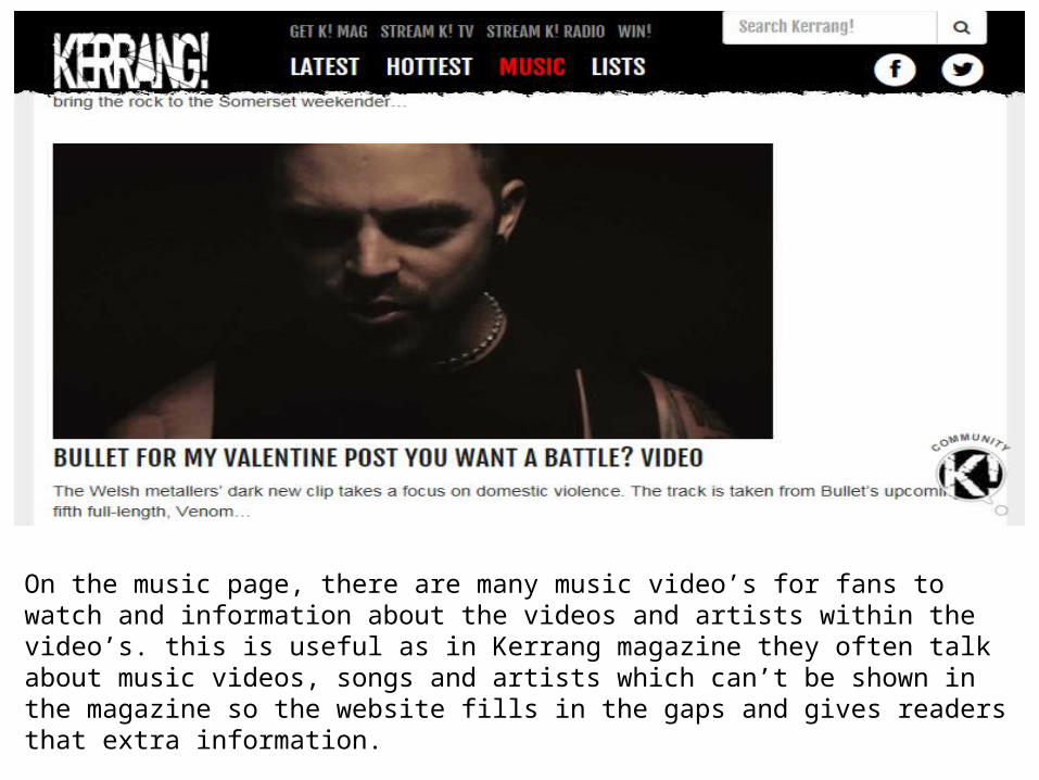
On the music page, there are many music video’s for fans to watch and information about the videos and artists within the video’s. this is useful as in Kerrang magazine they often talk about music videos, songs and artists which can’t be shown in the magazine so the website fills in the gaps and gives readers that extra information.
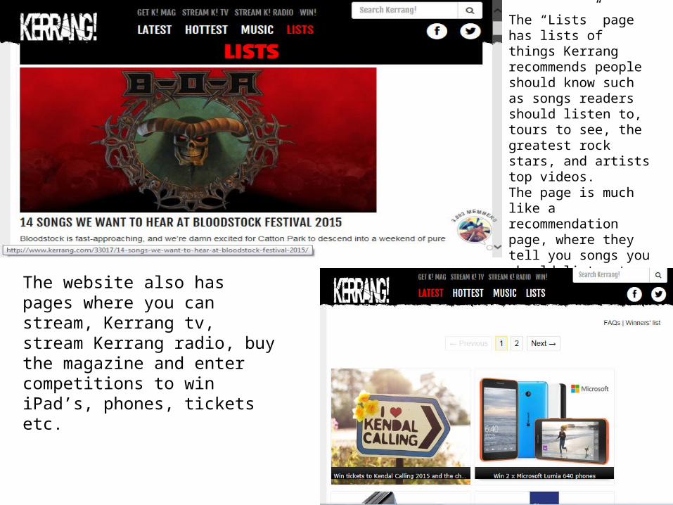
The “Lists” page has lists of things Kerrang recommends people should know such as songs readers should listen to, tours to see, the greatest rock stars, and artists top videos.The page is much like a recommendation page, where they tell you songs you should listen to or places you should be.
The website also has pages where you can stream, Kerrang tv, stream Kerrang radio, buy the magazine and enter competitions to win iPad’s, phones, tickets etc.
Denotations Kerrang is the word that derives from the sound made when playing a power chord on a distorted electric guitar, and was initially devoted to the New Wave of British Heavy Metal and the rise of hard rock acts.
Connotations
The Free band posters, and tickets to festivals on their website suggests that it is a music magazine and the posters are of bands and other music artists. The people on the front cover of Kerrang magazine always seem to be fairly young which suggests that they are aimed at the younger generation.
Choice of Fonts
Kerrang’s choices of fonts for the front cover are all quite Bold and brightly coloured so they stand out with other important text also in bold in order to stand out. Inside the magazine the fonts are all very simple mainly in either black or white, and quite simplistic which is effective as the backgrounds are mainly photos, therefore the simple text avoids the page becoming too busy.
Manipulation of imagesOn the front cover of Kerrang magazine the main image is nearly always taken from a low angle which makes the artists look more powerful and the main attraction on the front cover and normally indicates that they are the main focus of the magazine.