Embed Size (px)
Citation preview
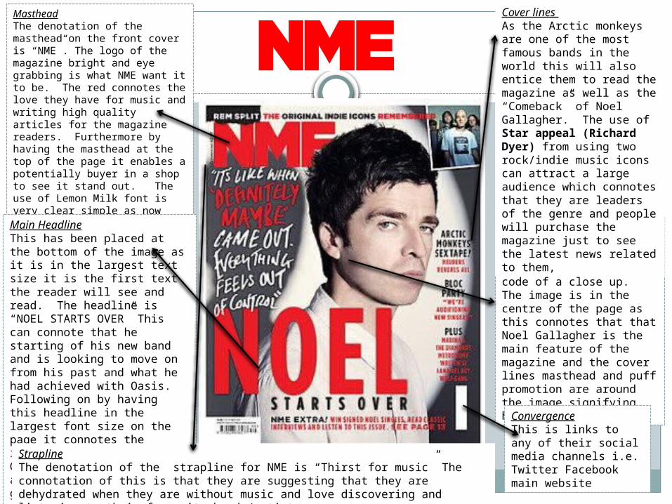
MastheadThe denotation of the masthead on the front cover is “NME”. The logo of the magazine bright and eye grabbing is what NME want it to be. The red connotes the love they have for music and writing high quality articles for the magazine readers. Furthermore by having the masthead at the top of the page it enables a potentially buyer in a shop to see it stand out. The use of Lemon Milk font is very clear simple as now created a brand recognition towards NME readers can link whenever they see a similar font style Main image
The denotation of the shot type for the main image is the technical code of a close up. The image is in the centre of the page as this connotes that that Noel Gallagher is the main feature of the magazine and the cover lines masthead and puff promotion are around the image signifying his importance
Main HeadlineThis has been placed at the bottom of the image as it is in the largest text size it is the first text the reader will see and read. The headline is “NOEL STARTS OVER” This can connote that he starting of his new band and is looking to move on from his past and what he had achieved with Oasis. Following on by having this headline in the largest font size on the page it connotes the importance of what Noel Gallagher is trying to say and where his career is going with his new direction of the band.
ConvergenceThis is links to any of their social media channels i.e. Twitter Facebook main website
StraplineThe denotation of the strapline for NME is “Thirst for music” The connotation of this is that they are suggesting that they are dehydrated when they are without music and love discovering and listening to their favourite bands/artists.
Cover lines As the Arctic monkeys are one of the most famous bands in the world this will also entice them to read the magazine as well as the “Comeback” of Noel Gallagher. The use of Star appeal (Richard Dyer) from using two rock/indie music icons can attract a large audience which connotes that they are leaders of the genre and people will purchase the magazine just to see the latest news related to them,
Denotations and Connotations
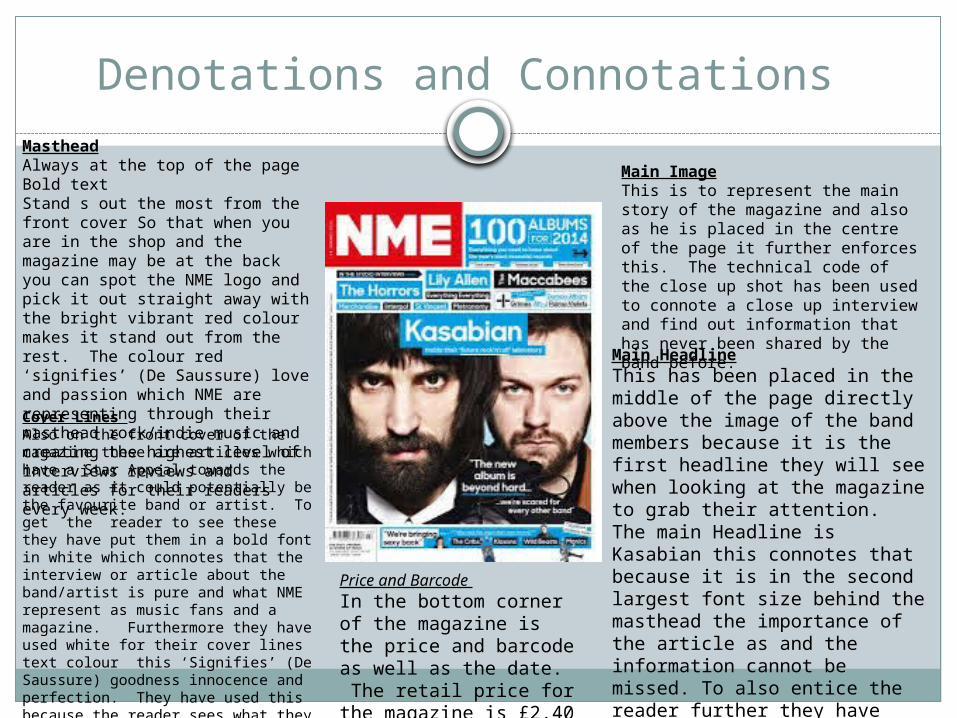
Main ImageThis is to represent the main story of the magazine and also as he is placed in the centre of the page it further enforces this. The technical code of the close up shot has been used to connote a close up interview and find out information that has never been shared by the band before.
MastheadAlways at the top of the page Bold textStand s out the most from the front cover So that when you are in the shop and the magazine may be at the back you can spot the NME logo and pick it out straight away with the bright vibrant red colour makes it stand out from the rest. The colour red ‘signifies’ (De Saussure) love and passion which NME are representing through their masthead rock/indie music and creating the highest level of interviews reviews and articles for their readers every week.
Price and Barcode In the bottom corner of the magazine is the price and barcode as well as the date. The retail price for the magazine is £2.40
Main HeadlineThis has been placed in the middle of the page directly above the image of the band members because it is the first headline they will see when looking at the magazine to grab their attention. The main Headline is Kasabian this connotes that because it is in the second largest font size behind the masthead the importance of the article as and the information cannot be missed. To also entice the reader further they have added a pull quote so it gives the potential reader and idea what the interview will be about.
Cover Lines Also on the front cover of the magazine these are articles which have a Star Appeal towards the reader as it could potentially be the favourite band or artist. To get the reader to see these they have put them in a bold font in white which connotes that the interview or article about the band/artist is pure and what NME represent as music fans and a magazine. Furthermore they have used white for their cover lines text colour this ‘Signifies’ (De Saussure) goodness innocence and perfection. They have used this because the reader sees what they are producing as pure compared to other magazines who do not cover stories with the honesty and detail as NME.
Denotations and Connotations
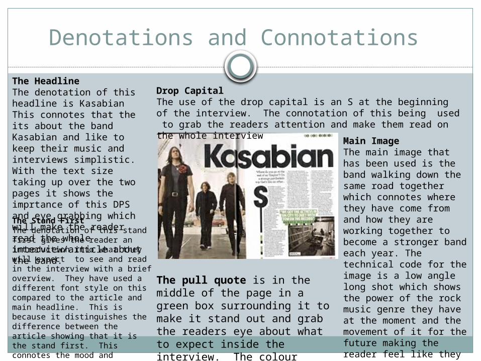
The pull quote is in the middle of the page in a green box surrounding it to make it stand out and grab the readers eye about what to expect inside the interview. The colour green ‘Signifies’
The Headline The denotation of this headline is Kasabian This connotes that the its about the band Kasabian and like to keep their music and interviews simplistic. With the text size taking up over the two pages it shows the imprtance of this DPS and eye grabbing which will make the reader read the whole interview/article about the band. The Stand First The denotation of this stand first gives the reader an introduction into what they will expect to see and read in the interview with a brief overview. They have used a different font style on this compared to the article and main headline. This is because it distinguishes the difference between the article showing that it is the stand first. This connotes the mood and atmosphere for the article as it is in a serious Times New Roman font .
Main Image The main image that has been used is the band walking down the same road together which connotes where they have come from and how they are working together to become a stronger band each year. The technical code for the image is a low angle long shot which shows the power of the rock music genre they have at the moment and the movement of it for the future making the reader feel like they have to look up to them and what they have done for the music industry and rock genre
Drop Capital The use of the drop capital is an S at the beginning of the interview. The connotation of this being used to grab the readers attention and make them read on the whole interview
NME DPS Analysis
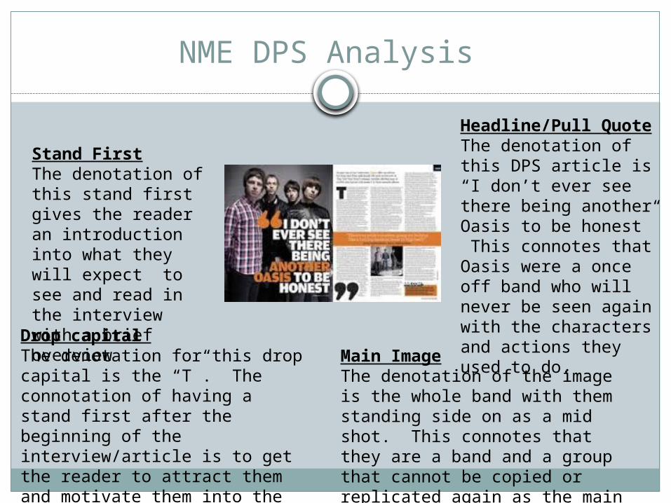
Headline/Pull Quote The denotation of this DPS article is “I don’t ever see there being another Oasis to be honest” This connotes that Oasis were a once off band who will never be seen again with the characters and actions they used to do.
Drop capital The denotation for this drop capital is the “T”. The connotation of having a stand first after the beginning of the interview/article is to get the reader to attract them and motivate them into the main article.
Main ImageThe denotation of the image is the whole band with them standing side on as a mid shot. This connotes that they are a band and a group that cannot be copied or replicated again as the main headline suggests
Stand FirstThe denotation of this stand first gives the reader an introduction into what they will expect to see and read in the interview with a brief overview
Choice of Images
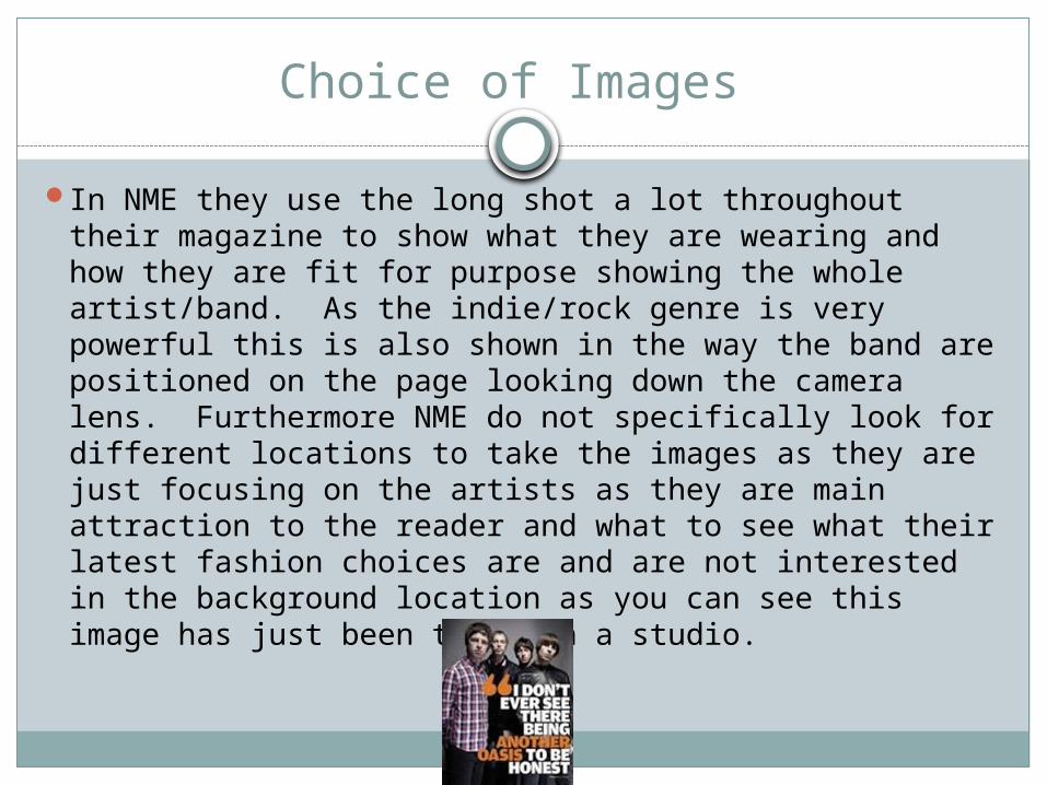
In NME they use the long shot a lot throughout their magazine to show what they are wearing and how they are fit for purpose showing the whole artist/band. As the indie/rock genre is very powerful this is also shown in the way the band are positioned on the page looking down the camera lens. Furthermore NME do not specifically look for different locations to take the images as they are just focusing on the artists as they are main attraction to the reader and what to see what their latest fashion choices are and are not interested in the background location as you can see this image has just been taken in a studio.