Embed Size (px)
Citation preview
OCR – Level 3 Cambridge Introductory Diploma in
Media
Unit 14: Producing a Print based Media Product
P1 Evidence
Name: Emily ThompsonCandidate Number: 6107Center Name: St. Andrew’s Catholic SchoolCenter Number: 64135
Set Brief - Print
Project/Brief –
Music Magazine & Promotion
Contents:
Title Slide
Front Cover Drafts 3 - 4
Double Page Spread Drafts 5 - 6
Final Image Plans 7
Graphic Layout 8
Mood Board 9
Magazine Masthead/Logo 10
Font and Colours 11
Interview Draft Planning 12
Draft Article – Interview 13
Image Plans 14 - 15
Prop List 16
Prop Sourcing 17
Location Images 18
Risk Assessment 19
Production Plan 20
Conclusion 21
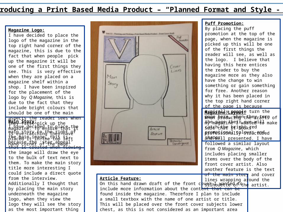
Unit 14 – Producing a Print Based Media Product – “Planned Format and Style - Front Cover”
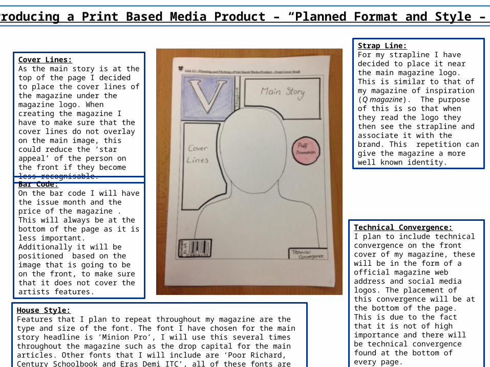
Puff Promotion:By placing the puff promotion at the top of the page, when the magazine is picked up this will be one of the first things the reader will see, as well as the logo. I believe that having this here entices the reader to buy the magazine more as they also have the change to win something or gain something for free. Another reason why it has been placed in the top right hand corner of the page is because typically people turn the page here, when they turn the page their eye will catch the bright red promotional colours and shapes.
Article Feature:On this hand drawn draft of the front cover I wanted to include more information about the content that can be found inside the magazine. Therefore I plan to include a small textbox with the name of one artist or title. This will be placed over the front cover subjects lower chest, as this is not considered as an important area that creates ‘star appeal’.
Main Story:I have decided to place the main story to the right of the main image, this is because the ‘star appeal’ that is created when viewing the image will draw the eye to the bulk of text next to them. To make the main story title more interesting I could include a direct quote from the interview. Additionally I thought that by placing the main story underneath the magazine logo, when they view the logo they will see the story as the most important thing within the magazine. Looking at my research of Q Magazine many of their front covers have used this layout for the main story text.
Magazine Logo:I have decided to place the logo of the magazine in the top right hand corner of the magazine, this is due to the fact that when people pick up the magazine it will be one of the first things they see. This is very effective when they are placed on a magazine shelf within a shop. I have been inspired for the placement of the logo by Q Magazine, this is due to the fact that they include bright colours that should be one of the main aspects the reader sees when they first pick up the magazine. To ensure that it is eye-catching they have placed it in the top left hand corner of the page.
Magazine Layout:When producing the drafts of my magazine I wanted to make sure that it looks professionally structured and well presented. I have followed a similar layout from Q Magazine, which includes placing smaller items over the body of the front cover artist. Also another feature is the text of the main story and cover lines wrapping around the silhouette of the artist.
Unit 14 – Producing a Print Based Media Product – “Planned Format and Style – Front Cover”
Technical Convergence:I plan to include technical convergence on the front cover of my magazine, these will be in the form of a official magazine web address and social media logos. The placement of this convergence will be at the bottom of the page. This is due to the fact that it is not of high importance and there will be technical convergence found at the bottom of every page.
Cover Lines:As the main story is at the top of the page I decided to place the cover lines of the magazine under the magazine logo. When creating the magazine I have to make sure that the cover lines do not overlay on the main image, this could reduce the ‘star appeal’ of the person on the front if they become less recognisable.
Bar Code:On the bar code I will have the issue month and the price of the magazine . This will always be at the bottom of the page as it is less important. Additionally it will be positioned based on the image that is going to be on the front, to make sure that it does not cover the artists features.
Strap Line:For my strapline I have decided to place it near the main magazine logo. This is similar to that of my magazine of inspiration (Q magazine). The purpose of this is so that when they read the logo they then see the strapline and associate it with the brand. This repetition can give the magazine a more well known identity.
House Style:Features that I plan to repeat throughout my magazine are the type and size of the font. The font I have chosen for the main story headline is ‘Minion Pro’, I will use this several times throughout the magazine such as the drop capital for the main articles. Other fonts that I will include are ‘Poor Richard, Century Schoolbook and Eras Demi ITC’, all of these fonts are similar to that of Q Magazine with an interesting formal style.
Unit 14 – Producing a Print Based Media Product – “Planned Format and Style – Double Page Spread”
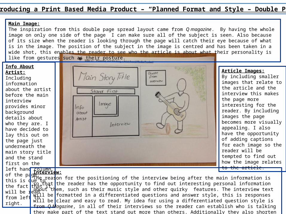
Main Image:The inspiration from this double page spread layout came from Q magazine. By having the whole image on only one side of the page I can make sure all of the subject is seen. Also because of its size when the reader is looking through the page will catch their eye because of what is in the image. The position of the subject in the image is centred and has been taken in a wide shot, this enables the reader to see who the article is about what their personality is like from gestures such as their posture.
Article Images:By including smaller images that relate to the article and the interview this makes the page more interesting for the reader. By including images the page becomes more visually appealing. I also have the opportunity of adding captions for each image so the reader will be tempted to find out how the image relates to the article.
Info About Artist:Including information about the artist before the main interview provides minor background details about who they are. I have decided to lay this out on the page just underneath the main story title and the stand first on the left hand column of the page, this is due to the fact that it will be read from left to right.
Interview:The reason for the positioning of the interview being after the main information is so that the reader has the opportunity to find out interesting personal information about them, such as their music style and other quirky features. The interview text will be formatted in a differentiated questions and answer style, this is responses will be clear and easy to read. My idea for using a differentiated question style is from Q Magazine, in all of their interviews so the reader can establish who is talking they make part of the text stand out more than others. Additionally they also shorten or use the initials of the name of the person being interviewed. This saves space in the magazine and is easier to read through.
Unit 14 – Producing a Print Based Media Product – “Planned Format and Style – Double Page Spread”
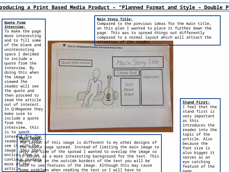
Quote From Interview:To make the page more interesting and to fill some of the blank and uninteresting space I decided to include a quote from the interview. By doing this when the image is viewed the reader will see the quote and then proceed to read the article out of interest. In Q Magazine they make sure to include a quote from the interview, this is to spark interest for the reader when they see it with the image; this then entices them to continue reading more of the article.
Main Image:The layout of this image is different to my other designs of the double page spread. Instead of limiting the main image to only one side of the spread I wanted to overlap the image so it serves as a more interesting background for the text. This means that on the outside borders of the text you will be able to see features of the image. Although this may cause some problems when reading the text so I will have to consider either making the background have little detail or surround the text with text boxes.
Main Story Title:Compared to the previous ideas for the main title, on this plan I wanted to place it further down the page. This was to spread things out differently compared to a normal layout which will attract the attention of the reader.
Stand First:I feel that the stand first is very important as this introduces the reader into the topic of the article. Also because the font size is also bigger it serves as an eye catching feature of the page.
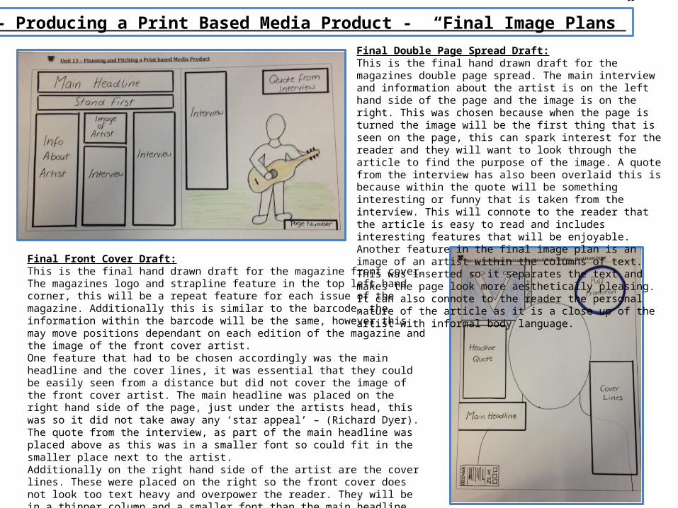
Unit 14 – Producing a Print Based Media Product - “Final Image Plans”Final Double Page Spread Draft:This is the final hand drawn draft for the magazines double page spread. The main interview and information about the artist is on the left hand side of the page and the image is on the right. This was chosen because when the page is turned the image will be the first thing that is seen on the page, this can spark interest for the reader and they will want to look through the article to find the purpose of the image. A quote from the interview has also been overlaid this is because within the quote will be something interesting or funny that is taken from the interview. This will connote to the reader that the article is easy to read and includes interesting features that will be enjoyable.Another feature in the final image plan is an image of an artist within the columns of text. This was inserted so it separates the text and makes the page look more aesthetically pleasing. It can also connote to the reader the personal nature of the article as it is a close up of the artist with informal body language.
Final Front Cover Draft:This is the final hand drawn draft for the magazine front cover. The magazines logo and strapline feature in the top left hand corner, this will be a repeat feature for each issue of the magazine. Additionally this is similar to the barcode, the information within the barcode will be the same, however this may move positions dependant on each edition of the magazine and the image of the front cover artist.One feature that had to be chosen accordingly was the main headline and the cover lines, it was essential that they could be easily seen from a distance but did not cover the image of the front cover artist. The main headline was placed on the right hand side of the page, just under the artists head, this was so it did not take away any ‘star appeal’ – (Richard Dyer). The quote from the interview, as part of the main headline was placed above as this was in a smaller font so could fit in the smaller place next to the artist.Additionally on the right hand side of the artist are the cover lines. These were placed on the right so the front cover does not look too text heavy and overpower the reader. They will be in a thinner column and a smaller font than the main headline.Finally the puff promotion is at the top of the page opposite the main masthead/logo. The purpose of placing this here is to attract the eye because when readers turn the page they typically turn with this corner. The circle shape has also been chosen to stand out the rest of the text which is placed in a square/rectangular format.
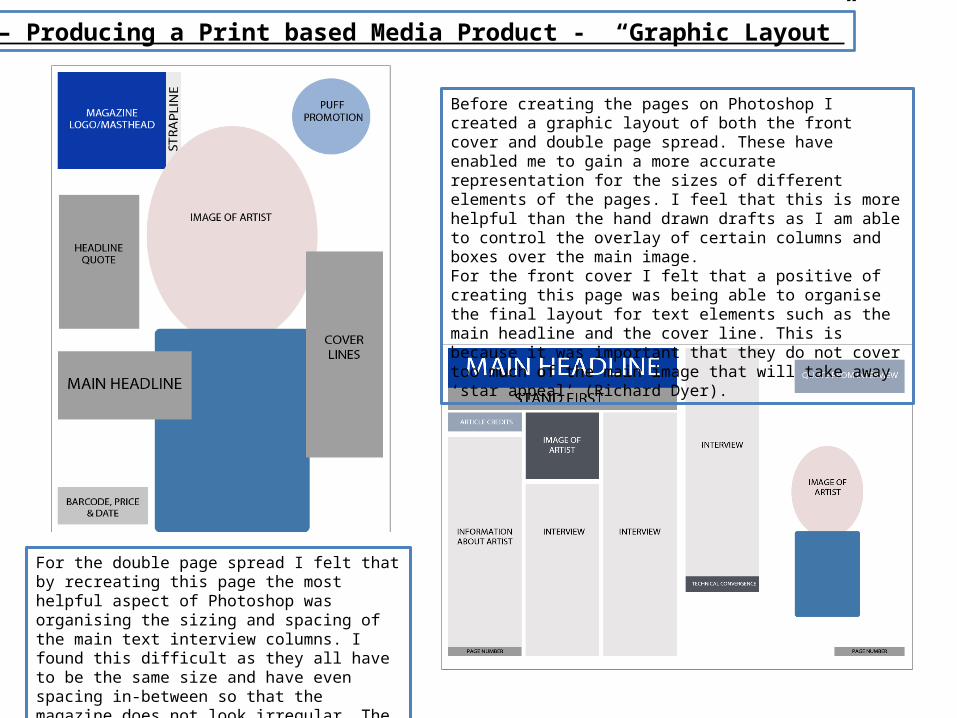
Unit 14 – Producing a Print based Media Product - “Graphic Layout”
Before creating the pages on Photoshop I created a graphic layout of both the front cover and double page spread. These have enabled me to gain a more accurate representation for the sizes of different elements of the pages. I feel that this is more helpful than the hand drawn drafts as I am able to control the overlay of certain columns and boxes over the main image.For the front cover I felt that a positive of creating this page was being able to organise the final layout for text elements such as the main headline and the cover line. This is because it was important that they do not cover too much of the main image that will take away ‘star appeal’ (Richard Dyer).
For the double page spread I felt that by recreating this page the most helpful aspect of Photoshop was organising the sizing and spacing of the main text interview columns. I found this difficult as they all have to be the same size and have even spacing in-between so that the magazine does not look irregular. The Photoshop tool, ‘ruler’ enabled me to correct this problem and increase my accuracy.
Unit 14 – Producing a Print Based Media Product – “Mood Board”
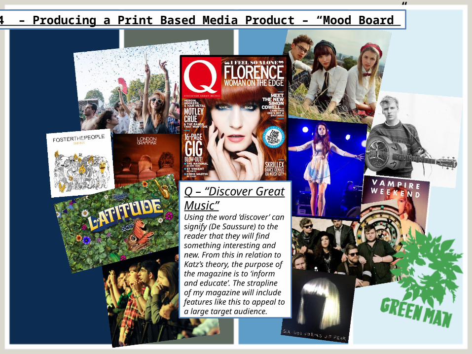
Q – “Discover Great Music”Using the word ‘discover’ can signify (De Saussure) to the reader that they will find something interesting and new. From this in relation to Katz’s theory, the purpose of the magazine is to ‘inform and educate’. The strapline of my magazine will include features like this to appeal to a large target audience.
Unit 14 – Producing a Print Based Media Product – “Magazine Masthead/Logo”
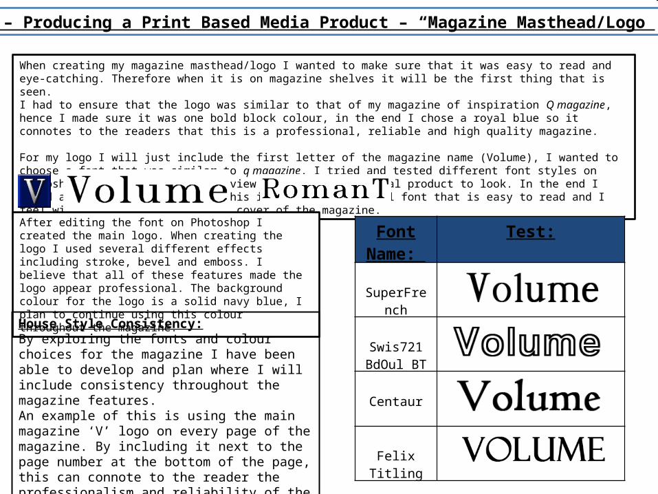
When creating my magazine masthead/logo I wanted to make sure that it was easy to read and eye-catching. Therefore when it is on magazine shelves it will be the first thing that is seen.I had to ensure that the logo was similar to that of my magazine of inspiration Q magazine, hence I made sure it was one bold block colour, in the end I chose a royal blue so it connotes to the readers that this is a professional, reliable and high quality magazine.
For my logo I will just include the first letter of the magazine name (Volume), I wanted to choose a font that was similar to q magazine. I tried and tested different font styles on Photoshop and dafont.com to overview how I wanted to final product to look. In the end I found a font called ‘RomanT’ , this is a very traditional font that is easy to read and I feel will work well on the front cover of the magazine.
Font Name:
Test:
SuperFrench
Swis721 BdOul BT
Centaur
Felix Titling
After editing the font on Photoshop I created the main logo. When creating the logo I used several different effects including stroke, bevel and emboss. I believe that all of these features made the logo appear professional. The background colour for the logo is a solid navy blue, I plan to continue using this colour throughout the magazine.
House Style Consistency:By exploring the fonts and colour choices for the magazine I have been able to develop and plan where I will include consistency throughout the magazine features.An example of this is using the main magazine ‘V’ logo on every page of the magazine. By including it next to the page number at the bottom of the page, this can connote to the reader the professionalism and reliability of the magazine.
Unit 14 – Producing a Print Based Media Product – “Magazine Fonts and Colours”
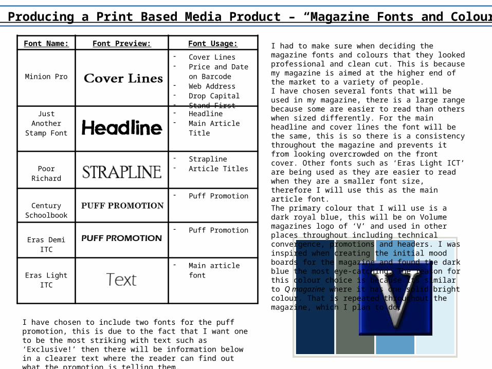
Font Name: Font Preview: Font Usage:
Minion Pro
- Cover Lines- Price and Date on
Barcode- Web Address- Drop Capital- Stand First
Just Another Stamp Font
- Headline- Main Article Title
Poor Richard- Strapline- Article Titles
Century Schoolbook
- Puff Promotion
Eras Demi ITC- Puff Promotion
Eras Light ITC- Main article font
I had to make sure when deciding the magazine fonts and colours that they looked professional and clean cut. This is because my magazine is aimed at the higher end of the market to a variety of people.I have chosen several fonts that will be used in my magazine, there is a large range because some are easier to read than others when sized differently. For the main headline and cover lines the font will be the same, this is so there is a consistency throughout the magazine and prevents it from looking overcrowded on the front cover. Other fonts such as ‘Eras Light ICT’ are being used as they are easier to read when they are a smaller font size, therefore I will use this as the main article font.The primary colour that I will use is a dark royal blue, this will be on Volume magazines logo of ‘V’ and used in other places throughout including technical convergence, promotions and headers. I was inspired when creating the initial mood boards for the magazine and found the dark blue the most eye-catching. The reason for this colour choice is because its similar to Q magazine where it has one solid bright colour. That is repeated throughout the magazine, which I plan to do.
I have chosen to include two fonts for the puff promotion, this is due to the fact that I want one to be the most striking with text such as ‘Exclusive!’ then there will be information below in a clearer text where the reader can find out what the promotion is telling them.
Unit 14 – Producing a Print Based Media Product – “Interview Draft Planning”
For my double page spread within the magazine I plan to conduct an interview with the well known artist, George Ezra. As well as featuring on his own double page spread he will be the main headline for the magazine and will create ‘star appeal’ (Richard Dyer).I have chosen to interview George Ezra as he is a well known, up-and-coming indie genre artist who has only been in the music industry since featuring on an introducing stage at Glastonbury Festival 2013. Since his success at Glastonbury he has had three singles in the top charts and is famously known for his quirky stylised song ‘Budapest’. Additionally this year he has released his first album, by featuring him in the album we are essentially promoting the new album as well as drawing readers in because of his previous hit songs.Some of the questions that I will ask in the interview will be based around his new career in the music industry. I also want the interview to have an informal feel so other questions including ‘What his musical inspiration was as a child’, this will spur on possibly humorous answers.
The presentation of the interview on the double page spread will be laid in a differentiated question and answer style. This is typical in many of Q magazine interviews, and makes it easier for the reader to understand the information that is being published.
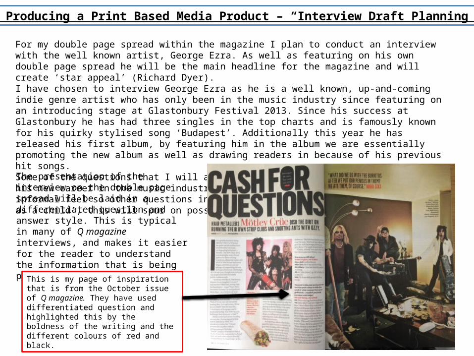
This is my page of inspiration that is from the October issue of Q magazine. They have used differentiated question and highlighted this by the boldness of the writing and the different colours of red and black.
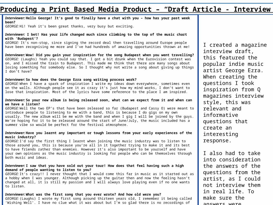
Interviewer: Hello George! It’s good to finally have a chat with you – how has your past week been?GEORGE: Hi! Yeah it’s been great thanks, very busy but exciting.
Interviewer: I bet! Has your life changed much since climbing to the top of the music chart with ‘Budapest’?GEORGE: It’s non-stop, since signing the record deal then travelling around Europe people have been recognising me more and I’ve had hundreds of amazing opportunities thrown at me!
Interviewer: Wow! Did you gain your inspiration for the song Budapest when you went travelling?GEORGE: (Laughs) Yeah you could say that. I got a bit drunk when the Eurovision contest was on, and I missed the train to Budapest. This made me think that there are many songs about losing something for somebody else. So I thought why not write a song about giving up things I don’t have?
Interviewer: So how does the George Ezra song writing process work?GEORGE: When I have a spark of inspiration I write my ideas down everywhere, sometimes even on the walls. Although people see it as crazy it’s just how my mind works, I don’t want to lose that inspiration. Most of the lyrics have some reference to the place I am inspired.
Interviewer: So your new album is being released soon, what can we expect from it and when can we have a listen?GEORGE: Well the two EP’s that have been released so far (Budapest and Cassy O) were meant to introduce people to listening to me with a band, this is because I do gigs on my own usually. The new album will be me with the band and when I gig I will be joined by the guys. We’re hoping for it to be released around the start of June/July, the music included has a summer vibe so would be perfect for the festival atmosphere.
Interviewer: Have you learnt any important or tough lessons from your early experiences of the music industry?GEORGE: I’d say the first thing I learnt when joining the music industry was to listen to those around you, this is because you’re all in it together trying to make it and its best to have friends rather than enemies. However it’s also important to be yourself and have your own opinions as the music industry is looking for people who can be themselves through both music and ideas.
Interviewer: I saw that you have sold out your tour! How does that feel having such a high demand of people wanting to listen to you?GEORGE: It’s crazy!! I never thought that I would come this far in music as it started out as a hobby when I was younger. Although picking up the guitar then and now the feeling hasn’t changed at all, it is still my passion and I will always love playing even if no one wants to listen.
Interviewer: What was the first song that you ever wrote? And how old were you?GEORGE: (Laughs) I wrote my first song around thirteen years old, I remember it being called ‘Wishing Well’. I have no clue what it was about but I’m so glad there is no recordings of it as that would be embarrassing!
Interviewer: When you were younger and started playing the guitar who was your musical inspiration?GEORGE: I grew up listening to Bob Dylan and Woody Guthrie, people find it strange that my inspirations are revolved around older blues and folk sound but within the music I create its more 21st century.
Interviewer: Finally, thank you George for your time it’s been great talking with you. Do you have any words of inspiration for your fans who are looking to pursue a music career?GEORGE: Thank you. Never stop playing music even if they tell you too, be unique and always look for opportunities to better yourself.
I created a magazine interview draft, this featured the popular indie music artist George Ezra. When creating the questions I took inspiration from Q magazines interview style, this was relevant and informative questions that create an interesting response.
I also had to take into consideration the answers of the questions from the artist, as I could not interview them in real life. To make sure the answers were accurate I conducted some small scale research into other interviews they had.
Unit 14 – Producing a Print Based Media Product – “Draft Article - Interview”
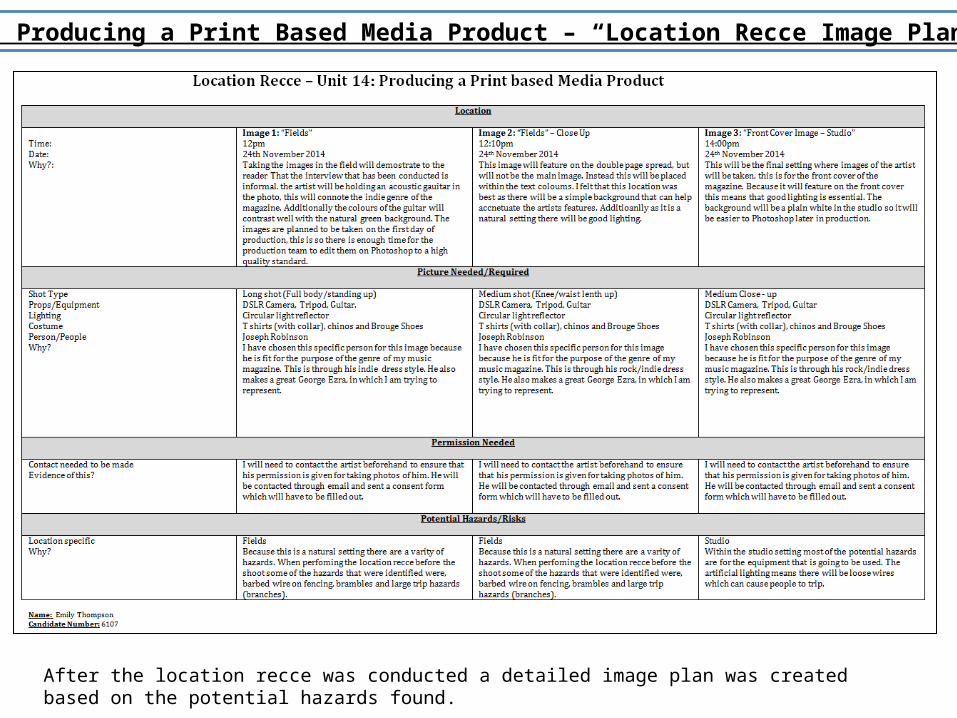
After the location recce was conducted a detailed image plan was created based on the potential hazards found.
Unit 14 – Producing a Print Based Media Product – “Location Recce Image Plan”
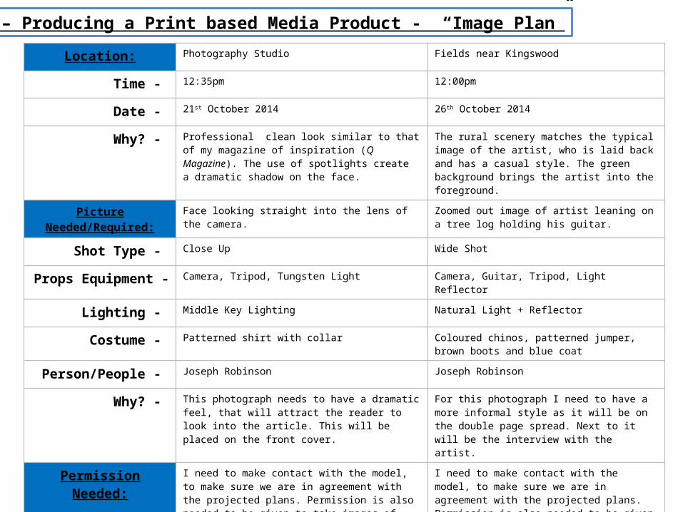
Location: Photography Studio Fields near Kingswood
Time - 12:35pm 12:00pm
Date - 21st October 2014 26th October 2014
Why? - Professional clean look similar to that of my magazine of inspiration (Q Magazine). The use of spotlights create a dramatic shadow on the face.
The rural scenery matches the typical image of the artist, who is laid back and has a casual style. The green background brings the artist into the foreground.
Picture Needed/Required: Face looking straight into the lens of the camera. Zoomed out image of artist leaning on a tree log holding his guitar.
Shot Type - Close Up Wide Shot
Props Equipment - Camera, Tripod, Tungsten Light Camera, Guitar, Tripod, Light Reflector
Lighting - Middle Key Lighting Natural Light + Reflector
Costume - Patterned shirt with collar Coloured chinos, patterned jumper, brown boots and blue coat
Person/People - Joseph Robinson Joseph Robinson
Why? - This photograph needs to have a dramatic feel, that will attract the reader to look into the article. This will be placed on the front cover.
For this photograph I need to have a more informal style as it will be on the double page spread. Next to it will be the interview with the artist.
Permission Needed: I need to make contact with the model, to make sure we are in agreement with the projected plans. Permission is also needed to be given to take images of them.
I need to make contact with the model, to make sure we are in agreement with the projected plans. Permission is also needed to be given to take images of them.
Potential Hazards/Risks: The studio may in be use at the time we want to take the photographs, this means we may have to re-organise when we take the photos.
The weather may be rainy, this means I will have to cover the camera and lens with a waterproof case.
Unit 14 – Producing a Print based Media Product - “Image Plan”
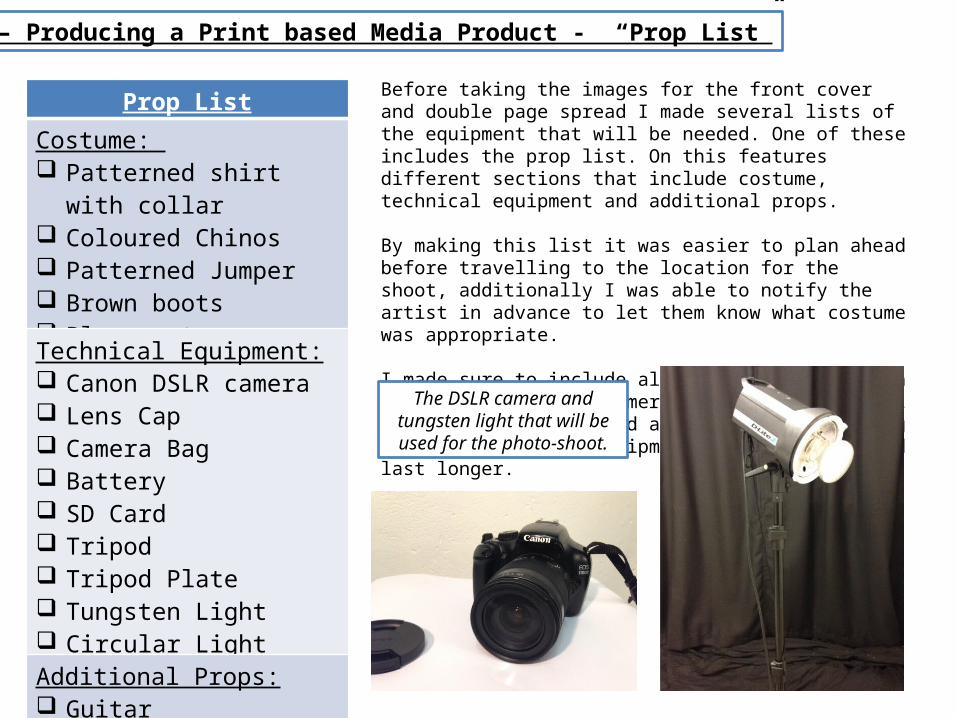
Unit 14 – Producing a Print based Media Product - “Prop List”
Before taking the images for the front cover and double page spread I made several lists of the equipment that will be needed. One of these includes the prop list. On this features different sections that include costume, technical equipment and additional props.
By making this list it was easier to plan ahead before travelling to the location for the shoot, additionally I was able to notify the artist in advance to let them know what costume was appropriate.
I made sure to include all smaller details such as the lens cap and camera bag as the equipment will have to be carried around and by including these features the equipment will stay safe and last longer.
Prop List
Costume: Patterned shirt with collar Coloured Chinos Patterned Jumper Brown boots Blue coat
Technical Equipment: Canon DSLR camera Lens Cap Camera Bag Battery SD Card Tripod Tripod Plate Tungsten Light Circular Light Reflector
Additional Props: Guitar Chair
The DSLR camera and tungsten light that will be used for the photo-shoot.
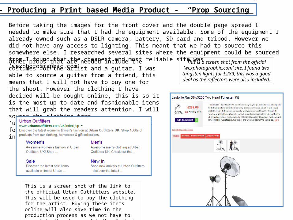
Unit 14 – Producing a Print based Media Product - “Prop Sourcing”
Before taking the images for the front cover and the double page spread I needed to make sure that I had the equipment available. Some of the equipment I already owned such as a DSLR camera, battery, SD card and tripod. However we did not have any access to lighting. This meant that we had to source this somewhere else. I researched several sites where the equipment could be sourced from I found that the cheapest and most reliable site was ‘wexphotographic.com’.
Other props that are needed include the costumes for the artist and a guitar. I was able to source a guitar from a friend, this means that I will not have to buy one for the shoot. However the clothing I have decided will be bought online, this is so it is the most up to date and fashionable items that will grab the readers attention. I will source the clothing from ‘urbanoutfitters.com’. The clothing budget for two whole outfits will be £250, including all shoes and accessories.
This is a screen shot from the official ‘wexphotographic.com’ site, I found two tungsten lights for £289, this was a good deal as the reflectors were also included.
This is a screen shot of the link to the official Urban Outfitters website. This will be used to buy the clothing for the artist. Buying these items online will also save time in the production process as we not have to travel to the shops and tediously look through all the clothing.
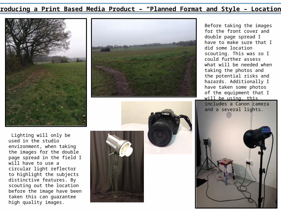
Unit 14 – Producing a Print Based Media Product – “Planned Format and Style – Location Images”
Before taking the images for the front cover and double page spread I have to make sure that I did some location scouting. This was so I could further assess what will be needed when taking the photos and the potential risks and hazards. Additionally I have taken some photos of the equipment that I will be using, this includes a Canon camera and a several lights.
Lighting will only be used in the studio environment, when taking the images for the double page spread in the field I will have to use a circular light reflector to highlight the subjects distinctive features. By scouting out the location before the image have been taken this can guarantee high quality images.
Unit 14 – Producing a Print Based Media Product – “Risk Assessment”
When taking and editing the images for the front cover and double page spread I had to take into consideration risk assessment. This meant that I had to look at all individual ‘safe working practices’ and how they could affect the final images.
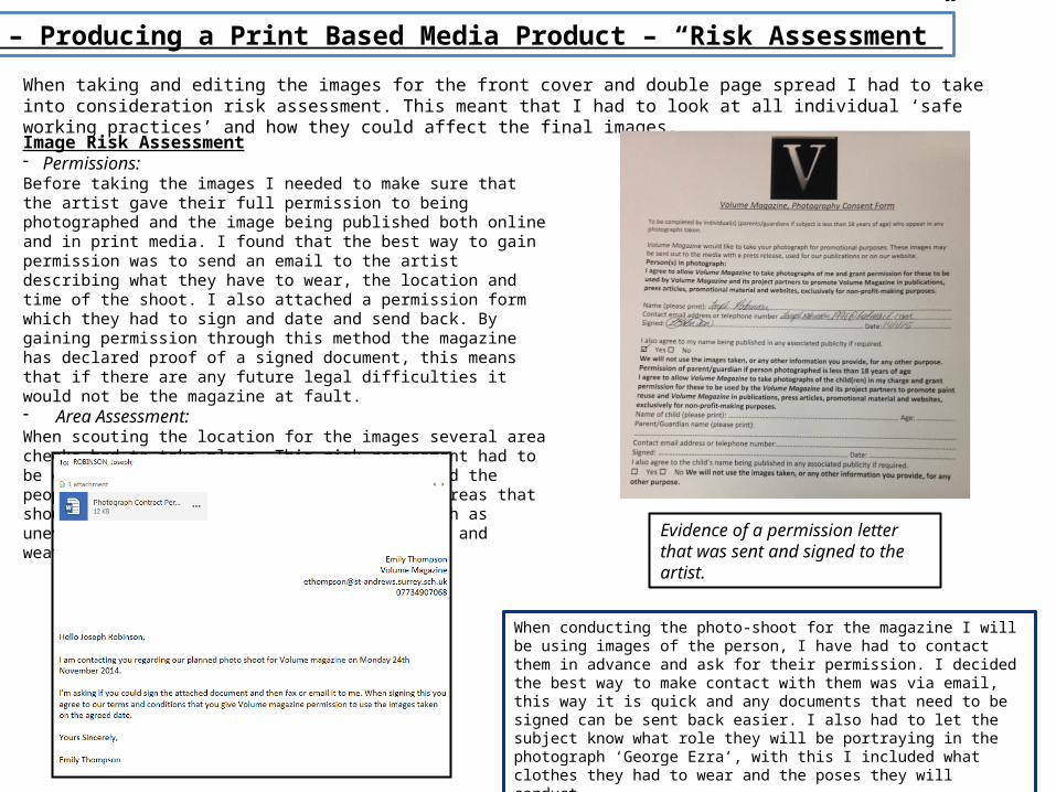
Image Risk Assessment- Permissions:Before taking the images I needed to make sure that the artist gave their full permission to being photographed and the image being published both online and in print media. I found that the best way to gain permission was to send an email to the artist describing what they have to wear, the location and time of the shoot. I also attached a permission form which they had to sign and date and send back. By gaining permission through this method the magazine has declared proof of a signed document, this means that if there are any future legal difficulties it would not be the magazine at fault.- Area Assessment:When scouting the location for the images several area checks had to take place. This risk assessment had to be conducted to guarantee both the artist and the people who are taking the images are safe. Areas that should be looked at are possible hazards such as uneven ground levels, running water, heights and weather conditions.
Evidence of a permission letter that was sent and signed to the artist.
When conducting the photo-shoot for the magazine I will be using images of the person, I have had to contact them in advance and ask for their permission. I decided the best way to make contact with them was via email, this way it is quick and any documents that need to be signed can be sent back easier. I also had to let the subject know what role they will be portraying in the photograph ‘George Ezra’, with this I included what clothes they had to wear and the poses they will conduct.
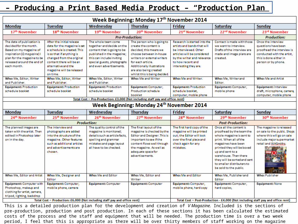
Unit 14 – Producing a Print Based Media Product – “Production Plan”
This is a detailed production plan for the development and creation of V Magazine. Included is the sections of pre-production, production and post production. In each of these sections it has been calculated the estimated costs of the process and the staff and equipment that will be needed. The production time is over a two week period, I feel that this is appropriate as there will be over thirty members of staff working on the magazine pages with the highest quality software and equipment. Two weeks was chosen as this is the typical length of time that the original magazine of inspiration ‘Q Magazine’ has for creation.
Unit 14 –Producing a Print Based Media Product – “Conclusion”
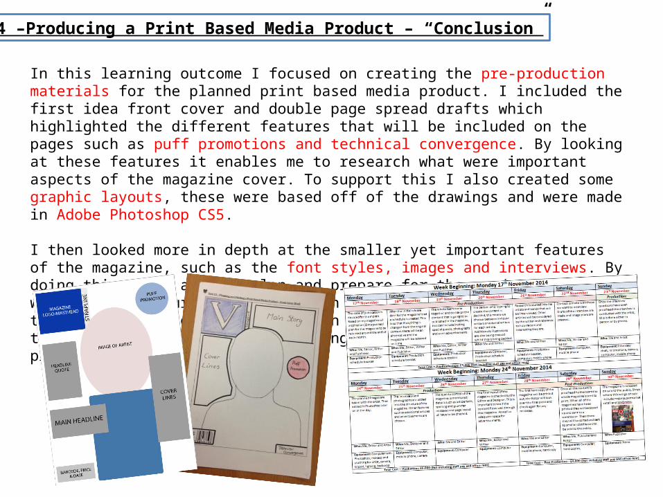
In this learning outcome I focused on creating the pre-production materials for the planned print based media product. I included the first idea front cover and double page spread drafts which highlighted the different features that will be included on the pages such as puff promotions and technical convergence. By looking at these features it enables me to research what were important aspects of the magazine cover. To support this I also created some graphic layouts, these were based off of the drawings and were made in Adobe Photoshop CS5.
I then looked more in depth at the smaller yet important features of the magazine, such as the font styles, images and interviews. By doing this I was able to plan and prepare for the production stage which would in turn save me time in the future. To support with this I also included the production plan for the whole magazine, this gave me an overview on how long should be spent on pre-production.