Embed Size (px)
Citation preview
Wednesday, April 6, 16
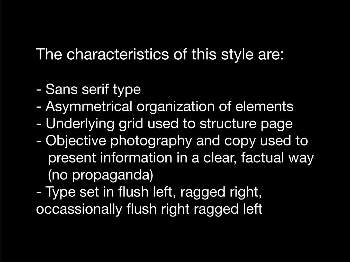
The characteristics of this style are:
- Sans serif type- Asymmetrical organization of elements- Underlying grid used to structure page- Objective photography and copy used to present information in a clear, factual way (no propaganda)- Type set in flush left, ragged right, occassionally flush right ragged left
Wednesday, April 6, 16
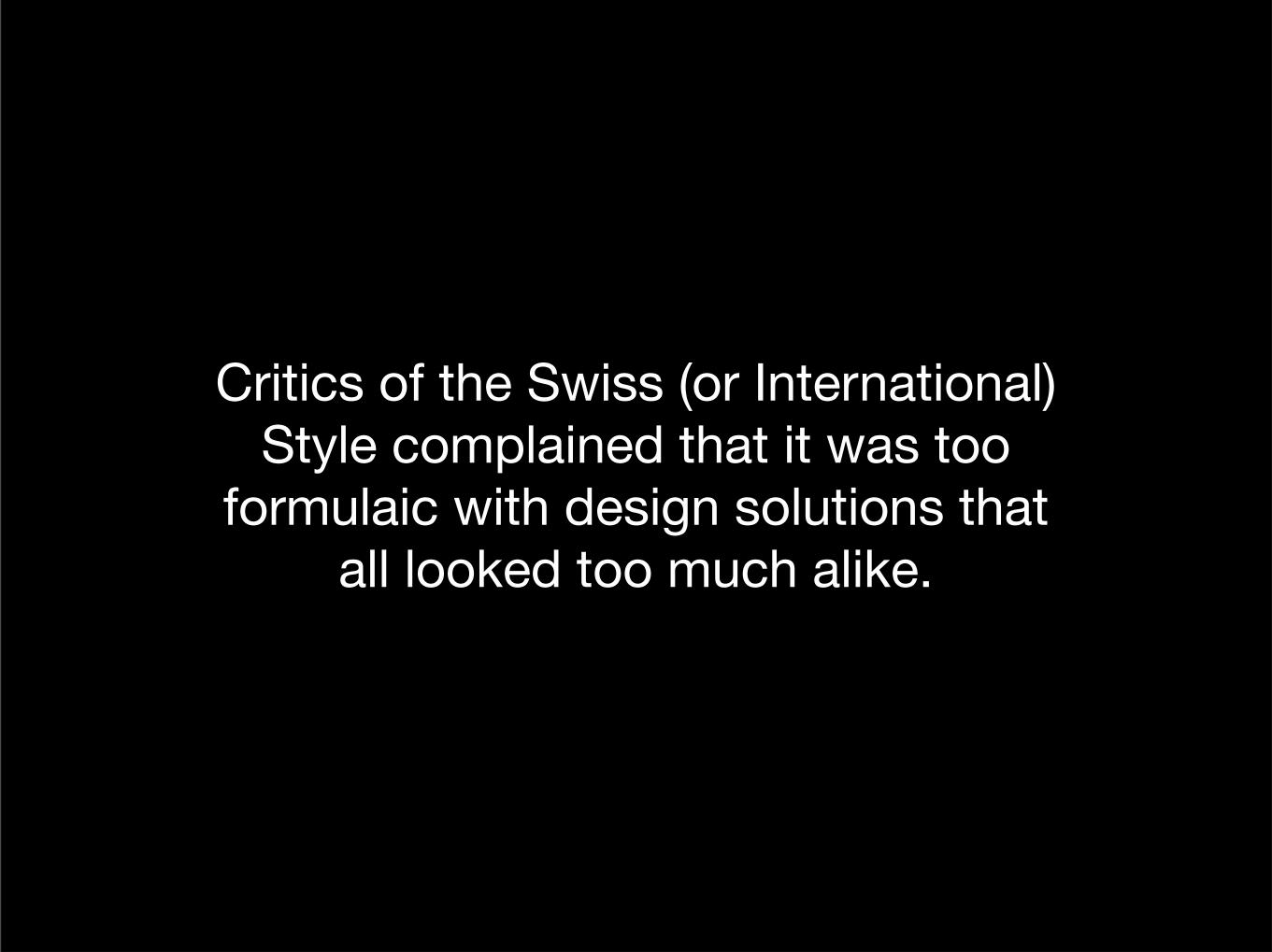
Critics of the Swiss (or International) Style complained that it was too
formulaic with design solutions that all looked too much alike.
Wednesday, April 6, 16

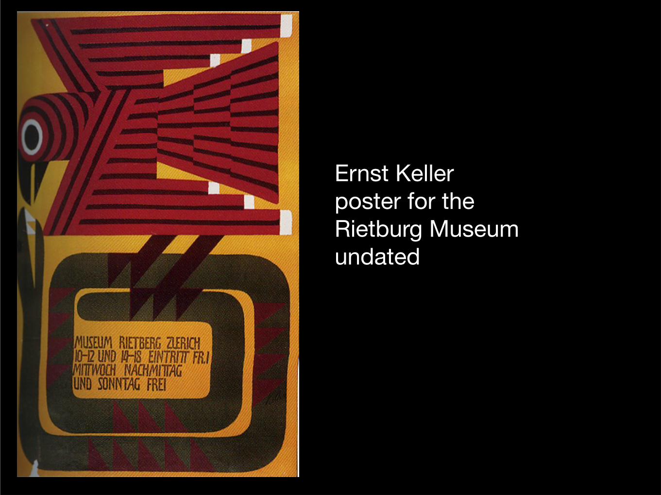
Ernst Kellerposter for the Rietburg Museumundated
Wednesday, April 6, 16
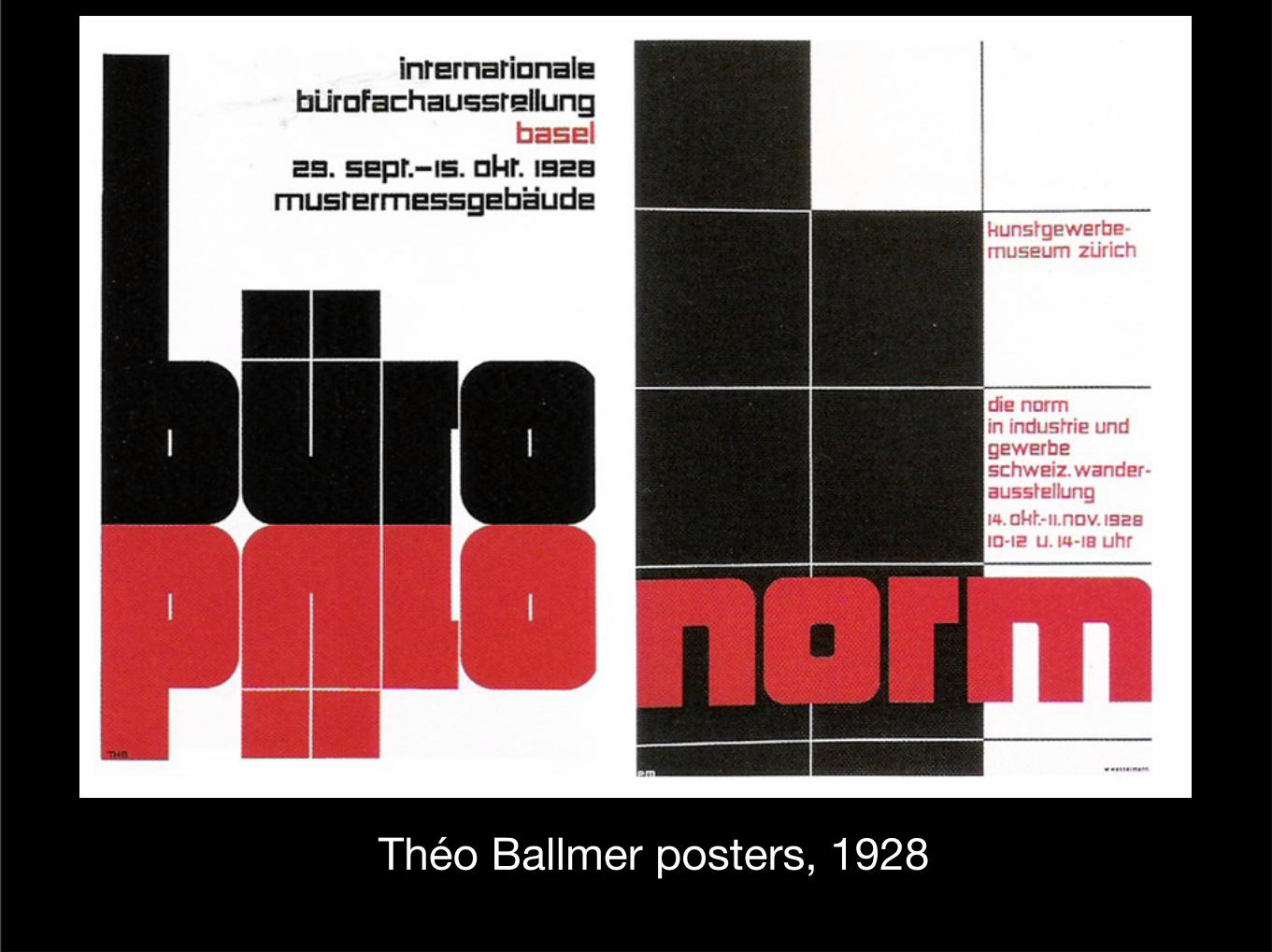
Théo Ballmer posters, 1928
Wednesday, April 6, 16
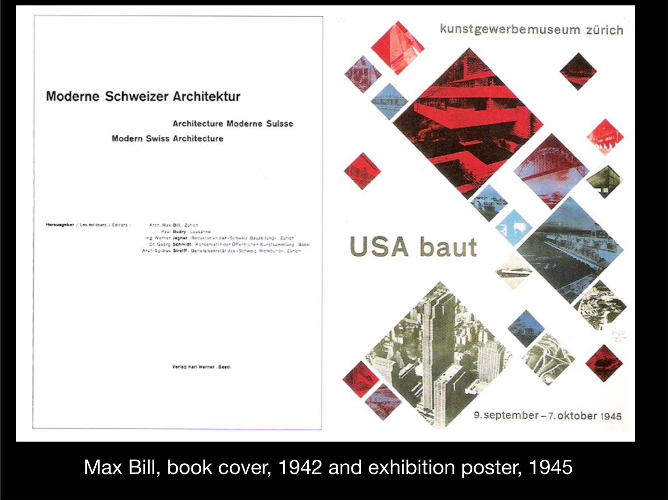
Max Bill, book cover, 1942 and exhibition poster, 1945Wednesday, April 6, 16
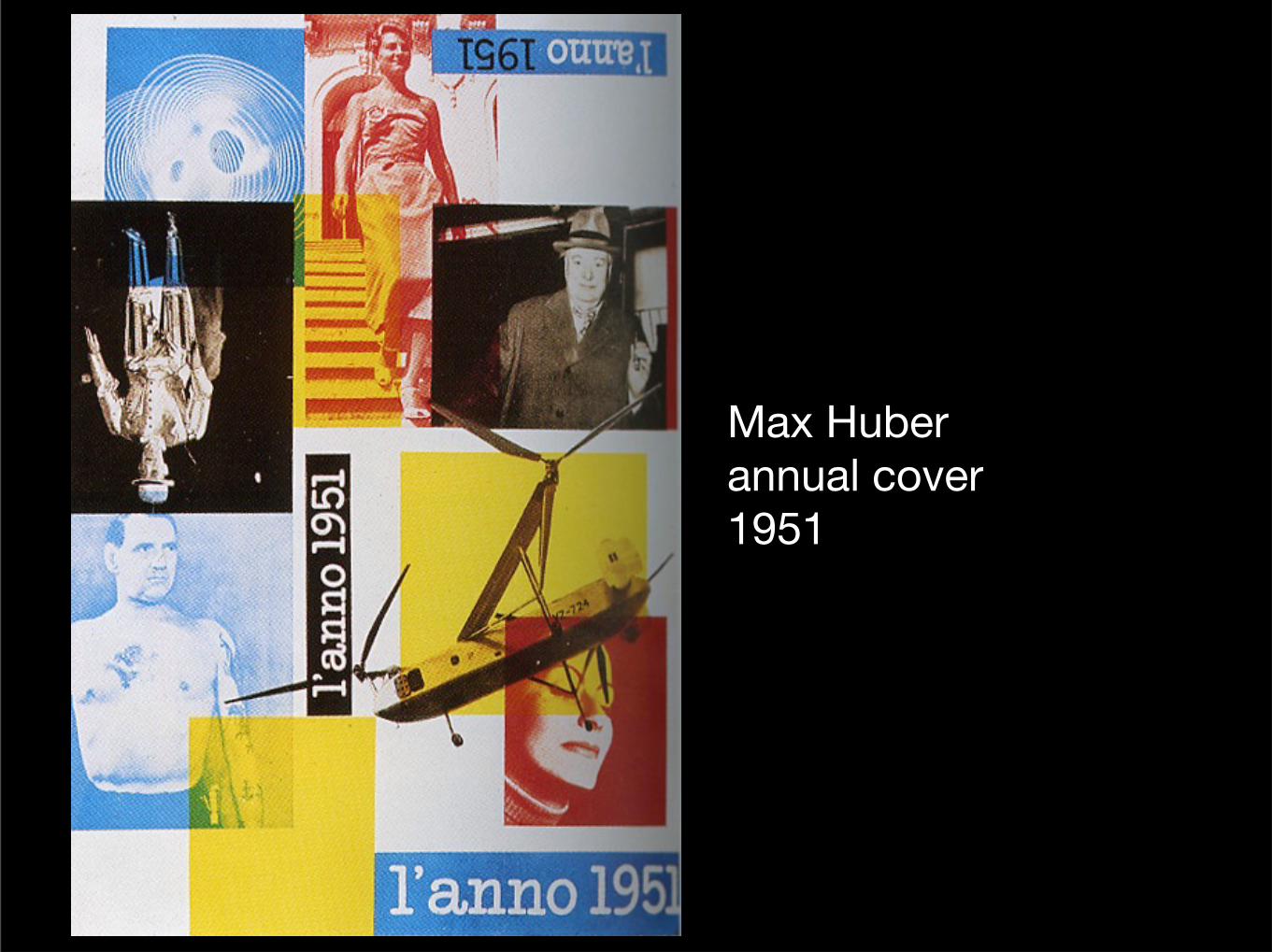
Max Huberannual cover1951
Wednesday, April 6, 16
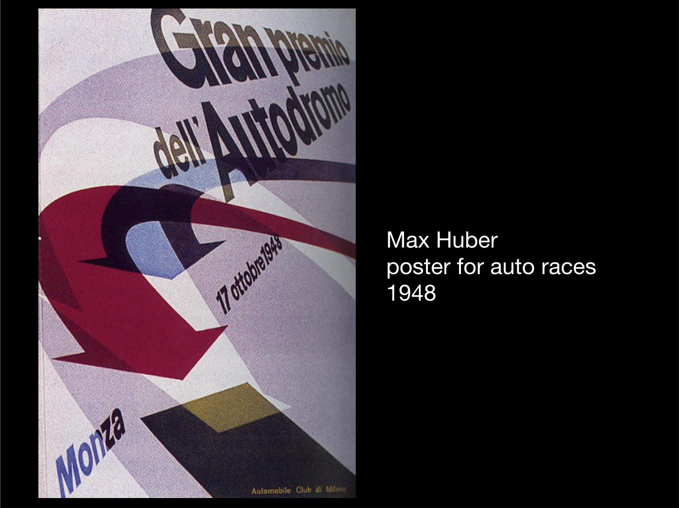
Max Huberposter for auto races1948
Wednesday, April 6, 16
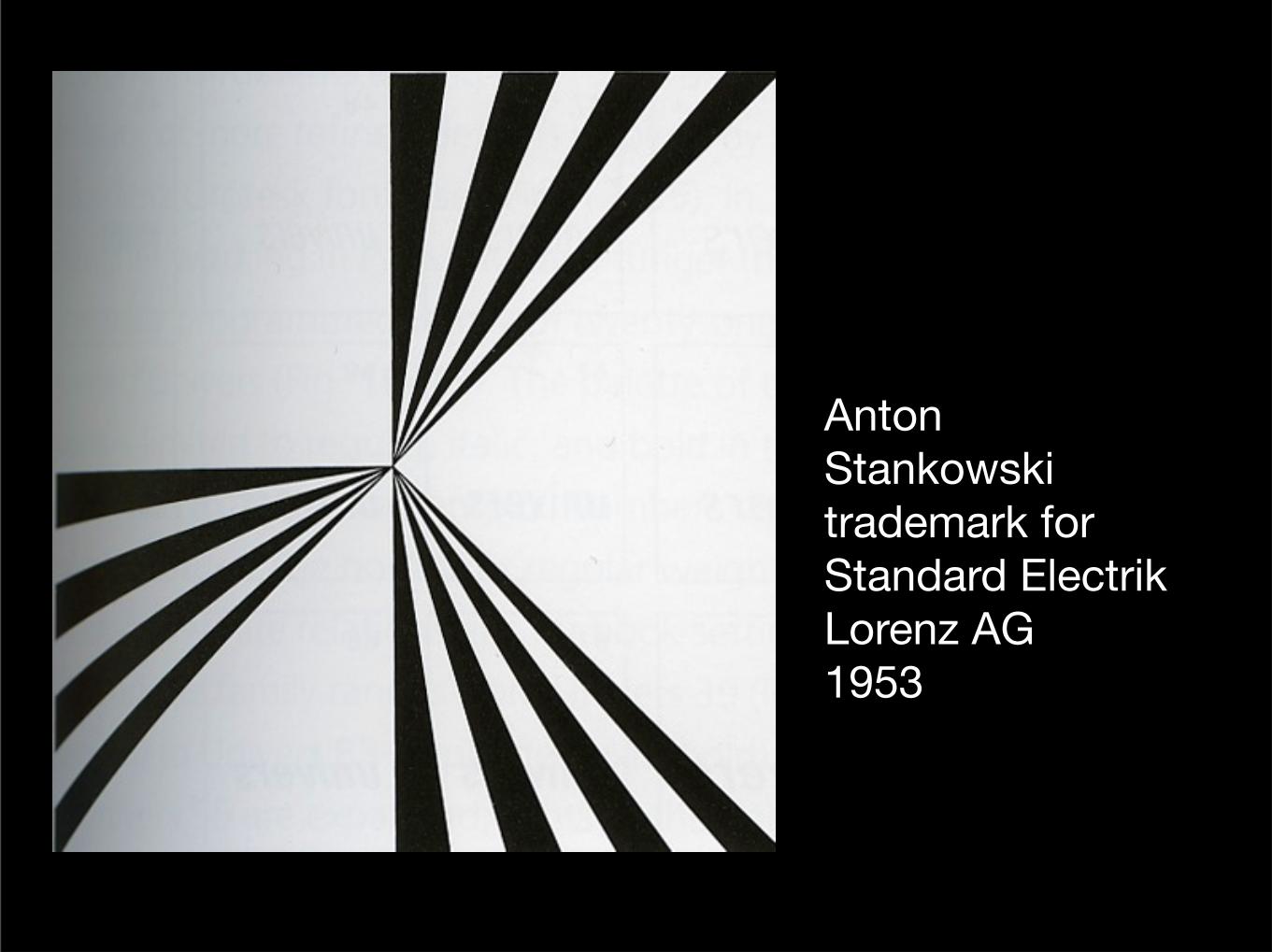
Anton Stankowskitrademark for Standard Electrik Lorenz AG1953
Wednesday, April 6, 16
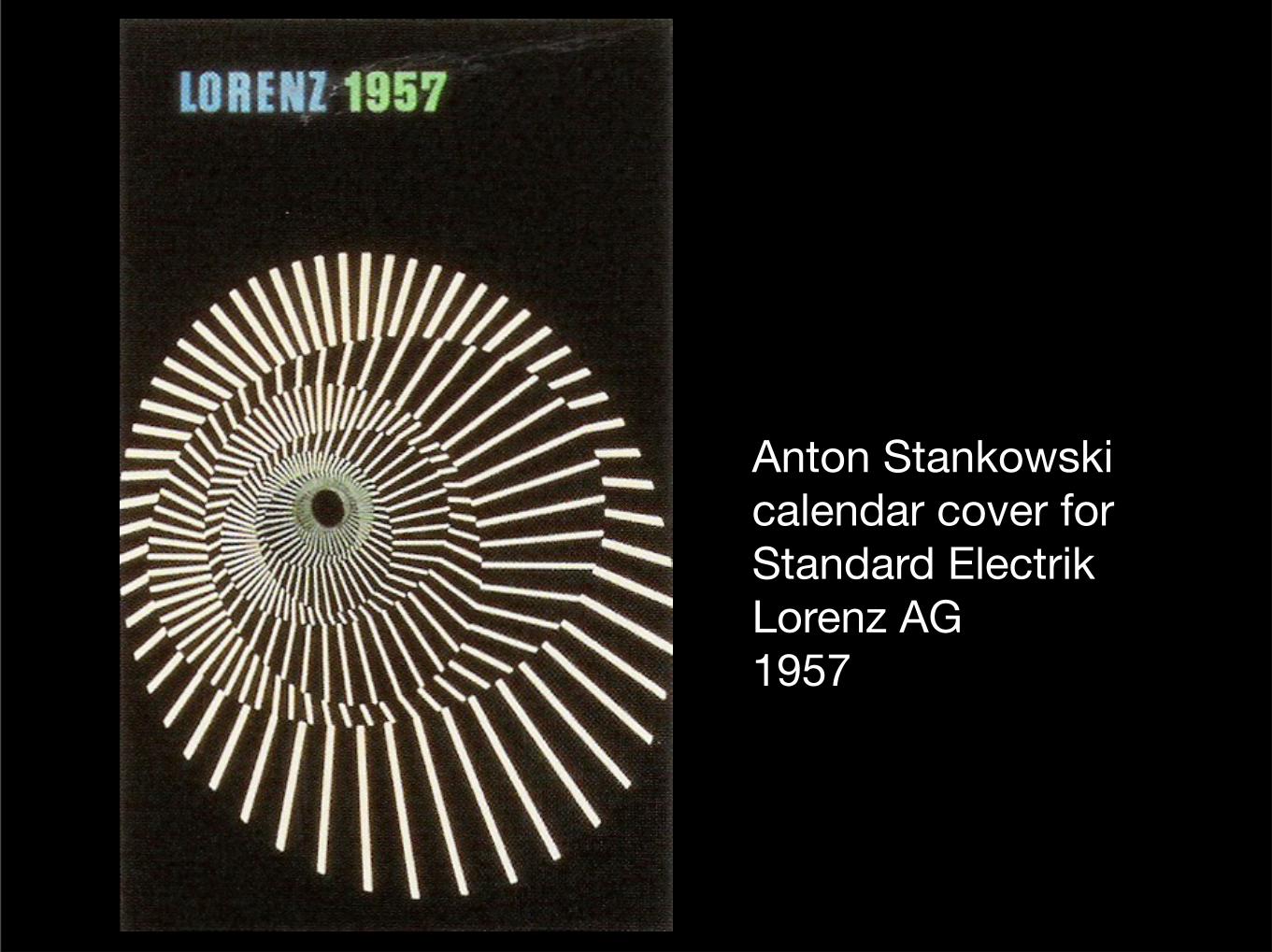
Anton Stankowskicalendar cover for Standard Electrik Lorenz AG1957
Wednesday, April 6, 16
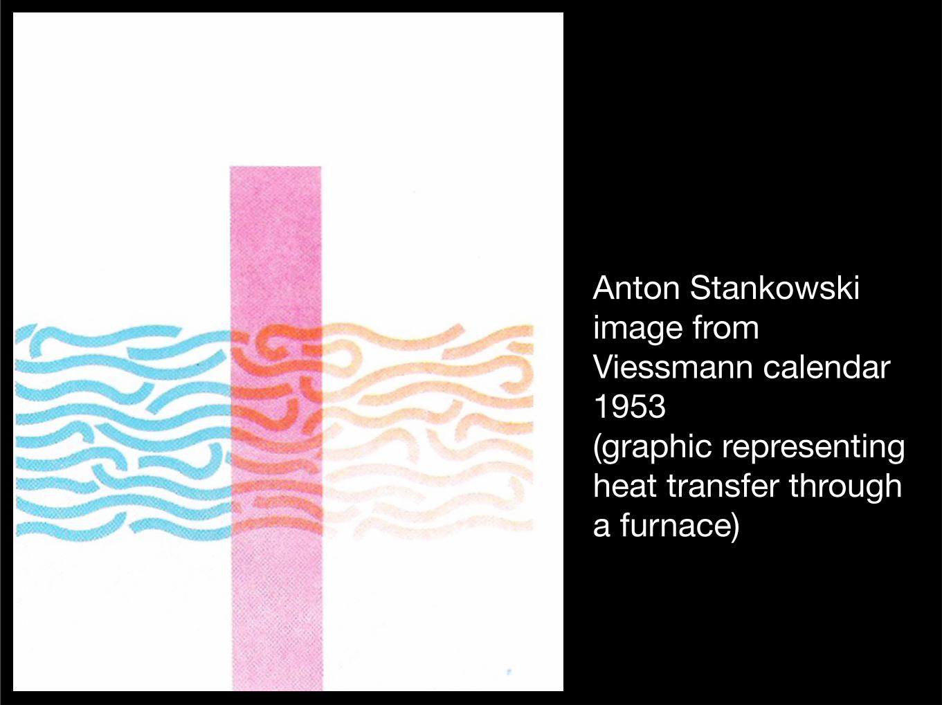
Anton Stankowskiimage from Viessmann calendar1953(graphic representing heat transfer through a furnace)
Wednesday, April 6, 16
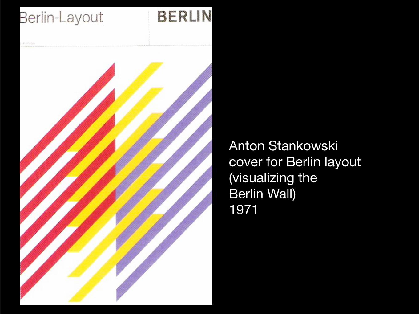
Anton Stankowskicover for Berlin layout(visualizing the Berlin Wall)1971
Wednesday, April 6, 16
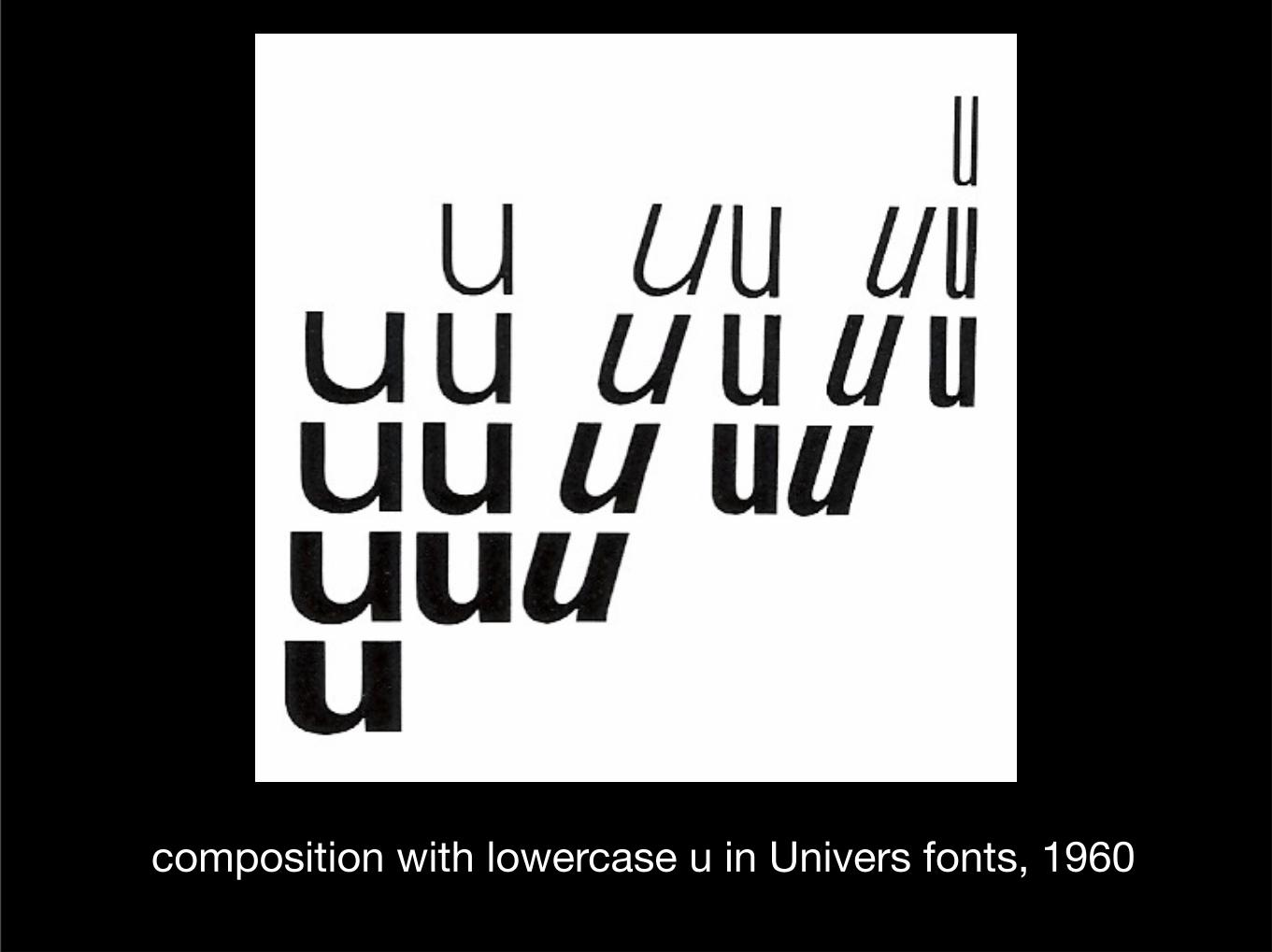
composition with lowercase u in Univers fonts, 1960
Wednesday, April 6, 16
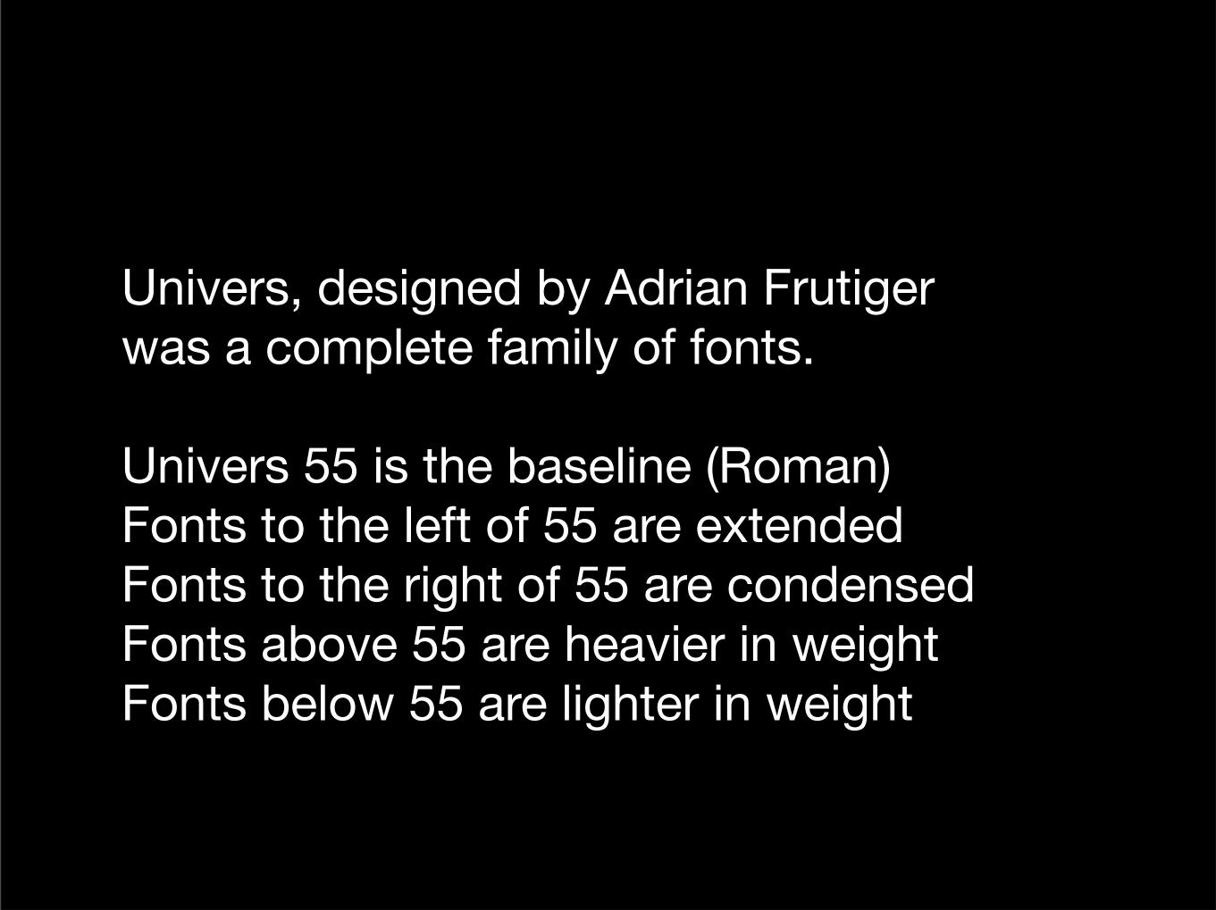
Univers, designed by Adrian Frutiger was a complete family of fonts.
Univers 55 is the baseline (Roman)Fonts to the left of 55 are extendedFonts to the right of 55 are condensedFonts above 55 are heavier in weightFonts below 55 are lighter in weight
Wednesday, April 6, 16
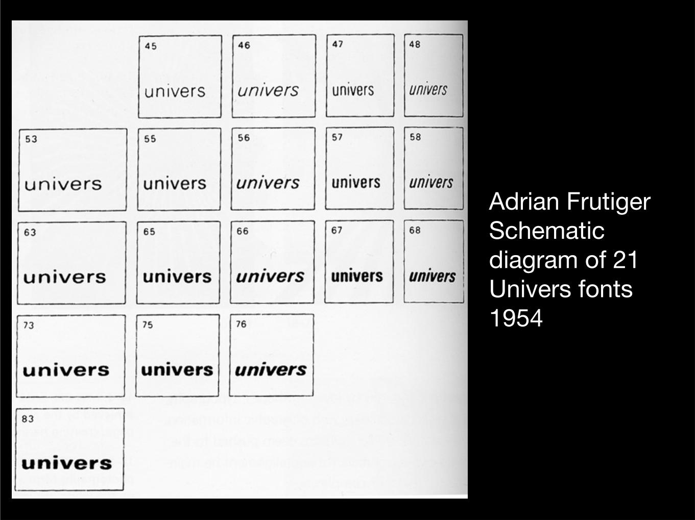
Adrian FrutigerSchematic diagram of 21 Univers fonts1954
Wednesday, April 6, 16
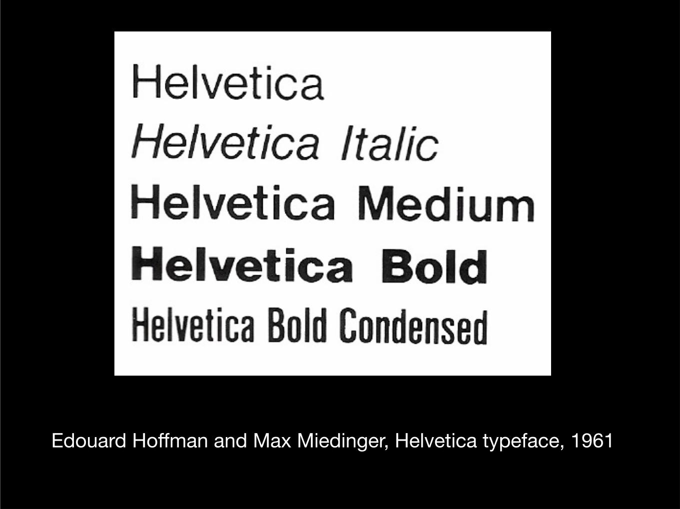
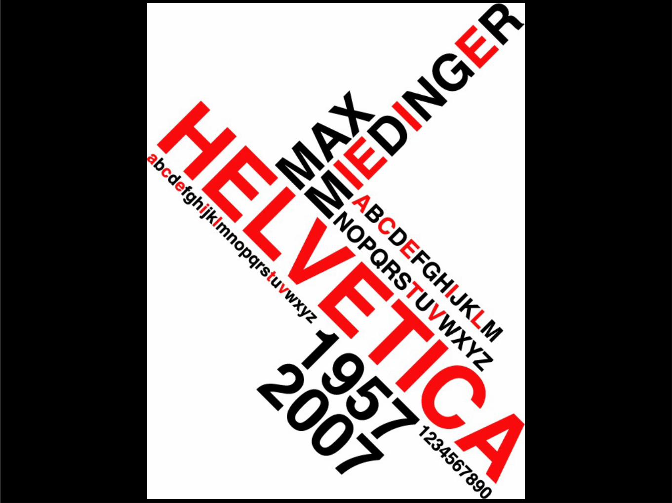
Edouard Hoffman and Max Miedinger, Helvetica typeface, 1961
Wednesday, April 6, 16
Wednesday, April 6, 16
Wednesday, April 6, 16
Herman Zapf is a master of typography. Born in 1918 and still living, he is the designer of typefaces including:
Palatino, Melior and Optima
Wednesday, April 6, 16
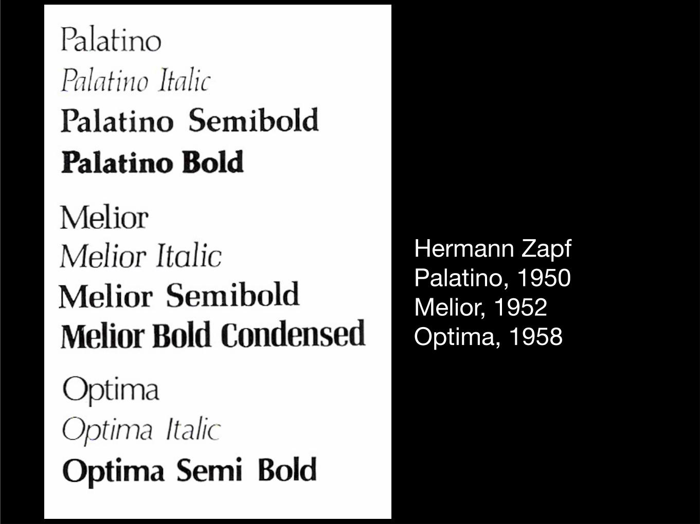
Hermann ZapfPalatino, 1950Melior, 1952Optima, 1958
Wednesday, April 6, 16

Wednesday, April 6, 16
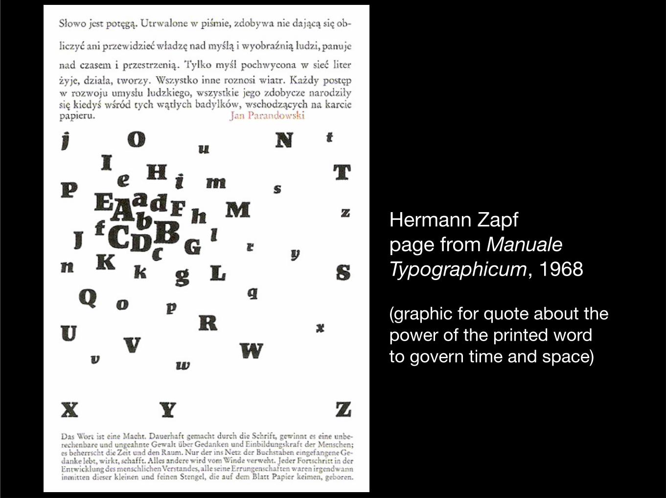
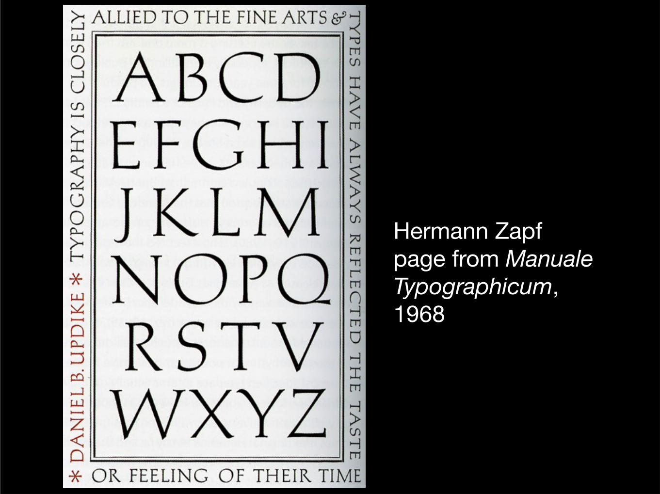
Hermann Zapfpage from Manuale Typographicum, 1968
(graphic for quote about the power of the printed word to govern time and space)
Wednesday, April 6, 16
Hermann Zapfpage from Manuale Typographicum, 1968
Wednesday, April 6, 16
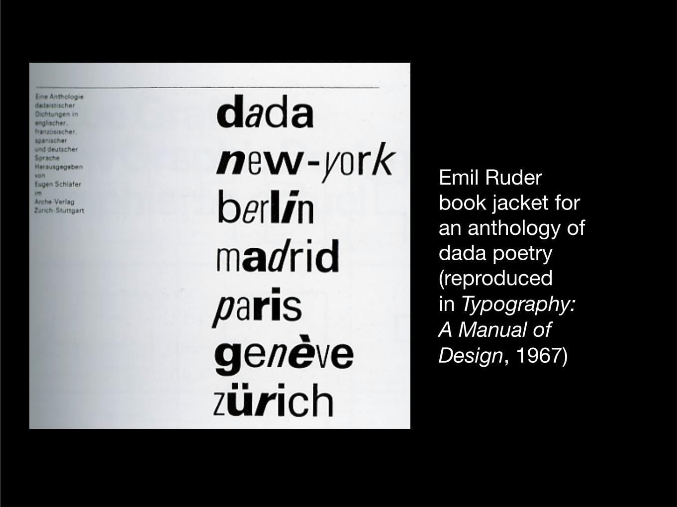
Emil Ruderbook jacket for an anthology of dada poetry(reproduced in Typography: A Manual of Design, 1967)
Wednesday, April 6, 16
Wednesday, April 6, 16
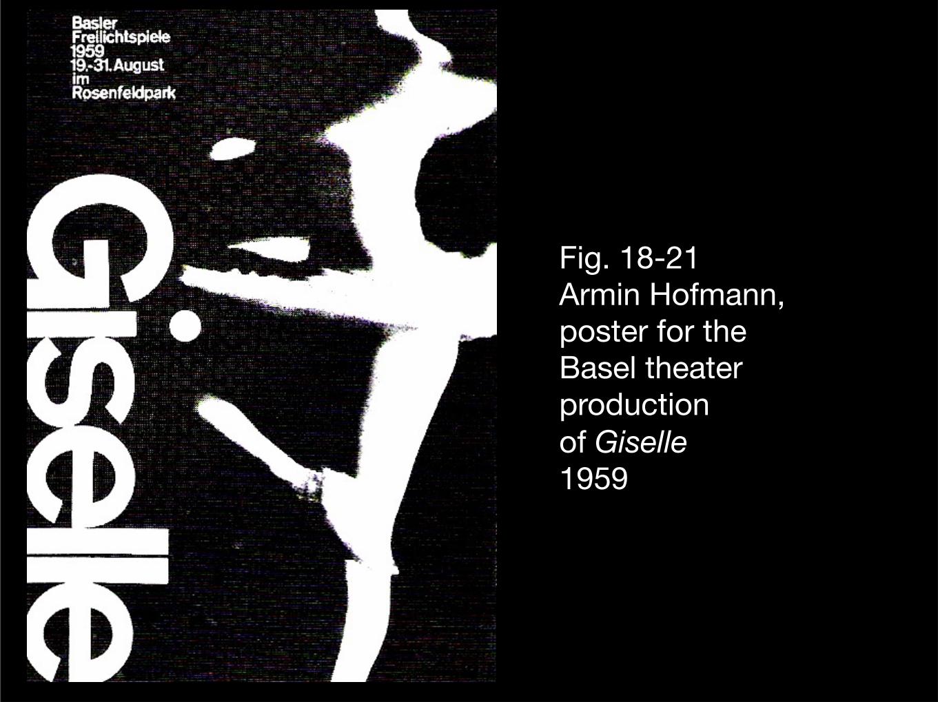
Fig. 18-21Armin Hofmann,poster for the Basel theater production of Giselle1959
Wednesday, April 6, 16
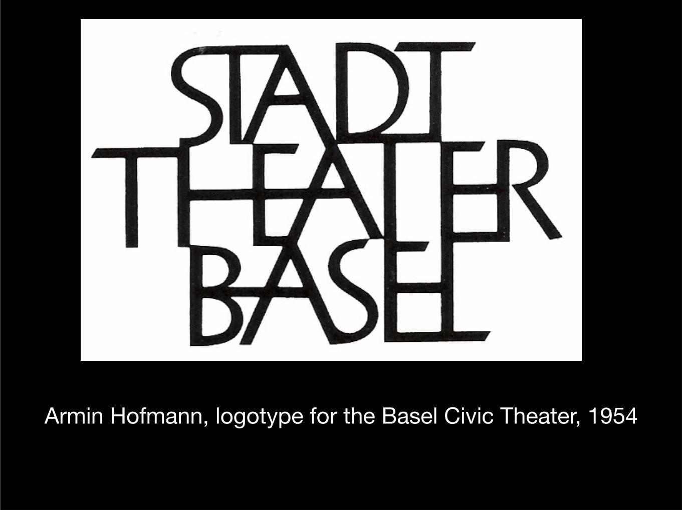
Armin Hofmann, logotype for the Basel Civic Theater, 1954
Wednesday, April 6, 16
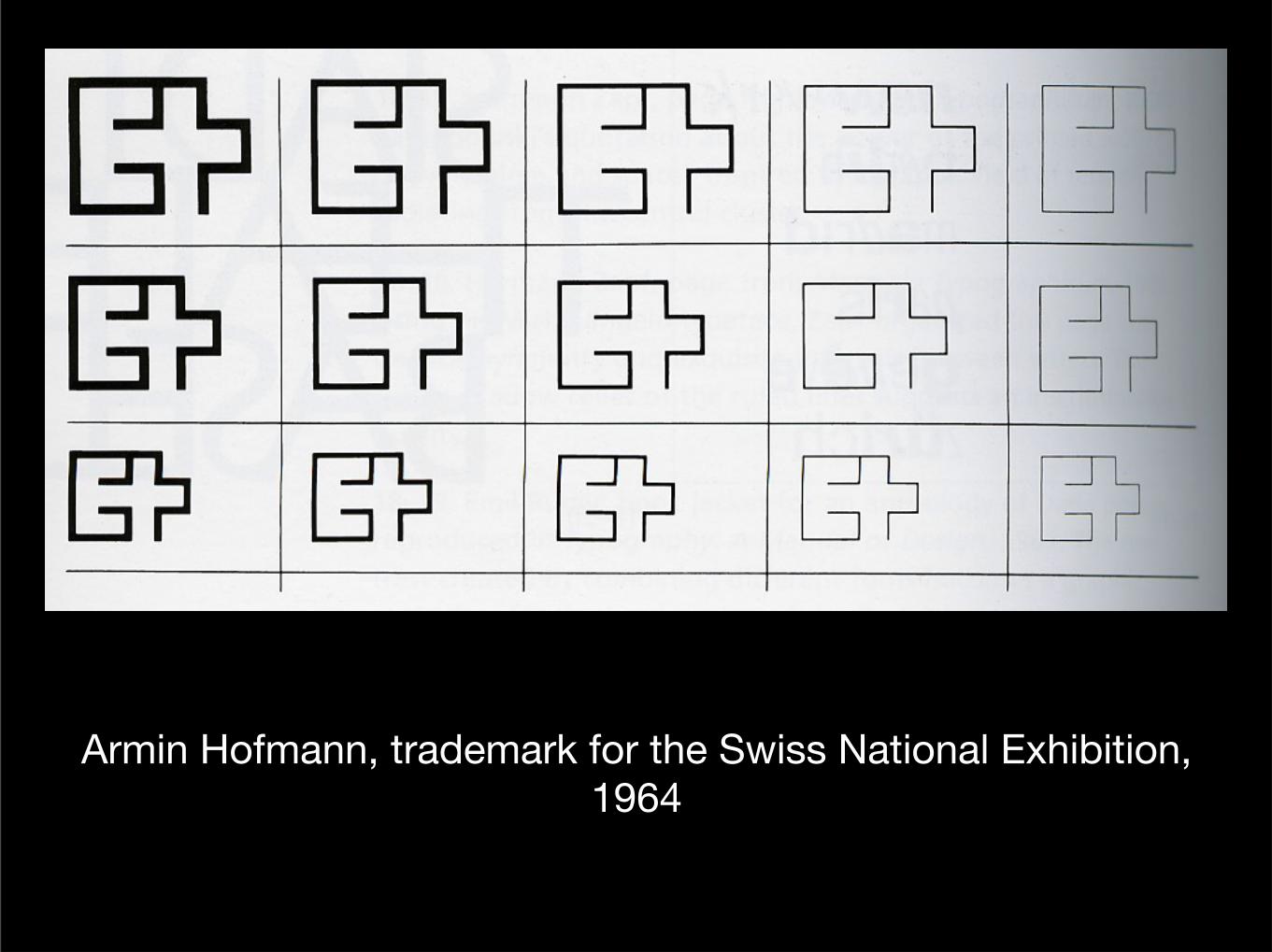
Armin Hofmann, trademark for the Swiss National Exhibition, 1964
Wednesday, April 6, 16
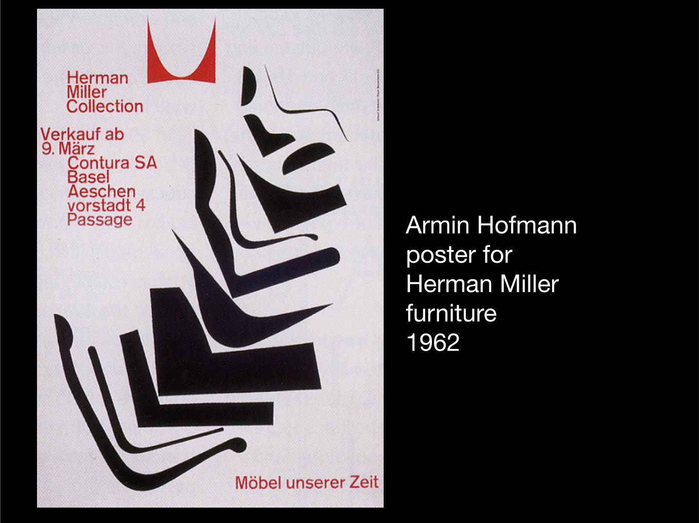
Armin Hofmannposter for Herman Miller furniture1962
Wednesday, April 6, 16
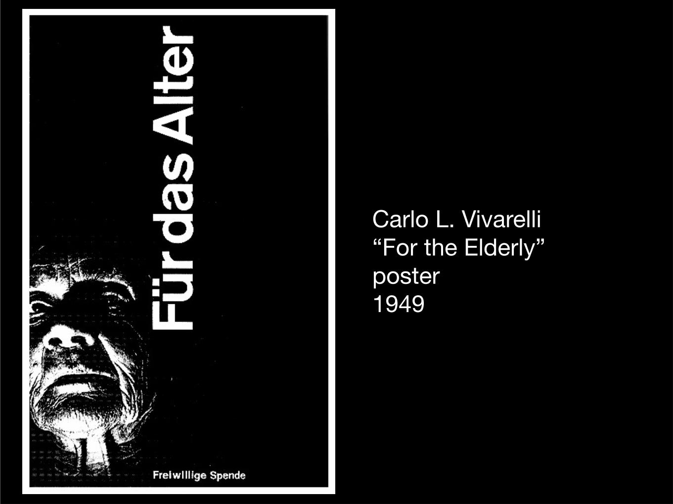
Carlo L. Vivarelli“For the Elderly” poster1949
Wednesday, April 6, 16
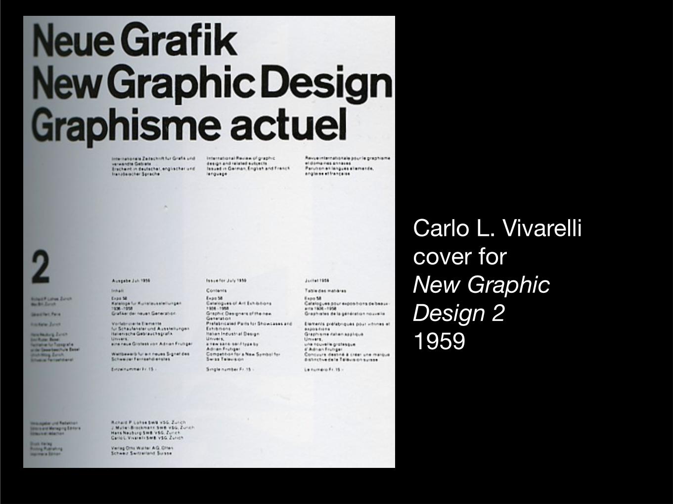
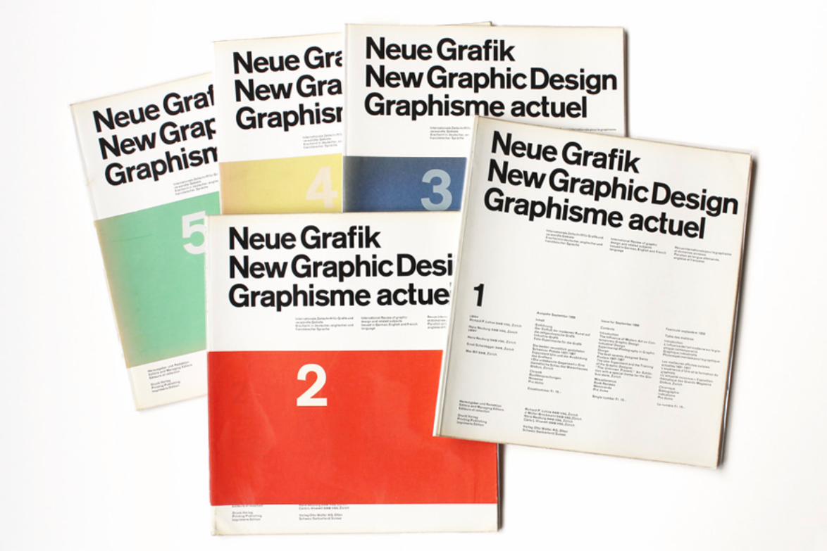
Carlo L. Vivarellicover for New Graphic Design 21959
Wednesday, April 6, 16
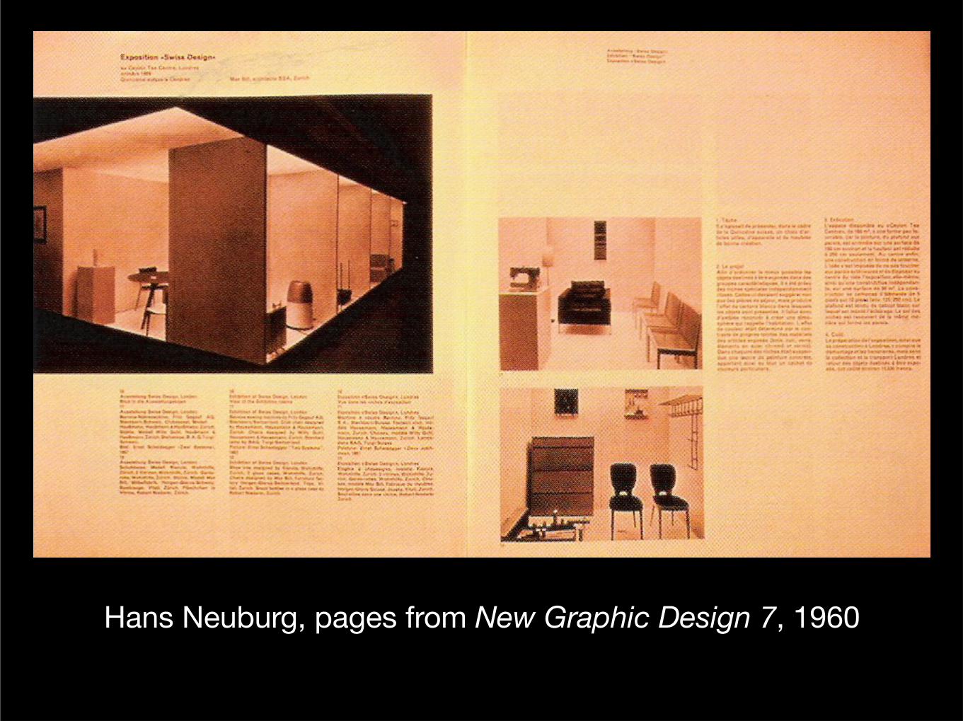
Hans Neuburg, pages from New Graphic Design 7, 1960
Wednesday, April 6, 16
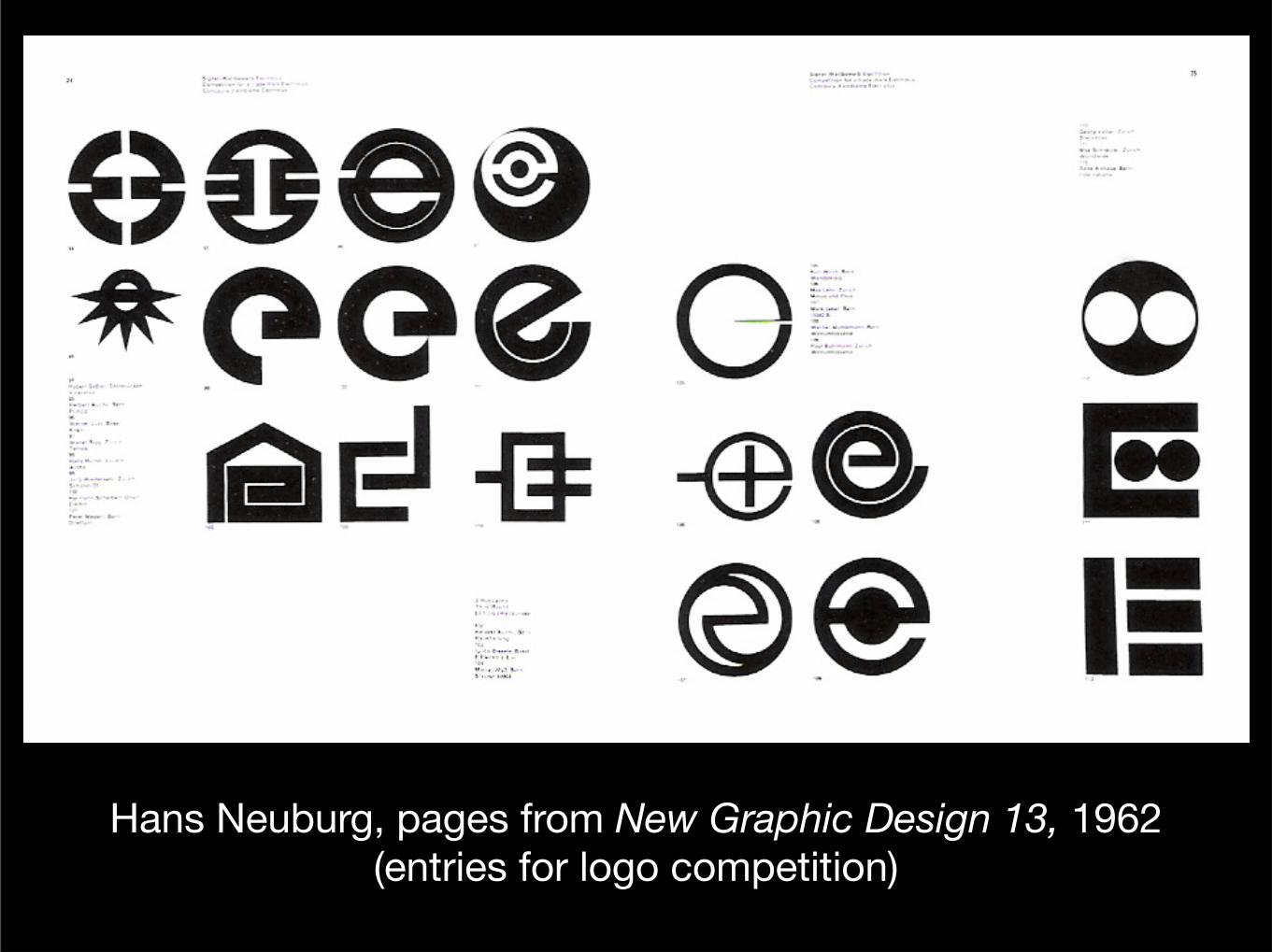
Hans Neuburg, pages from New Graphic Design 13, 1962(entries for logo competition)
Wednesday, April 6, 16
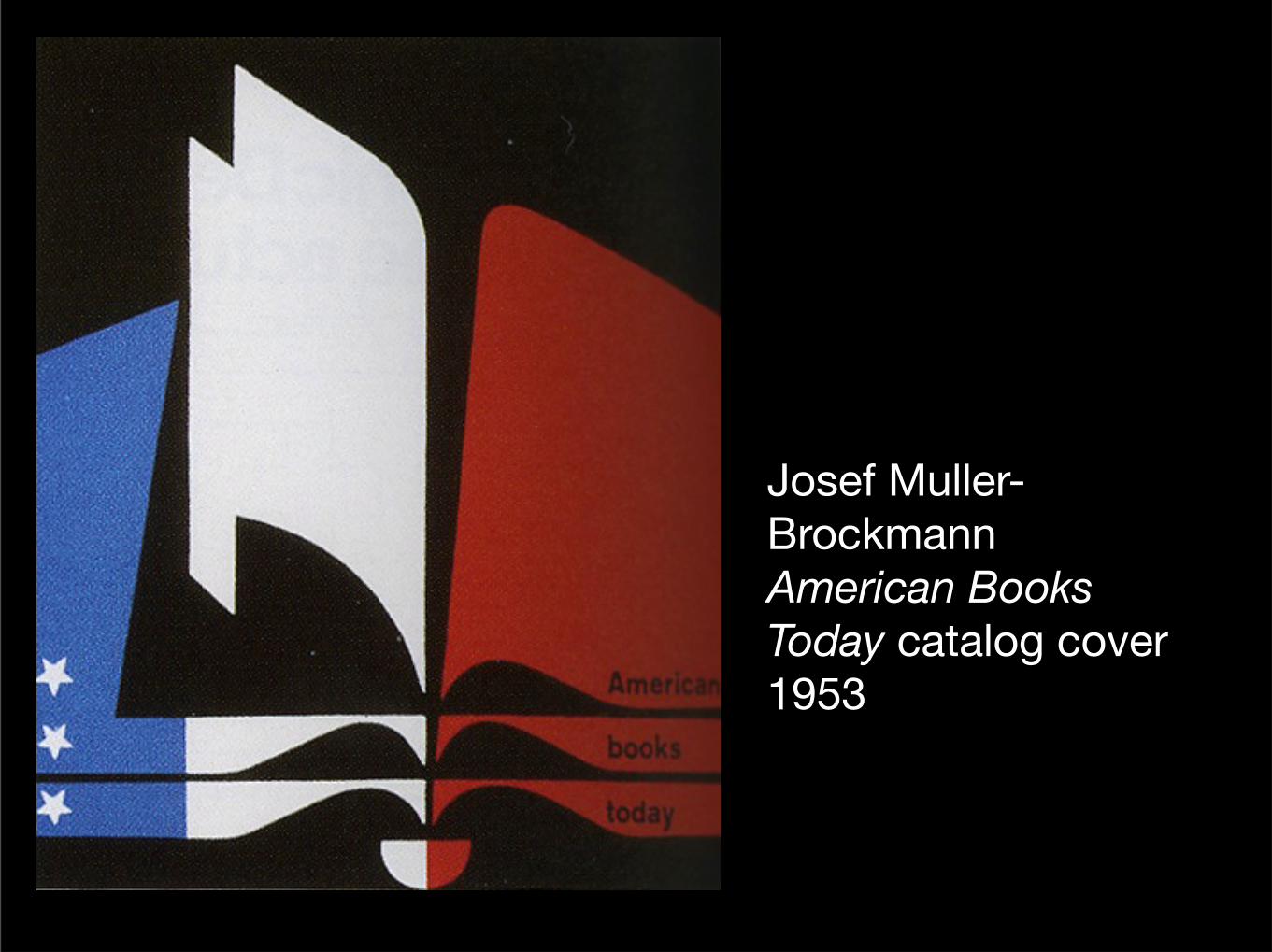
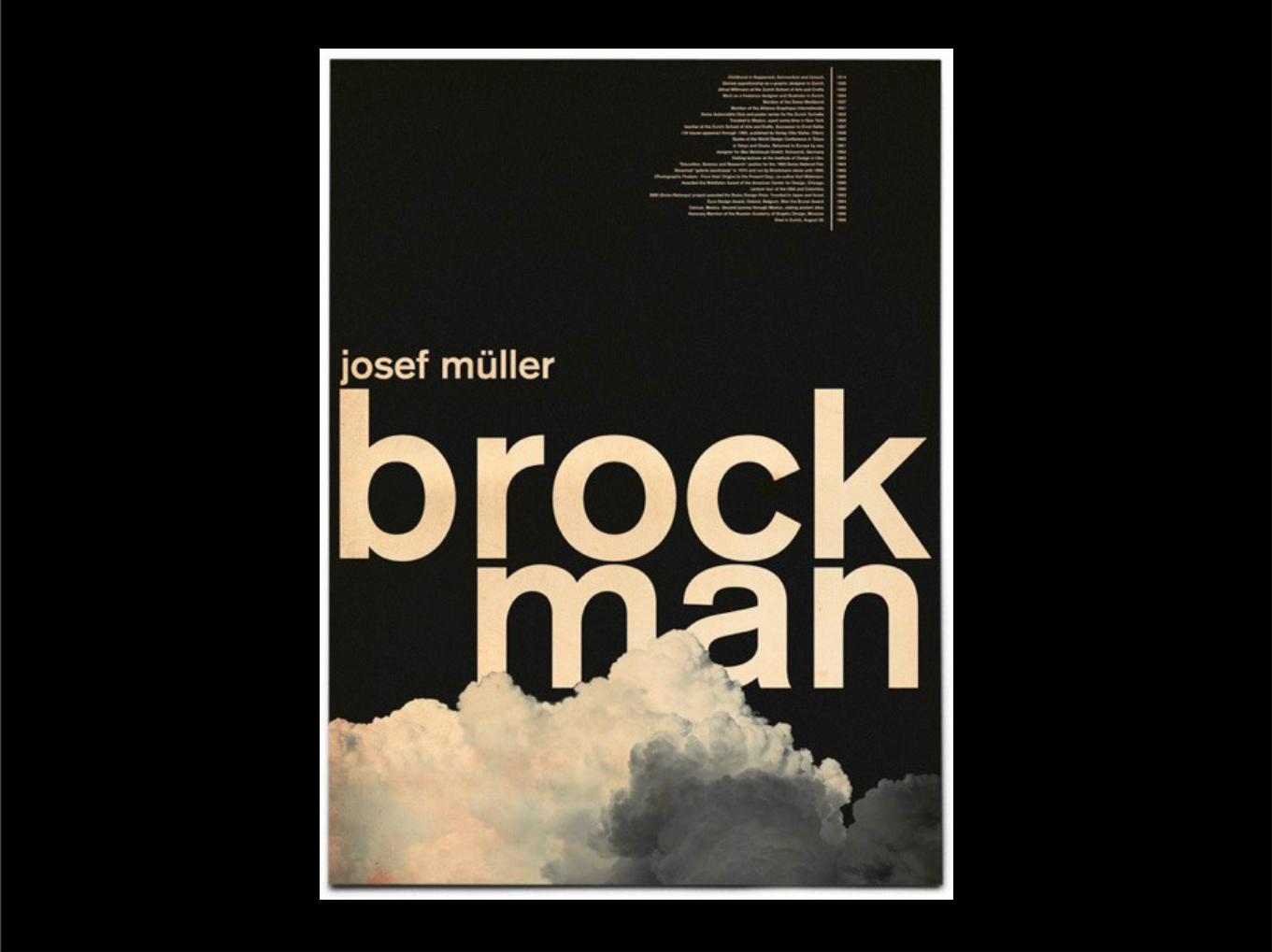
Josef Muller-BrockmannAmerican Books Today catalog cover1953
Wednesday, April 6, 16
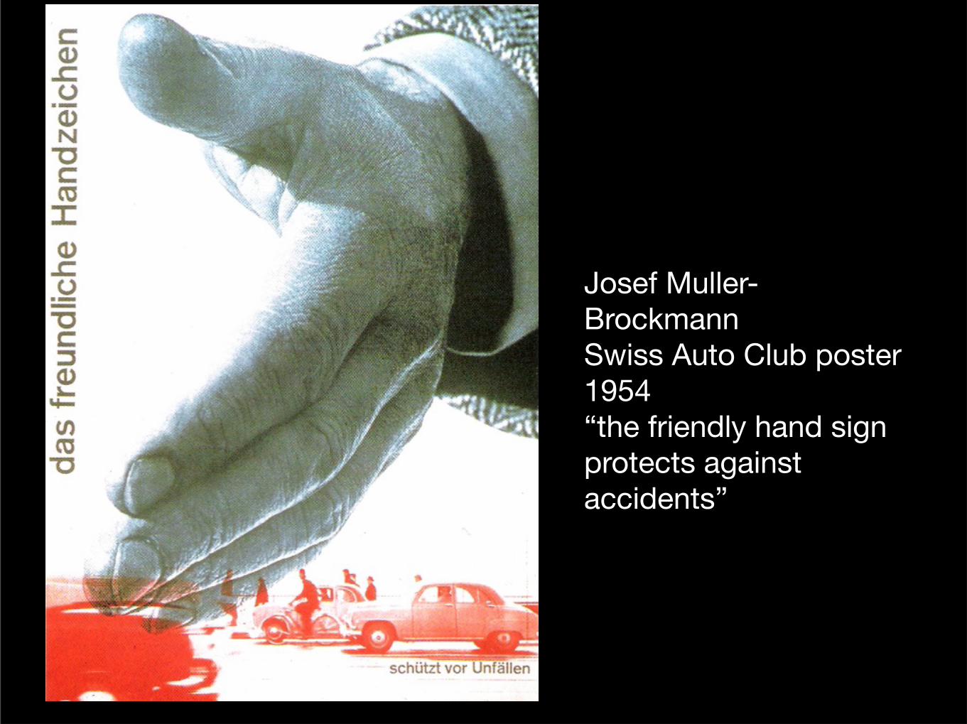
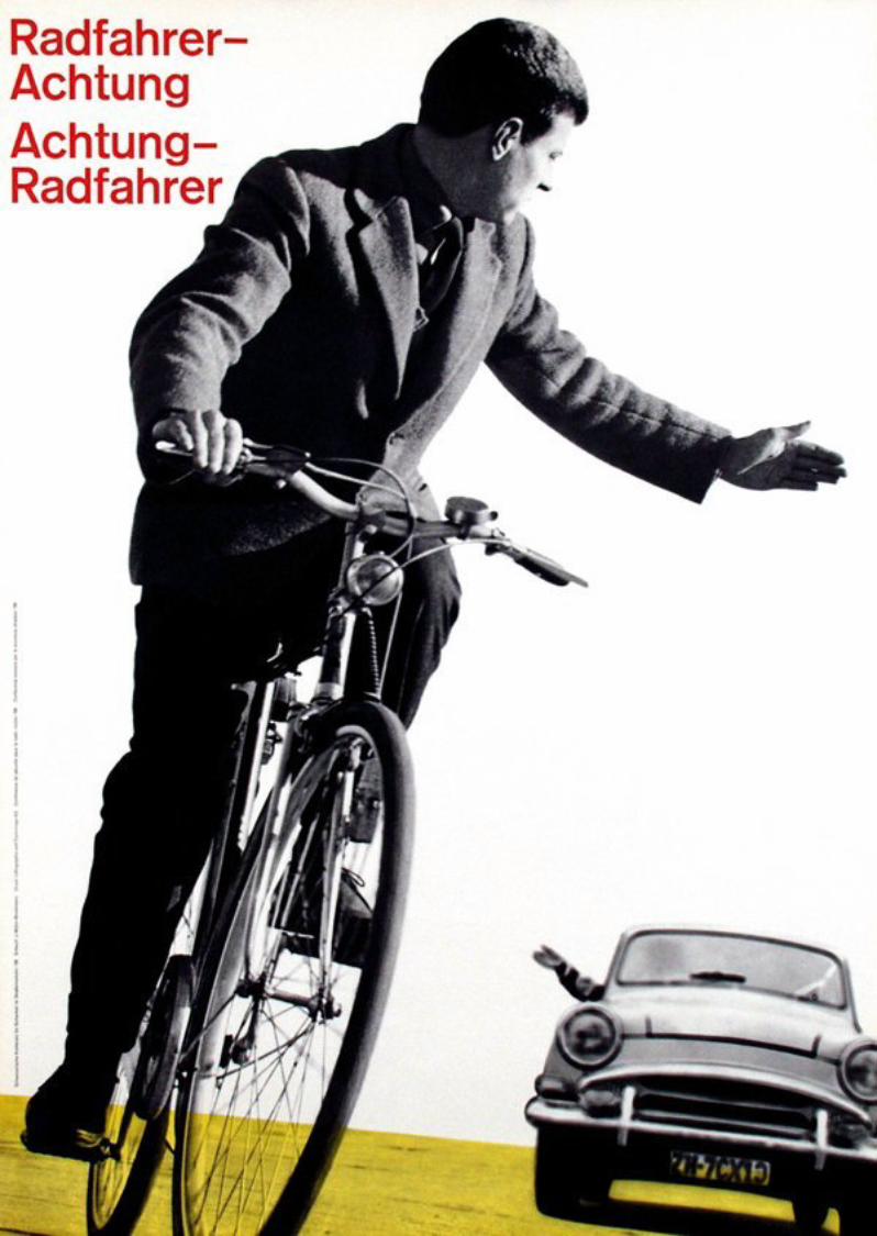
Josef Muller-BrockmannSwiss Auto Club poster1954“the friendly hand sign protects against accidents”
Wednesday, April 6, 16
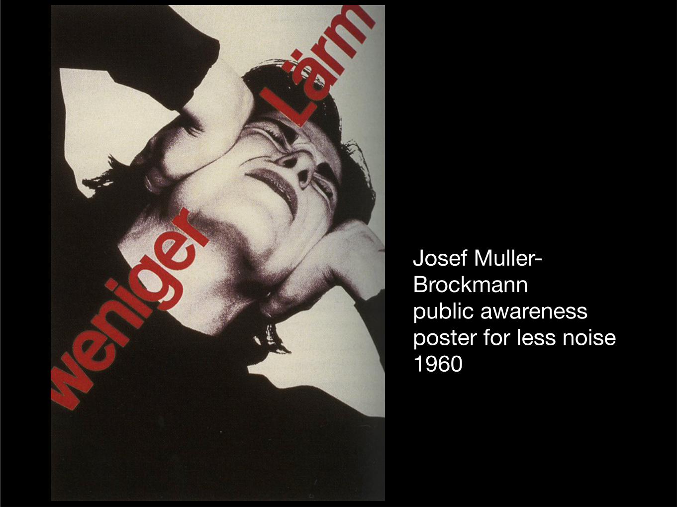
Josef Muller-Brockmannpublic awareness poster for less noise1960
Wednesday, April 6, 16
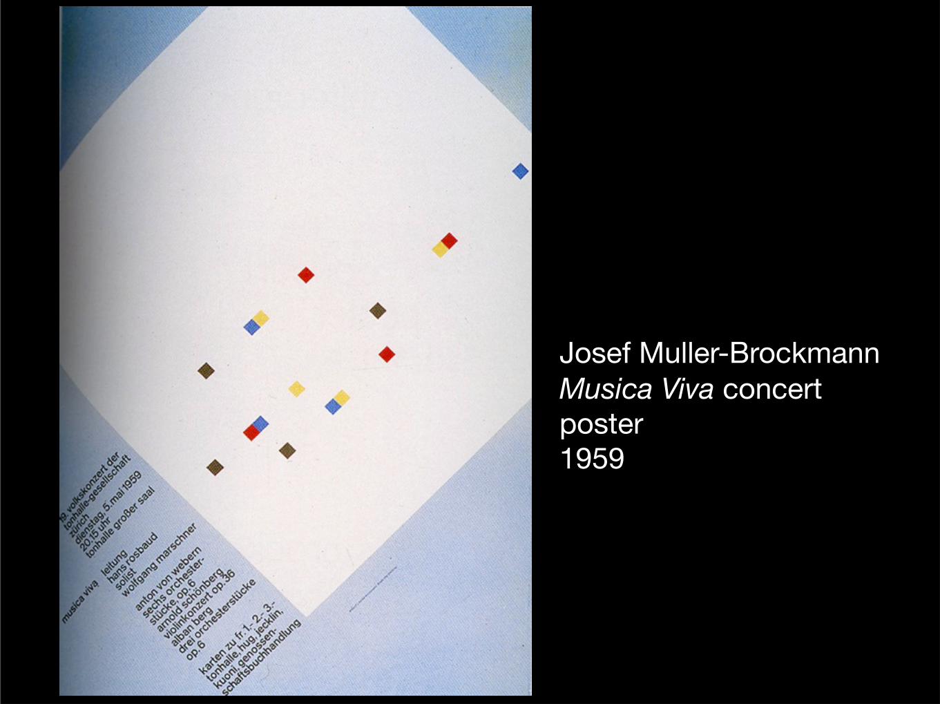
Josef Muller-BrockmannMusica Viva concert poster1959
Wednesday, April 6, 16
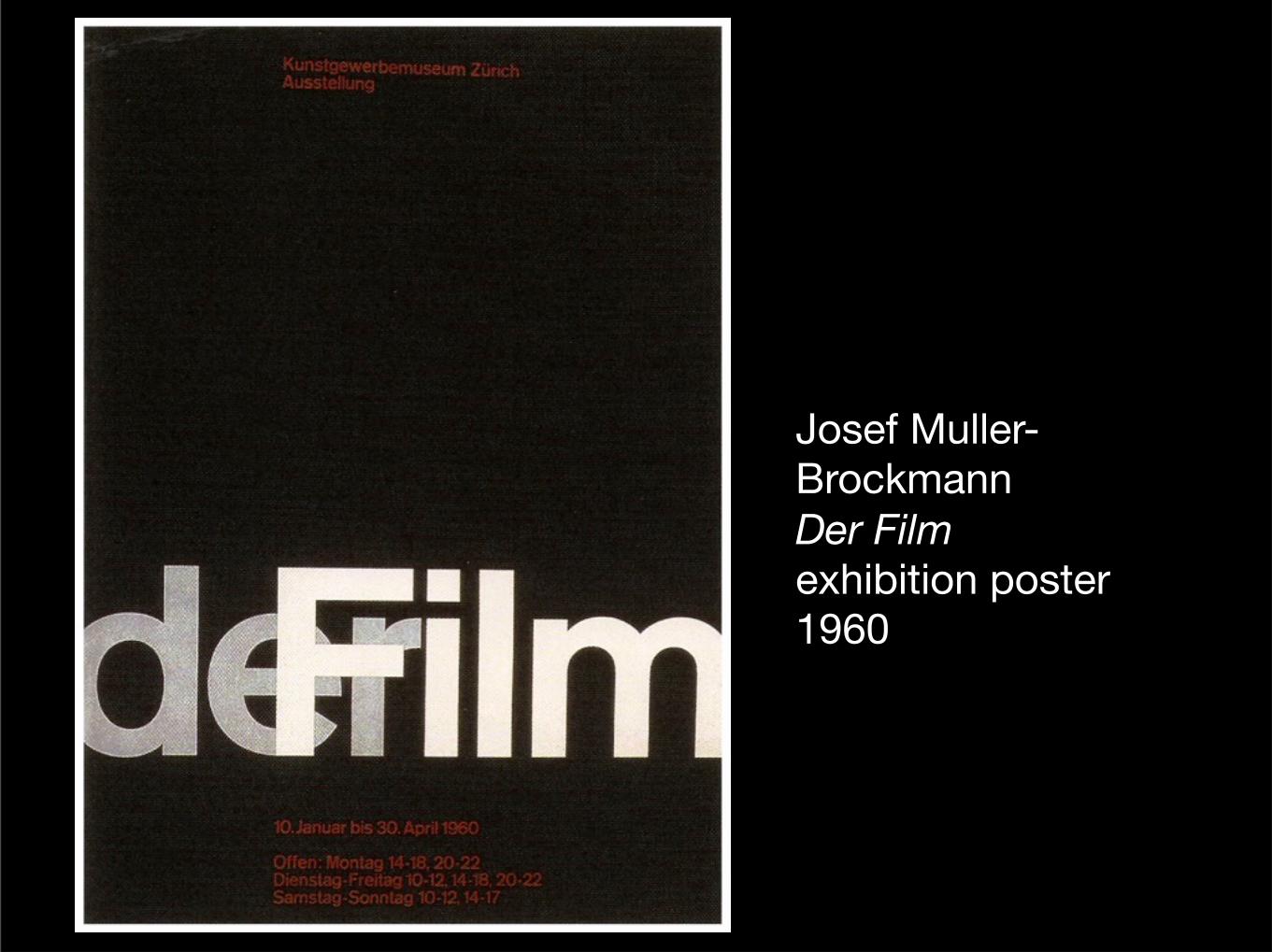
Josef Muller-BrockmannDer Film exhibition poster1960
Wednesday, April 6, 16
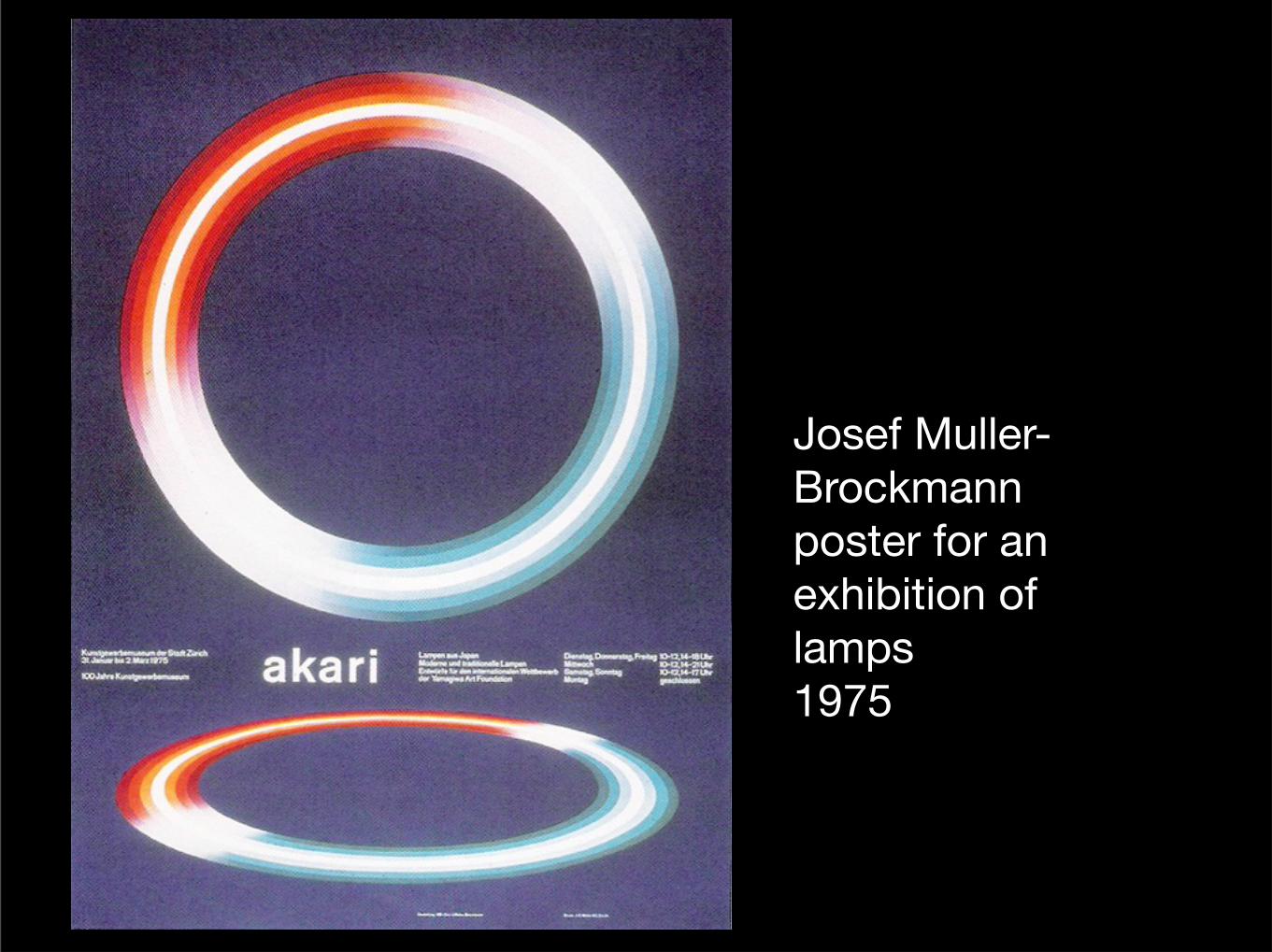
Josef Muller-Brockmannposter for an exhibition of lamps1975
Wednesday, April 6, 16
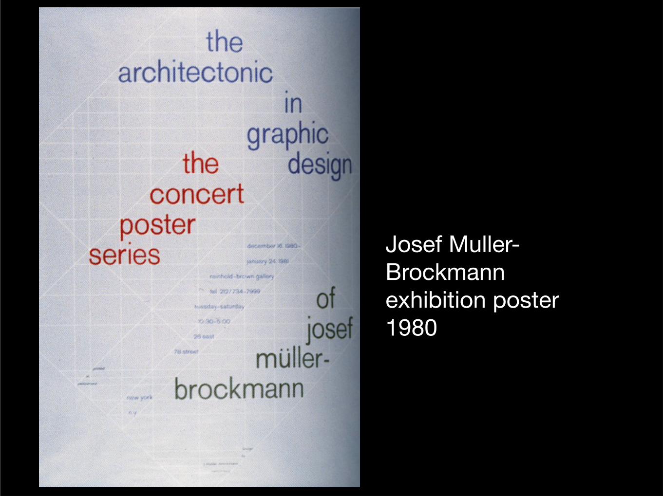
Josef Muller-Brockmannexhibition poster1980
Wednesday, April 6, 16
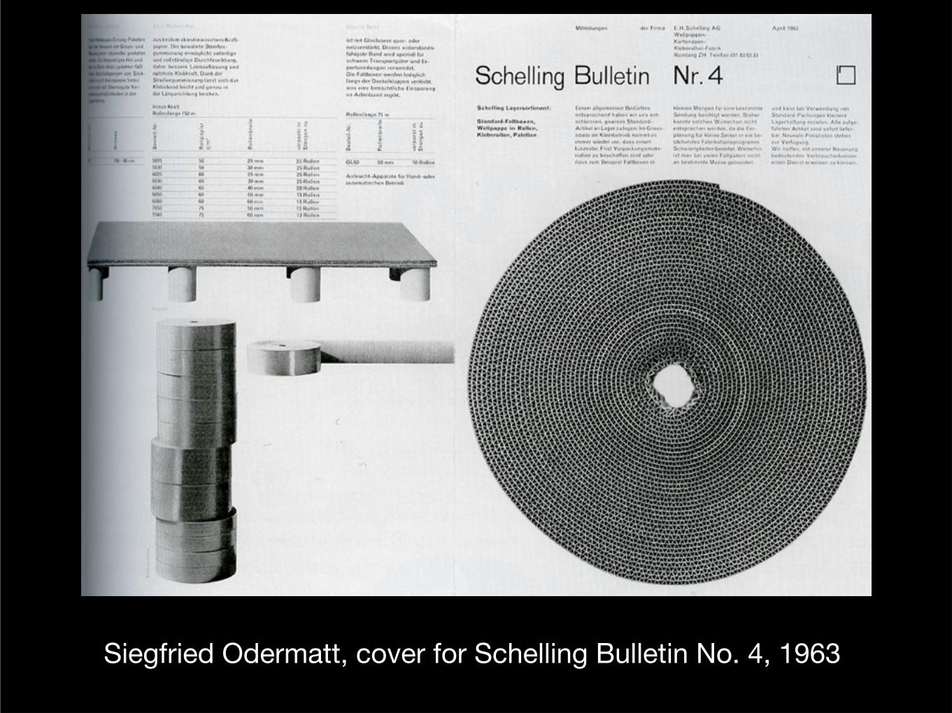
Siegfried Odermatt, cover for Schelling Bulletin No. 4, 1963
Wednesday, April 6, 16
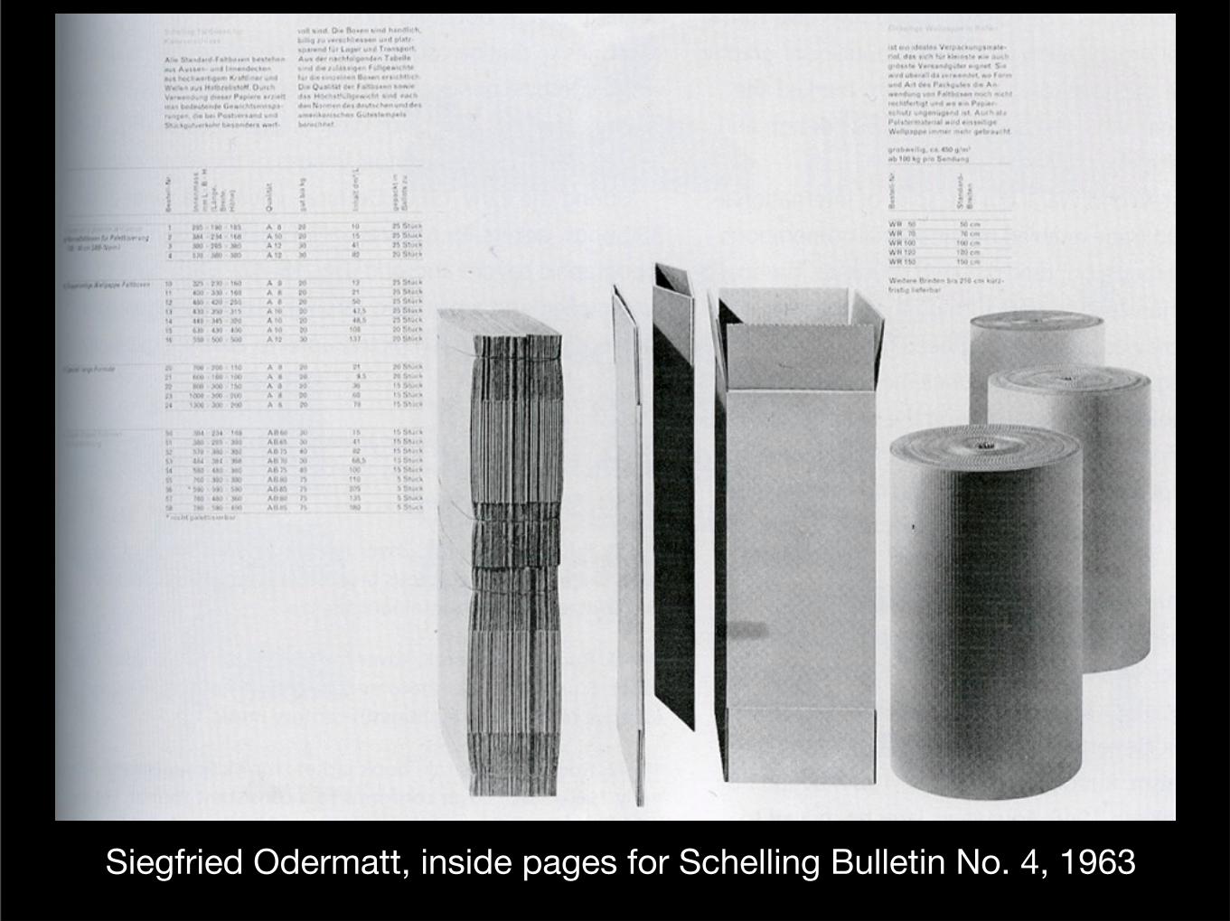
Siegfried Odermatt, inside pages for Schelling Bulletin No. 4, 1963
Wednesday, April 6, 16
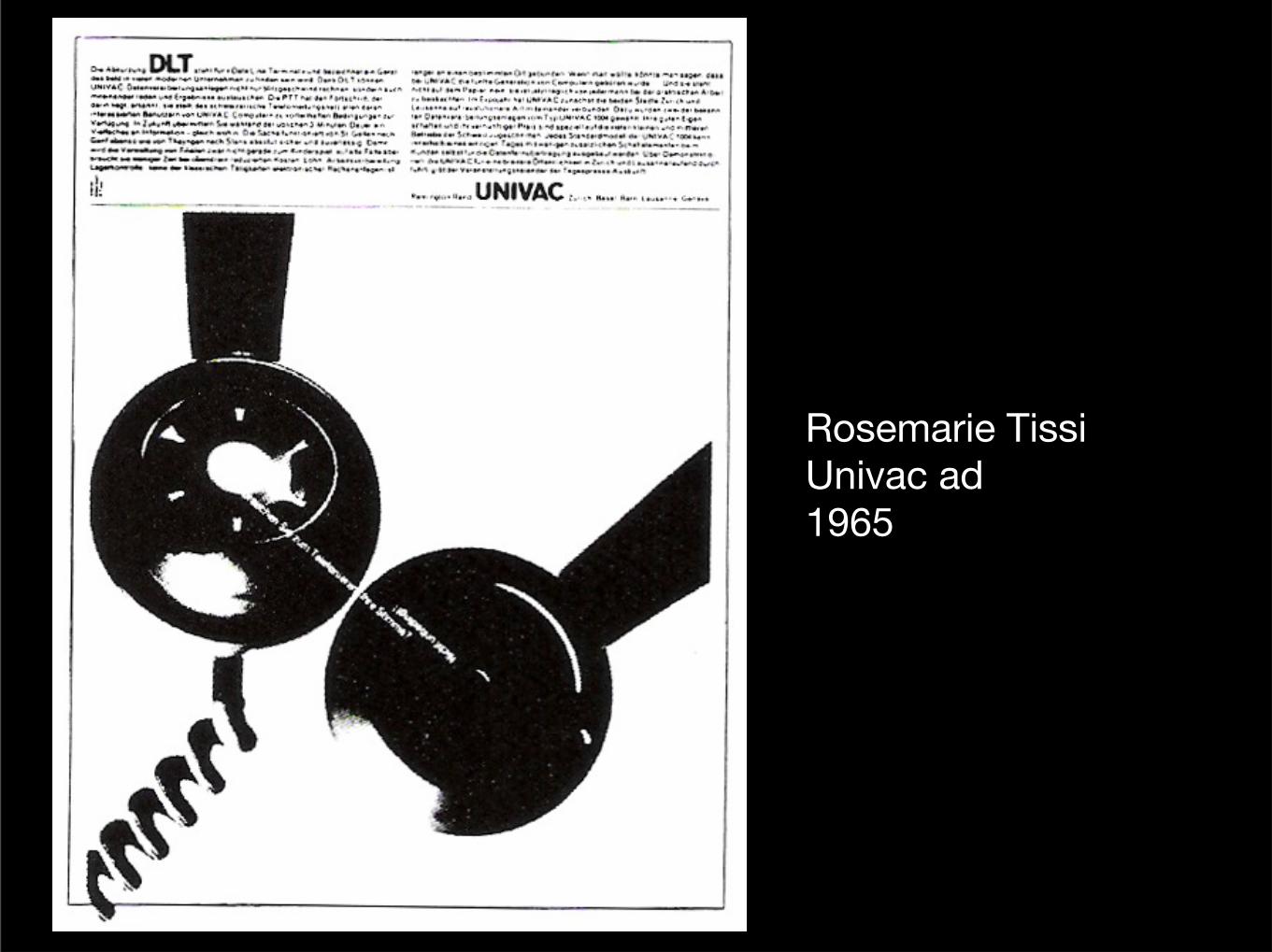
Rosemarie TissiUnivac ad1965
Wednesday, April 6, 16
Wednesday, April 6, 16
During the 1960s, Rudolph DeHarak designed more than 350 book jackets for McGraw-Hill Publishing. He utilized the
swiss sense of type and grid.
Wednesday, April 6, 16
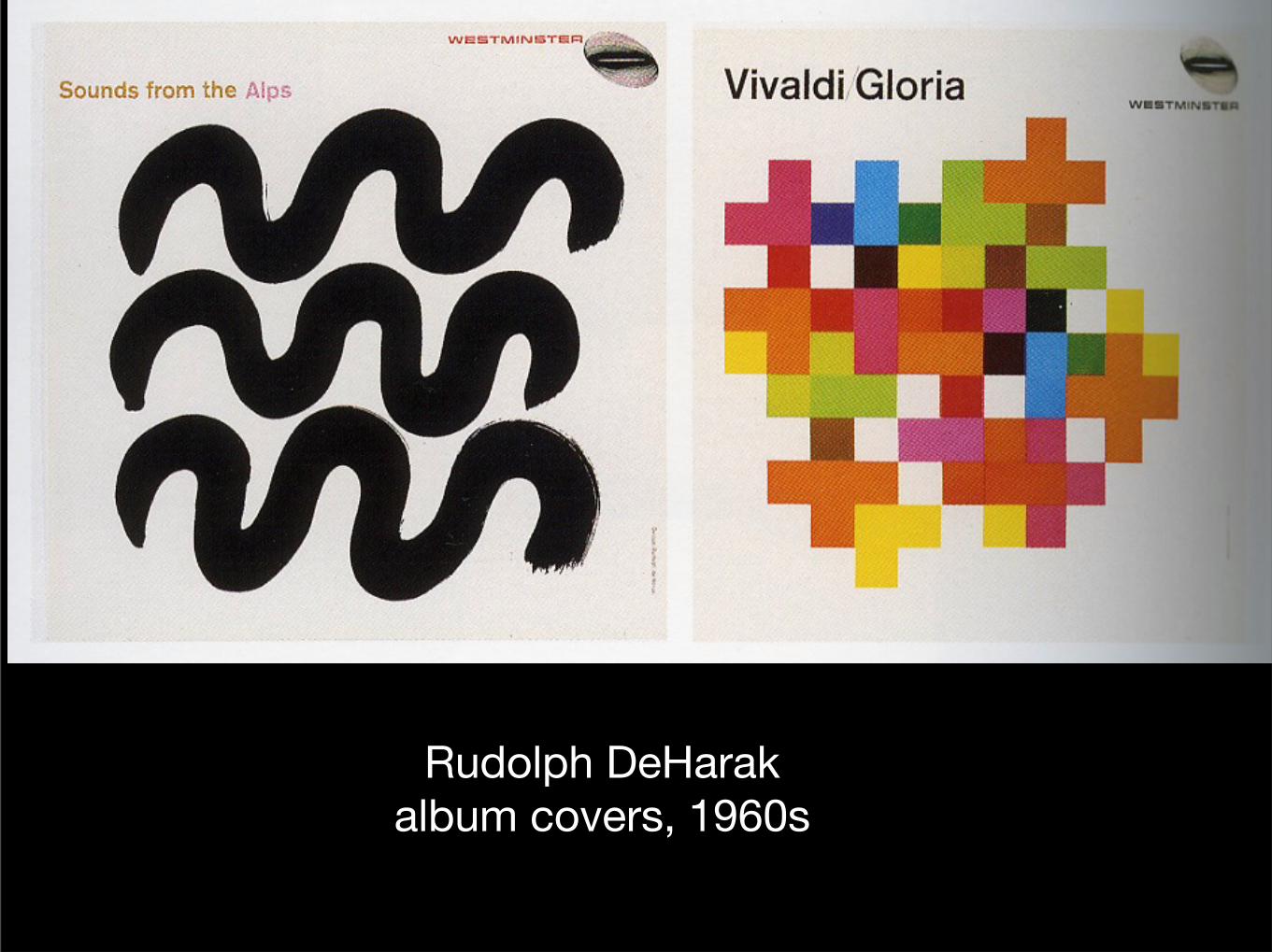
Rudolph DeHarakalbum covers, 1960s
Wednesday, April 6, 16
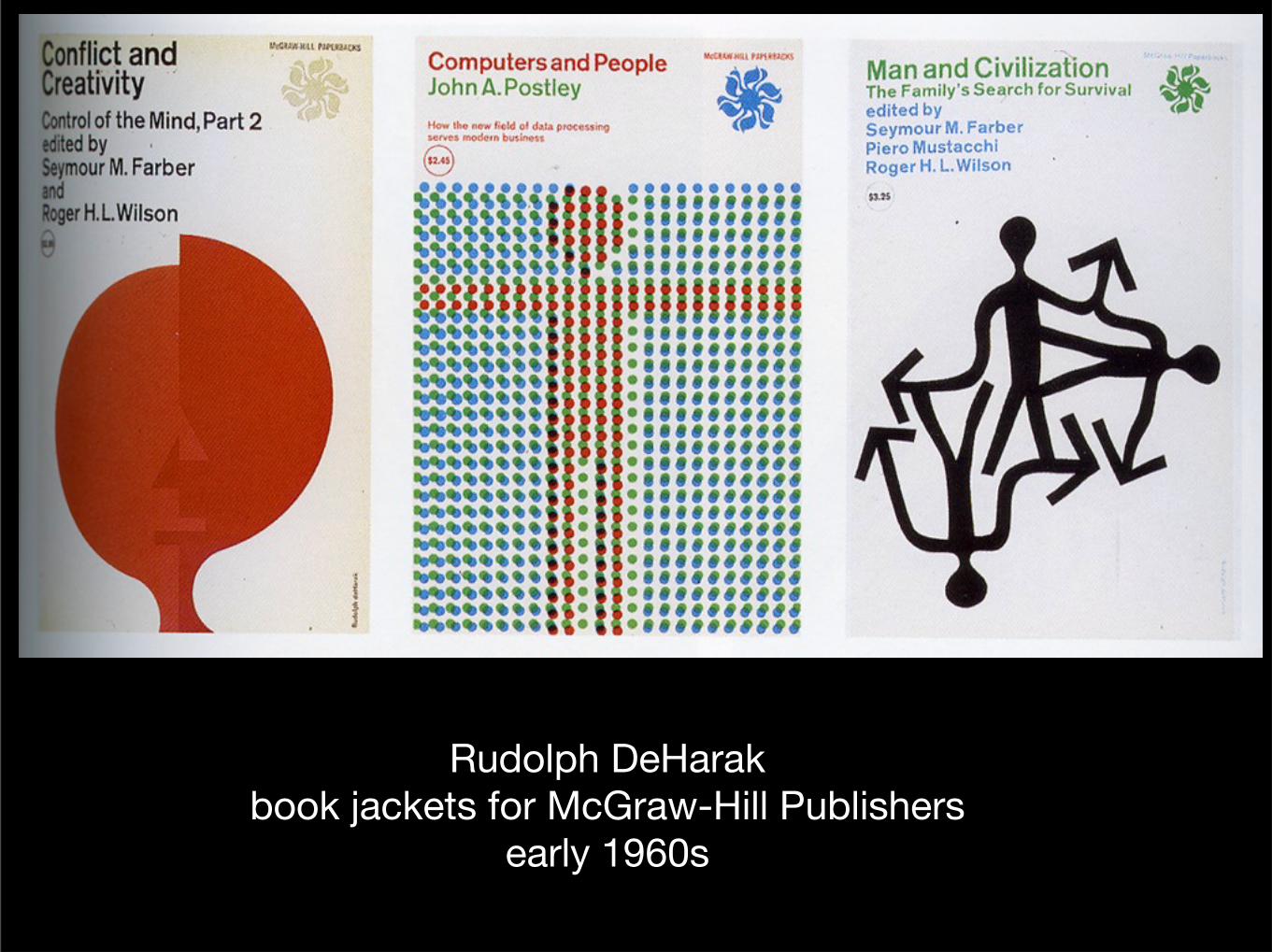
Rudolph DeHarakbook jackets for McGraw-Hill Publishers
early 1960s
Wednesday, April 6, 16
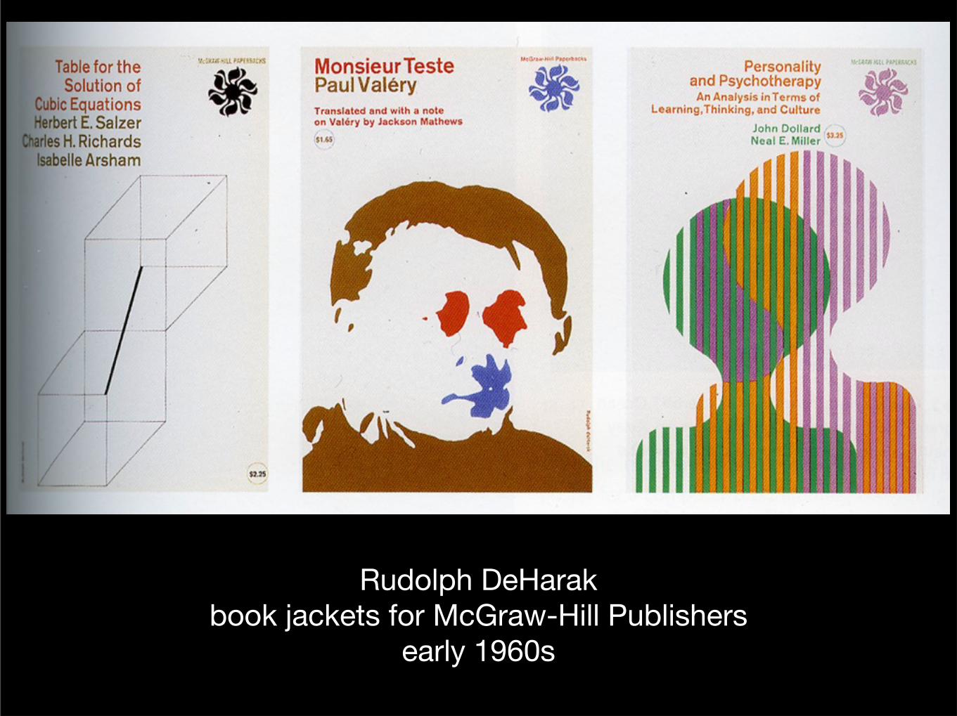
Rudolph DeHarakbook jackets for McGraw-Hill Publishers
early 1960s
Wednesday, April 6, 16
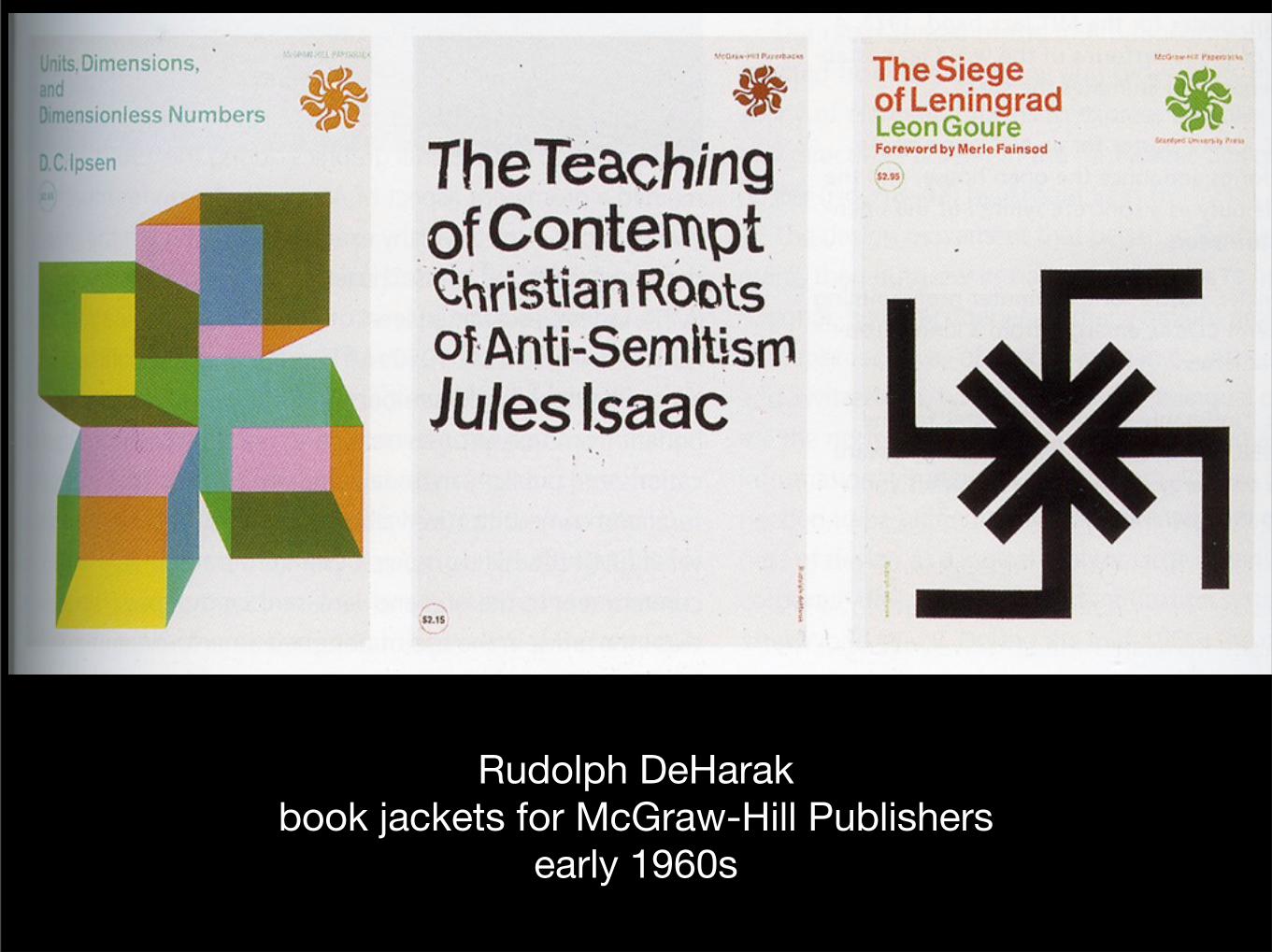
Rudolph DeHarakbook jackets for McGraw-Hill Publishers
early 1960s
Wednesday, April 6, 16

The Design Services office at MIT (Massachussetts Institute of Technology) helped to make the Swiss style prominent
in the United States.
Wednesday, April 6, 16
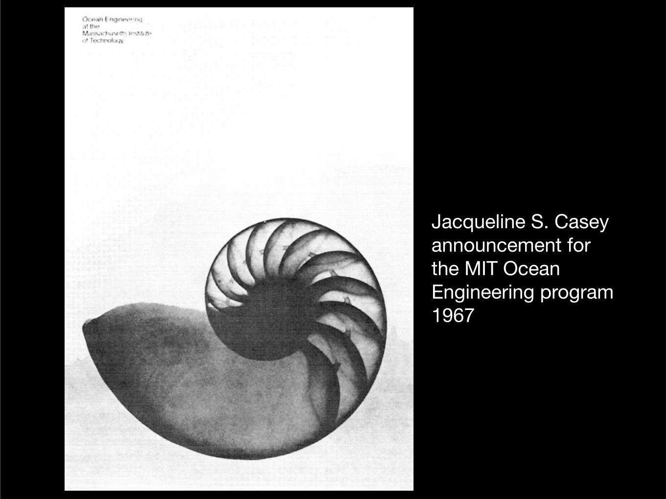
Jacqueline S. Caseyannouncement for the MIT Ocean Engineering program 1967
Wednesday, April 6, 16
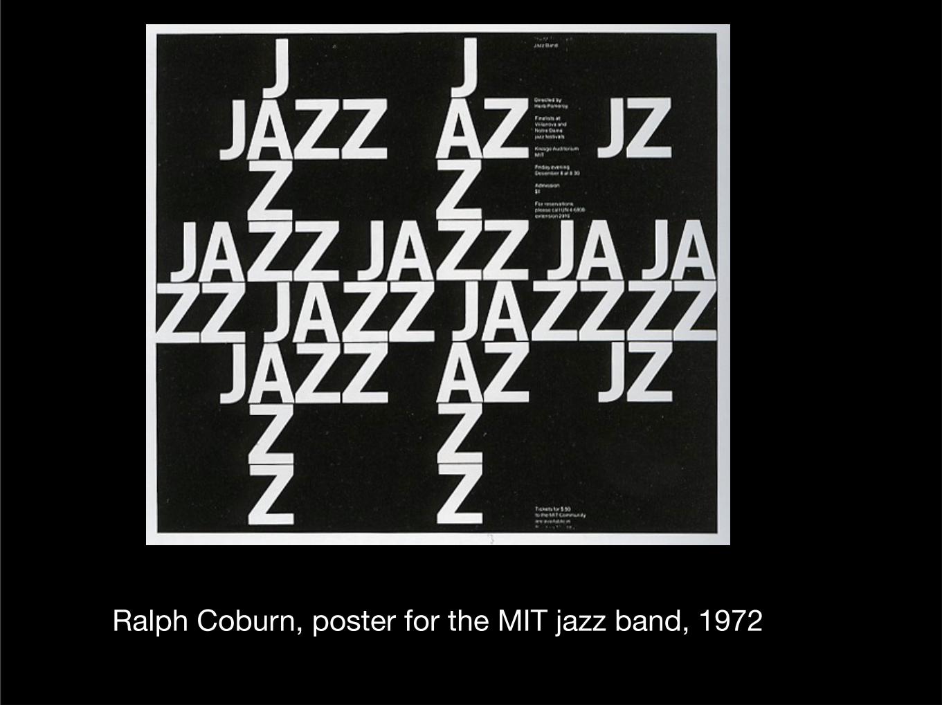
Ralph Coburn, poster for the MIT jazz band, 1972
Wednesday, April 6, 16
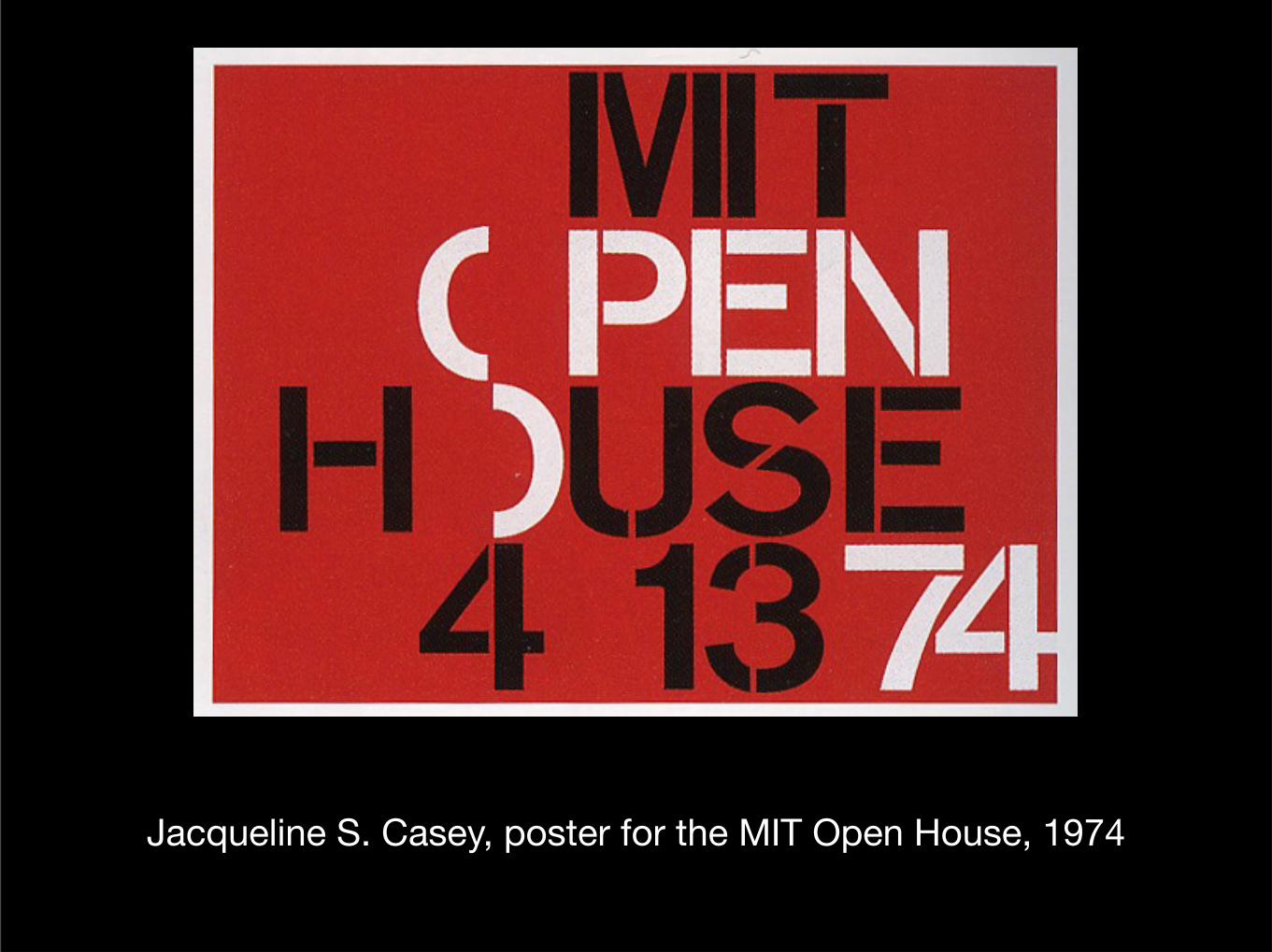
Jacqueline S. Casey, poster for the MIT Open House, 1974
Wednesday, April 6, 16
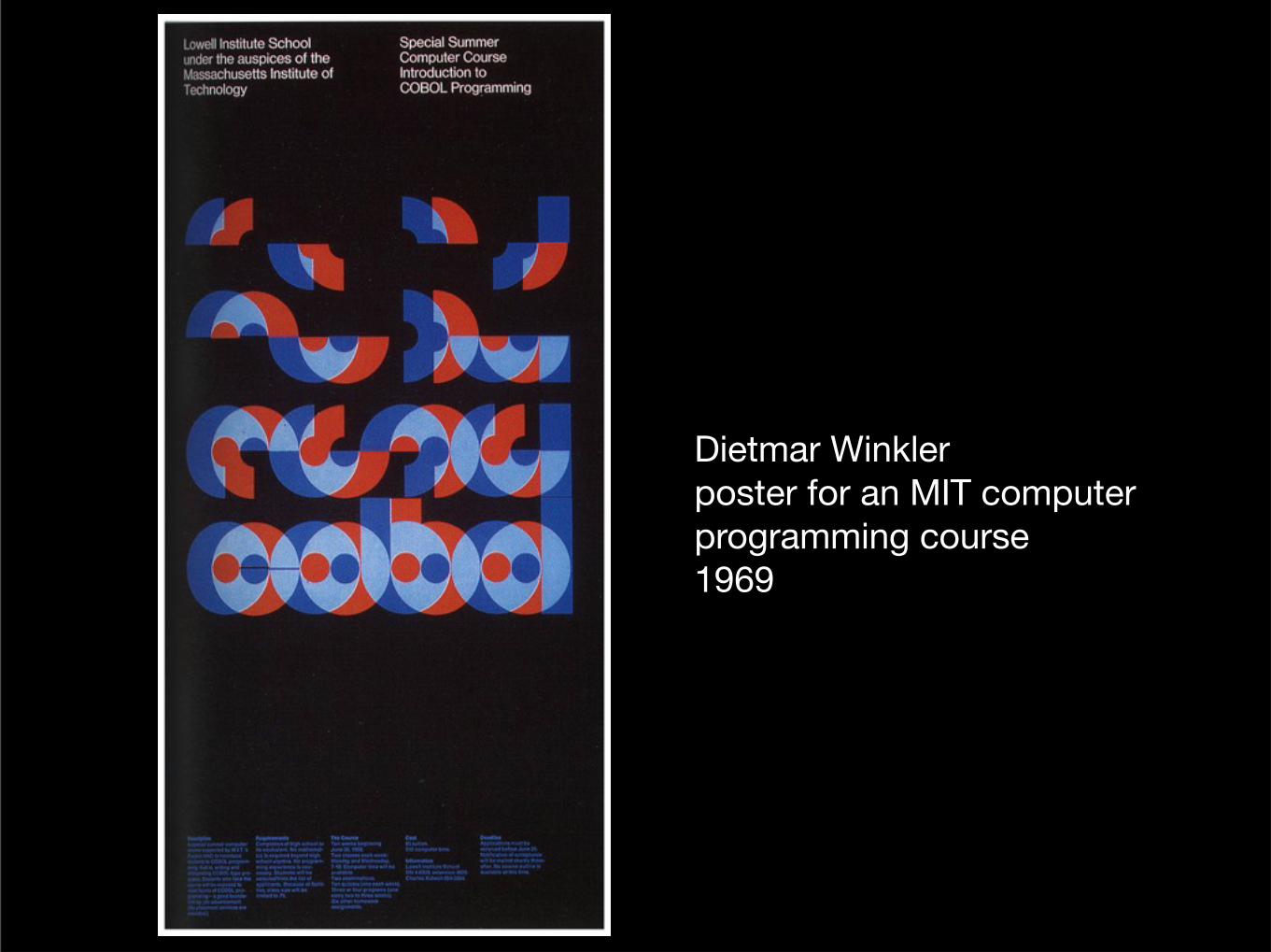
Dietmar Winklerposter for an MIT computer programming course1969
Wednesday, April 6, 16
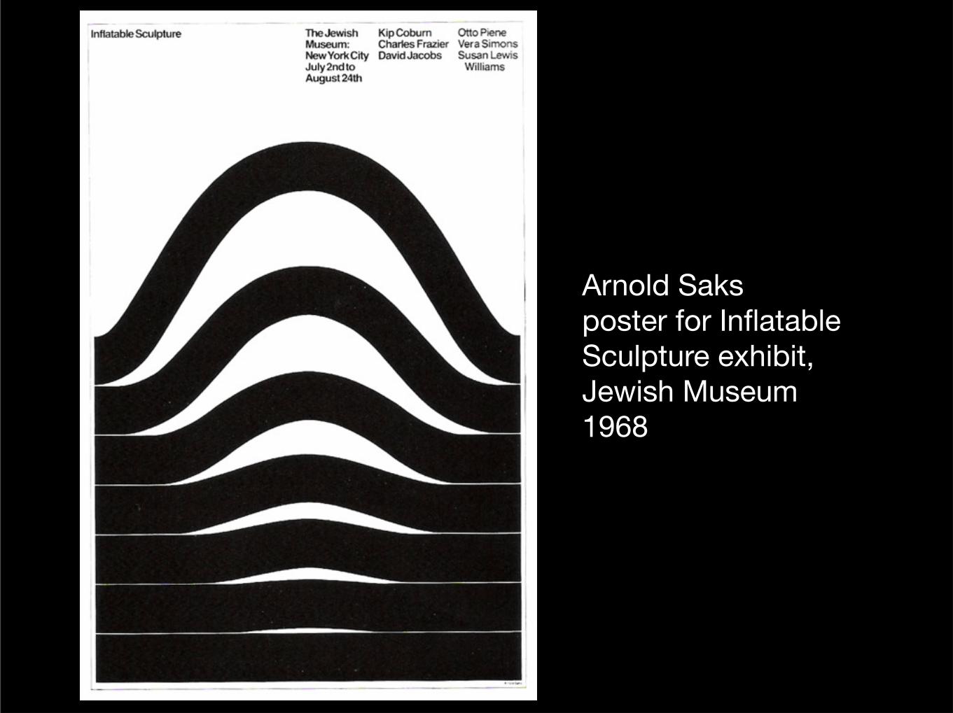
Arnold Saksposter for Inflatable Sculpture exhibit, Jewish Museum1968
Wednesday, April 6, 16
The Swiss or International style created the perfect visual vocabulary for the upsurge in corporate design that occured during the 1960s. This was because of its legibility,
visual strength and sense of order.
Wednesday, April 6, 16