Embed Size (px)
Citation preview
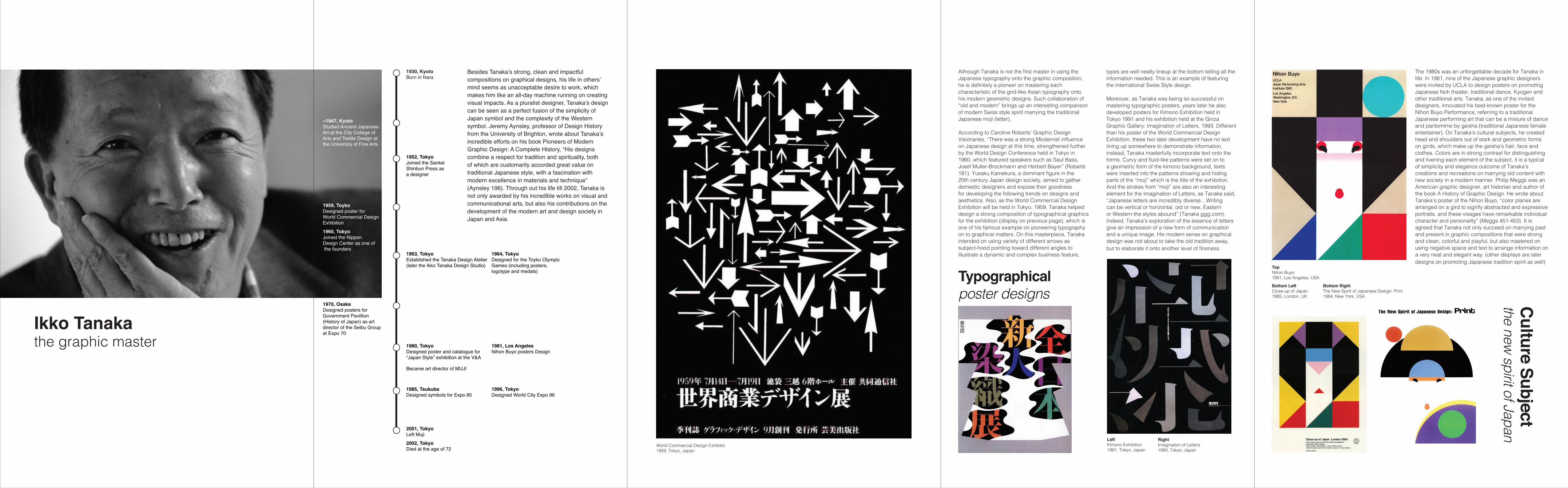
Ikko Tanakathe graphic master
Besides Tanaka’s strong, clean and impactful compositions on graphical designs, his life in others’ mind seems as unacceptable desire to work, which makes him like an all-day machine running on creating visual impacts. As a pluralist designer, Tanaka’s design can be seen as a perfect fusion of the simplicity of Japan symbol and the complexity of the Western symbol. Jeremy Aynsley, professor of Design History from the University of Brighton, wrote about Tanaka’s incredible efforts on his book Pioneers of Modern Graphic Design: A Complete History, “His designs combine a respect for tradition and spirituality, both of which are customarily accorded great value on traditional Japanese style, with a fascination with modern excellence in materials and technique” (Aynsley 196). Through out his life till 2002, Tanaka is not only awarded by his incredible works on visual and communicational arts, but also his contributions on the development of the modern art and design society in Japan and Asia.
1930, KyotoBorn in Nara
1952, TokyoJoined the Sankei Shinbun Press as a designer
1959, ToykoDesigned poster for World Commercial Design Exhibition
1960, TokyoJoined the Nippon Design Center as one of the founders
1963, TokyoEstablished the Tanaka Design Atelier (later the Ikko Tanaka Design Studio)
1964, TokyoDesigned for the Toyko Olympic Games (including posters, logotype and medals)
~1947, KyotoStudied Ancient Japanese Art at the City College of Arts and Textile Design at the Univeristy of Fine Arts
1970, OsakaDesigned posters for Government Pavillion (History of Japan) as art director of the Seibu Group at Expo 70
1980, TokyoDesigned poster and catalogue for “Japan Style” exhibition at the V&A
Became art director of MUJI
1981, Los AngelesNihon Buyo posters Design
1985, TsukubaDesigned symbols for Expo 85
1996, TokyoDesigned World City Expo 96
2001, TokyoLeft Muji
2002, TokyoDied at the age of 72
World Commercial Design Exhibitio1959, Tokyo, Japan
Although Tanaka is not the first master in using the Japanese typography onto the graphic composition, he is definitely a pioneer on mastering each characteristic of the grid-like Asian typography onto his modern geometric designs. Such collaboration of “old and modern” brings up an interesting comparison of modern Swiss style spirit marrying the traditional Japanese moji (letter).
According to Caroline Roberts’ Graphic Design Visionaries, “There was a strong Modernist influence on Japanese design at this time, strengthened further by the World Design Conference held in Tokyo in 1960, which featured speakers such as Saul Bass, Josef Muller-Brockmann and Herbert Bayer” (Roberts 181). Yusaku Kamekura, a dominant figure in the 20th century Japan design society, aimed to gather domestic designers and expose their goodness for developing the following trends on designs and aesthetics. Also, as the World Commercial Design Exhibition will be held in Tokyo, 1959, Tanaka helped design a strong composition of typographical graphics for the exhibition (display on previous page), which is one of his famous example on pioneering typography on to graphical matters. On this masterpiece, Tanaka intended on using variety of different arrows as subject-hood pointing toward different angles to illustrate a dynamic and complex business feature,
types are well neatly lineup at the bottom telling all the information needed. This is an example of featuring the International Swiss Style design.
Moreover, as Tanaka was being so successful on mastering typographic posters, years later he also developed posters for Kimono Exhibition held in Tokyo 1991 and his exhibition held at the Ginza Graphic Gallery: Imagination of Letters, 1993. Different than his poster of the World Commercial Design Exhibition, these two later development have no text lining up somewhere to demonstrate information, instead, Tanaka masterfully incorporate text onto the forms. Curvy and fluid-like patterns were set on to a geometric form of the kimono background, texts were inserted into the patterns showing and hiding parts of the “moji” which is the title of the exhibition. And the strokes from “moji” are also an interesting element for the Imagination of Letters, as Tanaka said, “Japanese letters are incredibly diverse…Writing can be vertical or horizontal, old or new, Eastern or Western-the styles abound” (Tanaka ggg.com). Indeed, Tanaka’s exploration of the essence of letters give an impression of a new form of communication and a unique image. His modern sense on graphical design was not about to take the old tradition away, but to elaborate it onto another level of fineness.
LeftKimono Exhibition1991, Tokyo, Japan
RightImagination of Letters1993, Tokyo, Japan
Typographical poster designs
TopNihon Buyo 1981, Los Angeles, USA
Bottom LeftClose-up of Japan 1985, London, UK
Bottom RightThe New Spirit of Japanese Design: Print 1984, New York, USA
The 1980s was an unforgettable decade for Tanaka in life. In 1981, nine of the Japanese graphic designers were invited by UCLA to design posters on promoting Japanese Noh theater, traditional dance, Kyogen and other traditional arts. Tanaka, as one of the invited designers, innovated his best-known poster for the Nihon Buyo Performance, referring to a traditional Japanese performing art that can be a mixture of dance and pantomime by geisha (traditional Japanese female entertainer). On Tanaka’s cultural subjects, he created head and shoulders out of stark and geometric forms on girds, which make up the geisha’s hair, face and clothes. Colors are in strong contrast for distinguishing and livening each element of the subject, it is a typical of simplicity and elegance outcome of Tanaka’s creations and recreations on marrying old content with new society in a modern manner. Philip Meggs was an American graphic designer, art historian and author of the book A History of Graphic Design. He wrote about Tanaka’s poster of the Nihon Buyo, “color planes are arranged on a gird to signify abstracted and expressive portraits, and these visages have remarkable individual character and personality” (Meggs 451-453). It is agreed that Tanaka not only succeed on marrying past and present in graphic compositions that were strong and clean, colorful and playful, but also mastered on using negative space and text to arrange information on a very neat and elegant way. (other displays are later designs on promoting Japanese tradition spirit as well)
Culture Subjectthe new spirit of Japan
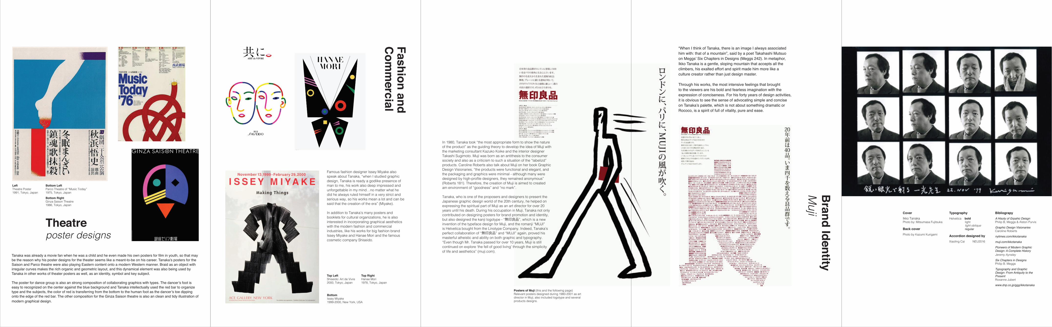
LeftTheatre Poster 1991, Tokyo, Japan
Bottom LeftParco Theatre of “Music Today” 1975, Tokyo, Japan
Bottom RightGinza Saison Theatre 1986, Tokyo, Japan
Tanaka was already a movie fan when he was a child and he even made his own posters for film in youth, so that may be the reason why his poster designs for the theater seems like a meant-to-be on his career. Tanaka’s posters for the Saison and Parco theatre were also playing Eastern content onto a modern Western manner. Braid as an object with irregular curves makes the rich organic and geometric layout, and this dynamical element was also being used by Tanaka in other works of theater posters as well, as an identity, symbol and key subject.
The poster for dance group is also an strong composition of collaborating graphics with types. The dancer’s foot is easy to recognized on the center against the blue background and Tanaka intellectually used the red bar to organize type and the subjects, the color of red is transferring from the bottom to the human foot as the dancer’s toe dipping onto the edge of the red bar. The other composition for the Ginza Saison theatre is also an clean and tidy illustration of modern graphical design.
Theatre poster designs
Top LeftShiseido: Art de Vivre 2000, Tokyo, Japan
Top RightHanae Mori 1978, Tokyo, Japan
Bottom Issey Miyake 1999-2000, New York, USA
Famous fashion designer Issey Miyake also speak about Tanaka, “when I studied graphic design, Tanaka is ready a godlike presence of man to me, his work also deep impressed and unforgettable in my mind…no matter what he did he always ruled himself in a very strict and serious way, so his works mean a lot and can be said that the creation of the era” (Miyake).
In addition to Tanaka’s many posters and booklets for cultural organizations, he is also interested in incorporating graphical aesthetics with the modern fashion and commercial industries, like his works for big fashion brand Issey Miyake and Hanae Mori and the famous cosmetic company Shiseido.
Fashion and C
omm
ercial
Posters of Muji (this and the following page)Relevant posters designed during 1980-2001 as art director in Muji, also included logotype and several products designs.
In 1980, Tanaka took “the most appropriate form to show the nature of the product” as the guiding theory to develop the idea of Muji with the marketing consultant Kazuko Koike and the interior designer Takashi Sugimoto. Muji was born as an antithesis to the consumer society and also as a criticism to such a situation of the “labelizd” products. Caroline Roberts also talk about Muji on her book Graphic Design Visionaries, “the products were functional and elegant, and the packaging and graphics were minimal - although many were designed by high-profile designers, they remained anonymous” (Roberts 181). Therefore, the creation of Muji is aimed to created am environment of “goodness” and “no mark”.
Tanaka, who is one of the proposers and designers to present the Japanese graphic design world of the 20th century, he helped on expressing the spiritual part of Muji as an art director for over 20 years until his death. During his occupation in Muji, Tanaka not only contributed on designing posters for brand promotion and identity, but also designed the kanji logotype - “無印良品”, which is a new invention of the typeface design for Muji, and the romanji “MUJI” is Helvetica bought from the Linotype Company. Indeed, Tanaka’s perfect collaboration of “無印良品” and “MUJI” again, proved his masterful atheistic and ability on both graphic and typography. “Even though Mr. Tanaka passed for over 10 years, Muji is still continued on explore ‘the fell of good living’ through the simplicity of life and aesthetics” (muji.com).
Brand Identity
Muji
“When I think of Tanaka, there is an image I always associated him with: that of a mountain”, said by a poet Takahashi Mutsuo on Meggs’ Six Chapters in Designs (Meggs 242). In metaphor, Ikko Tanaka is a gentle, sloping mountain that accepts all the climbers, his exalted effort and spirit made him more like a culture creator rather than just design master.
Through his works, the most intensive feelings that brought to the viewers are his bold and fearless imagination with the expression of conciseness. For his forty years of design activities, it is obvious to see the sense of advocating simple and concise on Tanaka’s palette, which is not about something dramatic or Rococo, is a spirit of full of vitality, pure and ease.
Typography Helvetica bold
light light oblique regular
Accordion designed by Xiaoling Cai NEU2016
BibliograpyA Hisoty of Grpahic DeisgnPhilip B, Meggs & Alston Purvis
Graphic Design VisionariesCaroline Roberts
nytimes.com/ikkotanaka
muji.com/ikkotanaka
Pioneers of Modern Graphic Design: A Complete History Jeremy Aynsley
Six Chapters in Designs Philip B. Meggs
Typography and Graphic Design: From Antiquity to the Present Roxanne Jubert
www.dnp.co.jp/ggg/ikkotanaka
CoverIkko TanakaPhoto by: Mitsumasa Fujitsuka
Back cover Photo by Kazumi Kurigami