Embed Size (px)
Citation preview

Online Journal of Communication and Media Technologies Volume: 7 – Issue: 3 July - 2017
© Online Journal of Communication and Media Technologies 46
Digital Collage, Poster Design and Stephan Bundi: The Semiotic Analysis of Theatre
Posters
Gürkan Gökaşan, Near East University, North Cyprus
Abstract
The aim of this study is to assess the single expression in approaching the traditional and
digital methods for the design of cultural based posters like theatrical posters in consideration
with the posters as a graphic design tool. The digital collage, which is the way of expression
created in the early 20th century by the art movements and artists using collage as aroused on
the computer screens other than canvas through the technology, has also been used in graphic
design. The digital collage facilitates the reflection of artist’s imagination to the screen by
means of technology, allows the traditional collage to be used together with the digital. The
semiotic analysis of theatre posters designed by Stephan Bundi between the years of 2012-
2015, who is considered as the one of the first users of these two methods, was conducted
within the scope of study. The graphic codes utilized were analysed and the climaxes in the
theatrical scripts were addressed in a single expression with these two styles. The posters
designed within this period by Bundi, who had used the traditional collage and digital collage
that considered as two different ways of expression in his cultural posters, were analysed on
the basis of Peircian sign theory, through the use of icon, index and symbols, and their
interpretation was elaborated accordingly. As a result of this study, the findings indicated that
Bundi made two different styles into one way of expression, used the traditional methods
together with digital collage in graphic design, chose the colour in posters in accordance with
the content of play and interpreted the content in the cultural posters designed by the poster
designer with his own style through digital collage method. In consideration with the
analysed posters of Bundi, his frequent use of icon that is given under the Peircian sign
theory was stood out.
Keywords: Graphic Design, Poster, Stephan Bundi, Digital Collage, Cultural Posters,
Theatre Posters

Online Journal of Communication and Media Technologies Volume: 7 – Issue: 3 July - 2017
© Online Journal of Communication and Media Technologies 47
Introduction
Poster can in general be defined as a picture placard prepared to announce or publicize
something that hung where people can see easily.Rather than the word “afiş” as used in
Turkish from the origin of French “affiche”, the word is used as “poster” in English. Both
words are used in Turkish. Poster is translated to “plakat” in German. Poster is one of the
effective graphic design tools in transmission of information within the context of
announcement and reaching the masses in our daily lives (Özmutlu, A., &Kaptan, 2009)
Thus while affiche or poster represent the same purpose in use, they are only referred in two
words. Posters, used in very comprehensive spectrum from propaganda, theatre plays to the
cinema, and consumption and service products may influence large masses depending on
where they are hung.
Pursuant to Özkan(2003),posters are one of the media tools that accomplish to remind the
message within and attract attention. The posters, which have a privileged position among the
messages of graphic arts, reflect the characteristics of the country that they are
designed/produced, on the walls and boards. Hence, they are the graphic objects that
publicise the massages concerning the structure of society (Agsakalli, 2014).
The posters as created on the basis of design and artistic thinking, are divided into categories
such as politics, social, commercial and cultural; therefore they may be considered as the
notices that are organised in accordance with the needs of social structure and prepared in the
transmission of advertisements.Everyday we see various advertisement images in the cities
that we live in; while turning a page, going around the corner or passing by us very fast. We
are used to seeing such images that it is not so much possible to identify the complete impacts
on us. As Berger indicated, such advertisement images that have surrounded us all around
might be everywhere, yet it is inevitable that they have different features and styles (Berger,
2008).
The advertisement posters, one of the effective ways to allow the advertisements reach the
masses have been the domain of printed advertisement means. The advertisement posters
used to promote a product or service are used to provide information to the masses, persuade
regarding such product/service and guidance (Parsa, 2007).

Online Journal of Communication and Media Technologies Volume: 7 – Issue: 3 July - 2017
© Online Journal of Communication and Media Technologies 48
The poster designs covering the cultural events such as festival, theatre, cinema and
symposium might also be discussed under the subject of cultural posters(Lucie-Smith, Kılıç,
Kovulmaz, & Akınhay, 2004). A poster designer may follow much ‘free’ way in the design
of cultural posters, thus it would be possible to reach various target groups and the design of
poster would become ‘unique’ in terms of the content and style. The composition with
various elements created by the event aimed for promotion is an indicator that the artist can
think indefinite and can reflect this on the poster. The artist may take the audience to ‘an
intellectual’ adventure through the reflection of imagination on the poster (Işik, 2010).
Social posters that are related with the majority of society may covers the issues of health,
traffic as well as may be designed for different charity organisations. The social posters that
are mainly designed to inform, warn and motivate the public aim an effective communication
with the society through using the basis of human psychology and visual communication.
With the development of multiplication techniques, the states used such poster types during
the World War I and II in order to keep their communities together, encouragement and
awareness (Özkirişçi, 2016).
The aim of this study is to identify the contribution of Stephan Bundi, who is particularly
known for his cultural posters, through the analysis of graphic design codes used in the
theatre posters.
Theoretical Framework: Digital collage, poster designand Stephan Bundi
Historical Background of Poster Designs
The history of design goes back to the figures in caves and invention of writing; hence the
design shall not be considered separately than the printing art and technology in the graphic
art (Yalur, 2014).
When it comes to the poster designs in the world, many countries may stand up, however the
distribution of analysed posters on the basis of countries should be performed in
consideration with the socio-economic status, culture, education status, history and subjects
that influence the country. The formation of design on the basis of countries may be
considered in parallel with art; which may vary from the colour, font type, style of design
element and illustration style.

Online Journal of Communication and Media Technologies Volume: 7 – Issue: 3 July - 2017
© Online Journal of Communication and Media Technologies 49
The poster defined as an art form has been applicable as a way of expression since its
occurrence and pushes the boundaries of drawing (Gumustekin, 2013).
As indicated by Ertep (2007), the design, which is the message and way of delivering the
message, of a poster may be considered as the most crucial element to have impact on the
existence of a poster. Although tastes different, no doubt that a badly designed poster is not
acceptable. Each element comprising the picture, photo, colour etc. has an essential part in
the success of poster (Gumustekin, 2013).
The posters, which are defined as a design product rising in value over time, are used for the
purposes of propaganda and advertisement. The black-white graphic design products
produced until the invention of colour lithography by AloisSenefelder in 1798 (İncearık,
2012) have been visually effective with the use of colour.
In consideration with many resources, the abstract posters had been developed with the
World War I. El Lissitskywas one of the leading artists of abstract posters, a Soviet architect
and painter born in 1890 known to be around by the Soviet October Revolution. Similarly,
the German School of Bauhaus also brought innovations in industrial design and town
planning as well as in architecture, created a new architectural movement and influenced all
domains of art.
According to many philosophers, the strong compositions where the influence of purism and
cubism were explicitly observed post-World War II reflected the difference in the products
created after two wars. Although the World War II had an influence on the new technique of
John Heartfield (Bostancı,2012), who had a significant position in the art history of 20th
century and worked on the book cover designs prior to Berlin Dada Movement by using his
advertisement education as well as is known for his works of photomontage art that pieces of
photography are combined one another, there was no other innovation brought by the World
War II. However, the development of photography art after the war had an indirect impact on
the poster works.

Online Journal of Communication and Media Technologies Volume: 7 – Issue: 3 July - 2017
© Online Journal of Communication and Media Technologies 50
Digital Collage and Role of Graphic Design in Poster Design
The word of collage originated from French and used to define the art works created by
sticking the materials such as paper etc. was derived by adding the suffix –age to the word
“coller”, which is the word “to stick”. This art marked a surprising era in the plastic arts by
sticking different irrelevant objects on the painting. Firstly, “sticker papers”, such as press
clippings and envelopes then matches and cigarette boxes, pieces of wood and metal plates
were used (GroilerInternational Americana, 1993).
Digital, the term of numerical has been introduced into our lives with the use of mechanic
pieces such as machines and computers, which the computers may be considered as the most
popular example. The technologies developed via the computers facilitate the life and allow
saving time. Considering the evolution of graphic design in time, the works created with
traditional methods consume so much time. The advertisement and graphic design in private
sector developing in parallel with the developing technology is the locomotive of this sector.
Hence, the use of computer and other technologic equipment saves significant time. The
concept of ‘digital collage’ that may revive the historic adventure of collage provides an
opportunity to the artist to create his/her imagination in a shorter time with higher trial and
error tolerance.
As much as the importance of poster, the quality of graphic design on the poster can allow the
appropriate transmission of the message. The priority in the poster design is related with the
content of message and target group to be addressed. Similar to the other communication
tools, the space for the transmission of message is limited. This space shall be used as
effective as possible and the message, slogan and story shall go hand in hand. Additionally,
the clear objectives and universal design approach can be indicative components in the poster
design.
In the poster design, the graphic design is being used more effectively. After the computers
have been introduced into our lives, shaping the designs by blending the technology with art
positively affect the time, economy and creativity of designer. Moreover, technology has an
effective influence on the creation of various poster design alternatives.

Online Journal of Communication and Media Technologies Volume: 7 – Issue: 3 July - 2017
© Online Journal of Communication and Media Technologies 51
The main design elements in the poster design are colour, typography, illustration and/or
photography. The hierarchical order in the poster design shall be considered as obligatory for
a successful outcome. For instance; the use of solely text or visuals emphatically, instead of
equal use of visual and text may create more effective, clear and successful poster design. If
colour is found as the priority object of the audience in a poster, then the design should
include attention-grabbing colours (Ambrosse, & Harris, 2013). The reason for this might be
that the eye perceives the colour first than the style. The other visual and typographical
elements should be used in parallel with the subject; hence the outcome in designs would be
more successful, effective and aesthetic.
Stephan Bundi –Graphic Designer
Stephan Gundi, who is a Swedish Graphic Designer and Art Director, has specifically
designed the cultural and artistic posters for theatre, biennale and opera. According to Bundi,
who has more 100 world-famous awards particularly Red Dot with his works exhibited at
MoMA (Museum of Modern Art), the heading and content in a poster design lead an
effective design. The technique used in shaping the content, the story and catching the
attention of target group have a vital role in the poster design. Stephan Bundi, who used both
traditional techniques and digital space with the developing technology, emphasizes the
importance of technology in terms of saving time and technical facilities. Therefore, it is
possible to address that the artist becomes much free in reflection the imagination on the
poster with less boundaries (Gokasanand Dag, 2014).
Method
Data Analysis
Semiotics is a science that ensures the evaluation and analysis of all elements covering the
interpretation, establishment or comprehension of indicators. It is an interdisciplinary
discipline that brings many sciences and disciplines like semantics, phonetics, architecture,
sociology and psychoanalysis. The word semiotics is derived from the word ‘semeion’
which mean ‘sign’ in ancient Greek language. Namely, the semiotics known as the sign
science is considered as the discipline assessing the codes and structuring of codes.
Online Journal of Communication and Media Technologies Volume: 7 – Issue: 3 July - 2017
© Online Journal of Communication and Media Technologies 52
The leading people of semiotics are Ferdinand de Saussure, Roland Barthes and Charles
Peirce. Peirce as the basis of this study developed the idea of Saussure in semiotics and
considered the sign, object and interpretant as the basis.
The semiotics theory of Peirce as a basis for the data analysis of this study is known by the
categorisation of icon, index and symbol. Therefore; the relation between the sign and
signified can be analysed in three ways. One of such is the signs i.e. symbols that are
acknowledged and used regardless of no traditional relation between the sign and signified;
and index indicating the sensory related relation between the signifier and signified.
Eventually Pierce addressed the icon i.e. iconic sign where the signifier is the image or copy
of signified.
Within this perspective, this study will discuss the use and interpretation of icon, index and
symbols in theatre posters by Stephan Bundi.
Case study
This study analysed the graphic design codes used by Stephan Bundi, particularly known by
the cultural posters,in theatre posters. Therefore, the total of 9 posters of Bundi designed
between the years of 2012-2015 and published on his own website were analysed through the
semiotic method.
Data collection
Within the aim of this study, the new age theatre posters of the artist Stephan Bundi
published on his own website between the years of 2012-2014 asDon Carlos [Don Carlos],
Ephebiphobia [Ephebophobia], Faulen Julie [Miss Julie], Der Got Des Gemetzels [God of
Carnage], Lachen Verboten [No Laughing Allowed], Der Menschenfeind [The
Misanthrope], Rot[Red], Der Theater-Macher [The Theatre Maker], Der Man in Der Made-
Wanneoderwie Man ein Held wird [The man in the bathtub – or how to become a hero].
Limitations
As indicated above, this study discussed the new age works of Bundi, who has already many
other works, published on his official website between the years of 2012-2015 prepared for
the theatre among his cultural posters.
Online Journal of Communication and Media Technologies Volume: 7 – Issue: 3 July - 2017
© Online Journal of Communication and Media Technologies 53
The semiotic limitation of this study had already been indicated. Therefore, the study based
only on Peirce among the semiotics theorists will analyse to find an outcome through the
analysis of aesthetic codes used in his works.
Findings and evaluation: Theatre poster works of Stephan Bundi
Findings
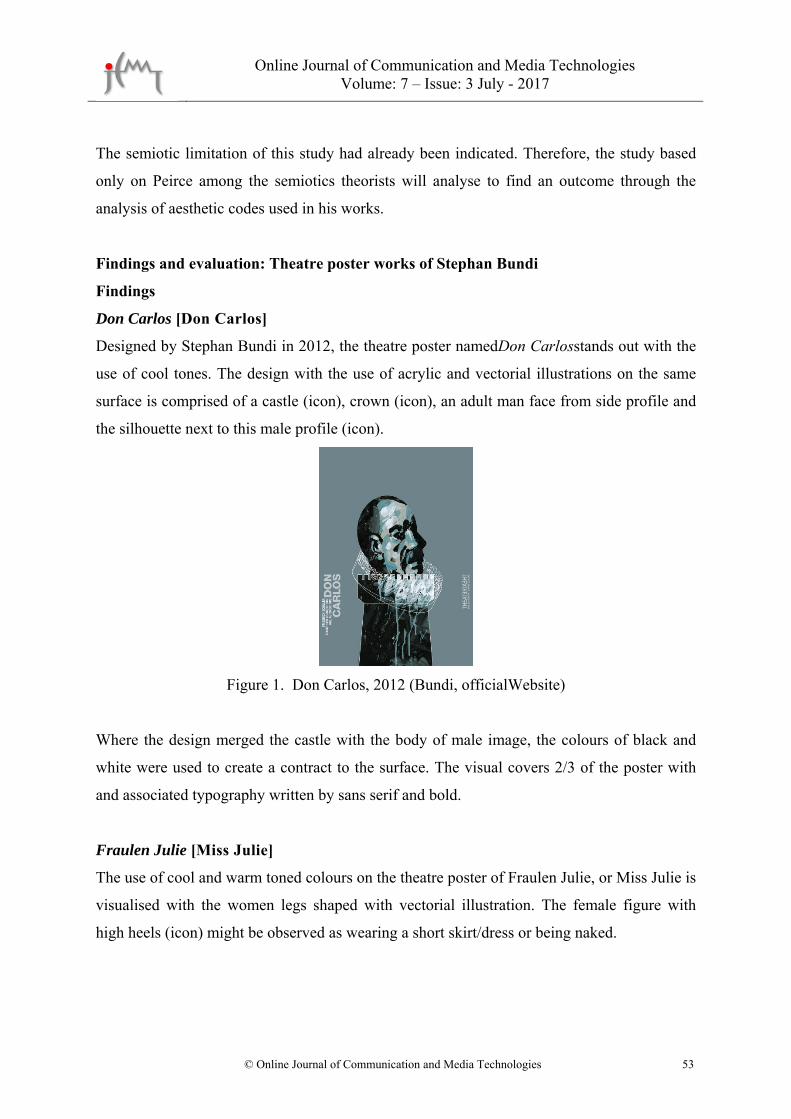
Don Carlos [Don Carlos]
Designed by Stephan Bundi in 2012, the theatre poster namedDon Carlosstands out with the
use of cool tones. The design with the use of acrylic and vectorial illustrations on the same
surface is comprised of a castle (icon), crown (icon), an adult man face from side profile and
the silhouette next to this male profile (icon).
Figure 1. Don Carlos, 2012 (Bundi, officialWebsite)
Where the design merged the castle with the body of male image, the colours of black and
white were used to create a contract to the surface. The visual covers 2/3 of the poster with
and associated typography written by sans serif and bold.
Fraulen Julie [Miss Julie]
The use of cool and warm toned colours on the theatre poster of Fraulen Julie, or Miss Julie is
visualised with the women legs shaped with vectorial illustration. The female figure with
high heels (icon) might be observed as wearing a short skirt/dress or being naked.
Online Journal of Communication and Media Technologies Volume: 7 – Issue: 3 July - 2017
© Online Journal of Communication and Media Technologies 54
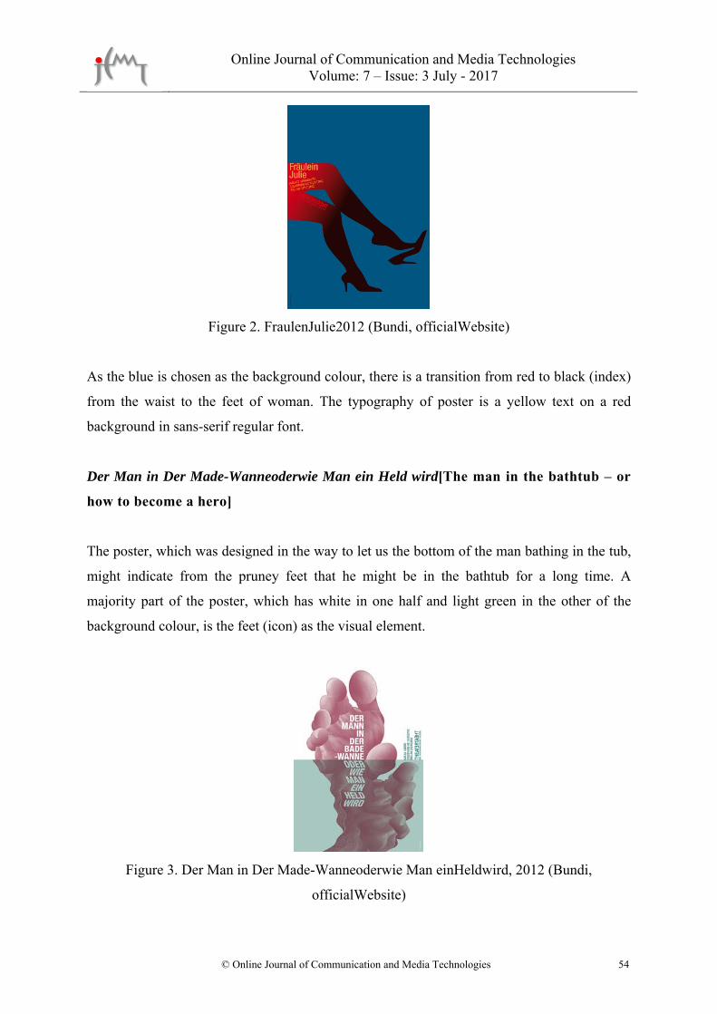
Figure 2. FraulenJulie2012 (Bundi, officialWebsite)
As the blue is chosen as the background colour, there is a transition from red to black (index)
from the waist to the feet of woman. The typography of poster is a yellow text on a red
background in sans-serif regular font.
Der Man in Der Made-Wanneoderwie Man ein Held wird[The man in the bathtub – or
how to become a hero]
The poster, which was designed in the way to let us the bottom of the man bathing in the tub,
might indicate from the pruney feet that he might be in the bathtub for a long time. A
majority part of the poster, which has white in one half and light green in the other of the
background colour, is the feet (icon) as the visual element.
Figure 3. Der Man in Der Made-Wanneoderwie Man einHeldwird, 2012 (Bundi,
officialWebsite)

Online Journal of Communication and Media Technologies Volume: 7 – Issue: 3 July - 2017
© Online Journal of Communication and Media Technologies 55
The issue of long theatre name had been practically solved by the position on the poster. The
typography was chosen in a vertical form with total 12 lines, 6 of which were written by sans-
serif and bold, whereas the remaining 6 was written in italics; and their deformed form had
given a strong impact on the poster.
Der Got Des Gemetzels [God of Carnage]
This poster, designed in 2013 by Bundi, is mainly in black, white and red. In consideration of
the typography as the basis in this poster, the extra-bold and sans-serif fonts were organised
in 5 lines aligned from the right, which were written on a white background with vertical cuts
(icon).
Figure 4. GotDesGemetzels, 2013 (Bundi, officialWebsite)
The thick and strong nature of font and the cuts on the surface did not make any negative
impact in reading the text and letters, while such cut effects created a three dimensional view
on the poster in places.
Der Theater-Macher [The Theatre Maker]
The visual elements distributed on the poster in the colours of grey, black and white
background, is the image of the bottom part of light bulb (icon) and scattered black paint
(index). There are big of black paint patches with a big black paint at the centre, and the other
dots are spread from this centre.

Online Journal of Communication and Media Technologies Volume: 7 – Issue: 3 July - 2017
© Online Journal of Communication and Media Technologies 56
Figure 5. Theater-Macher 2014 (Bundi, officialWebsite)
The bold font used on the middle-right of porter is in the same colour of the background as
grey that allows seeing the scattered black paint. The digital illustration is conceived in the
design of poster.
Rot [Red]
With the illustration placed on the almost-complete poster, the empty paint tube (icon)
created integration with the background colour with the empty section in the middle. The
poster illustrated a tube squeezed from the middle but at the same time all gone with no lid.
Figure 6. Rot 2014 (Bundi, officialWebsite)
The typography was analysed on the upper part of tube with sans-serif fonts. Green and
shades of green were chosen on the background with vertical blue brush strokes (index) and
light red brush effect on the upper part of the tube. The creases on the bottom part of tube
create the idea that the tube was tube for several times.
Online Journal of Communication and Media Technologies Volume: 7 – Issue: 3 July - 2017
© Online Journal of Communication and Media Technologies 57
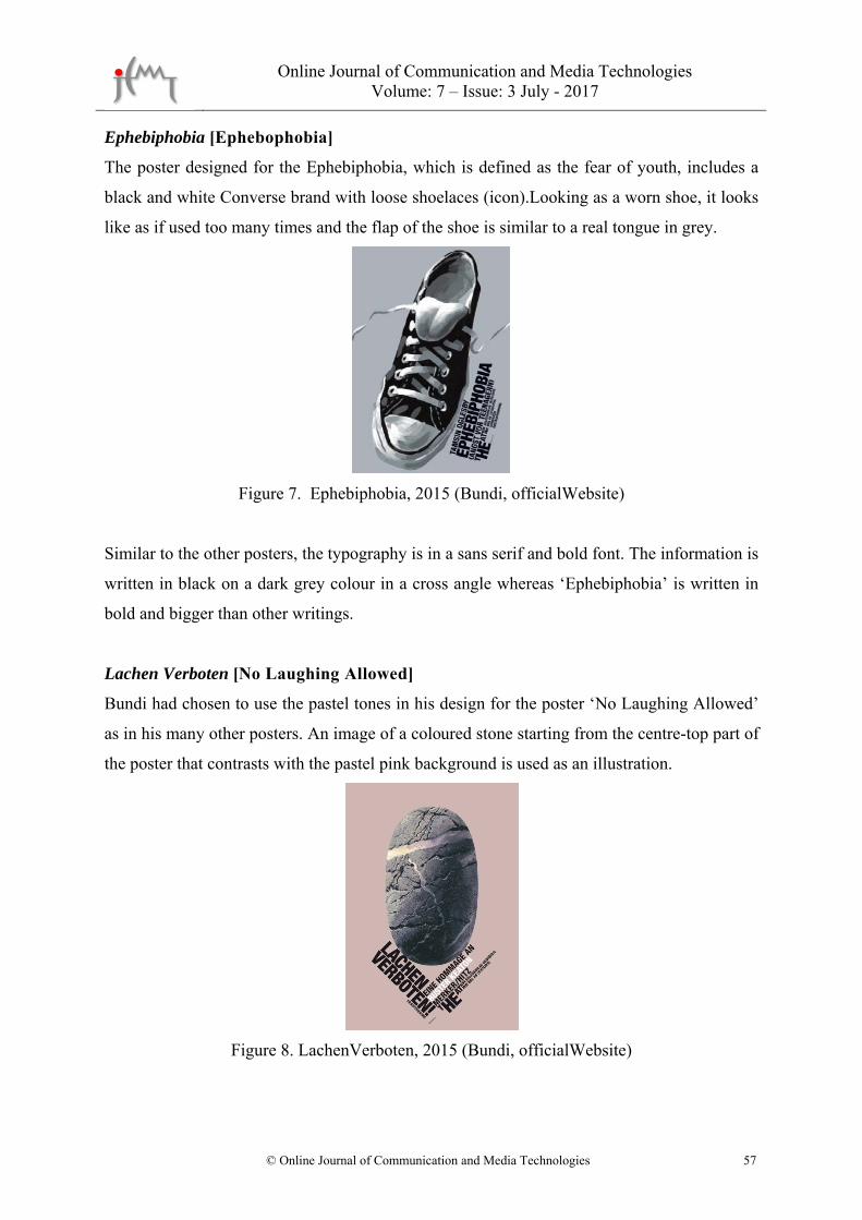
Ephebiphobia [Ephebophobia]
The poster designed for the Ephebiphobia, which is defined as the fear of youth, includes a
black and white Converse brand with loose shoelaces (icon).Looking as a worn shoe, it looks
like as if used too many times and the flap of the shoe is similar to a real tongue in grey.
Figure 7. Ephebiphobia, 2015 (Bundi, officialWebsite)
Similar to the other posters, the typography is in a sans serif and bold font. The information is
written in black on a dark grey colour in a cross angle whereas ‘Ephebiphobia’ is written in
bold and bigger than other writings.
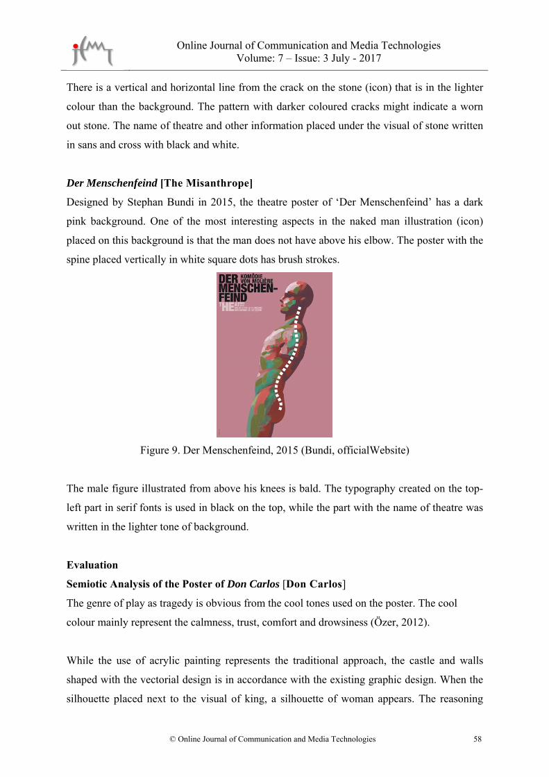
Lachen Verboten [No Laughing Allowed]
Bundi had chosen to use the pastel tones in his design for the poster ‘No Laughing Allowed’
as in his many other posters. An image of a coloured stone starting from the centre-top part of
the poster that contrasts with the pastel pink background is used as an illustration.
Figure 8. LachenVerboten, 2015 (Bundi, officialWebsite)
Online Journal of Communication and Media Technologies Volume: 7 – Issue: 3 July - 2017
© Online Journal of Communication and Media Technologies 58
There is a vertical and horizontal line from the crack on the stone (icon) that is in the lighter
colour than the background. The pattern with darker coloured cracks might indicate a worn
out stone. The name of theatre and other information placed under the visual of stone written
in sans and cross with black and white.
Der Menschenfeind [The Misanthrope]
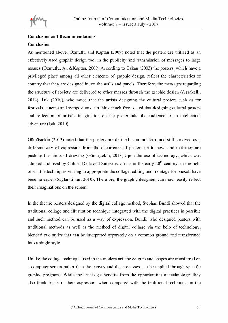
Designed by Stephan Bundi in 2015, the theatre poster of ‘Der Menschenfeind’ has a dark
pink background. One of the most interesting aspects in the naked man illustration (icon)
placed on this background is that the man does not have above his elbow. The poster with the
spine placed vertically in white square dots has brush strokes.
Figure 9. Der Menschenfeind, 2015 (Bundi, officialWebsite)
The male figure illustrated from above his knees is bald. The typography created on the top-
left part in serif fonts is used in black on the top, while the part with the name of theatre was
written in the lighter tone of background.
Evaluation
Semiotic Analysis of the Poster of Don Carlos [Don Carlos]
The genre of play as tragedy is obvious from the cool tones used on the poster. The cool
colour mainly represent the calmness, trust, comfort and drowsiness (Özer, 2012).
While the use of acrylic painting represents the traditional approach, the castle and walls
shaped with the vectorial design is in accordance with the existing graphic design. When the
silhouette placed next to the visual of king, a silhouette of woman appears. The reasoning

Online Journal of Communication and Media Technologies Volume: 7 – Issue: 3 July - 2017
© Online Journal of Communication and Media Technologies 59
behind the integrated female and male silhouettes might be that the former fiancée of Don
Carlos had become the stepmother of him and he did not ever forget her. The image of Don
Carlos nested into the castle symbolises that he is a prisoner in the castle.
Fraulein Julie [Miss Julie]
There is a transition from red to black starting from the sexual organ of woman to her feet.
Considering the colour of red on the genital recalls the sexual desire, this can be interpreted
as ‘Miss Julie’ uses her femininity effectively. As the figure wears stilettos, the shoe on her
right foot was placed on her fingertips inviting for the intercourse. The straight position of
left leg and right foot leaning ahead might be considered as the woman was about to seduce
the man. Looking at this image, the female figure sitting up straight is ready for the
intercourse and the stimulant of her sexual organ is active. Therefore, it is possible to
illustrate a woman who is confident and dominant on her man with her femininity.
Der Man in Der Made-Wanneoderwie Man ein Held wird[The Man in the Bathtub – or
How to Become A Hero]
The skin deformations occur when the human body stays in water for a long time. This
poster, which describes a man in a bathtub, illustrates a man with pruney feet. Considering
that half of the poster in green represents inside the water, the white part represents the air.
Der Got Des Gemetzels [God of Carnage]
In the poster for the play called the God of Carnage, the colour of red under the vertical cuts
on the white background represents the blood and murders. The upper part, which was
carefully torn apart with a knife or another sharp object, hides the red i.e. the murders/deaths.
Not from the position of cuts but moving to another direction, wind or another external factor
might scatter these pieces. When looked carefully, the white background has two layers. In
consideration with the name of play, there might be a murderer with more than murders
committed professionally. Drawing an analogy to ‘God’ represents inaccessibility, obscurity,
supremacy, punisher and immunity, which might lead us the character of murderer.
Der Theater-Macher [The Theatre Maker]
The object, dominant on the poster and resembling a light bulb, represent the concepts such
as creativity, idea and enlightenment. The light bulbs give out light and enlighten the

Online Journal of Communication and Media Technologies Volume: 7 – Issue: 3 July - 2017
© Online Journal of Communication and Media Technologies 60
surrounding pursuant to the mechanism on the glass part. However, instead of a glass part on
this light bulb, there are little black dots all around, which may indicate that the issues as
creativity and idea fell apart or disappeared. With a different perspective, this source of light
was broken with a hard object and spattered the black colour (negativity, sadness etc.)
around.
Rot [Red]
In the theatre poster named ‘Red’ which is about the famous painter Mark Rothko, The
colour of red was not used directly.Bundi, who managed to lead people to look for the colour
of red, used an empty paint tube and referred that the missing colour of red might be from
that paint tube. Bundi might complement Rothko, who described his concern with “one day
black would eat the red”, with his image.
Ephebiphobia[Ephebophobia]
The visual on the poster that represents youth/being young with an old casual shoe gives one
of the most important hints about the context of play named ‘the fear of youth’. A
rebel/protest was expressed through a single shoe with loose shoelaces and without the other
one in the pair.The resemblance of the shoe flap with a real tongue signals that the play has a
fun topic. Sticking out a tongue is generally considered as a sarcastic behaviour as ‘an
empathy’ might be created with the shoe metaphor. The saying “put oneself in else’s shoes”
explains such circumstance.
Lachen Verboten [No Laughing Allowed]
The stone defines an object without any soul and movement. Bundi, who associated the
function of stone with the name of play ‘No Laughing Allowed’ gives the feeling of long
history and wear out in the stone.
Der Menschenfeind [The Misanthrope]
The male figure on the poster almost like a mannequin is bald with an athletic body but the
arms are cut up to the wrists. Therefore, the visual could not use his hands and somewhat
represented the despair. The geometrical structure of spine on the visual also attracted
attention.
Online Journal of Communication and Media Technologies Volume: 7 – Issue: 3 July - 2017
© Online Journal of Communication and Media Technologies 61
Conclusion and Recommendations
Conclusion
As mentioned above, Özmutlu and Kaptan (2009) noted that the posters are utilized as an
effectively used graphic design tool in the publicity and transmission of messages to large
masses (Özmutlu, A., &Kaptan, 2009).According to Özkan (2003) the posters, which have a
privileged place among all other elements of graphic design, reflect the characteristics of
country that they are designed in, on the walls and panels. Therefore, the messages regarding
the structure of society are delivered to other masses through the graphic design (Ağsakalli,
2014). Işık (2010), who noted that the artists designing the cultural posters such as for
festivals, cinema and symposiums can think much free, stated that designing cultural posters
and reflection of artist’s imagination on the poster take the audience to an intellectual
adventure (Işık, 2010).
Gümüştekin (2013) noted that the posters are defined as an art form and still survived as a
different way of expression from the occurrence of posters up to now, and that they are
pushing the limits of drawing (Gümüştekin, 2013).Upon the use of technology, which was
adopted and used by Cubist, Dada and Surrealist artists in the early 20th century, in the field
of art, the techniques serving to appropriate the collage, editing and montage for oneself have
become easier (Sağlamtimur, 2010). Therefore, the graphic designers can much easily reflect
their imaginations on the screen.
In the theatre posters designed by the digital collage method, Stephan Bundi showed that the
traditional collage and illustration technique integrated with the digital practices is possible
and such method can be used as a way of expression. Bundi, who designed posters with
traditional methods as well as the method of digital collage via the help of technology,
blended two styles that can be interpreted separately on a common ground and transformed
into a single style.
Unlike the collage technique used in the modern art, the colours and shapes are transferred on
a computer screen rather than the canvas and the processes can be applied through specific
graphic programs. While the artists get benefits from the opportunities of technology, they
also think freely in their expression when compared with the traditional techniques.in the
Online Journal of Communication and Media Technologies Volume: 7 – Issue: 3 July - 2017
© Online Journal of Communication and Media Technologies 62
digital era, the collage technique evolves to the digital and minimize the limits of
imagination.
Bundi preferred to use the font Sans-serif in the typography for his theatre poster works and
in all the analysed posters, the name of plays were written much bold and in bigger font.
Hence, Bundi analysed the typography of names and other information related with the play
in a certain hierarchical order.
In the analysed theatre posters, Bundi visualized the peak moments from the play and
followed the context of theatre scripts; such peak moments were analysed with the semiotic
analysis. The colours in the posters were chosen in consideration with the tension in the play,
and the whole story was assessed far from complication through indicators and colours.
Stephan Bundi, who is considered as one of the people using the traditional methods in the
graphic design, has utilized the means of technology and determined his style with two
different methods. Among the posters of Bundi, which were analysed under this study, he
used icon more specifically from the Peirce’s Theory of Signs.
Recommendations
Other cultural and artistic posters can be analysed in addition to this study, which assessed
the theatre posters of Stephan Bundi using digital and traditional illustration methods in the
graphic design. Another study to be conducted on the poster works of Bundi in relation with
his general style and analysing the reasons and ways in using signs and elements would
provide significant findings in understanding Bundi.
In a new study that might assess the cultural posters other than the ones between the years of
2012-2015, the subjects as the relation of typography in posters with the illustrations and
colours; and the analysis of fonts used in posters in a typographical approach and the relation
of fonts with content can be covered.
Additionally, the methodology and semiotic style in the poster designs of Bundi for opera and
musicals might also be analysed together with the signs respectively.

Online Journal of Communication and Media Technologies Volume: 7 – Issue: 3 July - 2017
© Online Journal of Communication and Media Technologies 63
References
Ağsakalli, M. S. (2014). Sürrealizm Akiminin Afiş Tasarimina Etkisi Ve Uygulama
Örnekleri (DoctoralDissertation). Atatürk Üniversitesi, Erzurum/ Turkey
Ambrose, G., Harris, P., &Bathana, B. (2010). Görsel grafik tasarım sözlüğü. Literatür
Yayınları.
Ambrosse, G.,& Harris, P. (2013). Grafik Tasarımda Renk. (1. Basım) Bengisu Bayrak
(Çeviren). İstanbul: Literatür Yayınları, 106,108-128
Berger, J. (2008). Görme Biçimleri, Çev. Yurdanur Salman, Metis Yayınları, Đstanbul.
Bostancı, M., (2012). John heartfield ve nesne yorumu. İstanbul: Işık Üniversitesi Sosyal
Bilimler Enstitüsü.
Ertep, H. (2007). Gündelik Yaşamımızın Ucundan Tutunan Bir Tasarım Nesnesi:
Afiş. Grafik Tasarım: Görsel İletişim Kültürü Dergisi, 13, 80.
Gokasan, G. & Dağ, H. (2014). Stephan Bundi ile söyleşi. Grafik Tasarım Dergisi, S.61,
Istanbul: Arşiv Yayıncılık
GrolierIncorporated. (1993). The Encyclopedia Americana. Danbury, Conn: GrolierInc.
Gümüştekin, N. (2013). Rengin Bir Grafik Tasarım Ürünü Olarak Afişe Katkısı: Tarihsel Bir
İnceleme.
I�ncearık, M. E. (2011). Grafik tasarım rehberi. I�stanbul: KODLAB.
Işik, D. (2010). Görsel İletişim Aracı Olarak Afiş Tasarımı: 2009 Yılı Yerel Seçimlerinde
İzmir Buuyuskşehir Belediye Başkan Adaylarının Afiş Tasarımlarının
GöstergebilimselÇözu�mlemesi. Yu�ksek Lisans Tezi. İzmir: Ege Üniversitesi
Sosyal Bilimler Enstitu�su�
Lucie-Smith, E., Kılıç, E., Kovulmaz, B., &Akınhay, O. (2004). 20. yüzyılda görsel sanatlar.
Akbank Kültür Sanat Merkezi.
Özer, D. (2012). Toplumsal düzenin oluşmasında renk ve iletişim. Sosyal Bilimler
Araştırmaları Dergisi, 6, 265-281.
Özkirişçi, İ. H. (2016). Tiyatro Afişlerinin Grafik Tasarimda Görsel AlgiAçisindan
İncelenmesi Ve Hareketli Afiş Uygulamalari. Hacettepe Üniversitesi Güzel Sanatlar
Enstitüsü Grafik Anasanat Dalı, Ankara.
Özmutlu, A.,& Kaptan, A. Y. (2009) Grafik Tasarim Atölye Derslerinde Afiş Konusunun
Uygulama Ve Çözümleme Süreçlerinde Göstergebilimsel Çözümleme Yönteminin
Kullanimi. (Unpublished Master thesis) Ondokuz Mayıs Üniversitesi, Samsun/
Turkey.
Online Journal of Communication and Media Technologies Volume: 7 – Issue: 3 July - 2017
© Online Journal of Communication and Media Technologies 64
Parsa, A. F. (2007). İmgenin gücü ve görsel kültürün yükselişi. Fotografya Dergisi, 19, 1-10.
Sağlamtimur, Z. Ö. (2010). Dijital Sanat. Eskişehir: Anadolu Üniversitesi Sosyal Bilimler
Dergisi.
Yalur, R. (2014). 1990-2013 yılları arasında afiş ve sosyal afişlerin grafik tasarım ve
teknolojik açıdan incelenmesi (Doctoraldissertation, İstanbul Arel Üniversitesi).