Embed Size (px)
Citation preview
ANALYSIS OF MUSIC MAGAZINES
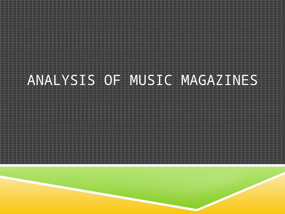
Analysis Magazine Front Covers
Masthead
Cover Lines
Left Third
Main Image
Main Cover Line
Barcode and Date Line
Establishing what the title of the magazine the consumer is reading.
The left hand side, consumers will first see in shop.
Legal rights
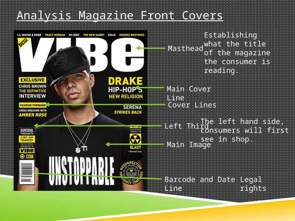
MAIN IMAGE: the main imagine is of a music icon, and although the main image is of a male I feel that the magazine is uni-sex but still leaning towards males, with the way he’s dressed and presented. Drake is very much the star of this magazine and is the main focus with the cover lines including drake and other artists.
THE COVER LINES: in bright yellow and white in comparison to the dark black ground, it includes other artists and “exclusive interviews” for the fanatic fans .
THE LEFT THIRD: the left third is crucial to the publishers, it’s the first area of the magazine visible in the shop and “Exclusive interviews” and the “Masthead” but be partly visible.
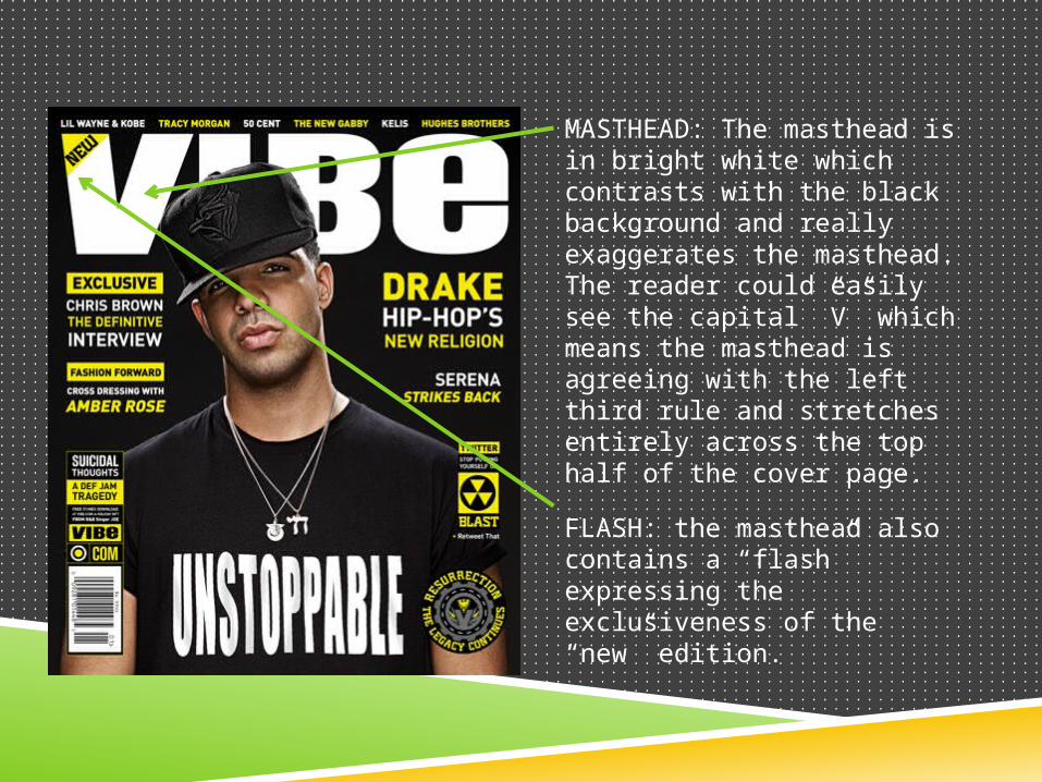
MASTHEAD: The masthead is in bright white which contrasts with the black background and really exaggerates the masthead. The reader could easily see the capital ”V” which means the masthead is agreeing with the left third rule and stretches entirely across the top half of the cover page.
FLASH: the masthead also contains a “flash” expressing the exclusiveness of the “new” edition.
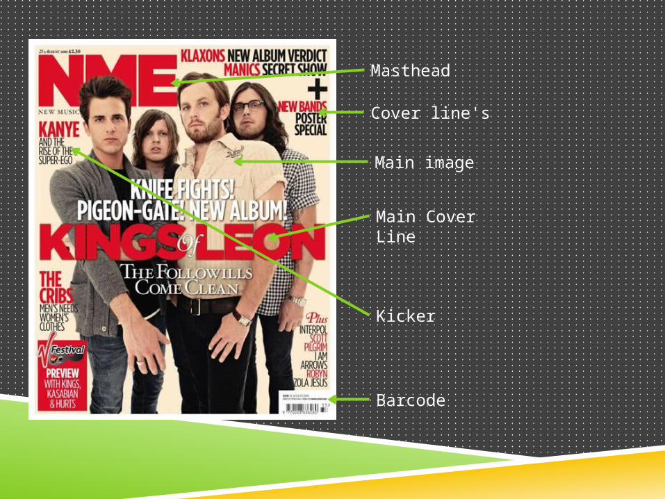
Masthead
Main Cover Line
Cover line's
Barcode
Kicker
Main image
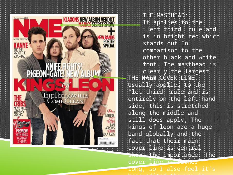
THE MASTHEAD:It applies to the “left third” rule and is in bright red which stands out In comparison to the other black and white font. The masthead is clearly the largest font.
THE MAIN COVER LINE:Usually applies to the “let third” rule and is entirely on the left hand side, this is stretched along the middle and still does apply, The kings of leon are a huge band globally and the fact that their main cover line is central shows the importance. The cover line is rather long, so I also feel it’s been edited the way it has for style as well as importance.
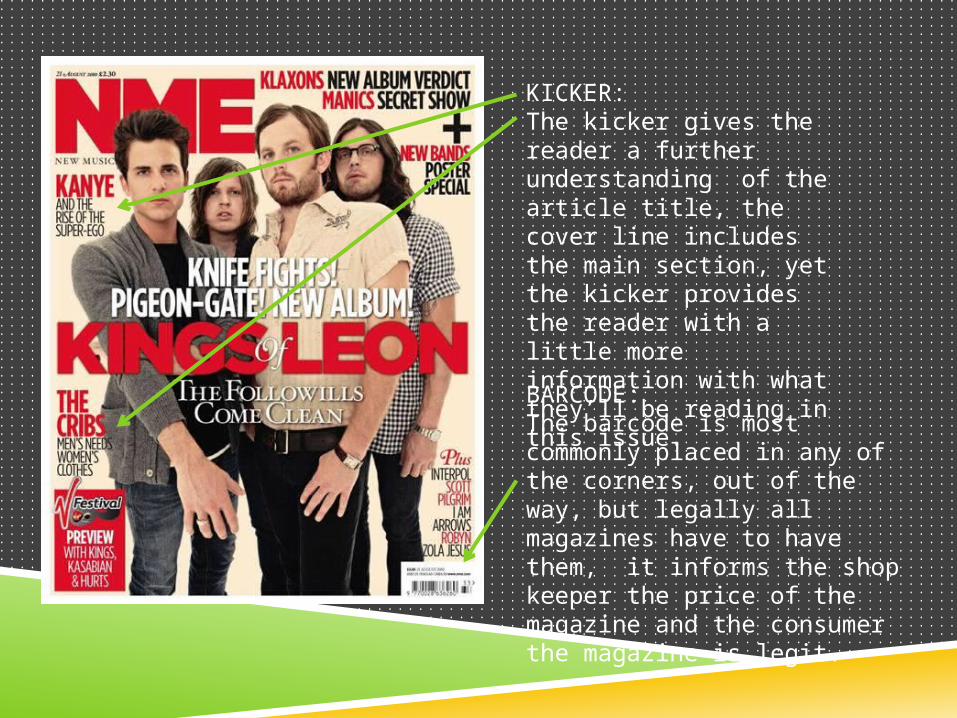
KICKER:The kicker gives the reader a further understanding of the article title, the cover line includes the main section, yet the kicker provides the reader with a little more information with what they’ll be reading in this issue. BARCODE:The barcode is most commonly placed in any of the corners, out of the way, but legally all magazines have to have them, it informs the shop keeper the price of the magazine and the consumer the magazine is legit.
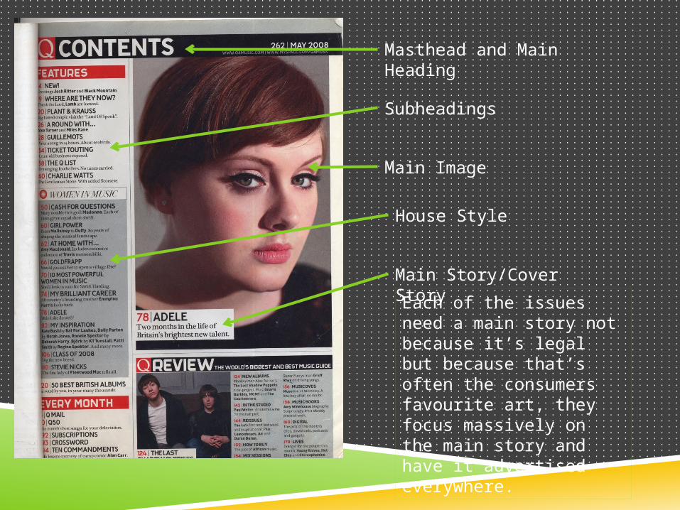
Masthead and Main Heading
Subheadings
Main Image
House Style
Main Story/Cover Story
Each of the issues need a main story not because it’s legal but because that’s often the consumers favourite art, they focus massively on the main story and have it advertised everywhere.
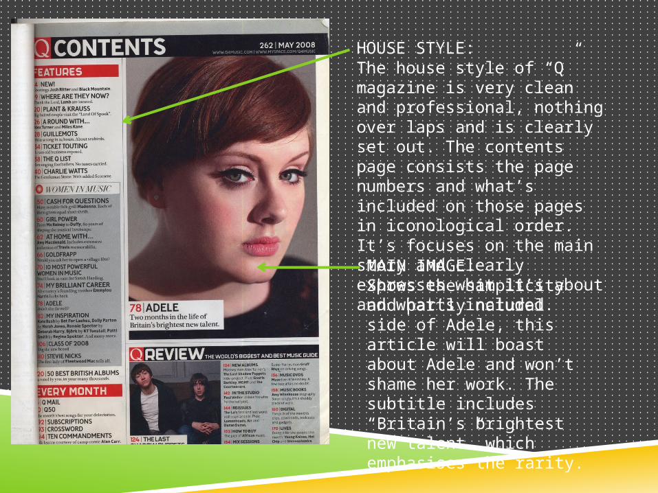
HOUSE STYLE:The house style of “Q” magazine is very clean and professional, nothing over laps and is clearly set out. The contents page consists the page numbers and what’s included on those pages in iconological order. It’s focuses on the main story and clearly expresses what it’s about and what’s included. MAIN IMAGE:Shows the simplicity and partly natural side of Adele, this article will boast about Adele and won’t shame her work. The subtitle includes “Britain’s brightest new talent” which emphasises the rarity.
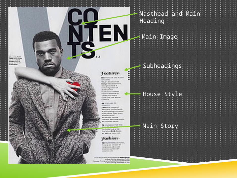
Masthead and Main Heading
Subheadings
Main Image
House Style
Main Story
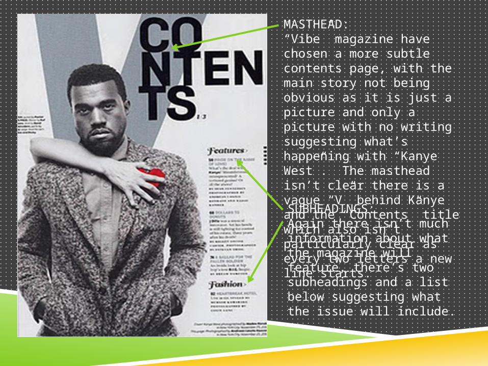
MASTHEAD:“Vibe” magazine have chosen a more subtle contents page, with the main story not being obvious as it is just a picture and only a picture with no writing suggesting what’s happening with “Kanye West”. The masthead isn’t clear there is a vague “V” behind Kanye and the “Contents” title which also isn’t particularly clear as every two letters a new line starts. SUBHEADINGS:Again there isn’t much information about what the magazine will feature, there’s two subheadings and a list below suggesting what the issue will include.
Font Type
Main Image
Headline
Quotation
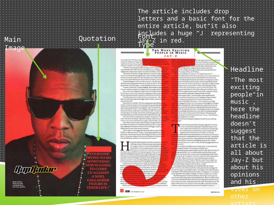
The article includes drop letters and a basic font for the entire article, but it also includes a huge “J” representing Jay-Z in red.
“The most exciting people in music”, here the headline doesn’t suggest that the article is all about Jay-Z but about his opinions and his views on other artists.
MAIN IMAGE: Jay-Z is presented as a man with attitude, he’s wearing black glasses, black t-shirt and his chain. The red light coming from the left and the white from the right seems to create the atmosphere that Jay-Z has a good and a bad side. The image is very stripped back and plane, with a acknowledgeable quotation on the low right hand side.
HEADLINE: The headline suggests the article isn’t about Jay-Z and his music but more about his views on other artists and their music, Jay-Z isn’t just considered a musician but also owns his own record label “Roc-A-Fella” which only emphasises his knowledge for the music industry. So an interview about his views an opinions makes sense but also may miss lead the consumer depending on the how the “cover page” was resented.
Main Image
House StyleStand first
Font Type
Headline
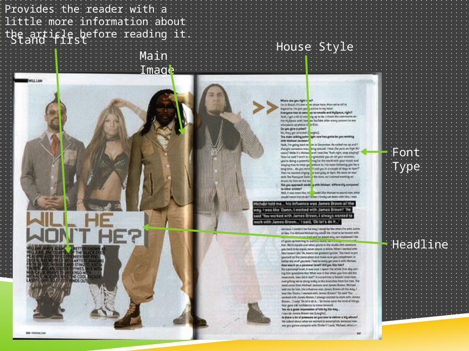
Provides the reader with a little more information about the article before reading it.
HEADLINE: This article is clearly talking about the “Black eyed peas” as a group, but as everyone knows “will.i.am” is the founder and true leader of the group, this article singles him out and makes him the focus by directing the title, which s a question at him. The title is a rhetorical question t engage the reader and to ensure they answer that question in the article.
THE MAIN IMAGE: The image used is obviously a group photo for the group, the “black eyed peas” but has fainted the other group members and highlighted the group “leader” will.i.am to focus the article on him. All of the group members are still dressed up and edited but the fact that they’ve been fainted down isn’t
totally ignoring them.
STAND FIRST: Not all double page spreads include “stand firsts” but the additional paragraph to provide the reader with more information before the main article can be very affective and can intrigue the reader more, additionally people who aren’t particularly interested in this specific band can read a short paragraph in case of sudden interest.