Embed Size (px)
Citation preview

ANALYSIS OF MUSIC MAGAZINE
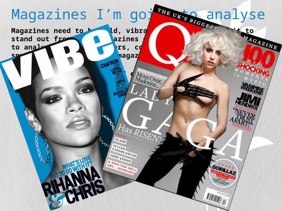
Magazines I’m going to analyseMagazines need to be bold, vibrant and enticing for it to stand out from other magazines of that genre, so I'm going to analyse the front covers, contents page and double page spread page of two music magazines these magazines are Q and Vibe.
Both magazines are bold and exciting in their own way, both magazines apple to the same genre, which is pop so they look at artists such as Lady Gaga, Will.I.am Rihanna etc.

The front covers. The magazine Q has a very Bold front page, they stick to their main colour scheme, which is Gray, Balck and Red 99.9% of the time. The red is used to make certain features and the mast head stand out more. For instance the masthead is the first thing that grabs your attention, this draws you in making you notice the other features on the magazine, such as the main story which in this case would be GAGA, the main feature on the front page is bold and extremely sexy, this acts as a hook to really grab your attention, sexy front covers is something that Q do extremely well with nearly all of their front covers having half naked artists on the front cover. The other feature that I really like about this front cover is how its so simple yet its so sexy and makes you want to pick it up and read it.

Second front cover Vibe is another music magazine aimed at pop artists such as Rihanna and lily Allan. Vibe unlike Q doesn't’t always stick to the same colour scheme, however they do stick with the same font. On this particular front cover they’ve kept it extremely simple that’s what I love about this front cover its simplicity, and elegance. And also how the main photo Is in black and white, I think that this just enhances the elegance of this particular magazine. The main story has been enhance by the simplistic and the boldness of the writing. And it also helps that this was a massive story when it came out.

Contents Page of magazine Q
The colour scheme runs though the whole magazine, and also the red is still used to highlight particular points of the magazine.
The special articles and competitions have a completely different color scheme to the rest of the magazine in this issue its gold.
The main feature of that issue has a bigger picture and bigger writing to get its noticed.
They also have reviews on different things such as new music and the latest fashion again this is separate from the rest of the contents page.

Contents page of vibe
The contents page of vibe is much like the front cover it is extremely simple and yet it is so sexy and inviting to read. I love the way the the ‘contents’ is all jumbled up it adds a quirkiness to the contents page.
Unlike Q the contents page is simple with very few features, the main picture again takes over the whole page making it stand out, with a caption by the right hand side. This contents
page is the sex of sexy contents pages. Everything about it is sexy the font, the pictures the color scheme everything!

Double page spread of Q
The double page spread of Q is very unlike the front cover or the contents page it is very simple and less busy. They’ve stuck to their colour scheme, Grays and reds, this also is used in the main picture.
The thing I love most about Q double page spreads is how they use the first letter of the artists name and put it in like that it’s the one consistent thing that they carry out in all their contents pages, I think that this makes them stand out from the rest of magazines.
They talk about many things in their interviews form their latest album to their love life. Because they mix it up I think it keeps it fresh and exciting.
They’ve also headed the article with the name of the artist, just to make sure you know who it is.

Double page spread of Vibe.
The first thing that draws your attention is the main picture its very sexy and bold. And also its very colour full.
Much like Q vibe covers a wide topic of issues in their interview form, new albums to love life’s, in this particular issue their talking about Florence taking America. Hence the American flag and the Title if the interview – USA.
The sub title of the issue is ‘Got the love’ which Is the name of her new album, which gives us the impression that will be what their talking about.
I like the way how the font has stayed the same right the way through the magazine.