Embed Size (px)
Citation preview
1
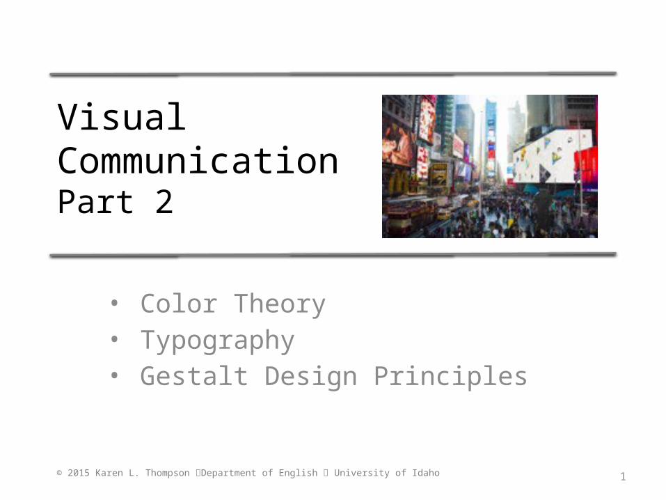
Visual CommunicationPart 2
• Color Theory• Typography• Gestalt Design Principles
© 2015 Karen L. Thompson Department of English University of Idaho
2
Color Theory
• How we perceive the meaning of color is a function of both our personal preferences and cultural background.
• One of the readings for this project is an introduction to basic color theory. Use it to help you choose colors for your billboard or poster.
• Keep the following design tip in mind, however, when deciding on colors.
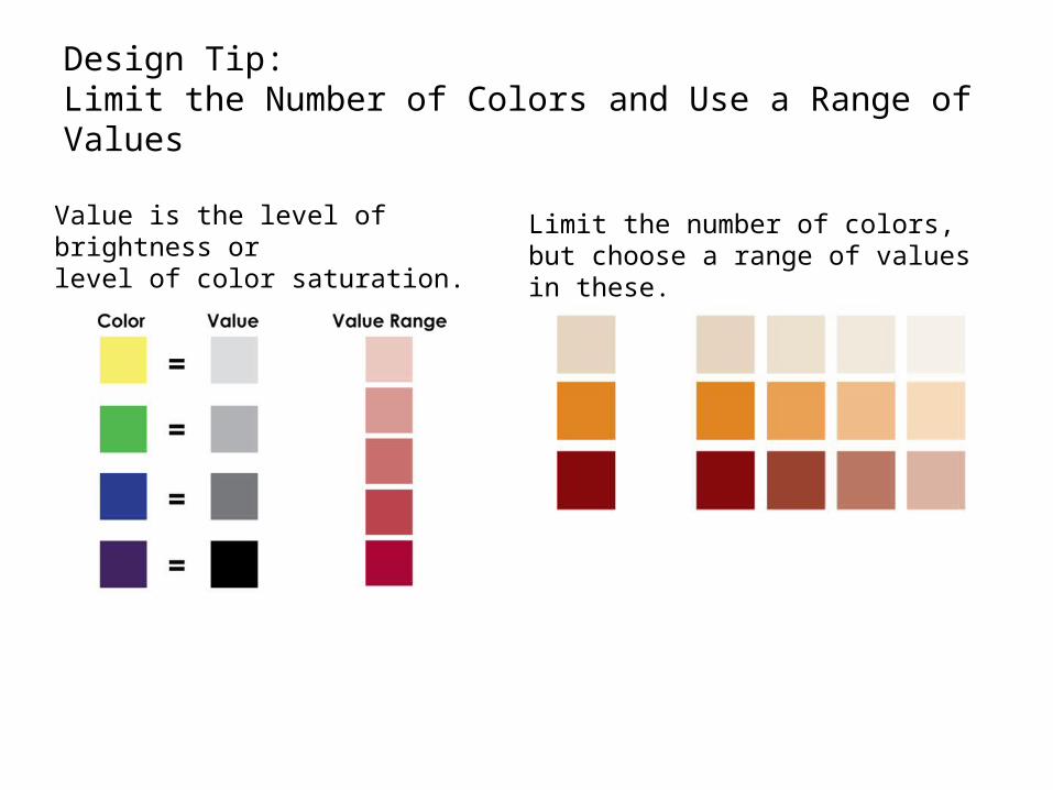
Design Tip: Limit the Number of Colors and Use a Range of Values
Value is the level of brightness or level of color saturation.
Limit the number of colors, but choose a range of values in these.
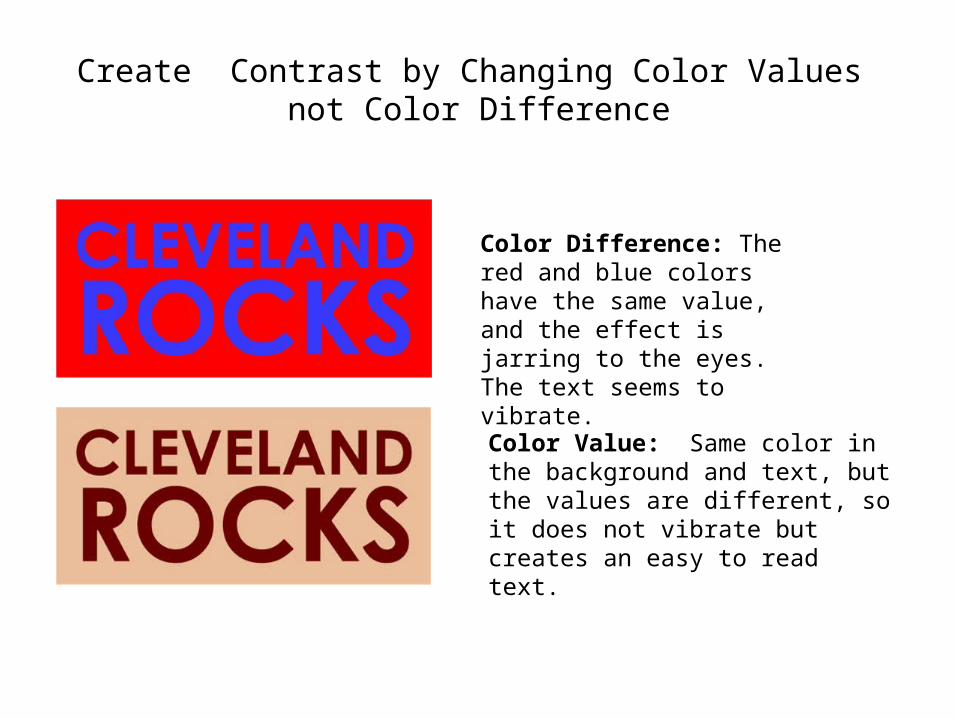
Create Contrast by Changing Color Values not Color Difference
Color Difference: The red and blue colors have the same value, and the effect is jarring to the eyes. The text seems to vibrate.
Color Value: Same color in the background and text, but the values are different, so it does not vibrate but creates an easy to read text.
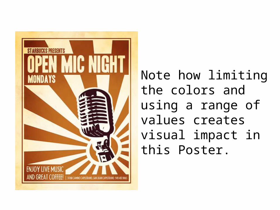
Note how limiting the colors and using a range of values creates visual impact in this Poster.
6
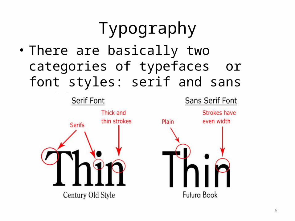
Typography• There are basically two categories of
typefaces or font styles: serif and sans serif.
7
Within These Two Categories
• There are thousands of typefaces to choose from.
• One of the readings for this project is an introduction to typography. Use it to help you choose the typeface(s) for your billboard or poster but avoid using more than two different font styles.
• Keep in mind that a typeface should be easy to read, but it can also convey visual information.
8
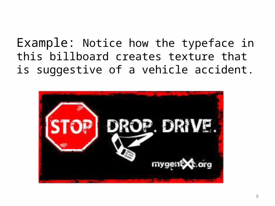
Example: Notice how the typeface in this billboard creates texture that is suggestive of a vehicle accident.
9
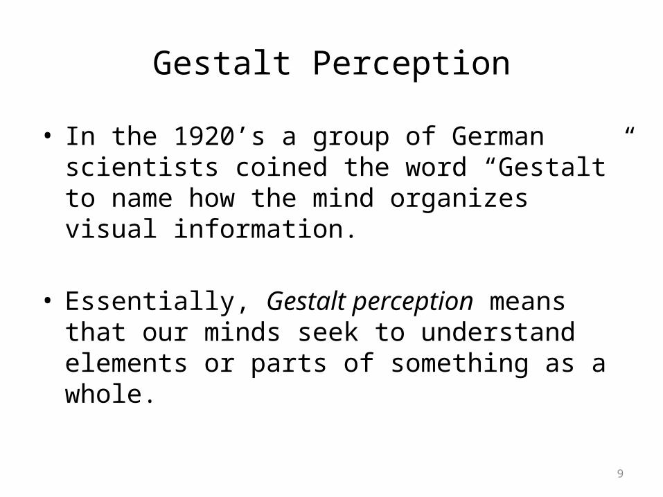
Gestalt Perception
• In the 1920’s a group of German scientists coined the word “Gestalt” to name how the mind organizes visual information.
• Essentially, Gestalt perception means that our minds seek to understand elements or parts of something as a whole.
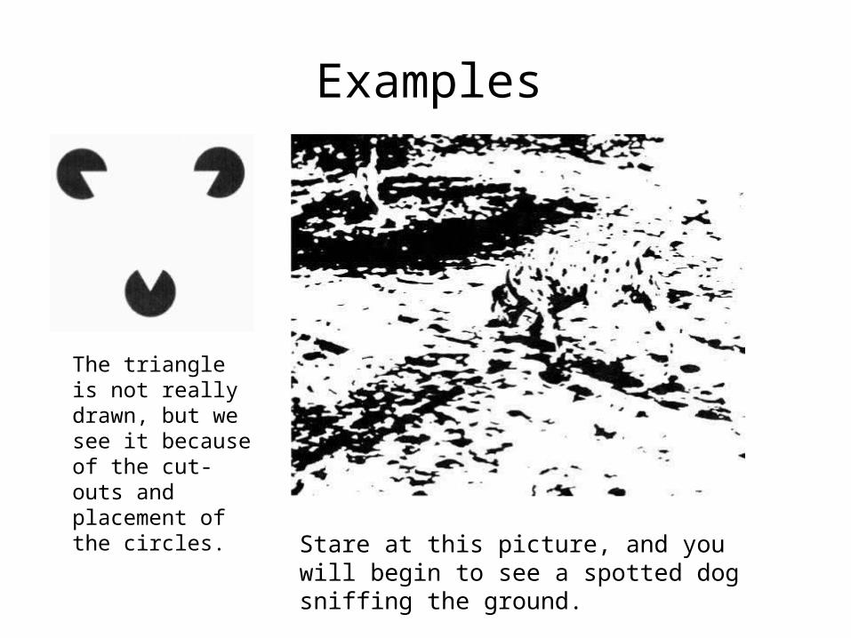
Examples
The triangle is not really drawn, but we see it because of the cut-outs and placement of the circles.
Stare at this picture, and you will begin to see a spotted dog sniffing the ground.

Gestalt Design Principles
• The following design principles are based on Gestalt perceptual theory:
• Similarity/Anomaly• Figure/Ground Relationship• Continuation• Closure• Proximity and Alignment
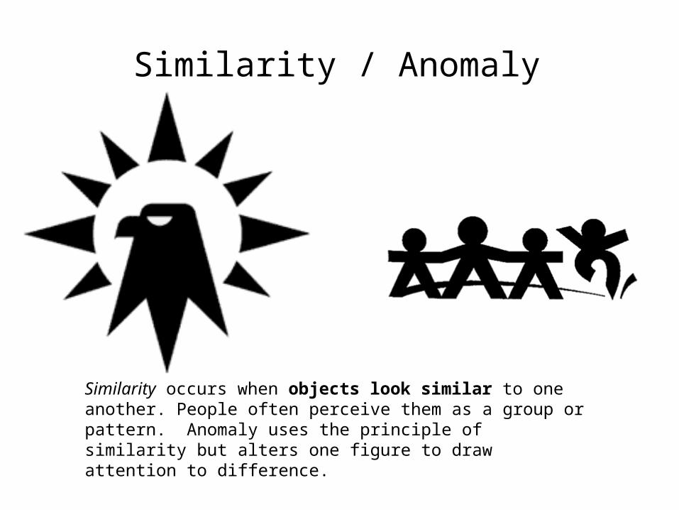
Similarity / Anomaly
Similarity occurs when objects look similar to one another. People often perceive them as a group or pattern. Anomaly uses the principle of similarity but alters one figure to draw attention to difference.
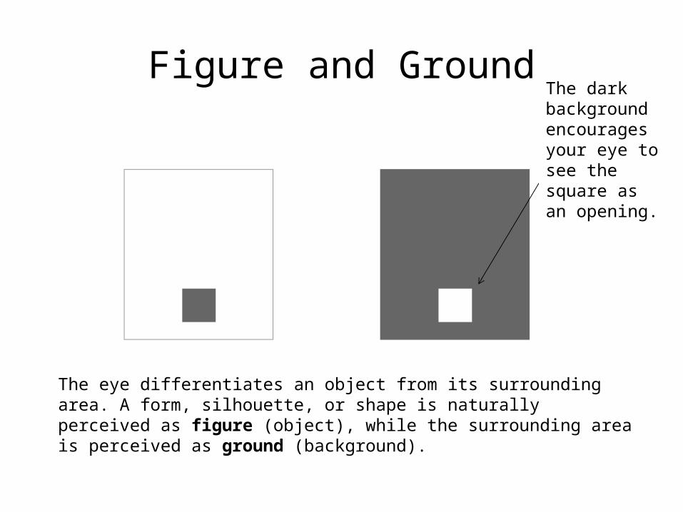
The eye differentiates an object from its surrounding area. A form, silhouette, or shape is naturally perceived as figure (object), while the surrounding area is perceived as ground (background).
The dark background encourages your eye to see the square as an opening.
Figure and Ground
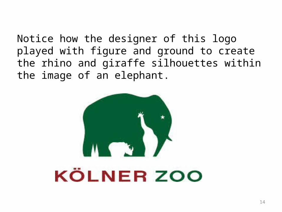
14
Notice how the designer of this logo played with figure and ground to create the rhino and giraffe silhouettes within the image of an elephant.
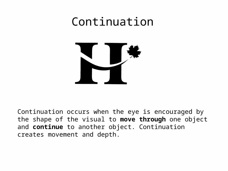
Continuation
Continuation occurs when the eye is encouraged by the shape of the visual to move through one object and continue to another object. Continuation creates movement and depth.
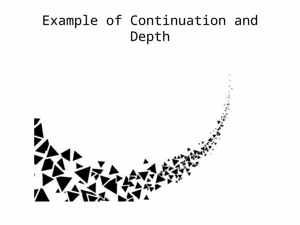
Example of Continuation and Depth
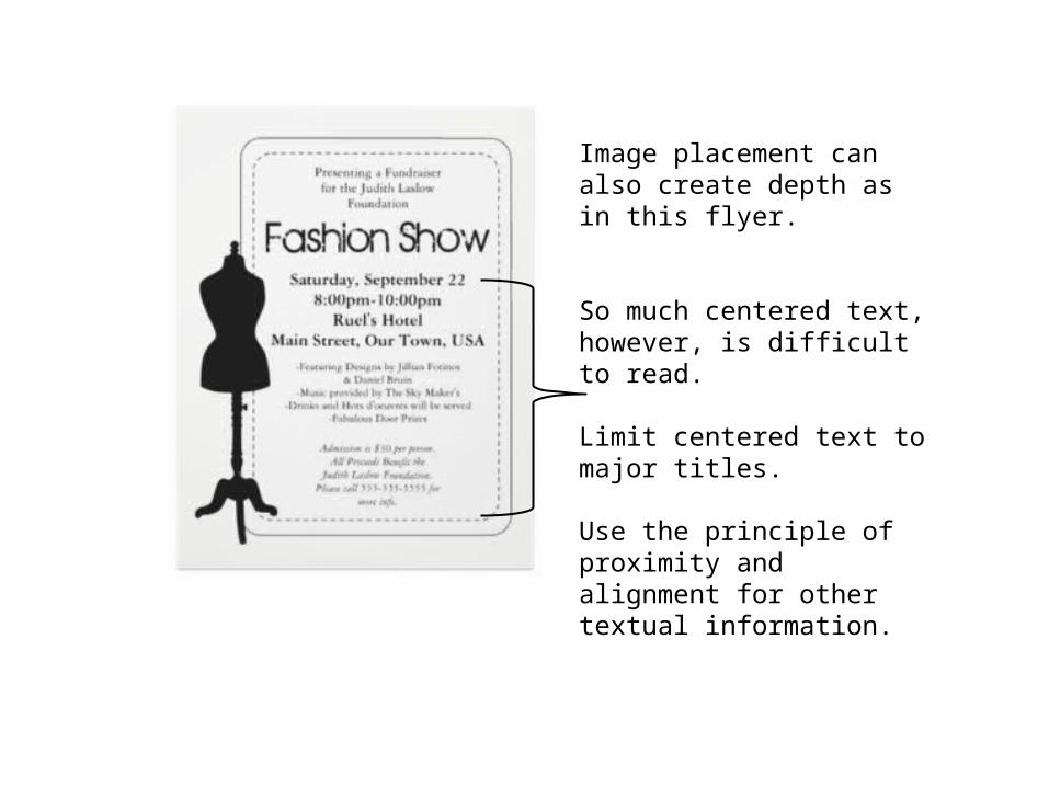
Image placement can also create depth as in this flyer.
So much centered text, however, is difficult to read.
Limit centered text to major titles.
Use the principle of proximity and alignment for other textual information.
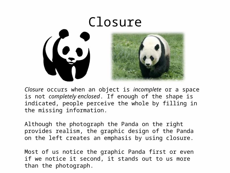
Closure occurs when an object is incomplete or a space is not completely enclosed. If enough of the shape is indicated, people perceive the whole by filling in the missing information.
Although the photograph the Panda on the right provides realism, the graphic design of the Panda on the left creates an emphasis by using closure.
Most of us notice the graphic Panda first or even if we notice it second, it stands out to us more than the photograph.
Closure
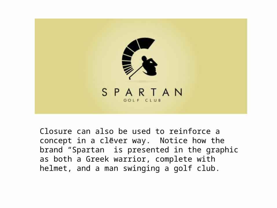
Closure can also be used to reinforce a concept in a clever way. Notice how the brand “Spartan” is presented in the graphic as both a Greek warrior, complete with helmet, and a man swinging a golf club.
Proximity and Alignment
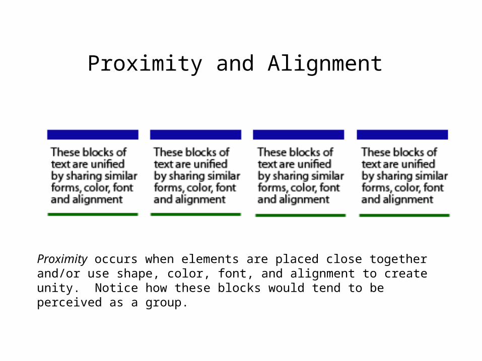
Proximity occurs when elements are placed close together and/or use shape, color, font, and alignment to create unity. Notice how these blocks would tend to be perceived as a group.
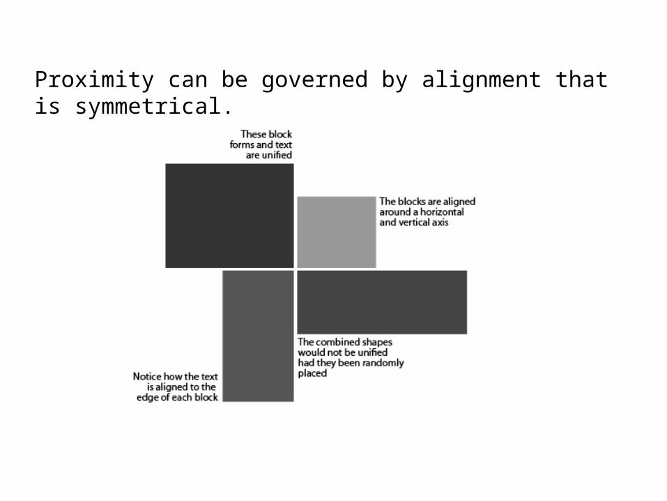
Proximity can be governed by alignment that is symmetrical.
Visual Hierarchy
• Visual hierarchy is the order in which we notice or prioritize objects and text.
• The size of objects, shape, and color, and placement provide cues that help us notice those things that are most important and others that are supplemental.
• Help direct viewers to the most important objects in your billboard or poster by giving them a focal point.
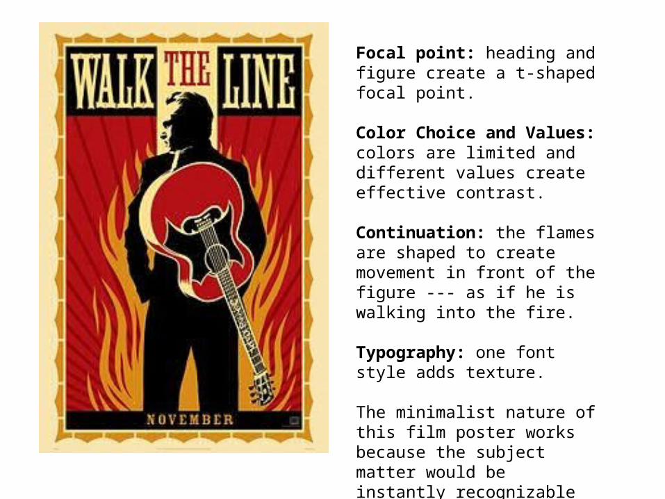
Focal point: heading and figure create a t-shaped focal point.
Color Choice and Values: colors are limited and different values create effective contrast.
Continuation: the flames are shaped to create movement in front of the figure --- as if he is walking into the fire.
Typography: one font style adds texture.
The minimalist nature of this film poster works because the subject matter would be instantly recognizable to most viewers.
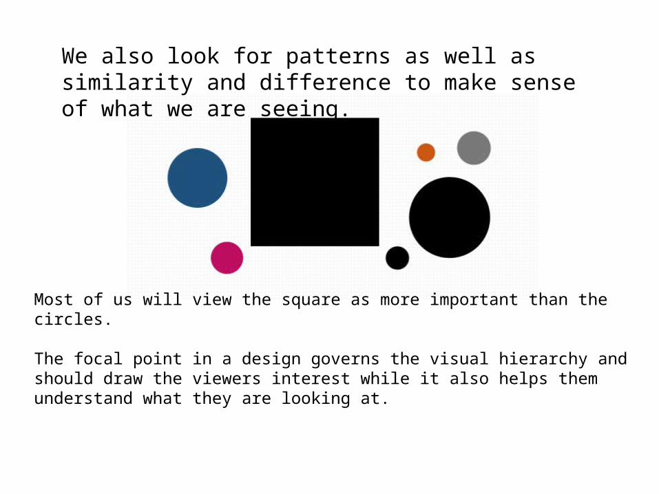
We also look for patterns as well as similarity and difference to make sense of what we are seeing.
Most of us will view the square as more important than the circles.
The focal point in a design governs the visual hierarchy and should draw the viewers interest while it also helps them understand what they are looking at.
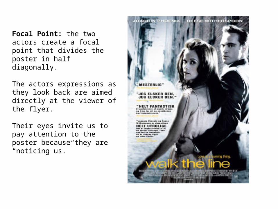
Focal Point: the two actors create a focal point that divides the poster in half diagonally.
The actors expressions as they look back are aimed directly at the viewer of the flyer.
Their eyes invite us to pay attention to the poster because they are “noticing us.”
Examples of Bad Design
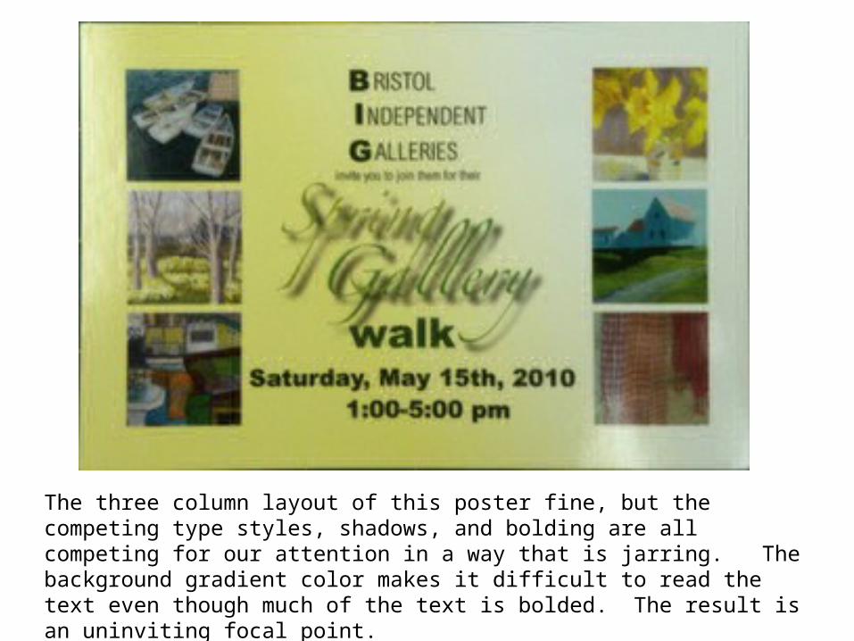
The three column layout of this poster fine, but the competing type styles, shadows, and bolding are all competing for our attention in a way that is jarring. The background gradient color makes it difficult to read the text even though much of the text is bolded. The result is an uninviting focal point.
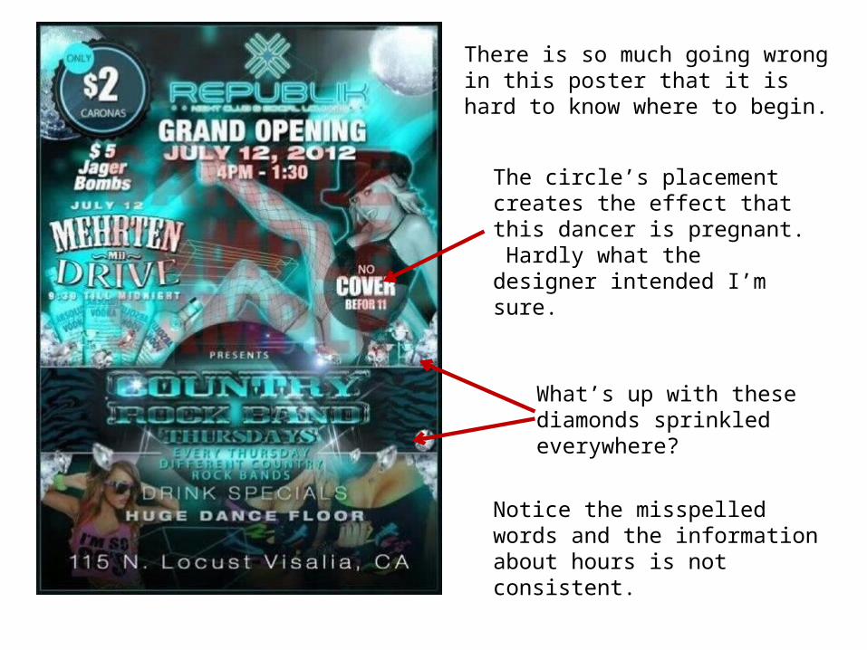
There is so much going wrong in this poster that it is hard to know where to begin.
The circle’s placement creates the effect that this dancer is pregnant. Hardly what the designer intended I’m sure.
What’s up with these diamonds sprinkled everywhere?
Notice the misspelled words and the information about hours is not consistent.
Examples of Good Design
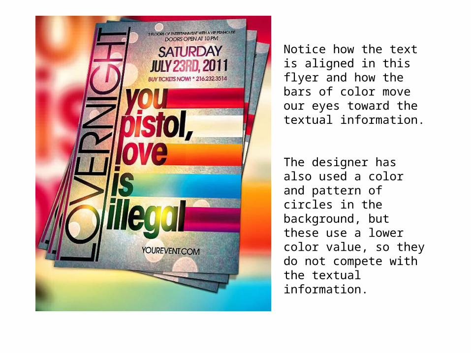
Notice how the text is aligned in this flyer and how the bars of color move our eyes toward the textual information.
The designer has also used a color and pattern of circles in the background, but these use a lower color value, so they do not compete with the textual information.
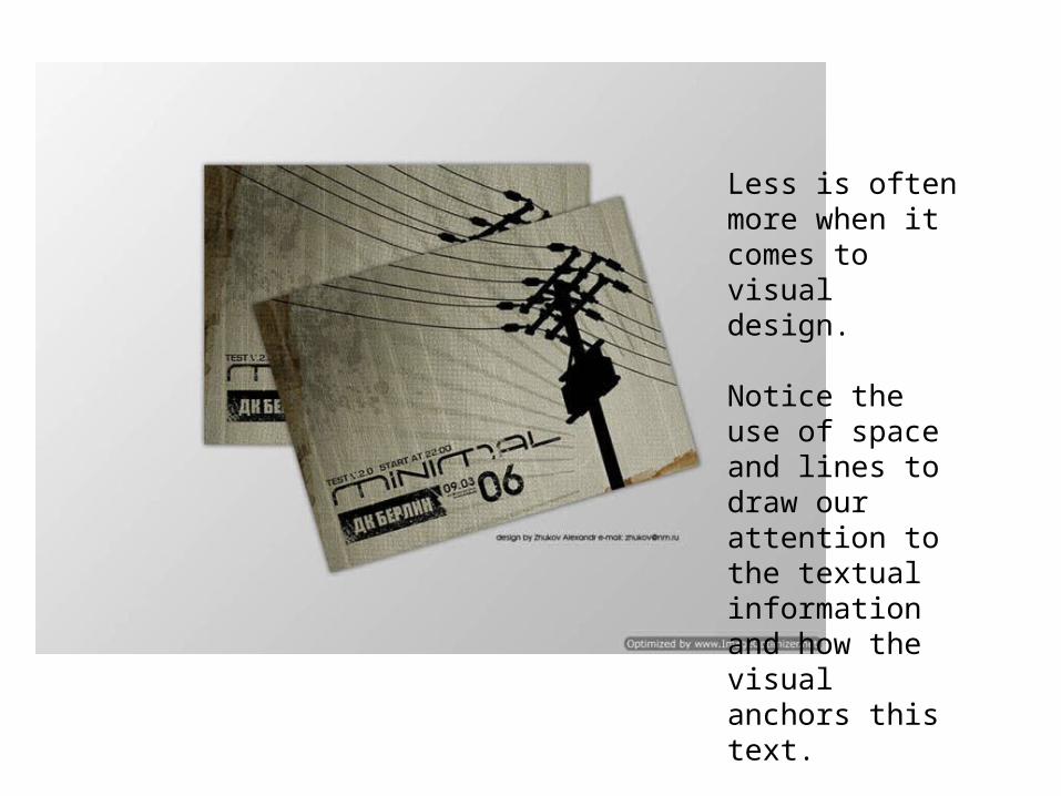
Less is often more when it comes to visual design.
Notice the use of space and lines to draw our attention to the textual information and how the visual anchors this text.
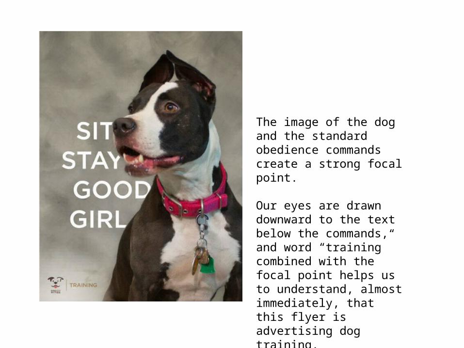
The image of the dog and the standard obedience commands create a strong focal point.
Our eyes are drawn downward to the text below the commands, and word “training” combined with the focal point helps us to understand, almost immediately, that this flyer is advertising dog training.
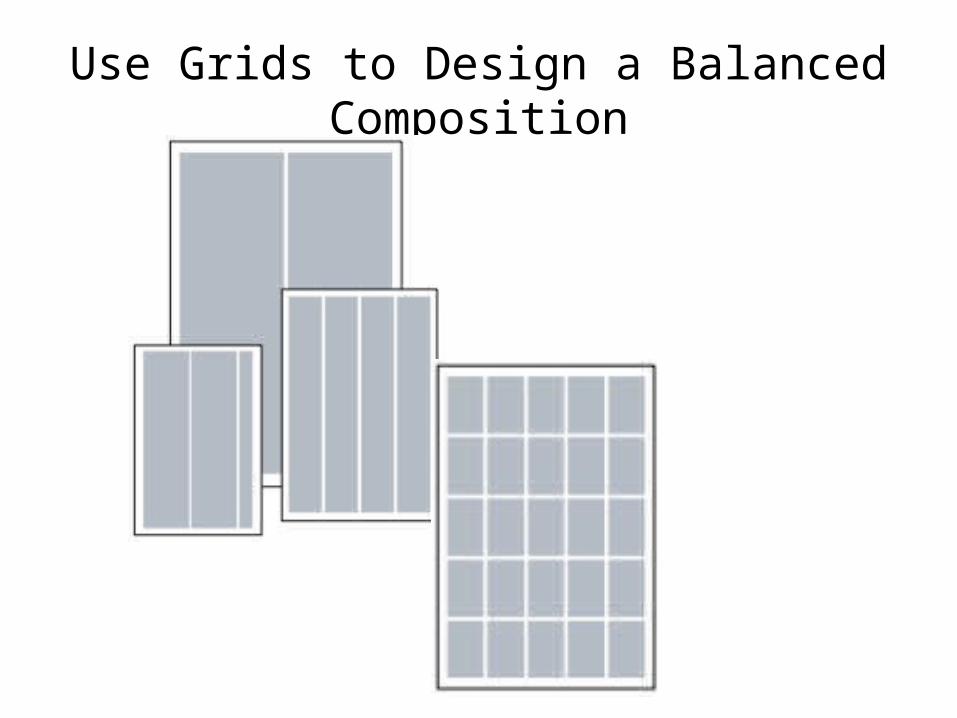
Use Grids to Design a Balanced Composition
Tips for Working with Grids
• Don’t confine page elements to individual grid units. Text and images can span several grid units. You can also make some grid lines visible to help balance the composition.
• Leave some grid units empty, or use them for accents such as small photos, adjacent caps, headlines, and so on.
• Use your gutters and margins. Extending some images and headlines into the bleed area can add interest to a layout.
• If you are not using a tool that allows you to create a grid and make it visible as you design the layout, try drawing lines after you have done a layout to check if you have a balanced composition.
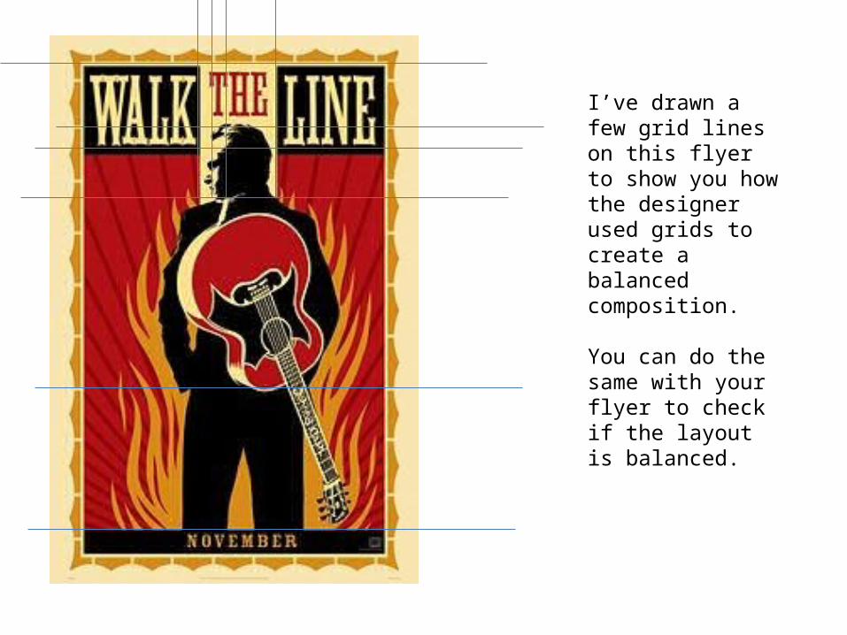
I’ve drawn a few grid lines on this flyer to show you how the designer used grids to create a balanced composition.
You can do the same with your flyer to check if the layout is balanced.
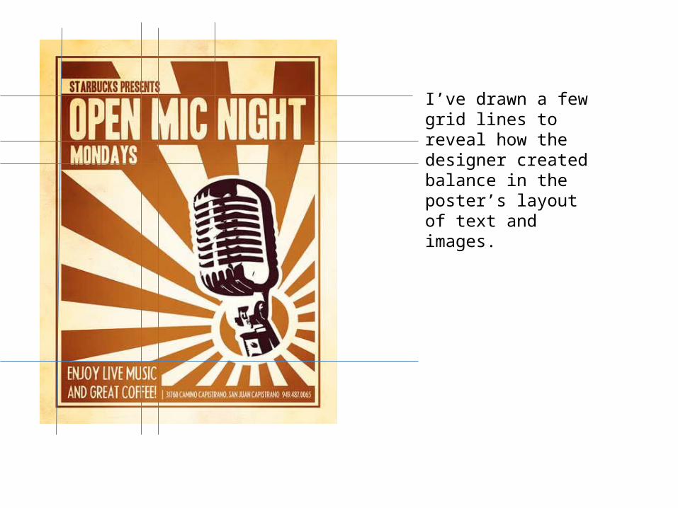
I’ve drawn a few grid lines to reveal how the designer created balance in the poster’s layout of text and images.
37
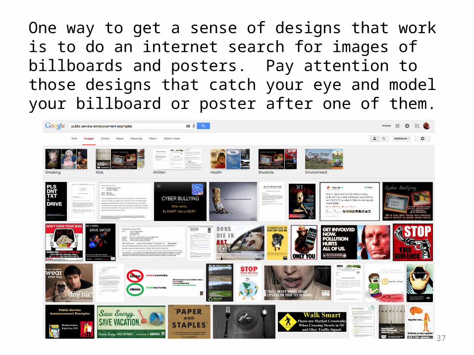
One way to get a sense of designs that work is to do an internet search for images of billboards and posters. Pay attention to those designs that catch your eye and model your billboard or poster after one of them.