Embed Size (px)
Citation preview
The Sunday Times - Travel
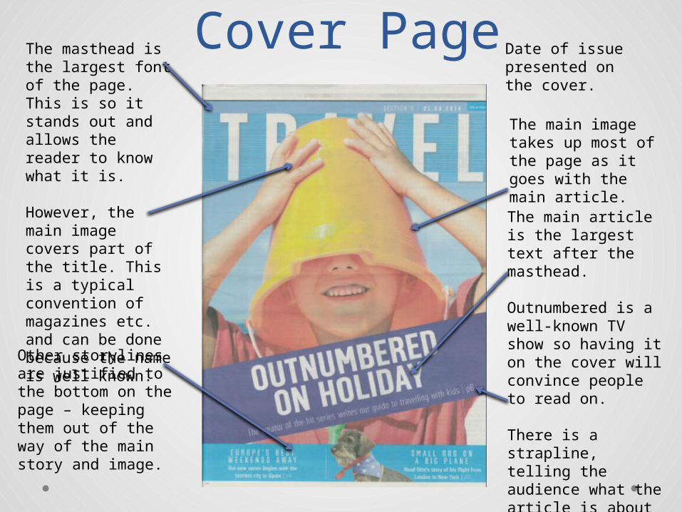
Cover PageThe masthead is the largest font of the page. This is so it stands out and allows the reader to know what it is.
However, the main image covers part of the title. This is a typical convention of magazines etc. and can be done because the name is well known.
The main image takes up most of the page as it goes with the main article.
The main article is the largest text after the masthead.
Outnumbered is a well-known TV show so having it on the cover will convince people to read on.
There is a strapline, telling the audience what the article is about as well as the page number so they know where to find it.
Date of issue presented on the cover.
Other storylines are justified to the bottom on the page – keeping them out of the way of the main story and image.
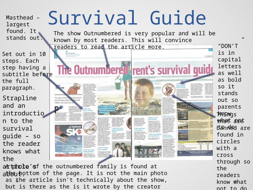
Survival GuideMasthead – largest found. It stands out.
Set out in 10 steps. Each step having a subtitle before the full paragraph.
The show Outnumbered is very popular and will be known by most readers. This will convince readers to read the article more.
Things that are banned are found in circles with a cross through so the readers know what not to do without reading it.
“DON’T” is in capital letters as well as bold so it stands out so parents know what not to do.
A photo of the outnumbered family is found at the bottom of the page. It is not the main photo as the article isn’t technically about the show, but is there as the is it wrote by the creator of the show.
Strapline and an introduction to the survival guide – so the reader knows what the article’s about.
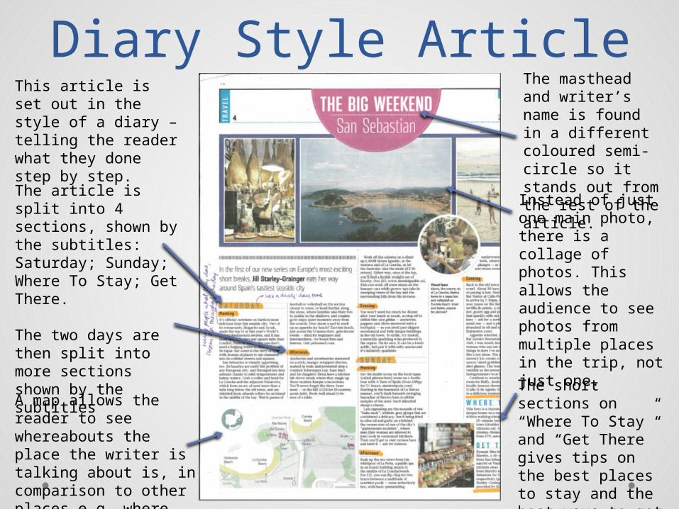
Diary Style ArticleThis article is set out in the style of a diary – telling the reader what they done step by step.
The article is split into 4 sections, shown by the subtitles: Saturday; Sunday; Where To Stay; Get There.
The two days are then split into more sections shown by the subtitles
The short sections on “Where To Stay” and “Get There” gives tips on the best places to stay and the best ways to get there.
Instead of just one main photo, there is a collage of photos. This allows the audience to see photos from multiple places in the trip, not just one.
The masthead and writer’s name is found in a different coloured semi-circle so it stands out from the rest of the article.
A map allows the reader to see whereabouts the place the writer is talking about is, in comparison to other places e.g. where they are staying.
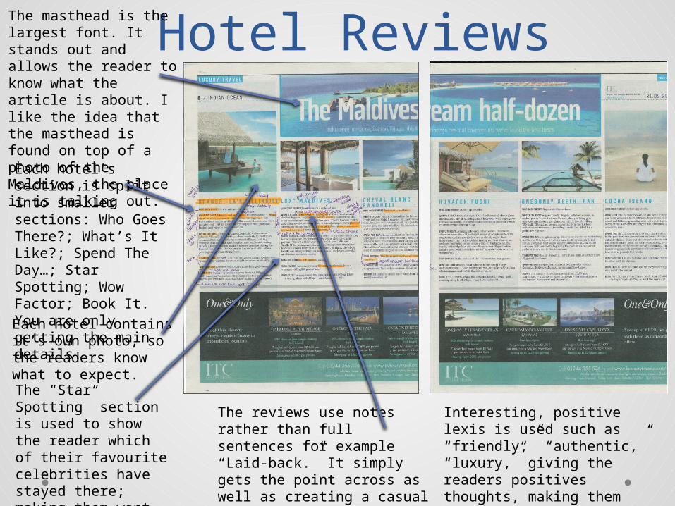
Hotel ReviewsThe masthead is the largest font. It stands out and allows the reader to know what the article is about. I like the idea that the masthead is found on top of a photo of the Maldives, the place it is talking out. Each hotel’s section is split into smaller sections: Who Goes There?; What’s It Like?; Spend The Day…; Star Spotting; Wow Factor; Book It. You are only getting the main details.Each hotel contains it’s own photo, so the readers know what to expect.The “Star Spotting” section is used to show the reader which of their favourite celebrities have stayed there; making them want to stay there themselves.
The reviews use notes rather than full sentences for example “Laid-back.” It simply gets the point across as well as creating a casual atmosphere for the reader.
Interesting, positive lexis is used such as “friendly,” “authentic,” “luxury,” giving the readers positives thoughts, making them want to go there themselves.
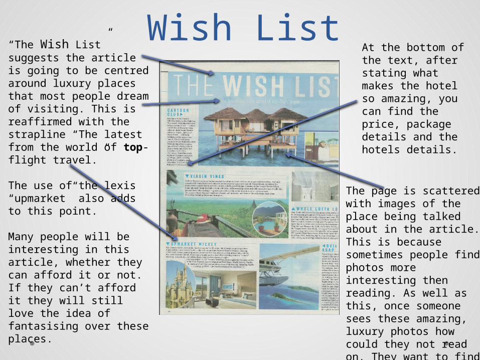
Wish List“The Wish List” suggests the article is going to be centred around luxury places that most people dream of visiting. This is reaffirmed with the strapline “The latest from the world of top-flight travel.”
The use of the lexis “upmarket” also adds to this point.
Many people will be interesting in this article, whether they can afford it or not. If they can’t afford it they will still love the idea of fantasising over these places.
The page is scattered with images of the place being talked about in the article. This is because sometimes people find photos more interesting then reading. As well as this, once someone sees these amazing, luxury photos how could they not read on. They want to find out more about them.
At the bottom of the text, after stating what makes the hotel so amazing, you can find the price, package details and the hotels details.
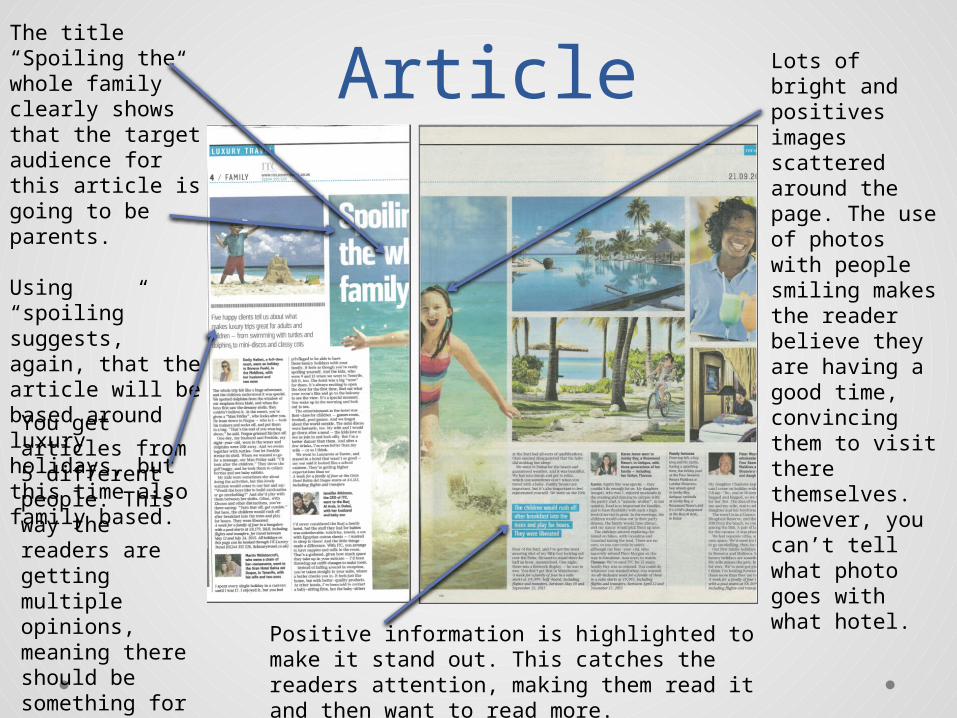
ArticleThe title “Spoiling the whole family” clearly shows that the target audience for this article is going to be parents.
Using “spoiling” suggests, again, that the article will be based around luxury holidays, but this time also family based. You get articles from 5 different people. This way the readers are getting multiple opinions, meaning there should be something for everyone.
Positive information is highlighted to make it stand out. This catches the readers attention, making them read it and then want to read more.
Lots of bright and positives images scattered around the page. The use of photos with people smiling makes the reader believe they are having a good time, convincing them to visit there themselves. However, you can’t tell what photo goes with what hotel.