Embed Size (px)
Citation preview
BY AYESHA PATEL
Question 7 - Looking back at your preliminary task what do you feel
you have learnt in the progression from it to
the full product?
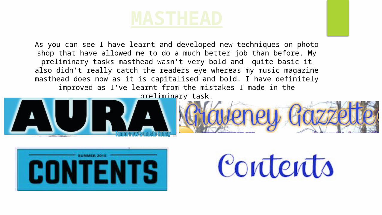
As you can see I have learnt and developed new techniques on photo shop that have allowed me to do a much better job than before. My preliminary
tasks masthead wasn’t very bold and quite basic it also didn't really catch the readers eye whereas my music magazine masthead does now as it is capitalised and bold. I have definitely improved as I've learnt from the
mistakes I made in the preliminary task.
MASTHEAD
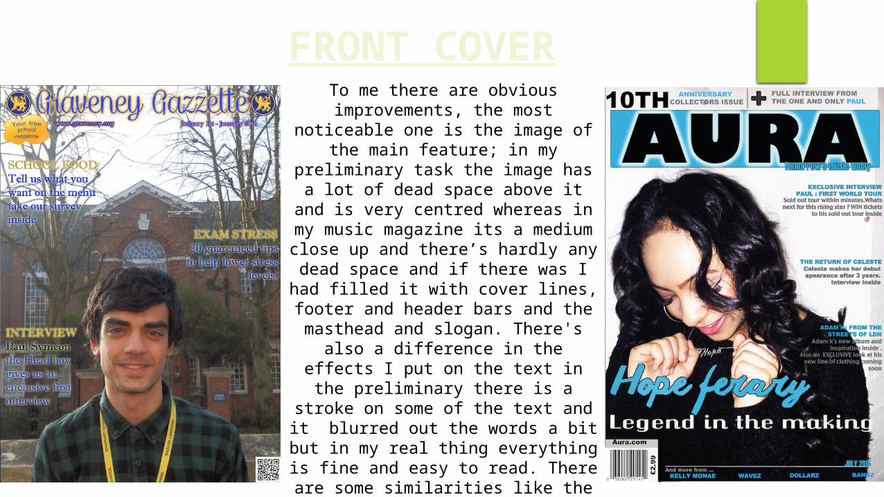
FRONT COVERTo me there are obvious
improvements, the most noticeable one is the image of the main feature; in my preliminary task the image has
a lot of dead space above it and is very centred whereas in my music
magazine its a medium close up and there’s hardly any dead space and if
there was I had filled it with cover lines, footer and header bars and the masthead and slogan. There's also a difference in the effects I put on the
text in the preliminary there is a stroke on some of the text and it
blurred out the words a bit but in my real thing everything is fine and easy to read. There are some similarities like the fact that both front covers aren’t over crowded and still have quite a lot of information in them.
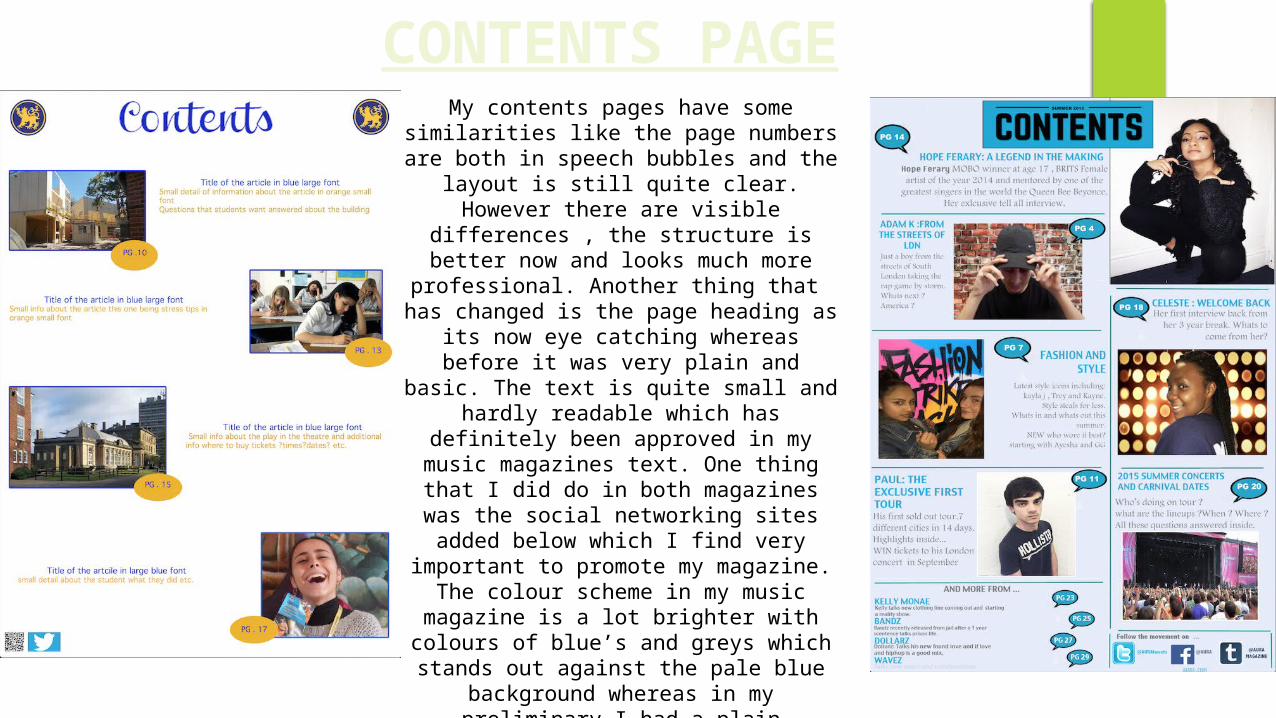
CONTENTS PAGEMy contents pages have some
similarities like the page numbers are both in speech bubbles and the layout is still quite clear. However there are visible differences , the structure is better now
and looks much more professional. Another thing that has changed is the page heading as its now eye catching whereas before it was very plain and
basic. The text is quite small and hardly readable which has definitely been
approved in my music magazines text. One thing that I did do in both magazines
was the social networking sites added below which I find very important to promote my magazine. The colour
scheme in my music magazine is a lot brighter with colours of blue’s and greys which stands out against the pale blue
background whereas in my preliminary I had a plain background with yellow and blue text which didn’t stand out as much due to the background being too bright.
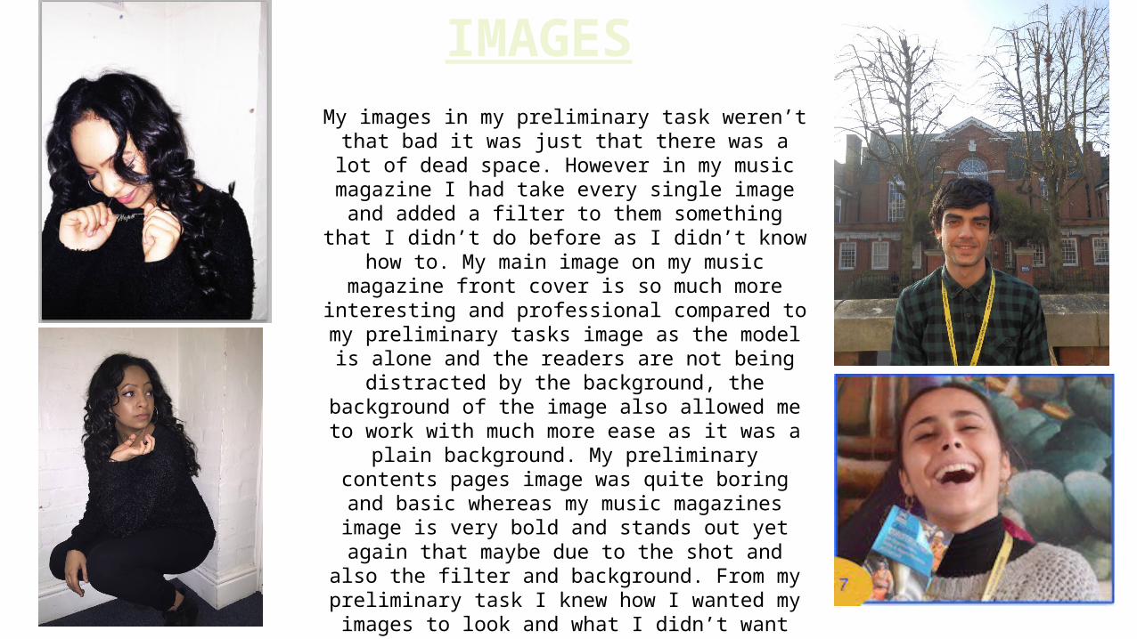
IMAGESMy images in my preliminary task weren’t that
bad it was just that there was a lot of dead space. However in my music magazine I had take every single image and added a filter to them something that I didn’t do before as I didn’t know how to. My main image on my
music magazine front cover is so much more interesting and professional compared to my preliminary tasks image as the model is alone
and the readers are not being distracted by the background, the background of the image also allowed me to work with much more ease as it
was a plain background. My preliminary contents pages image was quite boring and basic whereas my music magazines image is
very bold and stands out yet again that maybe due to the shot and also the filter and
background. From my preliminary task I knew how I wanted my images to look and what I
didn’t want them to look like , so I was therefore able to improve my work.
OVERALLI am quite pleased to see how far I've come just by
learning new techniques on Photoshop, this has greatly improved my work and its clear to see. I was able to see my weak areas in my preliminary tasks and adjust them so they are no longer weak and this allowed me to make
a much more professional piece of work. I know that I have learnt a lot and I know I can now use these new
techniques in future projects to strengthen my work. My understanding of the layout, images, mastheads and modes of address have improved and allowed me to
make a better piece of work that I can honestly say I'm proud of.