Embed Size (px)
Citation preview
THE RED BANNER
This banner is used throughout all of my products in one shape or form, it is especially shown in my double page spread and contents page. This allows audience's to notice the products
before they have seen the masthead which would be a unique selling point but also gives my products a different style to it as I have never seen this in another magazine making it stand out
amongst other products.

All my products follow this masthead in the same font and style which helps bind the products together and makes them work but also allows audience's to identify the
product and it's regional alternative genre.
THE MASTHEAD
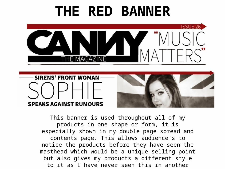
The magazine's slogan can also be found on the website and billboard tying the products together and also making it memorable to audiences making them most likely to purchase again or even see something that may remind them of the products which will make
them want to read/view them again.
THE SLOGAN
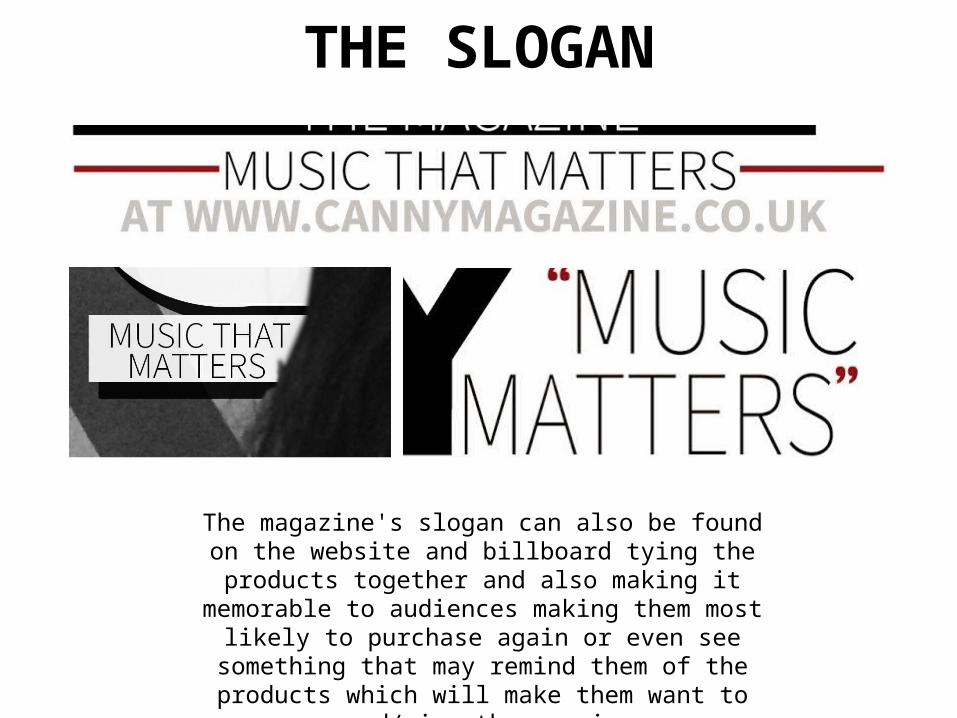
THE IMAGES
Black and White images found throughout the products which again help bind the products
together as it creates a house style.
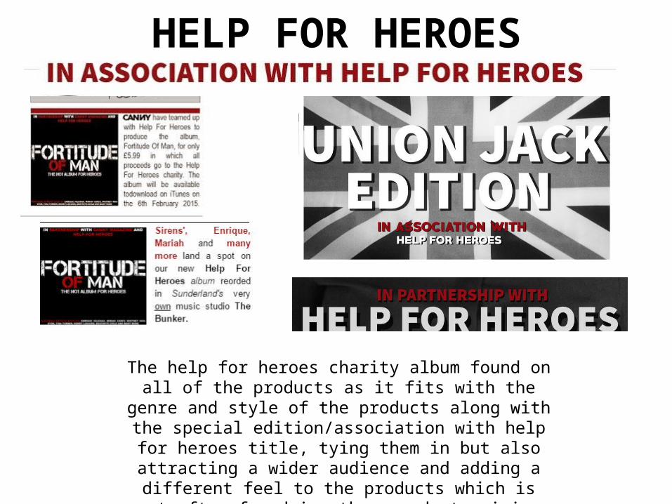
The help for heroes charity album found on all of the products as it fits with the genre and style of the products
along with the special edition/association with help for heroes title, tying them in but also attracting a wider audience and adding a different feel to the products which is not often found in other products giving my
products more appeal.
HELP FOR HEROES
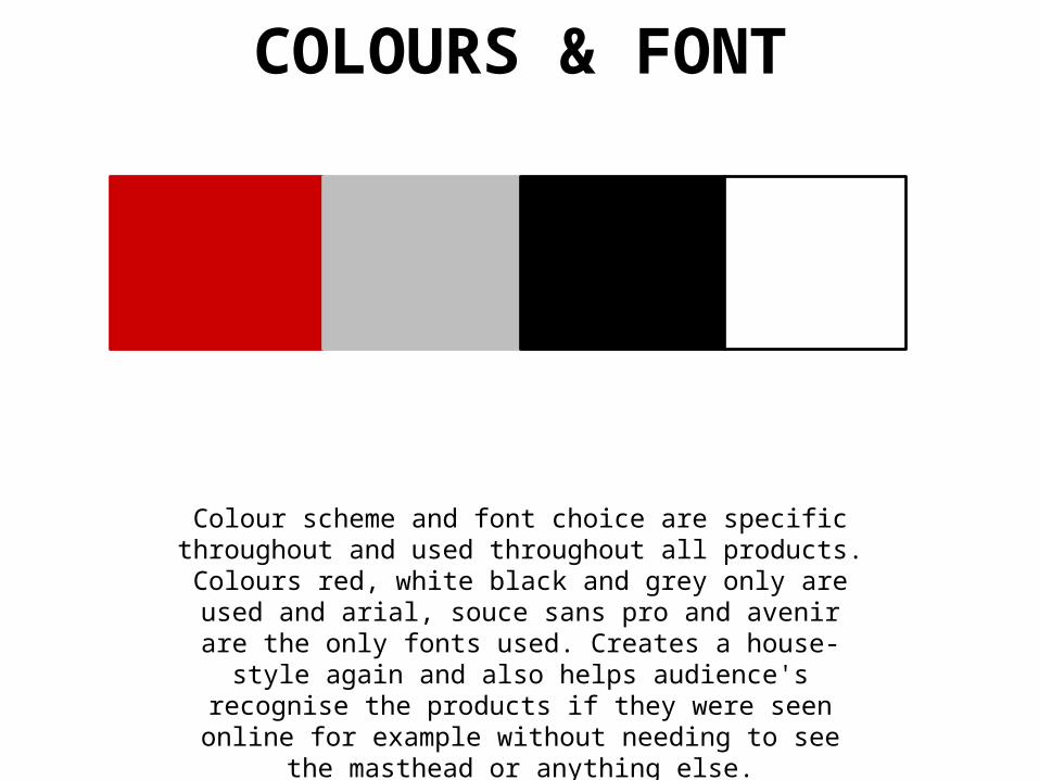
Colour scheme and font choice are specific throughout and used throughout all products. Colours red, white black and
grey only are used and arial, souce sans pro and avenir are the only fonts used. Creates a house-style again and also helps audience's recognise the products if they were seen online for example without needing to see the masthead or
anything else.
COLOURS & FONT


![Q2 Evaluation [Media A Level 2016 Music Magazine]](https://img.pdfslide.us/doc/110x75/58ef29681a28abe14f8b457b/q2-evaluation-media-a-level-2016-music-magazine.jpg)