Embed Size (px)
Citation preview
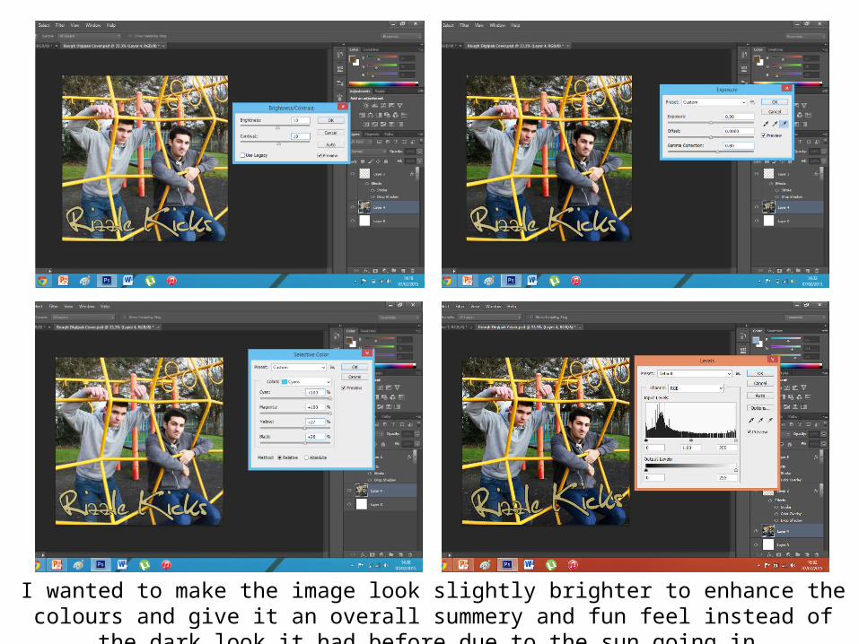
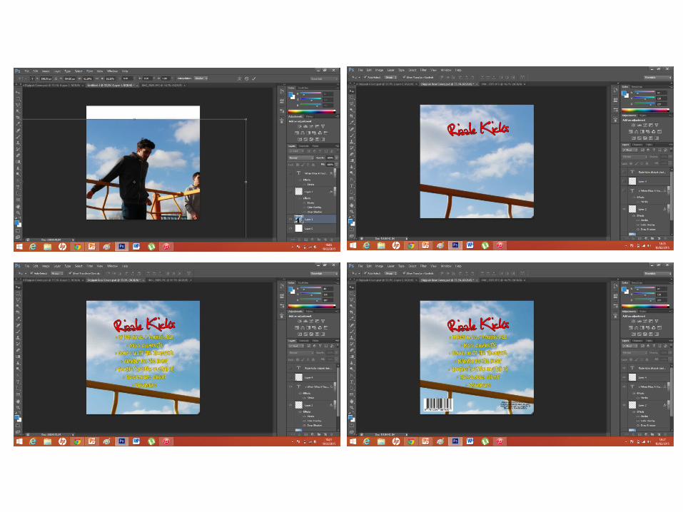
I wanted to make the image look slightly brighter to enhance the colours and give it an overall summery and fun feel instead of the dark look it had before due to the sun going in.
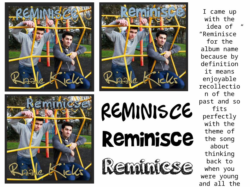
I came up with the idea of
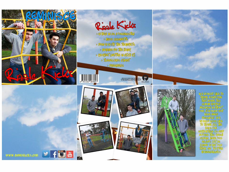
“Reminisce” for the album name
because by definition it
means enjoyable recollection of the past and so
fits perfectly with the theme of the
song about thinking back to when you were
young and all the kinds of things you got up to. I
then looked online for some fonts that fitted the style of the
artists and theme.
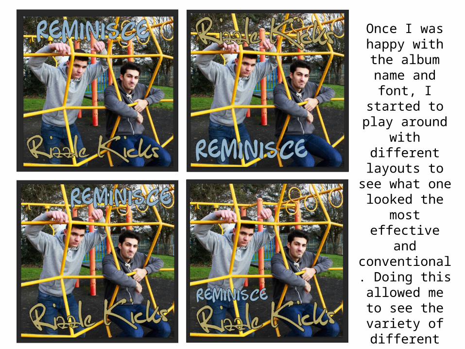
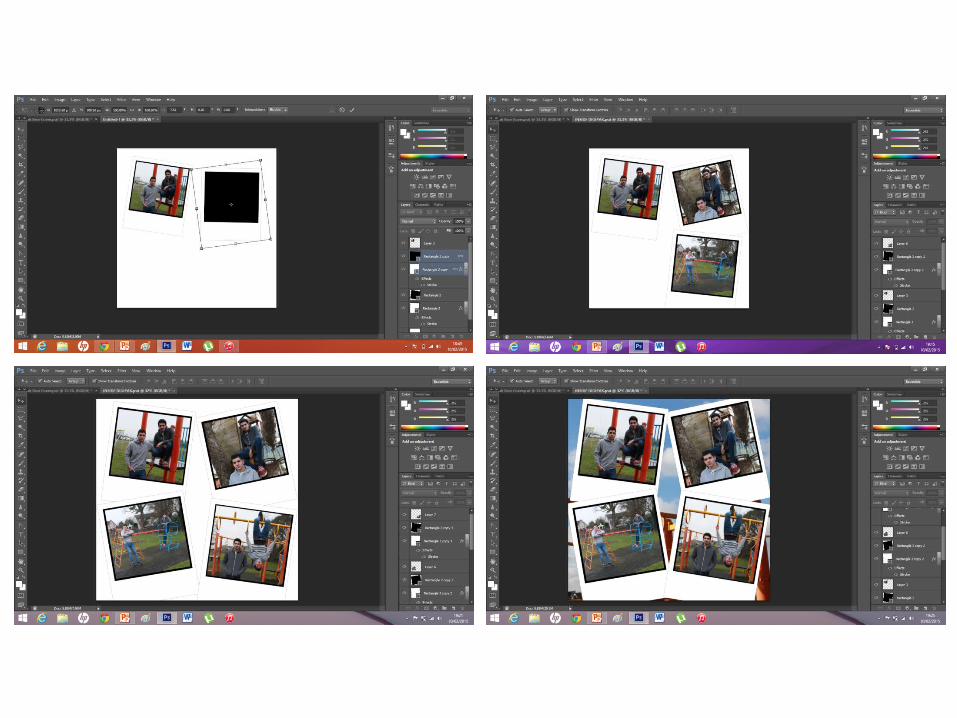
Once I was happy with the album
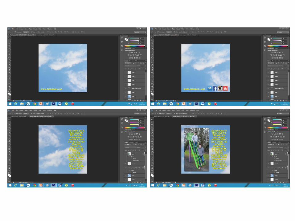
name and font, I started to play around with
different layouts to see what one looked the most
effective and conventional.
Doing this allowed me to
see the variety of different looks I could use for my cover and meant
I was able to select the one that stood out
the most.
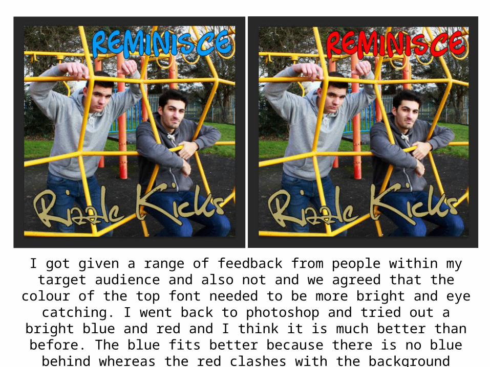
I got given a range of feedback from people within my target audience and also not and we agreed that the colour of the top font needed to be more bright and eye catching. I went back to photoshop and tried out a bright blue and red and I think it is much better than before. The blue fits better because there is no blue behind whereas the red clashes with the background slightly. I also think blue is better suited as it has a more relaxed connotation whereas red is more harsh.