Embed Size (px)
Citation preview

The Design and Evaluation of Prototype Eco-Feedback Displays for Fixture-Level Water Usage Data
ABSTRACT Few means currently exist for home occupants to learn about their water consumption: e.g., where water use occurs, whether such use is excessive and what steps can be taken to conserve. Emerging water sensing systems, however, can provide detailed usage data at the level of individual water fixtures (i.e., disaggregated usage data). In this paper, we perform formative evaluations of two sets of novel eco-feedback displays that take advantage of this disaggregated data. The first display set isolates and examines specific elements of an eco-feedback design space such as data and time granularity. Displays in the second set act as design probes to elicit reactions about competition, privacy, and integration into domestic space. The displays were evaluated via an online survey of 651 North American respondents and in-home, semi-structured interviews with 10 families (20 adults). Our findings are relevant not only to the design of future water eco-feedback systems but also for other types of consumption (e.g., electricity and gas).
Author Keywords Eco-feedback, water, sustainability, iterative design
ACM Classification Keywords H5.m. Information interfaces and presentation (e.g., HCI).
INTRODUCTION Cities across the world are facing an escalating demand for potable water due to growing populations, higher population densities and warmer climates [12,13]. As new sources of water become more environmentally and economically costly to extract, water suppliers and governments are shifting their focus from finding new supplies to using existing supplies more efficiently [13,17,18,20]. One challenge in improving residential efficiency, however, is the lack of awareness that occupants have about their in-home water consumption habits. This disconnect makes it difficult, even for motivated individuals, to make informed decisions about what steps can be taken to conserve [7].
Eco-feedback has been offered as one strategy to encourage conservation and help build the connection between home activities and resource use (see [4,6,9] for a review). However, most past work has focused on energy, with water-based eco-feedback largely limited to sensing and feedback at the point-of-consumption and to simple ambient and/or LED-based displays [2,19,21,22,30]. Although this type of feedback can potentially reduce usage at the installed fixture [30], it is limited in its ability to convey broader patterns of use or to compare across fixtures. These systems have also disproportionately focused on faucet and shower usage, which account for only 22% of water use in the average North American home [29].
In this paper, we explore a range of eco-feedback designs enabled by disaggregated (i.e., fixture-level) water usage data. Our work is inspired by emerging technologies that can sense water usage at individual fixtures with only one or a few sensors [5,11]. Such detailed data presents new opportunities for water-based eco-feedback systems to visualize not only how much water is being consumed but also where and when it is occurring (e.g., upstairs bathroom toilet, front lawn sprinkler). The key question then becomes how to most effectively visualize this information? Moreover, what aspect(s) of the disaggregated data, if any, are people interested in, and what sort of reactions do these visualizations provoke?
To address these questions, we designed two sets of novel eco-feedback displays. The first set is designed to isolate and examine a subset of eco-feedback design dimensions [7,26] within the context of water usage (e.g., data and
Jon Froehlich1,7, Leah Findlater6,8, Marilyn Ostergren6, Solai Ramanathan3, Josh Peterson5, Inness Wragg4, Eric Larson2, Fabia Fu3, Mazhengmin Bai3, Shwetak N. Patel1,2, James A. Landay1
Computer Science and Engineering1, Electrical Engineering2, Pre-Engineering3, Interaction Design4, DxArts5, Information School6
University of Washington, Seattle {ostergrn, eclarson, shwetak, landay}@uw.edu
Computer Science7 College of Information Studies8
University of Maryland, College Park {jonf, leahkf}@umd.edu
Figure 1: In our in-home interviews, participants selected preferredlocations in their home to place our prototype water usage display.
Permission to make digital or hard copies of all or part of this work forpersonal or classroom use is granted without fee provided that copies arenot made or distributed for profit or commercial advantage and that copiesbear this notice and the full citation on the first page. To copy otherwise,or republish, to post on servers or to redistribute to lists, requires priorspecific permission and/or a fee. CHI’12, May 5–10, 2012, Austin, Texas, USA. Copyright 2012 ACM 978-1-4503-1015-4/12/05...$10.00.

temporal granularity, comparison, goal-setting, and measurement unit). Displays in the second set are design probes meant to elicit reactions about how these displays would fit within a household and potentially affect family dynamics. Our displays were informed by past work in the design of eco-feedback interfaces and by formative work exploring water attitudes, knowledge, and motivations surrounding residential water usage.
To evaluate the displays, we conducted two studies: an online survey of 651 North American respondents and in-home household interviews with 10 families (20 adults). While the survey quantitatively and qualitatively assessed reactions and preferences to the designs, the interviews served to contextualize the survey data, explore differences in perspective and preference across members of the same household, and investigate how a water feedback display may actually fit into domestic space. An overarching goal was to identify which displays and design elements seemed particularly promising for future research to explore in actual deployments. This follows from Froehlich et al. [9], who argue that HCI design methods such as iterative and participatory design are particularly well-suited to evaluate early eco-feedback designs before time and effort is invested in longitudinal behavioral studies.
The contributions of this paper are threefold: (1) a broad set of novel eco-feedback displays for water that methodically explore a large eco-feedback design space (see [7,26]); (2) findings from two evaluations: an online survey of 651 North American respondents and in-home interviews of 10 families (20 adults); (3) a set of design recommendations on what information to visualize and the potential interaction of eco-feedback displays with household dynamics. This research not only has implications for the design of future water-based eco-feedback systems but also, more generally, for other areas of eco-feedback where disaggregated usage data may be available (e.g., electricity or gas—see [10]).
RELATED WORK Eco-feedback has become a prominent focus of sustainable HCI research in the past five years, exploring areas including home electricity [25] and water [21] consumption, transit [8], and waste disposal (see [9] for a review). Pre-dating this work, environmental psychologists and others have studied eco-feedback since the 1970s as a strategy to increase awareness, educate consumers, and promote more eco-friendly behaviors [9]. A majority of past work in both disciplines has targeted energy consumption, for which eco-feedback in the home has been shown to result in savings between 5-12% (see [4,6] for a review). Eco-feedback designs that performed best provided multiple options (e.g., for time periods and comparisons), were updated frequently (daily or more), were interactive, and/or were capable of providing detailed, appliance-specific breakdown of energy usage. In this paper, we build upon these findings and offer the first examination of eco-feedback visualizations for disaggregated water usage.
Three fields are of primary relevance to our work: HCI (e.g., [9,25,26]), water resource management (e.g., [17]), and environmental psychology (e.g., [1,3,14]). HCI has focused on creating novel water feedback prototypes and evaluating these via informal user studies. In these cases, the visualization system—its understandability, its interactivity, its aesthetic—is typically the focus of the research rather than the effect of the system on behavior (see [9]). As mentioned previously, this past research has also focused exclusively on designing sensing and feedback systems at the point-of-consumption at showers and faucets [2,19,21,22]. In contrast, our displays are designed for sensing systems that need not be collocated with a fixture and can therefore support a wider range of visualizations (e.g., comparison of all fixtures usages within one display).
Environmental psychologists have also studied water feedback systems, largely focusing on large-scale studies with simple feedback technology—even hand-written notecards—to study how feedback may change behavior (e.g., [1,14,30]). Although this work has shown feedback to be effective in reducing water consumption, results are more mixed than for electricity. One key difference is the elasticity or potential responsiveness of behaviors to feedback; for example, lawn watering is elastic while toilet flushing is not. Because fewer activities in the home consume water than energy, there are fewer opportunities to impact behavior. In addition, some activities, such as toilet usage, hygiene, and cooking are fundamental to life and not amenable to change (see [7,27] for a longer discussion about these tensions). With that said, there are still vast differences in water consumption amounts across homes [13], which points to the role of behavior in usage.
Environmental psychologists and water resource management scientists have explored reasons for these differences. Factors that correlate with usage include socioeconomic status, home and yard size, attitudes, beliefs, and motivations concerning water, and the occupant’s understanding and awareness of water usage in the home [3,17,20]. In addition, although economic motivations are often cited in the electricity feedback literature (e.g., [4]), financial motives may be less significant for water because of its low-cost: Americans pay $2.50 per 1,000 gallons ($0.0025 per gallon) [13]. Finally, Kantola et al. [18] note that motivation may not translate to reduced consumption if the person does not possess the skills or knowledge to conserve water, which we believe is something that eco-feedback can directly address.
ECO-FEEDBACK WATER DISPLAY DESIGNS We created two sets of water consumption displays to explore the design space of eco-feedback based on disaggregate water usage data. To identify and uncover elements of interest to users, the first set isolated and examined a subset of four eco-feedback design dimensions [7,26]: data and time granularity, comparison (including goal-setting) and measurement unit. Displays in the second set were created as design probes to integrate multiple
dimensions and encourage discussion around complex issues such as competition, motivation, privacy, and household social dynamics. All of the displays use water usage values based on an average North American family of four with two adults and two teenagers living in a detached home with a yard (from [29]).
The displays were developed using an iterative process of design critiques and three pilot studies. Each pilot study involved semi-structured interviews with 15-20 participants recruited on a college campus. Interviews lasted 10-30 minutes and sought positive and negative feedback on multiple design ideas presented in sketch form or on an electronic display. Space limits us from describing the results in detail; however, in summary, the results helped increase the clarity of our designs and identify information that was perceived as particularly useful. Below, we present the final set of designs. Some were evaluated in the online survey; all were evaluated in the interviews.
Isolating Design Dimensions For this set of displays we used a bar graph base design be-cause it could be easily changed along any one dimension.
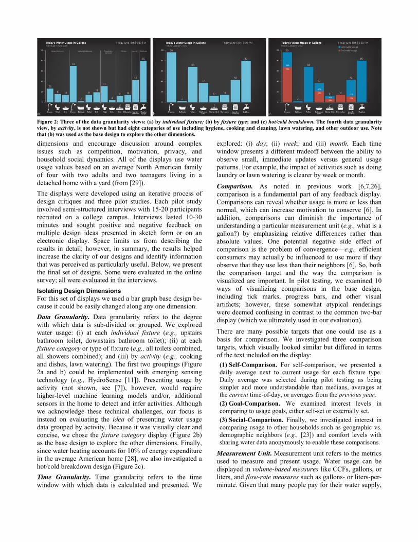
Data Granularity. Data granularity refers to the degree with which data is sub-divided or grouped. We explored water usage: (i) at each individual fixture (e.g., upstairs bathroom toilet, downstairs bathroom toilet); (ii) at each fixture category or type of fixture (e.g., all toilets combined, all showers combined); and (iii) by activity (e.g., cooking and dishes, lawn watering). The first two groupings (Figure 2a and b) could be implemented with emerging sensing technology (e.g., HydroSense [11]). Presenting usage by activity (not shown, see [7]), however, would require higher-level machine learning models and/or, additional sensors in the home to detect and infer activities. Although we acknowledge these technical challenges, our focus is instead on evaluating the idea of presenting water usage data grouped by activity. Because it was visually clear and concise, we chose the fixture category display (Figure 2b) as the base design to explore the other dimensions. Finally, since water heating accounts for 10% of energy expenditure in the average American home [28], we also investigated a hot/cold breakdown design (Figure 2c).
Time Granularity. Time granularity refers to the time window with which data is calculated and presented. We
explored: (i) day; (ii) week; and (iii) month. Each time window presents a different tradeoff between the ability to observe small, immediate updates versus general usage patterns. For example, the impact of activities such as doing laundry or lawn watering is clearer by week or month.
Comparison. As noted in previous work [6,7,26], comparison is a fundamental part of any feedback display. Comparisons can reveal whether usage is more or less than normal, which can increase motivation to conserve [6]. In addition, comparisons can diminish the importance of understanding a particular measurement unit (e.g., what is a gallon?) by emphasizing relative differences rather than absolute values. One potential negative side effect of comparison is the problem of convergence—e.g., efficient consumers may actually be influenced to use more if they observe that they use less than their neighbors [6]. So, both the comparison target and the way the comparison is visualized are important. In pilot testing, we examined 10 ways of visualizing comparisons in the base design, including tick marks, progress bars, and other visual artifacts; however, these somewhat atypical renderings were deemed confusing in contrast to the common two-bar display (which we ultimately used in our evaluation).
There are many possible targets that one could use as a basis for comparison. We investigated three comparison targets, which visually looked similar but differed in terms of the text included on the display:
(1) Self-Comparison. For self-comparison, we presented a daily average next to current usage for each fixture type. Daily average was selected during pilot testing as being simpler and more understandable than medians, averages at the current time-of-day, or averages from the previous year. (2) Goal-Comparison. We examined interest levels in comparing to usage goals, either self-set or externally set. (3) Social-Comparison. Finally, we investigated interest in comparing usage to other households such as geographic vs. demographic neighbors (e.g., [23]) and comfort levels with sharing water data anonymously to enable these comparisons.
Measurement Unit. Measurement unit refers to the metrics used to measure and present usage. Water usage can be displayed in volume-based measures like CCFs, gallons, or liters, and flow-rate measures such as gallons- or liters-per-minute. Given that many people pay for their water supply,
Figure 2: Three of the data granularity views: (a) by individual fixture; (b) by fixture type; and (c) hot/cold breakdown. The fourth data granularity view, by activity, is not shown but had eight categories of use including hygiene, cooking and cleaning, lawn watering, and other outdoor use. Note that (b) was used as the base design to explore the other dimensions.
c.b. a.

one might instead emphasize cost—e.g., per day, week or month. We also explored equivalence or metaphorical measurement units, which can make usage amounts more understandable and/or provocative. Unlike energy, water has a myriad of common, tangible manifestations that one can rely on for metaphors—such as a 1-gallon milk jug or a 5-gallon water bottle. Like many of the design dimensions, the choice of measurement unit is not just about understandability but also about identifying a presentation that the individual/household may find particularly motivating (e.g., financial vs. environmental cost).
Design Probes We move now from describing displays based on specific design dimensions to designs intended to provoke responses to themes such as competition, motivation, and privacy.
Time-Series. Time-series visualizations allow users to view trends over time. Three major temporal trends exist for water consumption: (i) time of day: with peaks in the morning, dinner time and bedtime; (ii) day of week: where use can rise on weekends due to chores (e.g., laundry, gardening) and to more occupant time at home; and (iii) season: particularly an increase in summer due to outdoor use (e.g., lawn watering) [29]. Our goal was to create displays that revealed these trends and exposed different usage patterns across various time windows (Figure 3a).
Spatial. In formative work exploring electricity feedback in the home, Riche et al. [25] recommend spatial-based presentation of information, particularly for appliance- or device-level usage. Unlike for electricity, however, only a few rooms in the home use water: bathrooms, kitchens, laundry rooms, and outdoor spaces. As such, we were interested in studying whether spatial layouts would also feel more intuitive and understandable for water usage than other presentations of information (Figure 3b).
Per-Occupant. The Per-Occupant display shows water usage broken down by occupant rather than by fixture (Figure 3c). This view allowed us to specifically explore particular themes of interest including competition, accountability, blame, and privacy. We were less concerned with the practicality of this display than with the reactions that it might elicit. We were particularly interested in investigating whether notions of competition would arise and how people felt about revealing an individual’s daily water usage patterns.
Aquatic Ecosystem. The most abstract of our displays is the Aquatic Ecosystem (Figure 3d), which uses fish and plant life to depict water usage information in an artistic and ambient manner (similar to UbiGreen for transit [8]). The display is intended to be attractive and appealing to children and adults who prefer a less ‘data-centric’ design. Unlike our other designs, which focus on tracking consumption, this display focuses on water savings and reaching water savings goals for different fixtures in the home. When goals are met, the ecosystem evolves in a positive manner, for example, by adding a fish or more vegetation. We did not explore punishment scenarios specifically (e.g., having a fish die with excessive use), leaving this for future work.
Rainflow. This design (Figure 3e) visualizes fixture-category water usage in a way that is analogous to the basic bar graph display (figure 2b) but in a more playful and fun manner. Water flows out of the fixture icons at the top of the display and into containers at the bottom, which fill according to use. Thus, the fill amount in the container is similar to a bar in a bar graph. If water usage for the time period of interest (day, week, or month) exceeds a predefined level, the container overflows.
Other Probes. Due to space restrictions, we are not able to describe our other probes in detail, which include
Figure 3: Six of the design probes: (a) the Time-Series view shows water usage over the current day and year; (b) the Spatial view uses a floorplan to show room-level and fixture-level usage; (c) the Per-Occupant view shows water usage broken down by occupant for the current day and past month; (d) the Aquatic Ecosystem explores the use of ambient game elements to motivate water savings; (e) the Rainflow view is a stylized, more ambient version of the fixture category base bar graph design; (f) one of the Metaphorical Unit views, which uses common objects to depict average daily, weekly, monthly, and yearly usage. The top three design probes were evaluated in the survey; all were evaluated in the interviews.
a. b. c.
d. e. f.

Geographic Comparison displays that use maps to compare usage across the US and the world and Metaphorical Unit displays that use common, everyday objects such as one-gallon jugs or oil trucks to depict usage (e.g., Figure 3f).
DISPLAY EVALUATION To evaluate the displays, we conducted two studies: an online survey of 651 North American respondents and 10 in-home household interviews with 20 adults. Our goal was not only to evaluate the specific designs themselves (e.g., what levels of temporal granularity are considered useful and why?), but also to explore richer contextual themes surrounding the designs and potential uses of the displays.
Online Survey Study Method We recruited survey respondents via email lists, word-of-mouth, and online postings to websites including Craigslist, Twitter, and Facebook. Our recruitment material invited respondents to take a survey on “water usage displays” and noted that those who completed the survey could enter a drawing for a single $100 Amazon gift certificate. The survey was created and hosted using the online platform SurveyGizmo and included 63 questions (53 were required). When possible, question and answer orders were randomized to mitigate order effects; all questions were eventually asked of all respondents. We refined the survey by piloting with 19 participants, five of whom were co-located with a researcher for observational purposes.
Survey Outline and Data Analysis The survey began with a series of demographic questions and an introduction to the general notion of real-time disaggregated water usage feedback. The remainder of the survey was split into two parts. Survey Part 1 evaluated the impact of the design dimensions on a variety of subjective measures. Within each dimension, displays were presented in random order. The two primary questions asked for each dimension were: “which display would be most useful in helping you to conserve water” and “why?” (open ended). Survey Part 2 included three of the design probes presented in random order: Time-Series View, Spatial View, and the Per-Occupant View. For each, we asked about comprehension, who the display might appeal to in the respondent’s home, and how often they might want to view the display. The displays were accompanied with short, one or two sentence descriptions. Ranking mechanisms and 5-point Likert scales were used to assess the displays on a number of characteristics (e.g., attractiveness, most thought-provoking).
A total of 712 surveys were completed by respondents across the world. An additional 140 surveys were partially completed, resulting in a drop-out rate of 16.4%. Because of cultural and regional differences in water usage attitudes and behaviors, we focus on the 651 completed surveys from North America (610 from the U.S., 41 from Canada). Median completion time was 21 minutes. Of the 63 questions, 14 were open-form response (10 of these were optional). Of the open-form questions, we received 5,685
qualitative responses (62.4% response rate) with an average word count of 21.2 (Median=15; SD=21.3). For each open-form question, 150 randomly selected responses were coded by two coders following the iterative coding process described by Hruschka et al. [16]. A Cohen’s Kappa test was used to examine inter-rater reliability; the average score was 0.75 (SD=0.19). The worst performing codes were “other” and “junk,” which were infrequent and are not reported on below.
Survey Respondent Demographics The respondents’ average age was 36 (SD=13; Min=18; Max=94), 60% were female, and over 80% reported four-year college degrees or more. The top three professions were student (18%), science/ technology (18%), and education (12%). Household income was spread evenly across categories from less than $25,000 (15%) to $150,000+ (16%); this distribution is upwardly skewed compared to the general US/Canadian population. We also asked respondents about their attitudes and beliefs regarding water and the environment. Unsurprisingly, given that respondents opted-in to a water survey, 91% reported interest in conserving water in their home, 87% reported concern for global climate change, and 75% considered themselves “green” or “eco-friendly.” Although skewed, this sample represents what are likely to be early adopters of an eco-feedback system. We acknowledge and discuss this limitation at the end of this paper.
In-Home Interview Method In addition to the survey, we conducted semi-structured in-home interviews with 10 households (20 adults total). As with the survey, participants were recruited via email lists, word-of-mouth, and postings to websites such as Craigslist. Here, we specifically recruited families because we were interested in exploring differences in perspective within a household, including children’s reactions to our displays. In all interviews, at least two members of the household were present for the duration of the interview. Households were compensated $65 for participating.
Interview Outline Two researchers conducted each interview; one led the interview and the other took notes on verbal and non-verbal interactions. Interviews were audio recorded for transcription purposes. At the beginning of the interview, demographic information on the household (e.g., house size and number of bathrooms) and on each participant (e.g., environmental beliefs) was collected. The interview itself was split into two parts: the first part did not involve the eco-feedback designs and, instead, explored general water attitudes, knowledge, and practices across occupants of the home. We do not report on this aspect of the work here. The second part focused on the eco-feedback designs. Participants were supplied with a touchscreen laptop loaded with the data granularity and comparison design dimensions as well as six design probes: Time-Series, Geographic Comparison, Rainflow, Metaphorical Units, Aquatic Ecosystem, and Per-Occupant. Due to time

limitations, Spatial was evaluated in some, but not all interviews. The interviewer used each design to elicit both positive/negative feedback as well as to encourage discussion about how the display might be used in the home. During the last 10 minutes of the interview, participants were asked to select their favorite design overall and pick one or two locations in their home where they would install the display. Photos were taken of these areas with the display held in place (e.g., Figure 1 and 4).
Interview Data Analysis and Demographics Interviews lasted 90 minutes. Adult interviewees were aged 39 on average (Min=18; Max=62), 11 were female, and 18 had four-year college degrees or more. Seven households had children (N=11), aged 2 to 12. In two homes, a child was present throughout the interview; typically, though, children spent 5-10 minutes with us. The average house size was 1850 sq ft with two bathrooms and 3.4 occupants. Two households rented, the rest owned. All paid for water. Occupations included a massage therapist, two attorneys, three healthcare professionals, three engineers, two teachers, and an architect (among others). Similar to our survey, most participants were environmentally conscious: 90% indicated interest in conserving water in their home, all were concerned about global climate change and 85% considered themselves “green” or “eco-friendly.” Despite this interest, many had misconceptions about water usage in their homes. For example, the mother in household three (I3.2) overestimated that her average morning shower used 400 gallons of water (a ten-minute shower with a standard shower head uses 35 gallons). In addition, many interviewees identified their dishwasher as their top water user (dishwashers account for 1% of water use in the average US home [29]). Interview data was coded and categorized into overarching themes by two researchers.
STUDY FINDINGS We now present findings from the online survey and the in-home interviews. We use respondent (R) and interviewee (I) to refer directly to a survey or interview participant. The word “participant” refers to both. We take care to explicitly specify the source when relevant. For the surveys, we captured both quantitative and qualitative data. The interviews, largely qualitative in nature, were meant to both contextualize our survey findings as well as to probe more nuanced feelings about our designs. Percentages appearing in the text are from the survey only, unless otherwise noted.
Isolating Design Dimensions Findings As the interviews primarily focused on the design probes, a majority of findings reported in this section are from the online survey with supplementary data from the interviews. Table 1 shows the preference breakdown for each dimension evaluated in the online survey.
Data Granularity. We compared three levels of data granularity: individual fixture, fixture category and activity (e.g., showers vs. dishes). Over half of respondents (54%) preferred the individual fixture design because it seemed
best for targeting reduction efforts at specific fixtures and identifying maintenance issues such as leaks. Another quarter (27%) preferred the fixture category view, because it was useful without being too detailed. The remaining 19% of respondents preferred the activity view because they felt the data was actionable and intuitive since it emphasized behaviors rather than fixtures. We found similar preferences in our interviews. “[The individual fixture view] would be easiest to tell if a certain fixture is leaking or inefficient, or if certain members of the household are using more water, etc. This display lets you more easily identify the specific areas that need attention” –R536
“[The activity view] makes it so much easier to visualize what actions I need to take in order to reduce water usage (e.g. ‘turn the tap off while shaving’ vs. ‘be careful running the tap in the second upstairs bathroom’).” –R48
IMPLICATION: Although there is a general preference toward specific information at highly granular levels (e.g., at the individual fixture level), this data should be supplemented, when possible, with recommendations about what actions can be taken to reduce usage.
Hot/Cold Breakdown. Nearly all respondents wanted access to hot/cold information (91%) primarily because they recognized the relationship between hot water use and energy consumption; some even mentioned the greater cost of hot water as a result.
IMPLICATION: This is an important new finding; no past work has distinguished between hot and cold water usage amounts in their displays. Future systems should integrate this information.
Time Granularity. A large majority (64.5%) of participants saw value in all three displays (by day, by week and by month) and wanted to be able to switch between them. The remaining participants were somewhat equally split between the most useful temporal window (16% weekly, 10% monthly and 10% daily). Common reasons for selecting these views included matching a temporal routine
Data Granularity N% Comparison N% Individual fixture 53.6% Self-Comparison 91.0% Fixture category 27.0% Goal-Comparison 68.2% Activity 19.4% Set manually 58.1% Hot/Cold Breakdown Set by display 44.1% Hot/Cold always 47.5% Set to efficient neighbors 37.4% Switch between both 43.8% Set by supplier 21.8% No hot/cold info 8.8% Set by local government 16.9% Time Granularity Social-Comparison 67.7% Switch between all 3 64.5% Demographically similar 73.0% By week only 15.5% Geographic neighbors 52.4% By month only 10.1% Households in other cities 35.6% By day only 9.8% Households in other countries 32.4% Measurement Unit Select Family/Friends 35.2% Display both together 71.4% Comfortable sharing data
anonymously to enable social comparisons 78.8%
Gallons only 16.0% Cost only 12.6%
Table 1: Survey responses (N=651) to our design dimension questions. The responses for each dimension in the left column were exclusive options; thus percentages add to 100. The comparisons (right column) were individual 5-point agreement Likert scales (% here represents number of respondents who selected “Strongly Agree” or “Agree” for each row).

at home (e.g., “we live our lives in cycles of weeks” –R664) or a desire to see immediate vs. longer term information.
IMPLICATION: Different time windows are amenable to different actions and interest levels. Designers should make it easy for users to explore different temporal ranges. These “drill-down” actions will likely be infrequent, so a reasonable default (e.g., week view) should be set.
Measurement Units. Participants preferred to see both gallons and cost (71% of respondents), recognizing the usefulness of both:
“Seeing the gallon amount triggers the ‘save the environment’ impulse to conserve, while the dollar amount is helpful because almost everyone is motivated by money to some extent.” –R143
Others emphasized the understandability of dollars over gallons, CCFs or liters:
“I don't think very well in ‘thousands of gallons’, but $20 I can understand. That’s a case of beer down the drain, if you will.” –R48
In the interviews specifically, some interviewees observed how displaying cost information broken down by fixture would allow them to rethink the cost of water: “[it] puts a price on your activity. I’ve spent $14 on showers this month” (I1.1). Also in the interviews, we examined the use of visual metaphors such as gallon jugs to make water use seem more tangible (e.g., Figure 3e). Although most interviewees responded positively to these representations and some found them “shocking” (I4.2) in how much water usage they seemed to reveal, they did not think they were necessary to see all of the time.
For those participants who did not want dollars as a measurement unit, many cited the low price of water as making cost irrelevant while others simply stated that conservation for ethical reasons was their main motivation. Interestingly, some respondents mentioned the potential negative effect of water’s low cost on conservation, for example: “Water is cheap in some places, so I think seeing a low number for cost could be an anti-motivator.” (R93).
IMPLICATION: Water feedback displays should include both volumetric units and cost. However, the inexpensiveness of water, especially when compared to energy, may serve to discourage conservation for some people. Adding the cost of sewage and hot water heating may mitigate this issue.
Comparison. Comparisons were the most uniformly desired pieces of information of all the dimensions. In the survey, an overwhelming majority was interested in comparing current household usage to the past (91%), followed by comparing to a goal (68%) and to other households (68%)—see Table 1. A similar preference was found in the interviews; however, here, more people were interested in social-comparison than goals, with some noting that they would never set goals. For those participants interested in self-comparison, popular reasons included that it contextualized or provided perspective on current usage, would motivate them to conserve (e.g., by “beating” their past performance), and/or would help identify where to target conservation effort, by showing typical use.
Although a majority of participants were interested in comparing their usage to a goal, feelings were mixed about how this goal should be set. Most preferred having the goal manually set by members of the household compared to automatically set by the display system or by the local government or water supplier (Table 1). Interviewees were more amenable to externally set goals if they were provided with a justifiable reason (e.g., low reservoir levels).
In terms of social comparison, 79% of respondents indicated they would feel comfortable sharing anonymous fixture-level usage data to enable such comparisons. The most popular social-comparison target in both the survey and interviews was demographically similar households (i.e., houses with similar size and number of occupants). Interestingly, comparing to geographic neighbors was less popular (52%). Most interviewees questioned the fairness of this comparison: “the thing is, you just don’t know if you are comparing apples to apples” (I9.2).
IMPLICATION: Some form of self-comparison is important and should be included in future designs. Although social-comparisons are of interest and people seem willing to share their fixture-level data to enable them, eco-feedback systems should offer a rationale for any external comparison targets. User control and system transparency are also important aspects for goal-setting.
Summary of Findings Overall, there was a strong preference for specific, detailed information about water usage at the individual fixture level in both volume and cost metrics. Our participants also strongly preferred the ability to see their usage broken down by hot/cold, and their usage contextualized by some sort of comparison data (self-comparison was most preferred). In general, our participants also recognized the need for interactivity and wanted the option to view data with different time windows and measurement units; however, it is unclear how often such a display would actually be interacted with and configured in practice.
Design Probe Findings In comparison to the design dimension displays, the design probes elicited a much greater range of responses. We first summarize reactions to these displays, and then focus on synthesizing higher-level emergent themes such as competition, accountability, and playfulness.
Specific Preferences At the end of the survey and interviews, we asked participants to select their favorite design(s). In the survey, respondents could choose between a bar graph view or one of the three design probes: Time-Series, Spatial or Per-Occupant. The majority preferred the bar graph (64%) because it was simplest and most glanceable. Among those respondents who preferred a different design, the votes were nearly an even split: 14% for Spatial, 12% for Time-Series, and 10% for Per-Occupant. In the interviews, each interviewee was asked to select their top three designs including the bar graph view and all of the design probes.

The comparison-based displays were selected most commonly (12 times), followed by the Individual Fixture Bar Graph view (10), the Time-Series view (9), the Aquatic Ecosystem (8) and the Fixture Category Bar Graph (7). Unsurprisingly, in 8 of the 10 homes, there was not perfect agreement among interviewees on which were the best displays suggesting that multiple feedback options should be made available to account for differences in perspective and personality across occupants within the same home.
For the Time-Series view, which was arguably the most complex, participants liked being able to see longer-term temporal patterns and the effect of reduction efforts in the graph. In contrast, the main reason stated for preferring the Spatial view was that the floorplan made information easier to read and understand: “The breakdown between rooms and appliances is clear and gives an intuitive sense of where water is being used” (R182). For those that selected the Per-Occupant view, primary reasons included notions of accountability (i.e., pinpointing who was using water) and competition. Finally, for Aquatic Ecosystem, interviewees were attracted to the idea of “turning consumption on its head and rewarding saving” (I1.2), because it was good for children, and/or because it more was ambient, “like a screensaver” (I5.2). In the next section, we further explore these reactions in the context of higher level themes.
Emergent Themes Competition & Cooperation. Competition was a polarizing theme that arose most often with the Per-Occupant and Aquatic Ecosystem designs. Those who liked it pointed to motivating properties of competition, notions of gaming (e.g., beating past low usage scores), and creating “friendly competition” with others. Those who disliked it felt household water savings was about cooperation rather than competition. They felt the Per-Occupant display “pits the family members against each other rather than encouraging collaboration.” (R485). Similarly, some worried how this display went against the non-competitive ethic that they were trying to create in their home: “[it] sets up a ‘competitive’ environment that we are trying not to create in our household” (R493).
IMPLICATION: Though competition was recognized as having motivating properties, some found it disconcerting and potentially inhibiting towards the goal of saving water. One simple solution here would be to make those elements or displays that specifically encode competition optional. Another is to make the comparative elements stress collaboration rather than competition (e.g., by making the comparison target other households).
Accountability & Blame. As with competition above, the ability to observe who used water was polarizing. This was the case with Spatial view, and, most particularly, the Per-Occupant view. Some liked the ability to pinpoint who was using water (e.g., these designs made it easier to know who may need to reduce their water usage): “it holds each individual accountable for water usage” (R354). Some even
offered pragmatic suggestions about how this data could be used: e.g., for bill splitting. However, there was a distinction between those who felt that this data could be used to hold people accountable for their behaviors and those that felt that this would lead to blame and household conflict. This was particularly true for Per-Occupant: “I don’t think there’s any reason to add an element of ‘blame’ to conservation efforts within a family. If I received information in this format, I would throw it away without looking at it” –R98
“Would seem to lead to plenty of arguments about usage” –R144
Participants also recognized that such inferences could be made with other designs (e.g., by observing who uses the master bath shower in the individual fixture bar graph).
IMPLICATION: There is a thin line between enabling accountability and introducing elements that could be perceived as blame inducing. As with competition, there is clearly a contingent of people attracted to the idea of knowing who uses water. However, any eco-feedback system that tries to encode accountability explicitly should realize that “accountability” can be perceived as “blame.”
Playfulness & Functionality. Aquatic Ecosystem and Rainflow elicited responses about playfulness vs. utility. Most interviewees reacted positively to these designs, particularly the Aquatic Ecosystem: “it’s clever, I love it” (I1.2) and “I like the idea of getting rewards for saving water” (I8.1). While 12 interviewees chose one of these designs in their top three, only 2 out of 20 chose one as their most preferred. The tension between utility and playfulness is embodied here: “It’s like unlocking badges in Foursquare. No matter how trivial it can be to make a fish appear on this screen, you still want to do it” –I4.1
“It doesn’t appeal to me as much. I don’t do Foursquare. This distracts me a little bit and it doesn’t make me think about my usage.” –I4.2
Similarly, for Rainflow, although many thought that it was “interesting”, “fun” and “pretty”, they weren’t sure if it was functionally better than a normal bar graph: “it looks cooler, but I’m not sure it’s more useful than the bar graphs” (I8.1).
In those households with children, many interviewees felt these two displays could be a useful educational tool in addition to getting their children involved in conservation at home. However, some worried their children might become overly involved in trying to earn rewards by not cleaning themselves or flushing. Others were also concerned about how their children would react if a fish died or what would happen “to the game” if a minimal level of usage in their home was reached. For Rainflow, some parents mentioned how it might actually encourage their children to use more water just to see the pretty water flows.
IMPLICATION: Playful and fun designs can be good at creating engagement and interest as well as serve an educational tool but the actionability of the visual representation is of paramount importance. In addition, designs that are more ambient need to take care not to look more visually interesting with increased consumption.

Privacy. Disaggregated water usage feedback can reveal information about otherwise latent patterns and routines about a household (e.g., where and when people are in the home). Such revelations can be obscured by simple changes to the interface: e.g., a bar graph view of a day makes it more difficult to assess when an occupant wakes up, goes to work, and goes to bed, compared to a timeline view. Although some notions of privacy arose from our Time-Series and Spatial displays with references to “big brother” (R826), “creepy” (R5), and being able to see when people were “regular” (I9.1), privacy was a major reason why some participants reacted negatively to the Per-Occupant display. Because this design emphasizes who is using water rather than what, it provoked the most comments about surveillance, intrusiveness and violations of boundaries: “It’s incredibly invasive. And other people’s water consumption is not my business.” –R25 “water usage for many purposes can be very personal, and shouldn’t be automatically shared.” –R246
Interestingly, some respondents recognized that similar information could be derived from other designs but that these did not feel as surveillance-oriented: “This display comes across more ‘big brotherish’ to me to assign usage to specific people and I didn’t feel that way when being assigned to appliances/faucets even though those can often be tied back to specific people” –R84
In contrast to the survey results, most of the interview participants, when asked, had not even thought about the privacy implications of the designs. Even after providing specific scenarios about how people could be tracked (e.g., “see, here you could tell that your son skipped school because of his bathroom usage during the day”), privacy was not considered a significant issue. “Maybe if my daughter was a teenager she wouldn’t want me to track her but I’m not that kind of Mom” –I3.2 “We are more tightknit than the average family because of our house size and everything… we tend to know a lot about each other (laughter)”. –I1.2
IMPLICATION: Privacy is an important aspect of future eco-feedback displays in the home, particularly as sensing systems become more granular. Designers need to take care to offer different levels of abstraction to make particular events in the home less visible in some views. Privacy and eco-feedback is an important area for future work.
Display Placement. At the end of the interview, we asked participants to select one or two places in their home where
they would install the water eco-feedback display. The first choice was the kitchen (6), followed by a highly trafficked area of the home such as a hallway (5), near the thermostat (5), or in the shared upstairs bathroom (1). Reasons for these placements included accessibility for all occupants, glanceability and being able to see information easily multiple times a day (e.g., when cooking). Interestingly, two households selected locations that were inaccessible on purpose: H6 wanted the display mounted inside their kitchen cupboard (Figure 4e) and H8 wanted it in their storage closet next to their gas meter (Figure 4f). The reason given for these placements was that they did not want technology infiltrating all aspects of their life.
When selecting a location, most homes took into account who could see the display—either other householders or guests: “[if we placed it here], the kids couldn’t see it” (I2.1). Some participants mentioned how guests may be able to see the data, which was perceived either positively or negatively. I7.2, for example, thought that the Aquatic Ecosystem could be used to “brag to our friends when they come by.” However, H9 took the opposite view: “If we hang it here [Bob] and [Jane] would come over and they would look at it. I’m not sure I like that.” –I9.1 “Yah, if you just had Nemo floating around then you could put it here, but otherwise I wouldn’t necessarily want people to see it.” –I9.2
IMPLICATION: There was a preference towards placing displays in shared and highly trafficked areas of the home, yet a privacy tension exists since these are often the more “public” areas of a home (e.g., viewable by guests). Future work should explore display form and placement more deeply, particularly since only bathroom feedback displays have been previously studied for water.
Summary of Findings The design probes elicited strong and sometimes polarizing reactions. Although certain designs provoked positive feelings of competition, accountability, and playfulness in some people; in others, these same designs felt intrusive, blame-inducing, or antithetical to the goal of saving water. The key here is to realize that eco-feedback displays do not just visualize consumption, they document household activities. Consequently, designers have to account for how their designs expose otherwise latent household routines and how this may affect underlying social dynamics in a household. Our findings suggest that these issues could affect whether a display will be accepted into the home.
Figure 4: Preferred display locations in H5, H4, H1, H10, H6, and H8. Most selected a highly visible, easily glanceable location (e.g., H5 and H4 selected the kitchen and H1 and H10 selected hallways). H6 and H8, however, preferred behind the cupboard or in a closet next to the gas meter.
a. H5 b. H4 c. H1 d. H10 e. H6 f. H8

LIMITATIONS One limitation of this research is that the study populations in both the survey and the interviews were skewed towards an environmentally interested demographic. While this sample may arguably be representative of early adopters of eco-feedback systems, studying reactions to the displays with a broader range of people, particularly, those who do not consider themselves eco-friendly, is an important area of future work. The study findings are also based on insights from the initial reactions of our designs rather than from real, long-term use. This method allowed us to explore promising design dimension and themes, which we argue is particularly important given the lack of past work studying disaggregated resource consumption data. We also used the in-home interviews to complement the survey data, since the interviews more directly allowed families to consider how a physical eco-feedback display would fit into their home. Future work will need to take the findings provided here and apply them in functioning, interactive systems, and, ultimately, conduct longitudinal field deployments.
CONCLUSION As the first work in the area of visualizing disaggregated water resource consumption data, this paper explored a broad range of novel eco-feedback designs to examine and uncover particularly promising elements for future work as well as to investigate how different representations of feedback data may affect household dynamics. Through the use of a basic bar graph design, we first examined and uncovered design dimensions perceived as particularly useful. We found widespread interest in displaying data at the individual fixture level with hot and cold information and comparisons used to contextualize performance. We then evaluated six design probes that integrated multiple dimensions and allowed us to examine more complex issues such as competition, motivation, and privacy. Our findings are relevant not only to HCI researchers interested in building future eco-feedback systems but also to utilities, billing services, and professional designers working in eco-feedback for electricity, gas, and water.
REFERENCES 1. Aitken C., McMahon, T., Wearing, A., et al. (1994). Residential
Water Use: Predicting and Reducing Consumption. J.of Applied Social Psychology; 24 (2):136-158.
2. Arroyo, E., Bonanni, L., & Selker, T. (2005). Waterbot: Exploring Feedback & Persuasive Techniques at the Sink. CHI’05, 631-639.
3. Corral-Verdugo, V., Bechtel, R., & Fraijo-Sing, B. (2003). Environmental Beliefs and Water Conservation: An Empirical Study. Journal of Environmental Psychology, 23(3).
4. Ehrhardt-Martinez, K., et al (2010). Advanced Metering Initiatives and Residential Feedback Programs: Meta-Review for Household Electricity-Saving Opportunities. ACEEE’10; 1-140.
5. Feng Chen, Jing Dai, et al. (2011). Activity Analysis Based on Low Sample Rate Smart Meters. Proc. of KDD '11;240-248.
6. Fischer, C. (2008) Feedback on Household Electricity Con-sumption: a Tool for Saving Energy? En.Efficiency;1(1):79-104.
7. Froehlich, J. (2011). Sensing and Feedback of Everyday Activities to Promote Environmental Behaviors. Doctoral dissertation. University of Washington, Seattle.
8. Froehlich, J., Dillahunt, T., Klasnja, P., et al. (2009). UbiGreen: Investigating a Mobile Tool for Tracking and Supporting Green Transportation Habits. CHI'09, 1043-1052.
9. Froehlich J., Findlater L., & Landay J. (2010). The Design of Eco-Feedback Technology. CHI’10, 1999–2008.
10. Froehlich, J., Larson, E., et al. (2011). Disaggregated End-Use Energy Sensing for the Smart Grid. Perv.Computing, 28-39.
11. Froehlich, J., Larson, E., Saba, E., et al. (2011). A Longitudinal Study of Pressure Sensing to Infer Real-World Water Usage Events in the Home. Pervasive’11; 50-69.
12. Gleick, P., Cooley, H., & Morikawa, M. (2008). The World’s Water 2008-2009: Biennial Report on Freshwater Resources. Island Press.
13. Glennon, R. (2009). Unquenchable: America’s Water Crisis and What to Do about It. Island Press.
14. Geller, E., Ericksson, J., & Buttram, B. (1983). Attempts to Promote Residential Water Conservation with Educational, Behavioral and Engineering Strategies. Population and Environment. 6(2):96-112.
15. Hamilton, L. (1983). Saving Water: A Causal Model of Household Conservation. Sociological Perspectives. 26(4);355-374.
16. Hruschka, D., Schwartz, D., et al. (2004). Reliability in Coding Open-Ended Data: Lessons Learned from HIV Behavioral Research. J. of Field Methods. 16(3):307-331.
17. Inman, D., & Jeffrey, P. (2006). A Review of Residential Water Conservation Tool Performance and Influences on Implementation Effectiveness. Urban Water J., 3(3):127-143.
18. Kantola, S., Syme, G., & Nesdale, A. (1983). The Effects of Appraised Severity and Efficacy in Promoting Water Conservation: An Informational Analysis. J. Applied Social Psych.13(2):164-182.
19. Kappel K, & Grechenig, T. (2009). “show-me”: Water Consumption at a Glance to Promote Water Conservation in the Shower. Persuasive’09.
20. Kenney, D., Goemans, C., Klein, R., et. al.(2008). Residential Water Demand Management: Lessons from Aurora, Colorado. J. of American Water Resources Association; 44(1), 192-207.
21. Kuznetsov, S., & Paulos, E. (2010). UpStream: Motivating Water Conservation with Low-Cost Water Flow Sensing and Persuasive Displays. CHI’10, 1851–1860.
22. Laschke, M., et al. (2011). With a Little Help from a Friend: A Shower Calendar to Save Water. CHI’11 Extended Abstracts.
23. Laskey & Kavazovic. (2011). OPOWER. XRDS 17(4); 47-51. 24. Mayer, P., DeOreo W., Opitz E., et al. (1999). Residential End
Uses of Water. AWWA Research Foundation. 25. Riche, Y., Dodge, J., & Metoyer R, (2010). Studying Always-On
Electricity Feedback in the Home. Proc of CHI ’10. 26. Rodgers, J. & Bartram, L. Visualizing Residential Resource Use:
A Framework for Design. Proc. of InfoVis 2010. Poster. 27. Strengers, Y. (2008). Smart Metering Demand Management
Programs: Challenging the Comfort and Cleanliness Habitus of Households. OZCHI’08, 9-16.
28. US Department of Energy, US Household Electricity Report, Energy Information Administration, US DOE, 2001.
29. Vickers A. (2001). Handbook of Water Use and Conservation: Homes, Landscapes, Industries, Businesses. WaterPlow Press.
30. Willis, R., et. al. (2010). Alarming Visual Display Monitors Affecting Shower End Use Water and Energy Conservation in Australian Residential Households. Resources, Conservation and Recycling. 54(12):1117-1127.