Embed Size (px)
Citation preview
12/14/2015
1
1
CPET491 Senior Design Project Phase II
Submitted to Professor Paul Lin
Submitted by Don Ohlwine
Advisor: Professor Paul Lin
Project sponsor: In My View, LLC
• Today’s modern cell phones (smart phones) and tablets are in
fact mobile web devices.
• Many websites are formatted for desktop computers.
• New approach to solving formatting problems, combine server
side processing with Cascading Style Sheets (CSS).
2
12/14/2015
2
• Introduction
• System Design
• Software Design
• Unit Testing and System Integration
• Project Management
• Conclusion
3
Introduction, Problem Statement, Example of Poor Formatting, Back Ground,
Primary Purpose, Overview
4
12/14/2015
3
• This report is organized with a discussion of the problem to be
solved, system design, software design, testing and integration,
project management, and a conclusion.
• Graphics which may not display well during the presentation
are included in the Appendix.
5
• In 2014, the use of mobile devices to access the internet became greater than fixed (e.g. desktop computer) internet access [1].
• There is one issue which often plagues users of mobile platforms which is visiting websites which are difficult to view.
• Many websites attempt to maintain separate webpages for mobile devices which are tailored to the smaller form factor.
[1] Danyl Bosomworth (2015). “Mobile Marketing Statistics 2015.” Smart Insights [Online]. Available: http://www.smartinsights.com/mobile-marketing/mobile-marketing-analytics/mobile-marketing-statistics
6
12/14/2015
4
7
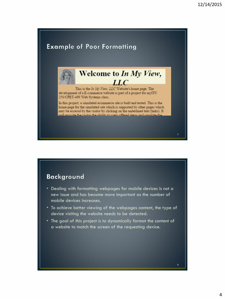
• Dealing with formatting webpages for mobile devices is not a
new issue and has become more important as the number of
mobile devices increases.
• To achieve better viewing of the webpages content, the type of
device visiting the website needs to be detected.
• The goal of this project is to dynamically format the content of
a website to match the screen of the requesting device.
8
12/14/2015
5
• The goal of this project is to dynamically format the content of
a website to match the screen of the requesting device thereby:
• Reducing labor and maintenance cost for website.
• Improved experience for site visitors.
9
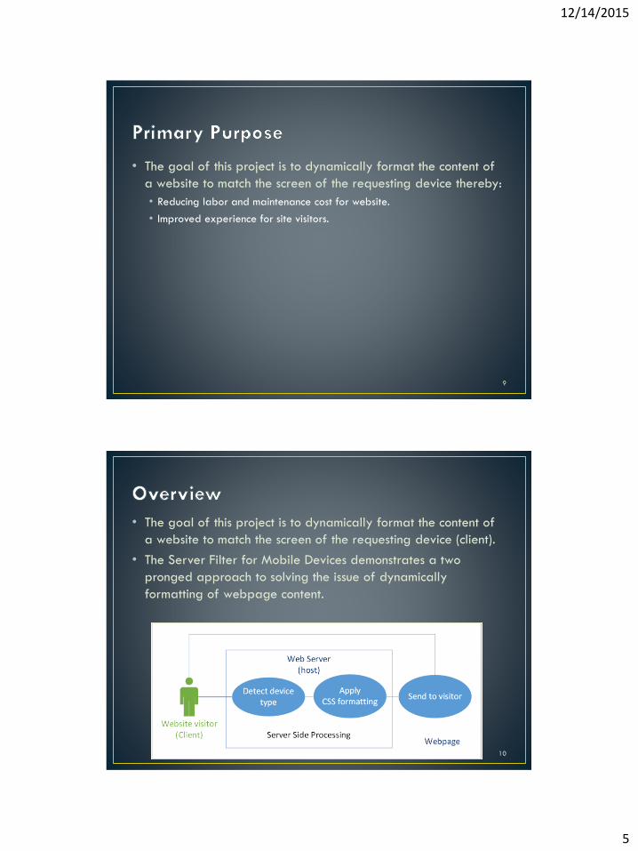
• The goal of this project is to dynamically format the content of
a website to match the screen of the requesting device (client).
• The Server Filter for Mobile Devices demonstrates a two
pronged approach to solving the issue of dynamically
formatting of webpage content.
10
12/14/2015
6
E-commerce Site Development, Apache Hosted Website, Software Development Environment, Microsoft Expression Web 4, CSS File definitions, and Scope
11
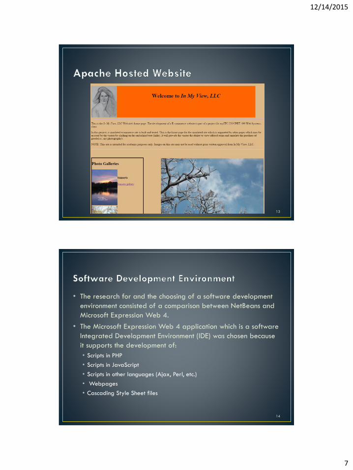
• The development of E-commerce site to be used as a controlled
test site was originally completed as part of a project for a
previous class ITC250/CPET499, Web Systems.
• The site was developed using the Microsoft Expression Web 4
application and was hosted on an Apache server on a desktop
computer.
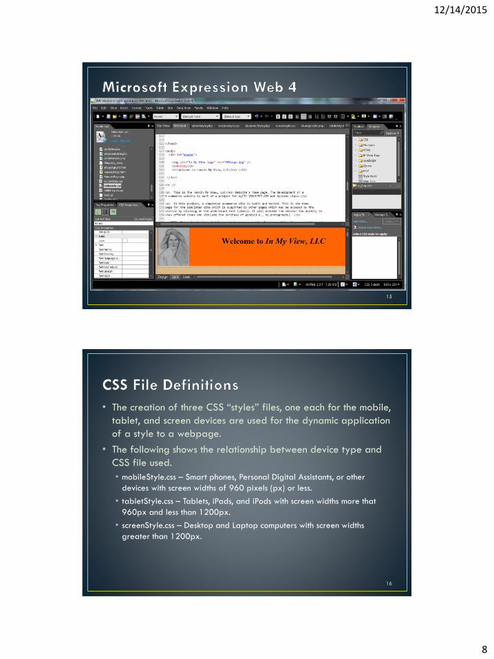
• The “In My View, LLC” (www.inmyviewllc.com) website currently
serves as a test site for the Server Filter for Mobile Devices
project.
• Following is a screen capture of the website.
12
12/14/2015
7
13
• The research for and the choosing of a software development
environment consisted of a comparison between NetBeans and
Microsoft Expression Web 4.
• The Microsoft Expression Web 4 application which is a software
Integrated Development Environment (IDE) was chosen because
it supports the development of:
• Scripts in PHP
• Scripts in JavaScript
• Scripts in other languages (Ajax, Perl, etc.)
• Webpages
• Cascading Style Sheet files
14
12/14/2015
8
15
• The creation of three CSS “styles” files, one each for the mobile,
tablet, and screen devices are used for the dynamic application
of a style to a webpage.
• The following shows the relationship between device type and
CSS file used.
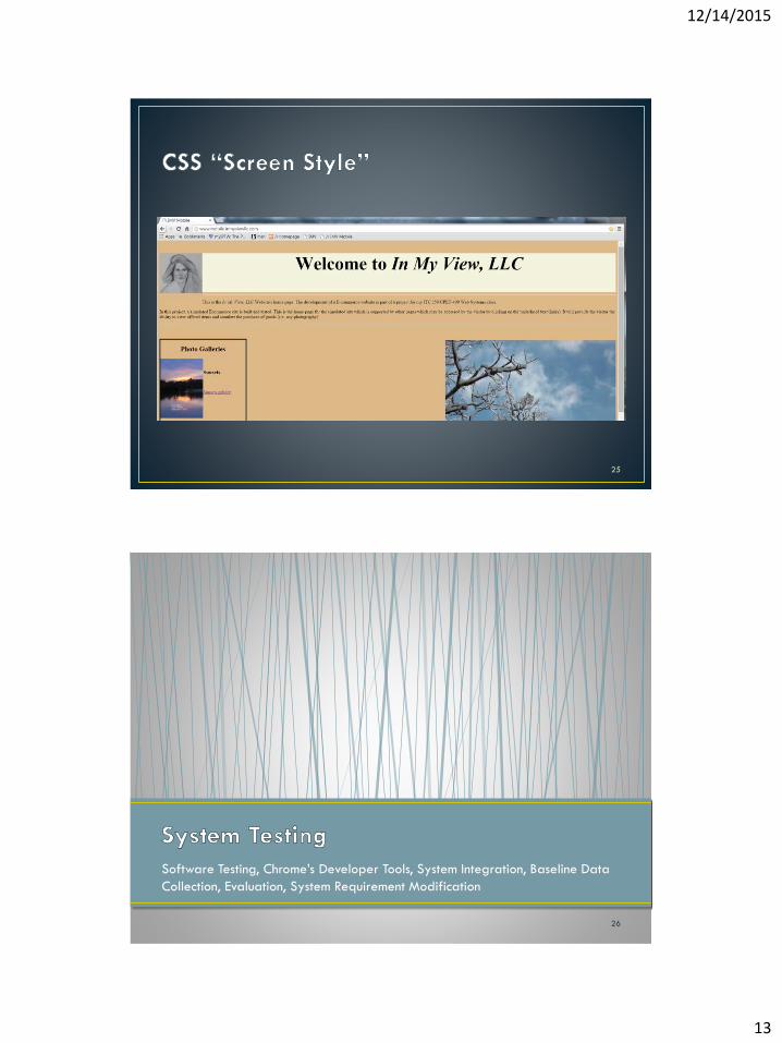
• mobileStyle.css – Smart phones, Personal Digital Assistants, or other
devices with screen widths of 960 pixels (px) or less.
• tabletStyle.css – Tablets, iPads, and iPods with screen widths more that
960px and less than 1200px.
• screenStyle.css – Desktop and Laptop computers with screen widths
greater than 1200px.
16
12/14/2015
9
• Modify existing website to use new “Mobile Filter” application.
• Integrate server side mobile device detection with dynamically
applied formatting using CSS.
17
Filter Design, Flow Diagram, Website Hosting, Remote Hosting, Remotely Hosted
Website, Subdomain, and CSS “Screen Style”
18
12/14/2015
10
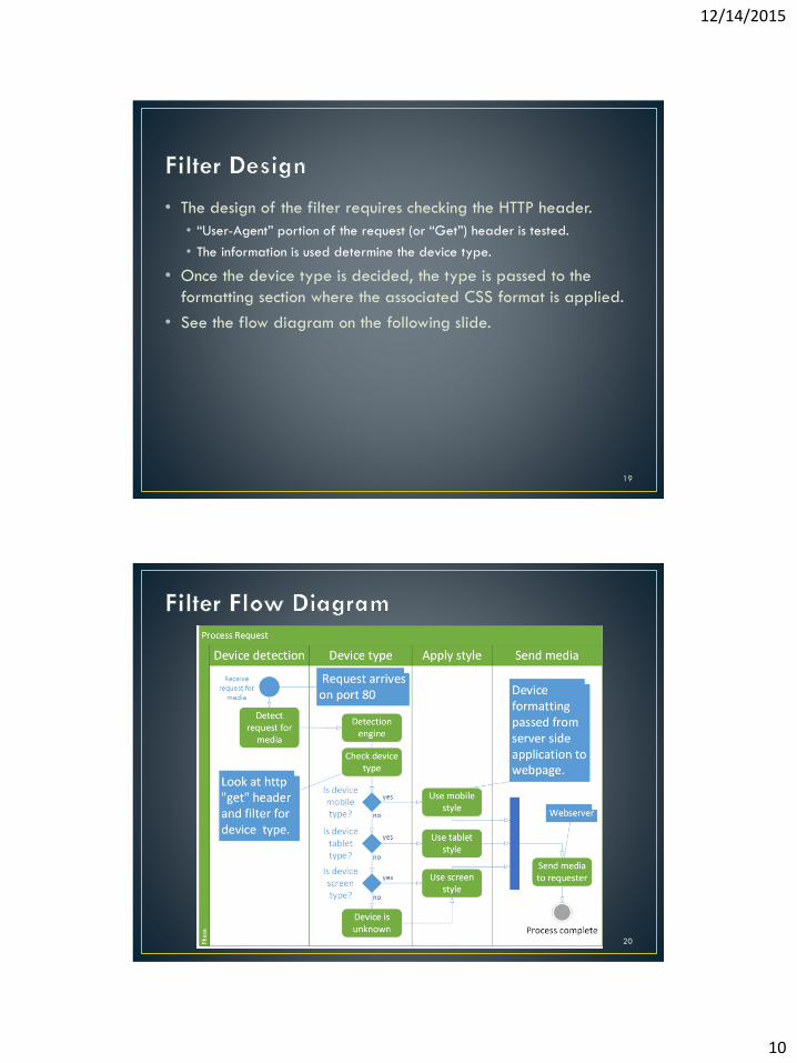
• The design of the filter requires checking the HTTP header.
• “User-Agent” portion of the request (or “Get”) header is tested.
• The information is used determine the device type.
• Once the device type is decided, the type is passed to the
formatting section where the associated CSS format is applied.
• See the flow diagram on the following slide.
19
20
12/14/2015
11
• The purchasing of a domain through Arvixe has enabled the In My View LLC site, www.inmyviewllc.com to go online.
• Webhosting sites which were compared:• Arvixe
• InMotion
• JustHost
• HostGator
• BlueHost
• GoDaddy
• Features compared:• Price
• Type of servers
• Number of domains
• Number of email addresses
• Support
• Disk space
• and site builder tools21
• To facilitate realistic testing of the design features, the site
needed to be remotely hosted.
• The cost of the webhosting service is $7.00 per month which
includes:
• Domain name registration for up to six domains
• 100 email addresses per domain
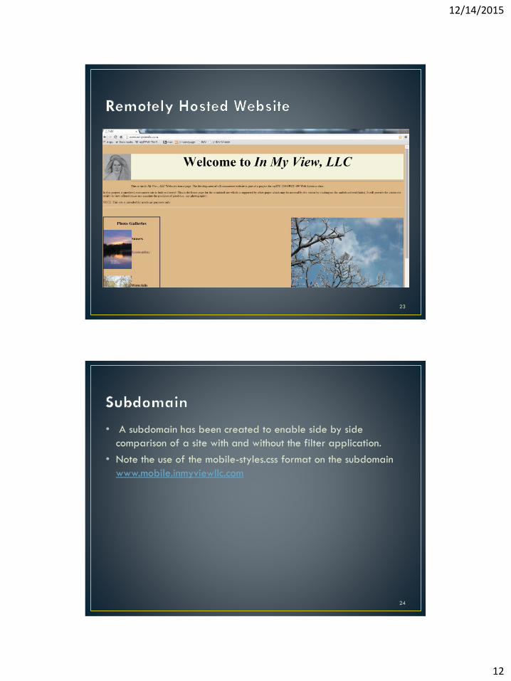
• The following is a screen capture from the homepage of the In
My View LLC Website.
22
12/14/2015
12
23
• A subdomain has been created to enable side by side
comparison of a site with and without the filter application.
• Note the use of the mobile-styles.css format on the subdomain
www.mobile.inmyviewllc.com
24
12/14/2015
13
25
Software Testing, Chrome’s Developer Tools, System Integration, Baseline Data
Collection, Evaluation, System Requirement Modification
26
12/14/2015
14
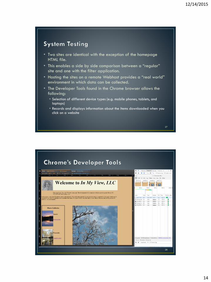
• Two sites are identical with the exception of the homepage HTML file.
• This enables a side by side comparison between a “regular” site and one with the filter application.
• Hosting the sites on a remote Webhost provides a “real world” environment in which data can be collected.
• The Developer Tools found in the Chrome browser allows the following:
• Selection of different device types (e.g. mobile phones, tablets, and laptops)
• Records and displays information about the items downloaded when you click on a website
27
28
12/14/2015
15
• The collection of data to form a baseline of performance is
critical to evaluate the success of this project.
• To gather quantifiable data, the Chrome bowser’s Developer
Tools provides data on file size, files downloaded, and time
required for downloading a webpage.
29
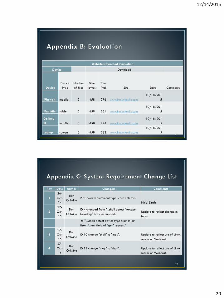
• A sample copy of a Website Download Evaluation summary is
found in Appendix B.
30
12/14/2015
16
• The project has evolved to include device detection/filtering
and system testing using a remote host site running a Linux
server.
• This change affects the expected outcome and therefore the
System Requirements need modification to reflect the new
direction.
• See Appendix C for the proposed changes to the System
Requirements.
31
Schedule, Cost, Problems Encountered, Lessons Learned
32
12/14/2015
17
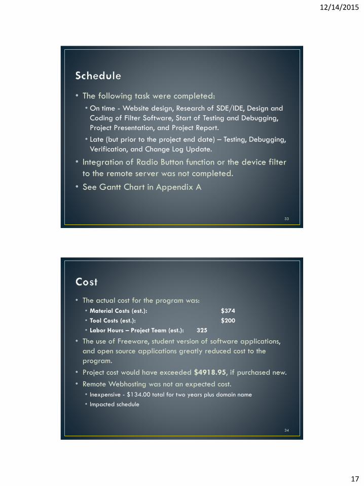
• The following task were completed:
• On time - Website design, Research of SDE/IDE, Design and
Coding of Filter Software, Start of Testing and Debugging,
Project Presentation, and Project Report.
• Late (but prior to the project end date) – Testing, Debugging,
Verification, and Change Log Update.
• Integration of Radio Button function or the device filter
to the remote server was not completed.
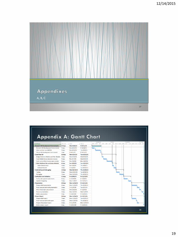
• See Gantt Chart in Appendix A
33
• The actual cost for the program was:
• Material Costs (est.): $374
• Tool Costs (est.): $200
• Labor Hours – Project Team (est.): 325
• The use of Freeware, student version of software applications,
and open source applications greatly reduced cost to the
program.
• Project cost would have exceeded $4918.95, if purchased new.
• Remote Webhosting was not an expected cost.
• Inexpensive - $134.00 total for two years plus domain name
• Impacted schedule
34
12/14/2015
18
• Definition of device types is complicated by new features and
screen resolutions of smart phones.
• The integration of PHP scripts into remotely hosted websites.
• System Requirements did not reflex change in scope.
35
• Limit and or avoid scope changes.
• CSS 3 used properly “fixes” many formatting issues.
• Not all browsers recognize new CSS 3 features
• Converting old sites to new standard is often very labor intensive
• Not having full access and administrative rights to your server
can make resolving issues difficult.
• PHP parsing
• Technical support
36
12/14/2015
19
A, B, C
37
38
12/14/2015
20
Website Download Evaluation
Device Download
Device
Device
Type
Number
of files
Size
(bytes)
Time
(ms) Site Date Comments
iPhone 4 mobile 3 458 276 www.inmyviewllc.com
10/18/201
5
iPad Mini tablet 3 459 261 www.inmyviewllc.com
10/18/201
5
Gallexy
III mobile 3 458 274 www.inmyviewllc.com
10/18/201
5
Laptop screen 3 458 283 www.inmyviewllc.com
10/18/201
539
Rev Date Author Change(s) Comments
1
26-
Oct-
14
Don
Ohlwine2 of each requirement type were entered.
Initial Draft
2
27-
Oct-
15
Don
Ohlwine
ID 4 changed from "...shall detect "Accept-
Encoding" browser support." Update to reflect change in
focus
to "…shall detect device type from HTTP
User_Agent field of "get" request."
3
27-
Oct-
15
Don
OhlwineID 10 change "shall" to "may". Update to reflect use of Linux
server on Webhost.
4
27-
Oct-
15
Don
OhlwineID 11 change "may" to "shall". Update to reflect use of Linux
server on Webhost.
40