Embed Size (px)
Citation preview

................................. / /' 03 Bilingual Design Layout Systems: Cases from Beirut RANDA ABDEL BAKI
ABSTRACT
This paper identifies and analyzes the challenges of bilingual design layout systems in Beirut. With the rapid spread of globalization , English and Arabic often enter the public realm together.
As the design industry also rapidly develops
and the Western influences are manifested, the duality of languages and scripts are constantly negotiated. This paper investigates various
bilingual design layouts and proposes six new variations of bilingual design layout systems for designers, educators and students to employ and develop further. By employing an illustrative
methodology in which different layout systems are both examined and compared , the author proposes visual structures for bilingual readers,
adding an extra layer to the understanding of visual communication while offering the viewer the choice of reading both scripts.
•
POGGENPOHL & ZENDER Ill/ Visible Language in Transition 39
> W ith the rapid spread of globalization and the overwhelming development of the design industry in the Middle East, Arabic
script has become secondary in publication designs. Beirut, as the capital , is used in this paper as an intense laboratory where Western influences are clearly manifested and negotiated in language
and graphic design. In Beirut, bilingual design for a range of mediafrom street signs and graffiti to various forms of printed materials
including posters, pamphlets, and books have become an increasingly obvious "challenge" as designers treat the two scripts; Latin and Arabic equally, despite their differences in direction , texture, and weight. As the design industry develops and as more designers are taught
at Western educational institutions, the issue of bilingual design is more and more frequently resolved by having the Arabic script
as a secondary form, foregrounding the Latin script.
This paper investigates the challenges of bilingual design layout
systems in the Middle East and more specifically in Beirut, the capital
city of Lebanon. It proposes bilingual design layout structures to equip designers with a better understanding of bilingual compositions
and integrated methods of application. Many attempts have been made to bring together Latin and Arabic scripts in a harmonious way, yet, they have not yielded thorough explorations that will assist
designers in the development of bilingual layout systems.
Building on Kimberly Elam's typographic systems and based on
my research and observation of Beirut's visual bilingual topography1, I developed bilingual layout systems and will demonstrate their applications by showcasing selected projects of my students' work
at the Lebanese American University (LAU) in Beirut, along with
personal work and vernacular bilingual city signs. The choice of these examples is representative of a larger scope illustrating the diverse applications of bilingual layouts in our daily life in Beirut.
This paper exposes the difficulties of combining dual distinct scripts
of Latin and Arabic, and overviews several approaches for designing and pairing bilingual scripts in a harmonious manner.2 It culminates
in the proposal of six new variations of bilingual design layout systems for designers, educators and students to apprehend , employ and develop a variety of bilingual compositions.
Many design publications in this region are produced solely in English
since Middle Eastern designers are more comfortable using Westernized layouts given that their design background lacks adequate training in combining Arabic and Latin scripts. The lack of training stems from
a well-founded desire to study in the West, but the application of this Westernized knowledge to further the dialogue between the two cultures is still amiss. The ultimate goal should be to enhance the local
40 VISIBLE LANGUAGE 47.1

language by looking at and learning from the Western design
systems, whereas the trend in design seems to merely adapt Latin script compositions to the Arabic script that do not necessarily accept such aesthetics. Paul Cleveland, professor at Griffith University explains, "Aesthetic preference involves complex factors which
optimize the degree of arousal potential. The use of ratios may be one of these, but balance, complexity and order are also important
factors" (Cleveland, 2008:37}. While assessing the relationship between the scripts of two languages, it is crucial to consider the
specific elements that contribute to our innate visual preferences.
The lack of training in creating harmonious bilingual layout systems3
calls for the need of innovative, compelling layout systems that
can be employed for various daily needs of designers in the Middle
East to combine Latin and Aribic type. Understanding the specific problems posed by the combination of Arabic and Latin script is vital to start thinking about the guiding principles in the creation of bilingual layout systems. The challenge of integrating bi-scripts of distinct nature into a coherent and skillful layout drove many
designers in this region to choose form over function. Form over function here refers to the prioritization of goals; where form is treated as more important than solving the problem of handling Arabic and Latin script in a balanced manner. This is the easy way out so instead of thinking about the co-existence of the two scripts, designers dealing with bilingual layouts allow the Latin
script to dominate, which underscores design limitations. This paper
sheds light on this trend and I am hoping it will be a steppingstone for further investigations in the field.
CHALLENGES OF COMBINING LATIN AND ARABIC SCRIPTS
Before tackling the issue of bilingual layouts, one has to start by understanding the challenges of combining two scripts of different nature and to learn how to select or create suitable and corresponding typefaces in order to proceed with an integrated bilingual layout
design. Scripts play an essential role in layout designs, as they generate the texture, tone, contrast and form of the composition. They also indicate the reading direction of the text , each have an appearance and
style that should be considered before structuring a bilingual layout.
There are two primary differences between the Latin and Arabic scripts that constitute the problem of bilingual layouts: form and direction. The curved, flexible form of Arabic type, rooted in its calligraphic foundations , is in contrast to Latin structured type. The ascenders,
descenders and baseline, important in typography for word recog
nition, are different in Latin and Arabic scripts; in addition Arabic script has no capital letters.
POGGENPOHL & ZENDER I ll/ Visible Lanquaqe in Transition 41

The anatomy of the letters and the scripts reveals further differences.
The two scripts create different textures, which further complicate their
representation together. Texture of the script refers to the type created
by the strokes as well as the curvature of the script. In an ideal bilingual
layout, the textures of the two scripts would be to preserve a harmoni
ous look and feel. As Robert Bringhurst notes,
"the more closely different alphabets are mixed, the more important it becomes that they should be close in color and in size, no matter how superficially different in form" (Bringhurst, 2002).
For instance, Helvetica, a sans serif typeface that was developed
in 1957 by Swiss typeface designer Max Miedinger, required a corr
esponding Arabic typeface that would be consistent and complement
the Latin type in bilingual layout publications. The Arabic type library
is still nascent in comparison to Latin typeface library and the flexibility
of the Arabic scripts for typographic interpretation is an important
matter of debate for designers such as Nadine Chahine4 , Yara Khoury5 ,
Pascal Zoghb;6 who develop typefaces, in relation to and independent
from Latin scripts. The Arabic text occupies different dimensions
than the Latin with respect to the length and width of the paragraphs.
As illustrated in Figure 8 and onward, the multifaceted Arabic script
carries a wide range of ascenders and descenders and combines small
glyphs and counters that create a smaller appearance in comparison
to the length of Latin text.
Unlike Latin script, Arabic script is read from right to left, which
makes the two texts collide if facing each other. They run in opposite
directions. The Arabic script is rhythmical and its letters connect
smoothly in a soft and natural flow. It is multi facetted; each letter
has 3 to 4 assorted forms depending on its position in the word
(Tracey, 1975). (figures 1, 2)
~t )Om .....
~ .. , ,., .,
\\ ~ ~~ ~) ~) ... "" ., ~ dhJI .., t .. ~ ~) ~ ~) ~\
'"t OH) Tjt- """~ ... ·~· If.
~ ~ ~ m"" "J\ '".:; qttl tf
·~ ·~~ ~ " ~
~ WJ' .... , ... ~
(! I
~ t,))
FIGURE 1 Freestanding Arabic letters
42 VISIBLE LANGUAGE 47.1

b ':-'- ~; y
~ ..!?Y..) -?" t J. .Q
:f)
v- -"'£) .... U" ...,.,. 4 )
""' h 4-) .6 .6
E: -'0 t -...;. 4.; ~
~ ~ 1.3 cl 50 -!)
J. -b J ('- -'0
0- ~) 0 <l ~
~ 5) .9
I? -£) '-?
FIGURE 2 A few Arabic letters with variation
of forms depending on their placement in the word.
In addition, the Arabic letters are mostly vertical in comparison
to the horizontal form of Latin words that are based on a standard
x-height, descender and ascender. Arabic letters have a varied
x height, and an extended ascender and descender in comparison
to Latin letters (Nemeth, 2006). They have many glyphs and hundreds
of ligatures that make it difficult to typeset and read . The diacritics
are hard to position correctly and often require manual adjustment,
thus more time and effort. The difference in letter size makes the small
Arabic size typeset illegible; moreover the vertical nature of the letters
with big ascenders and descenders requires a larger baseline skip ,
hence less lines fit on the page (Haralambous, 1998).
HARMONIZING LATIN AND ARABIC TYPEFACES
Many reform attempts have been proposed to simplify the Arabic
Writing systems but only few succeeded in providing adequate Arabic
typesetting and a new direction for Arabic type design (Smitshuijzen
AbiFares, 2001 ). Nowadays the Arabic typeface design library is still
skeletal in comparison to the Latin versatile library of type. This is due
to the complexity of the Arabic script and the lack of technological
programs that enables Arabic font applications.
Consequently, recent efforts from a few design firms and local
designers have been focused on developing a resourceful Arabic
typographic library providing the designers with more choices
of harmonizing Latin and Arabic typefaces.
There are different ways of associating typefaces, either by designing
both Latin and Arabic type simultaneously such as pairing them to
POGGENPOHL & ZENDER I ll/ Visible Language in Transition 43

secure a complete customized entity, or by matching a type to another and having a main script that influences the development
of its matching script.
PAIRING TYPEFACES A compelling case study to understand the design problems posed the specific bilingualism using Latin and Arabic script is the Dubai Metro. The newly constructed
metro, a crucial part of Dubai's rapid modernization was
opened in 2009. Dalton Maag, a design agency currently working on a number of Arabic font projects, created the branding system of Dubai Metro project in Collaboration
with Transport Design Consultancy (TDC). They conceived a font design and typographic system covering both Arabic
and Latin, which satisfied all of the functional requirements.
Dalton Maag identifies a most common problem with dual language systems-when Latin script is used to "set the tone,"
the Arabic script takes on a secondary role, disregarding the
specific visual and cultural heritage. The need to treat Arabic script the same as Latin script becomes obvious in the con
text of growing tourism and cultural sharing opportunities (Dalton Maag, 201 0). The subservient treatment of Arabic foregrounds the Western element in the Middle East and
disregards the context and the specifics of local language.
According to the firm, too often in dual language systems, the Latin script is used to establish the tone of typography. This means that other scripts such as Arabic are considered
secondary, giving little significance for its rich heritage and visual semblance to the rest of the identity. This project was a pioneer in developing two entirely different script systems
in unison and harmony.
44 VISIBLE LANGUAGE 47.1
~ ~.P..a '-1' Exit OJ
FIGURE 3 Dalton Maag. Dubai Metro stgnage. http:!/wvvw.daltonmaag.corn!
news/135.html http://www. transportdestgn.com/?pid=2&sid= 17

Looking at bilingualism in the larger context by analyzing another combination of scripts, namely, Welsh and English ,
can help us anchor the study of Arabic and Latin scripts used in combination. Nikolas Coupland, in "Welsh linguistic
"parallelism" as a crucial element in bilingual layout systems,
through looking at bilingual designs employing Welsh and
English (Coupland, 201 0).
It is possible to format bilingual text, stylistically, following principles of parallelism in several different ways [ .. . ] The main [principle] is equality: Welsh and English must
be given equal weighting and prominence, so that
the same access is afforded to each language. Equivalence is interpreted in the specific sense that the textual content of Welsh and English must be identical ; then once again choice, in the assumption that bilin
gual speakers/ readers will be able to choose whether
to access the content of a text either in Welsh or in English . A further principle is code integrity, requiring that Welsh and English text-elements must be presented as fully formed and separate from each other.
The relationship between Welsh and English is obviously different from the relationship between English and Arabic. However, the principle of equality holds valid for the conception of new bilingual layout systems. Parallelism, in the
context of a globalized Arab world becomes particularly important as the governing principle should be that the local language is held in the same esteem as English, not as a subservient second, echoing colonial relationships between
the West and the Middle East.
MATCHING TYPEFACES Matching Arabic type to Latin has been a rising concern and has been explored by a few designers. Khatt Foundation
lead by Huda Smitshuijzen Abifares has gathered Dutch
and Arab typographers to conceive five new Arabic typefaces inspired by Latin type (Smitshuijzen Abifares, 2009). These new Arabic typefaces will assist designers in creating con
temporary and compelling bilingual products. According to Abifares, this exchange plays an essential role in visually
representing a culture's identity (figure. 4) .
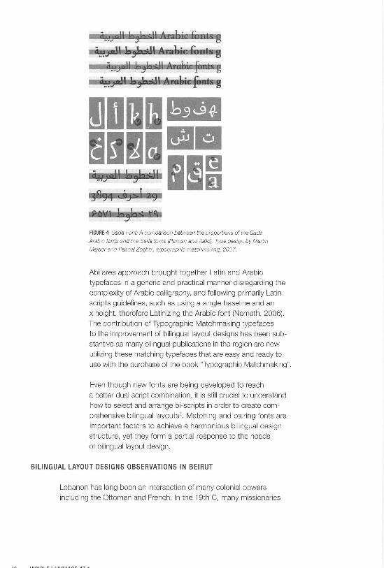
FIGURE 4 Sada Font: A comparison between the proportions of the Sada
Arabic fonts and the Seria fonts (Roman and Italic). Type design by Martin
Majoor and Pascal Zoghbi, typographic matchmaking, 2007.
Abifares approach brought together Latin and Arabic
typefaces in a generic and practical manner disregarding the
complexity of Arabic calligraphy, and following primarily Latin
scripts guidelines, such as using a single baseline and an
x height, therefore Latinizing the Arabic font (Nemeth, 2006) .
The contribution of Typographic Matchmaking typefaces
to the improvement of bilingual layout designs has been sub
stantive as many bilingual publications in the region are now
utilizing these matching typefaces that are easy and ready to
use with the purchase of the book "Typographic Matchmaking".
Even though new fonts are being developed to reach
a better dual script combination, it is still crucial to understand
how to select and arrange bi-scripts in order to create com
prehensive bilinguallayouts7. Matching and pairing fonts are
important factors to achieve a harmonious bilingual design
structure, yet they form a partial response to the needs
of bilingual layout design.
BILINGUAL LAYOUT DESIGNS OBSERVATIONS IN BEIRUT
Lebanon has long been an intersection of many colonial powers
including the Ottoman and French. In the 19th C, many missionaries
established schools and institutions in Great Lebanon (Salibi, 2003). Even though Arabic is the official language of Lebanon, the hybridity and mix of languages is quite dominant, especially in the capital
city of Beirut.
Indeed, Beirut is a cosmopolitan city where both the native Arabic language and English are vital in the daily communication with the city's inhabitants . Most people who live in Beirut speak at least two languages. Therefore, bilingual publication layouts and visual identities
are imper- ative to the integration of both cultures. They preserve
the native language of the city inhabitants allowing a blending of identities and harmonious discourse. The balanced treatment of the two types becomes particularly important when the readers are bilingual. How do you retain visual harmony in text that enables the bilingual
reader to read both languages easily? How do you design a complementary bilingual design or publication with an understanding
of a well-balanced layout, ensuring a wholesome bilingual design?
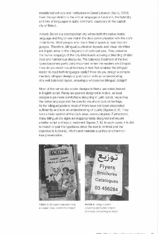
Most of the vernacular poster designs in Beirut are solely treated
in English script. Rarely are posters designed in Arabic, as local designers are more comfortable designing in Latin script, neglecting
the native language and the specific visual and cultural heritage.
As for bilingual posters most of them have not been elaborated sufficiently and lack an understanding of duality (figures.5, 6). They form a trivial section of the city's visual communication. Furthermore,
many bilingual city signs are inappropriately designed and require a better script and layout treatment (figures 7, 8). In such cases, it is vital to match or pair the typefaces since the text is minimal and the
objective is to brand, inform and maintain a unified and harmon-ious presentation.
FI GURE 5 Bilingual poster promoting
a cabaret show. Hamra street Beirut
Flyers Brochures
Catalogues
03 456284
FIGURE 6 Bilingual poster
promoting distribution of flyers,
brochures and catalogues Beirut

FIGURE 7 Mixed Nuts bilingual store sign. Hamra, Beirut
FIGURE 8 City Library bilingual sign. Beirut
BILINGUAL LAYOUT SYSTEMS EXPANDING ON KIMBERLY ELAM'S PARADIGMS
Based on Kimberly Elam 's expansive research and approach
to typographic compositions, along with my professional and teaching experience in bilingual designs and including my extensive observation of Beirut's bilingual designs representations, I propose six new bilingual layout systems. In order to propose new bilingual design layouts systems, I have used Elam's Typographic Systems as a reference, which led me to create a revised version that is suitable
for bilingual layouts dealing with bi-scripts of distinct origin .
These will equip designers with innovative and flexible solutions when faced with the challenge of combining scripts that are different
in nature, direction and form. These systems are set on dual and harmonious typographic systems based on target audience require
ments. In the particular case of Beirut , the target audience is the majority of readers equally comfortable in two languages.
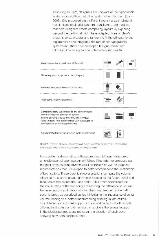
According to Elam, designers are unaware of the typographic
systems possibilities that other systems hold for them (Eiam,
2007). She proposed eight different systems: axial, bilateral,
radial, dilatational, grid, random, transitional, and modular,
that help designers create compelling layouts by exploring
beyond the traditional grid. I have adapted three of Elam's
systems: axial , bilateral and random to fit the bilingual layout
requirements and integrated the rest of her typographic
systems into three new developed bilingual structures:
mirroring, interlacing and complementary (figures 9).
Axial [scripts lay on each side of the axis]
Mirroring [each script has a distinct layout]
Bilateral [scripts are centered to the axis]
Interlacing [intertwined scripts]
Complementary [an attribute to any of the systems with the exception of mirroring system] . The script complements the other, with no equal transliteration. This system mixes both languages to communicate one bilingual message.
Random/ Multi systems [multiple systems combined]
FIGURE 9 Diagram of the six new proposed bilingual system. Latin script is represented
by the black color and the Arabic script by the grey color.
For a better understanding of these proposed bilingual structures,
an explanation of each system will follow. I illustrate the proposed six
bi lingual systems using diverse visual examples8 as well as graphical
representations that I developed to better comprehend the relationship
of both scripts. These graphical representations compute the volume
allocated for each language; grey color represents the Arabic script and
black color represents the Latin script. This chart communicates
the visual ratios of the two scripts reinforcing the difference in volume
between scripts and demonstrating that most frequently the Latin
script is larger, as described earlier. It highlights the importance of script
volume leading to a better understanding of bilingual structures .
This difference in volumes supports the analytical fact of both scripts
differing in structure and dimension. In addition, the arrows located
in the black and grey areas represent the direction of each script
showing how both scripts interact.
BAKI //// New Bilinqual Desiqn Layout Systems 49

THE SIX PROPOSED BILINGUAL SYSTEMS
1: BILINGUAL AXIAL SYSTEM The bilingual axial system is where each script (Arabic + English /French) lays on the side of a vertical or horizontal axis . This structure is widely used in bilingual catalogs
and book designs, keeping the scripts independent from
each other. It allows designers to place the scripts individually on one side or the other of a single axis, which creates an invisible divider (figure 10) .
60
45
30
IS
0
percentage%
FIGURE 10 Vertical axial system. "Ayam Beirut AI Cinema"iya·· Arab F;im Festival
Catalog. Beirut 2008AraiJ Film Festival Catalog. Beirut 2
This system is also practiced with two parallel axes each introducing a script that faces the other (figure 11 ). However, if both scripts are aligned , then the opposite direction of the scripts poses a problem for the axial
system, as the texts ideally should not move towards each other, but away from each other, unless the designer
chooses to create a particular negative space between the two scripts.

60
45
30
IS
0
percentage% FIGURE 11 Horizontal ax1al system. Poster design by Malika Katishat. LAU,
Beirut 2008
In advanced publications such as in posters designs, the designer can apply multiple axial systems combined to create an attractive and intricate composition (figure 12).
1'he conference on corruptaon an Lebanon
L...uill . c
.l . lid J4.118 u. ~
60
45
30
IS
0
percentage% FIGURE 12 Vertical and horizontal axial systems. Poster design by Dana Charabati.
LAU, Beirut 2008

II: BILINGUAL MIRRORING SYSTEM The bilingual mirroring system is where scripts are "mirror" reflections and separated from each other. Most mirroring
systems are used in bilingual package designs (figure 13 ),
street signs, business cards and brochures. The mirroring system comprises of two parts with equal visual density,
each containing exclusively one script.
FIG URE 13 "Leaves·· tea package design by Farah Kalash. LAU, Beirut 2008
This system is widely used in brochures and books where
the treatment of texts is equal yet separate. It deals with single
script model that is convenient for lengthy texts to keep it intact without the distraction of the other script, thus making
it easier to read. For instance in Figure 14, the scripts are
facing each other, each placed on a flap of the cd booklet , displaying an equal text volume, and are divided by the center CD holder.
I AMr-IIA _t: A7 1
FIGU RE 14 "Darwish" CD design by Randa Abdel Baki. © Forvvard Music 2009
Many designers choose this system as it deals with
scripts distinctly, without handling the complexity of bilingual layouts. However, they have to understand even though
the scripts are not combined together they still have to work
together, thus the importance of harmonizing bi-scripts
as discussed earlier. The most common and weak application
of the mirroring system is exhibited in the vernacular presen
tation of shop signage and adverts. These bilingual layouts
are not integrated since the treatment of both types
is neither compatible nor harmonious (figure 15).
FIGURE 15 Berkley School bilingual sign. Beirut 2012
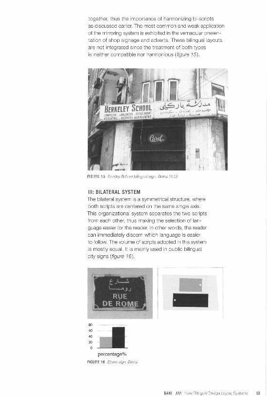
Ill: BILATERAL SYSTEM The bilateral system is a symmetrical structure, where
both scripts are centered on the same single axis.
This organizational system separates the two scripts
from each other, thus making the selection of lan
guage easier for the reader. In other words, the reader
can immediately discern which language is easier
to follow. The volume of scripts adopted in this system
is mostly equal. It is mainly used in public bilingual
city signs (figure 16) .
I ll!
80
60
40
20
0
t ~l-..:. ·--A 3~
R\JE DE ROME
percentage%
FIGURE 16 Street sign. Beirut
BAKI //// New Bilingual Design Layout Systems 53

The practice of bilingual bilateral system is common
and predictable, since it requires keeping both scripts
separate and centered to the same axis. This simple
bi-structure relies mostly on the choice of corresponding and harmonious scripts that are centered to one axis.
In many existing cases when the typeface treatment
is not studied then the final outcome of the layout is weak. (figure 17) An effective treatment of bilateral system is when used for bilingual indorsed display sign . (figure 18)
52
39
26
13
percentage%
FIGURE 17 Flyer posted on the walls of Beirut 2009
60
30
percentage%
FIGURE 18 Sursocl< Cochrane Palace sign. Gemayze. Beirut 2010
54 VISIBLE LANGUAGE 47.1

IV: INTERLACING SYSTEM The interlacing system is where intertwined or interlacing
scripts display an interweaving of the two languages. The
two languages are combined without a conspicuous axis .
This system has the advantage of blending together the two
scripts and making the separation of scripts seamless .
This bilingual layout system gives the impression of having
one unified body text where the volume of each script is no
smore crucial as they seem to become one unit (figure 19).
80
60
40
20
0
percentage%
FIGURE 19 "The Last Communique'' back cover design by Randa Abdel Bal<i.
Forward Music 20 1 0
In addition, this system can be combined with other
systems such as bilateral or axial as illustrated in Figure
20, where the bilingual text is flushed to the right side axis ,
having an interlacing axial system. This advanced combin
ation of two layout systems helps the designer to explore
a wider range of sophisticated bilingual compositions
aiming to unify both scripts into one.
52
39
26
13
0
percentage%
FIGURE 20 Poster design L)y Mona
Yakzan. LAU, Beirut 2007
BAKI //// New Bilingual Design Layout Systems 55

The interlaced system generates a blended visual message
that creates a unified dynamic content. The designer has to understand that this bilingual system is inappropriate for
lengthy text.
V: COMPLEMENTARY SYSTEM The complementary system features a layout structure
where one script complements the other. It is an attribute
to any of the proposed bilingual systems with the excep-tion of the mirroring system that has equal content and cannot be associated to a dual complementary combination. The complementary layout designs could be described or characterized as axial complementary (figure 21 ), bilateral
complementary (figure 22), intertwined complementary (figure 23) or random complementary that wi ll be discussed further in this paper. (figure 24)
60
45
30
15
0 percentage%
FIGUR E 21 Axial complementary systems. Poster design by Yasmine Salami.
LAU, Beirut 20"10
56 VISIBLE LANGUAGE 47.1

60
45
30
15
0 percentage%
-FIGURE 22 The Arabic calligraphy complements the Latin script. "Arabtango"
CD cover design tJy Randa Abdel Baki. © FoJWard Music 2009
80
60
40
20
0 percentage%
FIGURE 23 Poster design by Dunia Nassar LAU. Beirut 2011
In this case, the designer should keep in mind his priority
audience. If the viewer is primarily an Arabic reader, then
the main information will be presented in Arabic script and
vice versa.
BAKI //// New Bilinaual Desian Lavout Svstems 57
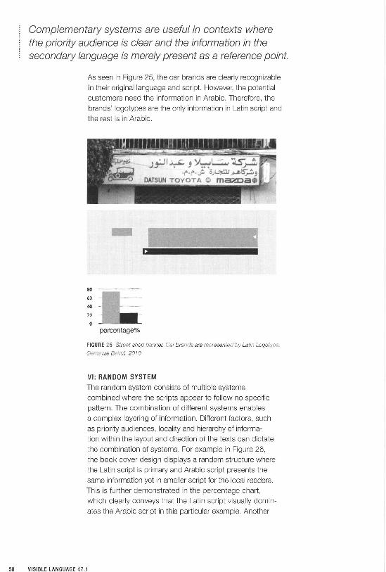
Complementary systems are useful in contexts where the priority audience is clear and the information in the secondary language is merely present as a reference point.
As seen in Figure 25, the car brands are clearly recognizable
in their original language and script. However, the potential
customers need the information in Arabic. Therefore, the
brands' logotypes are the only information in Latin script and
the rest is in Arabic.
- ..;. 3.. . ~ . '
: .. ·· ' ' . . ' ' .~.
80 -~ -~-····~··
60
40
20
0 percentage%
FIGURE 25 Street shop banner. Car brands are represented by Latin Logotype.
Gemayze Beirut. 2010
VI: RANDOM SYSTEM The random system consists of multiple systems
combined where the scripts appear to follow no specific
pattern. The combination of different systems enables
a complex layering of information. Different factors, such
as priority audiences , locality and hierarchy of informa-
tion within the layout and direction of the texts can dictate
the combination of systems. For example in Figure 26,
the book cover design displays a random structure where
the Latin script is primary and Arabic script presents the
same information yet in smaller script for the local readers.
This is further demonstrated in the percentage chart,
which clearly conveys that the Latin script visually domin
ates the Arabic script in this particular example. Another
58 VISIBLE LANGUAGE 47 .1

combination of multiple visual systems is presented in Figure
27. It is comprised of intertwined and axial structures,
including the same content in both languages.
70
53
35
18
0
AYAM BEIRUT
AI Cinema'iya
percentage%
'08 1 arab film festival
FIGURE 26 "Ayam Beirut" book cover. 2008
percentage%
FIGURE 27 "The book between the Aesthetic and the Useful" Conference. Poster
design by Randa Abdel Baki & Bassam /(ahwagi. 2009
BAKI //// New Bilinqual Desiqn Layout Systems 59
DISCUSSION
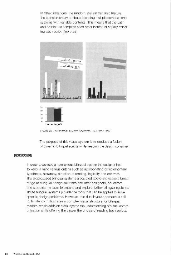
In other instances, the random system can also feature
the complementary attribute, blending multiple compositional
systems with variable contents. This means that the Latin
and Arabic text complete each other instead of equally reflect
ing each script (figure 28) .
52
39
26
13
percentage%
FIGURE 28 Poster design by Aleen Chehayeb. LAU. Betrut 2011
The purpose of this visual system is to produce a fusion
of dynamic bilingual scripts while keeping the design cohesive.
In order to achieve a harmonious bilingual system the designer has
to keep in mind various criteria such as appropriating complementary
typefaces, hierarchy, direction of reading, legibility and contrast.
The six proposed bilingual systems articulated above showcase a broad
range of bilingual design solutions and offer designers, educators,
and students the tools to expand and explore further bilingual systems.
These bilingual systems provide the tools that can be applied to solve
specific design problems. However, this dual layout approach is still
in its infancy. It illustrates a complex visual structure for bilingual
readers, which adds an extra layer to the understanding of visual comm
unication while offering the viewer the choice of reading both scripts.

The specific challenge of bilingual systems remains for designers to create symbiotic designs that enrich the emerging global dialogue while preserving local culture specifics.
In bilingual design, the most important challenge remains to maintain
harmony between the two languages. In a visual culture dominated by Western influence, it is important to bring Arabic script up to par in novelty, innovation, and legibility. Bilingual material possesses culturally sensitive duality, which poses a critical contemporary question for the local designers in the Middle East. The specific problems posed by the
combination Arabic and Latin scripts are relatively novel and made
acute by the cultural necessities of globalization. In this sense, the specific case study of Lebanon is an important beginning for this larger conversation on the use of bilingualism in design.
The duality of scripts, as illustrated in the case study of Beirut , can also be expanded to other scripts such as the Cyrillic, Hellenic,
and Sanskrit alphabets. The specific issues posed by Arabic can be used as a foundation to expand on, as script-based differences
will inevitably produce different affects. The juxtaposition of different languages will pose challenges that can only be overcome through the understanding of specific dualities.
The inherent hybridity in bilingual design layouts is an immediate rendition of a sense of belonging and the fusion of two languages
is indicative of a cultural exchange.
The research in dualities and hybridity also furthers our understanding of design as a form of communication, a contemporary mode of research, and an intercultural tool. This opens up a new horizon of possibilities in places where there is a plurality.
The integral relationship between everyday life and design also
accentuates the importance of carrying the permeability of this study
in both the commercial design world and the more abstract understanding of these concepts in educational contexts. To put in harmony two scripts of different language in various formats such as adverts, posters, books, and packages can be enhanced with the application
of the six proposed bilingual systems.
It is also of note that the general concept of duality can be applied to many different media and any artistic realm in which cultural pro
duction takes place. As cultural nuances become more prominent

in contemporary design, the need to integrate the differences
as well as the similarities into the quotidian becomes more
pressing. The abstract and the utilitarian come together in
bilingual design layouts that can be used as a framework
for other forms of hybridity.
REFERENCES
Bringhurst, R. 2002. The elements of typographic style, 2nd
ed., Hartley & Marks, Vancouver, 1 07.
Chahine, N. 2008. Face to Face Interview. http://ilovetypogra
phy. com/2008/05/0 1 /face-to-face-an-interview-with-nadine
chahine (Accessed April 10, 2012).
Cleveland, P. 2008. Aesthetics and Complexity in Digital
Layout Systems. http://www98.griffith.edu.au/dspace/
bitstream/handle/1 0072/24181 /49670_1.pdf?sequence=1
(Accessed May 12, 2012).
Coupland, N. 2010. Welsh Linguistic Landscapes 'From
Above'
and 'From Below'. Jaworski, A., ed. Semiotic Landscapes:
Language, Image, Space. London: Continuum, 77-101.
Dalton Maag. 2012 . Case Study Dubai Metro in Detail. http://
www.daltonmaag.com/news/135.html (Accessed May 20,
2012].
Elam, K. 2007. Typographic Systems. Princeton : Princeton
Architectural Press.
Haralambous, Y. 1 998. Simplification of the Arabic Script:
Three Different Approaches and their Implementations.
Lecture Notes
In Computer Science. Berlin: Springer-Verlag, Vol. 1375.
Linotype. 2012. Badiaya Family. http://www.linotype.
com/341148/Badiya-family.html (Accessed April11, 2012).
Nemeth, T. 2006. Harmonization of Arabic and Latin Script.
Possibilities and Obstacles. University of Reading.

Salibi, K. 2003. A House of Many Mansions- The History of
Lebanon Reconsidered, New Ed edition. London: B Tauris &
Co Ltd.
Smitshuijzen AbiFares , H. 2001 . Arabic Typography a
Comprehensive Sourcebook. London: Saki Books.
Smitshuijzen AbiFares, H. 2009. Typographic Matchmaking:
Building Cultural Bridges with Typeface Design. Pap/Cdr Bl
Edition. Amsterdam: BIS Publishers.
Tracey, W. 1975. Advances in Arabic printing, British Society
for Middle Eastern Studies, Durham: British Society for Middle
Eastern Studies.
ENDNOTES
1 As a graphic designer and an academic working and teaching
in Lebanon, I have thoroughly observed and analyzed many
typographic bilingual layouts displayed in the city of Beirut for
at least two decades and have directly worked with bilingual
design issues in my teaching career.
2 Bi-scripts will be discussed later in this paper, as they
represent a major component to design successful bilingual
layouts. They display the overall texture, contrast and form
of the layout.
3 I use the term "harmonious" and "integrated" to refer to a
relatively comparable and equal treatment of both Arabic and
Latin scripts.
4 Nadine Chahine, font designer and Arabic specialist at
Linotype GmbH, handles Arabic-related projects. A few of
her Arabic fonts are: Frutiger Arabic, Palatino Arabic, Badiya
and Janna.
5 Yara Khoury type designer and design director at AI
Mohtaraf (www.mohtaraf.com) design house. Her work
focuses on designing corporate identities and publications
for the Arab world and developing Arabic typefaces.
6 Pascal Zoghbi is a typography instructor and type designer
specialized in Arabic fonts. He designed contemporary Arabic
fonts for leading Middle Eastern Newspapers, magazines, and
urban spaces.
7 In the advanced typography class that I taught at LAU, I
requested from my students to develop bi-scripts in order to
understand the differences of scripts and their challenges
before moving forward and looking at the big picture of designing successful bilingual layouts. This was further
developed in another paper: Coupling Bilingual Typefaces.
8 The selected visual examples are depictive of bilingual
applications in the city of Beirut and demonstrate the
integrated new bilingual layout systems. They are based on
urban street signs, my students' work at LAU and a
collection of personal design work.

ABOUT THE AUTHORS
Mike Zender is Professor of Design and
Director of the Graduate Program in Design
at the University of Cincinnati. Mike received his MFA (terminal degree) from Yale
University where he was the Carl Purrington
Rollins Fellow. In 2004 he was a Medical
Informatics Fellow at the Marine Biology
Laboratory, Woods Hole, MA, and in 2009
was named a National Fellow of the AlGA
(American Institute of Graphic Arts) for his
contributions to design and design edu
cation. Professor Zender's research
is on non-verbal communication through
simple symbols such as icons and picto
grams in the medical domain, and the
application and testing of these in global
cross-cultural communication.
G. Mauricio Mejia is an assistant
professor at the Department of Visual
Design, Faculty of Arts and Humanities,
at the University of Caldas, Colombia.
He received a Master's degree in Design
from the University of Cincinnati, USA.
Currently, he is a PhD in Design candi
date at the University of Minnesota,
USA. His research work focuses on inter
action design for social change. He
is interested in the theory of rhetoric
in design, human differences in design, and design research methods.