Embed Size (px)
Citation preview
Mobile Health Mashups: Making sense of multiple streams of wellbeing and contextual data
for presentation on a mobile device Konrad Tollmar1, Frank Bentley2, Cristobal Viedma1
1Department for Communication Systems Royal Institute of Technology
Stockholm, Sweden [konrad, crvi]@kth.se
2Motorola Mobility Libertyville, IL USA
Abstract— In this paper we present the Mobile Health Mashups system, a mobile service that collects data from a variety of health and wellbeing sensors and presents significant correlations across sensors in a mobile widget as well as on a mobile web application. We found that long-term correlation data provided users with new insights about systematic wellness trends that they could not make using only the time series graphs provided by the sensor manufacturers. We describe the Mobile Health Mashups system with a focus on analyzing and detailing the technical solution, such as: integration of sensors, how to create correlations between various data sets, and the presentation of the statistical data as feeds and graphs. We will also describe the iterative design process that involved a 2-month field trial, the outcome of this trial, and implications for design of mobile data mashup systems.
Keywords-component; Health, Well-being, Mobile, Mash-up, Data Visualization
I. INTRODUCTION A person wanting to improve their overall health and
wellbeing has many choices in understanding their current condition and tracking their behavior over time to improve. From traditional paper-based logs to a variety of specialty devices and sensors, an individual can soon be overwhelmed by all of the data that is collected. How does one make sense of it in a way that can lead to positive behavior change? With just two simple devices, an internet-connected scale and a step counter, a wide variety of questions could arise: Do I actually lose weight when I walk more? Do I walk more on particular days of the week? etc. If you add contextual data such as calendar free/busy data, location, and people around you, even more questions can arise. How is my daily step count affected by my calendar? When I go on business trips, do I gain or lose weight?
Li et al argue that it is currently quite difficult for people to discover these correlations about themselves. Even for those who use tools like the Withings scale and Fitbit pedometer to track their daily weight and step count, it is not possible to sees trends between the two or to see how they interact on specific days of the week, weekends vs. weekdays, month to month, etc. without exporting the data into complex statistical packages [13,14].
We set our goal to develop a tool that helped ordinary non-technical people zoom out from this growing mountain of data
and identify the top correlations between data streams and deviations from typical behavior. This paper will discuss our system, the first (to our knowledge) consumer-focused platform for automatically finding significant trends in long-term wellness and context data, as well as summarise our findings from a 2-month field study.
We see the mobile phone, a device almost always nearby, as an ideal platform to use to help people reflect on their wellbeing. Given that there will be high demands of computational power for statistical analysis in order to calculate the notifications, we had to design the system to cope with the limited computational power and battery life-span of mobile devices. Moreover, our system aims to help improve the well-being of people from larger audiences, as such, it needs to be implemented with a scalable architecture.
The paper will, after a brief related work section, put a particular focus on detailing the technical solution of our Mobile Health Mashup system, such as: the Mashup architecture and collection of sensor data, the Mashup algorithms used to create aggregated information through correlations and deviations, and the presentation of the data on mobile phones as feeds and correlation diagrams. Given the scope of the paper we will not be able to include the detailed analysis of our field trial, however the outcome of the design and field study is presented in this paper as a set of recommendations that could act as a guideline for mobile health and well-being services. In addition, these findings are also highly applicable to other systems that deal with multiple data streams that interact in complex ways.
II. RELATED WORK Collecting and making sense of multiple data streams has
been a longstanding problem in computing systems. Representing data in a way that is useful for novice users to understand has been approached in domains as broad as understanding public governmental data [10] to the causes of major industrial accidents [18]. Commercial financial services, such as mint.com, aggregate data from multiple sources, but do not perform statistical or contextual analysis of the data.
Hyland [10] explored systems to present mashups of statistical governmental data to a wide range of users. He writes about the problems of data aggregation including that different data feeds are sampled at different rates, presented in
summarized forms that lose the rich data points needed for finer statistical analysis, and the often incompatible data formats between different agencies and data sets. These problems have not gone away in the 15 years since his early work in this domain, however the wide availability of data through web interfaces and XML/JSON formats has made the problem of data access easier. In the domain of Mobile Mashups, Maximilien pointed out that the problems are frequently outside of the realm of engineering and technology but rather social, legal and political [15]. He argues that this is due to the fact that Mobile Mashups impact directly on human activities and social fabric. From an architectonic point of view, Peenikal pointed out two styles of Web Mashups: Client-based and Server-based [16]. Additionally, we can have a combination of both styles where they are combined leveraging on the advantages of each one. This architecture has been previously used by Brodt and Nicklas in the TELAR Mobile Mashup platform [2]. In this work we are also testing a similar architecture that relying strongly on the server side for computational calculations and the mobile terminal for contextual sensing as well as presentation of the results with graphs generated from another server.
Over the past five years, there has been a solid stream of work on mobile well-being systems. Commercially, devices such as the Fitbit and Nike+ sensors have allowed people to sense their physical activity by measuring movements and steps at a great level of detail. This data can then be uploaded and studied on these companies’ web sites. Other devices such as Philips Direct Life provide easy ways to understand daily activity levels and provide simple suggestions on ways to be more active throughout the day. Internet-connected scales such as the Withings model are allowing people to easily keep track of their weight and changes over time without the need for manual log-keeping. However, almost all of these services do not combine data from other devices nor provide any graphs, insights, or suggestions to users based on the combination of different well-being devices or contextual factors. Each sensor is devoted to its own space in the interface.
In the research community there have been many interesting studies that have utilized ICT to support health behavior change for an individual. Based on their work with Ubifit Garden and Houston, Consolvo et al have developed a set of design guidelines for systems that support health behavior change [4,5,12] for an individual. Anderson et al developed a system called Shakra [1] in which users’ physical activity is monitored using the GSM cell signal information. BJ Fogg has also created a series of guidelines for behavior change and has been exploring the mobile platform as a means to encourage behavior change [8,9]. Li et al have developed a system to display contextual information with related wellbeing data in time-series graphs [13,14]. This system allows users to remember specific single scenarios when trying to interpret spikes or valleys in data such as step count or weight. We believe that this is an important first step, but that long term trends and correlations are still quite difficult to discover in systems such as this, hence our focus on mining wellbeing and contextual data streams for correlations and deviations over months of data. In his PhD thesis [14], Li agrees and says that
correlation analysis of this data is “difficult” and “another research project.”
There also exists a vast amount of related work in social psychology and preventive medicine on the topics of data logging and behavior change. Emmons & McCullough [7] demonstrated in an experimental study that persons who kept gratitude journals on a weekly basis exercised more regularly, reported fewer physical symptoms, felt better about their lives as a whole, and were more optimistic about the upcoming week, this is also noted by Burke [3]. Kahn et al. [11] review and evaluate the effectiveness of various approaches to increase physical activity in preventive medicine. Kahn highlights the complex dependencies that various information interventions have with each other, and found that many sources of methods and information need to come together more effectively to create positive changes.
In summary, we realize that we need to scope our challenge broadly in order learn and understand how to create a tool that will help ordinary non-technical people to better understand their wellbeing data. This is multi-faced challenge in finding a working technical solution that fits and becomes accepted and used by people in their everyday lives.
III. THE HEALTH MASHUP SYSTEM Our system consists of a Mashup Server that interfaces with
the well-being and contextual data from multiple data sources for each user. The Mashup server performs a statistical analysis across the data and presents user-specific findings in a mobile phone widget. This widget then links to additional graphs and data that users can explore to dig deeper into the details of their well-being via a mobile web site. The mobile phone also contains a service that runs in the background that (depending on user privacy settings) uploads contextual data streams to the Mashups Server.
We collect data from several sources as shown in Table 1. For the commercial sensors, Withings and Fitbit, we used their public APIs to collect data on weight, body fat, step count, and sleep activities. A custom REST API was built on the Health Mashup server in order to upload information coming from the mobile background service that we built to collect information such as hours “busy” per day in the calendar, location at a city level, and daily intake of food and exercise input manually in a secondary widget. Subsection A further describes the Health Mashup architecture.
Each night, we perform a statistical analysis of the data for each user and create a feed of significant findings per user. The statistical analysis that we run includes deviations and correlations of data with different time scales: daily, by day of the week, weekly and monthly. However, different machine learning algorithms could potentially be implemented to unveil new findings such as clusters of similar life-styles and forecasts of health conditions based on regression analysis with multiple health features.
Currently, the feed of observations can include items across data types such as “On days when you sleep more you get more exercise” or items from a particular sensor: “You walk significantly more on Fridays.” Since we perform the analysis
based on different time scales, it can include complex items such as “On Tuesdays when you do more exercise you sleep better.”
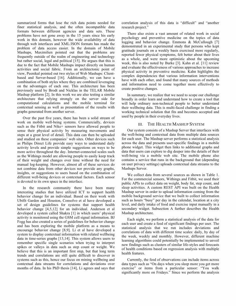
TABLE I. DATA COLLECTED BY OUR SERVER FOR EACH USER. USERS COULD CHOOSE NOT TO UPLOAD DATA OF A PARTICULAR TYPE.
Data Collected Source Type Sampling
Weight Withings scale Grams Daily
Body fat Withings scale Grams Daily
Step Fitbit Count Daily
Hours slept Fitbit Minutes Daily
Time Awoken Fitbit Count Daily
“Busy” time Android Calendar
Time range
Every 30min
Location Mobile Cell-id
Coordi-nates
Every 30min
Exercise Mobile Widget 1-5 scale On
demand
Food Mobile Widget 1-5 scale On
demand
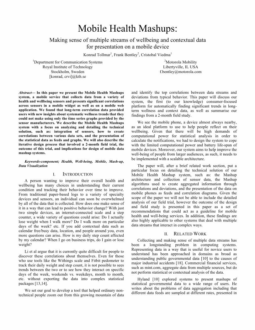
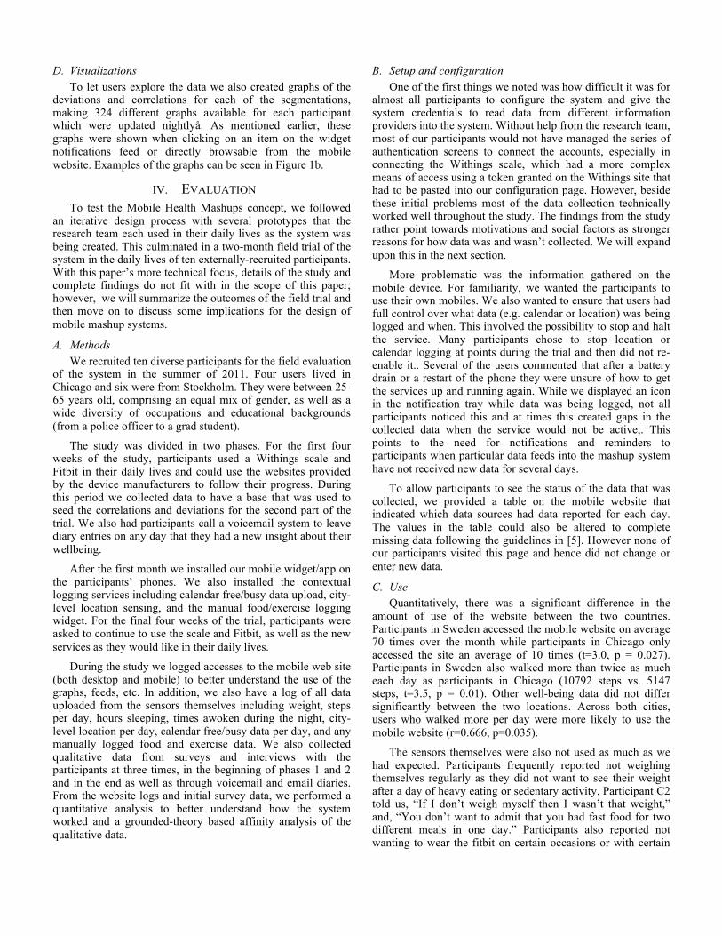
Data from the feed is presented on a widget on each user’s phone and is updated nightly by accessing an RSS feed on the server. Only items deemed statistically significant are displayed in the mobile widget and all items contain a plain text confidence (e.g. “possibly,” “very likely,” etc.) that can help users understand the confidence interval of the correlation. The widget can be seen in Figure 1a.
From the widget, users can click on an individual item to see a graph detailing that particular correlation or deviation. They can also click on a “More” button to see the complete feed. These graphs and the complete feed are served as a part of the mobile website and are displayed in the mobile web browser.
The graphs show all of the data points for a given correlation or deviation (such as points of <Steps, Weight> for each day), or plots of a sensor vs. time (such as weight per day). The graphs are meant to better illustrate the correlation and show users outliers or other points that can show the overall strength of the correlation. The plot of weight for the past several months can be seen in Figure 1b. From any graph or from the full feed page, users can navigate to other graphs of correlations and deviations or to other sensors over time.
We installed a second homescreen widget on our participants’ phone that was used to manually log food and exercise behaviors each day. While logging individual food items and calories has been proven to be quite difficult to maintain over time [4], we hoped for a simpler approach using a 5-star rating. Since we were performing correlations on the data, a set range was necessary and we were hoping to be able to see patterns of activity and weight gain/loss based on these coarse eating and exercise logs (e.g. “On days when you eat unhealthily, you gain weight”/sleep more/etc.). Participants were encouraged to use this feature at the end of the day as a reflection on the day’s habits.
In our trial, participants were free to use the devices as they would like and no constraints were imposed as a part of the trial. However, if we did not see a particular sensor used in a week or more, we did contact participants to ensure that a device was not broken or lost. Since the wifi scale just involved stepping on it and the Fitbit just needed to be clipped to pants and charged once per week, we hoped that these devices would be used quite regularly. We hoped that the widget on the home screen of the device would encourage users to remember the study and the devices that they had available to track their wellbeing.
Before exploring some of the technical implications from the trial itself, we will focus on a more complete description of the components of the system.
Figure 1. The widget (a) and the plot of weight (b) for the past few months.
A. Architecture and sensor data collection The data collection method and tools can be divided into
three main groups. First we have external measurements from two commercially available systems, Fitbit for step counts and sleep data and the Withings Scale for weight and body fat. Second, we collect contextual information from the phone. We compute an estimate on busyness based on how many hours are marked as “busy” on the phone’s calendar (which is often configured to be an aggregation of work and personal calendars). We also compute a “travel” metric based on how many kilometers have been traveled during the day based on the distances between city centers that were logged that day. Thirdly, we provide a simple tool for manual logging of daily food and exercise habits.
Both commercial services, Withings and Fitbit, provided a public API that allowed us to gather the users’ data from their sensors. These APIs required permission to access the data which was obtained with user permission via OAuth on an account setup website that we created. OAuth is a protocol that allows users to share private information of one service with another service. It works by providing tokens, instead of passwords, that grant access to a specific service (e.g. Fitbit) for a specific resource (e.g. just step counts and hours slept) and for a defined duration (e.g. 6 months). Both commercial systems were in the process of developing their APIs but access was fairly robust once the system was implemented.
The server was a mid-size cloud computing resource. Data was backed up incrementally every 15 minutes in an Amazon S3 server and, additionally, full backups of all the information were executed nightly.
Information gathered on the mobile devices was uploaded to our Health Mashups database via a custom REST API. City-level location data was cached on the phone and uploaded hourly whenever a reliable network connection was available. Calendar free/busy data was uploaded daily.
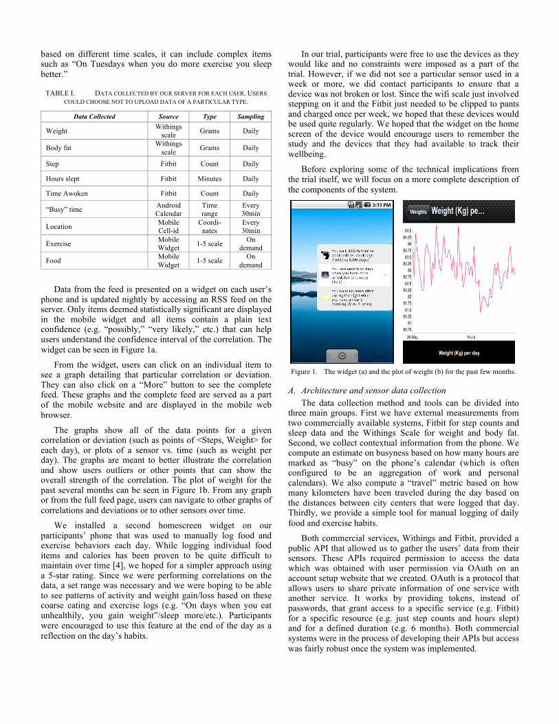
Each night, the statistical analysis and computational calculations were performed on the server side as described in the next section. The results from this analysis were accessible from the phone via the above-mentioned Health Mashups API. Figure 2 presents the overall architecture of the Health Mashups Service.
Figure 2. Health Mashups server architecture. Information from all the different sensors are mashed-up in the server. Afterwards deviations and
correlations are calculated and presented on the mobile..
B. Correlations and Deviations Once per day we computed statistics and updated the users’
feeds with the latest significant findings. We were interested in both correlations across data streams and deviations from the data in a given stream as we believed that these patterns were hard for people to identify on their own and would lead to useful insights about their wellbeing. We performed the analysis based on four different time scales - daily, weekly, monthly and by day of the week - across each of the nine different sensor data feeds - weight, bodyfat, steps, sleep, times awoken, food, exercise, events and location. All these data sources have different characteristics and we wanted to explore if and how these could be compared but also aggregated.
Different sensors’ data had different time scales, for example the Fitbit reported the step count on a daily basis while the busy time was reported from the mobile calendar in hourly increments. In order to make meaningful correlations and extract insights the data had to be normalized. Given that, the minimum level of segmentation used was a day, so we normalized the information on a daily level. Note that while some data could be aggregated by summing its values on a daily level, for example steps or busy hours, other data had to be averaged, such as weight (if recoded more than once per day).
We generated a total of 36 different deviation analyses and the correlations were calculated pair-wise between each of the variables. That produced 45 different pairs that were tested over the four different time segmentations producing a total of 180 different correlation analyses. All of these analyses were performed every night for each of the users of the system in order to provide new data to the participants each morning. As such, it could include complex notifications such as “On Tuesdays when you do more exercise you sleep better.”
For the correlations we used a Pearson correlation coefficient threshold of 0.5. Any correlation with a lower value was discarded and every notification included an indication of how strong the correlation was. For the deviations we used those that were more than one standard deviation from the mean of the sample (e.g. “On Tuesday you walked 3,000 fewer steps than usual for Tuesdays.”). For computing these statistical measures we used a Ruby library called Statsample that integrated easily with our web service.
C. Feeds Based on the correlations and deviations, our Mashup
server produced an individual RSS feed for each user. As mentioned earlier, there could be several correlation and deviation notifications each day and only feed items that passed a significance level were added to the feed. Moreover, we also mixed the feed items based on the different time scales to get a mix between daily alerts and significant correlations and deviations that are steady over time. Since only three items were visible on the widget (without clicking a “more” button), we wanted to ensure that these items changed over time.
Once a new significant observation was identified, a new feed item was created based on a number of templates that we created. These templates were simple strings with place holders for the actual data and, as such, could be easily translated into multiple languages making the platform available to a broader audience (our initial field study was conducted in Sweden and America).
The templates were different for each of the potential deviations based on the sensor and the time segmentation and included information regarding a user’s typical value and how much above or below they were of that value. For the correlations we had a template for each possible pair of sensors. This template included placeholders for the segmentation type as well as the kind of correlation (direct or inverse). Additionally we had an indication of the strength of the correlation with 3 possible values: “Probable”, “Quite probable” and “Very probable”, see table 2 for details.
TABLE II. MESSAGES DESCRIBING IS THE STRENGTH OF THE CORRELATION DEPENDING ON THE CORRELATION COEFFICIENT.
Message R Min R Max
Probably 0.5 0.69
Quite Probably t 0.7 0.89
Very Probably t 0.9 1.0
D. Visualizations To let users explore the data we also created graphs of the
deviations and correlations for each of the segmentations, making 324 different graphs available for each participant which were updated nightlyå. As mentioned earlier, these graphs were shown when clicking on an item on the widget notifications feed or directly browsable from the mobile website. Examples of the graphs can be seen in Figure 1b.
IV. EVALUATION To test the Mobile Health Mashups concept, we followed
an iterative design process with several prototypes that the research team each used in their daily lives as the system was being created. This culminated in a two-month field trial of the system in the daily lives of ten externally-recruited participants. With this paper’s more technical focus, details of the study and complete findings do not fit with in the scope of this paper; however, we will summarize the outcomes of the field trial and then move on to discuss some implications for the design of mobile mashup systems.
A. Methods We recruited ten diverse participants for the field evaluation
of the system in the summer of 2011. Four users lived in Chicago and six were from Stockholm. They were between 25-65 years old, comprising an equal mix of gender, as well as a wide diversity of occupations and educational backgrounds (from a police officer to a grad student).
The study was divided in two phases. For the first four weeks of the study, participants used a Withings scale and Fitbit in their daily lives and could use the websites provided by the device manufacturers to follow their progress. During this period we collected data to have a base that was used to seed the correlations and deviations for the second part of the trial. We also had participants call a voicemail system to leave diary entries on any day that they had a new insight about their wellbeing.
After the first month we installed our mobile widget/app on the participants’ phones. We also installed the contextual logging services including calendar free/busy data upload, city-level location sensing, and the manual food/exercise logging widget. For the final four weeks of the trial, participants were asked to continue to use the scale and Fitbit, as well as the new services as they would like in their daily lives.
During the study we logged accesses to the mobile web site (both desktop and mobile) to better understand the use of the graphs, feeds, etc. In addition, we also have a log of all data uploaded from the sensors themselves including weight, steps per day, hours sleeping, times awoken during the night, city-level location per day, calendar free/busy data per day, and any manually logged food and exercise data. We also collected qualitative data from surveys and interviews with the participants at three times, in the beginning of phases 1 and 2 and in the end as well as through voicemail and email diaries. From the website logs and initial survey data, we performed a quantitative analysis to better understand how the system worked and a grounded-theory based affinity analysis of the qualitative data.
B. Setup and configuration One of the first things we noted was how difficult it was for
almost all participants to configure the system and give the system credentials to read data from different information providers into the system. Without help from the research team, most of our participants would not have managed the series of authentication screens to connect the accounts, especially in connecting the Withings scale, which had a more complex means of access using a token granted on the Withings site that had to be pasted into our configuration page. However, beside these initial problems most of the data collection technically worked well throughout the study. The findings from the study rather point towards motivations and social factors as stronger reasons for how data was and wasn’t collected. We will expand upon this in the next section.
More problematic was the information gathered on the mobile device. For familiarity, we wanted the participants to use their own mobiles. We also wanted to ensure that users had full control over what data (e.g. calendar or location) was being logged and when. This involved the possibility to stop and halt the service. Many participants chose to stop location or calendar logging at points during the trial and then did not re-enable it.. Several of the users commented that after a battery drain or a restart of the phone they were unsure of how to get the services up and running again. While we displayed an icon in the notification tray while data was being logged, not all participants noticed this and at times this created gaps in the collected data when the service would not be active,. This points to the need for notifications and reminders to participants when particular data feeds into the mashup system have not received new data for several days.
To allow participants to see the status of the data that was collected, we provided a table on the mobile website that indicated which data sources had data reported for each day. The values in the table could also be altered to complete missing data following the guidelines in [5]. However none of our participants visited this page and hence did not change or enter new data.
C. Use Quantitatively, there was a significant difference in the
amount of use of the website between the two countries. Participants in Sweden accessed the mobile website on average 70 times over the month while participants in Chicago only accessed the site an average of 10 times (t=3.0, p = 0.027). Participants in Sweden also walked more than twice as much each day as participants in Chicago (10792 steps vs. 5147 steps, t=3.5, p = 0.01). Other well-being data did not differ significantly between the two locations. Across both cities, users who walked more per day were more likely to use the mobile website (r=0.666, p=0.035).
The sensors themselves were also not used as much as we had expected. Participants frequently reported not weighing themselves regularly as they did not want to see their weight after a day of heavy eating or sedentary activity. Participant C2 told us, “If I don’t weigh myself then I wasn’t that weight,” and, “You don’t want to admit that you had fast food for two different meals in one day.” Participants also reported not wanting to wear the fitbit on certain occasions or with certain
types of clothing. These factors of use need to be considered when deigning systems for health/wellbeing logging as the data collected will likely be sparse, making daily comparisons across sensors difficult.
D. Sensor data collection In order for our system to operate well and provide accurate
correlations and deviations to our users, it is necessary to have as much data as possible from multiple inputs on the same day. We then need examples of good, bad, and average days in order to find patterns. However, many of our study participants did not use the devices with this regularity, making the overall feeds less interesting and reliable.
Because of the lack of consistent use of each of the sensors, at times the system provided contradictory information on subsequent days as new data was received. This was an obvious problem for some participants that lead to a reduced trust in how well and reliably the system could interpret the health data. Most participants didn't see the connection between the amount of data that was supplied with the quality and accuracy in correlations and deviations.
This leads to new problems in how to handle sparse data but, as noted above, we wanted in this phase of the study to understand the natural and normal use of health sensors. Even with reduced use of the sensors, we were able to calculate a number of significant correlations and deviations for each user on a daily basis. Typically 3-10 significant items could be calculated for each user, the majority being deviations (e.g. “Yesterday you walked significantly more than normal”).
The lack of data represents typical usage in daily life. Naturally, reminders could be sent out and information can also be labeled with a quality estimate. However this would not likely solve the issues of missing data when users are having bad days and simply do not want data recorded. Some data may also vary rather dramatically from day to day, like steps, so a correlation that might have been positive one day could swing negative with a few strong examples on the other side in the following days (especially if sensors are only used occasionally). What remains clear is that more adaptive ways of computing and presenting the correlations and deviations are needed.
E. Reading Feeds As we discussed above, the main goal of the feed was to
make some rather complex data and correlations easy to understand and place them in a single location, i.e. the mobile phone home screen. As the widget was on the home screen of the device, there is no easy way of measure how many times the user actually looked at the widget itself or for how long. However, based on data from the qualitative interviews and voicemails we identified several themes.
Overall, participants found certain entries in their feeds to be interesting and they were able to learn a bit more about themselves through the widget and mobile website. For example, one participant was able to piece together two feed items from one day that told her that when she eats more she sleeps more but also that when she sleeps more she exercises more. Thus for her, eating more (i.e. enough) could lead to
healthier sleep and thus a desire to be more active the next day and feel better overall.
Simple forms of data representations were valuable and often more appreciated than detailed graphs. Although participants viewed the graphs (more in Sweden than the US), none of the insights that they made in the second half of the study came from the graphs. They all came from the feed items themselves and understanding these feed items in their daily lives. For example, one participant saw that she gained weight on Mondays. She thought about this and realized that it was because she went to her mom’s house every Sunday for a very heavy fried Southern meal and dessert.
In this study we focused on the individual and how to improve the everyday wellbeing by learning how different health factors interplay. We noticed significant differences in the types of feed items that different users received. As an example, for some, exercising more meant losing weight, but for others it meant gaining weight as they usually followed up a run with an extra large meal as a “reward.” This validates the need for personal mashups that are unique to each user and illustrates how various aspects of wellbeing and context work together in each user’s own unique life.
F. Explore Visualization Our initial hypothesis was that the feeds would invoke
interest to further explore the data and that users would click on an item in the widget and study a graph detailing that particular item on our mobile website. This didn't happen to the extent that we hoped (especially in the American group although the Stockholm group averaged 70 views).
The text in our feed items worked for our users and boiled down a great deal of statistical data and data streams into a simple sentence written in plain English. Our users did not need graphs and in fact became a bit confused when actually digging into the graphs behind the feed items (a common issue was that graphs of correlations do not have a time axis and thus are harder for many to interpret). While the text only allowed users to scratch the surface of the rich data that our system collected, perhaps these simple one-sentence summaries are all that is necessary for awareness of a particular wellbeing pattern. However, beyond the feed item itself, our users wanted recommendations of what they could do to improve on the areas that the system identified. We would argue that these recommendations should also take the form of small text snippets that make clear and crisp statements that are easy to read and understand, much like the feed items themselves.
G. Summary Our participants used the system in a variety of ways and
were able to extract different amounts of value from the items presented in the feeds on the mobile phone. Participants were able to learn new facts about how aspects of their long-term well-being are affected by their context that they could not discern from the visualizations from each sensor alone in the first half of the study. Over all participants, we observed that 8/10 lost weight during the study, averaging 1.6kg.
To capture another aspect of the systems impact we collected a well-being score for the Stockholm participants (the
Chicago group did not complete this questionnaire) based on the WHO-5 Well-Being Index1. We observed an increased well-being index over the study for all participants (anova p=0.05), and we noted a weakly significant correlation between the WHO-5 index and the activity level (r= 0.79, p=0.059). This suggests that combining HCI methods with established medical surveys could be a useful design tool when designing ICT supported health systems.
V. DISCUSSION We have learned a great deal about how systems should be
architected to better fit with the ways that people actually use these types of sensors in their daily lives. In this section will we discuss how this learning could be used to improve ours and similar systems.
A. Feeds for visualizations and feedback While the mashup data presented in the feed was seen as
useful to our participants, they wanted additional raw sensor data presented to them as well so that they could see their latest progress in a weight loss or steps goal. This need to balance presentation of raw data with aggregated data needs to be explored in greater detail.
New and different forms of mini-visualizations and feedback are needed in the feeds to make them more engaging and provide a glanceable view of recent progress. This is in line with theories from information visualization research [17] and health visualization [4]. One possible way to display rich data in the small real estate of a phone widget is by using a concept called a Sparkline explored by Tufte [17].
B. Sparse data samples Missing data is a major problem in creating reliable
correlations and deviations. Several participants asked us what it actually meant that two items are correlated. We learned that our participants were not able to understand the coupling of the quality and accuracy of the correlations and deviations with how much data they have provided into the system for those sensors in the same time period (e.g. to make a correlation between steps and weight on a daily basis, there need to be days with both reported). This indicates that there is a need to label the feed items (i.e. correlations and deviations) with some quality or quantity indicators. Confidence and correlations values will probably not make sense for people in general so here again we could use a Sparkline to indicate when the quality goes up and down as a function on how much data is feeding into a particular calculation. Further information could explain the data needed for a given calculation (e.g. that steps and weight need to be reported on the same day to be useful for the daily correlation) to better educate the user as to how the system works and their role in providing data to produce accurate end results.
We also learned that social factors play an important role in how data was and wasn’t collected. Reminders, data summaries for the major sensors, and quality indicators could probably fix some of these problems. However we also became rather convinced during the study that this will not plug all the holes.
1 http://www.who-5.org/
Rather it is also needed to find new ways to compute correlations and deviations on sparse data samples. This could be done for example by using multiple time scales where more data across attributes is present, ranking based on quality indicators, and by preference and user interest that is learned by how the system is used (for example what types of feed items are selected as favorites). Finally, algorithms that take into consideration that lack of data often signifies negative values could help correct for the positive bias in data reporting and sensor use.
C. Mashups normalization In order to support these types of statistical mashups, APIs
for data access should support new types of queries for accessing and aggregating specific types of data. In order for our system to work, we had to import all of the raw data from each of the sensors into our system for analysis. This may not always be practical or desired. Often, we only needed summary data which each of the individual services could have provided more efficiently. Through this research, we have identified a need for additional data access methods and have implemented these in the Indivo X system2 for personal health data. While our system does not currently rely on Indivo X, with these changes anyone could build a similar system on top of a personal health record. As an example, the GluBalloon3 team at the Health and Wellness Innovation event at the MIT Media Lab used these new querying methods to implement an application for diabetes that tracked multiple aspects of wellbeing with sensors and contextual data.
These data access methods seek to define the range of data and the method by which to normalize it. For example, when wanting to correlate weekly step counts with weekly weights two arrays are needed. The first, an array of total step counts for each week, needs to sum all steps for each day of that week and return a list with elements for every week within a range. The second, an array of weight for each week, needs to average any weigh-ins for each week and then return a list with elements for every week within the range.
In the end, we see a need for three parameters in performing queries for data that are used in mashup systems like this. First, there is a need for an aggregation segmentation. This is the time range covered in each element of the returned array. For example by week, hour or day. Secondly, there is a need for an aggregation function. This describes how to combine the data that exists over each aggregation range. For example, steps or hours slept need to be summed, but weights need to be averaged. Finally, there is a need for the overall data range that is to be queried. This can be accomplished with a start and end time.
D. Mobile app versus mobile web By storing data in the web service, we were able to create a
much more powerful mashup service that is visible on both the web and from multiple mobile devices (e.g. phone, tablet, laptop, etc.). If we had performed the mashups on an individual device, all data would have to be shared with all other devices
2 http://indivohealth.org/ 3 http://www.youtube.com/watch?v=B4ILARloH4I
in order to make this cross-device access possible. It is simply more efficient to access data and calculate mashup data in the cloud where fast and relatively low-power access to Internet-based data sources is available. Because of this, any device can access the platform no matter the OS or form-factor without the need to rewrite all of the presentation logic on each platform.
However, there is still a need for native applications for tasks such as the mobile widget and the background data reporting which cannot be creating using today’s web technologies on mobile devices.
E. Security When storing and analyzing personal health and wellbeing
data, security must be a central concern. For one entity to hold all of this data across sensors and context could lead to issues if the data was ever subpoenaed or hackers were able to access the combined database. This problem is relevant to other data mashup services such as mint.com with financial data. The utmost care must be taken to ensure that specific account details cannot be reconstructed should there be a breach in the database. Also, if raw data is not stored on the mashups server, but aggregated data is requested from individual data collection services as discussed above, there is less risk if the server should be compromised as only data summaries will be visible and not, for example, detailed time-stamped location data.
F. Related services In this paper, we have studied mashups for health and
wellbeing data, however our architecture and findings can be applied to other domains where combined and aggregated data could lead to an increased understanding of more complex phenomena. One example could be transportation where factors like time, traffic, safety, experienced utility, and cost could be combined and lead to new insights in how to deal with personal transportation [18]. This could benefit both the individual as well as society and make it possible to interact with and understand a complex system. Other areas such as personal finance, energy use, and pain management could also benefit from this approach.
VI. SUMMARY Our exploration with the Health Mashups system has
demonstrated how combinations of well-being sensor data and contextual data can help people to understand their overall well-being in new ways.
We have described an architecture that supports easily interfacing to new sensors or contextual attributes and a Mashup Server that computes correlations and deviations on the data that it ingests as well as presents a view for users on mobile phones or the full web.
In the field trail we note that our participants were able to learn new facts about how aspects of their long-term well-being are affected by their context that they could not discern from the visualizations from each sensor alone in the first half of the study. However, our system was not perfect and we have learned a great deal about how systems should be architected to better fit with the ways that people actually use these types of sensors in their daily lives. We hope that other systems designers look to the successful aspects of the system as well as
the challenges around sparse data population, visualizations that provide further explanations of the data, and providing actionable suggestions when designing new systems that aggregate and analyze multiple data streams.
ACKNOWLEDGMENTS We would like to thank our participants for their time and
feedback, Fitbit for providing early access to their sensor platform, and Wireless@KTH and Motorola for financial support.
REFERENCES [1] Anderson, I., Maitland, J., Sherwood, S., Barkhuus, L., Chalmers, M.,
Hall, M., Brown, B., and Muller, H. 2007. Shakra: tracking and sharing daily activity levels with unaugmented mobile phones. Mob. Netw. Appl. 12, 2-3 (Mar. 2007), 185-199.
[2] Brodt A. and Nicklas D., "The telar mobile mashup platform for nokia internet tablets," in EDBT 08: Proceedings of the 11th international conference on Extending database technology. New York, NY, USA: ACM, 2008, pp. 700-704.
[3] Burke, L.E., Sereika, S.M., Music, E., Warziski, M., Styn, M.A., and Stone, A. 2008. Using Instrumented Paper Diaries to Document Self-Monitoring Patterns in Weight-Loss. In Contemp Clin Trials. 2008 March; 29(2): 182–193.
[4] Consolvo, S., Klasnja, P., McDonald, D., Avrahami, D., Froehlich, J., LeGrand, L., Libby, R., Mosher, K., and Landay, J. 2008. Flowers or a robot army?: encouraging awareness & activity with personal, mobile displays. In Proc. UbiComp '08.
[5] Consolvo, S., McDonald, D., and Landay, J. 2009. Theory-driven design strategies for technologies that support behavior change in everyday life. In Proc. CHI '09.
[6] Consolvo, S., Everitt, K., Smith, I., and Landay, J. 2006. Design requirements for technologies that encourage physical activity. In Proc. CHI '06.
[7] Emmons, R. A., & McCullough, M. E. (2003). Counting blessings versus burdens: Experimental studies of gratitude and subjective well-being in daily life. Journal of Personality and Social Psychology, 84, 377-389.
[8] Fogg, B.J. and Allen, E. 2009. 10 uses of texting to improve health. In Proc. Persuasive '09.
[9] Fogg, B.J. Persuasive Technology: Using Computers to Change What We Think and Do, San Francisco, CA, USA: Morgan Kaufmann Publishers, (2003).
[10] Hyland P., Hasan H., and Fuentes A. (1996). Supporting Casual or Naive Users of Externally Derived Statistical Data. In Proceedings of the 6th Australian Conference on Computer-Human Interaction (OZCHI '96) (OZCHI '96). IEEE Computer Society, Washington, DC, USA
[11] Kahn, E.B. et al. The effectiveness of interventions to increase physical activity. A systematic review. American Journal of Preventive Medicine 22, 73-107 (2002).
[12] Klasnja, P., Consolvo, S., and Pratt, W. 2011. How to evaluate technologies for health behavior change in HCI research. In Proc. CHI '11.
[13] Li, I., Dey,A. and Forlizzi, J. (2011) Understanding My Data Myself: Supporting Self-Reflection with Ubicomp Technologies. In Proc UbiComp 2011.
[14] Li, I. Personal Informatics and Context: Using Context to Reveal Factors that Affect Behavior. PhD Thesis. 2011.
[15] Maximilien, "Mobile mashups: Thoughts, directions, and challenges," Semantic Computing, 2008 IEEE International Conference on, pp. 597 -600, aug. 2008.
[16] Peenikal S. (2009). Mashups and the enterprise. White paper by MphasiS - HP.
[17] Tufte E. Envisioning Information. Graphics Press (1990) [18] WHO: World report on road traffic injury prevention