Embed Size (px)
Citation preview
Image Quality Evaluation
Joyce E. Farrell
15.1 INTRODUCTION
Image quality evaluation plays an important role in the design of many Hewlett Packard products, including imaging peripherals such as digital cameras, scanners, printers and displays. This chapter describes some of the engineering tools my colleagues and I are developing at Hewlett Packard Laboratories to help us evaluate how our customers perceive the image quality of our products. The engineering tools we use to evaluate image quality can be grouped into three categories: device simu- lation, subjective evaluation and distortion metrics.
Simulation tools enable us to test our understanding of devices, predict their output, and optimize their design. We use software simulators for image capture devices, such as scanners and digital cameras, and rendering devices, such as displays and printers, to determine how adjustments in device parameters affect subjective impressions of image quality. Simulators also enable us to investigate regions of design space that are difficult to build and prototype. In this chapter I briefly review the assumptions underlying our device simulations and give an example of how device simulation enables us to optimize the image quality of H P inkjet and electrophoto- graphic printers.
Since our customers are the final arbiter of image quality, we consider their subjec- tive image quality judgements to be key to the success of our imaging product. We
Colour. Imaging: Vision and Technology, edited by L.W. MacDonald and M.R. Luo O 1999 John Wiley S( Sons Ltd.
286 JOYCE E. FARRELL
ask our customers to evaluate the image quality of HP products using a variety of methods at different points in the products' lifecycle. The research that I describe in this paper is conducted during the early stages of product design, in which we ask people to indicate when they can detect an artifact or distortion in an image, discriminate between two images, or prefer one image over another. These visual psychophysical judgements (detection, discrimination and preference) are made under controlled viewing conditions (fixed lighting, viewing distance, etc.), generate highly reliable and repeatable data, and are used to optimize the design of imaging peripherals.
There is no one single image quality metric that can predict our subjective judge- ments of image quality because image quality judgements are influenced by a multitude of different types of visible signals, each weighted differently depending on the context under which a judgement is made. When we ask observers to focus on one distortion or signal, e.g. printer banding, they will ignore other distortions, e.g. halftone texture, that under different conditions would be very annoying. In fact, they may prefer one highly visible signal, such as halftone texture, if it masks a very annoying distortion, such as printer banding.
Our goal is to identify the visual signals that annoy our customers and minimize their visibility. Device simulations enable us to isolate the source of a visual signal. Visual psychophysical evaluation studies enable us to assess the role the signal plays in subjective judgements of image quality. And metrics enable us to quantify or measure the magnitude of the signal.
15.2 ENGINEERING TOOLS FOR IMAGE QUALITY EVALUATION
15.2.1 Device simulation
People judge an imaging system based on the final output rendered on a printer or a display. But the quality of the rendered output is determined by all image trans- formations that occur before and during image rendering. To identify the source of a visible distortion, we need to be able to simulate and evaluate the entire imaging system, from image capture to image processing, transmission and rendering.
My colleagues and I have simulated a variety of different imaging devices, including digital cameras [I, 21, scanners [3], displays [4] and printers [5]. These simulations enable us to determine how device parameters and processing algorithms influence the user's image quality judgements. In this section I review the fundamental assump- tions underlying our device simulations.
The device simulations use several simplifying assumptions. First, the devices are linear or have a static nonlinearity. For several types of devices, linearity is quite accurate. For example, the CCD sensors in many modern digital cameras have linear intensity response functions over a wide operating range [6]. For some devices, responses differ from linear only by a fixed nonlinear transfer function that can be
IMAGE QUALITY EVALUATION 287
measured. (In printing the nonlinearity is called a tone reproduction curve and for displays it is called a gamma function.)
Second, we assume that, after correcting for these static nonlinearities, the simu- lated devices obey the principle of superposition. This principle asserts that the response of a linear device to any compound input is equal to the sum of the responses to each individual component in the compound input. The principle of superposition implies that if the spectral and spatial response to a point light source (in the case of camera) or to a pixel (in the case of printers and displays) is known, the response to any collection of image points can be computed efficiently. The temporal response functions of imaging devices such as digital cameras, scanners, printers and displays are separable from the spatial and spectral response properties and will not be addressed in this chapter.
Third, we assume that the spectral and spatial response of the devices are shift invariant. In other words, the functions describing the spectral and spatial response of the device should be the same, regardless of image location.
These three assumptions are all approximately correct for the devices we have simulated. They are important because using them reduces the computational burden placed on the simulators. Response, linearity, superposition and shift invari- ance, imply that three functions are sufficient to describe the behavior of a device. I will refer to these functions as the intensity response, the spectral response and the spatial (pointspread) response functions. In the following sections I provide several examples of how these principles are applied to simulating image capture and rendering.
Image capture
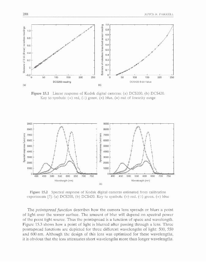
Let's begin at the point where a scene is captured by a device, such as a digital camera or scanner. Light sensors based on charge-coupled devices (CCDs) have linear intensity response functions over a wide operating range [6]. But the overall camera system may not exhibit the underlying device linearity. For example, there may be a nonlinear mapping between the analog sensor output and the digital responses actually available from the camera. Such a nonlinearity might be designed into a camera system to expand its dynamic range. For example, the Kodak DCS-420 uses a 12-bit internal data representation but its standard control software maps the 12- bit linear data into nonlinear data with 8-bit precision. Figure 15.1 shows the linear output of the Kodak DCS200 and the nonlinear output of the DCS420 camera systems [I, 71. We assume that such simple nonlinearities can be accommodated by lookup tables (LUTs) that map linear input into linear output.
The spectral response function of a digital camera can be described by an n x w matrix X, where n is the number of color sensors in the camera and w is the number of wavelength samples we use to characterize spectral data. For example, w is 31 when the wavelengths range from 400 nm to 700 nm in 10 nm steps and n is 3 for RGB (3 sensor) digital cameras. Figure 15.2 shows examples of the spectral response of the Kodak DCS200 and DCS420 digital cameras that we estimated after careful calibration experiments 171.
288 JOYCE E. FARRELL
DCS200 reading DCS420 %bit Value (b)
Figure 15.1 Linear response of Kodak digital cameras: (a) DCS200, (b) DCS420. Key to symbols: (+) red, (0) green, (x) blue, (*) out of linearity range
Wavelength (nm) (b)
Wavelength (nm)
Figure 15.2 Spectral response of Kodak digital cameras estimated from calibration experiments [7]: (a) DCMOO, (b) DCS420. Key to symbols: (x) red, (0) green, (+) blue
The pointspread function describes how the camera lens spreads or blurs a point of light over the sensor surface. The amount of blur will depend on spectral power of the point light source. Thus the pointspread is a function of space and wavelength. Figure 15.3 shows how a point of light is blurred after passing through a lens. Three pointspread functions are depicted for three different wavelengths of light: 500, 550 and 600 nm. Although the design of this lens was optimized for these wavelengths, it is obvious that the lens attenuates short wavelengths more than longer wavelengths.
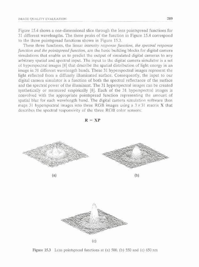
IMAGE QUALITY EVALUATION 289
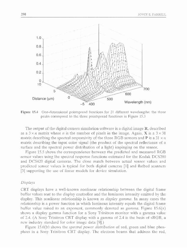
Figure 15.4 shows a one-dimensional slice through the lens pointspread functions for 31 different wavelengths. The three peaks of the function in Figure 15.4 correspond to the three pointspread functions shown in Figure 15.3.
These three functions, the linear intensity response function, the spectral response f~~nction and the pointspread function, are the basic building blocks for digital camera simulations that enable us to predict the output of simulated digital cameras to any arbitrary spatial and spectral input. The input to the digital camera simulator is a set of hyperspectral images [8] that describe the spatial distribution of light energy in an image in 31 different wavelength bands. These 31 hyperspectral images represent the light reflected from a diffusely illuminated surface. Consequently, the input to our digital camera simulator is a function of both the spectral reflectance of the surface and the spectral power of the illuminant. The 31 hyperspectral images can be created synthetically or measured empirically [8]. Each of the 31 hyperspectral images is convolved with the appropriate pointspread function representing the amount of spatial blur for each wavelength band. The digital camera simulation software then maps 31 hyperspectral images into three RGB images using a 3 x 31 matrix X that describes the spectral responsivity of the three RGB color sensors:
(c)
Figure 15.3 Lens pointspread functions at (a) 500, (b) 550 and (c) 650 nm
29Q .IOYCE E. FARRELL
Figure 15.4 One-dimensional pointspread functions for 31 clifferent wavelengths: the three peaks correspond to the three pointspread f~~nctions in Figure 15.3
The output of the digital camera sirnulation software is a digital image R, described as a 3 x n matrix where n is the number of pixels in the image. Again, X is a 3 x 31 matrix describing the spectral responsivity of the three RGB sensors and P is a 31 x rz matrix describing the input color signal (the product of the spectral reflectance of a surface and the spectral power distribution of a light) impinging on the sensor.
Figure 15.5 shows the correspondence between the predicted and measured RGB sensor values using the spectral response functions estimated for the Kodak DCS200 and DCS420 digital cameras. The close match between actual sensor values and predicted sensor values is typical for both digital cameras [I] and flatbed scanners [3] supporting the use of linear models for device simulation.
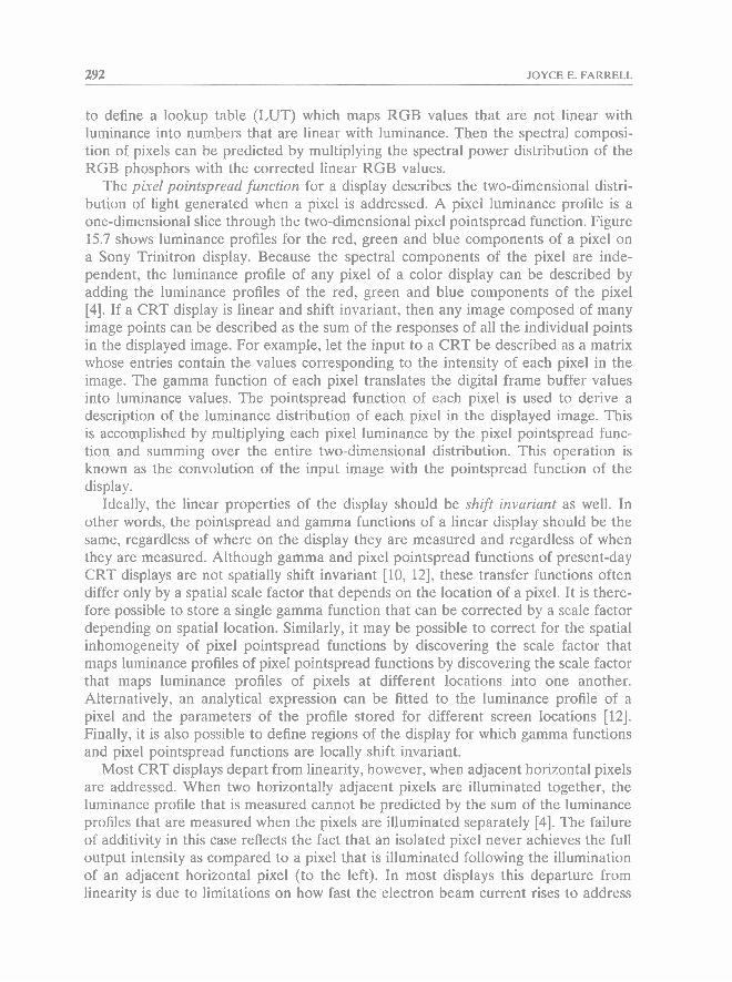
CRT displays have a well-known nonlinear relationship between the digital frame buffer values sent to the display controller and the luminous intensity emitted by the display. This nonlinear relationship is known as display gamma. In many cases the relationship is a power function in which luminous intensity equals the digital frame buffer value raised to an exponent, commonly denoted as gamma. Figure 15.6(a) shows a display gamma Function for a Sony Trinitron mollitor with a gamma value of 2.4. (A Sony Trinitron CRT display with a gamma of 2.4 is the basis of sRGB, a new industry standard for color image data [9].)
Figure 15.6(b) shows the spertrol poww di,stributiort of red, green and blue phos- phors in a Sony Trinitron CRT display. The electron beams that address the red,
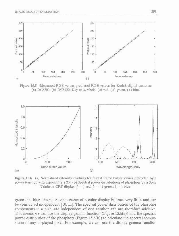
IMAGE QUALITY EVALUATION 291
Measured values (a)
Measured values
Figure 15.5 Measured RGB versus predicted RGB values for Kodak digital cameras: (a) DCS200, (b) DCS420. Key to symbols: (x) red, (0) green, (+) blue
0 100 200
Frame buffer values (a)
400 500 600 700
Wavelength (nm)
Figure 15.6 (a) Normalized intensity readings for digital frame buffer values predicted by a power function with exponent y ( 2.4. (b) Spectral power distributions of phosphors on a Sony
Trinitron CRT display: (-) red, (- - -) green, (. . .) blue
green and blue phosphor components of a color display interact very little and can be considered independent [lo, 111. The spectral power distribution of the phosphor components in a pixel are independent of one another and are therefore additive. This means we can use the display gamma function (Figure 15.6(a)) and the spectral power distribution of the phosphors (Figure 15.6(b)) to calculate the spectral compo- sition of any displayed pixel. For example, we can use the display gamma function
292 JOYCE E. FARRELL
to define a lookup table (LUT) which maps RGB values that are not linear with luminance into numbers that are linear with luminance. Then the spectral composi- tion of pixels can be predicted by multiplying the spectral power distribution of the RGB phosphors with the corrected linear RGB values.
The pixel pointspread function for a display describes the two-dimensional distri- bution of light generated when a pixel is addressed. A pixel luminance profile is a one-dimensional slice through the two-dimensional pixel pointspread function. Figure 15.7 shows luminance profiles for the red, green and blue components of a pixel on a Sony Trinitron display. Because the spectral components of the pixel are inde- pendent, the luminance profile of any pixel of a color display can be described by adding the luminance profiles of the red, green and blue components of the pixel [4]. If a CRT display is linear and shift invariant, then any image composed of many image points can be described as the sum of the responses of all the individual points in the displayed image. For example, let the input to a CRT be described as a matrix whose entries contain the values corresponding to the intensity of each pixel in the image. The gamma function of each pixel translates the digital frame buffer values into luminance values. The pointspread function of each pixel is used to derive a description of the luminance distribution of each pixel in the displayed image. This is accomplished by multiplying each pixel luminance by the pixel pointspread func- tion and summing over the entire two-dimensional distribution. This operation is known as the convolution of the input image with the pointspread function of the display.
Ideally, the linear properties of the display should be shift invariant as well. In other words, the pointspread and gamma functions of a linear display should be the same, regardless of where on the display they are measured and regardless of when they are measured. Although gamma and pixel pointspread functions of present-day CRT displays are not spatially shift invariant [lo, 121, these transfer functions often differ only by a spatial scale factor that depends on the location of a pixel. It is there- fore possible to store a single gamma function that can be corrected by a scale factor depending on spatial location. Similarly, it may be possible to correct for the spatial inhomogeneity of pixel pointspread functions by discovering the scale factor that maps luminance profiles of pixel pointspread functions by discovering the scale factor that maps luminance profiles of pixels at different locations into one another. Alternatively, an analytical expression can be fitted to the luminance profile of a pixel and the parameters of the profile stored for different screen locations [12]. Finally, it is also possible to define regions of the display for which gamma functions and pixel pointspread functions are locally shift invariant.
Most CRT displays depart from linearity, however, when adjacent horizontal pixels are addressed. When two horizontally adjacent pixels are illuminated together, the luminance profile that is measured cannot be predicted by the sum of the luminance profiles that are measured when the pixels are illuminated separately [4]. The failure of additivity in this case reflects the fact that an isolated pixel never achieves the full output intensity as compared to a pixel that is illuminated following the illumination of an adjacent horizontal pixel (to the left). In most displays this departure from linearity is due to limitations on how fast the electron beam current rises to address

IMAGE QUALITY EVALUATION 293
- RED
Spatial position
- BLUE
.... : . C. . . . .
: '., . . . . , . . . . , . . . . . ..,.. . , ,,
Spatial position
- GREEN I I
I k : 1
; I : : I I 4 :
: : ' I : : I : : : I ; i ; ;
: ; ' 1 , ', , - I- \ ,
Spatial position
- WHITE 11 A 1 , I : : : : : : ; : ' 1 I '
; I : : I I
I I I I
Spatial position
Figure 15.7 Pixel luminance profiles: the luminance profile of a white pixel is predicted by the sum of the red, green and blue luminance profiles
a pixel (i.e. slew rate limitations resulting from the display video bandwidth). In many instances the display was designed with this feature in mind. For example, some displays are designed such that the electron beam current rises when a pixel is addressed and remains on if the adjacent pixel is addressed. Horizontally spatially adjacent pixels are not, therefore, independent and cannot be described by simply adding the pixel pointspread functions of the two adjacent pixels. Additivity in the vertical direction, however, seems to be a good assumption. A pixel's vertical neigh- bors had very little interactive effect, presumably because the bandwidth of electron beam and drive electronics is more demanding in the horizontal direction than the vertical.
Despite known failures of display spatial linearity, it is often convenient to assume that CRT displays can be described as linear devices. By assuming that the display is a linear shift-invariant system, one can completely characterize its performance using only three functions: the gamma, the spectral power distribution of the phos- phors, and the pixel pointspread functions. This economy of representation, together

294 JOYCE E. FARRELL
with the predictive power of linear systems analysis, must be weighed against the errors in stimulus representation that occur because displays are not linear and shift invariant.
Printers
The subtractive nature of the ink absorption process, the irregularity of sprayed ink droplets in inkjet printers and the magnetic attraction between toner particles in elec- trophotographic printers result in nonlinear interactions between printed dots. Consequently, when printed dots overlap, their reflectances do not add. This failure of superposition makes it difficult to simulate the output of printers. At the end of this chapter I describe a study that investigates the effect that printer addressability (pixels per inch) and grayscale (bits per pixel) have upon subjective judgements of image quality. T o generalize the results of the study to printers, we simulated (predicted) the output of a grayscale monochrome thermal dye diffusion printer. The simulation modeled the printing process as a convolution of the pixel bitmap value with a shift-invariant Gaussian pixel pointspread function. Although we know that the printing process does not obey the principle of superposition, the linear model was a reasonable approximation for the monochrome thermal dye diffu- sion printer because the printed dots were well separated and we empirically measured the tone reproduction curves. Moreover, because we knew the assumption of linearity was not precisely accurate, we compared subjective judgements of displayed simulations of printed images to the actual printed images themselves.
15.2.2 Subjective evaluation
The validity of the studies depends on the methods we use to (1) characterize the stimuli, (2) ask subjects to make judgements, and (3) analyze the judgements that are recorded. In the previous section I described the assumptions underlying our methods for modeling and characterizing the visual stimuli that are presented to people. In this section I describe our methods for asking people to make subjective judgements of image quality.
A popular method for assessing image quality involves asking people to quantify their subjective impressions with a number between 1 and 10, where 10 is the best and 1 is the worst. Subjects often complain that they don't know what a 10 or a 1 is. Providing an example of a 'best' and a 'worst' image helps to anchor their 10 and 1 responses, but they are still uncomfortable with the task. Unfortunately, the data collected using the direct scaling method is often inconsistent and highly variable [13]. Averaging the responses over many trials and many subjects will reduce the variability in the data, but the averaged data will still be unitless. Subjects change their criteria over time, and the same image scaled in one condition will almost certainly have a different value when it is scaled in another condition at another time.
At the other extreme, when you ask subjects to make 'threshold' judgements, such as indicating when they see a visual stimulus or when they can detect the difference
IMAGE QUALITY EVALUATION
between two stimuli, they rarely complain about the vagueness of the task. And when you provide subjects with feedback about the correctness of their responses, they can optimize their performance and minimize the variance in the data. The problem with this method is that, although it generates reliable data, one must identify and isolate the visual factor one wishes to study prior to the experiment. One cannot use this method to discover the factors that influence image quality. Another limitation to this method is that even in cases where the stimulus factor has been identified and isolated, one can only use the method to quantify judgements at threshold. The threshold for detecting a distortion does not predict the perceived quality of suprathreshold distortions 114, 151.
The method of pairwise comparison generates reliable and informative data about perceived image quality above threshold. In this method, subjects are presented with two stimuli at any given time and asked to indicate which of the two stimuli 'looks better' to them. This method requires no a priori decisions (assumptions) about the factors determining their judgements. Rather, it enables us to test assumptions about how many different factors (such as addressability and gray levels) affect suprathreshold judgements about image quality.
The data collected in pairwise comparison tasks can be used to estimate a quality value if the following assumptions hold. First, the quality of each image or stimulus i can be described by a single value q,. Second, the estimate of the qual- ity of an image is normally distributed across observers. Third, the standard devia- tion around the estimate q, is the same for all i. And fourth, each comparison is independent. If these four assumptions are valid, we can use Thurstonian scaling methods [16].
The first assumption implies that the images can be positioned on a one- dimensional quality line or scale. There are many ways to statistically test this assump- tion, including factor analysis 1171, singular value decomposition [I81 and various regression techniques [19]. These methods determine the percent variance accounted for as a function of the number of stimulus dimensions or factors. If most of the variance can be accounted for by a single dimension, we can proceed to use one- dimensional scaling methods to estimate the quality q, of each image by the distance between images ordered along a one-dimensional scale.
The distance between two samples d,, is expressed in units of standard deviations of preference using the inverse cumulative-normal function or Z-score:
where C is an N x N matrix containing the preference data, C , is the number of times stimulus i is preferred over stimulus j, and q, and qi are scalar values estimating the perceived quality of stimulus i and j, respectively. Again, we assume that the quality of each image or stimulus can be described by a single value that is distributed normally across trials or observers and that the standard deviation around each esti- mate is the same for all stimuli.
296 JOYCE E. FARRELL
If the images can be positioned on a one-dimensional quality line, we can esti- mate the quality of an image by taking the mean distance between the image and all other images [20]. This is equivalent to calculating the number of times people prefer one image over all the others. This estimate is not accurate when there is unanimous agreement (i.e. no variance) about the preference for one image over all the others. In other words, when people always prefer one image over all the others, distance is estimated as infinite and the mean distance cannot be computed. Although there are heuristic solutions to this problem [21], we prefer to use a regression method [22] that finds the q values for each image that maximize the probability of the comparison matrix C that we collected in our preference experiment. This means we can strategically choose the data we collect and we can analyze a partial or sparse comparison matrix. A partial comparison matrix is one in which not every pair of images is compared. Not all comparisons provide the same amount of information. Comparisons between images that are very dissimilar do not provide as accurate an estimate of distance as images that are very similar. By strategically choosing the comparisons, a partial comparison matrix can be more efficient than a complete matrix [22].
It is important to make a distinction between judgements about image quality and image fidelity. Image fidelity refers to how accurately we can render an image, without any visible distortion of information loss. Image fidelity may be quantified by the probability that people can detect the difference between an original image and a transformed version of the image, in other words, by threshold judgements. Image quality, however, is quantified by suprathreshold judgements such as preference or rank ordering. People may be able to detect the difference between an original image and a distorted version of the image and yet prefer the distorted version over the original. Consequently, image fidelity and image quality judgements will not always be positively correlated.
In our investigations we estimate perceived image quality by analysis of subjects' preference judgements. When our subjects can detect the difference between two images, they are consistent in responding that they prefer one of the images over the other. I will refer to these judgements as suprathreshold judgements. When subjects cannot detect the difference between two images, their preference judgements are at chance. I will refer to these judgements as threshold judgments.
Because it is not possible to predict suprathreshold contrast judgements by contrast detection thresholds [14, 151, we should not expect human vision models based on contrast detection to predict suprathreshold judgements of image quality. Nonethe- less, computational measures of image fidelity based on human vision models [23-351 are a powerful tool for evaluating image quality. Quite often the goal of an imaging system is to reproduce an image with no visible distortions. For example, we design electrophotographic and inkjet printers to generate text, graphics and images that can easily be confused with offset lithography. And we design digital cameras and printers to capture and print images that are difficult to distinquish from printed photographs. To accomplish these design goals, we need metrics that predict the visi- bility of the distortion signals we wish to minimize.
IMAGE QUALITY EVALUATION 297
15.2.3 Distortion Metrics
Just as simulators enable us to record subjective judgements of imaging devices in the absence of a real device, distortion metrics enable us to make predictions about subjective judgements in the absence of a real person. In this section I summarize and review several different computational measures that have been proposed in the literature as image fidelity metrics and consider how they can be used to predict the visibility of film grain, toner particles, halftone texture, printer banding, compression artifacts and other annoying visual signals.
Single-channel metrics
A large collection of distortion metrics are based on single-channel models of human visual processing [23-301. Typically these metrics quantify the energy in a signal after it has been passed through a visual filter that represents human spatial sensitivity as a function of spatial frequency. The filtered signal is pooled together in a single 'channel' of information, hence the term 'single-channel metrics'.
Single-channel (SC) metrics have a long evolutionary history, beginning with the application of linear systems theory to the study of optical systems [36]. The image quality of lens, for example, is determined by its optical blur, which in turn can be characterized by an optical blur function (in space) or a modulation transfer func- tion (in the Fourier frequency domain).
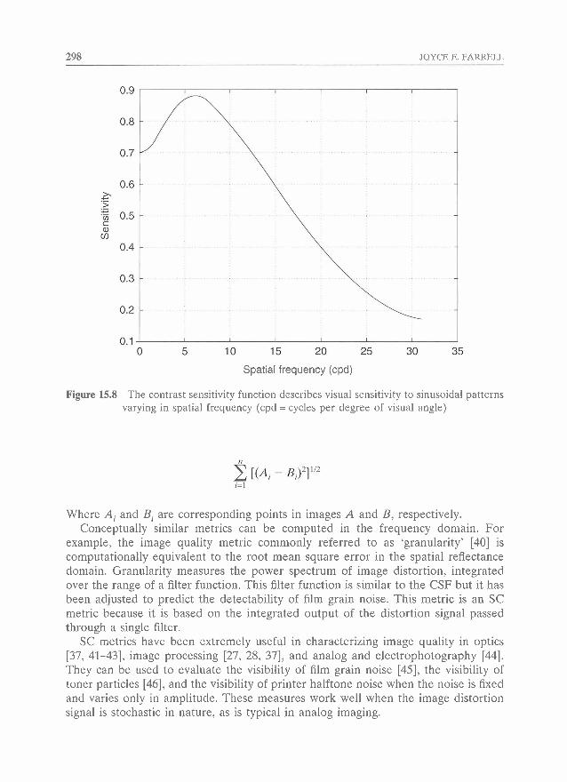
Image quality evaluation tools based on single-channel metrics predict the visi- bility of a distortion by the summed energy of the perceptual signal. For example, the mean square error metric (MSE), popularly used as a fidelity metric in digital image processing [37], is based on the sum of the squared differences between corre- sponding pixels in an original and a distorted image or, in other words, the squared vector length of the difference image. An improvement of the MSE is the visually weighted mean square error (VMSE), which is computed by filtering the difference image with a human contrast sensitivity function (CSF) [27].
The human contrast sensitivity function describes how sensitive is a typical, or standard, observer to the spatial frequency components in any spatial image. Figure 15.8 depicts a CSF that can be described by the expression
Where f is spatial frequency, expressed in cycles per degree (cpd) of visual angle, and K, a and b are parameters that depend on the ambient light, pupil size or any other visual factors that may change the state of visual adaptation [38, 391.
Filtering an image with the human contrast sensitivity function effectively weights the image by how sensitive the visual system is to the spatial frequencies present in the image. To quantify the difference between two visually filtered or weighted images, we compute the vector length of the filtered difference between the two images. The vector length is based on the Euclidean distance between two points in an n-dimensional space:
298 JOYCE E. FARRELL
Spatial frequency (cpd)
Figure 15.8 The contrast sensitivity function describes visual sensitivity to sinusoidal patterns varying in spatial frequency (cpd = cycles per degree of visual angle)
Where A, and B, are corresponding points in images A and B, respectively. Conceptually similar metrics can be computed in the frequency domain. For
example, the image quality metric commonly referred to as 'granularity' [40] is computationally equivalent to the root mean square error in the spatial reflectance domain. Granularity measures the power spectrum of image distortion, integrated over the range of a filter function. This filter function is similar to the CSF but it has been adjusted to predict the detectability of film grain noise. This metric is an SC metric because it is based on the integrated output of the distortion signal passed through a single filter.
SC metrics have been extremely useful in characterizing image quality in optics [37, 41-43], image processing [27, 28, 371, and analog and electrophotography 1441. They can be used to evaluate the visibility of film grain noise [45], the visibility of toner particles [46], and the visibility of printer halftone noise when the noise is fixed and varies only in amplitude. These measures work well when the image distortion signal is stochastic in nature, as is typical in analog imaging.
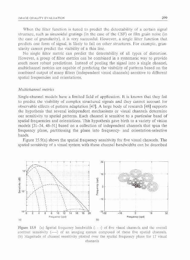
IMAGE QUALITY EVALUATION 299
When the filter function is tuned to predict the detectability of a certain signal structure, such as sinusoidal gratings (in the case of the CSF) or film grain noise (in the case of granularity), it is very successful. However, a single filter function that predicts one form of signal, is likely to fail on other structures. For example, gran- ularity cannot predict the visibility of a thin line.
No single filter metric can predict the detectability of all types of distortion. However, a group of flter metrics can be combined in a systematic way to provide much more robust predictions. Instead of pooling the signal into a single channel, multichannel metrics are capable of predicting the visibility of patterns based on the combined output of many filters (independent visual channels) sensitive to different spatial frequencies and orientations.
Multichannel metrics
Single-channel models have a limited field of application. It is known that they fail to predict the visibility of complex structured signals and they cannot account for observable effects of pattern adaptation [47]. A large body of research [48] supports the hypothesis that several independent mechanisms or visual channels determine our sensitivity to spatial patterns. Each channel is sensitive to a particular band of spatial frequencies and orientations. This hypothesis gave birth to a variety of vision models [31-34, 48-51] based on a collection of independent channels that span the frequency plane, partitioning the plane into frequency- and orientation-selective bands.
Figure 15.9(a) shows the spatial frequency sensitivity for five visual channels. The spatial sensitivity of a visual system with these channel bandwidths can be described
Frequency (cpd) (a)
Figure 15.9 (a) Spatial frequency bandwidth (. . .) of five visual channels and the overall contrast sensitivity (-1 of an imaging system composed of these five spatial channels. (b) Magnitude of channel sensitivity plotted over the spatial frequency plane for 17 visual
channels
300 JOYCE E. FARRELL
by a global function - the contrast sensitivity function described earlier. Figure 15.9(b) illustrates the spatial frequency and orientation tuning of 17 visual channels [52].
Multichannel (MC) metrics use at least two different types of summation to predict detection. The image is filtered independently by a collection of filters. Each filter is pooled to provide a separate channel. The channels are then weighted and pooled together with a different function (such as probability summation function). MC metrics are typically more computationally expensive than SC metrics, but they can predict the visibility of more complex, structured and periodic patterns, as well as account for some effects of visual adaptation.
In developing metrics for printers, it is usually more useful to know the detectability of distortion on a uniform field, since this is the worst case of distor- tion. In this instance we do not need to consider the effects of visual masking. Visual masking refers to the fact that the visibility of a signal is reduced by the presence of the background or pedestal upon which it is presented. Multichannel metrics that incorporate masking [31-341 are useful for predicting the visibility of distortions in images such as compression artifacts and printer banding. (Banding is a periodic thin line that is sometimes introduced on top of a significantly strong background of halftone noise. In some cases the halftone noise can mask the banding [53, 541.)
Investigators are actively developing multichannel metrics that incorporate masking and color [31]. The application of these metrics to image quality evaluation is an important applied research problem. Much more research is necessary before the metrics will reach the maturity of an industry standard.
S-CIELAB
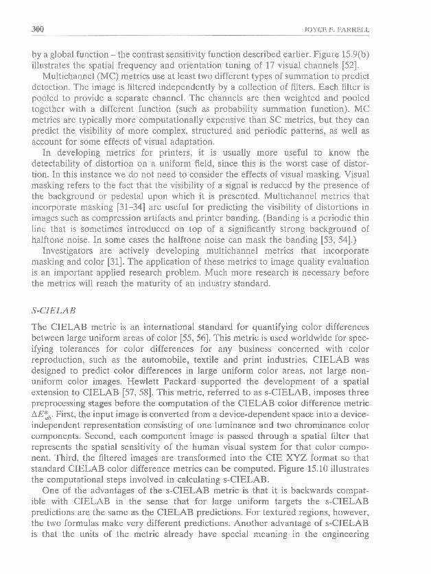
The CIELAB metric is an international standard for quantifying color differences between large uniform areas of color [55,56]. This metric is used worldwide for spec- ifying tolerances for color differences for any business concerned with color reproduction, such as the automobile, textile and print industries. CIELAB was designed to predict color differences in large uniform color areas, not large non- uniform color images. Hewlett Packard supported the development of a spatial extension to CIELAB [57, 581. This metric, referred to as s-CIELAB, imposes three preprocessing stages before the computation of the CIELAB color difference metric AE:,. First, the input image is converted from a device-dependent space into a device- independent representation consisting of one luminance and two chrominance color components. Second, each component image is passed through a spatial filter that represents the spatial sensitivity of the human visual system for that color compo- nent. Third, the filtered images are transformed into the CIE XYZ format so that standard CIELAB color difference metrics can be computed. Figure 15.10 illustrates the computational steps involved in calculating s-CIELAB.
One of the advantages of the s-CIELAB metric is that it is backwards compat- ible with CIELAB in the sense that for large uniform targets the s-CIELAB predictions are the same as the CIELAB predictions. For textured regions, however, the two formulas make very different predictions. Another advantage of s-CIELAB is that the units of the metric already have special meaning in the engineering
lMAGE QUALITY EVALUATION MI
Smooth Halftoned
Original images
Ownent color tnursformatf6n
Spatially filtered XYZ representation
Spatially filtered CIELAB representaion
SCIELAB AE map
Histogram and summary statistics
Figure W.11 Computing the ;s-CfELhB difference betwmn zwa images: a smooth contone image and a halftoned texturd imp. Both images are &'st converted fram devics- dependent KGB valuas into device-independent wlor opponent representations wnsiating d one luminance and two ch~ominance color components. Then each oamponent image is pawed through a spatial fitw that represents the spatial m%ensitivity of the human visual system for that wlor carnponent.. Finally, the filtered inxigm me transformed into the CIE-XYZ format and the standsrd CIELAB color difference metrim are computed. The result is an KIELBB difference: image which can be summarized by a statistic such as the median of the histogram
of s-CIELAB values.
302 JOYCE E. FARRELL
community. Color scientists and engineers are accustomed to reporting perceived color differences in units of AEZb.
Appropriate use of metrics
When used properly, metrics can be powerful design evaluation tools. Single-channel metrics, such as granularity and visually weighted mean square error, can be used to predict the visibility of stochastic noise (such as film grain and toner particle noise). Multichannel metrics are necessary to predict the visibility of periodic noise (such as printed halftone texture noise). As the complexity of the signal increases, so too does the complexity of the metric designed to predict its visibility. Metrics capable of predicting halftone texture visibility require multiple visual channels sensitive to different frequencies and orientations, but they do not require the additional expense of masking operations. Metrics capable of predicting the visibility of printer banding require additional masking operations. And multiple luminance and chrominance channels are required to predict the visibility of color halftone patterns.
An image quality metric only has meaning with respect to a visual task, a visual target, a computational measure and a measurement device. For example, distortion metrics predict performance on detection tasks such as the visibility of toner particle noise, halftone texture, printer banding, JPEG compression artifacts, MPEG compres- sion artifacts, and so on. Because we want to predict performance on a particular visual task, we develop a metric.
Distortion metrics predict performance on visual tasks with specific test targets or patterns. For example, an ideal test target for assessing the visibility of toner particle noise, halftone texture and printer banding is an image of constant gray level (i.e. a uniform field). Over time the engineering community has developed a large collec- tion of test images to assess the visibility of JPEG compression artifacts. Unfortunately, these images reflect the personal tastes of researchers, rather than a scholarly approach to the development of test images. Consequently, many JPEG distortion metrics have been designed to predict the visibility of distortions in a partic- ular test image and do not generalize to a larger collection of test images. The development of JPEG distortion metrics is limited by the lack of agreement on a common set of test images.
Distortion metrics predict performance on visuals tasks by computational analysis of the visual target. The development of computational image quality metrics is an important area of research. It begins with initial basic research in vision; this evolves into engineering metrics and eventually industry metrics tested over time. The best example of this process is the evolutionary history of the CIELAB metrics. Note that the success of CIELAB metrics is not only due to the computational measures them- selves (Euclidean distance in an LaB color space), but also due to the fact that the metrics define both the task (detection of color differences) and visual target (uniform color patch subtending 2" or 10" of visual angle) for which the metric has meaning.
Finally, distortion metrics predict visual performance by measuring the visual target with a specially designed measurement device. To calculate the collection of different distortion metrics, we need to develop sensing devices that are capable of capturing
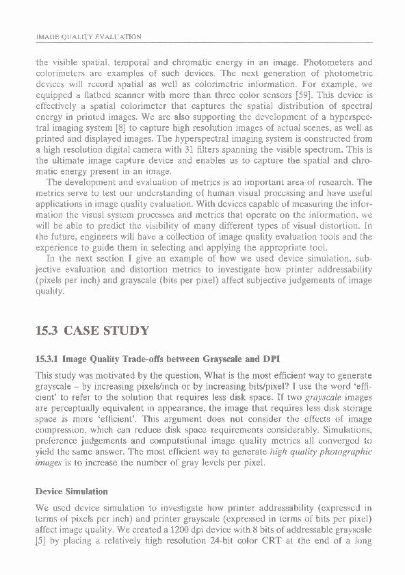
IMAGE QUALITY EVALUATION
the visible spatial, temporal and chromatic energy in an image. Photometers and colorirneters are examples of such devices. The next generation of photometric devices will record spatial as well as colorimetric information. For example, we equipped a flatbed scanner with more than three color sensors [59]. This device is effectively a spatial calorimeter that captures the spatial distribution of spectral energy in printed images. We are also supporting the development of a hyperspec- tral imaging system [8] to capture high resolution images of actual scenes, as well as printed and displayed images. The hyperspectral imaging system is constructed from a high resolution digital camera with 31 filters spanning the visible spectrum. This is the ultimate image capture device and enables us to capture the spatial and chro- matic energy present in an image.
The development and evaluation of metrics is an important area of research. The metrics serve to test our understanding of human visual processing and have useful applications in image quality evaluation. With devices capable of measuring the infor- mation the visual system processes and metrics that operate on the information, we will be able to predict the visibility of many different types of visual distortion. In the future, engineers will have a collection of image quality evaluation tools and the experience to guide them in selecting and applying the appropriate tool.
Tn the next section I give an example of how we used device simulation, sub- jective evaluation and distortion metrics to investigate how printer addressability (pixels per inch) and grayscale (bits per pixel) affect subjective judgements of image quality.
15.3 CASE STUDY
15.3.1 Image Quality Trade-offs between Grayscale and DPI
This study was motivated by the question, What is the most efficient way to generate grayscale - by increasing pixelslinch or by increasing bitslpixel? I use the word 'effi- cient' to refer to the solution that requires less disk space. If two grayscale images are perceptually equivalent in appearance, the image that requires less disk storage space is more 'efficient'. This argument does not consider the effects of image compression, which can reduce disk space requirements considerably. Simulations, preference judgements and computational image quality metrics all converged to yield the same answer. The most efficient way to generate high quality photographic images is to increase the number of gray levels per pixel.
Device Simulation
We used device simulation to investigate how printer addressability (expressed in terms of pixels per inch) and printer grayscale (expressed in terms of bits per pixel) affect image quality. We created a 1200 dpi device with 8 bits of addressable grayscale [5] by placing a relatively high resolution 24-bit color CRT at the end of a long

304 JOYCE E. FARRELL
tunnel. The tunnel was lined with black felt cloth to eliminate depth information about the actual location of the CRT. Inside the tunnel we placed two camera lenses between the CRT at one end and a small hole at the other end. The camera lenses enabled us to minify and focus a virtual image of the CRT display at a distance of 12 inches from the viewing hole. The focused virtual image had an effective visual addressability of 1200 dpi (dots per inch).
Figure 15.11 compares the modulation transfer function of the display apparatus with modulation transfer functions calculated for photographic print media and the human contrast sensitivity function. The figure illustrates the fact that the display apparatus was capable of presenting spatial frequencies beyond human sensitivity and beyond the frequencies present in photographic media. More importantly, the display apparatus was capable of presenting all the spatial frequencies visible to humans.
We used the 1200 dpi display to present simulations of lower resolution images (200, 300, 400 and 600 dpi) with varying grayscale capability [ S ] . Figure 15.12 illus- trates the computational steps involved in modeling a grayscale printer. We first created a high resolution (2K x 2K) &bit grayscale image. We decimated the image (lowpass followed by sampling) to create lower resolution images. After correcting for printer and display nonlinearities, we mapped the 8-bit grayscale map to fewer bits using the Floyd and Steinberg [60] error diffusion algorithm. To create the simu- lated images, we interpolated (upsampled) the lower resolution images to 2K x 2K
Photographic print MTF
P Spatial frequency (cpd)
Figure 15.11 Modulation transfer function for display apparatus with an effective address- ability of 1200 dpi.
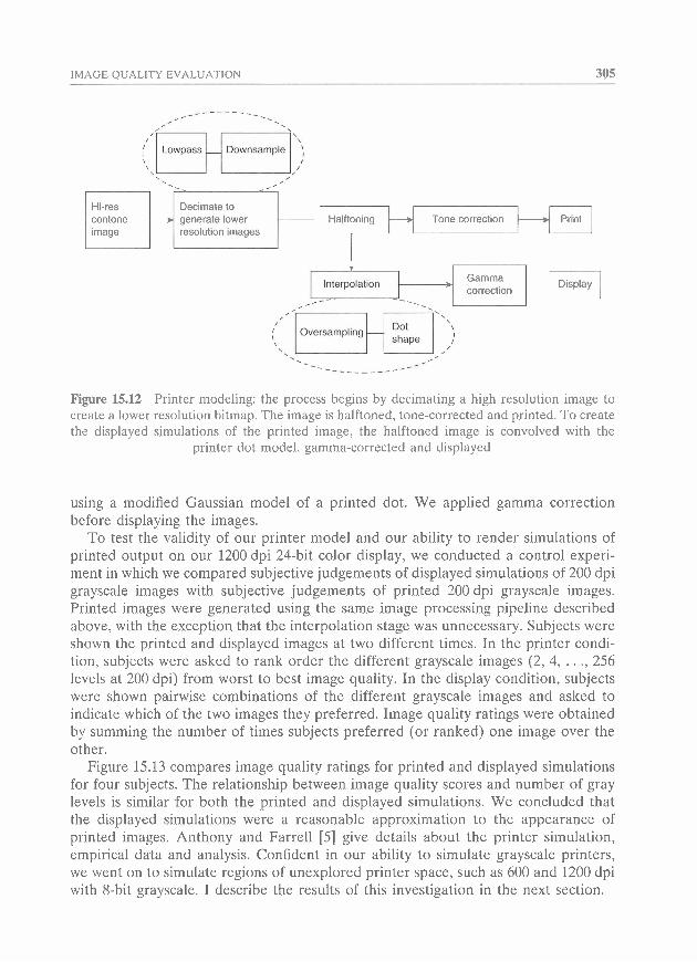
IMAGE QUALITY EVALUATION 305
Decimate to generate lower Halftoning Tone correction
image resolution images
Gamma correction I
shape
Display I
Figure 15.12 Printer modeling: the process begins by decimating a high resolution image to create a lower resolution bitmap. The image is halftoned, tone-corrected and printed. To create the displayed simulations of the prlnted image, the halftoned image is convolved with the
printer dot model, gamma-corrected and displayed
using a modified Gaussian model of a printed dot. We applied gamma correction before displaying the images.
To test the validity of our printer model and our ability to render simulations of printed output on our 1200 dpi 24-bit color display, we conducted a control experi- ment in which we compared subjective judgements of displayed simulations of 200 dpi grayscale images with subjective judgements of printed 200 dpi grayscale images. Printed images were generated using the same image processing pipeline described above, with the exception that the interpolation stage was unnecessary. Subjects were shown the printed and displayed images at two different times. In the printer condi- tion, subjects were asked to rank order the different grayscale images (2, 4, . . ., 256 levels at 200 dpi) from worst to best image quality. In the display condition, subjects were shown pairwise combinations of the different grayscale images and asked to indicate which of the two images they preferred. Image quality ratings were obtained by summing the number of times subjects preferred (or ranked) one image over the other.
Figure 15.13 compares image quality ratings for printed and displayed simulations for four subjects. The relationship between image quality scores and number of gray levels is similar for both the printed and displayed simulations. We concluded that the displayed simulations were a reasonable approximation to the appearance of printed images. Anthony and Farrell [5] give details about the printer simulation, empirical data and analysis. Confident in our ability to simulate grayscale printers, we went on to simulate regions of unexplored printer space, such as 600 and 1200 dpi with 8-bit grayscale. I describe the results of this investigation in the next section.
306 JOYCE E. FARRELL
06 I 0 50 100 150 200 250
Number of gray levels Number of gray levels
Observer G
80 7
v-
0 50 100 150 200 250
Number of gray levels Number of gray levels
Figure 15.13 Image quality scores versus number of gray levels: (0) display, (+) printer. For each observer the printer curve has a similar shape to the display curve, so the display
simulations seem to be a reasonable approximation to the printed images
15.32 Subjective evaluation
In this study [61] we presented all pairwise combinations of images that differed in both addressability (300, 600 and 1200 dpi) and number of gray levels (2, 4, 8 and 12) and asked subjects to indicate which of any two presented combinations they preferred. Since there were 12 different stimuli, this required a minimum of 132 comparisons. Each of the four people who volunteered to be subjects in our exper- iment viewed each comparison 10 times over the course of a week. Thus, for each subject, we collected data over 1320 trials; (see Silverstein and Farrell [22] for an adaptive pairwise comparison method that reduces the number of trials while maxi- mizing the information content of the confusion matrix.)
To test the hypothesis that addressability and gray levels directly trade off, we analyzed the stimulus comparison matrix to determine whether the stimuli could be ordered along one dimension (or preference vector) and if different combinations of
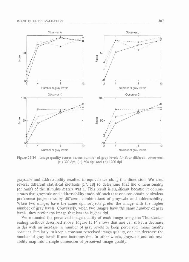
IMAGE QUALITY EVALUATION 307
Observer A
Number of gray levels
Observer X
loo-
Number of gray levels
Number of gray levels Number of gray levels
Figure 15.14 Image quality scores versus number of gray levels for four different observers: (0) 300 dpi, (+) 600 dpi and (*) 1200 dpi
grayscale and addressability resulted in equivalence along this dimension. We used several different statistical methods [17, 181 to determine that the dimensionality (or rank) of the stimulus matrix was 1. This result is significant because it demon- strates that grayscale and addressability trade-off, such that one can obtain equivalent preference judgements by different combinations of grayscale and addressability. When two images have the same dpi, subjects prefer the image with the higher number of gray levels. Conversely, when two images have the same number of gray levels, they prefer the image that has the higher dpi.
We estimated the perceived image quality of each image using the Thurstonian scaling methods described above. Figure 15.14 shows that one can offset a decrease in dpi with an increase in number of gray levels to keep perceived image quality constant. Similarly, to keep a constant perceived image quality, one can decrease the number of gray levels if one increases dpi. In other words, grayscale and address- ability map into a single dimension of perceived image quality.
JOYCE E. FARRELL
15.3.3 Image quality metrics
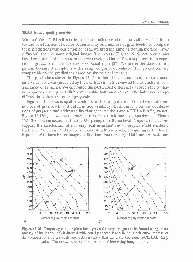
We used the s-CIELAB metric to make predictions about the visibility of halftone texture as a function of device addressability and number of gray levels. To compare these predictions with our empirical data, we used the same halftoning method (error diffusion) and the same original image. The results (Figure 15.15) are predictions based on a standard test pattern that we developed later. The test pattern is an expo- nential grayscale ramp that spans 3" of visual angle [57]. We prefer the standard test pattern because it samples a wider range of grayscale values. (The predictions are comparable to the predictions based on the original image.)
The predictions shown in Figure 15.15 are based on the assumption that a stan- dard visual observer (modeled by the s-CIELAB metric) viewed the test pattern from a distance of 12 inches. We computed the s-CIELAB differences between the contin- uous grayscale ramp and different possible halftoned ramps. The halftoned ramps differed in addressability and grayscale.
Figure 15.15 shows isoquality contours for the test pattern halftoned with different number of gray levels and different addressability. Each curve plots the combina- tions of grayscale and addressability that generate the same s-CIELAB AE:, values. Figure 15.15(a) shows measurements using linear halftone level spacing and Figure 15.15(b) shows measurements using L*-spacing of halftone levels. Together the curves support the conclusions of our empirical investigations of grayscale/addressability trade-offs. When equated for the number of halftone levels, L*-spacing of the levels is predicted to have better image quality than linear spacing. Halftone errors do not
2 4 6 1 0 1 6 2 5 4 0 6 4 1 0 1 255
Number of gray levels per point
. - 2 4 6 10 16 25 40 64101 255
Number of gray levels per point
Figure 15.15 Isoquality contour plots for a grayscale ramp image: (a) halftoned using linear spacing of luminance, (b) halftoned with equally spaced levels in L*. Each curve represents the combinations of grayscale and addressability that generate the same s-CIELAB AE:,
value. The arrow indicates the direction of increasing image quality
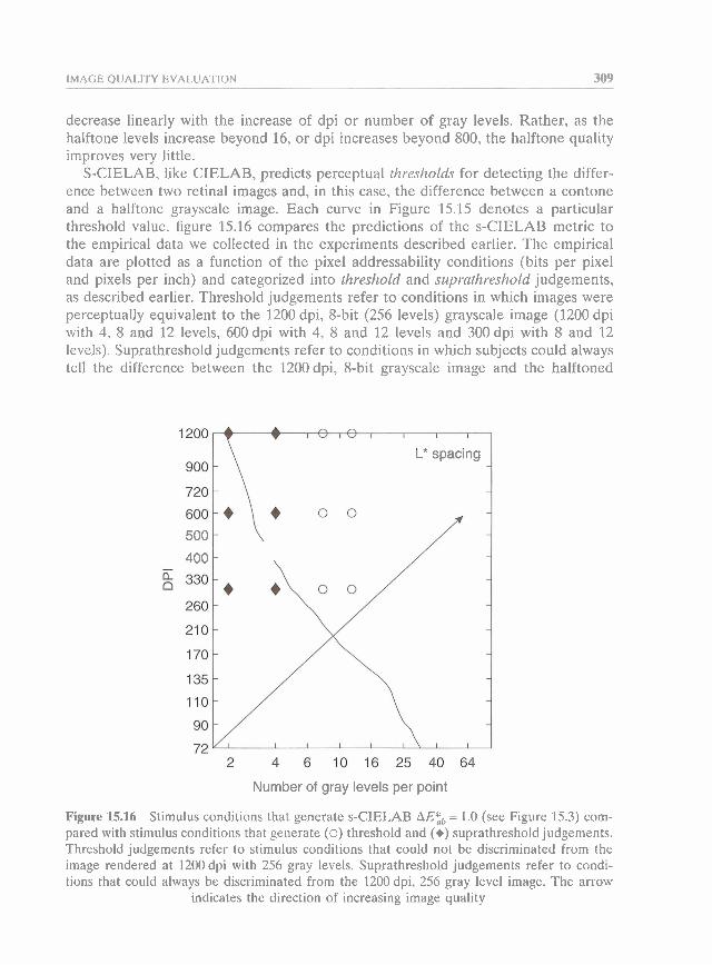
IMAGE QUALITY EVALUATION 309
decrease linearly with the increase of dpi or number of gray levels. Rather, as the halftone levels increase beyond 16, or dpi increases beyond 800, the halftone quality improves very little.
S-CIELAB, like CIELAB, predicts perceptual thresholds for detecting the differ- ence between two retinal images and, in this case, the difference between a contone and a halftone grayscale image. Each curve in Figure 15.15 denotes a particular threshold value. figure 15.16 compares the predictions of the s-CIELAB metric to the empirical data we collected in the experiments described earlier. The empirical data are plotted as a function of the pixel addressability conditions (bits per pixel and pixels per inch) and categorized into threshold and suprathreshold judgements, as described earlier. Threshold judgements refer to conditions in which images were perceptually equivalent to the 1200 dpi, 8-bit (256 levels) grayscale image (1200 dpi with 4, 8 and 12 levels, 600 dpi with 4, 8 and 12 levels and 300 dpi with 8 and 12 levels). Suprathreshold judgements refer to conditions in which subjects could always tell the difference between the 1200 dpi, 8-bit grayscale image and the halftoned
L* spacing -
-
-
210 - -
- -
Number of gray levels per point
Figure 15.16 Stimulus conditions that generate s-CIELAB AE;, = 1.0 (see Figure 15.3) com- pared with stimulus conditions that generate (0) threshold and (+) suprathreshold judgements. Threshold judgements refer to stimulus conditions that could not be discriminated from the image rendered at 1200 dpi with 256 gray levels. Suprathreshold judgements refer to condi- tions that could always be discriminated from the 1200 dpi, 256 gray level image. The arrow
indicates the direction of increasing image quality
310 JOYCE E. FARRELL
image (300, 600 and 1200 dpi with 2 levels and 300 dpi with 4 levels). The data is plotted in this way to illustrate the following observation: s-CIELAB values of 1.0 separate the threshold and suprathreshold stimulus conditions. When the s-CIELAB difference metric was greater than 1.0, subjects could always perceive the difference between a halftone and contone image. In other words, halftone texture was visible in images with s-CIELAB values greater than 1.0. When the s-CIELAB difference metric was less than 1.0, subjects could not perceive the difference between a halftone and contone image.
S-CIELAB makes predictions that are also consistent with other experiments we have conducted on the visibility of halftone texture in color images. For example, the metric predicts that the increase in image quality with increasing grayscale depth is greater for black, magenta and cyan, in that order [57]. s-CIELAB predicts that there is no improvement in image quality with increasing number of levels for the yellow inks. These predictions are consistent with our own observations and support the design decisions we made for the HP Photosmart Printer.
15.4 SUMMARY
To evaluate image quality we develop (1) tools to simulate and prototype imaging devices, (2) visual psychophysical methods and statistical dnta analysis tools for clas- sifying types of image distortion, and (3) metrics for predicting the visibility of such categorized visual distortions.
Device simulation relies upon several simplifying assumptions: device linearity, superposition and shift invariance. These assumptions imply that three functions (the intensity response, the spectral responsivity and the pixel pointspread functions) are sufficient to describe the behavior of a device. The use of these assumptions reduces the computational burden on software simulation. Of course the assumptions of device linearity, superposition and shift invariance are often not valid, as is the case for printers, and one must must weigh the economy of representation and power of linear systems analysis against the errors in predicting the device behavior.
When it comes to assessing subjective judgements of image quality, I prefer to ask people to make preference judgements. The method of pairwise comparison gener- ates reliable and informative data about perceived image quality above threshold. When the variance in subjective judgements for different stimuli (e.g. images) can be predicted by one (and no more than one) stimulus dimension, the data collected in pairwise comparison tasks can be used to estimate a quality value for each stimulus.
It is important to make a distinction between suprathreshold judgements of image quality (such as preference judgements) and threshold visibility judgements (such as the visibility of image distortions). Analysis of preference judgements enables us to determine whether we have isolated a single dimension of image quality. When this stimulus dimension corresponds to the visibility of an image distortion, we can design visual psychophysical tasks, such as signal detection, to investigate how sensitive people are to the image distortion signal.
IMAGE QUALITY EVALUATION 311
Computational image quality metrics are designed to predict contrast detection thresholds and not suprathreshold contrast judgements. These metrics are useful in image quality evaluation because they can be used to predict the visibility of image distortions introduced by devices and processing methods.
Finally, I described an example of how we used methods for device simulation, subjective evaluation and distortion metrics to investigate image quality trade-offs between printer addressability (pixels per inch) and grayscale (bits per pixel). Simulations, preference judgements and distortion metrics led us to the same conclu- sion: the most efficient way to generate high quality photographic images is to increase the number of gray levels per pixel.
ACKNOWLEDGMENTS
I thank the following people for many helpful discussions and collaborations: Rick Anthony, David Brainard, Peter Catrysse, Mike Harville, Amnon Silverstein, Louis Silverstein, Christian van den Branden Lambrecht, Doron Sherman, Poorvi Vora, Brian Wandell and Xuemei Zhang. I thank Lindsay MacDonald for helpful feedback and suggestions on this chapter.
REFERENCES
1. Vora, P. L., Farrell, J. E., Tietz, J. D. and Brainard, D. H. (1997) Linear models for digital cameras. Proc. IST 50th Annual Conference, pp. 378-82.
2. Hubel, P. M., Sherman, D. and Farrell, J. E. (1994) A comparison of methods of sensor spectral sensitivity estimation. Proc. IS&T and SID Second Color Imaging Conference, pp. 45-48.
3. Farrell, J. E. and Wandell, B. A. (1993) Scanner linearity. J. Electron. Imag., 2, 225-30. 4. Lyons, N. P. and Farrell, J. E. (1989) Linear systems analysis of CRT displays. SID Digest,
220-223. 5. Anthony, W. R. and Farrell, J. E. (1995) CRT-Display simulation of printed output, SID
Digest, 1995, 209-12. 6. Lomheim, T. S. and Kalman, L. S. (1992) Analytical modeling and digital simulation of
scanning charge-coupled device imaging systems, in Karim, M. A. (ed.) Electo-Optical Displays. New York: Marcel Dekker.
7. Vora, P. L., Harville, M. L., Farrell, J. E., Tietz, J. D. and Brainard D. H. (1997) Digital image capture: synthesis of sensor responses from multispectral images. Proc. SPIE, 3018, 2-1 1 . -
8. Brainard, D. H. (1997) Hyperspectral image data: http:Ncolor.psych.ucsb.edu/hyperspectral. 9. Andersen, M., Motta, R., Chandrasekar, S., Stokes, M. (1996) Proposal for a Standard
Default Color Space for the Internet-sRGB, 1STISID Proceedings for the Fourth Color Imaging Conference on Color Science, Systems, and Applications, pp. 238-246 (see also www.sRGB.com)
10. Brainard, D. H. (1984) Calibration of a computer-controlled color monitor. Color Res. Appl., 14, 23-34.
11. Cowan, W. B. and Rowell, N. (1986) On the gun independence and phosphor constancy of colour video monitors. Color Res. Appl., suppl. 11, S33-S38.
312 JOYCE E. FARRELL
12. Hosokawa, H. Y., Nishimura Ashiya, R. and Odumura, S. (1987) Digital CRT luminance uniformity correction. SID Digest, 1987, 412-15.
13. Riskey, D. R. (1986) Use and abuses of category scales in sensory measurement. J. Sensory Studies, 1, 217-36.
14. Georgeson, M. A. and Sullivan, G . D. (1975) Contrast constancy: deblurring in human vision by spatial frequency channels. J. Physiol., 252, 627-56.
15. Silverstein, D. A. and Farrell, J. E. (1996). The relationship between image fidelity and image quality. Proc. ICIP-96, 1, 881-84.
16. Thurstone, L. L. (1959) The Measurement of Values. Chicago IL: University of Chicago Press.
17. Stewart, D. W. (1981) The application and misapplication of factor analysis in marketing research. J. Marketing Res., 18, 51-62.
18. Ahumada, A. J. and Null, C. H. (1992) Image quality: a multidimensional problem, SID Digest, 1992, 851-54.
19. Draper, N. and Smith, H. (1981) Applied Regression Analysis. New York: John Wiley.
20. Mosteller, F. (1951) Remarks on the method of paired comparisons 111. A test of significance when equal standard deviations and equal correlations are assumed. Psychometrika, 16, 207-18.
21. Bartleson, C. J. (1984) Optical Radiation Measurements, Vol. 5, Visual Measurements. Orlando FL: Academic Press.
22. Silverstein, D. A. and Farrell, J. E. (1998) Quantifying perceptual quality. Proc. 5Ist IST Annual Meeting, pp. 881-84.
23. Charman, W. N. and Olin. A. (1965) Image quality criteria for aerial camera systems. Photograph. Sci. Engng. 9, 385-87.
24. Granger, E. M. and Cupery, K. N. (1972) An optical merit function (SQF) which corre- lates with subjective image judgements. Photograph. Sci. Engng, 16(3), 221-30.
25. van Meeteran, A. (1973) Visual aspects of image intensification. PhD dissertation, University of Utrecht.
26. Snyder, H. L. (1973) Image quality and observer performance, in Biberman, L. (ed.) Perception of Displayed Information. New York: Plenum Press.
27. Mannos, J. L. and Sakrison, D. J. (1974) The effects of a visual fidelity criterion on the encoding of images. IEEE Trans. Information Theory, 20, 525-36.
28. Limb, J. 0. (1979) Distortion criteria of the human viewer. IEEE Trans. Systems, Man and Cybernetics, 778-93.
29. Carlson. C. R. and Cohen, R. W. (1980) A simple psycho-physical model for predicting the visibility of displayed information. Proc. SID, 21(3) 229-46.
30. Barten, P. G. J. (1987) The SQRI method: a new method for the evaluation of visible resolution on a display. Proc. SID, 28(3), 253-62.
31. Watson, A. B. (1990) Perceptual-components architecture for digital video. J. Opt. Soc. Am. A, 7 , 1943-54.
32. Daly, S. (1993) The visible differences predictor: an algorithm for the assessment of image fidelity, in Watson, A.B. (ed.) Digital Images and Human Vision. Cambridge MA: MIT Press.
33. Lubin. J. (1993) The use of psychophysical data and models in the analysis of display system performance, in Watson, A.B. (ed.) Digital Images and Human Vision. Cambridge MA: MIT Press.
34. Teo, P. C. and Heeger, D. J. (1994) Perceptual image distortion. ICIP-94, 2, 98246. 35. Ahumada, A. J. Jr (1993) Computational image quality metrics: a review. SID Digest,
1993. 305-8. 36. Goodman, J. W. (1968) Introduction to Fourier Optics. 2nd ecln. San Francisco CA:
McGraw-Hill. 37. Pratt, W. K. (1991) Digital Image Processing, 2nd edn. New York: John Wiley. 38. Kelly, D. H. (1974) Spatial frequency selectivity in the retina. Vision Res., 15, 665-72.
IMAGE QUALITY EVALUATION 313
39. Klein, S. A. and Levi, D. M. (1985) Hyperacuity thresholds of 1 sec: theoretical predic- tions and empirical validation. J. Opt. Soc. Am. A , 2, 1170-90.
40. Jones, R. C. (1955) New methods of describing and measuring the granularity of photo- graphic materials. J. Opt. Soc. Am., 45, 799-808.
41. Schade, 0 . H. (1956) Optical and photoelectric analog of the eye. J. Opt. S. Am., 46, 721-39.
42. Campbell, R. W. and Gubisch, R. W. (1966) Optical quality of the human eye. J. Physiol., 186, 558-78.
43. Campbell, R. W. (1968) The human eye as an optical filter. Proc. IEEE, 56, 1009-14. 44. Dainty, J. D. and Shaw, R. (1974) Image Science. New York: Academic Press. 45. Shaw. R. (1980) Image noise evaluation. Proc. SID, 21,293-304. 46. Dooley, R. P. and Shaw, R. (1979) Noise perception in electrophotography. J. Appl.
Photograph. Engng, 5, 190-96. 47. Graham, N. and Nachmias, J. (1971) Detection of grating patterns containing two spatial
frequencies: a comparison of single-channel and multiple-channel models. Vision Res., 11, 251-59.
48. Graham, N. (1989) Visual Pattern Analyzers. Oxford: Oxford University Press. 49. Wilson, H. R. and Regan, D. (1984) Spatial-frequency adaptation and grating discrimi-
nation: predictions of a line element model. J. Opt. Soc. Am., 1, 1091-96. 50. Foley, J. M. and Legge, G. E. (1981) Contrast detection and near-threshold discrimina-
tion in human vision. Vision Res., 21, 1041-53. 51. Watson, A. B. (1983) Detection and recognition of simple spatial form, in Slade, A. C.
(ed.) Physical and Biological Processing of Images. Berlin: Springer-Verlag, pp. 100-1 14. 52. Farrell, J. E., Zhang, X., van den Branden Lambrecht, C. J. and Silverstein, D. A. (1997)
Image quality metrics based on single and multi-channel models of visual processing. Proceedings of IEEE Compcon97, pp. 57-60.
53. Trontelj, H., Farrell, J., Wiseman, J. and Shu, J. (1992) Optimal halftoning algorithm depends on printing resolution. SID Digest, 1992, 749-52.
54. Silverstein, A. and Chu, B. (1998) Does error-diffusion halftone texture mask banding? Proc. NIP14: International Conference on Digital Printing Technologies, pp. 560-63.
55. Wyseski, G. and Stiles, W. S. (1982) Color Science, 2nd edn. New York: John Wiley. 56. Judd, D. B. and Wyszecki, G. (1975) Color in Business, Science and Industry. New York:
John Wiley. 57. Zhang, X. M. and Wandell, B. A. (1996) A spatial extension to CIELAB for digital color
image reproduction. SID Digest, 1996, 731-34. 58. Zhang, X. M., Farrell, J. E. and Wandell, B. A. (1997) Applications of a spatial extension
to CIELAB. Proc. IS&T and SPIE Symposium on Electronic Imaging, 3025, pp. 154-157. 59. Farrell, J. E., Sherman, D. and Wandell, B. A. (1994) How to turn your scanner into a
calorimeter. IS&T Tenth International Congress on Advances in Non-Impact Printing Technologies, pp. 579-81.
60. Floyd, R. and Steinberg, L. (1975) An adaptive algorithm for spatial gray scale. SID Digest, 1975. 36-37.
61. ~arre l l , J. E. (1997) Grayscale and resolution tradeoffs for photographic image quality. Proc. SPIE, 3016, 148-53.