Embed Size (px)
Citation preview
Graph Design 1/20
Interaksi Manusia dan Komputer
Graphic Design
Graphic DesignDesign Philosophies
Graphic Design PrinciplesEconomy of Visual Elements
Coding TechniquesTypography
FontsColor
Icon Design
Graph Design 2/20
Interaksi Manusia dan Komputer
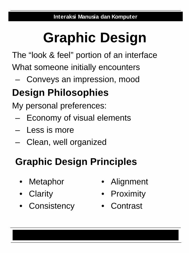
Graphic DesignThe “look & feel” portion of an interfaceWhat someone initially encounters– Conveys an impression, mood
Design PhilosophiesMy personal preferences:– Economy of visual elements– Less is more– Clean, well organized
• Metaphor• Clarity• Consistency
Graphic Design Principles
• Alignment• Proximity• Contrast
Graph Design 3/20
Interaksi Manusia dan Komputer
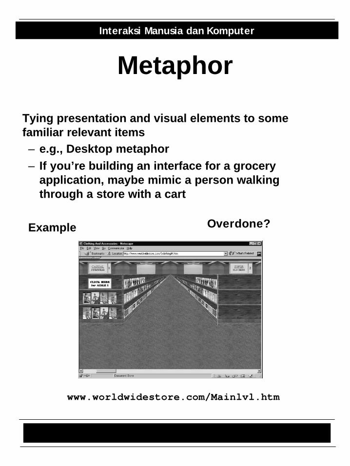
Metaphor
Tying presentation and visual elements to some familiar relevant items– e.g., Desktop metaphor– If you’re building an interface for a grocery
application, maybe mimic a person walking through a store with a cart
Example
www.worldwidestore.com/Mainlvl.htm
Overdone?
Graph Design 4/20
Interaksi Manusia dan Komputer
Clarity• Every element in an interface should
have a reason for being there– Make that reason clear too!
• Less is more• White space
– Leads the eye– Provides symmetry and balance
through its use– Strengthens impact of message– Allows eye to rest between
elements of activity– Used to promote simplicity,
elegance, class, refinement
Graph Design 5/20
Interaksi Manusia dan Komputer
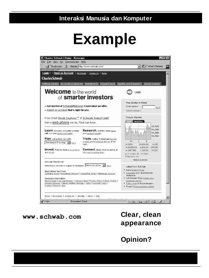
Example
www.schwab.com Clear, cleanappearance
Opinion?
Graph Design 6/20
Interaksi Manusia dan Komputer
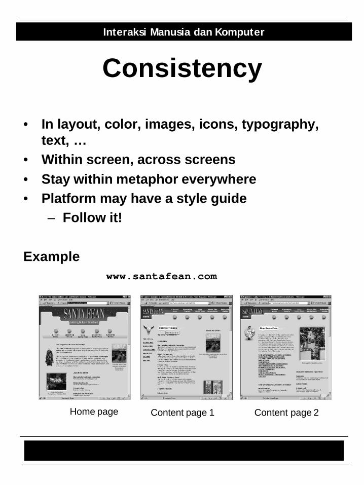
Consistency
• In layout, color, images, icons, typography, text, …
• Within screen, across screens• Stay within metaphor everywhere• Platform may have a style guide
– Follow it!
Example
Home page Content page 1 Content page 2
www.santafean.com
Graph Design 7/20
Interaksi Manusia dan Komputer
Alignment
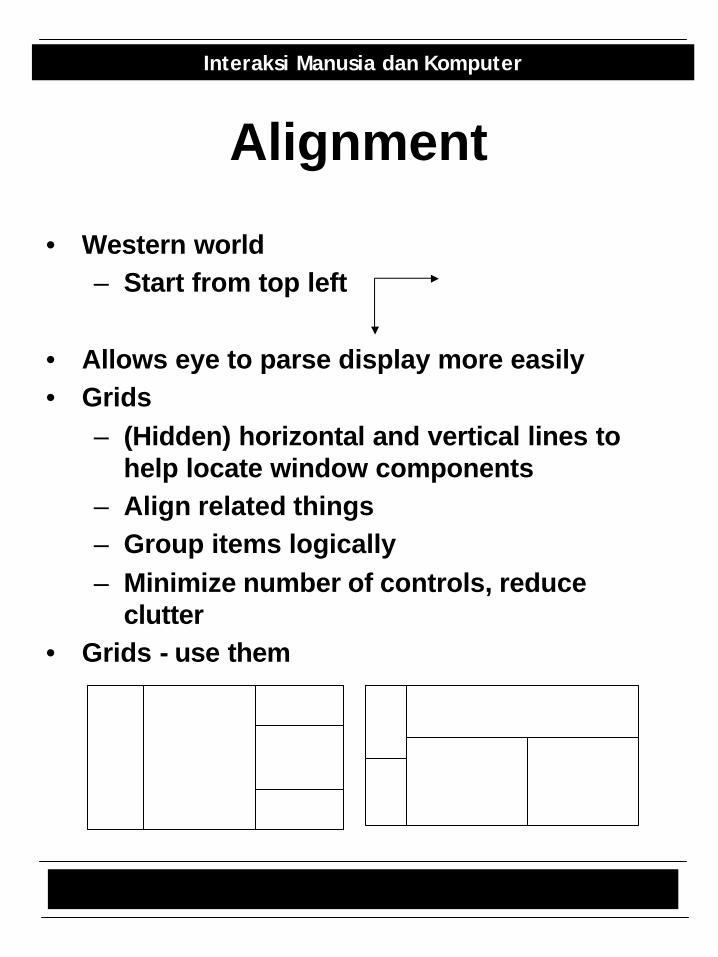
• Western world– Start from top left
• Allows eye to parse display more easily• Grids
– (Hidden) horizontal and vertical lines to help locate window components
– Align related things– Group items logically– Minimize number of controls, reduce
clutter• Grids - use them
Graph Design 8/20
Interaksi Manusia dan Komputer
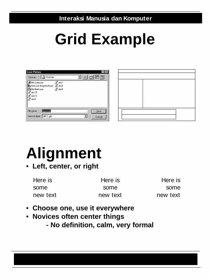
Grid Example
Alignment• Left, center, or right
• Choose one, use it everywhere• Novices often center things
- No definition, calm, very formal
Here is somenew text
Here is some
new text
Here is some
new text
Graph Design 9/20
Interaksi Manusia dan Komputer
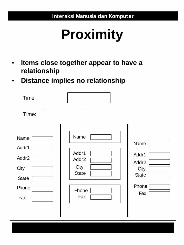
Proximity
• Items close together appear to have a relationship
• Distance implies no relationship
Time
Time:
Name
Addr1
Addr2
City
State
Phone
Fax
Name
Addr1Addr2
CityState
PhoneFax
Name
Addr1
Addr2City
State
PhoneFax
Graph Design 10/20
Interaksi Manusia dan Komputer
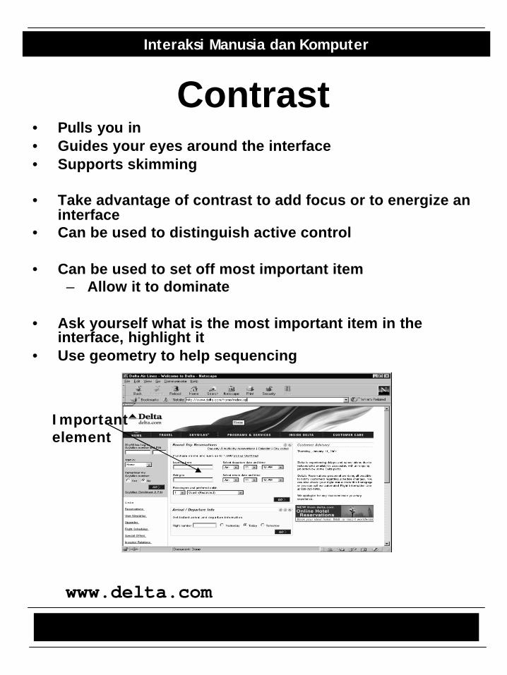
Contrast• Pulls you in• Guides your eyes around the interface• Supports skimming
• Take advantage of contrast to add focus or to energize an interface
• Can be used to distinguish active control
• Can be used to set off most important item– Allow it to dominate
• Ask yourself what is the most important item in the interface, highlight it
• Use geometry to help sequencing
Importantelement
www.delta.com
Graph Design 11/20
Interaksi Manusia dan Komputer
Economy of Visual Elements
• Less is more• Minimize borders and heavy outlining, section
boundaries (use whitespace)• Reduce clutter• Minimize the number of controls
Coding Techniques• Blinking
– Good for grabbing attention, but use verysparingly
• Reverse video, bold– Good for making something stand out– Again, use sparingly
Graph Design 12/20
Interaksi Manusia dan Komputer
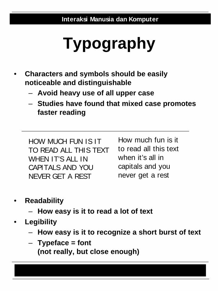
Typography
• Characters and symbols should be easily noticeable and distinguishable– Avoid heavy use of all upper case– Studies have found that mixed case promotes
faster reading
• Readability– How easy is it to read a lot of text
• Legibility– How easy is it to recognize a short burst of text– Typeface = font
(not really, but close enough)
HOW MUCH FUN IS ITTO READ ALL THIS TEXTWHEN IT’S ALL IN CAPITALS AND YOUNEVER GET A REST
How much fun is itto read all this textwhen it’s all in capitals and younever get a rest
Graph Design 13/20
Interaksi Manusia dan Komputer
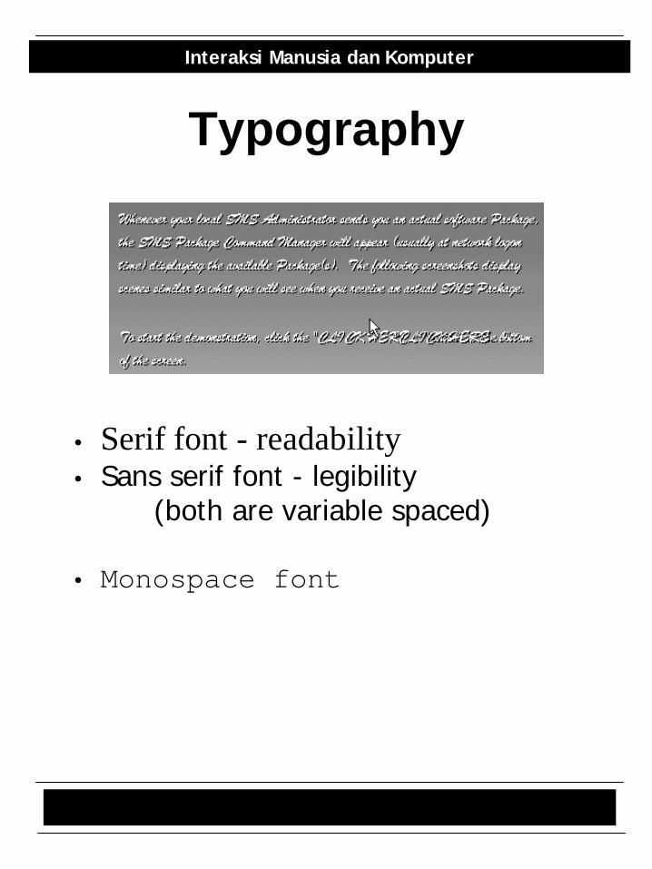
Typography
• Serif font - readability• Sans serif font - legibility
(both are variable spaced)
• Monospace font
Graph Design 14/20
Interaksi Manusia dan Komputer
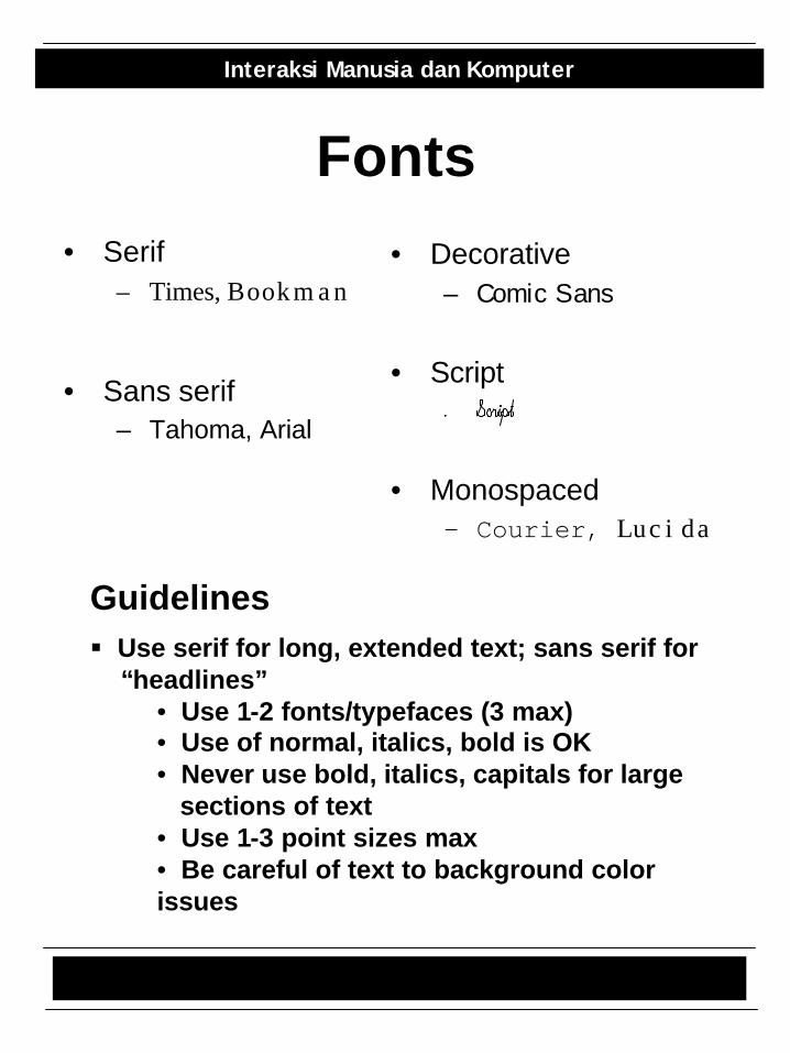
Fonts• Serif
– Times, Bookman
• Sans serif– Tahoma, Arial
• Decorative– Comic Sans
• Script
• Monospaced– Courier, Lucida
Guidelines§ Use serif for long, extended text; sans serif for
“headlines”• Use 1-2 fonts/typefaces (3 max)• Use of normal, italics, bold is OK• Never use bold, italics, capitals for large
sections of text• Use 1-3 point sizes max• Be careful of text to background color issues
Graph Design 15/20
Interaksi Manusia dan Komputer
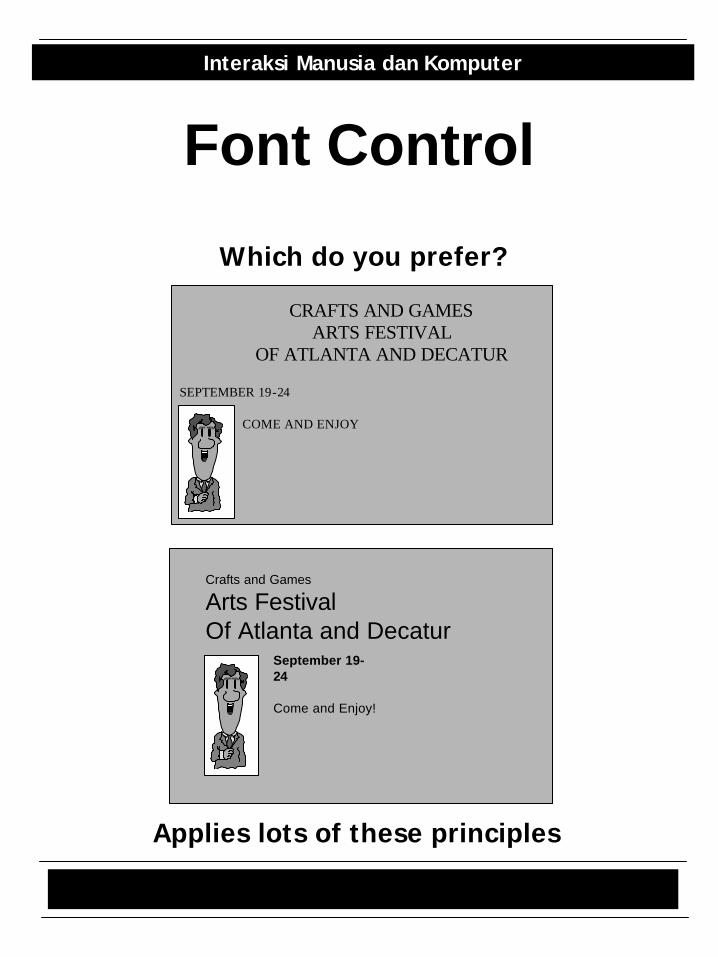
Font Control
CRAFTS AND GAMESARTS FESTIVAL
OF ATLANTA AND DECATUR
COME AND ENJOY
SEPTEMBER 19-24
Crafts and Games
Arts FestivalOf Atlanta and Decatur
September 19-24
Come and Enjoy!
Which do you prefer?
Applies lots of these principles
Graph Design 16/20
Interaksi Manusia dan Komputer
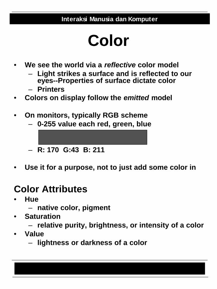
Color• We see the world via a reflective color model
– Light strikes a surface and is reflected to our eyes--Properties of surface dictate color
– Printers• Colors on display follow the emitted model
• On monitors, typically RGB scheme– 0-255 value each red, green, blue
– R: 170 G:43 B: 211
• Use it for a purpose, not to just add some color in
Color Attributes• Hue
– native color, pigment• Saturation
– relative purity, brightness, or intensity of a color• Value
– lightness or darkness of a color
Graph Design 17/20
Interaksi Manusia dan Komputer
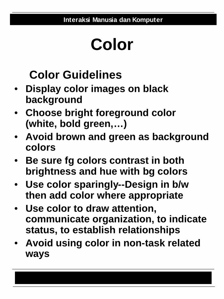
Color
Color Guidelines• Display color images on black
background• Choose bright foreground color
(white, bold green,…)• Avoid brown and green as background
colors• Be sure fg colors contrast in both
brightness and hue with bg colors• Use color sparingly--Design in b/w
then add color where appropriate• Use color to draw attention,
communicate organization, to indicate status, to establish relationships
• Avoid using color in non-task related ways
Graph Design 18/20
Interaksi Manusia dan Komputer
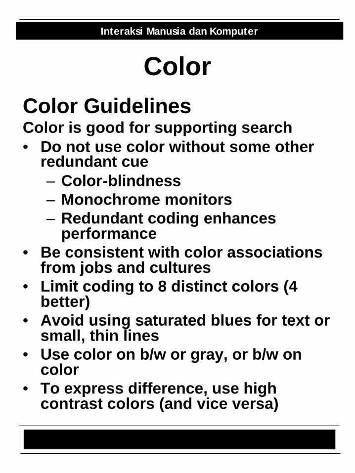
ColorColor GuidelinesColor is good for supporting search• Do not use color without some other
redundant cue– Color-blindness– Monochrome monitors– Redundant coding enhances
performance• Be consistent with color associations
from jobs and cultures• Limit coding to 8 distinct colors (4
better)• Avoid using saturated blues for text or
small, thin lines• Use color on b/w or gray, or b/w on
color• To express difference, use high
contrast colors (and vice versa)
Graph Design 19/20
Interaksi Manusia dan Komputer
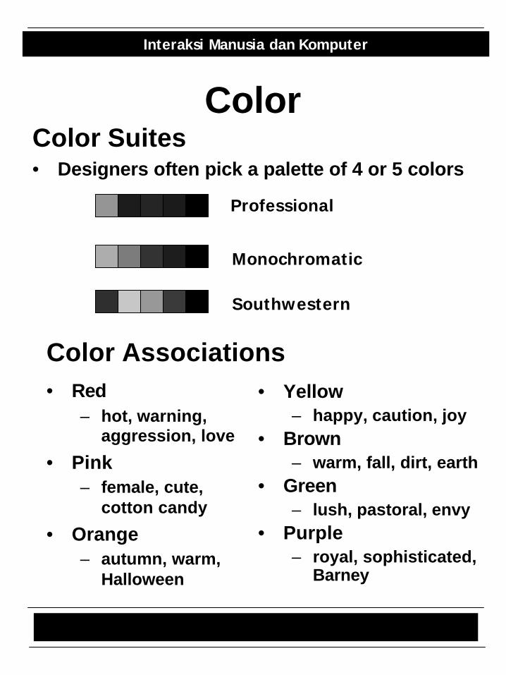
ColorColor Suites• Designers often pick a palette of 4 or 5 colors
Professional
Monochromatic
Southwestern
• Red– hot, warning,
aggression, love
• Pink– female, cute,
cotton candy
• Orange– autumn, warm,
Halloween
• Yellow– happy, caution, joy
• Brown– warm, fall, dirt, earth
• Green– lush, pastoral, envy
• Purple– royal, sophisticated,
Barney
Color Associations
Graph Design 20/20
Interaksi Manusia dan Komputer
Icon Design
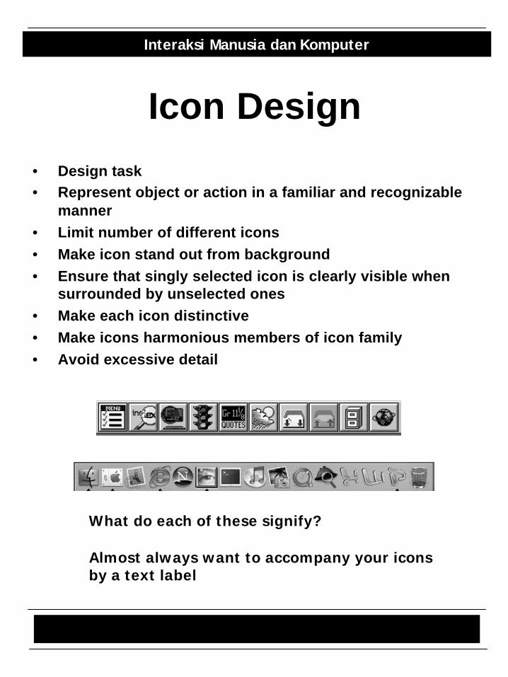
• Design task• Represent object or action in a familiar and recognizable
manner• Limit number of different icons• Make icon stand out from background• Ensure that singly selected icon is clearly visible when
surrounded by unselected ones• Make each icon distinctive• Make icons harmonious members of icon family• Avoid excessive detail
What do each of these signify?
Almost always want to accompany your iconsby a text label