Embed Size (px)
Citation preview
Buffering tutorial in Qgis
1) Open Qgis
2) Select the “Project Properties” dialog box under “Project”
from the menu above
3) Select the box to the left of the “Enable ‘on the fly’ CRS
transformation” option
4) The Coordinate Reference System for the wards is
“NAD83(CSRS)/MTM zone 9 EPSG:2951”
5) Make sure the reference system appears in the Selected
CRS section of the dialog box.
6) Select Apply, and then OK
7) Import the Ottawa wards shape file that should already be
in one of your folders. If not, then you’ll be have to
download it from the city’s open data website, and extract
the wards shape file from the zip folder.
1) Open ArcMap
8) Once the Wards_2010 shape file is in Qgis, right-click on
the “Wards_2010” layer and select the Set “CRS Project
from Layer” option, just like we did in step 16 in the first
Qgis tutorial.
9) To Download the csv file, right-click on
“GeoCoded_FullSyringeFile” and save it to your folder.
10) Save your entire Qgis project in the same folder that
will contain your files and layers.
11) Upload the “GeoCoded_FullSyringeFile” to Qgis.
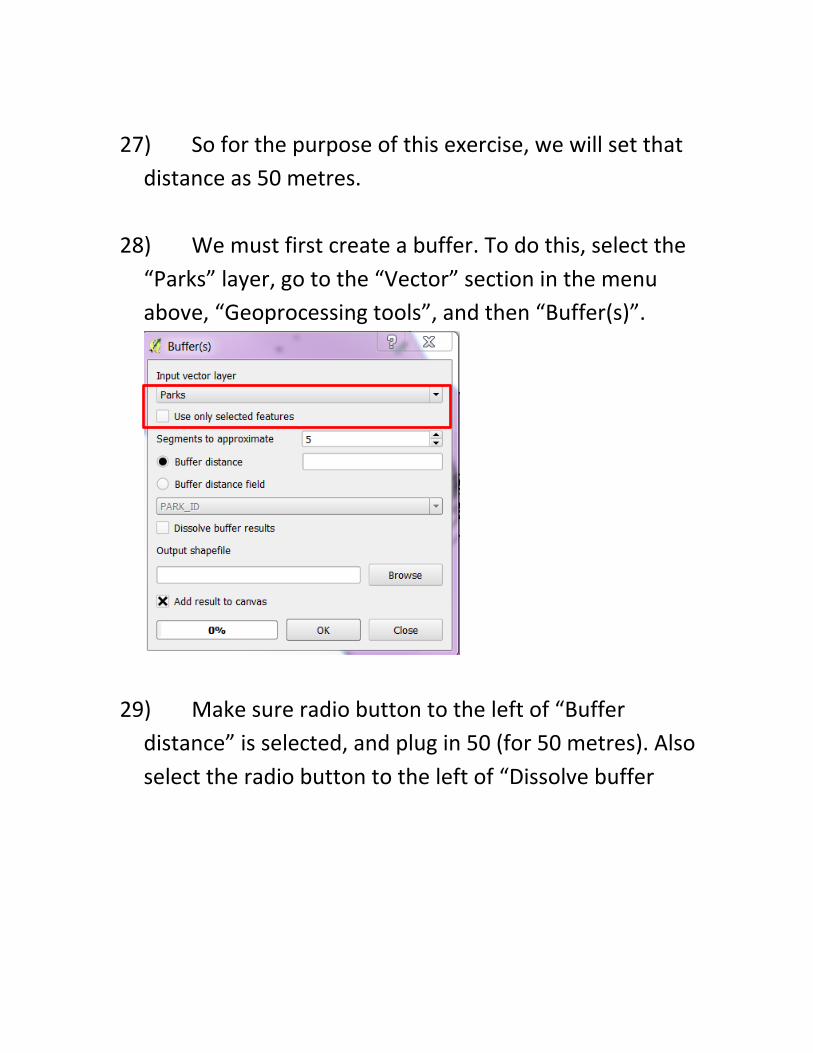
12) (NOTE: Fortunately, there is no need to create a
“csvt” file as we did in steps 26-36 in the second Qgis
tutorial. This is because we don’t want to convert any of
the numbers to text, or vice-versa. A “csvt” file is only
necessary if you want to reformat the values to
correspond with the values in a second file, or layer in
Qgis.)
13) Selecting “OK” produces a second dialog box
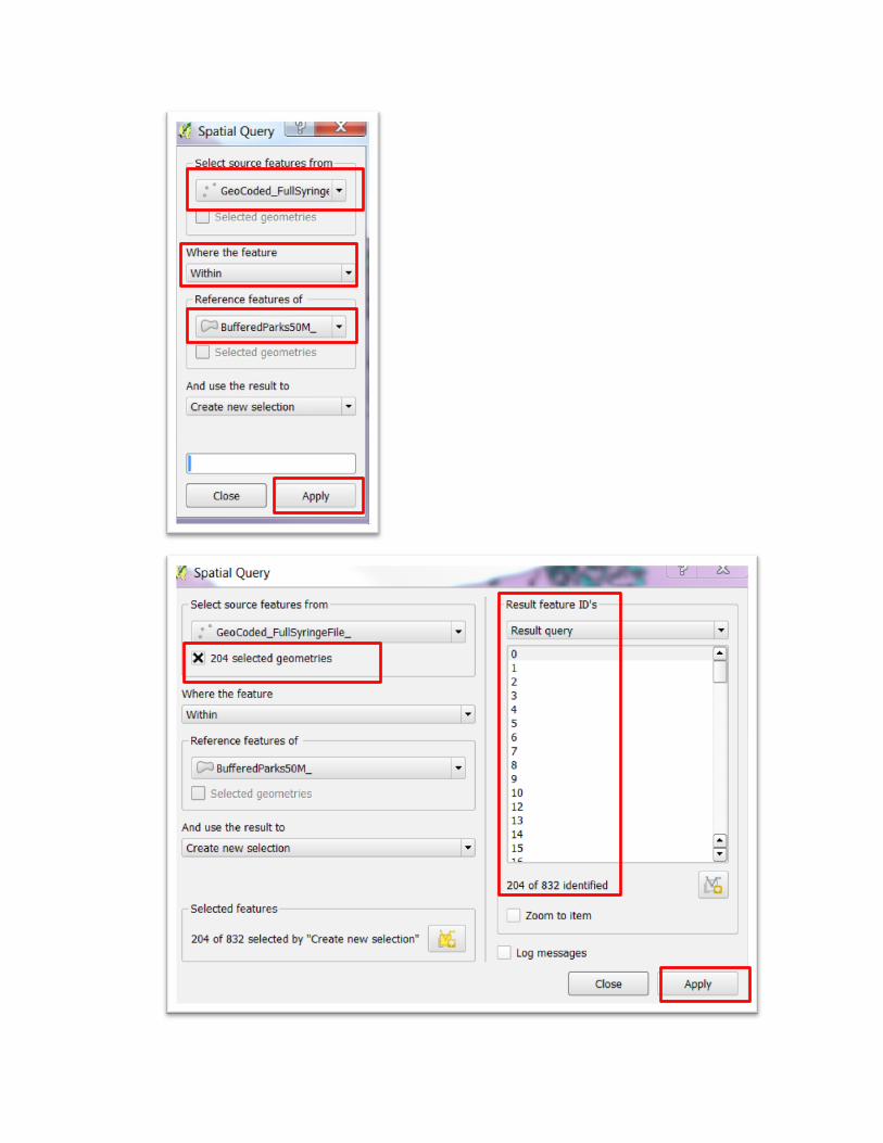
containing the file’s coordinate system –NAD83 – which is
different from that of the Ward. However, because we’ve
told Qgis to project on the fly, it knows to force a match
between the coordinate systems.
v
v
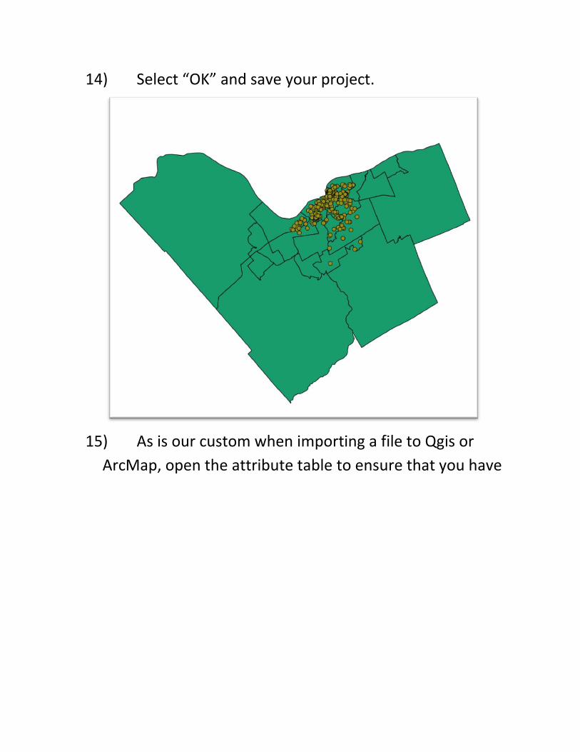
14) Select “OK” and save your project.
15) As is our custom when importing a file to Qgis or
ArcMap, open the attribute table to ensure that you have
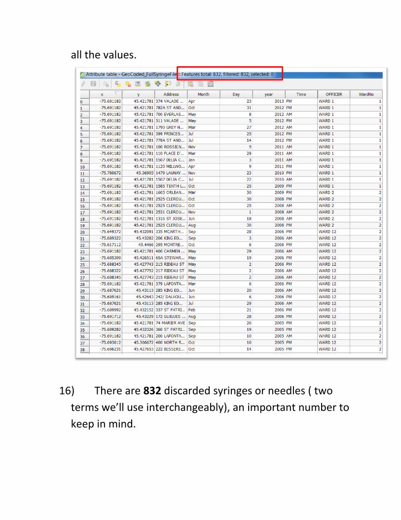
all the values.
16) There are 832 discarded syringes or needles ( two
terms we’ll use interchangeably), an important number to
keep in mind.
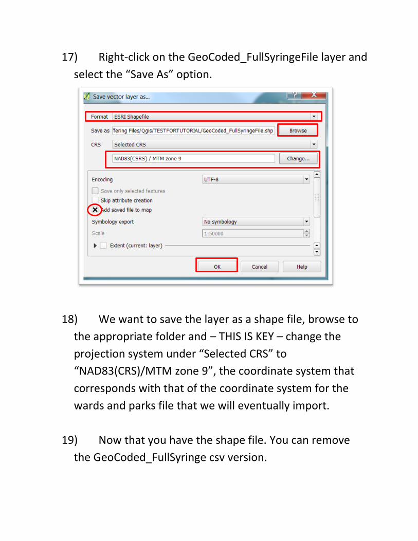
17) Right-click on the GeoCoded_FullSyringeFile layer and
select the “Save As” option.
18) We want to save the layer as a shape file, browse to
the appropriate folder and – THIS IS KEY – change the
projection system under “Selected CRS” to
“NAD83(CRS)/MTM zone 9”, the coordinate system that
corresponds with that of the coordinate system for the
wards and parks file that we will eventually import.
19) Now that you have the shape file. You can remove
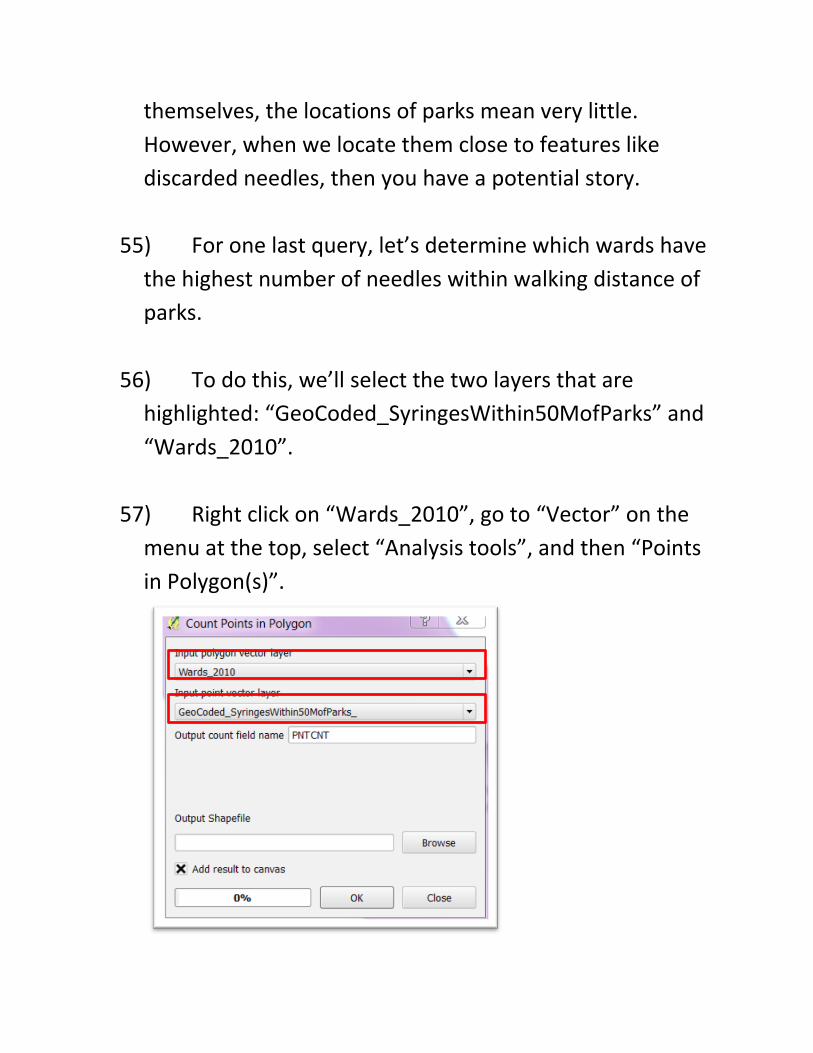
the GeoCoded_FullSyringe csv version.
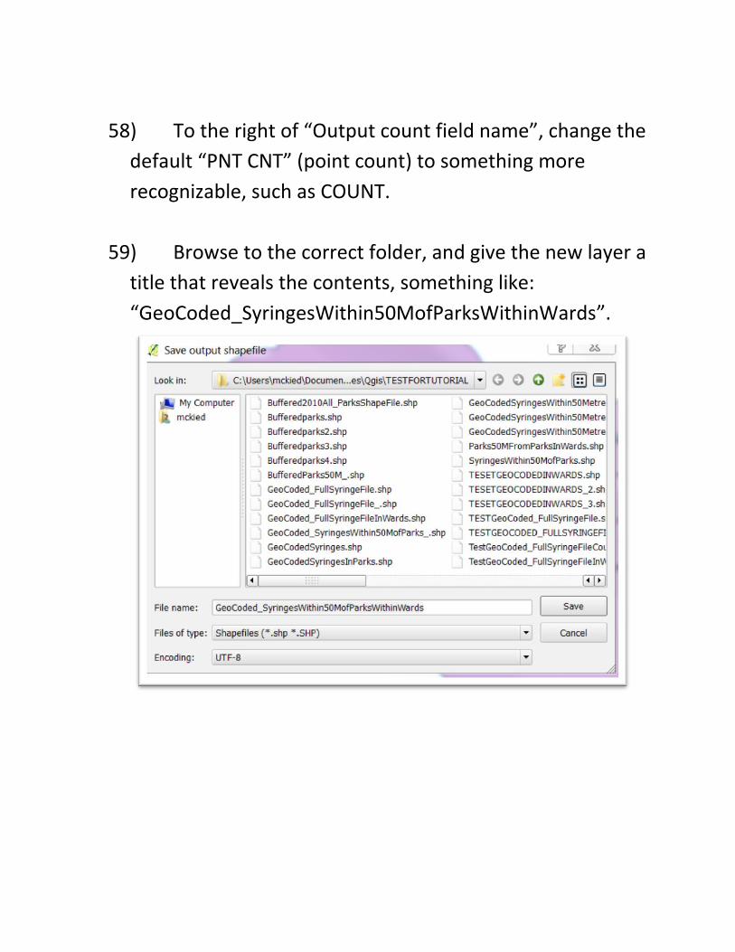
20) Now let’s import the shape file that contains all the
park locations in Ottawa.
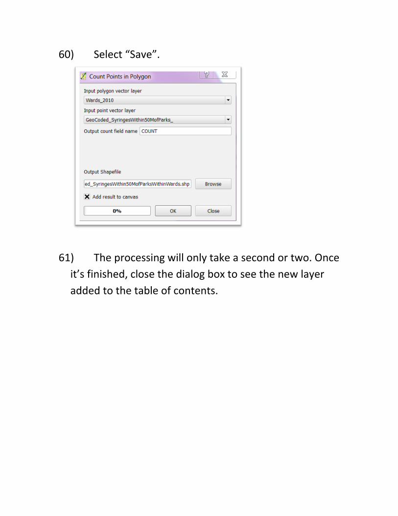
21) To do this, we’ll have to visit the city’s open data
portal, and navigate to parks.
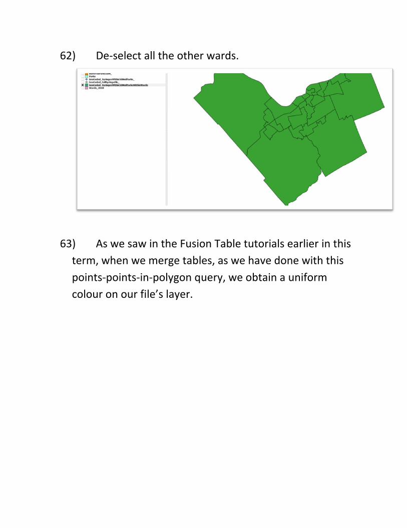
22) Download the shape file, and save it in the same
folder that contains your other files for this Qgis tutorial.
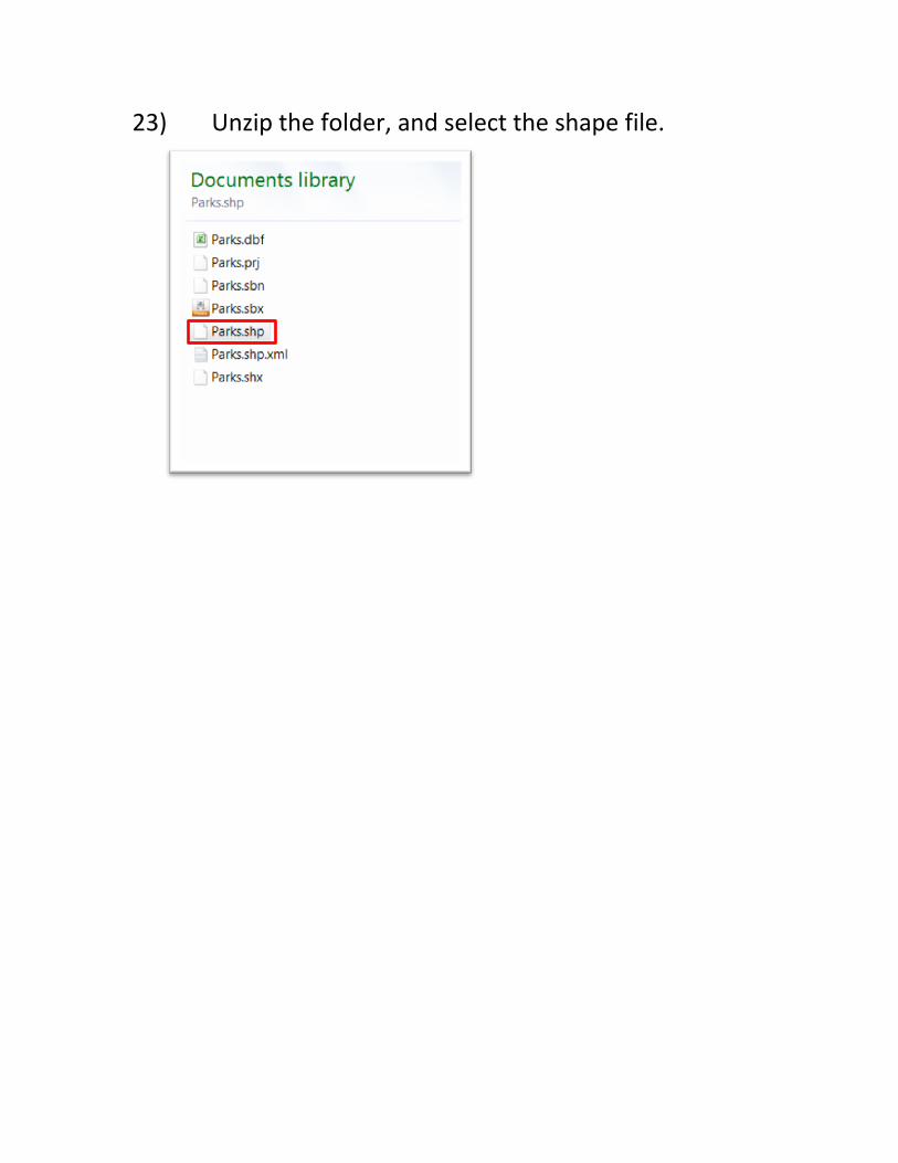
23) Unzip the folder, and select the shape file.
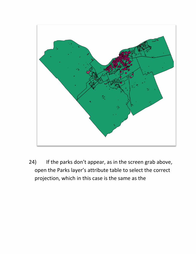
24) If the parks don’t appear, as in the screen grab above,
open the Parks layer’s attribute table to select the correct
projection, which in this case is the same as the
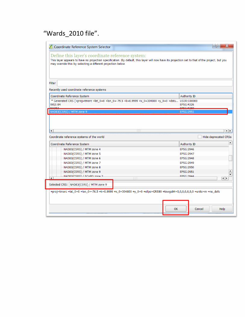
“Wards_2010 file”.
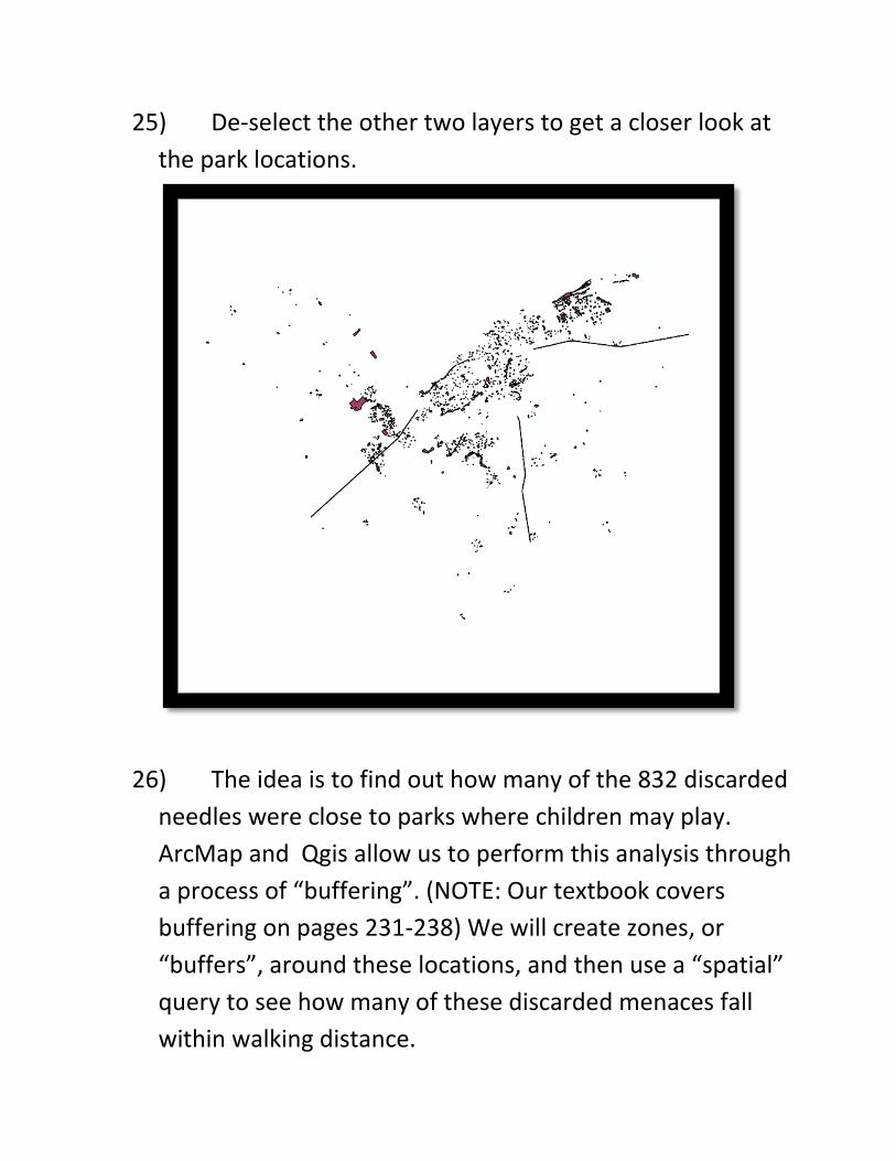
25) De-select the other two layers to get a closer look at
the park locations.
26) The idea is to find out how many of the 832 discarded
needles were close to parks where children may play.
ArcMap and Qgis allow us to perform this analysis through
a process of “buffering”. (NOTE: Our textbook covers
buffering on pages 231-238) We will create zones, or
“buffers”, around these locations, and then use a “spatial”
query to see how many of these discarded menaces fall
within walking distance.
27) So for the purpose of this exercise, we will set that
distance as 50 metres.
28) We must first create a buffer. To do this, select the
“Parks” layer, go to the “Vector” section in the menu
above, “Geoprocessing tools”, and then “Buffer(s)”.
29) Make sure radio button to the left of “Buffer
distance” is selected, and plug in 50 (for 50 metres). Also
select the radio button to the left of “Dissolve buffer
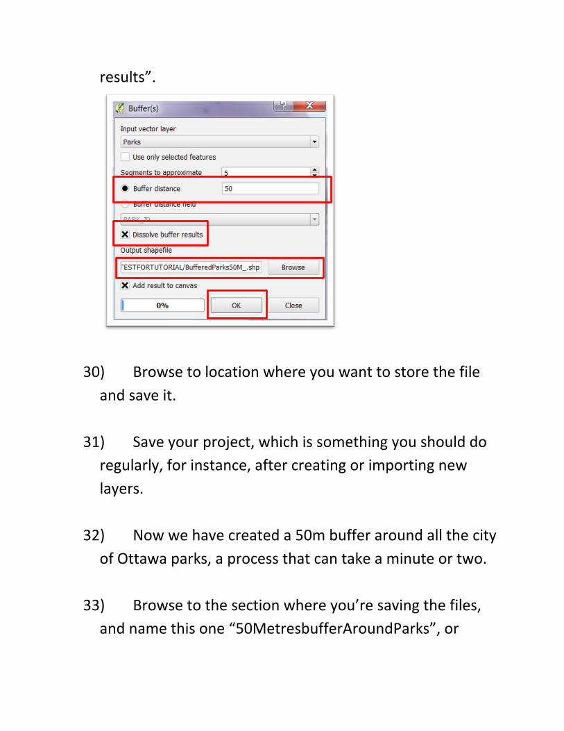
results”.
30) Browse to location where you want to store the file
and save it.
31) Save your project, which is something you should do
regularly, for instance, after creating or importing new
layers.
32) Now we have created a 50m buffer around all the city
of Ottawa parks, a process that can take a minute or two.
33) Browse to the section where you’re saving the files,
and name this one “50MetresbufferAroundParks”, or
something similar. In other words, a title – albeit, a long
one -- that indicates the contents of the file.
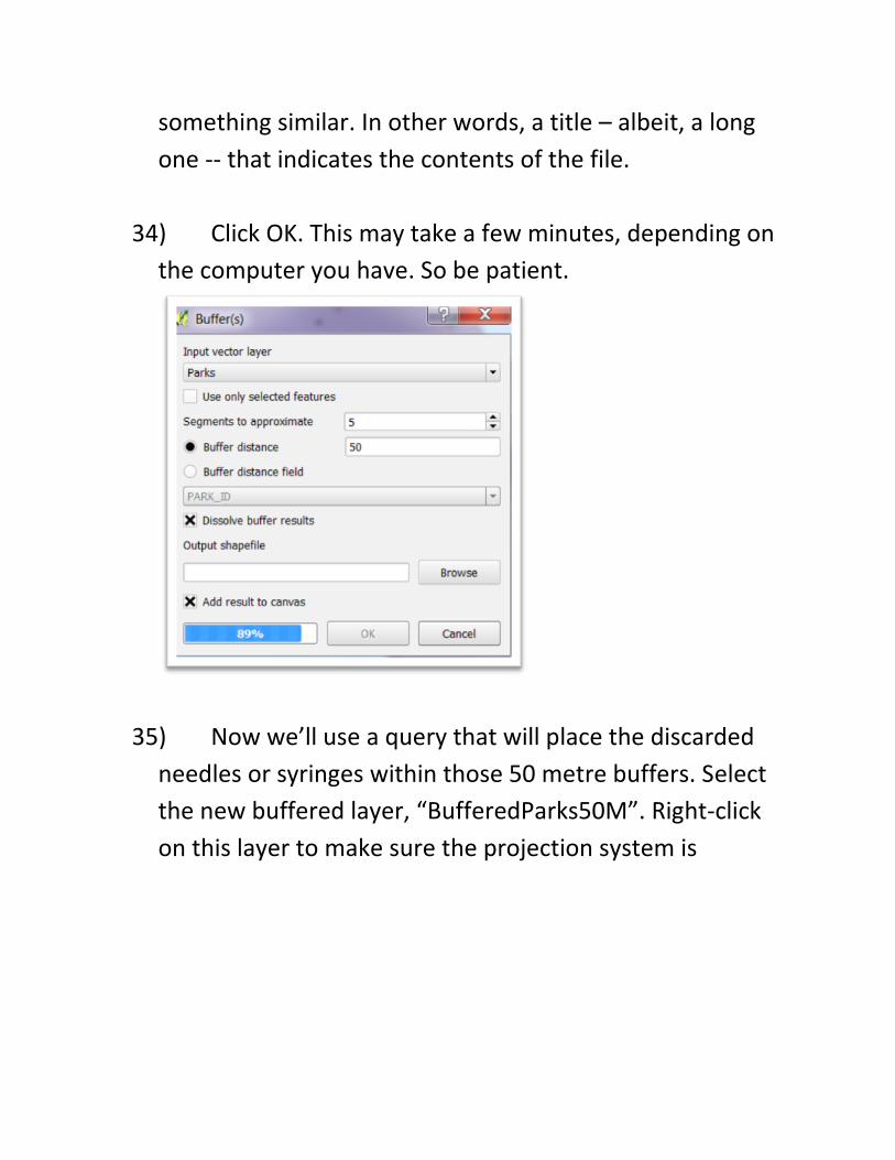
34) Click OK. This may take a few minutes, depending on
the computer you have. So be patient.
35) Now we’ll use a query that will place the discarded
needles or syringes within those 50 metre buffers. Select
the new buffered layer, “BufferedParks50M”. Right-click
on this layer to make sure the projection system is
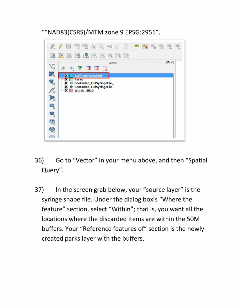
““NAD83(CSRS)/MTM zone 9 EPSG:2951”.
36) Go to “Vector” in your menu above, and then “Spatial
Query”.
37) In the screen grab below, your “source layer” is the
syringe shape file. Under the dialog box’s “Where the
feature” section, select “Within”; that is, you want all the
locations where the discarded items are within the 50M
buffers. Your “Reference features of” section is the newly-
created parks layer with the buffers.
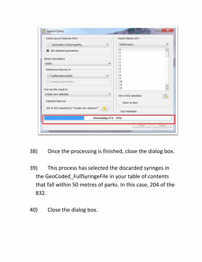
38) Once the processing is finished, close the dialog box.
39) This process has selected the discarded syringes in
the GeoCoded_FullSyringeFile in your table of contents
that fall within 50 metres of parks. In this case, 204 of the
832.
40) Close the dialog box.
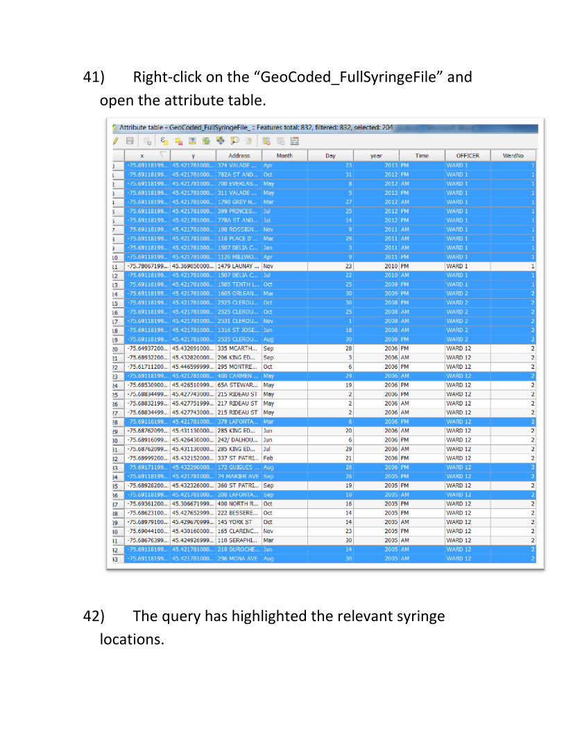
41) Right-click on the “GeoCoded_FullSyringeFile” and
open the attribute table.
42) The query has highlighted the relevant syringe
locations.
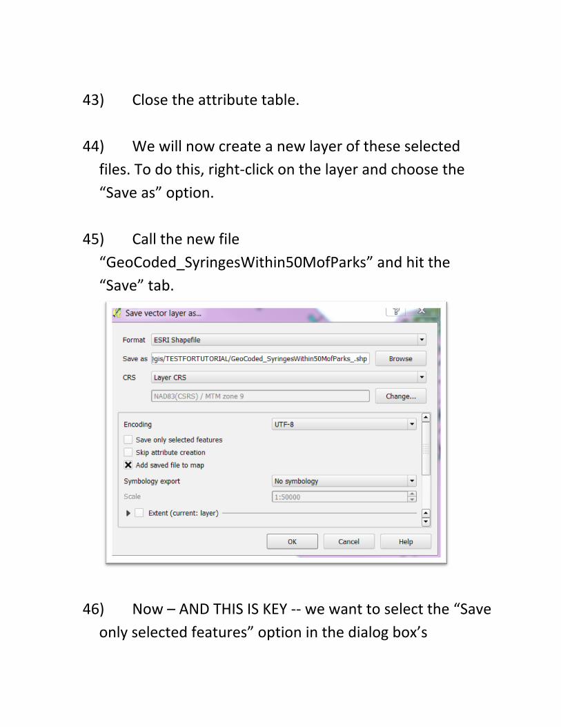
43) Close the attribute table.
44) We will now create a new layer of these selected
files. To do this, right-click on the layer and choose the
“Save as” option.
45) Call the new file
“GeoCoded_SyringesWithin50MofParks” and hit the
“Save” tab.
46) Now – AND THIS IS KEY -- we want to select the “Save
only selected features” option in the dialog box’s
“Encoding” section. You’ll also notice that the projection
corresponds to the projection for the parks and wards. If it
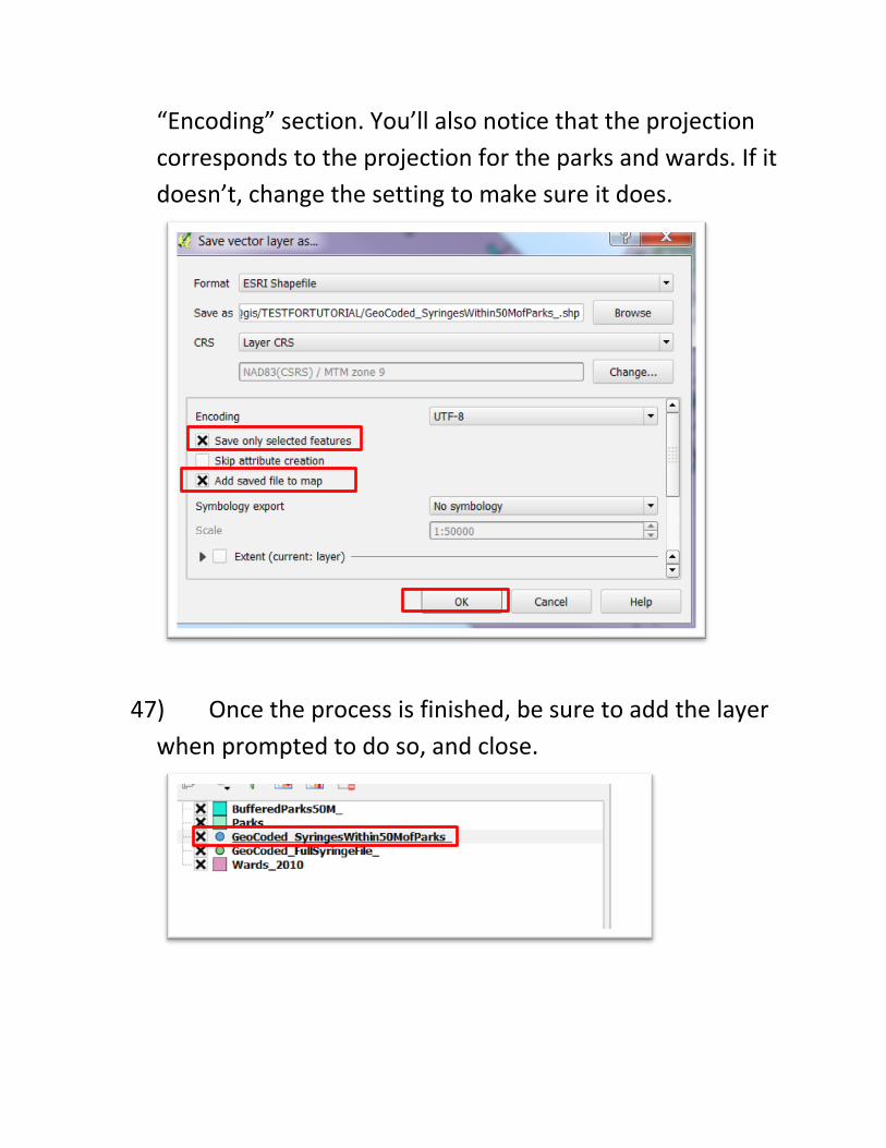
doesn’t, change the setting to make sure it does.
47) Once the process is finished, be sure to add the layer
when prompted to do so, and close.
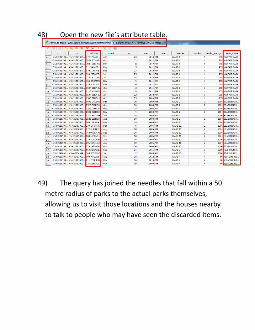
48) Open the new file’s attribute table.
49) The query has joined the needles that fall within a 50
metre radius of parks to the actual parks themselves,
allowing us to visit those locations and the houses nearby
to talk to people who may have seen the discarded items.
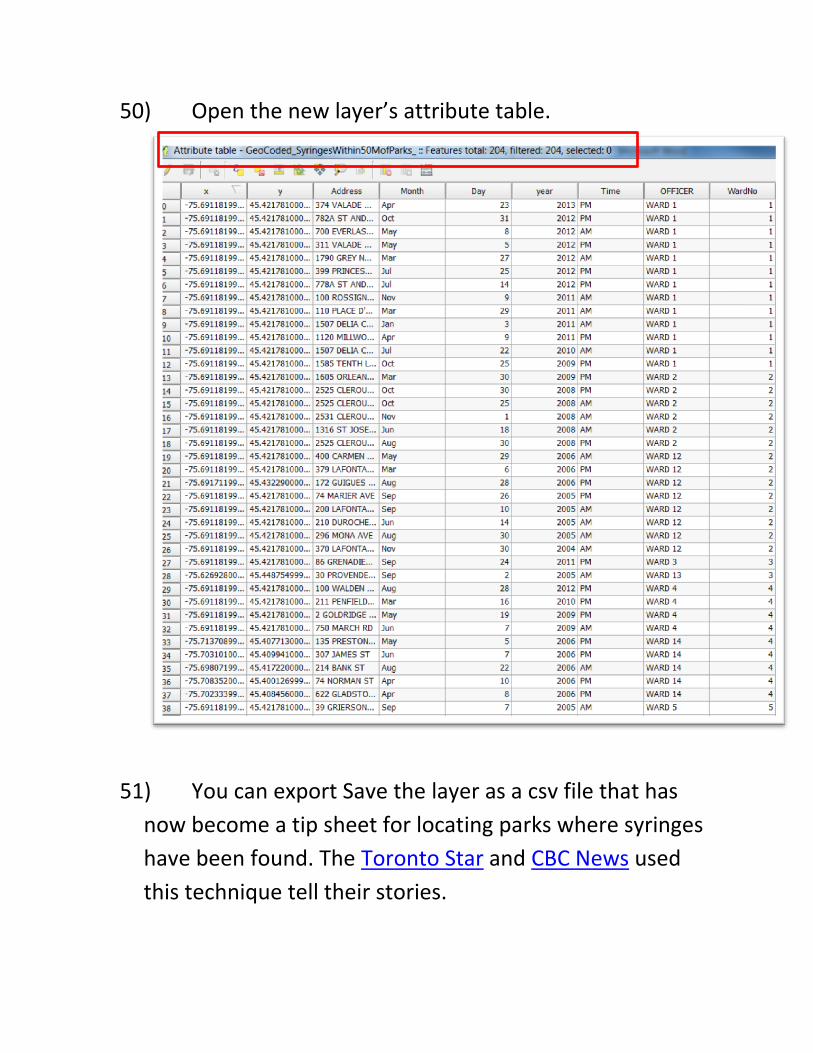
50) Open the new layer’s attribute table.
51) You can export Save the layer as a csv file that has
now become a tip sheet for locating parks where syringes
have been found. The Toronto Star and CBC News used
this technique tell their stories.
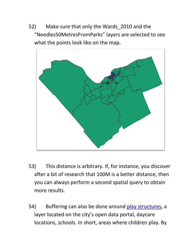
52) Make sure that only the Wards_2010 and the
“Needles50MetresFromParks” layers are selected to see
what the points look like on the map.
53) This distance is arbitrary. If, for instance, you discover
after a bit of research that 100M is a better distance, then
you can always perform a second spatial query to obtain
more results.
54) Buffering can also be done around play structures, a
layer located on the city’s open data portal, daycare
locations, schools. In short, areas where children play. By
themselves, the locations of parks mean very little.
However, when we locate them close to features like
discarded needles, then you have a potential story.
55) For one last query, let’s determine which wards have
the highest number of needles within walking distance of
parks.
56) To do this, we’ll select the two layers that are
highlighted: “GeoCoded_SyringesWithin50MofParks” and
“Wards_2010”.
57) Right click on “Wards_2010”, go to “Vector” on the
menu at the top, select “Analysis tools”, and then “Points
in Polygon(s)”.
58) To the right of “Output count field name”, change the
default “PNT CNT” (point count) to something more
recognizable, such as COUNT.
59) Browse to the correct folder, and give the new layer a
title that reveals the contents, something like:
“GeoCoded_SyringesWithin50MofParksWithinWards”.
60) Select “Save”.
61) The processing will only take a second or two. Once
it’s finished, close the dialog box to see the new layer
added to the table of contents.
62) De-select all the other wards.
63) As we saw in the Fusion Table tutorials earlier in this
term, when we merge tables, as we have done with this
points-points-in-polygon query, we obtain a uniform
colour on our file’s layer.
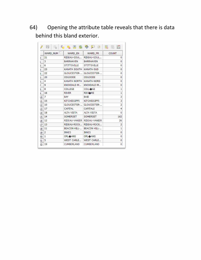
64) Opening the attribute table reveals that there is data
behind this bland exterior.
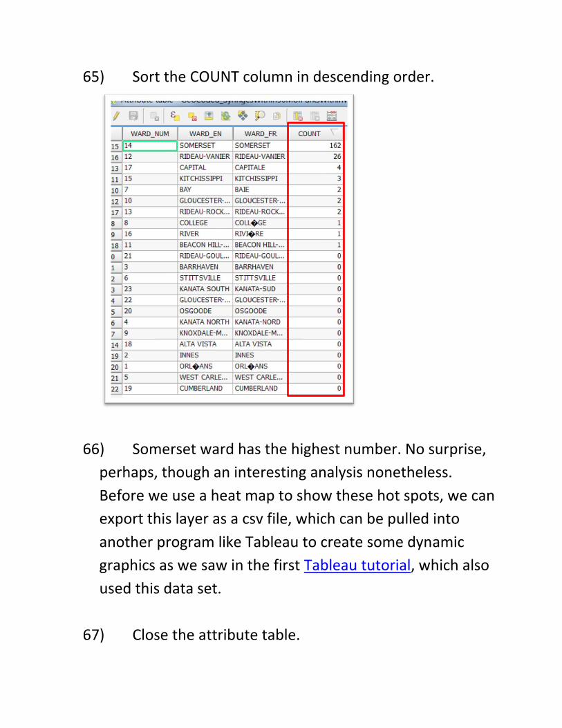
65) Sort the COUNT column in descending order.
66) Somerset ward has the highest number. No surprise,
perhaps, though an interesting analysis nonetheless.
Before we use a heat map to show these hot spots, we can
export this layer as a csv file, which can be pulled into
another program like Tableau to create some dynamic
graphics as we saw in the first Tableau tutorial, which also
used this data set.
67) Close the attribute table.
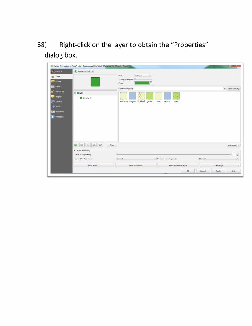
68) Right-click on the layer to obtain the “Properties”
dialog box.
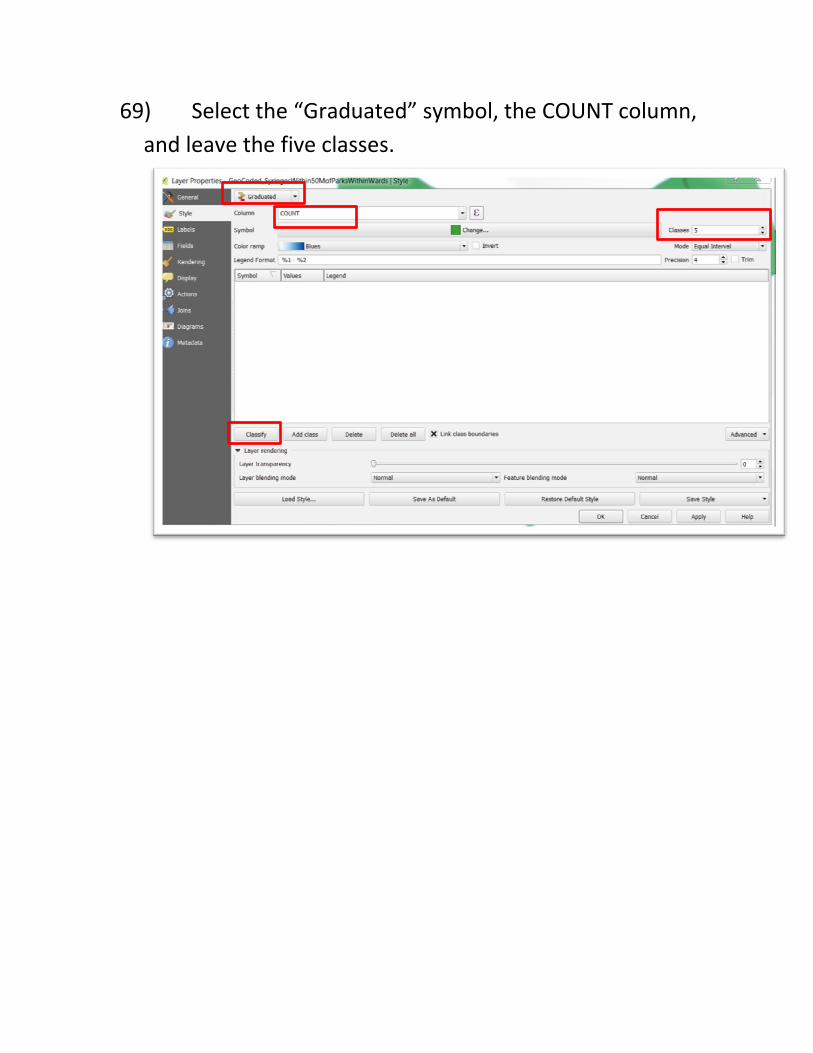
69) Select the “Graduated” symbol, the COUNT column,
and leave the five classes.
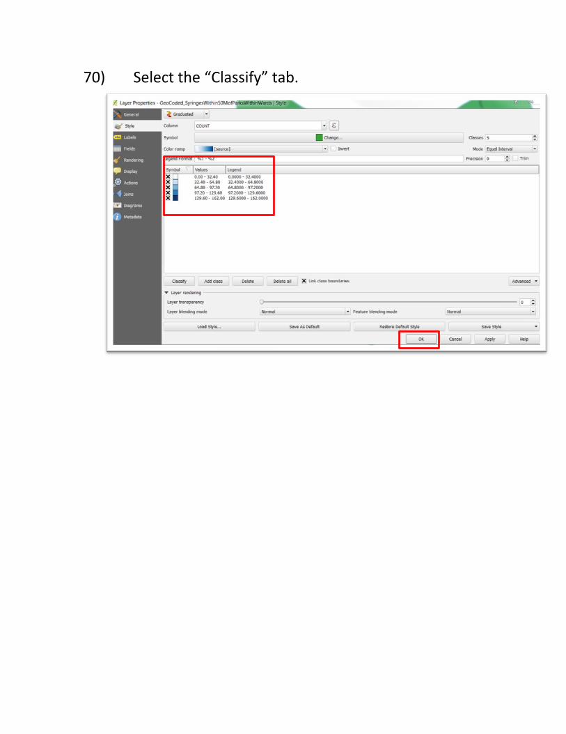
70) Select the “Classify” tab.
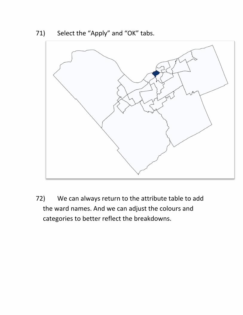
71) Select the “Apply” and “OK” tabs.
72) We can always return to the attribute table to add
the ward names. And we can adjust the colours and
categories to better reflect the breakdowns.