Embed Size (px)
Citation preview
Chapter 7
Making Choropleth Maps in QGIS Desktop
Summary: As we learned in Chapters 6 and 7, choropleth maps apply colours to polygons in order to demonstrate variations in the values that we want to convey in our stories. A range of colours could indicate municipal wards or police districts with highest break-and-enter rates, the electoral boundaries that receive the highest per capita spending on social programs or, in the case of this tutorial, the areas in Winnipeg with the highest average household incomes. So, we will simply pick up where we left off in the “7_4_JoiningMapstoOtherDatasetsQGIS” tutorial, which used that city’s shapefile census tracts. Skills you will learn:
1. How to create a choropleth maps using QGIS. 2. How to add a base map. 3. How to create a map layout that can be exported as a PDF.
If you are unsure about how to use the QGIS user interface, you should read the tutorial “A Quick Tour of QGIS Desktop” before using this tutorial. Task 1: How to create a choropleth map using QGIS Before creating a choropleth map, we must join the shape file to the table that contains the values we want to display. In the last step of the joining maps tutorial, we completed this task. This tutorial will pick up where we left off by returning to the project.
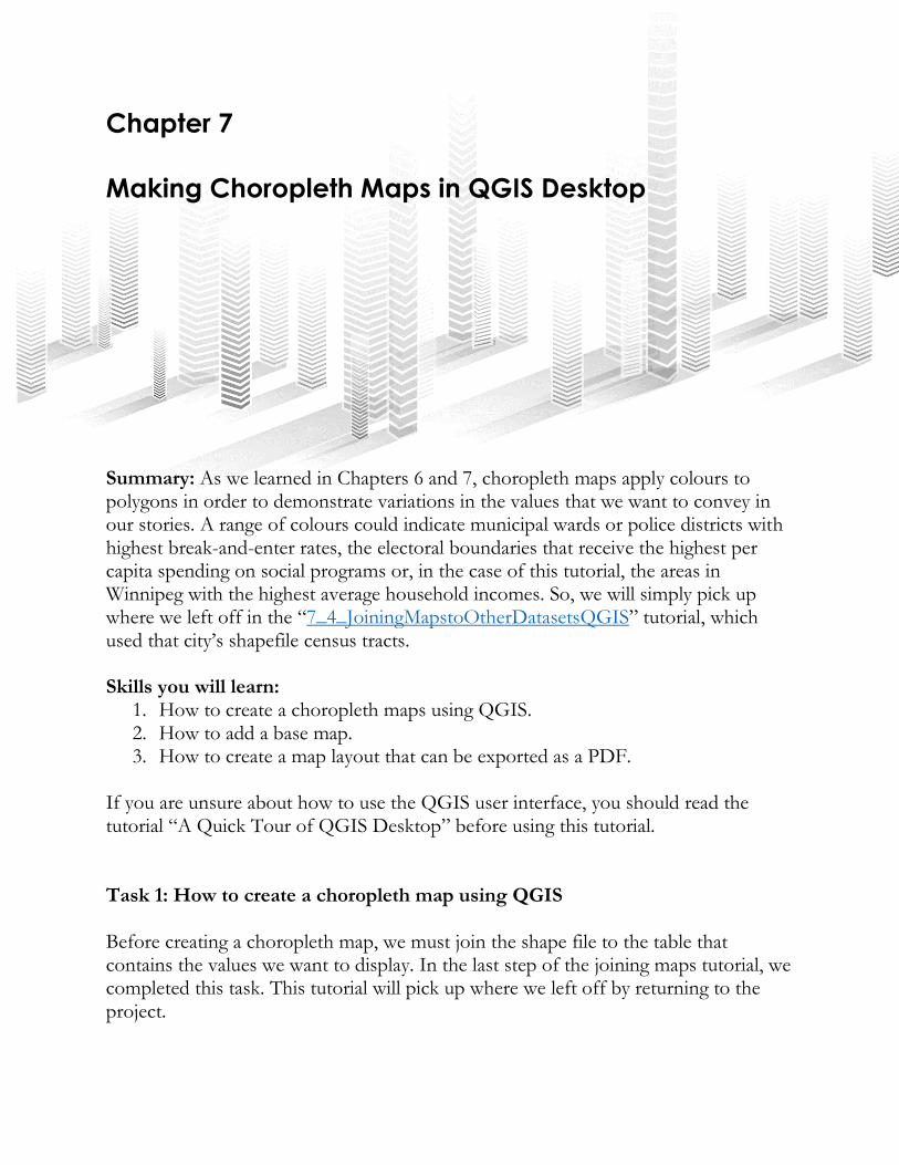
In the joining maps tutorial, we joined Winnipeg’s census tracts…
…to the non-geographic household income table.
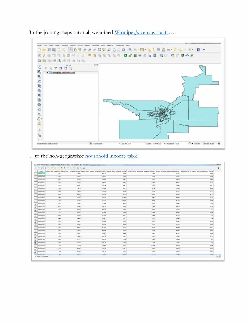
We used the average household income column.
We used the join option in the properties dialogue box by right-clicking on the census
tract layer to obtain the shortcut menu, the “Layer Properties” dialogue box, and then
the “Joins” option.
Now we have a new layer that is ready to be colour-coded.
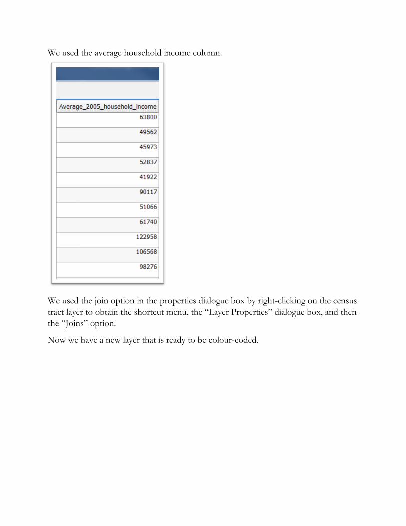
Select the “Style” icon.
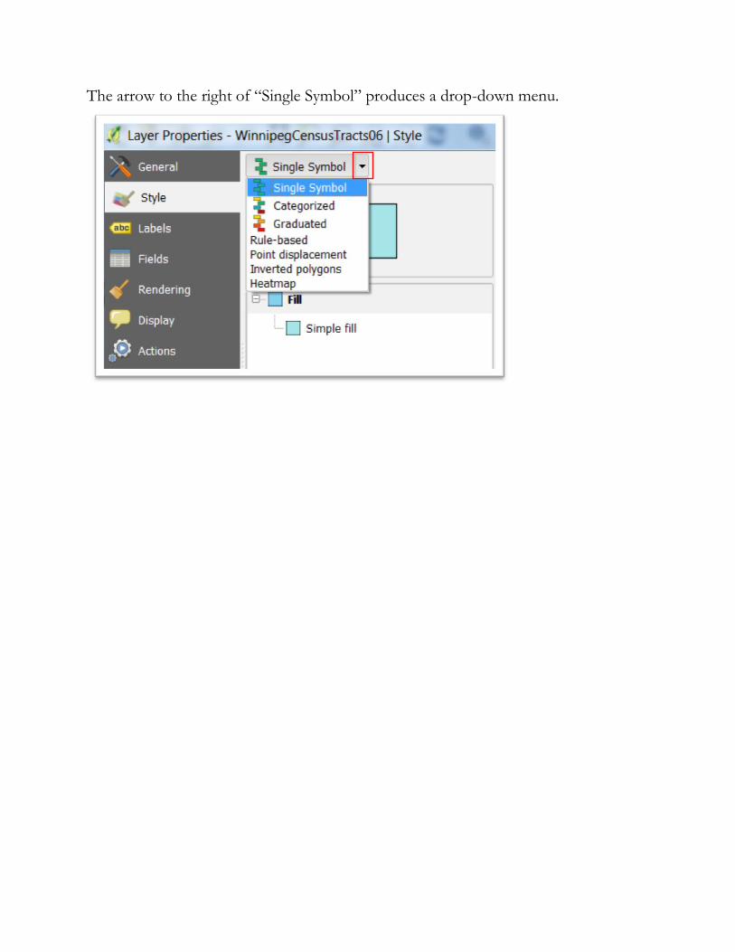
The arrow to the right of “Single Symbol” produces a drop-down menu.
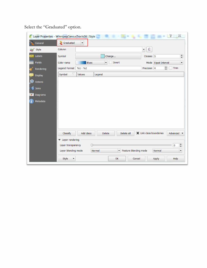
Select the “Graduated” option.
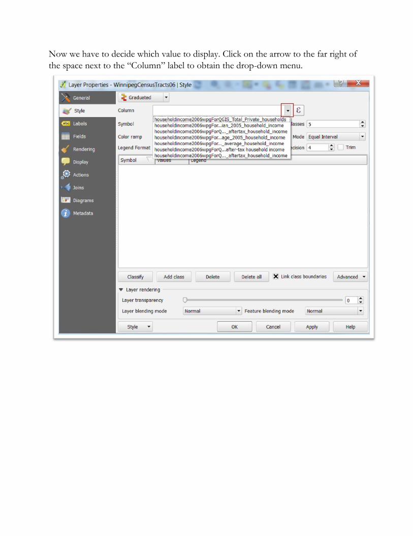
Now we have to decide which value to display. Click on the arrow to the far right of
the space next to the “Column” label to obtain the drop-down menu.
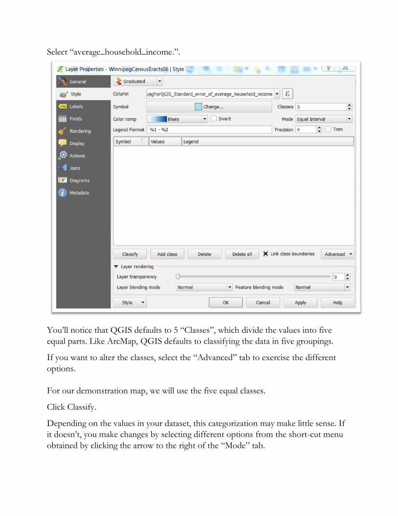
Select “average_household_income.”.
You’ll notice that QGIS defaults to 5 “Classes”, which divide the values into five
equal parts. Like ArcMap, QGIS defaults to classifying the data in five groupings.
If you want to alter the classes, select the “Advanced” tab to exercise the different
options.
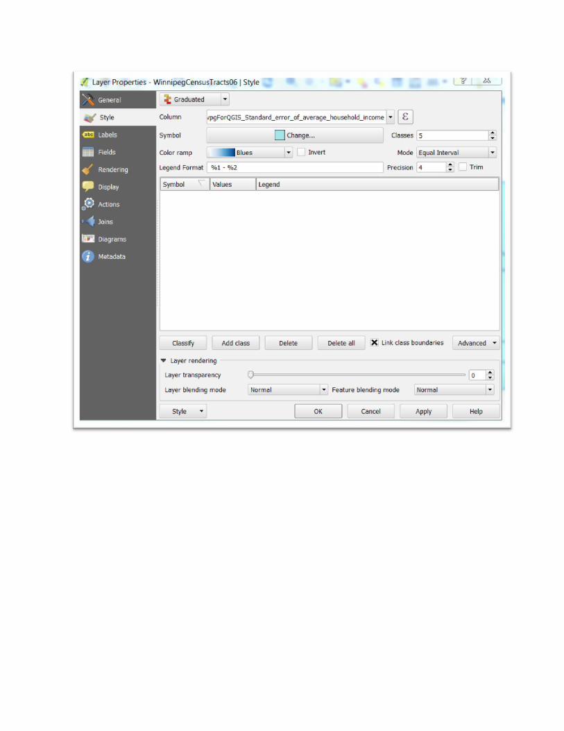
For our demonstration map, we will use the five equal classes.
Click Classify.
Depending on the values in your dataset, this categorization may make little sense. If
it doesn’t, you make changes by selecting different options from the short-cut menu
obtained by clicking the arrow to the right of the “Mode” tab.
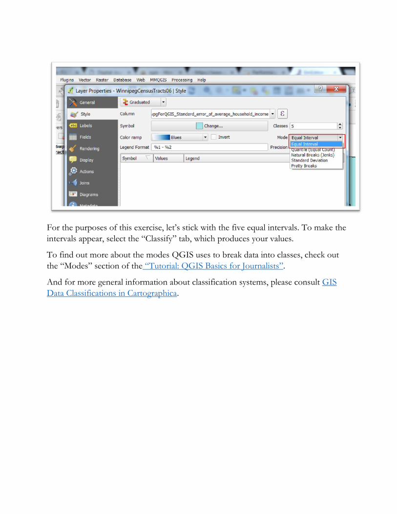
For the purposes of this exercise, let’s stick with the five equal intervals. To make the
intervals appear, select the “Classify” tab, which produces your values.
To find out more about the modes QGIS uses to break data into classes, check out
the “Modes” section of the “Tutorial: QGIS Basics for Journalists”.
And for more general information about classification systems, please consult GIS
Data Classifications in Cartographica.
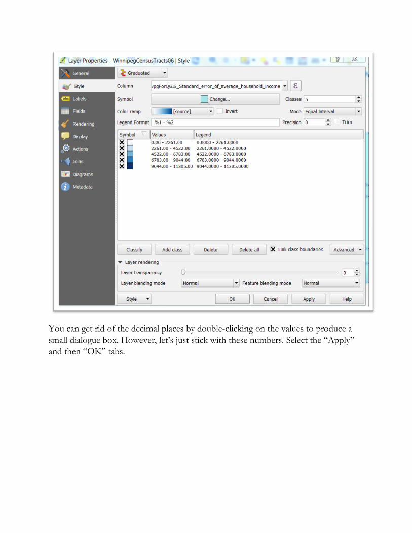
You can get rid of the decimal places by double-clicking on the values to produce a
small dialogue box. However, let’s just stick with these numbers. Select the “Apply”
and then “OK” tabs.
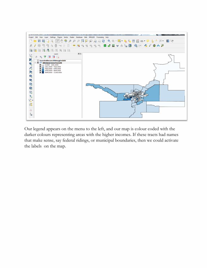
Our legend appears on the menu to the left, and our map is colour coded with the
darker colours representing areas with the higher incomes. If these tracts had names
that make sense, say federal ridings, or municipal boundaries, then we could activate
the labels on the map.
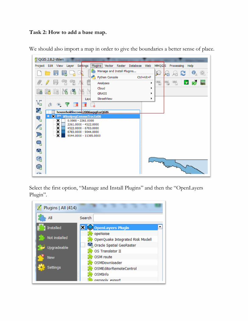
Task 2: How to add a base map.
We should also import a map in order to give the boundaries a better sense of place.
Select the first option, “Manage and Install Plugins” and then the “OpenLayers
Plugin”.
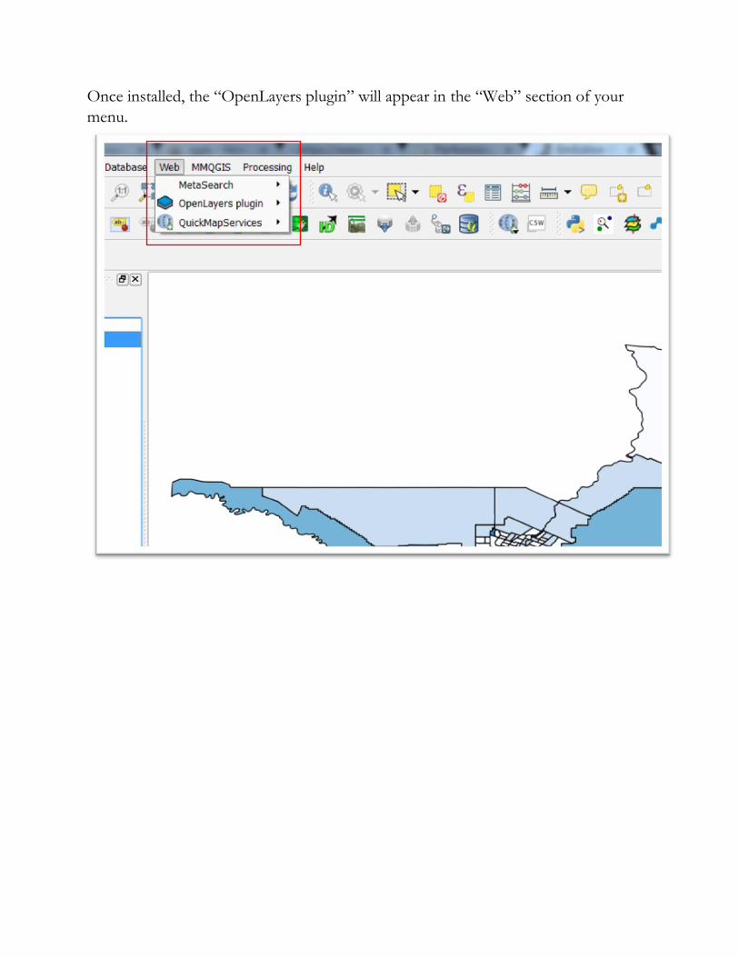
Once installed, the “OpenLayers plugin” will appear in the “Web” section of your
menu.
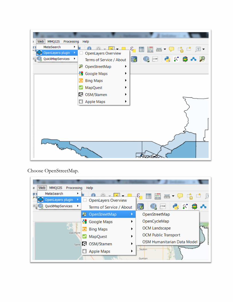
Choose OpenStreetMap.
Select the first option from the drop-down menu, “OpenStreetMap”.
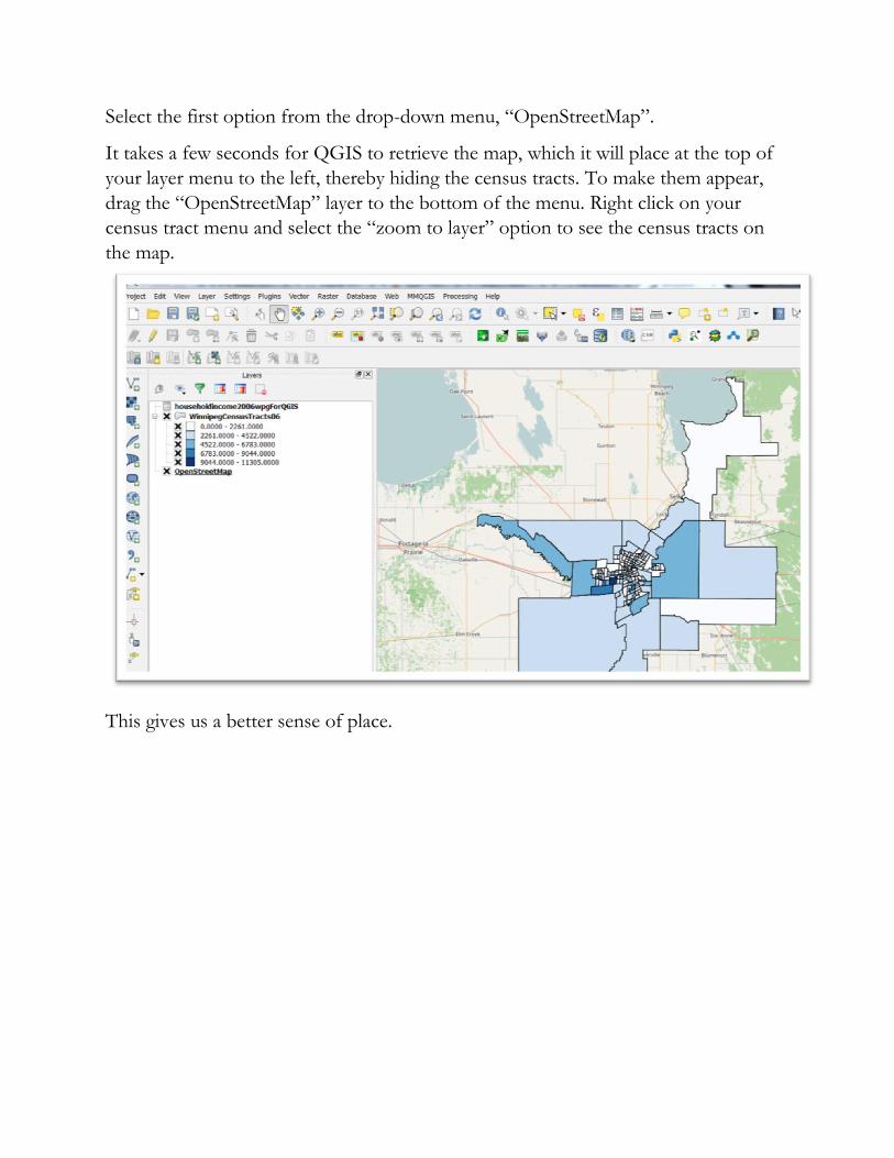
It takes a few seconds for QGIS to retrieve the map, which it will place at the top of
your layer menu to the left, thereby hiding the census tracts. To make them appear,
drag the “OpenStreetMap” layer to the bottom of the menu. Right click on your
census tract menu and select the “zoom to layer” option to see the census tracts on
the map.
This gives us a better sense of place.
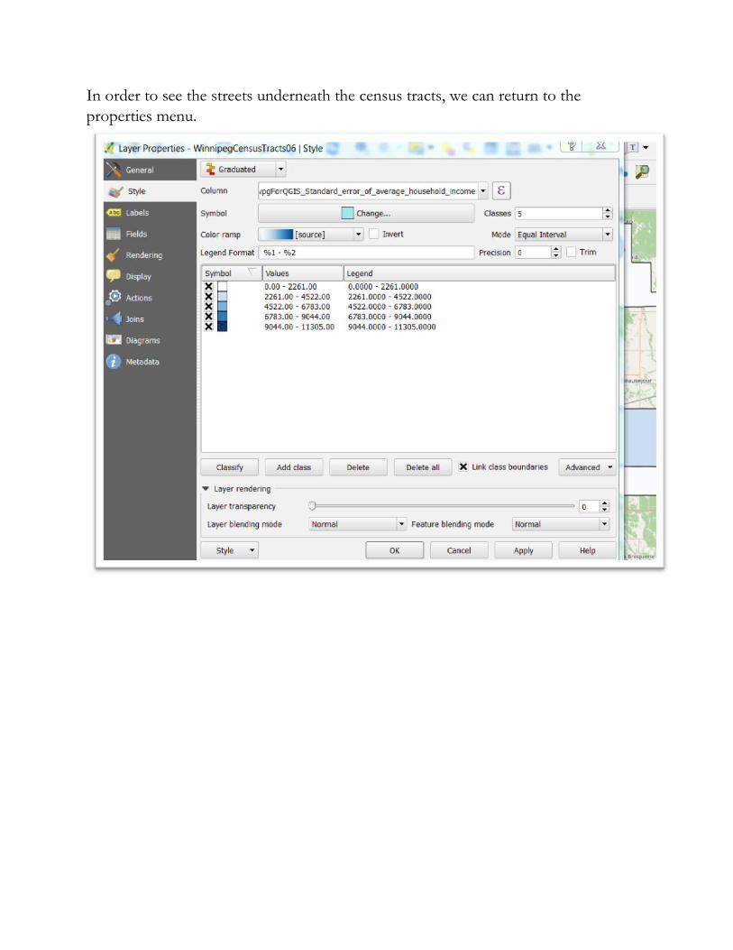
In order to see the streets underneath the census tracts, we can return to the
properties menu.
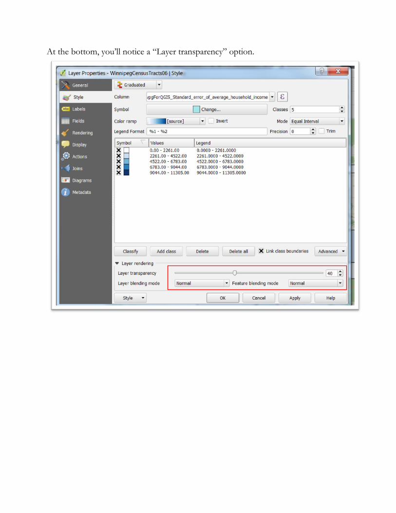
At the bottom, you’ll notice a “Layer transparency” option.
Move the setting to the the halfway mark, select “Apply” and then “OK”.
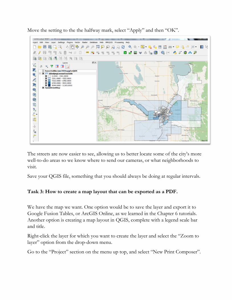
The streets are now easier to see, allowing us to better locate some of the city’s more
well-to-do areas so we know where to send our cameras, or what neighborhoods to
visit.
Save your QGIS file, something that you should always be doing at regular intervals.
Task 3: How to create a map layout that can be exported as a PDF.
We have the map we want. One option would be to save the layer and export it to
Google Fusion Tables, or ArcGIS Online, as we learned in the Chapter 6 tutorials.
Another option is creating a map layout in QGIS, complete with a legend scale bar
and title.
Right-click the layer for which you want to create the layer and select the “Zoom to
layer” option from the drop-down menu.
Go to the “Project” section on the menu up top, and select “New Print Composer”.
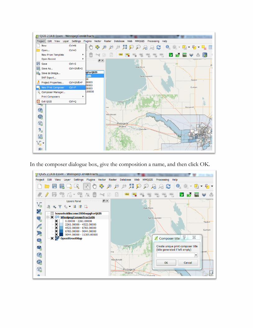
In the composer dialogue box, give the composition a name, and then click OK.
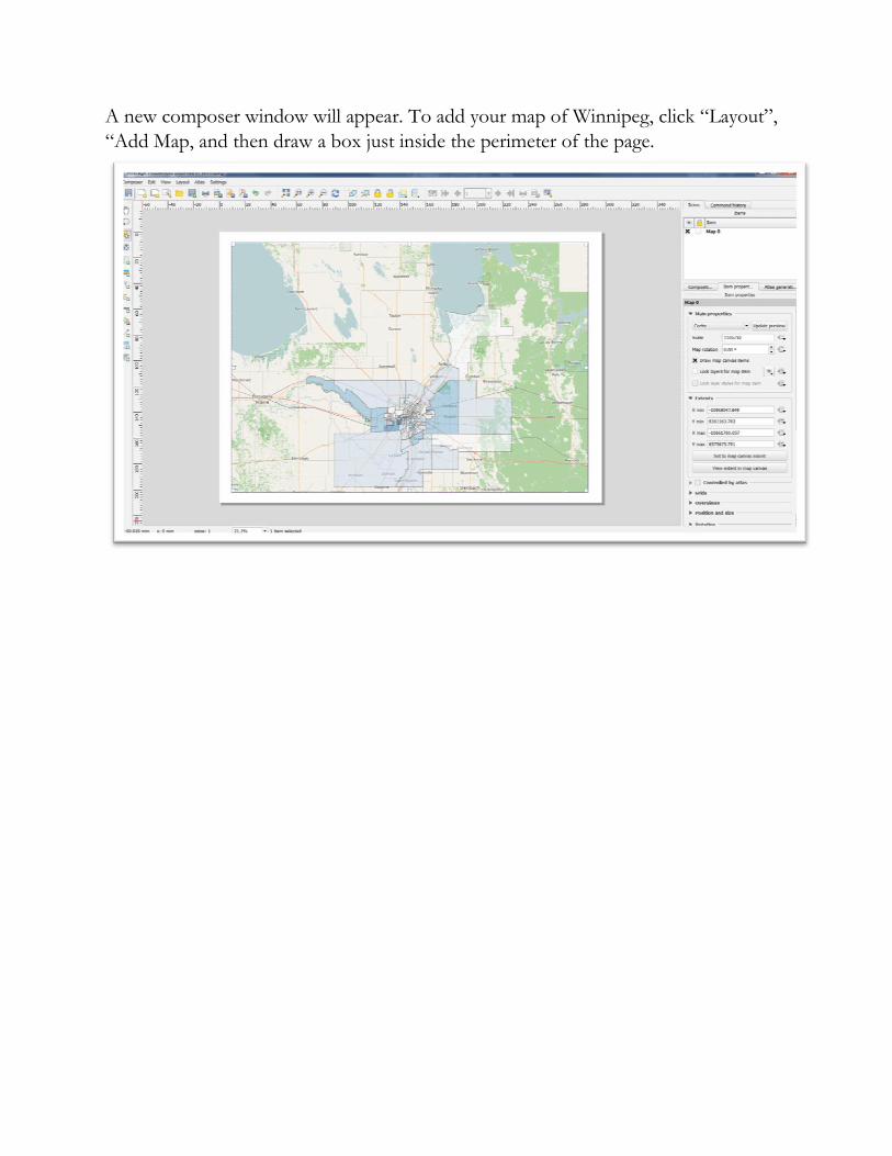
A new composer window will appear. To add your map of Winnipeg, click “Layout”,
“Add Map, and then draw a box just inside the perimeter of the page.
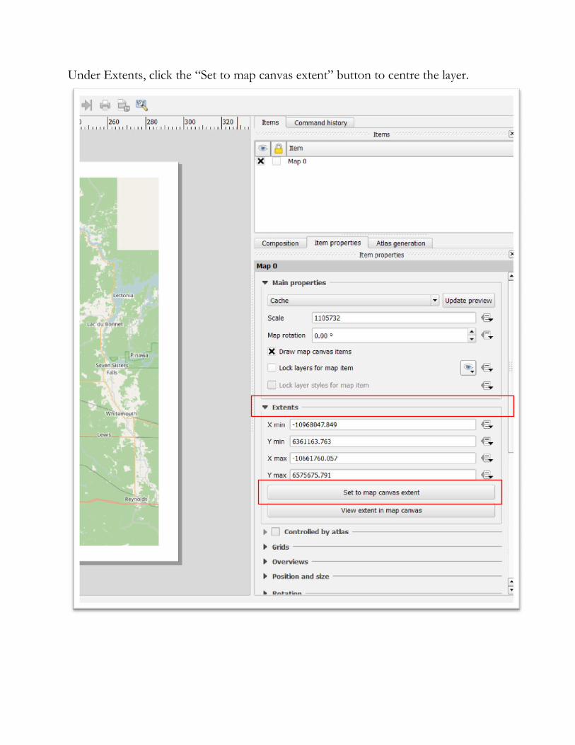
Under Extents, click the “Set to map canvas extent” button to centre the layer.
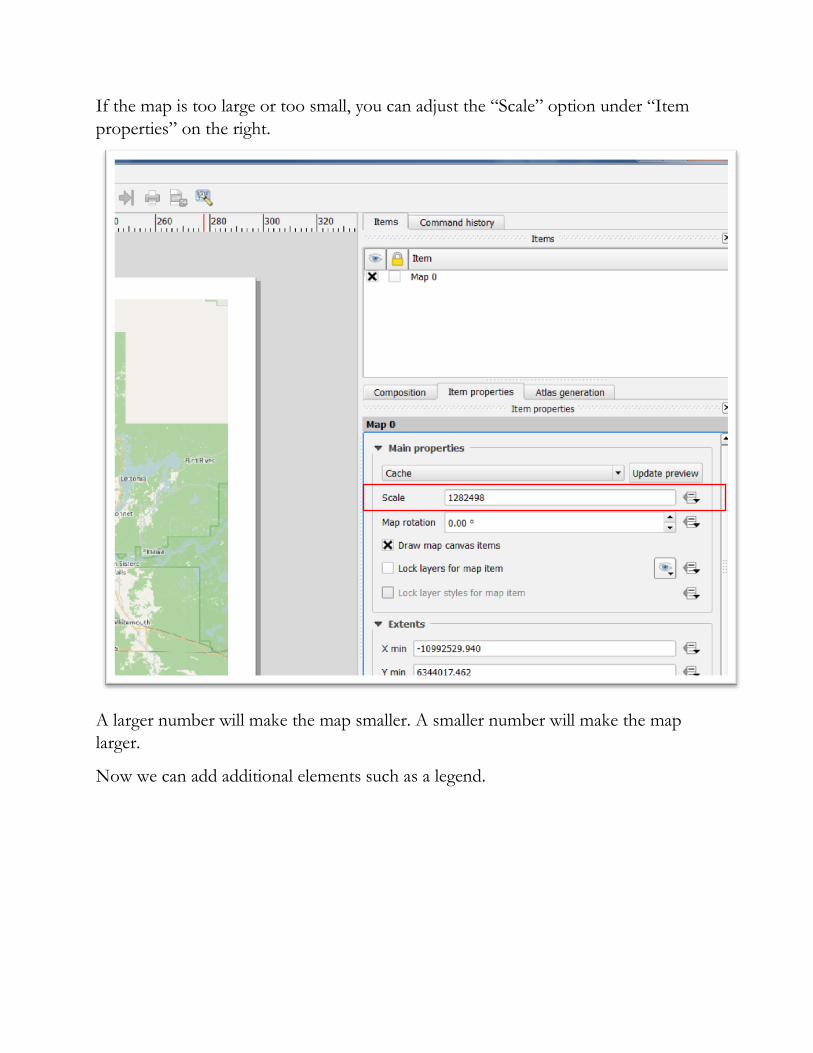
If the map is too large or too small, you can adjust the “Scale” option under “Item
properties” on the right.
A larger number will make the map smaller. A smaller number will make the map
larger.
Now we can add additional elements such as a legend.
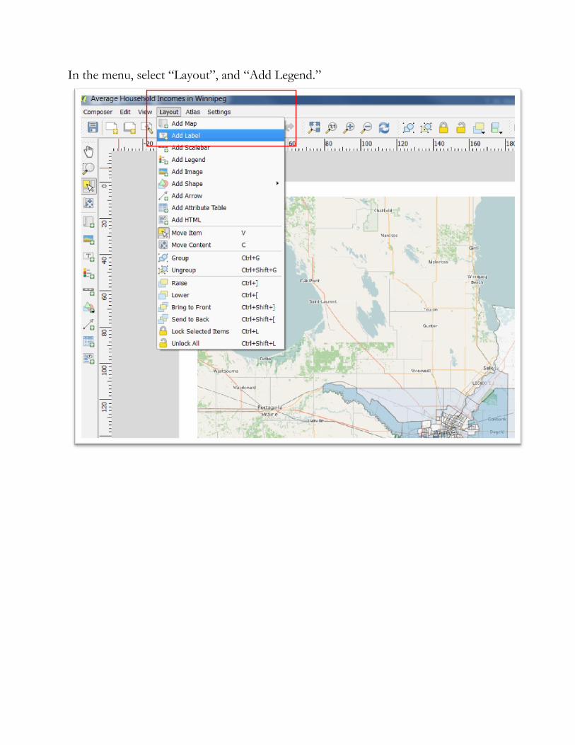
In the menu, select “Layout”, and “Add Legend.”
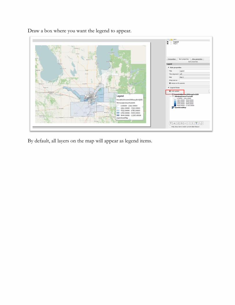
Draw a box where you want the legend to appear.
By default, all layers on the map will appear as legend items.
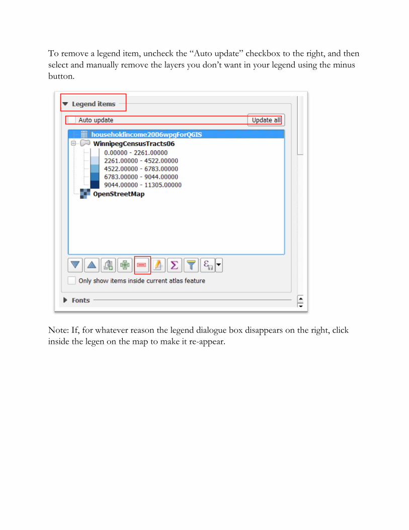
To remove a legend item, uncheck the “Auto update” checkbox to the right, and then
select and manually remove the layers you don’t want in your legend using the minus
button.
Note: If, for whatever reason the legend dialogue box disappears on the right, click
inside the legen on the map to make it re-appear.
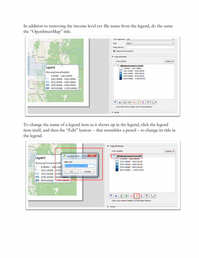
In addition to removing the income level csv file name from the legend, do the same
the “OpenStreetMap” title.
To change the name of a legend item as it shows up in the legend, click the legend
item itself, and then the “Edit” button -- that resembles a pencil – to change its title in
the legend.
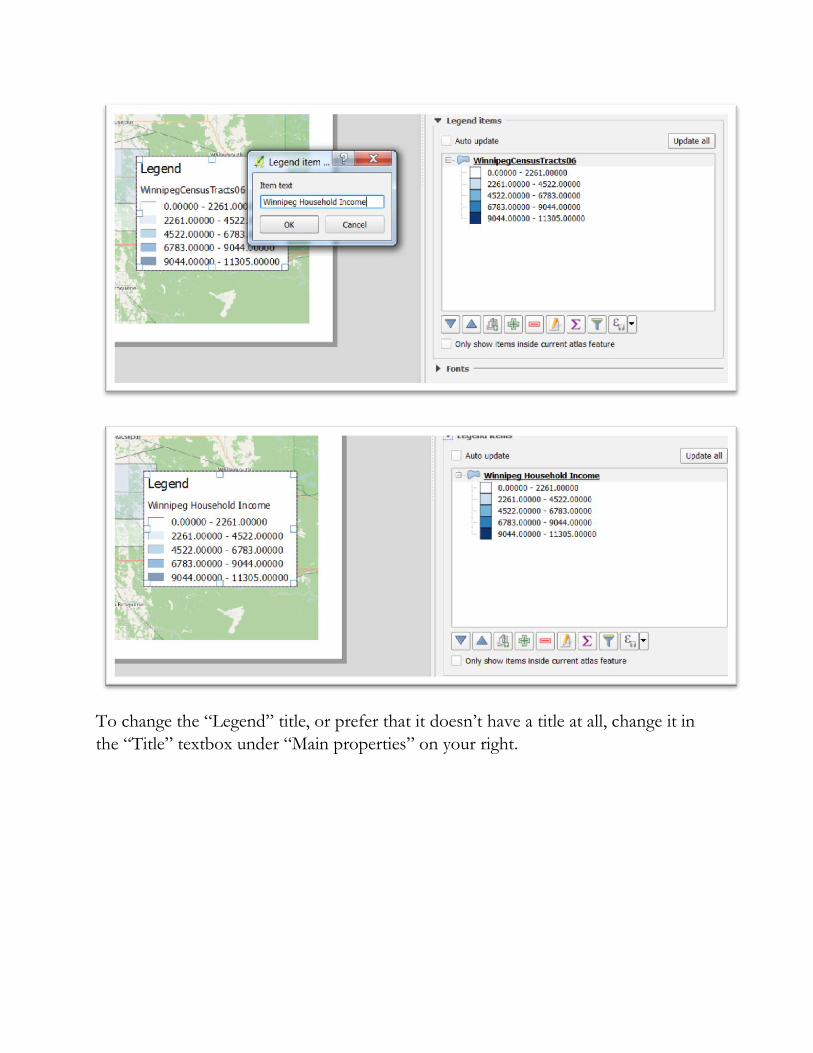
To change the “Legend” title, or prefer that it doesn’t have a title at all, change it in
the “Title” textbox under “Main properties” on your right.
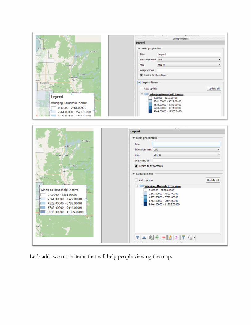
Let’s add two more items that will help people viewing the map.
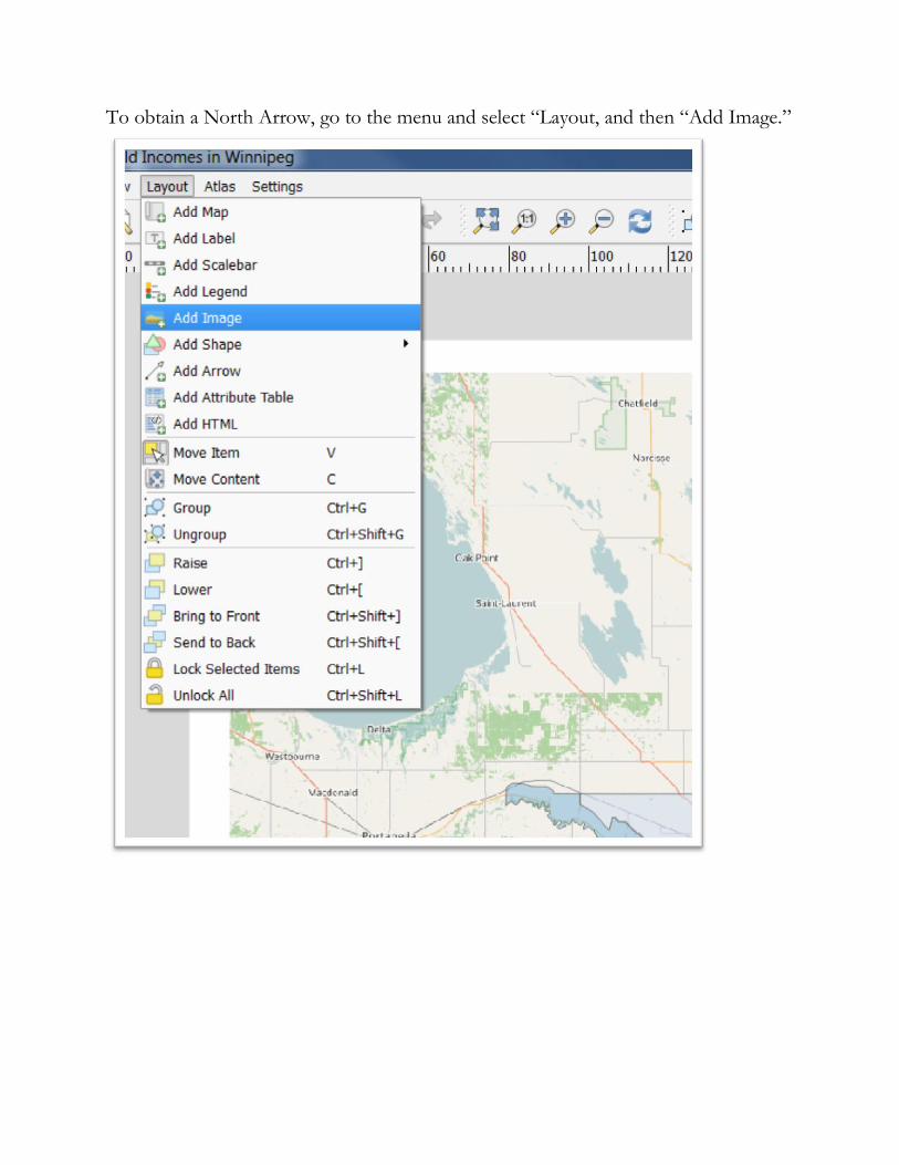
To obtain a North Arrow, go to the menu and select “Layout, and then “Add Image.”
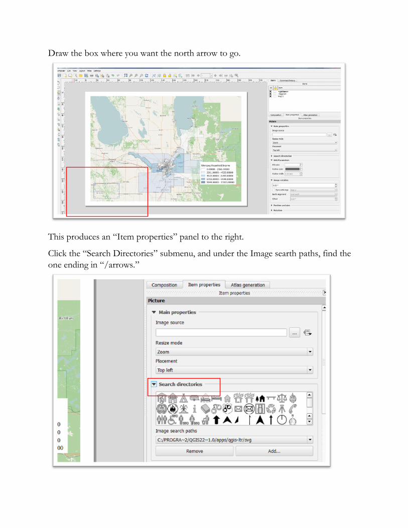
Draw the box where you want the north arrow to go.
This produces an “Item properties” panel to the right.
Click the “Search Directories” submenu, and under the Image searth paths, find the
one ending in “/arrows.”
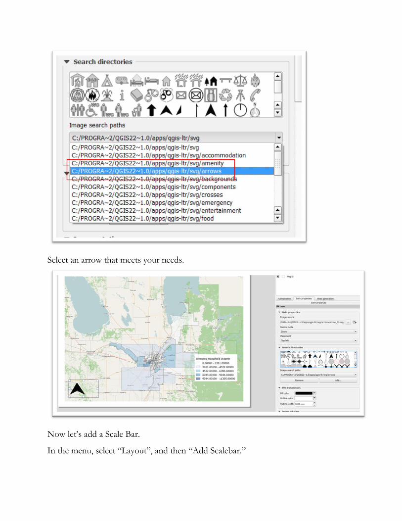
Select an arrow that meets your needs.
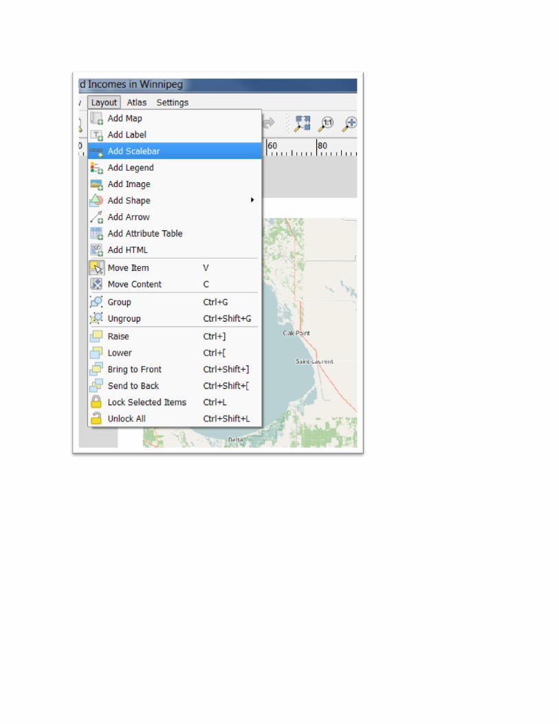
Now let’s add a Scale Bar.
In the menu, select “Layout”, and then “Add Scalebar.”
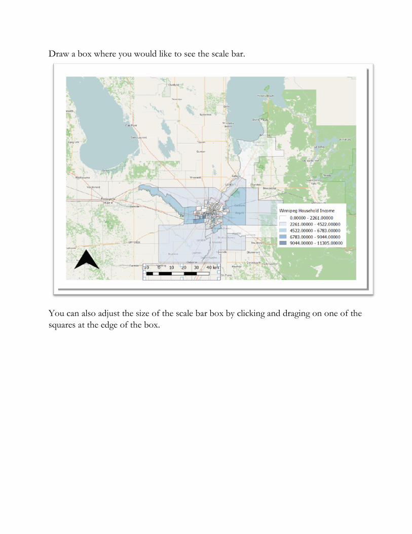
Draw a box where you would like to see the scale bar.
You can also adjust the size of the scale bar box by clicking and draging on one of the
squares at the edge of the box.
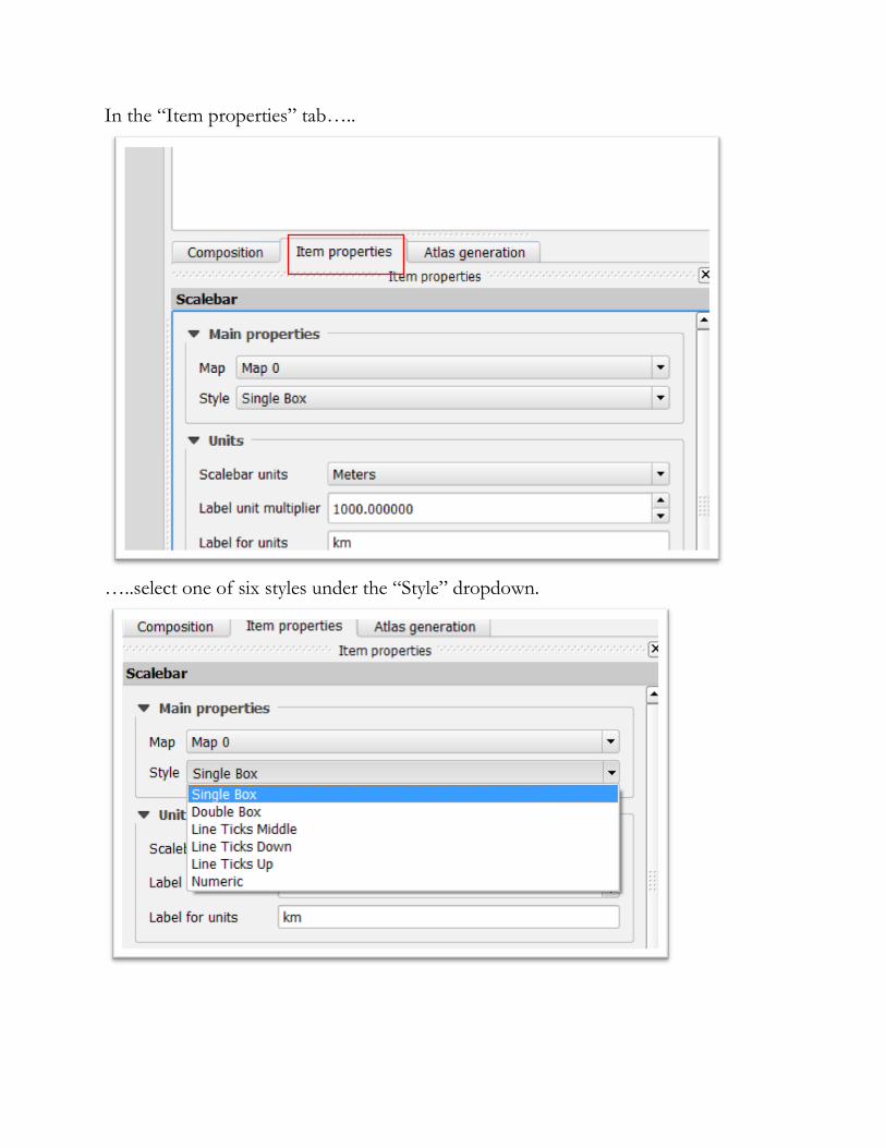
In the “Item properties” tab…..
…..select one of six styles under the “Style” dropdown.
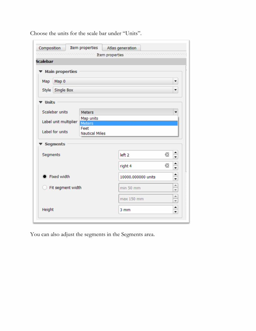
Choose the units for the scale bar under “Units”.
You can also adjust the segments in the Segments area.
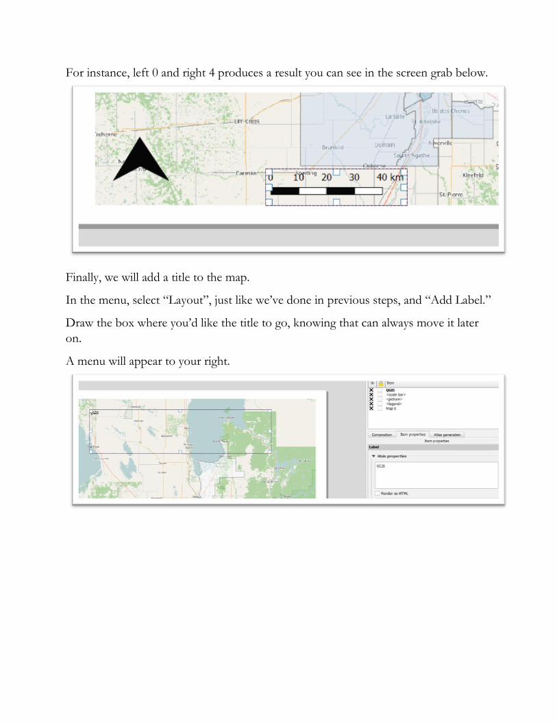
For instance, left 0 and right 4 produces a result you can see in the screen grab below.
Finally, we will add a title to the map.
In the menu, select “Layout”, just like we’ve done in previous steps, and “Add Label.”
Draw the box where you’d like the title to go, knowing that can always move it later
on.
A menu will appear to your right.
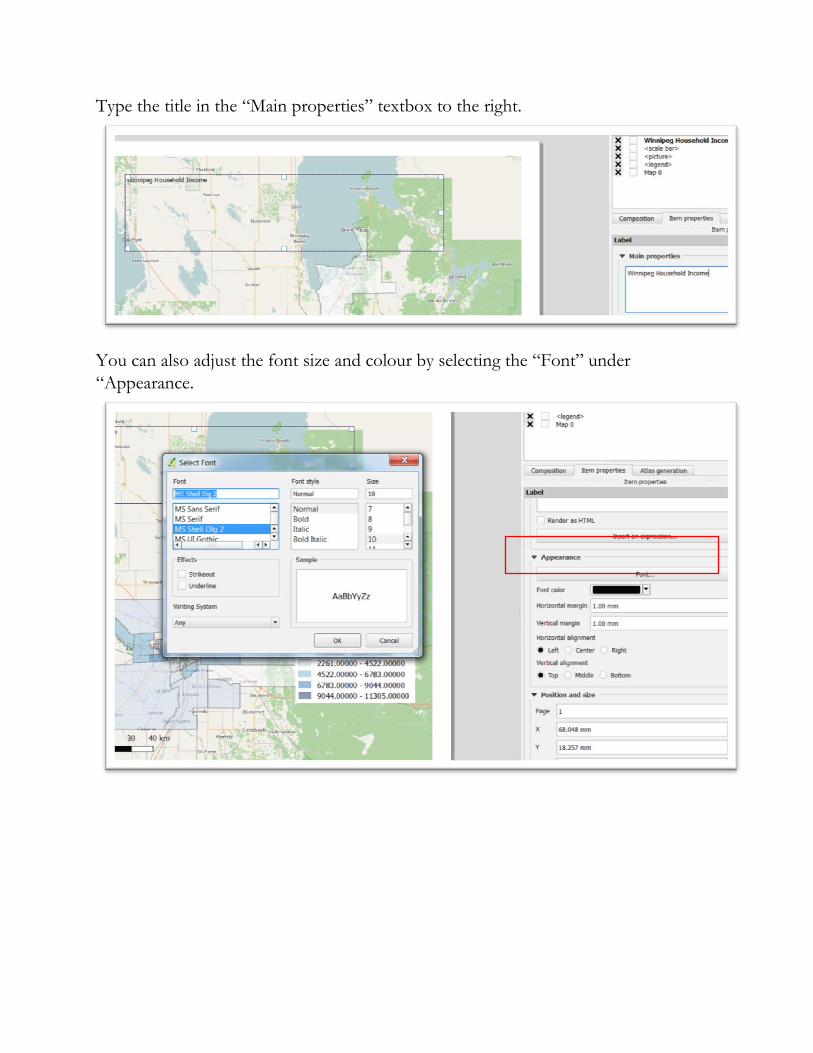
Type the title in the “Main properties” textbox to the right.
You can also adjust the font size and colour by selecting the “Font” under
“Appearance.
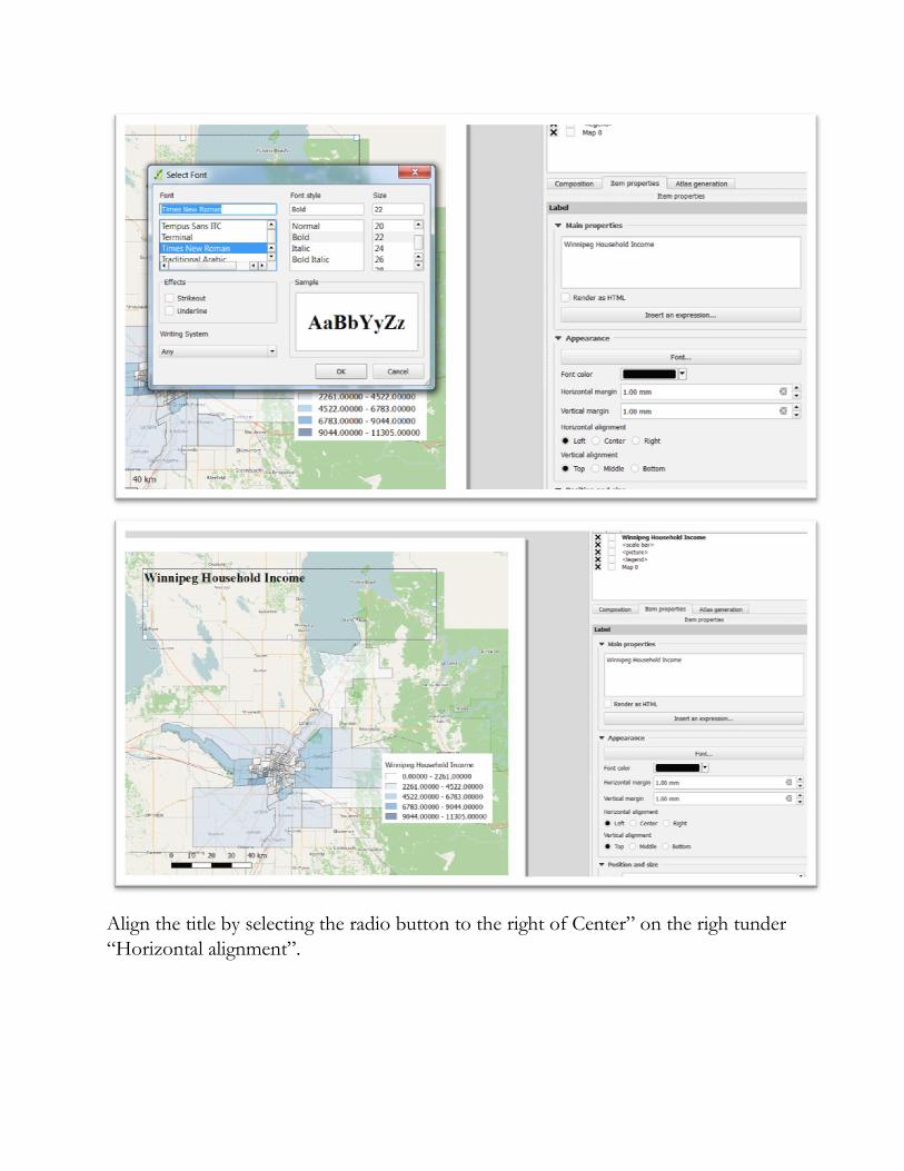
Align the title by selecting the radio button to the right of Center” on the righ tunder
“Horizontal alignment”.
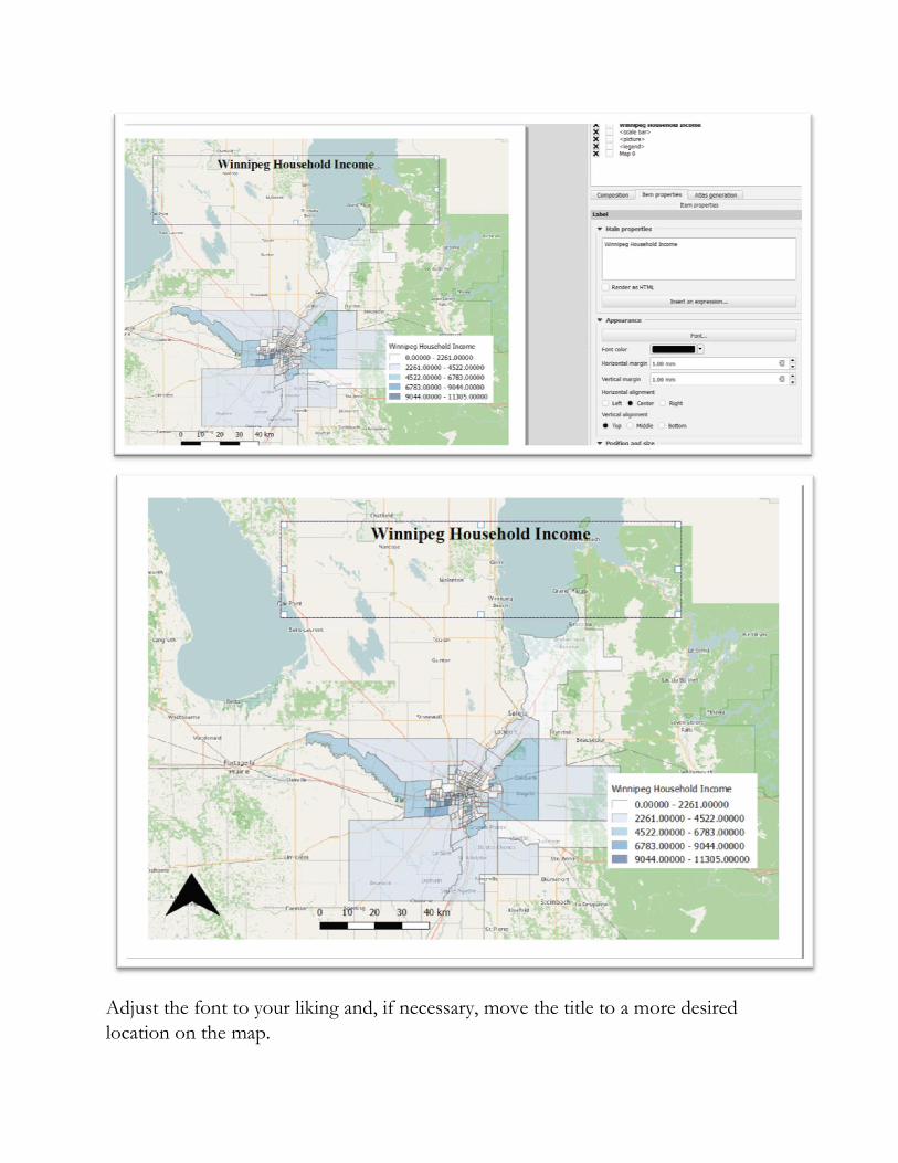
Adjust the font to your liking and, if necessary, move the title to a more desired
location on the map.
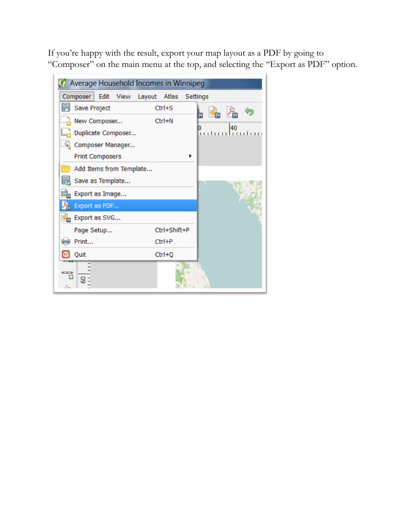
If you’re happy with the result, export your map layout as a PDF by going to
“Composer” on the main menu at the top, and selecting the “Export as PDF” option.
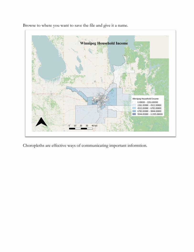
Browse to where you want to save the file and give it a name.
Choropleths are effective ways of communicating important informtion.