Embed Size (px)
Citation preview
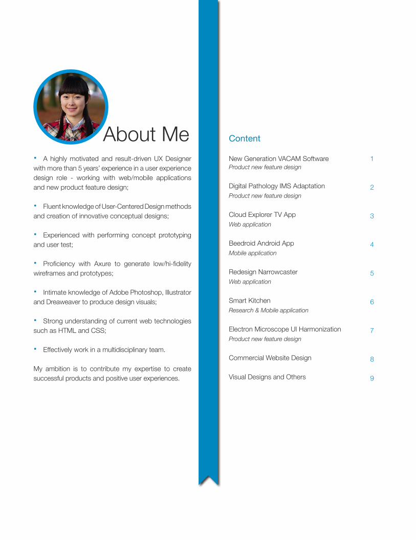
About Me• A highly motivated and result-driven UX Designer with more than 5 years’ experience in a user experience design role - working with web/mobile applications and new product feature design;
• Fluent knowledge of User-Centered Design methods and creation of innovative conceptual designs;
• Experienced with performing concept prototyping and user test;
• Proficiency with Axure to generate low/hi-fidelity wireframes and prototypes;
• Intimate knowledge of Adobe Photoshop, Illustrator and Dreaweaver to produce design visuals;
• Strong understanding of current web technologies such as HTML and CSS;
• Effectively work in a multidisciplinary team.
My ambition is to contribute my expertise to create successful products and positive user experiences.
New Generation VACAM SoftwareProduct new feature design
Digital Pathology IMS AdaptationProduct new feature design
Cloud Explorer TV AppWeb application
Beedroid Android AppMobile application
Redesign NarrowcasterWeb application
Smart KitchenResearch & Mobile application
Electron Microscope UI HarmonizationProduct new feature design
Commercial Website Design
Visual Designs and Others
1
2
3
4
5
6
7
8
9
Content
1
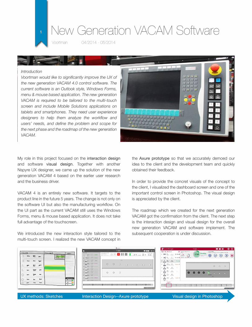
IntroductionVoortman would like to significantly improve the UX of the new generation VACAM 4.0 control software. The current software is an Outlook style, Windows Forms, menu & mouse based application. The new generation VACAM is required to be tailored to the multi-touch screen and include Mobile Solutions applications on tablets and smartphones. They need user experience designers to help them analyze the workflow and users’ needs, and define the problem and scope for the next phase and the roadmap of the new generation VACAM.
My role in this project focused on the interaction design and software visual design. Together with another Nspyre UX designer, we came up the solution of the new generation VACAM 4 based on the earlier user research and the business driver.
VACAM 4 is an entirely new software. It targets to the product line in the future 5 years. The change is not only on the software UI but also the manufacturing workflow. On the UI part as the current VACAM still uses the Windows Forms, menu & mouse based application. It does not take full advantage of the touchscreen.
We introduced the new interaction style tailored to the multi-touch screen. I realized the new VACAM concept in
Voortman 04/2014 - 05/2014
New Generation VACAM Software
the Axure prototype so that we accurately demoed our idea to the client and the development team and quickly obtained their feedback.
In order to provide the concret visuals of the concept to the client, I visualized the dashboard screen and one of the important control screen in Photoshop. The visual design is appreciated by the client.
The roadmap which we created for the next generation VACAM got the confirmation from the client. The next step is the interaction design and visual design for the overall new generation VACAM and software implement. The subsequent cooperation is under discussion.
UX methods: Sketches Visual design in PhotoshopInteraction Design--Axure prototype
2
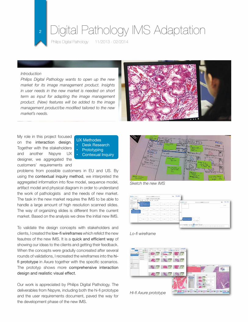
IntroductionPhilips Digital Pathology wants to open up the new market for its image management product. Insights in user needs in the new market is needed on short term as input for adapting the image management product. (New) features will be added to the image management product/be modified tailored to the new market’s needs.
My role in this project focused on the interaction design. Together with the stakeholders and another Nspyre UX designer, we aggregated the customers’ requirements and problems from possible customers in EU and US. By using the contextual inquiry method, we interpreted the aggregated information into flow model, sequence model, artifact model and physical diagram in order to understand the work of pathologists and the needs of new market. The task in the new market requires the IMS to be able to handle a large amount of high resolution scanned slides. The way of organizing slides is different from the current market. Based on the analysis we drew the initial new IMS.
To validate the design concepts with stakeholders and clients, I created the low-fi wireframes which refelct the new feautres of the new IMS. It is a quick and efficient way of showing our ideas to the clients and getting their feedback. When the concepts were gradully concreated after several rounds of validations, I recreated the wireframes into the hi-fi prototype in Axure together with the specific scenarios. The prototyp shows more comprehensive interaction design and realistic visual effect.
Our work is appreciated by Philips Digital Pathology. The deliverables from Nspyre, including both the hi-fi prototype and the user requirements document, paved the way for the development phase of the new IMS.
Philips Digital Pathology 11/2013 - 02/2014
Digital Pathology IMS Adaptation
UX Methodes• Desk Research• Prototyping• Contexual Inquiry
Sketch the new IMS
Lo-fi wireframe
Hi-fi Axure prototype
3
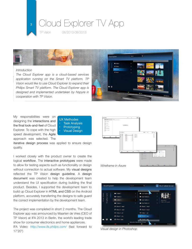
IntroductionThe Cloud Explorer app is a cloud-based services application running on the Smart TV platform. TP Vision would like to use Cloud Explorer to expand their Philips Smart TV platform. The Cloud Explorer app is designed and implemented undertaken by Nspyre in cooperation with TP Vision.
My responsibilities were on designing the interactions and the final look-and-feel of Cloud Explorer. To cope with the high speed development, the Agile approach was selected. The iterative design process was applied to ensure design quality.
I worked closely with the product owner to create the logical workflow. The interactive prototypes were made to allow for testing aspects such as functionality or design without connection to actual software. My visual designs reflected the TP Vision design guideline. A design document was created to help the development team understand the UI specification during building the final product. Besides, I supported the development team to build up Cloud Explorer in HTML and CSS on the Android platform, accurately transferring the designs to safe guard the correct implementation by the development team.
The project was completed in short 2 months. The Cloud Explorer app was announced by Maarten de Vries (CEO of TP Vision) at IFA 2013 in Berlin, the world’s leading trade show for consumer electronics and home appliances.IFA Video: http://www.ifa.philips.com/ (fast forward to 17’20”)
TP Vision 06/2013-08/2013
Cloud Explorer TV App
Wireframe in Axure
Visual design in Photoshop
UX Methodes• Task Analysis• Prototyping• Visual Design
4
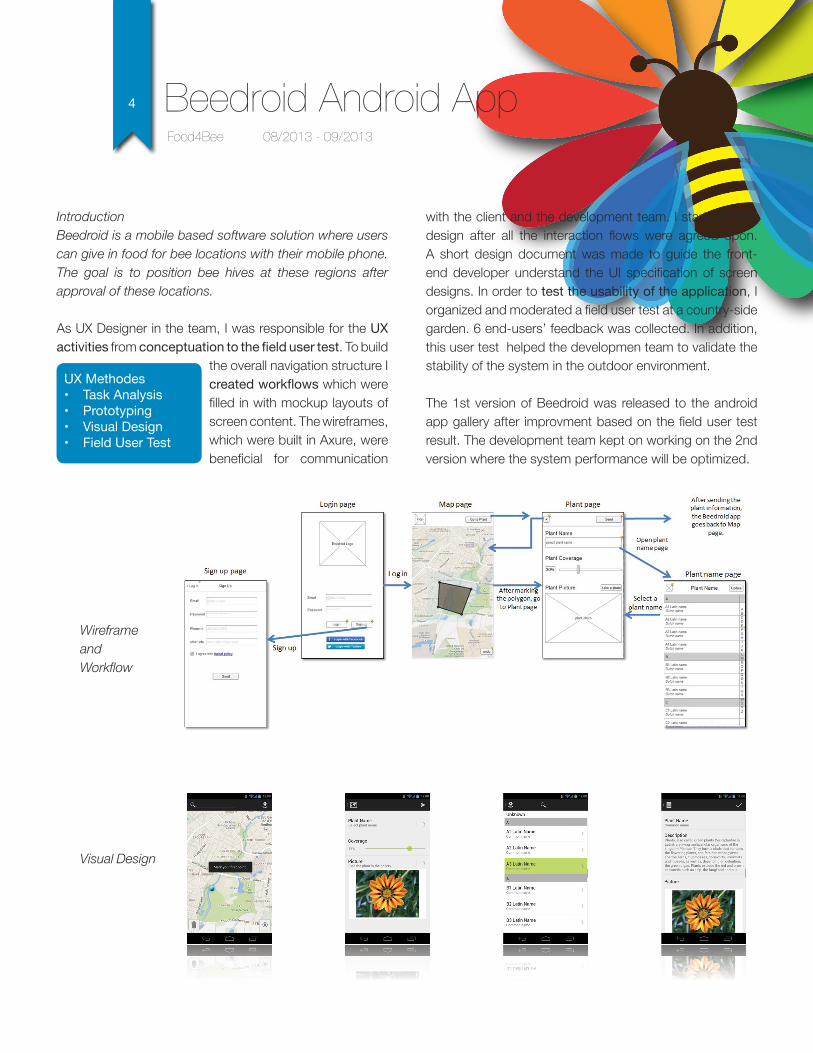
IntroductionBeedroid is a mobile based software solution where users can give in food for bee locations with their mobile phone. The goal is to position bee hives at these regions after approval of these locations.
As UX Designer in the team, I was responsible for the UX activities from conceptuation to the field user test. To build
the overall navigation structure I created workflows which were filled in with mockup layouts of screen content. The wireframes, which were built in Axure, were beneficial for communication
Food4Bee 08/2013 - 09/2013
Beedroid Android App
with the client and the development team. I started visual design after all the interaction flows were agreed upon. A short design document was made to guide the front-end developer understand the UI specification of screen designs. In order to test the usability of the application, I organized and moderated a field user test at a country-side garden. 6 end-users’ feedback was collected. In addition, this user test helped the developmen team to validate the stability of the system in the outdoor environment.
The 1st version of Beedroid was released to the android app gallery after improvment based on the field user test result. The development team kept on working on the 2nd version where the system performance will be optimized.
WireframeandWorkflow
Visual Design
UX Methodes• Task Analysis• Prototyping• Visual Design• Field User Test
5
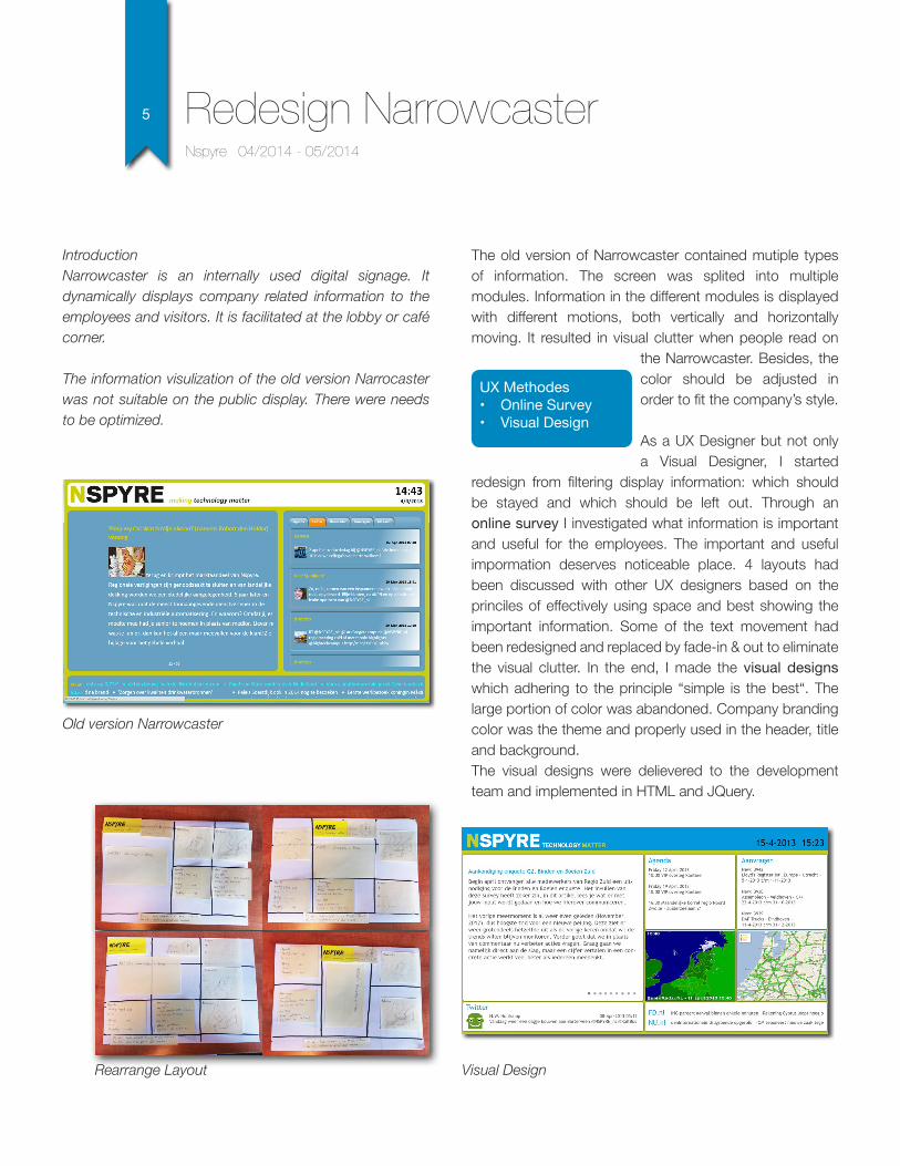
IntroductionNarrowcaster is an internally used digital signage. It dynamically displays company related information to the employees and visitors. It is facilitated at the lobby or café corner.
The information visulization of the old version Narrocaster was not suitable on the public display. There were needs to be optimized.
The old version of Narrowcaster contained mutiple types of information. The screen was splited into multiple modules. Information in the different modules is displayed with different motions, both vertically and horizontally moving. It resulted in visual clutter when people read on
the Narrowcaster. Besides, the color should be adjusted in order to fit the company’s style.
As a UX Designer but not only a Visual Designer, I started
redesign from filtering display information: which should be stayed and which should be left out. Through an online survey I investigated what information is important and useful for the employees. The important and useful impormation deserves noticeable place. 4 layouts had been discussed with other UX designers based on the princiles of effectively using space and best showing the important information. Some of the text movement had been redesigned and replaced by fade-in & out to eliminate the visual clutter. In the end, I made the visual designs which adhering to the principle “simple is the best“. The large portion of color was abandoned. Company branding color was the theme and properly used in the header, title and background. The visual designs were delievered to the development team and implemented in HTML and JQuery.
Nspyre 04/2014 - 05/2014
Redesign Narrowcaster
Old version Narrowcaster
Rearrange Layout Visual Design
UX Methodes• Online Survey• Visual Design
6
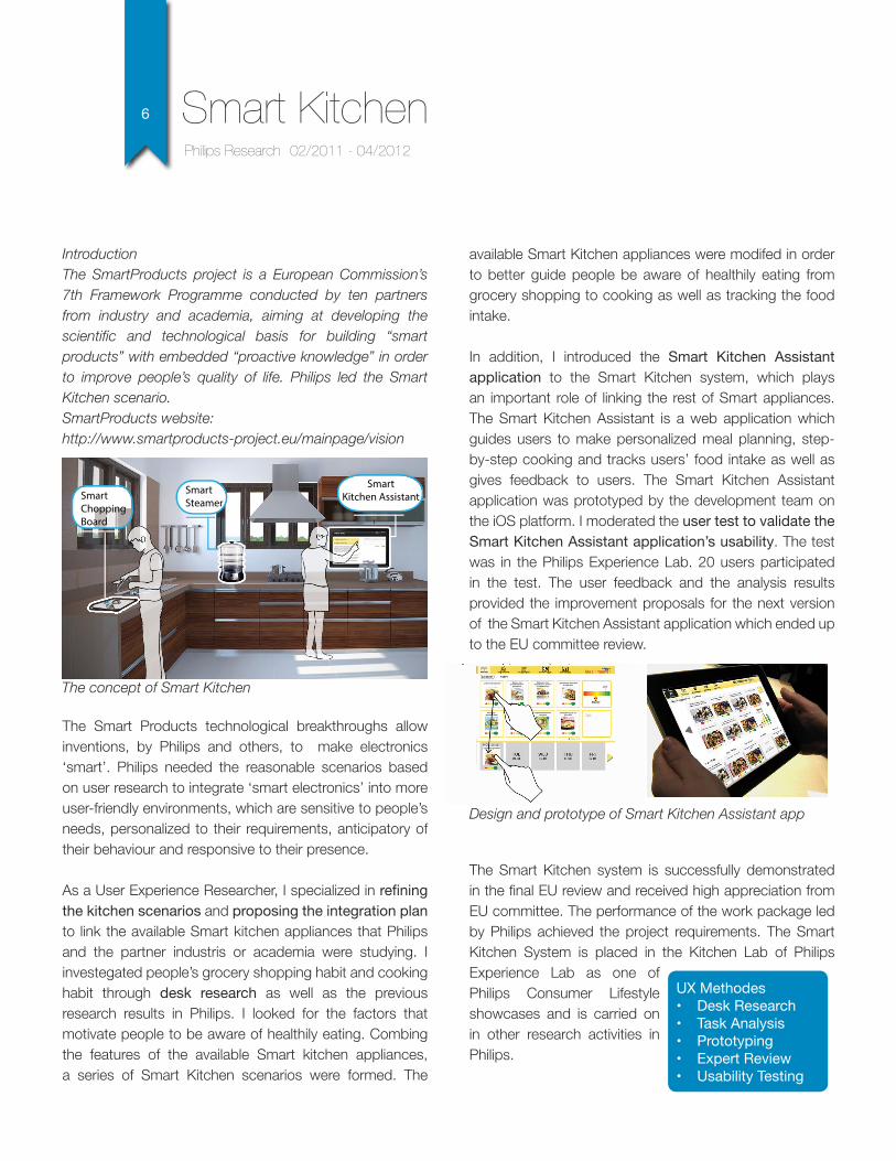
IntroductionThe SmartProducts project is a European Commission’s 7th Framework Programme conducted by ten partners from industry and academia, aiming at developing the scientific and technological basis for building “smart products” with embedded “proactive knowledge” in order to improve people’s quality of life. Philips led the Smart Kitchen scenario.SmartProducts website: http://www.smartproducts-project.eu/mainpage/vision
The Smart Products technological breakthroughs allow inventions, by Philips and others, to make electronics ‘smart’. Philips needed the reasonable scenarios based on user research to integrate ‘smart electronics’ into more user-friendly environments, which are sensitive to people’s needs, personalized to their requirements, anticipatory of their behaviour and responsive to their presence.
As a User Experience Researcher, I specialized in refining the kitchen scenarios and proposing the integration plan to link the available Smart kitchen appliances that Philips and the partner industris or academia were studying. I investegated people’s grocery shopping habit and cooking habit through desk research as well as the previous research results in Philips. I looked for the factors that motivate people to be aware of healthily eating. Combing the features of the available Smart kitchen appliances, a series of Smart Kitchen scenarios were formed. The
available Smart Kitchen appliances were modifed in order to better guide people be aware of healthily eating from grocery shopping to cooking as well as tracking the food intake.
In addition, I introduced the Smart Kitchen Assistant application to the Smart Kitchen system, which plays an important role of linking the rest of Smart appliances. The Smart Kitchen Assistant is a web application which guides users to make personalized meal planning, step-by-step cooking and tracks users’ food intake as well as gives feedback to users. The Smart Kitchen Assistant application was prototyped by the development team on the iOS platform. I moderated the user test to validate the Smart Kitchen Assistant application’s usability. The test was in the Philips Experience Lab. 20 users participated in the test. The user feedback and the analysis results provided the improvement proposals for the next version of the Smart Kitchen Assistant application which ended up to the EU committee review.
The Smart Kitchen system is successfully demonstrated in the final EU review and received high appreciation from EU committee. The performance of the work package led by Philips achieved the project requirements. The Smart Kitchen System is placed in the Kitchen Lab of Philips Experience Lab as one of Philips Consumer Lifestyle showcases and is carried on in other research activities in Philips.
Philips Research 02/2011 - 04/2012
Smart Kitchen
Smart Chopping Board
Smart Steamer
Smart Kitchen Assistant
UX Methodes• Desk Research• Task Analysis• Prototyping• Expert Review• Usability Testing
The concept of Smart Kitchen
Design and prototype of Smart Kitchen Assistant app
7
FEI’s electron microscope products have the different user interfaces. It is foreseen that there will be more cross operability between its main stream electron microscopes, thus there is a need to harmonize their user interfaces. Besides, the current user experience needs to be significantly improved to make technology truely usable and beneficial for all users.
As Usability Engineer, my responsibility was to define the design principles that guide the UI harmonization, and validate the harmonized UI in the manner of usability testing. I began with acquiring users’ needs by interviewing 4 application technicians and specialists in FEI and observing them performing the regular tasks on the different types electron microscopes. Based on the user research together with foreseen future needs, 4 design principles are formed as the guideline of the UI design.
FEI Company 01/2010 - 09/2010
Electron Microscope UI Harmonization
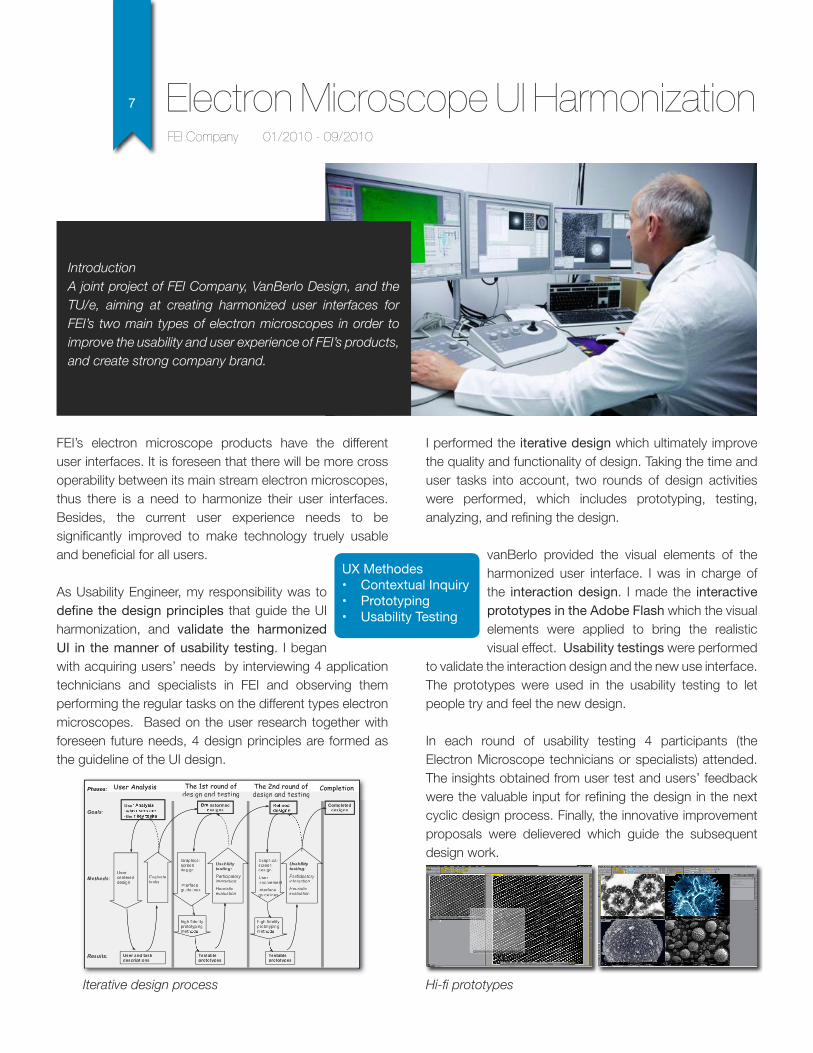
I performed the iterative design which ultimately improve the quality and functionality of design. Taking the time and user tasks into account, two rounds of design activities were performed, which includes prototyping, testing, analyzing, and refining the design.
vanBerlo provided the visual elements of the harmonized user interface. I was in charge of the interaction design. I made the interactive prototypes in the Adobe Flash which the visual elements were applied to bring the realistic visual effect. Usability testings were performed
to validate the interaction design and the new use interface. The prototypes were used in the usability testing to let people try and feel the new design.
In each round of usability testing 4 participants (the Electron Microscope technicians or specialists) attended. The insights obtained from user test and users’ feedback were the valuable input for refining the design in the next cyclic design process. Finally, the innovative improvement proposals were delievered which guide the subsequent design work.
IntroductionA joint project of FEI Company, VanBerlo Design, and the TU/e, aiming at creating harmonized user interfaces for FEI’s two main types of electron microscopes in order to improve the usability and user experience of FEI’s products, and create strong company brand.
Use•wh•the
User and task descriptions
Goals:
Methods:
Results:
nstormed esigns
User-centered design
Evaluatetasks
Usability testing:Participatory interaction
Heuristic evaluation
Graphical screen design
User involvement
Interface guidelines
Testable prototypes
Completed designs
Testable prototypes
The 1st round of design and testing
User AnalysisPhases: Completion
Usability testing:Participatory interaction
Heuristic evaluation
The 2nd round of design and testing
Graphical screen design
Interface guidelines
high fidelity prototypingme
high fidelity prototypingme
Use•wh•the
User and taskdescriptions
Goalsll :
Methtt odsdd :
Resultstt :
nstormedesigns
User-centereddesign
Evavv luatetaskskk
UsUU abilii ill tyttett stitt nii g:Partrr itt cipii atoryrrinii terarr ctitt oii n
Heurirr sii titt cevavv luatitt oii n
Graphicalscreendesign
Userinvolvement
Interfrr aceguidelines
Testableprototypes
Completeddesigns
Testableprototypes
design and testingp
UsUU abilii ill tyttett stitt nii g:Partrr itt cipii atoryrrinii terarr ctitt oii n
Heurirr sii titt cevavv luatitt oii n
design and testing
Graphicalscreendesign
Interfrr aceguidelines
high fidelityprototypingme
high fidelityprototypingme
Iterative design process Hi-fi prototypes
UX Methodes• Contextual Inquiry• Prototyping• Usability Testing
8
Helantong website (the predecessor of outpie.com) is founded in 2008 in the Netherlands. I was one of the co-founders of this startup. It is a comprehensive services exchange web platform, facing to Chinese who study or work in the Netherlands. It aims to provide Chinese in the Netherlands information on studying and living. Users can fast and conveniently access to information and share experiences through Helantong website. The preliminary release included four sections: Wiki, Useful website collection, entertainment, and forum, which cover all aspects of living in the Netherlands.
As UI Designer, I was responsible for designing, coordinating and managing artwork and executing creative concepts for Helantong website, including website information architecture, webpage layout, icons and themes design. I was also in charge of creating company’s identity, brochures and collateral.
Besides of providing a graphic design, I built the front-end together with the development team. I experienced the difficulties in implementing graphic design to web page. This prompted me to enhance the knowledge and understanding of web technologies such as HTML, CSS and Javascript.
Helantong website 01/2008 - 08/2008
Commercial Website Design
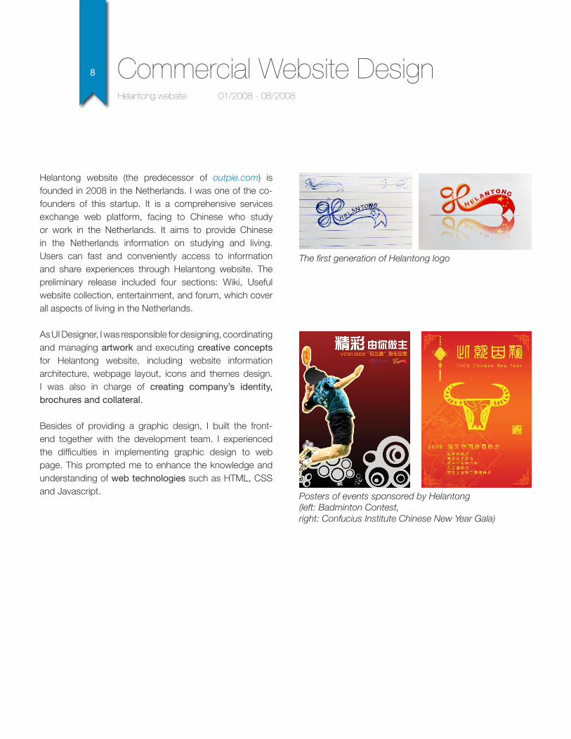
The first generation of Helantong logo
Posters of events sponsored by Helantong (left: Badminton Contest, right: Confucius Institute Chinese New Year Gala)
9 Visual Designs and Others
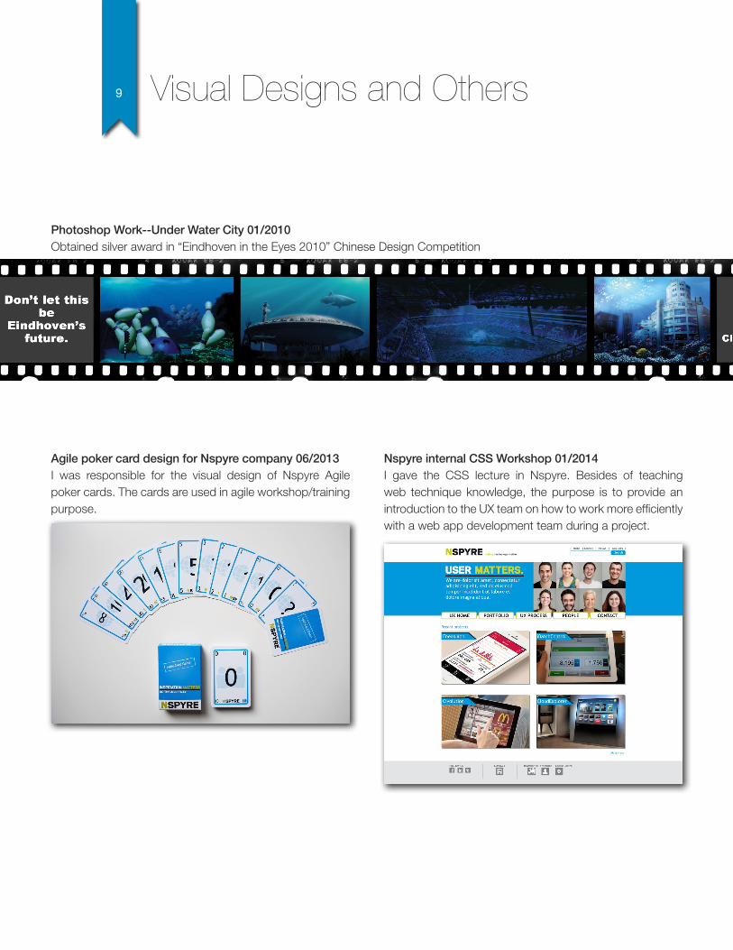
Photoshop Work--Under Water City 01/2010Obtained silver award in “Eindhoven in the Eyes 2010” Chinese Design Competition
Agile poker card design for Nspyre company 06/2013I was responsible for the visual design of Nspyre Agile poker cards. The cards are used in agile workshop/training purpose.
Nspyre internal CSS Workshop 01/2014I gave the CSS lecture in Nspyre. Besides of teaching web technique knowledge, the purpose is to provide an introduction to the UX team on how to work more efficiently with a web app development team during a project.