Embed Size (px)
Citation preview

project info
plan 3
plan 2
plan 1
section
title bar
written by Anne Boccella
The City University of New YorkArchitectural Technology Dept. digital media assistance
archtech
Presentation Board Layout
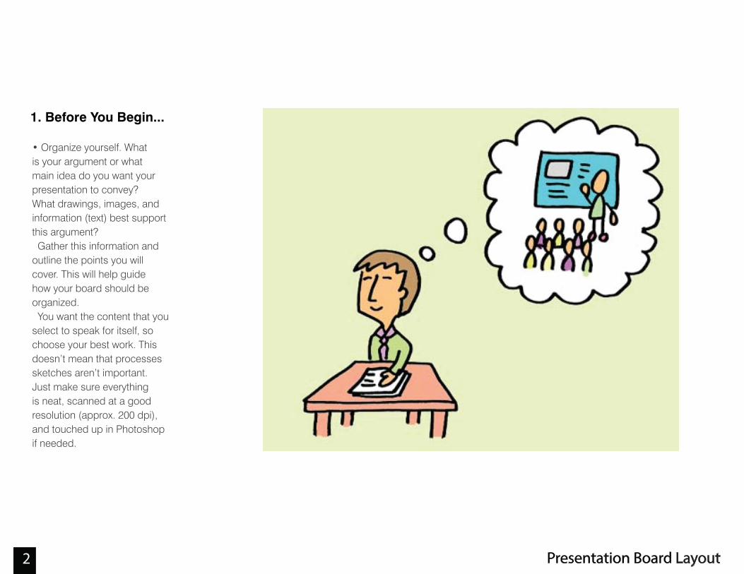
1. Before You Begin...
• Organize yourself. Whatis your argument or whatmain idea do you want yourpresentation to convey?What drawings, images, andinformation (text) best supportthis argument? Gather this information andoutline the points you willcover. This will help guidehow your board should beorganized. You want the content that youselect to speak for itself, sochoose your best work. Thisdoesn’t mean that processessketches aren’t important.Just make sure everythingis neat, scanned at a goodresolution (approx. 200 dpi),and touched up in Photoshopif needed.
Presentation Board Layout 2
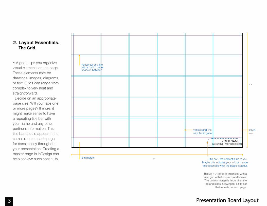
• A grid helps you organizevisual elements on the page.These elements may bedrawings, images, diagrams,or text. Grids can range fromcomplex to very neat andstraightforward. Decide on an appropriatepage size. Will you have oneor more pages? If more, itmight make sense to havea repeating title bar withyour name and any otherpertinent information. Thistitle bar should appear in thesame place on each pagefor consistency throughoutyour presentation. Creating amaster page in InDesign canhelp achieve such continuity. 36 in.
2 in.margin
horizontal grid linewith a 1/4 in. gutterspace in between.
Title bar - the content is up to you.Maybe this includes your info or maybethis describes what the board is about.
24 in.
0.5 in.margin
vertical grid linewith 1/4 in.gutter.
YOUR NAMECLASS TITLE | PROFESSOR | DATE
This 36 x 24 page is organized with abasic grid with 6 columns and 5 rows.
The bottom margin is larger than thetop and sides, allowing for a title bar
that repeats on each page.
Presentation Board Layout 3
2. Layout Essentials. The Grid.

•The concept of hierarchyshould be considered whenlaying out your board. That is,certain drawings or imagesshould receive more (orless) visual attention. Thisemphasis or de-emphasiscan help better communicateyour idea. When viewingyour presentation board,there should be somethingto discover from a distance,from 6 feet away, and from upclose. When you gather yourmaterial, arrange yourdrawings, images, and text inorder of importance.Sketch out some possibleorganizations dependingon the content that you’veselected. This exercise will focus oncreating hierarchy by playingwith scale. However, we willdiscuss other ways to createhierarchy in a layout.
Think about proportion,scale, and balance. Thesame concepts that youemploy when designing
architecture are importantwhen laying out your
boards.
project info
plan 3
plan 2
plan 1
section
rendering
rendering
imageimage
main diagram
diagram 4
diagram 3
diagram 2
diagram 1
title bar
title
bar
Presentation Board Layout 4
2. Layout Essentials Visual Hierarchy.

• Just as a rhythm or patterncan stimulate a work of art ormusic, visual rhythm can alsocreate order or stimulation.Grids help create thestructure for a visual rhythm.
Presentation Board Layout 5
2. Layout Essentials Rhythm

With so many typefacedesigns, the task of choosingthe right typeface can seem adesign challenge in itself.There are two mainclassifications of typefaces:Serifs and Sans-serif. Seriftypefaces contain semistructuraldetails called serifs at the end of some of the letter strokes. A typeface without these details is called sans-serif.Within these two categories exist a range of fonts.
• Which one is right forarchitecture?
Many architects gravitatetowards the simplicity andclean lines of Sans-serif fonts.However, selecting your fontdepends on the nature ofthe content being presented.The personality of the lettersshould correspond with yourpresentation style, while notoverpowering the content.Keep it simple!
sans serif
serif
serifs (in red)
S ERIF FACES
Baskerville
Garamond
Palatino
Times New Roman
S ANS SERIF FACES
Franklin Gothic
Gill Sans
Helvetica
Swis721
Presentation Board Layout 6
3. The Truth about Text

• How many fonts?
One font is usually sufficient.Two can be used at the most.It is wise to select a typefacethat belongs to a larger typefamily. That way, you canconsistently use the regularversion and use the boldversion when emphasis isneeded. However, if you doselect more than one font, thefont matrix to the right mayhelp.
• What font size is ok?
Similar to limiting the amountof fonts you choose, youshould also limit the size offonts to two or three differentsizes. That is, set a size tobe used for titles, text, andcaptions, for example. Titlesshould be visible from adistance. Text and captionsmay require a closer view.There is no foolproof way topredict your font sizes exceptto practice and print out inadvance. Avoid huge fontsizes that take away fromyour content.
8.5 in.8.5 in.34 in.
11 in.22 in.
reduce by 50%
Quick tip: If you design yourpresentation board at 34 x 22,
you can reduce it by 50% toachieve two 8.5 x 11 pages for
your portfolio. This is also a way togauge your font size.
This font matrix can help whencombining two fonts. The most
important consideration is contrast:serif with sanserif, Roman with
script, heavy with light, thick withthin, simple with ornamental.
Presentation Board Layout 7
3. Text(contiued)
presentation board 2 facing portfolio pages

Presentation boards forarchitectural drawings needto clearly communicatespecific information relative toarchitecture. It’s important tokeep the following in mind:
• Drawing RelationshipsArchitectural drawings suchas sections and plans shouldbe aligned and coordinated.Plans and sections shouldbe aligned vertically and ofthe same scale. This shouldbe the case regarding scaleunless you want one drawingto receive more/less attention.
• Visual GravityExtending the ground ofsections at the bottom of thepage can offer visual gravityor weight to the layout.
• SymbolsSymbols such as the Northarrow, a scale indicator, andarrows/leaders should beincluded to clarify drawings.
The Belvedere
plan and section
De8 architetti
The drawings to the left are vertically aligned andof the same scale so that drawings are able to
reference one another accurately.
The sections arehorizontally alignedand of the same scale.If placed at the bottomof the page, they aregrounded by visualgravity.
Office for Metropolitan Architecture
Presentation Board Layout8
4. Architecture Specific
8

• Competition entry for theArt Fund Pavilion by 3SixOArchitecture.
Note how the next four boards are organized asan entire composition. The title bar on the righthand offers a consistent space for information.
Images are of various sizes, exhibiting a level ofhierarchy to keep the viewer’s interest. Sectionaldrawings, which are clearly aligned, anchor the
page at the bottom.
Note the nice use of white space - imagesare sparsely arranged so that the page is not
“choked” with visual information. However, keyinformation is always present, such as the site
map with its corresponding North arrow.
Presentation Board Layout 9
5. Examples

Presentation Board Layout 10
• Competition entry for theArt Fund Pavilion by 3SixOArchitecture.
5. Examples(contiued)

Presentation Board Layout 11
• Competition entry for theArt Fund Pavilion by 3SixOArchitecture.
5. Examples(contiued)

Presentation Board Layout 12
• Competition entry for theArt Fund Pavilion by 3SixOArchitecture.
5. Examples(contiued)

• Competition board from the9/11 memorial designs.
Presentation Board Layout 13
5. Examples(contiued)

• Student competition entry
Presentation Board Layout 14
5. Examples(contiued)

•Layout Essentials: 100Design Principles for UsingGrids by Beth Tondreau•Making and Breaking theGrid: A Graphic Design LayoutWorkshop by Timothy Samara
Presentation Board Layout 15
6. Resources