Embed Size (px)
Citation preview
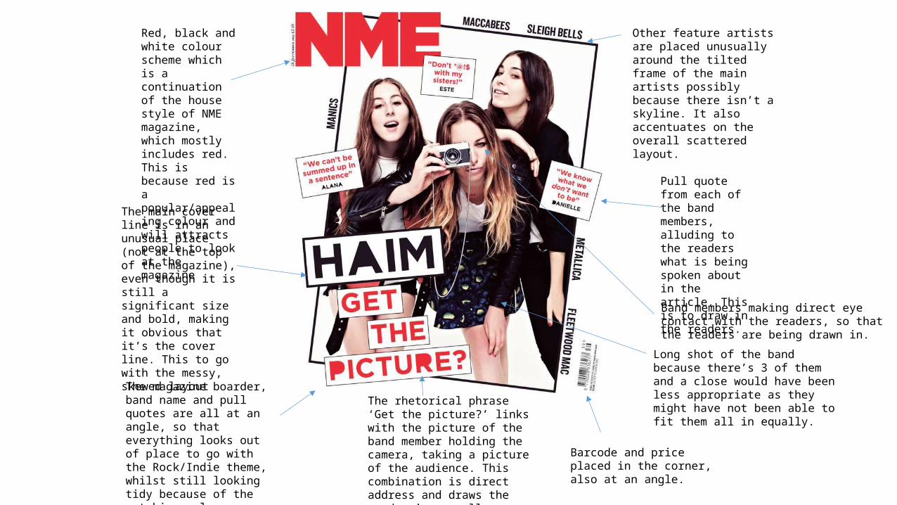
Red, black and white colour scheme which is a continuation of the house style of NME magazine, which mostly includes red. This is because red is a popular/appealing colour and will attracts people to look at the magazine Pull quote from each
of the band members, alluding to the readers what is being spoken about in the article. This is to draw in the readers.
The main cover line is in an unusual place (not at the top of the magazine), even though it is still a significant size and bold, making it obvious that it’s the cover line. This to go with the messy, skewed layout
The magazine boarder, band name and pull quotes are all at an angle, so that everything looks out of place to go with the Rock/Indie theme, whilst still looking tidy because of the matching colour scheme
The rhetorical phrase ‘Get the picture?’ links with the picture of the band member holding the camera, taking a picture of the audience. This combination is direct address and draws the reader in as well as forming a relationship.
Other feature artists are placed unusually around the tilted frame of the main artists possibly because there isn’t a skyline. It also accentuates on the overall scattered layout.
Barcode and price placed in the corner, also at an angle.
Band members making direct eye contact with the readers, so that the readers are being drawn in.
Long shot of the band because there’s 3 of them and a close would have been less appropriate as they might have not been able to fit them all in equally.
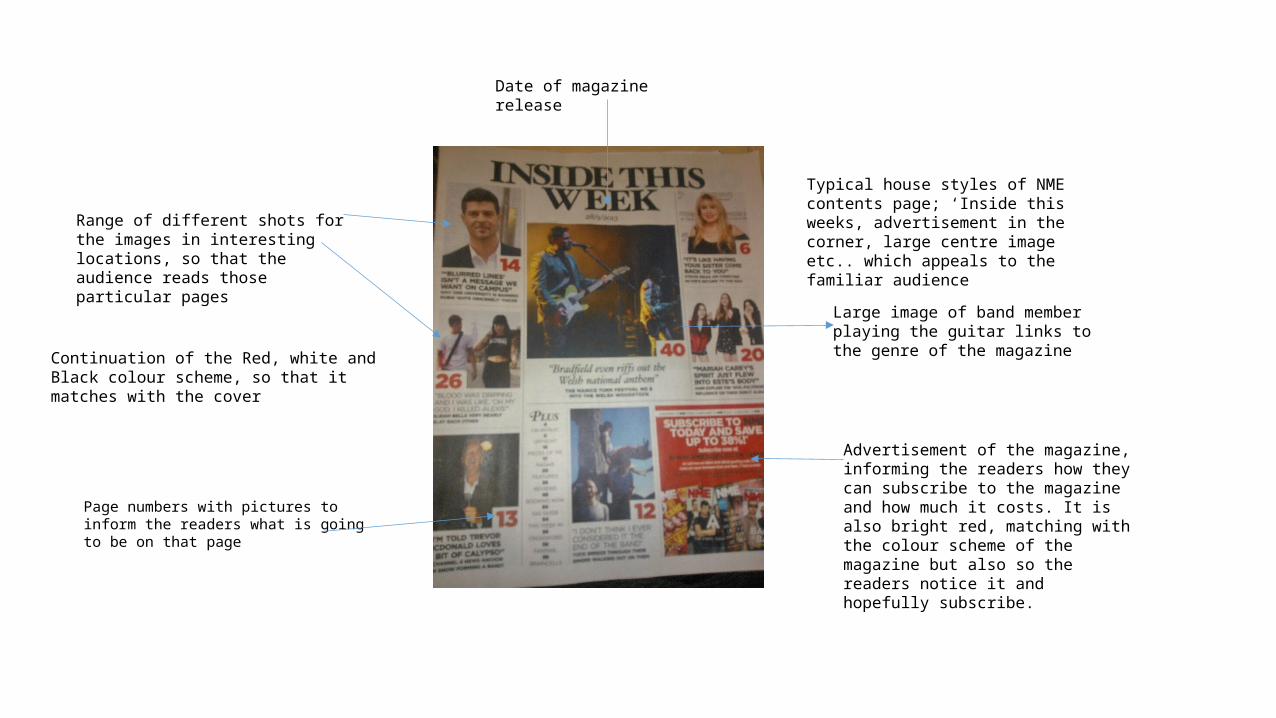
Date of magazine release
Page numbers with pictures to inform the readers what is going to be on that page
Advertisement of the magazine, informing the readers how they can subscribe to the magazine and how much it costs. It is also bright red, matching with the colour scheme of the magazine but also so the readers notice it and hopefully subscribe.
Continuation of the Red, white and Black colour scheme, so that it matches with the cover
Range of different shots for the images in interesting locations, so that the audience reads those particular pages
Typical house styles of NME contents page; ‘Inside this weeks, advertisement in the corner, large centre image etc.. which appeals to the familiar audience
Large image of band member playing the guitar links to the genre of the magazine
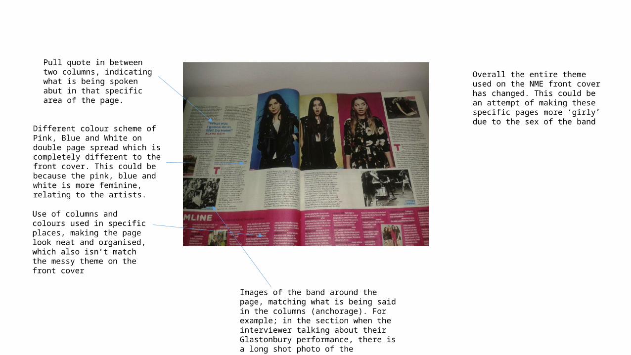
Different colour scheme of Pink, Blue and White on double page spread which is completely different to the front cover. This could be because the pink, blue and white is more feminine, relating to the artists.
Use of columns and colours used in specific places, making the page look neat and organised, which also isn’t match the messy theme on the front cover
Pull quote in between two columns, indicating what is being spoken abut in that specific area of the page.
Images of the band around the page, matching what is being said in the columns (anchorage). For example; in the section when the interviewer talking about their Glastonbury performance, there is a long shot photo of the audience, reacting to their performance.
Overall the entire theme used on the NME front cover has changed. This could be an attempt of making these specific pages more ‘girly’ due to the sex of the band
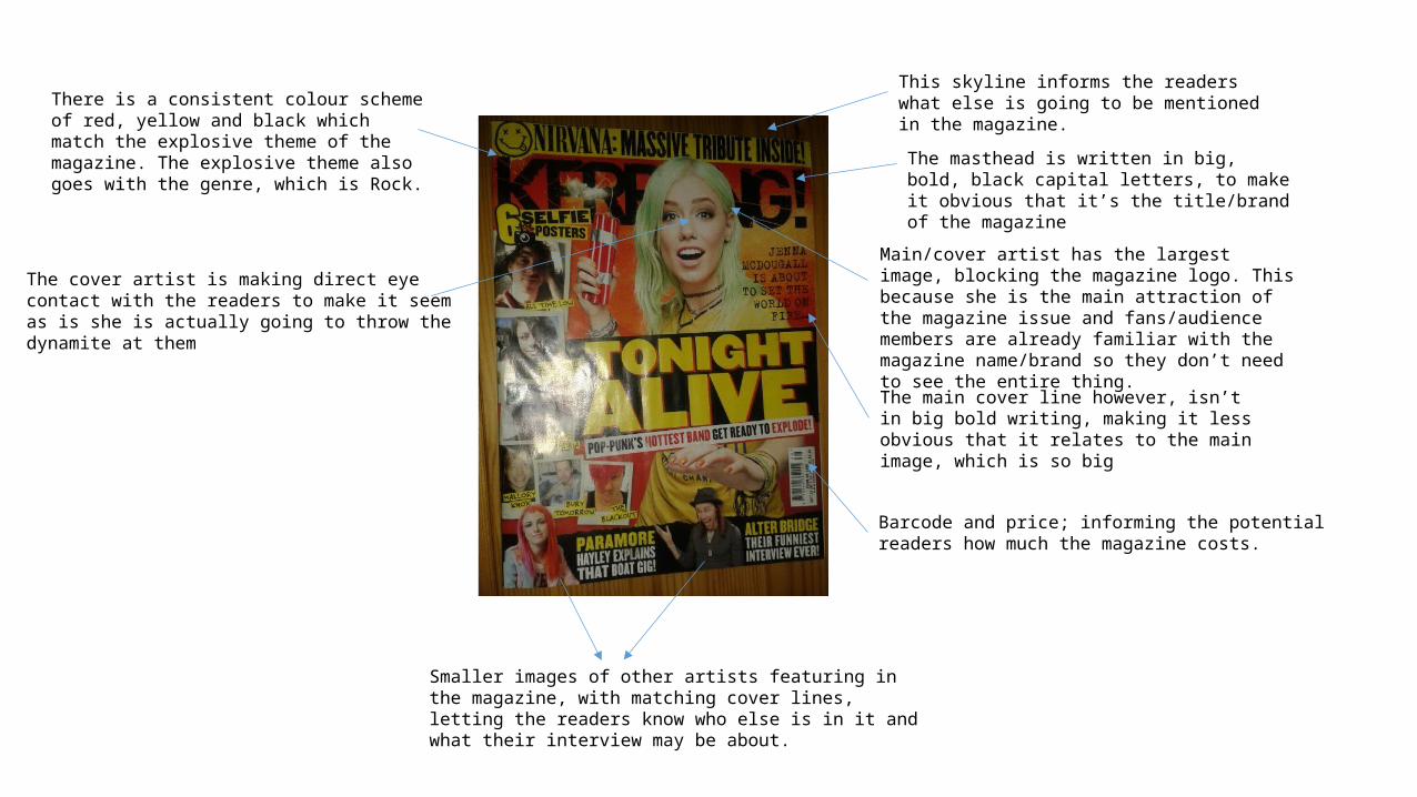
This skyline informs the readers what else is going to be mentioned in the magazine.
The masthead is written in big, bold, black capital letters, to make it obvious that it’s the title/brand of the magazine
Main/cover artist has the largest image, blocking the magazine logo. This because she is the main attraction of the magazine issue and fans/audience members are already familiar with the magazine name/brand so they don’t need to see the entire thing.
Barcode and price; informing the potential readers how much the magazine costs.
There is a consistent colour scheme of red, yellow and black which match the explosive theme of the magazine. The explosive theme also goes with the genre, which is Rock.
The cover artist is making direct eye contact with the readers to make it seem as is she is actually going to throw the dynamite at them
The main cover line however, isn’t in big bold writing, making it less obvious that it relates to the main image, which is so big
Smaller images of other artists featuring in the magazine, with matching cover lines, letting the readers know who else is in it and what their interview may be about.
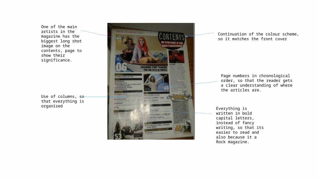
Continuation of the colour scheme, so it matches the front cover
One of the main artists in the magazine has the biggest long shot image on the contents, page to show their significance.
Use of columns, so that everything is organised
Page numbers in chronological order, so that the reader gets a clear understanding of where the articles are.
Everything is written in bold capital letters, instead of fancy writing, so that its easier to read and also because it a Rock magazine.
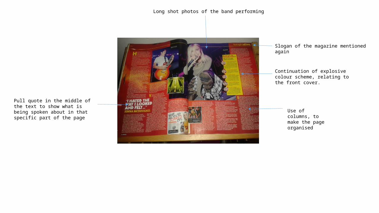
Continuation of explosive colour scheme, relating to the front cover.
Pull quote in the middle of the text to show what is being spoken about in that specific part of the page
Long shot photos of the band performing
Use of columns, to make the page organised
Slogan of the magazine mentioned again


![Crave [music] Mag](https://img.pdfslide.us/doc/110x75/568c36fa1a28ab02359a0b71/crave-music-mag.jpg)