Embed Size (px)
Citation preview
By Halima Khan
CREATING MY FRONT COVER
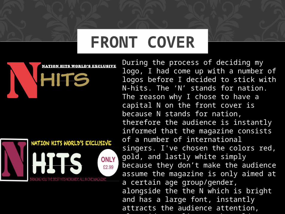
FRONT COVERDuring the process of deciding my logo, I had come up with a number of logos before I decided to stick with N-hits. The ‘N’ stands for nation. The reason why I chose to have a capital N on the front cover is because N stands for nation, therefore the audience is instantly informed that the magazine consists of a number of international singers. I've chosen the colors red, gold, and lastly white simply because they don’t make the audience assume the magazine is only aimed at a certain age group/gender, alongside the the N which is bright and has a large font, instantly attracts the audience attention, alongside compliments the gold besides it. The reason I chose to put “nation hits world’s exclusive” in a smaller font is because once the audience read the obvious writing such as the large N-hits, they're eyes are instantly then going to go on to the small font above it. Below is the new logo I had created, during the process of altering my front cover page.
CHOOSING THE MAIN PICTURE FOR MY FRONT
COVER
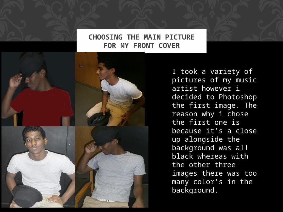
I took a variety of pictures of my music artist however i decided to Photoshop the first image. The reason why i chose the first one is because it’s a close up alongside the background was all black whereas with the other three images there was too many color's in the background.
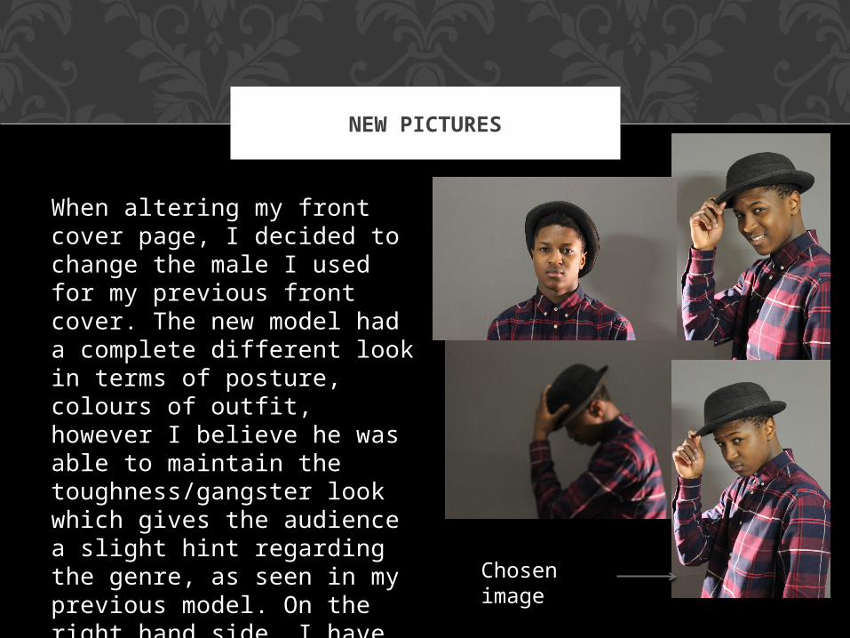
When altering my front cover page, I decided to change the male I used for my previous front cover. The new model had a complete different look in terms of posture, colours of outfit, however I believe he was able to maintain the toughness/gangster look which gives the audience a slight hint regarding the genre, as seen in my previous model. On the right hand side, I have added a few images of the pictures I had taken, and the one I chose overall for my front cover page.
NEW PICTURES
Chosen image
EDITING THE MAIN IMAGE
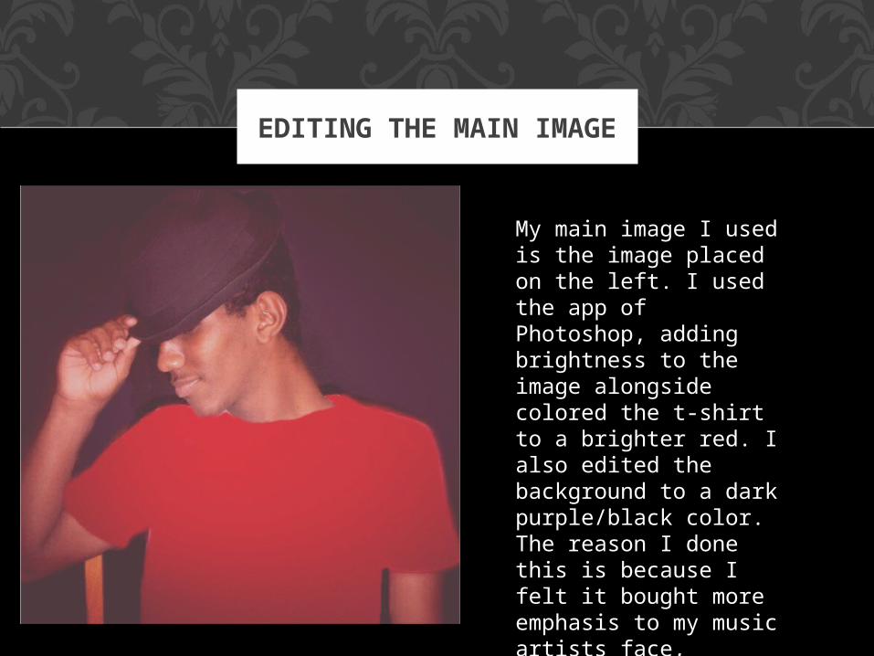
My main image I used is the image placed on the left. I used the app of Photoshop, adding brightness to the image alongside colored the t-shirt to a brighter red. I also edited the background to a dark purple/black color. The reason I done this is because I felt it bought more emphasis to my music artists face, alongside concentrated on his hand posture.
LOGO AND IMAGE
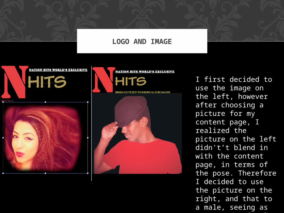
I first decided to use the image on the left, however after choosing a picture for my content page, I realized the picture on the left didn't’t blend in with the content page, in terms of the pose. Therefore I decided to use the picture on the right, and that to a male, seeing as I've used a female for the content page, alongside the magazine is based on the world hits, therefore crucial to have both male and female.
USING QUARK
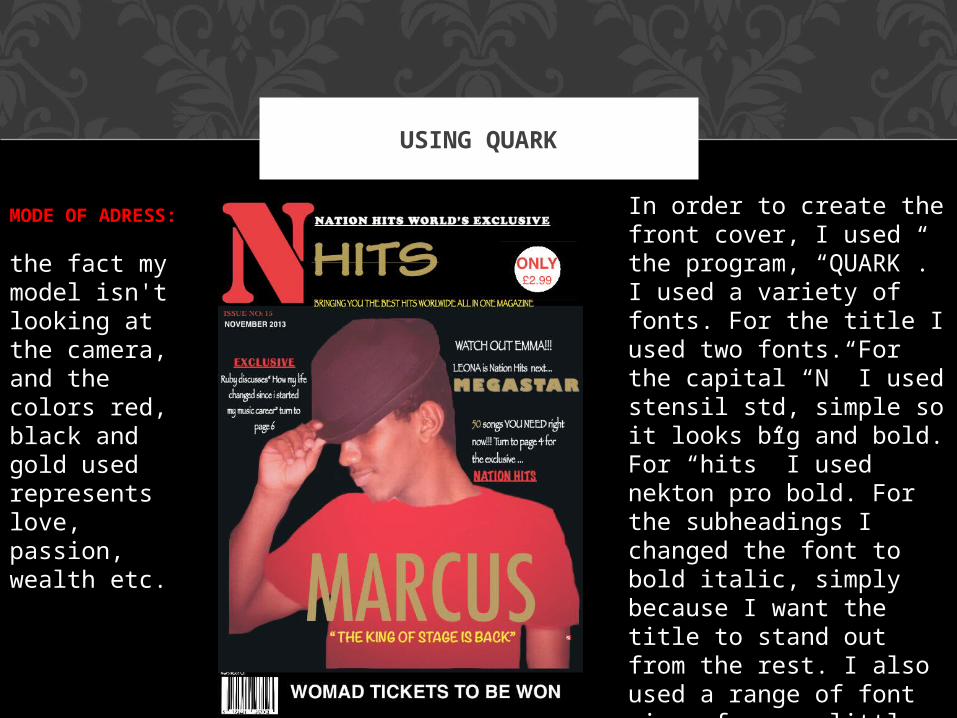
In order to create the front cover, I used the program, “QUARK”. I used a variety of fonts. For the title I used two fonts. For the capital “N” I used stensil std, simple so it looks big and bold. For “hits” I used nekton pro bold. For the subheadings I changed the font to bold italic, simply because I want the title to stand out from the rest. I also used a range of font sizes from as little as 12 to 210.Furthermore in terms of purchase, I decided to give my magazine the pricing of £2.99, simply because its an affordable price, and appealing.
MODE OF ADRESS:
the fact my model isn't looking at the camera, and the colors red, black and gold used represents love, passion, wealth etc.
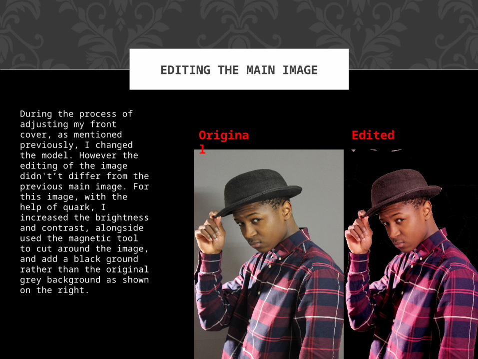
During the process of adjusting my front cover, as mentioned previously, I changed the model. However the editing of the image didn't’t differ from the previous main image. For this image, with the help of quark, I increased the brightness and contrast, alongside used the magnetic tool to cut around the image, and add a black ground rather than the original grey background as shown on the right.
EDITING THE MAIN IMAGE
Original Edited
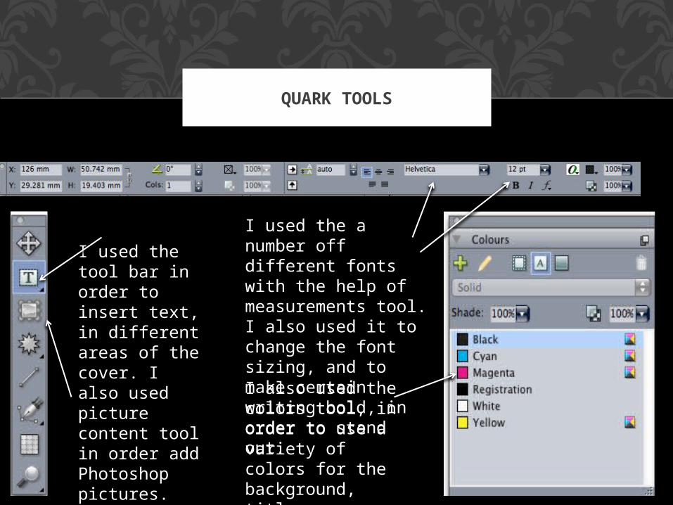
QUARK TOOLS
I used the a number off different fonts with the help of measurements tool. I also used it to change the font sizing, and to make certain writing bold, in order to stand out.I also used the colors tool, in order to use a variety of colors for the background, title, subheadings etc.
I used the tool bar in order to insert text, in different areas of the cover. I also used picture content tool in order add Photoshop pictures.
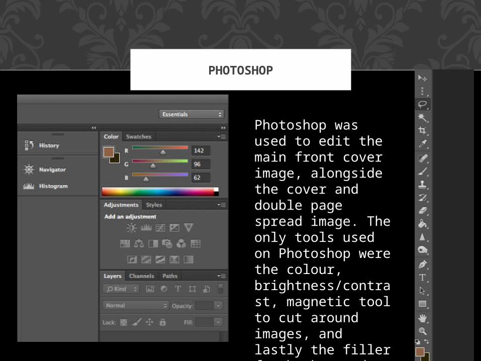
PHOTOSHOP
Photoshop was used to edit the main front cover image, alongside the cover and double page spread image. The only tools used on Photoshop were the colour, brightness/contrast, magnetic tool to cut around images, and lastly the filler for background to edit the colour of the background.
![Crave [music] Mag](https://img.pdfslide.us/doc/110x75/568c36fa1a28ab02359a0b71/crave-music-mag.jpg)