Embed Size (px)
Citation preview
Q6. WHAT HAVE YOU LEARNT ABOUT TECHNOLOGIES FROM THE
PROCESS OF CONSTRUCTING THIS PRODUCT?
WHAT HAVE I USED?
The hardware I have used:
• DSLR camera
• Light – Studio strobes
• Soft boxes
• Backdrop
• iMac – Apple
• SD card
• Keyboard/mouse
• X-Serve – Apple iMac server (holds
network accounts)
The software I have used:
• Adobe Photoshop CS5
• Adobe Indesign CS5
• Wordpress.com
• Firefox – browser
• OSX – operating system
• Microsoft Powerpoint
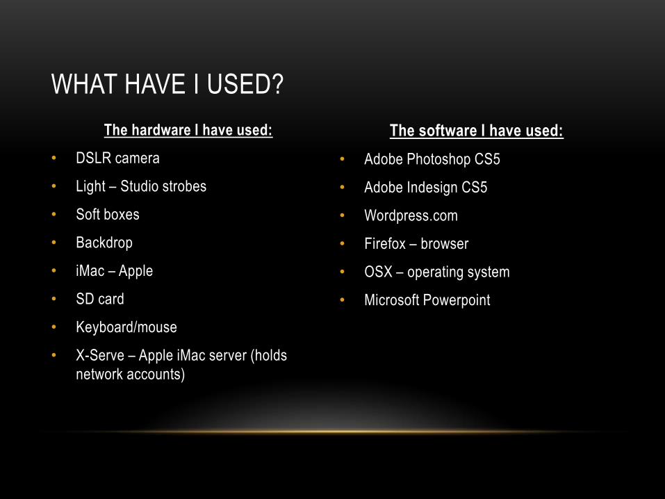
• Camera - Nikon D3100 – Digital SLR
• Settings – Manual Aperture
• I learnt that by half-pressing down the shutter you can focus, this
helped me get a better quality for my cover as this is the show
piece, and so it needs to be of the highest quality. I also learnt by
twisting the lenses I could zoom in and out, I found this useful as
I could
• Horseshoe Flash Trigger
• Infra red signal sent to Strobe flash – triggers the
flash in-sync with the camera shutter
• (speed set to 1/300th sec to match strobe speeds)
• I learnt that you can attach the flash trigger to the camera in
order to trigger the strobes to flash in order to make for a better
quality photo.
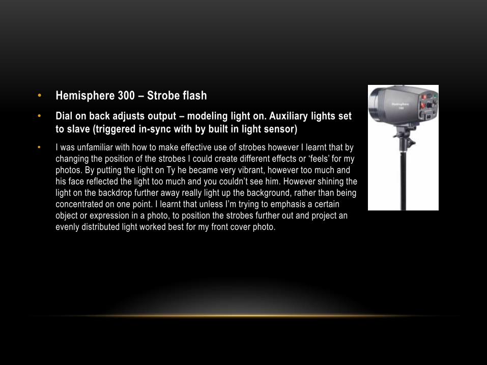
• Hemisphere 300 – Strobe flash
• Dial on back adjusts output – modeling light on. Auxiliary lights set
to slave (triggered in-sync with by built in light sensor)
• I was unfamiliar with how to make effective use of strobes however I learnt that by
changing the position of the strobes I could create different effects or ‘feels’ for my
photos. By putting the light on Ty he became very vibrant, however too much and
his face reflected the light too much and you couldn’t see him. However shining the
light on the backdrop further away really light up the background, rather than being
concentrated on one point. I learnt that unless I’m trying to emphasis a certain
object or expression in a photo, to position the strobes further out and project an
evenly distributed light worked best for my front cover photo.
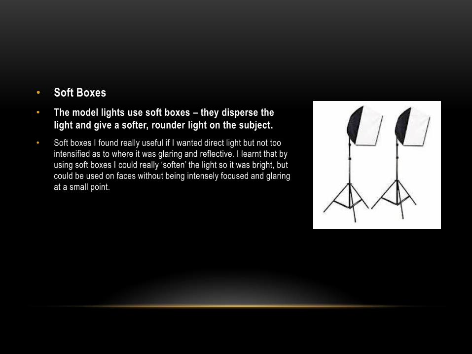
• Soft Boxes
• The model lights use soft boxes – they disperse the
light and give a softer, rounder light on the subject.
• Soft boxes I found really useful if I wanted direct light but not too
intensified as to where it was glaring and reflective. I learnt that by
using soft boxes I could really ‘soften’ the light so it was bright, but
could be used on faces without being intensely focused and glaring
at a small point.
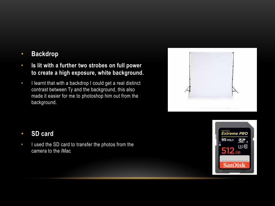
• Backdrop
• Is lit with a further two strobes on full power
to create a high exposure, white background.
• I learnt that with a backdrop I could get a real distinct
contrast between Ty and the background, this also
made it easier for me to photoshop him out from the
background.
• SD card
• I used the SD card to transfer the photos from the
camera to the iMac
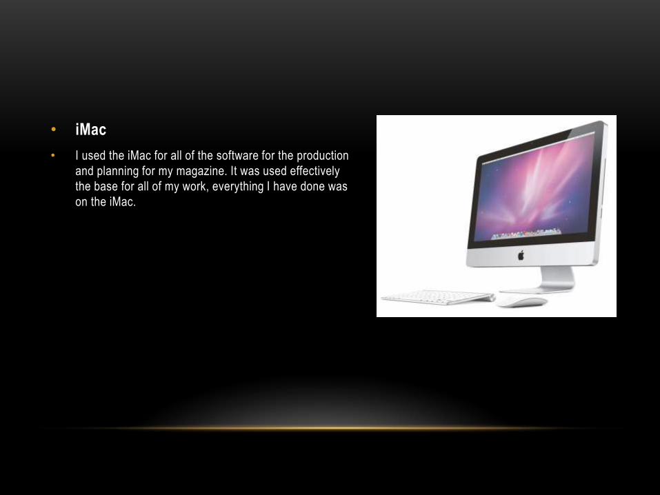
• iMac
• I used the iMac for all of the software for the production
and planning for my magazine. It was used effectively
the base for all of my work, everything I have done was
on the iMac.
ADOBE PHOTOSHOP
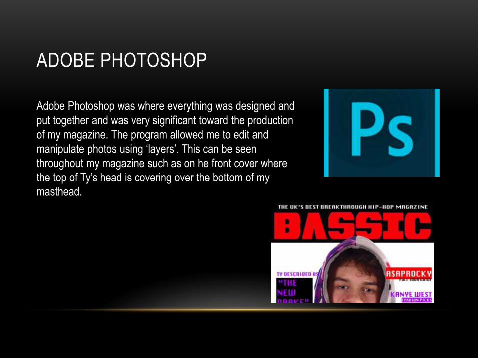
Adobe Photoshop was where everything was designed and
put together and was very significant toward the production
of my magazine. The program allowed me to edit and
manipulate photos using ‘layers’. This can be seen
throughout my magazine such as on he front cover where
the top of Ty’s head is covering over the bottom of my
masthead.
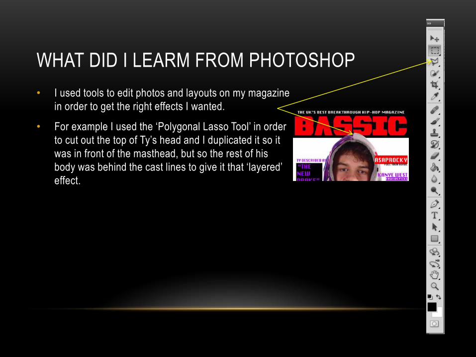
WHAT DID I LEARM FROM PHOTOSHOP
• I used tools to edit photos and layouts on my magazine
in order to get the right effects I wanted.
• For example I used the ‘Polygonal Lasso Tool’ in order
to cut out the top of Ty’s head and I duplicated it so it
was in front of the masthead, but so the rest of his
body was behind the cast lines to give it that ‘layered’
effect.
MORE SOFTWARE
• For all of my research I used the browser ‘Firefox’. This also gave me
access to my wordpress: my blog
• This allowed me to look at existing magazines and find out what’s
conventional and what’s not.
• OSX – is the operating system that’s on the iMacs, this stores all of the
information and enables me to open files that I have previously worked
on. So without it I couldn’t have made my magazine.
Q7. LOOKING BACK AT YOUR PRELIMINARY TASK, WHAT DO YOU FEEL
YOU HAVE LEARNT IN THE PROGRESSION FROM IT TO THE FULL
PRODUCT?
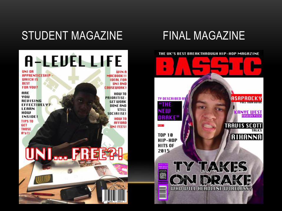
STUDENT MAGAZINE FINAL MAGAZINE
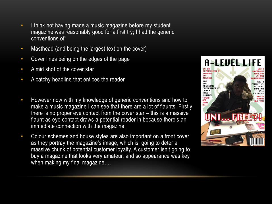
• I think not having made a music magazine before my student magazine was reasonably good for a first try; I had the generic conventions of:
• Masthead (and being the largest text on the cover)
• Cover lines being on the edges of the page
• A mid shot of the cover star
• A catchy headline that entices the reader
• However now with my knowledge of generic conventions and how to make a music magazine I can see that there are a lot of flaunts. Firstly there is no proper eye contact from the cover star – this is a massive flaunt as eye contact draws a potential reader in because there’s an immediate connection with the magazine.
• Colour schemes and house styles are also important on a front cover as they portray the magazine’s image, which is going to deter a massive chunk of potential customer loyalty. A customer isn’t going to buy a magazine that looks very amateur, and so appearance was key when making my final magazine….
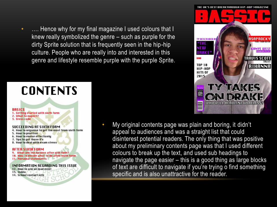
• …. Hence why for my final magazine I used colours that I
knew really symbolized the genre – such as purple for the
dirty Sprite solution that is frequently seen in the hip-hip
culture. People who are really into and interested in this
genre and lifestyle resemble purple with the purple Sprite.
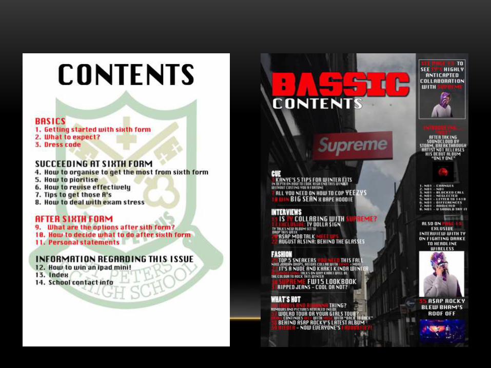
• My original contents page was plain and boring, it didn’t appeal to audiences and was a straight list that could disinterest potential readers. The only thing that was positive about my preliminary contents page was that I used different colours to break up the text, and used sub headings to navigate the page easier – this is a good thing as large blocks of text are difficult to navigate if you’re trying o find something specific and is also unattractive for the reader.
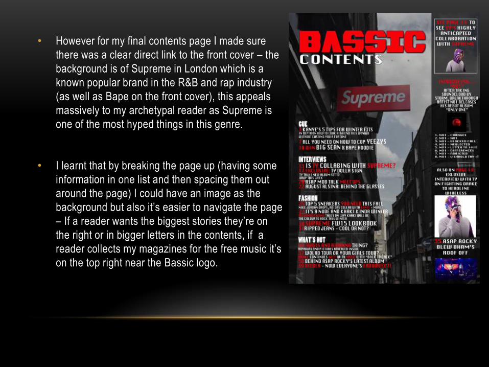
• However for my final contents page I made sure
there was a clear direct link to the front cover – the
background is of Supreme in London which is a
known popular brand in the R&B and rap industry
(as well as Bape on the front cover), this appeals
massively to my archetypal reader as Supreme is
one of the most hyped things in this genre.
• I learnt that by breaking the page up (having some
information in one list and then spacing them out
around the page) I could have an image as the
background but also it’s easier to navigate the page
– If a reader wants the biggest stories they’re on
the right or in bigger letters in the contents, if a
reader collects my magazines for the free music it’s
on the top right near the Bassic logo.