Embed Size (px)
Citation preview
Question 1:In what ways does your product use, develop or
challenge forms and conventions of real media
products?
By Amos Mukombero
• Conventions in media are acceptance of ways of doing something. On a magazine there are general conventions such as:
• Masthead (usually the name the magazine) – This signifies the magazine, it is bold usually on the top third of a magazine it is important that the mast head is aesthetic and eye catching so it stands out from the rest of the magazines that are sold near.
• A banner (promotional features are an option) – This is like an advertisement for other mediums, such as new TV shows starting, events coming up, free give away etc. The banner usually has some sort of connection to the magazine.
Conventions of a magazine of a front cover
• Main image (so people can have a tease of what content the magazine will feature)
• Cover lines – Stories that appear in the magazine are cover lines. These are presented around the magazine; the more important cover lines are generally bigger, stand out and more ambiguous.
• Strap lines – This is a subheading or another way to advertise.
• Footers – On the bottom of the magazine is the footer. It is continues on all of the pages. They are usually used for pages numbers. They are the same as ‘Headers’ but they are situated on the top of the magazine.
• Barcode – This is a legal requirement, it is used for scanning when purchasing a magazine at a store. It is a code of information encrypted in a picture format.
• Price – This is another legal requirement. It allows the audience to know how much the magazine will cost.
• Website address – this is just a URL that informs readers the magazine stories/content can be found on the internet and you are able to do other things on the internet.
• Serif font – This Is a writing style without flicked ends. It is genre specific and not always used.
• A clear color scheme – This enforces the magazine to the audience, it allows them to associate the colors to the magazine.
• Issue number and date – This is another legal requirement is allows the audience to know how recent the news and stories they are reading.
• Most conventions are genre and target audience specific.
The following slide will give you an idea of the conventions I used on my front cover...

a strip of featuring articles
Masthead: The Run
Barcode and price
Cover lines
Strap line/footer with a promotion.
Main image(s) - Colin Fresh
Puff and plug
Banner/Strap line/ header with the Issue number and a cover line
Generic Construction in comparison
• Generally a banner and masthead are positioned horizontally on the top third of the magazine, with the headlines and cover lines on the left third. This is so people can see what stories are in the magazine easier when they are stacked up on a shelf of a store. The image is always in the middle of the magazine left or right third; depending on the image size and the editors preference. The purpose of this is to grab the audiences focus.
• My magazine follows the typical the conventions. The only challenge to the norm is that I have used is a strip of featuring pictures on the right to emboss the articles in the magazine. Whether this works or not will be put to the test when my product is put out for sale.

In comparison to a real media product
Conventions of a magazine of a double page spread
• One main image: The main image should have a direct link to the content of the page. This give the audience an idea of what the article is about. It is usually positioned on the left third of the page.
• Paul Quotes: Interesting quotes taken from the article to engage the reader in. They are usually dropped into the text and wrap around, used as headlines and can also be dropped onto a picture.
• Headline: This tells the reader what the article will be about. It is usually the name of the artist in a music magazine.
• Stand first: This introduces the article and is positioned underneath the headline.
• Columns: Usually 2-3 columns are used.
• Colour scheme: This should be consistent thought the magazine.
• Drop Caps: Indicate to the reader where the article starts.
• Writing size and font: Usually 11pt and aerial font.

Masthead of magazine
Drop Caps
Paul Quote
Page number
Main Image
HeadlineStand first
3 columns
Generally, my double page spread follows the conventions of a real media product. The main developments from the general I have changed are I have situated my main image on the right side instead of the left. I put it there because the stance of the modal is left side focused, this hopefully will draw the audience to the left side of the page which is where the article is.Another development is that I have included a strip of pictures which are the same but edited differently this is to make my double page spread aesthetically pleasing for the reader. Having my headline on the right side is another development from the generic convention. I put it there as it will allow readers who are not aware who the artist is to know who it is.
The next slide is a comparison to a real media product.
Analysis of my double page spread

Drop Caps
Main Image
Stand first
2 columns
Quote
The Vibe double page spread follows the conventional layout of most double page spreads. The main image is on the left; in comparison to mine where I challenge the conventions of a real media product. There are 2 columns which is different to mine as I have 3. The amount of content would not be restricted. On this example there is a quote that is centred on the right page with a graffiti font. This is to keep the theme running as the artist has graffiti on his face. The colour scheme is also simple red, white and black. With the text size 11pt with an aerial font. The style of layout matches the magazine it is, this reinforces the magazines’ profile.
Analysis of Vibe double page spread
• A Contents page is used for navigating round the magazine. It should be user friendly, clear and easy to understand this is so that the reader can go straight to the article that caught their eye as soon as possible. General conventions are as follows:
• Page numbers with a description of what is going to appear on the page.
• Numerous pictures – this is an editorial preference
• Consistent colour scheme
• Title (contents)
• Different size text and fonts – this is to show importance
• Subheadings to break up the different types of pages
Conventions of a magazine of a Contents page
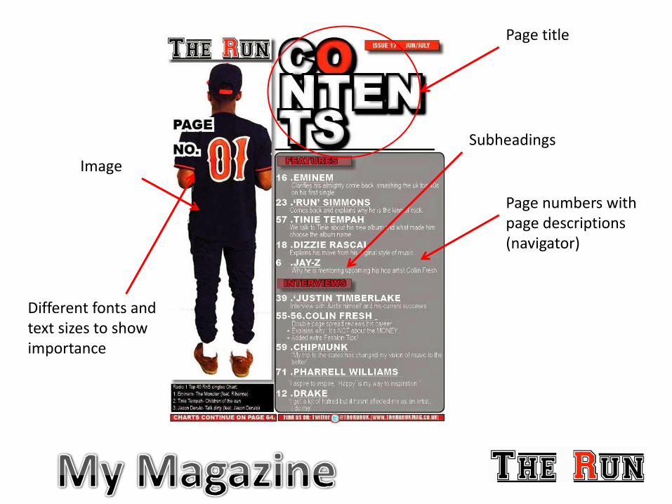
Page title
Page numbers with page descriptions (navigator)
Image
Different fonts and text sizes to show importance
Subheadings
• The contents page of a magazine has no concrete layout. It is solely on the editors preference where elements go, which elements work k and which don’t. This is dependent on whether the contents page fulfils its purpose and navigates the user to where they want to read.
• My contents page does this. It is generic in the sense that all the important conventions are there but I have constructed it by using my theme from my front cover as a guide. As the magazine must have a consistent colour scheme and theme. Using the similar picture aids this but the model is facing the opposite way.
The next slide gives an example of a real media product that is from Vibe music magazine.
Analysis of my Contents page
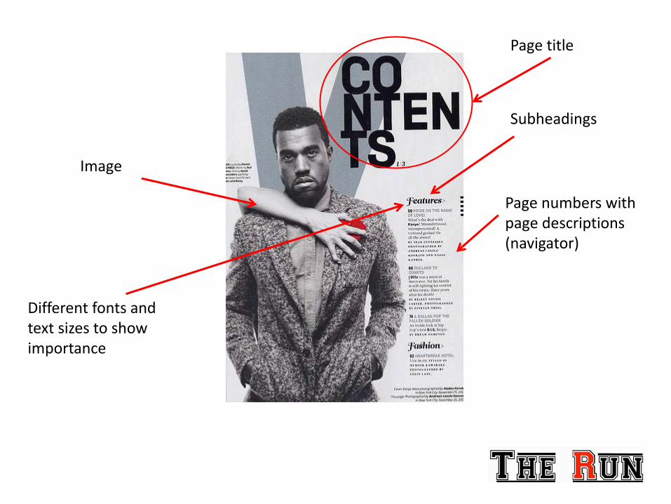
Page title
Page numbers with page descriptions (navigator)
Image
Different fonts and text sizes to show importance
Subheadings
Conclusion
• I have come to a conclusion that all of the magazine page I have created generally follow the conventions of real media products. However some elements I have cleverly developed with clear evidence as to why.
• I chose to keep the conventions generic so that my magazine would sell. Also the distributing company I will present my magazine will see that as it is generic it will work as a real media product that can sell.

Thank you for viewing my PowerPoint. Hope you enjoyed!