Embed Size (px)
Citation preview

130
Brenda Hoddinott J01 INTERMEDIATE: SKILLS & SECRETS During my lengthy career, I’ve made tons of mistakes and learned from them. With necessity being the mother of invention, I’ve also discovered numerous easier and more efficient methods of working. These tips and helpful hints are designed to make your drawing experiences more pleasurable and less frustrating! To help you find what you need more quickly, this article is divided into the following sections:
13 PAGES – 130 TIPS AND HELPFUL HINTS
Published by Drawspace.com, Halifax, NS, Canada – 2004 (Revised - July, 2009)
Generally Speaking Working from Photos Values and Shading Blending Shading Composition Drawing with a Grid Drawing Portraits and People
Perspective Figure Drawing from Life Protecting your Drawings Keeping the Enjoyment Signing Your Name Beyond the Sketchbook Warm Fuzzies
Copyright to all articles, images, text, projects, lessons and exercises within this document belong to Brenda Hoddinott and may not be reproduced or used for any commercial purposes whatsoever without the written permission of Brenda Hoddinott. E-mail [email protected] Web site http://www.drawspace.com
2
GENERALLY SPEAKING 1) To prevent cramping and repetitive movement injuries, move your fingers and wrist as little as possible when you draw. You should also be moving your lower and upper arm. 2) Stay away from poor‐quality graphite! Inexpensive graphite may work well for writing, but can scratch your drawing paper instead of going on smoothly. Professional drawing pencils are made with a higher‐quality mixture of graphite and clay and make marks that flow more smoothly. 3) Always lay your graphite pencils somewhere safe so they don’t fall! When a pencil falls to the floor, the graphite inside the core breaks, and the pencil becomes very difficult to sharpen. Small pieces of broken graphite can jam up the inside of the sharpener. 4) Purchase only professional quality mechanical pencils. You can find inexpensive novelty mechanical pencils in many stores. However, professional mechanical pencils that are designed for drawing can only be found in art supply stores. Most are expensive, but they tend to last much longer than the department store variety. 5) Stay away from papers with a glossy surface! Glossy paper is toothless, and therefore too smooth for graphite or charcoal to properly stick to it. 6) Stay away from acid! Don’t be fooled by cheap imitations of good‐quality drawing paper. Before you buy a sketchbook, look for a label that says the paper is acid‐free. Just because the cover of a sketchbook says it’s suitable for drawing doesn’t mean it’s acid‐free. Your drawings can be ruined when poor quality paper deteriorates and turns yellow. 7) Always take good care of a paper’s tooth! The tooth of any paper can be easily destroyed by pressing too hard on its surface with your pencil. If your shading begins to look shiny, the tooth is flattened beyond repair. Additional shading will no longer hold fast to the paper’s surface. 8) The wrong erasers can ruin your drawings! Stay away from erasers that are colored (especially the pink ones) or very hard (such as those on the ends of some pencils). 9) You can make a sanding tool similar to a sandpaper block. Cut sheets of sandpaper into long narrow pieces, and use a heavy duty stapler to hold them together at one end. 10) Don’t draw on a flat surface! When you draw on a flat surface, the top of your paper is farther away from you than the bottom. As a result, you can end up with all sorts of problems trying to draw accurate proportions. 11) You can clean your kneaded eraser by stretching and reshaping it several times (also known as “kneading”) until it comes clean. However, kneaded erasers eventually get too dirty to work properly, so pick up some extras.

Copyright to all articles, images, text, projects, lessons and exercises within this document belong to Brenda Hoddinott and may not be reproduced or used for any commercial purposes whatsoever without the written permission of Brenda Hoddinott. E-mail [email protected] Web site http://www.drawspace.com
3
12) When drawing an oval or a circle, rotate your paper and examine it from different perspectives. View its reflection in a mirror to help locate problem areas. 13) Draw slowly. Accuracy is more important than speed. Your speed will automatically improve the more you practice. 14) Don’t press too hard with your pencils. Not only do these areas become impossible to touch up, but they also leave dents in your paper. When you try to draw over dents in the paper with a soft pencil (such as a 2B or 6B), they show up as light lines, spoiling the overall appearance of your drawing. 15) Have a basic set of drawing materials pre‐packed so you can spontaneously take your art outside your studio whenever you want. 16) When planning to draw outdoors, take into consideration such factors as weather, lighting conditions, time of day, and the angle from which you wish to capture your subject. Then make your plans accordingly. 17) Practice drawing straight lines freehand in any way you find comfortable; however, you may want to use a ruler to draw straight lines for some subjects. 18) A thorough visual examination of your subject is the most important ingredient for making great sketches. 19) Drawing from actual objects enhances your memory. Each time you draw something new, valuable information is stored in your long‐term memory. 20) Always feel comfortable to use your creative abilities to rearrange, modify, or even completely change, various components of subjects that inspire you! 21) Display your unfinished drawings in a safe place in your home, where you see them frequently throughout the day. Each time you look at the drawing and see something that needs to be touched up, write yourself a note about the problem area, and go back to fix it later. 22) Be careful not to put tape on your drawing paper as it may damage the surface when you remove it. 23) If you need anything to look symmetrical, from a vase to a face, draw a faint line down the center of your drawing space before you begin. Visually measure the spaces on both sides of this line as you draw. You can even use a ruler to measure different sections if you wish to be very precise! WORKING FROM PHOTOS 24) Unless you are an expert photographer, use photos only as reference tools and draw from actual objects whenever possible. 25) Use a viewfinder frame to help you modify the composition of a photo before you begin drawing. You can make a viewfinder frame with heavy paper and two large paper clips.

Copyright to all articles, images, text, projects, lessons and exercises within this document belong to Brenda Hoddinott and may not be reproduced or used for any commercial purposes whatsoever without the written permission of Brenda Hoddinott. E-mail [email protected] Web site http://www.drawspace.com
4
26) If you want the face in a photo to be at a slightly different angle, you can tilt your photo a little as you tape it to a piece of paper, and then add a mat to hide the tilted corners of the photo. 27) Whenever you plan to do a drawing from photographs, take lots of pictures of the potential drawing subjects from several different angles. You need to be familiar with a subject from all sides, before you can accurately draw its forms. VALUES AND SHADING 28) Before you begin shading, confirm that objects, spaces, and perspective elements are drawn correctly. Check the relationships of objects to one another, observe that angles, sizes, and proportions are accurate, and adjust as needed. 29) Many artists prefer to work from light to dark. By drawing the light values first, you can then layer your medium shading on top of your light shading. This layering creates a nice smooth transition between values. The darkest values are then built in layers on top of the medium. 30) Squinting, to see the different values of an object, provides you with a visual map for sketching the shape of each value. 31) Almost everything has more than one value. Depending on the light source, most things have areas that are very light and others that are quite dark. When you can see these different values you can draw the object in the third dimension. 32) When shading with graduations, you can make the transition from one value to the next barely noticeable by drawing the individual shading lines different lengths. Sometimes a short line, placed inside a space between two other lines, helps make the transition look smoother. 33) Step back from your drawing from time to time and have a look at the overall values. You may need to make some areas lighter and others darker. 34) Take your time when drawing the forms of an object (or living being). Draw the shapes first and then shade in the light and shadows. 35) Capturing the illusion of a three dimensional reality is more important than rendering patterns and/or textures. 36) Use a piece of scrap paper to experiment with drawing the different textures you plan to use, before incorporating them into your actual drawing. 37) Your drawings can appear flat, rather than three‐dimensional when too little contrast in values is used. Unless you are trying to achieve a specific mood or want the subject to look flat, always use a full range of values. 38) The textures of some three‐dimensional objects are difficult to translate into a two‐dimensional drawing, for example a seashell, or a highly textured piece of driftwood. Photocopy (or scan and print) black and white images of a section of the object, so you can see the texture on a flat piece of paper before you begin adding shading.

Copyright to all articles, images, text, projects, lessons and exercises within this document belong to Brenda Hoddinott and may not be reproduced or used for any commercial purposes whatsoever without the written permission of Brenda Hoddinott. E-mail [email protected] Web site http://www.drawspace.com
5
39) When shading a drawing subject with crosshatching, turn your paper around in various directions as you work, so that you are always using your natural hand movement. You should also try holding your arm in different positions as you draw. Whatever you find to be the most comfortable is right for you. 40) When drawing an animal or person, visually break the subject down into shapes and measure proportions. Closely examine the areas where parts of the body bend, twist, or are extended or outstretched. 41) The shading in a cast shadow (on the surface on which an object is sitting) is darker closer to the object and becomes gradually lighter as it moves outward. BLENDING SHADING 42) Blending is difficult for beginners. Develop strong skills with traditional shading techniques, such as hatching and crosshatching, before you attempt blending. For blending to work well, you need to be reasonably skilled at putting graduated values on your paper. After all, there has to be something to blend. On the other hand, expecting blending to fix poorly done shading, simply isn’t realistic. 43) When blending NEVER use your fingers! As a matter of fact, don’t touch your drawing paper in the sections where you plan to blend. Your skin can transfer oil to the paper, which becomes noticeable after blending (especially in light and middle values). Creating a smooth tone then becomes darn near impossible. 44) Realistic shading with blending needs a broad range of values. The most common blending mistake is to over blend dark values. Either use blending very sparingly in dark shadowed areas, or don’t blend your dark values at all. If blending removes too much graphite, you can darken the values again by adding more graphite. 45) Be careful not to wear away tissues or paper towels so your fingers are doing the blending. Wrap several layers around your finger and check often that the tissue isn’t wearing away. 46) The final look of blended shading can be affected by many factors, including your choice of blending tools, shading techniques, media, and types of drawing paper. 47) Don’t give up if you don’t like your first few attempts at blending. With patience and practice your blending skills improve. COMPOSITION 48) An ideal composition requires components of different values, textures, shapes, and sizes. However, remember to keep it simple! Too many objects in a drawing creates overcrowding and disharmony.

Copyright to all articles, images, text, projects, lessons and exercises within this document belong to Brenda Hoddinott and may not be reproduced or used for any commercial purposes whatsoever without the written permission of Brenda Hoddinott. E-mail [email protected] Web site http://www.drawspace.com
6
49) Choose a drawing format that best fits your subject; for example, many portraits look better in a vertical rectangle (sometimes called portrait format) rather than horizontal (often referred to as landscape). 50) You can unify a still life drawing by choosing objects that relate to one another. Some themes to consider are: gardening tools and plants, kitchen utensils and food, table settings, themes based on texture or color (such as all black or all white objects), or an arrangement of children’s toys. 51) A composition becomes more intriguing when you highlight your center of interest with more detail and a stronger contrast in values than other aspects of your drawing. 52) Include an odd number of objects into a grouping, rather than an even number, whenever possible. 53) Pay close attention to the shapes of negative and positive spaces. 54) Often you discover perfect drawing subjects with imperfect compositions. If nature or man has placed an object in a position you don’t like, draw it in a different place on your paper or simply leave it out. 55) Study composition by examining the works of masters. When you understand the basic guidelines of composition, you become more confident in planning your drawings, and subsequently your drawings improve. 56) A shading plan, in the form of a thumbnail sketch, provides you with a blueprint for a composition. 57) Use some of the basic elements of composition such as balance, shading, proportion, and overlapping to draw the viewer’s eye to your focal point. 58) Arrange your objects asymmetrically. Taller objects usually look better off to one side. 59) Place your focal point off center within the boundaries of your drawing space. In other words, don’t position a focal point dead center (sometimes called a bull’s eye)! While this serves to make your focal point stand out, all the other parts of your drawing may be ignored and your overall composition becomes weak. 60) Don’t place all the dark or all the light values on one side of your drawing space. Rather, balance dark and light values in much the same way as objects. Sometimes, simply moving objects slightly to the right or left or drawing them lighter or darker than they appear in actuality, balances the composition. DRAWING WITH A GRID 61) No matter how careful you are, when you draw with a grid, accidents do happen. If you draw some lines in the wrong grid squares, simply erase that section, redraw the grid lines, and keep on going! Lightly drawn lines are easy to erase!

Copyright to all articles, images, text, projects, lessons and exercises within this document belong to Brenda Hoddinott and may not be reproduced or used for any commercial purposes whatsoever without the written permission of Brenda Hoddinott. E-mail [email protected] Web site http://www.drawspace.com
7
62) Draw the grid on your photo with a fine tip permanent marker or an ordinary ballpoint pen. They can be seen more clearly than a pencil, which tends to scratch the surface of the photo. 63) Never draw a grid directly on a valuable photo! Make a photocopy, or scan and print it, and work from the copy. 64) Using a grid helps render precise facial and figurative proportions and correct perspective when working from a photo. 65) If you don’t like drawing grids on photos, pick up a few sheets of clear (don’t buy frosted) acetate at an art supply store. Draw grids with squares of different sizes on separate sheets with a very fine permanent marker (or draw the grid in Photoshop and print it on the acetate). To grid a photo, especially one you don’t want to damage, you simply place the clear grid over the photo, and you are ready to draw. As an extra perk, you can reuse acetate grids over and over again. 66) Tape the corners of your drawing paper to a large sheet of graph paper to help draw the grid lines. Adjust the size of each square proportionate to the size you want the drawing to be. For example, if you want your drawing to be twice the size of the photo, use four (2 by 2) of the one‐quarter‐inch graph squares, to represent one, quarter‐inch grid square on the photo. DRAWING PORTRAITS AND PEOPLE 67) When drawing a frontal view of a face, draw a line of symmetry on your paper before you begin. This line serves as a guideline for visually measuring horizontal distances so the head and face don’t end up lopsided. 68) Always add some shading to the whites of peoples’ or animals’ eyes. 69) In a graphite or charcoal portrait, you can imply the color of the iris of an eye, by using different values. Brown eyes are very dark in value, almost as dark as the pupil. Hazel, blue, or green eyes are mostly shaded with middle values. Pale blue, green, or gray eyes are very light in value and contrast sharply to the dark pupil. 70) The secret to drawing teeth well, is to hardly draw them at all! Simply allow the shading of the lips, the upper and lower gums, and the shadows created by the light source to define them. Teeth, which are farther back in the jaw, need to be shaded darker because they are in the shadows of the mouth. Never draw lines between the individual teeth, or else they end up looking like a checkerboard! 71) Never draw eyelashes from the tip down toward the eyelid. Always draw them in the direction in which they grow, from the eyelid (or root) outward. 72) Soft lighting works best for portraits of young children. 73) The eyes of babies and children are more rounded, the irises appear to be much larger, and their eyebrows are lighter than those of adults.
Copyright to all articles, images, text, projects, lessons and exercises within this document belong to Brenda Hoddinott and may not be reproduced or used for any commercial purposes whatsoever without the written permission of Brenda Hoddinott. E-mail [email protected] Web site http://www.drawspace.com
8
74) Babies’ heads are proportionately large when compared to their tiny bodies, but their faces are disproportionately tiny. The most common mistake of beginners, attempting to draw a baby’s portrait is to make the face too big, in proportion to the size of the skull. An adult face is half the size of the adult cranial mass. However, a baby’s face is approximately one third the size of his or her cranial mass. 75) Resist the temptation to make a baby’s hair too thick or full. When it comes to babies, the old expression “less is more” applies nicely. Too much hair in a drawing can make the baby look older than his or her actual age. 76) You age progress a person by illustrating the changing three‐dimensional exterior forms of the skeletal structure, and by transforming the outward appearance of the skin, fat, and muscles pulled downward by gravity. You can’t accurately depict the aging process by simply drawing lines on a person’s face. 77) When drawing a cartoon or caricature of someone familiar, such as a friend, family member, or a celebrity, exaggerate prominent features. If the eyes are far apart, draw them even farther apart. If his or her eyebrows are heavy, thick and dark, draw them heavier, thicker, and darker! If he or she has a big chin or nose, draw it larger! If the hair is thin, make it thinner and if it’s thick, draw it thicker! 78) The various parts of eyes look very different when you view them from different angles. People’s eyes also change shape with different facial expressions. 79) When drawing eyes, you need to draw the forms of the face, and the various folds of skin around the eyes. 80) Whenever you draw eyes, keep the initial sketch lines very light so they can be erased later. No part of an eye should be drawn with dark bold lines. Instead of lines, use contrasting shading graduations to separate the various parts of the eye, and give depth to their forms. 81) A full range of facial expressions are created by the movements of muscles. As various muscles do their jobs, different sections of the face move and often create folds and wrinkles in the skin. 82) When someone is feeling down (sad), the corners of the mouth curve down. If a person is feeling up (happy), the corners of the mouth curl up. 83) When selecting a pose for a portrait, something as simple as the tilt of a head, can make your drawing more interesting, and even tell something about the personality of your model. PERSPECTIVE 84) When viewing the world according to geometric perspective, the farther away objects, animals, and people are, the smaller they appear to be.

Copyright to all articles, images, text, projects, lessons and exercises within this document belong to Brenda Hoddinott and may not be reproduced or used for any commercial purposes whatsoever without the written permission of Brenda Hoddinott. E-mail [email protected] Web site http://www.drawspace.com
9
85) Perspective allows you to draw people visually correct and more realistic. Long parts of a body, such as arms or legs, look disproportionately short when viewed from an end. 86) Find opportunities to view people from extreme perspectives in real life. You can even lie on the floor and have a friend or family member (the taller the better) stand beside you. As you look up at the person take note that the person’s head will look especially tiny, his or her legs and feet look disproportionately large, and the entire body looks much shorter than it actually is. 87) Be patient with yourself. Your abilities to render perspective accurately, improve with practice, and eventually become instinctive. Careful observation of people and objects around you expands your understanding of perspective. 88) The horizon line and your eye level are the same thing. Objects at your eye level seem to touch the horizon line, and their perspective lines converge both downward and upward. Objects above your eye level are above the horizon line and their perspective lines converge downward. Angular lines of objects below your eye level (below the horizon line) converge upwards. 89) Always draw the horizon line parallel to the upper and lower sides of a square or rectangular drawing space. 90) You can create the illusion that clouds near the horizon line are farther away, than those directly overhead, by drawing them smaller, closer together, and lighter in value. 91) By overlapping closer objects over distant objects, the illusion of depth is enhanced. FIGURE DRAWING FROM LIFE 92) Identifying the exterior three‐dimensional forms of adult bodies, as defined by bones, fat, and muscles, is more important to artists than memorizing the names of different parts of the body. 93) Choose poses that are expressive, artistically pleasing, and comfortable for your model. 94) Use tape or chalk to mark the placement of a model’s body on the surface on which he or she is sitting, standing, or lying. For example, by marking the outline of the model’s feet in a standing pose, he or she can easily find the correct pose again after a break. 95) Experiment with different drawing media such as conté, charcoal, or graphite sticks and use large sheets of paper when sketching figures. 96) When figure drawing from a live model, have snacks and beverages handy. Remember, modeling is very difficult. 97) Don’t worry if your drawings of hands and feet look all wrong at first. Just do your best and in time, you will get better!
Copyright to all articles, images, text, projects, lessons and exercises within this document belong to Brenda Hoddinott and may not be reproduced or used for any commercial purposes whatsoever without the written permission of Brenda Hoddinott. E-mail [email protected] Web site http://www.drawspace.com
10
SIGNING YOUR NAME 98) Spend some time experimenting with the letters in your name and come up with a creative signature that will be easy to use. 99) Sign your name in the same medium used for rendering the drawing. For example, if the drawing is in charcoal, sign your name in charcoal. 100) The best place to sign your name is in either the lower right or lower left corner of your drawing. Sketch your name very lightly first, and then if you like its position, you can then draw it darker. 101) Be careful not to make your signature too large, because it will distract from the artwork. On the other hand, if you make your signature too small, it will be difficult to read. PROTECTING YOUR DRAWINGS 102) When your drawing is completely finished, a spray fixative can protect it from being accidentally smudged. The instructions on the can often say you can erase after using this spray, but erasing hasn’t worked well for me. They also say that you can work over the spray. However, I find the spray changes the texture of the paper, and graphite especially, won’t adhere to the surface as well after it’s been sprayed. 103) Use spray fixative only in a well‐ventilated place or outside on a fine day. Three or four very light coatings of fixative work much better than one or two heavy coats. 104) Don’t store your drawings, with either clear tape or corrugated cardboard, touching them. Either of these items can discolor your drawings, and do permanent damage after only a few weeks. 105) Always place a piece of clean paper under your hand as you draw. Each time you work on a new section, remember to move your paper, to prevent you from smudging your drawing. 106) The natural oils or dirt on someone’s hands can damage your drawing paper. Handle drawing paper by its edges, and never touch the surface, unless absolutely necessary (even before you begin to draw). Before you show a drawing to another person, let him or her know that the drawing is very delicate, and can be ruined if they touch it. Then watch them VERY closely, in case they forget! 107) Put your drawings away in a safe place when you are finished working! 108) Never place or hang drawings in direct sunlight, no matter how well protected you think they are. Better safe than sorry! 109) Have a special surface for cutting drawing papers and boards. A completed drawing that has been accidentally cut in half becomes two pieces of scrap paper.

Copyright to all articles, images, text, projects, lessons and exercises within this document belong to Brenda Hoddinott and may not be reproduced or used for any commercial purposes whatsoever without the written permission of Brenda Hoddinott. E-mail [email protected] Web site http://www.drawspace.com
11
110) Never rest a cup of coffee (or any other beverage) on your drawing surface or you’ll end up with a soggy brown mess instead of a drawing. 111) Drawings always need to be framed behind glass. Make sure that both the mat and the backing are acid‐free. If you’re framing a drawing you’re really fond of, use conservation glass, available at most reputable framing shops. Better still, if you can afford it, have your drawings professionally framed. WARM FUZZIES 112) Drawing is a journey, not a destination. The day that you are totally happy with your drawings is the day you pack up your supplies and quit. Learning to draw is an infinite quest. 113) You need three invaluable ingredients in order to improve your drawing skills ‐ practice, practice, and more practice! Drawing is an action word – you learn by doing! 114) Experiment with lots of different shading techniques until you find what works best for you. You are a unique individual with distinctive artistic needs. Stay true to yourself and continue developing your own vision and style. Remember there is no right or wrong way to draw. 115) Maintain a sketchbook and save all your favorite drawings. Reflecting back on your personal journey as an artist is inspirational and self‐affirming. 116) Draw in a way you really love. Styles are neither right nor wrong… they just are. With time, your style develops all by itself. 117) Talent is the self‐discovery that you possess the ability, and motivation needed to become exceptional. This acquired physical or mental aptitude is accessible to you, and can be developed with hard work, patience, and dedication. KEEPING THE ENJOYMENT 118) Make some time to draw every day. Find a peaceful space that is comfortable and free of distractions. If you begin to tire or feel frustrated, take a break. When you return have a fresh look at your drawing and touch up anything you’re not happy with. 119) To prevent your eyes from becoming too tired, always make sure you have adequate lighting. Natural light through a window is best in the daytime. On overcast days and in the evenings, a flexible‐neck study lamp can focus light directly on your drawing surface. 120) Make sure your proposed project isn’t more than you can handle. If you’re a beginner to drawing, choose a subject you feel is very, very simple. You set yourself up for a frustrating experience by taking on a project beyond your skill level.

Copyright to all articles, images, text, projects, lessons and exercises within this document belong to Brenda Hoddinott and may not be reproduced or used for any commercial purposes whatsoever without the written permission of Brenda Hoddinott. E-mail [email protected] Web site http://www.drawspace.com
12
121) Always choose a drawing subject that appeals to you. Otherwise you may get bored halfway through your project. BEYOND THE SKETCHBOOK 122) Take time to examine, and appreciate a diverse range of art and artists. Art has become very accessible in recent years through galleries, art books, and the Internet. With careful observation of the drawings of other artists, you gain invaluable information, which you can apply to your own drawings. 123) Watch your local newspapers and media for art exhibitions and plan to attend as many as possible. You can usually meet and chat with artists in your community by attending the openings of these shows. 124) You can enhance your artistic development by practicing mental and visual exercises, such as optical illusions. 125) Check out your local community based educational facilities and recreational centers, for programs in your area. You can always benefit from drawing classes and workshops. You can meet others who also want to improve their drawing skills and you are exposed to different techniques and drawing styles. 126) Plan an outing, find some floral models, and draw them from various perspectives. Do close‐up detailed drawings of the textures and forms of the individual petals and leaves, which define their unique qualities. 127) If you can access life‐drawing classes, you have the highly rewarding opportunity to draw from live models. As you uncover local art resources, you meet other artists, and have opportunities to become involved in art groups. Many art groups organize incredible workshops, taught by prominent artists, and the camaraderie and enjoyment is well worth your time. 128) Explore garage sales, flea markets, and antique stores, and find some “old” objects to draw. Old, weathered and worn objects have a lot of “personality” which you can identify, and incorporate as an integral part of your drawing. 129) The Internet is a vast resource for drawing lessons; an extensive list of artists provides online tutorials, lessons, and courses. Take time to investigate and participate in some of the wonderful drawing e‐groups on the Internet, where international artists share tips, critique one another’s works, and openly discuss various art techniques and art resources. 130) Check out the Internet or your public library to find out more about the history of art. Be sure not to miss Renaissance, Romanticism, Realism, or Impressionism.
Copyright to all articles, images, text, projects, lessons and exercises within this document belong to Brenda Hoddinott and may not be reproduced or used for any commercial purposes whatsoever without the written permission of Brenda Hoddinott. E-mail [email protected] Web site http://www.drawspace.com
13
BRENDA HODDINOTT As a self‐educated teacher, visual artist, portraitist, forensic artist (retired), and illustrator, Brenda Hoddinott utilizes diverse art media including her favorites: graphite and paint. Brenda is the author of Drawing for Dummies (Wiley Publishing, Inc., New York, NY) and The Complete Idiot’s Guide to Drawing People (Winner of the Alpha‐Penguin Book of the Year Award 2004, Alpha ‐ Pearson Education – Macmillan, Indianapolis, IN). She is currently writing two books on classical drawing.
My philosophy on teaching art is to focus primarily on the enjoyment aspects while gently introducing the technical and academic. Hence, in creating a passion for the subject matter, the quest for knowledge also
becomes enjoyable. >Brenda Hoddinott< Born in St. John’s, Newfoundland, Brenda grew up in the small town of Corner Brook. She developed strong drawing and painting skills through self‐directed learning. During her twenty‐five year career as a self‐educated civilian forensic artist, various criminal investigation departments have employed Brenda’s skills, including the Royal Canadian Mounted Police. In 1992, Brenda was honored with a commendation from the Royal Canadian Mounted Police, and in 1994, she was awarded a Certificate of Membership from “Forensic Artists International”. In 2003, Brenda retired from her careers as a forensic artist and teacher to work full time writing books and developing her website (Drawspace.com). This site is respected as a resource for fine art educators, home schooling programs, and educational facilities throughout the world.

TO
OR NOT TO
Brenda Hoddinott
J-02 INTERMEDIATE: SKILLS & SECRETS In order for blending to work well, an artist must be very skilled at rendering graduated values. After all, there has to be something to blend. This lesson provides guidance for properly adding shading to graphite drawings prior to blending, discusses the process of blending, and introduces various blending tools and methods.
Artists with the basic skills of hatching and/or crosshatching graduations can explore various techniques and tools for blending graphite drawings, throughout the following five sections:
COMPARING SHADING WITHOUT AND WITH BLENDING: You compare the same drawing of a smooth grape before and after it is blended, so you can see which style you prefer. A discussion provides insights into the shading and blending processes.
SUGGESTED BLENDING TOOLS: Blending is the process of rubbing shading lines with a blending tool (sometimes called a blender), to evenly distribute the drawing media over the surface of the paper. The pros and cons of various types of blending tools are discussed.
HOW NOT TO SET UP FOR BLENDING: As demonstrated in this section, expecting blending to fix poorly done shading in a graphite drawing, is totally unrealistic.
SETTING UP HATCHING FOR SMOOTH BLENDING: Blending is popular, and many beginners love to use blended hatching in their graphite drawings.
SETTING UP CROSSHATCHING FOR SMOOTH BLENDING: Small, delicate crosshatched strokes on smooth paper, creates a softly rendered graduation of values without blending. However, there is absolutely nothing wrong with using blending for any drawing, if an even smoother texture is the look you wish to achieve.
11 PAGES – 16 ILLUSTRATIONS This lesson is recommended for artists, with good shading skills, as well as home schooling,
academic and recreational fine art educators.
Published by Hoddinott Fine Art Publishers, Halifax, NS, Canada, Revised 2005

Copyright to all articles, images, text, projects, lessons and exercises within this drawing class belong to Brenda Hoddinott and may not be reproduced or used for any commercial purposes whatsoever without the written permission of Brenda Hoddinott.
E-mail [email protected] Web site http://www.finearteducation.com or http://www.drawspace.com
- 2 -
COMPARING SHADING WITHOUT AND WITH BLENDING When I was new to drawing, I always used blending to make my graduated shading smooth. However, it didn’t work well for most of my portraits because the texture of the skin tended to look like porcelain, or the faces ended up looking like cartoons. Blended drawings often look non-realistic and flat when the blending is not done well. I spoiled many drawings before I figured out how to do blending properly.
I eventually discovered that blending graphite isn’t a deep dark secret! The key to ending up with beautiful shading with blending is to apply your initial shading with carefully rendered squirkling, hatching or crosshatching graduations before you begin blending. Well done blending is also dependant on the different pencils you use and the types of paper and blending tools you choose. You just have to experiment with different techniques and drawing supplies until you find what works best for you!
By using contour crosshatching lines that followed the forms of the grape (Illustration 02-01), I created the illusion of form and depth. The cast shadow grounds the grape so it doesn’t look like it is floating. The darkest values in the shadow are close to the lower edge of the grape to help create the illusion of weight.
ILLUSTRATION 02-01 This drawing was prepared for blending as follows:
First, the grape and its shadow were carefully outlined.
Light values were then added with contour crosshatching.
I added darker shading until I achieved a strong contrast of values. Contrast measures the degree of difference between the light and dark values within shading.
The shadow was added with hatching lines.
Small intricate details, such as the stem were defined last.

Copyright to all articles, images, text, projects, lessons and exercises within this drawing class belong to Brenda Hoddinott and may not be reproduced or used for any commercial purposes whatsoever without the written permission of Brenda Hoddinott.
E-mail [email protected] Web site http://www.finearteducation.com or http://www.drawspace.com
- 3 -
In Illustration 02-02, you see the grape after the hatching and crosshatching lines were blended with Q-tips and facial tissues.
The blending process was as follows:
Using a Q-tip, I first very gently blended the light values around the highlight of the grape.
Working progressively from light to dark I used circular movements to blend the values.
If the shading became too light in the dark shadowed areas, I added more graphite and blended again.
I continued applying graphite to certain sections and repeating the blending process with facial tissues until I was happy with the results.
The shadow was blended very slightly from light to dark, so some of the hatching lines were still noticeable.
ILLUSTRATION 02-02

Copyright to all articles, images, text, projects, lessons and exercises within this drawing class belong to Brenda Hoddinott and may not be reproduced or used for any commercial purposes whatsoever without the written permission of Brenda Hoddinott.
E-mail [email protected] Web site http://www.finearteducation.com or http://www.drawspace.com
- 4 -
I love hatching and crosshatching techniques and find the visible lines to be artsy and fun. The shading in Illustration 02-01 was done with both hatching and crosshatching lines, in preparation for blending the values, to create the shiny texture of the grape in Illustration 02-02.
It is completely up to you whether you choose to blend or not to blend. Both techniques are a lot of fun, so it all comes down to the personal preference of the artist! Examine both drawings of the grape, without and with blending, to see which you prefer.
Drawing shading with hatching, squirkling, or crosshatching lines is much easier to control than blending values together. Expect to not be happy with your first few tries to blend graphite. However, with time, patience, and practice you do get better!
Refer to Q-02 Grape Smoothie in Intermediate: Places and Things for step-by-step instructions on drawing, shading, and blending the grape illustrated in this lesson.
SUGGESTED BLENDING TOOLS Blending is the process of rubbing shading lines with a blending tool (sometimes called a blender), to evenly distribute the drawing media over the surface of the paper, thereby achieving a smooth graduation of values.
Various blending tools create different textures. Texture is the surface detail of an object, as defined in a drawing with various shading techniques. The senses of touch and sight help identify the surface texture of drawing subject.
Some blending tools to consider experimenting with include:
Facial Tissues: are great for softening most pencil strokes, but be careful not to wear the tissue away to the point that your fingers are doing the blending and not the tissue. Wrap several layers around your finger and check often that the tissue isn’t wearing away.
Blending Stumps or Tortillons: are tightly wound sticks of paper with points on both ends. You find them in art supply stores and can choose from lots of different sizes. Big ones are great for large areas of shading, and the tiny ones work well for more detailed sections of your drawing.
Paper Towels: are another option and are more durable than facial tissues.
Q-tips: work beautifully for tiny detailed sections of drawings, and offer lots of control when moving graphite around on your paper.
Paper: brings out the texture of the drawing paper, which in turn can create some really neat textures in your drawings.
Felt: creates different textures for a variety of drawing subjects. You should stay with white pieces so colored dyes don’t spoil your drawings. You can find felt at department or craft supply stores, sometimes sold in convenient 1 by 1 foot squares.
Chamois: This stuff is available in lots of stores and is great when you need to create a very smoothly textured surface, such as for glass or a shiny piece of fruit.

Copyright to all articles, images, text, projects, lessons and exercises within this drawing class belong to Brenda Hoddinott and may not be reproduced or used for any commercial purposes whatsoever without the written permission of Brenda Hoddinott.
E-mail [email protected] Web site http://www.finearteducation.com or http://www.drawspace.com
- 5 -
HOW NOT TO SET UP FOR BLENDING Of course, you know that you will end up with the same white paper you begin with if you try to blend without a base of graphite. On the other hand, expecting blending to fix poorly done shading is also totally unrealistic. In the following exercises, you need 2H, HB, 2B, 4B and 6B pencils; good quality drawing paper; and blending tools such as facial tissues, paper towels and/or Q-tips.
1) Draw several random lines with a 2B pencil on your drawing paper. Draw lots of loosely sketched lines (as in Illustration 02-03)
ILLUSTRATION 02-03
2) Wrap a facial tissue (or piece of paper towel) around the end of one of your fingers. With gentle circular movements, blend the lines together as well as you possibly can.
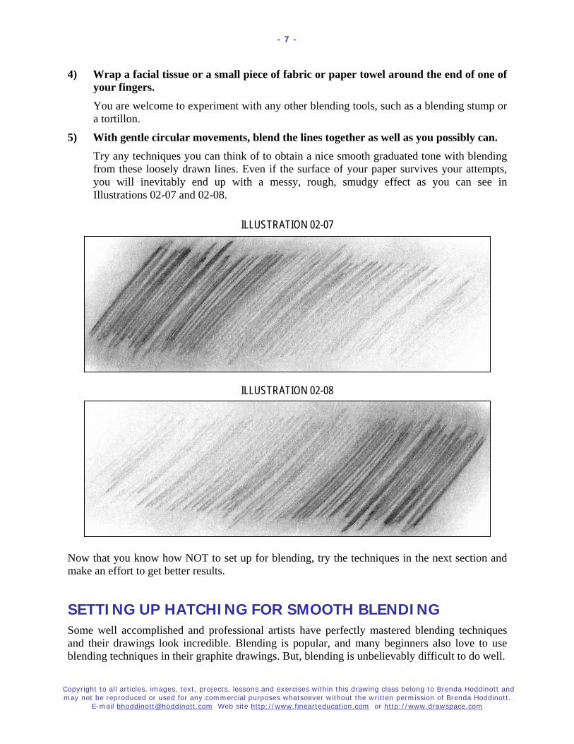
As you can clearly see, poorly rendered shading lines cannot be magically transformed into beautiful smooth blending; no matter what tools you use, or how much time you spend trying to make it work.
ILLUSTRATION 02-04

Copyright to all articles, images, text, projects, lessons and exercises within this drawing class belong to Brenda Hoddinott and may not be reproduced or used for any commercial purposes whatsoever without the written permission of Brenda Hoddinott.
E-mail [email protected] Web site http://www.finearteducation.com or http://www.drawspace.com
- 6 -
3) Draw a loosely rendered graduation of values from light to dark or from dark to light. In Illustration 02-05, a set of hatching lines is graduated from dark to light. In Illustration 02-06, you find a graduation from light to dark.
ILLUSTRATION 02-05
ILLUSTRATION 02-06
When blending NEVER use your fingers! As a matter of fact, try not to ever touch your drawing paper with your fingers or hands in sections you plan to blend. The powder component in graphite works almost exactly like the fingerprinting powder used by criminal investigative sections of police departments. Your skin can transfer oil to the paper. This oil becomes visible after blending, especially in the lighter values. Then, it becomes darn near impossible to create a smooth, even tone with graphite in those areas with finger or hand prints.
Copyright to all articles, images, text, projects, lessons and exercises within this drawing class belong to Brenda Hoddinott and may not be reproduced or used for any commercial purposes whatsoever without the written permission of Brenda Hoddinott.
E-mail [email protected] Web site http://www.finearteducation.com or http://www.drawspace.com
- 7 -
4) Wrap a facial tissue or a small piece of fabric or paper towel around the end of one of your fingers. You are welcome to experiment with any other blending tools, such as a blending stump or a tortillon.
5) With gentle circular movements, blend the lines together as well as you possibly can. Try any techniques you can think of to obtain a nice smooth graduated tone with blending from these loosely drawn lines. Even if the surface of your paper survives your attempts, you will inevitably end up with a messy, rough, smudgy effect as you can see in Illustrations 02-07 and 02-08.
ILLUSTRATION 02-07
ILLUSTRATION 02-08
Now that you know how NOT to set up for blending, try the techniques in the next section and make an effort to get better results.
SETTING UP HATCHING FOR SMOOTH BLENDING Some well accomplished and professional artists have perfectly mastered blending techniques and their drawings look incredible. Blending is popular, and many beginners also love to use blending techniques in their graphite drawings. But, blending is unbelievably difficult to do well.

Copyright to all articles, images, text, projects, lessons and exercises within this drawing class belong to Brenda Hoddinott and may not be reproduced or used for any commercial purposes whatsoever without the written permission of Brenda Hoddinott.
E-mail [email protected] Web site http://www.finearteducation.com or http://www.drawspace.com
- 8 -
Don’t allow any instructor or teacher to convince you that their way of blending is the best. Experiment with as many different techniques and tools as you possibly can. If you like certain ways of blending, use them, but keep your mind open and never hesitate to try new techniques and/or tools. You are a unique individual with distinctive artistic needs. In order to continue developing your own vision and style, you must stay true to yourself!
I very rarely use blending in my own drawings because I love seeing shading lines and the textures they create. But, you have to decide for yourself what you like or don’t like! In this lesson, I show you what blending techniques work well for me.
6) Render a graduation with hatching lines that are close together. Your values should graduate very gently from light to dark or from dark to light.
Shading lines need to be close together and tightly rendered with a very smooth and gentle gradation from dark to light (or light to dark). This will ensure a smooth blending of the pencil marks into a graduation. A piece of scrap of paper, placed under your drawing hand as you draw, will protect your drawing from the oils of your skin.
ILLUSTRATION 02-09
ILLUSTRATION 02-10

Copyright to all articles, images, text, projects, lessons and exercises within this drawing class belong to Brenda Hoddinott and may not be reproduced or used for any commercial purposes whatsoever without the written permission of Brenda Hoddinott.
E-mail [email protected] Web site http://www.finearteducation.com or http://www.drawspace.com
- 9 -
7) With any blending tool you prefer, gently blend your hatching graduation from the lighter section toward the darker section. Continue blending until your graduation is as smooth as you like, but be careful not to rub the surface of your paper off! Illustrations 02-12 and 02-13 show detailed, close-up views of blended hatching, from light to dark and dark to light.
ILLUSTRATION 02-11
ILLUSTRATION 02-12
ILLUSTRATION 02-13
SETTING UP CROSSHATCHING FOR SMOOTH BLENDING I love to shade my drawings with meticulously rendered crosshatching lines. Small, delicate strokes on smooth paper, creates a softly rendered graduation of values without blending. However, there is absolutely nothing wrong with using blending for any drawing, if an even smoother texture is the look you wish to achieve.

Copyright to all articles, images, text, projects, lessons and exercises within this drawing class belong to Brenda Hoddinott and may not be reproduced or used for any commercial purposes whatsoever without the written permission of Brenda Hoddinott.
E-mail [email protected] Web site http://www.finearteducation.com or http://www.drawspace.com
- 10 -
8) Render a graduation (from light to dark or from dark to light) with crosshatching lines that are close together.
ILLUSTRATION 02-14
9) Blend your crosshatching graduation from light to dark. Keep a piece of scrap paper under your hand to prevent accidentally smudging or transferring oils from your hands onto your drawing surface. Illustration 02-16 shows a close-up view of blended crosshatching.
ILLUSTRATION 02-15
ILLUSTRATION 02-16
Even though I recommend some specific blending tools, please don’t limit yourself to my suggestions! Experiment with some creative ideas of your own! Just make sure whatever you choose is clean and that colored items (such as fabrics) don’t leave their dyes on your drawing!

Copyright to all articles, images, text, projects, lessons and exercises within this drawing class belong to Brenda Hoddinott and may not be reproduced or used for any commercial purposes whatsoever without the written permission of Brenda Hoddinott.
E-mail [email protected] Web site http://www.finearteducation.com or http://www.drawspace.com
- 11 -
BRENDA HODDINOTT - BIOGRAPHY As a self-educated teacher, visual artist, portraitist, forensic artist, and illustrator, Brenda Hoddinott utilizes diverse art media including graphite, technical pen, colored pencil, chalk pastel, charcoal, conté crayon, and oil paints.
My philosophy on teaching art is to focus primarily on the enjoyment aspects while gently introducing
the technical and academic. Hence, in creating a passion for the subject matter, the quest for
knowledge also becomes enjoyable. >Brenda Hoddinott<
Born in St. John’s, Newfoundland, Brenda grew up in the small town of Corner Brook. She developed strong technical competencies with a personal commitment to self directed learning, and the aid of assorted “Learn to Draw” books. During Brenda’s twenty-five year career as a self-educated civilian forensic artist, numerous criminal investigation departments have employed Brenda’s skills, including Royal Canadian Mounted Police and municipal police departments. In 1992, Brenda was honored with a commendation from the Royal Canadian Mounted Police, and in 1994, she was awarded a Certificate of Membership from “Forensic Artists International”.
Her home-based art career included graphic design, and teaching recreational drawing and painting classes. As supervisor of her community’s recreational art department, Brenda hired and trained teachers, and designed curriculum for several children’s art programs. In 1998, Brenda chose to end her eighteen-year career as an art educator in order to devote more time to writing, drawing, painting, and developing her websites.
Drawspace http://www.drawspace.com incorporates her unique style and innovative approach to curriculum development. This site offers downloadable and printable drawing classes for students of all abilities from the age of eight through adult. Students of all ages, levels and abilities have praised the simple step-by-step instructional approach. This site is respected as a resource for fine art educators, home schooling programs, and educational facilities throughout the world.
LEARN-TO-DRAW BOOKS BY BRENDA HODDINOTT Drawing for Dummies (2003): Wiley Publishing, Inc., New, York, NY, this 336 page book
is available on various websites and in major bookstores internationally.
The Complete Idiot’s Guide to Drawing People (2004): Winner of the Alpha-Penguin Book of the Year Award 2004, Alpha - Pearson Education – Macmillan, Indianapolis, IN, this 360 page book is available on various websites and in major bookstores internationally.

SSSEEECCCRRREEETTT Brenda Hoddinott
J-03 INTERMEDIATE: SKILLS & SECRETS Many popular still life subjects are
symmetrical. Knowing how to employ a short cut for rendering symmetry, not only saves time, but can also make your drawing
subjects look more accurate.
Back in the day of the dinosaur, a commercial art teacher showed me this method of drawing symmetrical objects. It has proven invaluable for numerous aspects of my lengthy art career including graphic design, forensic art, jewelry design, and the rendering of portraits and still life.
In this project, your goal is to draw a symmetrical still life object. You can either follow the instructions to render the vase in this lesson, or you can select an object from your home, office, etc., and draw from life. If you plan to draw from life, choose a simple subject. Take a tour of your home and see what catches your eye; for example, vases, flowerpots, and wine glasses make gorgeous drawings.
Suggested drawing supplies include paper, pencils, erasers, a pencil sharpener, a ruler, and a sheet of tracing paper.
This project is recommended for artists from age 12 to adult, as well as home schooling, academic and recreational fine art educators.
7 PAGES – 15 ILLUSTRATIONS Published by Hoddinott Fine Art Publishers, Halifax, NS, Canada – Revised 2006

Copyright to all articles, images, text, projects, lessons and exercises within this drawing class belong to Brenda Hoddinott and may not be reproduced or used for any commercial purposes whatsoever without the written permission of Brenda Hoddinott.
E-mail [email protected] Web sites http://www.finearteducation.com and http://www.drawspace.com
- 2 -
In this exercise your goal is to draw a symmetrical still life object. Symmetry is a balanced arrangement of lines and shapes, on opposite sides of an often-imaginary centerline. Many popular still life subjects are symmetrical, and knowing a short cut for rendering symmetry not only saves time, but also makes your drawing subjects more realistic.
ILLUSTRATION 03-01 ILLUSTRATION 03-02 Examine the two wooden objects in illustration 03-01. Imagine a vertical line down the center of each object dividing it in half (illustration 03-02). On each side of this line is a mirror image of the other side of the object; hence, the sides are symmetrical.
You can either: follow the instructions and render the vase shown in Illustration 03-03; or, you can select an object from your home, office, etc. and draw it from life.
ILLUSTRATION 03-03
ILLUSTRATION 03-04
1) Lightly sketch an outline of the vase. Observe the lengths of the lines, the directions in which they curve, and the shapes of the spaces in between the lines.
If you plan to draw from life, choose a simple subject. Take a tour of your home and see what catches your eye. For example, vases, flowerpots, and wine glasses make gorgeous drawings.
Place your object on a flat surface, and follow along with the text instructions, while using the illustrations as visual references.

Copyright to all articles, images, text, projects, lessons and exercises within this drawing class belong to Brenda Hoddinott and may not be reproduced or used for any commercial purposes whatsoever without the written permission of Brenda Hoddinott.
E-mail [email protected] Web sites http://www.finearteducation.com and http://www.drawspace.com
- 3 -
ILLUSTRATION 03-05
2) Use a ruler to measure two different horizontal distances on the vase. I chose the neck of the vase and the widest part of the large circular section.
3) Mark the centers of these distances with dots, to identify the approximate placement of the vertical center (the line of symmetry) of the vase.
4) Use a ruler to draw a line of symmetry through the dots. The goal is to end up with a vertical line down the middle of the vase. You may even need to rotate your drawing slightly so the line of symmetry is vertical rather than at an angle.
ILLUSTRATION 03-06
5) Figure out which side of your sketch looks the most like the shape of the vase. The right side of my sketch looks more believable, and closer to the shape of the vase.
6) Lighten all the rough sketch lines on the good side, with your kneaded eraser.
7) Take your time, and refine the good side of your drawing with a freshly sharpened pencil. As you draw, constantly refer to the vase or object.
8) Use your vinyl eraser to completely erase the less desirable side of the vase.

Copyright to all articles, images, text, projects, lessons and exercises within this drawing class belong to Brenda Hoddinott and may not be reproduced or used for any commercial purposes whatsoever without the written permission of Brenda Hoddinott.
E-mail [email protected] Web sites http://www.finearteducation.com and http://www.drawspace.com
- 4 -
ILLUSTRATION 03-07 9) Use a ruler to draw a horizontal line
across the vase, perpendicular to the vertical line.
10) Tape tracing paper over the completed half of your drawing. Refer to Illustration 03-08. Don’t put tape on the sections of the paper to be occupied by the drawing of the vase; the tape may damage the surface when you pull it off.
ILLUSTRATION 03-08
11) Use a sharp pencil (2B or 4B) and a ruler to accurately trace the intersecting vertical and horizontal lines.
12) Sharpen the pencil again, and trace all the curved lines of the vase as precisely as possible. When you’re done, you have this half of the vase drawn on the tracing paper.

Copyright to all articles, images, text, projects, lessons and exercises within this drawing class belong to Brenda Hoddinott and may not be reproduced or used for any commercial purposes whatsoever without the written permission of Brenda Hoddinott.
E-mail [email protected] Web sites http://www.finearteducation.com and http://www.drawspace.com
- 5 -
13) Carefully remove the tracing paper.
14) Flip the tracing paper over to the reverse side. The graphite should now be on the down side of the tracing paper.
15) Position the tracing paper on the missing half of the vase. Make sure the vertical and horizontal lines overlap one another.
ILLUSTRATION 03-09
16) Tape the tracing paper in place.
17) Use a pencil (or a ball point pen) to go over each line of the half of the vase on the tracing paper. The graphite, of the drawing on the reverse side of your tracing paper, serves as a carbon for transferring the image onto your drawing paper.
ILLUSTRATION 03-10
18) Carefully remove the tracing paper and erase the horizontal and vertical lines. You now have a faint mirror image of half of the vase.
19) Outline the lines a little darker to match the first side you drew. Refer to the completed outline on the next page.

Copyright to all articles, images, text, projects, lessons and exercises within this drawing class belong to Brenda Hoddinott and may not be reproduced or used for any commercial purposes whatsoever without the written permission of Brenda Hoddinott.
E-mail [email protected] Web sites http://www.finearteducation.com and http://www.drawspace.com
- 6 -
ILLUSTRATION 03-11 An outline drawing of a vase is now awaiting a light source so it can be shaded!
20) Arrange your lighting however you wish, and add shading to your symmetrical outline. How you set up your lighting, influences every aspect of shading and ultimately whether or not your drawing subject looks three-dimensional.
For example, examine the two photos and drawings below.
ILLUSTRATION 03-12 ILLUSTRATION 03-13
A light source from the upper right (Illustrations 03-12 and 03-14) results in a three-dimensional drawing. Illustrations 03-13 and 03-15 demonstrate back lighting, which tends to flatten subjects as much as using a flash to take a photo.
ILLUSTRATION 03-14 ILLUSTRATION 03-15

Copyright to all articles, images, text, projects, lessons and exercises within this drawing class belong to Brenda Hoddinott and may not be reproduced or used for any commercial purposes whatsoever without the written permission of Brenda Hoddinott.
E-mail [email protected] Web sites http://www.finearteducation.com and http://www.drawspace.com
- 7 -
BRENDA HODDINOTT - BIOGRAPHY As a self-educated teacher, visual artist, portraitist, forensic artist, and illustrator, Brenda Hoddinott utilizes diverse art media including graphite, technical pen, colored pencil, chalk pastel, charcoal, conté crayon, and oil paints.
My philosophy on teaching art is to focus primarily on the enjoyment aspects while gently introducing the technical and academic. Hence, in creating a passion for the subject matter,
the quest for knowledge also becomes enjoyable. >Brenda Hoddinott<
Born in St. John’s, Newfoundland, Brenda grew up in the small town of Corner Brook. She developed strong technical competencies with a personal commitment to self directed learning, and the aid of assorted “Learn to Draw” books. During Brenda’s twenty-five year career as a self-educated civilian forensic artist, numerous criminal investigation departments have employed Brenda’s skills, including Royal Canadian Mounted Police and municipal police departments. In 1992, Brenda was honored with a commendation from the Royal Canadian Mounted Police, and in 1994, she was awarded a Certificate of Membership from “Forensic Artists International”.
Her home-based art career included graphic design, and teaching recreational drawing and painting classes. As supervisor of her community’s recreational art department, Brenda hired and trained teachers, and designed curriculum for several children’s art programs. In 1998, Brenda chose to end her eighteen-year career as an art educator in order to devote more time to writing, drawing, painting, and developing her websites.
Drawspace http://www.drawspace.com incorporates her unique style and innovative approach to curriculum development. This site offers downloadable and printable drawing classes for students of all abilities from the age of eight through adult. Students of all ages, levels and abilities have praised the simple step-by-step instructional approach. This site is respected as a resource for fine art educators, home schooling programs, and educational facilities throughout the world.
LEARN-TO-DRAW BOOKS BY BRENDA HODDINOTT Drawing for Dummies (2003): Wiley Publishing, Inc., New, York, NY, this 336 page book
is available on various websites and in major bookstores internationally.
The Complete Idiot’s Guide to Drawing People (2004): Winner of the Alpha-Penguin Book of the Year Award 2004, Alpha - Pearson Education – Macmillan, Indianapolis, IN, this 360 page book is available on various websites and in major bookstores internationally.

AN IMAGE By Cindy Wider Art educator, art curricula designer, award-winning gallery-represented artist, and author of Paint in Your Pyjamas
J-04 INTERMEDIATE: SKILLS & SECRETS A telltale sign of a professional artist is the ability to render a neat, clean artwork. Yet, quite often in early stages of the creative process, a potential masterpiece becomes irreparably smudged, soiled, or damaged. This wonderful simple technique shows you how experienced artists transfer the primary components of a drawing (or other image) to a fresh clean sheet of paper.
As an aside, this technique is unknown to many students of art, but is certainly not new; in fact, it can be traced (pun intended) back to the great masters of the Renaissance.
This exercise is divided into two sections:
SETTING UP FOR A TRANSFER: All you need is an image to use for testing this technique, a good quality sheet of drawing paper, masking tape, and an HB, 2B, or 4B graphite pencil.
TRANSFERRING YOUR IMAGE: In this section, you transfer the important parts of your image to a new sheet of paper.
6 PAGES – 3 ILLUSTRATIONS
This lesson is recommended for artists of all ages and skill levels, as well as students of home schooling, academic and recreational fine art educators.
Published by Hoddinott Publishing for Drawspace.com, Halifax, NS, Canada - 2008
Copyright to all intellectual property, articles, images, text, projects, lessons and exercises within this document belong to Cindy Wider and may not be reproduced or used for any commercial purposes whatsoever without the written permission of Cindy Wider. Copyright to this lesson in its current format belongs to Hoddinott Publishing, and may not be reproduced or used for any commercial purposes
whatsoever without the written permission of Cindy Wider (E-mail [email protected]) and Brenda Hoddinott (E-mail [email protected]) Web site http://www.drawspace.com
- 2 -
AS AN ASIDE The word Renaissance, derived from the French word rebirth, refers to the diverse changes that occurred within European culture from the early twelfth century to the late sixteenth century. Between 1480 and 1527, during the period known as the High Renaissance, many of history’s most renowned artists created some of the greatest masterpieces our world has ever known. During this short period in history, visual art developed more than at any other time since the beginning of mankind. Today, this rebirth, also referred to as new birth, continues its growth with a resurgence of the learning and teaching of traditional drawing techniques in home schooling, recreational, and academic learning environments.
ARTSPEAK Technique refers to a well-defined procedure, such as a particular way of rendering shading, used to accomplish a specific task. Quite often, more than one technique is suitable for successfully completing a task; hence, the artist’s selection of a technique is generally based on individual preferences and personal style. Proportion is the relationship in size of one component of a drawing to another or others. Perspective is a visual illusion in a drawing in which objects appear to become smaller, and recede into distant space, the farther away they are from the viewer. Shading (noun) refers to the various values within a drawing that make images appear three-dimensional; (verb) the process of adding values to a drawing so as to create the illusion of texture, form and/or three-dimensional space. Rough sketch is a quickly rendered drawing that illustrates the important elements of a subject with very few details. Graphite is a soft black form of opaque carbon found in nature, often mixed with clay in the manufacture of graphite pencils. Medium refers to a drawing tool, such as a graphite pencil, used to make marks on a drawing surface. Texture refers to the surface detail of an object. The properties of a texture can be identified with vision, a sense of touch, and a general knowledge of the subject.
SETTING UP FOR A TRANSFER Many students of art are in awe of a professional artist’s ability to turn out neat clean drawings. However, in addition to many years of experience, professional artists also know a few artistic secrets. The technique taught in this lesson is unknown to many students of art, but is certainly not new; in fact, this technique can be traced (pun intended) back to the great masters of the Renaissance.
Most artists use rough sketch lines, marks, and measuring devices during the process of decision-making in the early stages of creating an artwork. Many artists even prefer working out potential problems such as proportion and perspective on inexpensive paper before beginning a masterpiece. In addition, drawings can be easily smudged, soiled, or damaged. Erasing all these markings can be very difficult (and sometimes impossible).
The good news is that you can easily transfer your initial rough sketch (or damaged drawing) onto another surface. Transferring a drawing to a fresh clean sheet of paper allows you to restart with all the important aspects, such as proportion already in place. You are then all ready for the fun parts such as shading and final details.

Copyright to all intellectual property, articles, images, text, projects, lessons and exercises within this document belong to Cindy Wider and may not be reproduced or used for any commercial purposes whatsoever without the written permission of Cindy Wider. Copyright to this lesson in its current format belongs to Hoddinott Publishing, and may not be reproduced or used for any commercial purposes
whatsoever without the written permission of Cindy Wider (E-mail [email protected]) and Brenda Hoddinott (E-mail [email protected]) Web site http://www.drawspace.com
- 3 -
TTIIPP!! Do not use
graphite transfer paper! It does
not erase easily and also stands
out as quite a different texture than that created
by graphite pencils.
Time to take this technique for a test drive! You need:
An image to use for testing this technique. Maybe you already have a rough sketch with the potential to become a great drawing. If not, print an image that you like from your computer files. This technique works best when the image to be transferred is on thin paper.
An HB, 2B, or 4B graphite pencil.
A sheet of good quality drawing paper.
Masking tape
TRANSFERRING YOUR IMAGE In this section you transfer the important parts of your image to a new sheet of paper.
1) Use the side of an HB, 2B, or 4B pencil to rub the back of your image. You can rub the entire backside of the image (by holding your pencil almost flat to your paper) or only the sections you want to transfer. Refer to Figure 401.
If you can see your drawing clearly enough through the page when you flip it over, you can rub the picture at your desk. However, if you can’t see the image and do not wish to shade the entire back of the page, simply take your drawing over to a window, place it picture side out, and press it against the glass (so the sun allows your image to show through). If you want, you can tape the corners of the paper to the glass.
Figure
401: View of the
backside of a sheet of drawing
paper. A graphite pencil is used to rub the
important parts of a
drawing of a teapot.

Copyright to all intellectual property, articles, images, text, projects, lessons and exercises within this document belong to Cindy Wider and may not be reproduced or used for any commercial purposes whatsoever without the written permission of Cindy Wider. Copyright to this lesson in its current format belongs to Hoddinott Publishing, and may not be reproduced or used for any commercial purposes
whatsoever without the written permission of Cindy Wider (E-mail [email protected]) and Brenda Hoddinott (E-mail [email protected]) Web site http://www.drawspace.com
- 4 -
TTIIPP!! 2B and 4B pencils tend to make very dark transferred lines. If you are transferring an
intricate image, an HB may work better.
TTIIPP!! Occasionally, you might see some indentation marks as a result of transferring your image. These show up as tiny white lines once you begin to shade the area. You can correct these sections by gently filling in the white area with the very tip of your HB or 2B pencil. Press super softly and stroke the area with gentle feather-like strokes. Indentation marks pose more of a problem in the dark shadow areas. As you become more confident with your drawing skills, you can choose to draw the shadow shapes directly onto the newly transferred image (you will still have to draw super-soft to avoid indentation marks.)
2) Flip your drawing back over so it’s right side up.
3) Place it onto a fresh new sheet of drawing paper with the rubbed surface facing down.
4) Attach the image to the new paper with a small piece of masking tape on either end of the top of the page.
5) Press firmly (but not so hard that you indent your page) with an HB pencil or pen, and follow around the lines of your image that you want to transfer onto new paper. Refer to Figure 402. Remember; be very careful not to indent your page! Test a small area first and check to see that it is working. The lines should be barely visible, just dark enough to see.) This process will transfer the image onto your new page ready for shading.
Figure 402:
The image being
transferred is on top of the new sheet of
paper. A pencil is used to go
over all important lines.

Copyright to all intellectual property, articles, images, text, projects, lessons and exercises within this document belong to Cindy Wider and may not be reproduced or used for any commercial purposes whatsoever without the written permission of Cindy Wider. Copyright to this lesson in its current format belongs to Hoddinott Publishing, and may not be reproduced or used for any commercial purposes
whatsoever without the written permission of Cindy Wider (E-mail [email protected]) and Brenda Hoddinott (E-mail [email protected]) Web site http://www.drawspace.com
- 5 -
TTIIPP!! If your image has come through darker than you wish, you can erase it back to barely visible. Use a kneaded eraser to gently pat the entire surface until the lines become very faint.
6) Gently lift up and remove your image to expose the transferred drawing underneath. Refer to Figure 403. Your drawing is transferred. The image may not be as dark as in my illustration; I used a 4B pencil so that the transferred image would be dark enough for you to see clearly.
You are now ready to gently sketch your shadow and highlight shapes before you begin the shading process.
Figure 403: Your transferred lines should be very faint, much lighter than in this illustration. I have used a dark pencil so you can see the demonstration more clearly.

Copyright to all intellectual property, articles, images, text, projects, lessons and exercises within this document belong to Cindy Wider and may not be reproduced or used for any commercial purposes whatsoever without the written permission of Cindy Wider. Copyright to this lesson in its current format belongs to Hoddinott Publishing, and may not be reproduced or used for any commercial purposes
whatsoever without the written permission of Cindy Wider (E-mail [email protected]) and Brenda Hoddinott (E-mail [email protected]) Web site http://www.drawspace.com
- 6 -
Drawspace.com is proud to introduce
Cindy Wider Art educator, art curricula designer, award-winning gallery-represented artist, and author of Paint in Your Pyjamas
Cindy Wider currently resides in Noosa on the Sunshine Coast of Queensland, Australia with her husband Stuart, and daughters Isha and Sumaya.
Art philosophy I believe that almost everyone has the natural gifts needed for learning to draw and paint, and that art has the ability to heal and help us to reach our full human potential. Art is the missing language that can bridge the gap in communication when words are not enough. It is my life purpose to share my love of art, through inspiring and motivating others to realize their natural gifts for drawing and painting.
My passion for helping others to learn to draw and paint comes from the joy and excitement I experience through the process of creating art and my desire to share that feeling! I stumbled upon my natural gifts for art at the age of 23years and wished I had known about it sooner.
Professional accomplishments After ten years of serious art study Cindy went on to become one of her community’s leading artists with her artworks gracing the walls of many of the major hotels, corporate boardrooms and private homes as well as selling overseas. She began tutoring at the local Technical and Further Education College in 1988 and then went on to establish the largest on-going private art tuition school in Port Lincoln, then several years later in Noosa Queensland.
For many years Cindy worked as a part time freelance illustrator for the internationally renowned rubber stamp company, ‘Annaleey crafts.’ In 2005, along with her husband Stuart she was commissioned by the Microsoft Corporation to produce an original artwork for their Sydney headquarters, and limited edition prints for the annual corporate gift to their business associates.
You can view Cindy’s paintings at: http://www.thecoopergallery.com.au/wider/wider.htm
Paint in Your Pyjamas Have you been asking yourself, "Who am I and what do I really want out of life?” Perhaps you've been selflessly dedicating all your energy to your children or partner to help them fulfill their dreams and goals. Maybe you're working hard just to earn a living.
But now you feel the time has come to do something for yourself. If so, this book is just for you...
You can buy Cindy’s book, ‘Paint in Your Pyjamas – every Woman’s guide to finding your life purpose through art’ at:
http://www.paintinyourpyjamas.com/

FOCUS ON
Brenda Hoddinott
J05 INTERMEDIATE: SKILLS & SECRETS When looking at a drawing by an accomplished artist, have you ever noticed that one specific item catches your eye more than others? This is not an accident!
Accomplished artists know a few secrets to bring attention toward what they consider the most important part of their chosen subject.
A telltale sign of a drawing by an amateur artist is a hodgepodge of subjects (or sections of a subject) without one dominant center of interest. In this article, I discuss various ways of implementing a strong focal point(s) into your drawings to create more interesting and professional works of art.
This article is divided into the following three sections:
CHECKING OUT FOCAL POINTS: Focal points are an integral aspect of creating a strong composition in an artwork. Every drawing needs at least one.
CHOOSING A FOCAL POINT: Your drawings illustrate your choice of subjects from your own unique perspective. Your preference of a focal point is personal to you.
EMPHASIZING THE FOCAL POINT: Once you decide on a primary focal point, you need to find ways to make it stand out. In this section I discuss and demonstrate four popular methods for accentuating a focal point.
7 PAGES – 9 ILLUSTRATIONS This article is recommended for artists of all levels, as well as students of home schooling,
academic and recreational fine art educators.
Published by Hoddinott Publishing for Drawspace.com, Halifax, NS, Canada – 2008

Copyright to all articles, images, text, projects, lessons and exercises within this drawing class belong to Brenda Hoddinott and may not be reproduced or used for any commercial purposes whatsoever without the written permission of Brenda Hoddinott. E-mail [email protected] Web sites http://www.finearteducation.com and http://www.drawspace.com
- 2 -
Composition refers to the arrangement of the various facets of a drawing subject within the borders of a drawing space. A strong composition brings the eyes of the viewer into what the artist considers the most important elements, known as focal points. Focal Point is a term used to identify the most important elements in a drawing.
Primary focal point is the most important center of interest (or focus) in a drawing. For example, in a drawing of an animal, it may be the eyes, the entire face, or a whole section of the body that is especially fascinating. Secondary focal point(s) is a center of interest in a drawing composition that is significant but not as important as the primary focal point.
CHECKING OUT FOCAL POINTS Focal points are an integral aspect of creating a strong composition in an artwork. Every drawing needs at least one.
In a portrait it may be the eyes, and in a landscape it may be one specific tree or object. Sometimes, it can simply be one area within a scene that is especially fascinating. A drawing can even have more than one center of interest, known as a secondary focal point(s).
Figure 501 demonstrates a fun composition with a primary focal point and three secondary ones. In this cartoon, the very happy primary focal point takes center stage, while the disgruntled secondary focal points look on. Needless to say, very few compositions have focal points as blatantly obvious as these four cartoon heads.
In Figure 502, a rugged landscape with a river becomes more inviting with the addition of a chair as the focal point. The chair invites the viewer into the drawing.
In the drawing of the violin player (Figure 503), the face is the primary focal point, and his hands and violin are secondary focal points. The violin player, Chris Church, is a long time friend who currently plays and records all over the world.
FIGURE 501
FIGURE 502

Copyright to all articles, images, text, projects, lessons and exercises within this drawing class belong to Brenda Hoddinott and may not be reproduced or used for any commercial purposes whatsoever without the written permission of Brenda Hoddinott. E-mail [email protected] Web sites http://www.finearteducation.com and http://www.drawspace.com
- 3 -
Drawing space (also called a drawing surface or a drawing format) is the area in which you render a drawing within a specific perimeter. It can be the shape of the paper you choose, or outlined by any shape you draw, such as a square, rectangle, or circle.
Always place your focal point off center. A focal point placed in the very center of a drawing space is a big “NO”, unless you have a specific expressive or artistic reason to do so. Any object that is placed dead center commands the viewer’s full attention. All other important elements of your drawing may be ignored, and the drawing loses its impact.
CHOOSING A FOCAL POINT Your drawings illustrate your choice of subjects from your own unique perspective. Your preference of a focal point is personal to you. Think about what you want your drawing to say? Remember what attracted you this particular subject in the first place and select your focal point accordingly.
The drawing in Figure 504 is rendered from a photo taken in the quaint fishing village of Peggy’s Cove, Nova Scotia. The old, dilapidated lobster trap in the lower right immediately caught my eye. Hence, I chose it as my focal point.
To accentuate my focal point, I added more details and darker shading than all other objects in the scene.
FIGURE 503
FIGURE 504
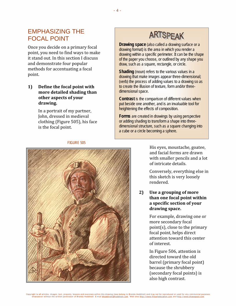
Copyright to all articles, images, text, projects, lessons and exercises within this drawing class belong to Brenda Hoddinott and may not be reproduced or used for any commercial purposes whatsoever without the written permission of Brenda Hoddinott. E-mail [email protected] Web sites http://www.finearteducation.com and http://www.drawspace.com
- 4 -
Drawing space (also called a drawing surface or a drawing format) is the area in which you render a drawing within a specific perimeter. It can be the shape of the paper you choose, or outlined by any shape you draw, such as a square, rectangle, or circle.
Shading (noun) refers to the various values in a drawing that make images appear three-dimensional; (verb) the process of adding values to a drawing so as to create the illusion of texture, form and/or three-dimensional space.
Contrast is the comparison of different values when put beside one another, and is an invaluable tool for heightening the effects of composition.
Forms are created in drawings by using perspective or adding shading to transform a shape into three-dimensional structure, such as a square changing into a cube or a circle becoming a sphere.
EMPHASIZING THE FOCAL POINT Once you decide on a primary focal point, you need to find ways to make it stand out. In this section I discuss and demonstrate four popular methods for accentuating a focal point.
1) Define the focal point with more detailed shading than other aspects of your drawing.
In a portrait of my partner, John, dressed in medieval clothing (Figure 505), his face is the focal point.
His eyes, moustache, goatee, and facial forms are drawn with smaller pencils and a lot of intricate details.
Conversely, everything else in this sketch is very loosely rendered.
2) Use a grouping of more than one focal point within a specific section of your drawing space.
For example, drawing one or more secondary focal point(s), close to the primary focal point, helps direct attention toward this center of interest.
In Figure 506, attention is directed toward the old barrel (primary focal point) because the shrubbery (secondary focal points) is also high contrast.
FIGURE 505

Copyright to all articles, images, text, projects, lessons and exercises within this drawing class belong to Brenda Hoddinott and may not be reproduced or used for any commercial purposes whatsoever without the written permission of Brenda Hoddinott. E-mail [email protected] Web sites http://www.finearteducation.com and http://www.drawspace.com
- 5 -
3) Strategically position your primary focal point within the boundaries of your drawing space so it commands attention.
An obvious method of making an object stand out is to draw it larger than anything else in your drawing space.
For instance, in a portrait, you can make the person’s head and face fill most of your drawing space.
In addition, a focal point becomes more powerful when you place it off center.
For example, the largest and most fascinating tree in a landscape is best positioned toward the right in your drawing space.
In Figure 507, the focal point is the highly detailed profile view of a young man.
His face and head are by far the largest section of the composition.
His head is side-on to the viewer, facing the left. Hence, the head is drawn closer to the right than the left.
4) Draw your focal point with a stronger contrast in values than other aspects of your drawing.
Refer to Figures 508 and 509.
FIGURE 506
FIGURE 507

Copyright to all articles, images, text, projects, lessons and exercises within this drawing class belong to Brenda Hoddinott and may not be reproduced or used for any commercial purposes whatsoever without the written permission of Brenda Hoddinott. E-mail [email protected] Web sites http://www.finearteducation.com and http://www.drawspace.com
- 6 -
What is the very first thing you notice when you look at the portrait of my grandson, Kaiden, in Figure 508?
The darkest shading is in the pupils of his eyes. Hence, when you look at this portrait, you are immediately drawn to his eyes.
Yes, his eyes are really that big!
What part of the drawing in Figure 509 do you look at first?
If you guessed the cat’s face, then I have done my job well.
Take note that the shading of the fur on the face and neck has more dark values than any other part of his body.
In addition, the dark shading of the eyes make them the most prominent feature on his face.
The next time you plan a drawing, choose a primary focal point before you put pencil to paper. Use one or more of the suggestions in this article to emphasize your center of interest.
FIGURE 508
FIGURE 509

Copyright to all articles, images, text, projects, lessons and exercises within this drawing class belong to Brenda Hoddinott and may not be reproduced or used for any commercial purposes whatsoever without the written permission of Brenda Hoddinott. E-mail [email protected] Web sites http://www.finearteducation.com and http://www.drawspace.com
- 7 -
BRENDA HODDINOTT - BIOGRAPHY As a self-educated teacher, visual artist, portraitist, forensic artist, and illustrator, Brenda Hoddinott utilizes diverse art media including graphite, technical pen, colored pencil, chalk pastel, charcoal, conté crayon, and oil paints.
My philosophy on teaching art is to focus primarily on the enjoyment aspects while gently introducing the technical and
academic. Hence, in creating a passion for the subject matter, the quest for knowledge also becomes enjoyable.
>Brenda Hoddinott<
Born in St. John’s, Newfoundland, Brenda grew up in the small town of Corner Brook. She developed strong technical competencies with a personal commitment to self directed learning, and the aid of assorted “Learn to Draw” books. During Brenda’s twenty-five year career as a self-educated civilian forensic artist, numerous criminal investigation departments have employed Brenda’s skills, including Royal Canadian Mounted Police and municipal police departments. In 1992, Brenda was honored with a commendation from the Royal Canadian Mounted Police, and in 1994, she was awarded a Certificate of Membership from “Forensic Artists International”.
Her home-based art career included graphic design, and teaching recreational drawing and painting classes. As supervisor of her community’s recreational art department, Brenda hired and trained teachers, and designed curriculum for several children’s art programs. In 1998, Brenda chose to end her eighteen-year career as an art educator in order to devote more time to writing, drawing, painting, and developing her websites.
Drawspace http://www.drawspace.com incorporates her unique style and innovative approach to curriculum development. This site offers downloadable and printable drawing classes for students of all abilities from the age of eight through adult. Students of all ages, levels and abilities have praised the simple step-by-step instructional approach. This site is respected as a resource for fine art educators, home schooling programs, and educational facilities throughout the world.
LEARN-TO-DRAW BOOKS BY BRENDA HODDINOTT Drawing for Dummies: Wiley Publishing, Inc., New, York, NY, this 336 page book is
available on various websites and in major bookstores internationally.
The Complete Idiot’s Guide to Drawing People: Winner of the Alpha-Penguin Book of the Year Award 2004, Alpha - Pearson Education – Macmillan, Indianapolis, IN, this 360 page book is available on various websites and in major bookstores internationally.
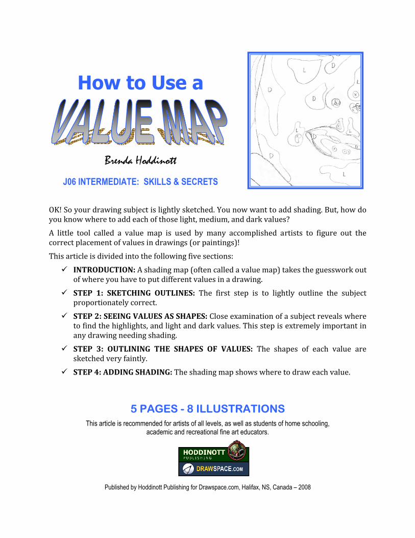
How to Use a
Brenda Hoddinott
J06 INTERMEDIATE: SKILLS & SECRETS OK! So your drawing subject is lightly sketched. You now want to add shading. But, how do you know where to add each of those light, medium, and dark values? A little tool called a value map is used by many accomplished artists to figure out the correct placement of values in drawings (or paintings)! This article is divided into the following five sections: INTRODUCTION: A shading map (often called a value map) takes the guesswork out of where you have to put different values in a drawing. STEP 1: SKETCHING OUTLINES: The first step is to lightly outline the subject proportionately correct. STEP 2: SEEING VALUES AS SHAPES: Close examination of a subject reveals where to find the highlights, and light and dark values. This step is extremely important in any drawing needing shading. STEP 3: OUTLINING THE SHAPES OF VALUES: The shapes of each value are sketched very faintly. STEP 4: ADDING SHADING: The shading map shows where to draw each value.
5 PAGES - 8 ILLUSTRATIONS This article is recommended for artists of all levels, as well as students of home schooling,
academic and recreational fine art educators.
Published by Hoddinott Publishing for Drawspace.com, Halifax, NS, Canada – 2008

Copyright to all articles, images, text, projects, lessons and exercises within this drawing class belong to Brenda Hoddinott and may not be reproduced or used for any commercial purposes whatsoever without the written permission of Brenda Hoddinott. E-mail [email protected] Web sites http://www.finearteducation.com and http://www.drawspace.com
- 2 -
INTRODUCTION A shading map (often called a value map) takes the guesswork out of where you have to put different values in a drawing. Different aspects of light and shadows assume various shapes. For example, a highlight can be a circle and a shadow can be a crescent shape. The illustrations used in this discussion are based on a photo of a section of a young lady’s face (Figure 301). An integral aspect of working with a value map is being able to find the shapes of the different values on your subject. If you have difficulty seeing different values, try squinting your eyes a little. Figure 302 (a digitally enhanced version of Figure 301) provides a little insight into what I see when I squint while looking at this photo. Curl up in a comfortable chair, relax, and follow along with me as I take you through the basic process of mapping values. The four‐step process includes: 1. Creating a detailed line drawing based on my photo. 2. Visually identifying the locations and shapes of the various values. 3. Lightly sketching their shapes on my line drawing and marking each with letters. 4. Add shading with crosshatching graduations. STEP 1: SKETCHING OUTLINES As in most drawings, the first step is to lightly outline the subject proportionately correct. The sketch in Figure 303 appears much darker than the actual sketch; in fact, my sketch is so faint that you can barely see the lines. Hence, I’ve darkened it in Photoshop so you can see the outlines of the various parts of her face.
FIGURE 303
FIGURE 302
FIGURE 301
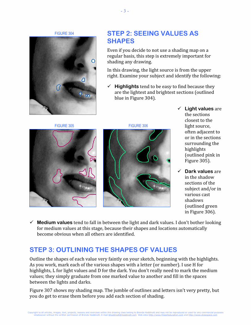
Copyright to all articles, images, text, projects, lessons and exercises within this drawing class belong to Brenda Hoddinott and may not be reproduced or used for any commercial purposes whatsoever without the written permission of Brenda Hoddinott. E-mail [email protected] Web sites http://www.finearteducation.com and http://www.drawspace.com
- 3 -
STEP 2: SEEING VALUES AS SHAPES Even if you decide to not use a shading map on a regular basis, this step is extremely important for shading any drawing. In this drawing, the light source is from the upper right. Examine your subject and identify the following:
Highlights tend to be easy to find because they are the lightest and brightest sections (outlined blue in Figure 304). Light values are the sections closest to the light source, often adjacent to or in the sections surrounding the highlights (outlined pink in Figure 305). Dark values are in the shadow sections of the subject and/or in various cast shadows (outlined green in Figure 306).
Medium values tend to fall in between the light and dark values. I don’t bother looking for medium values at this stage, because their shapes and locations automatically become obvious when all others are identified. STEP 3: OUTLINING THE SHAPES OF VALUES Outline the shapes of each value very faintly on your sketch, beginning with the highlights. As you work, mark each of the various shapes with a letter (or number). I use H for highlights, L for light values and D for the dark. You don’t really need to mark the medium values; they simply graduate from one marked value to another and fill in the spaces between the lights and darks. Figure 307 shows my shading map. The jumble of outlines and letters isn’t very pretty, but you do get to erase them before you add each section of shading.
FIGURE 304
FIGURE 305 FIGURE 306

Copyright to all articles, images, text, projects, lessons and exercises within this drawing class belong to Brenda Hoddinott and may not be reproduced or used for any commercial purposes whatsoever without the written permission of Brenda Hoddinott. E-mail [email protected] Web sites http://www.finearteducation.com and http://www.drawspace.com
- 4 -
Experiment with different approaches to shading, especially if mapping values doesn't appeal to you. Eventually you'll discover the perfect method for your unique needs.
Eventually, you may not feel a need to mark letters on your map. (I rarely do.) With practice, drawing graduations based on the various shapes becomes second nature. STEP 4: ADDING SHADING Follow the shading map to draw values. Before you begin, make sure you lighten your mapping lines and erase the letters. I prefer to work from light to dark. If you also enjoy this approach you need to do the following: 1. Use a 4H or 2H to add shading around
the highlights (H) with very light values. The center section of a highlight is left white. With your lightest pencil, add shading lines very lightly and far apart, around the edges of the highlight. 2. With various H pencils and an HB, add
light shading to the sections marked L. Follow the outlines of their shapes on your map. 3. Graduate the light values (L) toward the
darks (D) to fill in the medium values. HB and 2B pencils work well for graduating the middle values in between the lights and darks. 4. Use darker pencils to graduate the
middle values into the D sections.
5. Shade in the D sections with dark values. Dark values are best rendered with 2B to 6B pencils. For a step-by-step lesson on using a value map, refer to J06 Intermediate: Crosshatching with a Value Map (published December 2008).
FIGURE 308
FIGURE 307

Copyright to all articles, images, text, projects, lessons and exercises within this drawing class belong to Brenda Hoddinott and may not be reproduced or used for any commercial purposes whatsoever without the written permission of Brenda Hoddinott. E-mail [email protected] Web sites http://www.finearteducation.com and http://www.drawspace.com
- 5 -
BRENDA HODDINOTT - BIOGRAPHY As a self‐educated teacher, visual artist, portraitist, forensic artist, and illustrator, Brenda Hoddinott utilizes diverse art media including graphite, technical pen, colored pencil, chalk pastel, charcoal, conté crayon, and oil paints. My philosophy on teaching art is to focus primarily on the
enjoyment aspects while gently introducing the technical and academic. Hence, in creating a passion for the subject matter, the
quest for knowledge also becomes enjoyable. >Brenda Hoddinott< Born in St. John’s, Newfoundland, Brenda grew up in the small town of Corner Brook. She developed strong technical competencies with a personal commitment to self directed learning, and the aid of assorted “Learn to Draw” books. During Brenda’s twenty‐five year career as a self‐educated civilian forensic artist, numerous criminal investigation departments have employed Brenda’s skills, including Royal Canadian Mounted Police and municipal police departments. In 1992, Brenda was honored with a commendation from the Royal Canadian Mounted Police, and in 1994, she was awarded a Certificate of Membership from “Forensic Artists International”. Her home‐based art career included graphic design, and teaching recreational drawing and painting classes. As supervisor of her community’s recreational art department, Brenda hired and trained teachers, and designed curriculum for several children’s art programs. In 1998, Brenda chose to end her eighteen‐year career as an art educator in order to devote more time to writing, drawing, painting, and developing her websites. Drawspace http://www.drawspace.com incorporates her unique style and innovative approach to curriculum development. This site offers downloadable and printable drawing classes for students of all abilities from the age of eight through adult. Students of all ages, levels and abilities have praised the simple step‐by‐step instructional approach. This site is respected as a resource for fine art educators, home schooling programs, and educational facilities throughout the world. LEARN-TO-DRAW BOOKS BY BRENDA HODDINOTT
Drawing for Dummies: Wiley Publishing, Inc., New, York, NY, this 336 page book is available on various websites and in major bookstores internationally. The Complete Idiot’s Guide to Drawing People: Winner of the Alpha‐Penguin Book of the Year Award 2004, Alpha ‐ Pearson Education – Macmillan, Indianapolis, IN, this 360 page book is available on various websites and in major bookstores internationally.

THE PROCESS OF
WORKING WITH A
By Cindy Wider Art educator, art curricula designer, award-winning gallery-represented artist, and author of Paint in Your Pyjamas
J07 INTERMEDIATE: SKILLS & SECRETS This article discusses the process of using a grid to establish accurate proportions in a drawing. Working with a grid can be time consuming and tedious. However, having a proportionately correct outline of your drawing subject is well worth the effort! As a matter of fact, many of the greatest masters of the Renaissance used a grid method to help them create accurate drawings and paintings.
This article is divided into two sections:
THE GRID METHOD: A grid can be made up of any number of squares, depending on how large or small the picture is that you are copying from, just so long as the squares are all equal sized.
SETTING UP AND WORKING WITH A GRID: Artists tend to customize the process of setting up and working with grids to suit their individual preferences. In this section, I take you step-by-step through one method for setting up and drawing with a grid that involves drawing a grid the same size as your reference image.
5 PAGES – 7 ILLUSTRATIONS This article is recommended for artists of all skill levels, as well as students of home schooling,
academic and recreational fine art educators.
Published by Hoddinott Publishing for Drawspace.com, Halifax, NS, Canada – 2008

Copyright to all articles, images, text, projects, lessons and exercises within this document belong to Cindy Wider and may not be reproduced or used for any commercial purposes whatsoever without the written permission of Cindy Wider. E-mail [email protected] Web site http://www.drawspace.com
- 2 -
Rather than drawing a grid specific to the size of one image, you can make a reusable one that can be used over and over. Divide a full sheet of acetate into squares. By the way, the squares on a grid can be large or small; it doesn’t matter, just as long as they are all equal-sized.
Then, lay it over your reference image and tape it in place. The blue wren (Figure 702) fits nicely into 8 squares across by 8 squares down. Hence, the grid you draw on your drawing paper also needs to be 8 squares across by 8 squares down. Sometimes the measurements of a reference image might be longer in width than height (or vice versa). For example, a reference image of a crocodile might fit inside a grid that is 9 squares across by 3 squares down. Even though the acetate grid may have hundreds of squares, you only need to draw 9 squares across by 3 squares down on your drawing paper.
Figure 701
THE GRID METHOD Many of the great master artists used the grid method to help them create an accurate drawing or painting.
Instead of having the grid on a clear sheet and placing it over the drawing they were copying from, the masters often used an invention called a, ‘Dürer’s Device.’ This was a large, hollow frame with wires or strings running through the centre of it, forming many small squares. This device was placed vertically on the table in front of the artist and before the reclining nude or still-life display. The artist had a corresponding grid already drawn on his page and copied the image in front of him, square by square.
A grid can be made up of any number of squares, depending on how large or small the picture is that you are copying from, just so long as the squares are all equal sized.
You can draw the squares of a grid straight over the top of your picture, (not always ideal as you could ruin a good photograph or picture book by doing so).
Another method (on which this lesson is based) is to first draw the grid on a clear sheet of plastic or acetate which overlays your reference image (Figure 701).
SETTING UP AND WORKING WITH A GRID Artists tend to customize the process of setting up and working with grids to suit their individual preferences. In this section, I take you step-by-step through one method for setting up and drawing with a grid that involves drawing a grid the same size as your reference image. The following tip explains another method you may prefer.

Copyright to all articles, images, text, projects, lessons and exercises within this document belong to Cindy Wider and may not be reproduced or used for any commercial purposes whatsoever without the written permission of Cindy Wider. E-mail [email protected] Web site http://www.drawspace.com
- 3 -
Figure 704
Figure 703
Figure 702 As you become more familiar with how a grid works, you may find other methods that work better for you
Sit back and relax as I explain how one method of using a grid works. I use a simple little drawing of a wren as a reference image.
1) Measure the reference image (usually a drawing or photo) to determine the approximate size of the grid needed.
Refer to Figure 702. To keep things simple, assume that the overall size of the wren is 4 by 4 inches (including a little space around the wren on all sides).
2) Outline a 4 by 4 inch square on a sheet of clear acetate (or an A4 plastic sleeve).
3) Measure and divide this square into 64 one-half-inch squares, eight across by eight down (Figure 703).
4) Place your grid on top of the reference photo (Figure 704).
5) Move the grid around until every section of your reference image is inside the grid.
6) Tape the grid into place, so neither it nor the reference image can move.
7) Softly draw a corresponding number of squares onto your sheet of drawing paper using a HB pencil.
Refer to figure 705. Always make sure you have the same number of squares on both the picture you are copying from, and the page you are about to draw on.
In this case, you draw 8 squares across by 8 squares down on your drawing paper.
You can make your drawing bigger than the picture you are copying from by making the size of each individual square on your drawing page larger. Conversely, to end up with a smaller drawing, make the size of each individual square smaller.

Copyright to all articles, images, text, projects, lessons and exercises within this document belong to Cindy Wider and may not be reproduced or used for any commercial purposes whatsoever without the written permission of Cindy Wider. E-mail [email protected] Web site http://www.drawspace.com
- 4 -
Figure 706
Figure 705
Figure 707
For example, the reference image of the wren is 8 squares across by 8 squares down. If you draw each square on your drawing paper 1 inch instead of one-half inch, your drawing would be much larger than the reference image (but still only 8 squares across by 8 squares down). The overall size of each side of the drawing becomes eight inches instead of four inches.
It’s important to work out the height and width of the grid before you begin. Just experiment and see what sizes work best for you.
8) Draw the wren, one square at a time inside the grid.
Take it slowly, don’t rush. If you race quickly from square to square, drawing willy-nilly you may not achieve the result you are after.
By working in each square individually, it becomes much easier to copy an entire picture, because it provides a repeated horizontal and vertical line to continually compare with.
Look at the picture you are copying eighty percent of the time and only twenty percent of the time at your own drawing. That will give you plenty of time to use your natural comparison gifts.
As you work, ask yourself questions about the lines and shapes inside each square, such as:
What angle is this line compared to vertical or horizontal? When you find your answer, you don’t have to state the exact number of degrees, just copy the angle you see.
How far along the side of this square does my line begin? Is it before or after half way?
Where does the line or shape end?
9) When you have finished the drawing, gently erase the grid.
You are ready to add shading to your drawing, or you can simply file it away for future reference.

Copyright to all articles, images, text, projects, lessons and exercises within this document belong to Cindy Wider and may not be reproduced or used for any commercial purposes whatsoever without the written permission of Cindy Wider. E-mail [email protected] Web site http://www.drawspace.com
- 5 -
Drawspace.com is proud to introduce
Cindy Wider Art educator, art curricula designer, award-winning gallery-represented artist, and author of Paint in Your Pyjamas
Cindy Wider currently resides in Noosa on the Sunshine Coast of Queensland, Australia with her husband Stuart, and daughters Isha and Sumaya.
Art philosophy I believe that almost everyone has the natural gifts needed for learning to draw and paint, and that art has the ability to heal and help us to reach our full human potential. Art is the missing language that can bridge the gap in communication when words are not enough. It is my life purpose to share my love of art, through inspiring and motivating others to realize their natural gifts for drawing and painting.
My passion for helping others to learn to draw and paint comes from the joy and excitement I experience through the process of creating art and my desire to share that feeling! I stumbled upon my natural gifts for art at the age of 23years and wished I had known about it sooner.
Professional accomplishments After ten years of serious art study Cindy went on to become one of her community’s leading artists with her artworks gracing the walls of many of the major hotels, corporate boardrooms and private homes as well as selling overseas. She began tutoring at the local Technical and Further Education College in 1988 and then went on to establish the largest on-going private art tuition school in Port Lincoln, then several years later in Noosa Queensland.
For many years Cindy worked as a part time freelance illustrator for the internationally renowned rubber stamp company, ‘Annaleey crafts.’ In 2005, along with her husband Stuart she was commissioned by the Microsoft Corporation to produce an original artwork for their Sydney headquarters, and limited edition prints for the annual corporate gift to their business associates.
You can view Cindy’s paintings at: http://www.thecoopergallery.com.au/wider/wider.htm
Paint in Your Pyjamas Have you been asking yourself, "Who am I and what do I really want out of life?” Perhaps you've been selflessly dedicating all your energy to your children or partner to help them fulfill their dreams and goals. Maybe you're working hard just to earn a living.
But now you feel the time has come to do something for yourself. If so, this book is just for you...
You can buy Cindy’s book, ‘Paint in Your Pyjamas – every Woman’s guide to finding your life purpose through art’ at:
http://www.paintinyourpyjamas.com/

How to Draw with
Cindy Wider Author of: Draw and Paint in Your Pyjamas!
J08 INTERMEDIATE: SKILLS & SECRETS
Medium: Charcoal on grey Mi Teintes paper
In this lesson you will be taught four popular techniques for drawing with charcoal. Once you have completed this you might consider the lesson on ‘How To Draw Curly Hair’ or enroll into the unit four portrait unit where you will learn another 8 charcoal techniques among many other wonderful things.
This lesson is divided into the following five sections:
Introduction to charcoal
Willow charcoal and charcoal pencils
Charcoal papers
Fixing your image after completion
Prepare your paper for drawing with charcoal
1. Cover medium sized areas with willow charcoal
2. Draw fine lines with willow charcoal
3. Draw fine lines with charcoal pencil
4. Experiment with erasing techniques
This project is recommended for artists age 14 and up, as well as students of home schooling, academic, and recreational fine-art educators.
11 PAGES – 18 ILLUSTRATIONS
Published by Drawspace.com, Halifax, NS, Canada – August, 2010
2
Copyright to all articles images, text, projects, lessons and exercises within this course belong to StuartCindy Art and may not be reproduced or used for any commercial purposes whatsoever without the written permission of StuartCindy Art.
Email [email protected] Web site http://www.paintpj.com
ART MATERIALS LIST HB Charcoal Pencil (for fine lines)
White charcoal pencil
Several Willow charcoal sticks preferably 6mm and 9mm in diameter
Automatic or click eraser or normal plastic eraser and craft knife to cut into a thin slither or chisel shape
Putty Eraser (or kneaded eraser)
Ruler
Pencil Sharpener to sharpen the charcoal pencils (optional extra; you could consider buying a special charcoal or pastel pencil sharpener.)
Medium to coarse sandpaper 80 grit (to prepare your willow charcoal)
Special Paper: Canson Mi-Teintes Drawing Paper – light grey; suggest Flannel Gray (colour 122)
Soft, clean water colour brush (I recommend the 3/4" size) or a new and clean make-up brush for gently removing eraser particles
Can of fixative is optional to spray your charcoal drawing afterwards
Non-greasy baking paper to place under your hand while you work and protect the image from smudging. This is optional but recommended.
Glassine sheets (special paper purchased from an art supply store which prevent your work from smudging.) This is optional.
INTRODUCTION TO CHARCOAL Charcoal has been used in various forms by artists for centuries and is one of the oldest drawing materials.
The Charcoal that artists use these days is made from willow, a plant that grows in long rods up to seven feet high. Willow is grown in plantations and harvested every year in winter. The willow is cut into long lengths, bundled up and boiled in water. It is cleaned, dried in open air then sawn to the right length before being placed in metal boxes, filled with sand and lids placed on. The sticks are then fired at a very high temperature in a kiln for several hours before being left to cool. The entire process takes about three days. Finally the sticks are packaged and sent off to stores.
WILLOW CHARCOAL AND CHARCOAL PENCILS During this lesson we will be using charcoal that has been prepared by the manufacturer in two different ways; willow charcoal sticks and charcoal pencils. Charcoal pencils are quite difficult to erase. We will mostly be using these for fine details or after an initial under-drawing with the willow charcoal stick.

3
Copyright to all articles images, text, projects, lessons and exercises within this course belong to StuartCindy Art and may not be reproduced or used for any commercial purposes whatsoever without the written permission of StuartCindy Art.
Email [email protected] Web site http://www.paintpj.com
There are two sizes of willow charcoal that we will be using in this lesson; medium (9mm in diameter) and thin (6mm in diameter.) Providing you don’t press too hard, willow charcoal will wipe off your paper almost like chalk off a blackboard. Just a fine line will be left behind. Often called a ‘Ghost line,’ this remaining fine line that cannot be removed becomes an expressive part of your drawing.
You will be shown how to prepare your willow charcoal so that you can achieve either very fine lines or cover large areas.
Charcoal is a wonderful sensitive drawing medium; your results will be greatly influenced by how you hold the charcoal. Hold the charcoal softly in your hand for fine results and smile while you work to relax your shoulders and entire upper torso. To help prevent your charcoal from smudging you can place a small sheet of non-greasy baking paper under your hand but make sure you always peel back and lift it off – never drag it across the surface or it will smudge.
CHARCOAL PAPERS The type of paper you choose for charcoal drawing is a vitally important part of the process of drawing with charcoal. Charcoal cannot adhere to a glossy or shiny surface. The paper needs to have a little bit of texture, or ‘tooth.’ There are many different papers on the market which you can use, with a variety of colours. A popular paper used by artists is; Canson Mi-Teintes paper. This paper which has a 65% rag content is very strong. It is especially designed to allow repeated reworking so it is ideal for charcoal work.
One side of this paper is smooth and the other is quite textured; both sides give different effects. When we use a mid-toned grey paper, the colour of the paper provides the middle values in your artwork. It gives your drawing a fresh appearance if we leave the paper untouched in those areas then add white charcoal or white conté into the center of those areas as a finishing touch. Your choice of paper is really just a matter of personal preference, providing you choose a paper with some tooth. Watercolour papers are also great to use. You can use white paper with charcoal, however for the purpose of this lesson your will need to use light grey paper with a little tooth.
FIXING YOUR IMAGE AFTER COMPLETION Charcoal images are very delicate as the particles can easily fall off the surface of the paper. To protect your image from smudging with a swipe of your finger, you can spray your artwork with a ‘Fixative.’ There are some very good spray fixatives available on the market today. When sprayed your image usually dries very similar to before you sprayed, or it may go a little darker. Always test a small sample whenever using any new product to see the effect before using it on an important artwork. Spraying your charcoal drawings still does not completely protect your work but just makes it a little less likely to smudge.
You can further protect your artwork from smudging by placing a sheet of glassine over the top. This is a shiny paper that can be purchased in many good art supply stores.

4
Copyright to all articles images, text, projects, lessons and exercises within this course belong to StuartCindy Art and may not be reproduced or used for any commercial purposes whatsoever without the written permission of StuartCindy Art.
Email [email protected] Web site http://www.paintpj.com
PREPARE YOUR PAPER FOR DRAWING WITH CHARCOAL Before you begin this exercise, make sure you have your sheet of light grey Mi-Teintes paper with the smooth side facing upwards. Rule this sheet of paper into four similar-sized sections using a ruler and HB Charcoal pencil. You can do this simply by approximation like this;
Divide your page into half vertically. Use your ruler and a HB charcoal pencil for neatness but no need to measure.
Turn your page sideways and divide it into quarters horizontally.
You can be creative with the small patterns that you create in each section. You don’t have to copy the same shapes in the designs that are demonstrated. Have some fun with the following charcoal techniques. Write these names of each technique in a box before you place an example in the individual sections;
1. Cover medium-sized areas with willow charcoal
2. Draw fine lines with willow charcoal
3. Draw fine lines with charcoal pencil
4. Erasing techniques
1. COVER MEDIUM SIZED AREAS WITH WILLOW CHARCOAL You can cover medium sized areas of your page using your medium willow charcoal stick prepared in a special way known as the ‘Chisel Point’ tip.
1. Place a small section of coarse sandpaper (80 grit) onto a flat surface such as a table.
2. Gently rest the tip of your willow charcoal stick on the sandpaper holding it perpendicular to the surface to begin with. Gradually lower the charcoal until it is approximately on a 30º angle off the surface of the table. Holding it in this position, rub back and forth to shave the willow stick (see Fig. 1a.) This shaving action will gradually wear the charcoal down to form the vitally important angle known as a ‘chisel point’ (see Fig. 1b.)
Fig. 1a. Shave medium willow on sandpaper Fig. 1b. Ellipse on medium willow

5
Copyright to all articles images, text, projects, lessons and exercises within this course belong to StuartCindy Art and may not be reproduced or used for any commercial purposes whatsoever without the written permission of StuartCindy Art.
Email [email protected] Web site http://www.paintpj.com
3. If this is done correctly, you should create a large ellipse shape with a tip on the end.
4. Place the large ellipse-shaped area flat onto your page. To do this, you will need to position it so that you are holding it on the exact same angle as you just held it on when shaving it across the sandpaper (ie: on a 30º angle off the surface of your paper.) Once positioned on your paper you can then drag it across the surface in any direction you choose. You can use strokes or soft circular motions.
5. By varying the pressure you apply to the willow stick you can create a variety of tones. The harder you press the darker the tone. To achieve very light tones, hold your charcoal with a very soft grip and lightly skim the surface of the paper. You can even blend this area with a Q-tip or paper stump afterwards for very soft effects.
Never blend charcoal with your fingers; the natural oils in your skin will place a barrier on your paper which is impossible to remove. Charcoal will not adhere properly in that area. Make sure your hands are always clean and don’t work anywhere near a kitchen to avoid coming into contact with oily surfaces. Always wash your hands well with soap before drawing with charcoal.
If, during the shaving process, the tip of your charcoal shatters (or when you are drawing) this means you have applied too much pressure. Make sure that you are holding the ellipse area flat onto the page.
You can also cover small areas of your page using the thin willow charcoal stick prepared and applied in the same way as the medium willow sticks.
Fig. 1c. Chisel point on thin willow Fig. 1d. Ellipse area on thin willow
2. DRAW FINE LINES WITH WILLOW CHARCOAL The chisel-point shape on a stick of thin willow charcoal also provides us with a narrow but strong tip which enables us to create very fine lines. Hold the thin willow on even less of an angle when preparing for fine lines (approximately on a 20º angle off the surface of your paper.) This will achieve a larger ellipse shape and more long and narrow tip (see Fig. 1c. and Fig. 1d.)

6
Copyright to all articles images, text, projects, lessons and exercises within this course belong to StuartCindy Art and may not be reproduced or used for any commercial purposes whatsoever without the written permission of StuartCindy Art.
Email [email protected] Web site http://www.paintpj.com
The advantage of being able to use willow charcoal for fine lines is that it is very easy to erase unlike charcoal pencil. It is best to draw your fine lines with willow first then firm these into place with charcoal pencil in any areas you feel a need to darken such as the hair, eyes, nose and lip line on a portrait. This is not necessary though. You can spray your work once you have completed your drawing to help the charcoal hold in place better.
1. Create some fine lines with your thin willow charcoal stick prepared with a long chisel point by placing the narrow tip almost perpendicular to your page (see Figs 2a and 2b.) Draw a series of fine lines including straight, wavy and curved strokes (see Fig. 2c.) You can experiment to find the most comfortable position that also allows you to create fine lines. Support the willow stick by resting your little finger on the page either in an outstretched position or by resting the outside of your hand on the page (see Figs. 2a and 2b.) Make sure there is a sheet of scrap paper or non-greasy baking paper under your hand at all times.
Fig. 2a. Hold the willow stick on its tip Fig. 2b. Use your little finger for support
3. DRAW FINE LINES WITH CHARCOAL PENCIL In your collection of art supplies you should find a HB charcoal pencil as well as a white charcoal pencil. The HB charcoal pencil is good for general drawing of fine details and the white charcoal is used to achieve the lightest highlight tones in small areas or thin lines.
We can achieve very fine lines with charcoal pencils if we first of all sharpen to reveal the maximum amount of charcoal and then create a chisel point tip just as you did with the willow charcoal stick.
Fig. 2c. Hold the willow stick on its tip to create fine lines

7
Copyright to all articles images, text, projects, lessons and exercises within this course belong to StuartCindy Art and may not be reproduced or used for any commercial purposes whatsoever without the written permission of StuartCindy Art.
Email [email protected] Web site http://www.paintpj.com
Be careful not to shatter the tip. If you have problems sharpening your charcoal pencils consider investing in a special charcoal or pastel pencil sharpener.
Charcoal pencil is quite hard to completely erase so you need to be very sure of your mark-making before applying it to your page. Have a practice with both the black and white charcoal pencils to see the fine lines you can achieve with these (see Figs. 3a and 3b.) You can also use hatching or stippling (short) strokes (see Figs. 3c and 3d.)
Fig. 3a. HB charcoal pencil Fig. 3b. white charcoal pencil
Fig. 3c. HB hatching strokes Fig. 3d. HB with stippling strokes
4. EXPERIMENT WITH ERASING TECHNIQUES Within your list of supplies you were asked to purchase three different types of erasers; a gum eraser, putty eraser and a hard plastic (or click eraser.) In this section we will look at the various uses of each different eraser.

8
Copyright to all articles images, text, projects, lessons and exercises within this course belong to StuartCindy Art and may not be reproduced or used for any commercial purposes whatsoever without the written permission of StuartCindy Art.
Email [email protected] Web site http://www.paintpj.com
It is important to understand that the eraser is not simply used for removing mistakes. The eraser when used with charcoal is also a drawing tool. You can draw into any area that has been covered by charcoal, using your erasers. Each eraser will achieve a different effect and therefore suit a slightly different purpose.
1. Before you begin, please shade the entire square that was set aside for this technique on your sheet of Mi-Teintes paper. Use a medium piece of willow charcoal dragged across the surface, then blend the area afterwards with your paper stump or Q-tip.
2. Divide the square into 4 sections using your charcoal pencil on top of the shaded area of charcoal by halving it horizontally and vertically (see Fig. 4a.) You will be creating four different eraser techniques; one in each of these four quarters.
Erasing techniques
Fig. 4a. Example of the shaded square with 4 different erasing techniques
3. In the top left quarter of the square, draw some lines and marks into the layer of charcoal with your gum eraser (see Fig. 4b.) Notice the kinds of marks it makes as you remove the charcoal. The gum eraser is great for erasing larger areas and thick lines. It is very crumbly so that you cannot easily ruin your paper, making it ideal for erasing more stubborn charcoal marks and larger areas. Because it is quite large and cumbersome it isn’t suitable for finer details.
Fig. 4b.

9
Copyright to all articles images, text, projects, lessons and exercises within this course belong to StuartCindy Art and may not be reproduced or used for any commercial purposes whatsoever without the written permission of StuartCindy Art.
Email [email protected] Web site http://www.paintpj.com
4. In the top right quarter of the larger square remove some areas with your putty eraser to see the kinds of marks you can make.
You can draw very fine lines and larger shapes with the putty eraser (see Fig. 4c.) Working with just a small piece, you can mould the putty eraser into different shapes depending on your needs. Try preparing it so that it becomes a small ball with a point on the end like an ice-cream cone (see Fig. 4c.) or you can squash it as flat as a sheet of thin cardboard. Whatever way you prepare your putty eraser just be aware that you will need to continually re-mould it as it fills with charcoal very quickly. After several swipes across the area it will need reshaping.
5. In the bottom left quarter of your large shaded square, try a combination of putty eraser and lines with curves added to the outside of the erased shapes with your willow charcoal or charcoal pencil. Blend some of these charcoal areas (see Fig. 4d.)
Fig. 4d.
6. In the bottom right quarter draw some lines and curves (see Fig. 4f) using your hard plastic or click eraser. You can cut the tip on an angle either on one side or both sides to form a chisel or ‘V’ shape tip. This eraser has been cut with a craft knife into a ‘V’ shaped tip (see Fig. 4e insert. The ‘V’ shape is outlined in purple. ) The click eraser is fantastic because it feels like you are using a pencil and is especially helpful when drawing single lines. You can achieve very fine lines by continually sharpening your click eraser this way.
Putty-erased area.
Charcoal pencil added to form a hard line.
Charcoal pencil added then blended in with a stump.
Willow charcoal is added then blended, forming a hard edge between the line and the erased area.
Putty-erased area.
Putty eraser was used in this area.
Willow charcoal added and left untouched.
Fig. 4c.
10
Copyright to all articles images, text, projects, lessons and exercises within this course belong to StuartCindy Art and may not be reproduced or used for any commercial purposes whatsoever without the written permission of StuartCindy Art.
Email [email protected] Web site http://www.paintpj.com
Fig. 4e. A click eraser with chisel point
Fig. 4f.
Drawspace.com is proud to introduce
Cindy Wider Art educator, art curricula designer, award-winning gallery-represented artist, and author of Paint in Your Pyjamas.
Cindy Wider currently resides in Noosa on the Sunshine Coast of Queensland, Australia with her husband Stuart, and daughters Isha and Sumaya.
Art philosophy
I believe that almost everyone has the natural gifts needed for learning to draw and paint, and that art has the ability to heal and help us to reach our full human potential. Art is the missing language that can bridge the gap in communication when words are not enough. It is my life purpose to share my love of art, through inspiring and motivating others to realize their natural gifts for drawing and painting.
My passion for helping others to learn to draw and paint comes from the joy and excitement I experience through the process of creating art and my desire to share that feeling! I stumbled upon my natural gifts for art at the age of 23years and wished I had known about it sooner.

11
Copyright to all articles images, text, projects, lessons and exercises within this course belong to StuartCindy Art and may not be reproduced or used for any commercial purposes whatsoever without the written permission of StuartCindy Art.
Email [email protected] Web site http://www.paintpj.com
Professional accomplishments
After ten years of serious art study Cindy went on to become one of her community’s leading artists with her artworks gracing the walls of many of the major hotels, corporate boardrooms and private homes as well as selling overseas. She began tutoring at the local Technical and Further Education College in 1988 and then went on to establish the largest on-going private art tuition school in Port Lincoln, then several years later in Noosa Queensland.
For many years Cindy worked as a part time freelance illustrator for the internationally renowned rubber stamp company, ‘Annaleey crafts.’ In 2005, along with her husband Stuart she was commissioned by the Microsoft Corporation to produce an original artwork for their Sydney headquarters, and limited edition prints for the annual corporate gift to their business associates.
You can view Cindy’s paintings at: http://www.thecoopergallery.com.au/wider/wider.htm
Paint in Your Pyjamas
Have you been asking yourself, "Who am I and what do I really want out of life?” Perhaps you've been selflessly dedicating all your energy to your children or partner to help them fulfill their dreams and goals. Maybe you're working hard just to earn a living.
But now you feel the time has come to do something for yourself. If so, this book is just for you...
You can buy Cindy’s book, ‘Paint in Your Pyjamas – every Woman’s guide to finding your life purpose through art’ at:
http://www.paintpj.com/