Embed Size (px)
Citation preview
Digipak and Poster PlanningSanjana Nahar
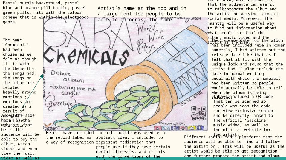
Different social media platforms that the audience will be able to find and follow the artist on ; this will be useful as the artist would be able to get recognition and further promote the artist and album.
I have included a QR Code that can be scanned so people who scan the code can view exclusive content and be directly linked to the official ‘Gasoline’ music video, as well as the official website for the artist.
The release date for the album has been included here in Roman numerals, I had written out the release date like that as I felt that it fit with the unique look and sound that the artist had. I also include the date in normal writing underneath where the numerals had been written so people would actually be able to tell when the album is being released.
The hashtag was included so that the audience can use it to talk/promote the album and the artist on varying forms of social media. Moreover, the hashtag will be a useful way to find out information about what people think of the album, music video and the artist as a whole.
Along the side here, is the website, from here, the audience will be able to buy the album, watch videos and even view the music video as well as buying the artists merchandise.
Here I have included the record label as a way of recognition
The name ‘Chemicals’, had been chosen as we felt as though it fit with the theme that the songs had, the songs on the album are related heavily around emotions ; emotions are created as a result of chemical reactions in the brain.
The pill bottle was used as an abstract idea, I included to represent medication that people use if they have certain mental illnesses, and it fits with the conventions of the artist and songs.
Artist’s name at the top and in a large font for people to be able to recognise the name
Pastel purple background, pastel blue and orange pill bottle, pastel green pills, fits with the colour scheme that is within the electropop genre.
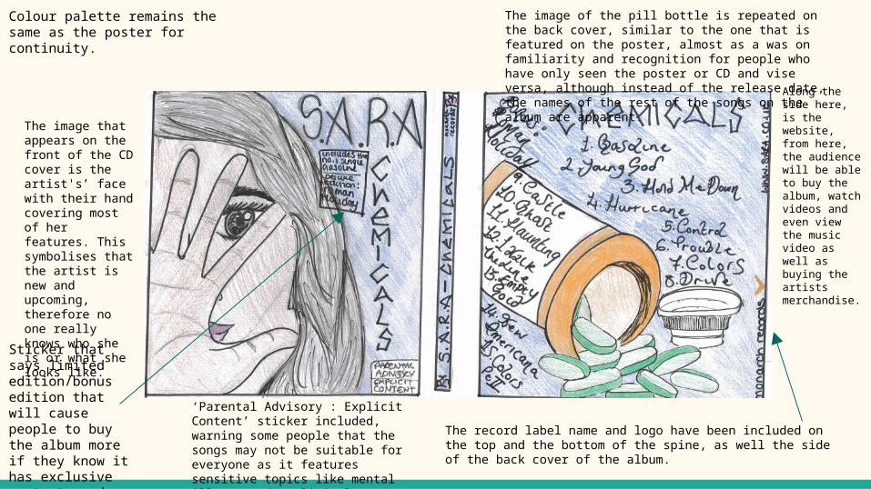
The image that appears on the front of the CD cover is the artist's’ face with their hand covering most of her features. This symbolises that the artist is new and upcoming, therefore no one really knows who she is or what she looks like.
The record label name and logo have been included on the top and the bottom of the spine, as well the side of the back cover of the album.
Colour palette remains the same as the poster for continuity.
The image of the pill bottle is repeated on the back cover, similar to the one that is featured on the poster, almost as a was on familiarity and recognition for people who have only seen the poster or CD and vise versa, although instead of the release date, the names of the rest of the songs on the album are apparent.
Along the side here, is the website, from here, the audience will be able to buy the album, watch videos and even view the music video as well as buying the artists merchandise.
Sticker that says limited edition/bonus edition that will cause people to buy the album more if they know it has exclusive contents and more music.
‘Parental Advisory : Explicit Content’ sticker included, warning some people that the songs may not be suitable for everyone as it features sensitive topics like mental illness and explicit language.