Embed Size (px)
Citation preview

Front CoverThe main thing that I like from the album covers here are the colours used. I believe that not only are the colours chosen a good representative of the Indie genre but I also believe that they will suit our artist well and will fit with the vibe that she presents. The pastel colours will make the album cover look soft which matches the music and our music video as a whole. I also believe that the colours could be seen to be quite feminine; this is not only the gender of the artist but also of our target audience. I also believe the style of these covers fit with our age range, 15-20 year olds, which would help me when creating my digipak. The fact that I was able to find a
selection of albums which use similar or the same colours as the colours I would like to use show that it is able to be successful. All of these covers could be seen to be quite effortless and simple which I believe is a good technique to represent the indie genre. I do not want to include the artist on the front cover as this may put a lot of people off of purchasing her album that have not heard or know of her before. The fact that she is not featured on the album exterior also may make people intrigued and encourage them to purchase the album. This is also original as a lot of artists follow the theme of an image of them being on the cover which may also make the album stand out. Most of the albums displayed above do not include the artist on the cover but they all still work and are attractive, showing that it is possible to go against this convention.

Even though I have picked out the colours in the album covers to the left, the main reason I chose to look at these album covers was for the art work displayed on them. I believe abstract art, particularly paint, will attract audiences as it is interesting and different. It also does not give a lot away about the artist and the type of music she creates meaning they may feel intrigued to purchase the digipak and listen to it. A lot of abstract art is created with quite bright and bold colours, however, I want to use pastel colours which give a completely new feel to the album artwork. I believe this will play a big part in grabbing the passing audiences attention. I understand that
this may not be easy to create as it involves me creating the art work myself but I believe that this, if done right, could be effective. It was hard for me to collect a lot of different album covers that included artwork that resembles my idea meaning that there may not be a lot already on the market. This reinforces the idea that this is very different and could attract a lot of people. However, this does not mean that the album would not work or would not attract people as these albums prove that it has worked. These are also more covers that do not include the artist on the cover. I still believe that these are attractive even though you do not know who the artist is or what they look like if you have not heard of the name of the musician before.

This is the style of painting that I would like to include on my front cover. I believe that it is eye-catching and is original for an album cover. As you are able to see, there is very bold and bright colours used, however, I believe that it would still have a good affect with pastel colours. I also believe this is a technique that is not used a lot and so would grab attention. As you are able to see, this style of painting looks effortless but a lot of organisation and technique is used to create something that looks like art. I believe that abstract art is able to create a lot of discussion and is able to tell a story that everyone is able to create themselves. If the artwork on the album makes people think,
then they will become interested in the album and see what the music has to offer. Each one of these paintings, although created the same way, are all different which is something that applies for the majority of artwork in this field. This means that the cover is going to be completely original, with no other artwork being exactly the same. I want to include the artists name, ‘Spirit’, on the front cover to add some identity to the artwork. I want this to be white font that is in the centre of the page but I do not want this to be too large as this may distract people from the art. This may also be accompanied by the name of the album. The idea of white font may have to be changed if this is not noticeable over the background colours but this can only be decided once the art has been created as work like this is almost unpredictable.

InsideAs I am going for such a different and striking design on the front of my cover, I need to ensure that the inside of the album not only matches this but is also as interesting. I do not want it to be the same as I believe that this could result in it looking as though I have not put in as much effort as I would have, it may also leave the album looking quite boring. To keep the front cover connected with the inside I believe that I would have to use the same, if not a very similar, colour scheme. Although the inside will not be the place which attracts the audience, it is still as important as I need to make sure the audience is still interested in the album when they pick it up and examine it. I do not want the inside to be as busy as the outside, I want it to be calm and relaxed to reflect the music on the album. To do this, I may include a white or pale pink rose in the centre of the page. This would be a garden rose as they are larger and have a more circular shape so would look better on the page. Another idea would be to use a rose bush as a whole and include a variety of different roses. I would then be able to continue this image onto the other side of the inside and make the CD part of the image. This would fit with the music as the vibe of the music is quite calm and relaxing and flowers often do well as representing this. It will also fit with my target audience as a rose, or flowers in general, are seen to be feminine. They would also fit with the age range as the rose could reflect innocence. This will then also create a connection between the artist and audience before the music has even been heard. This idea will only work if it does not have too much of a contrast with the exterior. I want the album to still look thought about and organised and the colours may not match meaning that I would not be able to use this idea. I believe if it does work it would look interesting and original and this would be more likely to attract audiences attention. I believe the large difference between the busy and relaxed feel would work well and would interest audiences. The pale pink and white roses would also work with the pastel colours on the exterior so would be able to create the link.

CDI want my CD to be interesting as I believe that some of the time albums lack this. I still want it to fit with the rest of the album as a whole but I also want it to stand out. To do this, I may continue the image that is placed on the inside onto and behind the CD. This is likely to be a rose as this will allow the CD to fit with the rest of the image but standout at the same time. I have found CD’s that are already using this idea. I believe these are effective as well as being interesting. It allows the CD itself to be an interesting feature meaning that when it is removed from the case it stands out among the rest. It also means that the image used on the inside of the case can be continuous and is not broken up by a different style on the CD. This results in my being able to be more creative with the image I use for the inside of the packaging as I am able to make this larger to cover a wider space. It also means that the inside of the album does not have to be too busy with a lot of different images being used. The casing behind the CD should be either the same image or something that directly links to the image of the CD. This means that when the CD is not in the case, the packaging is still kept interesting and does not lose its effect. This also means that the CD can be easily associated with the packaging and it is not hard to find where the CD belongs. If the rose idea does not match with the outside image then I may chose to change the image that I use but keep the same idea of the Cd tying in with the rest of the inside.
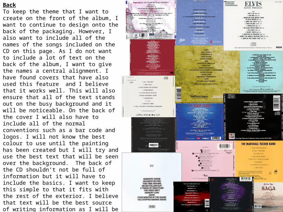
BackTo keep the theme that I want to create on the front of the album, I want to continue to design onto the back of the packaging. However, I also want to include all of the names of the songs included on the CD on this page. As I do not want to include a lot of text on the back of the album, I want to give the names a central alignment. I have found covers that have also used this feature and I believe that it works well. This will also ensure that all of the text stands out on the busy background and it will be noticeable. On the back of the cover I will also have to include all of the normal conventions such as a bar code and logos. I will not know the best colour to use until the painting has been created but I will try and use the best text that will be seen over the background. The back of the CD shouldn’t not be full of information but it will have to include the basics. I want to keep this simple to that it fits with the rest of the exterior. I believe that text will be the best source of writing information as I will be able to move it around easily and choose different styles. It will also ensure there is a good balance between normal conventions and original ones. At the top of this page, in the centre, I want to include both the name of the artist and the name of the album. This will ensure that people are aware of hat the album is called but it does not mean that I have to include this on the front. I want this to be the same colour as the rest of the text on the page as it will keep a connection.
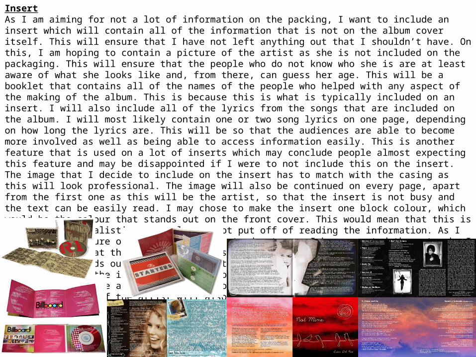
InsertAs I am aiming for not a lot of information on the packing, I want to include an insert which will contain all of the information that is not on the album cover itself. This will ensure that I have not left anything out that I shouldn’t have. On this, I am hoping to contain a picture of the artist as she is not included on the packaging. This will ensure that the people who do not know who she is are at least aware of what she looks like and, from there, can guess her age. This will be a booklet that contains all of the names of the people who helped with any aspect of the making of the album. This is because this is what is typically included on an insert. I will also include all of the lyrics from the songs that are included on the album. I will most likely contain one or two song lyrics on one page, depending on how long the lyrics are. This will be so that the audiences are able to become more involved as well as being able to access information easily. This is another feature that is used on a lot of inserts which may conclude people almost expecting this feature and may be disappointed if I were to not include this on the insert. The image that I decide to include on the insert has to match with the casing as this will look professional. The image will also be continued on every page, apart from the first one as this will be the artist, so that the insert is not busy and the text can be easily read. I may chose to make the insert one block colour, which would be the colour that stands out on the front cover. This would mean that this is simple and minimalistic so people are not put off of reading the information. As I am currently unsure of what colour will stand out once I have created the artwork, I will not know what the colour of the insert will be. I want to ensure it is the colour that stands out as this will be the feature that creates a link between the album cover and the insert. This is important as it will not be the same pattern that will be on the album cover, therefore not creating a link in that sense. The image that I use of the artist will also have to have the same colours or colours related to the colour that I choose to continue throughout the inset.