Embed Size (px)
Citation preview

developed bydeveloped by
VISION ZERO
Visual Identity GuidelinesPartner

Visual Identity Guidelines 2
Introduction
This document gives you an overview of how to use all the key elements of the Vision Zero campaign. As the campaign is being created by yourselves, decentrally, we have made the guidelines as practical as possible with the focus on how to use the graphical elements and practical tips and guidance for usage in a variety of applications.

Visual Identity Guidelines 3
Table of Contents
1. Logo1.1 Logo basics 41.2 Backgrounds 71.3 Logo stacked version 81.4 Co-branding 91.5 Use of Vision Zero key visual 15
2. Colours 18
Visual Identity Guidelines 4
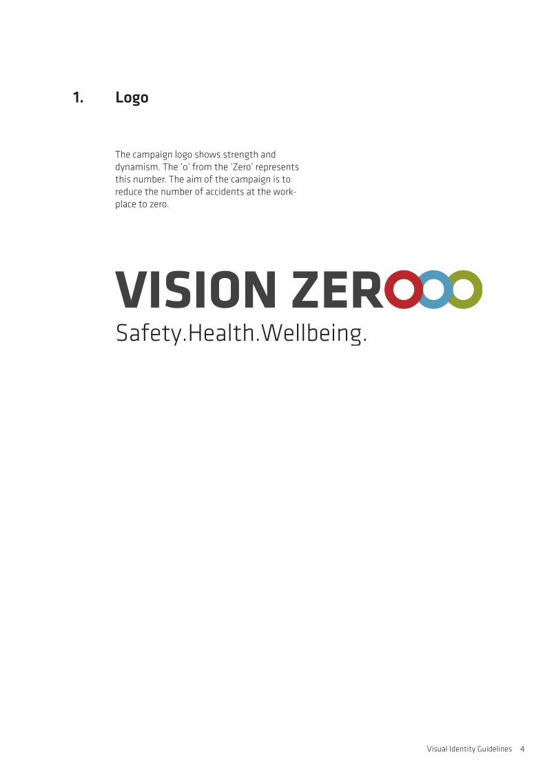
The campaign logo shows strength and dynamism. The ‘o’ from the ’Zero’ represents this number. The aim of the campaign is to reduce the number of accidents at the work- place to zero.
1. Logo

Visual Identity Guidelines 5
The standard version of the Vision Zero logo is the horizontal format, full colour version. It consists of the logo in combination with the tagline. The logo should always be positioned with enough clear space around it.
The percentage proportions are based on the logo files that are available from ISSA.
1.1 Logo basics
Clear space
Sizes
Minimum size
Business card: 45 mm width, 75 %Flyer: 45 mm width, 75 %A4: 51 mm width, 90 %A3: 63 mm width, 105 %Roll ups: 300 mm width, 500 %
30 mm width, 50 %
a
a
a
a

Visual Identity Guidelines 6
The logo is available in black and white. This version should only be used in exceptional cases, where the colour version cannot be used. Since the rings of the logo are usually in colour, it is recommended to use greyscale rather than full black for the logo.
1.1 Logo basics
Logo in greyscale
For the inverted logo version, please use the ai-file.

Visual Identity Guidelines 7
The vision zero logo should be used in the standard colour version with black writing on light backgrounds. The inverted version of the logo should be used on dark backgrounds.
Please ensure that enough contrast is created between the background colour and the logo. The background where the logo is positioned should never be the same colour as one of the logo rings.
1.2 Backgrounds
Light backgrounds
Don’ts
Dark backgrounds
Up to 50% solid colour

Visual Identity Guidelines 8
The percentage proportions are based on the logo files that are available from ISSA.
The stacked logo version is only to be used in exceptional cases, for instance for online banners in skyscraper format.
1.3 Logo stacked version
Sizes
Minimum size
Logo in greyscale
Flyer: ca. 23,3 mm width, 75 %A4: ca. 28 mm width, 90 %A3: ca. 32,6 mm width, 105 %Roll up: ca. 155,2 mm width, 500 %
ca. 15,5 mm width, 50 %
Clear space
a
a
a
aa
For the inverted logo version, please use the ai-file.

Visual Identity Guidelines 9
1.4 Co-branding
developed by

Visual Identity Guidelines 10
The Vision Zero campaign provides materials for companies, organisations and prevention networks to become Vision Zero campaign multipliers and to enable them to promote Vision Zero amongst their networks and implement it at the workplace.
Vision Zero Partners include prevention organ-isations and networks promoting Vision Zero via campaigns, events, training and other actions.
Vision Zero Companies commit to improving safety, health and wellbeing in their enterprise.
1.4.2 Co-branding with Vision Zero Partners and Companies

Visual Identity Guidelines 11
The Vision Zero logo will often be positioned together with partner logos. For this use “A Partner of“ logo version has been created.
The logos may be positioned together. If this is the case a minimum space has been defined.
1.4.2 Co-branding with Vision Zero Partners
A Partner of
Minimum space
A Partner of
a2xa
Equally proportioned
A Partner of
Stacked version
A Partner of2xa

Visual Identity Guidelines 12
The Vision Zero logo will often be positioned together with partner logos. For this use “A Company of“ logo version has been created.
The logos may be positioned together. If this is the case a minimum space has been defined.
1.4.2 Co-branding with Vision Zero Companies
A Company of
Minimum space
A Company of
a2xa
Equally proportioned
A Company of
Stacked version
A Company of2xa

Visual Identity Guidelines 13
1.4.2 Co-branding with Vision Zero Partners and Companies
Examples layout right of the logo Examples layout left of the logo
Title
Headline Otataest iorepro officip sunderiore, temquam erum on.
A Partner of
VISION ZERO
Title Brochure/PublicationSubtitle
A Partner of A Partner of
In some applications, the logos will be positioned apart. The partner logo can be used either to the right or to the left of the Vision Zero logo. The preference will be influenced by the corporate design of the partner.
Corporate Design: Berufsgenossenschaften | Unfallkassen | Deutsche Gesetzliche Unfallversicherung
Vers
ion
1.6
Geschäftsausstattung > Briefbogen
Briefbogen: erste Seite
6.2
Ihr Zeichen:Ihre Nachricht vom:
Unser Zeichen: Ansprechpartner:
Telefon:Fax:
E-Mail:
Datum:
z.B. Bezirksverwaltungz.B. Abteilungz.B. Bildungsstätte
Seite 1 von 2
LD 00 A2100 1009 Beispieltext
Trägername Beispiel, Musterstraße 123, 12345 Musterstadt
Trägername BeispielNamenszusatz
Musterstraße 1512345 MusterstadtPostfach 123, 12345 MusterstadtTelefon-Sammel-Nr. 0123 1234567
Musterbank, MusterstadtBLZ 123 456 78Kto.-Nr. 1234567890IBAN DE89 1234 1234 1234 1234BIC ABCDEFGH
IK-Nr.: 123 123 123
Internet: www.ukbgbeispiel.de
DOK-ID: 1234567DO
K-ID
/DO
K-B
arco
de
Sehr geehrte Frau Musterfrau,
Interdum volgus videt, est ubi peccat. Si veteres ita miratur laudatque poetas, ut nihil anteferat, nihil illis comparet, errat. Si quaedam nimis antique, si peraque dure dicere credit eos, ignave multa fate-tur, et sapit et mecum facit et Iova iudicat aequo.
Non equidem insector delendave carmina Livi esse reor, memini quae plagosum mihi parvo Orbilium dictare; sed emendata videri pulchraque et exactis minimum distantia miror. Inter quae verbum emi-cuit si forte decorum, et si versus paulo concinnior unus et alter, iniuste totum ducit venditque poema.
Recte necne crocum floresque perambulet Attae fabula si dubitem, clament periisse pudorem cuncti paene patres, ea cum reprehendere coner, quae gravis Aesopus, quae doctus Roscius egit; vel quia nil rectum, nisi quod placuit sibi, ducunt, vel quia turpe putant parere minoribus, et quae imberbes di-dicere senes.Quod si tam Graecis novitas invisa fuisset quam nobis, quid nunc esset vetus? Aut quid haberet quod legeret tereretque viritim.Non equidem insector delendave carmina Livi esse reor, memini quae plagosum mihi parvo Orbilium dictare; sed emendata videri pulchraque et exactis minimum distantia miror. Inter quae verbum emi-cuit si forte decorum, et si versus paulo concinnior unus et alter, iniuste totum ducit venditque poema.
Recte necne crocum floresque perambulet Attae fabula si dubitem, clament periisse pudorem cuncti paene patres, ea cum reprehendere coner, quae gravis Aesopus, quae doctus Roscius egit; vel quia nil rectum, nisi quod placuit sibi, ducunt, vel quia turpe putant parere minoribus, et quae imberbes di-dicere senes.Quod si tam Graecis novitas invisa fuisset quam nobis, quid nunc esset vetus? Aut quid haberet quod legeret tereretque viritim.
Non equidem insector delendave carmina Livi esse reor, memini quae plagosum mihi parvo Orbilium dictare; sed emendata videri pulchraque et exactis minimum distantia miror. Inter quae verbum emi-cuit si forte decorum, et si versus paulo concinnior unus et alter, iniuste totum ducit venditque poema.
Mit freundlichen Grüßen
Klaus Mustermann
ABCDE01.01.2010ABCDEHerr Mustermann+49 69 12345678-99+49 69 [email protected]
01.01.2010
ZV 1 Vermerk 1ZV 2ZV 3A1 Musterfirma GmbHA2 Frau Beate MusterfrauA3 Musterstraße 123A4 AdresszusatzA5 12345 MusterstadtA6 Adresszusatz
UK BSPUnfallkasse Beispielregion
Abbildungsgröße 73 %

Visual Identity Guidelines 14
Some partners may wish to translate Vision Zero materials. If this is the case, the ISSA secretariat will send them InDesign files and the partner organization may place its logo on the front centre or back corner of the publication. Partners may also mention their contribution in the text on the back cover.
Example 1 of co-branding logo placement
1.4.3 Translation of Vision Zero materials
Example 2 of co-branding logo placement

Visual Identity Guidelines 15
The rings of the Vision Zero logo can be used as a key visual element on colour backgrounds.
The sizes of the rings may vary according to the application.
1.5 Use of the key visual

Visual Identity Guidelines 16
– The size of the key visual orients itself on the grid lines
– The key visual can be cut off on the left or right side of the page
1.5 Use of the key visualOn colours, for example a brochure
developed bydeveloped by
VISION ZEROOptasitaes aut venit magniminti comni-mu scienih illorec aboriatus
developed bydeveloped by
VISION ZEROOptasitaes aut venit magniminti comni-mu scienih illorec aboriatus
developed bydeveloped by
VISION ZEROOptasitaes aut venit magniminti comni-mu scienih illorec aboriatus
developed bydeveloped by
VISION ZEROOptasitaes aut venit magniminti comni-mu scienih illorec aboriatus
developed bydeveloped by
VISION ZEROOptasitaes aut venit magniminti comni-mu scienih illorec aboriatus
developed bydeveloped by
VISION ZEROOptasitaes aut venit magniminti comni-mu scienih illorec aboriatus
Height: 6 grid lines Height: 4 grid lines Height: 3 grid lines
– The positioning is variable on the grid – Ensure enough colour contrast between the
rings and the background

Visual Identity Guidelines 17
– The size of the key visual orients itself on the grid lines
– The key visual can be cut off on the left or right side of the page
1.5 Use of the key visualOn images, for instance a brochure
developed bydeveloped by
VISION ZEROOptasitaes aut venit magniminti comni-mu scienih illorec aboriatus
developed bydeveloped by
VISION ZEROOptasitaes aut venit magniminti comni-mu scienih illorec aboriatus
developed bydeveloped by
VISION ZEROOptasitaes aut venit magniminti comni-mu scienih illorec aboriatus
developed bydeveloped by
VISION ZEROOptasitaes aut venit magniminti comni-mu scienih illorec aboriatus
developed bydeveloped by
VISION ZEROOptasitaes aut venit magniminti comni-mu scienih illorec aboriatus
developed bydeveloped by
VISION ZEROOptasitaes aut venit magniminti comni-mu scienih illorec aboriatus
Height: 2 grid lines
– Variable position, suited to the image – Ensure enough colour contrast between the
rings and the background

Visual Identity Guidelines 18
2. Colours
Primary colours
Secondary colours
CMYK: 40/15/100/15Pantone: 384RGB: 156/162/10Hex: 9CA20A
50% CMYK: 40/15/100/15RGB: 222/221/146Hex: DEDD92
CMYK: 84/56/42/23RGB: 41/86/103Hex: 295667
CMYK: 23/0/100/17RGB: 175/188/34Hex: AFBD22
CMYK: 0/0/0/90Pantone: Cool Gray 11RGB: 62/61/64Hex: 3E3D40
CMYK: 67/27/15/0Pantone: 549RGB: 86/155/190Hex: 569BBE
50% CMYK: 67/27/15/0RGB: 101/204/221Hex: B5CCDD
CMYK: 59/44/100/29RGB: 100/101/31Hex: 64651F
CMYK: 0/0/0/60Pantone: Cool Gray 8RGB: 128/127/131Hex: 807F83
50% CMYK: 0/0/0/60RGB: 197/199/200Hex: C5C7C8
CMYK: 30/100/100/0Pantone: 7621RGB: 181/22/33Hex: B51621
CMYK: 67/30/100/13RGB: 95/128/37Hex: 5F8025
The colours for the Vision Zero campaign are based on the colour palette of ISSA. A matching red has been added as a highlight colour.

Visual Identity Guidelines 19
Contact
www.visionzero.global
If you have questions re these Vision Zero Identity Guidelines please contact the ISSA: