Embed Size (px)
Citation preview

THREE ESSAYS ON COMPETITION AND PRODUCTIVITY IN THE U.S.
AIRLINE INDUSTRY
A dissertation presented
by
Tuvshintulga Bold
to
The Department of Economics
Submitted in partial fulfillment of the requirements for the degree of
Doctor of Philosophy
in the field of
Economics
Northeastern University
Boston, MA
November, 2013

THREE ESSAYS ON COMPETITION AND PRODUCTIVITY IN THE U.S.
AIRLINE INDUSTRY
by
Tuvshintulga Bold
ABSTRACT OF DISSERTATION
Submitted in partial fulfillment of the requirements
for the degree of Doctor of Philosophy in Economics
in the Graduate School of Social Sciences and Humanities of
Northeastern University
November, 2013

2
Abstracts
Chapter 1: The Effect of Wright Amendment on Consumer Welfare
This paper analyses effect of the Wright Amendment on airline ticket price and
ultimately consumer welfare for passengers flying to and from the Dallas metropolitan
area. The Wright Amendment is a law that was implemented in 1979 to restrict
passenger air travel to and from Dallas Love Field airport in order to encourage growth
at then the newly constructed Dallas Fort-Worth airport. Today, Dallas Fort-Worth has
become one of the busiest airports in the U.S., but the Wright Amendment continues to
suppress competition by prohibiting long distance flights to and from Dallas Love Field
airport. While supporters and opponents of the Wright Amendment have been debating
for some time, to date no economic study has measured the effect of the law on air fares
and consumer welfare. I use data from the U.S. Department of Transportation’s Ticket
and Origin and Destination Survey from 1996 to 2011 to produce estimations of the
effect of the Wright Amendment. Series of three relaxations to the amendment created
an opportunity to use the difference-in-difference econometric method to precisely
measure the fare distortion brought by the law. Of the three relaxations, the third and
the last change introduced a major alteration in the law by allowing airlines to fly
anywhere in the country from Dallas Love Field airport. As a result, fares decreased on
average by 13.88% while certain destinations experienced as much as 36% of fare
decrease during the five years following the implementation of the change.
Consequently, passengers of the Dallas area saved $1.31 billion from 2007 to 2011 on
flights to and from the Dallas region.
Chapter 2: The Effect of Bankruptcy on Productivity in the Airline Industry
This study tracks major airlines in the U.S. during the past 20 years to determine
whether bankruptcies of the biggest airlines affect their productivity under financial
stress. The U.S. airline industry has seen an incredible amount of volatility ever since
the deregulation of 1978 with every major carrier declaring bankruptcy at least once.
Business cycles surely affect airlines’ health, but not evenly. During economic
expansionary periods industry profits can be modest, but during recessions the biggest

3
airlines start declaring bankruptcies one after another. Yet after so many bankruptcies,
the industry still remains very vulnerable. In common practice, Chapter 7 bankruptcy
declaration is a way for an organization to reorganize and is a golden opportunity to
improve by getting rid of its inefficiency. However, to date there has been no previous
study in the airline industry looking into the relationship between bankruptcy and
productivity. Using data of the 14 biggest airlines in the U.S., I empirically explore how
bankruptcy affects productivity. Both partial and total factor productivity methods were
used to provide a detailed presentation of the evolution of airline productivity. I find
that bankruptcy does not have any impact on productivity as some of the major airlines
declare bankruptcy multiple times indicating lack of improvement in employee and
aircraft productivity. The results were consistent under different variations of post-
bankruptcy periods where short term and long term effects were tested.
Chapter 3: The Effect of Mergers on Productivity in the Airline Industry
In this study, I examine the effect of mergers in the U.S. airline industry on
productivity. Chapter 7 bankruptcies and mergers are the two major types of strategies
a vulnerable airline can pursue in order to secure its survival in its immediate future. A
merger deal can offer several major benefits including increased market power,
availability of new financing source by merging with a healthier airline, reduced cost
and improved productivity through synergy. The airline industry has witnessed a
significantly increased level of mergers in the last decade, especially among its biggest
players who enter mega-sized mergers to create the world’s biggest airlines one after
another. Airlines highlight cost savings and improved efficiency as their primary
merger motivations. Yet, to date no study exists has examined the relationship between
merger and productivity in the airline industry. Similar to bankruptcies mergers can
offer short term survival solutions, but long term viability comes from improvements in
productivity. I use data of the 14 biggest airlines in U.S. during the past 20 years to
track productivity of airlines going through mergers. For the 14 airlines, I construct
partial and total factor productivity in order to estimate merger effects. Using the
available data, I identify three mergers where is there is sufficient ex-ante and ex-post
data exist. Using the difference-in-difference econometric technique, I find that mergers

4
do improve productivity as promised by the airlines. However, the extent of
improvements depended on whether the acquiring airline was more productive than the
target airlines prior to the merger. The results were consistent with previous findings of
studies on mergers and productivity outside the airline industry.

5
Acknowledgements
I express my deepest gratitude to my dissertation committee. Without their
contribution, encouragement and dedication, this dissertation would not have been
possible. I thank my advisor Professor Steven Morrison for his invaluable advice,
patience and support. I feel most fortunate to have met him, to be able to benefit from
his constant encouragement and mentorship. I am thankful to Professor John Kwoka
and Professor James Dana whose insightful comments, points of view enriched my
thinking and whose ever present support made this work possible.
I thank Prof. Neil Alper for patiently mentoring me to deal with students, carrying a
course load and teaching me how to teach. I am also indebted to the other faculty for
their advice, the staff and my fellow graduate students at the Department of Economics
for their support and kindness.
I am thankful to my father Kh.Bold and my mother M.Tsetsegmaa for dedicating
themselves so that I could pursue my education in America.
Finally, I dedicate this dissertation to my daughter, T.Nandin, who puts a smile on my
face every single day.

6
TABLE OF CONTENTS
Abstract
Acknowledgments
Table of Contents
Chapter 1: The Effect of Wright Amendment
on Consumer Welfare
Introduction
History of Airport Restrictions
Econometric Identification
Data
Regression Results
Conclusion
References
Tables
Chapter 2: The Effect of Bankruptcy on Productivity
in the Airline Industry
Introduction
Literature Review
Data
Airline bankruptcy background
Measuring Productivity
2
5
6
8
8
11
17
19
22
28
30
32
44
44
46
48
51
57

7
Econometric Methodology
Regression Results
Conclusion
References
Tables
Figures
Appendix
Chapter 3: The Effect of Mergers on Productivity in
the Airline Industry
Introduction
Literature Review
Data
Background on Mergers in the U.S. Airline Industry
Measuring Productivity
Econometric Methodology
Regression Results
Conclusion
References
Tables
Figures
64
67
70
72
75
85
97
99
99
101
102
105
112
118
121
124
127
130
148

8
Chapter 1: The effect of Wright Amendment on Consumer Welfare
I. Introduction
Deregulation of the airline industry in 1978 marked the beginning of an era of
market competition for commercial aviation. Ever since, airlines have been competing
fiercely using all their resources by any means without the kind of regulation that
restricted their action before 1978: some have prospered, some ceased to exist and the
rest are still trying to find ways to survive. While airlines may have differing opinions
on whether deregulation has brought them prosperity, one particular stakeholder in the
industry who has benefited substantially from deregulation is consumers. Market
competition based pricing in the airline industry has made flying so inexpensive that
the gain in consumer welfare has been large.1
Today airlines can enter and exit to serve any airport pair market at their will
and set the level of fares and frequency of flights as they see fit. As such, passenger
fares have become heavily dependent on two aspects of market structure: the level of
competition that exists on a particular route and the extent of hub dominance at origin
or destination airports of a specific flight. Though most routes are open to free entry
and exit, laws that suppress market competition still exist, causing a significant
decrease in consumer welfare in affected regions.
These laws exist in the form of limiting airlines’ ability to fly to and from
certain airports. The two major airport restrictions are the perimeter rules and slot
1 See Morrison and Winston (1995) Estimation of annual benefits to the consumers were $12.4 billion in
1993 dollars, which is $19.9 billion in 2012 dollars.

9
rules.2 This paper aims to measure the effect of Wright Amendment, which is a form of
a perimeter rule, on consumer welfare for passengers who travel to and from the Dallas
Fort-Worth metropolitan area.
The Wright Amendment directly suppresses airline competition at the fourth
busiest airport in the United States, puts restrictions on flights out of Dallas Love Field
(DAL), which is the other major airport for commercial service in metropolitan Dallas
besides Dallas Fort-Worth (DFW).3 DAL is one-third as far from downtown Dallas as
DFW airport.
The Wright Amendment has gone through several changes, but the original
Wright Amendment prohibited any airline serving DAL to sell long-haul flight tickets
that used airplanes with more than 56 seats. Specifically, an airline at DAL could not
sell tickets, connecting or direct, to any destinations beyond Texas and its neighboring
states, Louisiana, Arkansas, Oklahoma and New Mexico. For example, if passengers
wished to fly to Los Angeles from DAL, not only were they not able to fly directly to
Los Angeles but they could not even purchase a flight ticket with a connection either in
Texas or its four neighboring states. They would have to purchase two tickets
separately, one for a flight to a connecting city within the Wright Amendment
perimeter and another one for the flight between the connecting city and final
2 A fourth, long-term exclusive gate leases are another form of restriction on competition at the airport
level. Such long-term leases allow incumbent airlines to employ a majority of the gates at a certain
airport for 20 years at a time. If an entrant wishes, it has to purchase the rights to use those gates usually
at undesired hours for higher prices. (“Slot-Controlled Airports” United States General Accounting
Office Report, 2012). 3 DFW ranks fourth in passenger enplanement and deplanement after Hartsfield-Jackson Atlanta (92
million), Chicago O’Hare (66 million) and Los Angeles International (61 million) according to Airport
Council International North America as of Q3 of 2012 (http://aci-na.org/).

10
destination. A more detailed background on the Wright Amendment comes in Section
II.
Because of the Wright Amendment, fares for flights to and from the Dallas
metropolitan area (DFW + DAL) have been potentially higher than what they would
have been due to the following factor. The higher the route level competition between
the airlines on a particular route, the lower the fares have been for passengers. In the
last three decades, Southwest has been the pioneer of increased route-level competition
that results in low fares wherever it chooses to serve. When Southwest enters a route
(airport pair) fares have declined on average by 46% (Morrison 2001). This is known as
the actual effect of Southwest. When Southwest serves a route by serving airports
adjacent to a specific airport pair, fares have declined on average by 26% (Morrison
2001). This is termed the effect of adjacent competition. As such, passengers flying to
or from the Dallas metropolitan area on routes outside of Texas and its neighboring
states have been paying higher for fares due to Southwest’s inability to serve out of
DAL.4 This paper aims to measure the effect of the Wright Amendment on the
consumer welfare of the Dallas metropolitan area.
The paper is organized as follows. Section II provides background on the
Wright Amendment and one other form of airport restriction. Section III discusses the
econometric model used to capture the effect of Wright Amendment. Section IV
4 Another potential cause for higher fares at DFW is the hub premium effect. Borenstein (1989) finds that
a carrier with at least 50% of the traffic at an airport charged about 12% higher fares than those with
about 10% traffic. Currently, Dallas Fort-Worth is American Airline’s hub airport as it handles 82% of
all flights originating or ending at the airport. Naturally, on routes outside of Texas and its contiguous
states American Airlines aims to charge a hub-premium on fares on its customers which it will not be
able to if faced with competition from Southwest out of DAL. Again, the Wright Amendment has
preserved American Airlines’ ability to charge a hub-premium fare by prohibiting Southwest from
serving the affected markets.

11
provides a description of the data used for the estimates. Section V presents and
interprets the results. Section VI provides the paper’s summary.
II. History of airport restrictions
Currently there are two types of airport restrictions that legally limit
competition in the airline industry. They are the slot rule and the perimeter rule.5 The
Wright Amendment is a form of a perimeter rule where the perimeter is defined by
state borders instead of a constant distance.
Slot rules were introduced in 1969 as means of controlling rapidly increasing
traffic at four airports: New York LaGuardia, New York JFK, Chicago O’Hare and
Washington National (now Reagan National). Slot controls functions by putting limits
on the number of landings and take offs within a given hour mainly during peak
periods. The limitation on the number of take offs and landings translates into reduced
competition, but only if the traffic is high enough that the limitations are binding, which
is indeed the case generally.
The general perimeter rules and Wright Amendment were implemented to
encourage growth at nearby newly built airports, while the slot rules were targeted at
reducing airport congestion. A perimeter rule at an airport restricts all carriers serving
that airport from offering flights outside the indicated perimeter. For example, La
Guardia Airport’s (LGA) perimeter, formalized in 1984, is 1,500 miles and it was
instituted to reduce congestion at LGA by forcing long-haul flights to John F. Kennedy
Airport (JFK). If someone wishes to fly non-stop from New York to Los Angeles, for
5 Slot rules are also known as “High Density Rule.”

12
example, the passenger would have to fly either from Newark or JFK since Los
Angeles lies outside of La Guardia’s 1,500-mile perimeter. For Reagan National in
Washington D.C., the perimeter rule was instituted in 1986.
The origin of the Wright Amendment dates back to the pre-deregulation era of
the airline industry and is a very interesting case of a law that has come to suppress
competition at one of the nation’s busiest metropolitan areas. As passenger traffic in the
airline industry grew in the 1960s in the metropolitan Dallas area, competition for air
service among airports surrounding the city intensified. These airports included Love
Field, Greater Southwest Airport, Red Bird Airport and Meacham Field. Concerned
with duplication of services, Federal officials drafted a proposal to build a single airport
to serve both the regions surrounding Dallas and Fort-Worth6. The proposal was
accepted by the relevant local government bodies and all the airlines agreed to relocate
to the new regional airport once construction was complete, except Southwest Airlines.
Southwest Airlines began service on June 18, 1971 operating intra-state flights within
the state of Texas. As Southwest flourished at Love Field, it expressed its intention to
remain at Love Field even after completion of construction at Dallas Fort-Worth
International Airport. As a result, Southwest Airlines was sued by the DFW Airport
board and by the cities of Dallas and Fort-Worth, who tried to decommission DAL and
force Southwest to move to DFW. Southwest Airlines won in court and was allowed to
operate from DAL offering intrastate flights while DFW officially opened in 1974.
Southwest continued to grow successfully out of DAL offering intrastate services until
1978. However, the beginning of airline industry deregulation in 1978 opened a whole
6 Love Terminal Partners, et al., Plaintiffs, v. THE UNITED STATES, Defendant. No. 08-536 L.

13
new level of opportunities for the airline to capitalize on its successful business model
on national level. In 1979, Southwest received a ruling from the Civil Aeronautics
Board that gave it permission to offer interstate services from DAL. Naturally, the
CBA’s ruling was not welcomed at all by the supporters of DFW as they quickly took
counter measures by turning to U.S. House of Representatives Speaker Jim Wright (D-
Texas) to include an amendment to the International Air Transportation Competition
Act of 1979 that would protect DFW from any competition by DAL. The result, after
some modifications, became what is known as the Wright Amendment of 1980, which
enforced three major points: a) it became illegal for any airline at DAL to offer flights
to destinations beyond Texas and its four neighboring states, Louisiana, Arkansas,
Oklahoma and New Mexico (the Wright perimeter), b) airlines were prohibited to offer
or advertise the availability of any connecting flights between DAL and any city
outside the Wright perimeter and c) airlines at DAL may not use aircraft with more
than 56 seats for commercial purposes to destinations outside the Wright perimeter.7
Today the annual enplanements and deplanements at DFW are 57.7 million
passengers, making them fourth largest in the country.8 At DAL it had stayed constant
around 6 million until 2006 and grew to 7.9 million by 2011.9 Considering the traffic
had reached 6.3 million in 1973 the growth at the airport was severely constrained by
the Wright Amendment. For many of the 57.7 million passengers who are forced to use
DFW, the Wright Amendment is potentially a major setback preventing them from the
choice of experiencing lower fares. As such, over the years there has been heavy
7 Love Terminal Partners, et al., Plaintiffs, v. THE UNITED STATES, Defendant. No. 08-536 L.
8 Dallas Fort-Worth Airport statistics of 2011 (http://www.dfwairport.com/stats/P1_058942.php).
9 Dallas Love Field Airport statistics of 2011 (http://www.dallas-lovefield.com/pdf/statistics).

14
campaigning resulting in a series of relaxations and an agreement to fully repeal the
amendment in 2014 was reached in 2006 among the stake holders. These sequences of
relaxations present an opportunity to measure what fares could be in the absence of the
amendment. Arguably, the Wright Amendment has outlived its original purpose and
stands in the way of all the benefits that can be brought by increased competition to the
Dallas metropolitan area consumers of air service.
The first exemption, passed in October of 1997, was sponsored by Senator
Richard Shelby of Alabama and was consequently named the Shelby Amendment.10
The Shelby Amendment allowed for non-stop flights to Alabama, Mississippi and
Kansas from DAL.11
Citing lack of demand at DAL, Southwest did not begin non-stop
service immediately, though Southwest did take the opportunity to start selling tickets
for connecting flights to two major cities in these states: Birmingham, Alabama and
Jackson, Mississippi. As Southwest did not increase its service due to low demand, it is
expected that no major statistically significant change in fare would take place. Table 1
provides a comparison of fares and passenger quantity before and after the Shelby
Amendment took effect.
Even though Southwest did not begin non-stop service immediately, fares
decreased by 23% for the Birmingham route, but increased by 12% over the next four
10
“Dallas Love field: The Wright and Shelby Amendments” CRS Report for Congress (2005). 11
The Shelby Amendment also introduced a more relaxed version of the 56-seat restriction stating that as
long as the airplane contained, including reconfigured or originally manufactured, fewer than 56-seats
and weighted less than 300,000 pounds, it could be flown anywhere in the country. The previous version
of the 56-seat rule stipulated that the aircraft originally must have been produced with fewer than 56
seats. Legend Airlines used the opportunity to offer service using re-configured 56-seat airplanes to long-
distance destinations such as Washington D.C. and New York. American Airlines immediately began
offering the same service to the same destinations even occasionally at lower prices while at the same
time suing Legend Airlines to halt their service out of DAL. Just a few months after beginning operation,
Legend Airlines went out of business.

15
quarters for the Jackson route. The increase in Jackson fares will be explained in the
results section. In addition, the number of passengers who flew to these destinations
saw a big increase for the Birmingham route and a mild 10% increase for the Jackson
route.
The second relaxation came in December 2005 when Senator Christopher ‘Kit’
Bond of Missouri successfully added another exemption (Bond Amendment) to the
Wright Amendment to allow flights to his state from DAL.12
Southwest immediately
began service to Kansas City and St. Louis. At the same time, American Airlines also
started serving those two cities from DAL. Table 2 provides a comparison of fares and
passenger traffic before and after the Bond Amendment took effect.
Here, we observe much bigger changes in both fare and traffic due to
Southwest’s immediate entrance into the new markets. The market concentration level
drops significantly as well.
The third and the most significant alteration was realized in 2006 after years of
heavy campaigning by Southwest to repeal the amendment in its entirety. An
agreement, which eventually became a public law named the Wright Amendment
Reform Act of 2006, was reached between American Airlines, the city of Dallas, the
city of Fort-Worth and Southwest. The agreement was that the original Wright
Amendment would be partially repealed beginning in October 2006 and fully repealed
in 2014. There were two major conditions that were agreed upon for the Reform-Act to
be realized. First, beginning October 2006 until October 2014, airlines operating at
12
Wright Amendment Reform Act (2006).

16
DAL were now permitted to sell tickets to any destination in the country as long as the
flights make a stopover (or a connection) within the Wright perimeter. Second, once the
stop-over requirement expires and airlines would be allowed to make non-stop flights
from DAL to anywhere in the country, the number of gates at DAL would be reduced
from 32 to 20.13
Under the Reform-Act from October 2006 till October 2014, an airline
could begin selling tickets from DAL to fly anywhere in the country, unlike previously,
but the itinerary would have to make a stop-over (or a connection) within the Wright
perimeter. Within a few days of passing of the Reform-Act, Southwest announced its
plan to immediately start selling tickets to 25 metropolitan areas from Love Field with
connections at various points inside the Wright perimeter. Table 3 presents a
comparison of fares before and after the third relaxation was introduced allowing
Southwest to begin selling tickets to 25 cities:14
The simple comparison of before-and-after average fares for the 25 markets
show significant reduction in fares for the most part as expected. 16 out of 25 markets
experience fare decreases of more than 10%. Of the remaining nine markets, seven
experience fare decrease, one shows no change and another one shows an increase in
13
Even though by 2014 all airlines could begin selling non-stop tickets to anywhere from Dallas Love
Field, the cap of twenty gates at Dallas Love Field will remain and has been causing some controversy.
The gate usage has been divided as 16 for Southwest, 2 for American and 2 for Continental (now
United). JetBlue has opposed the reform act. The cap will become a binding restriction for further growth
at DAL if demand increases significantly, which is expected. To remedy the situation at least partially,
the airport is investing in modernizing the airport’s twenty gates to handle passenger traffic more
efficiently. (http://www.dallas-lovefield.com/) 14
It must be noted that flights to these cities had been already available from Love Field prior to the
reform act. However, it was illegal for Southwest and other airlines at Love Field to sell tickets to these
long-haul destinations. There are reports of consumers who went through the task of booking two
roundtrip tickets on their own, one to a destination within the Wright perimeter and second to the final
destination from the connecting airport. Considering the additional task passengers had to complete to fly
on Southwest, their fares must have been low enough to offset the extra hurdle. For example, if a
passenger needs to fly from DAL to Chicago, he/she would comb through all the possible connecting
points within the Wright perimeter using Southwest’s website. Then, he/she would need to determine
flights with best matching connection times. Only, then he/she could begin to compare prices. It was
known as the “Texas two-step fare and ticketing” among the local fliers (flyerguide.com, flyertalk.com).

17
fares of 7%. Aggregate calculation of all the 25 markets show a 14% fare decrease and
a 13% increase in traffic.
III. Econometric Identification
The main estimation used for capturing the airport restriction effect is the OLS
difference-in-difference (DD) model. It has become a common practice to employ the
difference-in-differences methodology to estimate the effect of a natural experiment by
observing changes in two groups: treatment and control. To employ the difference-in-
differences method, we must have observations on both groups before and after the
event. Once the timing of the event and the two groups are identified, the DD model
works by observing the differences within the simultaneous changes in two groups as
both groups evolve through time.
Each of the three stages of the Wright Amendment serves as the external event
that affects the treatment group. With each relaxation, new routes that are no longer
subject to the Wright Amendment open up for service. These new routes will serve as
the treatment group, while all the other routes from the Dallas metropolitan area will
serve as the control group.
Furthermore, we implement a market-level fixed effect to account for all the
different routes that are being regressed at the same time.
The main assumption of the DD method is that no major change takes place
between the treatment and the control group other than the event in question. That is to
say if there were some other external causes affecting the treatment group differently
than the control group besides the event in question, then the control group can no

18
longer serve the purpose it is designed for. No event has been detected that could
influence the routes affected by the Shelby, Bond and the Reform-Act other than the
rest of the routes to/from the Dallas metropolitan area.
As I am only concerned with flights to and from the Dallas metropolitan area, I
make no distinction between flights to and from DFW or DAL. Therefore, flights to
and from DFW and DAL are regarded to be the same.
The following regression is used for the estimation:
ln (fare)it itit treatmentpostextreatmentpostexX )*.(**.** 4320
Dependent variable:
Log of fare:
For one-way trip flights: log of the fare for passengers in route i in time t (year-
quarter);
For roundtrip flights: log of half of the fare for a single passenger on a flight to
or from the Dallas metropolitan area in a given year-quarter;
Explanatory variables X:
Distance:
Distance between DAL and either the originating or the destination airport;
the coefficient is expected to be positive as longer trips are more expensive;
Quarterly Effect dummies:
1st quarter: 1 for all 1
st quarter observations regardless of year; 0 otherwise;
2nd
quarter: 1 for all 2nd
quarter observations regardless of year; 0 otherwise;
3rd
quarter: 1 for all 3rd
quarter observations regardless of year; 0 otherwise;
Roundtrip dummy:
1 for roundtrips flights and 0 otherwise; the coefficient is expected to be
negative as roundtrip flights are usually much cheaper than one way flights
distance held constant;
Time dummy:

19
1 for all observations after the event and 0 otherwise;
Treatment dummy:
The treatment dummy is 1 for routes where the Wright Amendment restriction
previously applied but was removed due to a particular relaxation and 0
otherwise. A route is consider a specific airport pair, but because this paper
aims to measure effect on consumers of the Dallas metropolitan area, containing
both DFW and DAL, DFW and DAL are considered to be the same point of
origin/destination.
Treatment Regional dummy:
This dummy further extends the Treatment Dummy by including other airports
in the nearby region, where a route is defined to exist between the Dallas
metropolitan area and another metropolitan area; for example, under this
definition, Dallas-Chicago, Midway and Dallas-Chicago, O’Hare are regarded
as one route; while it is expected that the Wright Amendment caused higher
fares when routes are defined at the airport level, it is interesting to see how far
the effect extends when the routes are defined at the metropolitan level.
Time*Treatment dummy (or Treatment Regional):
1 for all observations that are in the treatment group for the time period after
each relaxation and 0 otherwise; this is the main coefficient that will indicate
the impact of the Wright Amendment and it is expected to be negative as we
expect that restriction on competition results in higher fares;
Table 4 presents the treatment groups for each case of the exemptions.
Once a relaxation is introduced, I wait till the beginning of the next quarter to
implement the time dummy since the quarter in which the event takes place will have
undistinguishable mix of affected and unaffected fares by the treatment. The same goes
for the ex-ante time period that excludes the quarter in which the event takes place.
IV. Data
The data for this study come from the U.S. Department of Transportation’s
Ticket Origin and Destination Survey (Databank 1B), which consists of a 10% sample
of the tickets provided by domestic airlines to the Department of Transportation on a

20
quarterly basis. The data contains collection of tickets where one observation (a row) is
a ticket containing the following information:
Fare paid for one passenger
Number of passengers with the same itinerary and same fare
Number of segments in a given ticket15
Segment-specific variables: carrier airline, distance of segment, beginning and
ending airports,
Origin and destination airports of a ticket
Fare basis: first, business or coach economy class;16
Reporting year and quarter
Change in trip direction (used for identifying round trip tickets)
The following filters were applied to the 10 percent ticket sample to obtain
relevant observations for this study:
Only the tickets with trips either beginning or ending at DFW/DAL were
selected; this means all tickets that do not involve DFW/DAL as origins or
destinations were dropped.
Tickets with more than four segments (5% of the sample), which means tickets
that involve two or more stop-overs, were dropped.
Tickets with more than two trip breaks (1% of the sample), which means multi-
destination tickets, were dropped. A trip break indicates either a turn-around
15
One segment represents one leg of a flight. 16
In addition, the complete class of service types include variations of the above three which are first
class discounted, coach class discounted, business class discounted, thrift, thrift discounted, first class
premium, supersonic, standard class and coach economy premium.

21
point or the final destination of a ticket. The destination airport becomes
ambiguous for a ticket with more than two trip breaks when the ticket is for a
round-trip flight.
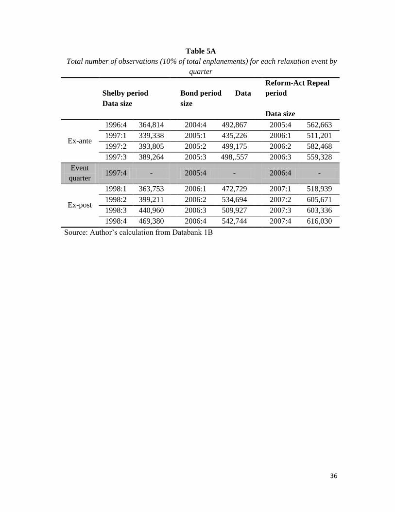
Table 5 presents the number of observations in each quarter for each relaxation
event after all irrelevant parts of the data have been filtered out. In addition, the
remaining data have been expanded by passenger number. In the original data set one
observation meant one itinerary at a specific price with one or multiple passengers in
the same itinerary. In other words, if multiple people paid the same and traveled exactly
the same itinerary, during the given quarter, all the passengers were grouped into one
observation. Expanding by passengers means converting that one observation into
multiple observations where one observation represents one person the same as one
enplanement. In doing so, the number of observations directly translates into number of
enplanements, which means it now reports 10% of traffic on a given route. We will use
traffic information to calculate the welfare effect in Section V.
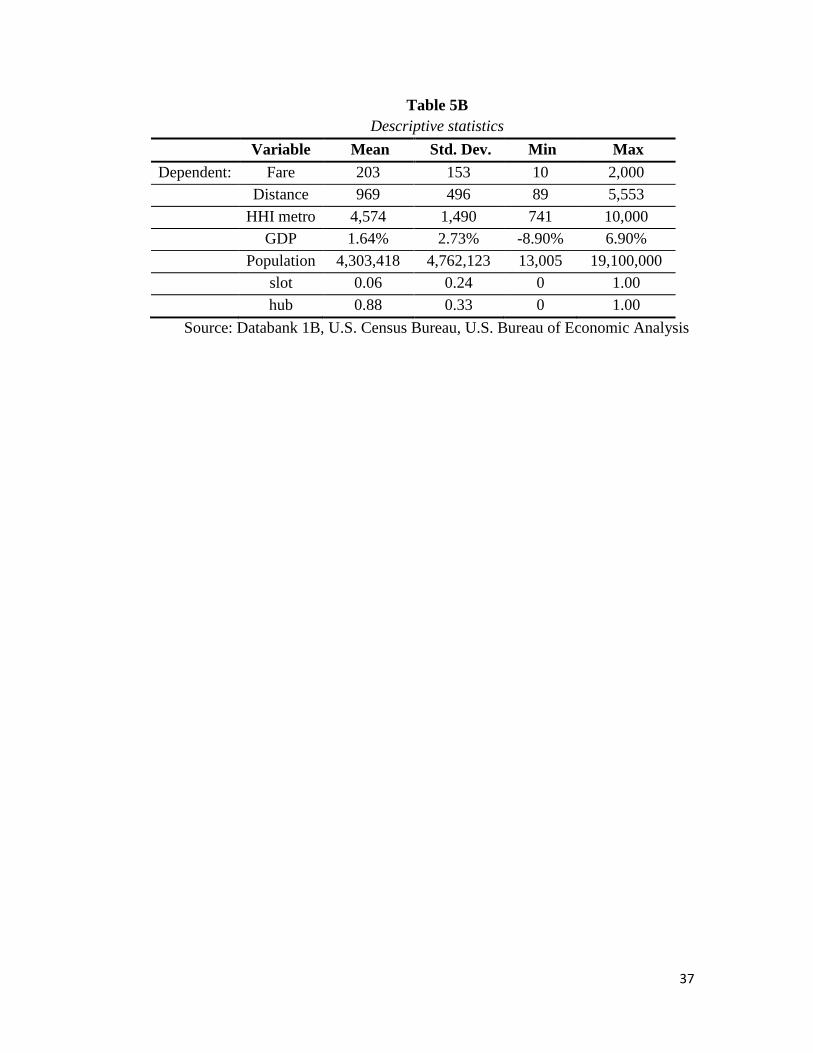
Additional control variable data consist of population at destination airports
where the origin is the Dallas metropolitan area and quarterly percentage change in
U.S. GDP. The population data comes from the U.S. Census Bureau and the GDP data
comes from the U.S. Bureau of Economic Analysis. Table 5B provides descriptive
statistics of the final data set.

22
V. Regression Results
1. Shelby Amendment
Table 6A presents the regression results for the routes affected by the Shelby
Amendment. The Shelby Amendment took place in the fourth quarter of 1997, thus that
particular quarter is excluded from regression data. Three different regressions have
been run covering three different frames of time. The first result covers the third quarter
of 1997 and the first quarter of 1998 which are the immediate quarter before and after
the Shelby relaxation takes effect. The second result covers the first quarter of 1997 and
the first quarter of 1998 which are three quarters before and the quarter after the
relaxation event, allowing for same quarter comparisons. The third result covers the
twelve month period prior the relaxation, from 1996:4 to 1997:3 and the twelve month
period after the event, from 1998:1 to 1998:4. This helps us to look at the effect of the
relaxation on a twelve-month aggregated time frame. The treatment dummy includes
both of the cities of Birmingham, AL and Jackson, MS for which Southwest began
selling tickets for connecting flights following the enactment of the Shelby
Amendment.
We observe that for all three instances, all signs of the coefficients are the same.
However, we find the coefficients to be insignificant for the Time*Treatment dummy,
the main variable capturing the change in fares, for the immediate before and after
quarter and the twelve-month period regressions. It is significant for the same quarter
analysis, which confirms that the fares decreased by 25% compared with the previous

23
year’s same quarter.17
For the immediate quarter before and after analysis, fares
decreased by 11% and for the twelve month period fares decreased by 7%; however,
since both of them are insignificant when the errors are clustered at the route level, they
will not be used for calculating the welfare effect.
For the twelve-month period, the time dummy indicates a 4% increase in fares,
statistically significant, as is the case for the same quarter analysis. All three
regressions agree that round-trip flights cost 37% less than one-way flights when
controlled for distance. Connecting flights do not display statistically different figures
when everything else is the same as direct flights. This makes sense for the Shelby
amendment as Southwest announced no intention of offering direct flights from DAL
citing lack of demand and only began to sell connecting tickets on services that were
already available.
An inquiry into the changes in traffic in Table 6B reveals that majority of the
increase in traffic is attributable to Southwest’s connecting services to these
destinations. It is likely that as Southwest offered only connecting services to compete
against American and Delta’s non-stop services to the destinations affected by the
Shelby Amendment, Southwest’s entry into these markets did not result in statistically
significant major reductions in fares.
17
The percentage change in fares is calculated by the formula of (e^(coefficient)-1)*100. It is roughly
equal to the coefficient when the value is small enough, but the difference grows drastically for bigger
values. Thus, 0.224 in percentage is (e^0.224-1)*100=25%.

24
2. Bond Amendment
Table 7A presents the effect of changes caused by Senator Bond’s amendment
to the Wright Amendment. Once the changes took effect, Southwest immediately began
non-stop service to Kansas City and St. Louis as they were lucrative markets in which
American had enjoyed a great deal of market power. The Bond amendment was
enacted in 2005:4 and thus that period has been excluded from the data.
We observe some major differences and similarities between the Bond and the
Shelby Amendment regressions.
First, the Time*Treatment dummies across regressions, which capture the
change in fares due to Southwest’s entrance allowed by the Bond Amendment, are not
only much larger than in the Shelby Amendment but all are significant. The coefficients
for one quarter before-and-after, same quarter and four quarter regressions are -0.45, -
0.53 and -0.49 respectively. In percentage terms these translate to fare reduction of
56%, 69% and 63% respectively. Second, the time dummy coefficient displays around
4% increase in fares over the twelve-month period captured in the regressions, the same
as in the Shelby Amendment. Third, just as in the Shelby Amendment, the value the
coefficients of the dummies on the connecting flights are small and statistically
insignificant.
The increase in traffic is 53% for the Bond effect while for the Shelby effect the
increase was 24%, signaling a much larger entry. During the four quarters after the
enactment of the Bond Amendment, Southwest’s market share rose from 4% to 32%.
25
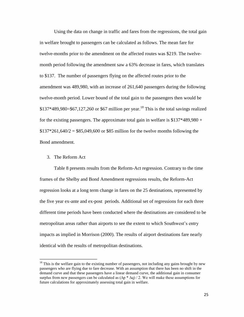
Using the data on change in traffic and fares from the regressions, the total gain
in welfare brought to passengers can be calculated as follows. The mean fare for
twelve-months prior to the amendment on the affected routes was $219. The twelve-
month period following the amendment saw a 63% decrease in fares, which translates
to $137. The number of passengers flying on the affected routes prior to the
amendment was 489,980, with an increase of 261,640 passengers during the following
twelve-month period. Lower bound of the total gain to the passengers then would be
$137*489,980=$67,127,260 or $67 million per year.18
This is the total savings realized
for the existing passengers. The approximate total gain in welfare is $137*489,980 +
$137*261,640/2 = $85,049,600 or $85 million for the twelve months following the
Bond amendment.
3. The Reform Act
Table 8 presents results from the Reform-Act regression. Contrary to the time
frames of the Shelby and Bond Amendment regressions results, the Reform-Act
regression looks at a long term change in fares on the 25 destinations, represented by
the five year ex-ante and ex-post periods. Additional set of regressions for each three
different time periods have been conducted where the destinations are considered to be
metropolitan areas rather than airports to see the extent to which Southwest’s entry
impacts as implied in Morrison (2000). The results of airport destinations fare nearly
identical with the results of metropolitan destinations.
18
This is the welfare gain to the existing number of passengers, not including any gains brought by new
passengers who are flying due to fare decrease. With an assumption that there has been no shift in the
demand curve and that these passengers have a linear demand curve, the additional gain in consumer
surplus from new passengers can be calculated as (∆p * ∆q) / 2. We will make these assumptions for
future calculations for approximately assessing total gain in welfare.

26
Distance and market concentration level have positive effect on fares as longer
flights cost more and bigger concentration also results in higher fares. GDP and
Population have no effect on fares as GDP is significant only in the one year time frame
and Population is dropped due to lack of variation.
Fares at airport with slots are on average 5% (the coefficient is 0.05) lower than
non-slot airports and fares at hubs are about 13% (the coefficient is 0.12) higher than
non-hub airports. Hub premiums are consistent with previous empirical studies
(Borenstein (1989)). The negative effect of the slot controlled airport could be logical if
the extent of competition at these airports outweighs the degree to which traffic is
constrained by the slot control. Roundtrip fares are on average 13% cheaper than one-
way fares when controlled for distance. Quarter dummies bear significance when there
is enough variation and get dropped otherwise. Where they are significant we observe
that fares in Q2 and Q3 are slightly more expensive than fares in Q1 and Q4. This
difference is related to the high tourism season.
The main variable of interest that captures the effect of the Wright Amendment
is Time*Treatment. The coefficient of this variables is big at first when 1 quarter before
and after fares are compared, 17%, but decreases to about 11%-13% when 1 year and 5
year periods are introduced. The decrease of fare difference between Wright affect and
non-affected markets from 17% to 13% is plausible as American Airlines and those
serving out of DFW cannot continuously keep charging higher amount for fares. What
is surprising is that while the 13% difference is reached within a year, it doesn't change
much from that level during the next four years. There are two possible explanations

27
that complement each other for airlines at DFW that continue to charge somewhat
higher fares in the long run. First, DAL is capacity constrained where it has only 20
gates. Even though Southwest can offer lower fares, compared to DFW, capacity
constraint will limit the extent to which consumers can benefit Southwest's new service.
Second, many consumers could be willing to pay 13% more for fares just to experience
the non-stop feature offered from DFW. Even though Southwest now can fly to any
destinations it wants from DAL, the law still enforces all flights out of DAL to have a
connection inside the Wright perimeter.
For the final result, this study focuses on the 13.88% of fare reduction affecting
the 25 metropolitan consumers for the five years following the Reform-Act.
The consumer welfare is calculated as follows. During the five years prior to the
Reform-Act, average fare between Dallas and the 25 affected metropolitan areas was
$215 per enplanement. 13.88% change in fare translates to $29.85. Total number of
traffic to the five metropolitan areas prior to the Reform-Act was 41,730,860. This
translates into $1,245,586,983 or $1.24 billion in savings to existing passengers alone.
Assuming the price elasticity of demand of -0.7 as the lower bound as done in
Morrison (1994), we can calculate the additional benefit to consumer surplus brought
by new passengers who are flying from Dallas due to the lower price. We already know
that price decreased by 14%, which means quantity demanded increased by
(-14)*(-0.7)=9.8 or 9.8% due to the lower price. If we apply the 9.8% increase in
quantity demanded to the 41,730,860 enplanements five years preceding the Reform-
Act, then increase in quantity is 4,086,624 or about 4 million enplanements. Assuming

28
a linear demand curve, the added consumer surplus brought by new passengers is
(4,086,624*$29.85)/2 or $61 million. The combined gain in consumer surplus is
$1,245+$61 million or $1.31 billion.
The higher bound assumption of price elasticity of demand at -1.5 brings the
added consumer surplus brought by new passengers to $131 million. The total gain in
consumer surplus in this case is $1,245+$131=$1.37 billion which is not very different
from the previous result.
VI. Conclusion.
In this essay, I measured the effect of airport competition restrictions on
consumer welfare by identifying changes in fares and traffic. A law that prohibits long
distance flights out of Dallas Love Field experienced three changes during its lifetime
has made it possible to estimate its effect on fares using the difference-in-difference
model. The regressions from three different time frames have produced fairly similar
results all pointing in the same direction if not with equal weight. The Shelby
amendment caused a decrease in fares, though statistically insignificant, with an
increase in quantity. This was expected as Southwest announced its intention to not
offer any new services and instead simply begin selling tickets on existing flights. The
Bond amendment saw a significant decrease in fares as Southwest immediately began
non-stop service to two destinations, Kansas City and St. Louis. The Reform-Act
finally allowed Southwest and other carriers at DAL to sell tickets to any destination
outside the Wright perimeter from DAL on the condition that the flights make a stop-
over. A 13.88% decrease in fares has been observed due to Southwest’s entry into

29
multiple markets. Based on the fare reduction and number of passengers flying long-
distance from DAL, the gain in consumer surplus over the five years following the last
change to the Wright Amendment has been estimated to be $1.31 billion.
It is worthy to note that the 13.88% reduction is occurring even though
Southwest is still being forced to make a connection within the Wright perimeter while
having to compete against those carriers at DFW that offer non-stop flights. Thus, the
price could fall even further once Southwest becomes eligible to offer the same service
from DAL.
The above results clearly display the scale of the negative welfare impact the
Wright Amendment brings to passengers of the Dallas metropolitan area. After 2014,
the Wright Amendment will be lifted, but not entirely due to gate capping, to allow
Southwest to offer non-stop flights and the region’s passengers and the economy can
finally begin enjoy everything that is brought by low airfares.

30
References:
Airport Council International – North American Q3, 2012 Traffic statistics (2012)
http://aci-na.org.
Borenstein, S. (1989) “Hubs and High Fares: Dominance and Market Power in the US
Airline Industry,” RAND Journal of Economics, 20, 344-65.
Cherny, A.I., D.Gillen, H.M. Niemeier and P.Forsyth (2008) “Airport Slots,” Ashgate
Publishing Company, London.
Dallas Fort-Worth International Airport Traffic report (2012)
http://www.dfwairport.com/stats/index.php.
Dallas Love Field Airport Traffic report (2012) http://www.dallas-
lovefield.com/pdf/statistics.
Dallas Love Field: The Wright and Shelby Amendments (2005) Congressional
Research Service report for Congress, 109th
Congress; H.R. 2932, H.R. 2646, H.R.
3058, H.R. 3383, S. 1424, and S. 1425.
Farris, M.T.II., and S.M.Swartz (2005) “Repeal or Retain? The Wright Amendment
Debate” University of North Texas.
Morrison, S.A. and C. Winston (1994) “The Evolution of the Airline Industry,” The
Brookings Institution Press, Washington, D.C.
Morrison, S.A. (2001) “Actual, Adjacent, and Potential Competition: Estimating the
Full Effect of Southwest Airlines,” Journal of Transport Economics and Policy,
Volume 35, Part 2, May 2001, pp. 239-256.
LOVE TERMINAL PARTNERS, et al., Plaintiffs, v. THE UNITED STATES,
Defendant. (2011) United States Court of Federal Claims, No. 08-536 L.
Reforming the Wright Amendment (2006) Hearing before the Subcommittee on
Aviation of the Committee on Transportation and Infrastructure House of
Representations, 109th
Congress, 2nd
session.
Slot-Controlled Airports: Report to the Committee on Commerce, Science, and
Transportation, U.S. Senate (2012) United States Government Accountability Office,
GAO-12-902.

31
Southwest Airlines New Release (2006) “Wright Amendment Reform Act of 2006
Enacted Into Law; Southwest Airlines Offers Customers $99 One-Way Fares and
Increased Travel Options From Dallas Love Field,” http://www.southwest.com.
“That Long Drive Out to the Airport: Why the Wright Amendment is bad for Dallas”
(2005) Dallas Magazine, August, 2005.
The Repeal of the Wright Amendment (2005) The Legacy Center for Public Policy
Wright Amendment Reform Act (2006) Public Law 109-352, 109th
Congress
“We’re talking about the Wright amendment and short-haul flights,” (2011) Dallas
Morning News, Jan 11, 2011.

32
Tables:
Table 1
Comparison of average fares and traffic for the Shelby Amendment affected
routes for four quarters before (1996:4 - 1997:3) and four quarters after (1998:1 -
1998:4) the event quarter (1997:4)*
Before Relaxation Percentage Change after relaxation
Average
Fare)
Traffic
(Enplanements)
HHI Average
Fare
Traffic
(Enplanements)
HHI
Birmingham,
AL $213 67,380 3754 -23% +37%
-
12%
Jackson, MS $120 59,660 5210 12% +10%
-
10%
Source: Author’s calculation from Databank 1B
* The event quarter is the quarter in which the law changes takes place and is
always excluded from analysis due to having some fares that were affected by
the law and some that are not.

33
Table 2
Changes to the Bond Amendment affected routes; four quarters before (2004:4 -
2005:3) and after (2006:1 - 2006:4) the event quarter (2005:4)
Before Relaxation
Percentage Change after
relaxation
Average
Fare
Traffic
(Enplanements) HHI
Average
Fare
Traffic
(Enplanements) HHI
Kansas,
MO $220 241,370
788
0 -50% +52% -32%
St. Louis,
MO $217 248,510
733
4 -50% +55% -23%
Source: Author’s calculation from Databank 1B

34
Table 3
Comparison of average fares and traffic for the 25 Reform-Act affected routes
1 year before (2005:4 – 2006:3) and 1 year after (2007:1 - 2007:4)*
Before Relaxation Percentage Change after
relaxation
Averag
e Fare
Traffic
(Enplanement
s)
HHI Averag
e Fare
Traffic
(Enplanement
s)
HHI
Louisville $268 70,280 3281 -34% 59% 14%
Omaha $239 81,830 6753 -30% 50% 2%
Columbus $269 132,690 5077 -29% 30% 21%
Detroit $252 271,660 3923 -27% 24% 2%
Nashville $236 146,180 7612 -26% 46% -
13%
Philadelphia $264 350,920 3954 -26% 22% 2%
Phoenix $232 394,410 3673 -23% 31% -2%
Oakland $274 117,910 5338 -22% 20% -
13%
San Diego $267 242,970 5062 -21% 33% -6%
Cleveland $263 131,190 3371 -20% -11% 30%
Denver $194 574,910 3208 -20% 8% 0%
Tampa $226 230,210 7044 -19% 24% -
15%
Salt Lake City $241 18,230 2713 -18% 19% -3%
Tucson $240 85,900 6714 -16% 3% 3%
Jacksonville $210 122,420 5997 -13% 15% -4%
Portland $253 161,360 3777 -10% 11% 5%
Sacramento $244 151,600 3841 -9% 8% 6%
Seattle/Tacoma $245 334,910 4281 -8% 8% -2%
Los Angeles, $227 590,490 5017 -7% 11% -1%
Indianapolis $204 169,580 6312 -7% 5% 11%
Baltimore/Washingto
n D.C.
$187 372,810 5776 -7% -1% -9%
Orlando $174 504,560 5108 -2% 14% -8%
Las Vegas $186 587,460 3781 -2% 8% 2%
Chicago Midway $131 328,220 4003 0% -25% 45%
Fort
Lauderdale/Hollywo
od
$175 271,840 7005 7% -11% -9%
All 25 markets
combined $217 6,608,610 4671 -14% 13% -1%
Source: Author’s calculation from Databank 1B
*the quarter in which the law takes place, 2006:4, is excluded

35
Table 4
Date of relaxations and affected treatment groups
Relaxation
name
Date of
Event Treatment routes
Control
routes
Shelby
Amendment 1997:4
To/From Dallas
metropolitan area to
Birmingham, AL and
Jackson, MS all other
routes to/from
the Dallas
metropolitan
area
Bond
Amendment 2005:4
To/From Dallas
metropolitan area to
Kansas and St. Louis,
MO
Reform-Act
repeal 2006:4
To/From Dallas
metropolitan area to the
25 new routes
Southwest entered
Source: Author’s calculation
36
Table 5A
Total number of observations (10% of total enplanements) for each relaxation event by
quarter
Shelby period
Data size
Bond period Data
size
Reform-Act Repeal
period
Data size
Ex-ante
1996:4 364,814
2004:4 492,867
2005:4 562,663
1997:1 339,338
2005:1 435,226
2006:1 511,201
1997:2 393,805
2005:2 499,175
2006:2 582,468
1997:3 389,264
2005:3 498,.557
2006:3 559,328
Event
quarter 1997:4 -
2005:4 -
2006:4 -
Ex-post
1998:1 363,753
2006:1 472,729
2007:1 518,939
1998:2 399,211
2006:2 534,694
2007:2 605,671
1998:3 440,960
2006:3 509,927
2007:3 603,336
1998:4 469,380
2006:4 542,744
2007:4 616,030
Source: Author’s calculation from Databank 1B
37
Table 5B
Descriptive statistics
Variable Mean Std. Dev. Min Max
Dependent: Fare 203 153 10 2,000
Distance 969 496 89 5,553
HHI metro 4,574 1,490 741 10,000
GDP 1.64% 2.73% -8.90% 6.90%
Population 4,303,418 4,762,123 13,005 19,100,000
slot 0.06 0.24 0 1.00
hub 0.88 0.33 0 1.00
Source: Databank 1B, U.S. Census Bureau, U.S. Bureau of Economic Analysis

38
Table 6A
Shelby Amendment regression results*
1 quarter before
(1997:4) and 1
quarter after
(1998:1)
Same quarter,
(1997:1) to
(1998:1)
Four quarters before
(1996:4 – 19997:3)
and four quarters
after (1998:1 – 1998:4)
Coeff.**
Clustered
t-stat*** Coeff.
Clusered
t-stat Coeff.
Clustered
t-stat
Time
dummy 0.070 (4.78) 0.044 (1.91) 0.048 (3.7)
Time *
Treatment -0.106 (-0.89) -0.224 (-7.73) -0.073 (-0.83)
Roundtrip -0.307 (-9.15) -0.322 (-10.6) -0.328 (-11.37)
Connecting -0.024 (-0.84) -0.002 (-0.09) -0.031 (-1.35)
1st quarter
effect 0.033 (2.1)
2nd
quarter
effect 0.027 (2.53)
3rd
quarter
effect 0.020 (2.48)
R-sq 0.23
0.24
0.25
Observations 753,017
703.091
3,160,525
* For all three regressions (Shelby, Bond and the Reform-Act), Hausman test
has been performed to test for random fixed effects. The results indicate there is
no statistically significant difference between the fixed and random effect
approaches in this case.
** For the Shelby and Bond amendments, control variables HHI, GDP,
population, slot dummy and hub dummy have been excluded due to lack of
variation as the treatment group consists only of two destinations. The Reform-
Act regression includes these variables.
*** Given the large number of observations, a regression clustered at the route
level has been performed to ensure robust results.

39
Table 6B
Changes in market share and traffic on routes affected by the Shelby
Amendment
American Delta Continental Southwest Remaining Combined
Traffic*
1996:3 –
1997:3
44% 44% 8% 1% 3% 127,040
1998:1 –
1998:4
41% 41% 2% 14% 2% 157,480
Source: Author’s calculation from Databank 1B
* Birmingham and Jackson traffic data are combined.

40
Table 7A
Bond Amendment regression results
1 quarter before
(2005:3) and 1
quarter after
(2006:1)
Same quarter,
(2005:3) to (2006:3)
Four quarters before
(2004:4 – 2005:3) and
four quarters after
(2006:1 – 2006:4)
Coeff.
Clustered
t-stat. Coeff.
Clustered
t-stat. Coeff.
Clustered t-
stat.
Time
dummy 0.030 (4.73) 0.046 (5.77) 0.047 (6.08)
Time *
Treatment -0.454 (-71.72) -0.539 (-27.86) -0.491 (-25.54)
Roundtrip -0.022 (-2.46) -0.017 (-2.10) -0.119 (-1.55)
Connecting -0.018 (-1.62) -0.015 -(1.35) -0.017 (-1.85)
1st quarter
effect 0.033 (5.52)
2nd
quarter
effect 0.049 (9.57)
3rd
quarter
effect 0.052 (10.24)
R-sq 0.27
0.25
0.27
Observations 971,286
907,955
3,985.919

41
Table 7B
Changes in market share and traffic on routes affected by the Bond Amendment
American Southwest Remaining Combined
Traffic
Q3,04 – Q3,05 87% 4% 9% 489,980
Q1,06 – Q4,06 66% 32% 2% 751,620
Source: Author’s calculation from Databank 1B

42
Table 8
Reform-Act Regression results for three different time frames to airport and metropolitan destinations
Dependent: Ln Fare Treatment=25 airport destinations Treatment=25 metropolitan destinations
Before/After time length 1 quarter 1 year 5 years 1 quarter 1 year 5 years
Ln Distance 0.43*** 0.44*** 0.42*** 0.43*** 0.44*** 0.42***
(0.05) (0.04) (0.04) (0.05) (0.04) (0.04)
Ln HHI metro (0.16) 0.04 0.13*** -0.14 0.03 0.13***
(0.08) (0.03) (0.04) (0.08) (0.04) (0.04)
GDP - 0.34* 0.03 - 0.35* 0.03
(.) (0.15) (0.09) (.) (0.15) (0.09)
Ln Population - - - - - -
(.) (.) (.) (.) (.) (.)
Slot dummy -0.06*** -0.04*** -0.05*** -0.06*** -0.04*** -0.05***
0.00 0.00 0.00 0.00 0.00 0.00
Hub dummy 0.18*** 0.18*** 0.12*** 0.18*** 0.18*** 0.12***
(0.02) (0.02) (0.02) (0.02) (0.02) (0.02)
Roundtrip dummy -0.12*** -0.12*** -0.12*** -0.12*** -0.12*** -0.12***
(0.01) (0.01) (0.01) (0.01) (0.01) (0.01)
Q1 dummy -0.05** 0.00 0.01*** -0.02 0 0.01***
(0.01) (0.01) 0.00 (0.01) (0.01) 0.00
Q2 dummy - 0.04*** 0.02*** - 0.04*** 0.02***
(.) (0.01) 0.00 (.) (0.01) 0.00
Q3 dummy - 0.04*** 0.02*** - 0.04*** 0.02***
(.) (0.01) 0.00 (.) (0.01) 0.00
Time dummy - -0.02 0.13*** - - 0.15***
(.) (0.01) (0.02) (.) (0.01) (0.02)
Time*Treatment -0.16*** -0.13*** -0.11*** -0.17*** -0.12*** -0.13***
(0.03) (0.03) (0.03) (0.03) (0.02) (0.02)
Observation 1,005,367 4,259,388 19,992,921 1,005,367 4,259,388 19,992,921
R-squared 0.07 0.06 0.06 0.07 0.06 0.06
* p<0.05, ** p<0.01, *** p<0.001
Note 1: Robust standard clustered errors are reported.

43
Note 2: Hausman test rejects the random effects model

44
Chapter 2: The Effect of Bankruptcy on Productivity in the Airline Industry
1. Introduction
Rising costs due to over expansion and increasing input prices combined with stagnant
revenue growth due to market competition is a theme that has plagued the U.S. airline industry
ever since deregulation in 1978. The vulnerable states of the biggest airlines manifest themselves
in waves of bankruptcies during economic downturns. The latest of such waves occurred from
2002 to 2007 following the recession caused by the tech-bubble and the September 11 attacks.19
During that time, four of the seven largest airlines in the country filed and were approved for
Chapter 11 reorganization bankruptcy protection plans.20
In the last decade, the majority of firms in the airline industry have gone through a
bankruptcy procedure. Every time an airline announces a bankruptcy, it cites the reason is to
become a more competitive and leaner organization.21
Can airlines really become more
competitive and efficient by declaring a bankruptcy? It is evident that at least in the short to
medium term the airlines reduce their costs (Government Accountability Study (2005)) by
getting out of contracts and renegotiating better terms through means of leveraging their
bankruptcy status. However, airline could benefit greatly in the long run from improvement in
efficiency and productivity rather than a mere short term cost reduction. Ultimately, increased
productivity of an organization is what surviving amid competition demands in the long term.
Judging from the industry’s fragile state, this paper hypothesizes that bankruptcies do not
19
The first wave took place just after the deregulation in the 80s. The second wave took place after the 1990
recession and the gulf war in 1991 that hurt air travel. 20
TWA in 2001, US Airways in 2002, United Airlines in 2003, Delta Air Lines and Northwest Airlines in 2005. 21
“US Airways Enters bankruptcy to emerge as a leaner, more competitive airlines” (http://www.usairways.com/en-
US/aboutus/pressroom/history/chronology.html); “AMR Files for Bankruptcy to Achieve Industry Competitiveness”
(http://www.aa.com/i18n/amrcorp/newsroom/fp_restructuring.jsp)

45
improve airline productivity and aims to empirically test this hypothesis using multiple cases of
airline bankruptcies.
Indeed, some industry insiders claim that Chapter 11 protection does not help firms
become more productive in the long run.22
Such claims are not without merit given the behavior
of repetitively declaring bankruptcy is observed. For instance, Trans World Airlines (TWA) went
into bankruptcy in 1992, 1995 andother one again in 2001. Also, U.S. Airways came out of
bankruptcy in 2003 only to go back in 2004. It could be that airlines simply use bankruptcy
protection to get out of unpleasant financial obligations and that is all. That, of course, is not
desirable market equilibrium for the long term as the inefficient incumbents remain by declaring
bankruptcy over and over again whenever they are under financial stress. Of course, as long as
there are enough lenders who are willing to keep the fund flowing into the airline industry
regardless of its state, airlines can maintain their status quo and simply keep declaring
bankruptcy. From the policy side, it becomes a question of how the bankruptcy courts can go
about imposing requirements as far as productivity and efficiency improvements go to ensure
that the bankrupt airlines are not simply “gaming” the system and that they are actually
becoming better organizations as a whole. Hence, this paper sets out to empirically determine
what happens to an airline’s overall productivity when it goes through a bankruptcy protection.
This paper uses bankruptcies of four legacy airlines to examine the effect of bankruptcy
on airline productivity. I use quarterly input and output data for each airline and use them to
22
“What is wrong with Chapter 11? It may keep ailing businesses going, but it distorts the airline industry: Chapters
11 businesses end up with unfair competitive advantages over competitors, thanks to their ability to renegotiate
contracts, cut costs and dump debts.” A quote by Simon Wilson in MoneyWeek, Dec 12, 2005.

46
create the total-factor-productivity index for each airline. After running fixed-effects regressions,
I find that bankruptcy does not improve productivity.
The paper is organized as follow. Section 2 looks at the literature on the subject of
bankruptcy and productivity in the airline industry. Section 3 discusses source of data and
provides a summary of descriptive statistics. Section 4 provides discussion on bankruptcies in the
airline industry since the deregulation. Section 5 elaborates on the ways in which productivity
can be measured. Section 6 discusses the econometric method used for identifying the effect of
bankruptcy on productivity. Section 7 covers regressions results and Section 8 provides
concluding remarks.
2. Literature Review
Many articles on the topic of bankruptcy in the airline industry exist where the focus is
mainly on the effect of bankruptcy on pricing, quality or capacity. Many articles also involve
various aspects of airline productivity, but none involve bankruptcy effects. The following
section provides a brief summary of the literature in bankruptcy and productivity respectively.
Bankruptcy and financial stress literature concerning the airline industry:
Borenstein and Rose (1995) focus on airline bankruptcies between 1989 and 1992 to
examine the effect of bankruptcy on pricing behavior. Their study finds that bankrupt airlines do
not change their own price dramatically and do not force competitors to reduce their price.
Borenstein and Rose (2003) look at whether airline bankruptcies affect supply quantity at the
airport level. The paper finds no evidence of significant effects of bankruptcy on flight quantity
at large and small airports. The effect on medium sized airports was small. The government
Accountability Office (2005) study investigates the effect of bankruptcy on aggregate costs of

47
airlines. The study determined that only some were able to reduce costs while others could not.
Hofer (2009) finds that financial distress causes airlines to reduce prices based on lowered costs
and demands. Waite (2009) focuses on airline bankruptcy and contracts between airlines and
airports to discover that airlines use bankruptcy status to avoid airport fees while continuing to
use airport facilities. Jayanti (2009) finds that airline bankruptcies result in decreasing own
market share and increasing rivals market presence. Lee (2010) finds that LCC capacity grew by
16% as legacy carriers when legacies reduce their capacity while undergoing a bankruptcy
procedure. Ciliberto and Schenone (2012a) find that bankrupt airlines on average drop 25% of
their pre-bankruptcy capacity. In addition, Ciliberto and Schenone (2012b) find that service
quality increases during bankruptcy and return to pre-bankruptcy lower levels once airlines exit
bankruptcy status.
Airline productivity literature:
The literature on the topic of airline productivity is rich. Caves et al. (1982a) was one of
the first studies to look at productivity aspect of the airline industry using the Total Factor
Productivity (TFP) indexing method. A more detailed look into this method comes in Section 5
as this section will provide findings of empirical productivity studies. Cave et al. (1982b), using
TFP, produces a comparison of airline industry productivity between 1970-1975 and 1976-1980.
They find that airline industry productivity increased by about 80% between those two periods.
Windle (1991) compares productivity of global airlines. The study uses TFP methodology to
determine that US airlines were 19% more productive than European airlines, but Asian airlines
were 45% more productive than US airlines in 1983. Good et al. (1993) conducts productivity
comparisons of eight US airlines to four European airlines from 1976 to 1986 and determines
that while the productivity growth rate between 1976 and 1986 were almost identical between

48
US and European carriers, US carriers were more productive. Distexhe and Perelman (1994)
finds that the biggest carriers, on a global scale, were better positioned to take advantage of
technological development and in turn showed more technical efficiency than the others between
1977 and 1986. Oum and Yo (1997) provide an extensive study of productivity and cost
competitiveness of world airlines employing the TFP index methodology. Ng and Seabrigth
(2001) perform productivity comparison of twelve European and seven major US airlines to find
that state ownership has a large impact on costs. Specifically the study finds that privatization
could reduce costs by as much as 20% for European airlines. Oum, et al. (2001) shows that
horizontal alliances of international airlines induce a significantly positive effect on productivity,
but there was no effect on profit. Swelbar (2007) compares partial productivity of legacy and low
-cost carriers US carriers from 1995 to 2006. The study shows that both aircraft and employee
productivity for legacy carriers declined sharply for three to four years and began improving
while low cost carrier partial productivity kept steadily increasing. Mark Greer (2008) looks at
changes in productivity of major US airlines from 2000 to 2004 using the Malmquist
productivity index, which is the same as the TFP index used in Caves et al. (1982), and finds that
there was significant improved in productivity during this period. The study discusses the overall
productivity trend in the industry from 1970 to 1980.
The main findings of the above studies were that over the years airlines’ productivity
have been increasing significantly as output grew much faster than input.
3. Data
The data for this study come from several different sources. The final database includes
detailed domestic US airline data on input/output quantity, cost/revenue statistics and market
concentration data for 11 airlines in Table 3.1 from 1992 to 2011 on quarterly basis. The

49
procedure for selecting these airlines is related to finding airline bankruptcy cases where pre and
post-bankruptcy data were available and determining suitable control group airlines for each
instance. This procedure is discussed in detail in Section 4. All data used in this study only
include the domestic portion of the 11 airlines.
The first part of the database consists of constructing necessary data for calculating the
TFP index and partial productivity ratios both of which come from the Department of
Transportation Form 41. Form 41 is a financial reports data where air carrier submit detailed
revenue, cost and operational statistics to the Department of Transportation. The TFP index uses
four input (labor, fuel, aircraft and miscellaneous) and three output (revenue passenger mile,
revenue-ton mile and incidental) to calculate productivity. As such, detailed database containing
both quantities of input/output components and respective dollar amount spent/earned on them
was assembled on quarterly basis between 1992 and 2011.
Input data: The quantitative part of the input index includes data on the number of
employees, gallons consumed for fuel and the average number of aircraft. Data on miscellaneous
quantity of inputs (all other material input besides aircraft and fuel such as amount of passenger
meals, various equipment, etc.) is not available. Instead, the miscellaneous material quantity
index was calculated by dividing miscellaneous materials cost by the quarterly US GDP deflator
as done in Oum, et al. (2001). The cost sharing part includes data on labor cost, fuel cost and
aircraft cost. Miscellaneous was cost was calculated by subtracting the previous three main costs
from total cost. The cost-share part of the input data was available from Form 41 on a quarterly

50
basis. It includes the dollar amount spent on labor, aircraft and fuel. The material cost (or
miscellaneous cost) was computed by subtracting labor, aircraft and fuel cost from Total Cost.23
Output data: The quantitative section of the output index includes revenue passenger
miles, revenue-ton miles and miscellaneous revenue earning quantity index (such as baggage
fees, meal service, etc.). While the former two are available, the miscellaneous revenue earning
quantity index is not available. Instead, it was replaced by an index computed by dividing
miscellaneous revenue by the quarterly US GDP deflator as was done previously. The revenue-
share section of the output index was computed by dividing each of ticket sale revenue, mail and
freight revenue and incidental revenue by the total revenue.
Once the output and input data indexed are calculated, the TFP index is calculated by
dividing output by input. Table 3.2 illustrates a sample of input, output and TFP index data.
The second part of the database consists of creating the independent variable data. The
data for fleet size, fleet age and fleet type were calculated come from Department of
Transportation’s data on airline fleet statistics section from its website which is available only
post 1992. Quarterly data for stage length and load factor come from Form 41. Quarterly GDP
growth and GDP deflator data were collected from the U.S. Bureau of Economic Analysis. The
quarterly HHI index, market share and network size for each airline was computed from
Databank 1B, the U.S. Department of Transportation’s Ticket Origin and Destination Survey, on
quarterly basis.
23
Total Cost and Total Revenue excludes Transport Related Costs and Transport Related Revenues. Transport
related revenues/costs report the amount earned/spent from purchasing airline service from regional feeder airlines
and thus do not directly take part in an airline’s own production of goods and services.

51
The finished database consists of an unbalanced panel consisting of 612 combined
observations where each observation is quarter-carrier unique data consisting of ln(TFP) as the
dependent variable along with the aforementioned independent variables (unbalanced set of
11airlines for 80 quarters combined, but strongly balanced when each bankruptcy and its control
groups are considered separately according to their time periods surrounding individual
bankruptcies). Each cross-section contains a total of 14 input and output variables used for
constructing the TFP index and nine potential independent variables for the panel regression.
Section 6 will provide a detailed discussion of the independent variables. The next section,
Section 4, discusses the background history of bankruptcy in the U.S. airline industry.
4. Airline Bankruptcy Background
There are two types of bankruptcies in the U.S., Chapter 7 and Chapter 11 of the
Bankruptcy Code of Title 11 of the United States Code. The Chapter 7 bankruptcy is a
liquidation procedure where firms cease operations and are forced exit the market. Chapter 11
bankruptcy helps firms reorganize while continuing operation. This paper will focus on firms
going through Chapter 11 bankruptcy since the focus is on evaluating their post-bankruptcy
conditions.
In the government-regulated era of the airline industry prior to 1978, airline bankruptcy
was not a very common phenomenon. However, after deregulation the number of bankruptcies in
the industry exploded, as did the number of start-up airlines, as surviving in the new environment
proved to be an extremely challenging task for most, both for the new entrants and well-
established legacy carriers. Since 1979 there have been around 180 recorded cases (including
52
multiple bankruptcies by the same airline) of bankruptcies in the airline industry.24
This number
includes every type of airline service providers including scheduled passenger carriers, cargo,
chartered and specialized contract (such as military, mail, etc.) carriers. Even though, most of the
bankruptcies were by non-standard service offering airlines, the list still included the industry’s
biggest players. For the purpose of this study and based on availability of data, this paper will
only consider bankruptcies of major scheduled passenger carriers between 1992 and 2011
excluding bankruptcies by regional feeder carriers whose main function is to provide local feeder
service to the major airlines.25
Historically, the frequency of bankruptcies can be divided into four time frames. The first
wave, beginning in the late 1980s, included Braniff International Airways from the majors and a
number of smaller carriers. It was the result of shake-up in the immediate aftermath of
deregulation as big and small airlines scrambled to establish their footing in the new
environment.
The second wave began in the late 1980s and carried into early 1990s. This wave saw
some of the biggest carriers declare bankruptcy one after another, including Eastern Air Lines
(1989), Pan American World Airways (1991), America West Airlines (1991) and TransWorld
Airlines (1992). Bankruptcies from the first two waves are not included in this study because (a)
many ended up ceasing operation and (b) data prior to 1992 are limited.
24
For a complete list see Airline For America (www.airlines.org) which currently is the only source of its kind. 25
There are three types of carrier classifications categorized by the Department of Transportation based on annual
revenue. Group I, called “regionals,” includes carriers with less than $100 million of revenue annually. Group II,
“nationals,” includes those with revenues between $100 million and $1 billion annually. Group III, “majors,” covers
carriers with revenues of over $1 billion. Once again, regional carriers are not to be mixed with regional-feeder
carriers whose size can range from $100 million to over $1 billion in revenue but they are excluded from the study
as they operate under a totally different system by receiving contracts from the major airlines.

53
The third wave began in early 2000s and continued till 2005 and is historically the
biggest wave that hit the industry. During that time we saw extinction of TWA (2001), multiple
bankruptcies by US Airways (2002, 2004), bankruptcies by United, Delta and Northwest. From
the smaller airlines, Allegiant, Hawaiian, ATA and Aloha declared bankruptcy during this era.
This wave was caused by the recession of 2001 compounded with significantly diminished air
travel due to 9/11 attacks.
The fourth wave began in 2008 with re-appearance in bankruptcies of Aloha, ATA, and
first time cases of Frontier and Sun Country that all took place in the same year. Even though
America’s bankruptcy occurred several year after 2008, in 2011, this wave can be characterized
as mostly affecting the smaller airlines. Arguably, this wave was the result of economic
downturn of 2008.
This study will focus on the third and fourth waves that include bankruptcies by major
and national carriers.
Table 4.1 lists all Chapter 11 bankruptcy occurrences by major, national and regional
carriers with annual revenues of at least $100 million between 1992 and 2011. As mentioned
previously, this study excludes all carriers offering other non-standard types of services (such as
chartered service, cargo, military contract, etc.).
Between 1992 and 2011, there were 18 cases of Chapter 11 bankruptcies by major,
national and regional carriers. Six of these (marked by *) are re-entry into Chapter 11 by the
same carriers. Table 4.2 illustrates the history of re-entering bankruptcy by the same airlines. The
level of frequency of re-entering bankruptcy protection could be an indication of airlines’ poor
health post-bankruptcy and what airlines are able to achieve (or not achieve) by declaring
bankruptcy. Even though they are able to shed costs (Government Accountability Study (2005))

54
by getting bankruptcy protection, ideally an organization could be using the protection as an
opportunity to improve its fundamental structure by becoming more productive and efficient to
guarantee long term viability.
In this study, I will focus on four instances of bankruptcies between 1992-2011 involving
a total of 11 airlines based on availability of data and compatibility of control group airlines.26
Two additional bankruptcies, that of Hawaiian’s in 2003 and Frontier’s in 2008, were also
considered and their results are displayed in the appendix due to compatibility of their control
group. Previously, we saw the list of 11 airlines considered in this study in Table 3.1. Table 4.3
lists the six instances of bankruptcies with control groups of each bankruptcy. The following
criteria were applied in determining airlines for a specific control group. First, during the entire
pre, mid and post-bankruptcy period, a control group airline must not itself be involved in a
bankruptcy procedure as that would conflict with being a control entity. Second, treatment and
control group airlines should be similar in size and network coverage to each other.27
The major
airlines were all much bigger in size than the non-major carriers and typically offer nationwide
network coverage where they compete against each other throughout the country and thus being
26
The 18 instances of bankruptcies in Table 4.1 were reduced to 6 as the following 12 exclusions took place in a
chronological order: (1)TWA’s 1992 bankruptcy didn’t have pre-bankruptcy data, (2) Hawaiian’s 1993 bankruptcy
does not have proper control group data (3) TWA’s 1995 bankruptcy was not truly a reorganization procedure
(though it was Chapter 11) as the sole purpose of it was to break a discounted ticketing contract made with Carl
Icahn as a condition of his departure in 1993, (4) Allegiant’s 2000 bankruptcy was excluded as only post 2004 data
is available for the airline, (5) Trans World Airline’s Chapter 11 in 2000 ended with a sale/merger with American
Airlines and thus contains no post-bankruptcy data, (6) US Airways’ 2004 bankruptcy ended after merging with
America West and thus the post-bankruptcy productivity would contain ambiguous merger and bankruptcy effects,
(7) ATA entered bankruptcy in 2004 and exited in 2006:1 only to go back into liquidation bankruptcy after 3
quarters and thus not having sufficient post-bankruptcy data,(8) and (9) Aloha Airline’s two instances of
bankruptcies have been excluded as (a) Aloha was too small to be compared to any other airline and (b) it entered
liquidation process soon after it exited its first bankruptcy, (10) ATA Airlines 2008 bankruptcy was followed by
dismantling the airline and selling remainder of its assets to Southwest, (11) Sun Country lost all of its fleet during
bankruptcy and as such, the post-bankruptcy airline was effectively a new organization that simply kept the name
and (12) American Airline is still in bankruptcy. 27
It is possible to question whether a particular control airline is the ideal match for the given treatment airline.
However, such a perfect match is hard to achieve and thus, the current selection is a best-possible scenario given the
situation.

55
subject to similar macro shocks. However, the non-major carriers are much smaller in size and
their service is mostly limited to destinations from their single local hub. As such, creating a
proper control group for them becomes increasingly difficult even though they may be similar in
size. For instance, Frontier and Hawaiian are comparable in size in terms of revenue passenger
miles and their bankruptcies are many years apart. Thus, it can be tempting use one as a control
group for the other and those results are displayed in the appendix. However, it can be argued
that due to their localized network concentration, Frontier in Denver and Hawaiian in Hawaii,
they become subject to entirely different local market conditions, which asks the question
whether they are good comparisons with each other. Therefore, the results are displayed in the
appendix and not included with the major airline results.
In addition to the control group airlines, Table 4.3 details entry and exit points as
announced by each airline and as well as pre and post-bankruptcy periods. The length of the pre
and post-bankruptcy periods were determined as the longest possible continuation of time
without having one of the control group carriers overlap into a bankruptcy period. For the main
results of this study, each airline’s announcement of exit from bankruptcy is used to mark
beginning of their post-bankruptcy period. Additionally, in the results section I post regression
results with an alternative version of the post-bankruptcy period where each airline is given a
longer time to spend in bankruptcy in case it took beyond the exit announcements dates for the
bankruptcy effects to be fully integrated into productivity.
Descriptive statistics of bankrupt airlines:
This section will discuss the descriptive statistics as airlines enter and exit bankruptcy.
For each of the four legacy bankruptcies, four descriptive measurements are illustrated. They are
56
(1) employee size, (2) aircraft quantity, which are inputs and (3) revenue passenger miles and (4)
network size, which are outputs.
Figure 4.1 looks at employee size patterns of the four airlines as they go through
bankruptcy. All the four airlines were experiencing a reduction in labor size for some time prior
to bankruptcy. During bankruptcy the trend continues except the magnitude of labor reduction
seems to have increased a bit as we see steeper downward trending slopes during bankruptcy.
The exception here is United, which sees a major increase in labor size right before exiting
bankruptcy. This was a result recalling thousands of furloughed workers, a normal process when
airlines go through difficult times, but in this case much larger in quantity for United than the
other airlines.28
Post-bankruptcy, airlines continue cut labor for some time except US Airways
and Delta, which entered merger deals that added to their existing work force.
Figure 4.2 looks at aircraft quantity trend. US Airways and United had a pre-bankruptcy
reduction in number of aircraft they operate, which continued during bankruptcy. Delta and
Northwest had maintained a stable quantity pre-bankruptcy but during bankruptcy we see their
fleet become smaller at a very fast rate. Post-merger, we see that the aircraft quantity stabilize for
some time until airlines begin engaging in mergers (for Delta, US Airways and Northwest).
Figure 4.3 illustrates the revenue-passenger-mile trend for each airline. The common
pattern here is the post-bankruptcy downward trend in output as compared with its pre and mid-
bankruptcy trends until an airline becomes involved in a merger, which increases their output.
Surprisingly, during bankruptcy, we see a relatively flat trend in that amid all the reduction in
28
United Airlines to recall pilots and other labor force (http://www.aviationpros.com/news/10405905/united-
airlines-to-recall-300-pilots)

57
labor and other input sources airlines manage to maintain their output until they exit bankruptcy,
at which point the downward trend begins.
Figure 4.4 illustrates the network size of each airline. Pre-bankruptcy, US Airways and
United had decreasing trends in network size, where Delta and Northwest had increasing trends.
By going into bankruptcy, Delta and Northwest enter a downward trend in decreasing network
size and US Airways continues its downward trend, United begins to expand its network until it
takes a sharp downward turn in 2008 in relation so the recession of that year.
In conclusion, the surprising common pattern from the above four airlines is that while
they make significant cuts in labor and aircraft quantity, and thus reducing their inputs, their
output levels, illustrated by RPM and network size, are not decreasing as fast as their inputs.
However, the above is only part of a bigger story as we need to take the partial and TFP
productivity measurements in conjunction.
5. Measuring productivity
This study will focus on two most used approaches to measure productivity: partial and
total factor productivity (TFP).29
Partial productivity is a simple ratio of one input to one output
and is widely used in the finance and mainstream economic literature to have a quick look at a
specific productivity. While partial productivity is simple to calculate, it can only focus on one
input/output at a time and therefore it lacks capacity to indicate a firm’s overall productivity. On
the other hand, TFP is an index based system that includes all inputs/outputs and enables
29
Similar to TFP, there is also data envelopment analysis and stochastic frontier estimation methods that employ
multiple input and outputs to asses a firm’s overall productivity. However, the study chose TFP as it is the most
commonly used method for looking at productivity in the airline industry. A full extent treatment and comparison of
all the three methods is beyond the scope of this paper.

58
comparison of productivity across different firms. This paper will analyze airlines’ partial and
total factor productivity in the style of Oum (2001).
5.1 Partial Productivity:
Partial productivity is a ratio of an input to output. In the airline industry, depending on
one’s research interest, it is possible to produce a variety of ratios using the many different input
and output variables available. This study will focus on the most four widely used ratios that
consider productivity of two inputs: employees ((a) and (b) below) and aircraft ((c) and (d)
below). The two productivities are presented through four ratios:
a. ASM/employee: output (available seat miles) per employee
b. Total passengers/employee: number of passengers enplaned per employee
c. ASM/aircraft day: output per aircraft day
d. Block hours/aircraft day: block hours per aircraft day which indicates on average
how many hours in a 24-hour frame one aircraft spends between gate-close and
gate-open.
Figures 5.1-5.4 illustrate comparisons of airlines’ partial productivity in the order listed
above.
Figure 5.1 compares employee productivity in terms of ASM for each airline. We see all
the airlines’ employee productivity increase in terms of ASM as in Figure 4.1 we saw that airline
cutting work force significantly. Reduction in employee size is much faster than reduction in
ASM output pre-bankruptcy. Post-bankruptcy, however, presents a story where the reduction in
ASMs have caught up with fluctuation in employee size where we see a decrease in employee
productivity as the number of employees keep decreasing from Figure 4.1.

59
Figure 5.2 has been considered to test a different aspect of employee productivity. While
airlines can maintain ASM, it is possible that being in bankruptcy could hurt passenger traffic
greatly and thus reducing the number of passengers handled by each employee. However, we see
a much similar pattern to the one in Figure 5.1 as the change in passenger traffic moves very
similarly to change in ASM as airlines enter and exit bankruptcy.
Figure 5.3 presents a measurement of how many hours per day on average each aircraft is
used. From Figure 4.2, we know that airlines continuously kept reducing their fleet before,
during and after bankruptcy. For US Airways, Delta and Northwest, we don’t see a major shift in
pre and post-bankruptcy behavior either increased or decreased. On the contrary, United’s
aircraft usage for post-bankruptcy increases steadily compared with its pre-bankruptcy trend.
Figure 5.4 compares aircraft productivity in terms of ASM. From Figure 4.2, United and
US Airways had experienced a sudden drop in aircraft quantity right before entering bankruptcy.
That reduction in quantity has affected the ASM productivity positively before bankruptcy for
the two airlines. Post-bankruptcy, the two airlines’ aircraft productivity remains somewhat flat as
their output reduction catches up with aircraft reduction.
Delta and Northwest both had very gradual declines in aircraft quantity and accordingly,
we observe a very gradual increase in aircraft productivity till they exit bankruptcy. However, in
post-bankruptcy, Delta’s productivity begins to drop slowly at the beginning and then drops
significantly in 2009 at which point it merged with Northwest increasing its aircraft quantity
dramatically. Northwest’s productivity keeps increasing post-bankruptcy as they keep reducing
their fleet size much faster than they cut their ASM.

60
5.2. Productivity indexing background
Although simple to calculate and widely used, the partial productivity method has two
main shortfalls. First, it cannot offer measurement at the firm level when multiple inputs are used
to produce multiple outputs. Second, partial productivity measurements do not account for
rational trade-off choices firms make between multiple inputs. An index numbering system
solves both of them.
One of the most widely used index numbering system for measuring productivity is the
Total Factor Productivity (TFP) index, which is a trans-log multilateral index formula. The TFP
index was advocated by Tornqvist (1936) and Theil (1965) and was later extended by Caves,
Christensen and Diewert in their 1982 paper. The extension by Caves et al. (1982) consisted of
modifying TFP to improve its transitivity property. Since then, as stated in Oum and Tretheway
(1986) and Windle (1991), the TFP has become “the single most useful measure of productive
efficiency.” Indeed, the majority of the empirical studies of productivity in the airline industry
employee TFP as their main tool to measure productivity. Such studies include Caves et al.
(1982b), Caves et al. (1983), Windle (1991), Oum et al. (1992), Good et al. (1993), Oum et al.
(1997), Duke (2005), Apostolides (2006), Honsombat et al. (2010) and also other studies in the
transportation industry.
The Thornqvist-Theil index formula is:
lnTFPk
where aggregate productivity of firm k with j outputs and i inputs are calculated. Full
explanation of the formula is provided below. Caves et al. (1982) further extended the above into
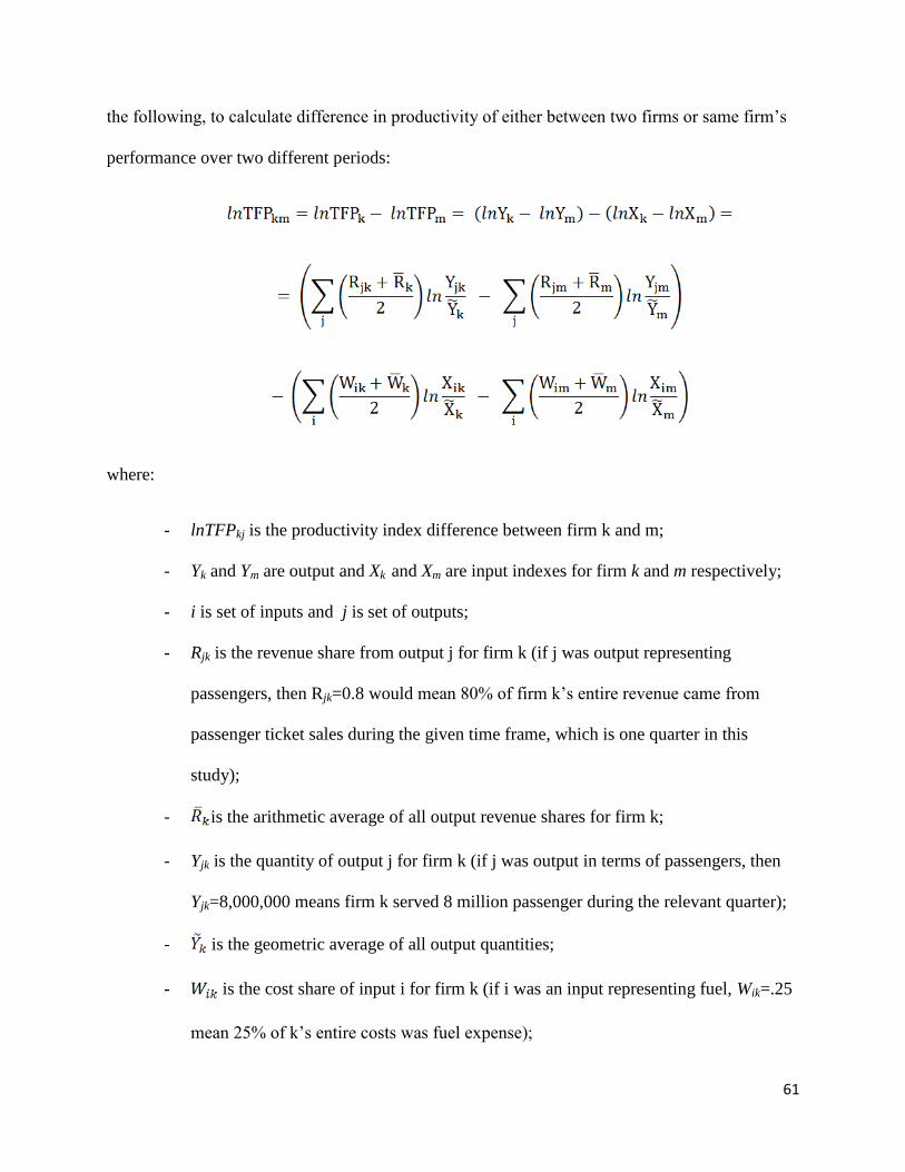
61
the following, to calculate difference in productivity of either between two firms or same firm’s
performance over two different periods:
where:
- lnTFPkj is the productivity index difference between firm k and m;
- Yk and Ym are output and Xk and Xm are input indexes for firm k and m respectively;
- i is set of inputs and j is set of outputs;
- Rjk is the revenue share from output j for firm k (if j was output representing
passengers, then Rjk=0.8 would mean 80% of firm k’s entire revenue came from
passenger ticket sales during the given time frame, which is one quarter in this
study);
- is the arithmetic average of all output revenue shares for firm k;
- Yjk is the quantity of output j for firm k (if j was output in terms of passengers, then
Yjk=8,000,000 means firm k served 8 million passenger during the relevant quarter);
- is the geometric average of all output quantities;
- is the cost share of input i for firm k (if i was an input representing fuel, Wik=.25
mean 25% of k’s entire costs was fuel expense);

62
- is the quantity if input i for firm k;
- is the geometric mean of input quantities;
The extended version of TFP index calculates percentage change of productivity between
two firms (or two points of time). Both indexes use revenue (cost) shares as weights for
aggregating firm’s output (input) quantities to produce an output and an input index.
This study uses the extended version of the TFP index by Caves et al. as is the standard in
most empirical work.
As was stated earlier, the extension of Caves, et al. (1982) to the Tornqvist-Theil index
was to improve its transitivity property. Such transitivity property becomes important when
simultaneous multilateral (more than two firms at once) comparisons are made across multiple
firms in cross section and/or over multiple time periods.30
In order to calculate the TFP indices, this study uses four input and three output variables
of 11 airlines from 1992 to 2011 on a quarterly basis to measure the TFP for each scenario in the
same way done in Oum (2001). The inputs include (i) number of employees, (ii) gallons of fuel
consumed, (iii) number of aircraft used and (iv) miscellaneous material input that consist of
everything else. For each input, its share of total cost was calculated separately.31
The outputs
include (i) RPM, (ii) Revenue-ton mile and (iii) incidental output, which includes all other
material outputs that earn revenue such as catering, ground handling, sales of technology,
consulting services, hotel businesses, etc. Both miscellaneous input quantity and incidental
30
In their empirical paper, Caves et al. (1983) demonstrates how the extended version of TFP index can be used by
aggregating productivity indices from 1970 to 1975 to compare with aggregated indices from1976 to 1980. For an
extended discussion see Coelli et al. (2005) and Caves et al. (1982). 31
Total Cost and Total Revenue excludes Transport Related Costs and Transport Related Revenues as was
explained previously in Footnote 4 on p.6.

63
output quantity are not available as there are no data for many different types of inputs/outputs
that take only small fraction of the entire operation. Instead, as done in Oum (2001), the dollar
amount spent on miscellaneous inputs and earned from incidental services was divided by the
U.S GDP deflator to be used as proxies.
Figures 5.5 through 5.8 illustrate output, input and TFP index comparisons of bankrupt
airlines with their control group airlines. The indices all have been normalized to American
Airline’s 1992 output, input and TFP index.
Figure 5.5 illustrates the rate of change in input, output and TFP index each of the four
bankruptcy airlines enter and exit bankruptcy. The index is created by pooling from four
different kinds of inputs taking into account individual cost shares. We see that unlike the output
and the TFP indices, there is less quarterly effect on input as it stays flat with a downward
trajectory. The exception is a sharp drop in the input index right before bankruptcy and a sharp
increase right before they exit bankruptcy. This is related to United furloughing thousands of
employees and recalling them when they exited bankruptcy as we saw in Figure 4.1. This change
visibly affects productivity positively as United’s output stays flat relative to its input. The
pattern of continuously reducing inputs while trying to maintain output at the same level is also
observed for Delta and United. US Airways’ output however declines as fast as its input.
Figure 5.6 and 5.7 separates each airline’s input and output indices and compares them
with their respective control group airlines’ indices. In each graph, the name of the airline that is
going through bankruptcy is outlined in a box and the vertical lines representing bankruptcy
entry and exit dates as usual. The common pattern observed in Figure 5.6 and 5.7 is that both
input and output indices decrease faster than their control group airlines’ respective indices. This

64
is natural as an organization decreases its overall input and output by going through bankruptcy.
However, the final effect on productivity cannot be told here as the rate of change in input and
output eventually determine the level of TFP. This is what Figure 5.8 achieves, which compares
each bankrupt airline’s TFP with its control group.
First, we see US Airway’s TFP history from 2000 to 2004 as it enters and exits
bankruptcy. There are five control group airlines and US Airways is the worst performer among
the six airlines. If we look at US Airways’ TFP on its own, visibly there is no point of defection
around bankruptcy entry and exit dates as the airlines mostly follows a similar pattern its control
group is following.
United’s TFP comparison reveals a slightly different story. Before bankruptcy it was
doing slightly better than American and we see sharp increase in productivity caused by the
change in employee size which comes down eventually. Post-bankruptcy, United is doing worse
than Southwest and American and Southwest continue to do better in the long run while
American eventually comes down to United’s level of productivity.
Delta’s productivity history differs from the above two in that it manages to the top
performer before and after bankruptcy, but post-bankruptcy it shares that top spot with
Southwest. American and Continental appear to be following the same pattern during Delta’s
post-bankruptcy era as it in the pre-bankruptcy period. We see a much similar story with
Northwest’s bankruptcy.
6. Econometric methodology
The econometric identification method used in this follows the methodology used in Oum
et al. (2001). The regression is a fixed effects difference-in-difference method that captures the

65
difference between the treatment and control groups using bankruptcy dates point of difference
between the two groups after controlling for exogenous variations. The treatment group in this
case is the bankrupt airline and the control group consists of other airlines that were selected
based on criteria in Section III. The panel regression is for each of the four bankruptcy case is:
where:
- is the lnTFP productivity index dependent variable for i (i=1….11) firm at quarter t
(t=1…80);
- is the firm level fixed effect for firm i;
- measures quarter effect where Quarter Dummyl (l=1,2,3 for quarter 1, 2 and 3) is 1 for
Quarter 1, 0 otherwise, etc;
- measures individual airline level fixed effect where (m=1,2…11) is 1
for each individual airline and 0 otherwise;
- is 0 for all quarters pre-bankruptcy and 1 for all quarters post-bankruptcy;
- is 1 for the firm going through bankruptcy and 0 for the firms that are in control group for
each bankruptcy case;
- is interaction of the Time dummy and the Treatment dummy which captures the effect of
bankruptcy on productivity, the coefficient of interest;
- is a vector of independent variables that consist of the following for each firm i:

66
1. Employee size: the more workers a firm has, the less productive it will be all else
constant. The hypothesis is that a firm under bankruptcy is could to reduce work
force and thus affecting productivity;
2. Stage length: the longer the stage length, the productive a firm will be;
3. Average fleet age: older fleet age could harm productivity as more resources will
be dedicated to keep the planes running all else equal;
4. Number of different types of aircraft: the more number of varieties of aircraft an
airline used, the less productive it is expected to be. The classical example is
Southwest’s 2-3 different types of usage of the Boeing 737 aircrafts as opposed to
a typical legacy carrier that used on average 14 different aircrafts.
5. Load factor: higher load factor is expected to result in higher productivity as more
people board a flight at a fixed level of input;
6. Quarterly GDP growth rate: as GDP growth increases productivity is expected to
increase as output can increase faster than input regardless of firm’s bankruptcy
7. Average-HHI of participating markets of airline i (airport pair or metropolitan
area pair): It is calculated as follows. Suppose firm i flew only on two markets A
and B. Let’s assume market A has HHI of 3000 and market B has HHI of 5000,
and 40% of i’s total flights were on market A and 60% were on market B. Then
the Average-HHI equals 3000*40%+5000*60%=4200. This variables measures
how frequently an airline serves highly competitive (and thus increasing pressure
on productivity) or highly non-competitive routes (and thus decreasing pressure
on productivity).

67
8. Average market share on participating markets (airport pair or metropolitan area
pair): this variables measures firm’s own presence on routes it serves. If most of
its flights are on markets where it has huge dominance, there is less competitive
pressure to be productive and vice versa. Continuing with the previous example, if
firm i’s market share on route A is 80% and on B is 90%, then its Average-
market-share equals 0.8*40%+0.9*60%=.86, a firm with very a dominant
advantage and thus less incentive to improve its productivity.
9. Network size (airport pair): this variables measures number of markets served in
a given quarter. As a firm goes through bankruptcy, its network size is known to
decrease significantly, because it is cutting back on service. The network size
needs to be controlled for because the study aims capture variation in productivity
not caused by decrease in network size.
Table 6 provides summary statistics of the TFP index and the ten independent variables. The
next section provides discussion of regression results.
7. Regression Results
Table 7.1 presents the fixed effects regression results for each of the four bankruptcies
considered in this study. The dependent variable is ln(TFP). The second row from the top
indicates the length of pre and post-bankruptcy periods along with the number of quarters each
airline spent in bankruptcy. For each bankruptcy, US Airways has a control group consisting of
five airlines where there are five dummies for each. For the other three bankruptcy cases, the
control group airlines are American, Continental and Southwest. Of the four regressions, United
has the longest pre/post and bankruptcy period. The airline spent 3.5 years in bankruptcy and
data for 4.25 years pre and after are available. Thus, having far more observations, the United

68
regression could have had much more significant variables but the results in Table 7.1 show that
the same significant variables are also significant across the other regressions, even for US
Airways where only 1.5 years of pre/post data was available.
Our main variable of interest that measures the effect of bankruptcy on firm productivity,
Time*Treatment, is insignificant for all cases of bankruptcies, confirming bankruptcies do not
result in any change in productivity. This confirms our observation from Figures 5.5 to 5.8 where
a detailed look into the source of change in productivity was provided. Since the post-bankruptcy
period began when each airline announced its exit in Table 7.1, another version of the
regressions were performed to test whether giving airlines more time to adjust for its post-
bankruptcy life would produce different results. In the alternative version, each airline’s post-
bankruptcy periods began after a certain time they had announced their exit and thus lending
them more time for adjustment. The new post-bankruptcy date for US Airways began 2 quarters
after their exit announcement date. This means US Airways actually exited bankruptcy on
2003:1 and previously for Table 7.1 regression their post-bankruptcy period began in 2003:2, the
very next quarter after their exit quarter. However, for Table 7.2, the post-bankruptcy period is
set to begin in 2003:4, giving them additional two quarters for adjustment. The extensions for the
United, Delta and Northwest bankruptcies were all four quarters each.
With the extended time in bankruptcy, all signs and statistical significances in Table 7.2
mimic Table 7.1 including the Time*Treatment dummy which all remain statistically
insignificant.
In terms of the control variables, we see that labor size has a negative impact on
productivity across the board. The weight of the effect ranges from -0.49% to -0.89% on
productivity as labor size increases by 1%. This means that as far as the legacy carriers go, they

69
are at a point where additional labor impacts productivity negatively or they got too big in terms
of labor size.
Load factor and stage length impact productivity positively expectedly as observed in
Oum (2001) and is a norm in the industry.
The additional variables used in this study that were not used in any of the previous
studies were the aircraft age, aircraft type and the market concentration variables which include
the Average HHI metro, average individual market share and average network size. Aircraft type
does not affect productivity. Surprisingly, we see that the age of fleet is positively related with
productivity. This means while controlled for everything else, the older planes increase
productivity compared to the younger planes. This could be explained by pre-existing trained
workers and equipment to work with older planes that improve productivity.
In addition, we see that airlines are productive in Q2 and Q3 than in Q4 which is most
likely related with the summer travel season. There is no statistical difference between Q1 and
Q4.
The airline dummies are consistent with what we observed from Figure 5.8. The two
noteworthy trends are that Southwest and Delta have been consistently leading the industry in
terms of productivity. Across the four regressions we see Southwest being at least 60% more
productive than its competitors which is attributed to their explosive growth especially during the
last decade while the rest of the pack were scrambling to just maintain their positions.32
32
The appendix contains the regression results for Hawaiian and Frontier. These results have not been included as
part of the main results due to the weak control group as discussed previously on pg. 10. Figure A compares each of
Hawaiian and Frontier bankruptcies in terms of TFP to their control group which are Alaska/Frontier and
Alaska/Hawaiian respectively. While there is no obvious elevation or a defecting point pre and post-bankruptcy, the
fact that Hawaiian’s productivity remain flat while the other two experience major gains during the same period
signals the possibility of Hawaiian lagging behind due to bankruptcy. Indeed, in Table A where the regression
results are displayed, we observe Hawaiian to be experiencing a 63% (ln(.49)-1) drop in productivity as a result of
the bankruptcy. However, this number could be so high is because (a) Hawaiian had only two airlines in its control

70
8. Conclusion
After an extensive assembly of quarterly input and output data for 11 airlines, this study
focused on four airline bankruptcies to measure the effect of bankruptcy on productivity. The
study used the fixed effects model to look at pre and post-bankruptcy behavior of airlines closely
following the methodology of Oum (2001) and introduced new control variables such as aircraft
age, type, market concentration, individual market share and network size.
A detailed look partial productivity revealed that productivity increased/decreased based
on a particular input/output selected and thus creating ambiguous effects for assessing overall
firm health. Indeed, the main descriptive indicators used in conjunction with the TFP indices
confirm that the TFP method successfully represents an airline’s overall productivity level.
For its main finding, this study discovers that declaring bankruptcy does not impact firm
productivity in the airline industry either negatively or positively. The results were consistent
across four airlines and were further strengthened when regressions with extended time in
bankruptcy for each airline produced very similar results. Even though the airlines reduce costs
by declaring bankruptcy, it has been decidedly determined that they do not improve productivity.
This could be one of the reasons why airlines continue to enter bankruptcy one after another and
why the industry remains fragile as even the most urgent measure of restricting an organization
by the threat of extinction, declaring bankruptcy, does not help them become more productive.
We know that improvement in productivity means either output grows faster than input or input
reduces faster than output. During bankruptcy, an organization is more likely to be cutting back
group and (b) both of those airlines happened to have experienced major gains during the period Hawaiian went
through bankruptcy. Frontier displays no change in productivity as a result of the bankruptcy.

71
on all fronts and thus to improve productivity during bankruptcy, they would need to make sure
to decrease output as little as possible while cutting back on input.
From the policy perspective, one way to prevent another round of bankruptcy wave is to
stipulate a stricter condition that enforces improvement in productivity by the bankruptcy courts.
However, so long as investors are willing to keep pouring money into the industry, the airlines
will not have any increased incentive to become more efficient. In that regard, there is very little
the bankruptcy courts can do.

72
References
Apostolides, A.D. (2006) “Impact of Productivity Changes in Air Transportation of Profits,
Prices and Labor Compensation: 1990-2001.” Journal of Transportation Statistics, 9(1).
Borenstein, S., Rose, N.L. (1995) “Bankruptcy and Pricing Behavior in the U.S. Airline
Markets.” The American Economic Review, 85(2).
Borenstein, S., Rose, N.L. (2003) “Do Bankruptcies Reduce Air Service?” NBER Working Paper
Series,9636.
Borenstein, S. (2011) “On the Persistent Financial Losses of the U.S. Airlines: A Preliminary
Exploration” NBER Working Paper Series, 16744.
Caves, D.W., Christensen, L.R., Diewert, W.E. (1982) “Airline productivity under deregulation”
AIE Journal on Government and Society, November/December Edition.
Caves, D.W., Christensen, L.R., Diewert, W.E. (1982) “Multilateral Comparisons of Output,
Input and Productivity using Superlative Index numbers.”Economic Journal, 92.
Caves, D.W., Christensen, L.R., Tretheway, M.W. (1983) “Productivity Performance and U.S.
Trunk and Local Service Airlines in the Era of Deregulation” Economic Inquiry, 21(3).
Ciliberto, F., Schenone, C. (2012) “Bankruptcy and Product Market Competition: Evidence from
the Airline Industry” MPRA, 38624.
Distexhe, V., Perelman, Sergio.. (1994) “Technical Efficiency and Productivity Growth in an Era
of Deregulation: the case of Airlines” Swiss Journal of Economics and Statistics, 130(4).
Duke, J., Torres, V. (2005) “Multifactor Productivity change in the Air Transportation Industry.”
Monthly Labor Review, March Edition.
Good, D.H., Nadiri, M.I., Roller, L., Sickles, R. (1993) “Efficiency and Productivity Growth
Comparisons of European and U.S. Air Carriers: A First Look at the Data.” The Journal of
Productivity Analysis, (4):115-125.
Greer, M.R. (2008) “Nothing focuses the mind on productivity quite like the fear
of liquidation: Changes in airline productivity in the
United States, 2000–2004” Transportation Research, Part A(42).
Hendel, I. (1996) “Competition under Financial Stress” The Journal of Industrial Economics,
44(3).
Hofer, C., Dresner. M., Windle, R. (2009) “Financial Distress and Airline Fares” IFSPA, Hong
Kong.

73
Homsombat, W., Fu, X., Sumalii, A. (2010) “Policy Implications of Airline Performance
Indicators: Analysis of Major North American Airlines.” Transportation Research Record,
2177:41-48.
Jayanti, R.K., Jayanti, S.V. (2009) “Effects of Airlines Bankruptcies: An Event Study” Journal
of Services Marketing, 25(6).
Kennedy, R.E. (2000) “The Effect of Bankruptcy Filing’s on Rivals’ Operating Performance:
Evidence from 51 Large Bankruptcies.” Journal of the Economic Business, 7(1).
Lee, H.R. (2010) “Bankruptcy and Low Cost Carrier Expansion in the Airline Industry” Institute
for Empirical Research in Economics, University of Zurich Working Paper Series, 1424-0459.
McGeehan, H. (1995) “Measuring Airline Productivity in Ireland: A Note.” The Economic and
Social Review, 26(3).
Ng, C.K., Seabright, P. (2001) “Competition, Privatization and Efficiency: Evidence from the
Airline Industry” The Economics Journal, 111(July).
Opler, T.C., Titman, S.(1994) “Financial Distress and Corporate Performance.” The Journal of
Finance, XLIX(3).
Oum, T.H., Tretheway, M.W. (1992) “Concepts, Methods and Purposes of Productivity
Measurement in Transportation.” Transport Research Journal, 26(6)
Oum, T.H., Yu, C. (1998) “Winning Airlines: Productivity and Cost Competitiveness of the
World’s Major Airlines.” Kluwer Academic Publishers, 6th
Ed.
Oum, T.H., Park, J., Kim, K., Yu, C. (2001) “The Effect of Horizontal Alliances on Firm
Productivity and Profitability: Evidence from the Global Airline Industry.” Journal of Business
Research, 57.
Swelbar, W.S. (2007) “Cost and Productivity Convergence” MIT.
Törnqvist, L. (1936) “The Bank of Finland’s Consumption Price Index.” Bank of Finland
Monthly Bulleting, 10:1-8.
Theil, H. (1965) “The Information Approach to Demand Analysis” Econometrica, 33(1).
Vennet, R.V. (1996) “The Effects of Mergers and Acquisitions on the Efficiency and
Profitability of E.C. Credit Institutions.” Journal of Banking and Finance, 20:1531-1558.
Waite, J.K., McDaniel, J.B. (2009) “The Impact of Airlines Bankruptcies on Airports” Legal
Research Digest, 6.
Windle, R.J. (1991) “The World’s Airlines: A Cost and Productivity Comparison.” Journal of
Transport and Economics Policy, 25(1).

74
Worthington, A.C. ( 2001) “Efficiency in Pre-Merger and Post-Merger Non-Bank Financial
Institutions.” Managerial and Decision Economics, 22(8).
United States Government Accountability Office (2004) “Legacy Airlines Must Further Reduce
Costs to Restore Profitability”
United States Government Accountability Office (2005) “Bankruptcy and Pension Problems are
Symptoms of Underlying Structural Issues”

75
Tables:
Table 3.1
List of Airlines categorized by size
Major carriers Non-major carriers
1 American Airlines (American) 9 Alaska Airlines (Alaska)
2 America West Airlines (American
West)
10 Frontier Airlines (Frontier)
3 Continental Airlines (Continental) 11 Hawaiian Airlines (Hawaiian)
4 Delta Air Lines (Delta)
5 Northwest Airlines (Northwest)
6 Southwest Airlines (Southwest)
7 United Airlines (United)
8 US Airways

76
Table 3.2
Sample of input and output variables used for TFP index
calculation.

77
Table 4.1
Bankruptcies of major, regional and national carrier in the US: 1992-2011
Airline Name Entry
Data
Exit Date Course of Action Carrier
Group
1 Trans World Airlines 1/31/1992 10/7/1993 Chapter 11 Major
2 Hawaiian Airlines 9/21/1993 9/20/1994 Chapter 11 Major
3 Trans World Airlines* 6/30/1995 8/1/1995 Chapter 11 Major
4 Allegiant Air 2/13/2000 3/1/2002 Chapter 11 National
5 Trans World Airlines* 4/1/2000 - Chapter 11 and a
merger with American
Airlines
Major
6 US Airways 8/11/2002 3/31/2003 Chapter 11 Major
7 United Airlines 12/9/2002 2/1/2006 Chapter 11 Major
8 Hawaiian Airlines* 3/21/2003 6/2/2005 Chapter 11 Major
9 US Airways* 9/12/2004 9/27/2005 Chapter 11 and a
merger with America
West
10 ATA Airlines 10/26/2004 2/8/2005 Chapter 11 National
11 Aloha Airlines 12/30/2004 2/7/2006 Chapter 11 National
12 Delta Air Lines 9/14/2005 4/30/2007 Chapter 11 Major
13 Northwest Airlines 9/14/2005 5/30/2007 Chapter 11 Major
14 Aloha Airlines* 3/20/2008 - Chapter 11 followed by
liquidation process
National
15 ATA Airlines* 4/2/2008 - Chapter 11 followed by
sale to Southwest
National
16 Frontier Airlines 4/11/2008 8/3/2009 Chapter 11 Major
17 Sun Country 10/6/2008 9/10/2008 Chapter 11 National
18 American Airlines 11/19/2009 Currently
under
bankruptcy
Chapter 11 and
proposed merger with
US Airways
Major
Source: Author’s research from airlines.org and individual airline’s website.

78
Table 4.2
Post Chapter 11 bankruptcy behavior
Source: Author’s research from airlines.org and individual airline’s website.
Airline Entry Exit Procedure
1 Trans World Airlines 1/31/1992 10/7/1993 Chapter 11
Trans World Airlines 6/30/1995 8/1/1995 Chapter 11
Trans World Airlines 4/1/2000 - Chapter 11 and a merger with American
Airlines
Hawaiian Airlines 9/21/1993 9/20/1994 Chapter 11
2 Hawaiian Airlines 3/21/2003 6/2/2005 Chapter 11
US Airways 8/11/2002 3/31/2003 Chapter 11
US Airways 9/12/2004 9/27/2005 Chapter 11 and a merger with America
West
3 ATA Airlines 10/26/2004 2/8/2005 Chapter 11
ATA Airlines 4/2/2008 - Chapter 11 followed by sale to Southwest
4 Aloha Airlines 12/30/2004 2/7/2006 Chapter 11
Aloha Airlines 3/20/2008 - Chapter 11 followed by liquidation process

79
Table 4.3
The list of six bankruptcies considered in this study, corresponding control group airlines,
pre and post-bankruptcy periods, entry and exit dates;
Bankruptcies of
major carriers
Control Group
Airlines
Pre-merger
period
Entry Date Length of time
spent in bankruptcy
Exit Date Post-merger
period
Major
Carriers
1 US Airways
American
Continental
Southwest
Delta
Northwest
6 quarters:
2001:1-2002:2
8/11/2002
(2002:3)
3 quarters 3/31/2003
(2003:1)
6 quarters,
2003:2-2004:3
2 United
American
Continental
Southwest
17 quarters:
1998:3-2002:3
12/9/2002
(2002:4)
14 quarters 2/1/2006
(2006:1)
17 quarters:
2006:2-2010:2
3 Delta
American
Continental
Southwest
10 quarters:
2003:1-2005:2
9/14/2005
(2005:3)
6 quarters 4/30/2007
(2007:1)
10 quarters:
2007:3-2009:3
4 Northwest
American
Continental
Southwest
10 quarters:
2003:1-2005:2
9/14/2005
(2005:3)
6 quarters 4/30/2007
(2007:1)
10 quarters:
2007:3-2009:3
Non-
major
carriers
5 Hawaiian 2003
Alaska
Frontier
11 quarters:
2000:2-2002:4
3/21/2003
(2003:1)
10 quarters 6/2/2005
(2005:2)
11 quarters:
2005:3-2008:1
6 Frontier
Alaska
Hawaiian
9 quarters:
2006:1-2008:1
4/11/2008
(2008:2)
6 quarters 8/3/2009
(2009:3)
9 quarters:
2009:4-2011:4

80
Table 6
Summary statistics of the dependent and independent variables;
Variable Obs Mean Std. Dev. Min Max
TFP 612 1.36 0.38 0.59 2.64
Employee size 612 37,137 16,577 10,118 76,031
Load factor 612 73% 8% 53% 89%
Stage length 612 820 207 373 1287
GDP 612 2.7% 2.6% -8.9% 8.0%
Aircraft age 608 11.2 3.4 6.3 19.9
Aircraft type 608 11.0 4.7 3.0 24.0
Aircraft quantity 612 356 134 84 681
Network size 612 6,922 3,410 493 13,796
Avg. HHI Metro 612 4,027 671 2,708 5,788
Avg. Ind Mkt Share 612 41% 9% 20% 61%
Source: Compilation of data from Databank 1B, F41 and Bureau of Transportation Fleet
Statistics.

81
Table 7.1
Fixed effects regression results where post-bankrutpcy period starts at the exit announcement.
Dependent Variable: Ln(TFP) US Airways United Delta Northwest
Pre - during bankruptcy – post1 6-3-6. 17-14-17. 10-6-10. 10-6-10.
Ln (Employee Size) -0.49** -0.65*** -0.71*** -0.89***
(0.16) (0.06) (0.11) (0.08)
Load factor (percentage) 1.28*** 0.63** 0.80*** 1.00***
(0.31) (0.22) (0.21) (0.20)
Ln(Stage length) 0.99*** 0.46*** 1.10*** 1.43***
(0.20) (0.10) (0.19) (0.18)
Aircraft age (years) 0.04* 0.01** 0.02* -0.02
(0.01) 0.00 (0.01) (0.01)
Type (numbers) 0 0.01*** 0 -0.01
0.00 0.00 0.00 0.00
Ln (Aircraft quantity) 0.76*** 0.55*** 0.58*** 0.53***
(0.14) (0.05) (0.07) (0.07)
GDP (percentage) 0.21 0.2 -0.1 -0.22
(0.30) (0.13) (0.14) (0.14)
Ln (Avg. hhi metro) -0.71 -0.04 0.34 0.47
(0.47) (0.24) (0.26) (0.25)
Ln (Avg. indmkt share) 0.47 0.29 0.12 -0.06
(0.32) (0.17) (0.15) (0.17)
Ln(Network size) 0.11 0.26*** 0.29*** 0.16*
(0.14) (0.08) (0.07) (0.07)
Q1 dummy 0.01 -0.01 -0.02* -0.02*
(0.02) (0.01) (0.01) (0.01)
Q2 dummy 0.01 0.04** 0.03 0.01
(0.02) (0.01) (0.01) (0.01)
Q3 dummy -0.01 0.05*** 0.03* 0.02
(0.02) (0.01) (0.01) (0.01)
American dummy -0.33 -0.11*** -0.19*** -0.05
(0.22) (0.02) (0.06) (0.08)
Continental dummy -0.11 -0.20*** -0.31** -0.59**
(0.19) (0.04) (0.10) (0.17)
Southwest dummy 0.63** 0.40** 0.60*** 0.55**
(0.22) (0.13) (0.14) (0.17)
Northwest dummy -0.35*** - - -
(0.09) - - -
Delta dummy 0.07 - - -
(0.13) - - -
Time dummy -0.07* 0.08* -0.03 0.02
-0.03 (0.03) (0.02) (0.03)
Time*Treatment dummy 0.04 -0.04 0.02 -0.1
-0.07 (0.03) (0.03) (0.05)
F_stats 180 210 240 222
Observations 48 136 84 80
R-sqr 0.99 0.97 0.99 0.98

82
* p<0.05, ** p<0.01, *** p<0.001
Note 1: This row indicates the number of pre and post-bankruptcy quarters and number of quarters
spend in bankruptcy. For instance, 6-3-6 means 6 quarters of data pre and post with 3 quarters spent in
bankruptcy.
Note 2: Robust standard errors in brackets. Hausman test rejects the random effects model.

83
Table 7.2
Fixed effects regression results where post-bankruptcy period begins past the exit date announcement
giving airlines additional time spent in bankruptcy.
US Airways United Delta Northwest
Pre - during bankruptcy - post 4-5-4. 13-18-13. 6-10-6. 6-10-6.
Ln (Employee Size) -0.58*** -0.65*** -0.76*** -0.87***
(0.09) (0.07) (0.14) (0.08)
Load factor (percentage) 1.16** 0.41 0.87*** 0.92***
(0.35) (0.29) (0.21) (0.21)
Ln(Stage length) 0.74*** 0.40* 1.23*** 1.24***
(0.17) (0.16) (0.31) (0.19)
Aircraft age (years) 0.05*** 0.01 -0.01 -0.01
(0.01) (0.01) (0.01) (0.01)
Type (numbers) - 0.01*** 0 0
- 0.00 (0.01) 0.00
Ln (Aircraft quantity) 0.88*** 0.53*** 0.51*** 0.58***
(0.11) (0.07) (0.11) (0.08)
GDP (percentage) 0.56 0.27 -0.24 -0.2
(0.34) (0.16) (0.14) (0.14)
Ln (Avg. hhi metro) -1.12*** -0.11 0.34 0.37
(0.28) (0.39) (0.32) (0.26)
Ln (Avg. indmkt share) 0.68*** 0.28 0.1 0
(0.17) (0.25) (0.22) (0.18)
Ln(Network size) -0.05 0.27* 0.16 0.15*
(0.10) (0.10) (0.11) (0.07)
Q1 dummy 0 -0.01 -0.01 -0.01
(0.02) (0.01) (0.01) (0.01)
Q2 dummy -0.01 0.05** 0.04* 0.02
(0.02) (0.02) (0.01) (0.01)
Q3 dummy -0.01 0.06*** 0.04* 0.03*
(0.02) (0.02) (0.02) (0.01)
American dummy -0.27*** -0.10** -0.25** 0
(0.04) (0.03) (0.08) (0.09)
Continental dummy -0.02 -0.18*** -0.68*** -0.46*
(0.06) (0.05) (0.18) (0.19)
Southwest dummy 0.14*** 0.41 0.28 0.50**
(0.02) (0.21) (0.23) (0.18)
Northwest dummy -0.37*** - - -
(0.08) - - -
Delta dummy 0.32 - - -
(0.16) - - -
Time dummy -0.08** 0.1 0.03 0.02
-0.03 (0.06) (0.04) (0.03)
Time*Treatment dummy 0.07 -0.06 -0.1 -0.06
-0.05 (0.04) (0.06) (0.05)
F_stats 166 132 185 184
Observations 48 104 52 72
R-sqr 0.99 0.97 0.99 0.98
* p<0.05, ** p<0.01, *** p<0.001

84
Note 1: This row indicates the number of pre and post-bankruptcy quarters and number of quarters
spend in bankruptcy. For instance, 6-3-6 means 6 quarters of data pre and post with 3 quarters spent in
bankruptcy.
Note 2: Robust standard errors in brackets. Hausman test rejects the random effects model.

85
Figures: Figure 4.1
Quarterly history of work force size among bankrupt carriers.
Bankruptcy exit date
Bankruptcy entry date

86
Figure 4.2
Quarterly history of aircraft quantity size among bankrupt carriers.
Bankruptcy exit date
Bankruptcy entry date

87
Figure 4.3
Quarterly history of Revenue-Passenger-Mile among bankrupt carriers.
Bankruptcy exit date
Bankruptcy entry date

88
Figure 4.4
Quarterly history of network size among bankrupt carriers.
Bankruptcy exit date
Bankruptcy entry date

89
Figure 5.1
Comparison of ASM output per employee among bankrupt carriers.
Bankruptcy exit date
Bankruptcy entry date

90
Figure 5.2
Comparison of total passengers served by per employee among bankrupt carriers.
Bankruptcy exit date
Bankruptcy entry date
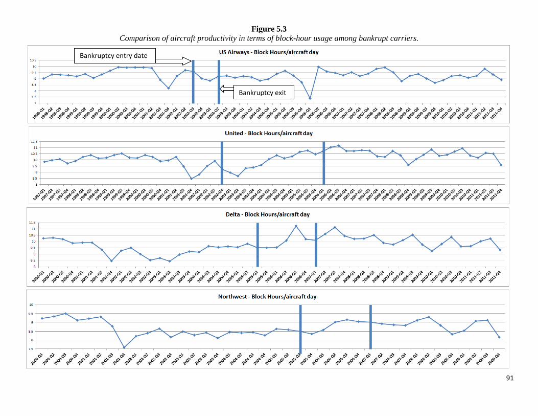
91
Figure 5.3
Comparison of aircraft productivity in terms of block-hour usage among bankrupt carriers.
Bankruptcy exit
Bankruptcy entry date

92
Figure 5.4
Comparison of aircraft output productivity in terms of ASM across bankrupt airlines.
Bankruptcy exit
Bankruptcy entry date
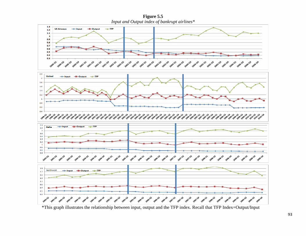
93
Figure 5.5
Input and Output index of bankrupt airlines*
*This graph illustrates the relationship between input, output and the TFP index. Recall that TFP Index=Output/Input

94
Figure 5.6
Input indexof each bankrupt airline compared with its control group airlines’ input indices

95
Figure 5.7
Output index of each bankrupt airline compared with its control group airlines’ output indices

96
Figure 5.8
Quarterly TFP comparison of legacy bankruptcies against their control groups (normalized at American 1992=1)
Bankruptcy exit date
Bankruptcy entry date

97
Appendix
Hawaiian and Frontier’s bankruptcy
Figure A
Quarterly TFP index comparisons of Alaska, Frontier and Hawaiian from 2000-2011 (normalized at Alaska 2000=1)
Hawaiian’s exit
Hawaiian’s entry
Frontier’s entry Frontier’s exit

---
Appendix
Hawaiian and Frontier’s bankruptcy
Table A
Hawaiian and Frontier bankruptcy regressions
Hawaiian Frontier
Pre - during bankruptcy - post 11-10-11. 9-6-9.
Ln (Employee Size) -0.50*** -0.56
(0.14) (0.55)
Load factor (percentage) 1.03* 2.42**
(0.43) (0.74)
Ln (Stage length) -0.2 0.3
(0.24) (0.48)
Aircraft age (years) 0.01 -0.01
(0.01) (0.01)
Type (numbers) -0.01 0
(0.02) (0.02)
Ln (Aircraft quantity) -0.01 1.37**
(0.03) (0.38)
GDP (percentage) -0.72 -1.92
(0.55) (1.04)
Ln (Avg. hhi metro) 0.2 -0.33
(0.44) (0.45)
Ln (Avg. indmkt share) 0 0
(.) (.)
Ln (Network size) 0.39** -0.17
(0.11) (0.29)
Q1 dummy -0.05 -0.04
(0.03) (0.05)
Q2 dummy -0.01 -0.06
(0.04) (0.05)
Q3 dummy -0.02 -0.06
(0.03) (0.05)
Alaska dummy -0.77*** 0.09
(0.19) (0.39)
Frontier dummy -1.35*** -
(0.22) -
Hawaiian dummy - 1.08*
- (0.47)
Time dummy 0.25** -0.03
(0.08) (0.08)
Time*Treatment dummy -0.49*** 0.01
(0.11) (0.14)
F_stats 104 26
Observations 66 54
R-sqr 0.97 0.92
* p<0.05, ** p<0.01, *** p<0.001 98

99
Chapter 3: The Effect of Mergers on Productivity in the Airline Industry
1. Introduction
This paper aims to measure the effect of mergers on firm productivity in the airline
industry. The level of consolidation in the airline industry has been increasing at a level never
seen before where every single one of the top carriers has been involved in mergers with another
mega carrier33
. Such industry wide consolidation has attracted a lot of attention from the
academics, the public media and the government which has allowed to every single major-
merger among airlines in the last two decade except the very last one, US Airways and American
Airlines.34
Traditionally, airline mergers have been well studied on antitrust grounds where common
concerns include effect of mergers on market power35
, price36
and service quality.37
However,
the amount of empirical research on the effect of mergers on productivity within the airline
industry has been very limited to date and yet, merging airlines like to cite increased synergy
resulting in improved efficiency as one of their reasons to merge.38
Indeed, the Horizontal Merger Guidelines of 2010 by the Department of Justice note in
Section 10 that “a primary benefit of mergers to the economy is their potential to generate
significant efficiencies and thus enhance the merged firm’s ability and incentive to compete,
which may result in lower prices, improved quality, enhanced service, or new products.” Given
33
Southwest/Airtran merger is an exception. However, AirTran was the third biggest carrier after Southwest and
jetBlue having served 3.66% of domestic passengers in the 3rd
quarter of 2012. 34
American/Trans World in 2001, US Air and America West in 2005, 35
See Borenstein (1990). 36
See Morrison (1996) and Kwoka, J. and E. Shumilkina (2010). 37
See Mazzeo (2003). See Greenfield (2011) for a more recent study. 38
Kole and Lehn (2000) is an exception which is a study that approaches the topic of efficiency and mergers in the
airline industry by analyzing the case of USAir’s acquisition of Piedmont Aviation. The study, however, solely
focuses on financial performance indicators with special attention given to increased labor costs as result of the
merger.

100
the increased level of consolidation during the last two decades, this study looks into each
merger to determine if any change in productivity has occurred due to mergers.
Outside the airline industry, empirical studies completed on other industries are rich and
diverse. While there are varieties of studies focusing on diverse industries, most of the studies
exploring the relationship between productivity and mergers focus either on hospital or financial
industries. Overall, the empirical studies produce very mixed results where some confirm a
positive relationship between mergers and productivity (see Harris, et al. (2000)and Brooks, et
al, (1992)) and others find no significant relationship between the two (see Alexander (1995)).
This study closely follows the methodology used in Oum (2001) using data of 8 airlines
from 1992 to 2012 to evaluate the effect of mergers on productivity. I define productivity both at
the partial level, where a single input to a single output ratio is used, and at the aggregate level
by employing the Total Factor Productivity (TFP) methodology. After determining that partial
productivity measures did not all point in the same directions pre and post-merger, I find that the
mergers do not bear any causal change on TFP productivity for the mergers considered in this
study.
The remainder of the paper is organized as follows. Section 2 looks at the previously
exiting literature and explains the sources of data. Section 3 covers the background of merger
activity in the airline industry between 1992 and 2012. Section 4 discusses the various methods
in which productivity is measured and illustrates the productivity trend of the merging airlines.
Section 5 explains the regressions used for econometric identification. Section 6 contains
regressions results and Section 7 provides concluding remarks.
101
2. Literature Review and Data
2.1 Literature Review
As previously mentioned, the two industries that have attracted empirical studies in the
past on the topic of mergers and productivity are the financial and the hospital service industry.
However, within each industry, the existing literature presents mixed results with no clear trend
in either direction. In the financial industry, for instance, Hayens and Thompson (1998),
Cummins and Xie (2007), Worthington (2001) find productivity gains as result of mergers in the
financial services industry. On the contrary, Dickerson, et al. (1997), Berger and Humphrey
(1992) and Vander and Vennet (1996) find no evidence of ex-post improvement in efficiency for
banking and credit institutions mergers. In addition, Cummins and Xie (2007) find post-merger
improvement in cost efficiency in the property liability insurance industry.
In the hospital industry, Ferrier and Valdmanis (2004) and Alexander et, al. (1996) found
no to little impact of mergers on operating efficiencies. However, Sinay (1998) and Harris, et al.
(2000) found gains of operational efficiencies to be one of the major impacts of mergers.
There are also several notable studies outside the finance and health industry, which are
the two industries that attract major attention on the topic of mergers and productivity.39
Kwoka
and Pollitt (2007) offer a comprehensive look at the relationship between mergers and
productivity in the electric power industry. They find that acquiring firms tended to seek out
better performing firms to merge. As result of mergers, acquiring firms saw their ex-post
productivity improve while target firms saw their productivity decrease. Nguyen and Ollinger
(2006) focus on the effect of merges on labor productivity in the meat products industry. The
study finds that labor productivity increased as result of mergers. Rajanet, et al. (1997) discusses
39
See Kaplan (2000) for a survey of empirical studies on mergers and productivity.

102
the effect of mergers in the US tire industry and they find productivity did not increase as result
of mergers.
Section 3 provides background history on the airline mergers that took place in the last
two decades as well as analysis on descriptive statistics of select mergers.
2.2 Data
The data for this study come from several different sources. The final database includes
domestic US Airline data on input/output quantity, cost/revenue statistics and market
concentration data for the following eight airlines from 1992 to 2011 on quarterly basis:
1. America West Airlines (America West)
2. American Airlines (American)
3. Continental Airlines (Continental)
4. Delta Air Lines (Delta)
5. Northwest Airlines (Northwest)
6. Southwest Airlines (Southwest)
7. United Airlines (United)
8. US Airways
All data used in this study only include the domestic portion of the above eight airlines.
The above eight were chosen based on their comparability among each other in that when one
goes through a merger the rest could be used as a control group.
The data used for constructing the TFP index and partial productivity ratios come from
the Department of Transportation Form 41. Form 41 Schedule is a publicly available data
presented by Bureau of Transportation statistics that contains detailed categorized information on
revenues, expenses and other operating statistics.40
The TFP index uses four inputs (labor, fuel,
aircraft and miscellaneous) and three outputs (revenue passenger mile, revenue-ton mile and
40
Form 41 schedule at Bureau of Transportation Statistics: http://www.transtats.bts.gov/DataIndex.asp

103
incidental) to calculate productivity. As such, a detailed database containing both quantities of
input/output components and respective dollar amount spent/earned on them was assembled.
Input data: The quantitative part of the input index includes data on number of
employees, amount of gallons consumed and average number of aircraft. Data on miscellaneous
quantity of inputs (all other material input besides aircraft and fuel, such as amount of passenger
meals, various equipment, etc.) is not available. Instead, the miscellaneous material quantity
index was calculated by dividing miscellaneous materials cost by the quarterly US GDP deflator
and then normalized as done in Oum et al. (2001). The cost sharing part includes data on labor
cost, fuel cost and aircraft cost. Miscellaneous was cost was calculated by subtracting the
previous three main costs from total cost. The cost-share part of the input data was available
from Form 41 on a quarterly basis. It includes the dollar amount spent on labor, aircraft and fuel.
The material cost (or miscellaneous cost) was computed by subtracting labor, aircraft and fuel
cost from Total Cost.41
Output data: The quantitative section of the output index includes revenue passenger
miles, revenue-ton miles and miscellaneous revenue earning quantity index (such as baggage
fees, meal service, etc.). While the former two are available, the miscellaneous revenue earning
quantity index is not available. Instead, it was replaced by an index computed by dividing
miscellaneous revenue by the quarterly US GDP deflator as was done previously. The revenue-
share section of the output index was computed by dividing each of ticket sale revenue, mail and
freight revenue and incidental revenue by the total revenue. Table 2 illustrates a sample of data
that goes into calculating the output, input, TFP indices with final calculated indices as well.
41
Total Cost and Total Revenue excludes Transport Related Costs and Transport Related Revenues. Transport
related revenues/costs report the amount earned/spent from purchasing airline service from regional feeder airlines
and thus not directly taking part in an airline’s own production of goods and services.

104
The independent variable section consists of nine variables that are being used in the
same style as in Oum (2001). In addition to Oum (2001), due to availability of data this study is
able to include a list of new additional variables such as aircraft age, quantity and market
concentration level. The data for fleet size, fleet age and fleet type come from Department of
Transportation’s fleet statistics published on its website.42
Data for stage length and load factor
come from Form 41 database. Quarterly GDP growth and GDP deflator data was collected from
the U.S. Bureau of Economic Analysis. The HHI index, market share and network size for each
airline was computed from Databank 1B, the U.S. Department of Transportation’s Ticket Origin
and Destination Survey, on quarterly basis.
The final database consists of unbalanced panel consisting of 612 observations where
each observation is year-quarter-carrier unique (unbalanced set of 8 airlines for 80 quarters, but
strongly balanced when each merger and its control groups are considered separately according
to their time period surrounding individual merger). A single observation consists of a TFP index
as the dependent variable and 9 different independent variables for the panel regression.
Table 2.1 provides summary statistics of TFP index and the nine independent variables.
Employee size is the number of workers employed by an airline. Load factor is the average fill
rate of flights. For instance, 0.7 of load factor means on average the flights are 70% full. Stage
lengths are the average distance travelled per flight of an airline. Aircraft age indicates the
average fleet age of an airline in a given quarter. Aircraft type indicates the number of different
types of aircraft being used by the airline. Avg. HHI Metro indicates the weighted average
market concentration level across all markets where an airline serves. Avg. Ind Market share
42
Department of Transportation’s publication of airline fleet statistics:
https://ntl.custhelp.com/app/answers/detail/a_id/223/~/airline-fleet-size-statistics

105
indicates the weighted average market share of all markets an airline serves. Finally, network
size indicates the number of unique airport pairs that an airline served in a given quarter.
3. Background on Mergers in the U.S. Airline Industry
During last two decades, from 1992 to 2012, the airline industry has become more consolidated
than ever. While during the 1990s we barely witnessed any noteworthy mergers, the tech-bubble
era of 2001 combined with September 11 events marked beginning of decade long mega-merger
frenzy in the airline industry. The 9 biggest airlines and AirTran, outlined in Table 3.1, that
operated independently at the beginning of 2001 had turned into the 5 biggest airlines, United,
Delta, US Airways, American and Southwest, by the end of 2012.In addition, two of those five
airlines, US Airways and American, have been in talks of entering a merger deal since late 2012.
With the recent objection to US Airways and American Airline’s merger by the Department of
Justice, some suggest that the industry is at such a high level of consolidation that any further
mergers could harm the consumers (see Moss and Mitchell (2012)). Table 3.1 presents all
mergers involving major airlines from 1992 to 2012.
In the 90s there were only three mergers that were minor in scale. The first one was in
1993 where a relatively small Southwest Airlines purchased even smaller Morris Air. The other
two were simply big carriers purchasing much smaller regional airlines for purposes of regional
feed services. However, we can see that beginning with American and TransWorld’s merger in
2001, the big carriers begun to start merging with each other. This latest wave of mega mergers
can be viewed as a method of survival in an increasingly hostile post 9/11 environment for the
airlines where the industry faced sharp rise in fuel costs and excess capacity combined with ever
increasing competition from the low cost carriers that put downward pressure on fares. Table 3.2

106
illustrated the evolution of the big 10 carriers’ market shares between 1992 and 2012 as they
engaged mergers.
Table 3.2 provides a detailed history of how the 10 airlines evolved from 1992 till 2012
in terms of individual and as well as industry-wide statics covering total combined passenger
load share, average industry market concentration, passenger load share, individual market share,
market concentration level and network size. Each of these six variables are discussed below.
First of all, the 10 airlines’ combined traffic share fell from being 95% in 1992 to 64% in
2012. There are two main reasons for the reduction of passengers carried by these10
majorcarriers. First, beginning around 2001 a new wave of low-cost carriers have been
successfully taking away market shares from the legacy carriers. Such new airlines include
jetBlue (carrying 5.4% of total domestic passengers as of 2012), Spirit, Frontier, Virgin,
Allegiant and Sun Country. Combined share of domestic passengers carried by these six low cost
carriers in 2012 was 12%. Second, the feeder carrier have been reporting to have carried more
and more passengers as of late as legacy carriers are relying more on their services for regional
service. The four biggest of such regional airlines include Atlantic Southwest (4.01% of
domestic passengers as feeder for Delta and United), Skywest (3.48% as feeder for United, US
Airways, Delta, American and Alaskan), American Eagle (2.59% as a feeder for American) and
Pinnacle (1.83% and a feeder for Delta). Their combined traffic in 2012 was 12% of all domestic
passengers.
Second, the weighted average industry-wide HHI has been decreasing steadily as
competition increases.43
Third, the domestic share of passengers carried by each airline steadily decrease over the
20 years unless an airline is involved in a merger where a temporary uptick is observed before
43
The weighted average HHI of each domestic metropolitan-pair markets.

107
reentering a downward trajectory. The sole exceptions are Southwest and AirTran, both of which
start with 2% and 1% domestic share respectively. By 2012, Southwest had captured an amazing
22% of market share (in terms of passengers served) while AirTran had achieved 4%. In the first
merged considered in this study, the merger of American and Trans World, we see American’s
domestic share decline from 17% in 1992 to 10% in 2001 when it bought out Trans World.
Immediately, its domestic share increases to 13% only to begin another decade long decrease. In
the second merger, which concerns US Airways and America West, U.S Air’s speedy loss of
domestic share from 14% in 1992 to 5% in 2007 is rescued by acquiring America West under its
wings to bring up US Airways’ domestic share to 7% 2008. As a result of buying a much
healthier airline, US Airways is able to hold on to its 7% domestic share from 2008 to 2012. In
the merger, involving Delta and Northwest, we see a story similar to that of US Airways. Delta’s
domestic share goes from a commanding 18% in 1992 to a mere 8% 2009 which is brought up to
13% the very next year by buying Northwest. In United and Continental’s merger, almost the
same pattern is observed.
Fourth, as the big airlines serve less and less passengers domestically, consequently we
observe the same airline’s weighted average of its own route-market shares decrease. The hardest
hit airlines are United and US Airways. For example, US Airways’ average weighted market
share peaked at 59% 1997 only to end up at 29% in 2012 even with the purchase of America
West. United’s market share peaked at 50% in 1995 before bottoming out at 25% in 2011. It rose
to 29% in 2012 with the purchase of Continental.
Fifth, with exception of Southwest and AirTran, for all the other airlines we see their
average HHI in markets served decrease dramatically. This is because the highly concentrated
markets the legacy carriers served in the early 90s have been successfully raided by low cost

108
carriers led by the likes of Southwest and jetBlue bringing down the HHI level. However, the
story is not the same for Southwest and AirTran because we see that they continue to operate in
high-level HHI markets throughout the years even though they are causing reduction in HHI by
stealing from the legacy carriers. Southwest’s HHI of markets served peaks at 4500 in 2005
before beginning to decline for the next seven years. This can be partially explained by
Southwest’s strategy of locating and entering niche markets and successfully protecting its lead
against any potential competition. However, with the rise of new low-cost airlines, its market
leadership is also being contested as new players enter the very same markets Southwest has
been serving.
Sixth, network size is a variable of great interest because it shows how an airline’s
national network coverage changes throughout the years as it faces harsh times and competition.
We see that American cut its network coverage almost in half where it went from serving 13,058
airport pairs in 1992 to 6,864 airport pairs in 2001. It went up to 8,385 through purchase of
TransWorld in 2001. Delta is the other behemoth whose network size dipped below 10,000 only
one time during the past 20 years, in 2009, but that was quickly solved by purchasing Northwest
to bring it back up to 13,000 in 2010. As usual, the odd pair in this group is Southwest and
AirTran, which have much smaller network sizes that keeps growing. An interesting observation
is to compare Southwest’s passenger-to-network size ratio to a typical legacy carrier’s passenger-
to- network size ratio. In 2012, Southwest carried 22% of all domestic passengers on a 2,640
unique leg network while United carried 10% of all domestic passengers on a 10,427 unique leg
network. This shows how serious Southwest is about choosing a niche market (a) with high
volume and (b) which at minimum must be served by 737s. It seems legacy carriers could have
been stuck serving thousands and thousands of the smaller markets forcing them to deal with
109
massive network management and associated costs. If that is the case, the rise of regional feeder
carriers is justifiable as legacy carrier try to outsource serving smaller markets and concentrate
on the bigger markets.
Of the nine mergers presented in Table 3.1, three mergers have been qualified for
productivity analysis as six of the above mergers are dropped primarily due to missing data and
other reasons.44
Table 3.3 outlines the three mergers for productivity analysis including pre and post-
merger periods.
In Table 3.3, we see three important dates. First, the beginning of a merger signifies a
date when both airlines have received approval from shareholders and regulatory government
officials to merge. Second, joint report date is the first time in which both airlines report jointly
filings under a single certificate. Joint report dates are of importance because this is the first time
when productivity statistics of two airlines are combined to one airline. These dates are usually
several quarters later than the official announcement of successful merger closing date.
Therefore, it is safe to assume that by the time they begin jointly reporting, merger integration
process would have been well under way for several months and sometime integration could be
in its later stages by that time. Third, merger integration end dates are approximations for all
three airlines to give them between 1.25-2.25 years to merge the most fundamental operations.45
44
(1)Southwest’s purchase of Morris Air does not have pre-merger as fleet data in general prior to 1992 are not
available. Similarly, (2) U.S Airways and American airlines merger is still pending and hence does not have post-
merger data. (3) United’s merger with Continental was not completed until 2011:4 which means post-merger data is
not available. (4) American’s 1998 merger with Reno Air and (5) Delta’s 1999 merger with several smaller airlines
are seen as purchase of regional feeder airlines that do not impact each airline’s operational productivity at the
national level. (6) Southwest’s purchase of AirTran has been complete but the two airlines are still in the midst of
integration as AirTran will continue operate as a separate airline towards late 2014. 45
Even though, a 100% full integration can possibly take much longer than two years to complete, based on available
announcements, this study assumes that main operations are merged within the period indicated. In case of American and Trans
World, Trans World had been facing major financial problems by early 2001 when American started acquiring its assets to
integrate into its fleet. Eventually, as part of a buyout deal by American, Trans World declared bankruptcy and ended all booking
activity in November of 2001. At that time, most of its assets were already transferred and being utilized by American. Delta and

110
Table 3.4 lists control group airlines for each of the three mergers. The primary criteria
for control group airlines were that (a) they were similar in size, operation and network coverage
and (b) that a control group’s airlines must not have overlapping pre- and post-merger periods
with the airline at question in case a control group airline was also involved in a merger recently.
Even though there were other airlines such as jetBlue, Alaska and Frontier with available
data, they were excluded for being much smaller and regionally focused airlines. In Table 3.4 all
airlines have a history of competing against each other throughout the country because of their
nationwide network coverage.
Figures 3.1, 3.2 and 3.3 illustrate the main airline descriptive parameters of American,
US Airways and Delta for the 20 year period of 1992-2011 where pre, mid and post-merger dates
are marked. Tables 3.5, 3.5 and 3.7 display percentage changes in those values during pre, mid
and post-merger period for the three airlines.
Figure 3.1 in conjunction with Table 3.5, illustrates changes to American’s main
descriptive statistics. American’s numbers can be divided into pre-merger and post-merger
trends. The had airline had been relatively healthy prior to the merger as we see it was adding
labor by 11% and capacity by 3% during two years leading up to the merger. The merger brought
in additional 16% of labor, 12% of network size and 7% of capacity where these numbers peak.
However, the merger marks a change of direction for American as the numbers begin a decade
long downward trajectory. In the two years following the merger, labor size is down by 20%,
network size down by 8%. Surprisingly, capacity is at the same level, but from Figure 3.1 we can
see beyond the post-merger two year period, the capacity starts decreasing continuously till the
present time.
Northwest’s merger began in 2008:4 and they posted a similar announcement in 2010:1 which confirmed the last part of
integration of by merging ground operations and reservation systems.

111
In Figure 3.2 and Table 3.6, US Airways’ statistics are presented. Prior to the merger, we
see a different story for US Airways than American’s. Up till 2001, the airline has been steadily
increasing its ASM while cutting down on network size. It had an expanding labor force that
peaked 1 year prior to September 11. However as US Airways was the hardest hit airline in the
wake of September 11 attacks, we see its numbers take a sharp decrease following 2001.
Ultimately US Airways was never able to reverse its steep downward trajectory of its vital
statistics including labor size, ASM and network until it merged with America West in 2006:1.
Two years prior to the merger US Airways saw its work force cut by 30%, network size by 10%
and ASM by 5% from previous years. The merger substantially lifts US Airways’ size in all
aspects where labor size increases by 52%, network size by 14% and capacity by 47%. The post-
merger story is, however, similar to American’s as we see work force, network size and ASM get
reduced.
In Figure 3.3 and Table 3.7, Delta’s descriptive numbers are presented. Similar to US
Airways and unlike American, Delta had been experiencing a steady decline in its work force,
network and capacity sharply prior to its merger as it had been spending some time in
bankruptcy. The merger decidedly puts Delta on an upward direction as it peaks in 2010:1 where
labor size increased by 58%, network size by 10% and capacity by a whopping 34%. Unlike
American and U.S. Air, Delta managed to successfully maintain the upward trajectory in the
post-merger era where all of its vital statistics continue to grow.
In summary, naturally we see each airline’s size and capacity increase dramatically as
they enter mergers. While American and US Airways were not able to hold on to their lead in in
capacity in the long run, Delta on the contrary so far has done very well at maintaining its lead.
While capacity is expected to grow, what remains to be determined is what happens to

112
productivity as the airlines graduate through a merger process. Section 4 discusses various ways
to measure airline productivity and provides a preliminary analysis of each of the three merger’s
productivity statistics during mergers.
4. Measuring Productivity
This study will focus on two most used approaches to measure productivity in the airline
industry: partial and total factor productivity (TFP).46
Partial productivity is a simple ratio of one
input to one output that is widely used and easy to grasp. While partial productivity’s simplicity
is its advantage, it falls short on measuring a firm’s overall productivity with multiple
inputs/outputs as it can do only one input/output at a time. On the other hand, TFP is an index
based system that includes all inputs/outputs and enables comparison of productivity across
different firms at different points in time. This paper will offer analysis of airlines’ both types of
productivity measures: partial through industry standard ratios and total factor productivity (in
the style of Oum (2001)).
4.1 Partial Productivity:
A partial productivity measure consists of a ratio of an input to output. In the airline
industry, depending on one’s focus area, it is possible to produce a variety of ratios using the
many different input and output variables available. This study will focus on the most widely
used ratios that include three inputs: employees, aircraft and fuel utilization productivity. The
five types of partial productivity included in this analysis are:
e. ASM/employee: output (available seat miles) per employee
f. Total passengers/employee: number of passengers enplaned by per employee
46
Besides TFP, the two other most commonly used productivity measurement methods for multi-input and multi-
output scenario are data envelopment analysis and stochastic frontier estimation. However, the study chose TFP as it
has been the most commonly used method for measuring productivity in the airline industry. [citation of previous
usage of TFPs]

113
g. ASM/aircraft day: output per aircraft day
h. Block hours/aircraft day: block hours per aircraft day which indicates on average
how many hours in a 24-hour frame one aircraft spends between gate-close and
gate-open.
i. ASM/per gallon of fuel: output per gallon of fuel
The above list includes productivities associated with the three single biggest costs for
airlines: labor, aircraft and fuel. Labor productivity is measured by (a) and (b), aircraft
productivity is measured by (c) and (d) and fuel efficiency is measured by (e).
Figures 4.1, 4.2 and 4.3 display evolution of American, US Airways and Delta’ partial
productivity change from 1992 to 2011. Table 1.4 combines all three airline’s immediate pre-
merger and post-merger partial productivity into one table.
From Figure 4.1[tables section] and Table 4.1, we can see that American experienced a
modest increase in partial productivity following the merger. In the long run, its employee
productivity increased until 2006 and stays flat from there on. Aircraft productivity decreases by
around 2% and fuel efficiency increases by 3.8% as the airline replaces its older planes with
newer fleet. The main pattern observed from Figure 4.1 is that the merger looks to have reversed
the direction of employee productivity from decreasing trend pre-merger to an increasing trend
post-merger. While aircraft usage per day remains relatively flat, capacity output by per aircraft
day also changes its downward slope from pre-merger to an upward slope post-merger.
From Figure 4.2 [appendix], for US Airways, the story is not as straightforward as
American’s as its employee productivity decreases post-merger compared to pre-merger, we see
that its aircraft utilization has increased significantly. Its aircraft usage per day stays constant.

114
From Figure 4.3 [appendix] , for Delta, all post-mergers number are big negatives with
the exception of fuel efficiency. Employee productivity is down by as much as 12.25% and
aircraft usage is down by as much as 11.25%.
In summary, the above story illustrates how difficult it is to asses airline’s overall health
using partial productivity when different productivity ratios begin pointing in different
directions. This problem however is solved by employing the Total Factor Productivity method
which is discussed in detail the next section.
4.2. Productivity indexing background
Although simple to calculate and widely used, the partial productivity method has two
main shortfalls. First, it cannot offer measurement at the firm level when multiple inputs are used
to produce multiple outputs. Second, partial productivity measurements do not account for trade-
offs between multiple inputs as individual weights shift among inputs. An index numbering
system solves both of those problems.
One of the most widely used index numbering system for measuring productivity is Total
Factor Productivity (TFP) index which is a trans-log multilateral index formula. The TFP index
was developed by Tornqvist (1936) and Theil (1965) which was later extended by Caves,
Christensen and Diewert in their 1982 paper. The extension by Caves et, al. (1982) consisted of
modifying TFP to improve its transitivity property. Since then, as stated in Oum and Tretheway
(1986) and Windle (1991), the TFP has become “the single most useful measure of productive
efficiency.” Indeed, majority of the empirical studies of productivity in the airline industry
employee TFP as their main tool to measure productivity. Such studies include Caves et, al.
(1982b), Caves et, al. (1983), Windle (1991), Good et, al. (1993), Oum et al. (1998), Duke

115
(2005), Apostolides (2006), Honsombat et al. (2010) and also other studies in the transportation
industry outside the airline industry.
The Thornqvist-Theil index formula is:
lnTFPk
where aggregate productivity of firm k with j outputs and i inputs are calculated. Full
explanation of denomination is provided below. Caves et al. (1982) further extended the above
into the following, to calculate difference in productivity of either between two firms or same
firm’s performance over two different periods:
where:
- lnTFPkj is the productivity index difference between firm k and m (or two period k
and m);
- Yk and Ym are output and Xk and Xm are input indexes for firm k and m respectively;
- i is set of inputs and j is set of outputs;
- Rjk is revenue share from output j for firm k (if j was output representing passengers,
then Rjk=.8 would mean 80% of firm k’s entire revenue came from passenger ticket
sales during the given time frame, which is one quarter in this study);
- is the arithmetic average of all output revenue shares for firm k;

116
- Yjk is quantity of output j for firm k (if j was output in terms of passengers, then
Yjk=8,000,000 means firm k served 8 million passenger during the relevant quarter);
- is the geometric average of all output quantities;
- is cost share of input i for firm k (if i was an input representing fuel, Wik=0.25
means 25% of k’s entire costs was fuel expense);
- is quantity if input i for firm k;
- is geometric mean of input quantities;
The extended version of TFP index calculates percentage change of productivity between
two firms (or two points of time). Both indexes use revenue (cost) shares as weights for
aggregating firm’s output (input) quantities to produce an output and an input index so that
tradeoff between input and output is accounted for.
This study uses the extended version of the TFP index by Caves et al. as is the standard in
most empirical work.
The extension of Caves et al. (1982) to the Tornqvist-Theil index was to improve its
transitivity property from bilateral comparison to multilateral comparison. Such transitivity
property becomes important when simultaneous multilateral (more than two firms at once)
comparisons are made across multiple firms in cross section and/or over multiple time periods.47
In order to calculate the TFP indices, this study uses four inputs and three outputs data of
eight airlines from 1992 to 2011 on a quarterly basis to measure the TFP for each scenario in the
same way done in Oum (2001). The inputs consist of:
(i) number of employees,
47
In their empirical paper, Caves et, al. (1983) demonstrates how the extended version of TFP index can be used by
aggregating productivity indices from 1970 to 1975 to compare with aggregated indices from1976 to 1980. For an
extended discussion see Coelli et, al. (2005) and Caves et, al. (1982).

117
(ii) gallon of fuel consumed
(iii) number of aircraft used
(iv) miscellaneous material input that consist of everything else
For each input, its share of total cost was calculated separately.48
The outputs include:
(i) RPM
(ii) Revenue-ton miles
(iii) Incidental output which includes all other material outputs that earn revenue
such as catering, ground handling, sales of technology, consulting services,
hotel businesses, etc.
Both miscellaneous input quantity and incidental output quantity are not available as there is no
data for many different types of inputs/outputs that take only small fraction of the entire
operation. Instead, as done in Oum (2001), the dollar amount spent on miscellaneous inputs and
earned from incidental services were divided by the U.S GDP deflator to be used as proxies.
From Table 3.4, we saw that there are eight unique airlines, including all the airlines in
the control group that will be included in this study. 49
For each of the eight airlines, using the
above input and output data, I generated a quarterly TFP index from 1992 to 2011, which will
serve as dependent variables in the regression.
The TFP index as the independent variable and its dependent variables are discussed in
detail in Section 6.
Figure 4.4 illustrates TFP indices of the three merging airlines from 1992 to 2011 and
Table 4.2 illustrates pre an post-merger percentage comparisons.
48
Total Cost and Total Revenue excludes Transport Related Costs and Transport Related Revenues. Transport
related revenues/costs report the amount earned/spent from purchasing airline service from regional feeder airlines
and thus not directly taking part in an airline’s own production of goods and services. 49
America West, American, Continental, Delta, Northwest, Southwest, United and US Airways;

118
From Table 4.2 we see numbers that for all three airlines, post-merger productivity is up
unlike the partial productivities that pointed in different directions. Figure 4.4, which looks at the
long term evolution of TFP for each three airlines including the mergers periods, presents a
pattern of increasing productivity over the long term which is consistent with Oum (1998).
Even though the two year pre and post-merger partial productivity averages were not
consistent with TFP averages, we see from the figures that the TFP long term pre and post-
merger patterns have a good resemblance to the long term partial productivity patterns for all the
three airlines: American’s decreasing productivity pre-merger begins to increase, US Airways’
post-merger productivity is elevated and flat and Delta having a good increase in the early 2000s.
However, the averages cannot provide accurate measurement. The real change in
productivity taking into account the control variables and control groups will be estimated using
the difference-in-difference estimation which will be presented in the section 6.
5. Econometric Methodology
As mentioned previously, the econometric identification method used in this study
follows closely the methodology used in Oum et al. (2001). The regression is a difference-in-
difference method that captures the difference between treatment and control groups using
merger entry and exit dates to group data into ex-ante and ex-post time frames. There are nine
dependent variables that are used to control for exogenous variations. The treatment group in this
case is the acquirer airline and the control group consists of other airlines that were selected
based on similarity in size and operational characteristics. The panel regression applied for each
of the three mergers consider is:

119
where:
- is the lnTFP productivity index dependent variable for i (i=1….14) firm at quarter t
(t=1…80);
- measures quarter effect where Quarter Dummyl (l=1,2,3 for quarter 1, 2 and 3) is 1 for
Quarter 1, 0 otherwise, etc;
- measures individual airline level fixed effect where (m=1,2…14) is 1
for each individual airline and 0 otherwise;
- is 0 for all quarters pre-bankruptcy and 1 for all quarters post-bankruptcy;
- is 1 for the firm going through bankruptcy and 0 for the firms that are in control group for
each bankruptcy case;
- is interaction of the Time dummy and the Treatment dummy which captures the effect of
bankruptcy on productivity, the coefficient of interest;
- is a vector of independent variables that consist of the following for each firm i:
10. Employee size: the more workers a firm has, the less productive it will be all else
constant. The hypothesis is that a firm under bankruptcy is could to reduce work
force and thus affecting productivity;
11. Stage length: the longer the stage length, the productive a firm will be;
12. Average fleet age: older fleet age could harm productivity as more resources will
be dedicated to keep the planes running all else equal;

120
13. Number of different types of aircraft: the more number of varieties of aircraft an
airline used, the less productive it is expected to be. The classical example is
Southwest’s 2-3 different types of usage of the Boeing 737 aircrafts as opposed to
a typical legacy carrier that used on average 14 different aircrafts.
14. Load factor: higher load factor is expected to result in higher productivity
considering if more people fly using the same resources, then output per resource
should increase.
15. Quarterly GDP growth rate: as GDP growth increases productivity is expected to
increase as output can increase faster than input regardless of firm’s bankruptcy
16. Average-HHI of participating markets of airline i (airport pair or metropolitan
area pair): It is calculated as follows. Suppose firm i flew only on two markets A
and B. Let’s assume market A has HHI of 3000 and market B has HHI of 5000,
and 40% of i’s total flights were on market A and 60% were on market B. Then
the Average-HHI equals 3000*40%+5000*60%=4200. This variables measures
how frequently an airline serves highly competitive (and thus increasing pressure
on productivity) or highly non-competitive routes (and thus decreasing pressure
on productivity).
17. Average market share on participating markets (airport pair or metropolitan area
pair): this variables measures firm’s own presence on routes it serves. If most of
its flights are on markets where it has huge dominance, there is less competitive
pressure to be productive and vice versa. Continuing with the previous example, if
firm i’s market share on route A is 80% and on B is 90%, then its Average-
121
market-share equals 0.8*40%+0.9*60%=0.86, a firm with very a dominant
advantage and thus less incentive to improve its productivity.
18. Network size (airport pair or metropolitan pair): this variables measures number
of markets served in a given quarter. As a firm goes through bankruptcy, its
network size is known to decrease significantly, because it is cutting back on
service. The network size needs to be controlled for because the study aims
capture variation in productivity not caused by decrease in network size.
The next section provides discussion on regression results.
6. Regression Results
Using the independent variables in Table 2.1 and the control groups in Table 3.4, there
are multiple regressions performed for each of the three mergers considered in this study. The
regressions differ from each other by the length of pre and post-merger periods they cover as
well as lengths of period airlines spent for merger integration. The different values of time have
been added to have a short-term and a long-term perspective in assessing the productivity
change. All regressions have been tested for Hausman test with all of them selecting the fixed
effects model over random effects model. At the bottom of each table, the pre and post-merger
period and merger integration time lengths are provided. For example, at the bottom of the first
column of Table 6.1A, which says “American 1”, indicates this regression compares
performance of two years pre-merger period with a two years post-merger period having a one
year merger integration window in the middle.
The regression tables have been split into two parts: non-dummy and dummy variables
due to space limitation. The first sections of each airline regressions, Table 6.1A, 6.2A and 6.3A
present the non-dummy variable section of regressions for American, US Airways and Delta

122
respectively. Across the board, we see some very consistent results regardless of airline and time
period chosen if we focus only on the statistically significant variables. Some of the consistent
results are employee size impacting productivity negatively, load factor and stage lengths
improving productivity. Aircraft age and type did not affect productivity while aircraft quantity
affected productivity positively.
We see that the weighted average of individual market share impacts productivity
positively. Higher market share could mean higher capacity to keep the airlines “busier.” For
American, in Table 6.1A, in the short run time period in regression “American 1”, market
concentration level, Ln (Avg. hhi metro), and network size have negative impact on productivity.
However, the signs switch for both in the long run regressions “American 4” while maintaining
its statistical significance. This could be explained by the fact that immediately after the merger
American may have been serving many of the markets previously served by Trans World where
American was not achieving good economies of scale. Over time, as the integration progresses,
American figures out which of Trans World’s markets offer better synergy with its own market,
it begins to serve selectively and thus arriving at a point where increased network size results in
improved productivity. We see a similar result for US Airways in Table 6.2A where there is no
effect of network size on productivity in the short run, in regression “US Airways 1”, but in the
long run, in regression “US Airways 4”, we observe a statistically significant positive
relationship between network size and productivity.
The second parts of the regression tables for each airline, Table 6.1B, Table 6.2B and
Table 6.3B, present all the dummy variable results. This section contains the coefficient of the
primary variable of interest for this study, the Time*Treatment dummy for each airline.

123
For American, we see a consistent improvement in productivity regardless of time frame
fluctuations. For American, the increase in productivity due to merger consistently stays around
10% in the long run while having no effect in the short run. Figure 4.5 offers a look into the pre-
merger comparison of TFP among American, TWA and their productivity weighted by
respective Revenue Passenger Mile. We can see that immediately before it merger with
American, TWA was a much more productive airline than American. However, their weights are
factored in, the difference becomes small. In addition, TWA is observed to more productive than
American only after 1998, the year when they switched from being mostly an international
carrier to mostly domestic carrier, significantly increasing their domestic output. As result of this
merger, we see that American’s productivity continues to climb in the long run.
For US Airways, increase is 28% in the long run while having a 35% increase in the short
term which are both very high.50
If we consult Figure 4.4 for the source of this high increase in
productivity, we see that while US Airways maintained its input flat after a slight increase during
merger integration, it was able to boost its output by a big margin. Its output index jumps from
.40 to .70 from 2007:3 to 2007:4, the quarter of first joint reporting, clearly indicating the amount
of additional capacity that was brought by America West’s addition. From there on, it maintains
its output levels while slowly decreasing input.
Delta does not report a statistically significant increase in productivity resulting from its
merger with Northwest. On one hand, this could be regarded as a lack of post-merger data range
for Delta and as with more time, it possibly could have posted statistically significant results like
American or US Airways in the future. On the other hand however, its two year post-merger
coverage is the same as American and US Airways’ two year coverage where both of which
posted statistically significant results. Furthermore, Figure 4.3, which details Delta’s partial
50
25% converts to (e.25
-1)*100=.28

124
productivity, and Figure 4.4, which presents Delta’s TFP, both suggest that by the time Delta’s
post-merger period began in 2010:1, its productivity levels were beyond any abnormal spikes
related with its merger and only saw “smooth” curves during the next two years. In addition,
Figure 4.7 shows that Delta was already more productivity than Northwest pre-merger. In other
words, it is reasonable to argue that Delta’s integration was over by 2010:1 and the period
2010:1-2011:4 presents a sufficient post-merger on which statistical conclusions can made. Thus,
it may be concluded that Delta did not experience statistically significant improvement in
productivity during from its merger with Northwest.
7. Conclusion
As the industry has gone under extensive consolidation, many interesting questions have
been asked and answered, except the issue of post-merger productivity. As such this study aimed
to help shed light on the subject by closely following the methodology of Oum (2001), but with
additional variables to examine merging airlines. The study carefully explores all major mergers
in the airline industry from 1992 to 2011. After an initial listing of nine major mergers that took
place during the stated period, it was decided that only three of those fit the criteria for proper
post-merger analysis. With the aim to illustrate all aspects of the three merging airlines’ health
from 1992 to 2011 as they enter and exit mergers, this study provided a look at overall evolution
of market shares, descriptive statistics, partial productivity and Total Factor Productivity
indicators.
In terms of shift in market concentration, of the nine major carriers and one smaller
carrier (AirTran, which did become a major carrier eventually) that operated in 1992, only five
remained in 2015 after a series of high level mergers. We saw the legacy carriers consistently
lost individual market shares (in terms of passengers) and consequently their combined market

125
share as it decreased from 95% in 1992 to 64% by 2011. The big winner has been Southwest
Airlines whose domestic market share went from 2% to 22%.
In terms of descriptive statistics, we see that while American’s aggregate indicators
returned to their downward outlook soon after it completed its merger, US Airways and Delta, on
the contrary, have been able to use the merger to stabilize their previously decreasing output
levels.
In terms of productivity, we saw that for a specific agenda, such as determining labor
productivity, the partial productivity method maybe more fitting, but for assessing an airline’s
overall health Total Factor Productivity is the better method. The Total Factor Productivity
indexing system was used in conjunction with a difference-in-difference estimation method to
measure post-merger productivity changes.
For its main finding, the study determined that American and US Airways experienced
significant gains in productivity, 10% and 28%, respectively from their mergers while Delta did
not make any gain. This is an interesting finding as there is good history of airlines terribly
suffering from badly timed and orchestrated mergers (for example, see history of Texas Air’s
purchase of Eastern Air, and People’s Express’ purchase of Frontier). In the case of US Air, the
improvement in productivity is consistent with the common speculation that at the time America
West was a much healthier airline that really helped stabilize US Airways’ downward outlook.
In terms of policy implications, the regulatory body can indeed expect improved
efficiency and synergy from mega-mergers. Airline mergers themselves are so complicated
procedures that they do not always guarantee improved performance. In addition, often times
mergers are orchestrated by managers and/or CEOs who have motivations more related to

126
market power, empire building, bargain hunting, survival, and access to new market entry than to
increase economies of scale and productivity. Yet, against the odds, the mega-mergers are
successfully producing improved efficiency.

127
References
Alexander, J.A., Halpern, M.T., Lee, S.Y. (1995) “The Short-Term Effects of Merger on
Hospital Operations.” Health Services Research, 30(6).
Apostolides, A.D. (2006) “Impact of Productivity Changes in Air Transportation of Profits,
Prices and Labor Compensation: 1990-2001.” Journal of Transportation Statistics, 9(1).
Berger, A.N., Humphrey, D.B. (1992) “Megamergers in banking and the use of cost efficiency as
an antitrust defense.” Antitrust Bulletin, 37.
Borenstein, S. (1990) “Airline Mergers, Airport Dominance, and Market Power." American
Economic Review Papers and Proceedings, 80.
Brooks, G.R., Jones V.G. (1997) “Hospital Mergers and Market overlap.” Health Services
Research, 31(6).
Caves, D.W., Christensen, L.R., Diewert, W.E. (1982) “Airline productivity under deregulation”
AIE Journal on Government and Society, November/December Edition.
Caves, D.W., Christensen, L.R., Diewert, W.E. (1982) “Multilateral Comparisons of Output,
Input and Producitivity using Superlative Index numbers.” Economic Journal, 92.
Caves, D.W., Christensen, L.R., Tretheway, M.W. (1983) “Productivity Performance and U.S.
Trunk and Local Service Airlines in the Era of Deregulation” Economic Inquiry, 21(3).
Cummins, J.D., Xie, X. (2007) “Mergers and Acquisitions in the U.S. Property-Liability
Insurance Industry: Productivity and Efficiency Effect.” Journal of Banking and Finance, 32(1).
Dickerson, A., Gibons, H.D., Tsakalotos, E., (1997) “The Impact of Acquisitions on Company
Performance: Evidence from a Large Panel of UK firms.” Oxford Economic Papers, 49(3).
Duke, J., Torres, V. (2005) “Multifactor Productivity change in the Air Transportation Industry.”
Monthly Labor Review, March Edition.
Ferrier, G.D., Valdmanis.V.G.(2004) “Do Mergers Improve Hospital Productivity?” The Journal
of Operational Research Society, 55(10).
Good, D.H., Nadiri, M.I., Roller, L., Sickles, R. (1993) “Efficiency and Productivity Growth
Comparisons of European and U.S. Air Carriers: A First Look at the Data.” The Journal of
Productivity Analysis, (4):115-125.
Mazzeo, M.J. (2003) “Competition and Service Quality in the U.S. Airline Industry.” Review of
Industrial Organization, 22.

128
Harris II, J.,Ozgen, H., Ozcan, Y. (2000) “Do mergers enhance the performance of hospital
industry?” The Journal of the Operational Research Society, 51, 801-811.
Haynes, M., Thompson, S. (1999)“The Productivity effects of bank mergers: Evidence from the
UK building societies.” Journal of Banking and Finance, 23.
Homsombat, W., Fu, X., Sumalii, A. (2010) “Policy Implications of Airline Performance
Indicators: Analysis of Major North American Airlines.” Transportation Research Record,
2177:41-48.
Kole, S., Lehn, K.M. (2010) “Workforce Integration and the Dissipation of Value in Mergers.”
Mergers and Productivity: National Bureau of Economic Research Conference Report.239-286.
Kwoka, J., Pollitt, M. (2007) “Do Mergers Improve Efficiency? Evidence from the Restructuing
the U.S. Electric Power Sector.” International Journal of Industrial Organization, 28(6).
Morrison, S.A. (1996) “Airline Mergers: A Longer View.” Journal of Transport Economics and
Policy, 30(3).
Nguyen, S.V., Ollinger, M. (2006) “Mergers and Acquisitions and Productivity in the U.S. Meat
Products Industries: Evidence from the Micro Data.” American Journal of Agricultural
Economcis, 88(3).
Oum, T.H., Tretheway, M.W. (1992) “Concepts, Methods and Purposes of Productivity
Measurement in Transportation.” Transport Research Journal, 26(6)
Oum, T.H., Yu, C. (1998) “Winning Airlines: Productivity and Cost Competitiveness of the
World’s Major Airlines.” Kluwer Academic Publishers, 6th
Ed.
Oum, T.H., Park, J., Kim, K., Yu, C. (2001) “The Effect of Horizontal Alliances on Firm
Productivity and Profitability: Evidence from the Global Airline Industry.” Journal of Business
Research, 57.
Rajan, R., Volpin, P., Zingales, L. (1997) “The Eclipse of the U.S. Tire Industry.” Mergers and
Productivity, 51-92.
Sinay, U.A., Campbell, C.R. (1995) “Scope and scale economies in merging hospitals prior to
merger.” Journal of Economics and Finance, 19(2).
Törnqvist, L. (1936) “The Bank of Finland’s Consumption Price Index.” Bank of Finland
Monthly Bulleting, 10:1-8.
Theil, H. (1965) “The Information Approach to Demand Analysis” Econometrica, 33(1).

129
Vennet, R.V. (1996) “The Effects of Mergers and Acquisitions on the Efficiency and
Profitability of E.C. Credit Institutions.” Journal of Banking and Finance, 20:1531-1558.
Windle, R.J. (1991) “The World’s Airlines: A Cost and Productivity Comparison.” Journal of
Transport and Economics Policy, 25(1).
Worthington, A.C. ( 2001) “Efficiency in Pre-Merger and Post-Merger Non-Bank Financial
Institutions.” Managerial and Decision Economics, 22(8).

---
Tables:
Table 2
Sample of Output and Input data for index calculations
130

---
Table 2.1
Summary of statistics for Independent and Dependent variables; Data for 8 airlines from 1992 to 2011.
Variable Obs Mean Std. Dev. Min Max
TFP Index 612 1.37 0.39 0.59 2.63
Employee size 612 37,136 16,576 10,118 76,031
Load factor 612 0.7 0.1 0.5 0.9
Stage length (miles) 612 819 207 373 1,287
Aircraft age (years) 608 11.2 3.4 6.3 19.9
Aircraft type 608 11.0 4.7 3.0 24.0
Aircraft quantity 612 355.8 134.2 83.7 680.9
Avg. HHI Metro 612 4,027 671 2,708 5,788
Avg. Ind Market
share
612 40 9.4 20.2 60.6
Network size 612 6,922 3,410 493 13,796
131

132
Table 3.1
All mergers involving a major airline between 1992 and 2012 in the airline industry*
Acquiring
Airline
Share of
domestics
passengers**
Target Airline Share of
domestics
passengers
Announce
ment date
Purchase
close date
1 Southwest
Airlines
2.28% Morris Airlines N/A 12/13/1993 12/31/1993
2 American
Airlines
13.20% Reno Air 1.09% 11/19/1998 2/1/1999
3 Delta Air
Lines
14.70% Atlantic
Southwest
Airlines &
Comair
1.94% 2/16/1999 10/22/1999**
*
4 American
Airlines
11.14% Trans World
Airlines
4.24% 1/10/2001 4/9/2001
5 US Airways 7.21% America West
Airlines
3.48% 5/19/2005 1/1/2006
6 Delta Air
Lines
7.91% Northwest
Airlines
4.79% 4/14/2008 12/31/2009
7 United
Airlines
6.41% Continental
Airlines
4.60% 5/3/2010 10/1/2010
8 Southwest
Airlines
20.94% AirTran Airways 4.65% 9/27/2010 5/2/2011
9 US Airways 6.80% American Airlines 8.97% 8/31/2012 pending
Source: Author’s research from Usatoday.com, Newyorktimes.com and Airlines.org
*Major airlines are Carrier Group III airlines that have revenue of at least $1 billion.
**Share of all domestic passengers served in the quarter of merger announcement.
***In the same annual year 1999, Delta bought two other regional carriers. Such purchases can
characterized mostly as financial transactions as Delta continued to operate them separately from its
main operation after acquisition only to sell them off later on.

---
Table 3.2
Evolution of mergers involving the 10 biggest airlines the airline industry from 1992 to
2012
133

134
1 Total Combined Share: Combined percentage of passengers carried for indicated year. 95% in 1992 signifies the 10 carriers carried 95% of all domestic
passengers in the U.S. 2Avg Industry HHI: Weighted (weighted by passengers carried) industry average of HHI. The average taken over HHI of all metropolitan-pair markets
where service exists. 3% of Domestic Passg: Percentage of domestic passengers served by indicated airline in a given year. 18% for American in 1992 signifies American carried
18% of all domestic passengers in the U.S. in 1992. 4Own Avg Market Share: Weighted average (weighted by passengers carried) of market shares of each metropolitan-pair market for a given airline in a
given year. For instance, suppose airline XYZ served only two metropolitan-pair markets, NY-LA and LA-Chicago flying 10 passengers total in one year. If
airline XYZ served 60% of the market flying 3 passengers in NY-LA market, but served only 30% of the market in LA-Chicago market flying 7 passengers,
its “Own Avg Market Share” equals 60%*3/10+30%*7/10=39%. 5
Avg HHI of Markets served: Weighted average of HHI of every market a given airline serves. 6Network Size: number of airport-pairs a given airline served during indicated year.

---
Table 3.3
List of mergers analyzed with pre and post-merger dates
Pre-
merger
Merger
integration
begins
Joint
report
begins
Merger
integration
ends
Integration
length
Post-
merger
American/Trans
World
pre
2001:1
2001:2* 2002:1 2002:2 1.25 years post
2002:3
US
Airways/America
West
pre
2005:4
2006:1** 2007:4 2008:1 2.25 years post
2008:2
Delta/Northwest pre
2008:3
2008:4*** 2010:1 2010:2 2 years post
2010:3
*For American and Trans World merger, 2001:2 was the quarter in which they announced
successfully closing the merger deal marking the start of integration and by the beginning of
2002 the majority bulk of integration process was over.
**For US Airways and America West, 2006:1 was the quarter in which they announced
successfully closing the merger deal marking the start of integration.
***For Delta and Northwest, even though the purchase closure date was in late 2009, by October
of 2008 they had received approvals from shareholders, the U.S. Department of Justice and
European Union’s regulatory authority at which point they began integrating.
135

136
Table 3.4
List of control groups for each merger
American/Trans
World
US Airways/America
West
Delta/Northwest
America West
Continental
Delta
Northwest
Southwest
United
US Airways
American
Continental
Delta
Northwest
Southwest
United
American
Continental
Southwest
United

137
Table 3.5
Descriptive Statistics for American’s merger with TWA
Pre 2 year avg:
1999:2-2001:1
First joint quarter:
2002:1
Post 2 year avg:
2002:3-2004:2
Quantity % change Quantity % change Quantity % change
Work force 64,776 11% 74,853 16% 60,034 -20%
Load Factor .70 1% .68 -2% .75 9%
Network
Size
7,265 -13% 8,117 12% 7,431 -8%
ASM(000s) 27,416,000 3% 29,286,000 7% 29,224,000 0%
Source: Author’s calculation from F41 and Databank 1B

138
Table 3.6
Descriptive Statistics for U.S. Air’s merger with America West
Pre 2 year avg:
2004:1-2005:4
First joint quarter:
2007:4
Post 2 year avg:
2008:2-2010:1
Quantity % change Quantity % change Quantity % change
Work force 19,086 -30% 30,451 52% 27,373 -10%
Load Factor .74 5% .79 6% .83 5%
Network
Size
6,409 -10% 7,309 14% 6,906 -6%
ASM(000s) 10,067,000 -5% 14,752,000 47% 13,632,000 -8%
Source: Author’s calculation from F41 and Databank 1B

139
Table 3.7
Descriptive Statistics for Delta’s merger with Northwest
Pre 2 year avg:
2006:4-2008:3
First joint quarter:
2010:1
Post 1.25 year avg:
2010:4-2011:4
Quantity % change Quantity % change Quantity % change
Work force 31,689 -18% 50,113 58% 51,826 3%
Load Factor .82 7% .81 -1% .84 3%
Network
Size
10,336 -4% 11,325 10% 12,388 9%
ASM(000s) 19,181,000 -18% 25,672,000 34% 27,166,000 6%
Source: Author’s calculation from F41 and Databank 1B

140
Table 4.1
Percentage changes for two years prior to merger start and two year following merger
close dates.
Pre 2 year
avg.
Post 2 year
avg.
% change
American ASM/Employee
(000s)
423 458 8.3%
Total Passg/Employee 265 288 8.7%
Blockhours/Aircraft
day
9.85 9.58 -2.7%
ASM/Aircraft day
(000s)
546 536 -1.8%
ASM/Gallon of fuel 53 55 3.8%
U.S. Air ASM/Employee
(000s)
510 498 -2.4%
Total Passg/Employee 476 424 -10.9%
Blockhours/Aircraft
day
9.15 9.18 0.3%
ASM/Aircraft day
(000s)
440 484 10.0%
ASM/Gallon of fuel 58 64 10.3%
Delta ASM/Employee
(000s)
609 535 -12.2%
Total Passg/Employee 488 452 -7.4%
Blockhours/Aircraft
day
10.52 9.86 -6.3%
ASM/Aircraft day
(000s)
660 586 -11.2%
ASM/Gallon of fuel 66 66 0.0%
Source: Author’s calculation from F41.

141
Table 4.2
Percentage change in TFP pre and post-merger
Pre 2
year
avg.
Post 2
year
avg.
%
change
American 1.33 1.41 6%
US Airways 1.10 1.48 35%
Delta 2.04 2.26 11%
Source: Author’s calculation from F41.
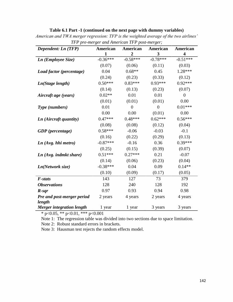
142
Table 6.1 Part -1 (continued on the next page with dummy variables)
American and TWA merger regression: TFP is the weighted average of the two airlines’
TFP pre-merger and American TFP post-merger;
Dependent: Ln (TFP) American
1
American
2
American
3
American
4
Ln (Employee Size) -0.36*** -0.58*** -0.78*** -0.51***
(0.07) (0.06) (0.11) (0.03)
Load factor (percentage) 0.04 0.68** 0.45 1.28***
(0.24) (0.23) (0.33) (0.12)
Ln(Stage length) 0.50*** 0.83*** 0.93*** 0.92***
(0.14) (0.13) (0.23) (0.07)
Aircraft age (years) 0.02** 0.01 0.01 0
(0.01) (0.01) (0.01) 0.00
Type (numbers) 0.01 0 0 0.01***
0.00 0.00 (0.01) 0.00
Ln (Aircraft quantity) 0.47*** 0.48*** 0.62*** 0.56***
(0.08) (0.08) (0.12) (0.04)
GDP (percentage) 0.58*** -0.06 -0.03 -0.1
(0.16) (0.22) (0.29) (0.13)
Ln (Avg. hhi metro) -0.87*** -0.16 0.36 0.39***
(0.25) (0.15) (0.39) (0.07)
Ln (Avg. indmkt share) 0.51*** 0.27*** 0.21 -0.07
(0.14) (0.06) (0.23) (0.04)
Ln(Network size) -0.38*** 0.04 0.09 0.14**
(0.10) (0.09) (0.17) (0.05)
F-stats 143 127 73 379
Observations 128 240 128 192
R-sqr 0.97 0.93 0.94 0.98
Pre and post-merger period
length
2 years 4 years 2 years 4 years
Merger integration length 1 year 1 year 3 years 3 years
* p<0.05, ** p<0.01, *** p<0.001
Note 1: The regression table was divided into two sections due to space limitation.
Note 2: Robust standard errors in brackets.
Note 3: Hausman test rejects the random effects model.

143
Table 6.1 Part 2 – Dummy variables
American and TWA merger regression: TFP is the weighted average of the two airlines’
TFP pre-merger and American’s TFP post-merger;
Dependent: Ln (TFP) American 1 American 2 American 3 American 4
Q1 dummy -0.03** -0.05*** -0.07*** -0.03***
(0.01) (0.01) (0.02) (0.01)
Q2 dummy 0.05*** 0.02 0.01 -0.01
(0.01) (0.02) (0.02) (0.01)
Q3 dummy 0.06*** 0.03* 0.04* 0.00
(0.01) (0.01) (0.02) (0.01)
America West dummy -0.36*** -0.23** -0.28 -
(0.10) (0.07) (0.16) -
Continental dummy -0.15** -0.19*** -0.18* -0.12***
(0.05) (0.05) (0.08) (0.02)
Delta dummy 0.38*** 0.27*** 0.15 0.24***
(0.07) (0.06) (0.09) (0.04)
Northwest dummy 0.04 0 -0.2 0.06
(0.13) (0.09) (0.16) (0.05)
Southwest dummy -0.2 0.43** 0.36 0.77***
(0.18) (0.15) (0.27) (0.08)
United dummy 0.28*** 0.19*** 0.15** 0.15***
(0.03) (0.03) (0.05) (0.02)
US Airways dummy 0.06 -0.06 -0.25
(0.11) (0.08) (0.14)
Time dummy -0.05** -0.09*** -0.08 -0.05**
(0.02) (0.02) (0.04) (0.02)
Treatment *Time dummy 0.04 0.09* 0.06 0.10***
(0.03) (0.04) (0.06) (0.02)
F-stats 143 127 73 379
Observations 128 240 128 192
R-sqr 0.97 0.93 0.94 0.98
Pre and post-merger period
length
2 years 4 years 2 years 4 years
Merger integration length 1 year 1 year 3 years 3 years
* p<0.05, ** p<0.01, *** p<0.001
Note 1: The regression table was divided into two sections due to space limitation.
Note 2: Robust standard errors in brackets.
Note 3: Hausman test rejects the random effects model.

144
Table 6.2 Part - 1 (continued on the next page with dummy variables)
US Airways and America West merger regression: merger regression: TFP is the weighted
average of the two airlines’ TFP pre-merger and US Airways’ TFP post-merger;
Dependent: Ln (TFP) US Airways 1 US Airways 2 US Airways 3 US Airways 4
Ln (Employee Size) -0.75*** -0.74*** -0.86*** -0.83***
(0.06) (0.05) (0.11) (0.07)
Load factor (percentage) 0.65** 0.78*** 0.82** 0.79***
(0.24) (0.20) (0.27) (0.21)
Ln(Stage length) 0.68*** 1.06*** 1.21*** 1.27***
(0.17) (0.14) (0.23) (0.16)
Aircraft age (years) 0 -0.01 -0.01 -0.01
(0.01) (0.01) (0.02) (0.01)
Type (numbers) - - - -
0.00 0.00 0.00 0.00
Ln (Aircraft quantity) 0.63*** 0.58*** 0.64*** 0.58***
(0.07) (0.05) (0.08) (0.06)
GDP (percentage) -0.22 -0.26 -0.54* -0.4
(0.15) (0.16) (0.27) (0.23)
Ln (Avg. hhimetro) -1.00*** -0.47 -0.73 -0.59*
(0.28) (0.27) (0.38) (0.28)
Ln (Avg. indmkt share) 0.92*** 0.75*** 0.75** 0.84***
(0.19) (0.19) (0.25) (0.19)
Ln(Network size) 0.13 0.11 -0.02 0.13
(0.09) (0.07) (0.11) (0.07)
F-stats 220 266 265 283
Observations 111 145 80 120
R-sqr 0.98 0.98 0.99 0.98
Pre and post-merger
period length
2 years 4 years 2 years 3 years
Merger integration
length
2 years 2 years 3 years 3 years
* p<0.05, ** p<0.01, *** p<0.001
Note 1: The regression table was divided into two sections due to space limitation.
Note 2: Robust standard errors in brackets.
Note 3: Hausman test rejects the random effects model.

145
Table 6.2 Part 2 – Dummy variables
US Airways and American West merger regression: merger regression: TFP is the weighted
average of the two airlines’ TFP pre-merger and US Airways’ TFP post-merger;
Dependent: Ln (TFP) US Airways 1 US Airways 2 US Airways 3 US Airways 4
Q1 dummy -0.03* -0.04*** -0.04** -0.04**
(0.01) (0.01) (0.02) (0.01)
Q2 dummy 0.02 0.01 0 0.01
(0.01) (0.01) (0.02) (0.01)
Q3 dummy 0.03* 0.03** 0.02 0.03*
(0.01) (0.01) (0.02) (0.01)
American dummy 0.28** 0.16 0.18 0.17*
(0.09) (0.08) (0.15) (0.08)
Continental dummy 0.1 -0.07 -0.18 -0.14
(0.08) (0.07) (0.10) (0.07)
Delta dummy 0.37***
(0.06)
Northwest dummy 0.08
(0.10)
Southwest dummy 0.64*** 0.60*** 0.55** 0.72***
(0.15) (0.11) (0.16) (0.11)
United dummy 0.38*** 0.26*** 0.24 0.24***
(0.09) (0.07) (0.13) (0.07)
Time dummy 0.01 0.03 -0.01 0
(0.03) (0.02) (0.05) (0.02)
Treatment *Time dummy 0.32*** 0.23*** 0.22** 0.25***
(0.07) (0.05) (0.08) (0.05)
F-stats 220 266 265 283
Observations 111 145 80 120
R-sqr 0.98 0.98 0.99 0.98
Pre and post-merger
period length
2 years 4 years 2 years 3 years
Merger integration length 2 years 2 years 3 years 3 years
* p<0.05, ** p<0.01, *** p<0.001
Note 1: The regression table was divided into two sections due to space limitation.
Note 2: Robust standard errors in brackets.
Note 3: Hausman test rejects the random effects model.

146
Table 6.3 Part 1 - (continued on the next page with dummy variables)
Delta and Northwest merger regression: TFP is the weighted average of the two airlines’
TFP pre-merger and Delta’s TFP post-merger;
Dependent: Ln (TFP) Delta 1 Delta 2
Ln (Employee Size) -0.65*** -1.00*
(0.19) (0.36)
Load factor
(percentage)
0.67* 1.14*
(0.28) (0.44)
Ln(Stage length) 1.13*** 1.02*
(0.29) (0.45)
Aircraft age (years) (0.01) (0.02)
(0.01) (0.02)
Type (numbers) - -
0.00 (0.01)
Ln (Aircraft quantity) 0.86*** 1.23**
(0.20) (0.36)
GDP (percentage) (0.30) (0.21)
(0.31) (0.43)
Ln (Avg. hhi metro) (0.03) (0.02)
(0.35) (0.66)
Ln (Avg. indmkt share) 0.03 (0.15)
(0.29) (0.46)
Ln(Network size) (0.05) (0.13)
(0.07) (0.12)
F-stats 101 59
Observations 76 46
R-sqr 0.97 0.98
Pre and post-merger
period length
2 years 1.25 year
Merger integration
length
1.25 year 2 years

147
Table 6.3 Part 2 – Dummy variables
Delta Air Lines regressions: dummy variables
Dependent: Ln (TFP) Delta 1 Delta 2
Q1 dummy -0.04** (0.02)
(0.01) (0.02)
Q2 dummy 0.02 0.01
(0.01) (0.02)
Q3 dummy 0.03 0.01
(0.02) (0.03)
American dummy -0.31*** -0.27*
(0.06) (0.11)
Continental dummy -0.44*** -0.50*
(0.12) (0.20)
Southwest dummy 0.12 -0.18
(0.22) (0.37)
United dummy -0.24** -0.19
(0.08) (0.15)
Time dummy 0.01 0
(0.02) (0.05)
Treatment *Time dummy 0.06 0.21
(0.11) (0.21)
F-stats 101 59
Observations 76 46
R-sqr 0.97 0.98
Pre and post-merger
period length
2 years 1.25 year
Merger integration length 1.25 year 2 years

148
Figures: Figure 3.1
American’s descriptive parameters as it merges with Trans World: 1992-2011
The first line indicates the date of merger closure announcement which marks the start of merger integration.
The second line indicates the date of first joint reporting.
The third line indicates the date for merger completion.

149
Figure 3.2
U.S. Airways’ descriptive parameters as it merges with America West: 1992-2011

150
Figure 3.3
Delta’s descriptive parameters as it mergers with Northwest: 1992-2011
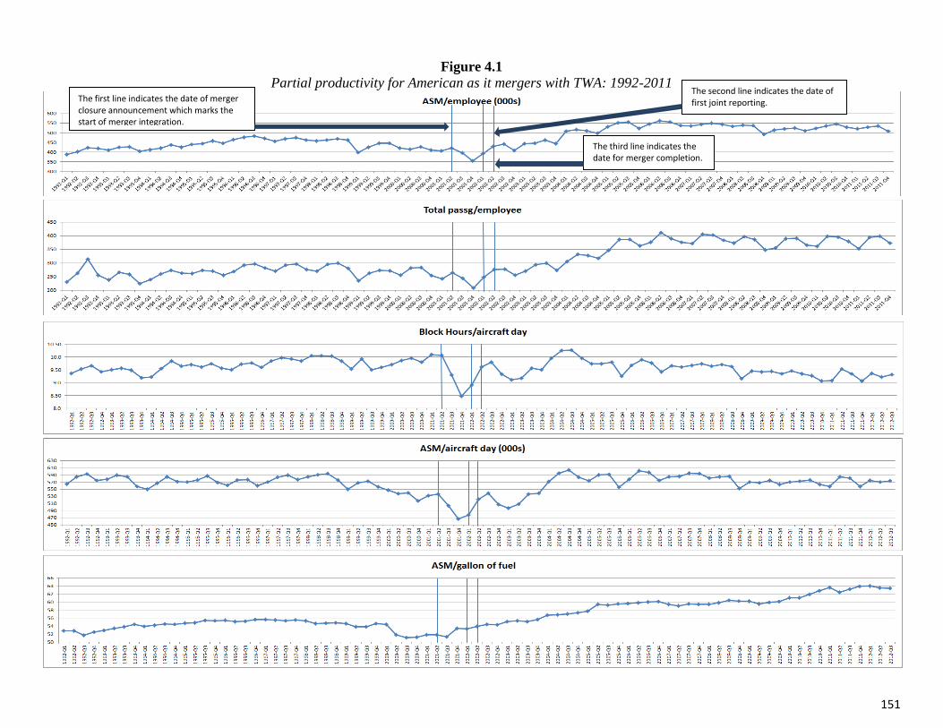
151
Figure 4.1
Partial productivity for American as it mergers with TWA: 1992-2011
The first line indicates the date of merger closure announcement which marks the start of merger integration.
The second line indicates the date of first joint reporting.
The third line indicates the date for merger completion.

152
Figure 4.2
Partial productivity of US Airways as it mergers with American West: 1992-2011

153
Figure 4.3
Partial productivity for Delta as it merges with Northwest: 1992-2011

154
Figure 4.4
Evolution of TFP productivity for American, US Airways and Delta (normalized at American 1992=1)
(The three vertical lines mark beginning of merger, first joint report and completion of merger, respectively)

155
Figure 4.5
Comparison of pre and post-merger TFP indices of American (as the acquirer), TWA (as the target airline) and their average (weighted by RPM)

156
Figure 4.6
Comparison of pre and post-merger TFP indices of US Airways (as the acquirer), America West (as the target airline)
and their average (weighted by RPM)

157
Figure 4.7
Comparison of pre and post-merger TFP indices of US Airways (as the acquirer), America West (as the target airline)
and their average (weighted by RPM)