Embed Size (px)
Citation preview
The William Morris Collection at the Archives and Rare
Books Library, University of Cincinnati
By Lilia Walsh
Author’s note: This bibliography has been divided into sections by subject. All volumes written
by Morris appear in the ‘Translated/written by William Morris’ section, even if they were also
printed at Kelmscott.
Translated/Written by William Morris
Morris, William. The Earthly Paradise, a Poem (Author's ed.). Boston: Roberts brothers, 1868.
ARB RB PR5075 .A1 1868
Arguably the most popular of Morris’s written works; this novel made Morris’s name as a
poet. It tells the story of twelve Norwegian sailors who flee the black plague and set off
to look for the ‘earthly paradise’. They end up on an isolated island, which houses the last
vestiges of an ancient Greek civilization. The book is made up of several poems, which
are tied to the twelve months of the year, paralleling the 12 sailors.
Morris, William. Letter to Aglaia Ionides Coronio. 24 October. 1872. ARB RB PR5083. A43
1872
See attached (or web linked) transcription and annotation.
A three and a half page folded letter on one piece of paper with some repairs to original
folds.
Morris, William. Chants for Socialists. London: Socialist League Office, 1885. ARB RB PR5078
.C4 1885
Bound in red leather and red linen, with gold embossed title. Appears to be an
inexpensive ‘propaganda’ pamphlet which has been but in a quality binding. Literally a
collection of verse chants, designed to spread the message and dreams of the socialists;
“For then – laugh not, but listen, to this strange tale of mine- all folk of England shall be
better lodged than swine. Then a man shall work and bethink him, and rejoice in the
deeds of his hand, nor yet come home in the even too faint and weary to stand”. It bears
many similarities to Morris’s News From Nowhere.
Morris, William. Poems by the Way. London: Reeves and Turner, 1891. ARB RB PR5078 .P4
1891
A richly bound copy of Morris’s book of poetry, this volume was published by the Chiswick
press. Bound in green leather, with ridged spine and gold embossed title. The interior
covers are covered with pink and gold fabric, with an embossed gold border. Page edges
are gilded on head, tail, and fore-edge. First leaves are heavier paper with William Morris
watermark, but main body is lighter weight paper.
Chiswick press shared many of its designers with the Doves Press, and this volume’s
interior cover design is almost identical to that of Mathew Arnold’s Poems, as published
by Doves.
Morris, William. The Defence of Guenevere, and Other Poems. Hammersmith: Kelmscott Press,
1892. ARB RB PR5078 .D4 1892
Inscribed on the first free endpaper: “To Rennell Rodd. From his friend Jane Patterson,
Oct. 27. 1894”.
Bound in vellum with green ties. Guenevere is printed on the spine in calligraphy inks.
Printed on handmade paper with deckled edges. Printed in Morris’s golden typeface, with
red subtitles, and illuminated letters. The inside cover bears a book plate which shows
two women reading a book and the words Ex Libris, and Rennell Rodd. Morris presents
the story of the illicit romance of Queen Guenevere and Sir Lancelot as a realistic drama.
Guenevere received mixed reviews.
Morris, William. Gothic Architecture: A Lecture for the Arts and Crafts Exhibition Society.
Hammersmith: Kelmscott Press, 1893. ARB RB NA440 .M86
One of Morris’s miniature publications, bound in blue board, with printed, all-caps title on
front. The paper is handmade, and Morris’s watermark is visible in parts on various
pages. Morris had little interest in bindings, he assumed that the buyer would have the
book rebound in their preferred style, even though his books didn’t always include
enough margin to allow rebinding. Morris even suggested that a machine should be
designed to bind books.
Gothic Architecture was first delivered by Morris as a lecture at the Arts & Crafts
Exhibition Society in 1889. It exhibits Morris’s passion for the gothic style, originally
awakened by John Ruskin’s work The Stones of Venice.
Morris, William. The Wood Beyond the World. Hammersmith: Kelmscott Press, 1894. ARB RB
PR5079 .W6 1894
Bound in vellum with pink cloth ties and printed on handmade paper with trimmed edges.
The wood-engraved frontispiece was designed by Edward Burne-Jones. This is a fantasy
novel, which tells the story of Golden Walter, who leaves home when he finds his wife has
betrayed him for another man. He is carried by a storm to a faraway land where he
meets a maiden held captive by an enchantress. He eventually comes to a new land and
Walter and the maiden become the king and queen. This novel made Morris one of the
founders of the fantasy genre.
Morris, William. The Tale of the Emperor Coustans and of Over Sea. Hammersmith: Kelmscott
Press, 1894. ARB RB PR5079 .E5 1894
The title page of this volume is highly ornamented, a style which seems outsize to the
small format of the book. The book is set in Morris’s Chaucer font, with ornamental
letters starting the paragraphs and red subtitles in the margins by the top exterior corner
of the box of text. Leaf characters were used to fill white spaces in the text.
This is one of the most elaborately bound books in the collection. The book itself has not
been modified as it retains the simple blue covers of Morris’s press. However, a very
elaborate case has been constructed to accompany the volume. There is a blue leather
slipcover with patterned paper in the interior that fits over the book. This, in turn, fits
into a blue leather case with a ridged spine and gold embossed title and decorative
elements.
Morris, William. Child Christopher and Goldilind the Fair. Hammersmith: Kelmscott Press,
1895. ARB RB PR5079 .C5 1895 v.1-2
This is a two-volume book, in Morris’s small format. Bound in blue boards with linen
spines. This work is considered one of the important foundation stones of the fantasy
genre. It is based on a medieval work, Lay of Havelock the Dane.
Morris, William. The Life and Death of Jason: A Poem. Hammersmith: Kelmscott Press, 1895.
ARB RB PR5076 .A1 1895
Bound in vellum with yellow cloth ties, with wood-engraved illustrations by Edward
Burne-Jones. This is one of 200 copies on paper. Titled horizontally in gilt on spine. This
book was one of Morris’s most popular works, both with readers and his critical peers
(Ruskin, Swinburne, Henry James, etc.). Morris revised the text several times and
published three editions. This work made Morris one of the most popular Victorian poets.
Jason was originally written to be part of ‘The Earthly Paradise’, but due to its length,
Morris decided to publish it as an independent work.
Morris, William. The Well at the World's End. Hammersmith: Kelmscott Press, 1896. ARB RB
PR5079 .W4 1896
Inscribed by Morris’s wife: “Fanny Emma Price with love from Jane Morris New Years Day
1899”.
Includes four illustrations by Sir Edward Burne-Jones. One of a limited edition of 350
copies on paper, eight on vellum. Bound in green linen with green leather spine and
corners. Title in gold on ridged spine, with additional exterior gold ornamentation and
gold edged head on pages. Chapter headings are printed in red, body of text in black. Set
in Morris’s Chaucer typeface. This work was an inspiration to future fantasy writers C.S.
Lewis and J.R.R. Tolkien.
Morris, William. The Water of the Wondrous Isles. Hammersmith: Kelmscott Press, 1897. ARB
RB PR5079 .W3 1897
Inscribed on front endpaper: “Francis George Richmond from Jane Morris Aug.: 1904”.
Bound in vellum with green ties. One of 250 copies printed on paper. In this book Morris
combined an imaginary world with a supernatural element, setting a precedent for the
future genre of fantasy novels. Morris began this work in verse, eventually changing to
the final prose format. Its design is mostly uniform with that of The Well at World’s End,
with the exception of the red-shoulder notes and lack of illustrations. Morris was working
on woodcut word designs for this book when he died. R. Catterson-Smith later completed
them. Set in Chaucer type with two columns of text per page.
Morris, William. An address delivered by William Morris at the distribution of prizes to students
of the Birmingham Municipal School of Art, on Feb. 21, 1894. London: Longmans & Co.,
1898. ARB RB N7450 .M7
Bound in blue board, with linen spine. Printed at the Chiswick press, in the Golden
typeface designed by Morris. No use of red ink. Inscribed on the front free endpaper:
“Marianne Grove with love from Jane Morris, May 1898.” Morris discusses the nature and
future of art (specifically in England), and the goals and potential future paths of the
students of the Birmingham Municipal School of Art. Tucked into the back free endpapers
is a printers ticket, stating that this lecture is hopefully one of a series to be published by
Chiswick in the fonts and style of Kelmscott.
Morris, William. Art and the Beauty of the Earth: Lecture delivered at Burslem Town Hall on
October 13, 1881. London: Longmans & Co., 1898. ARB RB N7450. M855 1898
Inscribed: “T. C. Powell from H. L. Hemming, X-mas 1901”.
A very simply printed book, in Golden type with no colors or ornamentation. It was
printed at Chiswick press and bound with blue-grey board and linen spine. Morris
discusses pottery and the decorative arts in general.
Morris, W., & Cockerell, S. A Note by William Morris on his Aims in Founding the Kelmscott
Press, Together with a Short Description of the Press by S. C. Cockerell, & an Annotated
List of the Books Printed there at. Hammersmith: Kelmscott Press, 1898. ARB RB
Z232.M87 M7
Bound in blue board with linen spine. The colophon states: “This was the last book
printed at Kelmscott Press… Sold by the trustees of the late William Morris at the
Kelmscott press” (last free endpaper). This volume is one of 525 copies. Set mostly in
Golden type with five pages in Troy and Chaucer type. In the “note” Morris explains his
thoughts and preferences in typography, illustrates how he came to the choices he makes
in the design of the Kelmscott books, and tells the history of the Kelmscott Press. The
volume includes an annotated bibliography of all the books printed at Kelmscott and the
titles are in red with annotations in black.
Morris, William. Some Hints on Pattern-Designing. London: Longmans, 1899. ARB RB TT520
.M83 1899
Bound in board covered with blue-grey paper, linen spine, with no red ink. Printed by the
Chiswick press. This is a lecture delivered by Morris at the Working Men’s College in
London on December 10, 1881. The leaves of this volume have not been opened (folded
along the top edge).
Morris addresses the difference between ‘real art’ and ‘ornamental art’. Most of the essay
is on the nature of art and labor in general. It is more of the exploration of art and
ornament than a series of rules or guides used to design a pattern. Morris does state:
“Ornamental pattern-work, to be raised above the contempt of reasonable men, must
posses three qualities: beauty, imagination, and order” (7).
Morris, William. Pre-Raphaelite Ballads. New York: A. Wessels Co., 1900. ARB RB PR5078
.P6 1900
This volume of ballads by William Morris was designed and illustrated by H.M. O’Kane and
published by A. Wessels Company in New York City, but is clear that the book has been
designed to reflect Morris’s style. The book is bound with the characteristic Kelmscott
blue boards and linen spine. The type is set in black and red, in a style similar to Morris’s
fonts. O’Kane uses black ornamental borders, but much more extensively than Morris,
and in a more art Nouveau style. The borders utilize floral designs, but they are looser,
more simplified, and more abstracted than Morris’s work.
Morris, William. Architecture and History, and Westminster Abbey. London: Longmans & Co.,
1900. ARB RB PR5080 .A7 1900
This volume was printed at Chiswick Press, and designed in the style of Morris’s
Kelmscott books. It employs Morris’s simple blue-grey binding and Golden type.
Architecture and History was written as a paper for SPAB, the Society for the Protection
of Ancient Buildings. Morris addresses the interchange of history, restoration, and
architecture: “Surely it is a curious thing that while we are ready to laugh at the idea of
the possibility of the Greek workman turning out a Gothic building, or a Gothic workman
turning out a Greek one, we see nothing preposterous in the Victorian workman
producing a Gothic one” (28).
This volume includes some pen underlining and notes from page 38 – 50.
Morris, William and Eirikr Magnusson. The Story of Grettir the Strong, Translated from the
Icelandic by Eirikr Magnusson and William Morris. London: Longmans, Green and Co.,
1901. ARB RB PT7269.G7 M3 1901
This is one of only a few books printed by Morris with two columns of text on a page.
Includes a map of the parts of Iceland that appear in the story. Printed in Golden type, in
red and black ink. Bound in dark blue linen and light blue paper.
Morris, William. Art and its Producers, and the Arts and Crafts of To-day: Two Addresses
Delivered before the National Association for the Advancement of Art. London: Longmans
& Co., 1901. ARB RB N7445. M755 1901
Printed in Golden type, bound in board covered in blue-grey paper with linen spine. Made
on handmade paper, with a standard layout, and no use of red ink. Printed at Chiswick
Press, this is a lecture delivered on December 5, 1888 in Liverpool before the National
Association for the Advancement of Art. Morris states: “The non-gentleman workmen are
beyond our reach unless we look on the matter from the wider point of view, but we can
try to get the artists to take an interest in those arts of life whose production at present
is wholly in the hands of the irresponsible machines of the commercial system, and to
understand that they, the artists, however great they may be, ought to be taking part in
this production; while the workmen who are now machines ought to be artists, however
humble” (19).
Morris, William. Gertha's Lovers: A Tale. Portland, ME: Thomas B. Mosher, 1905. ARB RB
PN6013 .B7 no.32
This volume is one of a large series of small books printed by Mosher, which are less than
six inches tall. It is called the ‘Brocade Series’ due to the rococo patterns that the
slipcases are covered in. The books in the series are largely all covered with this same
pattern, but in different color schemes. There are a few exceptions, including Frances
Villon by Robert Louis Stevenson. The books are bound in white paper with the title
printed on the cover, aligned to the top left corner. The first character in the title is
illuminated in this, and all other books in the Mosher Brocade Series. The illuminated
character is red and the rest of the title is in black, all capitals, with small decorative
elements. The title is repeated on the spine, with one character on each row, which in the
longer titles becomes difficult to read. Decorative elements fill the rest of the spine when
the title is shorter than the height of the book. In the top right hand corner of the back
cover is a printer’s emblem; a flaming torch with entwined serpentine forms. The interior
text is set in very small type, with some rococo decorative elements, which reflect the
brocade design of the slipcover.
The colophon states: “Four hundred and twenty-five copies of this book (second edition)
have been printed on Japan vellum, and type distributed, in the month of October, A.D.
MDCCCCV, at the press of George D. Loring, Portland, Maine”.
Gertha’s Lovers is clearly inspired by Morris’s work translating Nordic legends; the main
characters are Gertha, Olaf, and Sigurd. Like many of Morris’s stories, this one has a very
‘fairy-tale’ like tone. It opens with, “Long ago there was a land, never mind where or
when, a fair country and good to live in”, close enough to “once upon a time, in a land
far, far away” (11).
Morris, William and Pater, Walter. Some Great Churches in France; Three Essays (Third ed.).
Portland, ME: T. B. Mosher, 1905. ARB RB PN6013 .B7 no. 39
See the annotation for Gertha’s Lovers for layout and design of this series of books.
The first essay, Shadows of Amiens, is by Morris. The other two, Notre-Dame D’Amiems
and Vezelay, are by Walter Pater. Morris began working in architecture after his
graduation from Oxford, but eventually decided it wasn’t what he wanted to pursue.
Morris moved on to smaller scale design, such as furniture, tapestries, and books, but he
maintained a life-long passion for old buildings and architecture.
Morris, William. The Story of the Unknown Church, and Other Tales (Second ed.). Portland,
ME: T. B. Mosher, 1906. ARB RB PN6013 .B7 no.34
See the annotation for Gertha’s Lovers for layout and design of this series of books.
This story was the first that Morris contributed to The Oxford and Cambridge Magazine,
and the first story that he published. The narrator is the dead mason of a church who
vanished two hundred years ago. The narration is very dream-like and memory-based.
The dead narrator is a technique that Morris would return to later.
Morris, William. Golden wings: Svend and his Brethren (Second ed.). Portland, ME: T. B.
Mosher, 1906. ARB RB PN6013 .B7 no.33
See the above annotation for Gertha’s Lovers for layout and design of this book.
Golden Wings is one of the poems, which makes up Morris’s Defence of Guenevere.
Morris first wrote this poem when he was in his early twenties. The story is set in a
walled garden of innocence, which contains a castle. This was the last of William Morris’s
stories published in The Oxford and Cambridge Magazine. It is rather unusual in that its
first person narrator is deceased.
Morris, William. The Hollow Land: A Tale. Portland, ME: T. B. Mosher, 1908. ARB RB PN6013
.B7 no.22
See the annotation for Gertha’s Lovers for layout and design of this series of books.
This story is another of those that were included in The Oxford and Cambridge. Like
Gertha’s Lovers and Svend and his Brethren this story has a medieval setting and
knightly heroic characters. However, Morris brings in an element of moral questioning.
The narrator asks at one point, “Had our house been the devil’s servants all along? I
thought we were God’s servants.” Like many of Morris’s medieval romances, The Hollow
Land shows the influence of Malory’s Morte d’Arthur.
Morris, William. The History of Over Sea, Done out of the Ancient French into English by
William Morris. Portland, ME: T. B. Mosher, 1909. ARB RB PN6013 .B7 no.14
See the annotation for Gertha’s Lovers for layout and design of this series of books.
The History of Over Sea is one of four romances translated by William Morris from ancient
French. Like many of Morris’s stories, it centers on a strong female character, Lady
Pontheiu.
Morris, William. The Story of Amis & Amile, Done Out of the Ancient French into English by
William Morris. Portland, ME: T. B. Mosher, 1909. ARB RB PN6013 .B7 no.11
See the annotation for Gertha’s Lovers for layout and design of this series of books.
Morris translated this story from ancient French into English. Amis & Amile tells the story
of two devoted friends who are nearly twins. Amile discovers that the only way to cure
Amis, who is dieing of leprosy, is to kill his children and wash Amis in their blood. He
decides to do this and Amis recovers. Later they find the children alive and well, playing
in the nursery, with only a line on their throat to show what has happened to them.
Morris, William. The Collected Works of William Morris; with Introductions by his Daughter May
Morris. London: Longmans: Green and Company, 1910. ARB RB PR5071 .M7 1910
(24 volumes)
ARB has: 1, (2 in SW), 3, 8, 9, 14, 15, 16, 17, and 23
A 24-volume set which contains nearly everything Morris wrote in his lifetime. It includes
his published works, as well as several unfinished romances, previously unpublished
poems and writings, and his translations of classics and French, Icelandic, and early-
English sagas. Each volume opens with a print of a portrait of Morris from a different time
in his life and an introduction by his daughter May Morris.
Morris, William. Ed. The Tale of King Coustans, the Emperor, Done out of the Ancient French
into English by William Morris. Portland, ME: T. B. Mosher, 1912. ARB RB PN6013 .B7
no. 3
See the annotation for Gertha’s Lovers for layout and design of this series of books.
This volume is another French romance that was translated to English by William Morris.
Morris, William. Ed. The Tale of King Florus and the Fair Jehane, Done out of the Ancient
French into English. Portland, ME: T. B. Mosher, 1915. ARB RB PN6013 .B7 no.13
See the annotation for Gertha’s Lovers for layout and design of this series of books.
This volume is yet another French romance that was translated to English by William
Morris.
Morris, William. Masters in This Hall: A Christmas Carol. Berkeley, CA: Poole Press, 1995. ARB
RB M2075.C5 M87 1995
A miniature book, designed, printed, and bound by Maryline Poole Adams, this volume is
46 of 100 copies. A note at the end of the book, “About the Carol”, explains that Morris
wrote the carol while still apprenticed to the architect G.E. Street. Another architect at
the firm collected carols and asked Morris to write verse for an old French melody he had
acquired. The carol was later included in a volume, “Ancient Christmas Carols”.
About William Morris – His World and Work
Rossetti, William Micheal. Art and Poetry. London: Dickinson, 1850. ARB RB PN 1069 .R63
1850
Subtitled Being Thoughts Toward Nature Conducted Principally by Artists, the volume
contains From the Cliffs and Carillon by Dante Gabriel Rossetti. This publication was a
periodical related to the Pre-Raphaelites. It contains an etching by Ford Madox Brown, in
addition to several poems by D.G. Rossetti.
Cary, E. L. William Morris, Poet, Craftsman, Socialist. New York: G. P. Putnam's Sons, 1902.
ARB RB PR5083 .C3
Binding is dark blue and embossed with a gold image of an iron fence curling with ornate
grape vines. Centered in a gap in the fence on the cover is “Morris”. The spine bears the
complete title: “William Morris: Poet, Craftsman, Socialist” and the author “E.L. Cary.”
This volume is an extensive biographical examination of Morris’s life, career, and
character. Includes numerous illustrations, including portraits of Morris, Rossetti, and
Jane Morris, as well as designs by Morris.
Morris & Co. William Morris & Company. (Ruskin House) Limited : Studios, Works, Offices and
Showrooms, "Ruskin House", ... London: W. Morris & Co., 1912. ARB RB Oversize
NK1142.M67 W5 1912
Large-scale catalogue of Morris and Co products, bound in printed burlap (or linen).
Largely printed on brown or blue-grey paper with pasted-in color prints. The pages show
illustrations, details, specs, and options for a variety of products, including: stained glass
windows, door handles, gates, fences, hinges, weathervanes and fireplaces.
R. R. Donnelley and Sons Company. You are Invited to View an Exhibition of Finely-Printed
Books Since William Morris, of Which this is the Catalogue, at the Lakeside Press
Galleries, September, October, and November, 1932. Chicago: R. R. Donnelley, 1932.
ARB RB Z121 .D6
R.R. Donnelley introduces the exhibit and book: “William Morris was the author of a
revival of interest in fine printing in England in the 1890s. Because of his great influence
on the arts of the book then and since, it is fitting that an exhibition of some of the better
books of the past thirty-five years start with examples of the work of the Kelmscott
Press” (5). Composed of short profiles of the many represented printing presses, followed
by a bibliography of the displayed books.
Tinker, Chauncey B. and Carl P. Rollins. Addresses Commemorating the One Hundredth
Anniversary of the Birth of William Morris, Delivered Before the Yale Library Associates in
the Sterling Memorial Library, XXIX October, MCMXXXIV. New Haven, CT: Overbrook
Press, 1935. ARB RB PR5083 .T63
Tinker’s essay, “William Morris as Poet” focuses on Morris’s literary style, subject matter,
and romanticism. Rollins’s essay; “The Ordeal of William Morris”, examines Morris’s life,
temperament, passions, and struggles. The design of the book emulates Kelmscott in
some ways, utilizing Morris’s dichromatic color system, but replacing the Kelmscott red
with blue. The title page bears an ornamental border and the text includes several
woodcut illuminated letters.
Morris, May. William Morris, Artist, Writer, Socialist. Oxford: B. Blackwell, 1936. ARB RB
PR5083 .M5 (two volumes)
May Morris was William Morris’s daughter and she followed in his footsteps in the arts and
crafts movement. She grew up working with her mother to create embroideries for her
father’s business. Eventually, she became an expert on the subject, and wrote a practical
guide. May admired her father and was involved in several of his projects, working to tell
his story and preserve his legacy after his death. In this book May Morris details several
aspects of William Morris’s life: his inspiration, the arts and crafts movement in general,
the establishment of his firm, and his circle.
John Carter Brown Library. William Morris and the Kelmscott Press; an Exhibition Held in the
Library of Brown University, Providence, Rhode Island, from October 9 to December 31,
1959. To which is Appended an Address by Philip C. Duschnes before the Friends of the
Library of Brown University, December 7, 1959. Providence, RI: 1960. ARB RB
Z232.M87 B7
Bound in blue paper with William Morris’s Kelmscott printers mark centered on the cover
in red ink. The items in the catalogue range from tapestry samples, to wallpaper, to
printed work. The last few pages contain images of Morris’s printed works and progress
work from Morris type design work.
Thompson, E. P. William Morris: Romantic to Revolutionary. New York: Monthly Review Press,
1962. ARB Ref PR5083 .T6 1962
Romantic to Revolutionary is a biography of Morris and is divided into the phases of his
life and the passions that accompanied them: William Morris and the Romantic Revolt,
The Years of Conflict, Practical Socialism, Necessity and Desire, and Appendices. It looks
into Morris’s influences and his theories on art and socialism, but steers away from any
sort of strict chronology. The author states in a foreword: “This book is a study of William
Morris rather than a biography. J.W. Mackail’s Life of William Morris, published over fifty
years ago, is likely to remain the standard year-by-year narrative of the main events in
Morris’s life” (7). He goes on to argue that new information has since come to light, and
that Mackail’s proximity to Morris’s friends inhibited the honesty of his account. He also
felt that Mackail’s disdain for Morris’s active socialism made him underplay the
importance of this cause in Morris’s life. Thompson strives to create a more complete
historical, political, and social context for Morris’s life and legacy.
Thompson, Paul. The Work of William Morris (Rev. ed.). London: Quartet Books, 1977. ARB
Ref PR5083 .T63 1977
This is one of a small number of biographies of William Morris. The author addresses his
purpose in writing the biography: “I had two aims in writing this book. The first was that,
while notable biographies of Morris exist by J. W. Mackail and (more recently) by E.P.
Thompson, both are very long, and none of the shorter biographies is satisfactory. There
is no brief introduction to his work and ideas which takes account of all the important
revaluations of the last few years. This book is an attempt to meet that need” (I).
Thompson is able to relate Morris’s socialist belief to his attempt to reform the ‘lesser
arts’. Morris saw the transformation of both factory and home as necessary for the future
fulfillment of humanity; “ ‘ to him, the man lived in the house almost as the soul lived in
the body’ “ (2). The chapters of the book are divided into Morris’s many pursuits;
Architecture, Patterns in Textiles, Book Design, Poetry, Politics, etc. The Book Design
chapter is a very good overview of the evolution and history of Morris’s interest in
printing and book making. It chronicles how he evolved from illuminating manuscripts as
a hobby to starting the Kelmscott press. Thompson is critical of Morris’s efforts, stating
that they would have “been greatly helped by a more cautious assessment of the
development of Victorian printing, and especially of the social value of good printing by
cheap methods” (157).
Walsdorf, John J. William Morris in Private Press and Limited Editions: A Descriptive
Bibliography of Books by and about William Morris, 1891-1981. Phoenix, AZ: Oryx Press,
1983. ARB Ref Z8595 .W34 1983
An extensive annotated bibliography of works published or written by Morris or his
associates, as well as information about collecting William Morris, a chronology of Morris’s
career, and examples of his work. The author states in an introduction: “Just over fifteen
years ago I started my quest for Morris, a sometimes ill-planned and often costly search
for copies of all English language private press and limited edition books and pamphlets
by and about William Morris. My starting point was always 1891, the starting date of
Morris’s Kelmscott Press. Morris own works, other than Kelmscott Press editions, were
often published in limited editions as well… Fortunately these early limited editions did
not hold my interest” (xxi).
Franklin, Colin. Printing and the Mind of Morris: Three Paths to the Kelmscott Press.
Cambridge Cambridgeshire: Privately printed for the author and distributed by the
Rampant Lions Press, 1986. ARB RB Z232.M87 F73 1986
One of 50 copies on Barcham Green Canterbury handmade paper. Book is bound in a
blue and grey print of Morris’s willow pattern with a blue leather binding. The title is
embossed in gold type on the spine. The top edges of the pages are also covered in gold.
The volume fits into a light blue-grey slipcase covered in handmade paper with the wire
grid visible in the grain. The title is printed on a small white rectangle on the cover of the
slipcase. This essay by Franklin examines the correlations between the “typographic
decoration in the Kelmscott Press books, and literary elaboration of style he chose for his
prose romances” (9).
Colebrook, Frank. William Morris, Master-Printer: A Lecture Given on the Evening of November
27, 1896, to Students of the Printing School, St. Bride Foundation Institute in London.
Council Bluffs, IA: Yellow Barn Press, 1989. ARB RB Z232.M87 C65 1989b
Includes a new introduction by William S. Peterson and wood engravings by John DePol.
Bound in linen with the Kelmscott printers emblem, printed in red, on the front cover.
This lecture appeared in the November 1896 issue (‘Morris Memorial Number’) of ‘The
printing times and lithographer’. Includes publication announcement leaflet printed with a
woodcut of a printing press. It states; “The Colebrook lecture was delivered…to students
of the Printing School connected with the St. Bride Foundation Institute in London”. This
lecture was written less than two months after Morris’s death, but is fairly balanced in its
portrayal of his career and accomplishments.
Mann, C. W., Holmes, L., Stratton, M. C., Morris, W., Yeats, W. B., Yeats, E. C., et al. Printing
as Art : William Morris & His Circle of Influence. Lewisburg, PA: Press of Appletree Alley,
1994. ARB RB Z232.M87 P7 1994
Printed on handmade paper with a deckled edge. The original woodcuts are interspersed
in the text and illustrate the contents. This volume is a publication of three works: A
Return to Fundamental Principles by William Morris, High Standards in Typography by
Bernard Shaw and Encouraging the Craft Movement by Elizabeth Yeats. Edited by Mary
Chenoweth Stratton, with wood engravings by Linda Holmes and introduction by Charles
Mann. The book was designed, hand set, and printed by Barnard Taylor and Juanita
Bishop, and hand-bound by Don Rash and Nicolyn Rosen in Liberty willow pattern cloth
designed by William Morris. This edition consists of 150 copies, part of a series of limited
editions published through Ellen Clarke Bertrand Library at Bucknell University.
Mackail, John William. The Life of William Morris. New York: Dover Publications, 1995. ARB
Ref PR5083 .M25 1995
One of several important biographies of Morris, this book includes two volumes printed as
one. This is the most extensive of all the biographies, though it makes some notable
omissions, including the complexity of Morris’s marriage and Jane’s affair. Mackail’s
perspective is unique; he is the son of Edward and Georgina Burne-Jones, and thus had
access to all the important individuals of Morris’s life while they were still alive. It seems
that Mackail was consciously discreet in his depiction of Morris’s marriage. Mackail said,
on writing the book; “ ‘ how extraordinarily interesting one could make the story, if one
were going to die the day before it was published’ “ (Le Bourgeois, 127).
Published by Kelmscott Press
Blunt, Wilfrid Scawen. The Love-lyrics and Songs of Proteus. Hammersmith: Kelmscott Press,
1892. ARB PR 149 .B8 L5 1892
The first few pages of text of the lyrics and sonnets are contained within ornamental
borders, with initials and captions in red. Bound in stiff vellum with green ties. Title is
impressed in gilt on spine. Set in Golden type. This is the only Kelmscott book with the
decorated initials printed in red, which was specially requested by Wilfrid Blunt. The
layout of the sonnets is different from much of Morris’s work; one sonnet is printed, and
centered on each page, beginning with large red illuminated initials. Each sonnet is
lettered, and sometimes numbered, in red. Wilfrid Scawen Blunt was an English poet,
writer, horse breeder, and womanizer. He shared many traits with Rossetti, including
struggles with chemical dependence.
Jacobus de Varagine. The Golden Legend of Master William Caxton. London: B. Quaritch,
1892. [Printed at the Kelmscott Press] ARB RB Oversize BX4654 .J33 1892 v. 1-3
This book is in three volumes. It was one of the earliest books printed at the Kelmscott
Press. The text includes a large number of illustrated characters, often several to a page.
There are paragraph marks used in the text to divide paragraphs without interrupting the
solid block of the text. In other books, Morris used the leaf character to fill this role.
The colophon states: “Here ends this new edition of William Caxton’s Golden Legend; in
which there is no change from the original, except for correction of errors of the press &
some few other amendments thought necessary for the understanding of the text. It is
edited by Frederick S. Ellis, & printed by me William Morris at the Kelmscott Press, Upper
Mall, Hammersmith, in the County of Middlesex, and finished on the 12th day of
September of the year 1892.”
Lefevre, Raoul. The Recuyell of the Historyes of Troye. Hammersmith: Kelmscott Press, 1892.
ARB RB PQ1570. A7 E5 1892 (v.1 – 2)
The colophon states: “New Edition of William Caxton’s Recuyell of the Historyes of Troy,
done after the first edition, corrected for the press by H. Halliday Sparling, and printed by
me William Morris.”
Inscribed: “To Frank N Smith from William Morris, January 2nd 1893.”
Bound in vellum with blue cloth ties. Leaves have not been cut. Published in two volumes,
titled horizontally in gilt: Troye I and Troye II-III. This book was one of Morris’s favorites;
he designed a great deal of ornamental elements for the work and it was the first book
Kelmscott Press printed in the Troy typeface, as well as the first in which the Chaucer
type appeared (Chaucer is a smaller version of Troy). Set mostly in black type with
occasional use of red. Illustrated letters and ornamental elements in the margins.
Cavendish, George. The Life of Thomas Wolsey, Cardinal, Archbishop of York. Hammersmith:
Kelmscott Press, 1893. ARB RB DA334.W8 C35 1893
Bound in vellum with yellow ties. Printed on handmade paper with a deckled edge.
Wolsey was an English statesman and a cardinal of the Roman Catholic Church.
“One of 256 copies….The text was transcribed by F.S. Ellis from the autograph
manuscript in the British Museum. According to Morris, this is the first separate biography
in English; it is printed here with the original spellings. Morris inscribed this copy to
Sydney Cockerell on a preliminary blank. The inscription is dated January 22nd, 1894.
There is, in addition, a note in Cockerell’s miniscule hand on the front endpaper reporting
that ‘(t)his copy consists of the sheets that were brought in from the Press for Morris to
inspect as each one was printed’ “ (Bromer Booksellers description, tucked inside front
cover).
Caxton, William. The History of Godefrey of Boloyne and of the conquest of Iherusalem.
Hammersmith: Kelmscott Press, 1893. ARB RB D152 .G783 1893
One of the large-scale books Kelmscott produced; folio format and 450 pages long. This
copy is printed on handmade Kelmscott paper and bound in red leather with a ridged
spine and a horizontal gilt title. Housed in a custom box, the spine of which reproduces
the original binding. Set in Troy and Chaucer type.
Colophon states: “This new edition of William Caxton's Godeffroy of Boloyne, done after
the first edition, was corrected for the press by H. Halliday Sparling, and printed by me,
William Morris”.
Contains the bookplate of C.H. St. John Hornby, founder of the Ashendene Press, on the
front paste down endpaper.
Llull, R. The Order of Chivalry (W. Caxton, Trans.). Hammersmith: Kelmscott Press, 1893.
ARB RB CR4531 .L8 1893
One of ten copies printed on vellum with full vellum cover and ribbon ties. This work by
Llull was translated from the French by William Caxton and edited by F.S. Ellis, who also
wrote the “Memoranda concerning the two pieces here reprinted” (148 – 151). The book
is in two parts, each with a special title page and colophon; part two has a title and
colophon: “L’Ordene de chevalerie and its translation, by William Morris”. The Order is the
first book printed in Chaucer type and the last in a quarto. The woodcut title page by
Edward Burne- Jones depicts a knight and damsel.
More, Thomas. Utopia (R. Robinson, Trans.). Hammersmith: Kelmscott Press, 1893. ARB RB
HQ811 1516 .E893 1893
Inscribed: “To Walter Crane, with the editor’s kind regards. Sep. 17 1893”.
‘Editor’ refers to F.S. Ellis, who revised the text before publication. Set in Chaucer type
with the reprinted title in Troy type; headings and marginal notes are in red. One of 300
copies. Bound in vellum with green cloth ties, titled on spine in gold: Mores Utopia.
Printed on handmade paper with trimmed edges. Very large bottom margins, which
Morris felt were necessary to allow room for the reader’s thumbs while reading.
Tennyson, A. Maud, a Monodrama. Strand: Macmillan & Co., 1893. [Printed at the Kelmscott
Press]. ARB RB PR5567 .A1 1893
Encased in green slipcase with gold printed title: “Tennyson’s Maud Kelmscott Edition”.
This is a thin volume, bound in vellum with pink cloth ties and titled in gilt on spine in all
caps: “Maud by Alfred Lord Tennyson”. Printed on handmade paper with the W.M.
watermark. Stanzas or sections are numbered in red; the number is centered over the
stanza (this is not prevalent in Morris’s other work).
Kelmscott Press. An American Memorial to Keats. Hammersmith: Kelmscott Press, 1894. ARB
RB PR4836 .A438 1894
Printed in Morris’s Golden typeface on the recto of the first leaf only, on handmade paper
with Morris’s flower watermark visible. This was an announcement of an event, in which
Bret Harte was set to represent the donors, and Dr. Alexander C. Mackenzie would
perform on the organ. However, the event was cancelled as neither of the two men could
make it. The event was revised and the program later reprinted.
Herrick, R. Poems Chosen out of the Works of Robert Herrick. Hammersmith: Kelmscott Press,
1895. ARB RB PR3511 .E55 1895
Bound in vellum, with ties. Printed on handmade paper, with deckled edge and uncut
leaves. Set in Golden type with illuminated letters at the start of each poem and red ink
subtitles in the margins. Includes one of Herrick’s most famous poems: To the Virgins to
Make Much of Time. Herrick’s work was characterized by romance, sensuality, and a
desire to seize the day and make the most of youth.
Ellis, F. S., Ed. The Floure and the Leafe & the Boke of Cupide, God of Love, or, The Cuckow
and the Nightingale. Hammersmith: Kelmscott Press, 1896. ARB RB PR1898 .F4 1896
This is one of 300 copies on paper, with only 10 on vellum. Bound in blue paper with a
linen spine. Inscribed by Ellis: “To my dear wife, Oct. 31. 1896, F.S. Ellis.” A second
dedication on following free endpaper by Ellis’ son, Herbert Ellis, dated July, 1918.
“3 October 1896 (Saturday): Morris died peacefully at eleven-fifteen in the morning at
Kelmscott House. Cockerell recorded that Morris was shown the first bound copy of the
Kelmscott Press edition of The Floure and the Leafe, and the Boke of Cuipe, God of Love,
or the Cuckoo and the Nightingale `an hour or two before [his] death.” (Salmon, Morris
Chronology).
Laudes Beatae Mariae Virginis. Hammersmith: Kelmscott Press, 1896. ARB RB PA8360 .L35
1896
The Colophon states: “These poems are taken from a Psaltar written by an English scribe,
most likely in one of the Midland counties, early in the 13th century.”
This is one of only two books printed at the press in three colors (black, red, and blue). A
note on a half page which was included in the front free endpapers after the initial
printing states that: “The Reverend E.S. Dewick has pointed out that these poems were
printed in 1579, in a 16mo volume with the title Psalterium Divae Virginis Mariae” and
that they were written by Stephen Langton.
Laid in behind the front cover is an autographed letter from Morris and Company to the
original purchaser of this volume; A. Anderson Esq. of Oxford Square London, on their
headed stationary, dated May 12, 1896.
Ellis, F. S., Ed. Sire Degrevaunt. Hammersmith: Kelmscott Press, 1896. ARB PR 2065 .D45
1897
Bound in padded silk cover with gold and silk thread embroidery: pink flowers, leaves,
and geometric designs. Illustrated with wood-engraved frontispiece by Burne-Jones.
Printed in Chaucer typeface, with red sub-headings/summaries in the margins and
illuminated initials. The bookplate of Cornelius J. Hauck, Cincinnati Ohio, is mounted on
the paste down endpaper. This is a relatively rare Middle English romance, the text
survives in just two original manuscripts. It is less fantastical than many of the stories
Morris preferred, and it stresses battle action and historical settings.
Colophon states: “Edited by F.S. Ellis after the edition printed by J.O. Halliwell from the
Cambridge ms., with some additions and variations from that in the library of Lincoln
Cathedral. Printed by William Morris.”
Longmanns Green and Co. Messrs Longmans, Green, and Co. have the Pleasure of Announcing
that they have Arranged with the Trustees of the Late William Morris for the Publication of
a Limited Edition of the Following Eight Volumes in the Golden Type of the Kelmscott
Press. London: Longmans Green and Co., 1901. ARB RB Z232.M87 L66 1901
This is an announcement, not a book or pamphlet. It is a prospectus for the publication of
eight titles of Morris’s in the large quarto format. The text is printed on one side of the
inside of a printed folio, the original paper measuring 11 X17. The paper has been folded
in half twice. William Morris’s watermark is visible in the paper. The text is set in Morris’s
Golden typeface. This is not listed in Walsdorf’s bibliography.
Other Works Related to Morris
Morris, May. Decorative needlework. London, J. Hughes, 1893. ARB RB NK9204. M7 1893
A straightforward guide by May Morris, the daughter or Jane and William Morris, on
needlework. Includes a history of needlework, and descriptions of styles, materials,
techniques, and illustrating diagrams. May worked with her mother to embroider the
orders of Morris and Co., carrying out her father’s designs. Bound in pink cloth printed
with a small floral pattern. Interior endpapers are printed with a ‘Morris-esque’ floral.
The paste down endpaper is inscribed, but illegible. The pages employ ample white
space, with a small centered block of type. There are diagrams of designs, stitching
patterns and techniques interspersed throughout the text.
About Type, Book Design, and Printing
Bennett, P. A. Ed. Books and Printing : A Treasury for Typophiles. Cleveland: World Pub. Co.,
1951. ARB Ref Z4 .B46 1951
This book is a compilation of essays on type and printing by various professionals and
experts. The title design is different for each essay, often reflecting the work of the
author, or employing one of their typefaces. Included is the essay The Typography of
William Morris by Edwin Grabhorn, as well a works by Eric Gill, D.B. Updike, and W.A.
Dwiggins. The book contains many printed examples of typography and ornamentation.
McLean, Ruari. Typographers on Type: An Illustrated Anthology from William Morris to the
Present Day. 1st American ed. New York: Norton, 1995. ARB Ref Z250.A2 T9 1995
Similar in format to that of Books and Printing, this volume is a compilation of essays on
type by printers and type designers. Included are William Morris’ Aims in the Founding
the Kelmscott Press, 1895, as well as Thomas James Cobden-Sanderson’s essay I Do Not
believe in the Doctrine of William Morris, 1917, and My Interest in Typography Before the
Kelmscott Press, 1949, by George Bernard Shaw. Though opinion is divided over the
actual aesthetic merit of Morris’ book design, his place in the history of book-making is
undisputable: “This anthology starts with William Morris because he, more than anyone
else, inspired the changes, especially in book design, which introduced the twentieth
century” (3).
Mores, Edward Rowe. A Dissertation Upon English Typographical Founders with A Catalogue
and Specimen of the Typefoundry of John James. London: Oxford University Press, 1963.
RB Z250 .M84 1963
First published in 1961, this book was reprinted with corrections in 1963. Mores himself
printed eighty copies of this book just before his death. This book covers the typographic
history of the seventeenth and eighteenth centuries. Though some corrections,
introductions, and footnotes, have been added to update the text to changes in historical
knowledge, this book has been an important source of typographic information since its
publication. The included Catalogue was edited by Mores and reproduced through
photolithography. This is a rare document, and its contents are miscellaneous, but it
provides good typographic examples, many from famous printed works.
Slater, John Rothwell. Printing and the Renaissance: a paper read before the Fortnightly club
of Rochester, New York. New York: W.E. Rudge, 1921. RB Z 124 . S6
The colophon states: “Designed by Bruce Rogers and printed from monotype Caslon type
by William Edwin Rudge at Mount Vernon, New York, in December 1921.”
This volume details the history of printing, and the extent to which printing and the
renaissance defined and shaped each other. Slater provides summaries of the work of
several prominent printers, including William Caxton. Interspersed in the text are several
examples of their printer’s marks.
Walsdorf, John J. Ed. Men of Printing: Anglo-American Profiles. Easthampton, MA: Pennyroyal
Press, 1976. RB Z232 .P416 M46 1976
This item contains two volumes: a compilation of obituaries of eight famous printers, and
a folio of wood engraving portraits of the men by Barry Moser. The obituaries of William
Morris, T.J. Coben-Sanderson, Eric Gill, and Frederic Gaudy are reprinted from The Times,
London, and the New York Times. The obituary of William Morris stresses the duality of
his influence, the “unusual combination of manufacture and literature that he seemed to
have a sort of dual existence in the eyes of the public. His poems were ‘by Morris, the
wallpaper maker,’ his wallpapers, ‘by Morris, the poet’ .” The author plays down Morris’s
contributions to the socialist movement, and emphasizes his artistic endeavors,
describing him as a “singularly sincere artist, who worked hard to make the world a little
more beautiful and a little more honest.”
Copy two is inscribed; “For my dear friend, Vance” signature, 25.XI. 95 in the back
Colophon.
Charles Jenson
Luctus Christianorum Ex Passione Christi. Venice, Italy: Nicolas Jenson, 1471. ARB RB Incun
1471 .L8
This is one of the very early printed books, known as Incunabula, meaning ‘in the cradle’.
Nicolas Jenson’s type has strong verticals, and the thicks and thins of the letters mirror
those created by broad-nibbed pen calligraphy. He was an inspiration to William Morris,
who tried to emulate the solemn density of Jenson’s type with his ‘Golden’ typeface in
1890. The body of this volume is printed, but Jenson left white spaces, which were later
filled in by a calligrapher with illuminated initials and pointing hands.
There are inscriptions in pen on pages 20, 58, 49 (perhaps dated 1679), and 64 (dated
1471).
About/Related to Dante Gabriel Rossetti
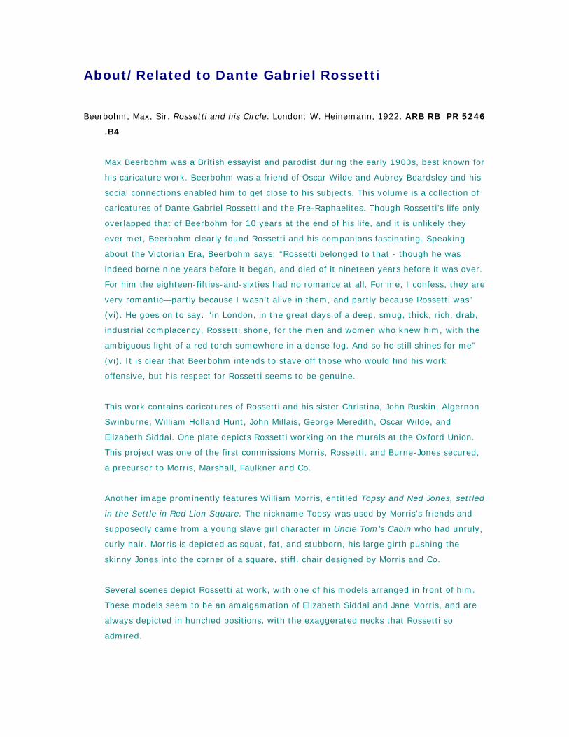
Beerbohm, Max, Sir. Rossetti and his Circle. London: W. Heinemann, 1922. ARB RB PR 5246
.B4
Max Beerbohm was a British essayist and parodist during the early 1900s, best known for
his caricature work. Beerbohm was a friend of Oscar Wilde and Aubrey Beardsley and his
social connections enabled him to get close to his subjects. This volume is a collection of
caricatures of Dante Gabriel Rossetti and the Pre-Raphaelites. Though Rossetti’s life only
overlapped that of Beerbohm for 10 years at the end of his life, and it is unlikely they
ever met, Beerbohm clearly found Rossetti and his companions fascinating. Speaking
about the Victorian Era, Beerbohm says: “Rossetti belonged to that - though he was
indeed borne nine years before it began, and died of it nineteen years before it was over.
For him the eighteen-fifties-and-sixties had no romance at all. For me, I confess, they are
very romantic—partly because I wasn’t alive in them, and partly because Rossetti was”
(vi). He goes on to say: “in London, in the great days of a deep, smug, thick, rich, drab,
industrial complacency, Rossetti shone, for the men and women who knew him, with the
ambiguous light of a red torch somewhere in a dense fog. And so he still shines for me”
(vi). It is clear that Beerbohm intends to stave off those who would find his work
offensive, but his respect for Rossetti seems to be genuine.
This work contains caricatures of Rossetti and his sister Christina, John Ruskin, Algernon
Swinburne, William Holland Hunt, John Millais, George Meredith, Oscar Wilde, and
Elizabeth Siddal. One plate depicts Rossetti working on the murals at the Oxford Union.
This project was one of the first commissions Morris, Rossetti, and Burne-Jones secured,
a precursor to Morris, Marshall, Faulkner and Co.
Another image prominently features William Morris, entitled Topsy and Ned Jones, settled
in the Settle in Red Lion Square. The nickname Topsy was used by Morris’s friends and
supposedly came from a young slave girl character in Uncle Tom’s Cabin who had unruly,
curly hair. Morris is depicted as squat, fat, and stubborn, his large girth pushing the
skinny Jones into the corner of a square, stiff, chair designed by Morris and Co.
Several scenes depict Rossetti at work, with one of his models arranged in front of him.
These models seem to be an amalgamation of Elizabeth Siddal and Jane Morris, and are
always depicted in hunched positions, with the exaggerated necks that Rossetti so
admired.
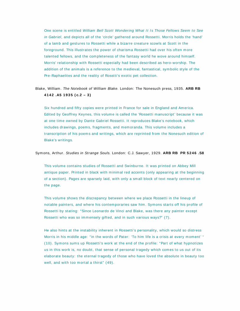
One scene is entitled William Bell Scott Wondering What It Is Those Fellows Seem to See
in Gabriel, and depicts all of the ‘circle’ gathered around Rossetti. Morris holds the ‘hand’
of a lamb and gestures to Rossetti while a bizarre creature scowls at Scott in the
foreground. This illustrates the power of charisma Rossetti had over his often more
talented fellows, and the completeness of the fantasy world he wove around himself.
Morris’ relationship with Rossetti especially had been described as hero-worship. The
addition of the animals is a reference to the medieval, fantastical, symbolic style of the
Pre-Raphaelites and the reality of Rosstti’s exotic pet collection.
Blake, William. The Notebook of William Blake. London: The Nonesuch press, 1935. ARB RB
4142 .A5 1935 (c.2 – 3)
Six hundred and fifty copies were printed in France for sale in England and America.
Edited by Geoffrey Keynes, this volume is called the ‘Rossetti manuscript’ because it was
at one time owned by Dante Gabriel Rossetti. It reproduces Blake’s notebook, which
includes drawings, poems, fragments, and memoranda. This volume includes a
transcription of his poems and writings, which are reprinted from the Nonesuch edition of
Blake’s writings.
Symons, Arthur. Studies in Strange Souls. London: C.J. Sawyer, 1929. ARB RB PR 5246 .S8
This volume contains studies of Rossetti and Swinburne. It was printed on Abbey Mill
antique paper. Printed in black with minimal red accents (only appearing at the beginning
of a section). Pages are sparsely laid, with only a small block of text nearly centered on
the page.
This volume shows the discrepancy between where we place Rossetti in the lineup of
notable painters, and where his contemporaries saw him. Symons starts off his profile of
Rossetti by stating: “Since Leonardo de Vinci and Blake, was there any painter except
Rossetti who was so immensely gifted, and in such various ways?” (7).
He also hints at the instability inherent in Rossetti’s personality, which would so distress
Morris in his middle age: “in the words of Pater: ‘To him life is a crisis at every moment’ “
(10). Symons sums up Rossetti’s work at the end of the profile: “Part of what hypnotizes
us in this work is, no doubt, that sense of personal tragedy which comes to us out of its
elaborate beauty: the eternal tragedy of those who have loved the absolute in beauty too
well, and with too mortal a thirst” (49).
By Dante Gabriel Rossetti
Rossetti, Dante Gabriel. The Ballad of Jan van Hunks. London: George G. Harrap, 1929. ARB
RB 5244 .B3 1929
Rossetti’s written words were illustrated by Monro S. Orr. This volume includes an
introduction by Mackenzie Bell, who begins by stating: “It would be impossible, in the
space at my disposal here, to deal fully with the reasons which induced that a group of
great poets, Dante Rossetti, William Morris, and Algernon Charles Swinburne, to hold
firmly the theory that humor was not admissible in serious poetry” (7). Jan van Hunks is
a humorous work, which Rossetti wrote mostly when he was 18 and finished shortly
before his death. It is not part of his most well know or respected works, and was even
left out of his collected works. It is clear that while humor was not the focus of Rossetti’s
main career, it was not outside of his capabilities. Much of Rossetti’s adult life was
defined by depression, dependency and mental illness, perhaps making it more difficult
for him to find humor in the world.
Rossetti, Dante Gabriel. The Blessed Damozel. New York: Dodge, 1917. ARB RB PR 5244
.B4 1917
Rossetti’s written words are illustrated with drawings by Kenyon Cox. Printed on
handmade paper, with a deckled edge. Binding is leather with a painted embossed scene.
The leather has been aged to appear more worn. The endpapers are marbled. Cox’s
sixteen illustrations have been printed out and mounted on the page, for the most part.
Though these illustrations are not by Rossetti, they seem to imitate his style. One full-
page plate especially bears strong resemblance to one of Rossetti’s favorite muses:
Morris’ wife, Jane Morris. Another plate sets a maiden against a background of willow
branches, which are reminiscent of Morris’s willow pattern. The poetry is flowery and
romantic, and the book design is decorative and medieval. The poem begins with this
stanza: “The blessed damozel leaned out from the gold bar of heaven; her eyes were
deeper that the depth of water stilled at even; and the stars in her hair were seven”.
Many have speculated that this poem is about Rossetti’s dead wife and ex-model,
Elizabeth Siddal, especially because of Rossetti’s description of the blond heroine looking
down on her beloved from heaven. This work as a whole reflects Rossetti’s love for the
medieval period.
Alighieri, Dante. La Vita Nuova. London: G. Routledge; New York: E.P. Dutton, 1900 (?). ARB
RB PQ 4315.58 .R7 1900
Inscribed on pasted down front endpaper: “Siegmund N. E. Betz”.
Inscribed on front free endpaper: “To Elsie
On her Birthday. Dec: 26: 1906 From Harold”.
La Vita Nuova is an autobiography of Dante’s youth. It includes the fifth canto of Dante’s
Inferno, translated, and illustrated by photogravures, after paintings by Dante Gabriel
Rossetti. This volume contains eight plates by Rossetti, which include some works that
were created for other projects, but were inspired by or applied to Dante’s story. Rossetti
wanted to create a strong association with the revered Dante, with whom he shared a
name. This volume was clearly a labor of love for Rossetti, who both translated the text
and illustrated it. Bound in blue, with navy and gold cover details. The front bears a
reproduction of one of Rossetti’s illustrations in gold.
Rossetti, Dante Gabriel. Poems. London: F.S. Ellis, 1870. ARB RB PR5240 .E70
This volume is a 1st edition compilation of the most famous of Rossetti’s works, including
The Blessed Damozel. Bound in the original blue publisher’s cloth with exterior gold
designs and blue floral endpapers. Inscribed with what seems to be a lending history of
the volume.
The book is dedicated to Dante’s brother William Micheal Rossetti: “these poems, to so
many of which, so many years back, he gave me the first brotherly hearing, are now at
last dedicated.” W.M. Rossetti was also a member of the art world in England, he wrote
for Art and Poetry, a periodical related to the Pre-Raphaelites.
The contents are divided into: Poems, Sonnets, Songs, and Sonnets for Pictures and
Other Sonnets. The works in the Pictures for Sonnets section are matched to, and written
for, famous paintings by Da Vinci, Giorgione, and Ingres. These works seem to be a
perfect representation of Rossetti’s interests and talents. He was an artist, but evaded
any strict definitions by media. He approached all his ‘arts’ with the same imaginative,
dreamy romanticism.
For more holdings on Dante Rossetti:
http://uclid.uc.edu/search~S18/?searchtype=X&searcharg=dante+rossetti&searchscope
=18&sortdropdown=-
&SORT=DZ&extended=0&SUBMIT=Search&searchlimits=&searchorigarg=Xdante+rossett
i
John Ruskin
Leo Tolstoy said of Ruskin: “One of those rare men who think with their hearts, and so he
thought and said not only what he himself had seen and felt, but what everyone will think
and say in future” (Ruskinland, Utopia-Britannica).
Ruskin, John. General Statement Explaining the Nature and Purpose of St. George’s Guild.
Sunnyside, Propington, Kent: G. Allen, 1882. ARB RB HD 6460 .R84 1882
A small pamphlet, marked with “Price Sixpence, Post Free.” The last few pages are
perforated, allowing the reader to send in their Form of Application for Membership, or a
form for non-members to contribute funds to the guild. Ruskin used his charitable trust to
distribute his ideas about how society should be re-organized. The guild never achieved
Ruskin’s utopia, but it still exists today.
Ruskin, John. The Guild of St. George: Master’s Report, 1885. Sheffield: 1886. HD 6460 .R85
1885
A small pamphlet, this is the master’s report for Ruskin’s guild. Ruskin rambles
extensively, discussing the organization of idealic country life and his willingness to give
advice to the young people of the world.
Ruskin, John. Lectures on Art Delivered before the University of Oxford in Hilary term, 1870.
Oxford: Clarendon Press, 1870. ARB RB N7445 .R9 1870
In this volume, Ruskin takes a similar approach to that of Eric Gill in his series of ‘Art and
-----‘ essays. He includes: ‘The Relation of Art to Religion’, ‘The Relation of Art to Morals’,
‘The Relation of Art to Use’, and ‘Line’, ‘Light’, and ‘Colour’. He addresses many of the
same questions as Gill in the ‘Art’ lecture: what does art do for religion? What does
religion do for art? Ruskin argues that good art is the product of good moral standing,
and that “You cannot paint or sing yourselves into being good men; you must be good
men before you can either paint or sing, and then the colour and sound will complete in
you all that is best” (66).
Ruskin shares Morris’ passion for the ‘beautiful and useful’, stating that “I can in the time,
convince you, that the entire vitality of art depends upon its being either full or truth, or
full of use; and that, however pleasant, wonderful, or impressive it may be in itself, it
must yet be of inferior kind, and tend to deeper inferiority, unless it has clearly one of
these main objects -- either to state a true thing, or to adorn a serviceable one” (94).
Ruskin, John. Seasame and Lilies: Three Lectures. Chicago: McClurg, 1893. ARB RB PR
5260 .A1 1893
This volume includes the following essays: Of King’s Treasuries, Of Queen’s Gardens, and
Of the Mystery of Life. Ruskin was an art critic, lecturer, intellectual, and patron of the
Pre-Raphaelite period. He was a personal friend of William Morris throughout his career.
This volume contains three essays with very broad subjects, touching on education,
structure of society, the duties of men and women, and the meaning of life. This volume
was widely popular in its time, and was entered into the debate on the complex nature of
Victorian gender roles.
Ruskin, John. The Stones of Venice: The Foundations. New York: J. Wiley, 1852. ARB RB
PR5261 .S78 1851 v. 1, c.2
This volume is listed because of the chapter “The Nature of Gothic”, included in the
second volume, which was highly praised by Morris. He called it “one of the very few
necessary and inevitable utterances of the century.” This work had a great deal of
influence over Morris’ career, spurring his life-long love for architecture and craft. It
inspired him to work for the architect Phillip Webb after leaving university. Though he
eventually decided architecture was not where his talents lay, Morris continued to have a
keen interest in buildings, later starting Anti-Scrap to protect old buildings from
damaging ‘restorations’. This volume has an embossed brown cover with an Islamic
design, and gold emblem. It includes many illustrations, drawn by the author himself.
For more holdings on John Ruskin:
http://uclid.uc.edu/search~S18/?searchtype=X&searcharg=John+Ruskin&searchscope=1
8&sortdropdown=-
&SORT=DZ&extended=0&SUBMIT=Search&searchlimits=&searchorigarg=Xdante+rossett
i
About Thomas Mosher
Bishop, Philip R. Thomas Bird Mosher: Pirate Prince of Publishers. New Castle, DE: Oak Knoll
Press, 1998. RB Z 232 .M886 B57 1998
An extensive tome detailing Mosher’s printing career and his place in the history of the
craft. The volume starts with a chapter by William E. Fredeman: “Thomas Bird Mosher
and the Literature of Rapture: A Chapter in the History of American Publishing.” This
chapter delves deeply into the place Mosher holds in the history of private press, with
special focus on his relative position to William Morris in the arts and crafts movement.
This chapter is balanced and well supported, and presents careful criticism of Morris’s
work and legacy. The majority of this volume is an extensive annotated bibliography of all
the works Mosher printed during his career. Includes many examples, photos, and
illustrations of Mosher’s books.
Hatch, Benton. Ed. A Check List of the Publications of Thomas Bird Mosher of Portland Maine,
MDCCCXCI [to] MDCCCXXIII, compiled & edited by Benton L. Hatch and with a
biographical essay by Ray Nash. Northampton: The Gehenna Press for the University of
Massachusetts Press, 1966.
A bibliography of sorts, which lists all of the works printed by Mosher. Some titles have
included reproductions of their title pages mounted in the book. The text is printed on
hand-laid paper, which is meant to mimic the type of paper used by Mosher.
Vilain, Jean-Francois, and Phillip R. Bishop. Thomas Bird Mosher and the Art of the Book.
Philadelphia, PA: F.A. Davis, 1992. ARB RB Z232 .M886 V55 1992
This book is a catalogue of an exhibition held in Temple University, 1991 – 1992. It
includes an annotated bibliography and scans of many Mosher books including: bindings,
design, title pages and layout examples.
Published by Thomas Mosher
Arnold, Matthew. Empedocles on Etna; a Dramatic Poem. Portland, ME: Thomas B. Mosher,
1900. ARB RB PR4022 .E25 1900
Reprinted by Mosher on Kelmscott-made paper, with borders and initials ‘borrowed’ from
Morris. Initials are in red and black with a red colophon. This is characteristic of Mosher’s
‘pirate’ tendencies. Though much is taken from Morris’ style, even the Golden typeface, a
closer look shows the discrepancies. Mosher’s red ink is a different hue, and he does not
share Morris’s care in handling and eliminating white spaces in the body of the text.
Barrie, J.M. George Meredith: A Tribute. Portland, ME: Thomas B. Mosher, 1929. ARB RB
PR5013 .B3 1929
This volume is one of a series of small books printed by Mosher. Mosher was tied to
Meredith because the first book he published was Meredith’s Modern Love. The text of
this volume is revised from the original article by Barrie in the Westminster Gazette. A
poem by Thomas Hardy is included as a prelude. Morris’ influence is evident in the black
and red printing, illuminated letters, and Golden font.
Bridges, Robert. The Growth of Love: The Poems of Mr. Bridges: A Brief and General
Consideration. Portland, ME: Thomas B. Mosher, 1894. ARB RB PR4161. B6 G7 1894b
This is a reprint of a copy of the original, which was printed by the private press of Rev.
H. Daniel, Oxford, in 1890. This is a good example of the approach to printing that
earned Mosher the title “The Pirate Prince of Publishers”. Printed on handmade paper with
deckled edges, this volume has a white paper cover with red and black type title, housed
in a blue slipcase.
Buonarroti, Micheal Angelo. The Sonnets of Micheal Angelo Buonarroti. Trans. John Addington
Symonds. Portland, ME: Thomas B. Mosher, 1910. ARB RB PQ 4615. B6 A17 1909 c.2
Printed on Van Gelder paper, in Roman typeface and red and black ink, with some
decorative elements. A small, slim volume bound only in heavyweight cream paper.
William Morris believed that the bottom margin should be much larger than the top or
side margins, in order to accommodate the reader’s thumbs. Mosher has taken this
aesthetic to an extreme; the book is much taller than it is wide, and many of the sonnets
included are very short, and placed one to a page. Most occupy less than half of the
page, leaving an expanse of space, with the page numbers awkwardly placed halfway
down the page, floating in the sea of white.
Hâjî Abdû El-Yezdî . The Kasîdah of Hâjî Abdû El-Yezdî. Trans. Sir Richard Francis Burton.
Portland, ME: Thomas B. Mosher, 1923. ARB RB PR4349. B52 K3 1923
This volume is from the “Old War series”. The binding is similar to the inexpensive Morris
bindings, bound in blue paper with a linen spine. Printed with small type, large bottom
margins, and deckled edge pages.
Hewlett, Maurice Henry. Quattrocentisteria; How Sandro Botticelli saw Simonetta in the
Spring. Portland, ME: Thomas B. Mosher, 1927. ARB RB PR4787 .Q3 1927
Originally published as a chapter in Hewlett’s Earthwork out of Tuscany (1895). A small
format book, bound in grey paper with a green frame on the cover with the title in red
inside: “QUATTRO CENTISTERIA MAURICE HEWLETT”. This volume includes rococo decorative
elements, with a centered block of text on each page. Each block of text is bounded by
thin lines in the top and bottom margins. Red ink was used only on the title page.
Holmes, Henry David. Under a Fool’s Cap: Songs. Portland, ME: Thomas B. Mosher, 1911.
ARB RB PS3515. O44 U6 1910
Inscribed: “Loring Andrews. 1914”.
Mosher wrote the forward for this volume. Bound in purple paper, with purple endpapers.
A small placket on the cover bears the title, surrounded with a decorative frame. There is
extensive use of thin lines to bound text and define space. Several different fonts were
used: a small medieval font (usually to print text that was not written by Holmes, such as
nursery rhymes and sayings), all caps for the titles, upper and lowercase italics, and a
unique type on the title page.
Jefferies, Richard. The Pageant of Summer. Portland, ME: Thomas B. Mosher, 1911. ARB RB
PN6013. B7 no.2
Similar to the other titles of the Brocade Series, except that the title is in green and black
instead of black and red. This book was printed at the press of George D. Loring, a
collaborator of Mosher.
Jefferies, Richard. Saint Guido. Portland, ME: Thomas B. Mosher, 1908. ARB RB 4822 .S3
1908
This volume also includes Queen Mary’s Child Garden, by Dr. John Brown. It is another
miniature paperback book, similar to A Lodging for the Night (see ‘Stevenson’ below),
with a title in red and black and head and tailpieces. It even shares many decorative
elements with Lodging and is arranged in a similar way.
Lee, Vernon. The Legend of Madame Krasinska. Portland, ME: Thomas B. Mosher, 1915. ARB
RB PR5115. P2 L4 1915
See the annotation for Gertha’s Lovers for layout and design of this series of books: the
Brocade Series.
This is the last of three ‘polite stories’, originally issued under the title of Vanitas, London
1892.
Schwob, Marcel. The Children’s Crusade. Portland, ME: Thomas B. Mosher, 1923. ARB RB
PQ2423 .S8 C72 1923
Printed on “Kelmscott” hand-made paper. This volume shows the influence of William
Morris’ book design on Mosher. He uses a typeface that is very similar to Morris’ Golden
typeface, which is appropriate to the medieval subject matter. Mosher aligns the titles in
the top left-hand corners of the title pages, as in the Kelmscott works. Mosher employs
an interesting convention with the last lines of a story; they taper in width as you move
down the page, forming a triangular shape.
Stevenson, Robert L. A Lodging for the Night: A Story of Francis Villon. Portland, ME: Thomas
B. Mosher, 1896. ARB RB PR5484 .L7 1916
This is one of a series of miniature books published by Mosher. This volume is very
similar in design and layout to Saint Guido by Richard Jefferies, above. The title is printed
in black and red with a head and tailpiece. The interior illuminations are more rococo in
design that the Arts and Crafts or Art Nouveau look of much of Mosher’s other works,
perhaps due to the French content.
Stevenson, Robert Louis. Francois Villon, Student, Poet, and Housebreaker. Portland, ME:
Thomas B. Mosher, 1911. ARB RB PN6013. B7 no.28
See the annotation for Gertha’s Lovers for layout and design of this series of books: the
Brocade Series.
This book was printed at the press of George D. Loring, a collaborator of Mosher.
Francis Villon was a poet and thief in the 1400s. Dante Gabriel Rossetti translated his
poem Ballade des dames du temps jadis, which became famous.
Stevenson, Robert Louis. Will o’ the Mill. Portland, ME: Thomas B. Mosher, 1911. ARB RB
PN6013. B7 no.17
See the annotation for Gertha’s Lovers for layout and design of this series of books; the
Brocade Series.
This book was printed at the press of George D. Loring, a collaborator of Mosher. The title
is in red and black with head and tailpieces.
Symons, Arthur. Lyrics. Portland, ME: Thomas B. Mosher, 1907. ARB RB PR5527 .L7 1907
A small format book which mimics the simple Kelmscott bindings with blue board and a
linen spine. Contains a small collection of poems by Arthur Symons, divided into “Love
Poems” and “Miscellaneous”. Printed on handmade paper with visible grid, large bottom
margins, centered page numbers, black and red type, and some decorative elements and
illuminated characters.
Whitman, Walt. Leaves of Grass. Portland, ME: Thomas B. Mosher, 1919. ARB RB PS3201
1855b
This text is a facsimile of the 1855 text. The colophon states: “This facsimile edition
consists of 400 copies as follows and the type distributed: 250 copies medium 8vo
printed on old Stratford white wove paper, in dark green cloth, stamped to match the
original edition.”
Bound in dark green textured leather, with plants embossed on it. The front and back
covers are identical, with a gold frame around the edge and the title centered in the
page. The title is in gold with a variety of plants and growth sprouting from the letters.
Wilde, Oscar. Intentions. Portland, ME: Thomas B. Mosher, 1904. ARB RB PR5818 .I7
1904
Includes: The Decay of Lying, Pen, Pencil and Poison, The Critic as Artist, and The Truth
of Masks. A compilation of dialogues and essays by Wilde, who was influenced by Morris’
poetry and attitude towards craft, but was not a fan of Morris’ wallpaper designs, saying
“they seem to me often deficient in real beauty of colour”, adding “I have seen more
rooms spoiled by wall papers than anything else”. The pages of this book retain their
deckled edges, showing off their handmade nature. Text is simply set in a Roman
typeface, with centered chapter headings and bracketed, centered page numbers.
For more holdings on Thomas B. Mosher
http://uclid.uc.edu/search~S18/?searchtype=X&searcharg=Mosher&searchscope=18&sor
tdropdown=-
&SORT=D&extended=1&SUBMIT=Search&searchlimits=&searchorigarg=cPR5527+.L7+1
907
Elbert Hubbard
Fra Elbertus (Elbert Hubbard). So Here Then are the Preachments Entitled The City of Tagaste,
and A Dream and a Prophecy. East Aurora, New York: The Roycroft Shop, 1900. ARB RB
PS2042 .C5 1900
Bound in red leather and marbled paper, which is repeated as the free endpaper, “Printed
on imperial Japan vellum, there are only fifty copies of this book, which are hand
illuminates.” This copy is number twenty-seven, and it is signed by Elbert Hubbard and
the illuminator Adella Plae. The first page has an illuminated border, which makes
references to Morris’ wallpaper patterns, but lacks the complexity. It also includes a
rectangular publishers mark on one of the end-pages, which is much more art nouveau
than others modeled on Morris’ Kelmscott mark.
The text is aligned to the center top corner of a spread, leaving larger margins on the
edges and bottom. This is in alignment with early printing, seen especially in the works of
Morris.
Hubbard, Elbert. So Here then are the preachments entitled ‘The City of Tagaste’ and ‘A
Dream And a Prophecy’. East Aurora, New York: The Roycroft Shop, 1900. RB PS2042
.C5 1900
This volume states: “Of this edition on imperial Japan vellum there were printed and
specially hand illuminated but fifty copies, and this book is number 27 [signed] Elbert
Hubbard. Illuminated by Adella Place.” Place’s signature is a hand drawn combination of
Roycrofter logo and signature.
Bound with red leather on spine and corners, with hand-marbled paper on covers and
interior leaves. Cover bears gold embossed title and ornamentation. The page facing the
title shows an image of Hubbard, and his signature, printed on a sheet of tissue paper
and mounted in the book. The first page of text is heavily illuminated; the text is set into
a frame with brightly colored pattern of flowers and leaves. This has a much more
modern look than the medieval-inspired work of his predecessors. The colors and
geometry of the repetition give it an art-deco feel. The book has large bottom borders
and the title is repeated in italics, aligned to the top exterior corner of the text on every
page. On the last printed page is the Roycroft printer’s mark, which is reminiscent
stylistically of Morris’s Kelmscott press.
Hubbard, Elbert. Elbert Hubbard’s Scrapbook. New York, New York: W.H. Wise & Co, 1923.
ARB RB PN6014 .H8 (copy 3 of 4)
The introduction describes the book as: “Elbert Hubbard’s scrap book, containing the
inspired and inspiring selections, gathered during a life time of discriminating reading for
his own use.” This volume is organized very similarly to Elbert Hubbard’s Notebook, but
instead of snippets by Hubbard, this volume collects short pieces from the work of a wide
range of authors, whom Hubbard found significant. It is a collection of his influences and
heroes. The endpapers of this book are photographs of the Roycroft Inn.
Hubbard, Elbert and Alice Hubbard. Justinian and Theodora. East Aurora, New York: The
Roycrofters, 1906. ARB RB PS2042 .J8 1906
This volume includes a decorated title page spread, with two art nouveau leaves facing
each other. It is bound in red leather with gold embossed details. The paper is handmade
and roughly trimmed. Two plates are included, depicting the authors Elbert and Alice
Hubbard. Each page spread is titled with Justinian & Theodora at the top in a large font
and art nouveau style. The book design makes references to Morris, but the illuminations
are much more modern and art nouveau. However, Hubbard’s love for Morris is clear in
the play, Hubbard sets the first scene in the grand court room of emperor Justin; “The
apartment seemingly designed and fitted out by William Morris and Alma-Tameda” (19).
Lawrence Alma-Tameda was a painter known for his paintings of scenes of the opulence
of the Roman Empire.
Hubbard, Elbert. The Mintage; being ten stories & one more. East Aurora, New York: The
Roycrofters, 1910. ARB RB PS2042. M5
This is a collection of ten stories by Hubbard on a variety of subjects. A beautifully
designed book with illuminated title page and illuminated letters which relate to the
abstracted florals of Morris’ design, but with an more modern look. Unlike some of
Hubbard’s more brightly colored works, this volume uses only black ink, and allows the
graphic, repetitive motifs stand on their own.
Hubbard, Elbert. The Notebook of Elbert Hubbard. New York: W.H. Wise, 1927. ARB RB
PS2040 .A35 1927 (c.1 – c.2)
The introduction states: “The note book of Elbert Hubbard; mottoes, epigrams, short
essays, passages, orphic sayings and preachments, coined from a life of love, laughter
and work, by a man who achieved greatly in literature, art, philosophy and business,
gathered together by Elbert Hubbard II. Done into a book by the Roycrofter, at their
shops which are located in East Aurora, Erie County, New York.”
Copy one is printed inexpensively, with cardboard binding. It includes interspersed pages,
which are grey and thicker that the other paper used, each showing one of Hubbard’s
sayings for life. Copy two is bound in leather with embossed ornamentation. It lacks the
grey plates present in copy one. The type on the pages is arranged in a concentric
pattern, the rectangle of the page contains the rectangle of type, and centered within this
is another square of type, usually some words of wisdom from Elbert Hubbard. The
content of this work is eclectic; it contains musings, parables, advice, and reflection.
Though Hubbard is very different from Morris, it is clear that he shared his sensibilities
about work: “The menial is a man who is disloyal to his work. All useful service is raised
to the plane of art - When love for the task – Loyalty – is fused with the effort” (129).
Hubbard, Elbert. Little Journeys to the Homes of English Authors. London: Putnam’s Sons,
1903. ARB RB PR99 .H8 1903
This copy of Little Journeys was not printed by the Roycrofters, but by Putman’s Sons.
William Morris is the first author featured in this volume. It includes a photograph or
illustration plate of each of the featured authors. This book uses the unusual convention
of printed boxes around the text on every page. This is used in conjunction with rococo
decorative devices and titles in gothic typefaces, to a distracting effect.
Bound in blue linen with a cream book-cloth spine. Cover is embossed with a gold logo:
an open book and an arrow. This emblem is repeated on the spine, alternating with an oil
lamp.
Hubbard, Elbert. Little Journeys to the Homes of English Authors. East Aurora, New York:
1900. ARB RB PS2042 .J6 1900a (v.1 – v.2)
William Morris is included in volume one. This volume was illuminated by Frances
Carmody. The first few free endpapers of volume one have been sketched on, there are
portraits of two men, rendered in a childish style. The second volume includes this note:
“of this edition but nine hundred and forty-seven copies were printed and specially
illuminated by hand. This book is number 412,[signed] Elbert Hubbard, Illuminated by
Nellie Bowen.”
These volumes contains essays by Hubbard on each of the English authors Hubbard found
influential or eminent. Hubbard sums up Morris’ attitude towards craft and labor with the
statement “Work is for the worker” and repeats this in order to emphasize his point. The
title pages include illuminations that mimic the style of Morris, but include bright colors,
like yellow and blue, which Morris would have avoided in book design. The text pages are
hand-made paper, but the plates showing reproduced photographs of the authors are
smooth and manufactured. Many of the pages bear the Roycrofters watermark along the
bottom edge. Hubbard employs a trick with his final paragraph structure; they taper at
the ends to a centered point. Sometimes this is exaggerated with a triangle shaped
decorative element. One of the last end-pages includes a publisher’s mark, which mimics
the style of the Kelmscott press logo.
Hubbard, Elbert. Little Journeys to the Homes of English Authors: John Milton. East Aurora,
New York: 1900. RB PS2042 .J6 1900
This is an individual publication of the ‘little journey’ to the home of John Milton. This
volume is designed in the style of the complete volumes of Little Journeys published by
The Roycrofters. A photo plate depicting Milton’s cottage in S. Giles is included in the
text.
Hubbard, Elbert. A Message to Garcia. New York: Little Leather Library, 1921. ARB RB
PN6013 .L46 1920 no.1
This miniature book is the Redcroft edition. It is bound in leather with a green and red
patina. It contains several of Hubbard’s more famous essays: A Message to Garcia, Get
Out or Get in Line, A Hundred Point Man, The Divine in Man, Chicago Tongue, and
Pasteboard Proclivities.
A Message to Garcia tells the story of a solider who, without questioning, completed his
mission, despite the odds against him, simply because it was his duty. It has been made
into two films and sold over 40 million copies.
Hubbard, Elbert. Selected Writings of Elbert Hubbard. New York: W.H. Wise & Co., 1922. ARB
RB PS2040. A5 H8 1922 v.1
Introduction states: “Selected writings of Elbert Hubbard; his mintage of wisdom, coined
from a life of love, laughter and work, lovingly gathered by Elbert Hubbard II and made
into goodly volumes by the Roycrofters at their shops, which are at East Aurora, New
York, and issued as a memorial edition.”
This volume is a memorial edition. It includes several plates: a photograph of Elbert
Hubbard, colored photographs of the Roycroft buildings, two illuminated title pages, and
a photograph of Elbert Hubbard II. The cover is bound with embossed and painted
leather. The writings include discussion of the press, Indian reservations, the divinity of
motherhood, vaccination, education, and music at meals.
Hubbard, Elbert. Works of Hubbard. East Aurora, New York: The Roycrofters, 1909. ARB RB
PS2042 .H85 1909
Includes:
A Hundred Point Man
The Divine in Man
The Boy from Missouri Valley
Get Out or Get in Line
A Message to Garcia: Being a Preachment
Each essay is preceded with two title pages: one in a more Art Nouveau style, the other
in a style more akin to Morris. There is no title page for the Works of Hubbard, it is
literally a compilation of works.
For more holdings by Elbert Hubbard, see:
http://uclid.uc.edu/search~S39/?searchtype=X&searcharg=Elbert+Hubbard&searchsc
ope=18&sortdropdown=-
&SORT=DZ&extended=0&SUBMIT=Search&searchlimits=&searchorigarg=XElbert+Hu
bbard
Published by Elbert Hubbard and The Roycrofters
Emerson, Ralph Waldo. Essay on Compensation. East Aurora, New York: Roycrofters, 1917.
ARB RB PS1615 .C6 1917.
Inscribed: “Love to dearest ‘Addio’ From ‘ae’”, on the first leaf.
Printed in a very small brochure format, with use of a small leaf character to designate
paragraph breaks. The text is set in very small type. The front and back covers are in
dark brown paper printed in blue and black ink. Back cover bears the Roycrofter’s
printer’s mark. Interior use of decorative borders, letters, and characters.
Stevenson, Robert Louis and Elbert Hubbard. The Essay on Walt Whitman with A Little Journey
to the Home of Whitman. East Aurora, New York: The Roycroft Shop, 1900. ARB RB
PS3238 .S7
This volume combines an essay on Walt Whitman by Robert Louis Stevenson and
Hubbard’s entry on Whitman from his Little Journeys to the Homes of English Authors.
The first plate is a reproduction of a portrait of Whitman done in bas-relief by Saint
Jerome Roycroft. This faces an illuminated title page, only one side of the spread, but
clearly influenced by Morris’ style and Burne-Jones’ illustration. The body of text also
borrows heavily from Morris: Hubbard uses illuminated letters and red for titles, aligns
subheadings in the margin to the top outer corner or text, uses paragraph symbols
instead of breaks, lays out the pages as a spread instead of individual pages, and nestled
page numbers closely to the bottom of the block of text. The type is also rather large.
Hubbard included a closing page that is set in all caps and red ink, very similar to Morris’
title pages. He sets this opposite a Roycroft printers mark, similar in size to the Kelmscott
mark.
For more holdings on The Roycrofters and Elbert
Hubbard, see:
http://uclid.uc.edu/search~S18/?searchtype=X&searcharg=the+roycrofters&searchscope
=18&sortdropdown=-
&SORT=DZ&extended=0&SUBMIT=Search&searchlimits=&searchorigarg=XDard+Hunter
T. J. Cobden-Sanderson
Cobden-Sanderson, T. J. Bookbinding by T.J. Cobden-Sanderson; and Exhibition at the
Perpont Morgan Library, September 3 – November 4, 1968. Compiled by Frederick B.
Adams, Jr. New York, Perpont Morgan Library, 1969. ARB RB Z269 .C6 A34 1969
A catalogue of an exhibition at the Morgan Library on the 57th anniversary of the founding
of the Doves press, which brought together two-thirds of the bindings executed by T.J.
Cobden-Sanderson. Cobden-Sanderson considered William Morris influential, but he not
share Morris’ disdain for bindings. While Cobden-Sanderson used just one roman typeface
for all of the Doves Press publications, his bindings were expressive, colorful, and varied.
It was a conversation with Mrs. Jane Morris that brought Cobden-Sanderson into this
work. He told her after a dinner party that he wanted to do work with his hands, she
replied “Then why don’t you learn bookbinding? That would add an art to our little
community, and we would work together.” Within a year he was working independently.
In order to place Cobden-Sanderson’s work in a context, the catalogue opens with a few
examples of the work of his contemporaries. In comparison, Cobden-Sanderson’s work
was much more creative and original, as he did not seek to imitate earlier forms of
bindings.
He bound several books by Morris, including Art and Socialism, Hope, Fears for Art and
Love is Enough.
Cobden-Sanderson, T. J. The Journals of Thomas James Cobden-Sanderson. New York:
Macmillan, 1926. ARB RB Z232 .C65 (v.1 – 2)
This volume is described as: “ A chronological catalogue of books bound and tooled by
T.J. Cobden-Sanderson” in the years 1884-1893 (volume 1) and 1900-1916 (volume 2).
Included in the text are re-produced pages of Doves press publications.
Eliot, Charlotte Chauncy Stearns. Savonarola, a Dramatic Poem. London: Cobden-Sanderson,
1926. ARB RB PS3509 .L35 S3 1926
Printed on hand-made paper with an elaborate watermark, visible grid pattern, and
deckled edge. The introduction was written by T.S. Eliot. The printing style is much more
simple that that of Morris, with no use of red ink or illumination. Headings are centered
and italics and capitals are used for emphasis and division of categories.
Monro, Harold. The Collected Poems of Harold Monro, edited by Alida Monro; with a
biographical sketch by F.S. Flint and a critical note by T.S. Eliot. London: Cobden-
Sanderson, 1933. ARB RB PR6025 .O35 1933 c.2
This is a collection of poems by Harold Monro, a British poet and printer and publisher.
Monro started the Poetry Bookshop as platform for poets to read and publish their work.
He also started a publication called The Poetry Review.
Doves Press
Orcutt, William Dana. Master Makers of the Book. London: George Allen & Unwin, 1929. ARB
RB Z124 .O64 1929
Subtitle: Being a consecutive story of the book from a century before the invention of
printing through the era of the doves press.
This book is a history of the notable people, movements, and evolutions of printing. It
includes a chapter on William Morris, arguing that Morris began a movement back to old-
style traditional printing after the proliferation and mis-use of the ‘modern types’ (Didot,
Bodoni, and Ibarra). Orcutt goes on to explain Morris’ significance as a printer, but also
as an artist and craftsperson in general; “Morris developed no particular interest in
designing English mansions or public buildings, stately though they might be. What he
really wanted to do was to reform English taste, and to force people to furnish and
decorate their homes with things that were beautiful instead of ugly” (211).
Orcutt explains Morris’s development as a designer: the influence of Emery Walker and
fifteenth century printing, his first typeface – Golden (which he intended to initiate with
Caxton’s translation of The Golden Legend), and the design of the ‘Troy’ typeface, (which
was reduced in size to become ‘Chaucer’ for the printing of The Works of Chaucer, the
Kelmscott press masterpiece). He quotes Morris on his vision: “ to bring before people’s
eyes the image of the thing my heart is filled with” (228).
Cobden-Sanderson founded the Doves press four years after Morris’ death in 1896 with
Emery Walker, Morris’ associate from the Kelmscott press (Updike, Printing Types 211).
For more holdings on T.J. Cobden-Sanderson:
http://uclid.uc.edu/search~S18/?searchtype=X&searcharg=Cobden-
Sanderson&searchscope=18&sortdropdown=-
&SORT=DZ&extended=0&SUBMIT=Search&searchlimits=&searchorigarg=XJohn+Ruskin
W.A. Dwiggins
Durer, Albrecht. Records of Journeys to Venice and the Low Countries. Boston, MA:
Merrymount Press, 1913. ARB RB ND588. D9 F7 1913
This book is a collection of the travel writings of German artist Albrecht Durer, as written
to Roger Fry and translated by Rudolph Tombo, PhD. It employs many of Morris’ printing
styles. It uses only black and red ink (a common convention due to the fact that these
were the cheapest colors). Printed on handmade paper with a deckled edge and a M-
shaped watermark with a six-pointed star. The title page was designed by W.A. Dwiggins.
As in Morris’ books, the heading of the chapter appears in the margin, abutted to the top
right and left corners of the body of text. The type has small script references, including
curved c-t ligatures.
Dwiggins, W.A. Mss.: Being a Collection of the Writings of Dwiggins on various subjects, Some
Critical, Some Philosophical, Some Whimsical. Portland, ME: The Typophiles, 1947. ARB
RB Z1005 .D85 1947
This volume is a compilation of essays by Dwiggins on a wide variety of subjects,
including: Comments on the System of Design, The Shapes of Roman Letters, A
Technique for Dealing with Artists, and Bees, Ants, Men and The Crew of the Ship
“Earth”. Dwiggins is considered the first person to use the term ‘Graphic Design’, which
he first did in 1922. Morris proved that there was a market for well-designed books, and
new typography. His work proved as a starting point for Dwiggins, who propelled book
and type design into the 20th century.
This volume is bound in blue cloth with embossed gold emblems; on the front ‘MSS BY
WAD’ is printed in a square, which is repeated on the spine, with geometric designs.
Embedded in the text are many illustrations showing principals of typography and
decorative elements.
Daniel Berkley Updike
Adams, Henry. The Education of Henry Adams: An Autobiography/Illustrated with Twelve
Etchings by Samuel Chamberlain; and with an Introduction by Henry Seidel Canby. New
York: Merrymount Press, 1942. ARB RB E175 .5 .A17427 1942
Printed for the members of the Limited Editions Club, in an edition of 1500 copies. Bound
in red linen book cloth with a gold embossed title. In slipcase covered in green paper with
a paper title-placket, with the edition number handwritten - 924. Illustrated with twelve
etchings by Samuel Chamberlain and with an introduction by Henry Seidel Canby. Title
page is printed in black and red ink. Body of text is printed in black and aligned to both
margins, creating a solid block of text.
Brooks, Van Wyck. The Flowering of New England. New York: Merrymount Press, 1941. ARB
RB PS243 .B7 1941
Printed for the Members of the Limited Editions Club, in a limited edition of 1500 copies.
Illustrations by Ray J. Holden. Book bound in green cloth with an all-over embossed print
of oak leaves and acorns. Issued in a slipcase with a checkered pattern. Signed by Brooks
on the half-title page. The extensive introduction is set entirely in italics.
Updike, Daniel Berkeley. Notes on the Merrymount Press and its Work. Cambridge, MA:
Harvard University Press, 1934. ARB RB Z232 .M57 U6 1934
Subtitle: “With a bibliographical list of books printed at the press, 1893 – 1933, by Julian
Pearce Smith; with views of the press at various periods, specimen of types alluded to &
etc.”
An annotated bibliography, with several plates of photographs of the Merrymount press
offices and printing rooms, and a semi-autobiographical introduction by Daniel Berkley
Updike. This introduction begins: “Printing became the occupation of my life by pure
accident” (3).
Updike, Daniel Berkeley. Printing Types, their History, Forms, and Use: A Study in Survivals.
New York: Dover Publications, 1980. ARB Ref Z250 .A2 U6 1980 (v.1 – 2)
A two-volume overview of the history of printing: the typefaces, regional styles, and
decorative elements. Contains many plates of typographic specimens and examples.
Volume two contains a section on William Morris, with examples from the Kelmscott press
(this section begins on page 202).
Updike's description of Morris’ character and numerous pursuits is a good one; he is
critical and fair, and he serves to illuminate some of Morris’ successes and failings. It is
probably one of the best critiques of Morris’s success in his vision as a printer, from the
perspective of a fellow printer.
Updike, Daniel Berkeley. Some Aspects of Printing, Old and New. New Haven: W.E. Rudge,
1941. ARB RB Z116. U7
Bound in grey linen book cloth with an all caps, gold-embossed title, centered at the top
of the front cover. This volume collects several essays by Updike on a variety of printing
related subjects. In the first essay, Gutenburg and His Relation to Printers Today, Berkley
respectfully dismantles the cult of Gutenburg. He acknowledges the importance of
Gutenburg’s innovations, but asserts that he was not necessarily the first to use movable
type, and that he was hardly the noble distributor of knowledge he is painted as. The
relationship between the craft of printing and the pursuit of knowledge is a theme
throughout the essays.
Updike, Daniel Berkeley. The Well-made Book: Essays and Lectures. West New York, NJ: Mark
Batty, 2002. ARB RB Z124 .U63 2002
A very well made book in itself: the spine is bound in blue-grey cloth, with a gold printed
title on the spine and top of the front cover. Cover is bound in light grey paper, with a
matching slipcover. There are pages of mounted printed examples of Berkeley’s work.
The sleeve on the back cover contains a folded folio-size example.
Updike is a well know printer of the post-Morris, 20th century printing revival, but he was
also well known for his rejection of Morris’ philosophy.
Dard Hunter
Hunter, Dard. My Life with Paper: An Autobiography. New York: Knopf, 1958. ARB RB
TS1098 .H8 A32
This volume is a first edition, in the original binding: red book-cloth with blue printed
squares and gold type and detail. The front features a reproduction of Dard Hunter’s
watermark.
This volume is an autobiography of Hunter, it accounts his travels throughout the world
as he researched the history and production methods of paper. This volume contains
numerous illustrations, largely photographs of papermaking facilities around the world,
and also several samples of handmade paper.
Hunter, Dard. Papermaking: The History and Technique of an Ancient Craft. New York: Dover
Publications, 1978. ARB Ref TS1090 .H849 1978
A truly comprehensive, international history of printing. Unlike Morris, who focused on
an euro-centric craft history, Hunter is truly global in his pursuit of knowledge and
inspiration.
Hunter also shows his awareness of the importance of profitability in making an
affordable product, factors which Morris had little regard for. In the introduction, Hunter
explains that he has written several previous volumes on papermaking: “For the most
part these books were expensively printed upon handmade paper in limited editions and
they were sold at extravagant prices. All of these volumes, from both my own and other
presses, are now out of print and at least one of the books commands a price that
quadruples the high figure at which it was published” (Foreword). This volume is an
attempt to produce a more accessible, affordable, and longer lasting book on
papermaking. Bound in original printed turquoise book cloth with blue spine.
Hunter, Dard. Papermaking in Pioneer America. Philadelphia, PA: University of Pennsylvania
Press, 1952. ARB RB TS1095 .U6 H8
A history of papermaking in the early pioneer settlements of America. The chapters are
divided by states: Pennsylvania, Ohio, Tennessee, Kentucky, Delaware, etc. This book is
basically Dard’s Papermaking by Hand in America with additional content and
corrections. In the forward, Dard gives a brief autobiography, detailing his family
history, and thus how he came to work in printing. He grew up in Ohio, and references
many individuals and organizations from Ohio. This volume includes a number of
illustrations, including reproductions of a number of watermarks belonging to the
papermakers of pioneer America.
Hunter, Dard. Papermaking Through Eighteen Centuries. New York: W.E. Rudge, 1930. ARB
RB TS1090 .H85
This volume is another exhaustive history of papermaking by Dard Hunter. It focuses on
the 18th century and Europe in particular. Includes numerous illustrations and diagrams,
including several foldout panels. There is a special focus on watermarks.
Eric Gill
Chesterton, Gilbert Keith. Gloria in Profundis. London: Faber & Gwyer, 1927. ARB RB PR4453
.C4 G5 1927
This volume is a poem, or “Chorus from an Unfinished Play”, illustrated by two
religiously themed wood engravings by Eric Gill. It is characterized by its bright yellow
paper title page and colophon.
Though Gill had no tangible ties to William Morris, he shared with him a passion for, and
pursuit of, many aspects of design, fine art, and decorative arts. Gill was a skilled type
designer, wood engraver, and sculptor. Gill and Morris are tied not by their face-to-face
interaction or collaboration, but by the shared sense of design, and belief in the social
value of honest craft.
Cornford, Frances Darwin. Autumn Midnight. London: The Poetry Bookshop, 1923. ARB RB
PR6005 .O67 A85 1923
This volume features illuminated letters by Eric Gill. These letters beautifully illustrate
the overlap of art and typography in the life and mind of Gill. The scene that illustrates
each letter comes from the content of the poem. Printed on handmade paper with
deckled tail and foredge, trimmed head.
Gill, Eric. Art & Love. Bristol: D. Cleverdon, 1927. ARB RB N70 .G5
From the same series as Art and Prudence, this essay by Gill initially appeared in
Blackfriars. Gill touches on many subjects, including a philosophy towards work that is
very reminiscent of that of Morris; “Food and shelter are not the ends for which a man
works. On the contrary, man’s work is the end to which food and shelter are the
means”, continuing; “All food and shelter are things to help a man in his work; all work
is to help man to his god” (I). Gill attaches a divinity to good work: “Love God and make
what you will” (11). He addresses the issue of the depiction of sex in art (particularly
religious art), and the relationship between sex/love and religion/faith. He states: “In all
cases, however unconsciously and with whatever accompaniment of philosophical error
and uncouth theology, God has been worshipped as the lover, the fount of love, Love
itself” (15). Gill is largely unique in his perception of the overlap between sex and
religion, and this perspective is perhaps what facilitated his bizarre life and the sexual
relationships and abuse he had with members of his immediate family.
Inscribed: Last printed page – Eric Gill T.S.D.
Gill, Eric. Art & Prudence; An Essay. Waltham Saint Lawrence: The Golden Cockerel Press,
1928. ARB RB N70 .G53
Inscribed: “For Leonard Woolf from Eric Gill.”
This is an essay by Gill, and it is illustrated with two of his woodcuts, in addition to
illuminated letters. Originally given as a lecture at Manchester University on the 7th of
February, 1928, then printed in the University Catholic Record. Printed on handmade
paper, in the Roman typeface, with large bottom margins, bound in red/orange cloth
with the title in gold on the spine. Gill describes the relationship of prudence to art;
“Skill in doing good to oneself is called prudence. Skill in doing good to things is called
art” (2). This work illustrates belief in the overlap of Church and art, and his conception
of faith as a sexual union of male and female.
Gill, Eric. Christianity and Art. Abergavenny: F. Walterson, 1927. ARB RB N7790 .G5
This edition was printed at The Shakespeare Head press at Stratford-upon-Avon. It was
limited to 200 copies. This is number 192, signed by Eric Gill and David Jones. Printed
on handmade paper with frontispiece engraving by David Jones. Set in small Roman
typeface, with large bottom margins. Bound in blue cloth with the title printed on the
spine in gold.
In this volume Gill examines the relationship that art has to the Christian church; “What
had the church done for art? The question is naturally divisible under three heads: (1)
What has she done as a teacher? (2) What has she done as artist?... and (3) What has
she done in the persons of her ministers as buyers and users of buildings and goods
(that is, as ‘consumer’)? (a) when her teaching was accepted, (b) to-day, when it is not”
(2).
Gill, Eric. The Lord’s Song; A Sermon. London: The Golden Cockerel Press, 1934. ARB RB
BV4253 .G48 1934
A long, rectangular book, printed on handmade paper with some edges left rough. This
is another of a series of essays written and illustrated by Gill. A printer’s note on a
preliminary leaf states; “This book is the first in which the press has made use of Eric
Gill’s Perpetua Roman and Felicity italic types”. The entire body of text is actually set in
italics, creating a distracting reading experience. Similar to Morris, Gill does not indent
to start a new paragraph, but instead uses the paragraph symbol, maintaining a solid
body of text. There is one large woodcut illustration in the text: it depicts a man working
at a gear, a woman reclining on gears, a serpent, and a lanky skeleton in a top hat
labeled “gov”. The skeleton holds up a book that reads “Shakespeare is culture – BBC”.
The skeleton’s head is framed by a sun-like ‘halo’. Gill is implying that the government
and the capitalist system have taken the place of God in society, and that this is
repressing and imprisoning man.
Gill, Eric. The Necessity of Belief; an Enquiry into the Nature of Human Certainty, the Causes
of Scepticism and the Grounds of Morality and a Justification of the Doctrine that the
End is the Beginning. London: Faber and Faber limited, 1936. ARB RB BD215 .G5
1936
This is one of the lengthier pieces of Gill’s work. He delves into many religious, moral
and societal issues. The chapters are: ‘The Necessity of Belief’, ‘The Word Belief’, ‘The
Ability to Believe’, ‘Belief and Law’, ‘Belief and Science’, ‘Belief and Personality’, ‘The
Problem of Evil’, ‘The Victory of Materialism’, ‘The Moral Universe’, ‘Tragedy and
Comedy’, and ‘The End is the Beginning’.
The publishers, Faber and Faber Limited, have laid out the text in a style reminiscent of
Morris’ pages; the body of text is pushed to the inner top corners, forming a continuous
page spread with larger outside and bottom margins. There are titles, subtitles and
subjects in different fonts in the margins, (Morris used red for these), and the page
numbers fall directly under the bottom line of text on the outside corner.
Other Related Sources
Burne-Jones, E. C. The Beginning of the World; Twenty-five Pictures by Edward Burne-Jones.
London: Longmans, Green & Co., 1902. ARB RB Oversize NC1115 .B8
Printed by the Chiswick Press. Begins with a note from Georgiana Burne-Jones: “The
Designs in this book were made for an illustrated edition of Mr. Mackail’s ‘Biblia
Innocentium,’ which was to have been produced by the Kelmscott Press and to have
contained upwards of two hundred pictures. Many of these were begun, but none quite
finished.” Mr. Catterson Smith, who worked with Burne-Jones on engravings, was able
to finish the twenty-five engravings for publication. This book is large format with very
wide margins. Illustrations are simple engravings, with many repetitive, curving lines.
They are very similar to Burne-Jones’ illustrations for Morris’ ‘The Earthly Paradise’.
Cellini, B. The Treatises of Benvenuto Cellini on Goldsmithing and Sculpture. Trans. C. R.
Ashbee. London: E. Arnold, 1898. ARB RB Oversize NB623 .C36 1898
Colophon states: “Here end The treatises of Benvenuto Cellini on metal work and
sculpture, made into English from the Italian of the Marcian codex by C.R. Ashbee, and
printed by him at the Guild's Press at Essex House, with the assistance of Lawrence
Hodson who sought to keep living the traditions of good printing refounded by William
Morris, the master craftsman, and likewise of T. Binning & J. Tippett, compositors, and S.
Mowlem, pressman, who came to Essex House from the Kelmscott Press to that end.
Begun April, 1898; finished October, 1898.”
Ashbee was a prominent businessman and mover and shaker of the arts and crafts
movement. His Guild of Handicraft began producing books after Morris’ Kelmscott Press
closed in 1897. Many of the Kelmscott craftsmen moved to the newly founded Essex
House Press, producing more than 70 titles between 1898 – 1910. Morris’ influence is
clear in the hand-made paper and all-caps titles, aligned in the top right corner. This
volume opens with a mounted plate of a portrait of Cellini. The pages of text, which are
printed on hand-laid paper, alternate with a smoother paper printed with illustrations of
Cellini’s work. Hodson and Ashbee occasionally use a rather unique page layout – a small
(1 inch by 2 inches) square of text centered on the page: dramatic and clean.
Marx, Karl. Capital, a critique of political economy. Chicago: Charles H. Kerr & Co., 1912. ARB
RB HB501. M354 1912 (v.1 – 3)
William Morris was widely criticized for joining the Socialist League. The development of
his interest in socialism paralleled the founding of Anti-Scrape, an organization that
sought to protect old buildings from damaging ‘restorations’. He developed a new
understanding of the artist's relationship to society, and thus, to the market. There was a
division between his words of admiration for the workingman and proposed socialists
ideals and his actual, acute separation from the lives and realities of these workers. He
was a man of privilege and inherited wealth. He was frustrated by the fact that he spent
so much of his time catering to the wealthy: “ ‘ Am I doing nothing but make-believe
then, something like Louis XVI’s lock-making?’ “ (Le Bourgeois, 110). Morris is believed
to have been influenced in his socialist beliefs by his reading of Marx’s Capital.
Tallis, John. History and description of the Crystal Palace: and the Exhibition of the worlds
industry in 1851. London: The London Printing and Publishing Company, 1852. ARB RB
T690. B1 T2 (v.1 – 3)
A three-volume record of the Crystal Palace exhibition of 1851. This includes a written
account of the events and displays, and numerous illustrations of the building, interior
and exterior and the many items on display at the exhibition. These items range from fire
engines, to sculpture, soup tureens, and printing presses.
This exhibition was very significant to William Morris’ life and career. It was here that
Morris was outraged by what he considered the ugly, corrupted, poorly made products of
the industrial revolution. He felt that ornamentation was replacing both quality and
beauty. This outrage inspired Morris to start his own company in the next year.