Embed Size (px)
Citation preview
ServDes2018 - Service Design Proof of Concept Politecnico di Milano 18th-19th-20th, June 2018
The future of visual communication design is almost invisible or why skills in visual aesthetics are important to service design
Mark Roxburgh [email protected] School of Creative Industries, Faculty of Education and Arts, University of Newcastle, University Drive, Callaghan, Australia, 2308 Jemimah Irvin [email protected] nib Health Insurance, Locked Bag 2010, Newcastle, Australia, 2300
Abstract
Over the past 20 years there has been an increase in post-secondary visual communication education in Australia while the growth of the industry itself has been low, meaning an increasing number of graduates compete for a limited pool of jobs1. The use of visualisation in human centered and service design approaches provides alternative employment opportunities for these graduates. This paper presents a case study of a visual communication honors research project that is indicative of those opportunities and the potential benefits of having highly skilled visual practitioners involved in human centered and service design processes. Furthermore, we argue that a consideration of the aesthetics of the visualisation methods used in this context is essential and that visual aesthetics should be a significant part of the service design skillset. KEYWORDS: visual communication, visual aesthetics, visual research methods, visual storytelling, visual skills
1 Average annual employment growth for visual communication in Australia: Historical 2010 – 2017, 0.69%. Forecast 2018 –
2024, 1.4% (Do, 2017).
Mark Roxburgh, Jemimah Irvin The future of visual communication design is almost invisible or why skills in visual aesthetics are important to service design Linköping University Electronic Press
200
Introduction
Whilst we use a visual communication honors design research project as a case study to argue our case, it is not our intention to provide a detailed account of the project, a step by step guide of the methods of research and an analysis of its success or failure. Rather it is our intention to analyse how the participants responded to the aesthetics of the visual methods used in the projects development as it became apparent to us that the visual aesthetics of the methods had an impact on how the users engaged with them. It struck us that methods that users did not feel confident in engaging with would impact on the quality of the research and we considered this more significant than the outcome of the project itself. We will mount our case by firstly outlining the changing nature of visual communication design practice and the challenge confronting contemporary graduates of an increasingly competitive work environment with a view to arguing that the skills they have are suited to human centered and service design practices. We will note that the literature on visual methods in these practices is quite extensive but argue that the aesthetic dimension of these methods is rarely discussed and when it is, it is generally dismissed as being important. We will then provide some background to the project itself to indicate its context and broad aim whilst indicating our key interest was on the user engagement with the methods and not the outcome. We will then move on to the case study analysis of the methods used and our observations of how users interacted with them. We will then conclude that the aesthetics of the methods, what Roxburgh (2010a) has called the “aesthetics of research” (p. 438) had an impact on user engagement and that this suggests to us that aesthetics are an important consideration in their use. Furthermore, we will argue that as visual communication graduates are skilled in visual aesthetics they can bring important attributes to human centered and service design practices.
The Disappearance of Design and the Appearance of the
Immaterial
The professional landscape of today's visual communication design graduate is perhaps more challenging than at any previous point in design's short history. The challenge of technological change presents itself on the aesthetic plane - anyone anywhere in the world with the right computer hardware, software and a good internet connection can compete on the basis of how well they style the things they design. The ubiquitous use of the term design thinking presents itself on the cognitive plane - once the sole preserve of designers it is increasingly used by non-designers who compete on the basis of how well they think the things they design. And finally, the phenomenal growth of the service economy presents itself on the existential plane - the decline of manufacturing in developed economies has seen a shift to designing immaterial things rather than artefacts, begging the question ‘as the material dimension of much that is designed disappears what is it that gets made and what do we do as designers?’ These three challenges call into question what it has historically meant to be a designer. The emergence of the graphic design industry during the 19th century phase of the industrial revolution is aligned with a rise in the production of manufactured goods and was integral in marketing them (Forty, 1986; McCoy, 2001). The graphic design education that evolved in the early 20th century was concerned with teaching the manual technical skills required to prepare artwork for print reproduction and the visual aesthetic skills required to make that artwork appealing to consumers of manufactured goods (Brinkley 1949). Despite design education evolving by the mid 20th century to encompass studies in psychology and social theory (Margolin 1991), by the latter part of the century the focus of much graphic design education mainly emphasised developing student's aesthetic and technical skills (Salchow, 1981; Bierut, 1988; Frascara, 2002) - albeit in a problem solving framework - typically using a
Mark Roxburgh, Jemimah Irvin The future of visual communication design is almost invisible or why skills in visual aesthetics are important to service design Linköping University Electronic Press
201
kind of master and apprentice model of learning (Scher, 1986; Holland, 1992) within a consumer lead design paradigm (Whitely, 1993; Margolin, 1998). Countries where the industrial revolution took hold witnessed a shift to a post-industrial footing by the mid 20th century as their service sector economy eclipsed their manufacturing economy (Kim, 2006). Companies operating in these countries that still manufacture physical goods see them as largely incidental to “the benefit or ‘value’ which customers derive from the product, and associated services” (Pawar, Beltagui, & Riedel, 2008, p. 469). The transformation from an industrialised product-based economy to a post-industrialised service-based economy heralds a move away from the material reality of a product towards a focus on the immateriality of the service as experience. This is what Jorge Frascara (2002) calls the “dematerialization of design” where design becomes “more concerned with the contexts in which objects and communications are used by people, and with the consequences that the existence of those design creations have on people in general” (p. 38). It is in this context that user-centered design emerged and by the 1990s it evolved to encompass “the active and direct involvement of all product stakeholders in and throughout the design process” (Sanders, 1992, p. 53) in a move to participatory or co-design. The tools, methods and processes used in this new conception of design signal “an emerging visual language that people, all people, can use to express and interpret those ideas and feelings that are often so difficult to express in words” (Sanders, 2002, p. 6). In service economies companies that don't manufacture physical products and are entirely service oriented deal with immateriality as core business. Beyond the use of visual communication design to sell their services it is easy to imagine that there is no further role for it. However, many such companies are leading the way in the use of design, or more precisely design thinking, to develop business strategy and new services (Kelley & Littman, 2001; Brown, 2009; Lockwood, 2009; Martin, 2009). Design thinking is used to design things that have no material properties but need to take a material form in order to be communicated and understood. There is an emerging body of literature that indicates visualisation and visual representation are central to human-centered service design (Diana, Pacenti, & Tassi, 2009; Segelstrom, 2009; Segelstrom & Holmlid, 2009). Designers working in this space “need to be trained to go beyond the individualized expression of visual communication” and “learn how to become involved in the creation and construction” of new tools of research and communication (Sanders, 2002, p. 6). Despite the challenges outlined above visual communication designers are well placed to adapt to and prosper in this new landscape as they are expert at telling stories visually and stories are not material objects but immaterial ideas about human experiences of the world. While the literature on the role of visualisation in user-centered design is quite extensive it tends to focus on the development of taxonomies of methods, how they are used in the process, and in general terms how they contribute to understanding and transforming the situation being researched (Roxburgh & Cox, 2016; Segelstrom, 2009; Segelstrom & Holmlid, 2009). Likewise, there is a body of literature that reports on the emergence of a user-centered approach within visual communication practice (Frascara, 1997; Fleming, 1998; Strickler, 1999; Hanington, 2003; Laurel, 2003; Bennett, 2006; Strickler & Neafsey, 2006) and it can be characterised as having similar concerns. Whilst both bodies of literature advocate the importance of visual methods there is a paucity of material that specifically interrogates the visual aesthetics of those methods and the role they play in understanding and transforming the situation being researched. On the rare occasions the visual aesthetics of visual methods are addressed in the literature it is typically to emphasise that the focus should be on their capacity to collect data and not their aesthetics, inferring that their aesthetics are either irrelevant or a distraction (Collier & Collier, 1967; Pink, 2006; Kueh & Thom, 2018). Kueh and Thom, for example, argue that “the quality of the visuals therefore should focus on the representation of experiences and exploration of events and things … not their aesthetic value.” (2018, p. 22).
Mark Roxburgh, Jemimah Irvin The future of visual communication design is almost invisible or why skills in visual aesthetics are important to service design Linköping University Electronic Press
202
However, the idea of separating the aesthetic aspect of a visual method from what it ‘tells us’ is a positivist view that infers that such methods are objective and transparently show us the world as it is. It is surprising to find this view in the literature of a constructivist activity like design. More so when you consider that in anthropology, from which human-centered design takes many of its cues, the relationship between the research methods used and how they in turn shape how data is collected and interpreted by the researcher was discussed by seminal anthropologist Clifford Geertz (1988). Geertz rejected the dominance of positivism which he argued was concerned with preventing “subjective views from colouring objective facts” (Geertz, 1988, p. 9). Geertz argued that the ethnographer, as observer and author, transforms the reality of the situation observed through the subjective act of observation and the nature of the methods used for that. This is known as reactivity and Geertz calls the role that the researcher's subjectivity plays in the production of ethnographic knowledge, the ‘author function’. That a positivist view prevails in relation to the aesthetics of the visual methods in design research is also surprising when we consider that “postmodern theory overturned the old idea of a world whose existence is independent of our representations of it” (Strickland, 2003, p. 125). Furthermore, ignoring the aesthetic dimension of such methods seems at odds with Herbert Simon's proposition that the manner in which “representations are created and how they contribute to the solution of problems will become an essential component in the future theory of design” (Simon, 1969, p. 24). The manner in which representations are created necessarily touches upon their aesthetic dimensions. In contrast to the positivist view there is a small body of literature that does discuss the need to consider the aesthetic dimension of the visual methods used in terms of their impact on understanding what is being researched (Diana et al., 2009; Roxburgh, 2006; Strickland, 2003) and the nature of the design outcomes produced (Roxburgh, 2010a, 2010b, & 2013a; Sanders & Stappers, 2012). In noting that design is an interpretive and constructivist activity concerned with transforming the world from what-is to what-might-be Roxburgh argues that as design researchers we should be “valuing the sensory and experiential parameters and attributes of our research methods” (Roxburgh, 2010a, p. 438) because the methods we use shape how we see, experience, and represent the world which then become the basis upon which we transform it. Roxburgh calls this understanding of the relationship between design research methods and the reality we observe and transform the “aesthetics of research” (2010a, p. 437) which “is an engagement with the embodied sensory aspects, and creative and interpretive potential of the framing, deployment and reading of design research methods” (Roxburgh 2013b, p. 288).
Service Design and Person-Centered Care: The Project Background The initial impetus for this project was to understand how the design process, and the visual methods used through it, could be applied to prompt a cultural change within a local aged care provider. Throughout the entire research and design process an auto-ethnographic record of observations and insights was maintained, in the form of a blog journal, which formed a self-reflexive narrative of the research process and experiences from which the following analysis is drawn. Auto-ethnography “seeks to describe and systematically analyze (graphy) personal experience (auto) in order to understand cultural experience (ethno)” (Ellis, Adams, & Bochner, 2011) and is commonly used in creative research practices (Crouch & Pearce, 2013). In 2007 the World Health Organisation recommended a move towards person-centred care. Three years prior, the Review of Pricing Arrangements in Residential Aged Care (Commonwealth of Australia, 2004) forecast the growth rate of Australia’s older demographic would peak in 2014-2015 and recommended users having more control over their aged care funding. In 2011 The Productivity Commission advocated the
Mark Roxburgh, Jemimah Irvin The future of visual communication design is almost invisible or why skills in visual aesthetics are important to service design Linköping University Electronic Press
203
implementation of consumer-directed care in Australia, linking user choice to wellbeing and creating a competitive market between providers to improve quality and innovation. More recently KPMG (2014) noted that consumer-directed care principles could increase quality of life in aged care homes and would be in line with international practices. Yet a study of international practice by McCormack et al. (2015) identified that care providers often fail to recognise the significance of organisational and financial culture on person-centred care and suggested a shift from care to culture to ensure all stakeholders have a voice in the process of moving towards a person-centred model. The aged care service sector's move from a clinical to a cultural approach has parallels with design's shift in focus from products to users. Consequently, a human centred design approach, as represented by service design, has emerged within the health services sector in the past decade or so (Donetto, Tsianakas, & Robert, 2014). Polaine, Løvlie, & Reason (2013) note “it is because many services are almost invisible that nobody takes care to design them” (p. 31). 31 Volts (n.d.) explain that service design is what helps you choose between neighbouring cafés that sell the same product at the same price. Stickdorn (2011) argues that there is as yet no agreed definition of what service design is but that it can be characterised as having five principles: “User-centred, co-creative, sequencing, evidencing and holistic” (p. 26). Sanders & Stappers (2012) define user-centred as a designer controlled process focusing on the users to create a better solution for them. In contrast, they define co-creative as a participatory design process that recognises the expertise of users and designers, and all involved share control of the process. To maintain the principles of service design the process includes people who use and provide the service being designed. Andrews (2011) suggests that service design is reshaping the common perception of design by demonstrating how its powerful creative process can be applied to social issues to improve human lives. Therefore we define service design as an intentional application of user research and the design process to connect the concrete of ‘what is’ to the intangible of ‘what might be’ to co-create better service experiences for the stakeholders of that service. During the research for this project it was evident that the form of the visual methods used was crucial to stakeholder engagement and it is this aspect of the project this paper is concerned with. The structure of the research from the initial contextual stage through to the use of generative methods conformed to the models typically outlined in the literature on human-centred and service design approaches (see Stickdorn & Schneider, 2011; Sanders & Stappers, 2012). The research itself commenced with a contextual inquiry through a review of literature on aged care as well as initial ad libitum observations of and semi structured interviews with stakeholders within the aged care provider. This research identified a silo mentality between the provider's Sydney head office and the local office that was manifest in poor communications to the families of newly admitted residents about the financial implications of residency thus creating undue anxiety at an already stressful time in their lives. Once this issue had been identified generative research was conducted, through a series of participatory workshops with the stakeholders in the aged care provider, with a view to co-creating a solution to the problem. The workshops empowered participants to be creative and used elements of role-play to explore and explain multiple stakeholder perspectives (Johnson, 2003). Through them deeper insight into the experiences of new clients and the service provided by the facility's staff was developed. At the outset, there was no concrete vision of what the project outcome would be as that would be determined through the research and co-creation process.
The Aesthetics of the Immaterial At the conclusion of the contextual interviews two visual tasks were tested to generate specific insight about how the employee stakeholders viewed their role within the organisation. The decision to do this was informed by Kirkley, et al’s., (2011) view on the importance of organisational culture on person-centred care. Likewise, Dishman (2003) and
Mark Roxburgh, Jemimah Irvin The future of visual communication design is almost invisible or why skills in visual aesthetics are important to service design Linköping University Electronic Press
204
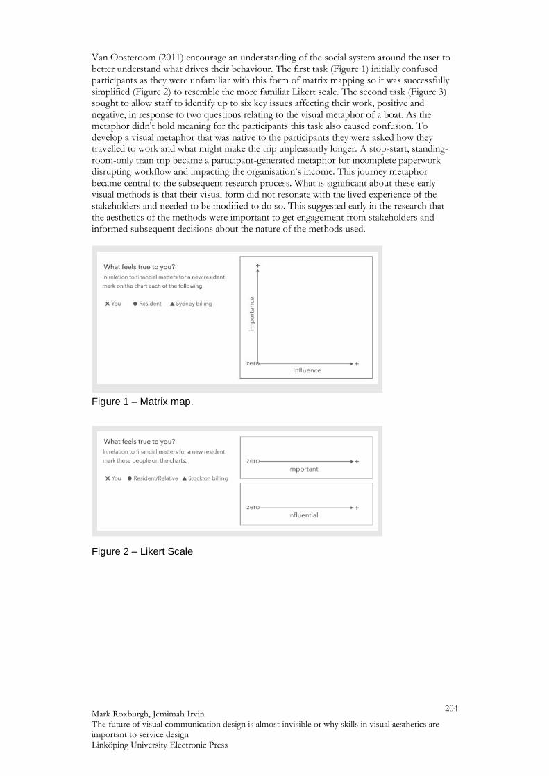
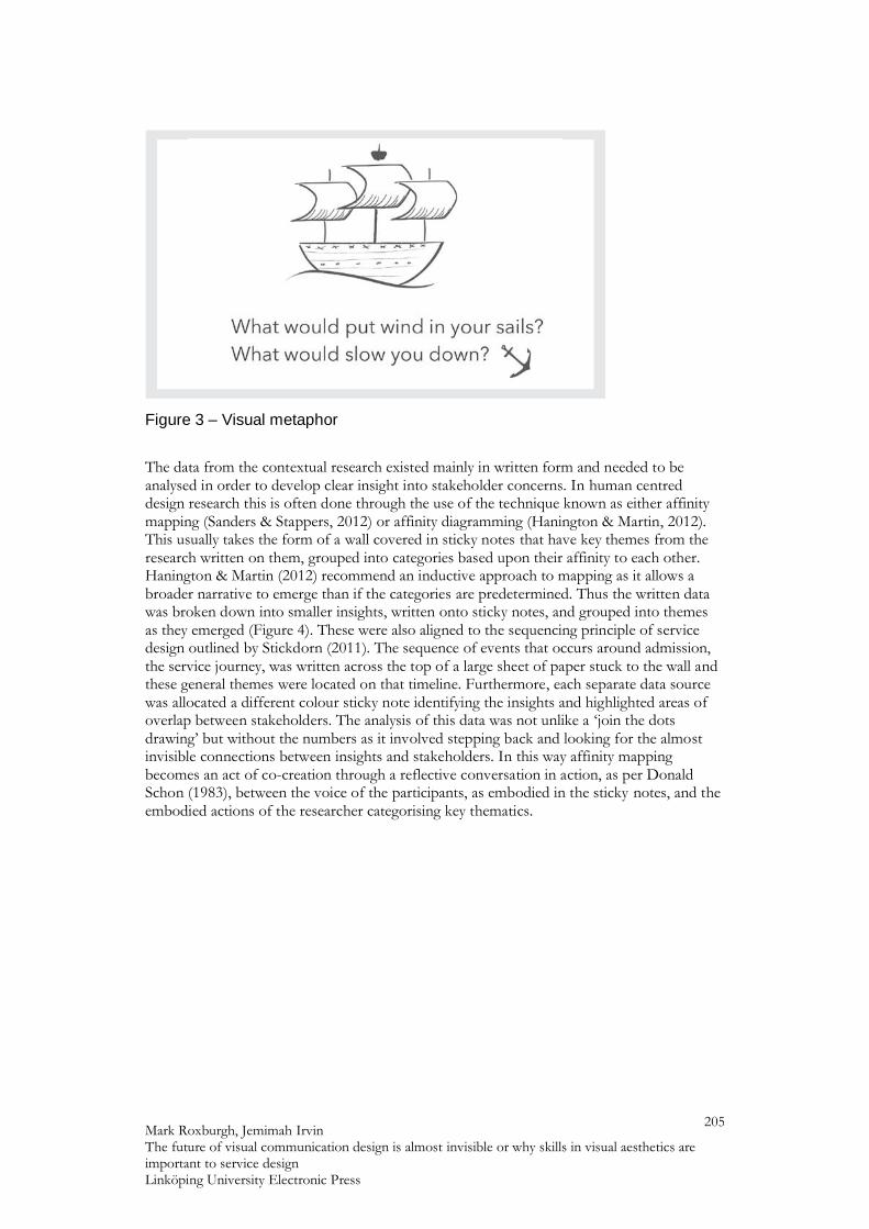
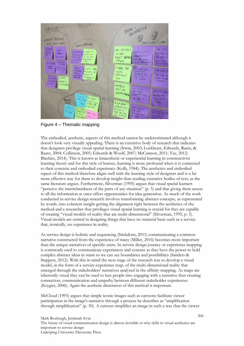
Van Oosteroom (2011) encourage an understanding of the social system around the user to better understand what drives their behaviour. The first task (Figure 1) initially confused participants as they were unfamiliar with this form of matrix mapping so it was successfully simplified (Figure 2) to resemble the more familiar Likert scale. The second task (Figure 3) sought to allow staff to identify up to six key issues affecting their work, positive and negative, in response to two questions relating to the visual metaphor of a boat. As the metaphor didn't hold meaning for the participants this task also caused confusion. To develop a visual metaphor that was native to the participants they were asked how they travelled to work and what might make the trip unpleasantly longer. A stop-start, standing-room-only train trip became a participant-generated metaphor for incomplete paperwork disrupting workflow and impacting the organisation’s income. This journey metaphor became central to the subsequent research process. What is significant about these early visual methods is that their visual form did not resonate with the lived experience of the stakeholders and needed to be modified to do so. This suggested early in the research that the aesthetics of the methods were important to get engagement from stakeholders and informed subsequent decisions about the nature of the methods used.
Figure 1 – Matrix map.
Figure 2 – Likert Scale
Mark Roxburgh, Jemimah Irvin The future of visual communication design is almost invisible or why skills in visual aesthetics are important to service design Linköping University Electronic Press
205
Figure 3 – Visual metaphor
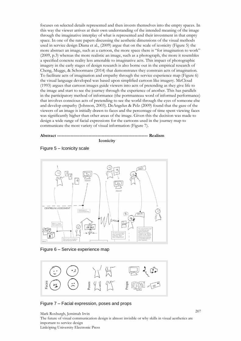
The data from the contextual research existed mainly in written form and needed to be analysed in order to develop clear insight into stakeholder concerns. In human centred design research this is often done through the use of the technique known as either affinity mapping (Sanders & Stappers, 2012) or affinity diagramming (Hanington & Martin, 2012). This usually takes the form of a wall covered in sticky notes that have key themes from the research written on them, grouped into categories based upon their affinity to each other. Hanington & Martin (2012) recommend an inductive approach to mapping as it allows a broader narrative to emerge than if the categories are predetermined. Thus the written data was broken down into smaller insights, written onto sticky notes, and grouped into themes as they emerged (Figure 4). These were also aligned to the sequencing principle of service design outlined by Stickdorn (2011). The sequence of events that occurs around admission, the service journey, was written across the top of a large sheet of paper stuck to the wall and these general themes were located on that timeline. Furthermore, each separate data source was allocated a different colour sticky note identifying the insights and highlighted areas of overlap between stakeholders. The analysis of this data was not unlike a ‘join the dots drawing’ but without the numbers as it involved stepping back and looking for the almost invisible connections between insights and stakeholders. In this way affinity mapping becomes an act of co-creation through a reflective conversation in action, as per Donald Schon (1983), between the voice of the participants, as embodied in the sticky notes, and the embodied actions of the researcher categorising key thematics.
Mark Roxburgh, Jemimah Irvin The future of visual communication design is almost invisible or why skills in visual aesthetics are important to service design Linköping University Electronic Press
206
Figure 4 – Thematic mapping
The embodied, aesthetic, aspects of this method cannot be underestimated although it doesn’t look very visually appealing. There is an extensive body of research that indicates that designers privilege visual-spatial learning (Irwin, 2003; Lockheart, Edwards, Raein, & Raatz, 2004; Collinson, 2005; Edwards & Woolf, 2007; McCannon, 2011; Yee, 2012; Blackler, 2014). This is known as kinaesthetic or experiential learning in constructivist learning theory and for this style of learner, learning is more profound when it is connected to their concrete and embodied experience (Kolb, 1984). The aesthetics and embodied aspect of this method therefore aligns well with the learning style of designers and is a far more effective way for them to develop insight than reading extensive bodies of text, as the same literature argues. Furthermore, Silverman (1995) argues that visual spatial learners “perceive the interrelatedness of the parts of any situation” (p. 3) and that giving them access to all the information at once offers opportunities for idea generation. As much of the work conducted in service design research involves transforming abstract concepts, as represented by words, into coherent insight getting the alignment right between the aesthetics of the method and a researcher that privileges visual spatial learning is crucial for they are capable of creating “visual models of reality that are multi-dimensional” (Silverman, 1995, p. 3). Visual models are central in designing things that have no material basis such as a service that, ironically, we experience in reality. As service design is holistic and sequencing (Stickdorn, 2011) communicating a common narrative constructed from the experience of many (Miller, 2016) becomes more important than the unique narratives of specific users. In service design journey or experience mapping is commonly used to communicate experiences and systems as they have the power to hold complex abstract ideas in stasis so we can see boundaries and possibilities (Sanders & Stappers, 2012). With this in mind the next stage of the research was to develop a visual model, in the form of a service experience map, of the multi-dimensional reality that emerged through the stakeholders' narratives analysed in the affinity mapping. As maps are inherently visual they can be used to lure people into engaging with a narrative thus creating connection, communication and empathy between different stakeholder experiences (Krygier, 2006). Again the aesthetic dimension of this method is important. McCloud (1993) argues that simple iconic images such as cartoons facilitate viewer participation in the image's narrative through a process he describes as “amplification through simplification” (p. 30). A cartoon simplifies an image in such a way that the viewer
Mark Roxburgh, Jemimah Irvin The future of visual communication design is almost invisible or why skills in visual aesthetics are important to service design Linköping University Electronic Press
207
focuses on selected details represented and then invests themselves into the empty spaces. In this way the viewer arrives at their own understanding of the intended meaning of the image through the imaginative interplay of what is represented and their investment in that empty space. In one of the rare papers discussing the aesthetic dimensions of the visual methods used in service design Diana et al., (2009) argue that on the scale of iconicity (Figure 5) the more abstract an image, such as a cartoon, the more space there is “for imagination to work” (2009, p.3) whereas the more realistic an image, such as a photograph, the more it resembles a specified concrete reality less amenable to imaginative acts. This impact of photographic imagery in the early stages of design research is also borne out in the empirical research of Cheng, Mugge, & Schoormans (2014) that demonstrates they constrain acts of imagination. To facilitate acts of imagination and empathy through the service experience map (Figure 6) the visual language developed was based upon simplified cartoon like imagery. McCloud (1993) argues that cartoon images guide viewers into acts of pretending as they give life to the image and start to see the journey through the experience of another. This has parallels in the participatory method of informance (the portmanteau word of informed performance) that involves conscious acts of pretending to see the world through the eyes of someone else and develop empathy (Johnson, 2003). DeAngelus & Pelz (2009) found that the gaze of the viewers of an image is initially drawn to faces and the percentage of time spent viewing faces was significantly higher than other areas of the image. Given this the decision was made to design a wide range of facial expressions for the cartoons used in the journey map to communicate the most variety of visual information (Figure 7). Abstract ------------------------------------------------------------- Realism Iconicity
Figure 5 – Iconicity scale
Figure 6 – Service experience map
Figure 7 – Facial expression, poses and props
Mark Roxburgh, Jemimah Irvin The future of visual communication design is almost invisible or why skills in visual aesthetics are important to service design Linköping University Electronic Press
208
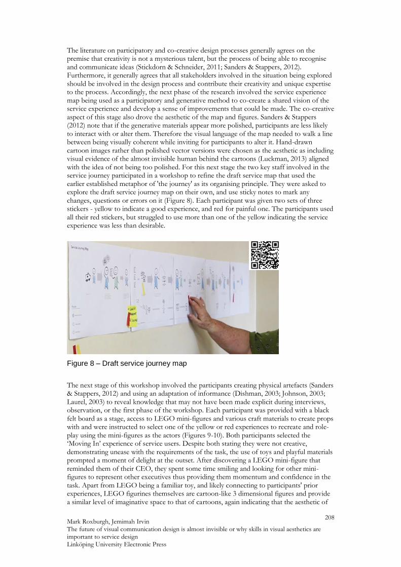
The literature on participatory and co-creative design processes generally agrees on the premise that creativity is not a mysterious talent, but the process of being able to recognise and communicate ideas (Stickdorn & Schneider, 2011; Sanders & Stappers, 2012). Furthermore, it generally agrees that all stakeholders involved in the situation being explored should be involved in the design process and contribute their creativity and unique expertise to the process. Accordingly, the next phase of the research involved the service experience map being used as a participatory and generative method to co-create a shared vision of the service experience and develop a sense of improvements that could be made. The co-creative aspect of this stage also drove the aesthetic of the map and figures. Sanders & Stappers (2012) note that if the generative materials appear more polished, participants are less likely to interact with or alter them. Therefore the visual language of the map needed to walk a line between being visually coherent while inviting for participants to alter it. Hand-drawn cartoon images rather than polished vector versions were chosen as the aesthetic as including visual evidence of the almost invisible human behind the cartoons (Luckman, 2013) aligned with the idea of not being too polished. For this next stage the two key staff involved in the service journey participated in a workshop to refine the draft service map that used the earlier established metaphor of 'the journey' as its organising principle. They were asked to explore the draft service journey map on their own, and use sticky notes to mark any changes, questions or errors on it (Figure 8). Each participant was given two sets of three stickers - yellow to indicate a good experience, and red for painful one. The participants used all their red stickers, but struggled to use more than one of the yellow indicating the service experience was less than desirable.
Figure 8 – Draft service journey map
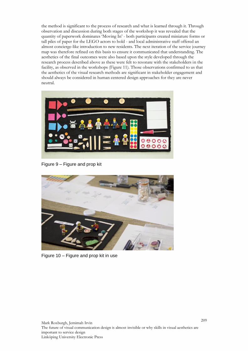
The next stage of this workshop involved the participants creating physical artefacts (Sanders & Stappers, 2012) and using an adaptation of informance (Dishman, 2003; Johnson, 2003; Laurel, 2003) to reveal knowledge that may not have been made explicit during interviews, observation, or the first phase of the workshop. Each participant was provided with a black felt board as a stage, access to LEGO mini-figures and various craft materials to create props with and were instructed to select one of the yellow or red experiences to recreate and role-play using the mini-figures as the actors (Figures 9-10). Both participants selected the ‘Moving In’ experience of service users. Despite both stating they were not creative, demonstrating unease with the requirements of the task, the use of toys and playful materials prompted a moment of delight at the outset. After discovering a LEGO mini-figure that reminded them of their CEO, they spent some time smiling and looking for other mini-figures to represent other executives thus providing them momentum and confidence in the task. Apart from LEGO being a familiar toy, and likely connecting to participants' prior experiences, LEGO figurines themselves are cartoon-like 3 dimensional figures and provide a similar level of imaginative space to that of cartoons, again indicating that the aesthetic of
Mark Roxburgh, Jemimah Irvin The future of visual communication design is almost invisible or why skills in visual aesthetics are important to service design Linköping University Electronic Press
209
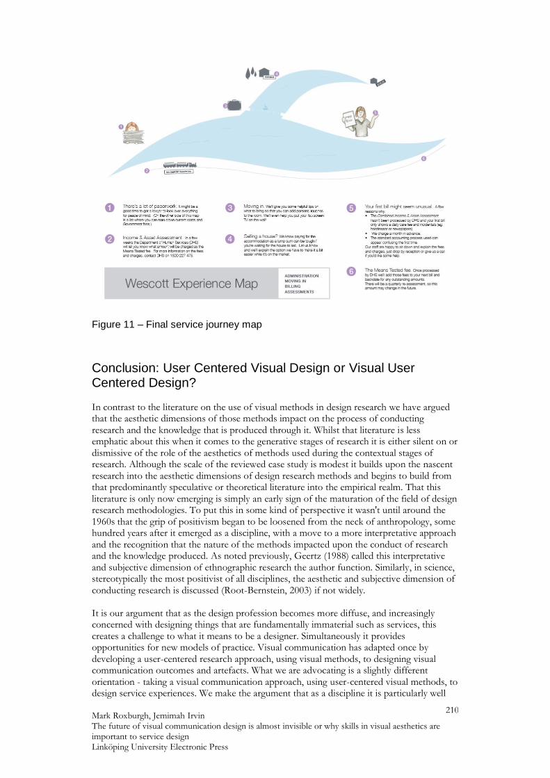
the method is significant to the process of research and what is learned through it. Through observation and discussion during both stages of the workshop it was revealed that the quantity of paperwork dominates ‘Moving In’ - both participants created miniature forms or tall piles of paper for the LEGO actors to hold - and local administrative staff offered an almost concierge-like introduction to new residents. The next iteration of the service journey map was therefore refined on this basis to ensure it communicated that understanding. The aesthetics of the final outcomes were also based upon the style developed through the research process described above as these were felt to resonate with the stakeholders in the facility, as observed in the workshops (Figure 11). Those observations confirmed to us that the aesthetics of the visual research methods are significant in stakeholder engagement and should always be considered in human centered design approaches for they are never neutral.
Figure 9 – Figure and prop kit
Figure 10 – Figure and prop kit in use
Mark Roxburgh, Jemimah Irvin The future of visual communication design is almost invisible or why skills in visual aesthetics are important to service design Linköping University Electronic Press
210
Figure 11 – Final service journey map
Conclusion: User Centered Visual Design or Visual User Centered Design? In contrast to the literature on the use of visual methods in design research we have argued that the aesthetic dimensions of those methods impact on the process of conducting research and the knowledge that is produced through it. Whilst that literature is less emphatic about this when it comes to the generative stages of research it is either silent on or dismissive of the role of the aesthetics of methods used during the contextual stages of research. Although the scale of the reviewed case study is modest it builds upon the nascent research into the aesthetic dimensions of design research methods and begins to build from that predominantly speculative or theoretical literature into the empirical realm. That this literature is only now emerging is simply an early sign of the maturation of the field of design research methodologies. To put this in some kind of perspective it wasn't until around the 1960s that the grip of positivism began to be loosened from the neck of anthropology, some hundred years after it emerged as a discipline, with a move to a more interpretative approach and the recognition that the nature of the methods impacted upon the conduct of research and the knowledge produced. As noted previously, Geertz (1988) called this interpretative and subjective dimension of ethnographic research the author function. Similarly, in science, stereotypically the most positivist of all disciplines, the aesthetic and subjective dimension of conducting research is discussed (Root-Bernstein, 2003) if not widely. It is our argument that as the design profession becomes more diffuse, and increasingly concerned with designing things that are fundamentally immaterial such as services, this creates a challenge to what it means to be a designer. Simultaneously it provides opportunities for new models of practice. Visual communication has adapted once by developing a user-centered research approach, using visual methods, to designing visual communication outcomes and artefacts. What we are advocating is a slightly different orientation - taking a visual communication approach, using user-centered visual methods, to design service experiences. We make the argument that as a discipline it is particularly well
Mark Roxburgh, Jemimah Irvin The future of visual communication design is almost invisible or why skills in visual aesthetics are important to service design Linköping University Electronic Press
211
placed to take advantage of these opportunities by drawing on its capacity to skillfully tell stories of human experience through appropriate and well considered visuals throughout the entire design process through a consideration of what Roxburgh (2010a) calls “the aesthetics of research” (p. 438).
References Andrews, K. (2011). Social design: Delivering positive social impact. In M. Stickdorn & J. Schneider (Eds.), This is service design thinking: Basics, tools, cases (pp. 88-93). Amsterdam, The Netherlands: BIS Publishers Bennett, A. (Ed.) (2006). Design studies: Theory and research in graphic design. New York, NY: Princeton Architectural Press. Bierut, M. (1988). Why designer's can't think. American Center for Design Journal, 3, 2. Blackler, A. (2014). Using a visually-based assignment to reinforce and assess design history knowledge and understanding. Design Research Society Conference Proceedings, Umea: DRS. Brinkley, J. (1949). Design for print: A handbook of design and reproduction processes, London, England: Sylvan Press. Brown, T. (2009). Change by design: How design thinking transforms organizations and inspires innovation, New York, NY: HarperCollins Cheng, P., Mugge, R. & Schoormans, J. P. L. (2014). A new strategy to reduce design fixation: Presenting partial photographs to designers. Design Studies, 35, 374-391. Collier, J. & Collier, M. (1967). Visual anthropology: Photography as a research method. New York, NY: Holt, Rinehart and Winston. Collinson, J. A. (2005). Artistry and analysis: Student experiences of UK practice-based doctorates in art and design. International Journal of Qualitative Studies in Education, 18, 713-728. Commonwealth of Australia. (2004). Review of pricing arrangements in residential aged care - full report. Retrieved from http://webarchive.nla.gov.au/gov/20140802094559/http://www.health.gov.au/internet/publications/publishing.nsf/Content/health-investinginagedcare-report-index.htm Crouch, C. & Pearce, J. (2013). Doing research in design. Oxford, England: Bloomsbury Publishing. DeAngelus, M., & Pelz, J. B. (2009). Top-down control of eye movements: Yarbus revisited. Visual Cognition, 17, 790-811. http://doi: 10.1080/13506280902793843 Diana, C., Pacenti, E. & Tassi, R. (2009). Visualtiles: Communication tools for (service) design. In Clatworthy, S., Nisula, J. & Holmlid, S. (Eds.) DeThinking service, rethinking design: 1st Service Design and Service Innovation conference, ServDes.2009 (pp. 65-76). Linköping Electronic Conference Proceedings, 59. Linköping, Sweden: Linköping University Electronic Press. Dishman, E. (2003). Designing for the new old: Asking, observing and performing future elders. In B. Laurel (Ed.), Design research: Methods and perspectives (pp. 41-48). Cambridge, MA: MIT Press Do, K. (2017). IBISWorld Industry Report M6924: Specialised Design Services in Australia. http://clients1.ibisworld.com.au/reports/au/industry/productsandmarkets.aspx?entid=56
Mark Roxburgh, Jemimah Irvin The future of visual communication design is almost invisible or why skills in visual aesthetics are important to service design Linköping University Electronic Press
212
Donetto, S., Tsianakas, V. & Robert, G. (2014). Using experience-based co-design to improve the quality of healthcare: Mapping where we are now and establishing future directions. Retrieved from https://www.kcl.ac.uk/nursing/research/nnru/publications/reports/ebcd-where-are-we-now-report.pdf Dreyfuss, H. (2003). Designing for people, New York, NY: Allworth Press. (Original work published 1955) Edwards, H. & Woolf, N. (2007). Design research by practice: Modes of writing in a recent Ph.D. from the RCA. Journal of Writing in Creative Practice, 1, 53-67. Ellis, C., Adams, T. E., & Bochner, A. P. (2010). Autoethnography: An overview. Forum Qualitative Sozialforschung / Forum: Qualitative Social Research, 12(1). http://dx.doi.org/10.17169/fqs-12.1.1589 Fleming, D. (1998). Design talk: Constructing the object in studio conversations. Design Issues, 14, 41-62. Forty, A. (1986). Objects of desire: Design and society, 1750-1980, London, England: Thames and Hudson. Frascara, J. (1997). User-centred graphic design: Mass communications and social change, London, England: Taylor & Francis Ltd. Frascara, J. (2002). People-centered design: Complexities and uncertainties. In Frascara, J. (Ed.) Design and the social sciences: Making connections, New York, NY: Taylor and Francis. Geertz, C. (1988). Works and lives: The anthropologist as author. Stanford, CA: Stanford University Press. Hanington, B. (2003). Methods in the making - A perspective on the state of human research in design. Design Issues, 19, 4, pp. 9-18. Hanington, B. & Martin, B. (2012). Universal methods of design, Beverly, MA: Rockport Publishers. Holland, D. K. (1992). Graphic design education: Struggling through those awkward teenage years. Communication Arts, September/October. Irwin, R. (2003). Toward an aesthetic of unfolding in/sights through curriculum. Journal of the Canadian Association of Curriculum Studies, 1, 63-78. Johnson, B. (2003). The paradox of design research: The role of informance. In B. Laurel (Ed.), Design research: Methods and perspectives (pp. 41-48). Cambridge, MA: MIT Press Kelley, T. & Littman, J. (2001). The art of innovation: Lessons in creativity from IDEO, America's leading design firm. New York, NY: Currency/Doubleday Kim, H. (2006). The shift to the service economy: Causes and effects. Paper presented at the Korea and the World Economy, V. http://faculty.washington.edu/karyiu/confer/seoul06/papers/kim_hj.pdf Kirkley, C., Bamford, C., Poole, M., Arksey, H., Hughes, J., & Bond, J. (2011). The impact of organisational culture on the delivery of person-centred care in services providing respite care and short breaks for people with dementia. Health & Social Care in the Community, 19(4), 438-448. https://doi.org/10.1111/j.1365-2524.2011.00998.x
Mark Roxburgh, Jemimah Irvin The future of visual communication design is almost invisible or why skills in visual aesthetics are important to service design Linköping University Electronic Press
213
Kolb, D.A. (1984). Experiential learning: Experience as the source of learning and development. New Jersey: Prentice Hall. KPMG for Department of Social Services. (2014). Applicability of Consumer Directed Care principles in residential aged care homes. Retrieved from https://www.dss.gov.au/sites/default/files/documents/09_2015/applicability-of-consumer-directed-care-principles-in-residential-aged-care- homes.pdf Krygier, J. (2006). Jake Barton's performance maps: An essay. Cartographic Perspectives, Winter2006(53), 41-50. http://dx.doi.org/10.14714/CP53.361 Kueh, C. & Thom, R. (2018) Visualising empathy: A framework to teach user-based innovation in design. In S. Griffith, S., M. Bliemel & K. Carruthers (Eds.), Visual tools for developing student capacity for cross-disciplinary collaboration, innovation and entrepreneurship. & A. Rourke & V. Rees (Series Curators), Transformative Pedagogies in the Visual Domain: Book No. 6. Champaign, IL: Common Ground Research Networks. (In Press) Laurel, B. (Ed.). (2003). Design research: Methods and perspectives. Cambridge, MA: MIT Press. Lockheart, J., Edwards, H., Raein, M. & Raatz, C. (2004). Writing purposefully in art and design (writing PAD), Art Design and Communication in Higher Education, 3, 2: 89-102. Lockwood, T. (2009). Design thinking: Integrating innovation, customer experience, and brand value. New York, NY: Allworth Press Luckman, S. (2013). The aura of the analogue in a digital age: Women’s crafts, creative markets and home-based labour after Etsy, Cultural Studies Review, 19(1), pp. 249-270. Retrieved from http://dx.doi.org/10.5130/csr.v19i1.2585 Margolin, V. (1991). Design studies and the education of designers. Elisava Temes De Disseny [Online], 6, pp. 49-54. Retrieved from: http://www.raco.cat/index.php/Temes/article/view/29204/40578 Margolin, V. (1998). Design for a sustainable world, Design Issues, 14(2), pp. 83-92. Retrieved from https://doi.org/10.2307/1511853 Martin, R. L. (2009). The design of business: Why design thinking is the next competitive advantage, Boston. MA: Harvard Business Press McCannon, D. (2011). Towards the hybrid essay: The 'visual essay project'. Journal of Writing in Creative Practice, 4, 131-140. McCloud, S. (1993). Understanding comics: The invisible art. New York, NY: HarperCollins McCormack, B., Borg, M., Cardiff, S., Dewing, J., Jacobs, G., Janes, N., . . . Wilson, V. (2015). Person-centredness - the 'state' of the art. International Practice Development Journal 5 , 1-15. Retrieved from https://www.fons.org/library/journal/volume5-person-centredness-suppl/article1 McCoy, K. (2001). American graphic design expression: The evolution of American typography, in Heller, S. & Ballance, G. (Eds.) Graphic design history, New York, NY: Allworth Press Miller, M. (2016, March 8). The difference between a journey map and a service blueprint [Blog post]. Retrieved from https://blog.practicalservicedesign.com/the-difference-between-a-journey- map-and-a-service-blueprint-31a6e24c4a6c#.k43zr99e3
Mark Roxburgh, Jemimah Irvin The future of visual communication design is almost invisible or why skills in visual aesthetics are important to service design Linköping University Electronic Press
214
Norman, D. A. & Draper, S. W. (1986). User centered system design: New perspectives on human-computer interaction. Hillsdale, NJ: Lawrence Erlbaum Associates. Pawar, K. S., Beltagui, A., & Riedel, J. C. (2009). The PSO triangle: Designing product, service and organisation to create value. The International Journal of Operations & Product Management, 29, 5, 468-493. Pink, S. (2006). The future of visual anthropology: Engaging the senses, London, England: Routledge Polaine, A., Løvlie, L. & Reason, B. (2013). Service design: From insight to implementation, Brooklyn, NY: Rosenfeld Media Productivity Commission (2011). Caring for older Australians: Overview (Report No. 53). Retrieved from http://www.pc.gov.au/inquiries/completed/aged-care/report Root-Bernstein, R. (2003). Sensual chemistry: Aesthetics as a motivation for research. International Journal for Philosophy of Chemistry 9, 33-50. Roxburgh, M. (2006). The Utility of Design Vision and the Crisis of the Artificial. In Bennett, A. (Ed.) Design Studies: Theory and Research in Graphic Design. New York: Princeton Architectural Press. Roxburgh, M. (2010a). Design and the Aesthetics of Research. Visual Communication, 9, 425-439. Roxburgh, M. (2010b). Photography and the Design Imperative. In Roxburgh, M (Ed.) Light Relief (Part II), Sydney: The University of Technology Sydney, DAB DOCS. Roxburgh, M. (2013a). The Images of the Artificial or Why Everything Looks the Same. The International Journal of the Image, 3, 3, 1-16. Roxburgh, M. (2013b) The crisis of the artificial: why does everything look the same?, PhD Thesis, Canberra: University of Canberra. canberra.primo.exlibrisgroup.com/discovery/fulldisplay?docid=alma991000143489703996&context=L&vid=61ARL_CNB:61ARL_CNB&lang=en&search_scope=MyInst_and_CI&adaptor=Local%20Search%20Engine&tab=Everything&query=any,contains,roxburgh%20%20mark&mode=Basic Roxburgh, M. & Cox, S. (2016). Visualisation and the Service Sector: Why Visual Communication Design is Central to Designing the Immaterial. Studies in Material Thinking, 15, 1-19. Salchow, G. (1981). Two myths about design education. Print, November/December Sanders, E.B.N. (2002). From user-centered to participatory design approaches. In Frascara, J. (Ed.) Design and the social sciences: Making connections, New York, NY: Taylor and Francis Sanders, E.B.-N. & Stappers, P.J. (2012). Convivial design toolbox : Generative research for the front end of design. Amsterdam, The Netherlands: BIS Scher, P. (1986). Back to show and tell. AIGA Journal of Graphic Design, 4, 1, 166-167. Schon, D. (1983). The reflective practitioner: How professionals think in action, New York, NY: Basic Books Segelstrom, F. (2009). Communicating through visualizations: Service designers on visualizing user research. In Clatworthy, S., Nisula, J. & Holmlid, S. (Eds.) DeThinking service, rethinking design: 1st Service Design and Service Innovation conference, ServDes.2009 (pp. 175-185). Linköping Electronic Conference Proceedings, 59. Linköping, Sweden: Linköping University Electronic Press.
Mark Roxburgh, Jemimah Irvin The future of visual communication design is almost invisible or why skills in visual aesthetics are important to service design Linköping University Electronic Press
215
Segelstrom, F. & Holmlid, S. (2009). Visualizations as tools for research: Service designers on visualizations. Paper presented at Engaging Artefacts: Nordic Design Research Conference 2009. http://www.nordes.org/opj/index.php/n13/article/view/53/44 Simon, H. (1969). The sciences of the artificial. Cambridge, MA: MIT Press. Silverman, L. K. (1995). Effective techniques for teaching highly gifted visual- spatial learners. Retrieved from https://files.eric.ed.gov/fulltext/ED418535.pdf Stickdorn, M. (2011). 5 Principles of Service Design Thinking. In M. Stickdorn & J. Schneider (Eds.), This is service design thinking: Basics, tools, cases (pp. 34-45). Amsterdam, The Netherlands: BIS Publishers Stickdorn, M. & Schneider, J. (Eds.) (2011) This is service design thinking: Basics, tools, cases. Amsterdam, The Netherlands : BIS Publishers. Strickland, R. (2003). Spontaneous Cinema as Design Practice. In B. Laurel (Ed.), Design research: Methods and perspectives (pp. 41-48). Cambridge, MA: MIT Press Strickler, Z. (1999). Elicitation methods in experimental design research. Design Issues, 15, 28-39. Strickler, Z. & Neafsey, P. (2006). Visual design of interactive software for older adults. In A. Bennett, (Ed.), Design studies - Theory and research in graphic design. New York, NY: Princeton Architectural Press. 31 Volts (n.d.). Service design, Retrieved from http://www.31volts.com/en/service-design Van Oosteroom, A. (2011). NL Agency and DesignThinkers: Service design for a governmental organisation. In M. Stickdorn & . Schneider (Eds.), This is service design thinking: Basics, tools, cases (pp. 221-233). Amsterdam, The Netherlands: BIS Publishers Whiteley, N. (1993). Design for society, London, England: Reaktion Books World Health Organisation (2007). People-centred Health Care: A Policy Framework. Retrieved from http://www.wpro.who. int/health_services/people_at_the_centre_of_care/documents/ENG- PCIPolicyFramework.pdf Yee, J. (2012). Implications for research training and examination for design PhDs. In R. Andrews, E. Borg, S. B. Davis, M. Domingo & J. England (Eds.), The SAGE Handbook of Digital Dissertations and Theses (pp. 461-49). London, England: SAGE Publications