Embed Size (px)
Citation preview

Potential MBTA Fare Increaseand Service Changes in 2012:Scenario 3 Impact AnalysisA report produced for the Massachusetts Bay Transportation Authority by the Central Transportation Planning Staff
Potential MBTA Fare Increase and Service Changes in 2012: Scenario 3 Impact Analysis
Project ManagerRobert Guptill
Project PrincipalElizabeth Moore
Data AnalystsGrace King Robert Guptill
Graphics Robert Guptill
Cover DesignKim Noonan
The preparation of this document was funded by the Massachusetts Bay Transportation Authority.
Produced for the Massachusetts BayTransportation Authority by the Central Transportation Planning Staff CTPS is directed by the Boston Region Metropolitan Planning Organization. The MPO is composed of state and regional agencies and authorities, and local governments.
March 28, 2012

To request additional copies of this document orcopies in an accessible format, contact:
Central Transportation Planning Staff State Transportation Building Ten Park Plaza, Suite 2150 Boston, Massachusetts 02116
(617) 973-7100 (617) 973-8855 (fax) (617) 973-7089 (TTY)
[email protected] www.bostonmpo.org
SOUTH-BOROUGH
HUDSON
MARLBOROUGH
SHERBORN
NATICK
SUDBURYWALTHA
WELLESLEY
WATERTOW
NEWTON
WOBURN
STON
EHA
WAKE-FIELD
HOPKINTON
NEEDHAM
DOVER
FOXBOROUGH
MILLIS
HOLLISTONMEDFIELD
NORFOLK
WALPOLMILFORD
MEDWAY
FRANKLIN
DUXBURY
CANTON
SHARON
NORWOOD
HINGHAM
HANOVER
MILTON
NORWELL
QUINCY
READING
MEDFORD
PEABODY
SWAMPSCOTT
REVEREMALDEN
EVERETT
MELROSENAHANT
LYNN
SALEM MARBLEHEAD
ROCKPOR
IPSWICH
WENHAM
MIDDLE-TON
DANVERS
TOPS-
MANCHESTERBEVERLY
ESSEX GLOUCESTER
CONCORD
CARLISLE
LINCOLN
BEDFORD
STOWBOLTON
LITTLE-TON
ACTON
SOMERVILLE
CAMBRIDGE
BRO
OKL
INE
STOUGH-
BEL
LIN
GH
AM
WRENTHAM
WESTW
OOD
WAY
LAN
D
ASHLAND
FRAMIN
GH
AM
BOX-BOR-
OUGH
MAY-NARD
BELMO
NTWESTO
N
DEDHAM
LEXINGTON
ARLINGTO
WINCHESTE
R
BUR-LINGTON
WILMING-TON LYN
NFIELD
COHASSET
HOL-BROOK
BRAINTREE
RAND
OLPH RO
CKLA
ND
WEY
-MO
UTH
PEMBROKE
SCITUATE
MARSHFIELD
HULLBOSTON
WINTHROP
SAU
GU
S
CHELSEA
HAMILTON
NORTHREADING

CTPS 3/28/2012 iii
ABSTRACT This analysis estimates various impacts of a potential scenario for MBTA pricing and service aimed at reducing a projected budget deficit. The proposed scenario raises most of its projected revenue through a fare increase; it also includes service changes that eliminate some of the MBTA’s least cost-effective services. The ridership, revenue, air quality, and environmental justice impacts of these measures are estimated. Two different modeling methodologies are used to produce these projections. The two models are complementary; in addition, producing two sets of estimates provides a range of possible impacts.

iv 3/28/2012 Boston Region MPO
Acknowledgments We wish to thank Charles Planck, Melissa Dullea, and Greg Strangeways of the MBTA for their participation in the analysis of various fare increase and service change scenarios.

CTPS 3/28/2012 v
CONTENTS List of Exhibits vii
EXECUTIVE SUMMARY ix
1 INTRODUCTION 1
2 DESCRIPTION OF PROPOSED FARE INCREASE/SERVICE CHANGE SCENARIO 3
2.1 Fare Structure Changes 3 2.2 Service Changes 5 2.2.1 Bus 5 2.2.2 Rapid Transit, Commuter Rail, Ferry, and THE RIDE 7 2.2.3 Summary of Service Changes 9 2.3 Fare Increase: Single-Ride Fares, Pass Prices, and Parking Rates 13
3 METHODS USED TO ESTIMATE RIDERSHIP AND REVENUE 19 3.1 CTPS Spreadsheet Model Approach 19 3.1.1 Modeling of Existing Ridership and Revenue 19 3.1.2 Estimation of Ridership Changes Resulting from a Fare Increase 21 3.2 Boston Region MPO Travel Demand Model Set Approach 22 3.3 Differences between the Two Estimation Methodologies 24
4 RIDERSHIP AND REVENUE IMPACTS 25 4.1 Overview of Results and Methodology 25 4.2 Spreadsheet Model Estimates 25 4.2.1 Projections 25 4.2.2 Sensitivity Analysis 26 4.2.3 Total Revenue Estimate 27 4.3 Regional Travel Demand Model Set Estimates 27

CONTENTS
vi 3/28/2012 Boston Region MPO
4.3.1 Projections 27 4.3.2 Total Revenue Estimate 28 4.4 Comparison of Model Results: Ranges of Projected Impacts 29
5 AIR QUALITY IMPACTS 33 5.1 Background 33 5.2 Estimated Air Quality Impacts 34
6 ENVIRONMENTAL JUSTICE IMPACTS 37 6.1 Definition of Environmental Justice Communities 37 6.2 Equity Determination 37 6.2.1 Transit Equity Metrics 38 6.2.2 Highway Congestion and Air Quality Equity Metrics 39 6.2.3 Accessibility Equity Metrics 40 6.2.4 Summary of Equity Impacts 40
7 CONCLUSIONS 43
APPENDIX: SPREADSHEET MODEL METHODOLOGY A.1 Apportionment of Existing Ridership A-1 A.2 Price Elasticity Estimation A-1 A.3 Price Elasticity A-3 A.4 Diversion Factors A-4 A.5 Examples of Ridership and Revenue Calculations A-5

CTPS 3/28/2012 vii
EXHIBITS
Figure
2-1 Scenario 3 Weekday Bus, Rapid Transit, and Ferry Service Changes 10 2-2 Scenario 3 Saturday Bus, Rapid Transit, and Ferry Service Changes 11 2-3 Scenario 3 Sunday Bus, Rapid Transit, and Ferry Service Changes 12 2-4 Percentages of Riders Affected and Unaffected by the Proposed
Scenario 3 Service Changes 13
Table E-1 Range of Revenue and Ridership Projections for the Proposed Fare
Increase and Service Changes x 2-1 MBTA-Operated Bus Routes with Average Net Cost per Passenger
(Subsidy) Greater than 3.5 Times the Systemwide Average, by Day of Week 5
2-2 Percentage of Service Affected 13 2-3 Key Single-Ride Fares: Existing and Proposed 14 2-4 Pass Prices: Existing and Proposed 15 2-5 Park-and-Ride Facility Rates: Existing and Proposed 16 2-6 Weighted Average Percentage Change in Average Fares, by Modal
Category, for Unlinked Trips 17 3-1 Price Elasticity Ranges Used in the Spreadsheet Model 22 4-1 Spreadsheet Model Estimates of Annual Ridership and Fare Revenue
Impacts 26 4-2 Spreadsheet Model Ranges of Estimates of Annual Ridership and Fare
Revenue Impacts Using Low and High Ranges of Elasticities 27 4-3 Spreadsheet Model Estimates of Total Revenue Change: Combined
Fare Revenue Gains and Saved Operating Costs 27 4-4 Travel Demand Model Set Estimates of Annual Ridership and Fare
Revenue Impacts 28

EXHIBITS
viii 3/28/2012 Boston Region MPO
4-5 Travel Demand Model Set Estimates of Total Revenue Change: Combined Fare Revenue Gains and Saved Operating Costs 28
4-6 Range of Ridership Projections 30 4-7 Range of Fare Revenue Projections 30 4-8 Range of Projections for Total Revenue: Combined Fare Revenue
Gains and Saved Operating Costs 31 5-1 Projected Average Weekday Changes in Selected Pollutants
(Regionwide) 35 6-1 Existing and Projected Measures of Transit Equity Metrics 41 6-2 Existing and Projected Measures of Highway Congestion and Air
Quality Equity Metrics 41 6-3 Existing and Projected Measures of Accessibility Equity Metrics 42 A-1 AFC Fare Categories A-1 A-2 AFC Modal Categories A-2 A-3 Single-Ride and Pass Elasticities by Fare Type and Mode A-3
KEYWORDS ridership revenue air quality environmental justice fare increase service reduction

CTPS 3/28/2012 ix
EXECUTIVE SUMMARY The Massachusetts Bay Transportation Authority (MBTA) faced a projected $185 million operating budget deficit for fiscal year (FY) 2013 (July 1, 2012–June 30, 2013). A series of one-time financial and administrative actions were taken to reduce the projected deficit to $161 million. This report identifies a combination of new fare revenues and operating cost savings through targeted service reductions to address the remaining $161 million projected deficit. The MBTA will continue to advance the operational and administrative efficiencies undertaken since the implementation of forward funding in 2000 and transportation reform in 2009, but it has limited means by which to raise revenue sufficiently to close this operating budget deficit. The primary means are raising fares, reducing service, or a combination of both. The MBTA has developed three potential scenarios, each of which employs the combination approach in different ways. Scenarios 1 and 2, described in a separate report, raise enough revenue to close the FY 2013 budget gap.
Scenario 3, described in the present report, raises fares and reduces service less than Scenarios 1 and 2 and consequently does not close the entire FY 2013 budget gap. It is projected to result in an increase in revenue of $88.3 million to $91.6 million. This scenario, which was developed after the MBTA had received significant public input in response to Scenarios 1 and 2, is now feasible, as the Massachusetts Department of Transportation (MassDOT) has identified additional funding sources that will meet the remainder of the MBTA’s FY 2013 budget deficit.
Scenario 3 raises the majority of its projected revenue through a fare increase, with the remainder of its revenue obtained by reducing service. This report documents the projection of the impacts of this scenario on ridership, revenue, air quality, and environmental justice communities.
The Central Transportation Planning Staff (CTPS) to the Boston Region Metropolitan Planning Organization (MPO), using a spreadsheet model, assisted the MBTA in determining the fare levels for each mode and fare category that would be needed in the context of Scenario 3 to reach the revenue targets the MBTA had established. It then used several analysis techniques to estimate and evaluate the impacts of the scenario’s proposed fare increase and
EXECUTIVE SUMMARY
x 3/28/2012 Boston Region MPO
service reductions. Both the spreadsheet model and the Boston Region MPO’s regional travel demand model set were used to estimate the projected ridership loss associated with the scenario and the net revenue change that would result from the lower ridership and higher fares. By employing both techniques, CTPS produced a range of estimates of potential impacts on ridership and revenue. The travel demand model set was also used to predict the effects of the fare increase on regional air quality and environmental justice.
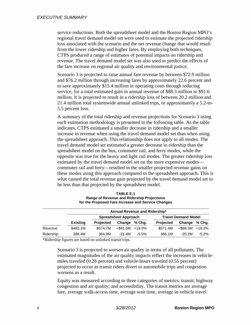
Scenario 3 is projected to raise annual fare revenue by between $72.9 million and $76.2 million through increasing fares by approximately 22.6 percent and to save approximately $15.4 million in operating costs through reducing service, for a total estimated gain in annual revenue of $88.3 million to $91.6 million. It is projected to result in a ridership loss of between 20.2 million and 21.4 million total systemwide annual unlinked trips, or approximately a 5.2-to-5.5 percent loss.
A summary of the total ridership and revenue projections for Scenario 3 using each estimation methodology is presented in the following table. As the table indicates, CTPS estimated a smaller decrease in ridership and a smaller increase in revenue when using the travel demand model set than when using the spreadsheet approach. This relationship does not apply to all modes. The travel demand model set estimated a greater decrease in ridership than the spreadsheet model on the bus, commuter rail, and ferry modes, while the opposite was true for the heavy and light rail modes. The greater ridership loss estimated by the travel demand model set on the more expensive modes—commuter rail and ferry—resulted in the smaller projected revenue gains on these modes using this approach compared to the spreadsheet approach. This is what caused the total revenue gain projected by the travel demand model set to be less than that projected by the spreadsheet model.
TABLE E-1
Range of Revenue and Ridership Projections for the Proposed Fare Increase and Service Changes
Annual Revenue and Ridership* Spreadsheet Approach Travel Demand Model Existing Projected Change % Chg. Projected Change % Chg. Revenue $483.1M $574.7M +$91.6M +19.0% $571.4M +$88.3M +18.3% Ridership 386.4M 364.9M -21.4M -5.5% 366.1M -20.2M -5.2% *Ridership figures are based on unlinked transit trips.
Scenario 3 is projected to worsen air quality in terms of all pollutants. The estimated magnitudes of the air quality impacts reflect the increases in vehicle-miles traveled (0.28 percent) and vehicle-hours traveled (0.55 percent) projected to occur as transit riders divert to automobile trips and congestion worsens as a result.
Equity was measured according to three categories of metrics: transit; highway congestion and air quality; and accessibility. The transit metrics are average fare, average walk-access time, average wait time, average in-vehicle travel

EXECUTIVE SUMMARY
CTPS 3/28/2012 xi
time, number of transfers, and total transit trips. Scenario 3 has a smaller increase in the average fare and a smaller estimated loss in transit riders for environmental justice (EJ) communities than non-EJ communities. There is no measurable difference between EJ and non-EJ communities in the change in average walk-access, wait, or in-vehicle-travel times or in the change in the number of transfers. As for local highway congestion and air pollution, the increases in Scenario 3 are worse for EJ communities than non-EJ communities (the existing levels of congestion and air pollution are also worse in EJ communities than non-EJ communities). Finally, the differences between the changes for EJ communities and those for non-EJ communities in the accessibility of jobs, healthcare, and educational opportunities are so small that they are not statistically significant, indicating that there would be no perceptible difference.


CTPS 3/28/2012 1
Introduction
The Massachusetts Bay Transportation Authority (MBTA) currently faces serious financial problems. Its fiscal year (FY) 2013 (July 1, 2012–June 30, 2013) operating budget deficit was projected to total $185 million. A series of one-time financial and administrative actions were taken to reduce the projected deficit to $161 million. Given continued increases in operating expenses, projected decreases in revenue, and growing debt service costs for capital investments, the Authority will face continuous and growing deficits in future years.
The primary methods that the MBTA has at its disposal for reducing deficits are raising fares to increase revenue and reducing service to decrease operating expenses, though the MBTA can raise revenue through other, less significant means. The MBTA recently explored the impacts of various combinations of potential fare-increase and service-reduction levels and decided to model two scenarios with different combinations. The amount of the fare increase and service reductions proposed by the MBTA for each of those scenarios was determined by the objective of closing the projected FY 2013 budget deficit. These two scenarios and their projected impacts are described in a separate report. A third scenario has now been explored because the Massachusetts Department of Transportation (MassDOT) has identified additional funding sources that will help the MBTA to close its FY 2013 budget gap. This report models this new third scenario, which was developed by the MBTA after receiving significant input from the public regarding Scenarios 1 and 2.
The first step in the analysis process was for the Central Transportation Planning Staff (CTPS) to the Boston Region Metropolitan Planning Organization (MPO), in consultation with the MBTA, to determine the fare level for each mode and fare category that would be needed to reach the MBTA’s revenue targets given the estimated ridership loss due to the scenario’s proposed service reductions. This was accomplished through an iterative process in which CTPS utilized a spreadsheet model that was specifically developed to analyze the degree to which ridership and revenue would change if fares were raised by any given amount. CTPS also produced alternative estimates of the impact on both ridership and revenue using the Boston Region MPO’s regional travel demand model set. A comparison of the

INTRODUCTION
2 3/28/2012 Boston Region MPO
projections of each model provides a range of estimated impacts on ridership and revenue. The impacts on air quality and environmental justice were projected using the travel demand model set.
This report first presents detailed descriptions of the proposed scenario. It then explains the estimation methods used by CTPS in its analysis and presents the projected impacts of the proposed scenario on ridership, revenue, air quality, and environmental justice communities. A brief summary of findings concludes the report.

CTPS 3/28/2012 3
Description of Proposed Fare Increase/Service Change Scenario
This chapter describes first the scenario’s fare structure, then its service changes, and finally its fare increases.
2.1 FARE STRUCTURE CHANGES Significant time and effort were expended, as part of developing the last fare increase plan, implemented in 2007, to simplify the fare structure and to modify it in ways that encourage riders to use certain fare media. Zoned local bus routes were collapsed into a single local bus category. Fare zones and exit fares were eliminated on the rapid transit system. The number of express bus zones was reduced. The transfer price between bus and rapid transit was reduced for CharlieCard users. CharlieTicket fares were priced at a higher rate than CharlieCard fares. The Subway Pass was eliminated and the LinkPass was introduced for use on both local bus routes and rapid transit routes at a reduced price compared to the similar pass type that existed prior to the fare increase, the Combo Pass. While the proposed Scenario 3 for FY 2013 raises prices, eliminates services, and changes the fare structure, the suggested changes do not conflict with or alter the structural changes or goals of the previous restructuring.
One recommendation for fare structure changes in Scenario 3 concerns the single-ride discounts for seniors and students for local bus and rapid transit. In the current fare structure, the senior fare and student fare (regardless of whether a CharlieCard or CharlieTicket is used) are set at approximately 33 percent and 50 percent, respectively, of the CharlieCard single-ride adult fare. In Scenario 3, these ratios are set at approximately 40 percent for both seniors and students, and the CharlieTicket single-ride adult fare, rather than the CharlieCard fare, is used as the base rate. This change is in keeping with the MBTA’s enabling legislation (MGL 161A, Section 5(e)) that links student and senior discounts to the “adult cash fare,” which is equivalent to the CharlieTicket adult fare.
Another change in the fare structure is proposed for THE RIDE. The current fare structure charges a flat fare for any trip within THE RIDE’s service area. THE RIDE currently serves riders living in any part of the towns to which the MBTA provides fixed-route local bus or rapid transit service as well as riders

DESCRIPTION OF PROPOSED FARE INCREASE/ SERVICE CHANGE SCENARIO
4 3/28/2012 Boston Region MPO
living in some nearby towns that do not have any fixed-route service. In Scenario 3, THE RIDE’s base fare increases to twice the CharlieTicket local bus adult fare, and a premium fare is charged for (a) trips to or from any area outside of the service area mandated by the Americans with Disabilities Act (ADA) (0.75-mile buffer from any local bus route or rapid transit station), (b) trips before or after the service hours mandated by the ADA, and (c) same-day and will-call1 trips (which are outside the scope of the ADA).
Several other changes are also proposed. Tokens (used for MBTA fares prior to 2007 and still accepted in fare vending machines) are no longer accepted; this reduces administrative costs. A 7-Day Student Pass is introduced to accompany the existing 5-Day Student Pass. Both Student Passes will have all-day validity, eliminating the existing 11:00 PM limit on use of the Student Pass. As with the 5-Day Student Pass, the 7-Day Student Pass is valid on local bus, rapid transit, inner and outer express bus, and commuter rail in zones up to Zone 2.
Scenario 3 also changes the structure of multi-ride tickets. The 12-ride ticket on commuter rail is replaced by a 10-ride ticket, and the 60-ride ticket on the ferry is eliminated. Therefore, commuter rail and ferry will have the same multi-ride ticket structure: a 10-ride adult ticket and a 10-ride reduced-fare ticket. On neither commuter rail nor ferry do the multi-ride tickets receive a multi-ride discount. The “Group Fare” on commuter rail is also eliminated, because of its limited usage and the cost of providing a separate product. The “Family Fare” on commuter rail remains, but its use is limited to off-peak trains. Finally, the duration of the validity of single- and multi-ride tickets is reduced from 180 days to 14 days and 30 days, respectively. Note that a round-trip ticket is considered to be two single-ride tickets, each with the single-ride duration of validity.
A surcharge is currently charged for commuter rail tickets that are sold onboard the trains. This policy is to charge a $2.00 surcharge during the peak time periods and a $1.00 surcharge during the off-peak time periods. Scenario 3 sets fares for single-ride tickets that are sold onboard the trains. The fare for such a ticket equals the price for the same zonal ticket if sold before boarding the train plus $3.00. There is no differentiation between peak and off-peak time periods. The $3.00 is added per ticket, not per transaction. In other words, the price of multiple onboard tickets bought by a single person would equal the number of tickets multiplied by the total single-ride onboard ticket price; that is, $3.00 would be added to the single-ride pre-sold fare for each ticket. For example, for two tickets with a pre-sold single-ride fare of $5.00 each, the total onboard cost would be $16.00.
1 Will-call trips are a type of same-day trip in which, although the passenger selects a time range for pick-up before the day of the trip, the passenger only specifies the exact pick-up time on the day of the trip.
DESCRIPTION OF PROPOSED FARE INCREASE/ SERVICE CHANGE SCENARIO
CTPS 3/28/2012 5
2.2 SERVICE CHANGES
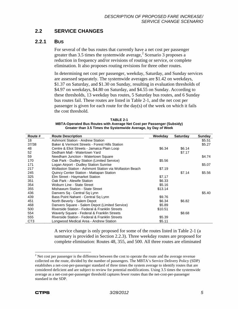
2.2.1 BUS For several of the bus routes that currently have a net cost per passenger greater than 3.5 times the systemwide average,2 Scenario 3 proposes a reduction in frequency and/or revisions of routing or service, or complete elimination. It also proposes routing revisions for three other routes.
In determining net cost per passenger, weekday, Saturday, and Sunday services are assessed separately. The systemwide averages are $1.42 on weekdays, $1.37 on Saturday, and $1.30 on Sunday, resulting in evaluation thresholds of $4.97 on weekdays, $4.80 on Saturday, and $4.55 on Sunday. According to these thresholds, 13 weekday bus routes, 5 Saturday bus routes, and 6 Sunday bus routes fail. These routes are listed in Table 2-1, and the net cost per passenger is given for each route for the day(s) of the week on which it fails the cost threshold.
TABLE 2-1
MBTA-Operated Bus Routes with Average Net Cost per Passenger (Subsidy) Greater than 3.5 Times the Systemwide Average, by Day of Week
Route # Route Description Weekday Saturday Sunday 18 Ashmont Station - Andrew Station $5.51 37/38 Baker & Vermont Streets - Forest Hills Station $5.27 48 Centre & Eliot Streets - Jamaica Plain Loop $6.34 $6.14 52 Dedham Mall - Watertown Yard $7.17 59 Needham Junction - Watertown Square $4.74 170 Oak Park - Dudley Station (Limited Service) $5.56 171 Logan Airport - Dudley Station Sunrise $5.07 217 Wollaston Station - Ashmont Station via Wollaston Beach $7.19 245 Quincy Center Station - Mattapan Station $7.14 $5.56 325 Elm Street - Haymarket Station $7.17 351 Oak Park - Alewife Station $6.33 354 Woburn Line - State Street $5.16 355 Mishawum Station - State Street $13.14 436 Danvers Sq - Central Sq Lynn $5.40 439 Bass Point Nahant - Central Sq Lynn $9.76 451 North Beverly - Salem Depot $6.34 $6.82 468 Danvers Square - Salem Depot (Limited Service) $5.89 500 Riverside Station - Federal & Franklin Streets $10.51 554 Waverly Square - Federal & Franklin Streets $8.68 555 Riverside Station - Federal & Franklin Streets $5.39 CT3 Longwood Medical Area - Andrew Station $5.11
A service change is only proposed for some of the routes listed in Table 2-1 (a summary is provided in Section 2.2.3). Three weekday routes are proposed for complete elimination: Routes 48, 355, and 500. All three routes are eliminated
2 Net cost per passenger is the difference between the cost to operate the route and the average revenue collected on the route, divided by the number of passengers. The MBTA’s Service Delivery Policy (SDP) establishes a net-cost-per-passenger standard of three times the system average to identify routes that are considered deficient and are subject to review for potential modifications. Using 3.5 times the systemwide average as a net-cost-per-passenger threshold captures fewer routes than the net-cost-per-passenger standard in the SDP.

DESCRIPTION OF PROPOSED FARE INCREASE/ SERVICE CHANGE SCENARIO
6 3/28/2012 Boston Region MPO
because of their high net cost per passenger and low ridership, and the fact that other transit services are nearby.3 These eliminations would likely require many of these passengers to walk a greater distance to access other transit services or to transfer between services at a greater rate. As an alternative for passengers using one of the four daily reverse-commute trips on Route 355, it is recommended that the inbound commuter rail train on the Lowell Line that passes through Mishawum Station around 3:36 PM stop at the station. As for weekend service, five routes on Saturday (Routes 48, 52, 245, 451, and 554) and four routes on Sunday (Routes 18, 37/38, 245, and 436) are recommended for elimination. Collectively, the eliminations proposed on these selected routes affect approximately 65,000 annual weekday unlinked trips, 40,000 annual Saturday unlinked trips, and 28,000 annual Sunday unlinked trips, for a total of 133,000 annual trips, or 0.12 percent of all annual MBTA bus unlinked trips.
Route revisions are proposed for three of the routes listed in Table 2-1: Routes 217, 439, and 555. For Route 217, the route segment serving Wollaston Beach is recommended for elimination. However, several school trips are combined with Route 217, which extends service on these trips to Ashmont Station. For Route 439, the recommendations are the elimination of service between Vinnin Square and Central Square, Lynn, and the extension of service beyond Central Square, Lynn, to Wonderland Station for 1.5 round-trips out of each day’s trips. Route 555 is merged into the schedule of Route 553 and the route terminus moved from Riverside Station to Central Square, Waltham. This variation of Route 553 would still serve Copley Square. Finally, it is also recommended that weekday Haymarket services on Routes 441, 442, and 455 terminate at Wonderland Station, replicating the weekend routing; while these routes do not have a net cost per passenger greater than 3.5 times the systemwide average, the revision of these routes would save nearly $0.5 million in annual operating costs. Passengers on these routes would need to transfer to the Blue Line, but the fare on these bus routes would be lowered from the current Inner Express fare to a Local Bus fare. Passengers still wanting a one-seat ride to and from downtown Boston could use Routes 448, 449, and 459.
In addition to the route revisions described above, Scenario 3 recommends the elimination of midday-only weekday service for Routes 354 and 451. This proposal maintains peak-period weekday service on these routes. When the unlinked trips on these two routes are added to the unlinked trips of riders affected by the routing revisions (on Routes 217, 439, 441, 442, 455, and 555), the annual weekday total is approximately 297,000, or 0.28 percent of all annual MBTA bus unlinked trips.
Changes to the frequency of service are recommended for five routes listed in Table 2-1. Weekday peak service is maintained for Route 52, but midday frequency is reduced from 45 minutes to 90 minutes. The total number of trips
3 Parts of Route 48 are also served by the Orange Line and Routes 22, 29, 41, and 44; Route 355 passengers can use commuter rail; Route 500 passengers can use the Green Line D Branch.

DESCRIPTION OF PROPOSED FARE INCREASE/ SERVICE CHANGE SCENARIO
CTPS 3/28/2012 7
on Route 217 is reduced from 11 to 4.5 round-trips. Frequency on Route 351 is reduced from 30 minutes to 45 minutes. The total number of trips on Route 439 is reduced from 9 to 5 round-trips, with 1.5 round-trips serving the route’s extension to Wonderland Station. Weekday peak service is maintained for Route CT3, but midday frequency is reduced from 30 minutes to 60 minutes. Collectively, the frequency reductions proposed on these selected routes affect approximately 69,000 annual weekday unlinked trips, or 0.06 percent of all annual MBTA bus unlinked trips. On Saturday, the only frequency reduction is proposed for Route 465, from 70 minutes to 120 minutes. With the proposed elimination of Route 451 service and the fact that buses are currently shared between Routes 451 and 465, the reduction in Route 465 frequency would avoid having Route 465 buses sit idle between trips. This proposal affects approximately 17,000 annual Saturday unlinked trips.
For private bus routes (routes that are part of the Private Carrier Bus Program or the Suburban Bus Program, under which bus service is funded by the MBTA but operated by a private contractor), two changes are recommended. First, the private-carrier route serving Medford (Route 710) is recommended for elimination, since a portion of this route would still be served by MBTA Route 134. Second, a reduction of 50 percent is recommended for the subsidy provided to all Suburban Bus Program recipients. While it is unknown how this reduction in subsidies might affect recipients’ decisions regarding whether to modify or to not operate service, this policy could potentially affect all passengers currently riding these routes. The sum of annual unlinked trips on Route 710 and all Suburban Bus Program routes is approximately 169,000 on weekdays and 4,000 on Saturdays, for a total of 173,000 annual trips, or 23.5 percent of all annual unlinked trips on routes subsidized through the Private Carrier Bus and Suburban Bus Programs. This total is 0.16 percent of annual unlinked trips on all bus routes (both MBTA and private bus routes).
Figure 2-1 presents a map of weekday service that shows MBTA and private bus routes and the service changes proposed in Scenario 3. Figures 2-2 and 2-3 do the same for Saturday and Sunday services, respectively. The figures also present estimates of the numbers of unlinked trips that would be affected by the proposed service changes.
2.2.2 RAPID TRANSIT, COMMUTER RAIL, FERRY, AND THE RIDE Two changes are proposed in Scenario 3 for rapid transit. First, the elimination of weekend service on the Green Line E Branch between Brigham Circle and Heath Street is recommended. An average of 7.3 passengers per trip use this segment of the Green Line on Saturday, and on Sunday this average is 5.1 passengers per trip. It is assumed that these passengers could use Route 39, which duplicates service on much of the Green Line, including between Brigham Circle and Heath Street. The second proposed change affects the Mattapan High-Speed Line on Saturday between 6:00 AM and 10:00 AM and between 8:00 PM and 1:00 AM, and on Sunday all day. It is recommended that the frequency be reduced from every 11–13 minutes to every 23–26 minutes

DESCRIPTION OF PROPOSED FARE INCREASE/ SERVICE CHANGE SCENARIO
8 3/28/2012 Boston Region MPO
(this is the frequency that is estimated to result from the elimination of one of the two trains serving the line during these time periods while maintaining coordination with every other Red Line train at Ashmont Station). Ridership during these time periods currently averages between eight and nine passengers per trip. The combined existing annual unlinked trips on the Green Line E Branch between Brigham Circle and Heath Street and on the Mattapan High-Speed Line during the defined time periods is 116,000 on Saturday and 89,000 on Sunday, for a total of 205,000 annual trips, or 0.31 percent of all annual unlinked trips on light rail.
Of the ferry routes, the F1 service between Hingham and Rowes Wharf and the F2H service between Quincy, Hull, Logan Airport, and Long Wharf currently operate only on weekdays, and the F2 service between Quincy, Logan Airport, and Long Wharf and the F4 Inner Harbor Ferry service currently operate on weekdays, Saturdays, and Sundays. It is recommended in Scenario 3 that weekend F2 service be eliminated, but no service changes are proposed for the other ferry services. It is assumed that weekend F2 riders could use the Red Line. Existing Saturday ridership on the F2 service is approximately 42,000 annual trips; existing Sunday ridership is approximately 29,000. The combined weekend ridership total is 71,000, or 5.5 percent of all annual trips on ferry routes.
The elimination of weekend service is recommended for the commuter rail lines with the lowest weekend ridership totals. These are the Greenbush Line and the Plymouth/Kingston Line on Saturday and Sunday, and the Needham Line on Saturday (the Needham Line already does not operate on Sunday). Together, these lines serve approximately 179,000 annual trips on Saturday and 113,000 annual trips on Sunday. The combined weekend ridership total is 292,000, or 0.79 percent of all annual trips on commuter rail.
Finally, while no service reductions per se are proposed for THE RIDE, the increase in fares and the institution of a premium-fare zone are estimated to reduce the demand for service in Scenario 3, saving the MBTA the cost of serving the trips no longer made. Based on an analysis of a sample day of RIDE trips in which the trip pick-up and drop-off locations are linked,4 it was estimated that 11.7 percent of existing RIDE trips would fall into the premium-
4 Linking the trip pick-up and drop-off locations permits an analysis of not only how many trips are located outside the required ADA buffer, but also how many trips cross the border of this buffer into the premium-fare zone, for which the ADA permits a premium fare to be charged. According to the sample day, 1.1 percent of RIDE trips had both a pick-up and drop-off location outside the ADA buffer and 10.7 percent had one pick-up or drop-off location inside the buffer and the corresponding drop-off or pick-up location outside the buffer. An analysis of an annual total of all RIDE pick-up and drop-off locations that are not linked indicated that 6.4 percent of locations were outside the ADA buffer. If one assumes, from the sample day, that approximately 10 percent of all premium fares have both the pick-up and drop-off locations outside the ADA buffer (1.1 percent divided by 10.7 percent), then approximately 90 percent of the 6.4 percent of premium-fare locations in the annual total, or 5.7 percent, could be assumed to have either a corresponding pick-up or drop-off location within the ADA buffer. The sum of 6.4 percent and 5.7 percent, which represents the percentage of locations associated with trips charged at the premium fare, is 12.1 percent, which is close to the 11.7 percent estimated using the sample day. Based on this comparison of the annual and the sample-day trips, sufficient confidence was felt in the percentage from the sample day.

DESCRIPTION OF PROPOSED FARE INCREASE/ SERVICE CHANGE SCENARIO
CTPS 3/28/2012 9
fare category.
Figure 2-1 presents a map of weekday service that shows rapid transit and ferry routes and the service changes proposed in Scenario 3. Figures 2-2 and 2-3 do the same for Saturday and Sunday services, respectively. The figures also present estimates of the numbers of unlinked trips that would be affected by the proposed service changes.
2.2.3 SUMMARY OF SERVICE CHANGES In summary, Scenario 3 includes the following service changes:
• Bus o Eliminate the following routes: Weekday: 48, 355, and 500.
Saturday: 48, 52, 245, 451, and 554. Sunday: 18, 37/38, 245, and 436.
o Revise the routing: Weekday: 217, 439, 441, 442, 455, and 555 o Eliminate midday service: Weekday: 354 and 451 o Reduce the frequency: Weekday: 52, 217, 351, 439, and CT3
• Rapid Transit o Eliminate weekend service on the Green Line E Branch between
Brigham Circle and Heath Street o Reduce frequency on the Mattapan High-Speed Line on
Saturday from 6:00 AM to 10:00 AM and from 8:00 PM to 1:00 AM, and all day Sunday
• Commuter Rail: Eliminate the following service: o Saturday: Needham Line, Plymouth/Kingston Line, and
Greenbush Line o Sunday: Plymouth/Kingston Line and Greenbush Line
• Ferry: Eliminate weekend service on Quincy Ferry (Route F2) • Private Bus: Eliminate Private Carrier Bus Program in Medford (Route
710) and reduce subsidies by 50 percent to Suburban Bus Program in all locations (Bedford, Beverly, Boston [Mission Hill], Burlington, Dedham, and Lexington)
Figures 2-1, 2-2, and 2-3 all show the numbers of riders while Figure 2-4 shows the relative percentages of riders on each mode that are affected by the proposed service changes (eliminations, revisions, and frequency reductions) in Scenario 3. Table 2-2 summarizes four measures of service that are affected by the proposed scenario. The four measures are unlinked trips (the number of trips riders take on each transit vehicle), passenger miles (the total number of miles traveled on those unlinked trips), vehicle revenue hours (the total number of hours all transit vehicles are in service), and vehicle revenue miles (the total number of miles traveled by those transit vehicles in service). The table also presents the number of MBTA jobs that are estimated to be lost and the number of MBTA buses that could be removed from service. Scenario 3 generally reduces bus and commuter rail service on routes traversing longer distances, which is why the percentages of passenger miles, vehicle revenue hours, and vehicle revenue miles affected are greater than the percentage of unlinked trips.

BOSTON
HINGHAM
CANTON
QUINCY
LYNN
NORWELL
NEWTON
WALPOLE
BILLERICA
MILTON
PEABODY
SCITUATE
SHARON
BEVERLY
WEYMOUTH
DOVER
LEXINGTON
WOBURN
WALTHAM
SAUGUS
HANOVER MARSHFIELD
NEEDHAM
BRAINTREE
DEDHAM
SALEM
WILMINGTON
BEDFORD
READING
DANVERS
NORWOOD
STOUGHTON
WESTON
LYNNFIELD
RANDOLPH
WESTWOOD
COHASSET
BURLINGTON
AVON ABINGTON
REVERE
WAKEFIELD
MEDFORD
HOLBROOK
WELLESLEY
MALDEN
NORTH READING
MELROSE
BELMONT
WINCHESTER
ARLINGTONEVERETT
MANCHESTER
WATERTOWN
ROCKLAND
LINCOLN
MEDFIELD
STONEHAM
CAMBRIDGE
BROOKLINE
HULL
SOMERVILLE
MARBLEHEAD
BROCKTON
MIDDLETON
CHELSEA
SWAMPSCOTT
TEWKSBURY
WINTHROP
NAHANT
PEMBROKE
GLOUCESTERWENHAM
NORFOLK
CONCORD
LegendBus: Maintained ServiceRapid Transit: Maintained ServiceFerry: Maintained ServiceReduced-Frequency ServiceMidday-Only Eliminated ServiceEliminated ServiceSuburban Bus Program Service
FIGURE 2-1Scenario 3 Weekday Bus, Rapid Transit, andFerry Service Changes
CTPS - 3/28/20120 2 41 Miles
Route Eliminations (65,000 annual trips):- Eliminate routes: 48, 355, and 500Route Revisions (297,000 annual trips):- Route 217: Eliminate Wollaston Beach section- Route 354: Eliminate midday service- Route 439: Eliminate service between Central Square (Lynn) and Vinnin Square; extend service to Wonderland- Route 441: Eliminate service between Wonderland and Haymarket- Route 442: Eliminate service between Wonderland and Haymarket- Route 451: Eliminate midday service- Route 455: Eliminate service between Brown Circle and Haymarket and terminate at Wonderland- Route 555: Change terminus from Riverside to Central Square (Waltham)Reduce Frequency (69,000 annual trips):- Route 52: From 45 to 90 minutes in midday- Route 217: From 11 to 4.5 round-trips- Route 351: From 30 to 45 minutes- Route 439: From 9 to 5 round-trips; 1.5 round-trips to serve Wonderland- Route CT3: From 30 to 60 minutes in middayEliminate Private Carrier Bus Program in Medford (Route 710) and reduce Suburban Bus Program subsidies by 50% in all locations (Bedford, Boston[Mission Hill], Beverly, Burlington, Dedham, andLexington) (169,000 annual trips)
BOSTON
REVEREMEDFORD
MALDEN
CAMBRIDGE
BROOKLINE
ARLINGTON
EVERETT
SOMERVILLE
QUINCY
BELMONT CHELSEA
WATERTOWN
WINCHESTER
NEWTON
WINTHROP
SAUGUSMELROSE
MILTON
±

BOSTON
HINGHAM
CANTON
QUINCY
LYNN
NORWELL
NEWTON
WALPOLE
BILLERICA
MILTON
PEABODY
SCITUATE
SHARON
WEYMOUTH
BEVERLY
DOVER
LEXINGTON
WOBURN
WALTHAM
HANOVER
SAUGUS
MARSHFIELD
NEEDHAM
BRAINTREE
DEDHAM
SALEM
WILMINGTON
BEDFORD
READING
DANVERS
STOUGHTON
NORWOOD
LYNNFIELD
WESTON
RANDOLPH
WESTWOOD
COHASSET
BURLINGTON
AVON ABINGTON
REVERE
WAKEFIELD
MEDFORD
HOLBROOK
MALDEN
WELLESLEY
NORTH READING
MELROSE
BELMONT
WINCHESTER
ARLINGTONEVERETT
MANCHESTER
WATERTOWN
BROCKTON
ROCKLAND
LINCOLN
MEDFIELD
STONEHAM
CAMBRIDGE
BROOKLINE
HULL
SOMERVILLE
MARBLEHEAD
CHELSEA
MIDDLETON
SWAMPSCOTT
TEWKSBURY
WINTHROP
NAHANT
PEMBROKE
GLOUCESTERWENHAM
NORFOLK
CONCORD
FIGURE 2-2Scenario 3 Saturday Bus, Rapid Transit, andFerry Service Changes
CTPS - 3/28/20120 2 41 Miles
Route Eliminations (82,000 annual trips):- Eliminate routes: 48, 52, 245, 451, 554 and Quincy ferry (Route F2)Route Revisions (107,000 annual trips):- Green Line E Branch: Eliminate service between Brigham Circle and Heath StreetReduce Frequency (27,000 annual trips):- Route 465: From 70 to 120 minutes- Mattapan High-Speed Line: From 11-13 to 23-26 minutes, 6:00 to 10:00 AM and 8:00 PM to 1:00 AMEliminate Private Carrier Bus Program in Medford (Route 710) and reduce Suburban Bus Programsubsidies by 50% in both locations (Boston [Mission Hill]and Beverly) (4,000 annual trips)
BOSTON
REVEREMEDFORD
MALDEN
CAMBRIDGE
BROOKLINE
ARLINGTON
EVERETT
SOMERVILLEBELMONT CHELSEA
WATERTOWN
WINCHESTER
QUINCY
WINTHROP
SAUGUSMELROSE
LegendBus: Maintained ServiceRapid Transit: Maintained ServiceFerry: Maintained ServiceReduced-Frequency ServiceEliminated ServiceSuburban Bus Program Service±

BOSTON
HINGHAM
CANTON
QUINCY
LYNN
NORWELL
NEWTON
WALPOLE
BILLERICA
MILTON
PEABODY
SCITUATE
SHARON
WEYMOUTH
BEVERLY
LEXINGTON
DOVER
WOBURN
HANOVER
WALTHAM
SAUGUS
MARSHFIELD
NEEDHAM
BRAINTREE
DEDHAM
SALEM
WILMINGTON
BEDFORD
READING
DANVERS
STOUGHTON
NORWOOD
LYNNFIELD
RANDOLPH
WESTWOOD
COHASSET
BURLINGTON
WESTON
ABINGTONAVON
REVERE
WAKEFIELD
MEDFORD
HOLBROOK
MALDEN
WELLESLEY
NORTH READING
MELROSE
BELMONT
WINCHESTER
ARLINGTONEVERETT
MANCHESTER
BROCKTON
WATERTOWN
ROCKLAND
LINCOLN
STONEHAM
CAMBRIDGE
MEDFIELD
BROOKLINE
HULL
SOMERVILLE
MARBLEHEAD
CHELSEA
MIDDLETON
SWAMPSCOTT
TEWKSBURY
WINTHROP
PEMBROKE
NAHANT
GLOUCESTERWENHAM
NORFOLK
CONCORD
FIGURE 2-3Scenario 3 Sunday Bus, Rapid Transit, andFerry Service Changes
CTPS - 3/28/20120 2 41 Miles
Route Eliminations (57,000 annual trips):- Eliminate routes: 18, 37/38, 245, 436 and Quincy ferry F2Route Revisions (68,000 annual trips):- Green Line E Branch: Eliminate service between Brigham Circle and Heath StReduce Frequency (21,000 annual trips):- Mattapan High-Speed Line: From 11-13 to 23-26 minutes all day
BOSTON
REVEREMEDFORD
MALDEN
CAMBRIDGE
BROOKLINE
ARLINGTON
EVERETT
SOMERVILLEBELMONT CHELSEA
WATERTOWN
WINCHESTER
NEWTON
QUINCY
WINTHROP
SAUGUSMELROSE
MILTON
±
LegendBus: Maintained ServiceRapid Transit: Maintained ServiceFerry: Maintained ServiceReduced-Frequency ServiceEliminated Service

DESCRIPTION OF PROPOSED FARE INCREASE/ SERVICE CHANGE SCENARIO
CTPS 3/28/2012 13
TABLE 2-2 Percentage of Service Affected
Measure Number Percent Unlinked Trips 1,212,242 0.3% Passenger Miles 8,692,607 0.5% Vehicle Revenue Hours 60,677 1.2% Vehicle Revenue Miles 1,076,494 1.4% MBTA Jobs Lost 15 Buses Removed 3
2.3 FARE INCREASE: SINGLE-RIDE FARES, PASS PRICES, AND PARKING RATES Table 2-3 presents the key existing and proposed single-ride fares for each fare category, along with the percentage change in price from the existing to the proposed price. Table 2-4 presents the existing and proposed pass prices for each pass category, along with the percentage change in price from the existing to the proposed price. Table 2-5 presents the existing and proposed parking rates for each parking facility, along with the percentage change in price from the existing to the proposed price.

DESCRIPTION OF PROPOSED FARE INCREASE/ SERVICE CHANGE SCENARIO
14 3/28/2012 Boston Region MPO
TABLE 2-3 Key Single-Ride Fares: Existing and Proposed
Fare Category Existing Proposed % Chg. $ Chg. CharlieCard Adult Local Bus $1.25 $1.50 20.0% $0.25 Rapid Transit $1.70 $2.00 17.6% $0.30 Bus + RT* $1.70 $2.00 17.6% $0.30 Inner Express $2.80 $3.50 25.0% $0.70 Outer Express $4.00 $5.00 25.0% $1.00 Senior Local Bus $0.40 $0.75 87.5% $0.35 Rapid Transit $0.60 $1.00 66.7% $0.40 Bus + RT* $0.60 $1.00 66.7% $0.40 Student Local Bus $0.60 $0.75 25.0% $0.15 Rapid Transit $0.85 $1.00 17.6% $0.15 Bus + RT* $0.85 $1.00 17.6% $0.15 CharlieTicket Adult Local Bus $1.50 $2.00 33.3% $0.50 Rapid Transit $2.00 $2.50 25.0% $0.50 Bus + RT* $3.50 $4.50 28.6% $1.00 Inner Express $3.50 $4.50 28.6% $1.00 Outer Express $5.00 $6.50 30.0% $1.50 Commuter Rail** Zone 1A $1.70 $2.00 17.6% $0.30 Zone 1 $4.25 $5.50 29.4% $1.25 Zone 2 $4.75 $6.00 26.3% $1.25 Zone 3 $5.25 $6.75 28.6% $1.50 Zone 4 $5.75 $7.25 26.1% $1.50 Zone 5 $6.25 $8.00 28.0% $1.75 Zone 6 $6.75 $8.75 29.6% $2.00 Zone 7 $7.25 $9.25 27.6% $2.00 Zone 8 $7.75 $10.00 29.0% $2.25 Zone 9 $8.25 $10.50 27.3% $2.25 Zone 10*** N/A $11.00 N/A N/A InterZone 1 $2.00 $2.50 37.5% $0.50 InterZone 2 $2.25 $3.00 33.3% $0.75 InterZone 3 $2.50 $3.25 30.0% $0.75 InterZone 4 $2.75 $3.50 36.4% $0.75 InterZone 5 $3.00 $4.00 41.7% $1.00 InterZone 6 $3.50 $4.50 35.7% $1.00 InterZone 7 $4.00 $5.00 31.3% $1.00 InterZone 8 $4.50 $5.50 27.8% $1.00 InterZone 9*** N/A $6.00 N/A N/A InterZone 10*** N/A $6.50 N/A N/A Ferry F1 $6.00 $8.00 33.3% $2.00 F2: Boston $6.00 $8.00 33.3% $2.00 F2: X-Harbor $10.00 $13.00 30.0% $3.00 F2: Logan $12.00 $16.00 33.3% $4.00 Inner Harbor $1.70 $3.00 76.5% $1.30 THE RIDE ADA Territory $2.00 $4.00 100.0% $2.00 Premium Territory*** N/A $5.00 N/A N/A
* “Bus + RT” indicates the linked-trip price of a trip on both local bus and rapid transit. ** Multi-ride and onboard ticket prices are described in Section 2.1, Fare Structure Changes. *** This fare category does not currently exist; therefore, both the existing price and percent
change are marked as “N/A.”

DESCRIPTION OF PROPOSED FARE INCREASE/ SERVICE CHANGE SCENARIO
CTPS 3/28/2012 15
TABLE 2-4 Pass Prices: Existing and Proposed
Pass Category Existing Proposed % Chg. $ Chg. Local Bus $40.00 $48.00 20.0% $8.00 LinkPass $59.00 $70.00 18.6% $11.00 Senior/TAP $20.00 $28.00 40.0% $8.00 Student 5-Day $20.00 $25.00 25.0% $5.00 Student 7-Day* N/A $28.00 N/A N/A 1-Day $9.00 $11.00 22.2% $2.00 7-Day $15.00 $18.00 20.0% $3.00 Inner Express $89.00 $110.00 23.6% $21.00 Outer Express $129.00 $160.00 24.0% $31.00 Commuter Rail Zone 1A $59.00 $70.00 18.6% $11.00 Zone 1 $135.00 $173.00 28.1% $38.00 Zone 2 $151.00 $189.00 25.2% $38.00 Zone 3 $163.00 $212.00 30.1% $49.00 Zone 4 $186.00 $228.00 22.6% $42.00 Zone 5 $210.00 $252.00 20.0% $42.00 Zone 6 $223.00 $275.00 23.3% $52.00 Zone 7 $235.00 $291.00 23.8% $56.00 Zone 8 $250.00 $314.00 25.6% $64.00 Zone 9 $265.00 $329.00 24.2% $64.00 Zone 10* N/A $345.00 N/A N/A InterZone 1 $65.00 $82.00 26.2% $17.00 InterZone 2 $77.00 $100.00 29.9% $23.00 InterZone 3 $89.00 $109.00 22.5% $20.00 InterZone 4 $101.00 $118.00 16.8% $17.00 InterZone 5 $113.00 $134.00 18.6% $21.00 InterZone 6 $125.00 $151.00 20.8% $26.00 InterZone 7 $137.00 $167.00 21.9% $30.00 InterZone 8 $149.00 $184.00 23.5% $35.00 InterZone 9* N/A $201.00 N/A N/A InterZone 10* N/A $218.00 N/A N/A Commuter Boat $198.00 $262.00 32.3% $64.00
* This fare category does not currently exist; therefore, both the existing price and percent change are marked as “N/A.”
The overall price increase across all modes and fare/pass categories is approximately 22.6 percent. This systemwide average is based on the weighted averages that were calculated by multiplying the percentage change in price for each fare/pass category by the existing ridership in that category and dividing by total existing modal ridership. Table 2-6 presents these weighted average percentage increases by modal category. Note that the percentage changes in price can differ between modes that are similarly priced (such as local bus and the Silver Line–Washington Street, or subway and surface light rail) because of differences in how the riders on these modes pay for their trips.
In Scenario 3, the percentage change in prices (Table 2-6) is relatively consistent across modal categories except for ferry and THE RIDE. The latter faces a significant price increase with the introduction of the premium fare and the change in how the base fare is defined. The large price increase for ferry is driven by the percentage changes in the prices for the F1 and F4 services. Commuter rail receives the next-greatest percentage price increase; this is meant to compensate for the fact that no increase in commuter rail park-and-ride facility rates, except for the Route 128 facility, is proposed.

DESCRIPTION OF PROPOSED FARE INCREASE/ SERVICE CHANGE SCENARIO
16 3/28/2012 Boston Region MPO
TABLE 2-5 Park-and-Ride Facility Rates: Existing and Proposed
Park-and-Ride Facility
Existing Proposed % Chg. $ Chg.
Alewife $7.00 $7.00 0.0% $0.00 Beachmont $5.00 $5.00 0.0% $0.00 Braintree $7.00 $7.00 0.0% $0.00 Chestnut Hill $5.50 $6.00 9.1% $0.50 Eliot $5.50 $6.00 9.1% $0.50 Forest Hills $6.00 $6.00 0.0% $0.00 Lechmere $5.50 $6.00 9.1% $0.50 Malden $5.50 $6.00 9.1% $0.50 Mattapan* $4.50 $4.00 -11.1% -$0.50 Milton* $5.00 $4.00 -20.0% $1.00 North Quincy $5.00 $5.00 0.0% $0.00 Oak Grove $5.50 $6.00 9.1% $0.50 Orient Heights $5.00 $5.00 0.0% $0.00 Quincy Adams $7.00 $7.00 0.0% $0.00 Quincy Center $7.00 $7.00 0.0% $0.00 Riverside $5.75 $6.00 4.3% $0.25 Suffolk Downs $5.00 $5.00 0.0% $0.00 Sullivan $5.50 $6.00 9.1% $0.50 Waban $5.50 $6.00 9.1% $0.50 Wellington $5.50 $6.00 9.1% $0.50 Wollaston $5.00 $5.00 0.0% $0.00 Woodland $6.00 $6.00 0.0% $0.00 Wonderland $5.00 $5.00 0.0% $0.00 Express Bus** $5.00 $5.00 0.0% $0.00 Commuter Rail** $4.00 $4.00 0.0% $0.00 Route 128*** $5.00 $7.00 40.0% $2.00 Ferry** $3.00 $4.00 33.3% $1.00
* The Mattapan and Milton facilities currently have a $3.00 parking rate, as they are part of the “Competitive Lots Program,” which investigates lowering the parking rate at underutilized facilities. The existing rates listed in the table are those that were in place before the program. This program is intended to terminate on July 1, 2012, and the rates are programmed to increase to those listed as proposed.
** Park-and-ride daily facility rates are the same for all facilities serving these modes except for the Route 128 facility. The Fore River Shipyard Ferry Terminal in Quincy also has overnight and weekly rates that are currently set at $6.00 and $36.00, respectively. These proposed rates will increase to $8.00 and $48.00, respectively.
*** The park-and-ride rate at the Route 128 facility is currently set at $5.00 for the first 14 hours and $12.00 for each day thereafter. The post-14 hour rate will increase to $14.00 per day.
The percentage change in prices (Table 2-6) for parking is less than the percentage changes in single-ride fares and pass prices. This is because parking rate increases are proposed only for those facilities that are at or above 100 percent utilization. This includes several subway and surface light rail parking facilities and the Route 128 facility. The zero percent changes for the facilities with less than 100 percent utilization bring down the percentage changes in the parking price for subway, surface light rail, and commuter rail as well as for the overall parking category. Note that the average “fares” (in this case, the parking rates) for park-and-ride facility modal categories, as in all the other modal categories, reflect the unlinked-trip price rather than the linked-trip price.

DESCRIPTION OF PROPOSED FARE INCREASE/ SERVICE CHANGE SCENARIO
CTPS 3/28/2012 17
The largest proposed percentage increases in price (Table 2-6) within a modal category are generally for CharlieTicket and onboard cash fares. These increases are greater than the more modest increases in the CharlieCard fares, due to the greater price increases assessed to CharlieTicket and onboard cash fares for the local bus, express bus, and rapid transit modes. The increase in CharlieTicket and onboard cash fares is most apparent when comparing those fare categories with the CharlieCard with respect to the price for transfers between local bus and rapid transit service. With a CharlieCard, a “step-up” transfer between those modes would make the total price for a linked trip $2.00. The “step-up” transfer benefit is not available on CharlieTickets, however, resulting in a total proposed linked-trip price of $4.50 using CharlieTickets or onboard cash.
TABLE 2-6 Weighted Average Percentage Change in Average Fares,
by Modal Category, for Unlinked Trips
Modal Category % Change Bus 23.9% Local Bus 23.5% Inner Express 27.7% Outer Express 26.4% Rapid Transit 19.7% Subway 19.6% SL Washington 24.7% SL Waterfront 20.5% Surface Light Rail 20.0% Commuter Rail 29.2% Zone 1A 19.4% Zone 1 30.0% Zone 2 26.1% Zone 3 30.5% Zone 4 23.9% Zone 5 22.9% Zone 6 25.9% Zone 7 25.4% Zone 8 27.4% Zone 9 26.9% InterZone 25.3% Onboard 73.1% Ferry 43.1% F1 42.4% F2: Boston 34.6% F2: X-Harbor 30.3% F2: Logan 33.4% Inner Harbor 69.8% THE RIDE 100.0% ADA Territory 94.9% Premium Territory 140.0% Parking 1.2% Express Bus 0.0% Subway 1.1% Surface Light Rail 3.6% Commuter Rail 0.3% Ferry 33.3% Total System 22.6%

DESCRIPTION OF PROPOSED FARE INCREASE/ SERVICE CHANGE SCENARIO
18 3/28/2012 Boston Region MPO
The percentage increase in pass prices is generally less than that in the respective single-ride fares. Pass prices increase by various amounts in order to maintain or revise certain cash-fare equivalents (based on the lowest-priced respective single-ride fare), which are the number of single-ride trips equivalent to the total pass price. The difference between the lowest and highest cash-fare-equivalent values of the various commuter rail passes is reduced. The cash-fare equivalents of commuter rail passes currently range from 31.05 to 33.60 trips per pass; under the proposed fare increase in Scenario 3, the cash-fare equivalent would range from 31.33 to 31.50 trips per pass. For local bus, express bus, and rapid transit passes, the cash-fare equivalent would decrease or remain virtually the same.
CTPS 3/28/2012 19
Methods Used to Estimate Ridership and Revenue
Two separate approaches were used in this analysis to project the impact of the proposed fare increase and service reductions on MBTA ridership and revenue. One approach utilized a set of spreadsheets created by CTPS in consultation with the MBTA specifically for the purpose of such calculations. The second approach consisted of applying the Boston Region MPO’s regional travel demand model set to estimate demand for each MBTA mode using the existing and proposed fare levels.
The travel demand model set was also employed as a complement to the spreadsheet model in the 2007 Pre–Fare Increase Impacts Analysis, with the two models together providing an indication of the potential range of impacts on ridership and revenue. In addition, unlike the spreadsheet model, the travel demand model set can also be used to conduct the air quality and environmental justice impact analyses.
3.1 CTPS SPREADSHEET MODEL APPROACH The spreadsheet model was used to estimate the revenue and ridership impacts of the fare increase component of the proposed scenario. This model reflects the many fare-payment categories of the MBTA pricing system and applies price elasticities to analyze various changes across these categories. The accuracy of this methodology was proven to be satisfactory through the 2007 Post–Fare Increase Impacts Analysis, which included an analysis of its effectiveness in predicting the impacts of the proposed 2007 fare increase.
3.1.1 MODELING OF EXISTING RIDERSHIP AND REVENUE Inputs to the spreadsheet model included existing ridership in the form of unlinked trips by mode, by fare-payment method, and by fare-media type. An unlinked trip is an individual trip on any one transit vehicle; any trip using multiple vehicles—so-called “linked” trips—is counted as multiple unlinked trips.
Existing ridership5 (to which the spreadsheet model applies price elasticity figures – see Section 3.1.2) for the local bus, express bus, and rapid transit
5 Existing ridership is that for fiscal year 2011 (July 1, 2010–June 30, 2011).

METHODS USED TO ESTIMATE RIDERSHIP AND REVENUE
20 3/28/2012 Boston Region MPO
networks was provided in the form of automated fare-collection (AFC) data. Data were provided by month, with subtotals of transactions (unlinked trips) by the various possible combinations of product type (single-ride fare or pass) and stock (smart card, magnetic-stripe ticket, etc.). AFC data were also provided at the modal level at which each transaction occurs. More detailed information on AFC fare types, modes, and media can be found in the appendix.
Because AFC equipment has not yet been deployed on commuter rail and commuter boat, the number of trips on these modes was estimated using sales figures. Single-ride trips on commuter rail and ferry were set equal to the number of single-ride fares sold, while pass trips on these modes were estimated by dividing the number of pass sales by the estimated average number of trips made using the respective pass type, calculated as part of the 2007 Post–Fare Increase Impacts Analysis. Dividing the number of pass sales by the estimated number of trips per pass resulted in an estimate of the total number of pass trips for each pass type.
Other data used were estimates of the number of trips currently made using THE RIDE and the number of cars currently parked at transit stations. These data were provided to CTPS directly by the MBTA.
Because the spreadsheet model cannot estimate the ridership impacts of eliminating or revising service, estimates of the ridership changes that would be associated with service changes without a fare increase were first calculated separately in order to adjust the existing ridership numbers to reflect a post-service-change situation. The spreadsheet model then estimated the ridership and revenue impacts of a fare increase using the revised existing ridership as the baseline. The MBTA estimated the ridership loss associated with the service changes and provided those estimates to CTPS.
Revenue for single-ride trips was calculated in the spreadsheet model by multiplying the number of trips in each fare/modal category by that category’s price. Revenue for pass trips was calculated for each pass type by multiplying the number of pass sales by the pass price. Pass revenue was then distributed between modal categories based on each category’s ridership and weighted by each category’s single-ride fare.
The calculation of the change in ferry fare revenue collected by the MBTA presents a special challenge. Currently, the MBTA pays a subsidy to all contracted ferry operators, who collect and keep all fare revenue. Therefore, the MBTA does not currently receive any revenue whatsoever from ferry operations. However, under a new contract that will take effect at the start of FY 2013, the MBTA will receive the revenue from fare collection. Given this accounting change, the increase in ferry fare revenue specifically collected by the MBTA will consist of 100 percent of the existing revenue as well as whatever additional amount is collected because of the fare increase. However, this analysis assumed a net ferry revenue change consisting only of the additional fare revenue resulting from the fare increase.
METHODS USED TO ESTIMATE RIDERSHIP AND REVENUE
CTPS 3/28/2012 21
3.1.2 ESTIMATION OF RIDERSHIP CHANGES RESULTING FROM A FARE INCREASE Fares are one of many factors that influence the level of ridership on transit services. Price elasticity is the measure of either the expected or observed rate of change in ridership relative to a change in fares if all other factors remain constant. On a traditional demand curve that describes the relationship between price, on the y-axis, and demand, on the x-axis, elasticities are equivalent to the slope along that curve. As such, price elasticities are generally expected to be negative, meaning that a price increase will lead to a decrease in demand (with a price decrease having the opposite effect). The larger the negative value of the price elasticity (the greater its distance from zero), the greater the projected impact on demand. Larger (more negative) price elasticities are said to be relatively “elastic,” while smaller negative values, closer to zero, are said to be relatively “inelastic.” Thus, if the price elasticity of the demand for transit were relatively elastic, a given fare increase would cause a greater loss of ridership than if demand were relatively inelastic. An example of the application of price elasticities is demonstrated in the appendix.
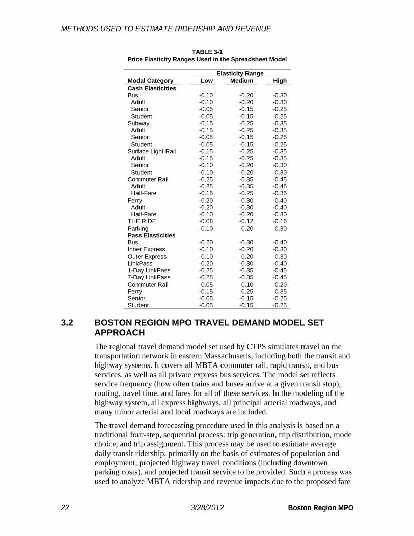
The spreadsheet model permits the use of various ranges of elasticities to estimate different possible ridership impacts of price increases. Performing calculations in the spreadsheet model with the same prices but with a range of higher and lower elasticities provides a range of estimates. In the present analysis, the model was generally set to use the middle range of elasticities, as these represent the best estimate of where the elasticities should be set based on past experiences. However, estimates were also made using more inelastic and elastic elasticities, as a sensitivity analysis of the model’s projections of the ridership losses and revenue gains. Table 3-1 presents the three elasticity ranges used in the spreadsheet model for this study’s analysis. For a description of how these elasticity values were determined, see the appendix.
An additional complexity of the spreadsheet model that provides increased accuracy is its use of ridership diversion factors. These factors reflect estimates of the likelihood of a switch in demand from one MBTA product type or mode to another as a result of a change in the relative prices. The diversion factors essentially work to redistribute demand between the two product types or modes after the respective price elasticities have been applied. The appendix provides examples of the application of diversion factors and the methodology for combining the use of price elasticities and diversion factors. These examples reflect the methodology used in the present analysis. While diversion factors estimate the diversion of riders between MBTA product types and modes based on their price, the spreadsheet model can only estimate the total loss of riders from the MBTA transit system, not the diversion of riders to specific non-MBTA modes such as driving or walking.
METHODS USED TO ESTIMATE RIDERSHIP AND REVENUE
22 3/28/2012 Boston Region MPO
TABLE 3-1 Price Elasticity Ranges Used in the Spreadsheet Model
Elasticity Range Modal Category Low Medium High Cash Elasticities Bus -0.10 -0.20 -0.30 Adult -0.10 -0.20 -0.30 Senior -0.05 -0.15 -0.25 Student -0.05 -0.15 -0.25 Subway -0.15 -0.25 -0.35 Adult -0.15 -0.25 -0.35 Senior -0.05 -0.15 -0.25 Student -0.05 -0.15 -0.25 Surface Light Rail -0.15 -0.25 -0.35 Adult -0.15 -0.25 -0.35 Senior -0.10 -0.20 -0.30 Student -0.10 -0.20 -0.30 Commuter Rail -0.25 -0.35 -0.45 Adult -0.25 -0.35 -0.45 Half-Fare -0.15 -0.25 -0.35 Ferry -0.20 -0.30 -0.40 Adult -0.20 -0.30 -0.40 Half-Fare -0.10 -0.20 -0.30 THE RIDE -0.08 -0.12 -0.16 Parking -0.10 -0.20 -0.30 Pass Elasticities Bus -0.20 -0.30 -0.40 Inner Express -0.10 -0.20 -0.30 Outer Express -0.10 -0.20 -0.30 LinkPass -0.20 -0.30 -0.40 1-Day LinkPass -0.25 -0.35 -0.45 7-Day LinkPass -0.25 -0.35 -0.45 Commuter Rail -0.05 -0.10 -0.20 Ferry -0.15 -0.25 -0.35 Senior -0.05 -0.15 -0.25 Student -0.05 -0.15 -0.25
3.2 BOSTON REGION MPO TRAVEL DEMAND MODEL SET APPROACH The regional travel demand model set used by CTPS simulates travel on the transportation network in eastern Massachusetts, including both the transit and highway systems. It covers all MBTA commuter rail, rapid transit, and bus services, as well as all private express bus services. The model set reflects service frequency (how often trains and buses arrive at a given transit stop), routing, travel time, and fares for all of these services. In the modeling of the highway system, all express highways, all principal arterial roadways, and many minor arterial and local roadways are included.
The travel demand forecasting procedure used in this analysis is based on a traditional four-step, sequential process: trip generation, trip distribution, mode choice, and trip assignment. This process may be used to estimate average daily transit ridership, primarily on the basis of estimates of population and employment, projected highway travel conditions (including downtown parking costs), and projected transit service to be provided. Such a process was used to analyze MBTA ridership and revenue impacts due to the proposed fare

METHODS USED TO ESTIMATE RIDERSHIP AND REVENUE
CTPS 3/28/2012 23
increase and service reductions.
The eastern Massachusetts geographic area represented in the model set is divided into several hundred areas known as transportation analysis zones (TAZs). The model set employs sophisticated and complex techniques in each of the four steps of the process. These steps can be very briefly summarized as follows.
Trip Generation: This step estimates the number of trips produced in and attracted to each TAZ. This is done using estimates of the population, employment, and other socioeconomic and household characteristics of each zone.
Trip Distribution: This step links the trip ends estimated in the trip generation step to form zonal trip interchanges (movements between pairs of zones). The output of this step is a trip table, which is a matrix containing the number of trips occurring in every origin-zone-to-destination-zone combination.
Mode Choice: This step allocates the person trips estimated in the trip distribution step to the two primary competing modes, automobile and transit, and to walking and biking. This allocation is based on the desirability or utility of each choice a traveler can opt for, based on the attributes of that choice and the characteristics of the individual. The resulting output of this step includes the percentage of trips that use automobiles and the percentage that use transit for all trips that have been generated.
Trip Assignment: This final step assigns the transit trips to the various transit modes, such as subway, commuter rail, local bus, or express bus. This is done by assigning each trip to one of several possible transit paths from one zone to another; each of these assignments is based on minimizing the generalized “cost” (including not only the transit fare, but also in-vehicle travel time, number of transfers, etc.). These paths may involve just one mode, such as express bus or commuter rail, or multiple modes, such as a local bus and a transfer to the subway. The trip assignment step also assigns the highway trips to the highway network. Thus, the traffic volumes on the highways and the ridership on the transit lines can be obtained from the outputs of this step.
Population and employment data are key inputs to the demand forecasting process; those used in this study were obtained from the Metropolitan Area Planning Council (MAPC). The highway travel times used in the analysis are those used in recent CTPS transit and highway studies. Downtown parking costs were obtained from recent CTPS studies. The travel demand model set assumes that, in general, people wish to minimize transfers. It also assumes that they may wish to minimize travel time, even if doing so costs more.
Note that the travel demand model set does not possess the capability of modeling THE RIDE, given the nature of paratransit service. As a result, the ridership and revenue impacts on THE RIDE that are included with the travel demand model set results are taken from the spreadsheet model results.
Existing revenue was estimated by multiplying the trips estimated by the model

METHODS USED TO ESTIMATE RIDERSHIP AND REVENUE
24 3/28/2012 Boston Region MPO
set for each mode by the average fare for that mode. The average fares were based on calculations in the spreadsheet model. The revenue impact was estimated by taking the ratio from the spreadsheet model of each mode’s change in revenue divided by the change in unlinked trips and applying this to the travel demand model set’s estimate of the change in that mode’s unlinked trips.
3.3 DIFFERENCES BETWEEN THE TWO ESTIMATION METHODOLOGIES There are several differences between the two methodologies. The spreadsheet model is primarily used to estimate the impacts of a fare change (though the estimated ridership impacts of service changes can be added to the model as an adjustment to existing ridership, so that the spreadsheet model’s projections will reflect the impacts of a simultaneous change in fare and service). On the other hand, the travel demand model set can forecast both impacts caused by fare changes and those caused by service changes.
The chief strengths of the spreadsheet model are that it accounts for every distinct type of fare that can be paid for an MBTA transit mode and that it assigns the fare to the correct number of passengers who are in that fare-payment/modal category. In comparison, the travel demand model set does not permit analysis of fares at this detailed level, but assumes for each more-generalized modal category an average fare for all fare types. However, unlike the travel demand model set, the spreadsheet model cannot predict how many riders who leave the system due to a fare increase are switching to modes other than transit (driving alone, carpooling, bicycling, or walking). The travel demand model set also provides the outputs necessary for conducting the air quality and environmental justice impact analyses.
There is another key difference between the two approaches in how they estimate ridership changes. The use of elasticities in the spreadsheet model has a relatively simple premise: the greater the percent change in price, the greater the percent change in demand. In the travel demand model set, while a greater percent change in fares will undoubtedly trigger a greater decline in transit ridership, it is not so much the percent change in transit fares that is important for determining the overall ridership change. Rather, it is the comparison of the resulting transit fares to the comparable cost of making the same trip via a different mode. For example, if the price of transit increases relative to the cost of driving, the travel demand model set will show transit diversions to driving.
CTPS 3/28/2012 25
Ridership and Revenue Impacts
4.1 OVERVIEW OF RESULTS AND METHODOLOGY Scenario 3 is projected to result in a gain in annual revenue of between $88.3 million using the travel demand model set and $91.6 million using the spreadsheet model. The corresponding estimated annual ridership losses are 20.2 million and 21.4 million unlinked trips.
The 2007 Post–Fare Increase Impacts Analysis shows the projections from the spreadsheet model, which uses elasticities to project ridership and revenue changes based on a detailed analysis by mode and fare category, to be close to the actual changes in ridership and revenue that occurred after that fare increase was implemented. In addition, through the 2007 Post–Fare Increase Impacts Analysis, CTPS was able to adjust the elasticities in the spreadsheet model to even better reflect the changes that occurred. This presumably improved the capability of the spreadsheet model to accurately project the ridership and revenue impacts of other fare increases. However, this marks the first time that CTPS has modeled the combined impacts of both a fare increase and service changes. The travel demand model set is capable of incorporating both a fare increase and service changes into its projections, whereas in the case of the spreadsheet model, the ridership losses associated with service changes must be made independently and then added to the model. Therefore, it was appropriate to use both models in combination as well as to conduct a sensitivity analysis of the spreadsheet model using different elasticity values to help to define a range of probable outcomes of the changes in fares and service.
4.2 SPREADSHEET MODEL ESTIMATES
4.2.1 PROJECTIONS Table 4-1 presents CTPS’s estimates of the ridership and fare revenue impacts of the Scenario 3 fare increase and service changes produced using the spreadsheet model and its medium range of elasticities. The existing ridership and fare revenue numbers, also presented, represent existing conditions before any adjustments are made to account for the estimated ridership lost due to the service reductions in this scenario. All figures are annual.

RIDERSHIP AND REVENUE IMPACTS
26 3/28/2012 Boston Region MPO
The total projected fare revenue increase from Scenario 3 comes to $76.2 million, or a 15.8 percent increase. The total projected ridership loss is estimated at 21.4 million annual unlinked trips, or a 5.5 percent decrease. The greatest absolute fare revenue increase is projected for the commuter rail category ($28.6 million). This is due partly to the fact that commuter rail not only has one of the highest existing average fares, but also faces one of the greater percentage increases in price of all modes. Heavy rail (Blue, Orange, and Red Lines) has the second-greatest projected absolute revenue increase ($20.1 million), followed by the bus category ($14.5 million). Ferry is projected to have the greatest percentage decrease in ridership (15.7 percent), while the absolute number of lost riders is projected to be greatest for heavy rail (8.1 million unlinked trips).
TABLE 4-1 Spreadsheet Model Estimates of Annual Ridership and Fare Revenue Impacts
Existing Fare Revenue Change Ridership Change
Modal Category Fare Revenue Ridership $ % # % Bus $84,943,464 111,903,868 $14,465,569 17.0% -6,168,961 -5.5% Heavy Rail $150,316,826 153,439,900 $20,118,742 13.4% -8,067,167 -5.3% Light Rail $61,940,368 77,659,524 $8,384,386 13.5% -4,143,170 -5.3% Commuter Rail $139,408,504 32,808,010 $28,572,633 20.5% -2,346,821 -7.2% Ferry $6,123,737 1,309,167 $1,195,195 19.5% -204,992 -15.7% THE RIDE $3,820,407 2,359,966 $3,033,136 79.4% -242,634 -10.3% Parking $36,501,063 6,889,609 $429,500 1.1% -263,279 -3.8% Total System $483,054,370 386,370,044 $76,199,160 15.8% -21,437,023 -5.5%
4.2.2 SENSITIVITY ANALYSIS The results reported in Table 4-1 were produced using the medium range of elasticities. Table 4-2 presents a sensitivity analysis of the spreadsheet model, showing the range of Scenario 3’s estimated ridership and fare revenue impacts from the fare increase and service changes using the lower and higher ranges of elasticities presented in Table 3-1. In the ranges of ridership-loss estimates in the table, the greater losses are those resulting from the higher range of elasticities, while in the ranges of fare-revenue-increase estimates, the greater increases are those resulting from the lower range of elasticities.
The use of the higher range of elasticities results in much greater estimates of ridership losses: 30.0 million unlinked trips, compared to 13.2 million using the lower range of elasticities; using the medium range of elasticities results in a loss of 21.4 million unlinked trips. As a result, the projected revenue gain from the fare increase estimated using the higher range of elasticities is approximately $15.0 million less than that estimated using the medium range of elasticities ($61.2 million versus $76.2 million) and $28.5 million less than that estimated using the lower range of elasticities.
RIDERSHIP AND REVENUE IMPACTS
CTPS 3/28/2012 27
TABLE 4-2 Spreadsheet Model Ranges of Estimates of Annual Ridership and Fare Revenue Impacts
Using Low and High Ranges of Elasticities
Range of Fare Revenue Increases Range of Ridership Losses
Modal Category $ (millions) % $ Range (millions) #
(millions) % # Range (millions)
Bus $11.9─$17.0 14.0%─20.0% $5.1 3.6─8.8 3.2%─7.9% 5.2 Heavy Rail $16.4─$23.7 10.9%─15.8% $7.3 5.0─11.3 3.2%─7.3% 6.3 Light Rail $6.9─$9.9 11.1%─16.0% $3.0 2.5─5.8 3.3%─7.4% 3.2 Commuter Rail $22.6─$33.3 16.2%─23.9% $10.6 1.7─3.2 5.1%─9.9% 1.6 Ferry $0.9─$1.5 13.9%─25.0% $0.7 0.2─0.3 11.8%─19.6% 0.1 THE RIDE $2.7─$3.4 70.6%─88.2% $0.7 0.2─0.3 6.9%─13.7% 0.2 Parking ($0.2)─$0.9 (0.5%)─2.5% $1.1 0.2─0.4 2.6%─5.4% 0.2 Total System $61.2─$89.7 12.7%─18.6% $28.5 13.2─30.0 3.4%─7.8% 16.8
4.2.3 TOTAL REVENUE ESTIMATE Table 4-3 adds the MBTA’s estimates of saved operating costs6 from Scenario 3’s service changes to the spreadsheet model’s estimates of the gains in fare revenue from Scenario 3’s fare increase and service changes reported in Table 4-1 to obtain an estimate of the change in total revenue. Commuter rail again represents the greatest revenue gain, as the saved operating costs on this mode place its total revenue gain even further above that of heavy rail, which is the only mode not affected by the proposed service changes.
TABLE 4-3 Spreadsheet Model Estimates of Total Revenue Change:
Combined Fare Revenue Gains and Saved Operating Costs
Modal Category Fare Revenue Gain Saved Operating Costs Fare Revenue Gain + Saved Operating Costs
Bus $14,465,569 $2,496,578 $16,962,147 Heavy Rail $20,118,742 $0 $20,118,742 Light Rail $8,384,386 $301,625 $8,686,010 Commuter Rail $28,572,633 $2,816,871 $31,389,504 Ferry $1,195,195 $174,900 $1,370,095 THE RIDE $3,033,136 $9,609,692 $12,642,827 Parking $429,500 $0 $429,500 Total System $76,199,160 $15,399,665 $91,598,825
4.3 REGIONAL TRAVEL DEMAND MODEL SET ESTIMATES
4.3.1 PROJECTIONS Table 4-4 presents CTPS’s estimates, produced using the travel demand model set, of the ridership and fare revenue impacts of the fare increase and service changes proposed in Scenario 3. All figures are annual. The travel demand model set projects that the greatest absolute increase in fare revenue will occur
6 The MBTA’s method for estimating saved operating costs for all modes except THE RIDE was based on the projected decrease in vehicle revenue hours from the service changes. To calculate saved operating costs for THE RIDE, the change in ridership for ADA-territory and premium-territory trips was estimated using the CTPS spreadsheet model. This projected ridership loss was multiplied by the estimated net cost per trip to calculate the saved operating costs for each fare category of THE RIDE.

RIDERSHIP AND REVENUE IMPACTS
28 3/28/2012 Boston Region MPO
on heavy rail. The greatest percentage increase aside from THE RIDE7 is also projected for heavy rail, though this increase is only slightly greater than the increases for light rail and commuter rail. These projected impacts reflect the fact that no service changes are proposed for heavy rail and service changes affecting only a small percentage of riders are proposed for light rail and commuter rail. In terms of ridership, the greatest projected absolute decrease is estimated on the bus mode because several bus routes either are eliminated or have a routing revision or frequency reduction. The greatest percentage decreases in ridership are on ferry and commuter rail. This is likely caused by a more elastic response to the fare increase given the already high ferry and commuter rail fares and pass prices and by the diversion of ferry and commuter rail riders to the less expensive heavy rail and light rail modes; that diversion somewhat lessens the ridership decreases on heavy and light rail.
TABLE 4-4 Travel Demand Model Set Estimates of Annual Ridership and Fare Revenue Impacts
Existing Fare Revenue Change Ridership Change
Modal Category Fare Revenue Ridership $ % # % Bus $84,943,464 111,903,868 $9,876,057 11.6% -11,075,868 -9.9% Heavy Rail $150,316,826 153,439,900 $26,162,279 17.4% -2,899,900 -1.9% Light Rail $61,940,368 77,659,524 $10,416,645 16.8% -1,999,524 -2.6% Commuter Rail $139,408,504 32,808,010 $21,941,988 15.7% -3,558,010 -10.8% Ferry $6,123,737 1,309,167 $411,863 6.7% -323,167 -24.7% THE RIDE $3,820,407 2,359,966 $3,033,136 79.4% -242,634 -10.3% Parking $36,501,063 6,889,609 $1,097,354 3.0% -139,609 -2.0% Total System $483,054,370 386,370,044 $72,939,320 15.1% -20,238,712 -5.2%
4.3.2 TOTAL REVENUE ESTIMATE
Table 4-5 adds the MBTA’s estimates of saved operating costs from Scenario 3’s service changes to the travel demand model set’s estimates of the changes in fare revenue resulting from Scenario 3’s fare increase and service reductions. Under this scenario, while heavy rail has the greatest revenue gain, the saved operating costs for the bus and commuter rail modes place their total revenue gain closer to that of heavy rail, which only incurs a fare increase.
TABLE 4-5 Travel Demand Model Set Estimates of Total Revenue Change:
Combined Fare Revenue Gains and Saved Operating Costs
Modal Category Fare Revenue Gain Saved Operating Costs Fare Revenue Gain + Saved Operating Costs
Bus $9,876,057 $2,496,578 $12,372,634 Heavy Rail $26,162,279 $0 $26,162,279 Light Rail $10,416,645 $301,625 $10,718,270 Commuter Rail $21,941,988 $2,816,871 $24,758,859 Ferry $411,863 $174,900 $586,763 THE RIDE $3,033,136 $9,609,692 $12,642,827 Parking $1,097,354 $0 $1,097,354 Total System $72,939,320 $15,399,665 $88,338,985
7 The travel demand model set does not include inputs for modeling THE RIDE. Therefore, trips on THE RIDE are set equal to those estimated using the spreadsheet model.

RIDERSHIP AND REVENUE IMPACTS
CTPS 3/28/2012 29
4.4 COMPARISON OF MODEL RESULTS: RANGES OF PROJECTED IMPACTS
Projected ranges of ridership impacts and fare revenue impacts of the proposed Scenario 3 fare increase and service changes are presented, respectively, in Tables 4-6 and 4-7. Probable ranges of impacts have been projected, as discussed above, by using both the spreadsheet model and the travel demand model set. As can be seen, the projections from the travel demand model set show a smaller overall decrease in ridership and a smaller overall increase in fare revenue than are projected using the spreadsheet model (with medium-range elasticities).
Using the travel demand model set, CTPS projects a decrease of 20.2 million unlinked trips, or a 5.2 percent decrease, compared to a decrease of 21.4 million unlinked trips, or a 5.5 percent decrease, using the spreadsheet model. The projections from the travel demand model set show smaller ridership decreases in the heavy rail and light rail modal categories and larger ridership decreases in the bus, commuter rail, and ferry categories compared to the spreadsheet model.
While the travel demand model set appears to estimate a less elastic response of riders overall to the fare increase than the spreadsheet model, the differences in heavy rail and light rail estimates may be caused by a combination of factors. It appears that, in addition to generally projecting a less elastic response, the travel demand model set is also estimating that a significant number of commuter rail riders will divert to heavy and light rail. This diversion occurs to a greater extent on commuter rail than other modes because its cost is already high, and the fare increase brings prices to a level where riders will search for less expensive travel options. The proposed elimination of weekend service on several commuter rail lines would also encourage some riders to switch to heavy and light rail at those times when commuter rail is no longer in service. In addition, the decline in commuter rail ridership is likely contributed to by a number of riders switching to the automobile mode as the already high cost of commuter rail makes driving relatively more competitive with commuter rail than it is for users of other transit modes. Some of the same factors are likely causing the travel demand model set’s projections of a greater ferry ridership decrease than that projected using the spreadsheet model.
In terms of annual fare revenue, projections from the travel demand model set show a gain of $72.9 million, or a 15.1 percent increase, compared to a gain of $76.2 million, or a 15.8 percent increase, from the spreadsheet model. When comparing modes, the smaller estimates of ridership loss from the travel demand model set for heavy and light rail result in greater estimates of fare revenue gains for these modes compared to the spreadsheet model. Conversely, the greater ridership losses estimated by the travel demand model set for bus, commuter rail, and ferry are correlated with smaller estimated fare revenue gains for these modes compared to the spreadsheet model. As was the case in the ridership projections, it appears that these differences between the models’

RIDERSHIP AND REVENUE IMPACTS
30 3/28/2012 Boston Region MPO
estimates can be at least partly explained by the travel demand model set’s projected diversion of commuter rail and ferry riders to heavy and light rail. Overall, this diversion would represent a loss in fare revenue, as riders switch from the higher-priced mode to lower-priced modes. Indeed, the smaller revenue gains projected by the travel demand model set for commuter rail and ferry result in the travel demand model set’s overall projection of total fare revenue being less than that of the spreadsheet model.
Taken together, the projections shown in these tables provide a probable range of outcomes from the proposed fare increase and service changes in terms of ridership and fare revenue impacts.
TABLE 4-6 Range of Ridership Projections
Annual Ridership Spreadsheet Model Travel Demand Model Set Modal Category Existing Projected # Chg. % Chg. Projected # Chg. % Chg. Bus 111.9M 105.7M -6.2M -5.5% 100.8M -11.1M -9.9% Heavy Rail 153.4M 145.4M -8.1M -5.3% 150.5M -2.9M -1.9% Light Rail 77.7M 73.5M -4.1M -5.3% 75.7M -2.0M -2.6% Commuter Rail 32.8M 30.5M -2.3M -7.2% 29.3M -3.6M -10.8% Ferry 1.3M 1.1M -0.2M -15.7% 1.0M -0.3M -24.7% THE RIDE 2.4M 2.1M -0.2M -10.3% 2.1M -0.2M -10.3% Parking 6.9M 6.6M -0.3M -3.8% 6.8M -0.1M -2.0% Total System 386.4M 364.9M -21.4M -5.5% 366.1M -20.2M -5.2%
TABLE 4-7 Range of Fare Revenue Projections
Annual Fare Revenue Spreadsheet Model Travel Demand Model Set Mode Existing Projected $ Chg. % Chg. Projected $ Chg. % Chg. Bus $84.9M $99.4M +$14.5M +17.0% $94.8M +$9.9M +11.6% Heavy Rail $150.3M $170.4M +$20.1M +13.4% $176.5M +$26.2M +17.4% Light Rail $61.9M $70.3M +$8.4M +13.5% $72.4M +$10.4M +16.8% Commuter Rail $139.4M $168.0M +$28.6M +20.5% $161.4M +$21.9M +15.7% Ferry $6.1M $7.3M +$1.2M +19.5% $6.5M +$0.4M +6.7% THE RIDE $3.8M $6.9M +$3.0M +79.4% $6.9M +$3.0M +79.4% Parking $36.5M $36.9M +$0.4M +1.2% $37.6M +$1.1M +3.0% Total System $483.1M $559.3M +$76.2M +15.8% $556.0M +$72.9M +15.1%
Table 4-8 adds the projected saved operating costs from service changes to the two models’ estimates of the revenue change from the fare increase. Therefore, this table presents a range of projections for the total estimated revenue change resulting from Scenario 3. The total change in revenue is projected to be an increase ranging between $88.3 million and $91.6 million, or between an 18.3 percent and a 19.0 percent increase.

RIDERSHIP AND REVENUE IMPACTS
CTPS 3/28/2012 31
TABLE 4-8 Range of Projections for Total Revenue:
Combined Fare Revenue Gains and Saved Operating Costs Annual Total Revenue Spreadsheet Model Travel Demand Model Set Mode Existing Projected $ Chg. % Chg. Projected $ Chg. % Chg. Bus $84.9M $101.9M +$17.0M +20.0% $97.3M +$12.4M +14.6% Heavy Rail $150.3M $170.4M +$20.1M +13.4% $176.5M +$26.2M +17.4% Light Rail $61.9M $70.6M +$8.7M +14.0% $72.7M +$10.7M +17.3% Commuter Rail $139.4M $170.8M +$31.4M +22.5% $164.2M +$24.8M +17.8% Ferry $6.1M $7.5M +$1.4M +22.4% $6.7M +$0.6M +9.6% THE RIDE $3.8M $16.5M +$12.6M +330.9% $16.5M +$12.6M +330.9% Parking $36.5M $36.9M $0.4M +1.2% $37.6M $1.1M +3.0% Total System $483.1M $574.7M +$91.6M +19.0% $571.4M +$88.3M +18.3%


CTPS 3/28/2012 33
Air Quality Impacts
5.1 BACKGROUND The air quality impacts of alternative transportation scenarios can be analyzed using standard transportation-forecasting models, including the Boston Region MPO’s travel demand model set. The travel demand model set can be used to estimate future traffic characteristics within the region’s transportation network: traffic volumes, average highway speeds, and vehicle-miles and vehicle-hours traveled. Since the amount of air pollution emitted by highway traffic depends on the prevailing highway speeds and vehicle-miles traveled, it is possible to estimate these air quality impacts with reasonable accuracy.
Air pollutants produced by vehicles generally fall into two groups: gaseous and particulate. Examples of gaseous pollutants include carbon monoxide (CO), volatile organic compounds (VOC, also known as hydrocarbons), nitrogen oxides (NOx), and carbon dioxide (CO2). In addition, there are the photochemical oxidants (such as ozone), which are not directly emitted from vehicles but are formed when VOC and NOx chemically react in the presence of sunlight and warm temperatures. Particulate pollutants produced by vehicles are commonly broken into two categories: fine particulates—those with a diameter of 2.5 micrometers or less, and coarse particulates—those with a diameter between 2.5 and 10 micrometers.
Under the Clean Air Act, the U.S. Environmental Protection Agency (EPA) sets standards for various types of emissions. Historically, EPA has regulated particulates, CO, and ground-level ozone, all of which are hazardous to human health. The Boston Region MPO is currently required to report the amount of CO, NOx, and VOC produced by the regional transportation system in such documents as the Transportation Improvement Program and the Long-Range Transportation Plan. Due to its contribution to climate change, CO2 is also an important type of emission to measure.
CTPS employs EPA MOBILE 6.2 emission factors for calculating the amounts of pollutants. For each link within the highway network, the travel demand model set applies the MOBILE 6.2 emission factors corresponding to the link’s average speed and estimates the emissions of pollutants based on the vehicle-miles traveled on that link. The total amount of emissions of a pollutant in the

AIR QUALITY IMPACTS
34 3/28/2012 Boston Region MPO
entire region is obtained by summing the amounts associated with the individual links in the system.
5.2 ESTIMATED AIR QUALITY IMPACTS With respect to the fare increase and service changes proposed in Scenario 3, the air quality impacts are primarily those associated with existing transit users who choose to drive to their destinations instead of using transit. A reduction in transit trips and addition of automobile trips generally causes increases in the generation of CO, VOC, NOx, CO2, and particulates, and these increases can be measured in the manner described in the preceding section. It should be noted that as the numbers of automobile trips and vehicle hours increase, the congestion on area roadways also increases. This additional congestion results in lower travel speeds (which are associated with higher emissions of pollutants) for all vehicles, not just those of former transit users. While air quality will typically worsen in response to fare increases and service reductions, the elimination of transit vehicle trips does represent a reduction in emissions, and this reduction is included in the estimates produced using the travel demand model set.
After calculating the ridership impacts as described earlier in this report, CTPS used the model set to estimate the change in regional vehicle-miles traveled and average miles per hour for private automobiles and transit vehicles. Specifically, for automobiles, the path of each automobile trip made by a former transit user was identified and the travel times for all automobile trips were estimated. For transit vehicles, the paths and travel times for all eliminated trips were identified. CTPS applied to these data the emission factors provided by the EPA that are associated with each of the pollutants identified above.
As shown in Table 5-1, automobile vehicle-miles and vehicle-hours traveled are estimated to increase and average miles per hour is estimated to decrease because of the proposed fare increase and service changes. Transit vehicle-miles traveled are also estimated to decrease. The projected regional change in emissions per weekday of each of the selected pollutants is reported for the sum of automobile and transit emissions.
Scenario 3 results in increases in all pollutant emissions and an overall worsening of air quality. VOC emissions increase by the greatest percentage, followed by CO and CO2. Scenario 3 bears out a general rule that usually applies in air quality analyses of this kind: any loss in transit ridership that results in an increase in auto vehicle-miles and vehicle-hours traveled will lead to some level of increase in pollutants.

AIR QUALITY IMPACTS
CTPS 3/28/2012 35
TABLE 5-1 Projected Average Weekday Changes in Selected Pollutants (Regionwide)
Indicator/Pollutant Absolute
Change Percent Change
Auto vehicle-miles traveled +289,244 +0.28% Auto vehicle-hours traveled +17,491 +0.55% Auto average miles-per-hour -0.09 -0.27% Transit vehicle-miles traveled -1,750 -1.51% Carbon monoxide (kg) +3,464 +0.28% Nitrogen oxides (kg) +266 +0.19% Volatile organic compounds (kg) +162 +0.38% Carbon dioxide (kg) +157,548 +0.27% Fine particulates (kg) +7 +0.20% Coarse particulates (kg) +11 +0.22%


CTPS 3/28/2012 37
Environmental Justice Impacts
6.1 DEFINITION OF ENVIRONMENTAL JUSTICE COMMUNITIES To assess the impacts of Scenario 3’s proposed fare increase and service changes on minority and low-income communities, CTPS conducted an environmental justice (EJ) impacts analysis. Environmental justice communities were identified based on a methodology developed from the MBTA’s ongoing Title VI program and on past practice of CTPS. For the purposes of Title VI analyses, the MBTA has defined two service areas with different demographic characteristics: one for the urban fixed-route transit system and another for the commuter rail system. Therefore, the Authority has two sets of criteria for identifying EJ communities, one for each service area.
For each of the two service areas, the average annual income and the percentage of minority population were identified for each transportation analysis zone (TAZ). A TAZ was then defined as low-income if its income level was at or below 60 percent of the median household income in the service area; this meant at or below $40,766 in the urban fixed-route transit service area and $41,636 in the commuter rail service area.8 Minority TAZs were defined as those in which the percentage of the non-white population (including the Hispanic population) was greater than the average for the service area. The average percentage of minority residents is 31.3 percent in the urban fixed-route transit service area and 26.2 percent in the commuter rail service area. Any TAZ which qualifies as minority and/or low-income is considered an EJ community.
6.2 EQUITY DETERMINATION After identifying the EJ communities in both service areas, CTPS analyzed, for each service area (except where noted otherwise), areawide equity in terms of both the existing and proposed conditions for Scenario 3 using the Boston Region MPO’s travel demand model set. Each TAZ’s “score” in terms of various metrics was estimated by the model set for both the existing system and each projected scenario. To measure the areawide results, averages across
8 Median household income was determined based on the 2006-2010 American Community Survey. Minority percentages were determined based on the 2010 U.S. Census.

ENVIRONMENTAL JUSTICE IMPACTS
38 3/28/2012 Boston Region MPO
TAZs (for EJ and non-EJ communities) were calculated; in this calculation, each TAZ’s score was weighted according to its existing transit trips. The statistical significance of the difference between the EJ and non-EJ averages was also calculated.
Three general categories of metrics were analyzed with respect to their projected equity impacts. Note that this analysis used data for the weekday AM peak time period, as this represents the greatest number of transit trips in any time period.
For the first category, transit equity, the measures were the average fare, the average walk-access time, the average wait time, the average in-vehicle travel time, the average number of transfers, and the total number of transit trips. All averages were weighted by the number of trips originating from each TAZ (as opposed to the trips destined for each TAZ).
The second category was highway congestion and air quality. Average vehicle-miles traveled per square mile was the metric for representing local levels of congestion. Average carbon monoxide emissions per square mile was the metric representing the local level of air pollution (since carbon monoxide is a local pollutant).
The third category was accessibility. The travel demand model set was utilized to produce measures of transit accessibility to various types of destinations; accessibility was measured relative to the ability to access the desired destination by transit within at least 40 minutes, which is based on the average commute trip time for the Boston region. Jobs were one of the destination types included in the measurement of transit accessibility; specifically, service sector jobs were used in this analysis, as the results tended to mirror those for the other job sectors. Accessibility to healthcare (as measured by the total number of beds at the accessible health facilities) and accessibility to post-secondary education (as measured by the total enrollment at the accessible colleges) were also measured by the travel demand model set.
6.2.1 TRANSIT EQUITY METRICS Table 6-1 presents the existing and projected values for the six transit equity metrics: average fare ($ per trip), average walk-access time (minutes), average wait time (minutes), average in-vehicle travel time (minutes), average number of transfers, and total number of transit trips. As seen in the tables, in both the commuter rail and urban fixed-route service areas, the existing average fare is less for EJ communities than for non-EJ communities, as are the average walk-access time, wait time, and in-vehicle travel time. This reflects the greater concentration of EJ communities in areas currently well-served by transit, which also tend to be more urban and densely developed. For these same reasons, EJ communities have more than 1.68 and 1.90 times the number of transit trips compared to non-EJ communities in the commuter rail and urban fixed-route service areas, respectively. These relationships between the EJ and non-EJ existing conditions remain consistent in the projected conditions.

ENVIRONMENTAL JUSTICE IMPACTS
CTPS 3/28/2012 39
In both areas, the absolute increase in average fare is slightly less for EJ communities than non-EJ communities. This likely reflects the greater fare increase on modes that are generally located outside the urban core, such as commuter rail and ferry. As a percentage change, in the commuter rail service area, the increase in average fare is less for EJ communities than non-EJ communities; however, in the urban fixed-route service area, since the existing average fare for EJ communities is lower than the non-EJ average, the nearly equal absolute price increase affects EJ communities relatively more on a percentage basis. The percentage increases for both service areas in average walk-access time, wait time, in-vehicle travel time, and number of transfers are all slightly greater for non-EJ communities compared to EJ communities. Although the changes in all existing and projected measures appear to be statistically significant for both EJ and non-EJ communities, the differences between EJ and non-EJ communities in the amounts of change are so minimal for several measures that they fail to be statistically significant, indicating that there would be no perceptible difference between the changes in these measures for EJ and those for non-EJ communities. Finally, both the absolute and percentage decreases in transit trips in Scenario 3 are greater for non-EJ communities than EJ communities.
6.2.2 HIGHWAY CONGESTION AND AIR QUALITY EQUITY METRICS Table 6-2 presents the existing and projected measures of average vehicle-miles traveled (VMT) per square mile and average kilograms of carbon monoxide (CO) emissions per square mile. The first metric was used to represent impacts on local congestion, and the second was used to represent impacts on local air pollution.
As shown in the table, the average existing-conditions measures of both VMT and CO emissions are greater for EJ communities than non-EJ communities. This is a reflection of the much greater traffic levels in the more urban areas, which is where EJ communities are typically located. In both the urban fixed-route and commuter rail service areas, EJ communities have existing averages for VMT and average CO per square mile that are nearly three times the averages for non-EJ communities.
Unlike the transit equity metrics, the highway congestion and air quality metrics show a greater negative impact on EJ communities compared to non-EJ communities, an exacerbation of the difference in local congestion and air quality that already exists. These differences in the percentage changes between EJ and non-EJ communities were determined to be statistically significant. The absolute increase in the average VMT per square mile for EJ communities is more than six times that for non-EJ communities for both the commuter rail and urban fixed-route service areas, and the absolute increase in the average CO per square mile for EJ communities is nearly seven times that for non-EJ communities for the commuter rail service area and more than seven times that for non-EJ communities in the urban fixed-route service area. The differences between existing and projected measures for both EJ and non-

ENVIRONMENTAL JUSTICE IMPACTS
40 3/28/2012 Boston Region MPO
EJ communities are also statistically significant.
6.2.3 ACCESSIBILITY EQUITY METRICS Table 6-3 presents the existing and projected accessibility measures. Access to jobs is measured by the number of jobs in the service employment category that can be accessed by transit. The changes in accessibility to service jobs largely match those for retail and other jobs; therefore, service jobs are presented in the table as a proxy for all jobs. Access to healthcare is measured by the number of hospitals, weighted by hospital beds, that can be accessed by transit. Access to higher education is measured by the two- and four-year institutions, weighted by enrollment, that can be accessed by transit. These metrics indicate the accessibility of high-demand destinations from EJ and non-EJ communities.
As seen in the table, in both the commuter rail and urban fixed-route service areas, EJ communities have a greater level of existing access in terms of all three metrics compared to non-EJ communities. This basic difference between EJ and non-EJ accessibility is not projected to change in Scenario 3. Indeed, the absolute and percentage changes in accessibility are slightly worse for non-EJ communities than EJ communities. However, none of the differences between the changes for EJ and those for non-EJ communities are statistically significant, indicating that there would be no perceptible difference between the EJ and non-EJ communities in terms of their changes in measures. For each of the accessibility measures, the difference between existing and projected is statistically significant for only either EJ or non-EJ communities, but not both.
6.2.4 SUMMARY OF EQUITY IMPACTS In general, for the metrics in which EJ communities have better existing “scores” than non-EJ communities, that is, for the transit and accessibility equity measures, Scenario 3, while making the scores slightly worse overall, degrades the scores less for EJ versus non-EJ communities. For example, the existing EJ average fare is less than the non-EJ average fare, and Scenario 3 results in a greater absolute increase in the non-EJ average fare, further increasing the difference. For the metrics in which EJ communities have worse existing scores than non-EJ communities, that is, for the highway congestion and air quality equity measures, Scenario 3 results in larger negative impacts on EJ communities than non-EJ communities, again further increasing the differences. The differences between EJ and non-EJ communities for several of the various measures are so small (less than one percent) that they fail to be statistically significant, indicating that there would be no perceptible difference.

CTPS 3/28/2012 41
TABLE 6-1 Existing and Projected Measures of Transit Equity Metrics
Existing Projected Absolute Change Percentage Change
Service Area Metric* EJ Non-EJ EJ Non-EJ EJ Non-EJ EJ Non-EJ Commuter Rail Average Fare4 $2.11 $2.20 $2.52 $2.64 +$0.41 +$0.45 +19.3% +20.4% Walk-Access Time (min.)2,3 19.35 20.97 19.38 21.00 +0.03 +0.03 +0.1% +0.2% Wait Time (min.)1,2,3 16.79 18.10 16.91 18.25 +0.12 +0.15 +0.7% +0.8% In-Vehicle Time (min.)2,3 47.06 52.48 47.11 52.56 +0.05 +0.08 +0.1% +0.2% Number of Transfers1,2,3 1.75 1.75 1.75 1.76 <0.01 +0.01 +0.3% +0.4% Total Transit Trips4 142,205 84,652 139,273 80,410 -2,932 -4,211 -2.1% -5.0% Urban Fixed-Route Average Fare4 $2.00 $2.25 $2.41 $2.68 +$0.41 +$0.42 +20.2% +18.8% Walk-Access Time (min.)2,3 19.34 20.63 19.37 20.66 +0.03 +0.04 +0.1% +0.2% Wait Time (min.)1,2,3 16.83 17.76 16.96 17.90 +0.12 0.14 +0.7% +0.8% In-Vehicle Time (min.)2,3 47.08 51.29 47.14 51.35 +0.06 +0.06 +0.1% +0.1% Number of Transfers1,2,3 1.76 1.74 1.76 1.74 <0.01 +0.01 +0.3% +0.4% Total Transit Trips4 135,296 71,209 132,729 68,300 -2,567 -2,909 -1.9% -4.1% * For measures without a note, there are no statistically significant differences either between the EJ and non-EJ changes or between the existing and projected
values for either EJ or non-EJ communities. 1 Indicates that the difference between the EJ change and the non-EJ change is statistically significant. 2 Indicates that the difference between the existing and projected values for EJ communities is statistically significant. 3 Indicates that the difference between the existing and projected values for non-EJ communities is statistically significant. 4 No statistical test was performed for average fare or total transit trips, since neither of these measures has a distribution to which a statistical test could be
applied. Average fare equals the total trip cost factored to eliminate the parking cost, but this factoring is performed after the weighted average of the total trip cost is calculated based on the distribution of total trip costs by TAZ, not at the individual TAZ level. Transit trips are a total and do not have a distribution of values.
TABLE 6-2 Existing and Projected Measures of Highway Congestion and Air Quality Equity Metrics
Existing Projected Absolute Change Percentage Change
Service Area Metric* EJ Non-EJ EJ Non-EJ EJ Non-EJ EJ Non-EJ Commuter Rail Avg. VMT / Sq. Mile1,2,3 38,406 13,822 38,686 13,867 +280 +45 +0.7% +0.3% Avg. CO / Sq. Mile (g)1,2,3 457,390 164,821 460,954 165,352 +3,564 +531 +0.8% +0.3% Urban Fixed-Route Avg. VMT / Sq. Mile1,2,3 40,805 14,280 41,119 14,329 +314 +49 +0.8% +0.3% Avg. CO / Sq. Mile (g)1,2,3 486,655 170,224 490,693 170,798 +4,039 +574 +0.8% +0.3% * For measures without a note, there are no statistically significant differences either between the EJ and non-EJ changes or between the existing and projected
values for either EJ or non-EJ communities. 1 Indicates that the difference between the EJ change and the non-EJ change is statistically significant. 2 Indicates that the difference between the existing and projected values for EJ communities is statistically significant. 3 Indicates that the difference between the existing and projected values for non-EJ communities is statistically significant.

42 3/28/2012 Boston Region MPO
TABLE 6-3 Existing and Projected Measures of Accessibility Equity Metrics
Existing Projected Absolute Change Percentage Change
Service Area Metric* EJ Non-EJ EJ Non-EJ EJ Non-EJ EJ Non-EJ Commuter Rail Service Jobs2 291,728 193,024 290,678 191,880 -1,051 -1,143 -0.4% -0.6% Hospital Beds3 3,059 2,021 3,043 2,006 -15 -15 -0.5% -0.7% College Enrollment3 45,594 33,996 45,601 33,745 +6 -251 <0.1% -0.7% Urban Fixed-Route Service Jobs2 290,825 215,530 289,888 214,239 -937 -1,291 -0.3% -0.6% Hospital Beds3 3,049 2,258 3,033 2,245 -16 -13 -0.5% -0.6% College Enrollment3 44,687 37,821 44,711 37,600 +24 -221 +0.1% -0.6% * For measures without a note, there are no statistically significant differences either between the EJ and non-EJ changes or between the existing and projected
values for either EJ or non-EJ communities. 1 Indicates that the difference between the EJ change and the non-EJ change is statistically significant. 2 Indicates that the difference between the existing and projected values for EJ communities is statistically significant. 3 Indicates that the difference between the existing and projected values for non-EJ communities is statistically significant.
CTPS 3/28/2012 43
Conclusions
The means available to the MBTA for addressing the $161 million projected budget deficit for FY 2013 are limited to increasing fares and reducing service, although the MBTA will continue to advance the operational and administrative efficiencies undertaken since the implementation of forward funding in 2000 and transportation reform in 2009. Two proposed scenarios that combine those two means in different ways to fully close the budget gap are described in a separate report. Scenario 3, the proposal analyzed in this report, also raises revenue through both a fare increase and service reductions, but the changes are smaller than those in Scenarios 1 and 2. Consequently, Scenario 3 does not close the entire FY 2013 budget gap, but is projected to result in an increase in revenue of between $88.3 million and $91.6 million. This scenario, which was developed after the MBTA had received significant public input in response to Scenarios 1 and 2, is now feasible, as MassDOT has identified additional funding sources that will meet the remainder of the MBTA’s FY 2013 budget deficit.
Closing the budget deficit employing only a fare increase or only service reductions is untenable. Modeling exercises done with the spreadsheet model show that it is not feasible to increase fares to an extent that would raise $161 million: the ridership losses estimated to result are so substantial under any fare increase above 60 percent that the fare revenue increases become minimal. Similarly, cutting $161 million from operating expenses is also infeasible, as the necessary service reductions would likely reduce ridership to such an extent that the already low average revenue per passenger would decrease even further.
While the previously proposed Scenarios 1 and 2 are projected to produce roughly equivalent gains in revenue, and either would close the projected budget deficit, both scenarios would impose a significant burden on MBTA riders in terms of increased prices and eliminated services. The concept behind Scenario 3 is that it is not feasible for transit riders to shoulder the entire burden of closing the budget gap. Therefore, the percentage magnitude of the fare increase proposed in Scenario 3 is more in line with previous fare increases, and service changes are only proposed for those routes that have the worst cost efficiency in the entire MBTA system or the change to which would

CONCLUSIONS
44 3/28/2012 Boston Region MPO
only affect a small percentage of passengers. Again, however, Scenario 3 cannot close the entire FY 2013 budget gap by itself; MassDOT has identified additional funding sources. In addition, while this scenario does marginally reduce the systemwide net cost per passenger, in the long run it does not change the situation currently faced by the MBTA, namely, operating too many services that cost too much money given the size of the MBTA’s dedicated revenue stream.
Neither fare increases nor service reductions present an appealing choice, but the primary methods that the MBTA has at its disposal for reducing deficits are these two measures, barring any additional sources of revenue. This report’s projections of the impacts of Scenario 3 on ridership, revenue, air quality, and environmental justice communities will inform the Authority’s decision making. It is based on these data—and on a vision of what shape the MBTA will take in the future—that a course of action must be chosen.

CTPS 3/28/2012 A-1
APPENDIX Spreadsheet Model Methodology
A.1 APPORTIONMENT OF EXISTING RIDERSHIP Automated fare-collection (AFC) data are provided on a monthly basis, including subtotals of transactions (unlinked trips) for the various combinations of fare type, fare mode, and fare media (Table A-1).
TABLE A-1
AFC Fare Categories
Fare Type Fare Mode Fare Media
Adult/Senior/TAP/Student/Free Single-Ride CharlieCard CharlieTicket Onboard Cash
Adult/Senior/TAP/Student Transfer CharlieCard CharlieTicket
Short (fares below the full value) Single-Ride Onboard Cash
Bus/Inner Express/Outer Express Pass CharlieCard CharlieTicket
LinkPass: Monthly/1-Day/7-Day Pass CharlieCard CharlieTicket
Commuter Rail Zone and InterZone/Commuter Boat Pass CharlieTicket
Senior/TAP/Student Pass CharlieCard CharlieTicket
AFC data are also provided at the modal level at which each transaction occurs. Table A-2 lists the modal and summary categories used in the Post–Fare Increase Impacts Analysis that was conducted for the 2007 MBTA fare increase.
A.2 PRICE ELASTICITY ESTIMATION Subsequent to the 2007 fare increase, CTPS conducted a Post–Fare Increase Impacts Analysis, which was intended, in part, to test the accuracy of the elasticities used for the Pre–Fare Increase Impacts Analysis that had been conducted to project changes in ridership that would result from higher fares.

APPENDIX: SPREADSHEET MODEL METHODOLOGY
A-2 3/28/2012 Boston Region MPO
TABLE A-2 AFC Modal Categories
Mode AFC Equipment Bus/ Trackless Trolley
Local Bus Farebox Inner Express Bus Farebox Outer Express Bus Farebox
Rapid Transit
Red, Orange, Blue, Green, Silver Waterfront Subway Faregate Silver Line Waterfront Surface Farebox Silver Line Washington Street Farebox Green Line Surface B, C, D, E Farebox/Validator Mattapan High-Speed Line Farebox
The price elasticities used in the spreadsheet model for the present analysis of a potential 2012 fare increase are based on the elasticities that the 2007 Post–Fare Increase Impacts Analysis found to have been demonstrated in the actual ridership impacts of the 2007 increase. In that analysis, CTPS used the percentage change in trips and price for each fare payment category and calculated the price elasticities. While the elasticities of smaller, individual categories were likely unreliable, CTPS was able to determine realistic elasticity figures for larger and more general categories. Those figures were generally found to be more elastic than the elasticity inputs used in the 2007 Pre–Fare Increase Impacts Analysis, which had underestimated the ridership loss from the 2007 fare increase.
It is admittedly difficult to isolate the effects of price elasticity on changes in demand. Over the course of a year (in which time it is assumed that the effects of price changes are largely internalized by the population), economic, demographic, and other factors may play as much, if not more, of a role in influencing transit demand than price. Indeed, the upcoming year promises to be characterized by significant uncertainty with regard to these larger trends.
Table A-3 presents the elasticities used in the spreadsheet model categorized by type of fare payment and mode. The types of fare payment are divided into two categories: “single-ride” (or pay-per-ride) and “pass.” Elasticities are further divided into several modal categories: bus, subway, surface light rail, commuter rail, ferry, and THE RIDE. All modes have both single-ride and pass price elasticities except for THE RIDE, which has only single-ride customers.
Based on the 2007 Post–Fare Increase Impacts Analysis, single-ride price elasticities are assumed to be as or less elastic than pass price elasticities, signifying that the spreadsheet model projects single-ride customers to be slightly less responsive to changes in price than pass customers. The least elastic of the single-ride modal price elasticities is that for THE RIDE, followed by bus, parking, subway and surface light rail, ferry, and, finally, commuter rail. Elasticities for seniors and students are also assumed to be less elastic than those for adults. For pass price elasticities, commuter rail is the least elastic of the modes. Express bus passes are the next-least elastic, followed by the Senior and Student Pass, the Commuter Boat Pass, the monthly Bus Pass and LinkPass, and the 1- and 7-Day LinkPasses.

APPENDIX: SPREADSHEET MODEL METHODOLOGY
CTPS 3/28/2012 A-3
TABLE A-3 Single-Ride and Pass Elasticities by Fare Type and Mode
Fare Type/Mode Elasticity Single-Ride Bus -0.20 Adult -0.20 Senior -0.15 Student -0.15 Subway -0.25 Adult -0.25 Senior -0.15 Student -0.15 Surface Light Rail -0.25 Adult -0.25 Senior -0.20 Student -0.20 Commuter Rail -0.35 Adult -0.35 Half-Fare -0.25 Ferry -0.30 Adult -0.30 Half-Fare -0.20 THE RIDE -0.12 Parking -0.20 Pass Bus -0.30 Inner Express -0.20 Outer Express -0.20 LinkPass -0.30 1-Day LinkPass -0.35 7-Day LinkPass -0.35 Commuter Rail -0.10 Ferry -0.25 Senior -0.15 Student -0.15
A.3 PRICE ELASTICITY Price elasticity is the measure of either the expected or observed rate of change in ridership relative to a change in fares if all other factors remain constant. On a traditional demand curve that describes the relationship between price, on the y-axis, and demand, on the x-axis, elasticities are equivalent to the slope along that curve. Therefore, price elasticities are generally expected to be negative, meaning that a positive price increase will lead to a decrease in demand (with a price decrease having the opposite effect). The more negative (farther from zero) the value of a price elasticity, the larger the projected decrease in demand. More negative price elasticities are said to be relatively “elastic,” while smaller negative values, closer to zero, are said to be relatively “inelastic.” Thus, if the price elasticity of the demand for transit is assumed to be elastic, a given fare increase would cause a greater loss of ridership than if demand were assumed to be inelastic.
At its most elemental level, the spreadsheet model is based on this simple price elasticity relationship, and requires four inputs: original demand, original fare, new fare, and the price elasticity. The formula for calculating new demand is:

APPENDIX: SPREADSHEET MODEL METHODOLOGY
A-4 3/28/2012 Boston Region MPO
New Demand = Original Demand × [1 + Price Elasticity × (New Fare / Old Fare - 1)]
As an example, assume that original demand equals 100 and that the impact that is being modeled is a 10 percent fare increase from $1.00 to $1.10. Also assume that the price elasticity is -0.25. New Demand = 100 × [1 + -0.25 × ($1.10 / $1.00 - 1)] = 97.50
Thus, using an elasticity of -0.25, a simple price elasticity model projects that a 10 percent increase in price will lead to a 2.50 percent decrease in demand. With the fare increased from $1.00 to $1.10, this simplified model projects a 7.25 percent increase in revenue ($100.00 to $107.25).
A.4 DIVERSION FACTORS The spreadsheet model’s calculations are more complex—and therefore more accurate—than a simple elasticity calculation. Its greater complexity lies in its use of ridership diversion factors. Diversion factors reflect estimates of the likelihood of a switch in demand for one type of good to another as a result of a change in the relative prices of those goods. In the spreadsheet model, such factors are used for estimating the number of riders choosing to divert from one fare/modal category to another.
Using cash tickets and passes as an example, assume that original ridership equals 100 cash riders and 1,000 pass riders. Also assume that original prices for cash tickets and passes equal $2.00 and $100.00, respectively, and that the new prices are set at $1.50 for cash tickets and $50.00 for passes, representing price decreases of 25 percent and 50 percent. Assume that the cash price elasticity equals -0.35 and the pass price elasticity equals -0.25. Finally, assume a cash-to-pass diversion factor of 0.05 and a pass-to-cash diversion factor of 0.00.
In these calculations of diversion, one of the diversion factors must always equal zero, indicating that the diversion is expected to occur in one direction only. The direction of the diversion, and thus the diversion factor value, depends on the respective price changes of the two types of goods. The category with the greater relative price decrease (or the smaller relative price increase)—in this case, pass, for which the price decrease is 50 percent, compared to 25 percent for cash tickets—would gain riders from the diversion, while the other category, with the smaller relative price decrease (or the greater relative price increase), would lose riders from the diversion. One would therefore expect that cash customers would switch to passes, but not that pass customers would switch to cash tickets: hence the 0.05 cash-to-pass and 0.00 pass-to-cash diversion factors.
The diversion factors essentially work to redistribute demand between the two categories after the respective price elasticities have been applied. For instance, after the cash fare is decreased from $2.00 to $1.50, the projected effect of price elasticity is that cash demand grows to 108.75 riders. Similarly, the pass price decrease from $100 to $50 leads to a projected increase in pass demand, due to price elasticity, to 1,125, for a total ridership of 1,233.75. However, the

APPENDIX: SPREADSHEET MODEL METHODOLOGY
CTPS 3/28/2012 A-5
percentage decrease in the pass price is larger than that in cash fares (50 percent versus 25 percent); thus, one would expect some customers to switch from cash to pass.
This diversion is estimated by taking the ratio of new-to-original cash prices ($1.50/$2.00, or 75 percent), dividing that ratio by the ratio of new-to-original pass prices ($50/$100, or 50 percent), subtracting 1, and multiplying this result by the 0.05 diversion factor and the price-elasticity-estimated cash ridership (108.75). The number of riders “diverted” from cash to pass equals 2.72, giving final ridership estimates of 106.03 for cash and 1,127.72 for pass (still summing, of course, to a total ridership of 1,233.75). New Cash Demand (Price Effect), Cp = 100 [1 + -0.35 × ($1.50 / $2.00 - 1)] = 108.75
New Pass Demand (Price Effect), Pp = 1,000 [1 + -0.25 × ($50 / $100 - 1)] = 1,125.00
Total Demand = 108.75 + 1,125.00 = 1,233.75
Diverted Riders from Cash to Pass = PC××
−
Diversion
OldPassNewPassOldCashNewCash 1
$/$$/$
Diverted Riders from Cash to Pass = PC××
−
05.01
100$/50$00.2$/50.1$ = 2.72
New Cash Demand = Cp – Diverted Riders from Cash to Pass = 106.03
New Pass Demand = Pp + Diverted Riders from Cash to Pass = 1,127.72
Total Demand = 106.03 + 1,127.72 = 1,233.75
In the present impact analysis, diversion factors were used to estimate diversions between cash and pass categories (for example, bus cash versus bus pass, subway cash versus subway pass, etc.), between bus and rapid transit (in other words, bus cash versus subway cash, bus pass versus subway pass, etc.), and between CharlieTicket/onboard cash and CharlieCard (for example, bus onboard cash versus bus CharlieCard, subway CharlieTicket versus subway CharlieCard, etc.). The factors were determined based on the 2007 Post–Fare Increase Impacts Analysis.
A.5 EXAMPLES OF RIDERSHIP AND REVENUE CALCULATIONS
A.5.1 SIMPLE EXAMPLE: PRICE ELASTICITY ONLY
• Original Demand: 100,000 • Original Fare: $1.50 • New Fare: $2.50 • Price Elasticity: -0.05
New Demand = 100,000 [1 + -0.05 × ($2.50 / $1.50 - 1)] = 96,666.67

APPENDIX: SPREADSHEET MODEL METHODOLOGY
A-6 3/28/2012 Boston Region MPO
A.5.2 MORE COMPLEX EXAMPLE: PRICE ELASTICITY PLUS RIDERSHIP DIVERSION – CASH TO PASS
• Original Cash Demand: 10,000 • Original Cash Fare: $2.25 • New Cash Fare: $2.00 • Cash Price Elasticity: -0.30
New Cash Demand (Price Effect), Cp = 10,000 [1 + -0.30 × ($2.00 / $2.25 - 1)] = 10,333.33
• Original Pass Demand: 5,000 • Original Pass Price: $71.00 • New Pass Price: $50.00 • Pass Price Elasticity: -0.25
New Pass Demand (Price Effect), Pp = 5,000 [1 + -0.25 × ($50 / $71 - 1)] = 5,369.72
Total Demand = 10,333.33 + 5,369.72 = 15,703.05
• Percentage Change in Cash Price: $2.25 to $2.00: -11% • Percentage Change in Pass Price: $71 to $50: -30% • Cash to Pass Diversion Factor: 0.05 • Pass to Cash Diversion Factor: 0.00
Diverted Riders from Cash to Pass = PC××
−
05.01
71$/50$25.2$/00.2$
= 135.48
New Cash Demand = Cp – Diverted Riders from Cash to Pass = 10,197.85
New Pass Demand = Pp + Diverted Riders from Cash to Pass = 5,505.20
Total Demand = 10,197.85 + 5,505.20 = 15,703.05
A.5.3 ADDITIONALLY COMPLEX EXAMPLE: PRICE ELASTICITY PLUS TWO RIDERSHIP DIVERSIONS – SINGLE-RIDE CHARLIECARD (SR-CC) TO PASS, AND SINGLE-RIDE CHARLIETICKET (SR-CT) TO SINGLE-RIDE CHARLIECARD (SR-CC)
• Original Single-Ride CharlieCard Demand: 10,000 • Original Single-Ride CharlieCard Fare: $2.20 • New Single-Ride CharlieCard Fare: $3.50 • Single-Ride CharlieCard Price Elasticity: -0.30
New SR-CC Demand (Price Effect), CCp = 10,000 [1 + -0.30 × ($3.50 / $2.20 - 1)] = 8,227.27
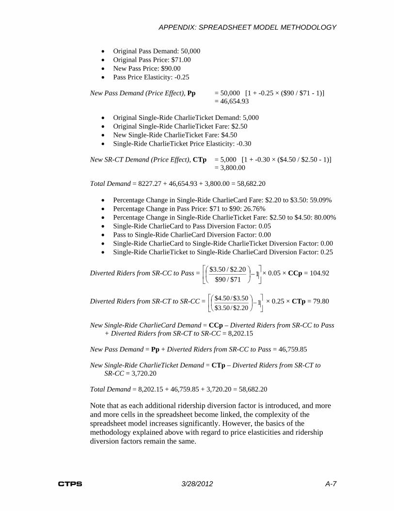
APPENDIX: SPREADSHEET MODEL METHODOLOGY
CTPS 3/28/2012 A-7
• Original Pass Demand: 50,000 • Original Pass Price: $71.00 • New Pass Price: $90.00 • Pass Price Elasticity: -0.25
New Pass Demand (Price Effect), Pp = 50,000 [1 + -0.25 × ($90 / $71 - 1)] = 46,654.93
• Original Single-Ride CharlieTicket Demand: 5,000 • Original Single-Ride CharlieTicket Fare: $2.50 • New Single-Ride CharlieTicket Fare: $4.50 • Single-Ride CharlieTicket Price Elasticity: -0.30
New SR-CT Demand (Price Effect), CTp = 5,000 [1 + -0.30 × ($4.50 / $2.50 - 1)] = 3,800.00
Total Demand = 8227.27 + 46,654.93 + 3,800.00 = 58,682.20
• Percentage Change in Single-Ride CharlieCard Fare: $2.20 to $3.50: 59.09% • Percentage Change in Pass Price: $71 to $90: 26.76% • Percentage Change in Single-Ride CharlieTicket Fare: $2.50 to $4.50: 80.00% • Single-Ride CharlieCard to Pass Diversion Factor: 0.05 • Pass to Single-Ride CharlieCard Diversion Factor: 0.00 • Single-Ride CharlieCard to Single-Ride CharlieTicket Diversion Factor: 0.00 • Single-Ride CharlieTicket to Single-Ride CharlieCard Diversion Factor: 0.25
Diverted Riders from SR-CC to Pass =
−
1
71$/90$20.2$/50.3$ × 0.05 × CCp = 104.92
Diverted Riders from SR-CT to SR-CC =
−
1
20.2$/50.3$50.3$/50.4$ × 0.25 × CTp = 79.80
New Single-Ride CharlieCard Demand = CCp – Diverted Riders from SR-CC to Pass + Diverted Riders from SR-CT to SR-CC = 8,202.15
New Pass Demand = Pp + Diverted Riders from SR-CC to Pass = 46,759.85
New Single-Ride CharlieTicket Demand = CTp – Diverted Riders from SR-CT to SR-CC = 3,720.20
Total Demand = 8,202.15 + 46,759.85 + 3,720.20 = 58,682.20
Note that as each additional ridership diversion factor is introduced, and more and more cells in the spreadsheet become linked, the complexity of the spreadsheet model increases significantly. However, the basics of the methodology explained above with regard to price elasticities and ridership diversion factors remain the same.