Embed Size (px)
Citation preview
Ektron CMS400.NET 1
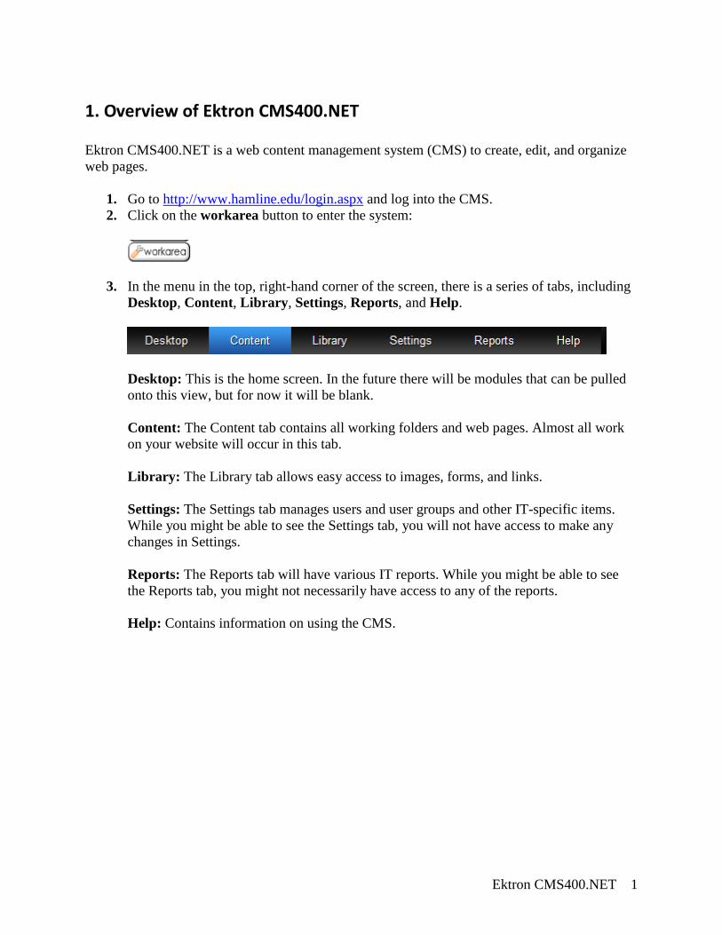
1. Overview of Ektron CMS400.NET Ektron CMS400.NET is a web content management system (CMS) to create, edit, and organize web pages.
1. Go to http://www.hamline.edu/login.aspx and log into the CMS. 2. Click on the workarea button to enter the system:
3. In the menu in the top, right-hand corner of the screen, there is a series of tabs, including Desktop, Content, Library, Settings, Reports, and Help.
Desktop: This is the home screen. In the future there will be modules that can be pulled onto this view, but for now it will be blank. Content: The Content tab contains all working folders and web pages. Almost all work on your website will occur in this tab. Library: The Library tab allows easy access to images, forms, and links. Settings: The Settings tab manages users and user groups and other IT-specific items. While you might be able to see the Settings tab, you will not have access to make any changes in Settings. Reports: The Reports tab will have various IT reports. While you might be able to see the Reports tab, you might not necessarily have access to any of the reports.
Help: Contains information on using the CMS.
Ektron CMS400.NET 2
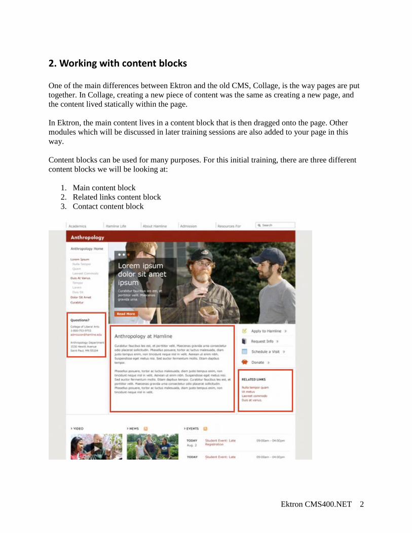
2. Working with content blocks One of the main differences between Ektron and the old CMS, Collage, is the way pages are put together. In Collage, creating a new piece of content was the same as creating a new page, and the content lived statically within the page. In Ektron, the main content lives in a content block that is then dragged onto the page. Other modules which will be discussed in later training sessions are also added to your page in this way. Content blocks can be used for many purposes. For this initial training, there are three different content blocks we will be looking at:
1. Main content block 2. Related links content block 3. Contact content block
Ektron CMS400.NET 3
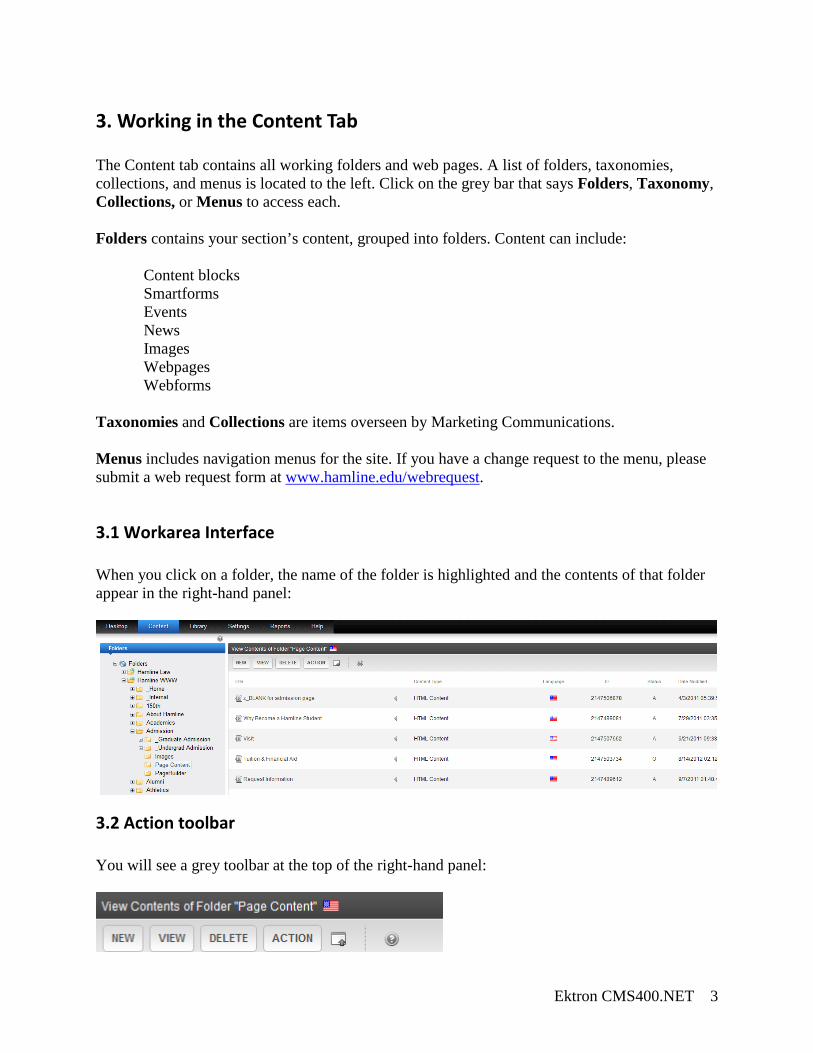
3. Working in the Content Tab The Content tab contains all working folders and web pages. A list of folders, taxonomies, collections, and menus is located to the left. Click on the grey bar that says Folders, Taxonomy, Collections, or Menus to access each. Folders contains your section’s content, grouped into folders. Content can include:
Content blocks Smartforms Events News Images Webpages Webforms
Taxonomies and Collections are items overseen by Marketing Communications. Menus includes navigation menus for the site. If you have a change request to the menu, please submit a web request form at www.hamline.edu/webrequest.
3.1 Workarea Interface When you click on a folder, the name of the folder is highlighted and the contents of that folder appear in the right-hand panel:
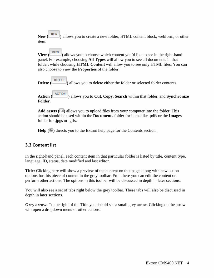
3.2 Action toolbar You will see a grey toolbar at the top of the right-hand panel:
Ektron CMS400.NET 4
New ( ) allows you to create a new folder, HTML content block, webform, or other item.
View ( ) allows you to choose which content you’d like to see in the right-hand panel. For example, choosing All Types will allow you to see all documents in that folder, while choosing HTML Content will allow you to see only HTML files. You can also choose to view the Properties of the folder.
Delete ( ) allows you to delete either the folder or selected folder contents.
Action ( ) allows you to Cut, Copy, Search within that folder, and Synchronize Folder. Add assets ( ) allows you to upload files from your computer into the folder. This action should be used within the Documents folder for items like .pdfs or the Images folder for .jpgs or .gifs. Help ( ) directs you to the Ektron help page for the Contents section.
3.3 Content list In the right-hand panel, each content item in that particular folder is listed by title, content type, language, ID, status, date modified and last editor. Title: Clicking here will show a preview of the content on that page, along with new action options for this piece of content in the grey toolbar. From here you can edit the content or perform other actions. The options in this toolbar will be discussed in depth in later sections. You will also see a set of tabs right below the grey toolbar. These tabs will also be discussed in depth in later sections.
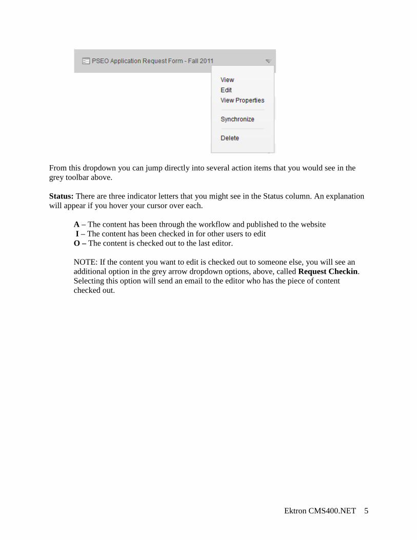
Grey arrow: To the right of the Title you should see a small grey arrow. Clicking on the arrow will open a dropdown menu of other actions:
Ektron CMS400.NET 5
From this dropdown you can jump directly into several action items that you would see in the grey toolbar above.
Status: There are three indicator letters that you might see in the Status column. An explanation will appear if you hover your cursor over each.
A – The content has been through the workflow and published to the website I – The content has been checked in for other users to edit O – The content is checked out to the last editor. NOTE: If the content you want to edit is checked out to someone else, you will see an additional option in the grey arrow dropdown options, above, called Request Checkin. Selecting this option will send an email to the editor who has the piece of content checked out.
Ektron CMS400.NET 6
4. Folder Structure and Properties Every section folder will have a set of predetermined folders:
_Subfolder: an optional folder. Subfolders contain their own Page Content folder. Use subfolders to help group like content when your original Page Content folder gets overcrowded. Documents: a folder for .pdfs and other static files. Please convert word documents to .pdf whenever possible. Upload documents to this folder with Add Assets ( ) in the grey toolbar. Events: a folder for events. Please note that with the impending R25 launch in Fall 2011, not every section will currently have an events folder. Events will be able to be submitted to the university-wide events calendar through a submission form. Images: a folder for images in .gif or .jpg format. Upload images with Add Assets ( ) fin the grey toolbar, the Library tab, or with a new Library item ( ) directly into the content editor. News: a folder for news items. Page Content: the folder where you should save your content blocks and smartforms. You will use these content items to “build” your pages. Pagebuilder: the folder where your site’s webpages will live. Social: an optional folder. If an individual in your area was hoping to start (or continue) a blog in Ektron, this is the folder that blog would live in.
Ektron CMS400.NET 7
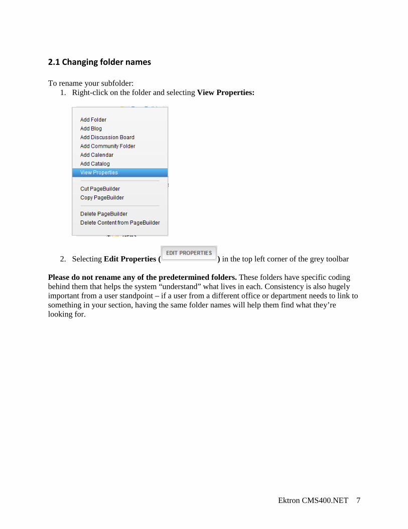
2.1 Changing folder names To rename your subfolder:
1. Right-click on the folder and selecting View Properties:
2. Selecting Edit Properties ( ) in the top left corner of the grey toolbar
Please do not rename any of the predetermined folders. These folders have specific coding behind them that helps the system “understand” what lives in each. Consistency is also hugely important from a user standpoint – if a user from a different office or department needs to link to something in your section, having the same folder names will help them find what they’re looking for.
Ektron CMS400.NET 8
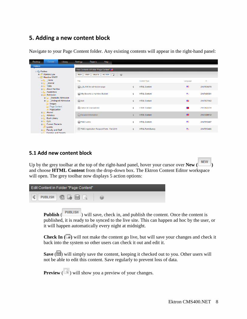
5. Adding a new content block Navigate to your Page Content folder. Any existing contents will appear in the right-hand panel:
5.1 Add new content block
Up by the grey toolbar at the top of the right-hand panel, hover your cursor over New ( ) and choose HTML Content from the drop-down box. The Ektron Content Editor workspace will open. The grey toolbar now displays 5 action options:
Publish ( ) will save, check in, and publish the content. Once the content is published, it is ready to be synced to the live site. This can happen ad hoc by the user, or it will happen automatically every night at midnight. Check In ( ) will not make the content go live, but will save your changes and check it back into the system so other users can check it out and edit it. Save ( ) will simply save the content, keeping it checked out to you. Other users will not be able to edit this content. Save regularly to prevent loss of data. Preview ( ) will show you a preview of your changes.
Ektron CMS400.NET 9
Cancel ( ) will cancel all changes and roll the content back to its previous version, if there is one.
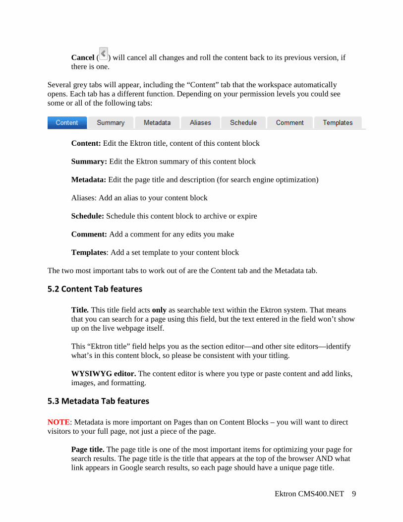
Several grey tabs will appear, including the “Content” tab that the workspace automatically opens. Each tab has a different function. Depending on your permission levels you could see some or all of the following tabs:
Content: Edit the Ektron title, content of this content block Summary: Edit the Ektron summary of this content block Metadata: Edit the page title and description (for search engine optimization) Aliases: Add an alias to your content block Schedule: Schedule this content block to archive or expire Comment: Add a comment for any edits you make Templates: Add a set template to your content block
The two most important tabs to work out of are the Content tab and the Metadata tab.
5.2 Content Tab features
Title. This title field acts only as searchable text within the Ektron system. That means that you can search for a page using this field, but the text entered in the field won’t show up on the live webpage itself. This “Ektron title” field helps you as the section editor—and other site editors—identify what’s in this content block, so please be consistent with your titling. WYSIWYG editor. The content editor is where you type or paste content and add links, images, and formatting.
5.3 Metadata Tab features NOTE: Metadata is more important on Pages than on Content Blocks – you will want to direct visitors to your full page, not just a piece of the page.
Page title. The page title is one of the most important items for optimizing your page for search results. The page title is the title that appears at the top of the browser AND what link appears in Google search results, so each page should have a unique page title.
Ektron CMS400.NET 10
• Titles have 7-9 words ideally, and no more than 63 characters total. • Move from most specific to least specific:
o Undergraduate Student Loans | Financial Aid at Hamline University o Health Law Degree | Hamline University Law School
• All keywords used in the title should be used in the main content at least once. Description. This field is what people see in Google search results. Each meta description consists of grammatically correct sentences totaling no more than 12-24 words (about 156 characters) and includes primary keywords/phrases.
• “Hamline University Law School offers a broad curriculum with opportunities to focus within 12 areas of legal specialty, as well as three nationally ranked Centers of Excellence.”
DO NOT HAVE THE SAME DESCRIPTION ON EVERY PAGE – this is harmful to your search results and could have drastic consequences for whole site.
5.4 Saving and closing your content block At any point while editing, you may Publish, Check In, Save, Preview, or Cancel your edits:
Publish ( ) will save, check in, and publish the content. Once the content is published, it is ready to be synced to the live site. This can happen ad hoc by the user, or it will happen automatically every night at midnight. Undo Checkout ( ) will cancel all changes and roll the content back to its previous version, if there is one. Check In ( ) will not make the content go live, but will save your changes and check it back into the system so other users can check it out and edit it. Save ( ) will simply save the content, keeping it checked out to you. Other users will not be able to edit this content. Save regularly to prevent loss of data. Preview ( ) will show you a preview of your changes.
Cancel ( ) will cancel all changes and roll the content back to its previous version, if there is one.
Ektron CMS400.NET 11
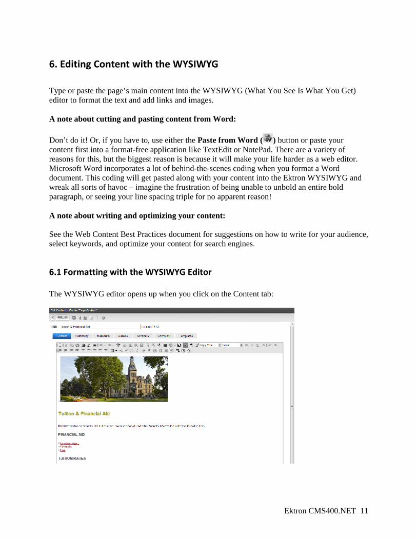
6. Editing Content with the WYSIWYG Type or paste the page’s main content into the WYSIWYG (What You See Is What You Get) editor to format the text and add links and images. A note about cutting and pasting content from Word: Don’t do it! Or, if you have to, use either the Paste from Word ( ) button or paste your content first into a format-free application like TextEdit or NotePad. There are a variety of reasons for this, but the biggest reason is because it will make your life harder as a web editor. Microsoft Word incorporates a lot of behind-the-scenes coding when you format a Word document. This coding will get pasted along with your content into the Ektron WYSIWYG and wreak all sorts of havoc – imagine the frustration of being unable to unbold an entire bold paragraph, or seeing your line spacing triple for no apparent reason! A note about writing and optimizing your content: See the Web Content Best Practices document for suggestions on how to write for your audience, select keywords, and optimize your content for search engines.
6.1 Formatting with the WYSIWYG Editor The WYSIWYG editor opens up when you click on the Content tab:
Ektron CMS400.NET 12
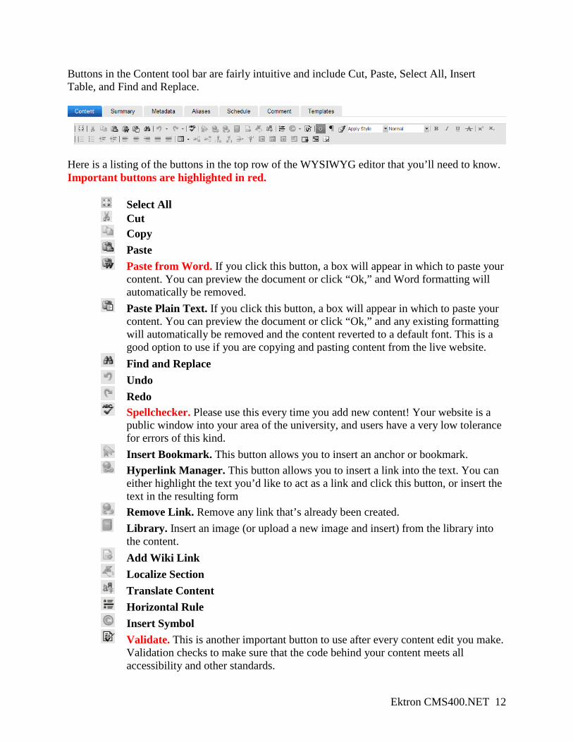
Buttons in the Content tool bar are fairly intuitive and include Cut, Paste, Select All, Insert Table, and Find and Replace.
Here is a listing of the buttons in the top row of the WYSIWYG editor that you’ll need to know. Important buttons are highlighted in red.
Select All Cut Copy Paste Paste from Word. If you click this button, a box will appear in which to paste your
content. You can preview the document or click “Ok,” and Word formatting will automatically be removed.
Paste Plain Text. If you click this button, a box will appear in which to paste your content. You can preview the document or click “Ok,” and any existing formatting will automatically be removed and the content reverted to a default font. This is a good option to use if you are copying and pasting content from the live website.
Find and Replace Undo Redo Spellchecker. Please use this every time you add new content! Your website is a
public window into your area of the university, and users have a very low tolerance for errors of this kind.
Insert Bookmark. This button allows you to insert an anchor or bookmark. Hyperlink Manager. This button allows you to insert a link into the text. You can
either highlight the text you’d like to act as a link and click this button, or insert the text in the resulting form
Remove Link. Remove any link that’s already been created. Library. Insert an image (or upload a new image and insert) from the library into
the content. Add Wiki Link Localize Section Translate Content Horizontal Rule Insert Symbol Validate. This is another important button to use after every content edit you make.
Validation checks to make sure that the code behind your content meets all accessibility and other standards.
Ektron CMS400.NET 13
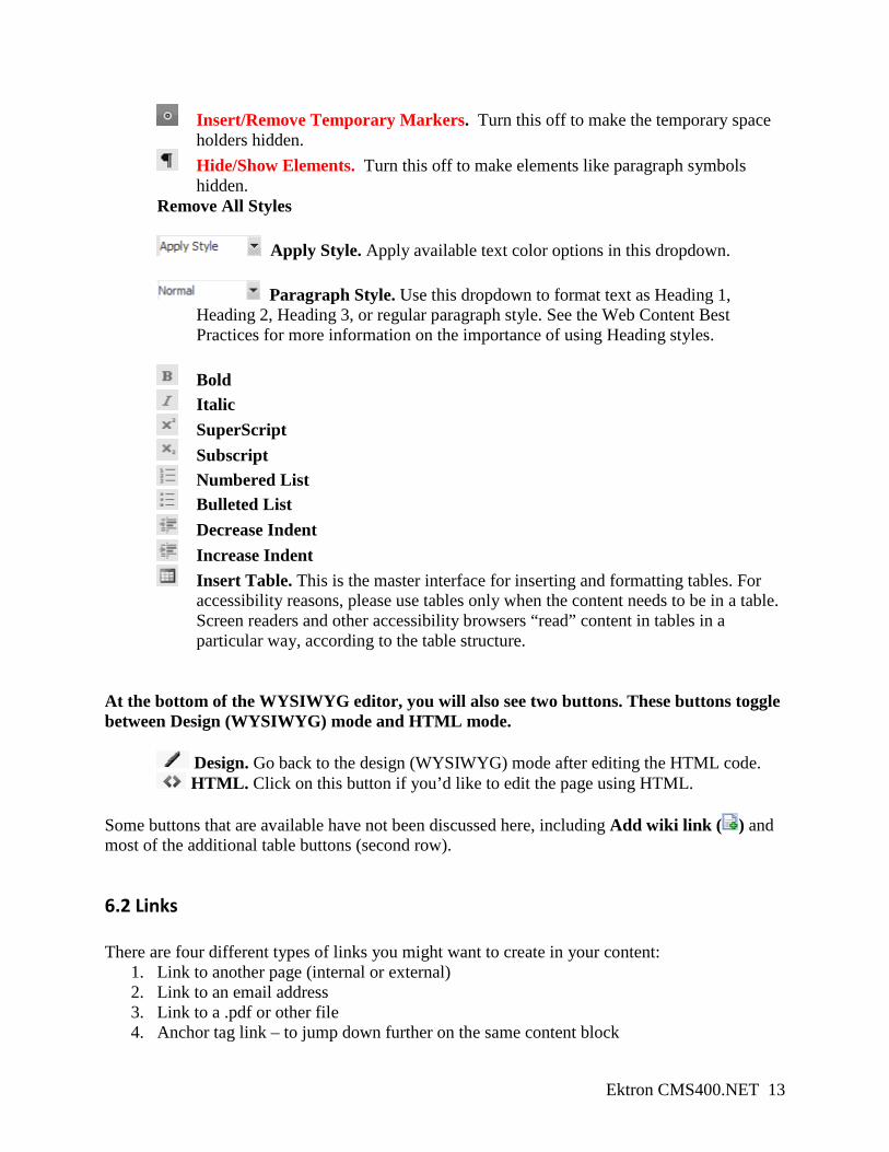
Insert/Remove Temporary Markers. Turn this off to make the temporary space holders hidden.
Hide/Show Elements. Turn this off to make elements like paragraph symbols hidden.
Remove All Styles
Apply Style. Apply available text color options in this dropdown.
Paragraph Style. Use this dropdown to format text as Heading 1, Heading 2, Heading 3, or regular paragraph style. See the Web Content Best Practices for more information on the importance of using Heading styles.
Bold Italic SuperScript Subscript
Numbered List Bulleted List Decrease Indent Increase Indent Insert Table. This is the master interface for inserting and formatting tables. For
accessibility reasons, please use tables only when the content needs to be in a table. Screen readers and other accessibility browsers “read” content in tables in a particular way, according to the table structure.
At the bottom of the WYSIWYG editor, you will also see two buttons. These buttons toggle between Design (WYSIWYG) mode and HTML mode.
Design. Go back to the design (WYSIWYG) mode after editing the HTML code. HTML. Click on this button if you’d like to edit the page using HTML.
Some buttons that are available have not been discussed here, including Add wiki link ( ) and most of the additional table buttons (second row).
6.2 Links There are four different types of links you might want to create in your content:
1. Link to another page (internal or external) 2. Link to an email address 3. Link to a .pdf or other file 4. Anchor tag link – to jump down further on the same content block
Ektron CMS400.NET 14
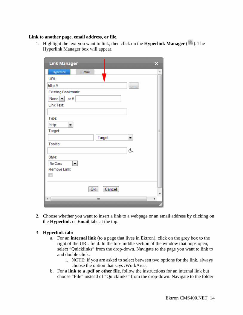
Link to another page, email address, or file.
1. Highlight the text you want to link, then click on the Hyperlink Manager ( ). The Hyperlink Manager box will appear.
2. Choose whether you want to insert a link to a webpage or an email address by clicking on the Hyperlink or Email tabs at the top.
3. Hyperlink tab: a. For an internal link (to a page that lives in Ektron), click on the grey box to the
right of the URL field. In the top-middle section of the window that pops open, select “Quicklinks” from the drop-down. Navigate to the page you want to link to and double click.
i. NOTE: if you are asked to select between two options for the link, always choose the option that says /WorkArea.
b. For a link to a .pdf or other file, follow the instructions for an internal link but choose “File” instead of “Quicklinks” from the drop-down. Navigate to the folder
Ektron CMS400.NET 15
your file lives in and double-click. In the “Target” drop-down, select “New window.” You should always select this option for documents and files.
c. For an external link, type in the URL in the URL field. In the “Target” drop-down, select “New window.” You should always select this option for external links.
4. Email tab: a. After choosing the Email tab, type in the appropriate email address and link text. b. When possible, type out the actual email address as the link text. Many people use
web-based email clients these days, including Hamline students. In some instances a web-based email client will not automatically open an email address link in a new email, as Groupwise will automatically do.
5. The “Style” field should be “No Class” Linking to a spot further down on the same content block.
1. These same-page links are often called anchor tags or bookmarks. Enter the content you want to jump to and click in front or right above that content.
2. Click on the Insert Bookmark ( ).
3. Name the bookmark in the “Name” field and click “Ok.” A green bookmark will appear. This will be invisible when the page goes live.
4. Back up at the top of the page, highlight the text that you want to link to that spot and click on the Hyperlink Manager ( ). Under Existing Bookmark, choose the bookmark that you just created. Click “Ok.”
Removing a link To remove a link, click on the underlined link and select Remove Link ( ). Best practices for links Using keywords in your links is one of the most important things for search engine optimization that you can do for the page you are linking to. If you are linking to a page within your site, think about what keywords apply to that page, and use them in the link text. Do not use “Click here” for your link text! There are two main reasons for this:
1. Imagine you are a normal web visitor, scanning down a page with a lot of links. How do you know at a glance which link you want to click on if they all say “click here”?
2. Google the words “click here” and look at what kinds of results you get. This is to demonstrate how link text informs search engines – if you are trying to optimize your pages or documents for search engines, using “click here” is not doing you any favors. Use your keywords instead!
Ektron CMS400.NET 16
6.3 Images Inserting an image to your content
1. Click in the WYSIWYG editor near where you want the image to be inserted. a. Once inserted, the image can be dragged to a different location
2. Click on the Library ( ) button and select “Images” from the dropdown.
3. Now, you can either browse to the folder where the image lives, or you can upload a new image into your images folder.
a. To insert an existing image, navigate through the folders to the image. Double-click the image or click once on the image and then click Insert ( ). The picture will be inserted.
b. To upload and insert a new image, navigate to your images folder and select Add
Library ( ).
4. You can set the image properties by right-clicking on the inserted image and selecting “Image Properties.”
a. Image Alt Text: this is a required field for all images. This improves accessibility of your content for screen readers or other alternative browsers.
b. Image Alignment: aligns the image to the top, bottom, left, or right, and has text flow around accordingly.
i. For best practices, please consider using ONLY left-align. Text flows around images in the most legible manner with this option.
c. Horizontal and vertical spacing: add some space between the image and the text that is flowing around it. A good starting point is 4 pixels for horizontal spacing. Vertical spacing may or may not be necessary.
d. Please avoid using the other options in this screen. Best practices for images
1. Resize the images before you upload them. Ektron includes an image resizer in the WYSIWYG editor, but this kind of image compression results in subpar image quality. If you do not have a way to resize images yourself, please don’t hesitate to send a request to www.hamline.edu/webrequest!
2. Don’t forget that, unless the user has clicked on a link for “Photo gallery,” they are not looking for large images, they are looking for CONTENT. Keep these extra images on the small size and make sure they’re either relevant or functional to the content and layout.
3. If you have images you’d like to display in a photo gallery, contact the Marketing
department for help.
Ektron CMS400.NET 17
4. If you have several images on a page, keep the horizontal and vertical spacing consistent (as well as the image size and alignment).
Ektron CMS400.NET 18
7. Building pages with PageBuilder PageBuilder is the workspace in Ektron that web editors will use to build webpages by dragging content blocks and other modules into a page structure. These Pagebuilder pages are the final pages that will appear on the website; they are what we link to when we create links in content blocks, and they are what Marketing Communications will link to your left menus. Web editors will have access to three or four different page structures, or “page types,” to choose from. See the “Page Types” handout to see the structure of each page type.
1. Content page type The content page type will be the most commonly used page type across the university. This is what web editors should use for the majority of their pages.
2. Program page type The program page type is one option web editors will have for their site’s front page. Program pages can also be used for the front page of a subsection of their site.
3. Frontpage page type The frontpage page type is a second option web editors have for their site’s front page. Frontpage pages can also be used for the front page of a subsection of their site.
4. School page type* The school page type is a front page option available only to school web editors – this should be the front page for each Hamline school. * Not available to all editors
When choosing a page type to use for a particular page, it’s most important to consider the content of that page and what page type best fits that content. For an inner page with a lot of text, the best option is the Content page type. For your office’s front page, look at the differences between the Program page type and the Frontpage page type and think about what content and modules you are planning to display. Please don’t hesitate to contact Marketing Communications if you have any questions about choosing between page types!
Ektron CMS400.NET 19
7.1 Creating a new page
1. Log into Ektron at http://www.hamline.edu/login.aspx and go to the Workarea.
2. Click on the Content tab in the upper right corner
3. In the left column, navigate through the folder list to your section folder. All webpages should be created in a folder labeled “Pagebuilder” – either the main Pagebuilder folder in your section or a Pagebuilder folder in one of your subfolders.
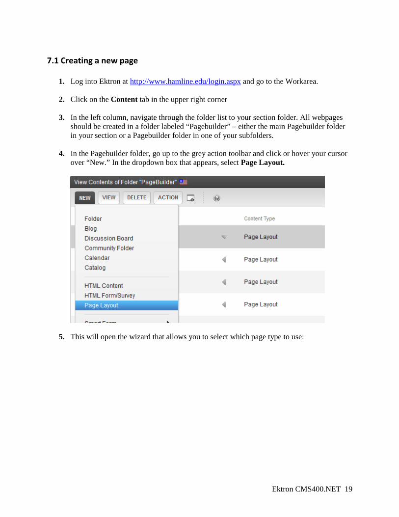
4. In the Pagebuilder folder, go up to the grey action toolbar and click or hover your cursor
over “New.” In the dropdown box that appears, select Page Layout.
5. This will open the wizard that allows you to select which page type to use:
Ektron CMS400.NET 20
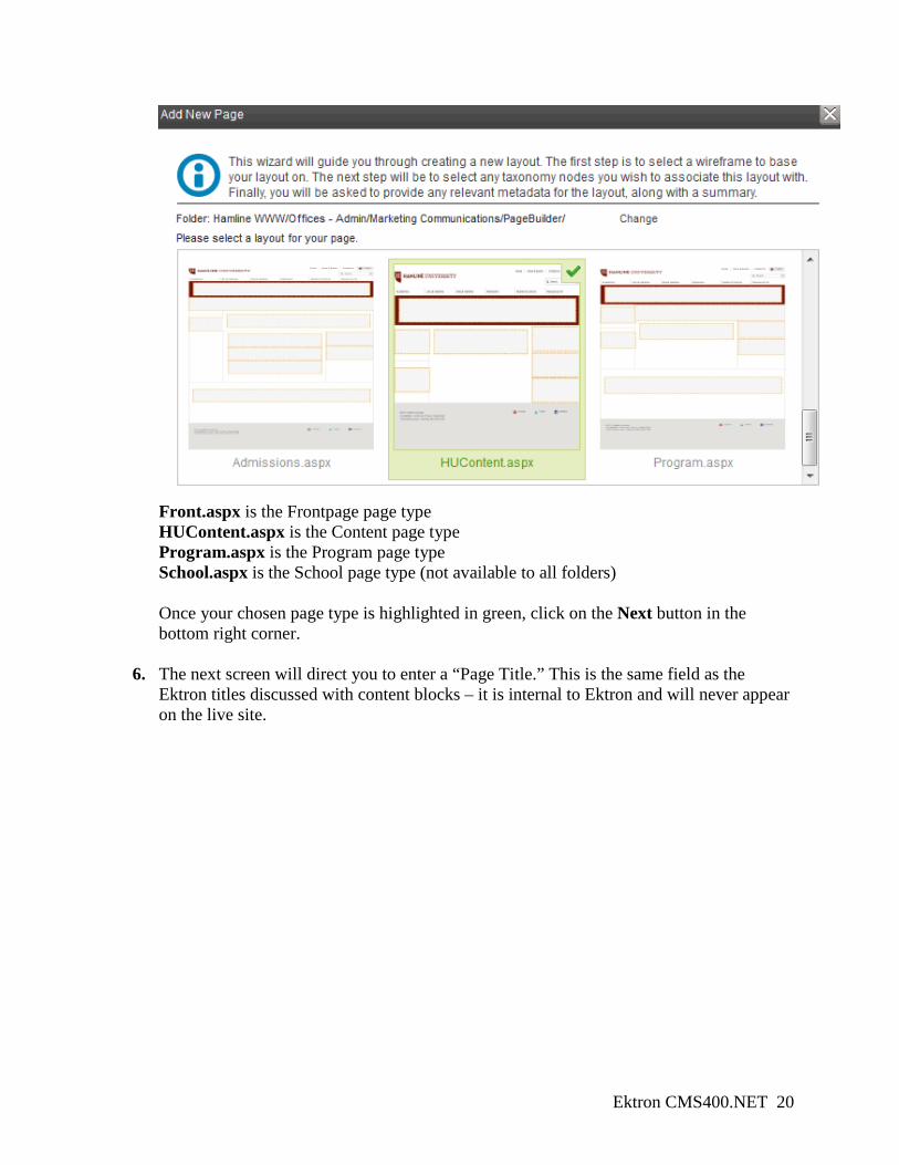
Front.aspx is the Frontpage page type HUContent.aspx is the Content page type Program.aspx is the Program page type
School.aspx is the School page type (not available to all folders)
Once your chosen page type is highlighted in green, click on the Next button in the bottom right corner.
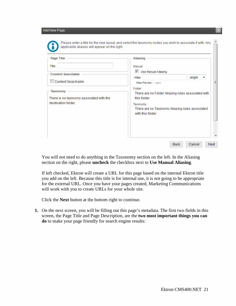
6. The next screen will direct you to enter a “Page Title.” This is the same field as the
Ektron titles discussed with content blocks – it is internal to Ektron and will never appear on the live site.
Ektron CMS400.NET 21
You will not need to do anything in the Taxonomy section on the left. In the Aliasing section on the right, please uncheck the checkbox next to Use Manual Aliasing. If left checked, Ektron will create a URL for this page based on the internal Ektron title you add on the left. Because this title is for internal use, it is not going to be appropriate for the external URL. Once you have your pages created, Marketing Communications will work with you to create URLs for your whole site. Click the Next button at the bottom right to continue.
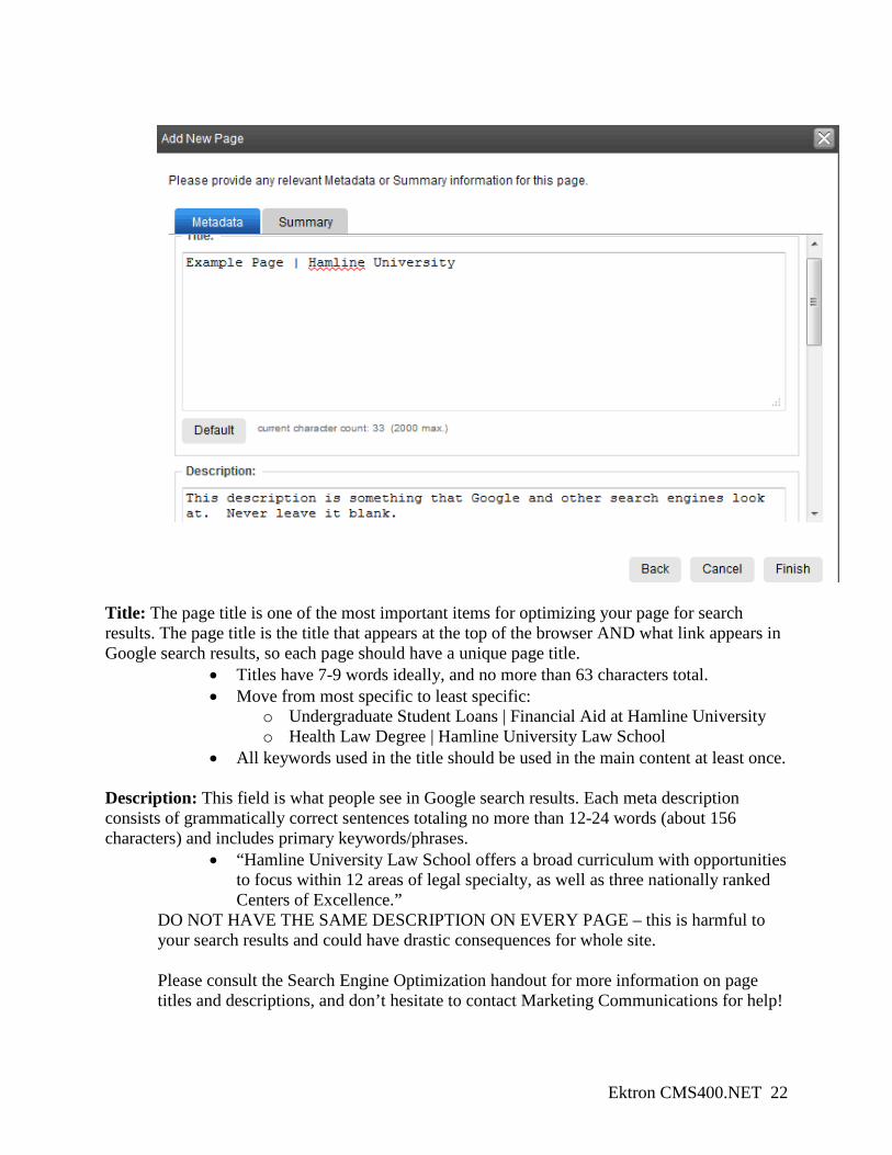
1. On the next screen, you will be filling out this page’s metadata. The first two fields in this screen, the Page Title and Page Description, are the two most important things you can do to make your page friendly for search engine results:
Ektron CMS400.NET 22
Title: The page title is one of the most important items for optimizing your page for search results. The page title is the title that appears at the top of the browser AND what link appears in Google search results, so each page should have a unique page title.
• Titles have 7-9 words ideally, and no more than 63 characters total. • Move from most specific to least specific:
o Undergraduate Student Loans | Financial Aid at Hamline University o Health Law Degree | Hamline University Law School
• All keywords used in the title should be used in the main content at least once.
Description: This field is what people see in Google search results. Each meta description consists of grammatically correct sentences totaling no more than 12-24 words (about 156 characters) and includes primary keywords/phrases.
• “Hamline University Law School offers a broad curriculum with opportunities to focus within 12 areas of legal specialty, as well as three nationally ranked Centers of Excellence.”
DO NOT HAVE THE SAME DESCRIPTION ON EVERY PAGE – this is harmful to your search results and could have drastic consequences for whole site.
Please consult the Search Engine Optimization handout for more information on page titles and descriptions, and don’t hesitate to contact Marketing Communications for help!
Ektron CMS400.NET 23
2. At this stage you are done with the initial creation of your page. A dialog box will pop up that asks you if you want to be redirected to the page you just made. If you’re ready to start dragging content onto that page, click Yes or Next!
7.2 Pagebuilder interface Once you are done with the initial creation of your page, you can start dragging content blocks and other modules into the page structure. In order to do this, you need to edit the page through the Pagebuilder interface:
From the page creation wizard: just click Yes, OK, or Next when it asks if you want to be redirected to your page From the Pagebuilder folder: click on the grey arrow next to your page’s Ektron title, and select Edit Page ( ).
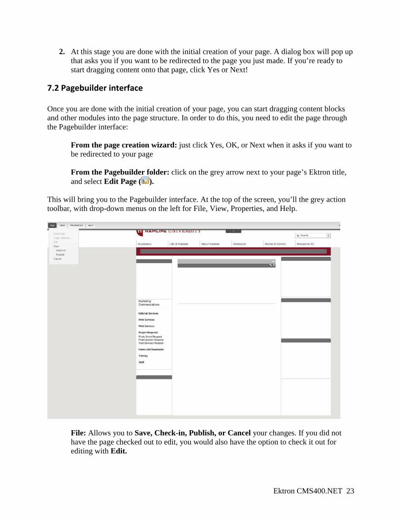
This will bring you to the Pagebuilder interface. At the top of the screen, you’ll the grey action toolbar, with drop-down menus on the left for File, View, Properties, and Help.
File: Allows you to Save, Check-in, Publish, or Cancel your changes. If you did not have the page checked out to edit, you would also have the option to check it out for editing with Edit.
Ektron CMS400.NET 24
View: Let’s you View Properties, Preview Page, and return to the Workarea. Properties: Displays information about the page, including what page type was used to create it. Help: Directs you to the Ektron help interface.
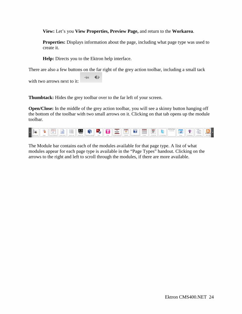
There are also a few buttons on the far right of the grey action toolbar, including a small tack
with two arrows next to it: Thumbtack: Hides the grey toolbar over to the far left of your screen. Open/Close: In the middle of the grey action toolbar, you will see a skinny button hanging off the bottom of the toolbar with two small arrows on it. Clicking on that tab opens up the module toolbar.
The Module bar contains each of the modules available for that page type. A list of what modules appear for each page type is available in the “Page Types” handout. Clicking on the arrows to the right and left to scroll through the modules, if there are more available.
Ektron CMS400.NET 25
8. Dragging content and modules onto your page In order to populate your page with content, you will drag the different modules from the module bar and drop them into one of the grey-highlighted drop zones on your page. The drop zones available to you correspond to the page type you chose to build your page with.
8.1 Dragging a module into a dropzone Populating your new page with content is essentially a two-step process:
1. First, drag a module into one of your dropzones 2. Then, tell the module to pull in the information you want displayed
To drag a module into a dropzone:
1. Scroll through the Module bar until you see the correct module. The majority of your content will be pulled in through a Content Block. A list of what modules should be used to display what content is available in the “Page Types” handout.
2. Click and hold your mouse and “pull” the module out of the module bar. The module bar will disappear as you drag the module away.
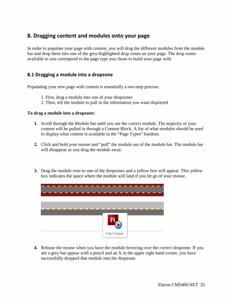
3. Drag the module over to one of the dropzones and a yellow box will appear. This yellow box indicates the space where the module will land if you let go of your mouse.
4. Release the mouse when you have the module hovering over the correct dropzone. If you see a grey bar appear with a pencil and an X in the upper right hand corner, you have successfully dropped that module into the dropzone.
Ektron CMS400.NET 26
8.3 Pulling content into the module Once you have the module placed in the dropzone, you can now edit the module and tell it what content you want it to pull in.
1. A grey action bar will appear at the top of the module. In the upper right hand corner, you’ll see Edit ( ) and Cancel ( ).
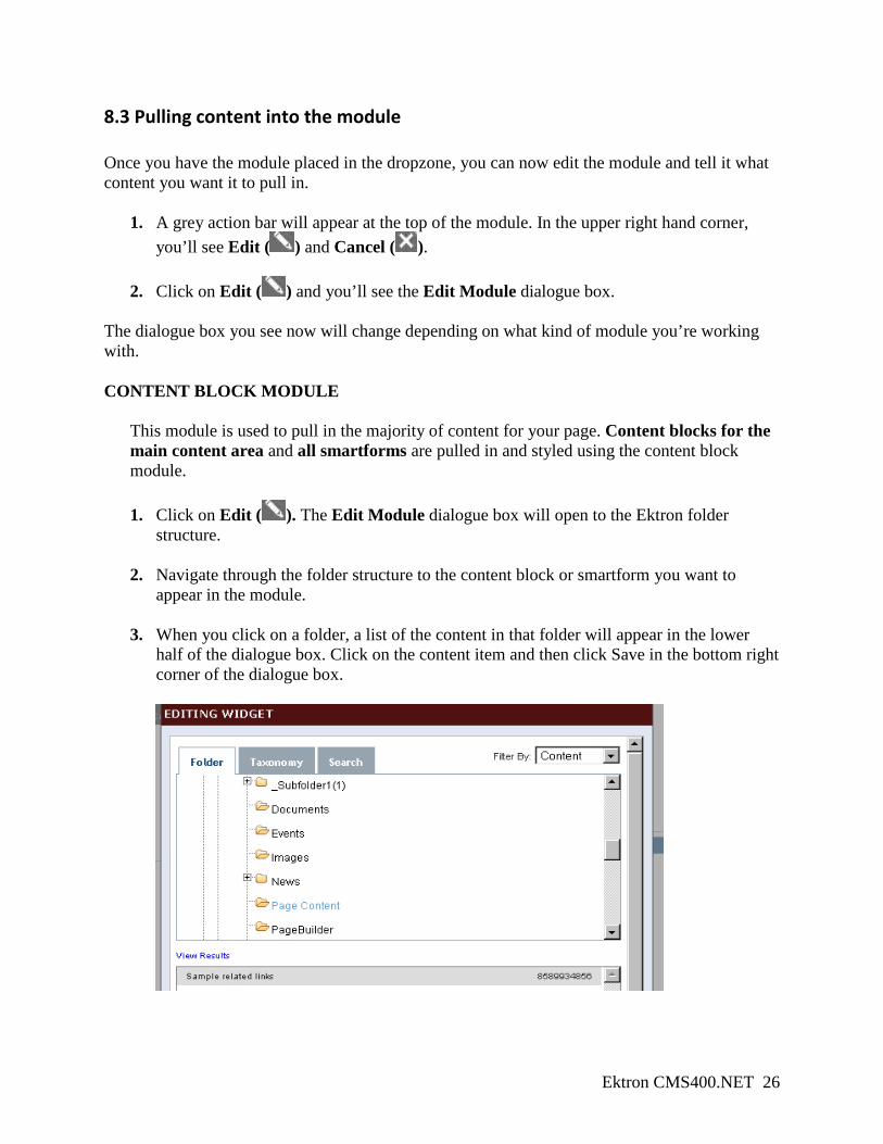
2. Click on Edit ( ) and you’ll see the Edit Module dialogue box. The dialogue box you see now will change depending on what kind of module you’re working with. CONTENT BLOCK MODULE
This module is used to pull in the majority of content for your page. Content blocks for the main content area and all smartforms are pulled in and styled using the content block module.
1. Click on Edit ( ). The Edit Module dialogue box will open to the Ektron folder
structure.
2. Navigate through the folder structure to the content block or smartform you want to appear in the module.
3. When you click on a folder, a list of the content in that folder will appear in the lower half of the dialogue box. Click on the content item and then click Save in the bottom right corner of the dialogue box.
Ektron CMS400.NET 27
4. Once you’ve saved a content item to that module, the contents will be pulled in and displayed on your page.
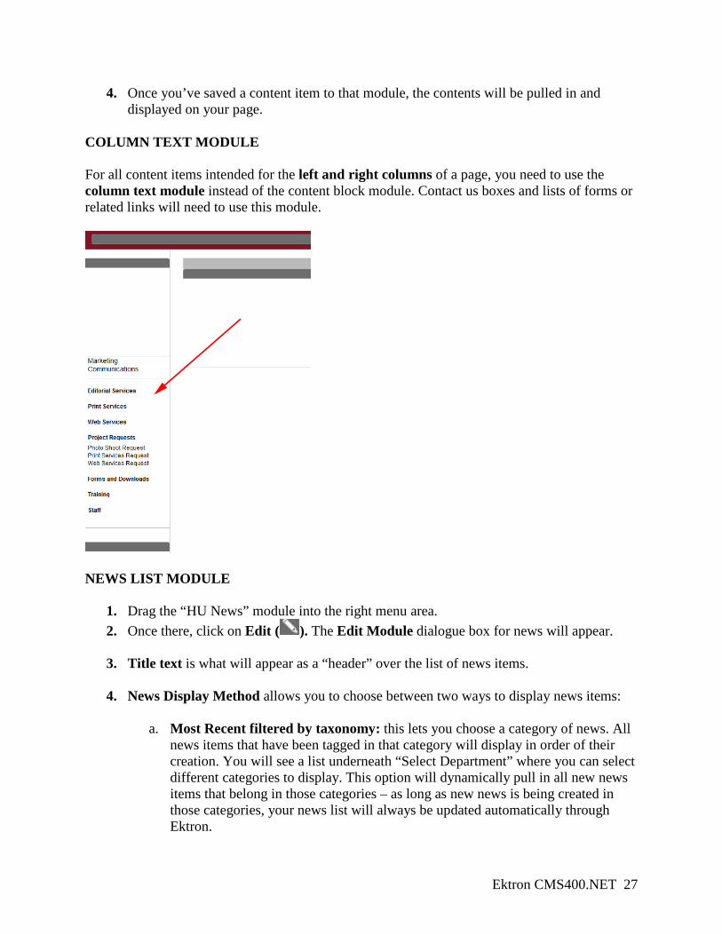
COLUMN TEXT MODULE For all content items intended for the left and right columns of a page, you need to use the column text module instead of the content block module. Contact us boxes and lists of forms or related links will need to use this module.
NEWS LIST MODULE
1. Drag the “HU News” module into the right menu area. 2. Once there, click on Edit ( ). The Edit Module dialogue box for news will appear.
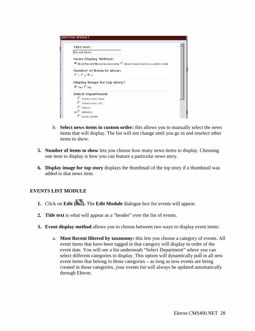
3. Title text is what will appear as a “header” over the list of news items.
4. News Display Method allows you to choose between two ways to display news items:
a. Most Recent filtered by taxonomy: this lets you choose a category of news. All
news items that have been tagged in that category will display in order of their creation. You will see a list underneath “Select Department” where you can select different categories to display. This option will dynamically pull in all new news items that belong in those categories – as long as new news is being created in those categories, your news list will always be updated automatically through Ektron.
Ektron CMS400.NET 28
b. Select news items in custom order: this allows you to manually select the news items that will display. The list will not change until you go in and reselect other items to show.
5. Number of items to show lets you choose how many news items to display. Choosing one item to display is how you can feature a particular news story.
6. Display image for top story displays the thumbnail of the top story if a thumbnail was added to that news item.
EVENTS LIST MODULE
1. Click on Edit ( ). The Edit Module dialogue box for events will appear.
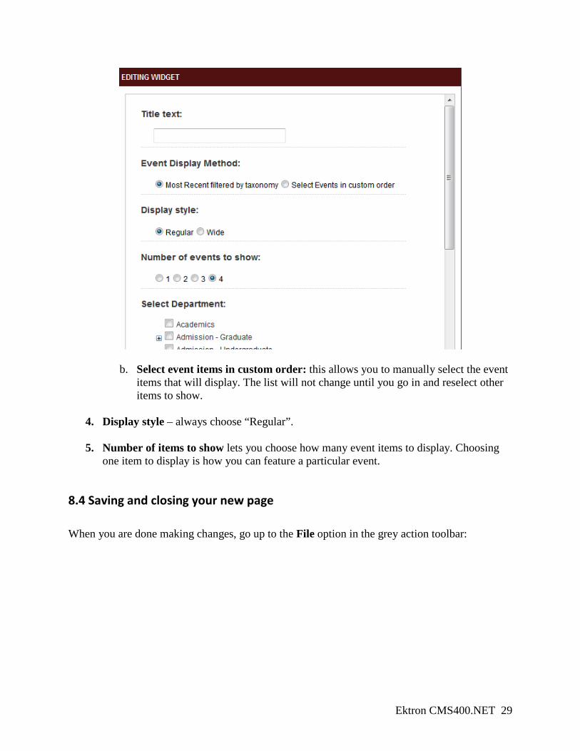
2. Title text is what will appear as a “header” over the list of events.
3. Event display method allows you to choose between two ways to display event items:
a. Most Recent filtered by taxonomy: this lets you choose a category of events. All event items that have been tagged in that category will display in order of the event date. You will see a list underneath “Select Department” where you can select different categories to display. This option will dynamically pull in all new event items that belong in those categories – as long as new events are being created in those categories, your events list will always be updated automatically through Ektron.
Ektron CMS400.NET 29
b. Select event items in custom order: this allows you to manually select the event
items that will display. The list will not change until you go in and reselect other items to show.
4. Display style – always choose “Regular”.
5. Number of items to show lets you choose how many event items to display. Choosing one item to display is how you can feature a particular event.
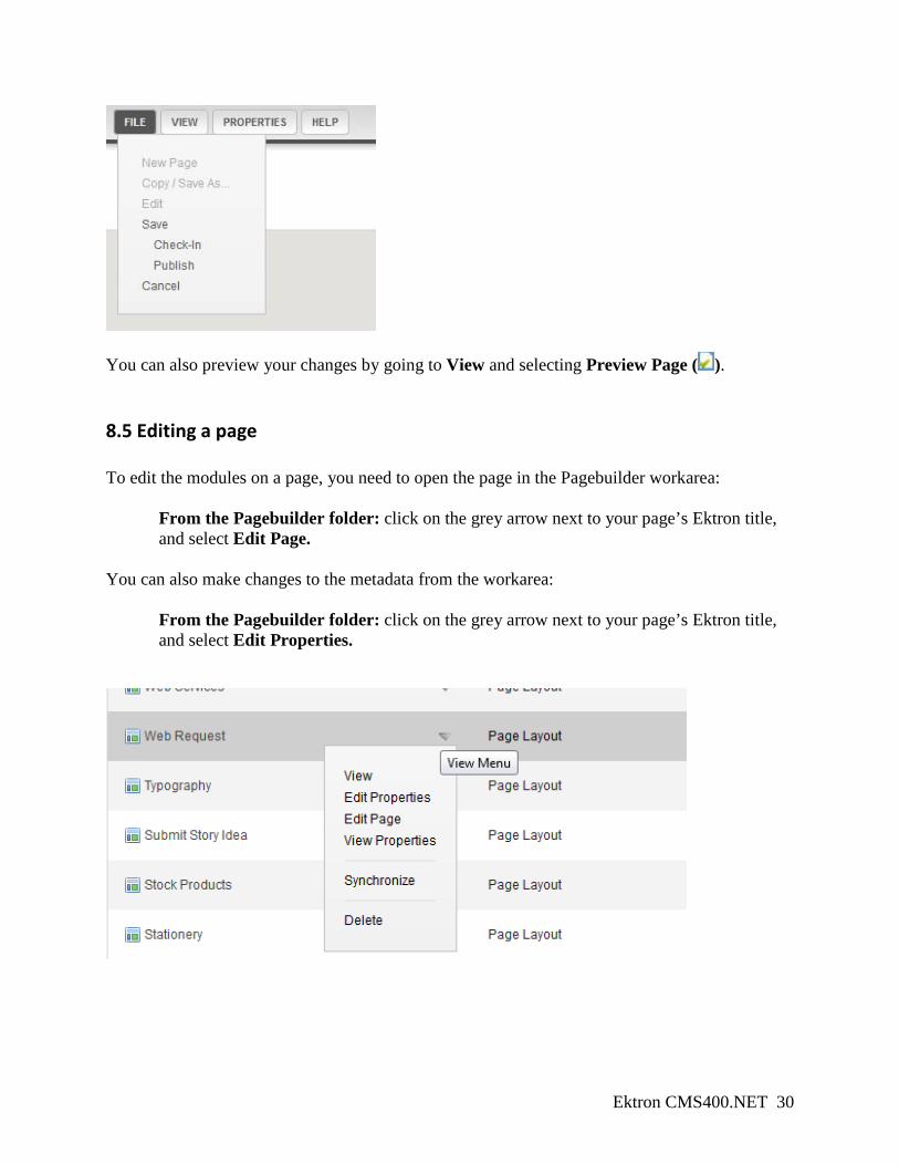
8.4 Saving and closing your new page When you are done making changes, go up to the File option in the grey action toolbar:
Ektron CMS400.NET 30
You can also preview your changes by going to View and selecting Preview Page ( ).
8.5 Editing a page To edit the modules on a page, you need to open the page in the Pagebuilder workarea:
From the Pagebuilder folder: click on the grey arrow next to your page’s Ektron title, and select Edit Page.
You can also make changes to the metadata from the workarea:
From the Pagebuilder folder: click on the grey arrow next to your page’s Ektron title, and select Edit Properties.
Ektron CMS400.NET 31
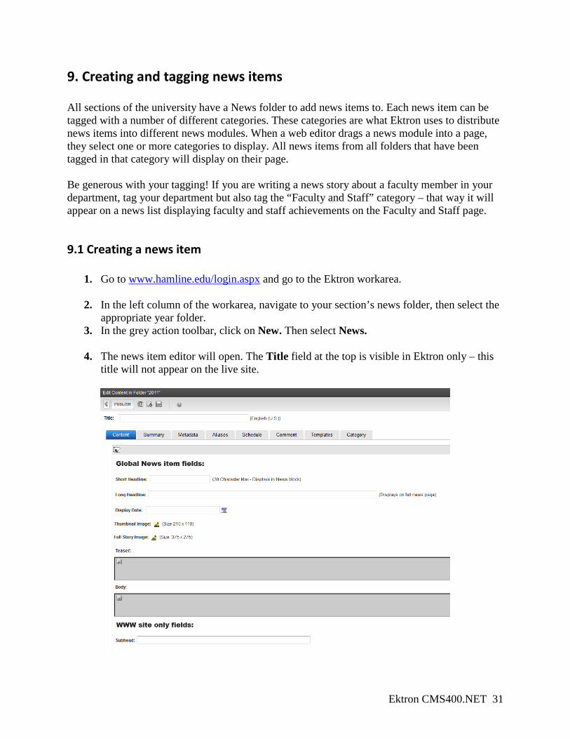
9. Creating and tagging news items All sections of the university have a News folder to add news items to. Each news item can be tagged with a number of different categories. These categories are what Ektron uses to distribute news items into different news modules. When a web editor drags a news module into a page, they select one or more categories to display. All news items from all folders that have been tagged in that category will display on their page. Be generous with your tagging! If you are writing a news story about a faculty member in your department, tag your department but also tag the “Faculty and Staff” category – that way it will appear on a news list displaying faculty and staff achievements on the Faculty and Staff page.
9.1 Creating a news item
1. Go to www.hamline.edu/login.aspx and go to the Ektron workarea.
2. In the left column of the workarea, navigate to your section’s news folder, then select the appropriate year folder.
3. In the grey action toolbar, click on New. Then select News.
4. The news item editor will open. The Title field at the top is visible in Ektron only – this title will not appear on the live site.
Ektron CMS400.NET 32
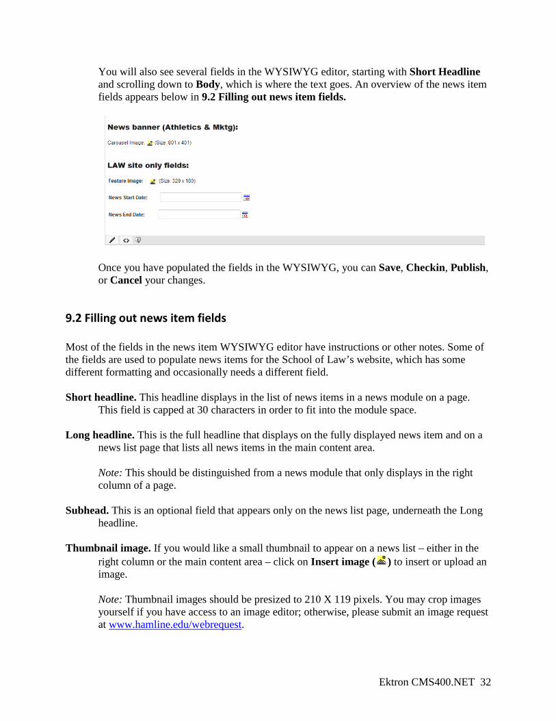
You will also see several fields in the WYSIWYG editor, starting with Short Headline and scrolling down to Body, which is where the text goes. An overview of the news item fields appears below in 9.2 Filling out news item fields.
Once you have populated the fields in the WYSIWYG, you can Save, Checkin, Publish, or Cancel your changes.
9.2 Filling out news item fields Most of the fields in the news item WYSIWYG editor have instructions or other notes. Some of the fields are used to populate news items for the School of Law’s website, which has some different formatting and occasionally needs a different field. Short headline. This headline displays in the list of news items in a news module on a page.
This field is capped at 30 characters in order to fit into the module space. Long headline. This is the full headline that displays on the fully displayed news item and on a
news list page that lists all news items in the main content area. Note: This should be distinguished from a news module that only displays in the right column of a page.
Subhead. This is an optional field that appears only on the news list page, underneath the Long
headline. Thumbnail image. If you would like a small thumbnail to appear on a news list – either in the
right column or the main content area – click on Insert image ( ) to insert or upload an image.
Note: Thumbnail images should be presized to 210 X 119 pixels. You may crop images yourself if you have access to an image editor; otherwise, please submit an image request at www.hamline.edu/webrequest.
Ektron CMS400.NET 33
You can choose a different image by clicking on the Insert image ( ) button again. To remove a chosen photo, just delete the pathway that appears in the Img src field.
Full story image. This is a full-sized image that can be displayed on the full display of the news
item. Please follow the instructions above for thumbnail images to upload and insert an image.
Note: Full story images should be presized to 375 X 275 pixels. You may crop images yourself if you have access to an image editor; otherwise, please submit an image request at www.hamline.edu/webrequest. You can choose a different image by clicking on the Insert image ( ) button again. To remove a chosen photo, just delete the pathway that appears in the Img src field.
Date displayed on news item. Enter the date to display on your news item. Items in a news list
will be ordered in chronological order based on this field. Teaser. Type a short paragraph that summarizes the news story – this will appear underneath the
Short headline in news lists. Body. This is where the main content of the news item should appear. You may use all the
formatting buttons available in the WYSIWYG’s grey toolbar to format the text and create links. You may also click on the HTML ( ) button if you would like to embed videos from YouTube—just make sure to paste the code in between the <BODY> and </BODY> tags. Follow the instructions on the “Getting YouTube Embed Coding” document to learn how to grab appropriate embed code.
9.3 Editing the grey tabs You will also see a series of grey tabs, similar to the tabs that appear when editing a content block. The important tabs to focus on are Content (discussed above), Metadata, Schedule, and Category. Summary: an internal field that only appears in Ektron, never on the live site. Metadata: News items can be high-visibility stories that drive web traffic to your site, so it is important to add metadata for all news items:
Title. The title is one of the most important items for optimizing your page for search results. The page title is the title that appears at the top of the browser AND what link appears in Google search results, so each page should have a unique page title.
o Titles have 7-9 words ideally, and no more than 63 characters total. o Move from most specific to least specific:
Undergraduate Student Loans | Financial Aid at Hamline University Health Law Degree | Hamline University Law School
Ektron CMS400.NET 34
o All keywords used in the title should be used in the main content at least once.
Description: This field is what people see in Google search results. Each meta description consists of grammatically correct sentences totaling no more than 12-24 words (about 156 characters) and includes primary keywords/phrases.
o “Hamline University Law School offers a broad curriculum with opportunities to focus within 12 areas of legal specialty, as well as three nationally ranked Centers of Excellence.”
Schedule: If you’d like to eventually have the news item pulled off your website, use the Schedule tab to select an end date for your news item. You may select for the news item to “archive and remove from site,” or for Ektron to flag that news item and add it to the Refresh report. Category: This tab allows you to apply one or more categories to this particular news item. When a web editor selects that category to display as a news list, your item will be included and displayed.
Ektron CMS400.NET 35
10. Creating event items (if you have them) Because of the impending launch of R25, the new events and course management software, not every section will have the ability to add their own events. If you do not have an Events calendar, please submit an event submission form at www.hamline.edu/ihsubmission and we will add your event to the university-wide calendar.
10.1 Creating a new event
1. Go to http://www.hamline.edu/login.aspx and go to the Ektron workarea.
2. In the left column of the workarea, navigate to your section’s events folder.
3. In the grey action toolbar, click on New ( ). Select Add Calendar Event.
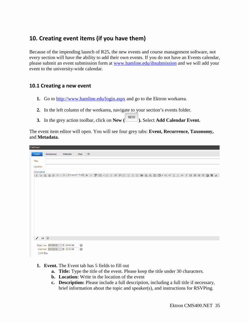
The event item editor will open. You will see four grey tabs: Event, Recurrence, Taxonomy, and Metadata.
1. Event. The Event tab has 5 fields to fill out a. Title: Type the title of the event. Please keep the title under 30 characters. b. Location: Write in the location of the event c. Description: Please include a full description, including a full title if necessary,
brief information about the topic and speaker(s), and instructions for RSVPing.
Ektron CMS400.NET 36
d. Start Time: The start time and date of the event e. End Time: The end time and date of the event.
If it is an all-day event, select the All Day checkbox.
2. Recurrence. If this event recurs multiple times, check the Recurrence checkbox and fill out the correct formula.
3. Taxonomy. This functions in the same way as the Category tab does for news items. Event items will be displayed in lists for every category that is selected.
4. Metadata. Enter information that is programmed to display, including Event Cost, Event Contact Information, Event Teaser, Event Image, and Event Sponsor. Other fields like Title and Description and MapAddress are not needed.
Ektron CMS400.NET 37
11. Creating other common content blocks: title bars, contact boxes, and related links There are many other content blocks that you can build to drag onto your page. This section will go over 4 content blocks web editors might want to use on their pages. Other content items will be discussed in further training sessions. For a full list of what content items or modules are sized for a particular page type, please see the “Page Types” handout.
11.1 Title bar The title bar is the (usually) red rectangle at the top of all Content and Program page types. The School page type also has a title bar, and web editors will have the ability to choose a particular color from that school’s color palette. Create one title bar for each school, department, or office – this will display your area’s name on all Program or Content page types in your area’s website to help web visitors know what area of the university they are in. Creating a title bar NOTE: These instructions are for creating text for the red title bars ONLY. School web editors will have access to a form that allows them to choose the background color; as of January 10 this form is still in production.
1. Go to http://www.hamline.edu/login.aspx and go to the Ektron workarea.
2. In the left column of the workarea, navigate to your section’s Page Content folder.
3. In the grey action toolbar, click on New ( ). Select HTML Content.
4. Use the Ektron title field to name the content item something you’ll recognize when pulling it onto the page.
5. In the WYSIWYG content field, simply type in the name of your office, department, or school.
Adding the title bar to your page
1. Open your page for editing
Ektron CMS400.NET 38
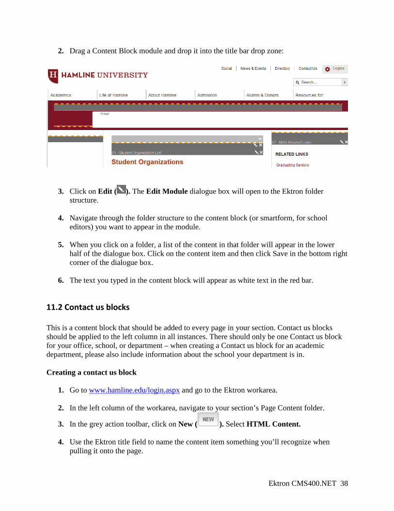
2. Drag a Content Block module and drop it into the title bar drop zone:
3. Click on Edit ( ). The Edit Module dialogue box will open to the Ektron folder structure.
4. Navigate through the folder structure to the content block (or smartform, for school
editors) you want to appear in the module.
5. When you click on a folder, a list of the content in that folder will appear in the lower half of the dialogue box. Click on the content item and then click Save in the bottom right corner of the dialogue box.
6. The text you typed in the content block will appear as white text in the red bar.
11.2 Contact us blocks This is a content block that should be added to every page in your section. Contact us blocks should be applied to the left column in all instances. There should only be one Contact us block for your office, school, or department – when creating a Contact us block for an academic department, please also include information about the school your department is in. Creating a contact us block
1. Go to www.hamline.edu/login.aspx and go to the Ektron workarea.
2. In the left column of the workarea, navigate to your section’s Page Content folder.
3. In the grey action toolbar, click on New ( ). Select HTML Content.
4. Use the Ektron title field to name the content item something you’ll recognize when pulling it onto the page.
Ektron CMS400.NET 39
5. In the WYSIWYG content field, type in and format your area’s contact information. See the pre-populated example in your Page Content folder for formatting suggestions.
Adding the contact us block to your page
1. Open your page for editing
2. Drag a Content Block module and drop it into the left column drop zone.
3. Click on Edit ( ). The Edit Module dialogue box will open to the Ektron folder structure.
4. Navigate through the folder structure to the content block or smartform you want to
appear in the module.
5. When you click on a folder, a list of the content in that folder will appear in the lower half of the dialogue box. Click on the content item and then click Save in the bottom right corner of the dialogue box.
6. The text you typed in the content block will appear.
11.3 Related links and Forms Related links and Forms blocks are created and added to pages in the same way as the red title bars, discussed above. Both of these content blocks should be used in the right column of any page type. Related links: see the pre-populated example in your Page Content folder. A related links block should be used when you want to provide links to pages that do not live in your area’s Pagebuilder folders. Forms: these should be formatted similarly to the Related links blocks. Use this to provide list of forms relevant to your area.
Ektron CMS400.NET 40
12. Webforms Forms for web visitors to enter data into are called Webforms. Webforms can be set up to either email the user’s submission to a specified email address, or get pulled as a database report in the Ektron workarea.
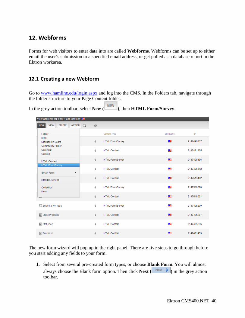
12.1 Creating a new Webform
Go to www.hamline.edu/login.aspx and log into the CMS. In the Folders tab, navigate through the folder structure to your Page Content folder.
In the grey action toolbar, select New ( ), then HTML Form/Survey.
The new form wizard will pop up in the right panel. There are five steps to go through before you start adding any fields to your form.
1. Select from several pre-created form types, or choose Blank Form. You will almost always choose the Blank form option. Then click Next ( ) in the grey action toolbar.
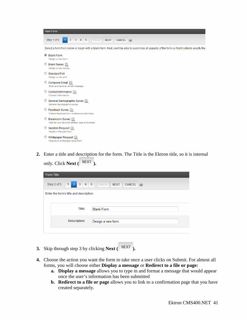
Ektron CMS400.NET 41
2. Enter a title and description for the form. The Title is the Ektron title, so it is internal
only. Click Next ( ).
3. Skip through step 3 by clicking Next ( ).
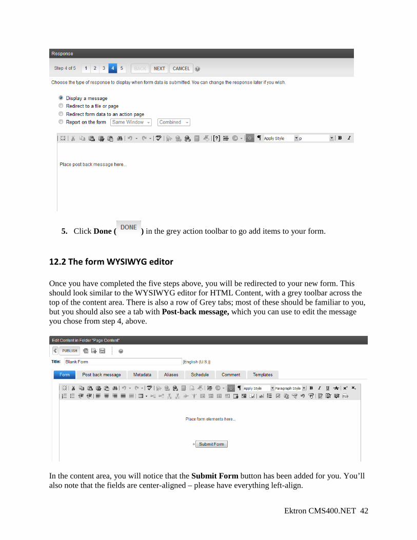
4. Choose the action you want the form to take once a user clicks on Submit. For almost all forms, you will choose either Display a message or Redirect to a file or page:
a. Display a message allows you to type in and format a message that would appear once the user’s information has been submitted
b. Redirect to a file or page allows you to link to a confirmation page that you have created separately.
Ektron CMS400.NET 42
5. Click Done ( ) in the grey action toolbar to go add items to your form.
12.2 The form WYSIWYG editor Once you have completed the five steps above, you will be redirected to your new form. This should look similar to the WYSIWYG editor for HTML Content, with a grey toolbar across the top of the content area. There is also a row of Grey tabs; most of these should be familiar to you, but you should also see a tab with Post-back message, which you can use to edit the message you chose from step 4, above.
In the content area, you will notice that the Submit Form button has been added for you. You’ll also note that the fields are center-aligned – please have everything left-align.
Ektron CMS400.NET 43
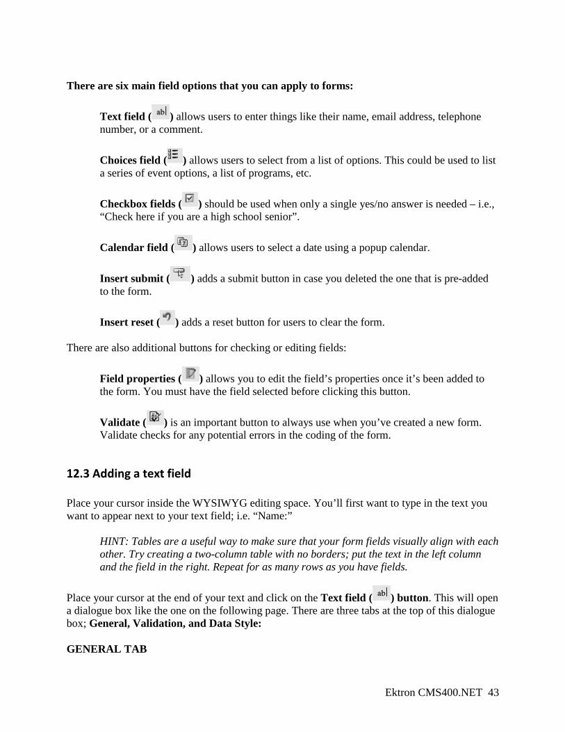
There are six main field options that you can apply to forms:
Text field ( ) allows users to enter things like their name, email address, telephone number, or a comment. Choices field ( ) allows users to select from a list of options. This could be used to list a series of event options, a list of programs, etc. Checkbox fields ( ) should be used when only a single yes/no answer is needed – i.e., “Check here if you are a high school senior”. Calendar field ( ) allows users to select a date using a popup calendar.
Insert submit ( ) adds a submit button in case you deleted the one that is pre-added to the form. Insert reset ( ) adds a reset button for users to clear the form.
There are also additional buttons for checking or editing fields:
Field properties ( ) allows you to edit the field’s properties once it’s been added to the form. You must have the field selected before clicking this button.
Validate ( ) is an important button to always use when you’ve created a new form. Validate checks for any potential errors in the coding of the form.
12.3 Adding a text field Place your cursor inside the WYSIWYG editing space. You’ll first want to type in the text you want to appear next to your text field; i.e. “Name:”
HINT: Tables are a useful way to make sure that your form fields visually align with each other. Try creating a two-column table with no borders; put the text in the left column and the field in the right. Repeat for as many rows as you have fields.
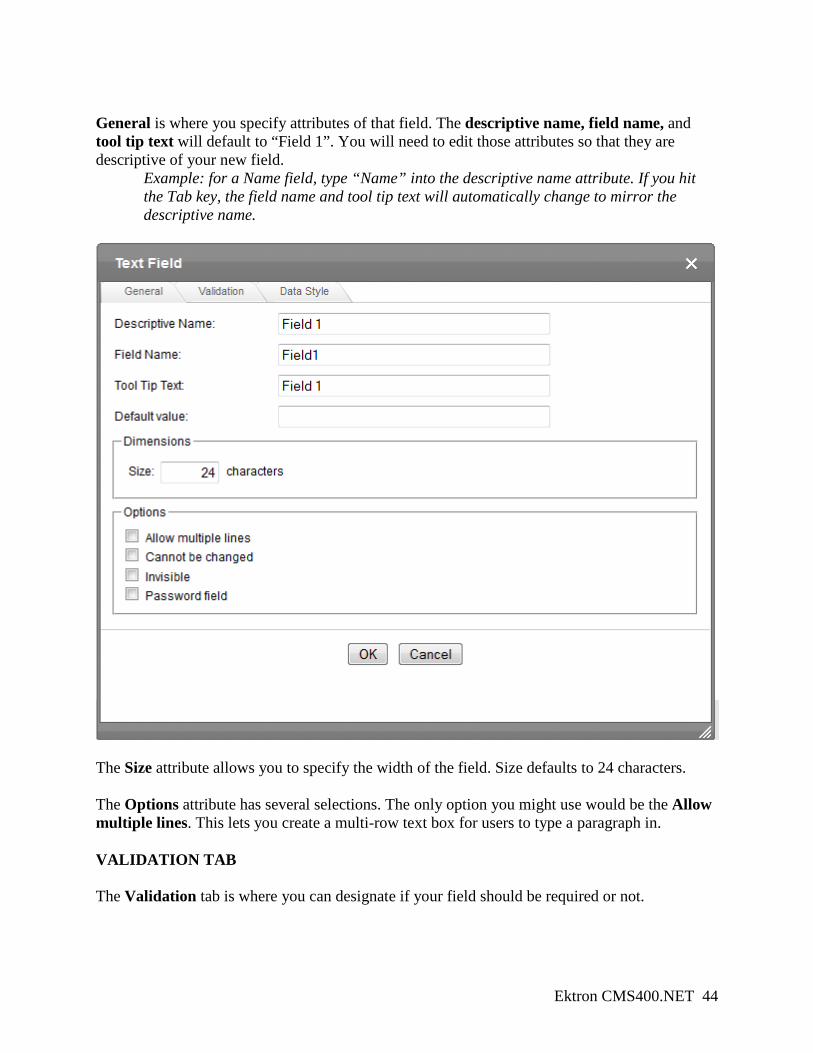
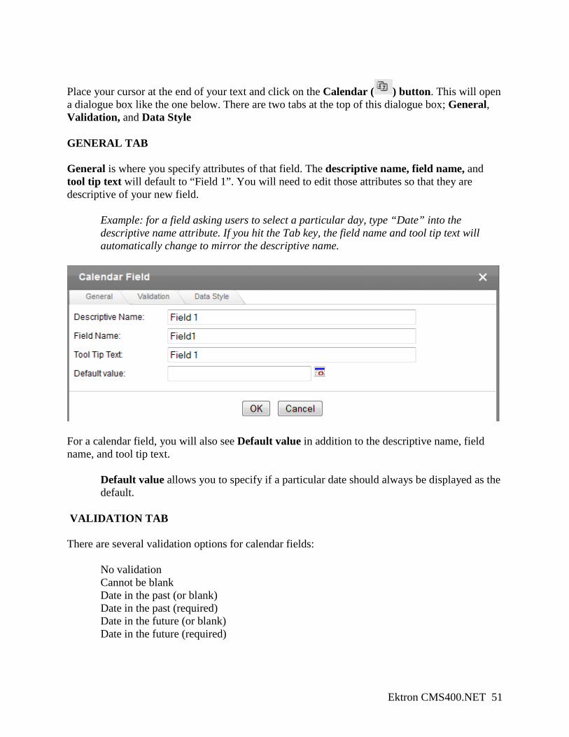
Place your cursor at the end of your text and click on the Text field ( ) button. This will open a dialogue box like the one on the following page. There are three tabs at the top of this dialogue box; General, Validation, and Data Style: GENERAL TAB
Ektron CMS400.NET 44
General is where you specify attributes of that field. The descriptive name, field name, and tool tip text will default to “Field 1”. You will need to edit those attributes so that they are descriptive of your new field.
Example: for a Name field, type “Name” into the descriptive name attribute. If you hit the Tab key, the field name and tool tip text will automatically change to mirror the descriptive name.
The Size attribute allows you to specify the width of the field. Size defaults to 24 characters. The Options attribute has several selections. The only option you might use would be the Allow multiple lines. This lets you create a multi-row text box for users to type a paragraph in. VALIDATION TAB The Validation tab is where you can designate if your field should be required or not.
Ektron CMS400.NET 45
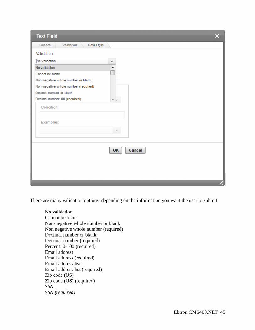
There are many validation options, depending on the information you want the user to submit: No validation Cannot be blank Non-negative whole number or blank Non negative whole number (required) Decimal number or blank Decimal number (required) Percent: 0-100 (required) Email address Email address (required) Email address list Email address list (required) Zip code (US) Zip code (US) (required)
SSN SSN (required)
Ektron CMS400.NET 46
Postal code (Canada) Postal code (Canada) (required) Social Insurance Number (Canada) Social Insurance Number (Canada) (required) Telephone Telephone (required) URL ISBN ISSN NOTE: Italicized options should never be used, as the Hamline website is not secured for these kinds of information transactions. Custom validation rules can be created by Marketing Communications. To initiate a conversation about custom validation, please submit a project request form at www.hamline.edu/webrequest.
DATA STYLE TAB Do not make any changes or additions to this tab. All text formatting changes will be overridden by the university-wide stylesheet.
12.4 Adding a choices field A Choices field ( ) allows you to create a list of options for users to select between. This can be a “choose one” or “choose many” list. Place your cursor inside the WYSIWYG editing space. You’ll first want to type in the text you want to appear next to your choices field; i.e. “Programs:” Place your cursor at the end of your text and click on the Choices field ( ) button. This will open a dialogue box like the one below. There are three tabs at the top of this dialogue box; General, Validation, and Data Style. GENERAL TAB General is where you specify attributes of that field. The descriptive name, field name, and tool tip text will default to “Field 1”. You will need to edit those attributes so that they are descriptive of your new field.
Example: for a list of information session dates for users to select, type “Sessions” into the descriptive name attribute. If you hit the Tab key, the field name and tool tip text will automatically change to mirror the descriptive name.
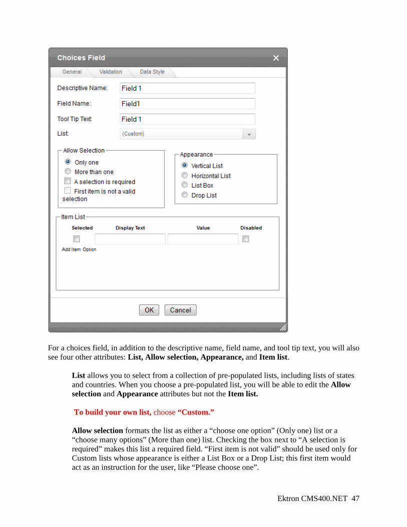
Ektron CMS400.NET 47
For a choices field, in addition to the descriptive name, field name, and tool tip text, you will also see four other attributes: List, Allow selection, Appearance, and Item list.
List allows you to select from a collection of pre-populated lists, including lists of states and countries. When you choose a pre-populated list, you will be able to edit the Allow selection and Appearance attributes but not the Item list. To build your own list, choose “Custom.” Allow selection formats the list as either a “choose one option” (Only one) list or a “choose many options” (More than one) list. Checking the box next to “A selection is required” makes this list a required field. “First item is not valid” should be used only for Custom lists whose appearance is either a List Box or a Drop List; this first item would act as an instruction for the user, like “Please choose one”.
Ektron CMS400.NET 48
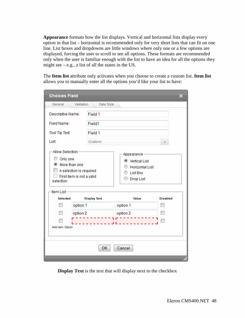
Appearance formats how the list displays. Vertical and horizontal lists display every option in that list – horizontal is recommended only for very short lists that can fit on one line. List boxes and dropdowns are little windows where only one or a few options are displayed, forcing the user to scroll to see all options. These formats are recommended only when the user is familiar enough with the list to have an idea for all the options they might see – e.g., a list of all the states in the US. The Item list attribute only activates when you choose to create a custom list. Item list allows you to manually enter all the options you’d like your list to have:
Display Text is the text that will display next to the checkbox
Ektron CMS400.NET 49
Value is the text that will appear in the database or email submission – this usually should be similar to the display text. Selected indicates that that checkbox will be pre-selected for users Disable allows you to remove an option temporarily.
To add a list item, click on the grey plus sign ( ) at the bottom of the list. To delete or reorder a list item, click on the page icon ( ) and choose from the options presented.
VALIDATION TAB Validation for choice lists is handled in the Allow selection attribute from the General tab. Choose “A selection is required” to force users to make a selection in your list. DATA STYLES TAB Do not make any changes or additions to this tab. All text formatting changes will be overridden by the university-wide stylesheet.
12.5 Adding a checkbox field Checkbox fields ( ) are similar to choice list fields, except that they are only used for a single true/false option. Place your cursor inside the WYSIWYG editing space. You’ll first want to type in the text you want to appear next to your checkbox field; i.e. “I am a high school senior:” Place your cursor at the end of your text and click on the Checkbox field ( ) button. This will open a dialogue box like the one below. There are two tabs at the top of this dialogue box; General and Validation. GENERAL TAB General is where you specify attributes of that field. The descriptive name, field name, and tool tip text will default to “Field 1”. You will need to edit those attributes so that they are descriptive of your new field.
Example: for a single checkbox asking if a prospective student is a high school senior, type “HS Senior” into the descriptive name attribute. If you hit the Tab key, the field name and tool tip text will automatically change to mirror the descriptive name.
Ektron CMS400.NET 50
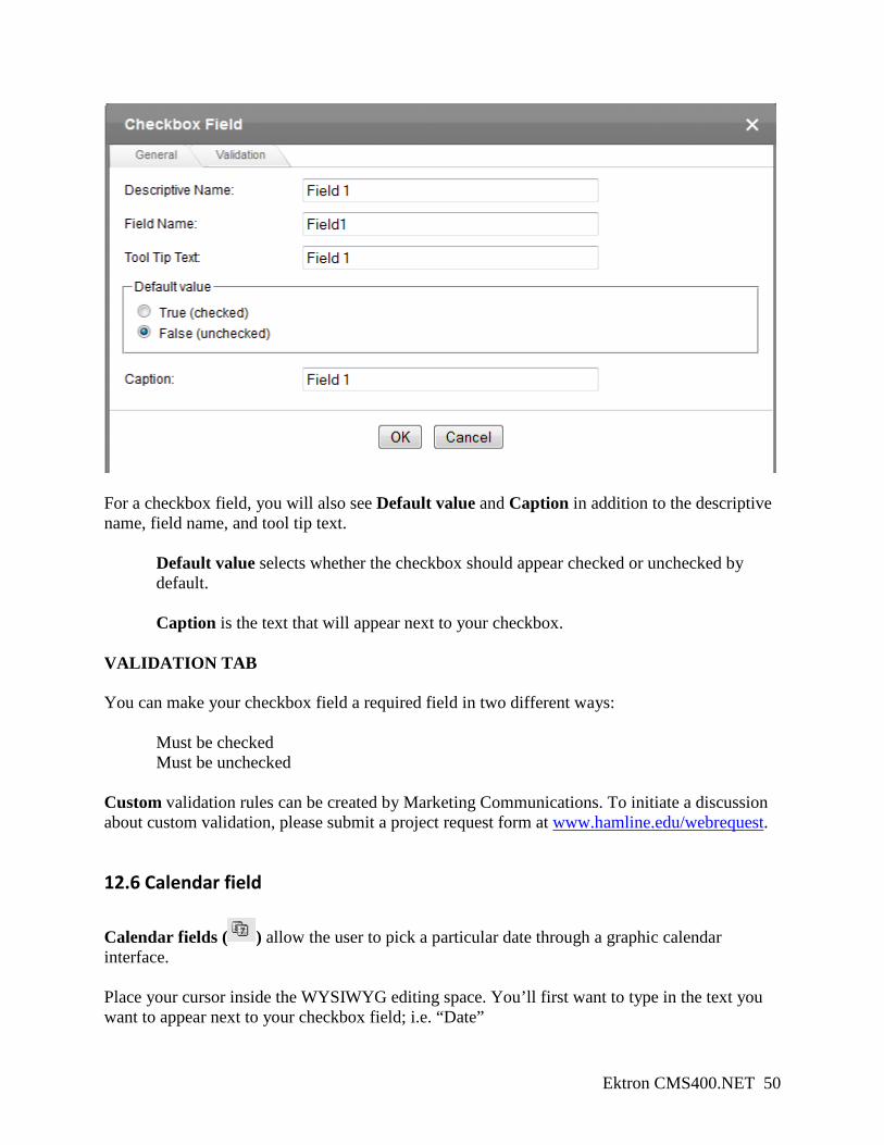
For a checkbox field, you will also see Default value and Caption in addition to the descriptive name, field name, and tool tip text.
Default value selects whether the checkbox should appear checked or unchecked by default. Caption is the text that will appear next to your checkbox.
VALIDATION TAB You can make your checkbox field a required field in two different ways: Must be checked Must be unchecked Custom validation rules can be created by Marketing Communications. To initiate a discussion about custom validation, please submit a project request form at www.hamline.edu/webrequest.
12.6 Calendar field Calendar fields ( ) allow the user to pick a particular date through a graphic calendar interface. Place your cursor inside the WYSIWYG editing space. You’ll first want to type in the text you want to appear next to your checkbox field; i.e. “Date”
Ektron CMS400.NET 51
Place your cursor at the end of your text and click on the Calendar ( ) button. This will open a dialogue box like the one below. There are two tabs at the top of this dialogue box; General, Validation, and Data Style GENERAL TAB General is where you specify attributes of that field. The descriptive name, field name, and tool tip text will default to “Field 1”. You will need to edit those attributes so that they are descriptive of your new field.
Example: for a field asking users to select a particular day, type “Date” into the descriptive name attribute. If you hit the Tab key, the field name and tool tip text will automatically change to mirror the descriptive name.
For a calendar field, you will also see Default value in addition to the descriptive name, field name, and tool tip text.
Default value allows you to specify if a particular date should always be displayed as the default.
VALIDATION TAB There are several validation options for calendar fields: No validation Cannot be blank
Date in the past (or blank) Date in the past (required) Date in the future (or blank) Date in the future (required)
Ektron CMS400.NET 52
Custom validation rules can be created by Marketing Communications. To initiate a conversation about custom validation, please submit a project request form at www.hamline.edu/webrequest.
DATA STYLES TAB Do not make any changes or additions to this tab. All text formatting changes will be overridden by the university-wide stylesheet.
12.7 Adding a reset or submit button To insert a reset or submit button, place your cursor inside the WYSIWYG editing space where you want the button to appear (generally at the end of the form) and click on either Insert reset ( ) or Insert submit ( ). You should be able to right click on each button and select Field properties ( ) from the list – this will allow you to change the text on each button. You can also edit the buttons by selecting a button with your cursor; you should see some editable fields appear at the bottom of the WYSIWYG editing space. Use these fields to make your edits. The Name, Value, and Tooltip attributes should all be similar: Submit or Submit form for a submit button, Reset or Reset form for a reset button.
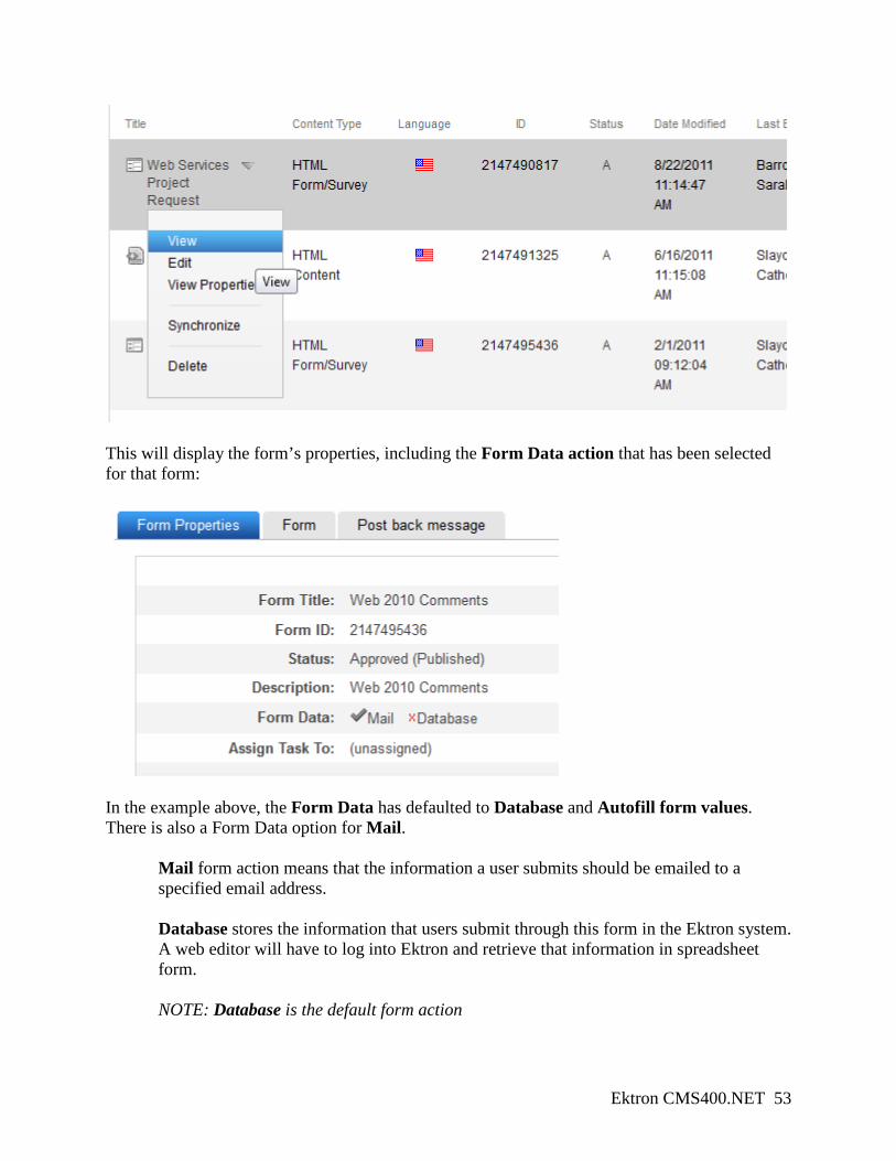
12.8 Choosing the form action Once you have published or checked-in your form, you will need to tell the form what to do with the data that the user has submitted. Click back in the left pane on your Page Content folder where the form lives. In the right pane of the workarea, click on the grey arrow next to your new form and select View:
Ektron CMS400.NET 53
This will display the form’s properties, including the Form Data action that has been selected for that form:
In the example above, the Form Data has defaulted to Database and Autofill form values. There is also a Form Data option for Mail.
Mail form action means that the information a user submits should be emailed to a specified email address. Database stores the information that users submit through this form in the Ektron system. A web editor will have to log into Ektron and retrieve that information in spreadsheet form. NOTE: Database is the default form action
Ektron CMS400.NET 54
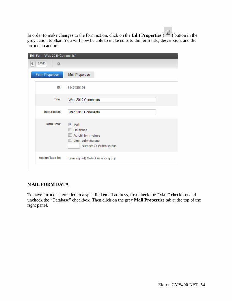
In order to make changes to the form action, click on the Edit Properties ( ) button in the grey action toolbar. You will now be able to make edits to the form title, description, and the form data action:
MAIL FORM DATA To have form data emailed to a specified email address, first check the “Mail” checkbox and uncheck the “Database” checkbox. Then click on the grey Mail Properties tab at the top of the right panel.
Ektron CMS400.NET 55
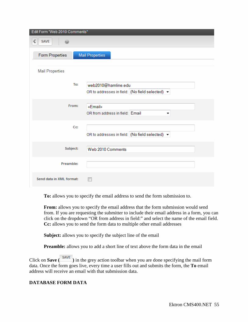
To: allows you to specify the email address to send the form submission to.
From: allows you to specify the email address that the form submission would send from. If you are requesting the submitter to include their email address in a form, you can click on the dropdown “OR from address in field:” and select the name of the email field. Cc: allows you to send the form data to multiple other email addresses Subject: allows you to specify the subject line of the email Preamble: allows you to add a short line of text above the form data in the email
Click on Save ( ) in the grey action toolbar when you are done specifying the mail form data. Once the form goes live, every time a user fills out and submits the form, the To email address will receive an email with that submission data. DATABASE FORM DATA
Ektron CMS400.NET 56
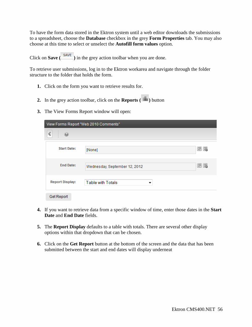
To have the form data stored in the Ektron system until a web editor downloads the submissions to a spreadsheet, choose the Database checkbox in the grey Form Properties tab. You may also choose at this time to select or unselect the Autofill form values option. Click on Save ( ) in the grey action toolbar when you are done. To retrieve user submissions, log in to the Ektron workarea and navigate through the folder structure to the folder that holds the form.
1. Click on the form you want to retrieve results for.
2. In the grey action toolbar, click on the Reports ( ) button
3. The View Forms Report window will open:
4. If you want to retrieve data from a specific window of time, enter those dates in the Start Date and End Date fields.
5. The Report Display defaults to a table with totals. There are several other display options within that dropdown that can be chosen.
6. Click on the Get Report button at the bottom of the screen and the data that has been submitted between the start and end dates will display underneat
Ektron CMS400.NET 57
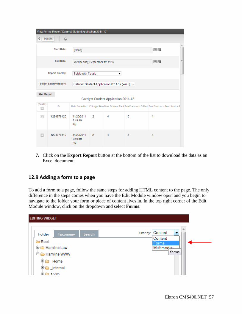
7. Click on the Export Report button at the bottom of the list to download the data as an
Excel document.
12.9 Adding a form to a page To add a form to a page, follow the same steps for adding HTML content to the page. The only difference in the steps comes when you have the Edit Module window open and you begin to navigate to the folder your form or piece of content lives in. In the top right corner of the Edit Module window, click on the dropdown and select Forms:
Ektron CMS400.NET 58
13. Smartforms A smartform is a tool that web editors can use to put in information that is set to display in a specific way. For example, the banners for the Frontpage page type and the Program page type are a set of fields that web editors enter photos and text into – the smartform is programmed to then format those fields and create the banner functionality. You have already seen two examples of smartforms in action: news items and event items.
13.1 Frontpage and Program banners Banners are the main image areas on both the Program page type and the Frontpage page type. The process for creating and adding the two types of banners is the same; the main difference is the size of the images. Creating a banner
1. Go to www.hamline.edu/login.aspx and go to the Ektron workarea.
2. In the left column of the workarea, navigate to your section’s Page Content folder.
3. In the grey action toolbar, click on New ( ). Hover over Smartform, then select Program Banner or Front Page Banner, depending on what page type you want to use.
4. Use the Ektron title field to name the banner.
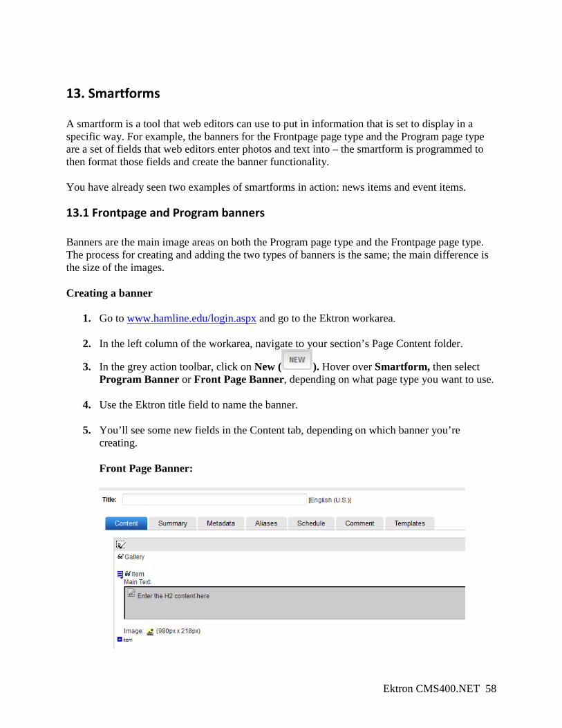
5. You’ll see some new fields in the Content tab, depending on which banner you’re creating. Front Page Banner:
Ektron CMS400.NET 59
a. One Item corresponds to one image, with a text header (Main Text) overlaid on top.
b. Images must be cropped to 980 x 218 pixels. This must occur before they are uploaded into Ektron. If you do not have the ability to crop images, please submit an image request form at www.hamline.edu/webrequest.
Program Banner:
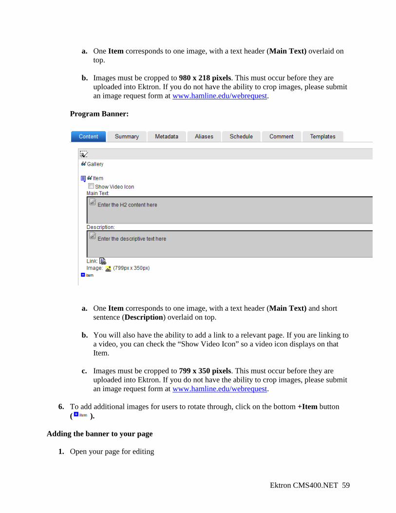
a. One Item corresponds to one image, with a text header (Main Text) and short sentence (Description) overlaid on top.
b. You will also have the ability to add a link to a relevant page. If you are linking to a video, you can check the “Show Video Icon” so a video icon displays on that Item.
c. Images must be cropped to 799 x 350 pixels. This must occur before they are uploaded into Ektron. If you do not have the ability to crop images, please submit an image request form at www.hamline.edu/webrequest.
6. To add additional images for users to rotate through, click on the bottom +Item button ( ).
Adding the banner to your page
1. Open your page for editing
Ektron CMS400.NET 60
2. Drag a Content Block module and drop it into the banner drop zone.
3. Click on Edit ( ). The Edit Module dialogue box will open to the Ektron folder structure.
4. Navigate through the folder structure to the folder that holds the banner.
5. In the list of content in the lower half of the dialogue box, double-click on the banner.
6. The banner will appear in the dropzone.
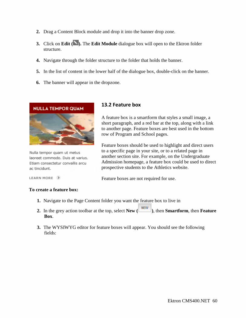
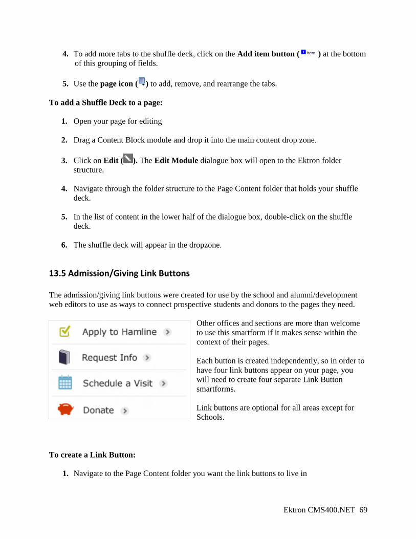
13.2 Feature box A feature box is a smartform that styles a small image, a short paragraph, and a red bar at the top, along with a link to another page. Feature boxes are best used in the bottom row of Program and School pages. Feature boxes should be used to highlight and direct users to a specific page in your site, or to a related page in another section site. For example, on the Undergraduate Admission homepage, a feature box could be used to direct prospective students to the Athletics website. Feature boxes are not required for use.
To create a feature box:
1. Navigate to the Page Content folder you want the feature box to live in
2. In the grey action toolbar at the top, select New ( ), then Smartform, then Feature Box.
3. The WYSIWYG editor for feature boxes will appear. You should see the following fields:
Ektron CMS400.NET 61
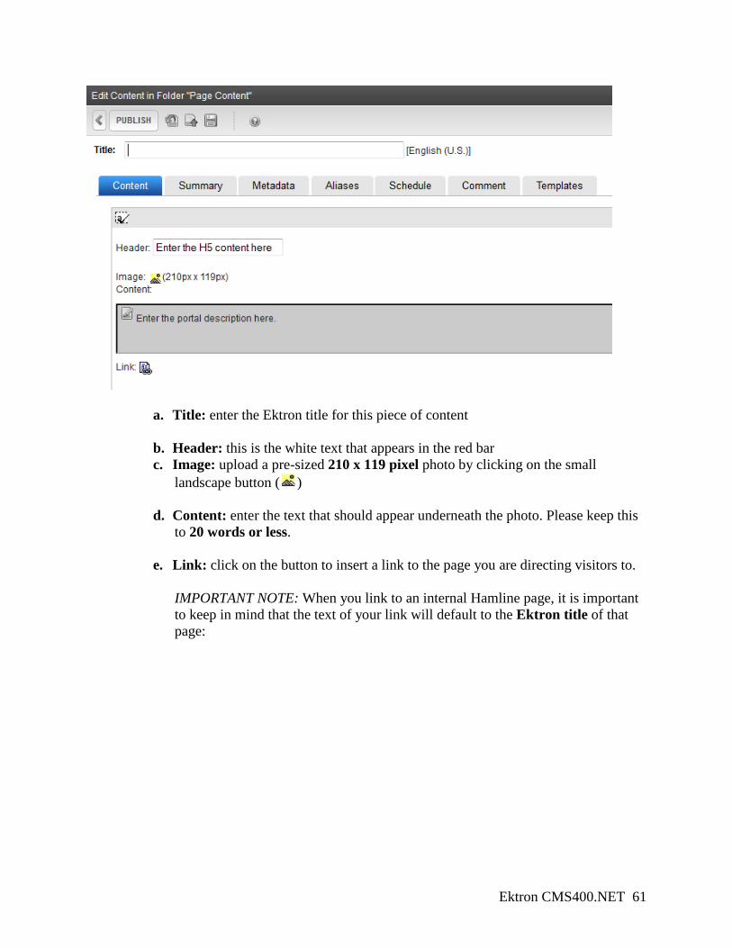
a. Title: enter the Ektron title for this piece of content
b. Header: this is the white text that appears in the red bar c. Image: upload a pre-sized 210 x 119 pixel photo by clicking on the small
landscape button ( )
d. Content: enter the text that should appear underneath the photo. Please keep this to 20 words or less.
e. Link: click on the button to insert a link to the page you are directing visitors to. IMPORTANT NOTE: When you link to an internal Hamline page, it is important to keep in mind that the text of your link will default to the Ektron title of that page:
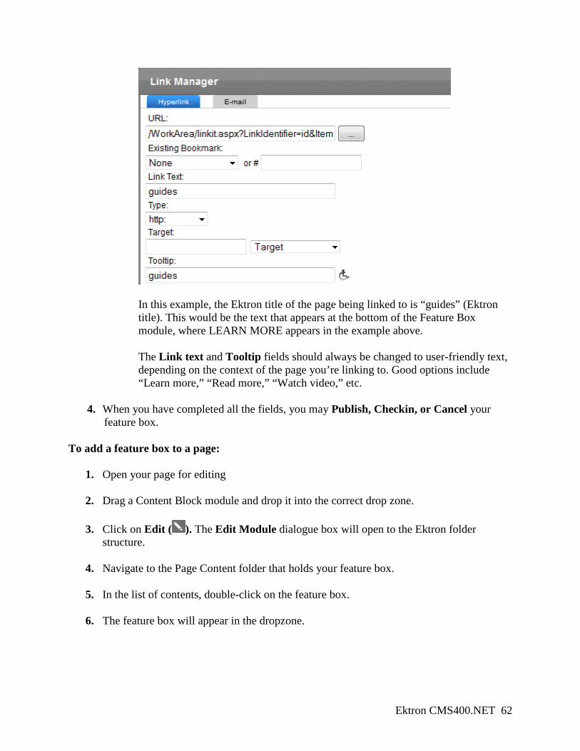
Ektron CMS400.NET 62
In this example, the Ektron title of the page being linked to is “guides” (Ektron title). This would be the text that appears at the bottom of the Feature Box module, where LEARN MORE appears in the example above. The Link text and Tooltip fields should always be changed to user-friendly text, depending on the context of the page you’re linking to. Good options include “Learn more,” “Read more,” “Watch video,” etc.
4. When you have completed all the fields, you may Publish, Checkin, or Cancel your feature box.
To add a feature box to a page:
1. Open your page for editing
2. Drag a Content Block module and drop it into the correct drop zone.
3. Click on Edit ( ). The Edit Module dialogue box will open to the Ektron folder structure.
4. Navigate to the Page Content folder that holds your feature box.
5. In the list of contents, double-click on the feature box.
6. The feature box will appear in the dropzone.
Ektron CMS400.NET 63
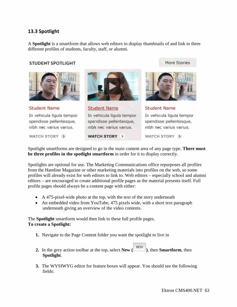
13.3 Spotlight A Spotlight is a smartform that allows web editors to display thumbnails of and link to three different profiles of students, faculty, staff, or alumni.
Spotlight smartforms are designed to go in the main content area of any page type. There must be three profiles in the spotlight smartform in order for it to display correctly. Spotlights are optional for use. The Marketing Communications office repurposes all profiles from the Hamline Magazine or other marketing materials into profiles on the web, so some profiles will already exist for web editors to link to. Web editors – especially school and alumni editors – are encouraged to create additional profile pages as the material presents itself. Full profile pages should always be a content page with either:
• A 475-pixel-wide photo at the top, with the text of the story underneath • An embedded video from YouTube, 475 pixels wide, with a short text paragraph
underneath giving an overview of the video contents. The Spotlight smartform would then link to these full profile pages. To create a Spotlight:
1. Navigate to the Page Content folder you want the spotlight to live in
2. In the grey action toolbar at the top, select New ( ), then Smartform, then Spotlight.
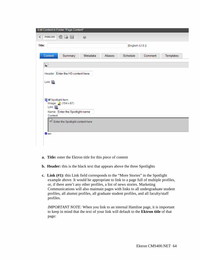
3. The WYSIWYG editor for feature boxes will appear. You should see the following fields:
Ektron CMS400.NET 64
a. Title: enter the Ektron title for this piece of content
b. Header: this is the black text that appears above the three Spotlights
c. Link (#1): this Link field corresponds to the “More Stories” in the Spotlight example above. It would be appropriate to link to a page full of multiple profiles, or, if there aren’t any other profiles, a list of news stories. Marketing Communications will also maintain pages with links to all undergraduate student profiles, all alumni profiles, all graduate student profiles, and all faculty/staff profiles. IMPORTANT NOTE: When you link to an internal Hamline page, it is important to keep in mind that the text of your link will default to the Ektron title of that page:
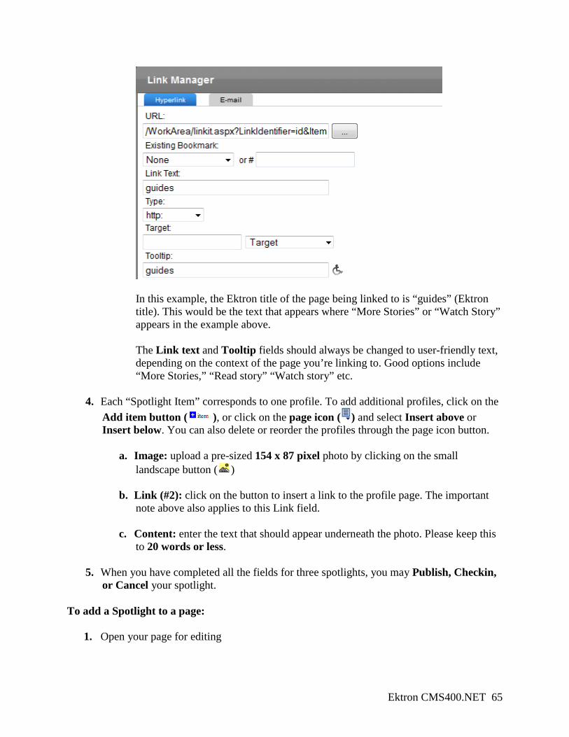
Ektron CMS400.NET 65
In this example, the Ektron title of the page being linked to is “guides” (Ektron title). This would be the text that appears where “More Stories” or “Watch Story” appears in the example above. The Link text and Tooltip fields should always be changed to user-friendly text, depending on the context of the page you’re linking to. Good options include “More Stories,” “Read story” “Watch story” etc.
4. Each “Spotlight Item” corresponds to one profile. To add additional profiles, click on the Add item button ( ), or click on the page icon ( ) and select Insert above or Insert below. You can also delete or reorder the profiles through the page icon button.
a. Image: upload a pre-sized 154 x 87 pixel photo by clicking on the small landscape button ( )
b. Link (#2): click on the button to insert a link to the profile page. The important note above also applies to this Link field.
c. Content: enter the text that should appear underneath the photo. Please keep this to 20 words or less.
5. When you have completed all the fields for three spotlights, you may Publish, Checkin, or Cancel your spotlight.
To add a Spotlight to a page:
1. Open your page for editing
Ektron CMS400.NET 66
2. Drag a Content Block module and drop it into the main content drop zone.
3. Click on Edit ( ). The Edit Module dialogue box will open to the Ektron folder structure.
4. Navigate through the folder structure to the Page Content folder that holds your spotlight.
5. In the list of content in the lower half of the dialogue box, double-click on the spotlight.
6. The spotlight will appear in the dropzone.
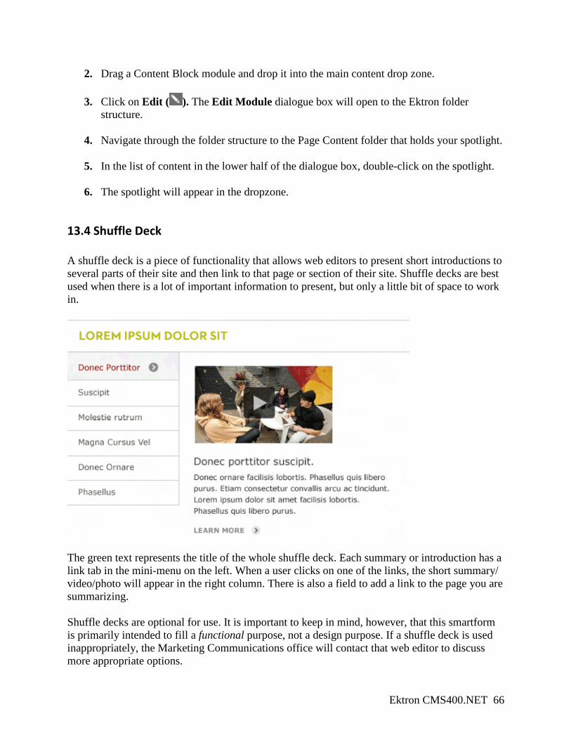
13.4 Shuffle Deck A shuffle deck is a piece of functionality that allows web editors to present short introductions to several parts of their site and then link to that page or section of their site. Shuffle decks are best used when there is a lot of important information to present, but only a little bit of space to work in.
The green text represents the title of the whole shuffle deck. Each summary or introduction has a link tab in the mini-menu on the left. When a user clicks on one of the links, the short summary/ video/photo will appear in the right column. There is also a field to add a link to the page you are summarizing. Shuffle decks are optional for use. It is important to keep in mind, however, that this smartform is primarily intended to fill a functional purpose, not a design purpose. If a shuffle deck is used inappropriately, the Marketing Communications office will contact that web editor to discuss more appropriate options.
Ektron CMS400.NET 67
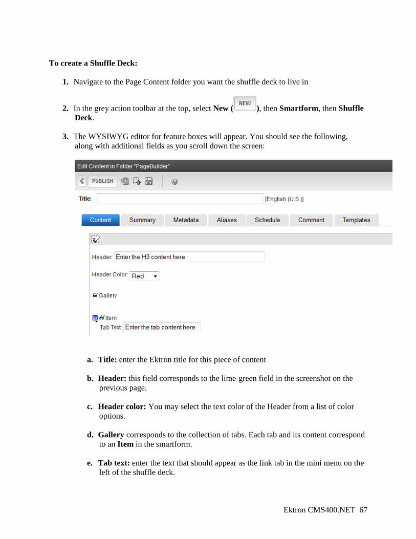
To create a Shuffle Deck:
1. Navigate to the Page Content folder you want the shuffle deck to live in
2. In the grey action toolbar at the top, select New ( ), then Smartform, then Shuffle Deck.
3. The WYSIWYG editor for feature boxes will appear. You should see the following, along with additional fields as you scroll down the screen:
a. Title: enter the Ektron title for this piece of content
b. Header: this field corresponds to the lime-green field in the screenshot on the previous page.
c. Header color: You may select the text color of the Header from a list of color options.
d. Gallery corresponds to the collection of tabs. Each tab and its content correspond to an Item in the smartform.
e. Tab text: enter the text that should appear as the link tab in the mini menu on the left of the shuffle deck.
Ektron CMS400.NET 68
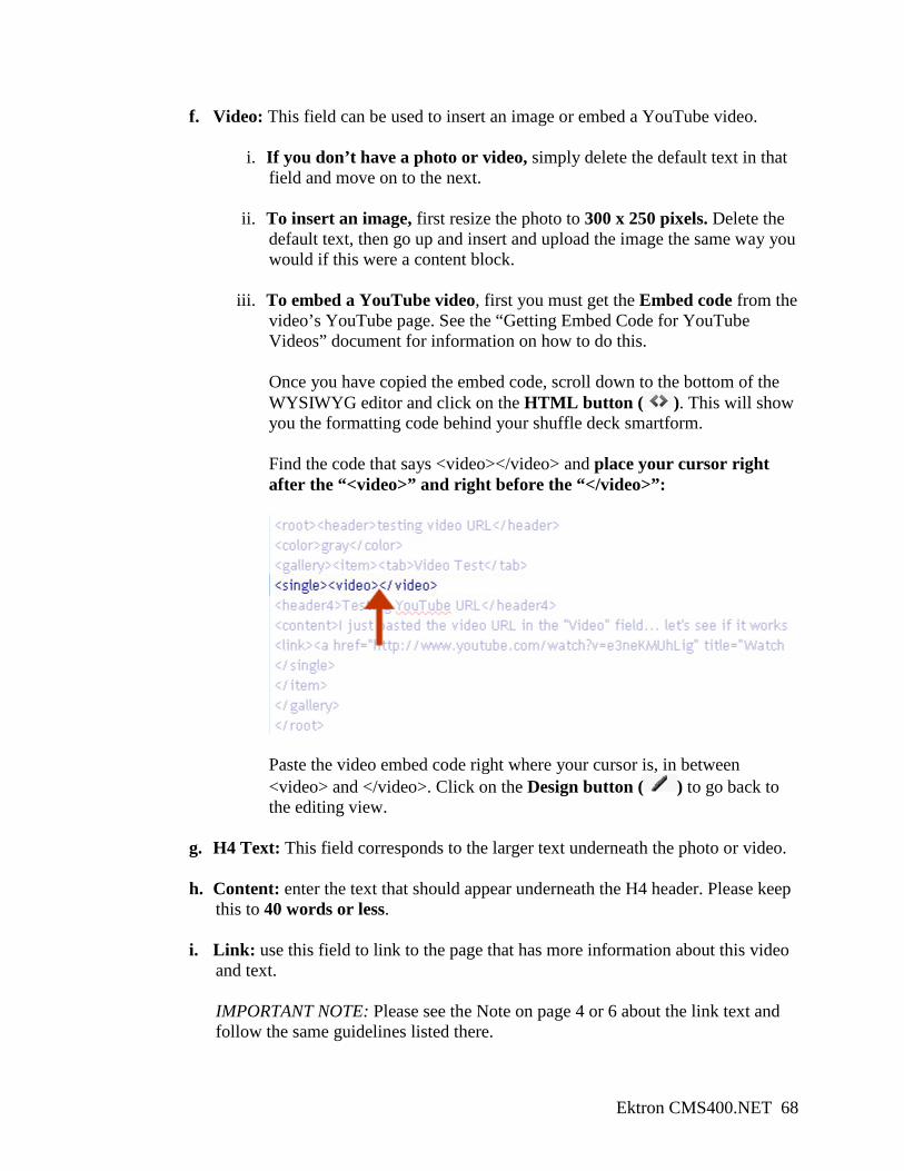
f. Video: This field can be used to insert an image or embed a YouTube video.
i. If you don’t have a photo or video, simply delete the default text in that field and move on to the next.
ii. To insert an image, first resize the photo to 300 x 250 pixels. Delete the default text, then go up and insert and upload the image the same way you would if this were a content block.
iii. To embed a YouTube video, first you must get the Embed code from the video’s YouTube page. See the “Getting Embed Code for YouTube Videos” document for information on how to do this. Once you have copied the embed code, scroll down to the bottom of the WYSIWYG editor and click on the HTML button ( ). This will show you the formatting code behind your shuffle deck smartform. Find the code that says <video></video> and place your cursor right after the “<video>” and right before the “</video>”:
Paste the video embed code right where your cursor is, in between <video> and </video>. Click on the Design button ( ) to go back to the editing view.
g. H4 Text: This field corresponds to the larger text underneath the photo or video.
h. Content: enter the text that should appear underneath the H4 header. Please keep this to 40 words or less.
i. Link: use this field to link to the page that has more information about this video and text. IMPORTANT NOTE: Please see the Note on page 4 or 6 about the link text and follow the same guidelines listed there.
Ektron CMS400.NET 69
4. To add more tabs to the shuffle deck, click on the Add item button ( ) at the bottom of this grouping of fields.
5. Use the page icon ( ) to add, remove, and rearrange the tabs. To add a Shuffle Deck to a page:
1. Open your page for editing
2. Drag a Content Block module and drop it into the main content drop zone.
3. Click on Edit ( ). The Edit Module dialogue box will open to the Ektron folder structure.
4. Navigate through the folder structure to the Page Content folder that holds your shuffle
deck.
5. In the list of content in the lower half of the dialogue box, double-click on the shuffle deck.
6. The shuffle deck will appear in the dropzone.
13.5 Admission/Giving Link Buttons The admission/giving link buttons were created for use by the school and alumni/development web editors to use as ways to connect prospective students and donors to the pages they need.
Other offices and sections are more than welcome to use this smartform if it makes sense within the context of their pages. Each button is created independently, so in order to have four link buttons appear on your page, you will need to create four separate Link Button smartforms. Link buttons are optional for all areas except for Schools.
To create a Link Button:
1. Navigate to the Page Content folder you want the link buttons to live in
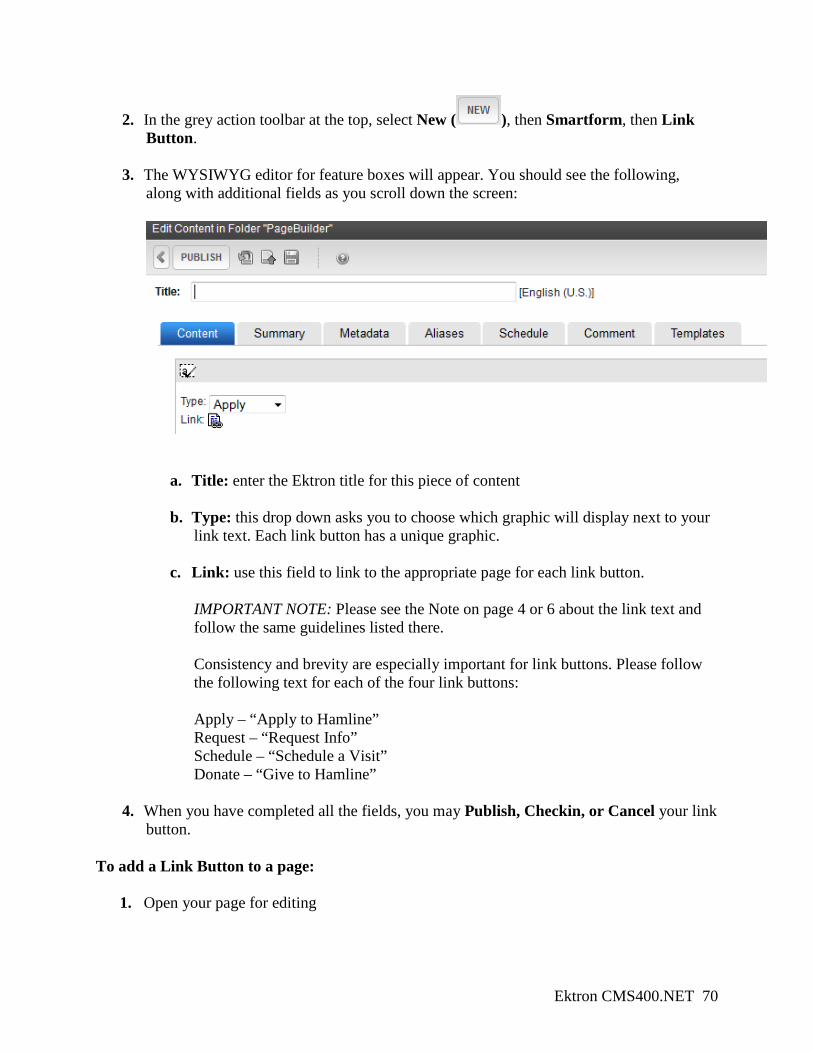
Ektron CMS400.NET 70
2. In the grey action toolbar at the top, select New ( ), then Smartform, then Link Button.
3. The WYSIWYG editor for feature boxes will appear. You should see the following, along with additional fields as you scroll down the screen:
a. Title: enter the Ektron title for this piece of content
b. Type: this drop down asks you to choose which graphic will display next to your link text. Each link button has a unique graphic.
c. Link: use this field to link to the appropriate page for each link button. IMPORTANT NOTE: Please see the Note on page 4 or 6 about the link text and follow the same guidelines listed there. Consistency and brevity are especially important for link buttons. Please follow the following text for each of the four link buttons: Apply – “Apply to Hamline” Request – “Request Info” Schedule – “Schedule a Visit” Donate – “Give to Hamline”
4. When you have completed all the fields, you may Publish, Checkin, or Cancel your link button.
To add a Link Button to a page:
1. Open your page for editing
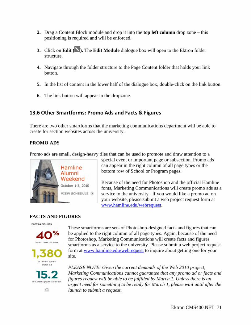
Ektron CMS400.NET 71
2. Drag a Content Block module and drop it into the top left column drop zone – this positioning is required and will be enforced.
3. Click on Edit ( ). The Edit Module dialogue box will open to the Ektron folder structure.
4. Navigate through the folder structure to the Page Content folder that holds your link
button.
5. In the list of content in the lower half of the dialogue box, double-click on the link button.
6. The link button will appear in the dropzone.
13.6 Other Smartforms: Promo Ads and Facts & Figures There are two other smartforms that the marketing communications department will be able to create for section websites across the university. PROMO ADS Promo ads are small, design-heavy tiles that can be used to promote and draw attention to a
special event or important page or subsection. Promo ads can appear in the right column of all page types or the bottom row of School or Program pages. Because of the need for Photoshop and the official Hamline fonts, Marketing Communications will create promo ads as a service to the university. If you would like a promo ad on your website, please submit a web project request form at www.hamline.edu/webrequest.
FACTS AND FIGURES
These smartforms are sets of Photoshop-designed facts and figures that can be applied to the right column of all page types. Again, because of the need for Photoshop, Marketing Communications will create facts and figures smartforms as a service to the university. Please submit a web project request form at www.hamline.edu/webrequest to inquire about getting one for your site. PLEASE NOTE: Given the current demands of the Web 2010 project, Marketing Communications cannot guarantee that any promo ad or facts and figures request will be able to be fulfilled by March 1. Unless there is an urgent need for something to be ready for March 1, please wait until after the launch to submit a request.
Ektron CMS400.NET 72
14. Slideshows and Photo Galleries Slideshows and photo galleries will be accommodated on the new Ektron site through a simple process of creating sets of photos in a Flickr account and pasting some code from an online application into a content block. To get started, please review the “Using Flickr to build slideshows and photo galleries” document. As a reminder, all images should be sized no wider than 475 pixels. Once you have completed the steps listed in the document above, select and copy the gallery code from Pictobrowser. To create a slideshow or photo gallery:
1. In Ektron, go to your Page Content folder and create a new HTML content block.
2. Click on the HTML button ( ) at the bottom of the WYSIWYG editor.
3. Paste the Pictobrowser code into the editing space.
4. You may return to the WYSIWYG editor by clicking on the Design button ( ). You are now able to insert text above or below the slideshow, if you like.
5. Click on Publish, Checkin, or Cancel in the grey action toolbar at the top.
To insert the slideshow or photo gallery into your page:
1. Open your page for editing
2. Drag a Content Block module and drop it into the main content area dropzone.
3. Click on Edit ( ). The Edit Module dialogue box will open to the Ektron folder structure.
4. Navigate through the folder structure to the Page Content folder that holds your
slideshow.
5. In the list of content in the lower half of the dialogue box, double-click on the slideshow.
6. The slideshow will appear in the dropzone.