Embed Size (px)
Citation preview
MyMyGraphical Graphical
RepresentationsRepresentationsBookletBooklet
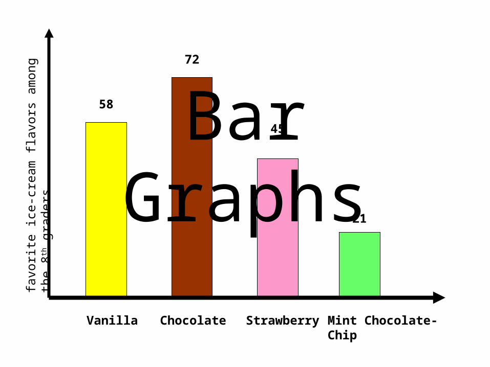
Bar Graphs
Vanilla Chocolate Strawberry Mint Chocolate-Chip
favo
rite
ice-
crea
m f
lavo
rs a
mon
g th
e 8th
gra
ders
58
72
45
21
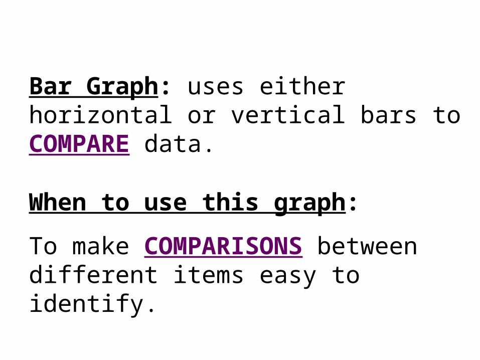
Bar Graph: uses either horizontal or vertical bars to COMPARE data.
When to use this graph:
To make COMPARISONS between different items easy to identify.
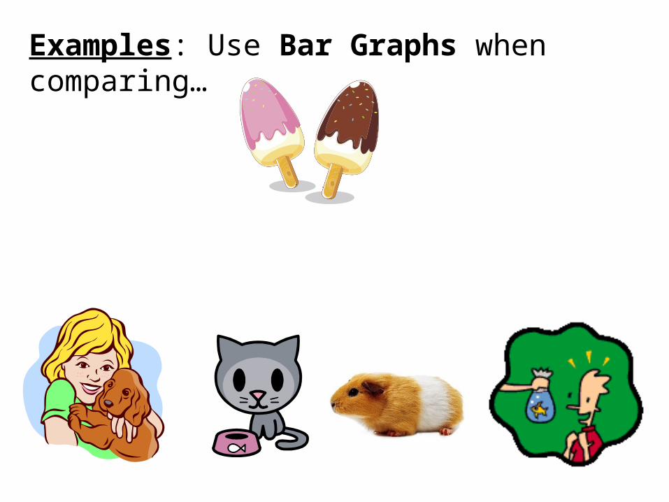
Examples: Use Bar Graphs when comparing…
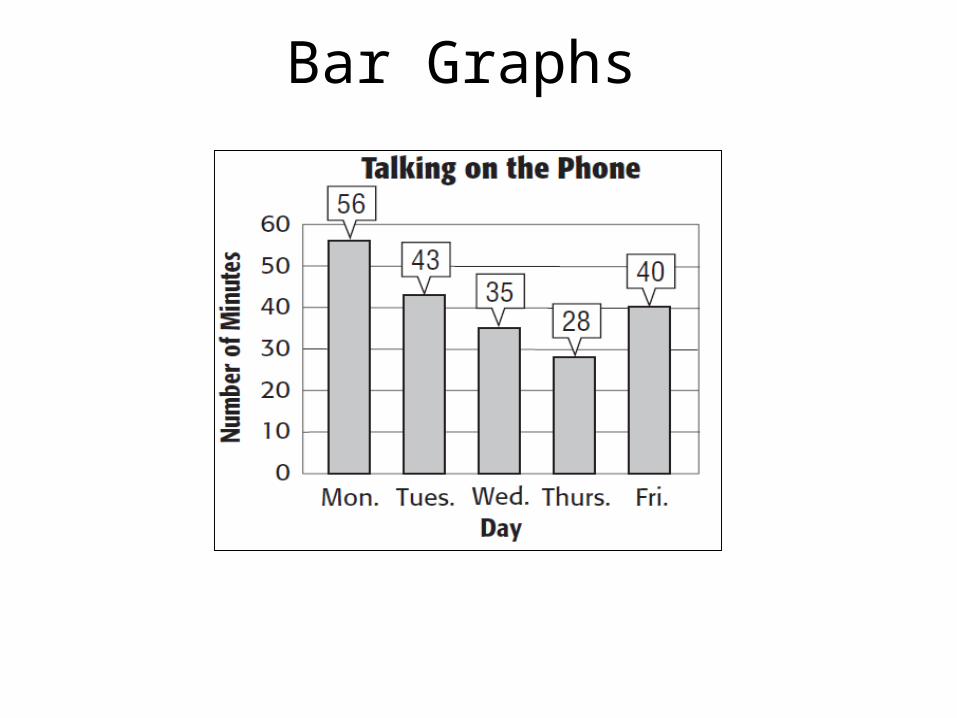
Bar Graphs
Bar Graphs
3. On which day did she talk on the phone half as long she did on Monday?
4. How many minutes did she talk during all five days?
Thursday
202 minutes
1. On which day did she talk the longest? Monday
2. How many minutes did she talk on Monday and Tuesday? 99 minutes
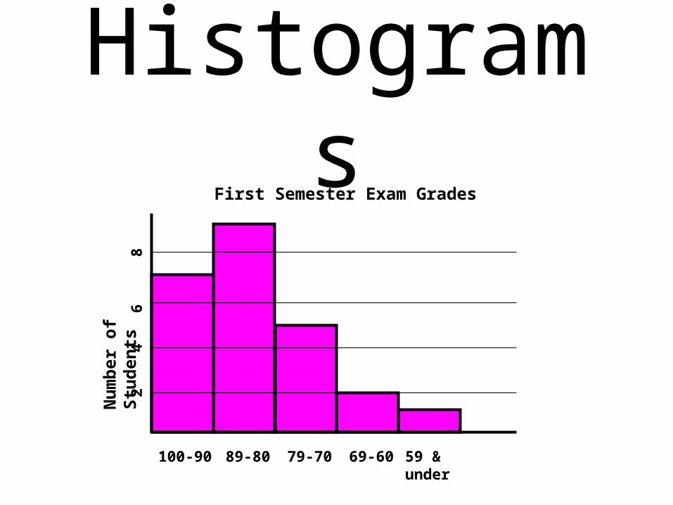
HistogramsN
um
ber
of
Stu
den
ts
100-90 89-80 79-70 69-60 59 & under
42
68
First Semester Exam Grades
Histogram: type of bar graph used to display the frequency of data that has been organized into equal intervals. In a histogram, the bars touch and both axes show numerical data.
When to use this graph: We use a histogram to identify the number of data points that occur within a range of values.
Examples: Use Histograms when finding how often values occur within a range of data.
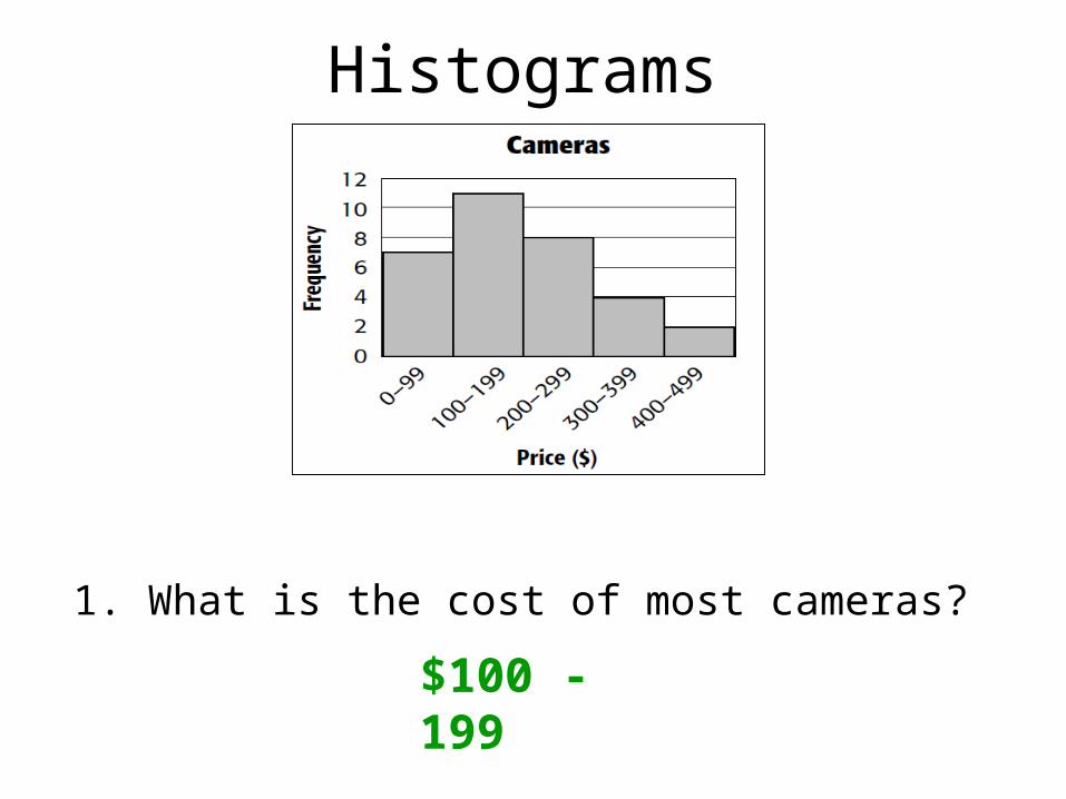
Histograms
1. What is the cost of most cameras?
$100 - 199
Histograms
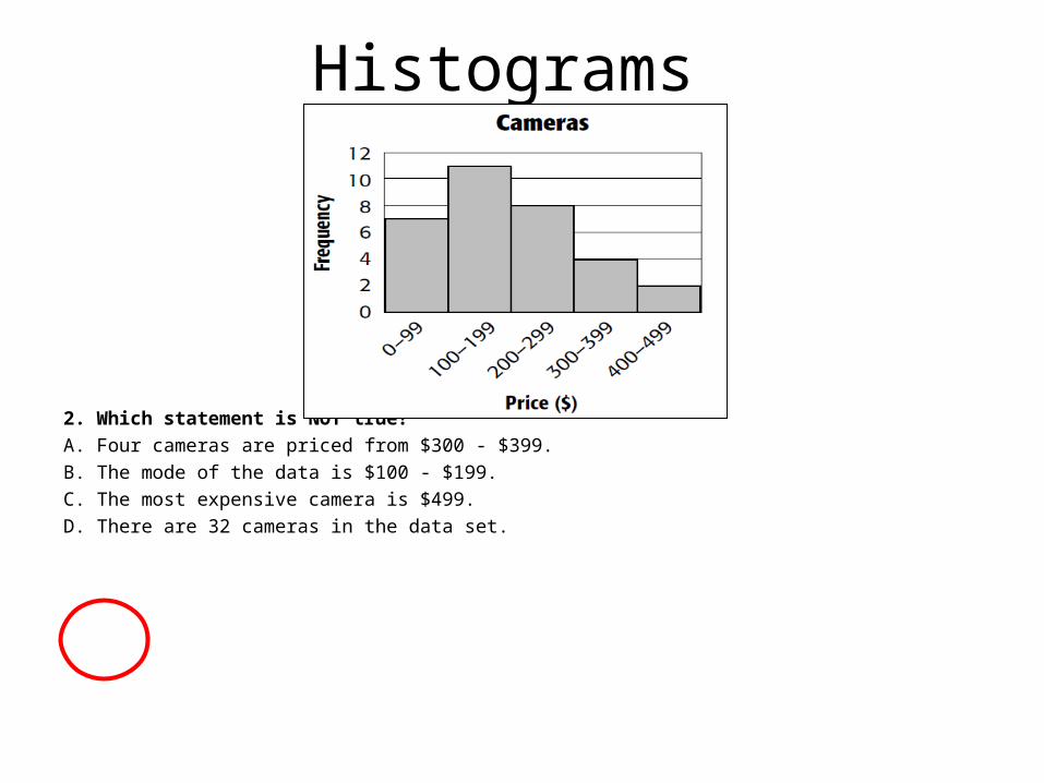
2. Which statement is NOT true?
A. Four cameras are priced from $300 - $399.
B. The mode of the data is $100 - $199.
C. The most expensive camera is $499.
D. There are 32 cameras in the data set.
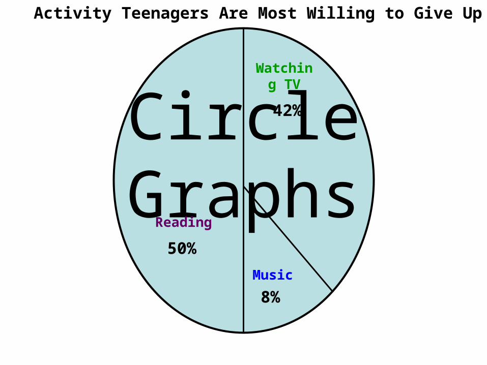
Circle Graphs42%
8%
50%
Activity Teenagers Are Most Willing to Give Up
Reading
Watching TV
Music
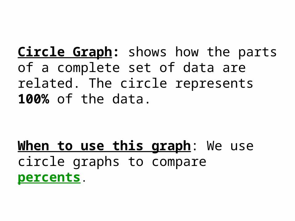
Circle Graph: shows how the parts of a complete set of data are related. The circle represents 100% of the data.
When to use this graph: We use circle graphs to compare percents.
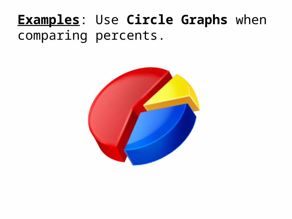
Examples: Use Circle Graphs when comparing percents.
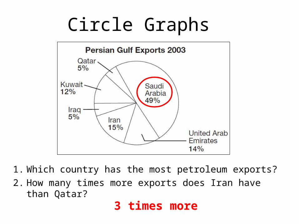
Circle Graphs
1. Which country has the most petroleum exports?
2. How many times more exports does Iran have than Qatar? 3 times more
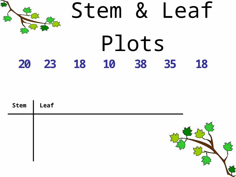
Stem & Leaf Plots
Stem Leaf
2 2 1 1 3 3 10 3 8 0 8 5 8
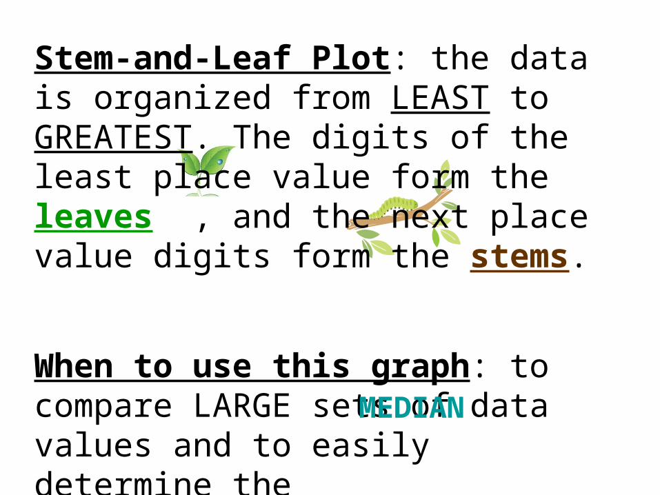
Stem-and-Leaf Plot: the data is organized from LEAST to GREATEST. The digits of the least place value form the leaves , and the next place value digits form the stems.
When to use this graph: to compare LARGE sets of data values and to easily determine the _________ value. MEDIAN
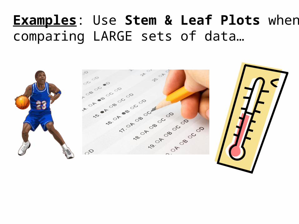
Examples: Use Stem & Leaf Plots when comparing LARGE sets of data…
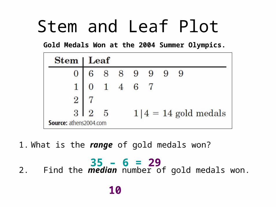
Stem and Leaf Plot
1. What is the range of gold medals won?
2. Find the median number of gold medals won.
Gold Medals Won at the 2004 Summer Olympics.
35 – 6 = 29
10
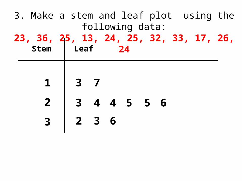
Stem Leaf
1
2
3
3 7
2 3
43 4 5 5 6
6
3. Make a stem and leaf plot using the following data:23, 36, 25, 13, 24, 25, 32, 33, 17, 26, 24

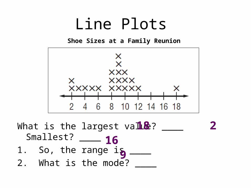
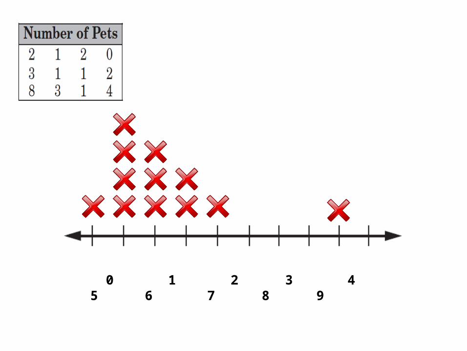
Line Plots
Rabbit Fish Cat Turtle Dog
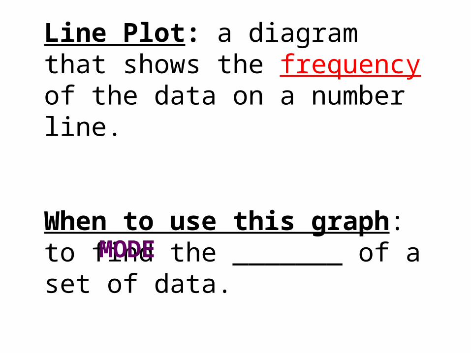
Line Plot: a diagram that shows the frequency of the data on a number line.
When to use this graph: to find the _______ of a set of data. MODE
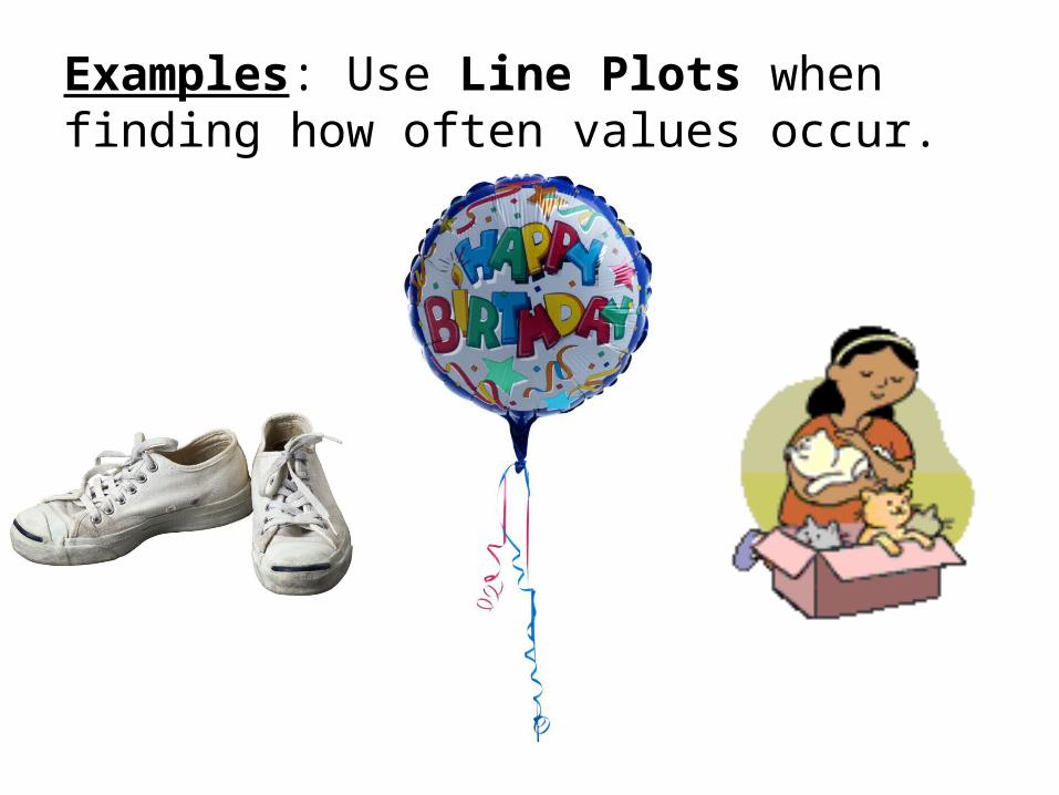
Examples: Use Line Plots when finding how often values occur.
Line Plots
What is the largest value? ____ Smallest? ____
1. So, the range is ____
2. What is the mode? ____
Shoe Sizes at a Family Reunion
18 216
9
0 1 2 3 4 5 6 7 8 9
Line Graphs
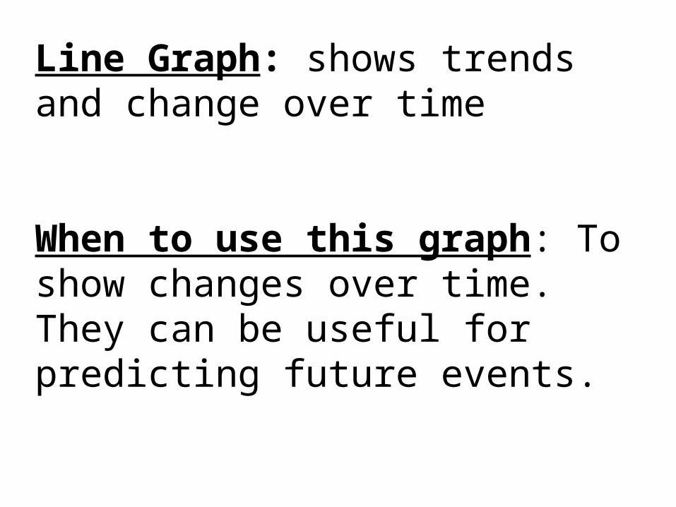
Line Graph: shows trends and change over time
When to use this graph: To show changes over time. They can be useful for predicting future events.
Examples: Use Line Graphs when comparing change over time.
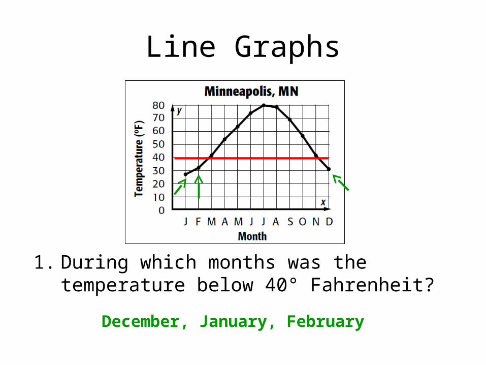
Line Graphs
1. During which months was the temperature below 40° Fahrenheit?
December, January, February
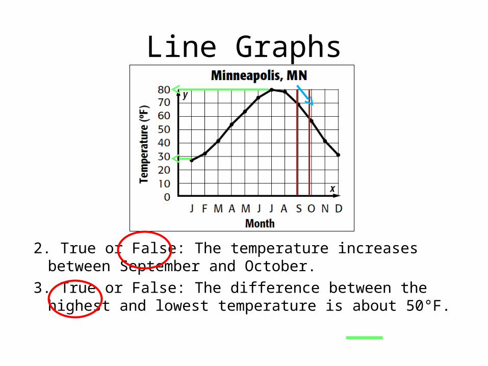
Line Graphs
2. True or False: The temperature increases between September and October.
3. True or False: The difference between the highest and lowest temperature is about 50°F.

Bar Graph
Histogram
Line Plot
Stem and Leaf Plot
Circle Graph
Line Graph
1. A chemist wants to organize calculations of atomic mass numbers so she can find the median value.
2. A teacher wants to know how many students made A’s, B’s, C’s, D’s, and F’s on the last exam.
3. State officials want to show how a state’s population changed over time.
4. A student wants to compare the different types of pets that people own.
5. A tennis coach wants to show the mode in a set of tennis scores.
6. A biologist wants to show the relative percentages of people who have different eye colors.
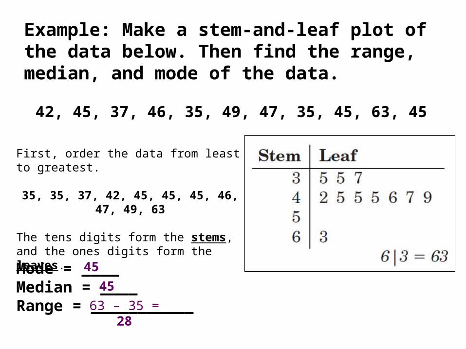
Example: Make a stem-and-leaf plot of the data below. Then find the range, median, and mode of the data.
42, 45, 37, 46, 35, 49, 47, 35, 45, 63, 45
First, order the data from least to greatest.
35, 35, 37, 42, 45, 45, 45, 46, 47, 49, 63
The tens digits form the stems, and the ones digits form the leaves.
Mode = ____ Median = ____Range = ___________
45
45
63 – 35 = 28
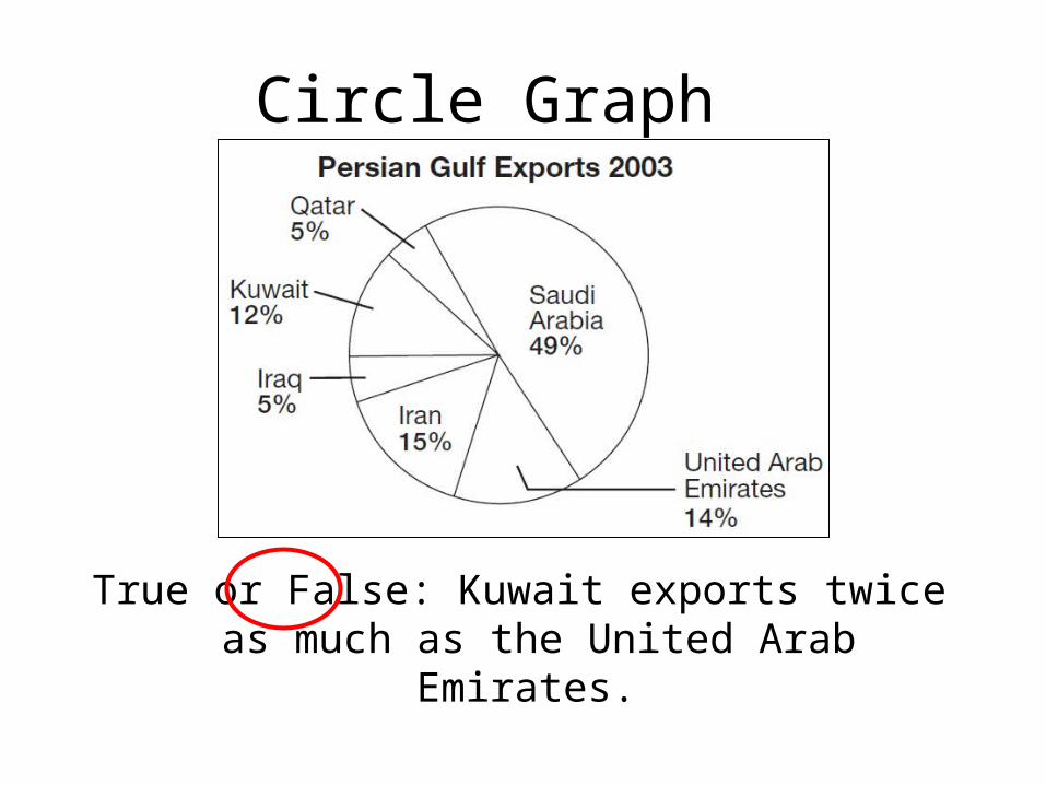
Circle Graph
True or False: Kuwait exports twice as much as the United Arab Emirates.
Box and Whiskers Plots
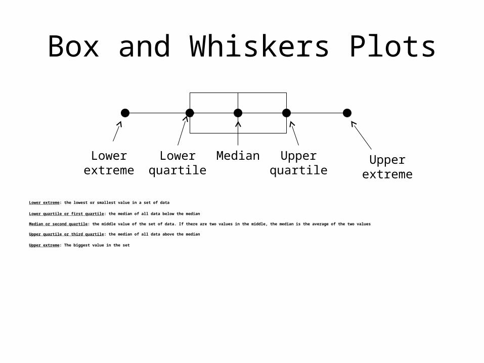
Lower extreme: the lowest or smallest value in a set of data
Lower quartile or first quartile: the median of all data below the median
Median or second quartile: the middle value of the set of data. If there are two values in the middle, the median is the average of the two values
Upper quartile or third quartile: the median of all data above the median
Upper extreme: The biggest value in the set
Lower extreme
Lower quartile
Upper extreme
Upper quartile
Median

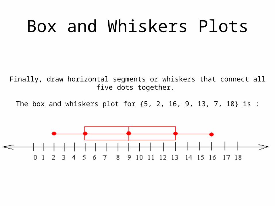
Construct a box and whiskers plot for the data set: {5, 2, 16, 9, 13, 7, 10}
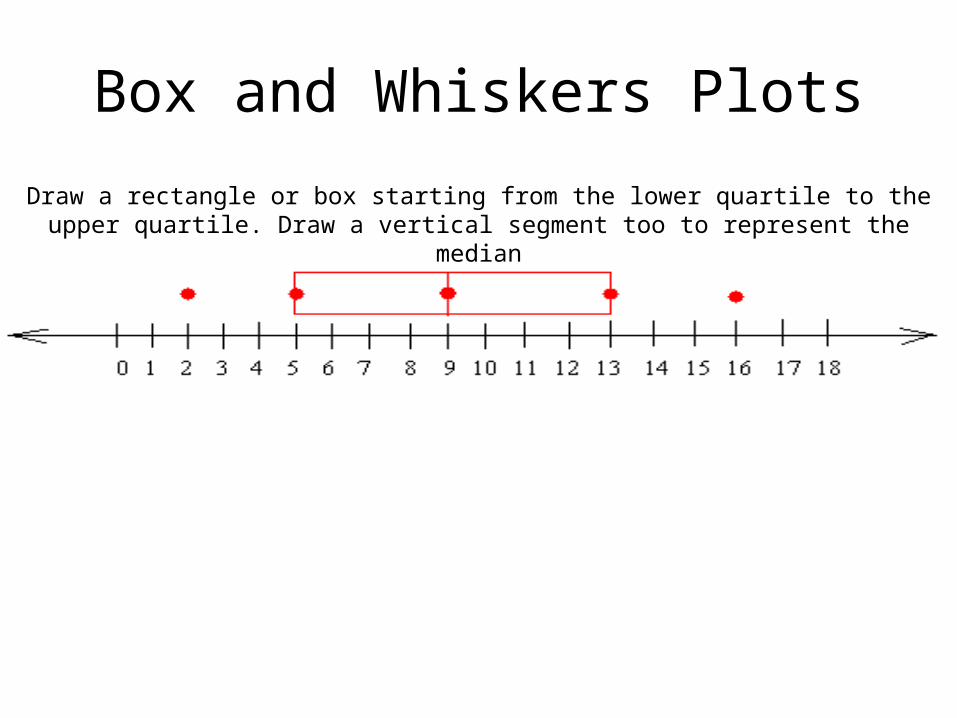
Draw a rectangle or box starting from the lower quartile to the upper quartile. Draw a vertical segment too to represent the median
First, you have to put the data set in order from greatest to least or from least to greatest
From least to greatest we get :
Since the greatest value in the set is 16, the upper extreme is 16
2 5 7 9 10 13 16
Since the smallest value in the set is 2, the lower extreme is 2
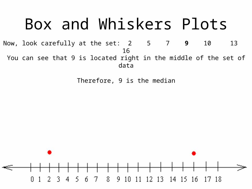
Box and Whiskers PlotsNow, look carefully at the set: 2 5 7 9 10 13 16
You can see that 9 is located right in the middle of the set of data
Therefore, 9 is the median
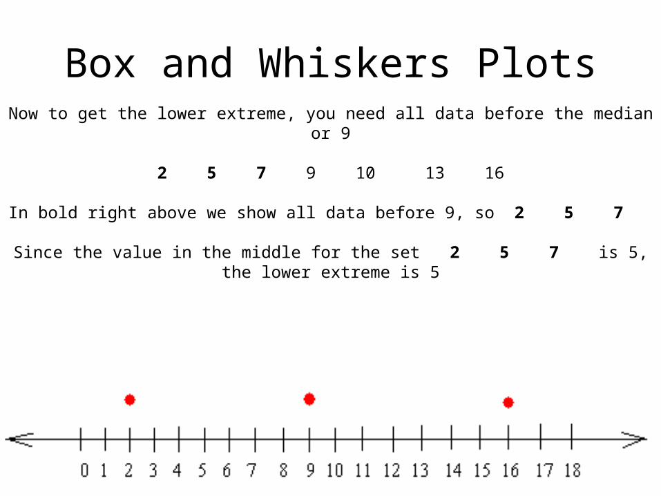
Box and Whiskers PlotsNow to get the lower extreme, you need all data before the median or 9
2 5 7 9 10 13 16
In bold right above we show all data before 9, so 2 5 7
Since the value in the middle for the set 2 5 7 is 5, the lower extreme is 5
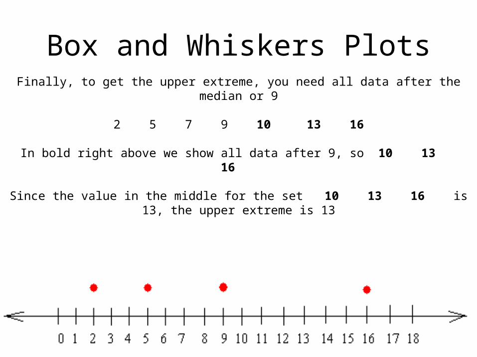
Box and Whiskers PlotsFinally, to get the upper extreme, you need all data after the median or 9
2 5 7 9 10 13 16
In bold right above we show all data after 9, so 10 13 16
Since the value in the middle for the set 10 13 16 is 13, the upper extreme is 13
Box and Whiskers Plots
Draw a rectangle or box starting from the lower quartile to the upper quartile. Draw a vertical segment too to represent the median
Box and Whiskers Plots
Finally, draw horizontal segments or whiskers that connect all five dots together.
The box and whiskers plot for {5, 2, 16, 9, 13, 7, 10} is :