Embed Size (px)
Citation preview

1st Photo Shoot
Photographs inspired by:
Sannah Kvist
Demond Meek
Houses and people walking in my favourite places.

Inspiration: Demond Meek This is a picture of my house. I do not like this photo very much as it not only has the iron gate in front of it but it also has the houses next to it in the picture as well as the car. To improve this photo, I would use a tripod so the picture does not become blurred like it has on this picture. I do however like the black and white as it makes the house seem older and moody. The shiny tarmac after the rain also adds to the feeling of depression this picture gives.
This is the picture I took after the one above. I used a tripod for this photo which improves the picture as nothing is blurred. I like the old film effect I used on this picture as it makes the house seem haunted. I do think that the light shining through the front of the house and the car take away from the overall mood of the picture. Also the gate is in the front of the photo which can be quite distracting.
This is a picture of my house. I have positioned myself so that the other houses are not fully in this picture however it has not cut them off completely nor has it excluded the car. I would crop this photo so that I can not only get rid of the other houses and car but also make the photo the same narrow shape of the house, as Demond Meek does in Slum Beautiful. I would also make the shadows more prominent by changing the contrast and I would add a vignette border. Also I would make it so that the top of the house is not cut off

This is the photo inspired by Demond Meek that I would further edit in Photoshop. I would crop the sides so that the next houses along and the cars are not in the photo, so as not to distract from the main house. I would crop it so that the shape of the photograph is narrow and the sides are parallel to those of the house. I would edit the window to make sure there is no light shining through. I would change the hue and saturation so that the shadows are more prominent. I will however keep the old film effect on this photo as it makes the house appear older and also adds a damaged effect on the house

Inspiration: Sannah Kvist
This picture is of my friend standing far away in the snow. There is a line of footprints in the snow, leading to her. I like this photo as it is all muted tones and is quite simple. I however would have made it so that she is in the middle of the picture instead of slightly to the right.
I prefer this photo as it shows the main subject walking off, leaving a trail of footprints behind them. I would crop it so that there is only one trail of footprints following the person so that the other trail is not distracting anyone. If I crop it I would make the person slightly to the right. I like the black and white effect as it makes the person stand out more as they are the only dark object in a grey and white picture. I edited the picture to black and white in photoshop.
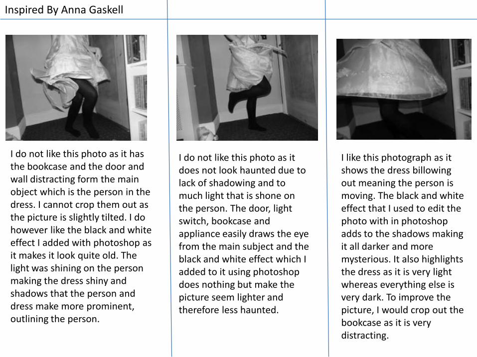
Inspired By Anna Gaskell
I do not like this photo as it has the bookcase and the door and wall distracting form the main object which is the person in the dress. I cannot crop them out as the picture is slightly tilted. I do however like the black and white effect I added with photoshop as it makes it look quite old. The light was shining on the person making the dress shiny and shadows that the person and dress make more prominent, outlining the person.
I do not like this photo as it does not look haunted due to lack of shadowing and to much light that is shone on the person. The door, light switch, bookcase and appliance easily draws the eye from the main subject and the black and white effect which I added to it using photoshop does nothing but make the picture seem lighter and therefore less haunted.
I like this photograph as it shows the dress billowing out meaning the person is moving. The black and white effect that I used to edit the photo with in photoshop adds to the shadows making it all darker and more mysterious. It also highlights the dress as it is very light whereas everything else is very dark. To improve the picture, I would crop out the bookcase as it is very distracting.

2nd Photoshoot
Belongings/Surroundings/Retakes Of Anna Gaskell Inspired Photos

This is a picture of the moon outside of my bedroom window. To improve this photo I would crop out the lamp in the bottom right hand corner of the picture. I do like the shadowing of the picture as it shows darkness gradually becoming lighter the nearer it gets. The darkness frames the window well. I also do not like the angle of the picture and the fact that the edges of the window are cropped out.
I do not like this picture as the bottom right edge of my window is cropped out. I should have positioned myself better so that instead of the television being in the picture which attracts attention away from the window and there also being to much space above the window, there is only the window in the picture and none of it is out of the picture. I also do not like the shadowing of the picture as there is hardly any. To improve this picture I should crop out the TV. and add a vignette border

I like this photograph as it focuses only on the window. I like that the window is at an angle which makes it more interesting than looking straight on the window. I also like the shadowing that gradually fades away as it gets nearer the window. Because of the fading away, the person looking at the photo will follow the gradually fading shadows until it is gone (this leads them to look at the window). I however feel this picture could have been better it some of the window had not been cropped out. To improve this photo, I would add a vignette border to accentuate the window.

This is an unedited photo of a chess board. The camera had no flash and there is many distractions in this photo. The light filled the whole room. I placed my camera on the actual chess board so that it was on the same level as the chess pieces which is the only good thing about this photograph.
This is the edited photo of a chess board. I took the picture with the main light off, the only light sources being the flash from the camera and the lampshade that is facing the wall. I like that the light sources make shadows for the chess pieces. I darkened the lightness of the picture so that the whole picture was even darker. To further improve this photograph , I would add a vignette border and would crop out the lamp as the light it is emitting is very distracting.

I like this photograph as it is on face level with the puppy and shows good depth of field. It focuses well on the puppy. However, it misses out half of the puppy’s face and has many distractions like the other puppy next to it.
To improve this picture I would add a vignette border to bring focus to the puppy. I like that the main focal point is the puppy’s face though and the fact that is on the same level as the puppy.

I like this photo as it does not have any distractions and the main focal point is the person in the dress. I like that it does not show anything other than the dress flowing. This makes it seem mysterious as we don’t know what the person looks like. The black and white adds to the mystery feel.
I like this photo as it shows a sort of dystopia. I like the old film effect that I applied to this picture as it adds to the haunted fairytale feel to the photograph. I also like that there is no face shown as it adds mystery to the picutre.