Embed Size (px)
Citation preview
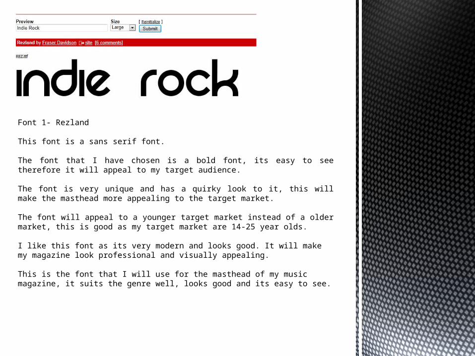
Font 1- Rezland
This font is a sans serif font.
The font that I have chosen is a bold font, its easy to see therefore it will appeal to my target audience.
The font is very unique and has a quirky look to it, this will make the masthead more appealing to the target market.
The font will appeal to a younger target market instead of a older market, this is good as my target market are 14-25 year olds.
I like this font as its very modern and looks good. It will make my magazine look professional and visually appealing.
This is the font that I will use for the masthead of my music magazine, it suits the genre well, looks good and its easy to see.
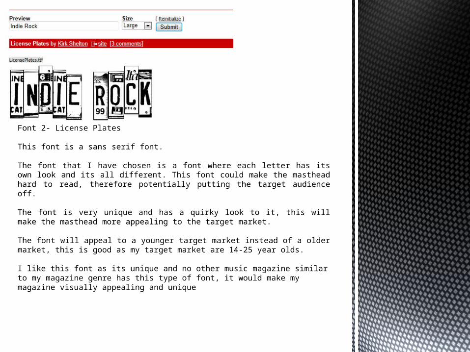
Font 2- License Plates
This font is a sans serif font.
The font that I have chosen is a font where each letter has its own look and its all different. This font could make the masthead hard to read, therefore potentially putting the target audience off. The font is very unique and has a quirky look to it, this will make the masthead more appealing to the target market.
The font will appeal to a younger target market instead of a older market, this is good as my target market are 14-25 year olds.
I like this font as its unique and no other music magazine similar to my magazine genre has this type of font, it would make my magazine visually appealing and unique
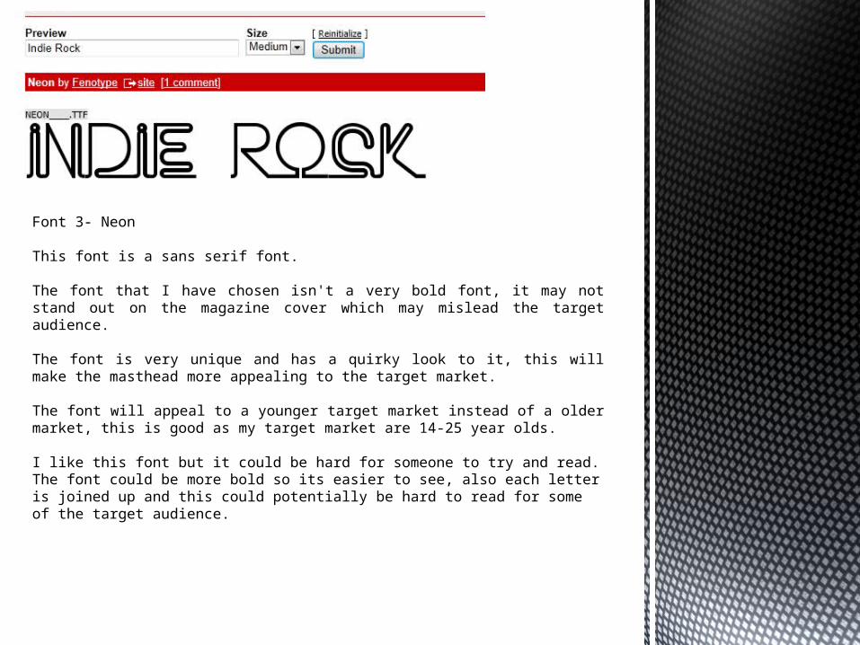
Font 3- Neon
This font is a sans serif font.
The font that I have chosen isn't a very bold font, it may not stand out on the magazine cover which may mislead the target audience.
The font is very unique and has a quirky look to it, this will make the masthead more appealing to the target market.
The font will appeal to a younger target market instead of a older market, this is good as my target market are 14-25 year olds.
I like this font but it could be hard for someone to try and read. The font could be more bold so its easier to see, also each letter is joined up and this could potentially be hard to read for some of the target audience.
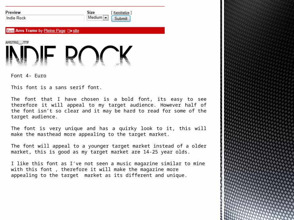
Font 4- Euro
This font is a sans serif font.
The font that I have chosen is a bold font, its easy to see therefore it will appeal to my target audience. However half of the font isn’t so clear and it may be hard to read for some of the target audience.
The font is very unique and has a quirky look to it, this will make the masthead more appealing to the target market.
The font will appeal to a younger target market instead of a older market, this is good as my target market are 14-25 year olds.
I like this font as I've not seen a music magazine similar to mine with this font , therefore it will make the magazine more appealing to the target market as its different and unique.
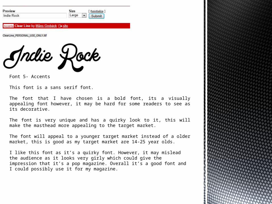
Font 5- Accents
This font is a sans serif font.
The font that I have chosen is a bold font, its a visually appealing font however, it may be hard for some readers to see as its decorative.
The font is very unique and has a quirky look to it, this will make the masthead more appealing to the target market.
The font will appeal to a younger target market instead of a older market, this is good as my target market are 14-25 year olds.
I like this font as it’s a quirky font. However, it may mislead the audience as it looks very girly which could give the impression that it’s a pop magazine. Overall it’s a good font and I could possibly use it for my magazine.