Embed Size (px)
Citation preview
Masthead Examples
Jessica Goldsmith
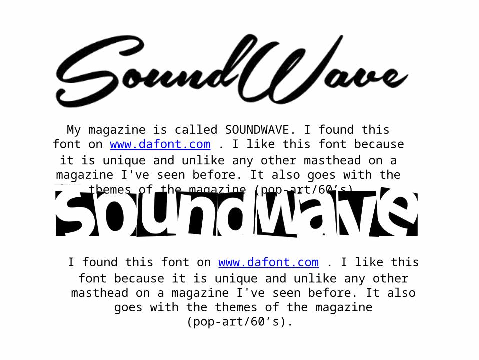
My magazine is called SOUNDWAVE. I found this font on www.dafont.com . I like this font because it is unique and unlike any other masthead on a magazine I've seen before. It also goes with the
themes of the magazine (pop-art/60’s).
I found this font on www.dafont.com . I like this font because it is unique and unlike any other masthead on a magazine I've seen before. It also
goes with the themes of the magazine (pop-art/60’s).
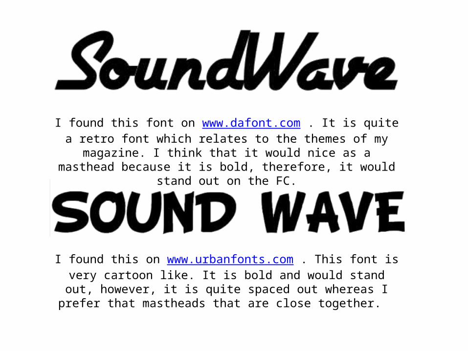
I found this font on www.dafont.com . It is quite a retro font which relates to the themes of my magazine. I think that it would nice as a masthead because it is bold, therefore, it would stand out on the FC.
I found this on www.urbanfonts.com . This font is very cartoon like. It is bold and would stand out, however, it is quite spaced out whereas I
prefer that mastheads that are close together.
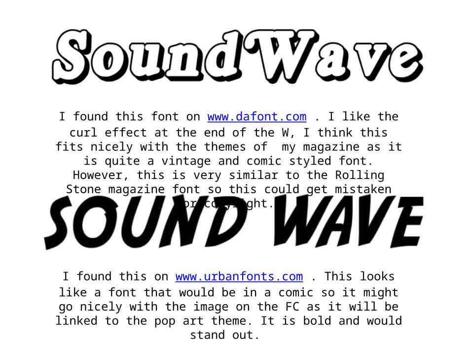
I found this font on www.dafont.com . I like the curl effect at the end of the W, I think this fits nicely with the themes of my magazine as it is
quite a vintage and comic styled font. However, this is very similar to the Rolling Stone magazine font so this could get mistaken for copyright.
I found this on www.urbanfonts.com . This looks like a font that would be in a comic so it might go nicely with the image on the FC as it will be
linked to the pop art theme. It is bold and would stand out.
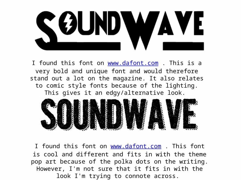
I found this font on www.dafont.com . This is a very bold and unique font and would therefore stand out a lot on the magazine. It also relates
to comic style fonts because of the lighting. This gives it an edgy/alternative look.
I found this font on www.dafont.com . This font is cool and different and fits in with the theme pop art because of the polka dots on the writing. However, I'm not sure that it fits in with the look I'm trying to connote
across.