Embed Size (px)
DESCRIPTION
hudgraphic
Citation preview
SOPHIAModule TFD1064.
Design for Communication DesignGraphic design group Artist typeface Sophia RimmerU125708007872939258
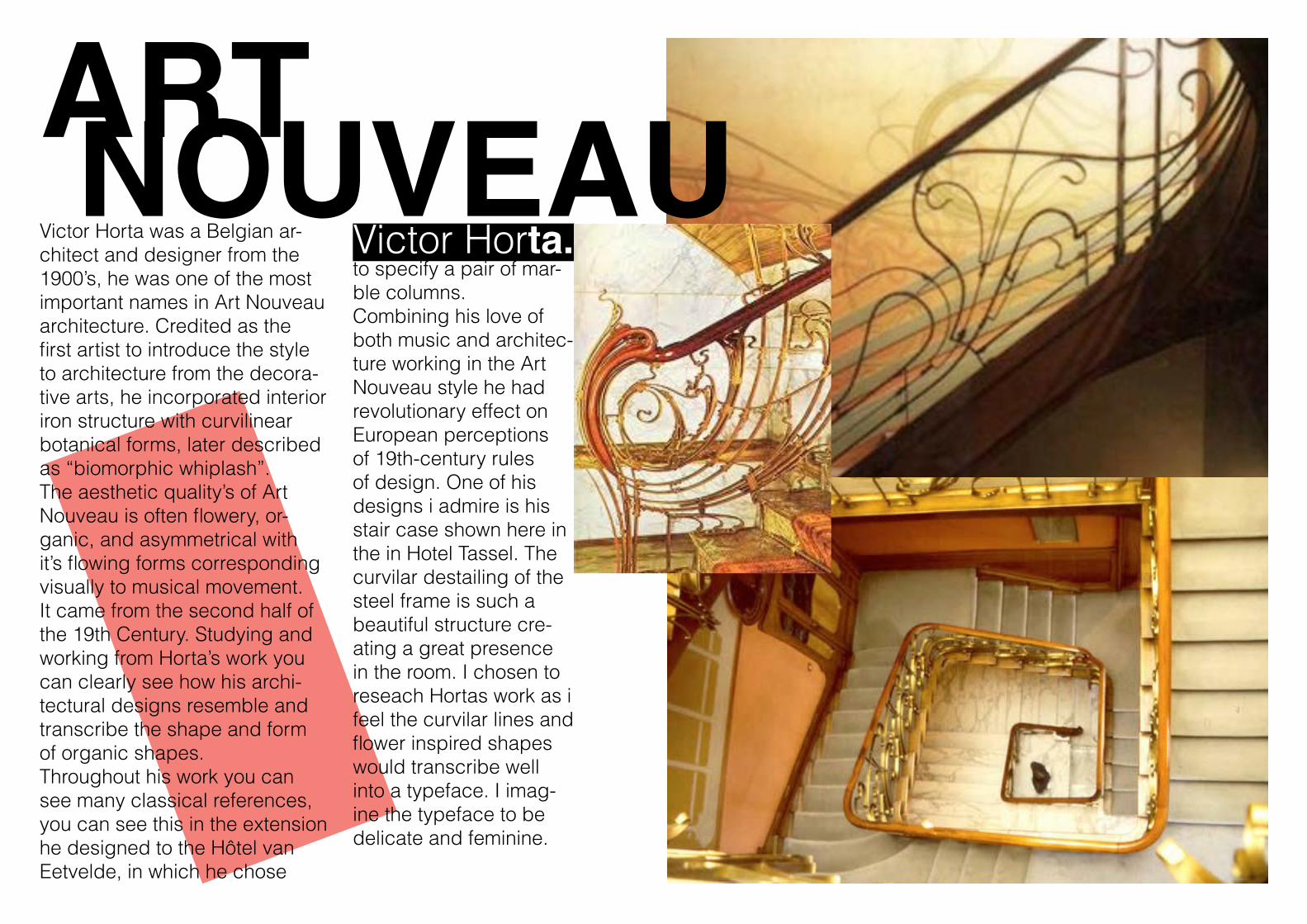
ART NOUVEAU Victor Horta.Victor Horta was a Belgian ar-
chitect and designer from the 1900’s, he was one of the most important names in Art Nouveau architecture. Credited as the first artist to introduce the style to architecture from the decora-tive arts, he incorporated interior iron structure with curvilinear botanical forms, later described as “biomorphic whiplash”.The aesthetic quality’s of Art Nouveau is often flowery, or-ganic, and asymmetrical with it’s flowing forms corresponding visually to musical movement. It came from the second half of the 19th Century. Studying and working from Horta’s work you can clearly see how his archi-tectural designs resemble and transcribe the shape and form of organic shapes. Throughout his work you can see many classical references, you can see this in the extension he designed to the Hôtel van Eetvelde, in which he chose
to specify a pair of mar-ble columns. Combining his love of both music and architec-ture working in the Art Nouveau style he had revolutionary effect on European perceptions of 19th-century rules of design. One of his designs i admire is his stair case shown here in the in Hotel Tassel. The curvilar destailing of the steel frame is such a beautiful structure cre-ating a great presence in the room. I chosen to reseach Hortas work as i feel the curvilar lines and flower inspired shapes would transcribe well into a typeface. I imag-ine the typeface to be delicate and feminine.
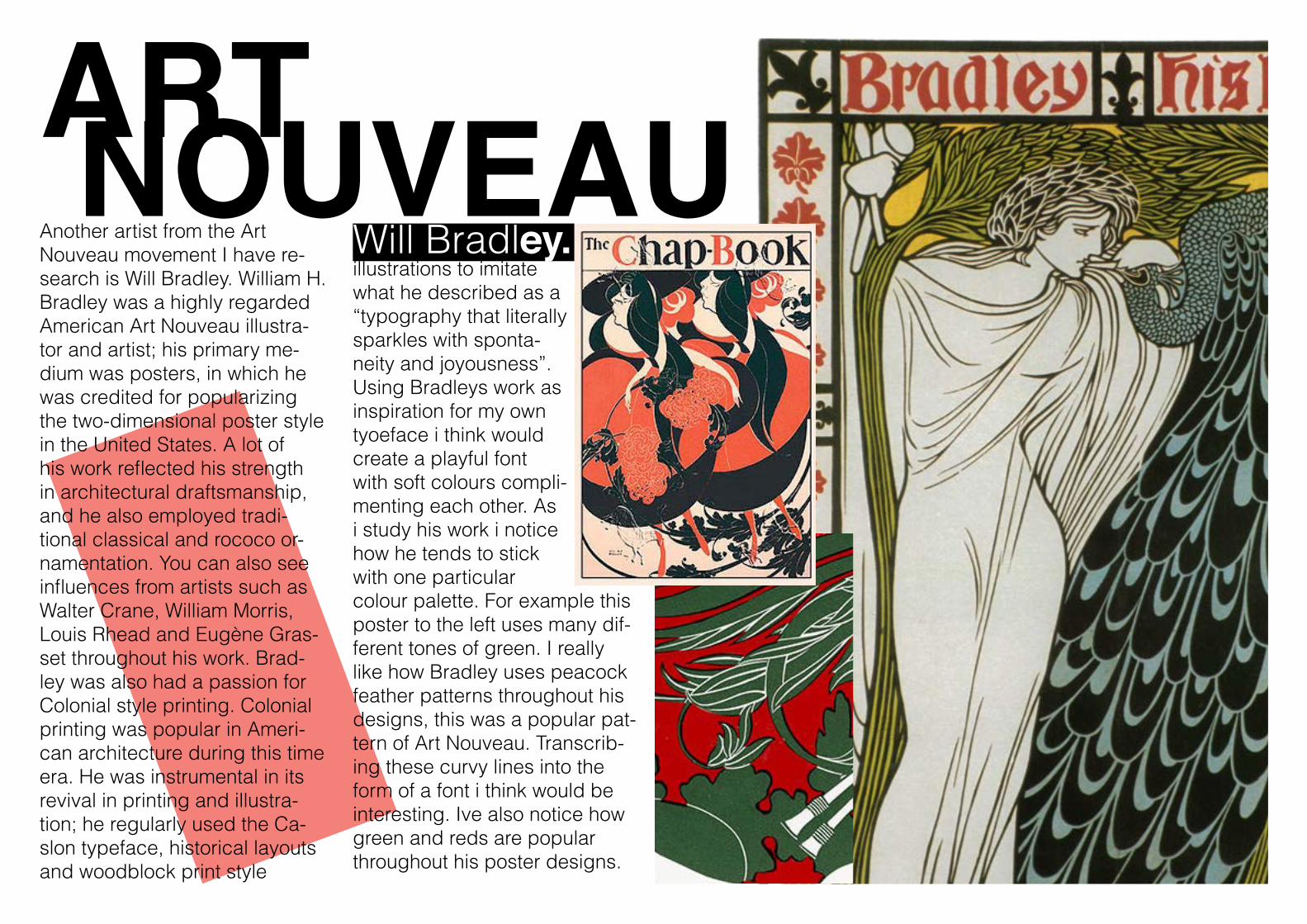
ART NOUVEAU Will Bradley.Another artist from the Art
Nouveau movement I have re-search is Will Bradley. William H. Bradley was a highly regarded American Art Nouveau illustra-tor and artist; his primary me-dium was posters, in which he was credited for popularizing the two-dimensional poster style in the United States. A lot of his work reflected his strength in architectural draftsmanship, and he also employed tradi-tional classical and rococo or-namentation. You can also see influences from artists such as Walter Crane, William Morris, Louis Rhead and Eugène Gras-set throughout his work. Brad-ley was also had a passion for Colonial style printing. Colonial printing was popular in Ameri-can architecture during this time era. He was instrumental in its revival in printing and illustra-tion; he regularly used the Ca-slon typeface, historical layouts and woodblock print style
illustrations to imitate what he described as a “typography that literally sparkles with sponta-neity and joyousness”. Using Bradleys work as inspiration for my own tyoeface i think would create a playful font with soft colours compli-menting each other. As i study his work i notice how he tends to stick with one particular colour palette. For example this poster to the left uses many dif-ferent tones of green. I really like how Bradley uses peacock feather patterns throughout his designs, this was a popular pat-tern of Art Nouveau. Transcrib-ing these curvy lines into the form of a font i think would be interesting. Ive also notice how green and reds are popular throughout his poster designs.
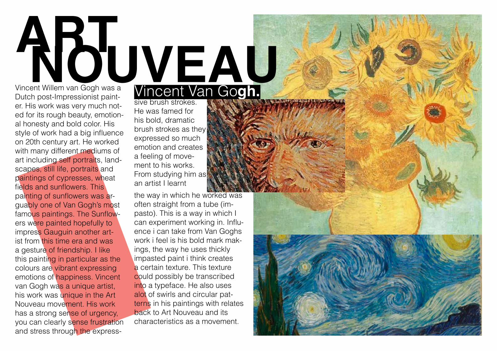
ART NOUVEAU Vincent Van Gogh.Vincent Willem van Gogh was a
Dutch post-Impressionist paint-er. His work was very much not-ed for its rough beauty, emotion-al honesty and bold color. His style of work had a big influence on 20th century art. He worked with many different mediums of art including self portraits, land-scapes, still life, portraits and paintings of cypresses, wheat fields and sunflowers. This painting of sunflowers was ar-guably one of Van Gogh’s most famous paintings. The Sunflow-ers were painted hopefully to impress Gauguin another art-ist from this time era and was a gesture of friendship. I like this painting in particular as the colours are vibrant expressing emotions of happiness. Vincent van Gogh was a unique artist, his work was unique in the Art Nouveau movement. His work has a strong sense of urgency, you can clearly sense frustration and stress through the express-
sive brush strokes. He was famed for his bold, dramatic brush strokes as they expressed so much emotion and creates a feeling of move-ment to his works. From studying him as an artist I learnt
the way in which he worked was often straight from a tube (im-pasto). This is a way in which I can experiment working in. Influ-ence i can take from Van Goghs work i feel is his bold mark mak-ings, the way he uses thickly impasted paint i think creates a certain texture. This texture could possibly be transcribed into a typeface. He also uses alot of swirls and circular pat-terns in his paintings with relates back to Art Nouveau and its characteristics as a movement.
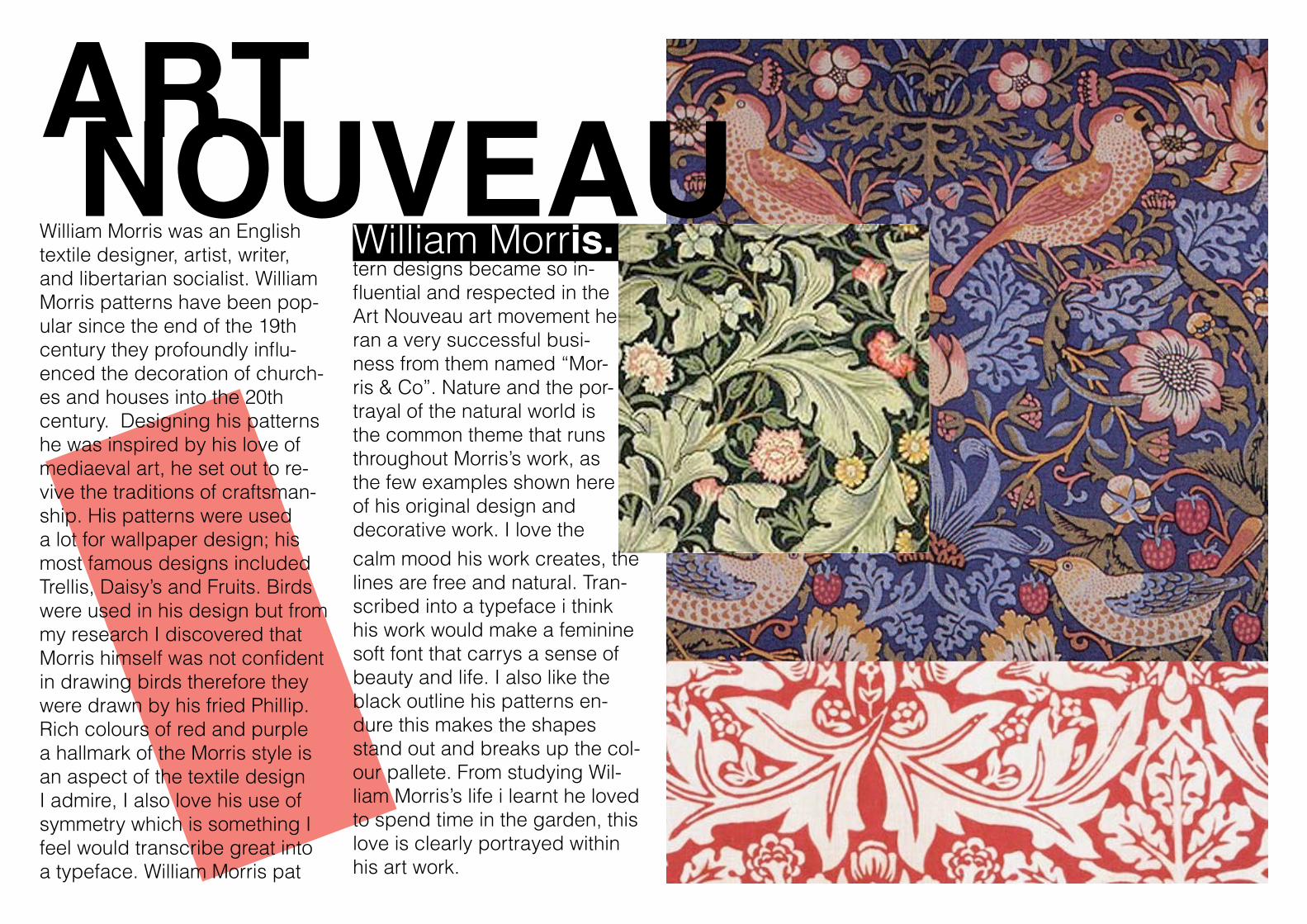
ART NOUVEAU William Morris.William Morris was an English
textile designer, artist, writer, and libertarian socialist. William Morris patterns have been pop-ular since the end of the 19th century they profoundly influ-enced the decoration of church-es and houses into the 20th century. Designing his patterns he was inspired by his love of mediaeval art, he set out to re-vive the traditions of craftsman-ship. His patterns were used a lot for wallpaper design; his most famous designs included Trellis, Daisy’s and Fruits. Birds were used in his design but from my research I discovered that Morris himself was not confident in drawing birds therefore they were drawn by his fried Phillip. Rich colours of red and purple a hallmark of the Morris style is an aspect of the textile design I admire, I also love his use of symmetry which is something I feel would transcribe great into a typeface. William Morris pat
tern designs became so in-fluential and respected in the Art Nouveau art movement he ran a very successful busi-ness from them named “Mor-ris & Co”. Nature and the por-trayal of the natural world is the common theme that runs throughout Morris’s work, as the few examples shown here of his original design and decorative work. I love thecalm mood his work creates, the lines are free and natural. Tran-scribed into a typeface i think his work would make a feminine soft font that carrys a sense of beauty and life. I also like the black outline his patterns en-dure this makes the shapes stand out and breaks up the col-our pallete. From studying Wil-liam Morris’s life i learnt he loved to spend time in the garden, this love is clearly portrayed within his art work.
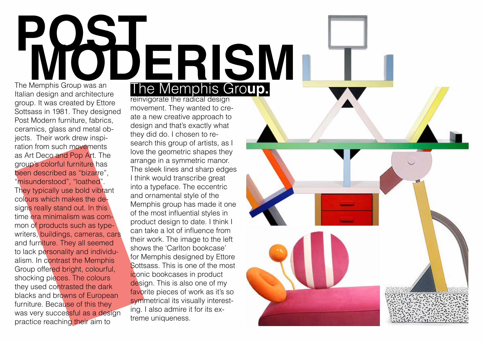
POST MODERISM The Memphis Group.The Memphis Group was an
Italian design and architecture group. It was created by Ettore Sottsass in 1981. They designed Post Modern furniture, fabrics, ceramics, glass and metal ob-jects. Their work drew inspi-ration from such movements as Art Deco and Pop Art. The group’s colorful furniture has been described as “bizarre”, “misunderstood”, “loathed”. They typically use bold vibrant colours which makes the de-signs really stand out. In this time era minimalism was com-mon of products such as type-writers, buildings, cameras, cars and furniture. They all seemed to lack personality and individu-alism. In contrast the Memphis Group offered bright, colourful, shocking pieces. The colours they used contrasted the dark blacks and browns of European furniture. Because of this they was very successful as a design practice reaching their aim to
reinvigorate the radical design movement. They wanted to cre-ate a new creative approach to design and that’s exactly what they did do. I chosen to re-search this group of artists, as I love the geometric shapes they arrange in a symmetric manor. The sleek lines and sharp edges I think would transcribe great into a typeface. The eccentric and ornamental style of the Memphis group has made it one of the most influential styles in product design to date. I think I can take a lot of influence from their work. The image to the left shows the ‘Carlton bookcase’ for Memphis designed by Ettore Sottsass. This is one of the most iconic bookcases in product design. This is also one of my favorite pieces of work as it’s so symmetrical its visually interest-ing. I also admire it for its ex-treme uniqueness.
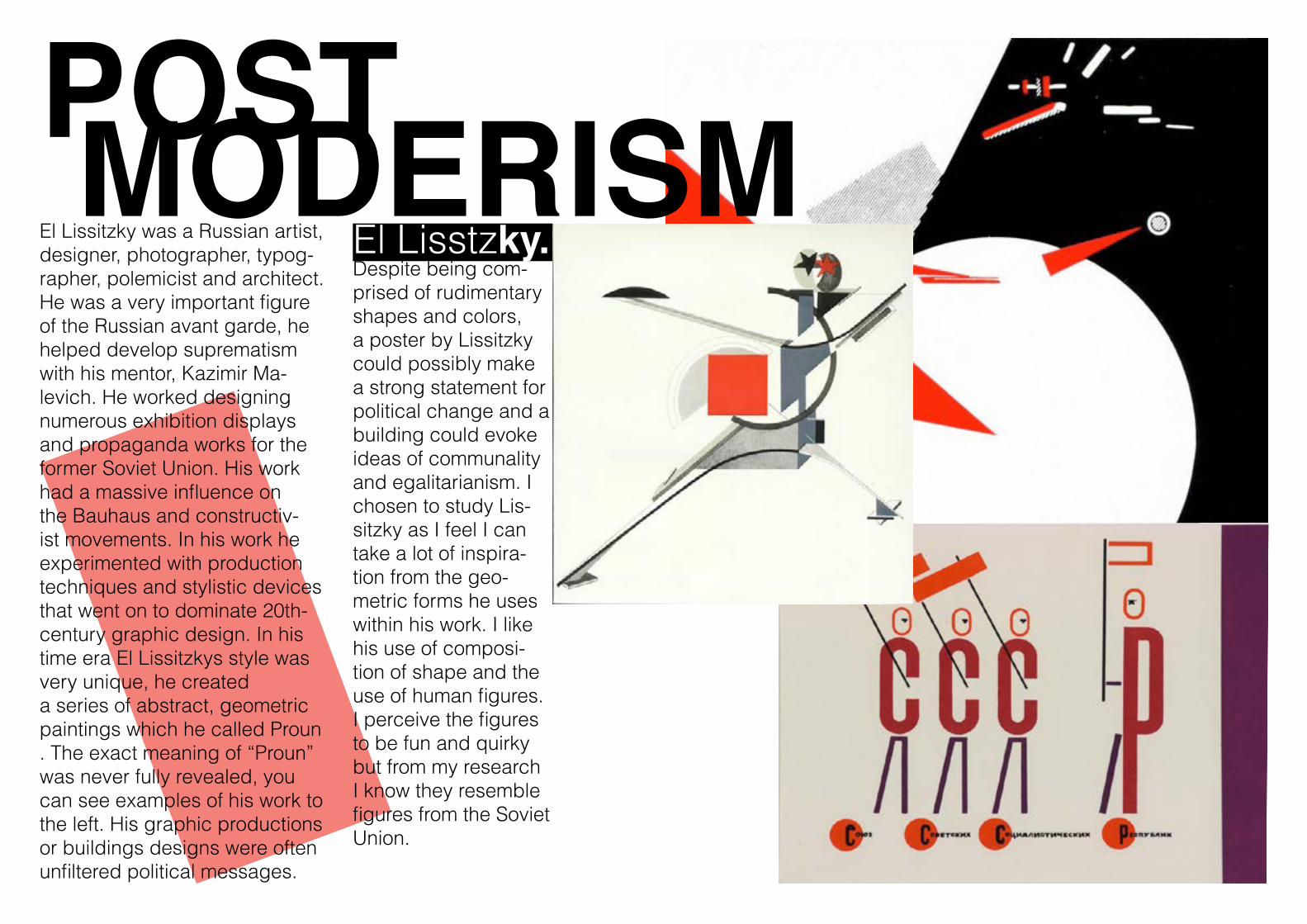
POST MODERISM El Lisstzky.El Lissitzky was a Russian artist,
designer, photographer, typog-rapher, polemicist and architect. He was a very important figure of the Russian avant garde, he helped develop suprematism with his mentor, Kazimir Ma-levich. He worked designing numerous exhibition displays and propaganda works for the former Soviet Union. His work had a massive influence on the Bauhaus and constructiv-ist movements. In his work he experimented with production techniques and stylistic devices that went on to dominate 20th-century graphic design. In his time era El Lissitzkys style was very unique, he created a series of abstract, geometric paintings which he called Proun . The exact meaning of “Proun” was never fully revealed, you can see examples of his work to the left. His graphic productions or buildings designs were often unfiltered political messages.
Despite being com-prised of rudimentary shapes and colors, a poster by Lissitzky could possibly make a strong statement for political change and a building could evoke ideas of communality and egalitarianism. I chosen to study Lis-sitzky as I feel I can take a lot of inspira-tion from the geo-metric forms he uses within his work. I like his use of composi-tion of shape and the use of human figures. I perceive the figures to be fun and quirky but from my research I know they resemble figures from the Soviet Union.
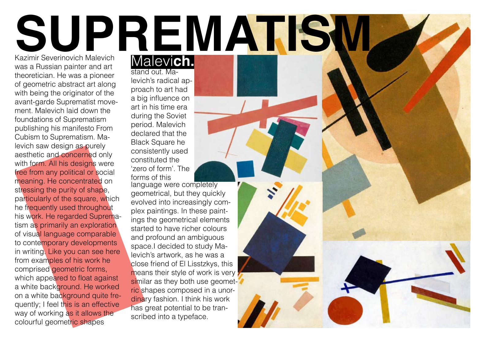
SUPREMATISM Malevich.Kazimir Severinovich Malevich
was a Russian painter and art theoretician. He was a pioneer of geometric abstract art along with being the originator of the avant-garde Suprematist move-ment. Malevich laid down the foundations of Suprematism publishing his manifesto From Cubism to Suprematism. Ma-levich saw design as purely aesthetic and concerned only with form. All his designs were free from any political or social meaning. He concentrated on stressing the purity of shape, particularly of the square, which he frequently used throughout his work. He regarded Suprema-tism as primarily an exploration of visual language comparable to contemporary developments in writing. Like you can see here from examples of his work he comprised geometric forms, which appeared to float against a white background. He worked on a white background quite fre-quently; I feel this is an effective way of working as it allows the colourful geometric shapes
stand out. Ma-levich’s radical ap-proach to art had a big influence on art in his time era during the Soviet period. Malevich declared that the Black Square he consistently used constituted the ‘zero of form’. The forms of this language were completely geometrical, but they quickly evolved into increasingly com-plex paintings. In these paint-ings the geometrical elements started to have richer colours and profound an ambiguous space.I decided to study Ma-levich’s artwork, as he was a close friend of El Lisstzkys, this means their style of work is very similar as they both use geomet-ric shapes composed in a unor-dinary fashion. I think his work has great potential to be tran-scribed into a typeface.
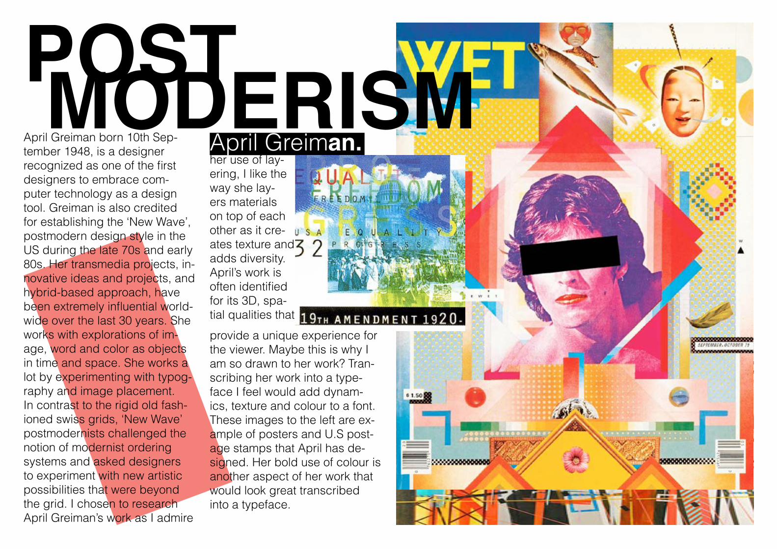
POST MODERISM April Greiman.April Greiman born 10th Sep-
tember 1948, is a designer recognized as one of the first designers to embrace com-puter technology as a design tool. Greiman is also credited for establishing the ‘New Wave’, postmodern design style in the US during the late 70s and early 80s. Her transmedia projects, in-novative ideas and projects, and hybrid-based approach, have been extremely influential world-wide over the last 30 years. She works with explorations of im-age, word and color as objects in time and space. She works a lot by experimenting with typog-raphy and image placement. In contrast to the rigid old fash-ioned swiss grids, ‘New Wave’ postmodernists challenged the notion of modernist ordering systems and asked designers to experiment with new artistic possibilities that were beyond the grid. I chosen to research April Greiman’s work as I admire
her use of lay-ering, I like the way she lay-ers materials on top of each other as it cre-ates texture and adds diversity. April’s work is often identified for its 3D, spa-tial qualities that
provide a unique experience for the viewer. Maybe this is why I am so drawn to her work? Tran-scribing her work into a type-face I feel would add dynam-ics, texture and colour to a font. These images to the left are ex-ample of posters and U.S post-age stamps that April has de-signed. Her bold use of colour is another aspect of her work that would look great transcribed into a typeface.
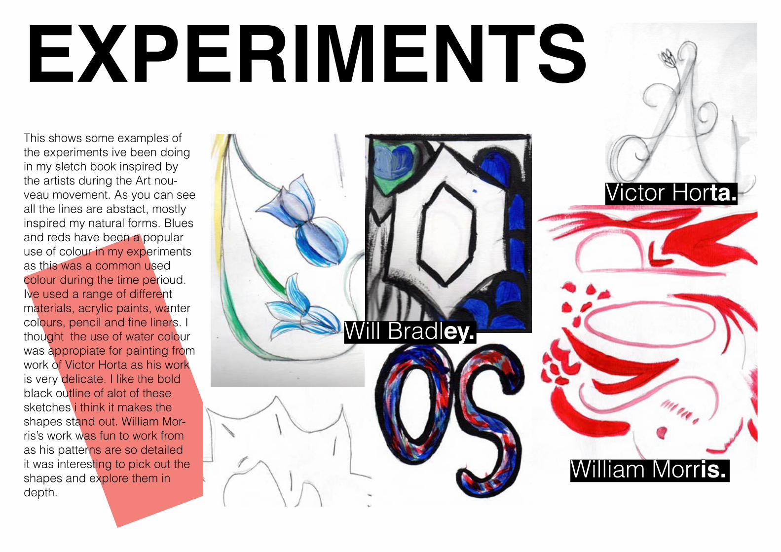
EXPERIMENTS Victor Horta.
Will Bradley.
William Morris.
This shows some examples of the experiments ive been doing in my sletch book inspired by the artists during the Art nou-veau movement. As you can see all the lines are abstact, mostly inspired my natural forms. Blues and reds have been a popular use of colour in my experiments as this was a common used colour during the time perioud. Ive used a range of different materials, acrylic paints, wanter colours, pencil and fine liners. I thought the use of water colour was appropiate for painting from work of Victor Horta as his work is very delicate. I like the bold black outline of alot of these sketches i think it makes the shapes stand out. William Mor-ris’s work was fun to work from as his patterns are so detailed it was interesting to pick out the shapes and explore them in depth.
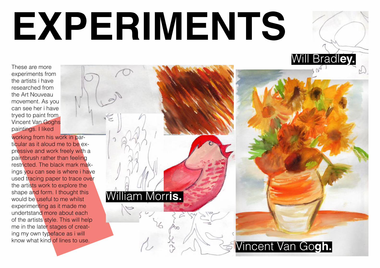
EXPERIMENTS Will Bradley.
Vincent Van Gogh.
William Morris.
These are more experiments from the artists i have researched from the Art Nouveau movement. As you can see her i have tryed to paint from Vincent Van Goghs paintings. I liked working from his work in par-ticular as it aloud me to be ex-pressive and work freely with a paintbrush rather than feeling restricted. The black mark mak-ings you can see is where i have used tracing paper to trace over the artists work to explore the shape and form. I thought this would be useful to me whilst experimenting as it made me undertstand more about each of the artists style. This will help me in the later stages of creat-ing my own typeface as i will know what kind of lines to use.
EXPERIMENTS
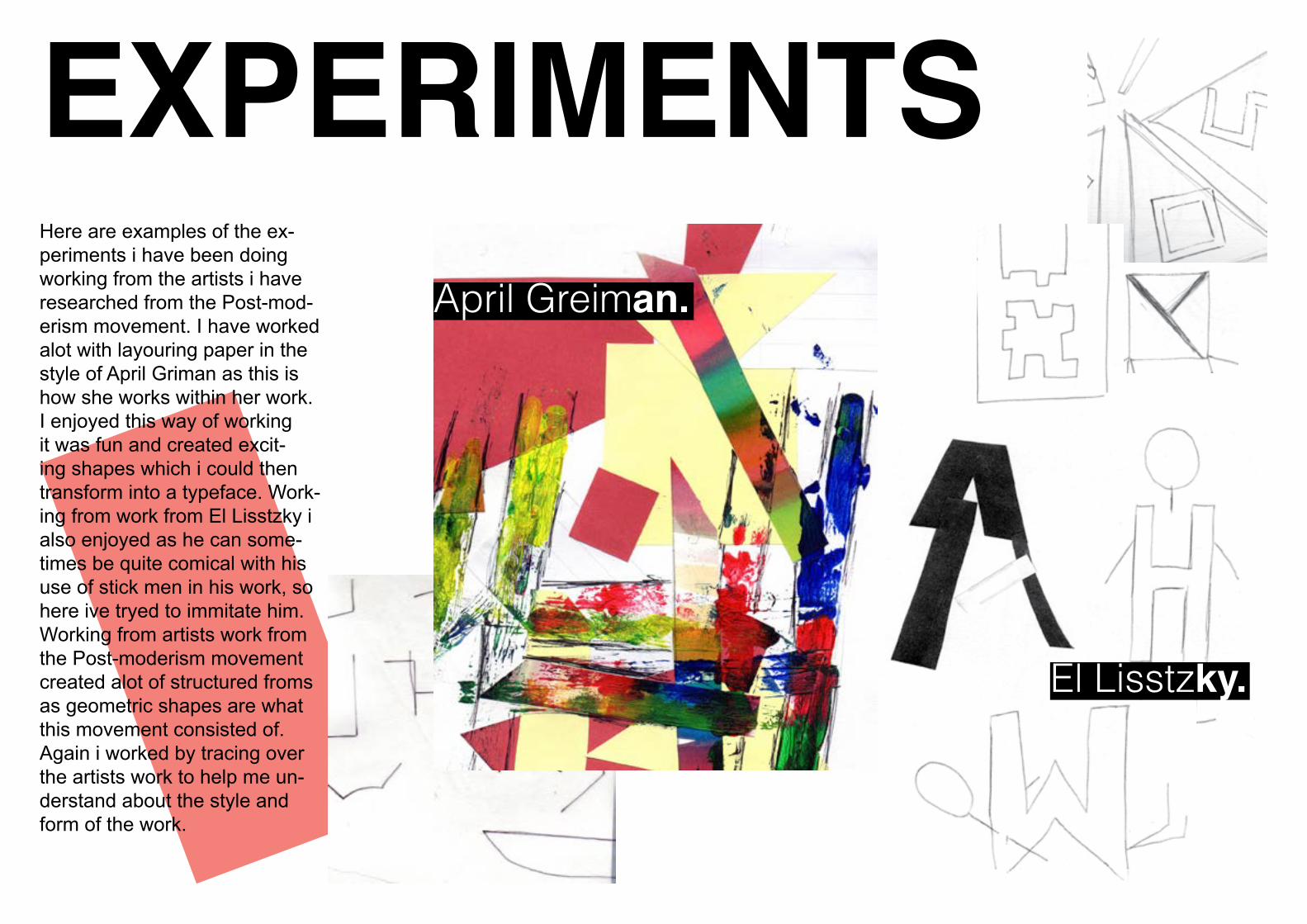
El Lisstzky.
April Greiman.
Here are examples of the ex-periments i have been doing working from the artists i have researched from the Post-mod-erism movement. I have worked alot with layouring paper in the style of April Griman as this is how she works within her work. I enjoyed this way of working it was fun and created excit-ing shapes which i could then transform into a typeface. Work-ing from work from El Lisstzky i also enjoyed as he can some-times be quite comical with his use of stick men in his work, so here ive tryed to immitate him. Working from artists work from the Post-moderism movement created alot of structured froms as geometric shapes are what this movement consisted of. Again i worked by tracing over the artists work to help me un-derstand about the style and form of the work.
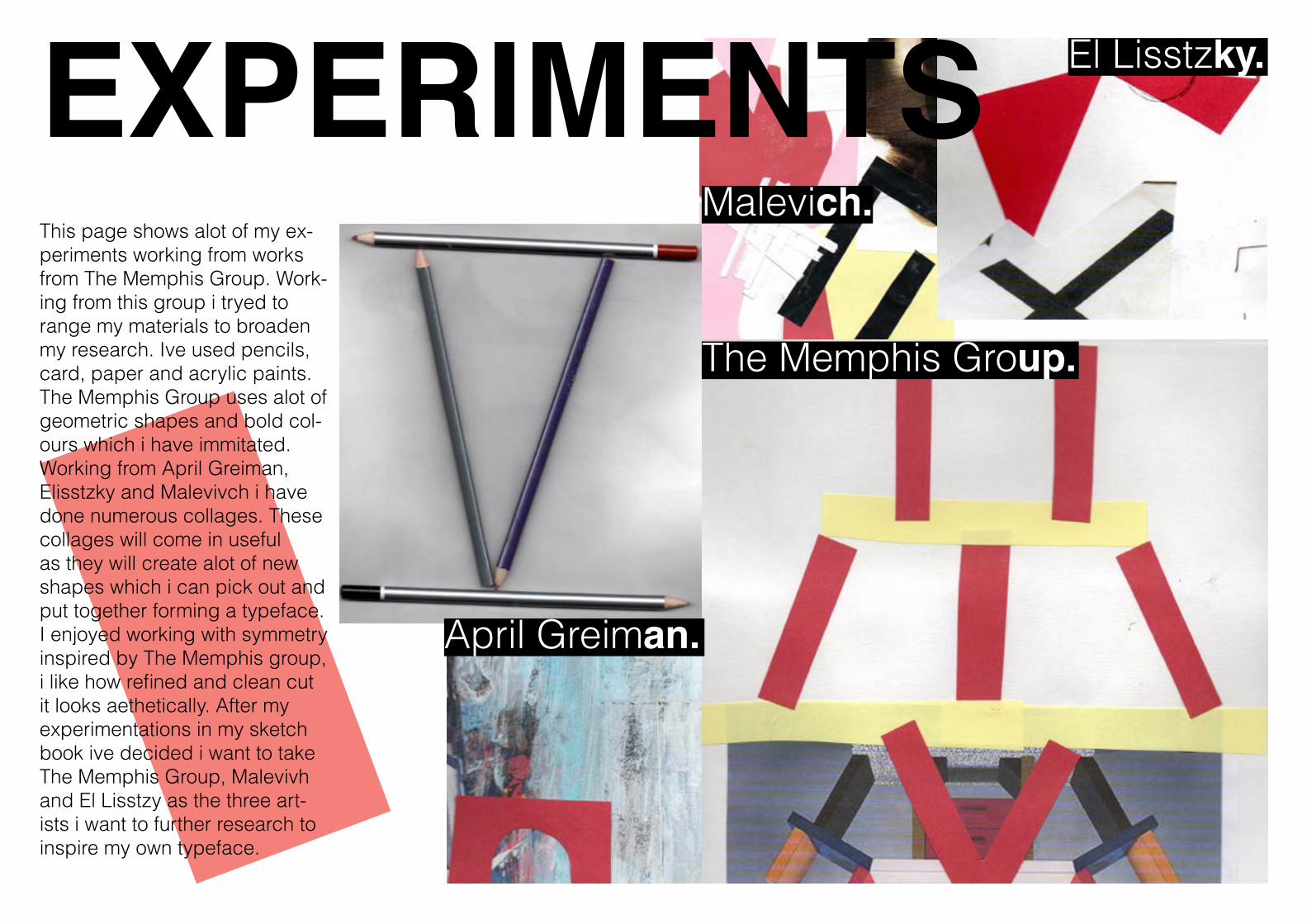
EXPERIMENTS The Memphis Group.
El Lisstzky.
Malevich.
April Greiman.
This page shows alot of my ex-periments working from works from The Memphis Group. Work-ing from this group i tryed to range my materials to broaden my research. Ive used pencils, card, paper and acrylic paints. The Memphis Group uses alot of geometric shapes and bold col-ours which i have immitated. Working from April Greiman, Elisstzky and Malevivch i have done numerous collages. These collages will come in useful as they will create alot of new shapes which i can pick out and put together forming a typeface.I enjoyed working with symmetry inspired by The Memphis group, i like how refined and clean cut it looks aethetically. After my experimentations in my sketch book ive decided i want to take The Memphis Group, Malevivh and El Lisstzy as the three art-ists i want to further research to inspire my own typeface.
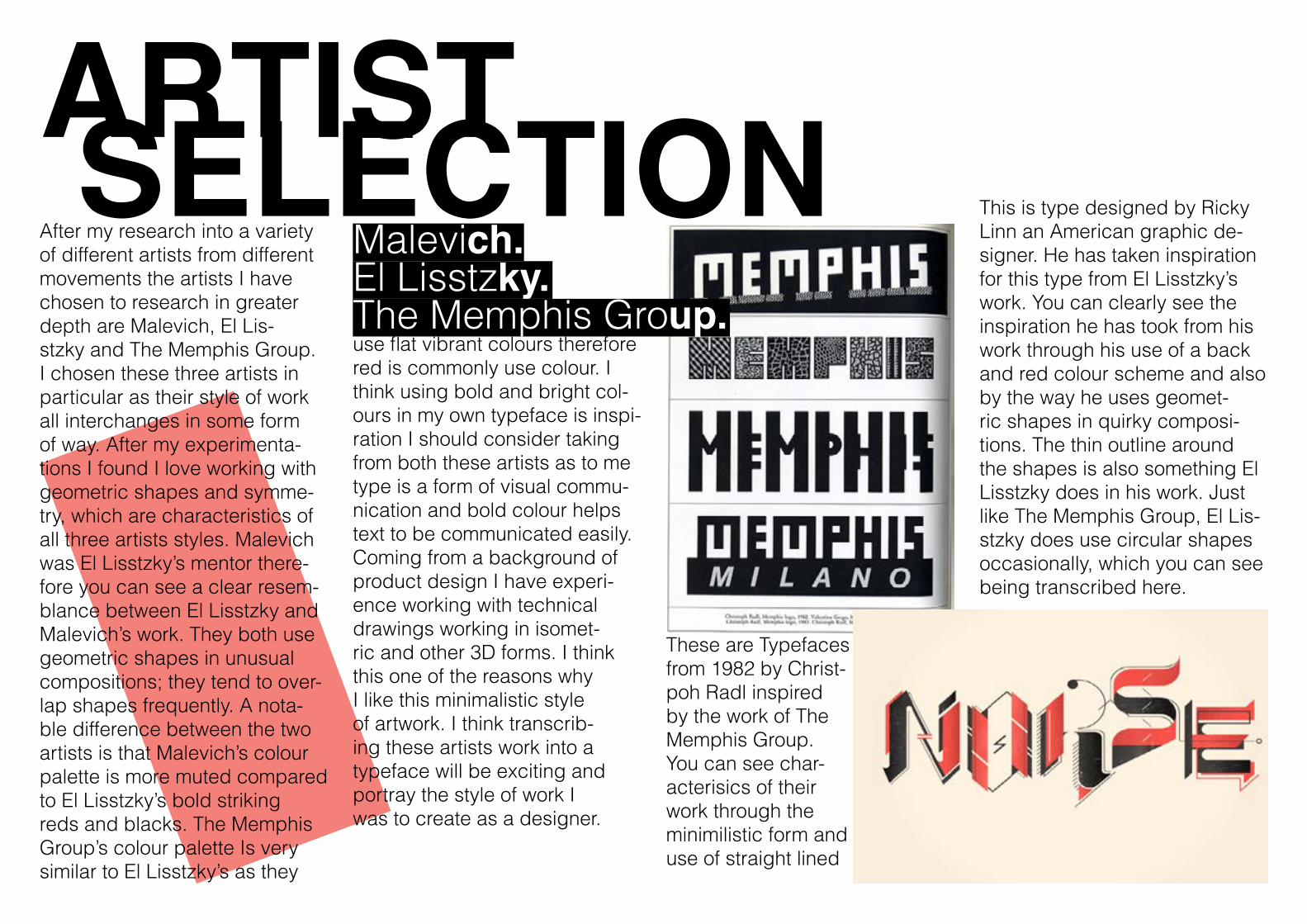
ARTIST SELECTION Malevich.El Lisstzky.The Memphis Group.
After my research into a variety of different artists from different movements the artists I have chosen to research in greater depth are Malevich, El Lis-stzky and The Memphis Group. I chosen these three artists in particular as their style of work all interchanges in some form of way. After my experimenta-tions I found I love working with geometric shapes and symme-try, which are characteristics of all three artists styles. Malevich was El Lisstzky’s mentor there-fore you can see a clear resem-blance between El Lisstzky and Malevich’s work. They both use geometric shapes in unusual compositions; they tend to over-lap shapes frequently. A nota-ble difference between the two artists is that Malevich’s colour palette is more muted compared to El Lisstzky’s bold striking reds and blacks. The Memphis Group’s colour palette Is very similar to El Lisstzky’s as they
use flat vibrant colours therefore red is commonly use colour. I think using bold and bright col-ours in my own typeface is inspi-ration I should consider taking from both these artists as to me type is a form of visual commu-nication and bold colour helps text to be communicated easily. Coming from a background of product design I have experi-ence working with technical drawings working in isomet-ric and other 3D forms. I think this one of the reasons why I like this minimalistic style of artwork. I think transcrib-ing these artists work into a typeface will be exciting and portray the style of work I was to create as a designer.
This is type designed by Ricky Linn an American graphic de-signer. He has taken inspiration for this type from El Lisstzky’s work. You can clearly see the inspiration he has took from his work through his use of a back and red colour scheme and also by the way he uses geomet-ric shapes in quirky composi-tions. The thin outline around the shapes is also something El Lisstzky does in his work. Just like The Memphis Group, El Lis-stzky does use circular shapes occasionally, which you can see being transcribed here.
These are Typefaces from 1982 by Christ-poh Radl inspired by the work of The Memphis Group. You can see char-acterisics of their work through the minimilistic form and use of straight lined
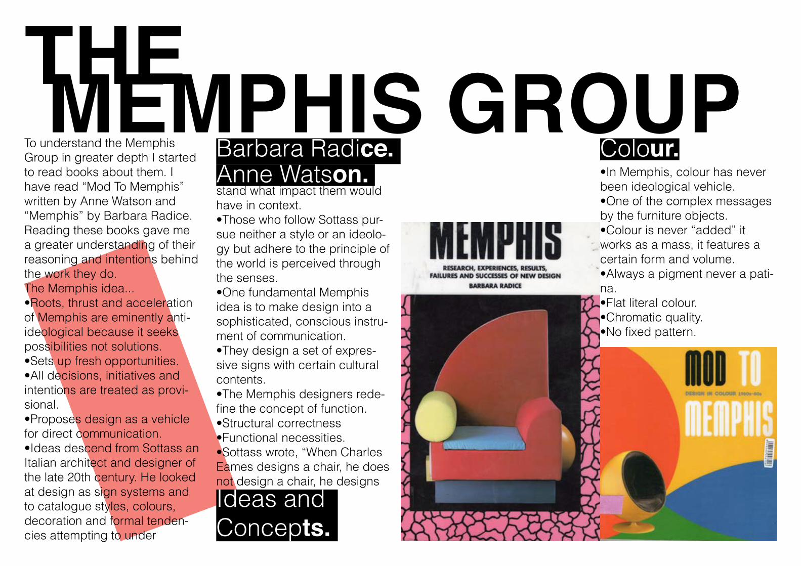
THE MEMPHIS GROUP Barbara Radice.Anne Watson.
To understand the Memphis Group in greater depth I started to read books about them. I have read “Mod To Memphis” written by Anne Watson and “Memphis” by Barbara Radice. Reading these books gave me a greater understanding of their reasoning and intentions behind the work they do.The Memphis idea...•Roots, thrust and acceleration of Memphis are eminently anti-ideological because it seeks possibilities not solutions. •Sets up fresh opportunities. •All decisions, initiatives and intentions are treated as provi-sional.•Proposes design as a vehicle for direct communication.•Ideas descend from Sottass an Italian architect and designer of the late 20th century. He looked at design as sign systems and to catalogue styles, colours, decoration and formal tenden-cies attempting to under
stand what impact them would have in context. •Those who follow Sottass pur-sue neither a style or an ideolo-gy but adhere to the principle of the world is perceived through the senses.•One fundamental Memphis idea is to make design into a sophisticated, conscious instru-ment of communication. •They design a set of expres-sive signs with certain cultural contents. •The Memphis designers rede-fine the concept of function. •Structural correctness•Functional necessities.•Sottass wrote, “When Charles Eames designs a chair, he does not design a chair, he designs
•In Memphis, colour has never been ideological vehicle.•One of the complex messages by the furniture objects.•Colour is never “added” it works as a mass, it features a certain form and volume.•Always a pigment never a pati-na.•Flat literal colour. •Chromatic quality. •No fixed pattern.
Colour.
Ideas andConcepts.
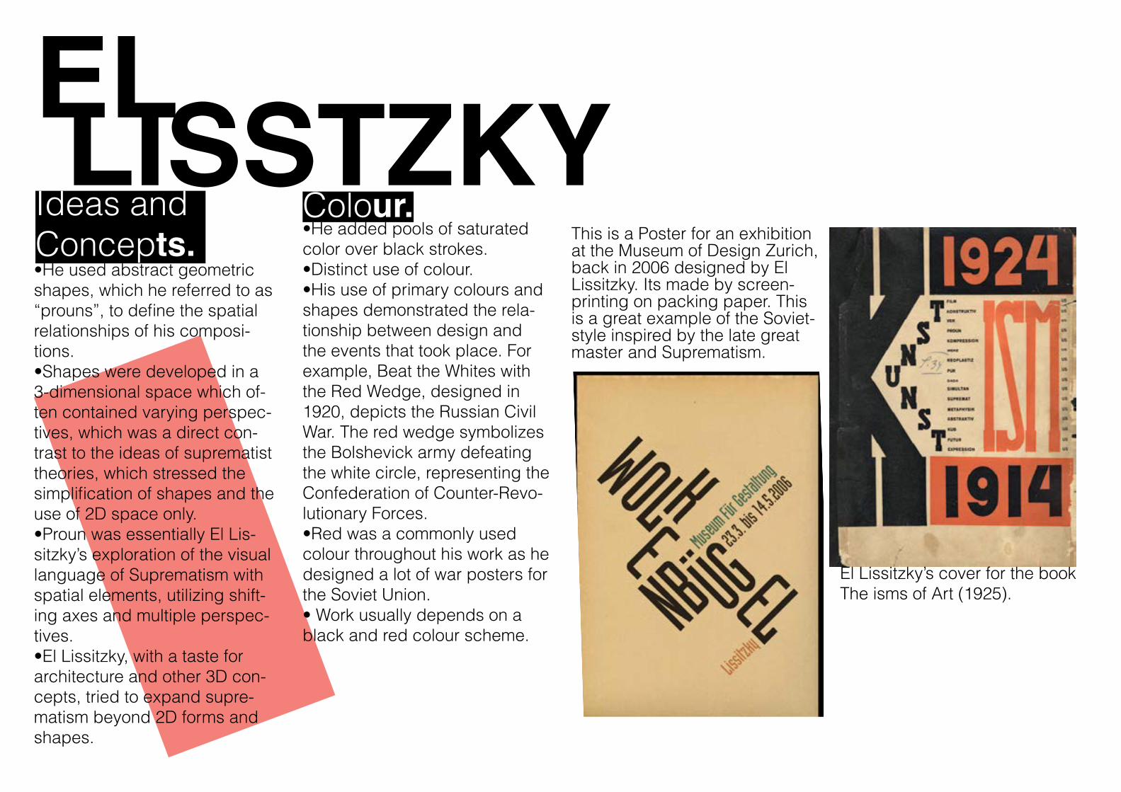
EL LISSTZKY•He used abstract geometric shapes, which he referred to as “prouns”, to define the spatial relationships of his composi-tions.•Shapes were developed in a 3-dimensional space which of-ten contained varying perspec-tives, which was a direct con-trast to the ideas of suprematist theories, which stressed the simplification of shapes and the use of 2D space only.•Proun was essentially El Lis-sitzky’s exploration of the visual language of Suprematism with spatial elements, utilizing shift-ing axes and multiple perspec-tives.•El Lissitzky, with a taste for architecture and other 3D con-cepts, tried to expand supre-matism beyond 2D forms and shapes.
•He added pools of saturated color over black strokes.•Distinct use of colour.•His use of primary colours and shapes demonstrated the rela-tionship between design and the events that took place. For example, Beat the Whites with the Red Wedge, designed in 1920, depicts the Russian Civil War. The red wedge symbolizes the Bolshevick army defeating the white circle, representing the Confederation of Counter-Revo-lutionary Forces.•Red was a commonly used colour throughout his work as he designed a lot of war posters for the Soviet Union.• Work usually depends on a black and red colour scheme.
Colour.Ideas andConcepts.
El Lissitzky’s cover for the book The isms of Art (1925).
This is a Poster for an exhibition at the Museum of Design Zurich, back in 2006 designed by El Lissitzky. Its made by screen-printing on packing paper. This is a great example of the Soviet-style inspired by the late great master and Suprematism.
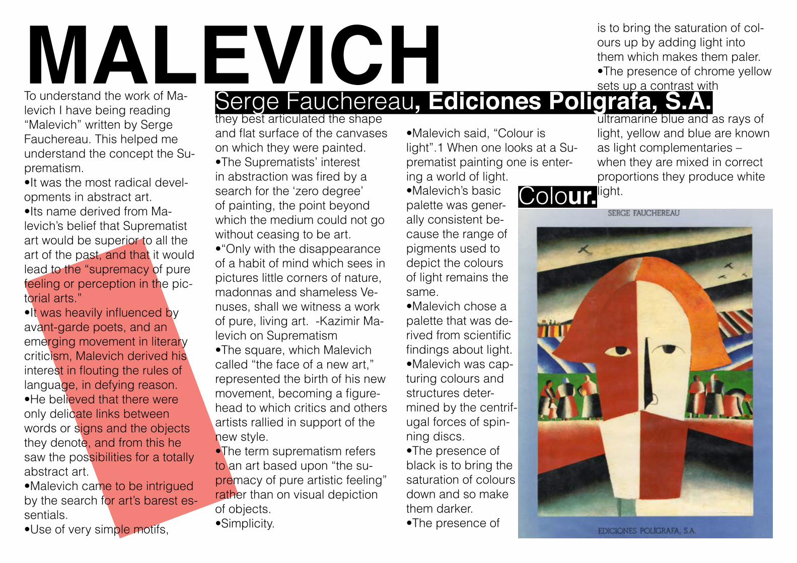
MALEVICH Serge Fauchereau, Ediciones Poligrafa, S.A.To understand the work of Ma-
levich I have being reading “Malevich” written by Serge Fauchereau. This helped me understand the concept the Su-prematism.•It was the most radical devel-opments in abstract art.•Its name derived from Ma-levich’s belief that Suprematist art would be superior to all the art of the past, and that it would lead to the “supremacy of pure feeling or perception in the pic-torial arts.”•It was heavily influenced by avant-garde poets, and an emerging movement in literary criticism, Malevich derived his interest in flouting the rules of language, in defying reason.•He believed that there were only delicate links between words or signs and the objects they denote, and from this he saw the possibilities for a totally abstract art.•Malevich came to be intrigued by the search for art’s barest es-sentials.•Use of very simple motifs,
they best articulated the shape and flat surface of the canvases on which they were painted.•The Suprematists’ interest in abstraction was fired by a search for the ‘zero degree’ of painting, the point beyond which the medium could not go without ceasing to be art.•“Only with the disappearance of a habit of mind which sees in pictures little corners of nature, madonnas and shameless Ve-nuses, shall we witness a work of pure, living art. -Kazimir Ma-levich on Suprematism•The square, which Malevich called “the face of a new art,” represented the birth of his new movement, becoming a figure-head to which critics and others artists rallied in support of the new style.•The term suprematism refers to an art based upon “the su-premacy of pure artistic feeling” rather than on visual depiction of objects.•Simplicity.
•Malevich said, “Colour is light”.1 When one looks at a Su-prematist painting one is enter-ing a world of light.•Malevich’s basic palette was gener-ally consistent be-cause the range of pigments used to depict the colours of light remains the same.•Malevich chose a palette that was de-rived from scientific findings about light. •Malevich was cap-turing colours and structures deter-mined by the centrif-ugal forces of spin-ning discs.•The presence of black is to bring the saturation of colours down and so make them darker.•The presence of
is to bring the saturation of col-ours up by adding light into them which makes them paler.•The presence of chrome yellow sets up a contrast with
ultramarine blue and as rays of light, yellow and blue are known as light complementaries – when they are mixed in correct proportions they produce white light.Colour.
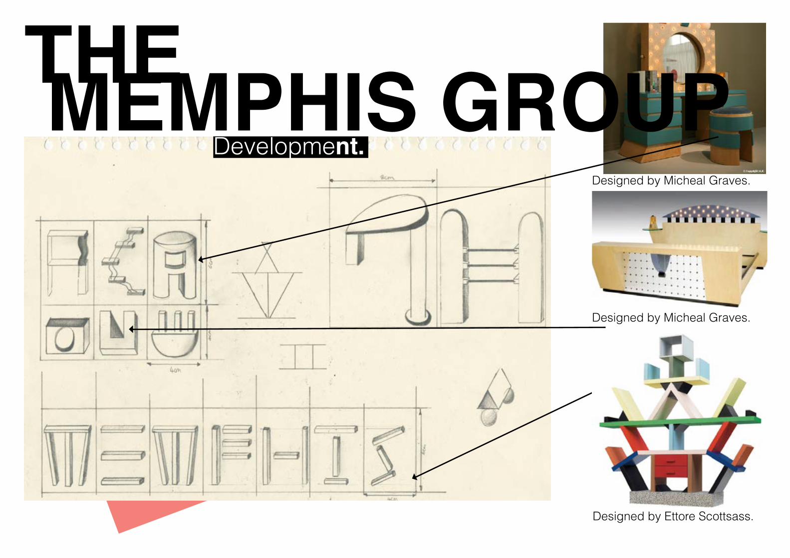
THE MEMPHIS GROUP
Designed by Ettore Scottsass.
Designed by Micheal Graves.
Designed by Micheal Graves.
Development.
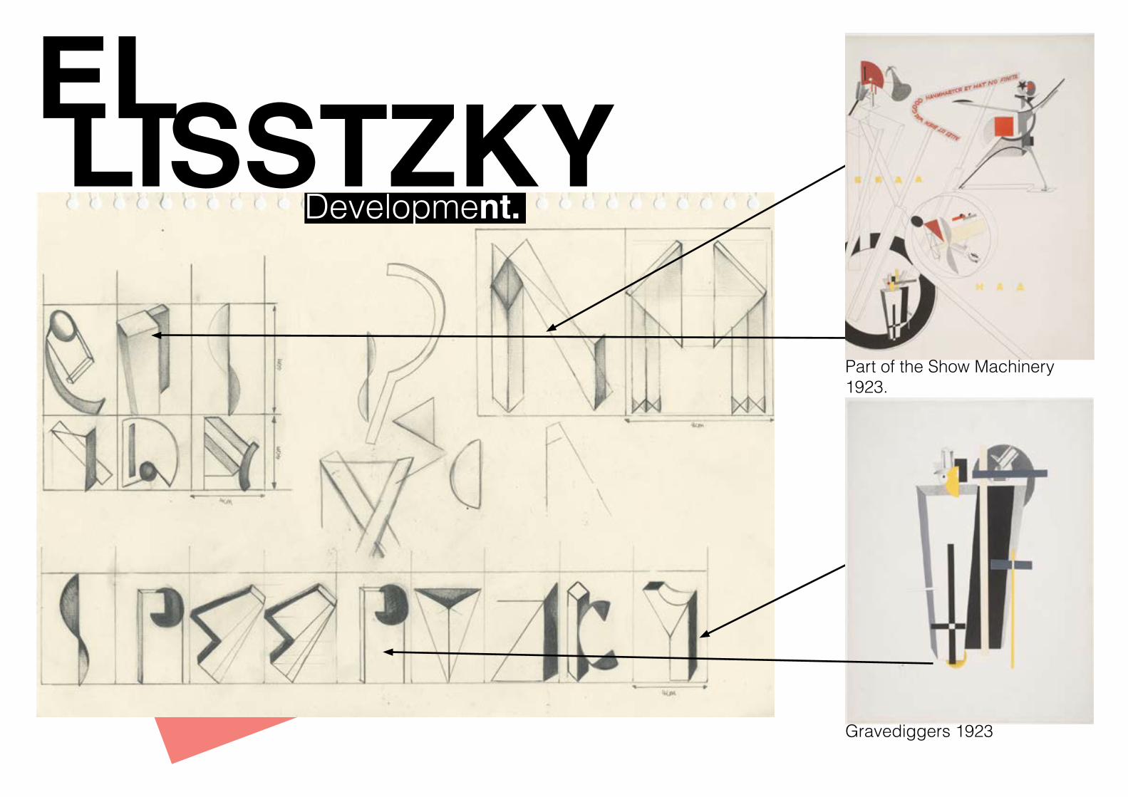
EL LISSTZKYPart of the Show Machinery 1923.
Gravediggers 1923
Development.
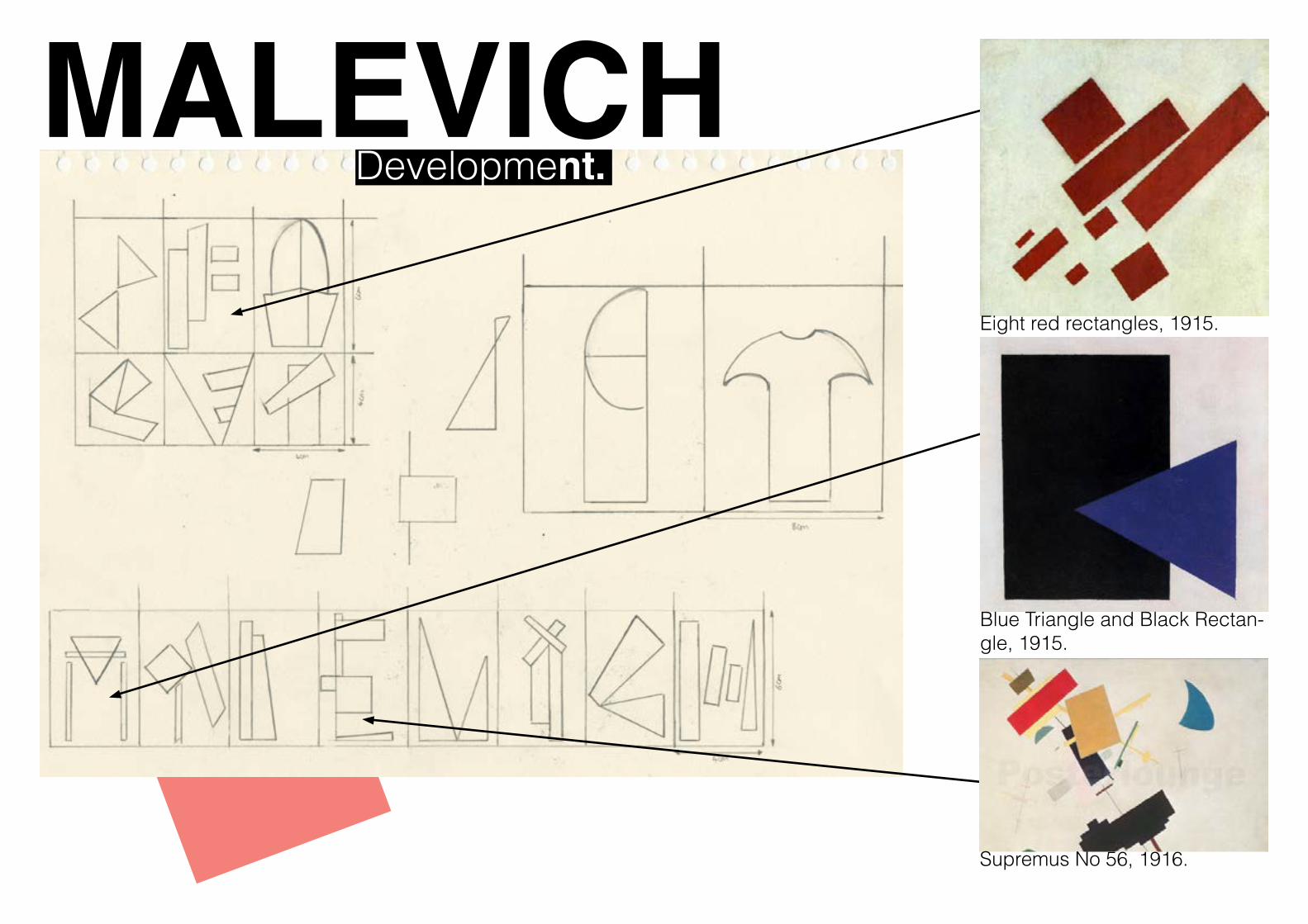
MALEVICH Eight red rectangles, 1915.
Blue Triangle and Black Rectan-gle, 1915.
Supremus No 56, 1916.
Development.
THE MEMPHIS GROUP Development.
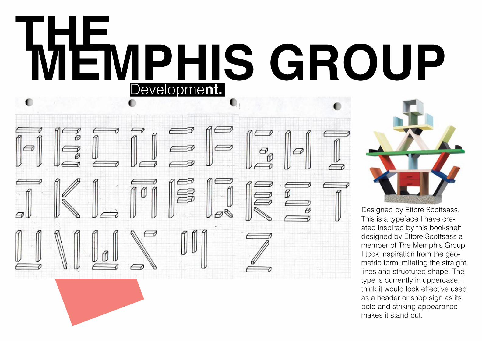
Designed by Ettore Scottsass.This is a typeface I have cre-ated inspired by this bookshelf designed by Ettore Scottsass a member of The Memphis Group. I took inspiration from the geo-metric form imitating the straight lines and structured shape. The type is currently in uppercase, I think it would look effective used as a header or shop sign as its bold and striking appearance makes it stand out.
EL LISSTZKYDevelopment.
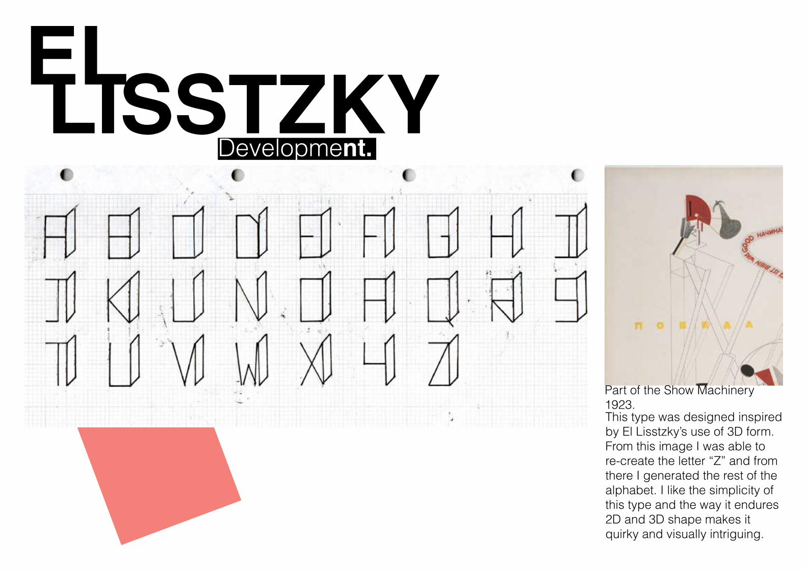
Part of the Show Machinery 1923.This type was designed inspired by El Lisstzky’s use of 3D form. From this image I was able to re-create the letter “Z” and from there I generated the rest of the alphabet. I like the simplicity of this type and the way it endures 2D and 3D shape makes it quirky and visually intriguing.
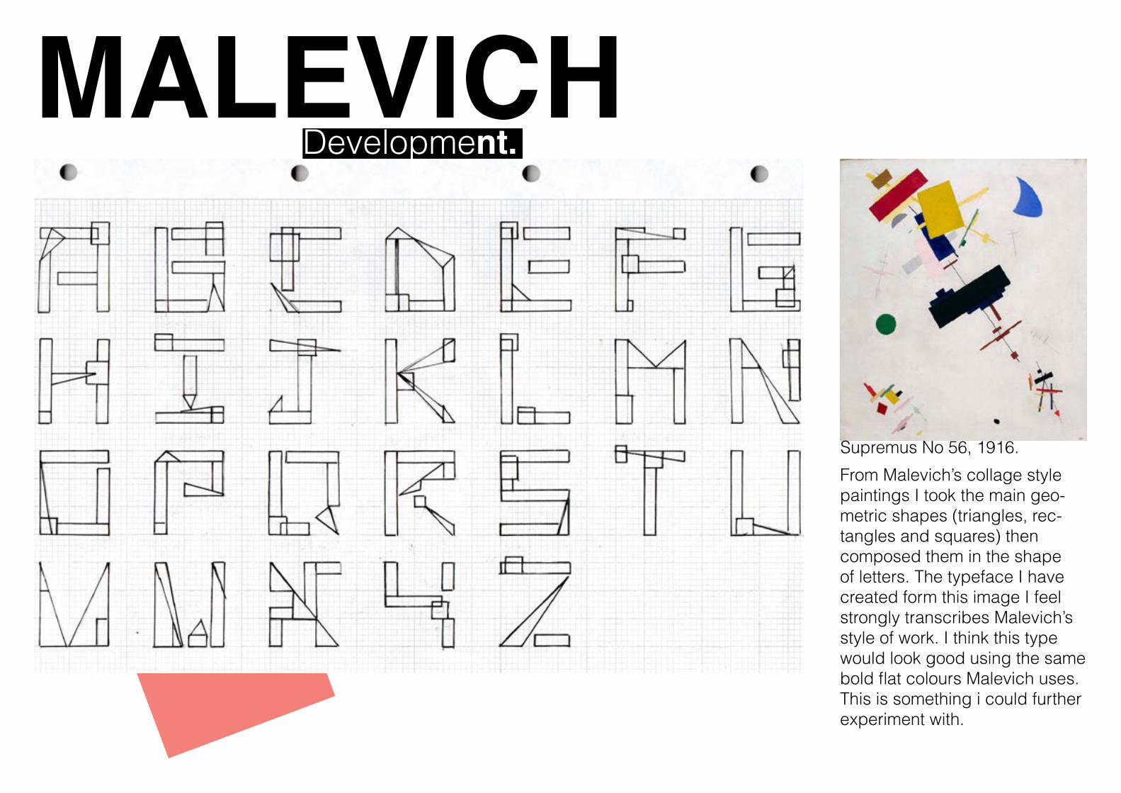
MALEVICH Development.
Supremus No 56, 1916.
From Malevich’s collage style paintings I took the main geo-metric shapes (triangles, rec-tangles and squares) then composed them in the shape of letters. The typeface I have created form this image I feel strongly transcribes Malevich’s style of work. I think this type would look good using the same bold flat colours Malevich uses. This is something i could further experiment with.
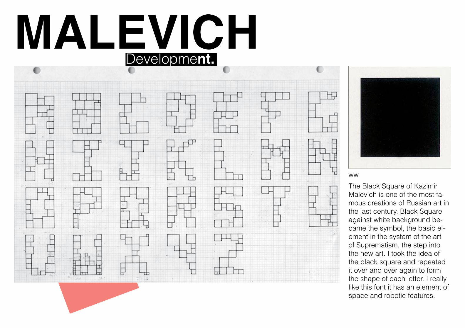
MALEVICH Development.
ww
The Black Square of Kazimir Malevich is one of the most fa-mous creations of Russian art in the last century. Black Square against white background be-came the symbol, the basic el-ement in the system of the art of Suprematism, the step into the new art. I took the idea of the black square and repeated it over and over again to form the shape of each letter. I really like this font it has an element of space and robotic features.
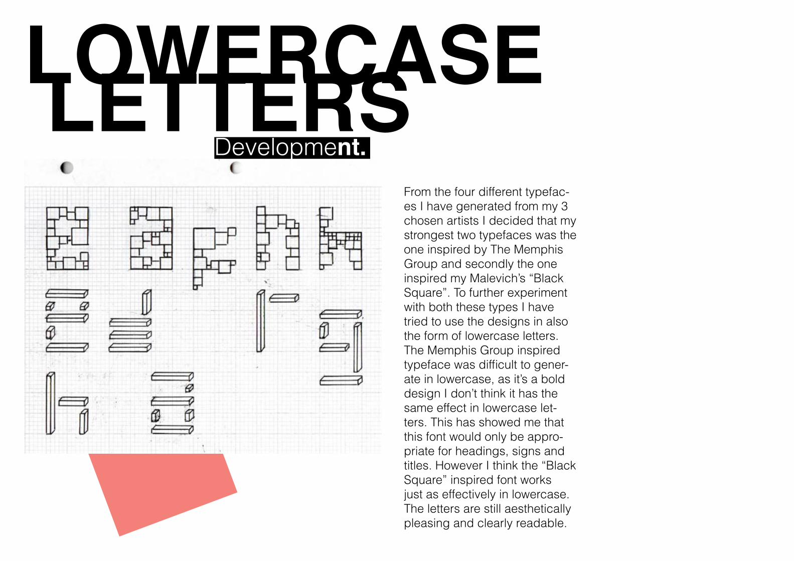
LOWERCASE LETTERS Development.
From the four different typefac-es I have generated from my 3 chosen artists I decided that my strongest two typefaces was the one inspired by The Memphis Group and secondly the one inspired my Malevich’s “Black Square”. To further experiment with both these types I have tried to use the designs in also the form of lowercase letters. The Memphis Group inspired typeface was difficult to gener-ate in lowercase, as it’s a bold design I don’t think it has the same effect in lowercase let-ters. This has showed me that this font would only be appro-priate for headings, signs and titles. However I think the “Black Square” inspired font works just as effectively in lowercase. The letters are still aesthetically pleasing and clearly readable.
COLOUR Development.
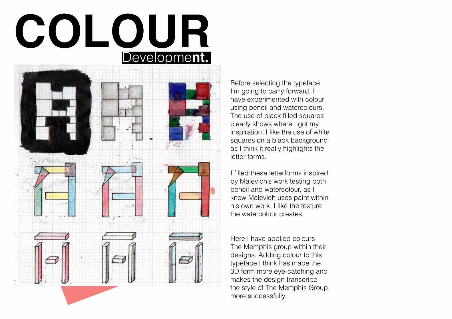
Before selecting the typeface I’m going to carry forward, I have experimented with colour using pencil and watercolours. The use of black filled squares clearly shows where I got my inspiration. I like the use of white squares on a black background as I think it really highlights the letter forms.
I filled these letterforms inspired by Malevich’s work testing both pencil and watercolour, as I know Malevich uses paint within his own work. I like the texture the watercolour creates.
Here I have applied colours The Memphis group within their designs. Adding colour to this typeface I think has made the 3D form more eye-catching and makes the design transcribe the style of The Memphis Group more successfully.
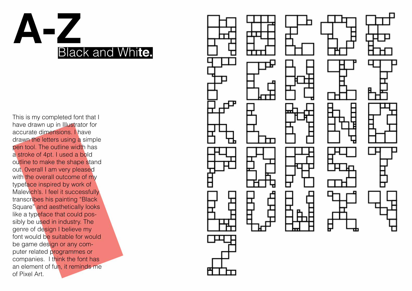
A-Z Black and White.
This is my completed font that I have drawn up in Illustrator for accurate dimensions. I have drawn the letters using a simple pen tool. The outline width has a stroke of 4pt. I used a bold outline to make the shape stand out. 0verall I am very pleased with the overall outcome of my typeface inspired by work of Malevich’s. I feel it successfully transcribes his painting “Black Square” and aesthetically looks like a typeface that could pos-sibly be used in industry. The genre of design I believe my font would be suitable for would be game design or any com-puter related programmes or companies. I think the font has an element of fun, it reminds me of Pixel Art.
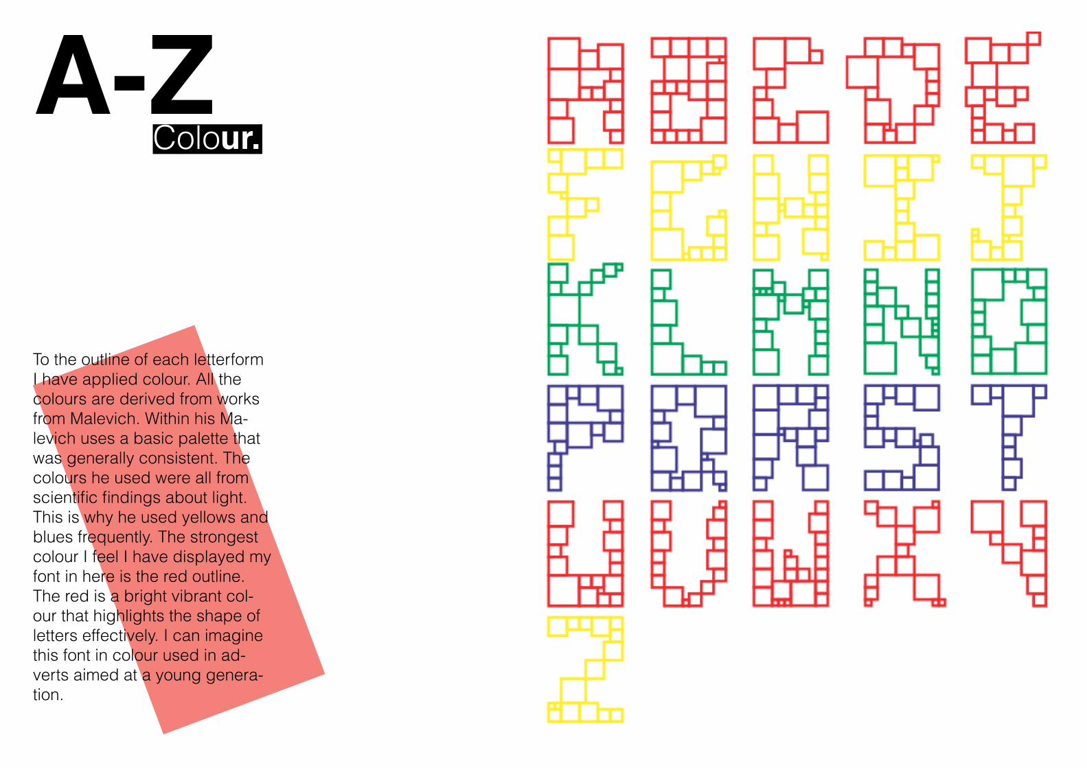
A-Z Colour.
To the outline of each letterform I have applied colour. All the colours are derived from works from Malevich. Within his Ma-levich uses a basic palette that was generally consistent. The colours he used were all from scientific findings about light. This is why he used yellows and blues frequently. The strongest colour I feel I have displayed my font in here is the red outline. The red is a bright vibrant col-our that highlights the shape of letters effectively. I can imagine this font in colour used in ad-verts aimed at a young genera-tion.
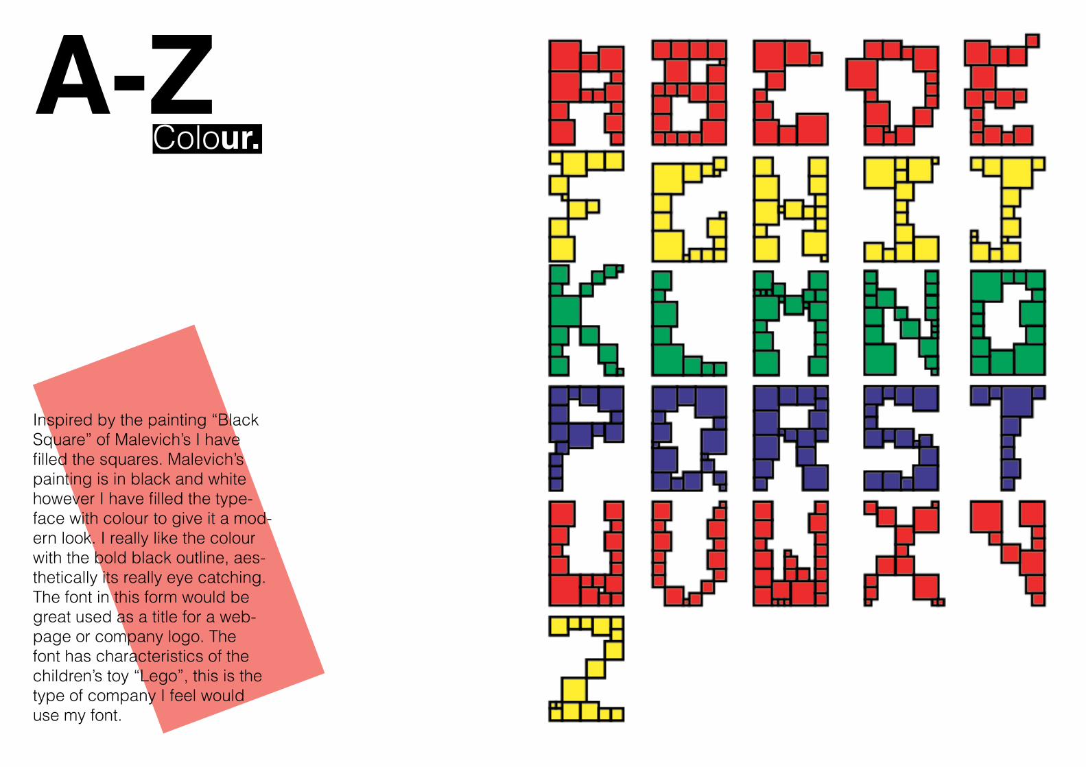
A-Z Colour.
Inspired by the painting “Black Square” of Malevich’s I have filled the squares. Malevich’s painting is in black and white however I have filled the type-face with colour to give it a mod-ern look. I really like the colour with the bold black outline, aes-thetically its really eye catching. The font in this form would be great used as a title for a web-page or company logo. The font has characteristics of the children’s toy “Lego”, this is the type of company I feel would use my font.
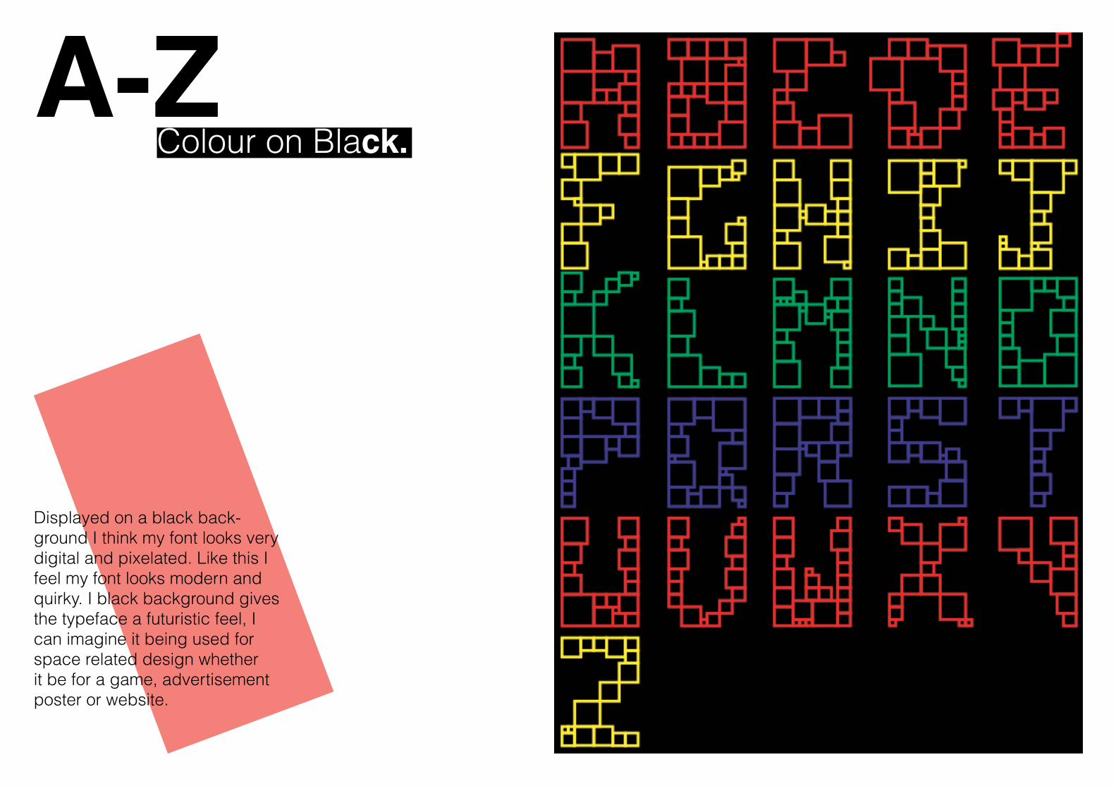
A-Z Colour on Black.
Displayed on a black back-ground I think my font looks very digital and pixelated. Like this I feel my font looks modern and quirky. I black background gives the typeface a futuristic feel, I can imagine it being used for space related design whether it be for a game, advertisement poster or website.
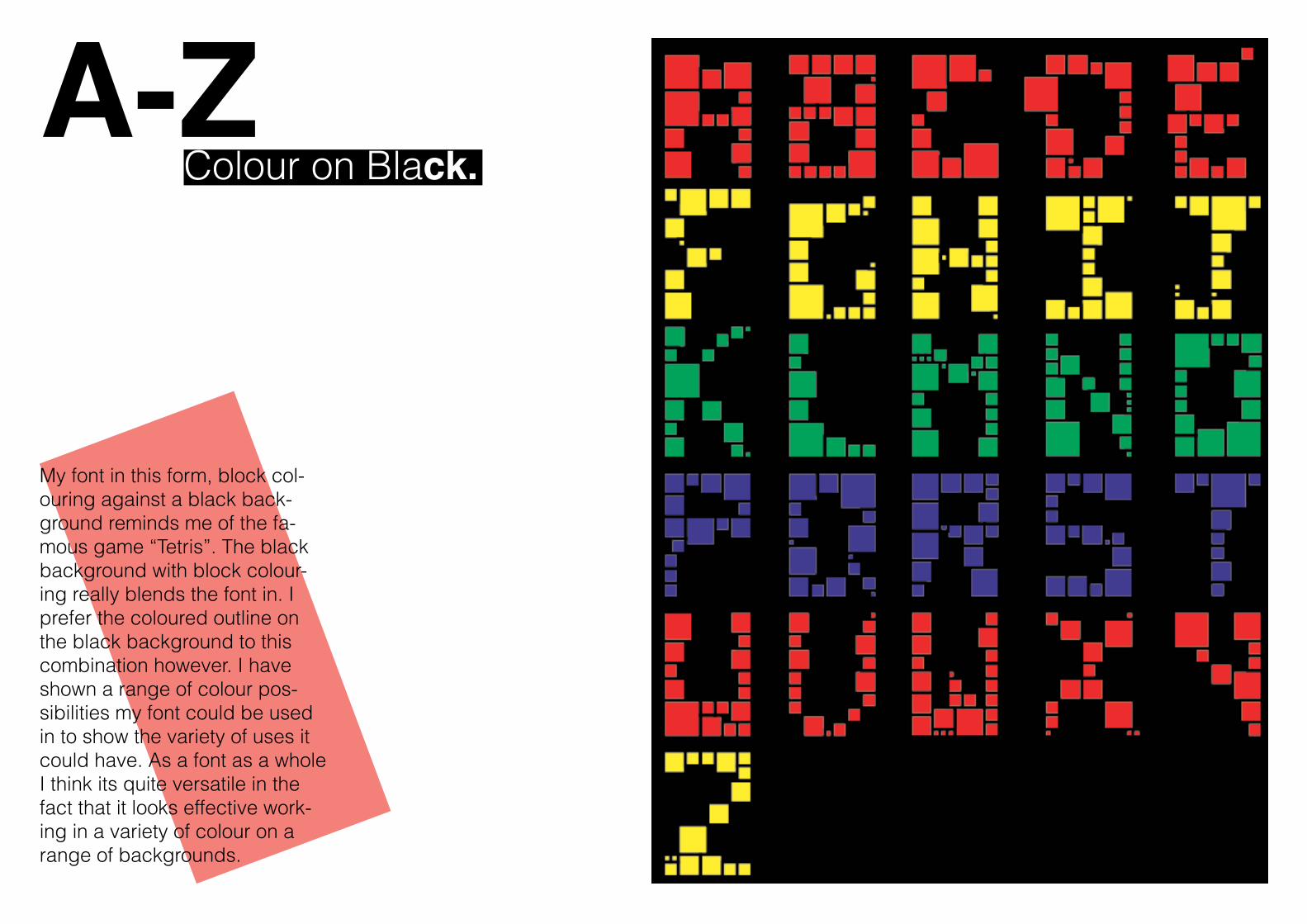
A-Z Colour on Black.
My font in this form, block col-ouring against a black back-ground reminds me of the fa-mous game “Tetris”. The black background with block colour-ing really blends the font in. I prefer the coloured outline on the black background to this combination however. I have shown a range of colour pos-sibilities my font could be used in to show the variety of uses it could have. As a font as a whole I think its quite versatile in the fact that it looks effective work-ing in a variety of colour on a range of backgrounds.
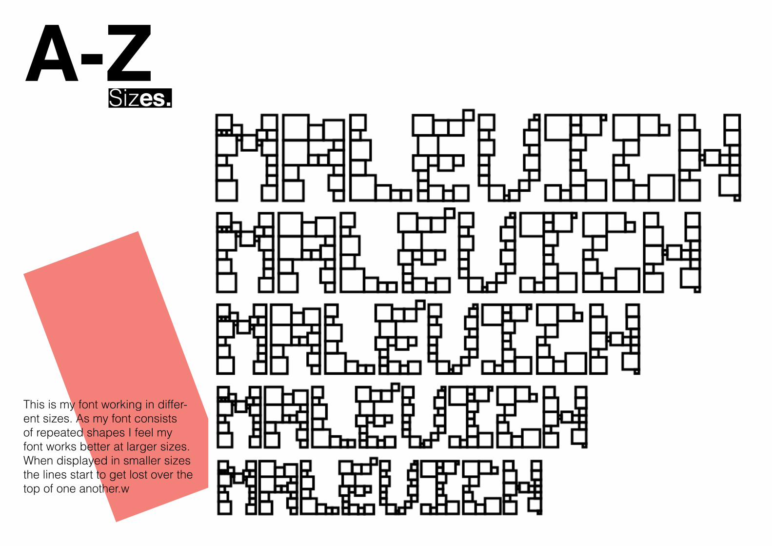
A-Z Sizes.
This is my font working in differ-ent sizes. As my font consists of repeated shapes I feel my font works better at larger sizes. When displayed in smaller sizes the lines start to get lost over the top of one another.w
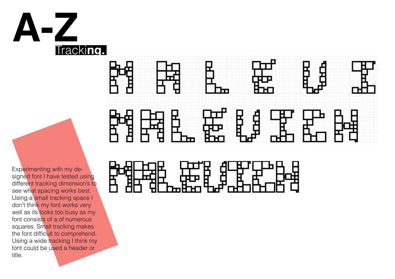
A-Z Tracking.
Experimenting with my de-signed font I have tested using different tracking dimension’s to see what spacing works best. Using a small tracking space I don’t think my font works very well as its looks too busy as my font consists of a of numerous squares. Small tracking makes the font difficult to comprehend. Using a wide tracking I think my font could be used a header or title.
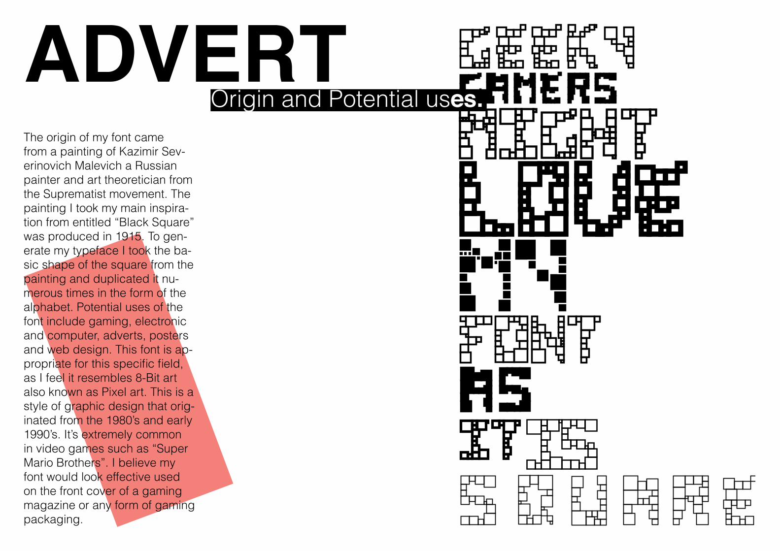
ADVERT The origin of my font came from a painting of Kazimir Sev-erinovich Malevich a Russian painter and art theoretician from the Suprematist movement. The painting I took my main inspira-tion from entitled “Black Square” was produced in 1915. To gen-erate my typeface I took the ba-sic shape of the square from the painting and duplicated it nu-merous times in the form of the alphabet. Potential uses of the font include gaming, electronic and computer, adverts, posters and web design. This font is ap-propriate for this specific field, as I feel it resembles 8-Bit art also known as Pixel art. This is a style of graphic design that orig-inated from the 1980’s and early 1990’s. It’s extremely common in video games such as “Super Mario Brothers”. I believe my font would look effective used on the front cover of a gaming magazine or any form of gaming packaging.
Origin and Potential uses.
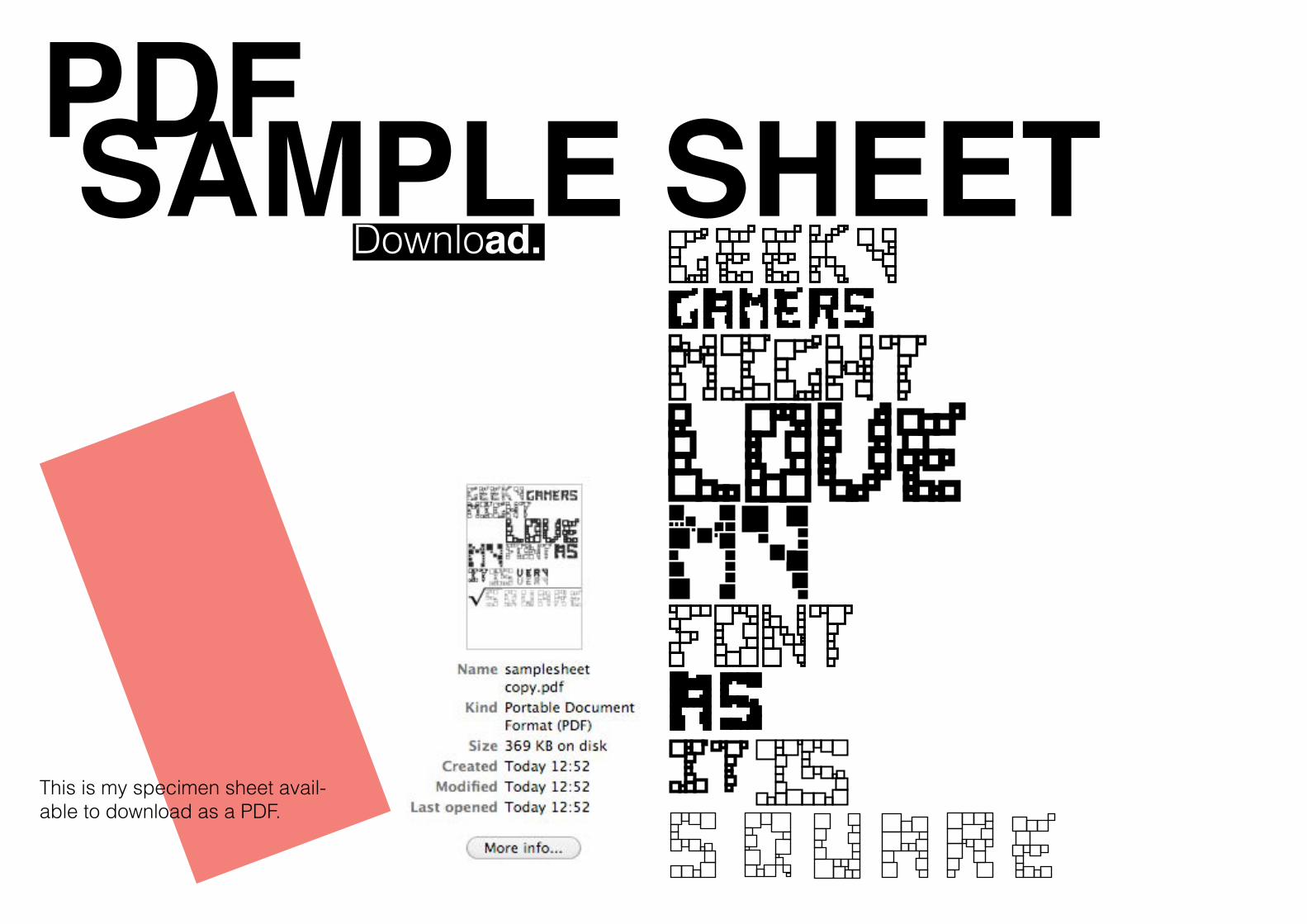
PDF SAMPLE SHEETDownload.
This is my specimen sheet avail-able to download as a PDF.
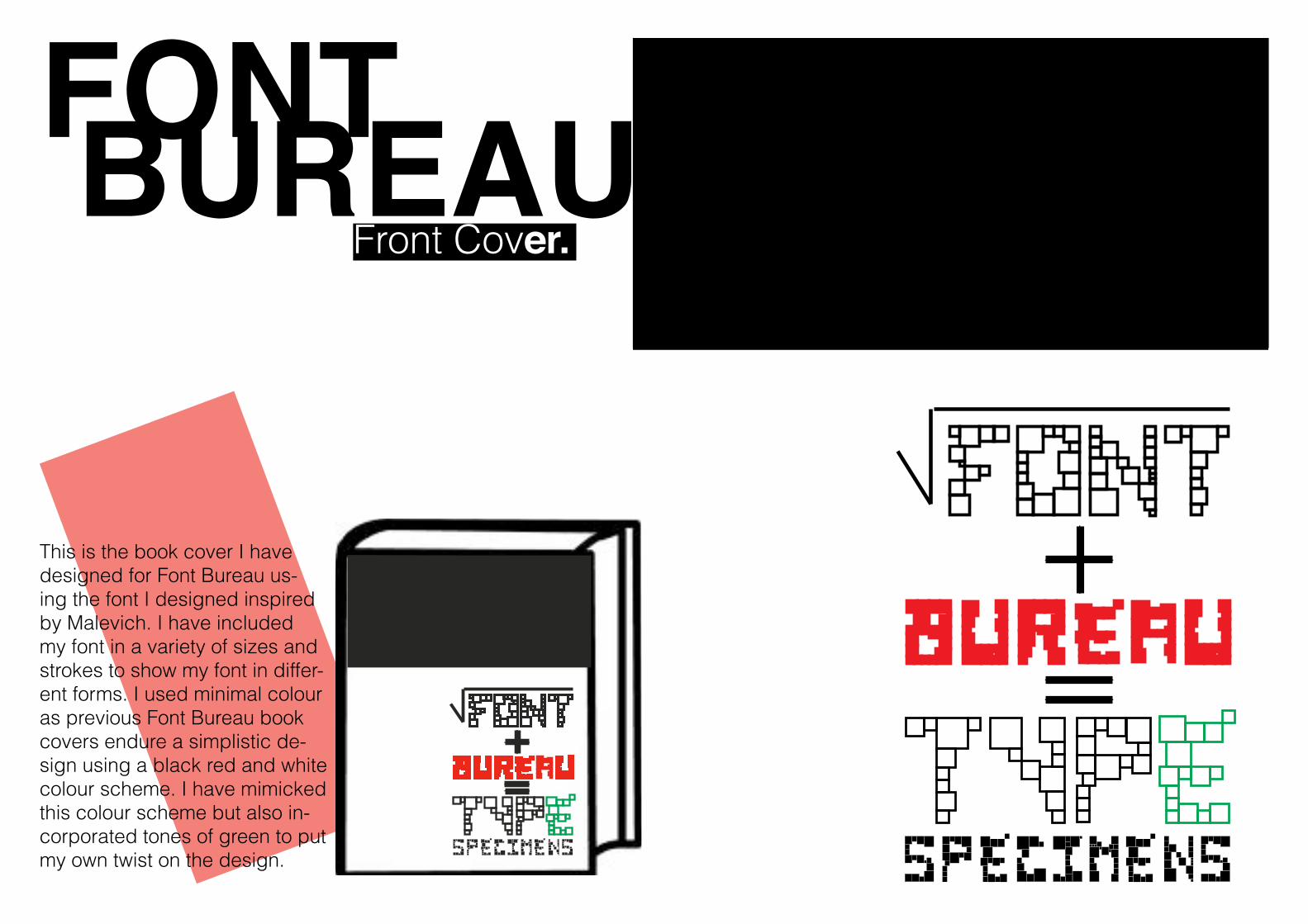
FONT BUREAUFront Cover.
This is the book cover I have designed for Font Bureau us-ing the font I designed inspired by Malevich. I have included my font in a variety of sizes and strokes to show my font in differ-ent forms. I used minimal colour as previous Font Bureau book covers endure a simplistic de-sign using a black red and white colour scheme. I have mimicked this colour scheme but also in-corporated tones of green to put my own twist on the design.
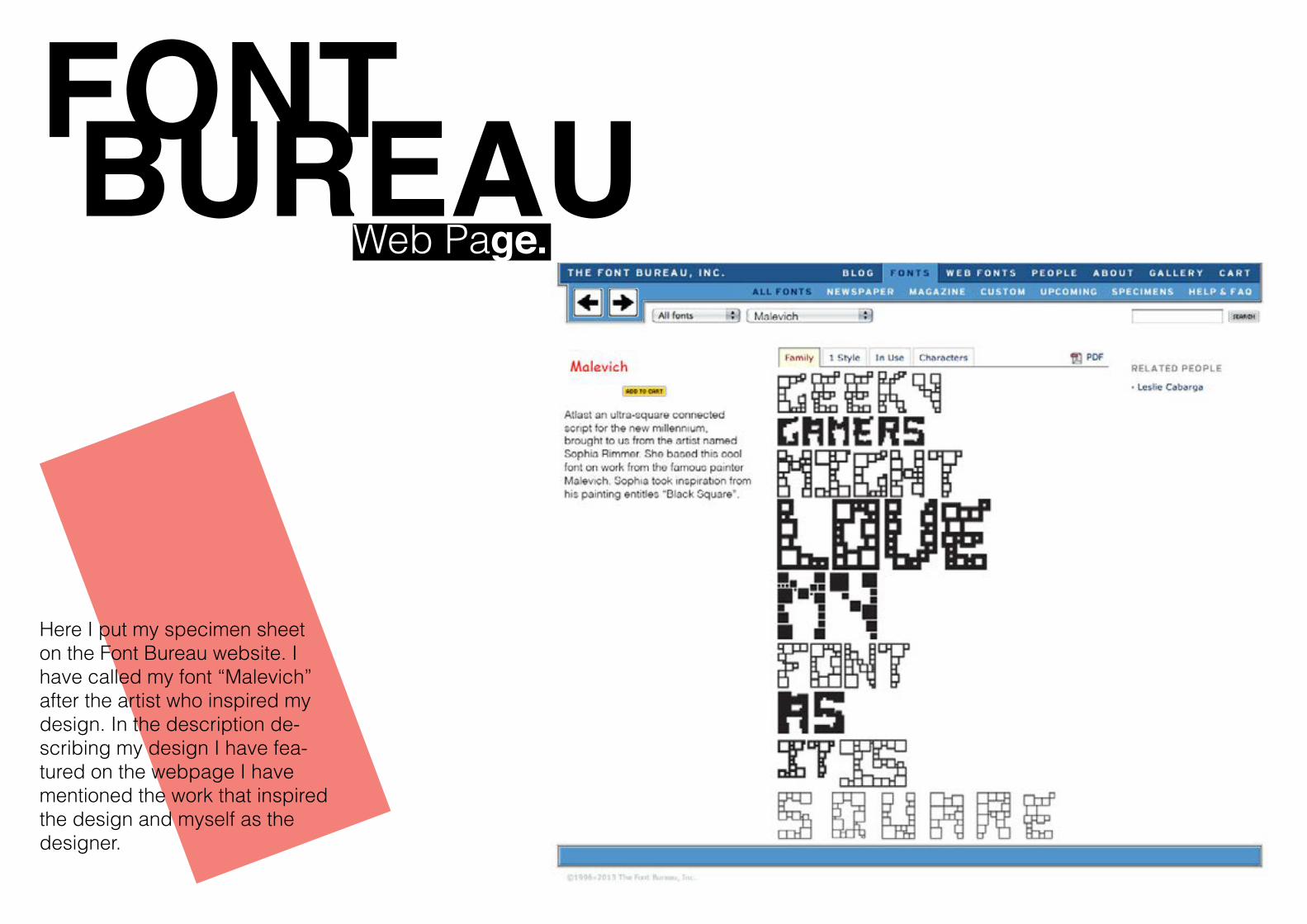
FONT BUREAUWeb Page.
Malevich
Here I put my specimen sheet on the Font Bureau website. I have called my font “Malevich” after the artist who inspired my design. In the description de-scribing my design I have fea-tured on the webpage I have mentioned the work that inspired the design and myself as the designer.