Embed Size (px)
DESCRIPTION
Â
Citation preview
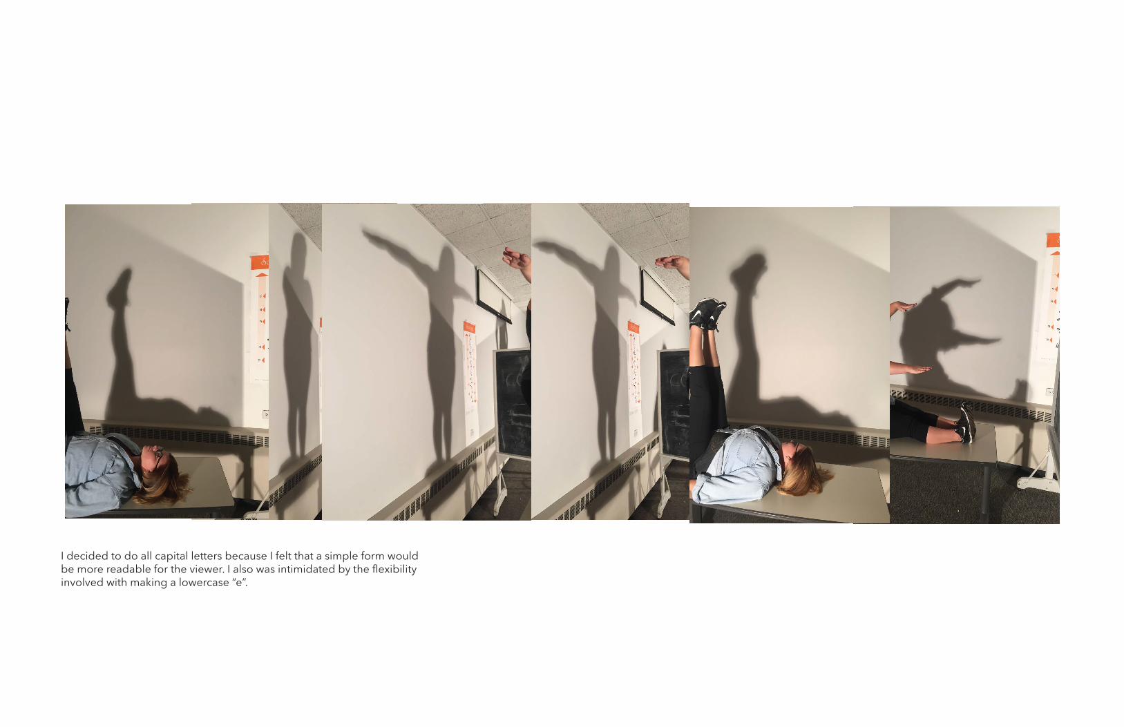
I decided to do all capital letters because I felt that a simple form would be more readable for the viewer. I also was intimidated by the flexibility involved with making a lowercase “e”.

I wanted all my letters to originate at a baseline and have the same cap height. Before I drew in my letters, I rested the im-ages on a baseline and adjusted the scale of my pictures to fit between a baseline and a cap line.

I really liked the idea of “melting down” my letter forms, so they look more like letters and less like the human form.
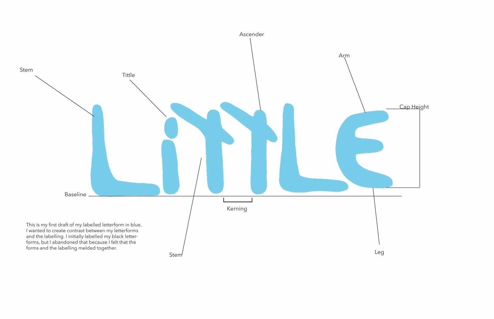
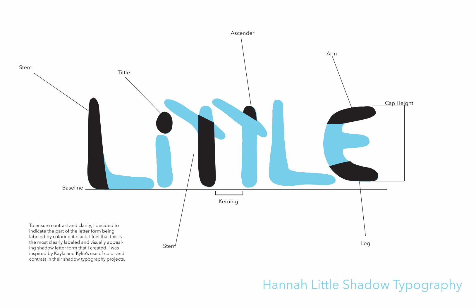
Stem
Baseline
Tittle
Ascender
Stem
Kerning
Arm
Leg
Cap Height
[This is my first draft of my labelled letterform in blue. I wanted to create contrast between my letterforms and the labelling. I initially labelled my black letter-forms, but I abandoned that because I felt that the forms and the labelling melded together.
Stem
Baseline
Tittle
Ascender
Stem
Kerning
Arm
Leg
Cap Height
[Hannah Little Shadow Typography
To ensure contrast and clarity, I decided to indicate the part of the letter form being labeled by coloring it black. I feel that this is the most clearly labeled and visually appeal-ing shadow letter form that I created. I was inspired by Kayla and Kylie’s use of color and contrast in their shadow typography projects.