Embed Size (px)
Citation preview
8/10/2019 Health Inequalities&Lorenz Curve
http://slidepdf.com/reader/full/health-inequalitieslorenz-curve 1/27
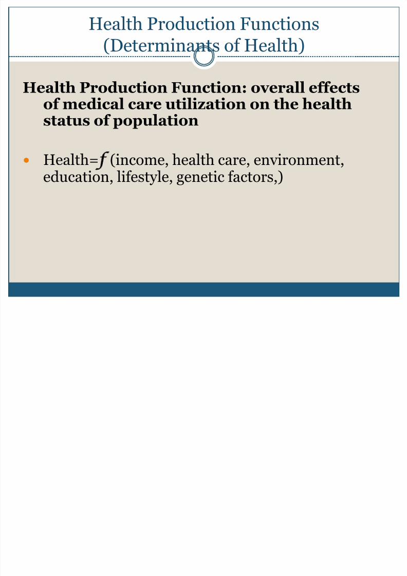
Health Production Functions(Determinants of Health)
Health Production Function: overall effectsof medical care utilization on the healthstatus of population
Health= (income, health care, environment,education, lifestyle, genetic factors,)
8/10/2019 Health Inequalities&Lorenz Curve
http://slidepdf.com/reader/full/health-inequalitieslorenz-curve 2/27
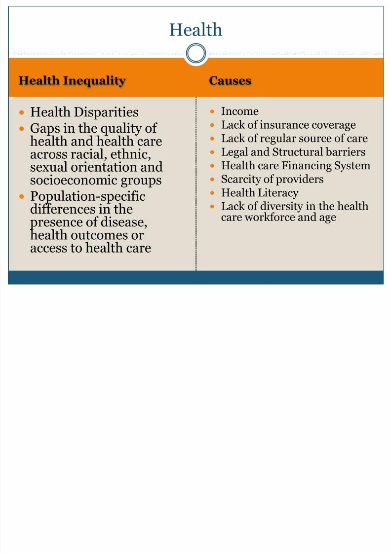
Health Inequality Causes
Health Disparities Gaps in the quality of
health and health careacross racial, ethnic,sexual orientation andsocioeconomic groups
Population-specificdifferences in thepresence of disease,health outcomes oraccess to health care
Income Lack of insurance coverage Lack of regular source of care Legal and Structural barriers Health care Financing System Scarcity of providers Health Literacy Lack of diversity in the health
care workforce and age
Health
8/10/2019 Health Inequalities&Lorenz Curve
http://slidepdf.com/reader/full/health-inequalitieslorenz-curve 3/27
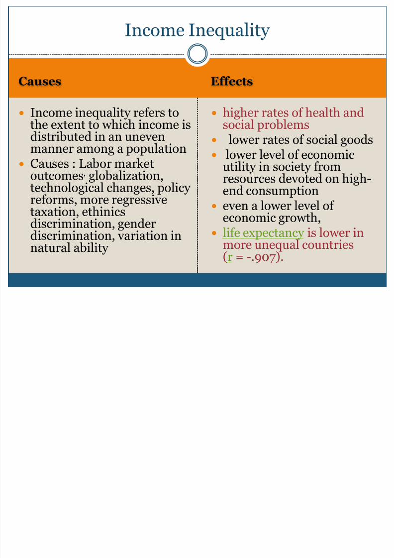
Causes Effects
Income inequality refers tothe extent to which income is
distributed in an unevenmanner among a population Causes : Labor market
outcomes, globalization,technological changes, policy
reforms, more regressivetaxation, ethinicsdiscrimination, genderdiscrimination, variation innatural ability
higher rates of health andsocial problems
lower rates of social goods lower level of economic
utility in society fromresources devoted on high-end consumption
even a lower level ofeconomic growth,
life expectancy is lower inmore unequal countries(r = -.907).
Income Inequality
8/10/2019 Health Inequalities&Lorenz Curve
http://slidepdf.com/reader/full/health-inequalitieslorenz-curve 4/27
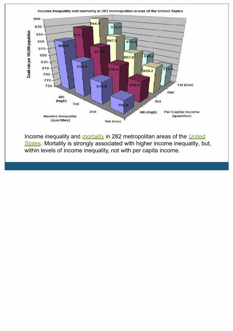
Income inequality and mortality in 282 metropolitan areas of the United
States. Mortality is strongly associated with higher income inequality, but,
within levels of income inequality, not with per capita income.
8/10/2019 Health Inequalities&Lorenz Curve
http://slidepdf.com/reader/full/health-inequalitieslorenz-curve 5/27
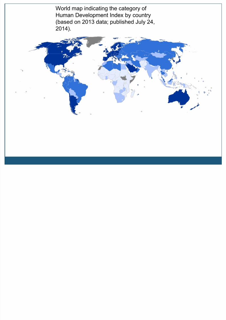
World map indicating the category of
Human Development Index by country
(based on 2013 data; published July 24,
2014).
8/10/2019 Health Inequalities&Lorenz Curve
http://slidepdf.com/reader/full/health-inequalitieslorenz-curve 6/27
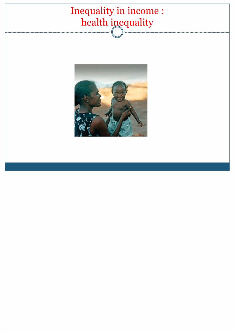
Inequality in income :health inequality
8/10/2019 Health Inequalities&Lorenz Curve
http://slidepdf.com/reader/full/health-inequalitieslorenz-curve 7/27
8/10/2019 Health Inequalities&Lorenz Curve
http://slidepdf.com/reader/full/health-inequalitieslorenz-curve 8/27
8/10/2019 Health Inequalities&Lorenz Curve
http://slidepdf.com/reader/full/health-inequalitieslorenz-curve 9/27

8/10/2019 Health Inequalities&Lorenz Curve
http://slidepdf.com/reader/full/health-inequalitieslorenz-curve 10/27
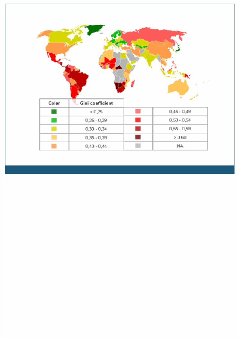
INCOME
DISTRI UTION
8/10/2019 Health Inequalities&Lorenz Curve
http://slidepdf.com/reader/full/health-inequalitieslorenz-curve 11/27
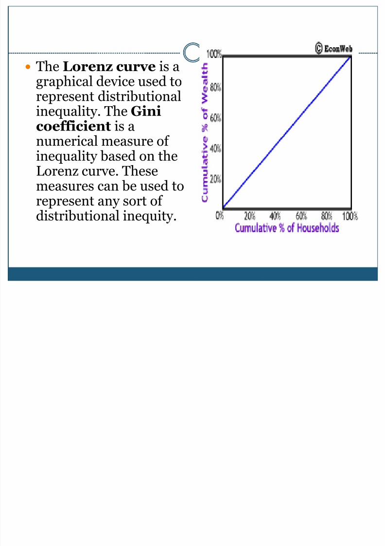
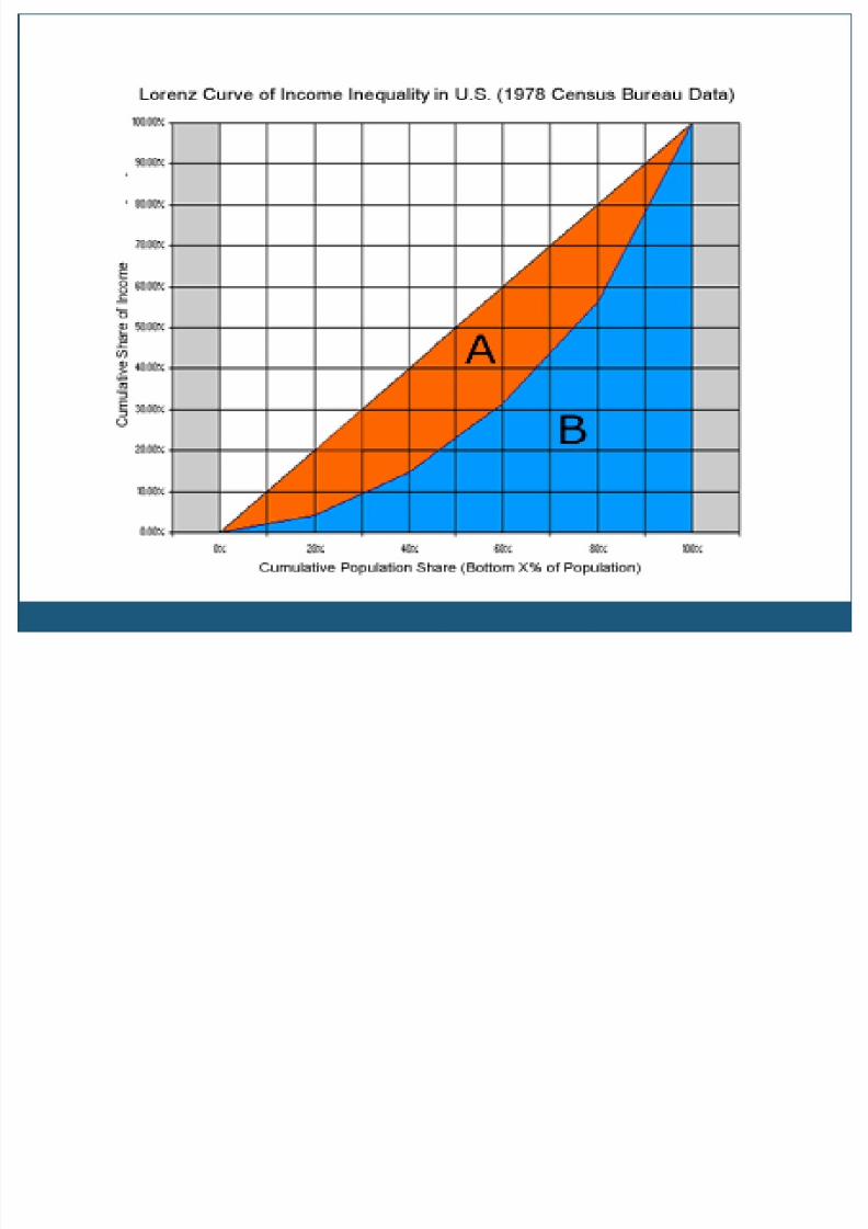
The Lorenz curve is agraphical device used torepresent distributionalinequality. The Ginicoefficient is anumerical measure ofinequality based on theLorenz curve. Thesemeasures can be used to
represent any sort ofdistributional inequity.
8/10/2019 Health Inequalities&Lorenz Curve
http://slidepdf.com/reader/full/health-inequalitieslorenz-curve 12/27
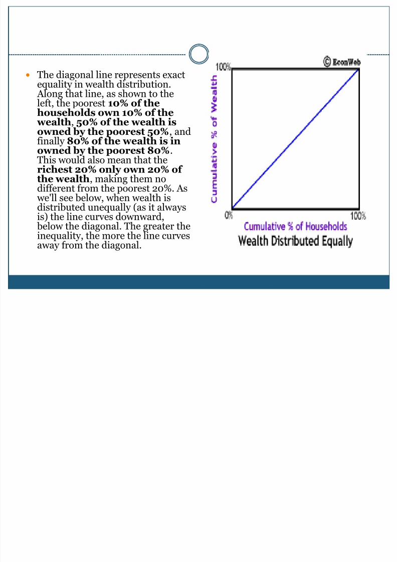
The diagonal line represents exactequality in wealth distribution. Along that line, as shown to theleft, the poorest 10% of thehouseholds own 10% of the
wealth, 50% of the wealth isowned by the poorest 50%, andfinally 80% of the wealth is inowned by the poorest 80%.This would also mean that therichest 20% only own 20% ofthe wealth, making them nodifferent from the poorest 20%. As we'll see below, when wealth is
distributed unequally (as it alwaysis) the line curves downward, below the diagonal. The greater theinequality, the more the line curvesaway from the diagonal.
8/10/2019 Health Inequalities&Lorenz Curve
http://slidepdf.com/reader/full/health-inequalitieslorenz-curve 13/27
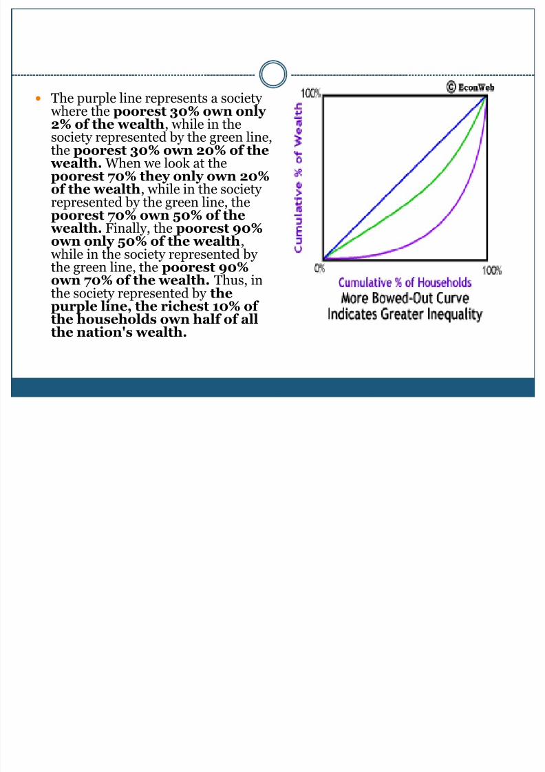
The purple line represents a society where the poorest 30% own only2% of the wealth, while in thesociety represented by the green line,the poorest 30% own 20% of the
wealth. When we look at thepoorest 70% they only own 20%
of the wealth, while in the societyrepresented by the green line, thepoorest 70% own 50% of the
wealth. Finally, the poorest 90%own only 50% of the wealth, while in the society represented bythe green line, the poorest 90%
own 70% of the wealth. Thus, inthe society represented by thepurple line, the richest 10% ofthe households own half of allthe nation's wealth.
8/10/2019 Health Inequalities&Lorenz Curve
http://slidepdf.com/reader/full/health-inequalitieslorenz-curve 14/27
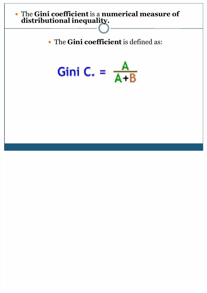
The Gini coefficient is a numerical measure ofdistributional inequality.
The Gini coefficient is defined as:
8/10/2019 Health Inequalities&Lorenz Curve
http://slidepdf.com/reader/full/health-inequalitieslorenz-curve 15/27
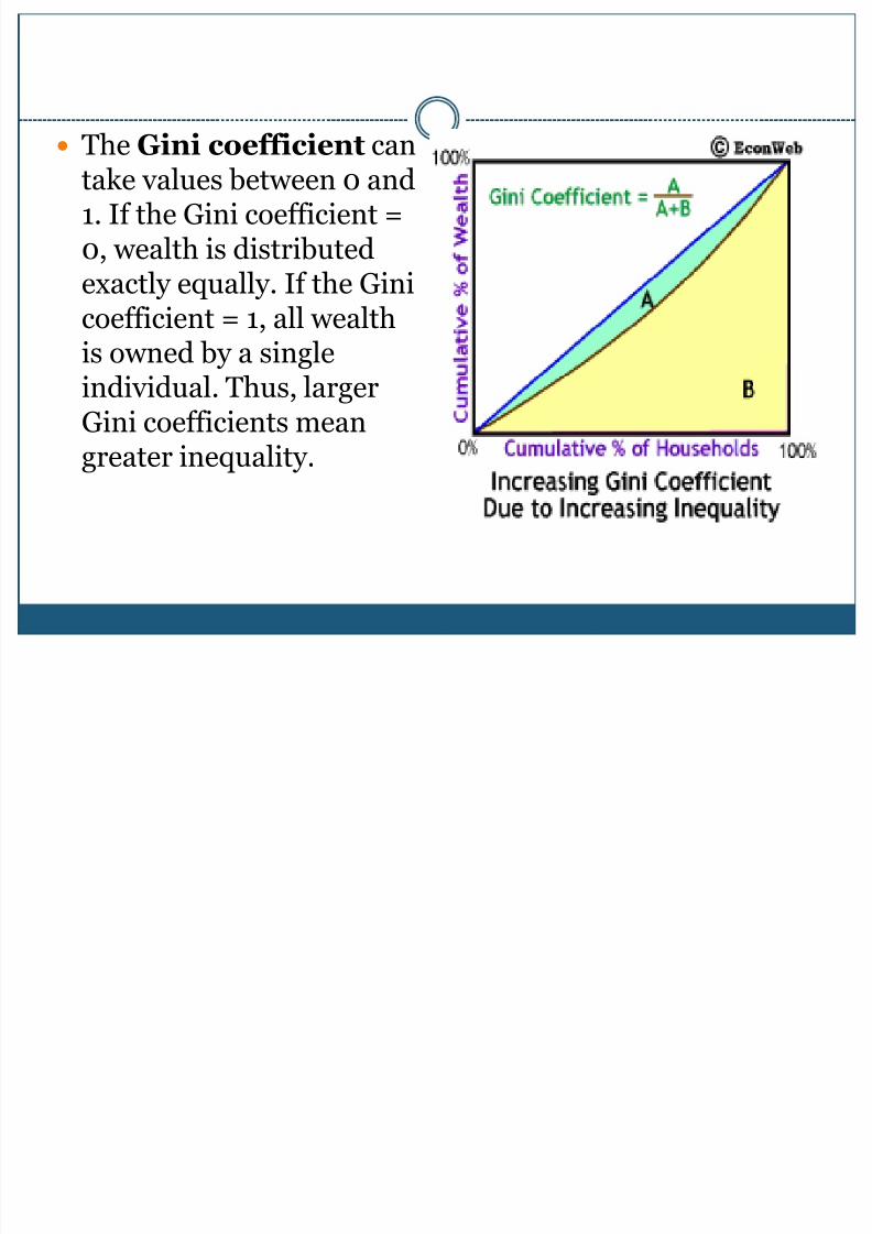
The Gini coefficient cantake values between 0 and1. If the Gini coefficient =0, wealth is distributedexactly equally. If the Ginicoefficient = 1, all wealthis owned by a singleindividual. Thus, largerGini coefficients mean
greater inequality.

8/10/2019 Health Inequalities&Lorenz Curve
http://slidepdf.com/reader/full/health-inequalitieslorenz-curve 16/27
% Household Share of Income
20 4.3
40 10.3
60 16.9
80 24.7
All household 43.9
8/10/2019 Health Inequalities&Lorenz Curve
http://slidepdf.com/reader/full/health-inequalitieslorenz-curve 17/27
8/10/2019 Health Inequalities&Lorenz Curve
http://slidepdf.com/reader/full/health-inequalitieslorenz-curve 18/27
8/10/2019 Health Inequalities&Lorenz Curve
http://slidepdf.com/reader/full/health-inequalitieslorenz-curve 19/27
8/10/2019 Health Inequalities&Lorenz Curve
http://slidepdf.com/reader/full/health-inequalitieslorenz-curve 20/27
8/10/2019 Health Inequalities&Lorenz Curve
http://slidepdf.com/reader/full/health-inequalitieslorenz-curve 21/27
8/10/2019 Health Inequalities&Lorenz Curve
http://slidepdf.com/reader/full/health-inequalitieslorenz-curve 22/27
8/10/2019 Health Inequalities&Lorenz Curve
http://slidepdf.com/reader/full/health-inequalitieslorenz-curve 23/27
HEALTH STATISTICS
UPDATES
INCOME
8/10/2019 Health Inequalities&Lorenz Curve
http://slidepdf.com/reader/full/health-inequalitieslorenz-curve 24/27
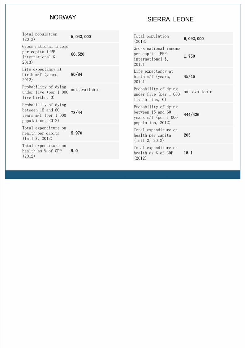
Total population
(2013) 5 043 000
Gross national income
per capita (PPP
international $,
2013)
66 520
Life expectancy at
birth m/f (years,
2012)
80/84
Probability of dyingunder five (per 1 000
live births, 0)
not available
Probability of dying
between 15 and 60
years m/f (per 1 000
population, 2012)
73/44
Total expenditure onhealth per capita
(Intl $, 2012)
5 970
Total expenditure on
health as % of GDP
(2012)
9 0
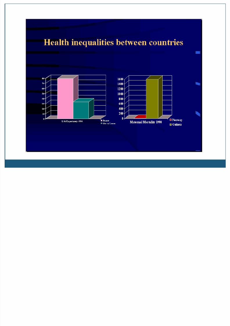
NORWAY
Total population
(2013) 6 092 000
Gross national income
per capita (PPP
international $,
2013)
1 750
Life expectancy at
birth m/f (years,
2012)
45/46
Probability of dying
under five (per 1 000
live births, 0)
not available
Probability of dying
between 15 and 60
years m/f (per 1 000
population, 2012)
444/426
Total expenditure onhealth per capita
(Intl $, 2012)
205
Total expenditure on
health as % of GDP
(2012)
15 1
SIERRA LEONE
8/10/2019 Health Inequalities&Lorenz Curve
http://slidepdf.com/reader/full/health-inequalitieslorenz-curve 25/27
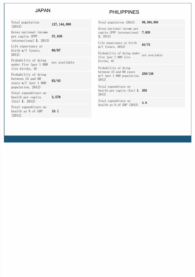
Total population (2013) 98 394 000
Gross national income per
capita (PPP international
$, 2013)
7 820
Life expectancy at birth
m/f (years, 2012) 65/72
Probability of dying under
five (per 1 000 live
births, 0)
not available
Probability of dyingbetween 15 and 60 years
m/f (per 1 000 population,
2012)
258/138
Total expenditure on
health per capita (Intl $,
2012)
202
Total expenditure on
health as % of GDP (2012) 4 6
PHILIPPINES
Total population
(2013) 127 144 000
Gross national income
per capita (PPPinternational $, 2013)
37 630
Life expectancy at
birth m/f (years,
2012)
80/87
Probability of dying
under five (per 1 000
live births, 0)
not available
Probability of dying
between 15 and 60
years m/f (per 1 000
population, 2012)
82/43
Total expenditure on
health per capita
(Intl $, 2012)
3 578
Total expenditure on
health as % of GDP
(2012)
10 1
JAPAN
8/10/2019 Health Inequalities&Lorenz Curve
http://slidepdf.com/reader/full/health-inequalitieslorenz-curve 26/27
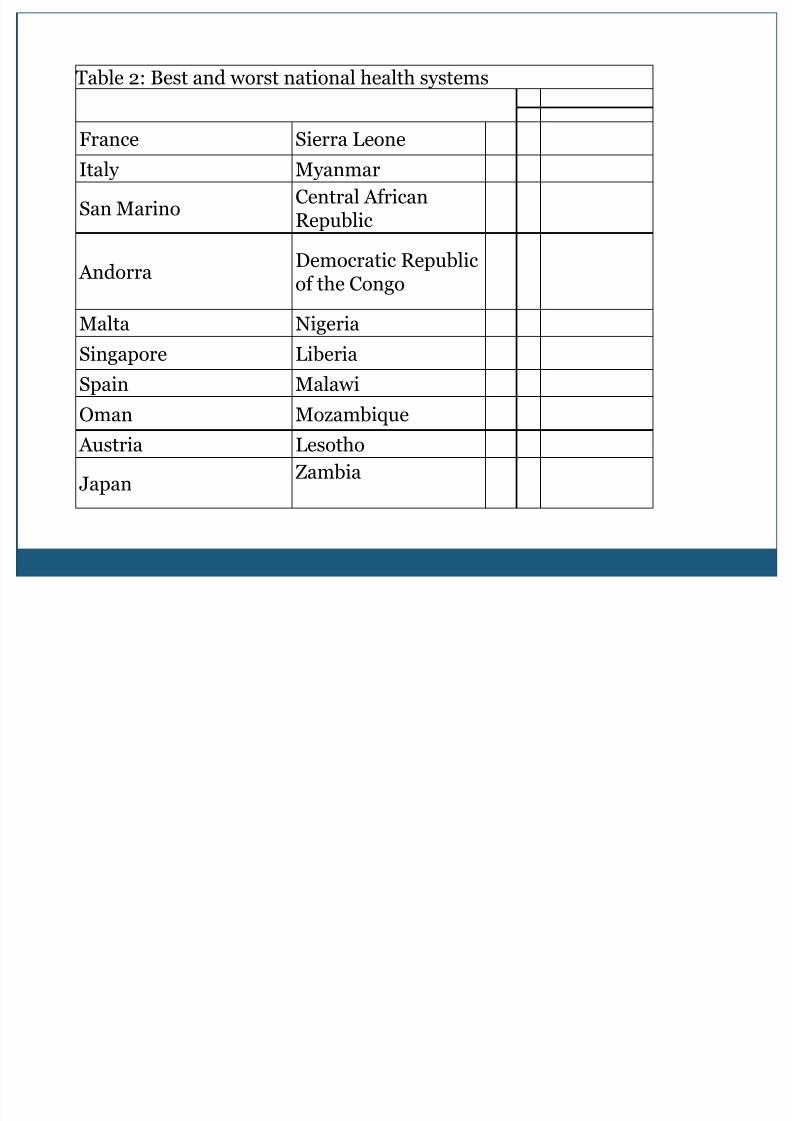
Table 2: Best and worst national health systems
France Sierra LeoneItaly Myanmar
San MarinoCentral AfricanRepublic
Andorra
Democratic Republic
of the Congo
Malta Nigeria
Singapore Liberia
Spain Malawi
Oman Mozambique Austria Lesotho
JapanZambia
8/10/2019 Health Inequalities&Lorenz Curve
http://slidepdf.com/reader/full/health-inequalitieslorenz-curve 27/27