Embed Size (px)
Citation preview
Presentation Materials (3.66 MB PDF)
Pages 156 to 203 of the Transcript
Appendix 1: Materials used by Ms. Johnson and Mr. Gagnon
Material for the FOMC presentation on U.S. External AdjustmentKaren Johnson and Joseph GagnonExhibits by James ChavezJune 29, 2004
STRICTLY CONFIDENTIAL (FR) CLASS II FOMC
Exhibit 1External Adjustment: Alternative Perspectives
06-28-04
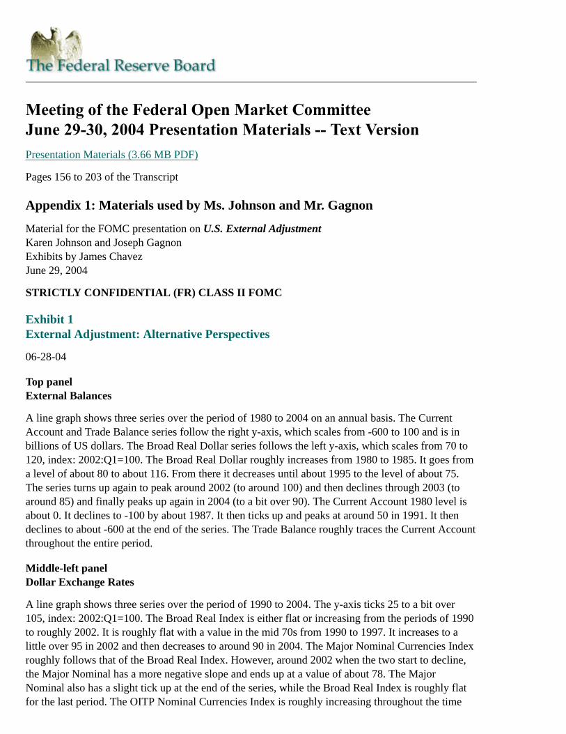
Top panelExternal Balances
A line graph shows three series over the period of 1980 to 2004 on an annual basis. The CurrentAccount and Trade Balance series follow the right y-axis, which scales from -600 to 100 and is inbillions of US dollars. The Broad Real Dollar series follows the left y-axis, which scales from 70 to120, index: 2002:Q1=100. The Broad Real Dollar roughly increases from 1980 to 1985. It goes froma level of about 80 to about 116. From there it decreases until about 1995 to the level of about 75.The series turns up again to peak around 2002 (to around 100) and then declines through 2003 (toaround 85) and finally peaks up again in 2004 (to a bit over 90). The Current Account 1980 level isabout 0. It declines to -100 by about 1987. It then ticks up and peaks at around 50 in 1991. It thendeclines to about -600 at the end of the series. The Trade Balance roughly traces the Current Accountthroughout the entire period.
Middle-left panelDollar Exchange Rates
A line graph shows three series over the period of 1990 to 2004. The y-axis ticks 25 to a bit over105, index: 2002:Q1=100. The Broad Real Index is either flat or increasing from the periods of 1990to roughly 2002. It is roughly flat with a value in the mid 70s from 1990 to 1997. It increases to alittle over 95 in 2002 and then decreases to around 90 in 2004. The Major Nominal Currencies Indexroughly follows that of the Broad Real Index. However, around 2002 when the two start to decline,the Major Nominal has a more negative slope and ends up at a value of about 78. The MajorNominal also has a slight tick up at the end of the series, while the Broad Real Index is roughly flatfor the last period. The OITP Nominal Currencies Index is roughly increasing throughout the time
period. It begins at a level of about 30 in 1990 and ends with a level of about 105 in 2004.
Middle-right panelNet International Investment Position
A line graph shows two series that both span 1990 to 2004. The first series is the level of the netinternational investment position, which ticks along the right y-axis in billions of dollars from -3500to 0. In the 1990s, the series declines from about -250 to -750, in a subtle and fairly flat fashion. Inthe early 2000s, the series drastically declines to almost -3000 by 2004. The second series is thepercent of GDP for the net international investment position. From 1990 until about the early 2000s,the series goes from -5% to about -8 % and tracks the level of GDP series. The steep decline in theearly 2000s of course also applies to the percent of GDP series, with the series hitting a low point in2004 of about -25%.
Bottom-left panelFinancial Flows
$ billions, s.a.a.r.
2003 2004Q1
1. Current account -531 -580
2. Foreign official 249 501
3. Pvt. foreign purchases of U.S. securities 364 515
4. Pvt. U.S. purchases of foreign securities (-) -72 -61
5. Net direct investment -134 -157
6. Other* 124 -218
* Primarily net flows reported by banking and non-banking concerns, acquisition of U.S. currency, and the statisticaldiscrepancy. Return to table
Bottom-right panelU.S. Saving and Investment
A line graph spans 1990 to 2004. The y-axis ranges from 0 to 1000 and is in billions of US dollars.There are two series. The first series is Net Domestic Investment. It declines from about 1990 to1992, hitting a low level of a bit over 200 billion dollars. Then the series increases to peak in theearly 2000s at around 1 trillion dollars. The series then declines to a level of about 700 billion dollarsin 2004. The second series is Net Savings. It declines from the beginning of the series until about1994, hitting a low of about 200 billion dollars. It increases until the late 1990s to a level of about600 billion. It remains roughly flat through the beginning of the 2000s and then declines to hit a newlow of a little under 200 billion.
Exhibit 2Financing
06-28-04
Top panelNominal Goods and Services
A line graph shows three series over the period of 1980 to 2010, with all values after 2004 being

projected. The y-axis ticks in billions of US dollars from -400 to 2800. Both Imports and Exportsroughly increase over the whole period with exports below imports. Both series begin at about 400billion dollars. Exports end at about 1.6 trillion, while imports end at about 2.8 trillion. There is alsoa series showing the change in the balance which is negative for most of the forecast since importsare usually above exports.
Middle panelFinancial Flows
A line graph shows four series over the period of 1980 to 2010, with all values after 2004 beingprojected. The y-axis ticks from -15 to 15 and represents the percent of GDP for each graph. Oneseries is U.S. Private Financial Outflows. It roughly declines from 1980 to 2010. It starts at about-2% of GDP and ends at around -13%. The second series is the Current Account Deficit. It alsoroughly declines (or is roughly flat) throughout the period. It begins at about 0% of GDP and ends atabout -9% of GDP. The third series is Net Official Flows and the fourth series is Foreign PrivateFinancial Inflows. The two series roughly follow one another. They both begin at about 3% of GDPand end at about 12% (Net Official Flows) and 14% (Foreign Private Financial Inflows) respectively.
Bottom-left panelForeign Official Holdings in the United States
$ billions, end of period
2001April2004e
Change
1. Total 1074 1630 556
2. Treasury 728 1092 364
3. Selected Asia* 476 972 496
4. Treasury 381 784 403
5. Other 598 658 60
6. Treasury 347 308 -39
* Selected Asia includes Japan, China, Taiwan, Korea, and Hong Kong. Return to table
Bottom-right panelForeign Private Holdings in the United States
$ billions, end of period
1995 2004Q1e
1. Treasury Securities 330 715
2. Agency Securities 129 485
3. U.S. Corporate Debt 361 1553
4. U.S. Equities 550 1655
5. FDI in U.S. 799 1621
Exhibit 3Orderly Adjustment
06-28-04
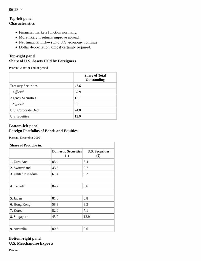
Top-left panelCharacteristics
Financial markets function normally.More likely if returns improve abroad.Net financial inflows into U.S. economy continue.Dollar depreciation almost certainly required.
Top-right panelShare of U.S. Assets Held by Foreigners
Percent, 2004Q1 end of period
Share of TotalOutstanding
Treasury Securities 47.6
Official 30.9
Agency Securities 11.1
Official 3.2
U.S. Corporate Debt 24.8
U.S. Equities 12.0
Bottom-left panelForeign Portfolios of Bonds and Equities
Percent, December 2002
Share of Portfolio in:
Domestic Securities
(1)U.S. Securities
(2)
1. Euro Area 85.4 5.4
2. Switzerland 43.5 9.7
3. United Kingdom 61.4 9.2
4. Canada 84.2 8.6
5. Japan 81.6 6.8
6. Hong Kong 58.3 9.2
7. Korea 82.0 7.1
8. Singapore 45.0 13.9
9. Australia 80.5 9.6
Bottom-right panelU.S. Merchandise Exports
Percent
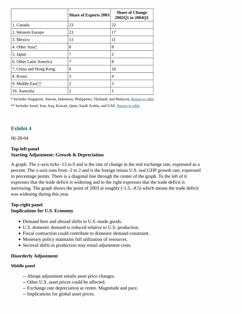
Share of Exports 2003Share of Change
2002Q1 to 2004Q1
1. Canada 23 22
2. Western Europe 23 17
3. Mexico 13 11
4. Other Asia* 8 8
5. Japan 7 2
6. Other Latin America 7 8
7. China and Hong Kong 6 16
8. Korea 3 4
9. Middle East** 2 3
10. Australia 2 1
* Includes Singapore, Taiwan, Indonesia, Philippines, Thailand, and Malaysia. Return to table
** Includes Israel, Iran, Iraq, Kuwait, Qatar, Saudi Arabia, and UAE. Return to table
Exhibit 4
06-28-04
Top-left panelStarting Adjustment: Growth & Depreciation
A graph. The y-axis ticks -13 to 0 and is the rate of change in the real exchange rate, expressed as apercent. The x-axis runs from -2 to 2 and is the foreign minus U.S. real GDP growth rate, expressedin percentage points. There is a diagonal line through the center of the graph. To the left of itexpresses that the trade deficit is widening and to the right expresses that the trade deficit isnarrowing. The graph shows the point of 2003 at roughly (-1.5, -8.5) which means the trade deficitwas widening during this year.
Top-right panelImplications for U.S. Economy
Demand here and abroad shifts to U.S.-made goods.U.S. domestic demand is reduced relative to U.S. production.Fiscal contraction could contribute to domestic demand constraint.Monetary policy maintains full utilization of resources.Sectoral shifts in production may entail adjustment costs.
Disorderly Adjustment
Middle panel
-- Abrupt adjustment entails asset price changes.-- Other U.S. asset prices could be affected.-- Exchange rate depreciation at center. Magnitude and pace.-- Implications for global asset prices.
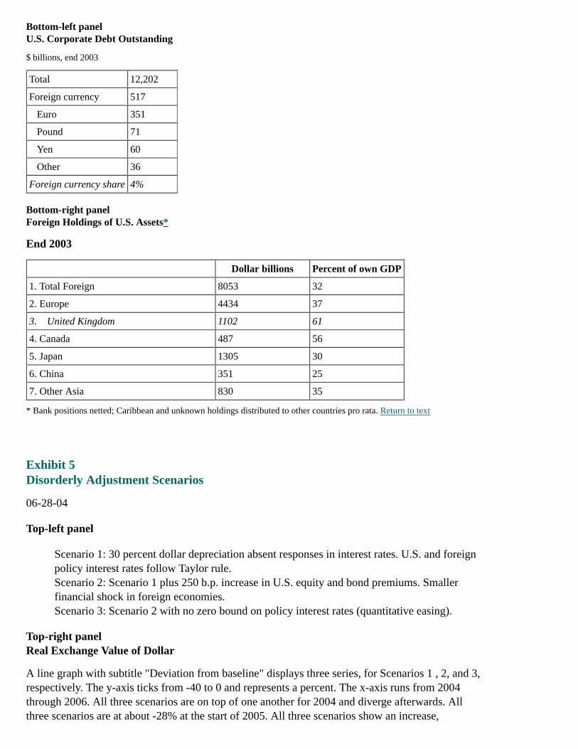
Bottom-left panelU.S. Corporate Debt Outstanding
$ billions, end 2003
Total 12,202
Foreign currency 517
Euro 351
Pound 71
Yen 60
Other 36
Foreign currency share 4%
Bottom-right panelForeign Holdings of U.S. Assets*
End 2003
Dollar billions Percent of own GDP
1. Total Foreign 8053 32
2. Europe 4434 37
3. United Kingdom 1102 61
4. Canada 487 56
5. Japan 1305 30
6. China 351 25
7. Other Asia 830 35
* Bank positions netted; Caribbean and unknown holdings distributed to other countries pro rata. Return to text
Exhibit 5Disorderly Adjustment Scenarios
06-28-04
Top-left panel
Scenario 1: 30 percent dollar depreciation absent responses in interest rates. U.S. and foreignpolicy interest rates follow Taylor rule.Scenario 2: Scenario 1 plus 250 b.p. increase in U.S. equity and bond premiums. Smallerfinancial shock in foreign economies.Scenario 3: Scenario 2 with no zero bound on policy interest rates (quantitative easing).
Top-right panelReal Exchange Value of Dollar
A line graph with subtitle "Deviation from baseline" displays three series, for Scenarios 1 , 2, and 3,respectively. The y-axis ticks from -40 to 0 and represents a percent. The x-axis runs from 2004through 2006. All three scenarios are on top of one another for 2004 and diverge afterwards. Allthree scenarios are at about -28% at the start of 2005. All three scenarios show an increase,
percentage wise, from the 2005 beginning value. Scenario 3 ends at about -20%, while Scenarios 1and 2 end at about -23% and -25%, respectively.
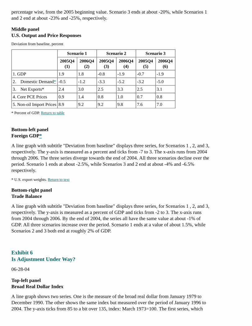
Middle panelU.S. Output and Price Responses
Deviation from baseline, percent
Scenario 1 Scenario 2 Scenario 3
2005Q4(1)
2006Q4(2)
2005Q4(3)
2006Q4(4)
2005Q4(5)
2006Q4(6)
1. GDP 1.9 1.8 -0.8 -1.9 -0.7 -1.9
2. Domestic Demand* -0.5 -1.2 -3.3 -5.2 -3.2 -5.0
3. Net Exports* 2.4 3.0 2.5 3.3 2.5 3.1
4. Core PCE Prices 0.9 1.4 0.8 1.0 0.7 0.8
5. Non-oil Import Prices 8.9 9.2 9.2 9.8 7.6 7.0
* Percent of GDP. Return to table
Bottom-left panelForeign GDP*
A line graph with subtitle "Deviation from baseline" displays three series, for Scenarios 1 , 2, and 3,respectively. The y-axis is measured as a percent and ticks from -7 to 3. The x-axis runs from 2004through 2006. The three series diverge towards the end of 2004. All three scenarios decline over theperiod. Scenario 1 ends at about -2.5%, while Scenarios 3 and 2 end at about -4% and -6.5%respectively.
* U.S. export weights. Return to text
Bottom-right panelTrade Balance
A line graph with subtitle "Deviation from baseline" displays three series, for Scenarios 1 , 2, and 3,respectively. The y-axis is measured as a percent of GDP and ticks from -2 to 3. The x-axis runsfrom 2004 through 2006. By the end of 2004, the series all have the same value at about -1% ofGDP. All three scenarios increase over the period. Scenario 1 ends at a value of about 1.5%, whileScenarios 2 and 3 both end at roughly 2% of GDP.
Exhibit 6Is Adjustment Under Way?
06-28-04
Top-left panelBroad Real Dollar Index
A line graph shows two series. One is the measure of the broad real dollar from January 1979 toDecember 1990. The other shows the same index but measured over the period of January 1996 to2004. The y-axis ticks from 85 to a bit over 135, index: March 1973=100. The first series, which
shows 1979-1990, starts at 85 and peaks around 1985 at about 130. It then declines to about 88. Thesecond series, which shows 1996-2004, starts at about 90 and jumps around over the time period. Itpeaks at about 112 in 2002 and ends at a bit over 100.
Top-right panelBalance on Goods and Services
A line graph shows two series. One shows the balance on goods and services from 1979:Q1 to1990:Q4, the other from 1996:Q1 to 2004. The y-axis is a percent of GDP (four-quarter movingaverage) and ticks from -5 to 1. The first series, 1979-1990, peaks in the early 1980s at around -0.5%and then declines to about -3% during the late 1980s. It then goes back up to finish at around -1.5%.The second series, 1996-2004, declines from about -1% at the beginning of the period to finish ataround -4.5%.
Middle panelReal Import and Export Growth Rates
A line graph shows two series, Exports and Imports, respectively. The y-axis is a four-quarter percentchange. It ticks from -20 to a bit over 30. The x-axis runs from 1979 to 2003. Exports start around18% and decline to a low of about -10% in the early 1980s. Exports peak at around 20% in the late80s and then stay between 20% and 0% until around 2000. The series hits its low of -10% againaround the early 2000s and ends at around 10%. Imports start at a bit over 0% and hit a high of over30% around the mid 1980s. Imports then decline to about 10% a few years later and stay roughlybetween 10% and 0% for most of the series. In the early 2000s, imports drop to about -5% and endthe series at the same point as exports at about 10%.
Bottom-left panelForeign minus U.S. Growth
A line graph shows two series, foreign minus U.S. growth, measured as the difference in four-quarterpercent changes. The y-axis ticks from -5 to 5. One series runs from 1979:Q1 through 1990:Q4. Theseries starts at about -2% and jumps up to hit a high of about 4% in the early 1980s. It then has asteep decline to about -1.5% over the next few years. It then jumps up again to about 3.5% only tobottom out at about-3.5% in the mid 1980s. It then roughly increases over the rest of the period to end at about 2%. Thesecond series runs from 1996:Q1 to 2004. The series starts at a little over 0% and declines to hit alow of about -3% in the very late 1990s. It then climbs to eventually hit 2% in the early 2000s andthen declines to about -2% in 2003. It grows a bit at the end of the period in 2004 to about -1%.
Bottom-right panelNet Securities Flows
A line graph shows two series, Private and Official, from 1996 through 2004. The y-axis is percentof GDP measured on a four-quarter moving average, and ticks from -2 to a bit over 4. The Privateseries starts at a bit under 0% of GDP and increases for a few years. It then declines into 2000 only togrow again to hit a peak of about 4% around 2002. It then declines for a bit to a little under 3% andticks back up at the end to a bit over 3%. The Official series starts at a little under 2% and hits a lowof about -1% in the late 1990s. It then roughly grows over the remainder of the timeline to a littleunder 3%.

Exhibit 7
06-28-04
Top-left panelImport Prices*
A line graph shows two series. One series shows import prices from 1979:Q1 to 1990:Q4, the otherfrom 1996:Q1 to 2004. The y-axis ticks from -6 to a bit over 15 and is a four-quarter percent change.The first series, 1979-1990, starts at about 12% and peaks around 1980 at about 15%. Then there is asteep decline over a few years to a low of about -3%. The series then climbs to about 10% in the mid1980s. The series then declines to about 0% in 1989, and then peaks back up at the end to about 3%.The second series, 1996-2004, starts at about 1.5%. It does not move about too much through theperiod but hits a low of about -3% in 1998 and around 2002. It ends the period at a high of a bit over3%.
* Excluding natural gas, oil, computers, and semiconductors. Return to text
Top-right panelPCE Prices*
A line graph shows two series. One series shows PCE prices from 1979:Q1 to 1990:Q4, the otherfrom 1996:Q1 to 2004. The y-axis ticks from -6 to a bit over 15 and is a four-quarter percent change.The first series, 1979-1990, begins at a value of about 6% and then peaks around 1982 at about 10%.It then decline to about 4% in the mid 1980s where it remains fairly flat for the rest of the period.The second series, 1996-2004, remains fairly flat throughout the period at about 2.5%.
* Excluding food and energy. Return to text
Bottom panelConclusions
U.S. external deficits are not sustainable.Depreciation in 2002 and 2003 helped slow the widening trade deficit, but no evidence thatadjustment has begun.Substantial further dollar depreciation is required.Orderly adjustment of 1980s associated with acceleration of foreign activity and brighterinvestment prospects abroad.Disorderly adjustment more likely with loss of confidence in U.S. policies and prospects.
-- Contractionary effects could be greater for foreign economies.-- Asset price declines depress output at home and abroad.-- Dollar depreciation boosts U.S. production and damps foreign production.
Effect on U.S. inflation is modest.
Appendix 2: Materials used by Ms. Goldberg
EXHIBIT 1International Trade Exposure of High-Trade-Oriented U.S. Industries
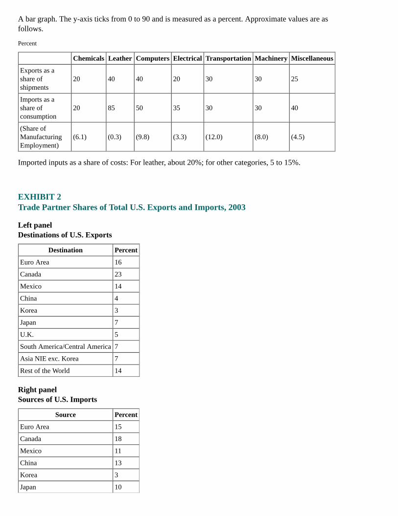
A bar graph. The y-axis ticks from 0 to 90 and is measured as a percent. Approximate values are asfollows.
Percent
Chemicals Leather Computers Electrical Transportation Machinery Miscellaneous
Exports as ashare ofshipments
20 40 40 20 30 30 25
Imports as ashare ofconsumption
20 85 50 35 30 30 40
(Share ofManufacturingEmployment)
(6.1) (0.3) (9.8) (3.3) (12.0) (8.0) (4.5)
Imported inputs as a share of costs: For leather, about 20%; for other categories, 5 to 15%.
EXHIBIT 2Trade Partner Shares of Total U.S. Exports and Imports, 2003
Left panelDestinations of U.S. Exports
Destination Percent
Euro Area 16
Canada 23
Mexico 14
China 4
Korea 3
Japan 7
U.K. 5
South America/Central America 7
Asia NIE exc. Korea 7
Rest of the World 14
Right panelSources of U.S. Imports
Source Percent
Euro Area 15
Canada 18
Mexico 11
China 13
Korea 3
Japan 10
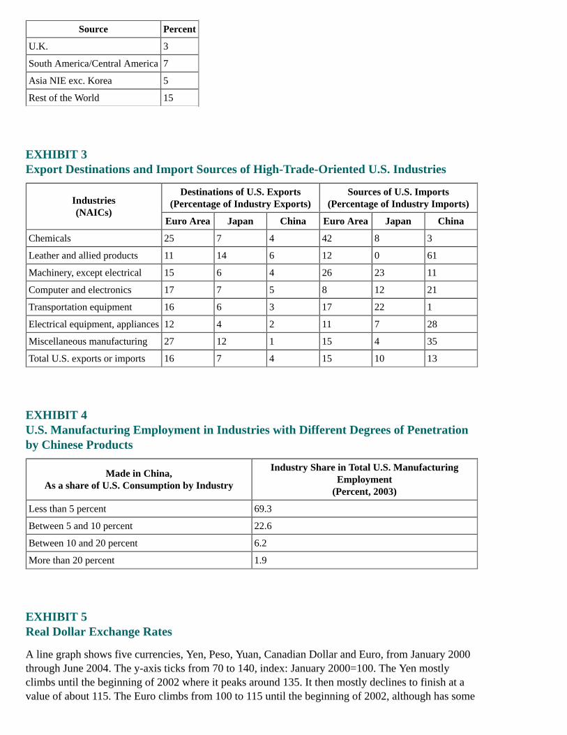
Source Percent
U.K. 3
South America/Central America 7
Asia NIE exc. Korea 5
Rest of the World 15
EXHIBIT 3Export Destinations and Import Sources of High-Trade-Oriented U.S. Industries
Industries(NAICs)
Destinations of U.S. Exports(Percentage of Industry Exports)
Sources of U.S. Imports(Percentage of Industry Imports)
Euro Area Japan China Euro Area Japan China
Chemicals 25 7 4 42 8 3
Leather and allied products 11 14 6 12 0 61
Machinery, except electrical 15 6 4 26 23 11
Computer and electronics 17 7 5 8 12 21
Transportation equipment 16 6 3 17 22 1
Electrical equipment, appliances 12 4 2 11 7 28
Miscellaneous manufacturing 27 12 1 15 4 35
Total U.S. exports or imports 16 7 4 15 10 13
EXHIBIT 4U.S. Manufacturing Employment in Industries with Different Degrees of Penetrationby Chinese Products
Made in China,As a share of U.S. Consumption by Industry
Industry Share in Total U.S. ManufacturingEmployment
(Percent, 2003)
Less than 5 percent 69.3
Between 5 and 10 percent 22.6
Between 10 and 20 percent 6.2
More than 20 percent 1.9
EXHIBIT 5Real Dollar Exchange Rates
A line graph shows five currencies, Yen, Peso, Yuan, Canadian Dollar and Euro, from January 2000through June 2004. The y-axis ticks from 70 to 140, index: January 2000=100. The Yen mostlyclimbs until the beginning of 2002 where it peaks around 135. It then mostly declines to finish at avalue of about 115. The Euro climbs from 100 to 115 until the beginning of 2002, although has some
dips during this period. It then mostly declines through the rest of the period hitting about 85 at theend. The Canadian dollar moves between 100 and 110 until about the end of 2002 when it starts todecline. It finishes at a bit over 90. The Yuan moves between 100 and 110 throughout the graph andfinishes at a little under 110. The Peso mostly declines until the middle of 2002, when it bottoms outat a little below 90. It then mostly climbs for the rest of the timeframe and finishes at about 110, veryclose to the Yuan.
EXHIBIT 6Dollar Depreciation Experienced by High-Trade-Oriented U.S. Industries
2/1/02 to 6/25/04(In Percent)
Industries(NAICs)
Export-PartnerWeighted*
Import-PartnerWeighted*
Chemicals 15.8 26.6
Leather and allied products 7.0 3.8
Machinery, except electrical 13.5 18.0
Computer and electronics 9.8 5.2
Transportation equipment 16.6 15.3
Electrical equipment, appliances 10.4 5.5
Miscellaneous manufacturing 18.4 7.4
* Constructed using real bilateral exchange rates and respective trade weights. Return to table
EXHIBIT 7Import Price Elasticity to Exchange Rate Movements
IndustryWeight
(%)
Industry(SITC)
Data included in Analysis
Late 1970s/Early1980s-2004:Q2
1990:Q1-2004:Q2
All commodities 0.54 0.75
All commodities except fuels 0.46 0.27
(0.9) Beverages and tobacco 0.19 0.01
(2.1) Crude materials, inedible, except fuels 0.74 0.82
(13.9) Mineral fuels, lubricants, and related 0.29 1.73
(7.7) Chemicals and related products 0.39 0.37
(12.2) Manufactured goods (classified) 0.72 0.69
(41.8) Machinery and transport equipment 0.41 0.17
(17.1) Miscellaneous manufactured articles 0.40 0.16
Indicated in bold are data significantly different from zero.
# 2004:Q2 data use April and May 2004 import prices and consensus forecast for GDP. Return to table
##
EXHIBIT 8Industry Contribution to Total U.S. Exports and Imports, 2003
Left panelU.S. Exports
Industry Percent
Transportation 19
Electrical 3
Computers 18
Machinery 11
Chemicals 14
Leather 0
Apparel 1
Textiles 1
Miscellaneous 3
Other Industries 30
Right panelU.S. Imports
Industry Percent
Transportation 18
Electrical 3
Computers 17
Machinery 6
Chemicals 8
Leather 2
Apparel 5
Textiles 1
Miscellaneous 5
Other Industries 34
Appendix 3: Materials used by Mr. Kos
Page 1
Top panel
Title: Current U.S. 3-Month Deposit Rates and Rates Implied by Traded Forward Rate AgreementsSeries: 3-month USD Libor, USD 3-month forward rate agreement, USD 6-month forward rateagreement, USD 9-month forward rate agreement

Horizon: March 15, 2004 - June 28, 2004Description: Forward rate agreements increase.
Middle panel
Title: Target Federal Funds Rate and Treasury 2-Year NoteSeries: Yield for 2-year Treasury note and Target Federal Funds rateHorizon: January 1, 2002 - June 28, 2004Description: Yield on 2-year Treasury note increases.
Bottom panel
Title: Yield Spread between 2- and 10-Year NotesSeries: Spread between Treasury 2- and 10-year notesHorizon: March 15, 2004 - June 28, 2004Description: Treasury yield curve flattens.
Page 2
Top panel
Title: TIPS Breakeven Inflation RatesSeries: 10-year and 5-year TIPS breakeven ratesHorizon: February 1, 2004 - June 28, 2004Description: TIPS breakeven rates begin to decline modestly.
Middle panel
Title: Primary Dealers Net Outright Positions in TIPSSeries: Primary dealers net position in TIPS and Average net position January 1998 - June 2004Horizon: February 1, 2004 - June 23, 2004Description: Primary dealer net outright positions in TIPS begin to increase in late June, though stillbelow historical average.
Bottom panel
Title: 1-Year Inflation Forward Rates Derived from CPI SwapsSeries: 1-year inflation forward rates for June 28, 2004, May 4, 2004, and April 1, 2004Horizon: N/ADescription: Inflation forward rates increase in June.
Page 3
Top panel
Title: Primary Dealer Net Outright PositionsSeries: Primary dealer net outright positions in corporate, MBS, agencies (excluding discount notes),and Treasuries (excluding TIPS and bills)Horizon: May 5, 2003 - June 23, 2004Description: Primary dealer outright positions in Treasuries decrease.

Source: FR2004
Middle panel
Title: Net Non-Commercial Positions in 10-Year Treasury FuturesSeries: Net non-commercial positions in 10-year Treasury futuresHorizon: May 1, 2003 - June 22, 2004Description: Net non-commercial positions in 10-year Treasury futures decline.
Source: CFTC
Bottom-left panel
Title: MBS and Corporate Debt SpreadsSeries: Investment grade corporate debt index OAS and 30-year conventional MBS index OASHorizon: January 1, 2004 - June 28, 2004Description: MBS and corporate debt spreads widen slightly.
Source: Lehman Brothers
Bottom-right panel
Title: High Yield and EMBI+ SpreadsSeries: High yield corporate debt index OAS and EMBI Plus spreadHorizon: January 1, 2004 - June 28, 2004Description: High yield and EMBI+ spreads narrow.
Source: Merrill Lynch, JP Morgan
Page 4
Top panel
Title: Select Foreign Currencies Versus U.S. DollarSeries: Spot foreign exchange rates versus the U.S. Dollar for Canadian Dollar, British Pound, SwissFranc, Japanese Yen, and European EuroHorizon: April 1, 2004 - June 28, 2004Description: U.S. Dollar depreciates.
Middle-left panel
Title: Yield on the 10-Year Japanese Government BondSeries: Yield on the 10-year Japanese government bondHorizon: April 1, 2004 - June 28, 2004Description: Yield on the 10-year Japanese government bond increases sharply.
Middle-right panel
Title: Japanese 3-Month to 30-Year Government Bond Yield CurveSeries: Japanese 3-month to 30-year government bond yield curveHorizon: N/ADescription: Japanese government bond yield curve steepens.
Bottom panel
Title: 2-Year U.S. and German Government Debt YieldsSeries: 2-Year U.S. Treasury yield and 2-Year German government bond yieldHorizon: March 15, 2004 - June 28, 2004Description: U.S and German government debt yields increase.
Page 5
Top panel
Title: Daily Intra-Day Standard Deviations of the Federal Funds RateSeries: Annual averages and annual medians of daily values of federal funds rate standard deviationHorizon: 1987 - 2004Description: Standard deviations of the federal funds rate decline.
Bottom panel
Title: Daily Intra-Day Standard Deviations of the Fed Funds Rate - medians of rolling 10-dayperiodsSeries: Medians of rolling 10-day periods of daily intra-day standard deviations of the federal fundsrateHorizon: January 2, 1987 - January 2, 2004Description: Daily standard deviations of federal funds rate decline.
Page 6
Top panel
Title: Absolute Deviations of Daily Effective Federal Funds Rate from TargetSeries: Annual averages and annual medians of daily values of effective federal funds rate deviationsfrom target federal funds rateHorizon: 1987 - 2004Description: Absolute deviations of daily effective federal funds rate from target decline.
Bottom panel
Title: Daily Effective Fed Funds Rate less Target Rate - medians of rolling 10-day periodsSeries: Medians of rolling 10-day periods of daily effective federal funds rate less target federalfunds rateHorizon: January 2, 1987 - January 2, 2004Description: Less variance appears in daily effective funds rate less target rate.
Page 7
Top panel
Title: High-Low Range, Effective Rate, & Primary Credit Rate, minus the Target Rate
Series: High-low range, effective rate and primary credit rate less the target federal funds rateHorizon: June 2001 - May 2004Description: Primary credit rate less the target federal funds rate is above the high-low rate andeffective rate less the target federal funds rate.
Ranges are truncated at 4 percentage points above/below the target rate
Reference Chart
Top panel
Title: Requirements (Total and Clearing Balances) and Federal Funds TargetSeries: Total requirements, clearing balance requirements and federal funds target rateHorizon: 1987 - 2004Description: Total requirements and clearing balance requirements decrease while federal fundstarget rate decreases.
Bottom panelChronology of Select Events Influencing Funds Rate Volatility
late 1990 - deteriorating financial position of banking sector amid recessionDec 1990 - reserve requirements eliminated on non-transaction and eurodollar depositsApr 1992 - reserve requirement ratio on transaction deposits reduced from 12 to 10 percentFeb 1994 - FOMC begins to publicly indicate policy changes1996 to 1998 - period of most rapid growth in bank sweep account programsAug 1998 - shift to lagged reserve accountingQ4 1998 - fallout from financial turmoil in emerging markets1999 - preparations ahead of Y2KSep 2001 - extra liquidity provided in the wake of 9/11 attacksJan 2003 - introduction of the primary credit facilityJun 2003 - Federal funds rate target reaches historic low
Appendix 4: Materials used by Messrs. Oliner, Wilcox, and Sheets
Material for Staff Presentation on the Economic OutlookJune 30, 2004
STRICTLY CONFIDENTIAL (FR) CLASS I-FOMC**Downgraded to Class II upon release of the July 2004 Monetary Policy Report.
Chart 1Recent Data
Top-left panelPrivate Payroll Employment
Horizon: 2000 to 2004:Q2, where 2004:Q2 is the average for April and MayDescription: Data are represented as bars and expressed as thousands of employees, presented at an
average monthly change over the quarter. A horizontal line is drawn at zero. There are 18 bars, whichindicate the following approximate values:
200,000, 2000:Q1100,000, 2000:Q2-2000:Q3just below 100,000, 2000:Q4
just below zero, 2001:Q1negative 200,000, 2001:Q2just below negative 200,000, 2001:Q3negative 350,000, 2001:Q4
negative 100,000, 2002:Q1negative 50,000, 2002:Q2a bit below negative 50,000, 2002:Q3-2002:Q4
a bit below negative 50,000, 2003:Q1just below zero, 2003:Q2just above zero, 2003:Q350,000, 2003:Q4
200,000, 2004:Q1300,000, 2004:Q2
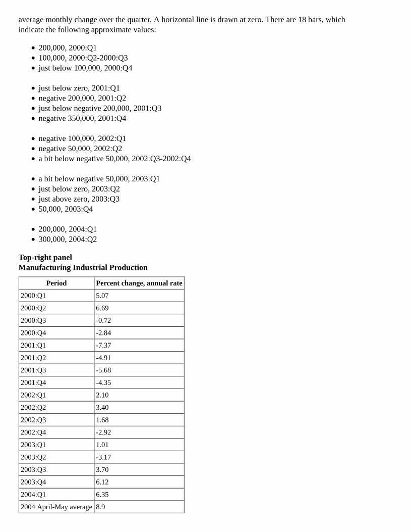
Top-right panelManufacturing Industrial Production
Period Percent change, annual rate
2000:Q1 5.07
2000:Q2 6.69
2000:Q3 -0.72
2000:Q4 -2.84
2001:Q1 -7.37
2001:Q2 -4.91
2001:Q3 -5.68
2001:Q4 -4.35
2002:Q1 2.10
2002:Q2 3.40
2002:Q3 1.68
2002:Q4 -2.92
2003:Q1 1.01
2003:Q2 -3.17
2003:Q3 3.70
2003:Q4 6.12
2004:Q1 6.35
2004 April-May average 8.9

Middle-left panelInventories Relative to Shipments and Sales
Horizon: 2000 to April 2004Description: Data are plotted on two curves. One curve represents manufacturing, and the othercurve represents retail and wholesale trade, excluding motor vehicles and parts. Data are expressedas a ratio, presented monthly at book value. The manufacturing curve begins at about 1.31 at the startof 2000, then fluctuates upward through 2001, reaching about 1.45. The curve then generallydecreases to end at about 1.23 in April 2004. The retail curve begins at about 1.39 in 2000 andremains at about that level through year-end. It increases to about 1.4 through 2001, then fallsthrough 2002:Q2 to approximately 1.31. The curve fluctuates between about 1.3 and 1.33 through2003, then decreases to end at about 1.21 in April 2004.
Middle-right panelSingle-family Home Sales and Starts
Horizon: 1997 to May 2004Description: The data are presented monthly and are expressed in millions of units at an annual rate.Data are plotted on two curves. One curve represents starts, and the other curve represents sales. Thestarts curve begins at about 1.1 in 1997, then fluctuates upward to approximately 1.4 by year-end1998. The curve decreases to about 1.2 at the start of 1999 and increases to just below 1.4 by the endof the year. It drops to about 1.1 by midyear 2000, then generally fluctuates upward to end just above1.6 in May 2004. The sales curve starts a bit above 0.8 in 1997, then continues upward to reach about1.0 by year-end 1998. The curve fluctuates between about 0.8 and 0.9 through mid-2000; it thenincreases to about 1.0 at the beginning of 2001, followed by a decrease to just above 0.8 by year-end.The curve increases through 2002 to reach about 1.1. It drops to about 0.9 at the start of 2003,increases to about 1.2 by midyear, then decreases to about 1.1 by year-end. The curve continuesgenerally upward to end just below 1.4 in May 2004.
Bottom-left panelReal Personal Consumption Expenditures
Period Trillions of chained (2000) dollars
January 2001 6.84
February 2001 6.83
March 2001 6.83
April 2001 6.86
May 2001 6.89
June 2001 6.87
July 2001 6.90
August 2001 6.94
September 2001 6.87
October 2001 7.02
November 2001 7.00
December 2001 7.01
January 2002 7.04
February 2002 7.09
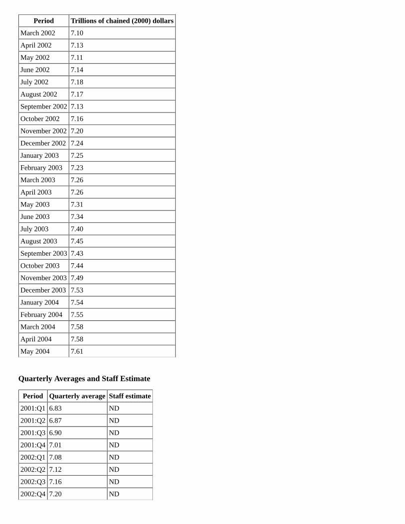
Period Trillions of chained (2000) dollars
March 2002 7.10
April 2002 7.13
May 2002 7.11
June 2002 7.14
July 2002 7.18
August 2002 7.17
September 2002 7.13
October 2002 7.16
November 2002 7.20
December 2002 7.24
January 2003 7.25
February 2003 7.23
March 2003 7.26
April 2003 7.26
May 2003 7.31
June 2003 7.34
July 2003 7.40
August 2003 7.45
September 2003 7.43
October 2003 7.44
November 2003 7.49
December 2003 7.53
January 2004 7.54
February 2004 7.55
March 2004 7.58
April 2004 7.58
May 2004 7.61
Quarterly Averages and Staff Estimate
Period Quarterly average Staff estimate
2001:Q1 6.83 ND
2001:Q2 6.87 ND
2001:Q3 6.90 ND
2001:Q4 7.01 ND
2002:Q1 7.08 ND
2002:Q2 7.12 ND
2002:Q3 7.16 ND
2002:Q4 7.20 ND
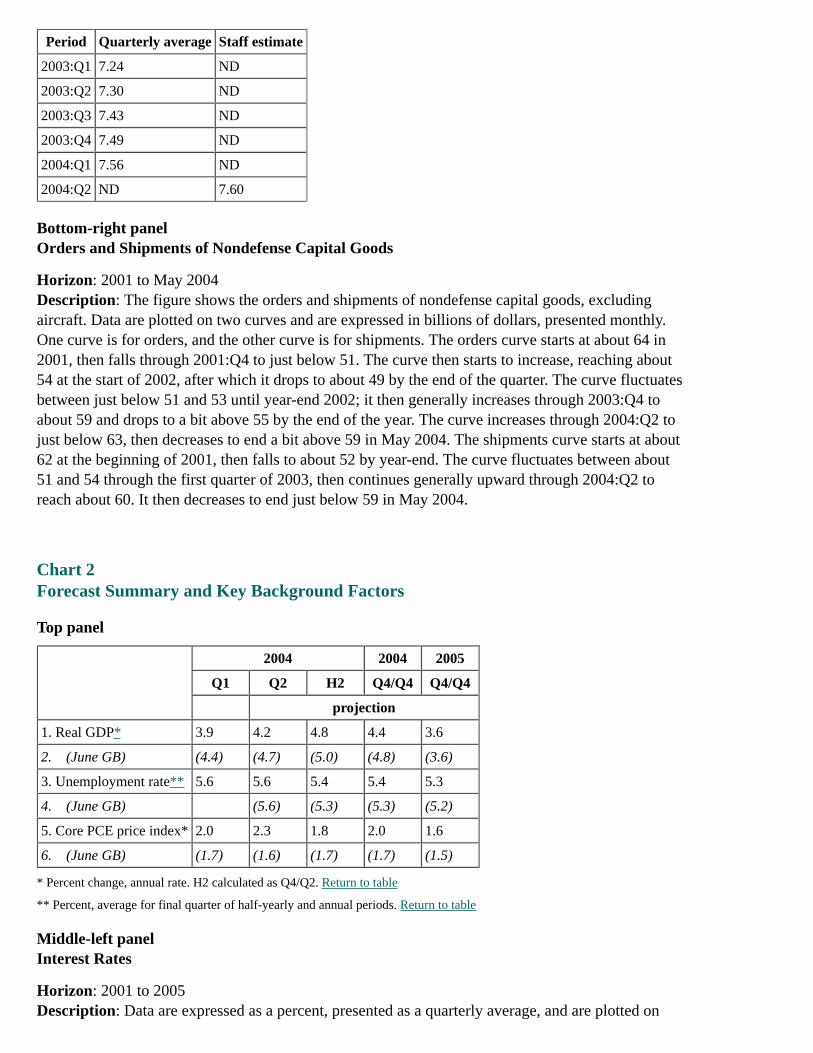
Period Quarterly average Staff estimate
2003:Q1 7.24 ND
2003:Q2 7.30 ND
2003:Q3 7.43 ND
2003:Q4 7.49 ND
2004:Q1 7.56 ND
2004:Q2 ND 7.60
Bottom-right panelOrders and Shipments of Nondefense Capital Goods
Horizon: 2001 to May 2004Description: The figure shows the orders and shipments of nondefense capital goods, excludingaircraft. Data are plotted on two curves and are expressed in billions of dollars, presented monthly.One curve is for orders, and the other curve is for shipments. The orders curve starts at about 64 in2001, then falls through 2001:Q4 to just below 51. The curve then starts to increase, reaching about54 at the start of 2002, after which it drops to about 49 by the end of the quarter. The curve fluctuatesbetween just below 51 and 53 until year-end 2002; it then generally increases through 2003:Q4 toabout 59 and drops to a bit above 55 by the end of the year. The curve increases through 2004:Q2 tojust below 63, then decreases to end a bit above 59 in May 2004. The shipments curve starts at about62 at the beginning of 2001, then falls to about 52 by year-end. The curve fluctuates between about51 and 54 through the first quarter of 2003, then continues generally upward through 2004:Q2 toreach about 60. It then decreases to end just below 59 in May 2004.
Chart 2Forecast Summary and Key Background Factors
Top panel
2004 2004 2005
Q1 Q2 H2 Q4/Q4 Q4/Q4
projection
1. Real GDP* 3.9 4.2 4.8 4.4 3.6
2. (June GB) (4.4) (4.7) (5.0) (4.8) (3.6)
3. Unemployment rate** 5.6 5.6 5.4 5.4 5.3
4. (June GB) (5.6) (5.3) (5.3) (5.2)
5. Core PCE price index* 2.0 2.3 1.8 2.0 1.6
6. (June GB) (1.7) (1.6) (1.7) (1.7) (1.5)
* Percent change, annual rate. H2 calculated as Q4/Q2. Return to table
** Percent, average for final quarter of half-yearly and annual periods. Return to table
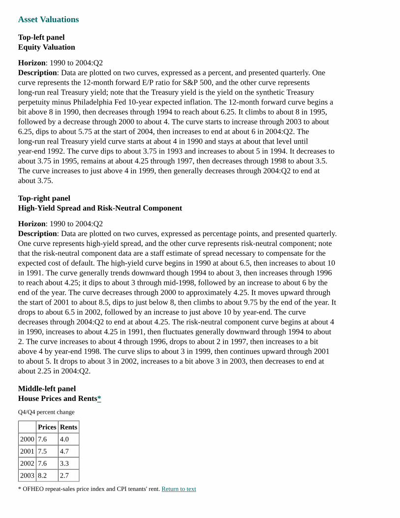
Middle-left panelInterest Rates
Horizon: 2001 to 2005Description: Data are expressed as a percent, presented as a quarterly average, and are plotted on
two curves. One curve represents the 10-year Treasury rate, and the other curve represents the federalfunds rate. The 10-year Treasury rate curve begins at just above 5 at the start of 2001, drops to about4.9 by year-end, then increases to just above 5 in 2002. The curve decreases through mid-2003 toabout 3.5, then increases to about 4.25 by the end of the year. It dips to about 4 in 2004, thenincreases to end at about 4.5 in 2005. A forecast for the curve from the April 2004 Greenbook startsat about 4 in mid-2004, then increases through 2005 to end at about 4.5. The federal funds curvebegins at approximately 5.5 in 2001; it then falls through the start of 2002 to about 1.75 and remainsat about that level until the third quarter. The curve decreases through 2004 to about 1, then increasesthrough 2005 to end at about 3. A forecast for the curve from the April 2004 Greenbook starts atabout 1 in mid-2004 and increases through 2005 to end at about 2.25.
Middle-right panelFiscal Impetus
Percent of GDP Forecast
1998 -0.03 ND
1999 0.32 ND
2000 0.12 ND
2001 0.47 ND
2002 1.04 ND
2003 1.15 ND
2004 ND 0.95
2005 ND -0.21
Bottom-left panelCrude Oil Prices
Horizon: 2001 to 2005Description: Data are plotted on a curve and show the quarterly average of West Texas Intermediatecrude oil prices in dollars per barrel. The curve begins in 2001 at about 28, then decreases to about18 by year-end. The curve moves generally upward to reach about 32 at the start of 2003, then dropsto about 28 by midyear. The curve generally increases through mid-2004, climbing to about 39; itthen decreases, ending at about 34 in 2005. A forecast for the curve from the April 2004 Greenbookstarts a bit above 34 in mid-2004, then decreases through 2005, ending at about 30.
Bottom-right panelEquity Prices
Horizon: 2001 to 2005Description: Data for the Wilshire 5000 are plotted on a curve, expressed as index values, and areshown on a quarter-end basis. The curve starts at about 10,800 at the beginning of 2001, increases toa bit above 11,200, drops to just below 9,800 by midyear, then increases to about 10,800 by the endof 2001. The curve decreases through 2002:Q3 to about 8,000, then increases to about 8,400 towardthe end of the year. The curve dips to about 8,200 at the start of 2003, then continues generallyupward through 2005 to end at about 12,500. A forecast for the curve from the April 2004Greenbook starts at about 11,200 in mid-2004, then increases through 2005 to end just below 12,600.
Chart 3
Asset Valuations
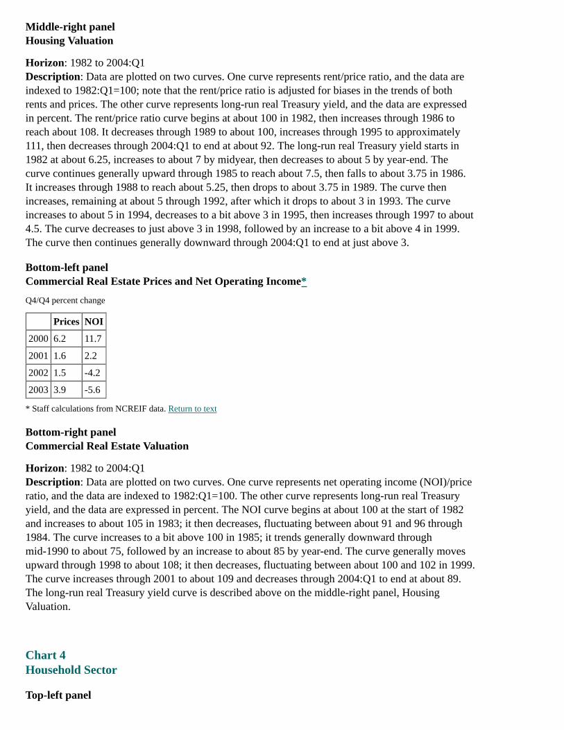
Top-left panelEquity Valuation
Horizon: 1990 to 2004:Q2Description: Data are plotted on two curves, expressed as a percent, and presented quarterly. Onecurve represents the 12-month forward E/P ratio for S&P 500, and the other curve representslong-run real Treasury yield; note that the Treasury yield is the yield on the synthetic Treasuryperpetuity minus Philadelphia Fed 10-year expected inflation. The 12-month forward curve begins abit above 8 in 1990, then decreases through 1994 to reach about 6.25. It climbs to about 8 in 1995,followed by a decrease through 2000 to about 4. The curve starts to increase through 2003 to about6.25, dips to about 5.75 at the start of 2004, then increases to end at about 6 in 2004:Q2. Thelong-run real Treasury yield curve starts at about 4 in 1990 and stays at about that level untilyear-end 1992. The curve dips to about 3.75 in 1993 and increases to about 5 in 1994. It decreases toabout 3.75 in 1995, remains at about 4.25 through 1997, then decreases through 1998 to about 3.5.The curve increases to just above 4 in 1999, then generally decreases through 2004:Q2 to end atabout 3.75.
Top-right panelHigh-Yield Spread and Risk-Neutral Component
Horizon: 1990 to 2004:Q2Description: Data are plotted on two curves, expressed as percentage points, and presented quarterly.One curve represents high-yield spread, and the other curve represents risk-neutral component; notethat the risk-neutral component data are a staff estimate of spread necessary to compensate for theexpected cost of default. The high-yield curve begins in 1990 at about 6.5, then increases to about 10in 1991. The curve generally trends downward though 1994 to about 3, then increases through 1996to reach about 4.25; it dips to about 3 through mid-1998, followed by an increase to about 6 by theend of the year. The curve decreases through 2000 to approximately 4.25. It moves upward throughthe start of 2001 to about 8.5, dips to just below 8, then climbs to about 9.75 by the end of the year. Itdrops to about 6.5 in 2002, followed by an increase to just above 10 by year-end. The curvedecreases through 2004:Q2 to end at about 4.25. The risk-neutral component curve begins at about 4in 1990, increases to about 4.25 in 1991, then fluctuates generally downward through 1994 to about2. The curve increases to about 4 through 1996, drops to about 2 in 1997, then increases to a bitabove 4 by year-end 1998. The curve slips to about 3 in 1999, then continues upward through 2001to about 5. It drops to about 3 in 2002, increases to a bit above 3 in 2003, then decreases to end atabout 2.25 in 2004:Q2.
Middle-left panelHouse Prices and Rents*
Q4/Q4 percent change
Prices Rents
2000 7.6 4.0
2001 7.5 4.7
2002 7.6 3.3
2003 8.2 2.7
* OFHEO repeat-sales price index and CPI tenants' rent. Return to text
Middle-right panelHousing Valuation
Horizon: 1982 to 2004:Q1Description: Data are plotted on two curves. One curve represents rent/price ratio, and the data areindexed to 1982:Q1=100; note that the rent/price ratio is adjusted for biases in the trends of bothrents and prices. The other curve represents long-run real Treasury yield, and the data are expressedin percent. The rent/price ratio curve begins at about 100 in 1982, then increases through 1986 toreach about 108. It decreases through 1989 to about 100, increases through 1995 to approximately111, then decreases through 2004:Q1 to end at about 92. The long-run real Treasury yield starts in1982 at about 6.25, increases to about 7 by midyear, then decreases to about 5 by year-end. Thecurve continues generally upward through 1985 to reach about 7.5, then falls to about 3.75 in 1986.It increases through 1988 to reach about 5.25, then drops to about 3.75 in 1989. The curve thenincreases, remaining at about 5 through 1992, after which it drops to about 3 in 1993. The curveincreases to about 5 in 1994, decreases to a bit above 3 in 1995, then increases through 1997 to about4.5. The curve decreases to just above 3 in 1998, followed by an increase to a bit above 4 in 1999.The curve then continues generally downward through 2004:Q1 to end at just above 3.
Bottom-left panelCommercial Real Estate Prices and Net Operating Income*
Q4/Q4 percent change
Prices NOI
2000 6.2 11.7
2001 1.6 2.2
2002 1.5 -4.2
2003 3.9 -5.6
* Staff calculations from NCREIF data. Return to text
Bottom-right panelCommercial Real Estate Valuation
Horizon: 1982 to 2004:Q1Description: Data are plotted on two curves. One curve represents net operating income (NOI)/priceratio, and the data are indexed to 1982:Q1=100. The other curve represents long-run real Treasuryyield, and the data are expressed in percent. The NOI curve begins at about 100 at the start of 1982and increases to about 105 in 1983; it then decreases, fluctuating between about 91 and 96 through1984. The curve increases to a bit above 100 in 1985; it trends generally downward throughmid-1990 to about 75, followed by an increase to about 85 by year-end. The curve generally movesupward through 1998 to about 108; it then decreases, fluctuating between about 100 and 102 in 1999.The curve increases through 2001 to about 109 and decreases through 2004:Q1 to end at about 89.The long-run real Treasury yield curve is described above on the middle-right panel, HousingValuation.
Chart 4Household Sector
Top-left panel
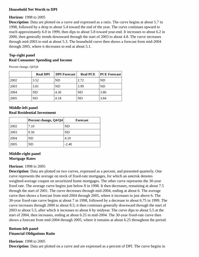
Household Net Worth to DPI
Horizon: 1998 to 2005Description: Data are plotted on a curve and expressed as a ratio. The curve begins at about 5.7 in1998, followed by a drop to about 5.4 toward the end of the year. The curve continues upward toreach approximately 6.0 in 1999, then dips to about 5.8 toward year-end. It increases to about 6.2 in2000, then generally trends downward through the start of 2003 to about 4.8. The curve increasesthrough mid-2003 to end at about 5.3. The household curve then shows a forecast from mid-2004through 2005, where it decreases to end at about 5.1.
Top-right panelReal Consumer Spending and Income
Percent change, Q4/Q4
Real DPI DPI Forecast Real PCE PCE Forecast
2002 3.52 ND 2.72 ND
2003 3.81 ND 3.99 ND
2004 ND 4.30 ND 3.80
2005 ND 4.18 ND 3.84
Middle-left panelReal Residential Investment
Percent change, Q4/Q4 Forecast
2002 7.10 ND
2003 9.50 ND
2004 ND 4.10
2005 ND -2.40
Middle-right panelMortgage Rates
Horizon: 1998 to 2005Description: Data are plotted on two curves, expressed as a percent, and presented quarterly. Onecurve represents the average on stock of fixed-rate mortgages, for which an asterisk denotesweighted-average coupon on securitized home mortgages. The other curve represents the 30-yearfixed rate. The average curve begins just below 8 in 1998. It then decreases, remaining at about 7.5through the start of 2001. The curve decreases through mid-2004, ending at about 6. The averagecurve then shows a forecast from mid-2004 through 2005, where it increases to just above 6. The30-year fixed-rate curve begins at about 7 in 1998, followed by a decrease to about 6.75 in 1999. Thecurve increases through 2000 to about 8.5; it then continues generally downward through the start of2003 to about 5.5, after which it increases to about 6 by midyear. The curve dips to about 5.5 at thestart of 2004, then increases, ending at about 6.25 in mid-2004. The 30-year fixed-rate curve thenshows a forecast from mid-2004 through 2005, where it remains at about 6.25 throughout the period.
Bottom-left panelFinancial Obligations Ratio
Horizon: 1998 to 2005Description: Data are plotted on a curve and are expressed as a percent of DPI. The curve begins in
1998 at about 17.5, increases to about 18.0 in 1999, then dips to about 17.7 in 2000. The curveclimbs to about 18.6 in mid-2001, drops to about 18.3, then increases to about 18.8 by year-end. Thecurve dips to about 18.6 at the start of 2002 and increases to about 18.7 by the end of the year. Itdecreases through mid-2003 to about 18.2 and then increases, reaching about 18.3 by year-end. Thecurve decreases through mid-2004 to end at about 18.1. The curve then shows a forecast frommid-2004 through 2005, where it remains at about 18.1.
Bottom-right panelCredit Card ABS Spread over Swap Rate
Horizon: 2000 to June 25, 2004Description: The figure shows the four-week moving average for the BBB, five-year. Data areplotted on a curve and expressed in basis points. The curve starts in mid-2000 at about 100, then dipsto about 75 toward the end of the year. The curve moves generally upward through mid-2001 toabout 110, dips to about 100, then increases to about 130 by year-end. It decreases through mid-2002to a bit below 100, followed by an increase to about 150 by the end of the year. The curve fallsthrough mid-2004 to about 50, then increases to end just above 60 on June 25, 2004.
Chart 5Business Sector
Top-left panelFinancial Ratios
Horizon: 1990 to 2004:Q1Description: Data are plotted on two curves and are expressed in percent, on an annual basis. Onecurve represents the interest expense to cash flow, and the other curve represents debt to assets. Theinterest curve begins at just above 23 in 1990, then increases to about 25 in 1991. The curve fallsthrough 1997 to about 15, increases through 2001 to about 20, then decreases through 2003 to end atabout 15. The curve then shows a forecast through 2004:Q1, where it decreases to about 14. The debtto assets curve begins at about 32 in 1990, then falls through 1994 to about 28. It increases to about28.5 in 1995 and decreases to about 28 in 1996. The curve increases through 1999 to almost 31, dipsto about 30 in 2000, then increases to just above 30 through 2002. The curve drops in 2003 to end atabout 27.25. The debt curve then shows a forecast through 2004:Q1, where it remains at about 27.25.
Source: Compustat, nonfinancial corporations.
Top-right panelBond Default and Loan Delinquency Rates
Horizon: C&I loan delinquency rate, 1990 to 2004:Q1; bond default rate, 1990 to May 2004Description: Data are plotted on two curves and are expressed as a percent of outstandings. Onecurve represents the C&I loan delinquency rate. The other curve represents the bond default rate, forwhich the six-month moving average is from Moody's Investors Service. The C&I curve begins in1990 at just below 5, followed by an increase to about 6 in 1991. The curve falls through 1999 toapproximately 1.75, then continues upward through 2002 to reach about 4. The curve decreasesthrough 2004:Q1, ending at about 2.5. The bond default curve begins at about 1.5 in 1990 andincreases to about 3.25 in 1991. The curve then generally trends downward, remaining at about 0.75through 1998, then increases to about 1.25 in 1999. The curve dips to about 1 in 2000, then continuesgenerally upward through year-end 2002 to almost 4. The curve then decreases, ending at about 0.25
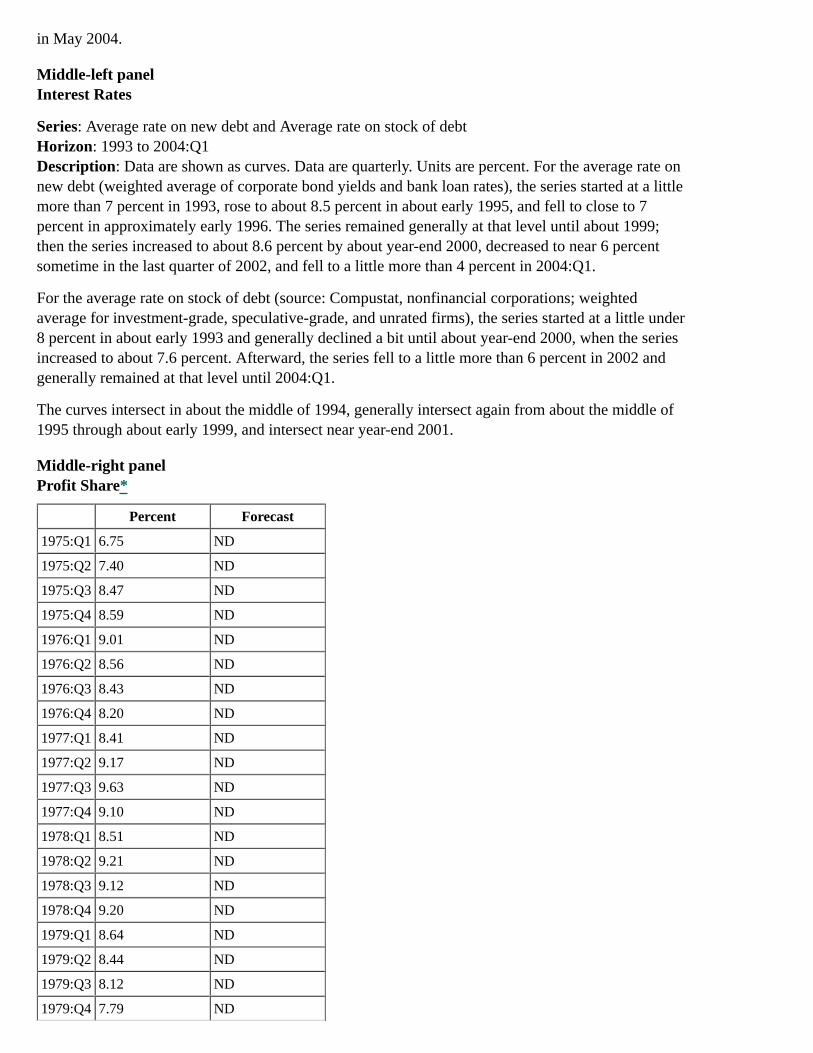
in May 2004.
Middle-left panelInterest Rates
Series: Average rate on new debt and Average rate on stock of debtHorizon: 1993 to 2004:Q1Description: Data are shown as curves. Data are quarterly. Units are percent. For the average rate onnew debt (weighted average of corporate bond yields and bank loan rates), the series started at a littlemore than 7 percent in 1993, rose to about 8.5 percent in about early 1995, and fell to close to 7percent in approximately early 1996. The series remained generally at that level until about 1999;then the series increased to about 8.6 percent by about year-end 2000, decreased to near 6 percentsometime in the last quarter of 2002, and fell to a little more than 4 percent in 2004:Q1.
For the average rate on stock of debt (source: Compustat, nonfinancial corporations; weightedaverage for investment-grade, speculative-grade, and unrated firms), the series started at a little under8 percent in about early 1993 and generally declined a bit until about year-end 2000, when the seriesincreased to about 7.6 percent. Afterward, the series fell to a little more than 6 percent in 2002 andgenerally remained at that level until 2004:Q1.
The curves intersect in about the middle of 1994, generally intersect again from about the middle of1995 through about early 1999, and intersect near year-end 2001.
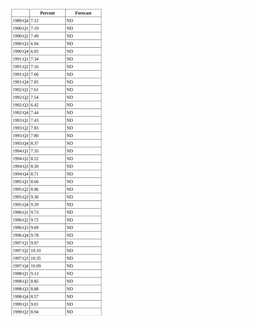
Middle-right panelProfit Share*
Percent Forecast
1975:Q1 6.75 ND
1975:Q2 7.40 ND
1975:Q3 8.47 ND
1975:Q4 8.59 ND
1976:Q1 9.01 ND
1976:Q2 8.56 ND
1976:Q3 8.43 ND
1976:Q4 8.20 ND
1977:Q1 8.41 ND
1977:Q2 9.17 ND
1977:Q3 9.63 ND
1977:Q4 9.10 ND
1978:Q1 8.51 ND
1978:Q2 9.21 ND
1978:Q3 9.12 ND
1978:Q4 9.20 ND
1979:Q1 8.64 ND
1979:Q2 8.44 ND
1979:Q3 8.12 ND
1979:Q4 7.79 ND
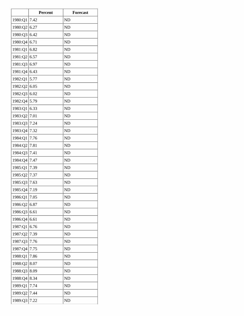
Percent Forecast
1980:Q1 7.42 ND
1980:Q2 6.27 ND
1980:Q3 6.42 ND
1980:Q4 6.71 ND
1981:Q1 6.82 ND
1981:Q2 6.57 ND
1981:Q3 6.97 ND
1981:Q4 6.43 ND
1982:Q1 5.77 ND
1982:Q2 6.05 ND
1982:Q3 6.02 ND
1982:Q4 5.79 ND
1983:Q1 6.33 ND
1983:Q2 7.01 ND
1983:Q3 7.24 ND
1983:Q4 7.32 ND
1984:Q1 7.76 ND
1984:Q2 7.81 ND
1984:Q3 7.41 ND
1984:Q4 7.47 ND
1985:Q1 7.39 ND
1985:Q2 7.37 ND
1985:Q3 7.63 ND
1985:Q4 7.19 ND
1986:Q1 7.05 ND
1986:Q2 6.87 ND
1986:Q3 6.61 ND
1986:Q4 6.61 ND
1987:Q1 6.76 ND
1987:Q2 7.39 ND
1987:Q3 7.76 ND
1987:Q4 7.75 ND
1988:Q1 7.86 ND
1988:Q2 8.07 ND
1988:Q3 8.09 ND
1988:Q4 8.34 ND
1989:Q1 7.74 ND
1989:Q2 7.44 ND
1989:Q3 7.22 ND
Percent Forecast
1989:Q4 7.12 ND
1990:Q1 7.19 ND
1990:Q2 7.49 ND
1990:Q3 6.94 ND
1990:Q4 6.92 ND
1991:Q1 7.34 ND
1991:Q2 7.16 ND
1991:Q3 7.06 ND
1991:Q4 7.05 ND
1992:Q1 7.61 ND
1992:Q2 7.54 ND
1992:Q3 6.42 ND
1992:Q4 7.44 ND
1993:Q1 7.43 ND
1993:Q2 7.83 ND
1993:Q3 7.80 ND
1993:Q4 8.37 ND
1994:Q1 7.35 ND
1994:Q2 8.22 ND
1994:Q3 8.50 ND
1994:Q4 8.71 ND
1995:Q1 8.66 ND
1995:Q2 8.96 ND
1995:Q3 9.36 ND
1995:Q4 9.29 ND
1996:Q1 9.73 ND
1996:Q2 9.72 ND
1996:Q3 9.69 ND
1996:Q4 9.78 ND
1997:Q1 9.97 ND
1997:Q2 10.10 ND
1997:Q3 10.35 ND
1997:Q4 10.09 ND
1998:Q1 9.13 ND
1998:Q2 8.85 ND
1998:Q3 8.88 ND
1998:Q4 8.57 ND
1999:Q1 9.01 ND
1999:Q2 8.94 ND
Percent Forecast
1999:Q3 8.73 ND
1999:Q4 8.80 ND
2000:Q1 8.31 ND
2000:Q2 8.14 ND
2000:Q3 7.89 ND
2000:Q4 7.62 ND
2001:Q1 7.21 ND
2001:Q2 7.11 ND
2001:Q3 6.79 ND
2001:Q4 8.16 ND
2002:Q1 8.27 ND
2002:Q2 8.41 ND
2002:Q3 8.31 ND
2002:Q4 8.57 ND
2003:Q1 8.42 ND
2003:Q2 9.21 ND
2003:Q3 9.92 ND
2003:Q4 10.48 ND
2004:Q1 10.49 ND
2004:Q2 ND 10.56
2004:Q3 ND 10.44
2004:Q4 ND 10.33
2005:Q1 ND 10.15
2005:Q2 ND 9.93
2005:Q3 ND 9.72
2005:Q4 ND 9.52
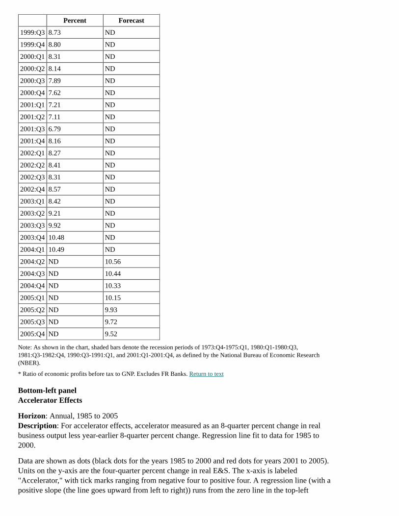
Note: As shown in the chart, shaded bars denote the recession periods of 1973:Q4-1975:Q1, 1980:Q1-1980:Q3,1981:Q3-1982:Q4, 1990:Q3-1991:Q1, and 2001:Q1-2001:Q4, as defined by the National Bureau of Economic Research(NBER).
* Ratio of economic profits before tax to GNP. Excludes FR Banks. Return to text
Bottom-left panelAccelerator Effects
Horizon: Annual, 1985 to 2005Description: For accelerator effects, accelerator measured as an 8-quarter percent change in realbusiness output less year-earlier 8-quarter percent change. Regression line fit to data for 1985 to2000.
Data are shown as dots (black dots for the years 1985 to 2000 and red dots for years 2001 to 2005).Units on the y-axis are the four-quarter percent change in real E&S. The x-axis is labeled"Accelerator," with tick marks ranging from negative four to positive four. A regression line (with apositive slope (the line goes upward from left to right)) runs from the zero line in the top-left

quadrant to the upper level of the top-right quadrant, from a little less than negative three to almostpositive three (x-axis) and from zero to a little more than 15 (y-axis).
The black dots are fitted to the regression line. The red dots are for the more recent years (as acomparison for the fitted black dots).
Bottom-right panelReal Business Fixed Investment
Percent change, Q4/Q4
2003 2004 2005
projection
1. Total BFI 7 12 9
2. E&S 10 15 10
3. NRS -1 1 7
Chart 6The Labor Market
Top-left panelPrivate Payroll Employment
Horizon: 1997 to 2005 (projections begin in 2004:Q2)Description: Data are plotted as a curve. Units are in thousands. The data represents the averagemonthly change over the quarter. The curve begins at about 250 in 1997 and generally remains at thatlevel through 1999. Beginning in 2000, the series falls until reaching nearly negative 400 nearapproximately year-end 2001. The series then generally rises to near 200 in approximately early2004. The series is projected to reach nearly 300 in about the middle of 2004. The series is projectedto fall to a little less than 200 approximately near the end of 2005.
Top-right panelOutput per Hour
Chained (2000) dollars per hour, ratio scale
StructuralStructuralForecast
ActualActual
Forecast
1997:Q1 36.46 ND 36.22 ND
1997:Q2 36.68 ND 36.60 ND
1997:Q3 36.90 ND 36.98 ND
1997:Q4 37.13 ND 37.05 ND
1998:Q1 37.38 ND 37.32 ND
1998:Q2 37.63 ND 37.46 ND
1998:Q3 37.88 ND 37.74 ND
1998:Q4 38.13 ND 38.12 ND
1999:Q1 38.39 ND 38.36 ND
1999:Q2 38.64 ND 38.43 ND

StructuralStructuralForecast
ActualActual
Forecast
1999:Q3 38.90 ND 38.70 ND
1999:Q4 39.17 ND 39.33 ND
2000:Q1 39.43 ND 39.15 ND
2000:Q2 39.70 ND 39.88 ND
2000:Q3 39.96 ND 39.84 ND
2000:Q4 40.23 ND 40.15 ND
2001:Q1 40.58 ND 40.15 ND
2001:Q2 40.94 ND 40.46 ND
2001:Q3 41.29 ND 40.64 ND
2001:Q4 41.65 ND 41.33 ND
2002:Q1 41.99 ND 42.29 ND
2002:Q2 42.34 ND 42.36 ND
2002:Q3 42.68 ND 42.84 ND
2002:Q4 43.03 ND 43.09 ND
2003:Q1 43.43 ND 43.47 ND
2003:Q2 43.83 ND 44.12 ND
2003:Q3 44.24 ND 45.12 ND
2003:Q4 44.65 ND 45.40 ND
2004:Q1 45.00 ND 45.81 ND
2004:Q2 ND 45.35 ND 46.08
2004:Q3 ND 45.71 ND 46.24
2004:Q4 ND 46.06 ND 46.41
2005:Q1 ND 46.40 ND 46.60
2005:Q2 ND 46.75 ND 46.85
2005:Q3 ND 47.09 ND 47.10
2005:Q4 ND 47.44 ND 47.36
Middle-left panelPrivate Employment
Series: Establishment survey and Adjusted household surveyHorizon: 1994 to 2004:Q2Description: Data are plotted as curves. Units are in millions, ratio scale. Note: Observations for2004:Q2 are April-May averages.
For the establishment survey, the series begins at nearly 113 in early 1994, then generally rises tosomewhat more than 130 in 2001, and then falls a little to about 130 in 2001 and generally remainsaround that level until the end of 2004:Q2.
For the adjusted household survey, the series begins at nearly 113 in about early 1994, then generallyrises to about 130 in 2001, remaining overall at that level, before rising to a little over 130 in2004:Q2.
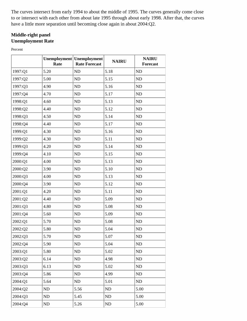
The curves intersect from early 1994 to about the middle of 1995. The curves generally come closeto or intersect with each other from about late 1995 through about early 1998. After that, the curveshave a little more separation until becoming close again in about 2004:Q2.
Middle-right panelUnemployment Rate
Percent
Unemployment
RateUnemploymentRate Forecast
NAIRUNAIRUForecast
1997:Q1 5.20 ND 5.18 ND
1997:Q2 5.00 ND 5.15 ND
1997:Q3 4.90 ND 5.16 ND
1997:Q4 4.70 ND 5.17 ND
1998:Q1 4.60 ND 5.13 ND
1998:Q2 4.40 ND 5.12 ND
1998:Q3 4.50 ND 5.14 ND
1998:Q4 4.40 ND 5.17 ND
1999:Q1 4.30 ND 5.16 ND
1999:Q2 4.30 ND 5.11 ND
1999:Q3 4.20 ND 5.14 ND
1999:Q4 4.10 ND 5.15 ND
2000:Q1 4.00 ND 5.13 ND
2000:Q2 3.90 ND 5.10 ND
2000:Q3 4.00 ND 5.13 ND
2000:Q4 3.90 ND 5.12 ND
2001:Q1 4.20 ND 5.11 ND
2001:Q2 4.40 ND 5.09 ND
2001:Q3 4.80 ND 5.08 ND
2001:Q4 5.60 ND 5.09 ND
2002:Q1 5.70 ND 5.08 ND
2002:Q2 5.80 ND 5.04 ND
2002:Q3 5.70 ND 5.07 ND
2002:Q4 5.90 ND 5.04 ND
2003:Q1 5.80 ND 5.02 ND
2003:Q2 6.14 ND 4.98 ND
2003:Q3 6.13 ND 5.02 ND
2003:Q4 5.86 ND 4.99 ND
2004:Q1 5.64 ND 5.01 ND
2004:Q2 ND 5.56 ND 5.00
2004:Q3 ND 5.45 ND 5.00
2004:Q4 ND 5.26 ND 5.00
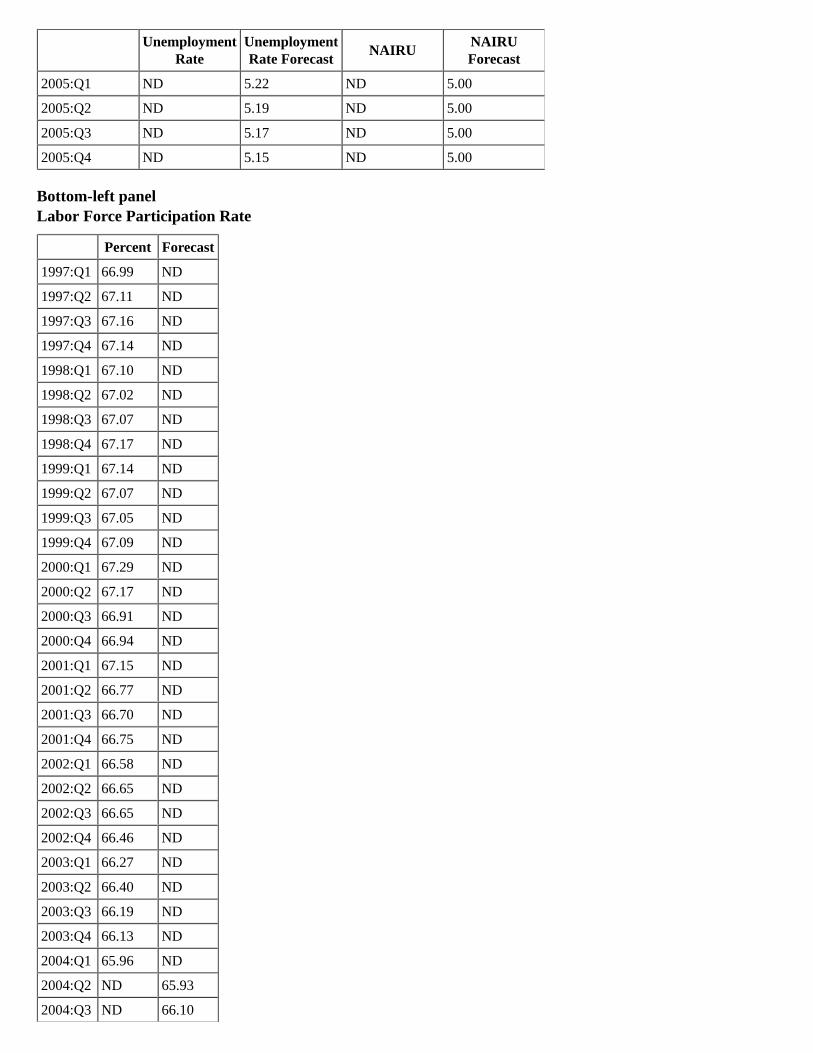
Unemployment
RateUnemploymentRate Forecast
NAIRUNAIRUForecast
2005:Q1 ND 5.22 ND 5.00
2005:Q2 ND 5.19 ND 5.00
2005:Q3 ND 5.17 ND 5.00
2005:Q4 ND 5.15 ND 5.00
Bottom-left panelLabor Force Participation Rate
Percent Forecast
1997:Q1 66.99 ND
1997:Q2 67.11 ND
1997:Q3 67.16 ND
1997:Q4 67.14 ND
1998:Q1 67.10 ND
1998:Q2 67.02 ND
1998:Q3 67.07 ND
1998:Q4 67.17 ND
1999:Q1 67.14 ND
1999:Q2 67.07 ND
1999:Q3 67.05 ND
1999:Q4 67.09 ND
2000:Q1 67.29 ND
2000:Q2 67.17 ND
2000:Q3 66.91 ND
2000:Q4 66.94 ND
2001:Q1 67.15 ND
2001:Q2 66.77 ND
2001:Q3 66.70 ND
2001:Q4 66.75 ND
2002:Q1 66.58 ND
2002:Q2 66.65 ND
2002:Q3 66.65 ND
2002:Q4 66.46 ND
2003:Q1 66.27 ND
2003:Q2 66.40 ND
2003:Q3 66.19 ND
2003:Q4 66.13 ND
2004:Q1 65.96 ND
2004:Q2 ND 65.93
2004:Q3 ND 66.10
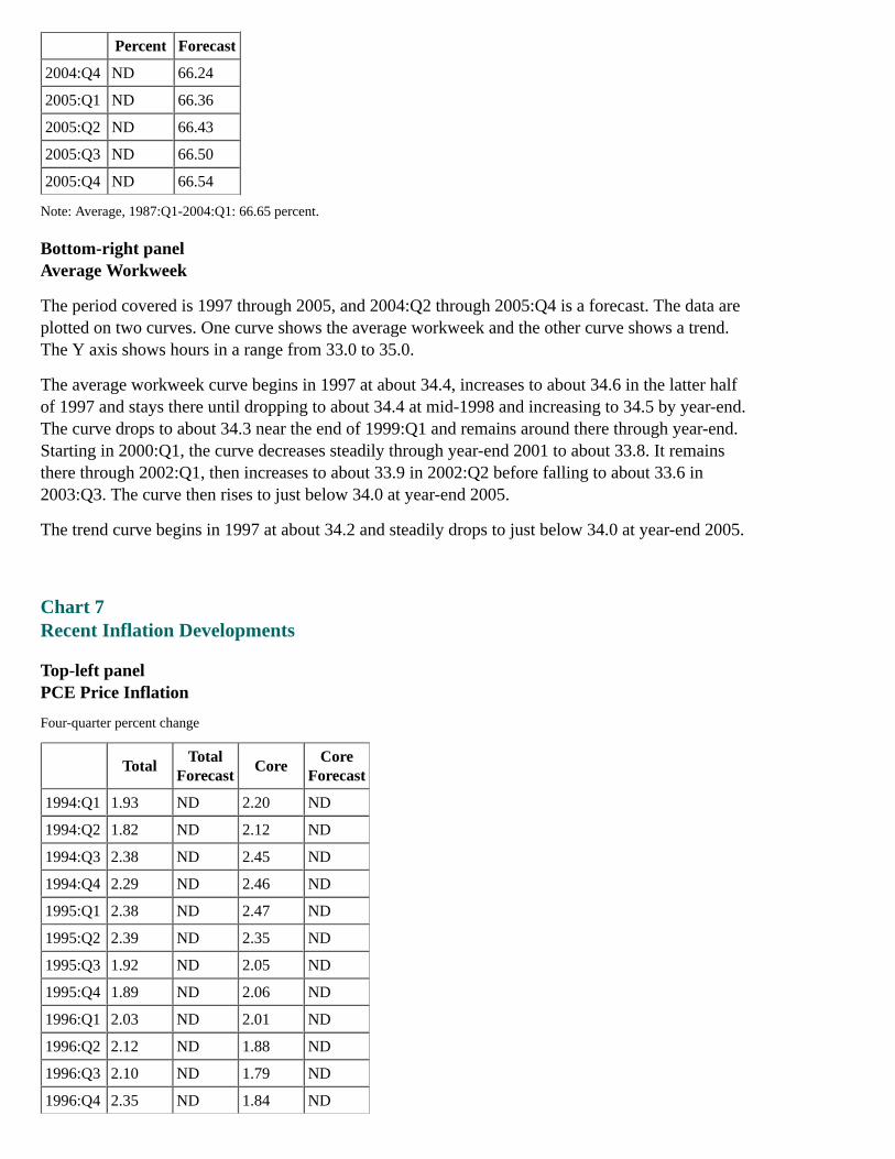
Percent Forecast
2004:Q4 ND 66.24
2005:Q1 ND 66.36
2005:Q2 ND 66.43
2005:Q3 ND 66.50
2005:Q4 ND 66.54
Note: Average, 1987:Q1-2004:Q1: 66.65 percent.
Bottom-right panelAverage Workweek
The period covered is 1997 through 2005, and 2004:Q2 through 2005:Q4 is a forecast. The data areplotted on two curves. One curve shows the average workweek and the other curve shows a trend.The Y axis shows hours in a range from 33.0 to 35.0.
The average workweek curve begins in 1997 at about 34.4, increases to about 34.6 in the latter halfof 1997 and stays there until dropping to about 34.4 at mid-1998 and increasing to 34.5 by year-end.The curve drops to about 34.3 near the end of 1999:Q1 and remains around there through year-end.Starting in 2000:Q1, the curve decreases steadily through year-end 2001 to about 33.8. It remainsthere through 2002:Q1, then increases to about 33.9 in 2002:Q2 before falling to about 33.6 in2003:Q3. The curve then rises to just below 34.0 at year-end 2005.
The trend curve begins in 1997 at about 34.2 and steadily drops to just below 34.0 at year-end 2005.
Chart 7Recent Inflation Developments
Top-left panelPCE Price Inflation
Four-quarter percent change
TotalTotal
ForecastCore
CoreForecast
1994:Q1 1.93 ND 2.20 ND
1994:Q2 1.82 ND 2.12 ND
1994:Q3 2.38 ND 2.45 ND
1994:Q4 2.29 ND 2.46 ND
1995:Q1 2.38 ND 2.47 ND
1995:Q2 2.39 ND 2.35 ND
1995:Q3 1.92 ND 2.05 ND
1995:Q4 1.89 ND 2.06 ND
1996:Q1 2.03 ND 2.01 ND
1996:Q2 2.12 ND 1.88 ND
1996:Q3 2.10 ND 1.79 ND
1996:Q4 2.35 ND 1.84 ND
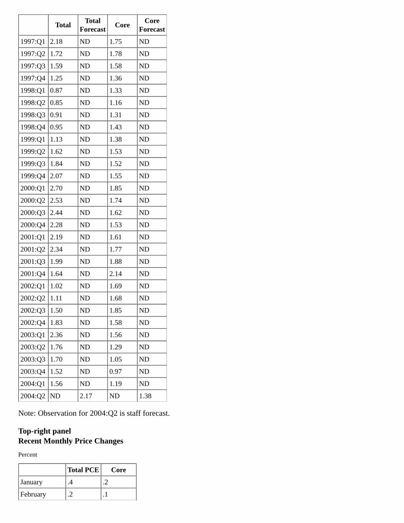
TotalTotal
ForecastCore
CoreForecast
1997:Q1 2.18 ND 1.75 ND
1997:Q2 1.72 ND 1.78 ND
1997:Q3 1.59 ND 1.58 ND
1997:Q4 1.25 ND 1.36 ND
1998:Q1 0.87 ND 1.33 ND
1998:Q2 0.85 ND 1.16 ND
1998:Q3 0.91 ND 1.31 ND
1998:Q4 0.95 ND 1.43 ND
1999:Q1 1.13 ND 1.38 ND
1999:Q2 1.62 ND 1.53 ND
1999:Q3 1.84 ND 1.52 ND
1999:Q4 2.07 ND 1.55 ND
2000:Q1 2.70 ND 1.85 ND
2000:Q2 2.53 ND 1.74 ND
2000:Q3 2.44 ND 1.62 ND
2000:Q4 2.28 ND 1.53 ND
2001:Q1 2.19 ND 1.61 ND
2001:Q2 2.34 ND 1.77 ND
2001:Q3 1.99 ND 1.88 ND
2001:Q4 1.64 ND 2.14 ND
2002:Q1 1.02 ND 1.69 ND
2002:Q2 1.11 ND 1.68 ND
2002:Q3 1.50 ND 1.85 ND
2002:Q4 1.83 ND 1.58 ND
2003:Q1 2.36 ND 1.56 ND
2003:Q2 1.76 ND 1.29 ND
2003:Q3 1.70 ND 1.05 ND
2003:Q4 1.52 ND 0.97 ND
2004:Q1 1.56 ND 1.19 ND
2004:Q2 ND 2.17 ND 1.38
Note: Observation for 2004:Q2 is staff forecast.
Top-right panelRecent Monthly Price Changes
Percent
Total PCE Core
January .4 .2
February .2 .1
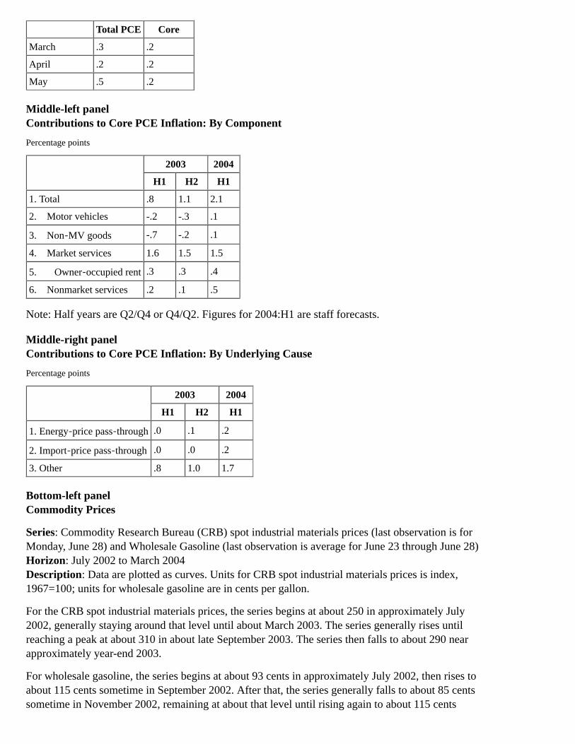
Total PCE Core
March .3 .2
April .2 .2
May .5 .2
Middle-left panelContributions to Core PCE Inflation: By Component
Percentage points
2003 2004
H1 H2 H1
1. Total .8 1.1 2.1
2. Motor vehicles -.2 -.3 .1
3. Non‑MV goods -.7 -.2 .1
4. Market services 1.6 1.5 1.5
5. Owner‑occupied rent .3 .3 .4
6. Nonmarket services .2 .1 .5
Note: Half years are Q2/Q4 or Q4/Q2. Figures for 2004:H1 are staff forecasts.
Middle-right panelContributions to Core PCE Inflation: By Underlying Cause
Percentage points
2003 2004
H1 H2 H1
1. Energy‑price pass‑through .0 .1 .2
2. Import‑price pass‑through .0 .0 .2
3. Other .8 1.0 1.7
Bottom-left panelCommodity Prices
Series: Commodity Research Bureau (CRB) spot industrial materials prices (last observation is forMonday, June 28) and Wholesale Gasoline (last observation is average for June 23 through June 28)Horizon: July 2002 to March 2004Description: Data are plotted as curves. Units for CRB spot industrial materials prices is index,1967=100; units for wholesale gasoline are in cents per gallon.
For the CRB spot industrial materials prices, the series begins at about 250 in approximately July2002, generally staying around that level until about March 2003. The series generally rises untilreaching a peak at about 310 in about late September 2003. The series then falls to about 290 nearapproximately year-end 2003.
For wholesale gasoline, the series begins at about 93 cents in approximately July 2002, then rises toabout 115 cents sometime in September 2002. After that, the series generally falls to about 85 centssometime in November 2002, remaining at about that level until rising again to about 115 cents

sometime in February 2003. The series falls to about 85 cents sometime in April 2003, remaining atabout that level until approximately June 2003. The series then begins to rise until reaching a peak ofnearly 150 cents sometime in November 2003. After that, the series falls, reaching approximately125 cents and then rising a bit to about 128 cents sometime in December 2003.
Sources: Commodity Research Bureau and Department of Energy.
Bottom-right panelMedian Expected Inflation
Percent
Next 12 months Next 5-10 years
January 2000 3.00 3.00
February 2000 2.90 2.90
March 2000 3.20 3.10
April 2000 3.20 2.80
May 2000 3.00 2.90
June 2000 2.90 2.80
July 2000 3.00 2.80
August 2000 2.70 2.90
September 2000 2.90 3.00
October 2000 3.20 3.00
November 2000 2.90 2.90
December 2000 2.80 3.00
January 2001 3.00 2.90
February 2001 2.80 3.00
March 2001 2.80 3.00
April 2001 3.10 3.10
May 2001 3.20 3.00
June 2001 3.00 3.00
July 2001 2.60 2.90
August 2001 2.70 3.00
September 2001 2.80 2.90
October 2001 1.00 2.70
November 2001 0.40 2.80
December 2001 1.80 3.00
January 2002 1.90 2.70
February 2002 2.10 2.80
March 2002 2.70 2.80
April 2002 2.80 2.80
May 2002 2.70 3.00
June 2002 2.70 2.80
July 2002 2.60 2.80

Next 12 months Next 5-10 years
August 2002 2.60 2.90
September 2002 2.50 2.50
October 2002 2.50 2.80
November 2002 2.40 2.80
December 2002 2.50 2.80
January 2003 2.50 2.70
February 2003 2.70 2.70
March 2003 3.10 2.80
April 2003 2.40 2.70
May 2003 2.00 2.80
June 2003 2.10 2.70
July 2003 1.70 2.70
August 2003 2.50 2.70
September 2003 2.80 2.70
October 2003 2.60 2.80
November 2003 2.70 2.70
December 2003 2.60 2.80
January 2004 2.70 2.80
February 2004 2.60 2.90
March 2004 2.90 2.90
April 2004 3.20 2.70
May 2004 3.30 2.80
June 2004 3.30 2.90
Source: Michigan SRC.
Chart 8Inflation Outlook
Top panelPCE Price Inflation
Percent, annual rate*
2003
20042005
H1 H2
projection
1. Total 1.5 3.4 1.3 1.3
2. (Jan. GB) (1.4) (1.3) (.7) (1.0)
3. Energy 7.8 25.7 -8.7 -4.2
4. (Jan. GB) (8.5) (3.8) (-6.8) (-.4)

2003
20042005
H1 H2
projection
5. Food 2.6 3.3 2.1 2.0
6. (Jan. GB) (2.7) (1.8) (1.4) (1.4)
7. Excluding food and energy 1.0 2.1 1.8 1.6
8. (Jan. GB) (.8) (1.0) (1.0) (1.0)
* Years are Q4/Q4; half years are Q2/Q4 or Q4/Q2. Return to text
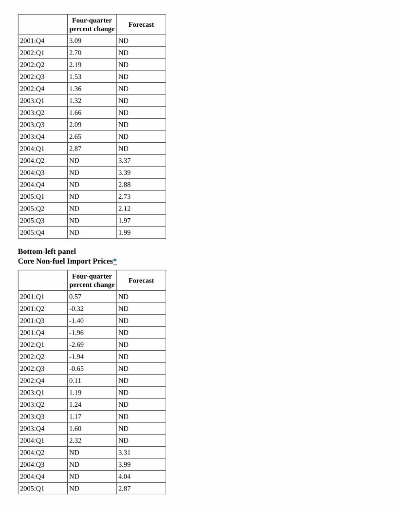
Middle-left panelEnergy Prices
Four-quarter
percent changeForecast
2001:Q1 10.53 ND
2001:Q2 10.37 ND
2001:Q3 1.20 ND
2001:Q4 -10.53 ND
2002:Q1 -14.35 ND
2002:Q2 -10.78 ND
2002:Q3 -4.47 ND
2002:Q4 7.90 ND
2003:Q1 21.11 ND
2003:Q2 10.57 ND
2003:Q3 12.15 ND
2003:Q4 7.77 ND
2004:Q1 4.20 ND
2004:Q2 ND 12.42
2004:Q3 ND 8.33
2004:Q4 ND 7.64
2005:Q1 ND -0.70
2005:Q2 ND -7.09
2005:Q3 ND -7.06
2005:Q4 ND -4.60
Middle-right panelFood Prices
Four-quarter
percent changeForecast
2001:Q1 2.80 ND
2001:Q2 2.93 ND
2001:Q3 2.95 ND
Four-quarter
percent changeForecast
2001:Q4 3.09 ND
2002:Q1 2.70 ND
2002:Q2 2.19 ND
2002:Q3 1.53 ND
2002:Q4 1.36 ND
2003:Q1 1.32 ND
2003:Q2 1.66 ND
2003:Q3 2.09 ND
2003:Q4 2.65 ND
2004:Q1 2.87 ND
2004:Q2 ND 3.37
2004:Q3 ND 3.39
2004:Q4 ND 2.88
2005:Q1 ND 2.73
2005:Q2 ND 2.12
2005:Q3 ND 1.97
2005:Q4 ND 1.99
Bottom-left panelCore Non-fuel Import Prices*
Four-quarter
percent changeForecast
2001:Q1 0.57 ND
2001:Q2 -0.32 ND
2001:Q3 -1.40 ND
2001:Q4 -1.96 ND
2002:Q1 -2.69 ND
2002:Q2 -1.94 ND
2002:Q3 -0.65 ND
2002:Q4 0.11 ND
2003:Q1 1.19 ND
2003:Q2 1.24 ND
2003:Q3 1.17 ND
2003:Q4 1.60 ND
2004:Q1 2.32 ND
2004:Q2 ND 3.31
2004:Q3 ND 3.99
2004:Q4 ND 4.04
2005:Q1 ND 2.87

Four-quarter
percent changeForecast
2005:Q2 ND 1.77
2005:Q3 ND 0.92
2005:Q4 ND 0.52
* Excluding oil, natural gas, semiconductors, and computers. Return to text
Bottom-right panelCore PCE Prices
Four-quarter
percent changeForecast
Lower 90% GBconfidence interval*
Lower 70% GBconfidence interval
Upper 70% GBconfidence interval
Upper 90% GBconfidence interval
2001:Q1 1.61 ND ND ND ND ND
2001:Q2 1.77 ND ND ND ND ND
2001:Q3 1.88 ND ND ND ND ND
2001:Q4 2.14 ND ND ND ND ND
2002:Q1 1.69 ND ND ND ND ND
2002:Q2 1.68 ND ND ND ND ND
2002:Q3 1.85 ND ND ND ND ND
2002:Q4 1.58 ND ND ND ND ND
2003:Q1 1.56 ND ND ND ND ND
2003:Q2 1.29 ND ND ND ND ND
2003:Q3 1.05 ND ND ND ND ND
2003:Q4 0.97 0.97 0.97 0.97 0.97 0.97
2004:Q1 ND 1.19 1.04 1.10 1.27 1.34
2004:Q2 ND 1.38 1.07 1.20 1.55 1.69
2004:Q3 ND 1.55 1.07 1.27 1.82 2.02
2004:Q4 ND 1.66 1.04 1.23 2.09 2.29
2005:Q1 ND 1.62 0.72 1.04 2.19 2.52
2005:Q2 ND 1.60 0.53 0.89 2.31 2.68
2005:Q3 ND 1.52 0.32 0.72 2.33 2.73
2005:Q4 ND 1.46 0.19 0.61 2.31 2.73
* Confidence intervals based on Greenbook forecast errors, 1978-2003. Return to table
Chart 9How Big is the Gap in Resource Utilization?
Chart 9 is a three-by-two array of graphs. Each graph shows data plotted as two curves. Units arestandard deviations. Horizon: 1990 to 2004. Except where noted, observations for 2004:Q2 are theaverages of April and May.
Each graph includes unemployment gap data plotted as a curve. The series begins at about onestandard deviation in approximately early 1990 and falls to about negative two standard deviations

by approximately early 1992. The series generally rises from that level, reaching a peak of about abit more than zero standard deviation in about early 1995. The series generally rises from that levelto about 1.80 standard deviations at about year-end 2000, falls generally from that level untilreaching about negative 0.5 standard deviation in approximately early 2003 before rising a bit toabout negative 0.25 standard deviation in about early 2004.
Top-left panelEmployment-Population Ratio and Unemployment Gap
For the employment-population ratio, the series begins at about one standard deviation in about early1990, then falls to approximately negative two standard deviations in about year-end 1991. Theseries generally rises to a little more than zero standard deviation at approximately year-end 1994.The series generally rises from that point until reaching a peak of approximately 1.75 standarddeviations sometime in early 2000. From that point, the series generally falls, reachingapproximately a bit less than zero standard deviation toward approximately year-end 2002, thenfalling again until reaching approximately negative one standard deviation in approximately themiddle of 2004.
The employment-population ratio and unemployment gap curves generally intersect throughout thehorizon.
Top-right panelJob-Market Perceptions* and Unemployment Gap
For job-market perceptions, the series begins at a little more than zero standard deviation in aboutearly 1990, falls to approximately negative 1.80 standard deviations by about year-end 1991. Theseries then rises to about zero standard deviations in early 1995, generally remaining at that leveluntil early 1996. The series generally rises from that level beginning in about the middle of 1996,reaching a peak of about 1.90 standard deviations in approximately late 2000. The series thengenerally falls until reaching about negative one standard deviation toward year-end 2003. The seriesthen rises to about negative 0.5 standard deviation in approximately early 2004.
The job-market perceptions and unemployment gap curves generally intersect throughout thehorizon.
* Source: Conference Board. The proportion of households believing jobs are easy to get, minus those believing jobs are hardto get, plus 100. Observation for 2004:Q2 is average of April, May, and June. Return to text
Middle-left panelManufacturing Capacity Utilization and Unemployment Gap
For capacity utilization, the series begins at about one standard deviation in about early 1990 andfalls to about negative 0.5 standard deviation by approximately the end of 1990. From that level, theseries generally rises reaching a peak of about one standard deviation in about early 1995. The seriesthen falls a bit to about 0.25 standard deviation toward year-end 1995; the series generally rises toabout one standard deviation at about the end of 1997, falls generally until reaching about 0.5standard deviation in about early 2000 and then falls generally again reaching nearly negative twostandard deviations toward year-end 2001. The series generally remains at that level until rising toabout negative one standard deviation in about early 2004.
The capacity utilization and unemployment gap curves generally do not intersect except nearlyintersecting in approximately year-end 1990 and intersecting in early 1998.

Middle-right panelISM Capacity Utilization and Unemployment Gap
Note: ISM series is semiannual. Last observation for ISM series is 2004:H1.
For capacity utilization, the series begins at about 0.25 standard deviation in approximately early1990 and, with some dips and rises, generally remains at that level until reaching zero standarddeviation in about the middle of 1992. The series then rises generally until reaching a peak of about1.80 standard deviations by about year-end 1994. The series falls a bit to about 0.5 standard deviationin about early 1996, and generally remains around that level until reaching about one standarddeviation in early 2000. The series then falls generally to a little below about negative two standarddeviations toward year-end 2001. The series rises to about negative 1.75 standard deviations in early2002, remains generally around that level until rising to about one standard deviation in about early2004.
The capacity utilization and unemployment gap curves generally do not intersect except nearlyintersecting in approximately year-end 1990 and intersecting in about the middle of 1991, about early1998, and about early 2004.
Bottom-left panelOutput Gap* and Unemployment Gap
For output gap, the series begins at about a little more than zero standard deviation in about early1990. The series then falls to nearly negative two standard deviations toward year-end 1990, remainsgenerally around that level until rising to about negative one standard deviation toward year-end1991, and then generally rises from that level until reaching a peak of about two standard deviationstoward year-end 1999. The series generally remains around that level and then falls to about negativeone standard deviation in about early 2003. The series then rises to about negative 0.25 standarddeviation in about early 2004.
The output gap and unemployment gap curves generally intersect throughout the horizon.
* Observation for 2004:Q2 is staff forecast. Return to text
Bottom-right panelNational Activity Index* and Unemployment Gap
For the National Activity Index, the series begins at about a little more than zero standard deviationin approximately early 1990. The series then falls to about negative 2.50 standard deviations at aboutyear-end. The series generally rises from that level until reaching a peak of about 1.75 standarddeviations in approximately year-end 1994. The series, after falling to a level which is a little lessthan zero standard deviation near approximately mid-1995, generally remains around that level andthen rises to about one standard deviation in approximately mid-1996. The series generally remainsaround that level until falling to a little more than zero standard deviation in about early 1998. Theseries remains generally at that level until rising to about 1.75 standard deviations at approximatelyyear-end 1999. The series then falls to approximately a little less than negative two standarddeviations in about early 2001. From that level, the series rises to a bit above zero standard deviationin about early 2002, falls to about negative 0.75 toward year-end 2002, and remains generally aroundthat level until rising to nearly 1.75 standard deviations in about early 2004.
The National Activity Index and unemployment gap curves generally do not intersect exceptintersecting in about the middle of 1991, intermittently in 1995, in about early 1996, in aboutmid-1997,intermittently in 2002, and in about early-to-middle 2003.

* Source: Federal Reserve Bank of Chicago. Observation for 2004:Q2 is the April figure. Return to text
Chart 10Selected Sources of Uncertainty in the Outlook for Inflation
Top-left panelResource Utilization Simulations
NAIRU is baseline value plus or minus 1/2 percentage pointSlope coefficient is baseline value plus or minus one standard error"Resource utilization uncertainty" includes coefficient uncertainty
Top-right panelCore PCE Prices
Series: Core PCE prices (resources utilization uncertainty (projected))Horizon: 2001 to 2005; data are projected for 2004 and 2005.Description: Data are plotted as a curve. Units are four-quarter percent change. Confidence intervalsare based on Greenbook forecast errors, 1978-2003.
The series begins at about 1.75 percent sometime in the first quarter of 2001, rising generally to apeak of about 2.25 percent sometime in the fourth quarter of 2001. The series then falls to about 1.75percent, remaining at about that level until falling generally to a little less than 1 percent sometime inthe fourth quarter of 2003.
In the projected area, the series reflects the resource utilization uncertainty and begins at about a littleless than 1 percent at about the beginning of 2004, rises generally to about 2 percent sometime in thefourth quarter of 2004, then the series decreases gradually to about 1.50 percent by about year-end2005.
The projected data are within the 70 percent GB confidence interval.
Middle-left panelEnergy Price Simulations
Energy prices are in range consistent with a 2/3 confidence interval around baseline oil priceSlope coefficient is baseline value plus or minus one standard error"Energy-prices uncertainty" includes coefficient uncertainty
Middle-right panelCore PCE Prices
Series: Core PCE prices (energy-price uncertainty (projected))Horizon: 2001 to 2005; data are projected for 2004 and 2005.Description: Data are plotted as a curve. Units are four-quarter percent change. Confidence intervalsare based on Greenbook forecast errors, 1978-2003.
The series begins at about 1.75 percent sometime in the first quarter of 2001, rising generally to apeak of about 2.25 percent sometime in the fourth quarter of 2001. The series then falls to about 1.75percent, remaining at about that level until falling generally to a little less than 1 percent sometime inthe fourth quarter of 2003.
In the projected area, the series reflects the energy-price uncertainty and begins at about a little lessthan 1 percent at about the beginning of 2004, rises generally to about 2 percent sometime in thefourth quarter of 2004, then the series decreases gradually to about 1.50 percent by about year-end2005.
The projected data are within the 70 percent GB confidence interval.
Bottom-left panelCore Non-fuel Import Price Simulations
Import prices are in range consistent with a 2/3 confidence interval around baseline exchangerateSlope coefficient is baseline value plus or minus one standard error"Core non-fuel import price uncertainty" includes coefficient uncertainty
Bottom-right panelCore PCE Prices
Series: Core PCE prices (core non-fuel import-price uncertainty (projected))Horizon: 2001 to 2005; data are projected for 2004 and 2005.Description: Data are plotted as a curve. Units are four-quarter percent change. Confidence intervalsare based on Greenbook forecast errors, 1978-2003.
The series begins at about 1.75 percent sometime in the first quarter of 2001, rising generally to apeak of about 2.25 percent sometime in the fourth quarter of 2001. The series then falls to about 1.75percent, remaining at about that level until falling generally to a little less than 1 percent sometime inthe fourth quarter of 2003.
In the projected area, the series reflects the core non-fuel import-price uncertainty and begins atabout a little less than 1 percent at about the beginning of 2004, rises generally to about 2 percentsometime in the fourth quarter of 2004, then the series decreases gradually to about 1.50 percent byabout year-end 2005.
The projected data are within the 70 percent GB confidence interval.
Chart 11Risks to Inflation Outlook
Top-left panelAn Upside Risk
Assume NAIRU is 5-3/4 percent rather than 5 percentAssume rebound in labor force participation will be only half as greatAssume long-term inflation expectations gradually rise one percentage point
Top-right panelCore PCE Inflation
Horizon: 2001 to 2005; data are projected for 2004 and 2005.Description: Data are plotted as a curve. Units are four-quarter percent change. Confidence intervalsare based on Greenbook forecast errors, 1978-2003. Data for high NAIRU/inflation expectations are

projected.
The series begins at about 1.75 percent sometime in the first quarter of 2001, rising generally to apeak of about 2.25 percent sometime in the fourth quarter of 2001. The series then falls to about 1.75percent, remaining at about that level until falling generally to a little less than 1 percent sometime inthe fourth quarter of 2003.
In the projected area, the series begins at about a little less than 1 percent at about the beginning of2004, rises generally to about 2 percent sometime in the fourth quarter of 2004, then the seriesdecreases gradually to about 1.50 percent by about year-end 2005.
Also in the projected area, the series for high NAIRU/inflation expectations begins at about 1.50percent sometime in mid-2004. The series gradually rises from that level, reaching about 2.50percent by about year-end 2005.
The projected data are within the 70 percent GB confidence interval. The data for 2005:Q4 is justwithin the area of the 90 percent GB confidence interval.
Middle panelPrice Markup Over Unit Labor Costs, Nonfarm Business Sector
Horizon: 1947 to 2005; data are projected for 2004 to 2005.Description: Data are plotted as a curve. Units are ratio. Note: Nonfarm business sector usingcompensation per hour and actual productivity. The 1947-2003 average is approximately 1.56 overthe horizon.
The series generally oscillates between 1.48 and 1.60 from 1947 to about year-end 1994. The seriesthen rises generally, peaking at nearly 1.65 near year-end 1997. The series then generally falls,reaching nearly 1.53 near year-end 1999. The series remains generally around that level until risinggenerally to a peak of a little more than 1.65 near year-end 2003. The series is generally projected tofall in 2004 and 2005, reaching about 1.63 by around year-end 2005.
The series for lower markup is also projected to fall from a little more than 1.65 in about early 2004to about 1.60 by around year-end 2005.
Bottom-left panelA Downside Risk
Firms may bid up wages faster than in the baselineCompetitive pressures may be so strong that they more than offset the price effects of higherunit labor costsFor a combination of these reasons, assume markup moves halfway back to its long-termaverage
Bottom-right panelCore PCE Prices
Horizon: 2001 to 2005; data are projected for 2004 and 2005.Description: Data are plotted as a curve. Units are four-quarter percent change. Confidence intervalsare based on Greenbook forecast errors, 1978-2003. Data for lower markup are projected.
The series begins at about 1.75 percent sometime in the first quarter of 2001, rising generally to apeak of about 2.25 percent sometime in the fourth quarter of 2001. The series then falls to about 1.75percent, remaining at about that level until falling generally to a little less than 1 percent sometime in
the fourth quarter of 2003.
In the projected area, the series begins at about a little less than 1 percent at about the beginning of2004, rises generally to about 2 percent sometime in the fourth quarter of 2004, then the seriesdecreases gradually to about 1.50 percent by about year-end 2005.
Also in the projected area, the series for lower markup begins at about 1.50 percent sometime inmid-2004. The series gradually falls from that level, reaching about 0.80 percent by about year-end2005.
The projected data are within the 70 percent GB confidence interval.
Chart 12International Financial Markets
Chart 12 is a two-by-two array of graphs for ten-year government bond yields, three-montheurocurrency futures, nominal exchange rates, and stock price indexes.
Top-left panelTen-Year Government Bond Yields
Ten-Year Government Bond Yields on a weekly basis for the United States, the United Kingdom,Germany, and Japan for 2002 through mid-2004. The range of the y-axis is [0, 7]; unit is percent.There is a vertical line in the graph that indicates the time of the January 2004 FOMC. The yields forthe United States, the United Kingdom, and Germany all start at about 5 percent and track fairlyclosely for the entire period. The yields for the United States rise to nearly 5½ percent by early 2002,decline to about 3¼ percent by mid-2003, quickly rise to about 4½ percent, decline a bit to about 4percent by the January 2004 FOMC, decline further to about 3¾ percent by early 2004, and then riseto about 4¾ percent by the end of the period. The yields for the United Kingdom rise to about 5¼percent by early 2002, decline to just under 4 percent by mid-2003, rise to about 5 percent by late2003, decline a bit to about 4¾ percent by the January 2004 FOMC, and then rise to about 5¼percent by the end of the period. The yields for Germany rise to about 5¼ percent by early 2002,decline to about 3½ percent by mid-2003, rise to about 4½ percent by late 2003, decline to about 4¼percent by the January 2004 FOMC, decline further to just under 4 percent by early 2004, and thenrise to nearly 4½ percent by the end of the period. The yields for Japan start at about 1½ percent,decline to about ½ percent by mid-2003, quickly rise to about 1½ percent, decline slightly to about1¼ percent by the January 2004 FOMC, and then rise to nearly 2 percent by the end of the period.
Top-right panelThree-Month Eurocurrency Futures
Three-Month Eurocurrency Futures for sterling, the U.S. dollar, the euro, and the yen, as of January28, 2004 and as of June 28, 2004 for 2004 through early 2006. The range of the y-axis is [0, 7]; unitis percent. Sterling as of January 28, 2004, begins at about 4½ percent and rises smoothly to just over5 percent by the end of the period. Sterling as of June 28, 2004, begins at just over 5 percent andrises smoothly to just over 5½ percent by the end of the period. The U.S. dollar as of January 28,2004, begins at about 1½ percent and rises smoothly to about 3½ percent by the end of the period.The U.S. dollar as of June 28, 2004, begins at just over 2 percent and rises smoothly to about 4½percent by the end of the period. The euro as of January 28, 2004, begins at just over 2 percent andrises smoothly to just about 3¼ percent by the end of the period. The euro as of June 28, 2004,begins at about 2¼ percent and rises smoothly to about 3¾ percent by the end of the period. The yen
as of January 28, 2004, begins at just above 0 percent and rises slowly to about ½ percent by the endof the period. The yen as of June 28, 2004, begins at just above 0 percent and rises slowly to about ¾percent by the end of the period.
Bottom-left panelNominal Exchange Rates
Nominal Exchange Rates, Foreign currency/U.S. dollar, on a weekly basis for 2002 throughmid-2004. The range of the y-axis is [60, 110]; index, Jan. 4, 2002 = 100. There is a vertical line inthe graph that indicates the time of the January 2004 FOMC. The four series are exchange rateindexes for the broad dollar, the yen, sterling, and the euro. The broad dollar index is trade-weighted.All the series begin at about 100. The broad dollar index rises immediately to about 102, falls toabout 87 by the January 2004 FOMC, and then rises to just over 90 by the end of the period. Theexchange rate index for the yen rises immediately to about 102, falls to about 80 by the January 2004FOMC, and then rises with marked volatility to about 82 by the end of the period. The exchange rateindex for sterling rises immediately to about 103, falls to just below 80 by the January 2004 FOMC,falls further to about 76, and then rises to just below 80 by the end of the period. The exchange rateindex for the euro rises immediately to about 104, falls to about 70 by the January 2004 FOMC, andthen rises to about 73 by the end of the period.
Bottom-right panelStock Price Indexes
Stock Price Indexes on a weekly basis for TOPIX, the S&P 500, the DJ Euro, and the FTSE-350 for2002 through mid-2004. The range of the y-axis is [40, 120]; index, Jan. 4, 2002 = 100. There is avertical line in the graph that indicates the time of the January 2004 FOMC. All the series begin at100. The TOPIX index, with marked volatility, rises to about 107 by mid-2002, declines to about 75by early 2003, rises to just over 100 by the January 2004 FOMC, and then rises further to about 117by the end of the period. The S&P 500 index, with marked volatility, falls to about 70 by mid-2002,ranges from about 70-80 through early 2003, rises to nearly 100 by the January 2004 FOMC, andthen ranges between about 95-98, ending at about 98 by the end of the period. The FTSE-350 index,with marked volatility, falls to about 63 by early 2003, rises to about 86 by the January 2004 FOMC,and then fluctuates between about 83-88, ending at about 87 by the end of the period. The DJ Euroindex, with marked volatility, falls to about 55 by early 2003, rises to about 80 by the January 2004FOMC, and then fluctuates between about 77-82, ending at about 80 by the end of the period.
Chart 13Outlook for the Foreign Economies
Chart 13 is a three-by-two array of panels, including a table on real GDP projections, and a panelwith word descriptions of the outlook for foreign economies. "Rebound in Japan" comprises thebottom four panels, including graphs on exports and corporate profits, investment and labor market,the household sector, and bank credit and land prices.
Top-left panelReal GDP Projections*
Percent change, a.r.**
2004 2005
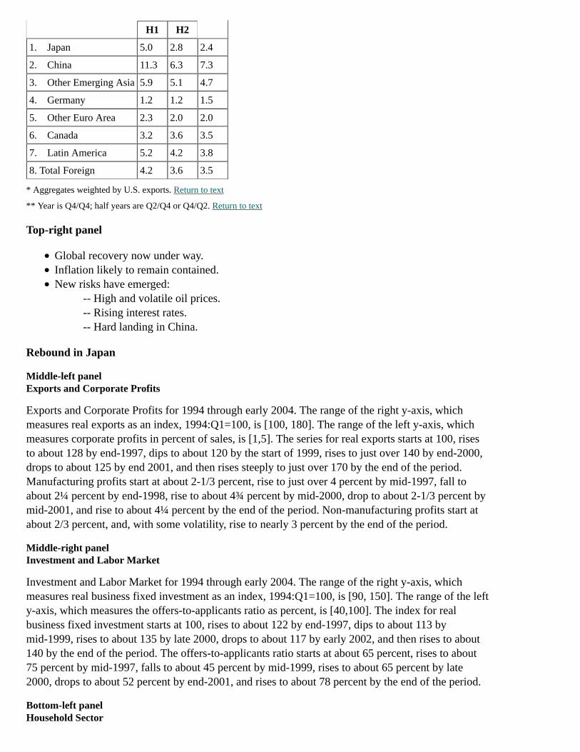
H1 H2
1. Japan 5.0 2.8 2.4
2. China 11.3 6.3 7.3
3. Other Emerging Asia 5.9 5.1 4.7
4. Germany 1.2 1.2 1.5
5. Other Euro Area 2.3 2.0 2.0
6. Canada 3.2 3.6 3.5
7. Latin America 5.2 4.2 3.8
8. Total Foreign 4.2 3.6 3.5
* Aggregates weighted by U.S. exports. Return to text
** Year is Q4/Q4; half years are Q2/Q4 or Q4/Q2. Return to text
Top-right panel
Global recovery now under way.Inflation likely to remain contained.New risks have emerged:
-- High and volatile oil prices.-- Rising interest rates.-- Hard landing in China.
Rebound in Japan
Middle-left panelExports and Corporate Profits
Exports and Corporate Profits for 1994 through early 2004. The range of the right y-axis, whichmeasures real exports as an index, 1994:Q1=100, is [100, 180]. The range of the left y-axis, whichmeasures corporate profits in percent of sales, is [1,5]. The series for real exports starts at 100, risesto about 128 by end-1997, dips to about 120 by the start of 1999, rises to just over 140 by end-2000,drops to about 125 by end 2001, and then rises steeply to just over 170 by the end of the period.Manufacturing profits start at about 2-1/3 percent, rise to just over 4 percent by mid-1997, fall toabout 2¼ percent by end-1998, rise to about 4¾ percent by mid-2000, drop to about 2-1/3 percent bymid-2001, and rise to about 4¼ percent by the end of the period. Non-manufacturing profits start atabout 2/3 percent, and, with some volatility, rise to nearly 3 percent by the end of the period.
Middle-right panelInvestment and Labor Market
Investment and Labor Market for 1994 through early 2004. The range of the right y-axis, whichmeasures real business fixed investment as an index, 1994:Q1=100, is [90, 150]. The range of the lefty-axis, which measures the offers-to-applicants ratio as percent, is [40,100]. The index for realbusiness fixed investment starts at 100, rises to about 122 by end-1997, dips to about 113 bymid-1999, rises to about 135 by late 2000, drops to about 117 by early 2002, and then rises to about140 by the end of the period. The offers-to-applicants ratio starts at about 65 percent, rises to about75 percent by mid-1997, falls to about 45 percent by mid-1999, rises to about 65 percent by late2000, drops to about 52 percent by end-2001, and rises to about 78 percent by the end of the period.
Bottom-left panelHousehold Sector

Household Sector for 1994 through early 2004. The range of the right y-axis, which measures realconsumption and real compensation as indexes, 1994:Q1=100, is [90, 130]. The range of the lefty-axis, which measures the household saving rate in percent, is [2,12]. The series for realconsumption starts at 100 and rises fairly steadily to about 113 by the end of the period. The seriesfor real compensation starts at 100, and, tracking fairly closely with real consumption through early1997, rises to about 105; the two series then diverge, with real compensation oscillating betweenabout 102 and 107 for the remainder of the period, ending at about 105 at the end of the period. Thehousehold savings rate starts at about 11 percent, falls to just below 8 percent by late 1997, rises toabout 9½ percent by mid-1998, and then falls to about 4½ percent by 2003:Q1, the last data point inthis series.
Bottom-right panelBank Credit and Land Prices
Bank Credit and Land Prices for bank credit and urban land prices for 1994 through early 2004. Therange of the y-axis is [50, 110]; index, 1994:Q1 = 100. Both series begin at 100. The bank creditindex remains near 100 through end-1997, and then falls to about 75 by the end of the period. Theindex for urban land prices falls in a nearly straight line to about 57 by the end of the period.
Chart 14
Chart 14 is a three-by-two array of panels. "Divergence in the Euro Area" comprises the top twopanels, including graphs on real consumption per capita, and employment. "Inflation Abroad"comprises the bottom four panels, including a table on the outlook for consumer prices, and graphson Japanese prices, oil and non-fuel commodity prices, and selected commodity prices.
Divergence in the Euro Area
Top-left panelReal Consumption per Capita
Real Consumption per Capita for Germany and for the euro area excluding Germany for 1994through early 2004. The range of the y-axis is [90, 130]; index, 1994:Q1=100. Both series begin at100. The index for Germany rises to about 112 by mid-2001 and then declines a bit to about 110 bythe end of the period. The index for the euro area excluding Germany rises fairly steadily to just over120 by the end of the period.
Top-right panelEmployment
Employment for Germany and for the euro area excluding Germany for 1994 through early 2004.The range of the y-axis is [90, 130]; index, 1994:Q1=100. Both series begin at 100. The index forGermany rises to about 105 by mid-2001 and then declines a bit to about 102 by the end of theperiod. The index for the euro area excluding Germany rises fairly steadily to about 115 by the endof the period.
Inflation Abroad
Middle-left panelOutlook for Consumer Prices
4-quarter percent change

2003
2004 2005 Q1 Q2 H2
projection
1. Average Foreign* 2.1 1.8 2.4 2.5 2.1
of which:
2. Euro Area 2.0 1.6 2.3 2.1 1.9
3. Japan -0.4 -0.3 -0.3 0.1 0.3
4. United Kingdom 1.3 1.2 1.6 1.3 1.8
5. Canada 1.7 0.9 1.9 1.8 1.7
6. China 2.6 2.8 4.3 3.7 1.6
7. Mexico 4.0 4.3 4.3 3.9 3.8
* Weighted by U.S. non-oil imports. Return to table
Middle-right panelJapanese Prices
Japanese Prices: CPI for 2002-2004:Q2 (actual) and for 2004:Q3-2005 (forecast) and the PCEdeflator for 2002-2004:Q1 (actual). The range of the y-axis is [-2.0, 0.5]; unit is 4-quarter percentchange. The 4-quarter percent change for CPI begins at about -1.3 percent, rises to about -0.2 percentby 2004:Q1 and then dips to about -0.4 percent in 2004:Q2; then over the forecast horizon, the4-quarter percent change for CPI rises to about 0.3 percent by the end of the period. The 4-quarterpercent change for the PCE deflator begins at about -1.6 percent, rises to about -1.2 percent by early2003, and then declines to about -1.6 percent by 2004:Q1.
Bottom-left panelOil and Non-fuel Commodity Prices
Oil and Non-fuel Commodity Prices on a monthly basis for 1994 through mid-2004 (actual) and formid-2004-2005 (forecast). The range of the left y-axis, which measures non-fuel primarycommodities as an index, Jan. 1994=100, is [70, 140]. The range of the right y-axis, which measuresthe WTI spot price in dollars per barrel, is [6, 42]. The non-fuel primary commodities index iscomprised of IMF component indexes weighted by U.S. imports. The WTI spot price starts at about$15 per barrel, rises to about $25 per barrel by end-1996, falls to about $11 per barrel by end-1998,rises to about $35 per barrel by end-2000, falls to about $19 per barrel by end-2001, rises to about$41 per barrel by early 2004, declines to about $38 per barrel by mid-2004, and then declines furtherto about $34 per barrel by the end of the forecast period. The index for non-fuel primarycommodities begins at 100, rises to about 124 by early 1996, falls to about 85 by late 2001, rises toabout 118 by mid-2004, and then declines to about 111 by the end of the forecast period.
Bottom-right panelSelected Commodity Prices
Selected Commodity Prices for steel scrap, soybeans, cotton, and copper for 2002 through mid-2004.The range of the y-axis is [50, 400]; index, Jan. 8, 2002=100. All series begin at 100. The index forsteel scrap rises fairly steadily to about 200 by late 2003, then begins a steep rise to about 380 byearly 2004, followed by a steep decline to about 250 by mid-2004. The index for soybeans risesfairly steadily to about 240 by early 2004 and then declines to about 210 by mid-2004. The index forcotton rises fairly steadily to about 230 by late 2003, and then declines to about 140 by mid-2004.The index for copper stays fairly stable around 100 through late 2003, rises to about 190 by early2004, and then declines to about 175 by mid-2004.
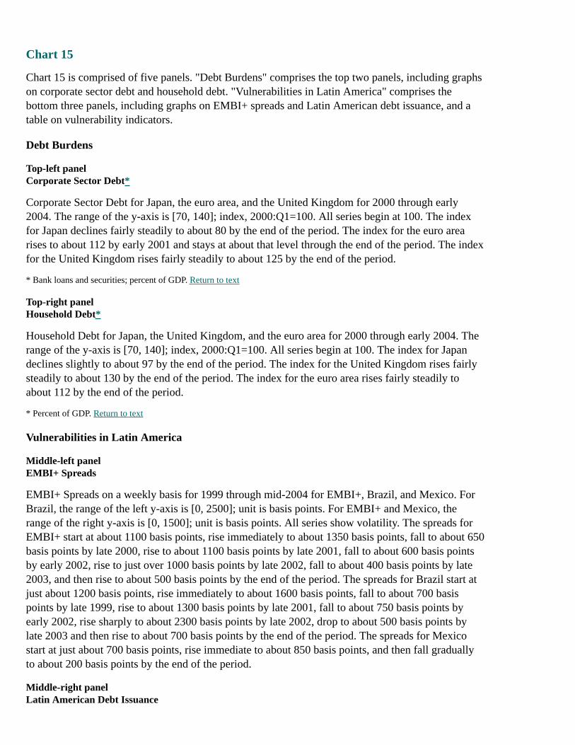
Chart 15
Chart 15 is comprised of five panels. "Debt Burdens" comprises the top two panels, including graphson corporate sector debt and household debt. "Vulnerabilities in Latin America" comprises thebottom three panels, including graphs on EMBI+ spreads and Latin American debt issuance, and atable on vulnerability indicators.
Debt Burdens
Top-left panelCorporate Sector Debt*
Corporate Sector Debt for Japan, the euro area, and the United Kingdom for 2000 through early2004. The range of the y-axis is [70, 140]; index, 2000:Q1=100. All series begin at 100. The indexfor Japan declines fairly steadily to about 80 by the end of the period. The index for the euro arearises to about 112 by early 2001 and stays at about that level through the end of the period. The indexfor the United Kingdom rises fairly steadily to about 125 by the end of the period.
* Bank loans and securities; percent of GDP. Return to text
Top-right panelHousehold Debt*
Household Debt for Japan, the United Kingdom, and the euro area for 2000 through early 2004. Therange of the y-axis is [70, 140]; index, 2000:Q1=100. All series begin at 100. The index for Japandeclines slightly to about 97 by the end of the period. The index for the United Kingdom rises fairlysteadily to about 130 by the end of the period. The index for the euro area rises fairly steadily toabout 112 by the end of the period.
* Percent of GDP. Return to text
Vulnerabilities in Latin America
Middle-left panelEMBI+ Spreads
EMBI+ Spreads on a weekly basis for 1999 through mid-2004 for EMBI+, Brazil, and Mexico. ForBrazil, the range of the left y-axis is [0, 2500]; unit is basis points. For EMBI+ and Mexico, therange of the right y-axis is [0, 1500]; unit is basis points. All series show volatility. The spreads forEMBI+ start at about 1100 basis points, rise immediately to about 1350 basis points, fall to about 650basis points by late 2000, rise to about 1100 basis points by late 2001, fall to about 600 basis pointsby early 2002, rise to just over 1000 basis points by late 2002, fall to about 400 basis points by late2003, and then rise to about 500 basis points by the end of the period. The spreads for Brazil start atjust about 1200 basis points, rise immediately to about 1600 basis points, fall to about 700 basispoints by late 1999, rise to about 1300 basis points by late 2001, fall to about 750 basis points byearly 2002, rise sharply to about 2300 basis points by late 2002, drop to about 500 basis points bylate 2003 and then rise to about 700 basis points by the end of the period. The spreads for Mexicostart at just about 700 basis points, rise immediate to about 850 basis points, and then fall graduallyto about 200 basis points by the end of the period.
Middle-right panelLatin American Debt Issuance
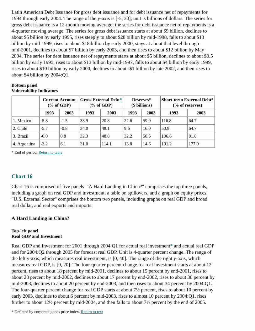
Latin American Debt Issuance for gross debt issuance and for debt issuance net of repayments for1994 through early 2004. The range of the y-axis is [-5, 30]; unit is billions of dollars. The series forgross debt issuance is a 12-month moving average; the series for debt issuance net of repayments is a4-quarter moving average. The series for gross debt issuance starts at about $9 billion, declines toabout $5 billion by early 1995, rises steeply to about $28 billion by mid-1998, falls to about $13billion by mid-1999, rises to about $18 billion by early 2000, stays at about that level throughmid-2001, declines to about $7 billion by early 2003, and then rises to about $12 billion by May2004. The series for debt issuance net of repayments starts at about $5 billion, declines to about $0.5billion by early 1995, rises to about $13 billion by mid-1997, falls to about $4 billion by early 1999,rises to about $10 billion by early 2000, declines to about -$1 billion by late 2002, and then rises toabout $4 billion by 2004:Q1.
Bottom panelVulnerability Indicators
Current Account(% of GDP)
Gross External Debt*(% of GDP)
Reserves*($ billions)
Short-term External Debt*(% of reserves)
1993 2003 1993 2003 1993 2003 1993 2003
1. Mexico -5.8 -1.5 33.9 20.8 22.6 59.0 116.8 64.7
2. Chile -5.7 -0.8 34.0 48.1 9.6 16.0 50.9 64.7
3. Brazil -0.0 0.8 32.3 48.8 32.2 50.5 106.6 81.8
4. Argentina -3.2 6.1 31.0 114.1 13.8 14.6 101.2 177.9
* End of period. Return to table
Chart 16
Chart 16 is comprised of five panels. "A Hard Landing in China?" comprises the top three panels,including a graph on real GDP and investment, a table on spillovers, and a graph on equity prices."U.S. External Sector" comprises the bottom two panels, including graphs on real GDP and broadreal dollar, and real exports and imports.
A Hard Landing in China?
Top-left panelReal GDP and Investment
Real GDP and Investment for 2001 through 2004:Q1 for actual real investment* and actual real GDPand for 2004:Q2 through 2005 for forecast real GDP. Unit is 4-quarter percent change. The range ofthe left y-axis, which measures real investment, is [0, 40]. The range of the right y-axis, whichmeasures real GDP, is [0, 20]. The four-quarter percent change for real investment starts at about 12percent, rises to about 18 percent by mid-2001, declines to about 15 percent by end-2001, rises toabout 23 percent by mid-2002, declines to about 17 percent by end-2002, rises to about 30 percent bymid-2003, declines to about 20 percent by end-2003, and then rises to about 34 percent by 2004:Q1.The four-quarter percent change for real GDP starts at about 7½ percent, rises to about 10 percent byearly 2003, declines to about 6 percent by mid-2003, rises to almost 10 percent by 2004:Q1, risesfurther to about 12½ percent by mid-2004, and then falls to about 7½ percent by the end of 2005.
* Deflated by corporate goods price index. Return to text

Top-right panelSpillovers
Percent of GDP
Exports
to China*(1)
Net Exportsof Commodities**
(2)
1. Taiwan 17.4 -5.3
2. ASEAN-5 11.4 0.6
3. Korea 8.2 -7.2
4. Chile 2.7 7.6
5. Japan 2.1 -3.1
6. Argentina 2.0 13.1
7. Russia 1.9 14.7
8. Brazil 1.2 2.8
9. Euro Area 0.8 -1.7
10. Canada 0.5 5.2
11. United Kingdom 0.4 -0.6
12. United States 0.4 -1.1
13. Mexico 0.3 1.0
* Includes to Hong Kong; 2003 data. Return to table
** Food and beverages, crude materials, and fuels; 2002 data. Return to table
Middle-left panelEquity Prices
Equity Prices on a weekly basis for 2002 through mid-2004 for Korea, Taiwan, and Singapore. Therange of the y-axis is [70, 140]; index, Jan. 4, 2002 = 100. The index for Korea starts at about 107,rises quickly to about 135 by early 2002, falls to about 77 by early 2003, rises to about 132 by early2004, and then falls to about 108 by mid-2004. The index for Taiwan starts at about 105, risesquickly to about 118 by early 2002, falls to about 77 by mid-2003 (with a spike down to about 72 inlate 2002), rises to about 125 by early 2004, and then falls to about 105 by mid-2004. The index forSingapore starts at about 105, rises quickly to about 112 by early 2002, falls to about 77 by early2003, rises to about 118 by early 2004, and then falls to about 113 by mid-2004.
U.S. External Sector
Bottom-left panelReal GDP and Broad Real Dollar
The panel plots U.S. and total foreign real GDP as a bar chart for 2002 and 2003 (actual) and 2004and 2005 (forecast), and it plots the broad real dollar as a line chart on a quarterly basis for 2002through mid-2004 (actual) and mid-2004 through 2005 (forecast).
The range of the left y-axis, which measures the broad real dollar as an index, 2002:Q1 = 100, is [75,105]. The broad real dollar, plotted as a red line, starts at about 98, rises immediately to about 100,falls to about 88 by early 2004, rises to about 90 by mid-2004, and then stays at about that level forthe entire forecast period.
The range of the right y-axis, which measures U.S. and total foreign real GDP in terms of percent
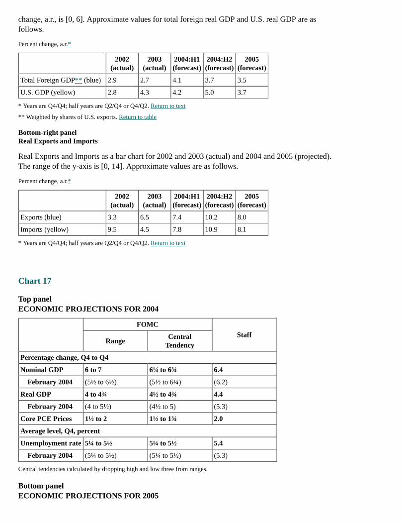
change, a.r., is [0, 6]. Approximate values for total foreign real GDP and U.S. real GDP are asfollows.
Percent change, a.r.*
2002
(actual)2003
(actual)2004:H1(forecast)
2004:H2(forecast)
2005(forecast)
Total Foreign GDP** (blue) 2.9 2.7 4.1 3.7 3.5
U.S. GDP (yellow) 2.8 4.3 4.2 5.0 3.7
* Years are Q4/Q4; half years are Q2/Q4 or Q4/Q2. Return to text
** Weighted by shares of U.S. exports. Return to table
Bottom-right panelReal Exports and Imports
Real Exports and Imports as a bar chart for 2002 and 2003 (actual) and 2004 and 2005 (projected).The range of the y-axis is [0, 14]. Approximate values are as follows.
Percent change, a.r.*
2002
(actual)2003
(actual)2004:H1(forecast)
2004:H2(forecast)
2005(forecast)
Exports (blue) 3.3 6.5 7.4 10.2 8.0
Imports (yellow) 9.5 4.5 7.8 10.9 8.1
* Years are Q4/Q4; half years are Q2/Q4 or Q4/Q2. Return to text
Chart 17
Top panelECONOMIC PROJECTIONS FOR 2004
FOMC
StaffRange
CentralTendency
Percentage change, Q4 to Q4
Nominal GDP 6 to 7 6¼ to 6¾ 6.4
February 2004 (5½ to 6½) (5½ to 6¼) (6.2)
Real GDP 4 to 4¾ 4½ to 4¾ 4.4
February 2004 (4 to 5½) (4½ to 5) (5.3)
Core PCE Prices 1½ to 2 1½ to 1¾ 2.0
Average level, Q4, percent
Unemployment rate 5¼ to 5½ 5¼ to 5½ 5.4
February 2004 (5¼ to 5½) (5¼ to 5½) (5.3)
Central tendencies calculated by dropping high and low three from ranges.
Bottom panelECONOMIC PROJECTIONS FOR 2005

FOMC
StaffRange
CentralTendency
Percentage change, Q4 to Q4
Nominal GDP 4¾ to 6½ 5 to 6 5.0
Real GDP 3½ to 4 3½ to 4 3.6
Core PCE Prices 1½ to 2½ 1½ to 2 1.6
Average level, Q4, percent
Unemployment rate 5 to 5½ 5 to 5¼ 5.3
Appendix 5: Materials used by Mr. Reinhart
Material for FOMC Briefing on Monetary Policy AlternativesVincent R. ReinhartJune 30, 2004
Strictly Confidential (FR) Class I - FOMC
Exhibit 1
The Policy Situation
The top panels of Exhibit 1 include a chart and table that provide information on expected federalfunds rates and policy expectations.
Top-left panelExpected Federal Funds Rates
A line chart displays the expected path of the federal funds rate embedded in futures quotes as ofJune 29, 2004. This chart indicates the upward trend of the expected path of the fed funds ratethrough the end of the year. Current futures quotes suggest that the federal funds rate will rise fromaround 1 percent to around 2¼ percent by December 2004. The chart also displays implied rates afterFOMC meetings: June 30, 1.26 percent; August 10, 1.58 percent; September 21, 1.86 percent;November 10, 2.13 percent; December 14, 2.30 percent.
Note. Estimates from federal funds futures on June 29, 2004, with an allowance for term premia and other adjustments.
Top-right panelPolicy Expectations
Expected Federal Funds Rate(percent)
June Meeting Year-End
Futures Market 1.26 2.30
Dealer Survey (median) 1.25 2.00
Assessment of Risks Paragraph
(percent of dealers)
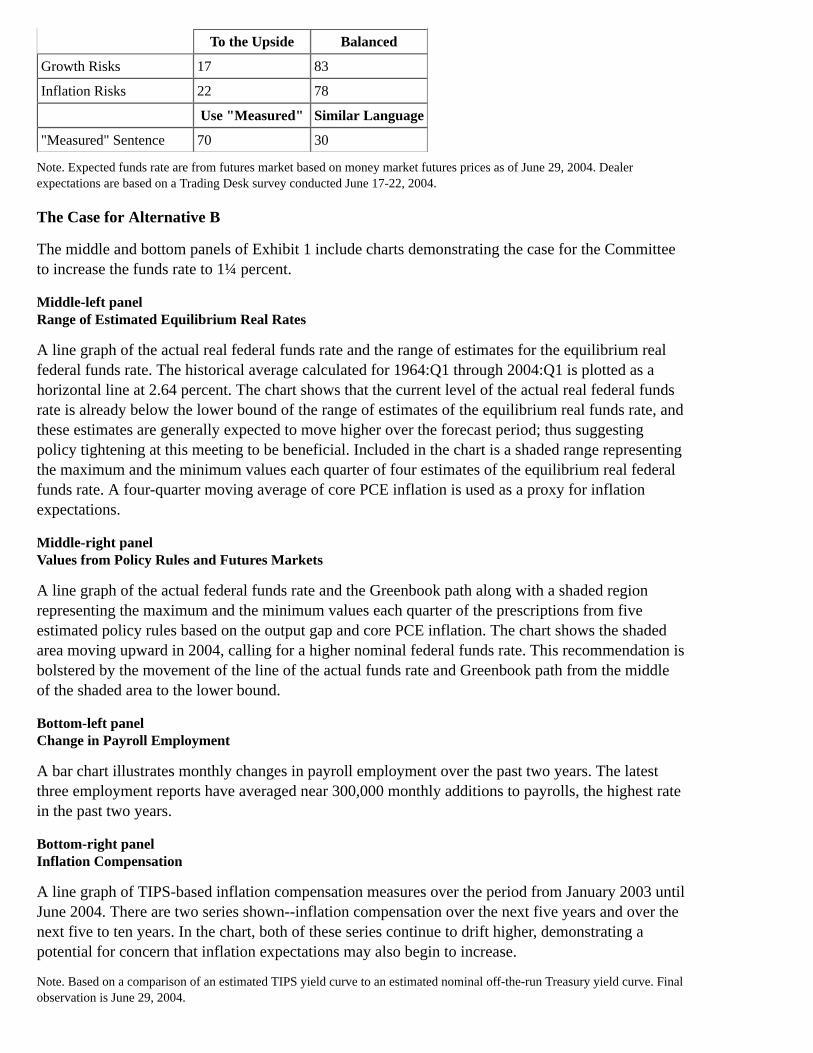
To the Upside Balanced
Growth Risks 17 83
Inflation Risks 22 78
Use "Measured" Similar Language
"Measured" Sentence 70 30
Note. Expected funds rate are from futures market based on money market futures prices as of June 29, 2004. Dealerexpectations are based on a Trading Desk survey conducted June 17-22, 2004.
The Case for Alternative B
The middle and bottom panels of Exhibit 1 include charts demonstrating the case for the Committeeto increase the funds rate to 1¼ percent.
Middle-left panelRange of Estimated Equilibrium Real Rates
A line graph of the actual real federal funds rate and the range of estimates for the equilibrium realfederal funds rate. The historical average calculated for 1964:Q1 through 2004:Q1 is plotted as ahorizontal line at 2.64 percent. The chart shows that the current level of the actual real federal fundsrate is already below the lower bound of the range of estimates of the equilibrium real funds rate, andthese estimates are generally expected to move higher over the forecast period; thus suggestingpolicy tightening at this meeting to be beneficial. Included in the chart is a shaded range representingthe maximum and the minimum values each quarter of four estimates of the equilibrium real federalfunds rate. A four-quarter moving average of core PCE inflation is used as a proxy for inflationexpectations.
Middle-right panelValues from Policy Rules and Futures Markets
A line graph of the actual federal funds rate and the Greenbook path along with a shaded regionrepresenting the maximum and the minimum values each quarter of the prescriptions from fiveestimated policy rules based on the output gap and core PCE inflation. The chart shows the shadedarea moving upward in 2004, calling for a higher nominal federal funds rate. This recommendation isbolstered by the movement of the line of the actual funds rate and Greenbook path from the middleof the shaded area to the lower bound.
Bottom-left panelChange in Payroll Employment
A bar chart illustrates monthly changes in payroll employment over the past two years. The latestthree employment reports have averaged near 300,000 monthly additions to payrolls, the highest ratein the past two years.
Bottom-right panelInflation Compensation
A line graph of TIPS-based inflation compensation measures over the period from January 2003 untilJune 2004. There are two series shown--inflation compensation over the next five years and over thenext five to ten years. In the chart, both of these series continue to drift higher, demonstrating apotential for concern that inflation expectations may also begin to increase.
Note. Based on a comparison of an estimated TIPS yield curve to an estimated nominal off-the-run Treasury yield curve. Finalobservation is June 29, 2004.
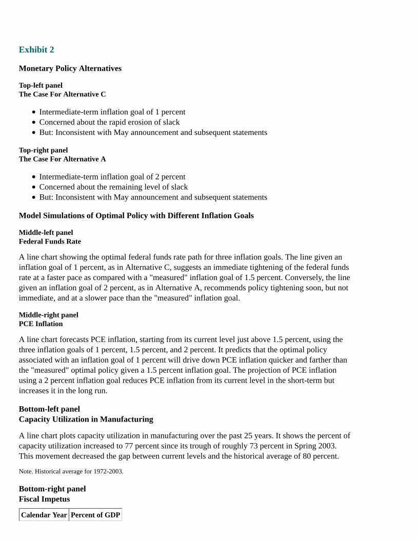
Exhibit 2
Monetary Policy Alternatives
Top-left panelThe Case For Alternative C
Intermediate-term inflation goal of 1 percentConcerned about the rapid erosion of slackBut: Inconsistent with May announcement and subsequent statements
Top-right panelThe Case For Alternative A
Intermediate-term inflation goal of 2 percentConcerned about the remaining level of slackBut: Inconsistent with May announcement and subsequent statements
Model Simulations of Optimal Policy with Different Inflation Goals
Middle-left panelFederal Funds Rate
A line chart showing the optimal federal funds rate path for three inflation goals. The line given aninflation goal of 1 percent, as in Alternative C, suggests an immediate tightening of the federal fundsrate at a faster pace as compared with a "measured" inflation goal of 1.5 percent. Conversely, the linegiven an inflation goal of 2 percent, as in Alternative A, recommends policy tightening soon, but notimmediate, and at a slower pace than the "measured" inflation goal.
Middle-right panelPCE Inflation
A line chart forecasts PCE inflation, starting from its current level just above 1.5 percent, using thethree inflation goals of 1 percent, 1.5 percent, and 2 percent. It predicts that the optimal policyassociated with an inflation goal of 1 percent will drive down PCE inflation quicker and farther thanthe "measured" optimal policy given a 1.5 percent inflation goal. The projection of PCE inflationusing a 2 percent inflation goal reduces PCE inflation from its current level in the short-term butincreases it in the long run.
Bottom-left panelCapacity Utilization in Manufacturing
A line chart plots capacity utilization in manufacturing over the past 25 years. It shows the percent ofcapacity utilization increased to 77 percent since its trough of roughly 73 percent in Spring 2003.This movement decreased the gap between current levels and the historical average of 80 percent.
Note. Historical average for 1972-2003.
Bottom-right panelFiscal Impetus
Calendar Year Percent of GDP
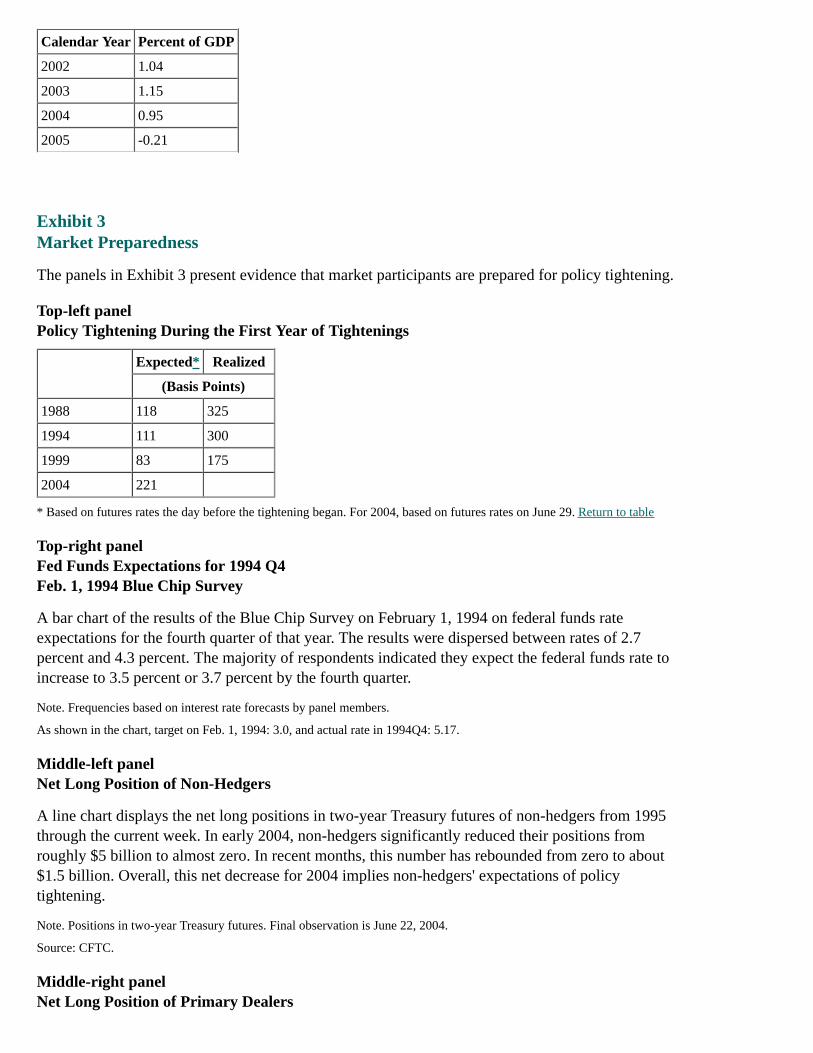
Calendar Year Percent of GDP
2002 1.04
2003 1.15
2004 0.95
2005 -0.21
Exhibit 3Market Preparedness
The panels in Exhibit 3 present evidence that market participants are prepared for policy tightening.
Top-left panelPolicy Tightening During the First Year of Tightenings
Expected* Realized
(Basis Points)
1988 118 325
1994 111 300
1999 83 175
2004 221
* Based on futures rates the day before the tightening began. For 2004, based on futures rates on June 29. Return to table
Top-right panelFed Funds Expectations for 1994 Q4Feb. 1, 1994 Blue Chip Survey
A bar chart of the results of the Blue Chip Survey on February 1, 1994 on federal funds rateexpectations for the fourth quarter of that year. The results were dispersed between rates of 2.7percent and 4.3 percent. The majority of respondents indicated they expect the federal funds rate toincrease to 3.5 percent or 3.7 percent by the fourth quarter.
Note. Frequencies based on interest rate forecasts by panel members.
As shown in the chart, target on Feb. 1, 1994: 3.0, and actual rate in 1994Q4: 5.17.
Middle-left panelNet Long Position of Non-Hedgers
A line chart displays the net long positions in two-year Treasury futures of non-hedgers from 1995through the current week. In early 2004, non-hedgers significantly reduced their positions fromroughly $5 billion to almost zero. In recent months, this number has rebounded from zero to about$1.5 billion. Overall, this net decrease for 2004 implies non-hedgers' expectations of policytightening.
Note. Positions in two-year Treasury futures. Final observation is June 22, 2004.
Source: CFTC.
Middle-right panelNet Long Position of Primary Dealers

A line chart displays the net long position of primary dealers in the Treasury market over the pastthree years. Over the time range of the graph, primary dealers are short, in aggregate, Treasurysecurities with more than three years to maturity. This short position has intensified even moreduring 2004 to approximately $100 billion.
Note. Positions in Treasury securities with more than three years to maturity. Final observation is June 16, 2004.
Source: FRBNY.
Bottom-left panelMortgage Duration
A line chart shows the average duration of mortgages starting in 1999. Over the past year, mortgageduration has increased to almost 4.5 years, bringing current durations to around the highest level seenover the period.
Note. Estimated duration of a representative sample of fifteen- and thirty-year fixed rate mortgages. Final observation is June25, 2004.
Source: Merrill Lynch.
Bottom-right panelCredit Default Swap Financial Index
A line chart plots the average credit default swap spread for financial firms. Spreads are very low atless than 40 basis points. Thus, the low cost of protection from default by financial firms signifiesthat these firms are predicted to stay in strong health.
Note. Average of individual CDS quotes of 32 investment-grade financial firms weighted by the book value of liabilities. Finalobservation is June 29, 2004.
Exhibit 4: FOMC Statement Alternatives for the June Bluebook
May FOMC Alternative A Alternative B Alternative C
PolicyDecision
1. The Federal OpenMarket Committeedecided today to keep itstarget for the federalfunds rate at 1 percent.
[Unchanged]
The Federal OpenMarket Committeedecided today to raiseits target for thefederal funds rate to1¼ percent.
The Federal OpenMarket Committeedecided today to raiseits target for thefederal funds rate to1½ percent.
Rationale
2. The Committeecontinues to believe thatan accommodative stanceof monetary policy,coupled with robustunderlying growth inproductivity, is providingimportant ongoingsupport to economicactivity.
[Unchanged]
The Committeebelieves that, evenafter this action, thestance of monetarypolicy remainsaccommodative and,coupled with robustunderlying growth inproductivity, isproviding ongoingsupport to economicactivity.
The Committeebelieves that, evenafter this action, thestance of monetarypolicy remainsaccommodative and,coupled with robustunderlying growth inproductivity, isproviding ongoingsupport to economicactivity.
3. The evidenceaccumulated over theintermeeting period
The evidenceaccumulated over theintermeeting period
The evidenceaccumulated over theintermeeting period
The evidenceaccumulated over theintermeeting period
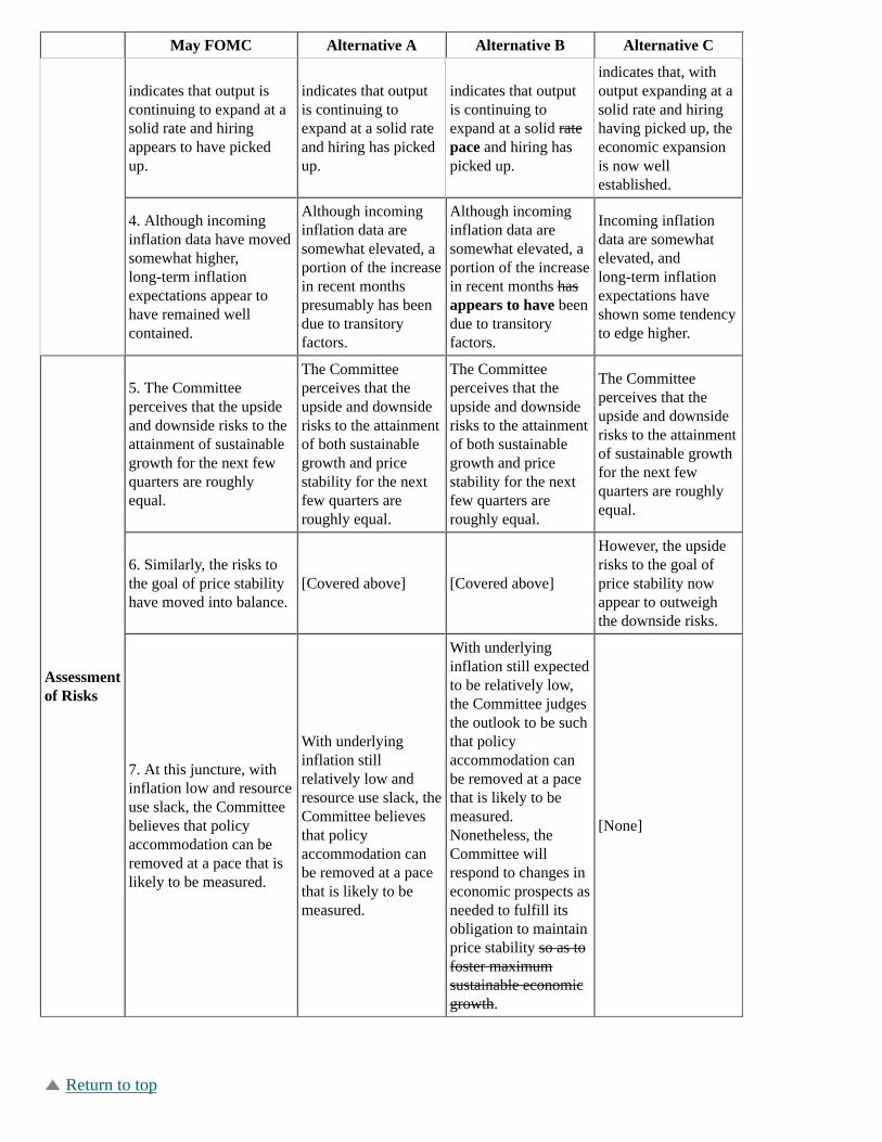
May FOMC Alternative A Alternative B Alternative C
indicates that output iscontinuing to expand at asolid rate and hiringappears to have pickedup.
indicates that outputis continuing toexpand at a solid rateand hiring has pickedup.
indicates that outputis continuing toexpand at a solid ratepace and hiring haspicked up.
indicates that, withoutput expanding at asolid rate and hiringhaving picked up, theeconomic expansionis now wellestablished.
4. Although incominginflation data have movedsomewhat higher,long-term inflationexpectations appear tohave remained wellcontained.
Although incominginflation data aresomewhat elevated, aportion of the increasein recent monthspresumably has beendue to transitoryfactors.
Although incominginflation data aresomewhat elevated, aportion of the increasein recent months hasappears to have beendue to transitoryfactors.
Incoming inflationdata are somewhatelevated, andlong-term inflationexpectations haveshown some tendencyto edge higher.
Assessmentof Risks
5. The Committeeperceives that the upsideand downside risks to theattainment of sustainablegrowth for the next fewquarters are roughlyequal.
The Committeeperceives that theupside and downsiderisks to the attainmentof both sustainablegrowth and pricestability for the nextfew quarters areroughly equal.
The Committeeperceives that theupside and downsiderisks to the attainmentof both sustainablegrowth and pricestability for the nextfew quarters areroughly equal.
The Committeeperceives that theupside and downsiderisks to the attainmentof sustainable growthfor the next fewquarters are roughlyequal.
6. Similarly, the risks tothe goal of price stabilityhave moved into balance.
[Covered above] [Covered above]
However, the upsiderisks to the goal ofprice stability nowappear to outweighthe downside risks.
7. At this juncture, withinflation low and resourceuse slack, the Committeebelieves that policyaccommodation can beremoved at a pace that islikely to be measured.
With underlyinginflation stillrelatively low andresource use slack, theCommittee believesthat policyaccommodation canbe removed at a pacethat is likely to bemeasured.
With underlyinginflation still expectedto be relatively low,the Committee judgesthe outlook to be suchthat policyaccommodation canbe removed at a pacethat is likely to bemeasured.Nonetheless, theCommittee willrespond to changes ineconomic prospects asneeded to fulfill itsobligation to maintainprice stability so as tofoster maximumsustainable economicgrowth.
[None]
Return to top

Home | Monetary policy | FOMC | FOMC transcriptsAccessibility | Contact UsLast update: April 30, 2010