Embed Size (px)
Citation preview

Communicating with charts 1
Communicating Clearly with Charts and Graphs
OFM 2007 Fall Forum Tying it all together
Sept. 18, 2007 3:30 – 5 pm
Jeffrey Showman OFM Budget / Performance Assessments 360-902-7536 [email protected] http://www.ofm.wa.gov/performance/
0
10
20
30
40
50
60
70
80
90
1st Qtr 2nd Qtr 3rd Qtr 4th Qtr
East
West
North
East
West
North
0
20
40
60
80
100
Q1 Q2 Q3 Q4
Communicating with charts 2
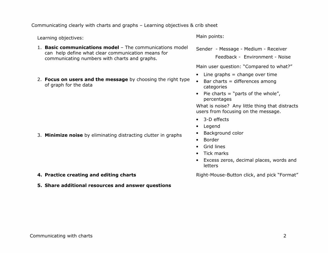
Communicating clearly with charts and graphs – Learning objectives & crib sheet
Learning objectives: Main points:
1. Basic communications model – The communications model can help define what clear communication means for communicating numbers with charts and graphs.
Sender - Message - Medium - Receiver
Feedback - Environment - Noise
2. Focus on users and the message by choosing the right type of graph for the data
Main user question: “Compared to what?”
• Line graphs = change over time
• Bar charts = differences among categories
• Pie charts = “parts of the whole”, percentages
3. Minimize noise by eliminating distracting clutter in graphs
What is noise? Any little thing that distracts users from focusing on the message.
• 3-D effects
• Legend
• Background color
• Border
• Grid lines
• Tick marks
• Excess zeros, decimal places, words and letters
4. Practice creating and editing charts Right-Mouse-Button click, and pick “Format”
5. Share additional resources and answer questions

Communicating with charts 3
Part I. A. Basic communications model
Communications is a system. Any communication can be analyzed by describing the main parts of the system:
• A sender who has something they want to communicate
• The message itself
• A medium that carries the message
• A receiver – the person to whom you’re communicating
• Feedback – “Uh-huh”, “OMG!”, “What do you mean?”
• The environment in which communication takes place
• Noise – unintended distractions from the channel or the environment
Technical communication models include other elements (coder and decoder, filters, etc.)
The goal of communication is that the receiver gets the message that the sender intended.
Applying this to charts and graphics:
• Think of the user (i.e. the receiver) and what they want to know
• Choose the right type of chart for the data and message
• Reduce noise to improve the odds that the receiver can focus on the message
References: For a thorough discussion of communication model, http://www.cultsock.ndirect.co.uk/MUHome/cshtml/introductory/sw.html#pnoise
Sender
Receiver
Message
Medium
Feedback
Environment
Noise
Noise

Communicating with charts 4
Part I. > B. Communicating with numbers Numbers tell certain types of stories
• How many things are there?
• How often do things happen?
• What type or degree of change has happened?
• Is change normal or unpredictable?
• Is change likely to continue in the future (i.e. a trend)?
When we use words to tell stories, we organize them in certain ways:
• sentences
• paragraphs
In the same way, to get numbers to tell stories, we have to organize them in certain ways.
• Tables are the first main tool for organizing numbers
• In a table, we put numbers in rows and columns
Every chart starts with a table of data, usually in a spreadsheet.
Whether to put data in rows or columns is up to you:
• Brian Willett likes dates in columns, going across the page
• I like dates in rows, going down the page
• We both produce similar graphs.
Example of a data table Biennium Period Actual Target
2003-05 Q1 59 58
Q2 135 144
Q3 174 210
Q4 180 150
Q5 117 58
Q6 86 144
Q7 188 210
Q8 210 162
2005-07 Q1 122 119
Q2 79 108
Q3 169 162
Q4 157 151
Q5 62 62
Q6 105 121
Q7 160
Q8 197
Source: Exercise 1 - DNR volume of timber sold

Communicating with charts 5
Part II. Focus on the users and the message > A. What makes an effective chart or graph?
A. What makes an effective chart or graph? Graphic communication has the same goal as written or verbal communication:
Focus the user on the message, with minimal “noise” to
distract them.
A good design is invisible.
Good charts lead to good conversations, clear understanding, better decisions.
Effective graphics:
• Are readily understood by the reader
• Are relevant to the world we live in
• Are timely
• Are formatted with a sense of balance, proportion, and clarity of design
• Have integrity (data/analysis, cite references, are signed)
• And answer some predictable, fundamental questions, the most important of which is . . .
“Compared to what?”
References: Handout 2, Barbara Felver, “Communicating effectively with graphics”,
http://www.digitalarchives.wa.gov/governorlocke/improve/quality/tools/bfelver.htm.
Remember: Your reader is an intelligent, thoughtful person just like you. Make your charts easy to read and understand, but don’t “dumb down” the information. (Tufte)

Communicating with charts 6
Part II. Focus on the users and the message > B. Types of comparisons
Graphic data acquires meaning when it has context.
Context can come from comparison among . . .
• Categories of things
• Time periods
• Parts of the whole
Other types of comparisons
• Comparisons in space or geography
• How does it work?

Communicating with charts 7
Part II. Choosing the right chart > Types of comparisons > C. Right chart for the each type of comparison
Each type of comparison has a type of graphic best suited to showing it:
Category comparisons
Bar charts
Column charts
$62.40 $62.11$60.20
$74.87
$70.01$68.05
$70.42
$75.72
PSE Avista NW Natural Cascade
Prior rates
Current rates
Change over time
Line charts
(run charts)
Annual aquatic lease revenue ($million)Trend = +$.77 million/year
$10
$11
$12
$13
$14
$15
$16
$17
$18
$19
1999 2000 2001 2002 2003 2004 2005 2006
Parts of the whole - percentages Pie charts
Consumer complaints by industry, 2004
Telecom, 74%
Electric, 13%
Solid waste, 6%
Gas, 4%
Water, 2%
Transportation,
1%
How does it work
Flow charts
org charts
diagrams
Spatial relations Maps
Face of customer
Photographs
Division Staff2 FTE
13.65 FTE
TelecommunicationsJing Roth
Assistant Director (Acting)
12.5 FTE
EnergyRoger Braden
Assistant Director
7.5 FTE
Solid Waste and WaterGene Eckhardt
Assistant Director
10.9 FTE
Records and LicensingKathy Hunter
Assistant Director
Regulatory Services DivisionGlenn BlackmonDirector (Acting)

Communicating with charts 8
Part II. C. Choosing the right chart > 1. Categories = column or bar charts Bar or Column charts show differences among categories.
The example on right shows number of customers of different types of telephone companies. (This is a type of “stacked column” graph.)
For long lists of categories, use horizontal bars because the chart category labels are easier to read. In Excel, these are called “Bar charts”. See example below.
Hours charged to telecommunication industry code by different
WUTC sections, fiscal years 2004-2005
Washington telephone lines by type of
technology, 2003.
Notes: Numbers are millions of subscriber lines. ILEC = Incumbent local exchange company, or a traditional land-line telephone company CLEC = Competitive local exchange company FCC = Federal Communications Commission. Chart sources: WUTC Telecommunications GMAP, Dec. 2005.
3.2763.567
0.775
0.494
0
0.5
1
1.5
2
2.5
3
3.5
4
Wireline Wireless High Speed
Source: FCC
Mil
lion
s
ILEC
CLEC
- 5 10 15 20 25
Telecommunications
Regulatory Group
Consumer Affairs
Administrative Law
Division
Records
Management
Utilities
Administration
Policy Planning and
Research
Administration
Business Practices
Motor Carrier Safety
Licensing Services
Thousands
FY04
FY05

Communicating with charts 9
Part II. B. Choosing the right chart > 1. Categories = bar charts > More bar and column chart examples
Because statistical analysis requires a minimum of seven data points, some analysts suggest using bar charts instead of line charts if there are six or fewer data points available.
The data above are cumulative every quarter, so the most relevant period is the total in the final quarter. Because the eye is attracted to dark things, I wanted to draw attention to these bars are colored dark. It’s difficult to draw attention to a single point in a line chart, so a bar chart works here.
Source: DSHS ESA charts – PowerPoint
In the example below, the categories are age groups. Note the detail at the bottom showing the percentage of each category summing to 100%.
Source: Stephen Few, Perceptual Edge – Design Examples: http://www.perceptualedge.com/images/example15-sol-large.jpg
Percent of client children with paternity established per year
(cumulative to Federal Fiscal Year end, Q1 & Q5)
98.1%98% 97% 94.6%
Target, 90%
0%
20%
40%
60%
80%
100%
Q1 Q2 Q3 Q4 Q5 Q6 Q7 Q8 Q1 Q2 Q3 Q4 Q5 Q6
2003-05 2005-07

Communicating with charts 10
Part II. B. Choosing the right chart > 2. Comparison in time = line charts 2. Line charts (or “run charts”) show performance over time
If one of the sets of data is related to time (e.g. quarter, month, year), then a line chart is probably the right choice.
Annual aquatic lease revenue ($million)
Trend = +$.77 million/year
$10
$11
$12
$13
$14
$15
$16
$17
$18
$19
1999 2000 2001 2002 2003 2004 2005 2006
Source: DNR Performance Assessment, data from DNR Annual Reports
A big advantage of run charts is that relationships among many data points is much easier to see and understand than “raw data” in a table. This is the data table for the chart to the left:
Year
Aquatic lease
revenue
1999 $11.7
2000 $15.0
2001 $12.6
2002 $14.4
2003 $17.5
2004 $15.8
2005 $16.8
2006 $17.8
It’s possible to get the same information from the table as from the chart (e.g., Which year was highest? Which was lowest? Is there a general trend?) but it takes a lot more time and effort by the user.

Communicating with charts 11
Part II. B. Choosing the right chart > Time change = line charts > More line chart examples
1. Line or run charts - More examples
Line charts are useful for showing things that change in a regular cycle, outlying or unusual events, etc.
Note that the dollar scale begins at $140 million. Some variation may be relatively minor, but still important to see closely. Changing the scale of the Value Axis (y axis) can highlight differences. Use this judiciously, though, as it can be perceived as manipulating the data.
Chart sources: Performance Assessments, DSHS ESA (above) and State Parks (right)
Small multiples help comparison (Tufte)
Parks revenue - Spring
(Apr - June, Q4 & Q8)
$0
$1
$2
$3
$4
$5
$6
$7
Q4 Q8 Q4 Q8 Q4 Q8 Q4 Q8
1999-01 2001-03 2003-05 2005-07
Millio
ns
Parks revenue - Summer
(July - Sept, Q1 & 5)
$0
$2
$4
$6
$8
$10
Q1 Q5 Q1 Q5 Q1 Q5 Q1 Q5
1999-01 2001-03 2003-05 2005-07
Mil
lio
ns
Parks revenue - Autumn
(Oct - Dec, Q2 & 6)
$0
$1
$2
$3
$4
Q2 Q6 Q2 Q6 Q2 Q6 Q2 Q6
1999-01 2001-03 2003-05 2005-07
Mil
lio
ns
Parks revenue - Winter
(Jan - Mar, Q3 & 7)
$0
$1
$2
$3
$4
Q3 Q7 Q3 Q7 Q3 Q7 Q3 Q7
1999-01 2001-03 2003-05 2005-07
Mil
lio
ns
Total Child Support Collections (dollars in millions)
Target
Actual collections
Trend = + $1.5m per Q
$140
$150
$160
$170
$180
Q1 Q2 Q3 Q4 Q5 Q6 Q7 Q8 Q1 Q2 Q3 Q4 Q5 Q6 Q7 Q8
2003-05 2005-07

Communicating with charts 12
Part II. C. Choosing the right chart > 3. Parts of the whole = pie charts 3. Pie charts show percentages of the whole
Use pie charts to show percentages, usually when there are a few (e.g. seven or less) categories, such as the chart on the right.
Avoid pie charts if there are many categories, such as the example below, or if any categories have a value of zero. In these cases, use a simple table of data, or an expanded pie chart, instead.
Hint: Rotate pie chart slices to draw users’ attention to what’s important, or to make it easier to read by orienting to familiar clock hand positions: “3 - 6 – 9 -12”. Reference: Stephen Few, “Save the pies for dessert” (Aug. 2007), http://www.perceptualedge.com/articles/08-21-07.pdf
Consumer complaints by industry, 2004
Telecom, 74%
Electric, 13%
Solid waste, 6%
Gas, 4% Water, 2%
Transportation,
1% Expenditures on Telecom Regulation, By Section
July-December 2003
Telecom Section
26%
Consumer Affairs
10%
Attorney General
8%
AG Public Counsel
8%
Indirect
30%
Agency Payments
2%Records Center
3%
Policy
2% Admin Law
4%
Commissioners
2%
Business Practices
2%
Licensing
1%
Other
2%
Total Expenditures (6 months) - $2.5 million

Communicating with charts 13
Part III. A. Noise – What is it?
Noise is any unwanted energy or distraction that degrades the quality of signals and data.
Examples of noise:
• Hiss, hum or crackle in a telephone call
• A motorcycle going by a sidewalk café as you’re about to propose
• Motors, fans, compressors at work
• Non-essential “chart junk” in a graphic.
Avoiding and reducing physical noise is a major concern of communication scientists.
Avoiding and reducing chart noise is a major concern of communicating with graphics.
Noise can be measured by counting all of the separate things on a chart.
The default PowerPoint chart (above) has over 200 lines, tick marks, edges, surfaces, digits, and words competing for attention.
The edited version (bottom, showing the same data) has about 22.
“The only question you should ask when looking at a ... chart is: Does it communicate the data in the clearest and most accurate way possible?” Stephen Few, “Excel’s new charting engine”
For technical discussion of noise in communications, see: http://www.cultsock.ndirect.co.uk/MUHome/cshtml/introductory/sw.html#pnoise
0
10
20
30
40
50
60
70
80
90
1st Qtr 2nd Qtr 3rd Qtr 4th Qtr
East
West
North
East
West
North
0
20
40
60
80
100
Q1 Q2 Q3 Q4

Communicating with charts 14
Part III. Noise > B. Sources of noise in charts and graphs Noise can come from a variety of things in charts (and Excel puts almost all of them into charts by default).
Examples of “noise” that distract from the message in a chart . . .
. . . And how to cure that particular noise problem:
Legends or “codes” that force the viewer to consult a “decoder” for meaning
Delete the legend, and instead label lines or bars directly: • Use text boxes (from the drawing toolbar) or • Label a data point and then edit that.
Extra benefit: legend takes up real estate from the data.
Colored or shaded background
Remove colored backgrounds using “Format Plot Area”
Gridlines, borders, tick marks – “Chartjunk”
• Remove gridlines by clicking on them, and choosing “clear”
• Remove borders by clicking on Plot and/or Chart area, and choosing Border and Patterns – none.
• Remove tick marks, or point them inside, by clicking on the axis, choosing “Format Axis”, and the Patterns tab.
Superfluous words and digits (decimal points, ‘000’s on currency, letters, words)
Click on the axis, choose Format Axis, and then Number or Scale tabs. Minimize the number of digits, letters, words.
“The only question you should ask when looking at a . . . chart is: Does it communicate the data in the clearest and most accurate way possible?” Stephen Few, “Excel’s new charting engine”

Communicating with charts 15
Part IV. Practical tips > A. How to create a chart in Excel
Highlight the area of the table you want to the graph • Click on a cell in one corner of the data table, • hold the button down and drag the mouse to the opposite
corner, and release the mouse button. • Include all data you want to be in the graph. • “X axis” labels can be added later. Click the "Chart Wizard" icon on the tool bar & just follow instructions on the chart wizard: • Choose best type of chart for the data and message
• Choose the chart sub-type with the minimum noise (note the "View sample" button)
• Add chart title (optional, can add later through "Chart Options" menu)
• Choose where to put the chart:
In same worksheet Advantages: o Data is right next to the chart, so easy to play with; o Smaller size exports well to a partial page in another document
(Word, Powerpoint) Disadvantages: Limited room for detail, labels, call-outs On its own worksheet: Advantages: o Large size, easy to read and work with, o Exports well to a full page in other documents Disadvantages: o Data is on a different sheet so is challenging to manipulate; o Exporting to less-than-full page in another document requires
extra handling (e.g. changing font lock)
See Exercise 1 – DNR Volume of Timber sold
Chart Wizard icon on the menu The prompt for choosing chart type and subtype on the Chart Wizard:

Communicating with charts 16
Part IV. Practical tips: How to clean up an Excel chart > B. Parts of an Excel chart 1
Chart area Chart title
Value axis (= y axis)
Category axis ( = x axis)
Percent of vendors and employees paid within OFM time
frames
Pct. of vendors paid
w ithin 30 days
Pct. of employee
travel paid w ithin 10
days
Target - 95%
50%
60%
70%
80%
90%
100%
Q1 Q2 Q3 Q4 Q5 Q6 Q7 Q8
2005-07
Plot area

Communicating with charts 17
Part IV. Practical tips: How to clean up an Excel chart > B. Parts of an Excel chart 2

Communicating with charts 18
Part IV. Practical tips > C. How to clean up an Excel chart –General approach 1. Put cursor on part of the chart that you want to
edit
• Black boxes appear on the ends or edges of the selected item
• Lines and borders appear mottled
• A description box may also appear (see item 1).
2. Right-Mouse-Button (RMB) click to see menu of options for that feature (see item 2).
3. Choose the “Format...” menu
4. Edit the item you want
• Menu items often have multiple tabs, each dealing with a different feature (e.g. font, lines, scale)
• Change items by choosing something different than current settings, usually "none", 'no fill", etc.
5. Click the "Okay" button or press "Enter"
Remember:
� It's okay to explore. There’s more here than I can show, and it’s a great way to learn.
� For peace of mind save your work early & often.
� Use "Edit - Undo" when something goes wrong.
1. Example of a selected “Plot Area” in a chart (note black squares and gray line)
2. Menu of choices after Right-Mouse-Button click on highlighted Plot Area:

Communicating with charts 19
Part IV. Practical tips > D. Good chart hygiene - What to clean up every time B. What to clean up every time:
� Delete legend - Highlight it and push “Delete” or “clear”. Your chart immediately will have additional “real estate”
� Remove gridlines (see item 1)
o Click on them, then push “Delete” or clear
� Get rid of background color and inner border
o Put cursor in Plot Area (see previous slide)
o Right-mouse-button click and choose "Format Plot Area" from the menu
o Choose “Area – None” and “Border – No line” (see item 2)
� If exporting to Word or Powerpoint, remove the outer border in the same way
o Put cursor in Chart Area (not the Plot Area, i.e. not within the area bounded by the two axes!)
o Choose “Border – none”
Hints:
� In general, start at outside and work your way in
� Since this happens on every chart, lots of chance to practice, get good at it.
� Can be done in about a minute or so, and pays immediate dividends in improved readability.
1. Selected Gridlines have boxes on ends
2. Menu choice for removing background and inner border from Plot Area

Communicating with charts 20
Part IV. Practical tips > E. Optional things to clean up Further ways to reduce noise or focus on the message:
Change tick marks - I like them to point inward, toward the data, not outward like little saw teeth. Some folks eliminate them. Unneeded digits on the value (y) axis - Some scales have too many data points, too many decimals, or too many zeros. For all these 1. Highlight the Value axis ( = y axis)
2. Right-mouse-button click 3 Choose "Format Axis . . ." menu
To change Tick marks: Patterns tab "Major tick mark type" - choose "Inside", or “None” To clean up excess decimals in numbers: Number tab Choose "Number" or "Currency" Set Decimal places = 0 To change the scale: Scale tab Change the "Minimum" amount Change the "Major unit" amount To clean up excess zeros in values: Scale tab "Display Units" box Select the one you want (hundreds, thousands, millions, etc) The axis label will automatically change ("In Millions")
1. Highlight value axis (note black squares):
2. Right-mouse-button click to see menu:
3. Pick the tab dealing with what you want:

Communicating with charts 21
Part IV. Practical tips > F. Advanced topics 1 – Using “Data Point” to make a single bar dark
To draw attention to a single bar by coloring it dark:
First color rest of the bars white or light • Put cursor on any item in the data series and click
once – the whole series is highlighted.
• RMB click, choose “Format Data Series”
• Under the Patterns tab, choose the color in Area (see item 1).
Then highlight the individual bar (= “data point”) • Put your cursor on the data point you want to highlight
• Click once to highlight the data series.
• Click a second time and hold it– the data point is highlighted (see item 2)
• RMB click, choose “Format Data Point”
• Change color under Area, and click Okay (see item 3).
1. Tabs on the “Format Data Series . . .” menu:
2. A highlighted data point in a bar chart:
3. Changing the color of a data point

Communicating with charts 22
Part IV. Practical tips > F. Advanced topics 2 – Enhance the message in the data lines Add emphasis to the message by increasing the weight of a data line Click on the data series RMB click and choose "Format Data Series" On the first "Patterns" tab, Under "Line", increase the weight (bottom option) Provide a visual clue that the target is not actual data by changing it
to a dashed line Same as above, but under "Line" . . . click "Style" (top option) and choose a type of dashed line Consider changing the color as well (middle option) Label the lines directly to replace the deleted legend: Method 1 - Use text boxes from the "Drawing" toolbar. (Hint – your cursor needs to be in the Chart Area when creating the text box, or it will disappear behind the chart) Method 2 - Label a data point, then edit and move it:
• Get to any data point on the line (see previous slide 21) • Choose "Format Data Point,” then the "Data Labels" tab • Click one of the choices (Series, Category or Value it doesn’t matter) • Once the data label is created for the data point, edit it and move it
o Click twice on the data label to move it around the chart area o Click three times on the data label to edit the text o Click on it once to get the "Format Data Label" to edit font (e.g.
make font color to match the line color), make it bold to be more readable, etc.

Communicating with charts 23
Part IV. Practical tips > F. Advanced topics 3 – Adding other data lines Excel can include a trend line:
• Click on the main chart line (i.e. data series), and choose
• “Add Trend line” from the menu choice.
• Can show slope, check R-squared, on one of the tabs
How to get a mixed bar and line chart or data on two axes:
• Click pretty much anywhere in the chart and RMB click
• Choose “Chart Type” on menu
• Click on the “Custom chart” tab (on the right at top)
• Scroll down and look for “Line and bar” chart, etc.
How to add additional series of data (e.g. mean or median, etc.) or define X axis labels
• Add the data in an additional column on the spreadsheet table
• Click anywhere in the chart
• Choose “Source Data”
• Click the “Series” tab
• Click “Add” and give it a name
• Click and highlight where to get the data

Communicating with charts 24
Part IV. Practical tips – More hints, ideas, things to think about 1. The eye reads a page like the mark of Zorro –
• People first focus on the upper left corner of the page
• Go across the top to the upper right,
• diagonally back down to lower left, and
• across bottom to lower right.
These are the four main attention corners, in that priority order. Use this to prioritize the space for users on charts, e.g.:
• Put legends in upper left corner
• Put technical information at bottom, etc.
2. It’s okay to write a chart title that draws the user’s attention to the main point.
• E.g. “Energy from renewable energy has increased 32% over past five years (measured in kilowatt hours)”
3. Some people are color blind. Use colors that don’t cause problems for these folks (avoid yellows and greens.)
4. Think about how your graphic will reproduce in black and white. Not everyone has a color copier or printer. Using shades of gray ensures copy-ability.
5. Think about ways to make design even less obtrusive:
• Reduce the weight of axis lines
• Change line or font color from black to gray
6. Trust comes from integrity
• State data sources, provide footnotes and explanatory text.
• Sign your work.

Communicating with charts 25
Part V. Resources for improving graphic literacy
Dr. Steve Marshall and OFM’s Brian Willett teach “Communicating with Data” classes through Dept. of Personnel (DOP).
Edward Tufte, the father of “information design,” has great books, seminars, insights, and discussion groups on his website (http://www.edwardtufte.com/tufte/) including discussion groups (e.g. on project management).
• About Tufte: “The Data Artist”, March, 1997 Salon http://archive.salon.com/march97/tufte2970310.html
• By Tufte: “PowerPoint Is Evil” (Wired , Sept. 03) http://www.wired.com/wired/archive/11.09/ppt2.html
• Influenced by Tufte: “Graphics and Web Design based on Tufte” - UW computer class: http://www.washington.edu/computing/training/560/zz-tufte.html
Stephen Few, and his firm Perceptual Edge, have a great web site with, for instance: • a library of publications - http://www.perceptualedge.com/library.php
• “before and after” examples of graphics - http://www.perceptualedge.com/examples.php
Barbara Felver, an analyst with the DSHS and OFM, developed some great tips and techniques that I’ve borrowed (e.g. how to clean up a bar chart, decision maker questions) http://www.digitalarchives.wa.gov/governorlocke/improve/quality/tools/bfelver.htm.
Start a folder and throw ideas into it. Look at examples from publications that use graphic and financial data (Wall St. Journal, New York Times, annual reports by mutual funds, etc.) Washington Department of Transportations’ Gray Notebook (http://www.wsdot.wa.gov/accountability/default.htm) has lots of ideas for graphic communication. Remember: Focus on the message Eliminate noise

Communicating with charts 26
Jeffrey Showman is a Budget Assistant at the Washington State Office of Financial Management (OFM) doing performance assessments of state agencies. In 18 years at the Washington Utilities and Transportation Commission, he did a variety of communication jobs:
• Published the agency’s Balanced Scorecard
• Coached managers on presenting performance data graphically for internal GMAP sessions
• Testified to legislative committees, using charts to show performance data
• Helped design web sites and information system projects for customer usability, took training on, and conducted, usability studies
• Helped write and publish a daily electronic newsletter
• Wrote, edited, and coordinated production of reports to the legislature
• Conducted workshops and gave presentations on a variety of topics to a variety of audiences.
Jeffrey holds a Masters degree in Urban Planning from the University of Washington and a Bachelors of Science degree in Environmental Studies from Huxley College at Western Washington University, where he was also production manager of the student newspaper and a blues disk jockey.