Embed Size (px)
Citation preview

CHAPTER 1
The ArcGIS platformL E A R N I N G G O A L S• Get an introduction to the ArcGIS® platform.• Get an introduction to the ArcGIS® Pro user interface.• Learn to navigate maps.• Work with tables of attribute data.• Get an introduction to symbolizing and labeling maps.• Work with side-by-side 2D and 3D maps.• Publish a map to ArcGIS SM Online.• Configure maps in ArcGIS Online.• Use Explorer for ArcGIS® on a mobile device.
IntroductionThe ArcGIS platform is an integrated collection of GIS software packages and apps developed by Esri that
work seamlessly across desktop computers, the Internet, and mobile devices. The tutorials in this first chapter
will familiarize you with some major components of this platform: ArcGIS Pro, ArcGIS Online, and Explorer
for ArcGIS. You’ll use additional ArcGIS apps and packages in other chapters.
ArcGIS Pro, the major package taught in this book, is a 64-bit desktop GIS application that uses the
Microsoft ribbon interface for 2D and 3D map authoring, analysis, and web publishing. The interface makes
relevant tools visible and available for whatever work you’re doing in GIS. ArcGIS Online is Esri’s cloud
solution for interactive web mapping and spatial data sharing. Maps that you create in ArcGIS Pro can be
published to ArcGIS Online. Then, once in ArcGIS Online, maps can be accessed in web browsers and in
mobile-device apps. Explorer for ArcGIS is a simple interactive viewer for your online maps.
In this chapter, you will work with a finished map that has the locations of urgent health care clinics in
Allegheny County, Pennsylvania. These clinics are federally qualified health centers (FQHCs) that provide
subsidized health care for underserved populations and MedExpress clinics that provide private health care.
In part, both FQHCs and MedExpress centers are low-cost alternatives to hospital emergency rooms. You
will examine the finished map’s components while navigating through user interfaces and around mapped
features. In the process, you’ll learn that both the publicly funded and private-sector urgent health care clinics
are well-located in interesting spatial patterns.

Part
1Chapter
1Tutorial
1
4 GIS Tutorial 1 for ArcGIS Pro Chapter 1: The ArcGIS platform
Tutorial 1-1: Overview of ArcGIS ProYou must have ArcGIS Pro and the data for this book installed on your computer for this tutorial and the
rest of the book. If you are taking a GIS class in a college or university, your instructor will provide access to
ArcGIS Pro on computer lab computers or your own computer. If you are not in a class, or in an organization
that licenses ArcGIS, you can download ArcGIS Pro: go to http://pro.arcgis.com and sign up for a free trial.
The first time you start ArcGIS Pro, you will be prompted to license the software. To license the software, you
must have an ArcGIS Online or Portal for ArcGIS account (http://pro.arcgis.com/en/pro-app/get-started/
install-and-sign-in-to-arcgis-pro.htm).
Before starting work on your computer, take time to review some key terminology for ArcGIS Pro projects
and spatial data.
A project is a file, with the extension .aprx, that contains one or more maps and related items. For exam-
ple, you’ll open project Tutorial1-1.aprx in ArcGIS Pro after this introduction. The project has two maps,
Health Care Clinics and Health Care Clinics_3D, plus other project items.
• A project has a home folder of your choice. The home folder of Tutorial1-1.aprx is Chapter1\Tutorials.
If you installed this book’s data on the C drive of your computer, the location of the Tutorial1-1.aprx
project is C:\EsriPress\GIST1Pro\Chapter1\Tutorials\Tutorial1-1.aprx.
• A file geodatabase is a folder, with the extension .gdb, that stores one or more feature classes, rasters,
and other related files. Although there are many other file formats for storing spatial data, the file
geodatabase is a preferred Esri format. The data used in Tutorial1-1.aprx is in the file geodatabase
Chapter1.gdb, stored in the Chapter1\Tutorials folder on your computer. A project does not store
spatial data used to make maps but instead stores connections to spatial data, such as a file geodata-
base, that is stored elsewhere on your computer, ArcGIS Online, or other locations.
• A feature class is composed of spatial data and is the basic building block of GIS for storing features
that can be graphically displayed on a map. Feature classes have corresponding attribute data for
each feature. For example, Chapter1.gdb has a feature class named FQHC that has point locations
for all FQHCs in Allegheny County, along with attribute data including the FQHC name and address.
Chapter1.gdb has many more feature classes, one of which is Municipality, which has boundaries for
all municipalities in the county (including the City of Pittsburgh). Yet another feature class is Streets,
which has center lines for all streets in the county.
• A raster dataset (or raster) is the other major type of spatial data for mapping. Quite often, a raster is a
stored image made up of pixels—square areas with assigned colors so small that you can’t see them
individually until you zoom close in. In general terms, a raster is a rectangular table with numbers
in cells (the pixels), with cells referenced to geographic coordinates. For images, the stored numbers
correspond to assigned colors.
• A map layer is a feature class or raster as visualized in a map, and a map is a composition of map
layers overlaying each other. The layers are chosen and symbolized by you to serve a given purpose.
It’s important to understand that an ArcGIS Pro project is a file that stores your maps, but the spatial data
(feature classes and rasters) that comprises maps is stored elsewhere on your computer, a local area network,
or in the cloud on the Internet.
5
Part
1Chapter
1Tutorial
1
Tutorial 1-1: Overview of ArcGIS Pro GIS Tutorial 1 for ArcGIS Pro
Open the Tutorial 1-1 projectThis book’s tutorials have prebuilt projects that you open and use or modify to learn lessons. So you’ll start by
opening ArcGIS Pro and then opening a project.
1. Navigate to esri.com/gist1arcgispro to download the tutorial data for the book, and extract the files to C:\.
2. Open ArcGIS Pro on your computer.
3. Sign in with your ArcGIS account user name and password.
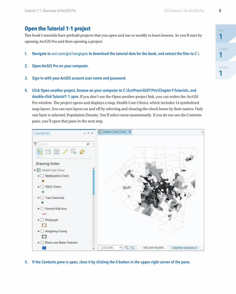
4. Click Open another project, browse on your computer to C:\EsriPress\GIST1Pro\Chapter1\Tutorials, and double-click Tutorial1-1.aprx. If you don’t see the Open another project link, you can widen the ArcGIS
Pro window. The project opens and displays a map, Health Care Clinics, which includes 14 symbolized
map layers. You can turn layers on and off by selecting and clearing the check boxes by their names. Only
one layer is selected, Population Density. You’ll select more momentarily. If you do not see the Contents
pane, you’ll open that pane in the next step.
5. If the Contents pane is open, close it by clicking the X button in the upper-right corner of the pane.
Part
1Chapter
1Tutorial
1
6 Chapter 1: The ArcGIS platformGIS Tutorial 1 for ArcGIS Pro
6. On the View tab in the Windows group, click Contents to open the Contents pane. The Contents pane
normally docks on the left. Optionally, you can float any pane (you will open several other panes later in
this chapter) by right-clicking the top of the pane and clicking Float or by clicking and dragging the top of
the pane outward. You can experiment right-clicking the top of the pane and clicking Dock to redock the
Contents pane on the left.
7. On the Map tab in the Navigate group, click the Full Extent button . Clicking the Full Extent button
zooms the map to the full extent of the data in the view, if the view is not already displayed that way. If the
map was zoomed into a small area, clicking the Full Extent button would display the entire map.
8. On the Project tab, click Save As, navigate to Chapter1\Tutorials, and save as Tutorial1-1YourName.aprx (substitute your name for YourName). You’ll generally save provided projects this way, so that if you
make a major mistake, you can start again with the original project.
Add and remove a basemapA basemap is a layer that helps orient the map user to the location. Map designers place additional
feature classes on top of a basemap to provide specific information for visualization, analysis, or solving
a problem. Although you can create your own basemap, Esri provides the basemaps that you’ll use in this
book as map web services from the Esri web portal, ArcGIS Online. By default, new projects created using
ArcGIS Pro have the topographic basemap added to the bottom of the Contents pane. Additional base-
maps are available.
1. On the Map tab in the Layer group, click Basemap. You will see a variety of basemaps. Many of the maps
you’ll build in this book will use the Light Gray Canvas basemap because you’ll reserve color for feature
classes that are the subject of the map. Basemaps in the background will provide spatial context for the
locations of subject features.
7
Part
1Chapter
1Tutorial
1
Tutorial 1-1: Overview of ArcGIS Pro GIS Tutorial 1 for ArcGIS Pro
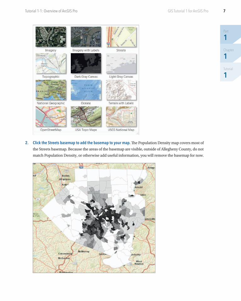
2. Click the Streets basemap to add the basemap to your map. The Population Density map covers most of
the Streets basemap. Because the areas of the basemap are visible, outside of Allegheny County, do not
match Population Density, or otherwise add useful information, you will remove the basemap for now.
Part
1Chapter
1Tutorial
1
8 Chapter 1: The ArcGIS platformGIS Tutorial 1 for ArcGIS Pro
3. If necessary, scroll to the bottom of the Contents pane, right-click World Street Map, and click Remove.
Turn layers on and off The order of drawing by ArcGIS Pro is from the bottom up in the Contents pane. So feature classes that cover
areas, such as Population Density, must go on the bottom, and other feature classes that could be covered up,
such as FQHC Clinic points, must go higher up and on top of other feature classes.
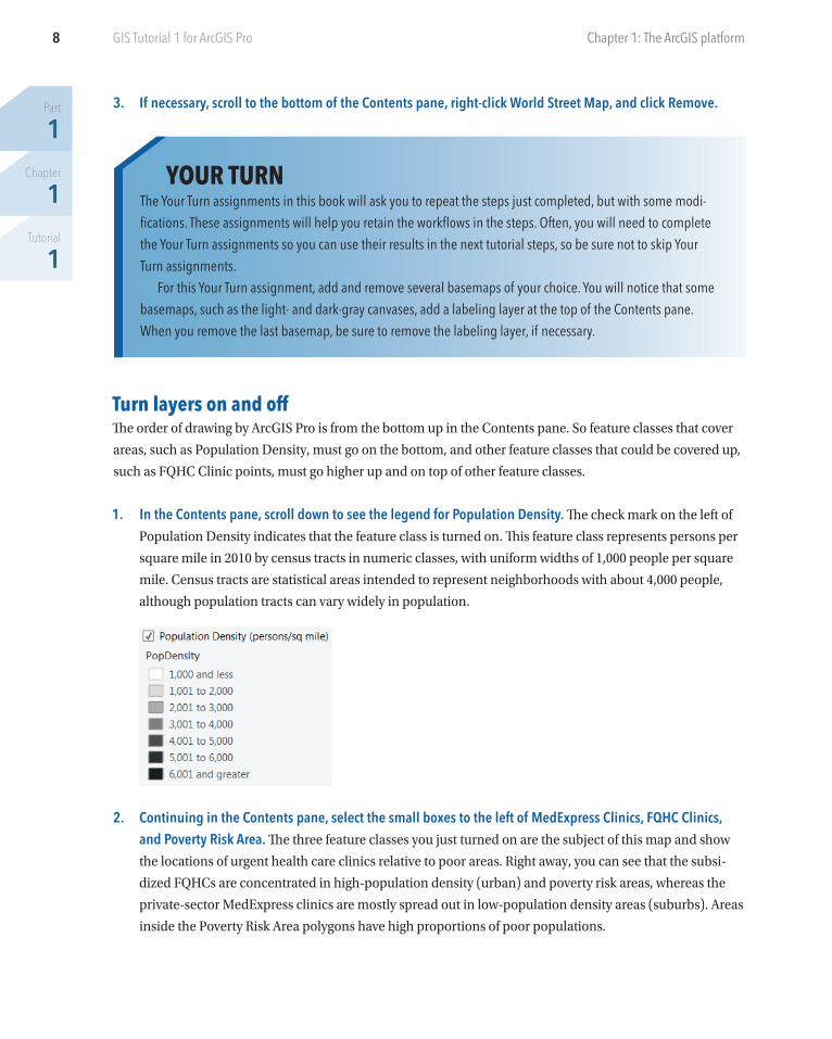
1. In the Contents pane, scroll down to see the legend for Population Density. The check mark on the left of
Population Density indicates that the feature class is turned on. This feature class represents persons per
square mile in 2010 by census tracts in numeric classes, with uniform widths of 1,000 people per square
mile. Census tracts are statistical areas intended to represent neighborhoods with about 4,000 people,
although population tracts can vary widely in population.
2. Continuing in the Contents pane, select the small boxes to the left of MedExpress Clinics, FQHC Clinics, and Poverty Risk Area. The three feature classes you just turned on are the subject of this map and show
the locations of urgent health care clinics relative to poor areas. Right away, you can see that the subsi-
dized FQHCs are concentrated in high-population density (urban) and poverty risk areas, whereas the
private-sector MedExpress clinics are mostly spread out in low-population density areas (suburbs). Areas
inside the Poverty Risk Area polygons have high proportions of poor populations.
YOUR TURNThe Your Turn assignments in this book will ask you to repeat the steps just completed, but with some modi-fications. These assignments will help you retain the workflows in the steps. Often, you will need to complete the Your Turn assignments so you can use their results in the next tutorial steps, so be sure not to skip Your Turn assignments.
For this Your Turn assignment, add and remove several basemaps of your choice. You will notice that some basemaps, such as the light- and dark-gray canvases, add a labeling layer at the top of the Contents pane. When you remove the last basemap, be sure to remove the labeling layer, if necessary.
9
Part
1Chapter
1Tutorial
1
Tutorial 1-1: Overview of ArcGIS Pro GIS Tutorial 1 for ArcGIS Pro
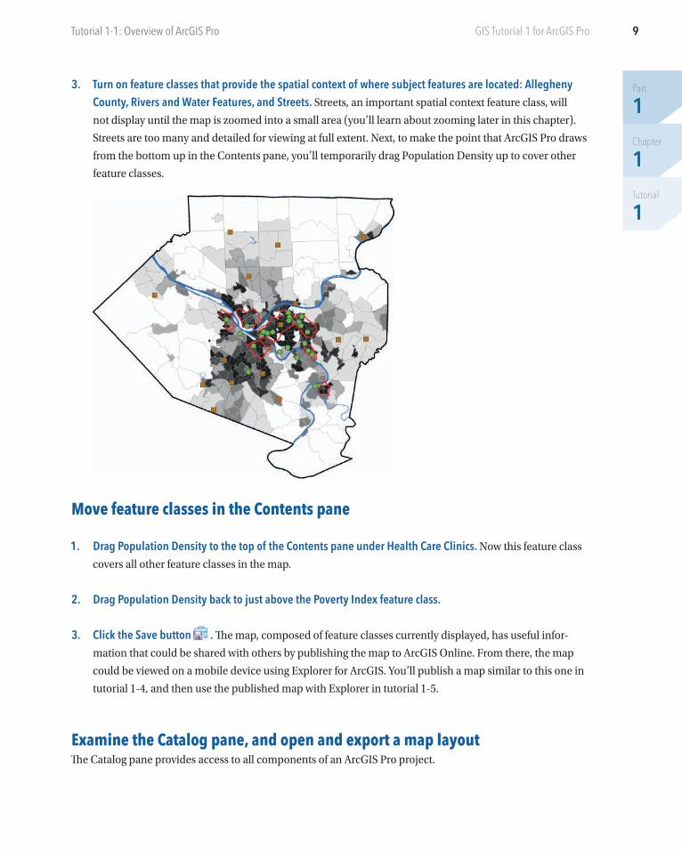
3. Turn on feature classes that provide the spatial context of where subject features are located: Allegheny County, Rivers and Water Features, and Streets. Streets, an important spatial context feature class, will
not display until the map is zoomed into a small area (you’ll learn about zooming later in this chapter).
Streets are too many and detailed for viewing at full extent. Next, to make the point that ArcGIS Pro draws
from the bottom up in the Contents pane, you’ll temporarily drag Population Density up to cover other
feature classes.
Move feature classes in the Contents pane
1. Drag Population Density to the top of the Contents pane under Health Care Clinics. Now this feature class
covers all other feature classes in the map.
2. Drag Population Density back to just above the Poverty Index feature class.
3. Click the Save button . The map, composed of feature classes currently displayed, has useful infor-
mation that could be shared with others by publishing the map to ArcGIS Online. From there, the map
could be viewed on a mobile device using Explorer for ArcGIS. You’ll publish a map similar to this one in
tutorial 1-4, and then use the published map with Explorer in tutorial 1-5.
Examine the Catalog pane, and open and export a map layout The Catalog pane provides access to all components of an ArcGIS Pro project.
Part
1Chapter
1Tutorial
1
10 Chapter 1: The ArcGIS platformGIS Tutorial 1 for ArcGIS Pro
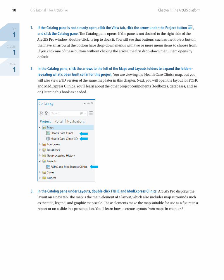
1. If the Catalog pane is not already open, click the View tab, click the arrow under the Project button , and click the Catalog pane. The Catalog pane opens. If the pane is not docked to the right side of the
ArcGIS Pro window, double-click its top to dock it. You will see that buttons, such as the Project button,
that have an arrow at the bottom have drop-down menus with two or more menu items to choose from.
If you click one of these buttons without clicking the arrow, the first drop-down menu item opens by
default.
2. In the Catalog pane, click the arrows to the left of the Maps and Layouts folders to expand the folders—revealing what’s been built so far for this project. You are viewing the Health Care Clinics map, but you
will also view a 3D version of the same map later in this chapter. Next, you will open the layout for FQHC
and MedExpress Clinics. You’ll learn about the other project components (toolboxes, databases, and so
on) later in this book as needed.
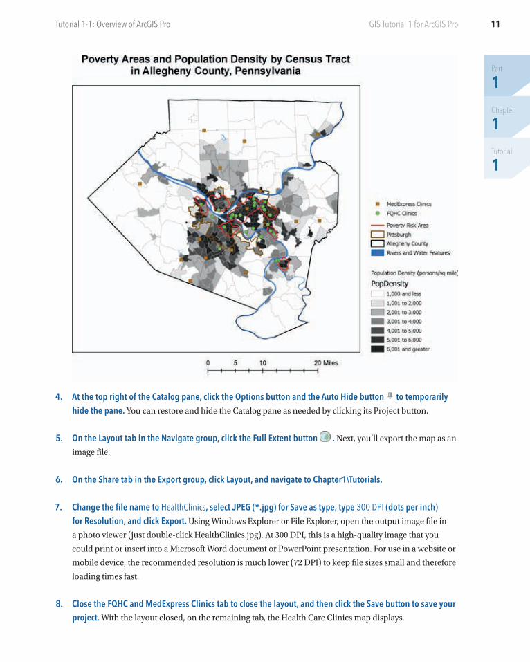
3. In the Catalog pane under Layouts, double-click FQHC and MedExpress Clinics. ArcGIS Pro displays the
layout on a new tab. The map is the main element of a layout, which also includes map surrounds such
as the title, legend, and graphic map scale. These elements make the map suitable for use as a figure in a
report or on a slide in a presentation. You’ll learn how to create layouts from maps in chapter 3.
11
Part
1Chapter
1Tutorial
1
Tutorial 1-1: Overview of ArcGIS Pro GIS Tutorial 1 for ArcGIS Pro
4. At the top right of the Catalog pane, click the Options button and the Auto Hide button to temporarily hide the pane. You can restore and hide the Catalog pane as needed by clicking its Project button.
5. On the Layout tab in the Navigate group, click the Full Extent button . Next, you’ll export the map as an
image file.
6. On the Share tab in the Export group, click Layout, and navigate to Chapter1\Tutorials.
7. Change the file name to HealthClinics, select JPEG (*.jpg) for Save as type, type 300 DPI (dots per inch) for Resolution, and click Export. Using Windows Explorer or File Explorer, open the output image file in
a photo viewer (just double-click HealthClinics.jpg). At 300 DPI, this is a high-quality image that you
could print or insert into a Microsoft Word document or PowerPoint presentation. For use in a website or
mobile device, the recommended resolution is much lower (72 DPI) to keep file sizes small and therefore
loading times fast.
8. Close the FQHC and MedExpress Clinics tab to close the layout, and then click the Save button to save your project. With the layout closed, on the remaining tab, the Health Care Clinics map displays.
Part
1Chapter
1Tutorial
1
12 Chapter 1: The ArcGIS platformGIS Tutorial 1 for ArcGIS Pro
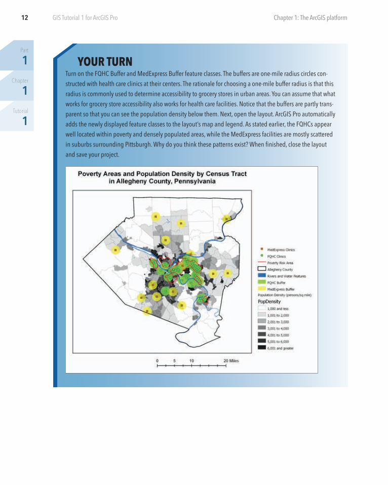
YOUR TURNTurn on the FQHC Buffer and MedExpress Buffer feature classes. The buffers are one-mile radius circles con-structed with health care clinics at their centers. The rationale for choosing a one-mile buffer radius is that this radius is commonly used to determine accessibility to grocery stores in urban areas. You can assume that what works for grocery store accessibility also works for health care facilities. Notice that the buffers are partly trans-parent so that you can see the population density below them. Next, open the layout. ArcGIS Pro automatically adds the newly displayed feature classes to the layout’s map and legend. As stated earlier, the FQHCs appear well located within poverty and densely populated areas, while the MedExpress facilities are mostly scattered in suburbs surrounding Pittsburgh. Why do you think these patterns exist? When finished, close the layout and save your project.
13
Part
1Chapter
1Tutorial
2
GIS Tutorial 1 for ArcGIS Pro
Tutorial 1-2: Navigate ArcGIS ProMap reading in GIS depends on varying location and scale (where and how far you are zoomed in) and using
the attribute data of spatial features. You can zoom in to any part of a map, drag (pan) the map to a different
location, and zoom back out. You can set some feature classes to display only when they are zoomed in to a
certain scale and beyond, such as streets, and you can clear the display for other feature classes. You can go to
preset locations and scales using spatial bookmarks. You can read the attribute data of any feature by clicking
the feature to get a pop-up window. Last, you can search for features by using attribute values such as the
name of a street.
Open the Tutorial 1-2 project
1. Click the Project tab.
2. Click Open and browse to Chapter1\Tutorials.
3. Open Tutorial1-2.aprx, and save the tutorial as Tutorial1-2YourName.aprx in Chapter1\Tutorials.
4. Click Full Extent to zoom the map.
Use a pop-up window
1. Click the Map tab on the ribbon.
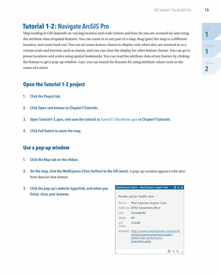
2. On the map, click the MedExpress Clinic farthest to the left (west). A pop-up window appears with attri-
bute data for that feature.
3. Click the pop-up’s website hyperlink, and when you finish, close your browser.
Part
1Chapter
1Tutorial
2
14 Chapter 1: The ArcGIS platformGIS Tutorial 1 for ArcGIS Pro
4. Drag the pop-up away from your map.
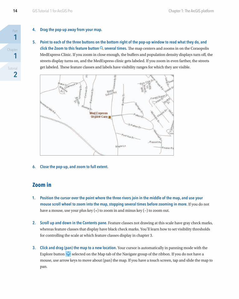
5. Point to each of the three buttons on the bottom right of the pop-up window to read what they do, and click the Zoom to this feature button several times. The map centers and zooms in on the Coraopolis
MedExpress Clinic. If you zoom in close enough, the buffers and population density displays turn off, the
streets display turns on, and the MedExpress clinic gets labeled. If you zoom in even farther, the streets
get labeled. These feature classes and labels have visibility ranges for which they are visible.
6. Close the pop-up, and zoom to full extent.
Zoom in
1. Position the cursor over the point where the three rivers join in the middle of the map, and use your mouse scroll wheel to zoom into the map, stopping several times before zooming in more. If you do not
have a mouse, use your plus key (+) to zoom in and minus key (−) to zoom out.
2. Scroll up and down in the Contents pane. Feature classes not drawing at this scale have gray check marks,
whereas feature classes that display have black check marks. You’ll learn how to set visibility thresholds
for controlling the scale at which feature classes display in chapter 3.
3. Click and drag (pan) the map to a new location. Your cursor is automatically in panning mode with the
Explore button selected on the Map tab of the Navigate group of the ribbon. If you do not have a
mouse, use arrow keys to move about (pan) the map. If you have a touch screen, tap and slide the map to
pan.
15
Part
1Chapter
1Tutorial
2
Tutorial 1-2: Navigate ArcGIS Pro GIS Tutorial 1 for ArcGIS Pro
4. On the Map tab in the Navigate group, click the Previous Extent button a couple of times. Clicking this
button moves you back through the sequence of zooming steps you have taken. There’s also a Next Extent
button for the other direction.
5. Zoom to full extent.
Zoom into a raster feature classAll but one of the map layers in the Health Care Clinics map, Poverty Index, have vector data, made up of
points (for example, MedExpress Clinics), lines (streets), or polygons (closed areas such as the census tracts
that display population density). GIS does not store images of vector feature classes but instead draws them
on the fly from stored points and drawing instructions, including how the map designer wants them symbol-
ized (such as the brown square symbols for MedExpress clinics). Rasters, however, are stored using image
data formats (for example, JPEG and TIFF) and rendered pixel by pixel as stored. However, as a map designer,
you can change the colors of certain kinds of rasters that are not pictures, such as the Poverty Index that you
are about to use.
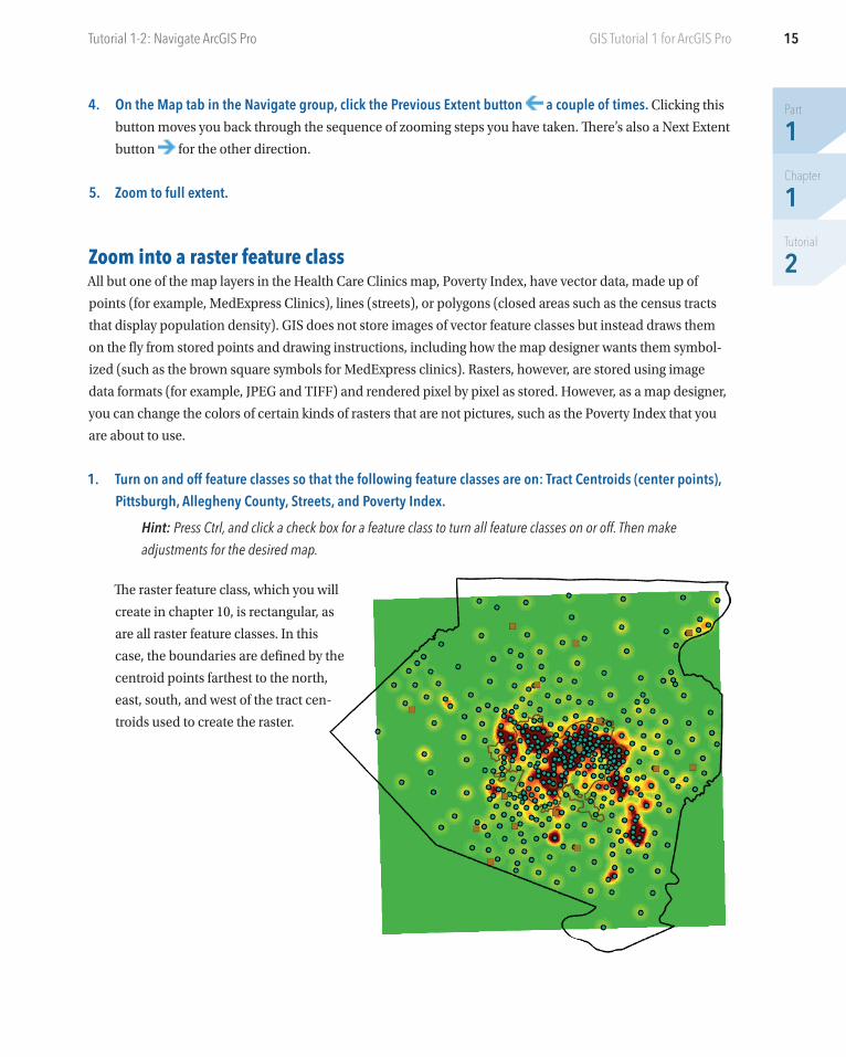
1. Turn on and off feature classes so that the following feature classes are on: Tract Centroids (center points), Pittsburgh, Allegheny County, Streets, and Poverty Index.
Hint: Press Ctrl, and click a check box for a feature class to turn all feature classes on or off. Then make adjustments for the desired map.
The raster feature class, which you will
create in chapter 10, is rectangular, as
are all raster feature classes. In this
case, the boundaries are defined by the
centroid points farthest to the north,
east, south, and west of the tract cen-
troids used to create the raster.
Part
1Chapter
1Tutorial
2
16 Chapter 1: The ArcGIS platformGIS Tutorial 1 for ArcGIS Pro
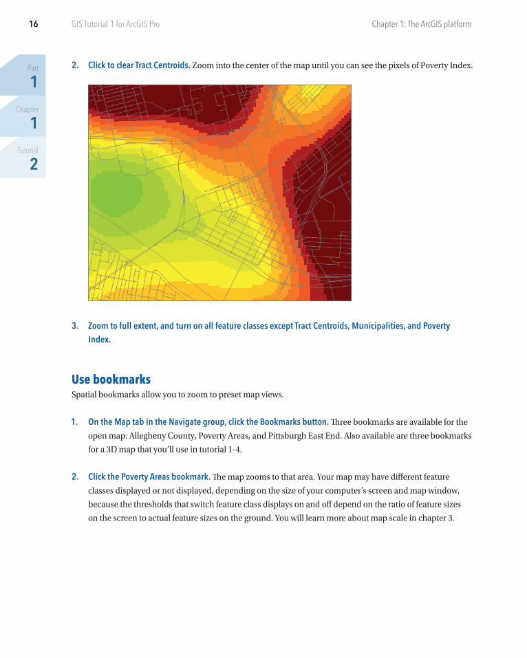
2. Click to clear Tract Centroids. Zoom into the center of the map until you can see the pixels of Poverty Index.
3. Zoom to full extent, and turn on all feature classes except Tract Centroids, Municipalities, and Poverty Index.
Use bookmarksSpatial bookmarks allow you to zoom to preset map views.
1. On the Map tab in the Navigate group, click the Bookmarks button. Three bookmarks are available for the
open map: Allegheny County, Poverty Areas, and Pittsburgh East End. Also available are three bookmarks
for a 3D map that you’ll use in tutorial 1-4.
2. Click the Poverty Areas bookmark. The map zooms to that area. Your map may have different feature
classes displayed or not displayed, depending on the size of your computer’s screen and map window,
because the thresholds that switch feature class displays on and off depend on the ratio of feature sizes
on the screen to actual feature sizes on the ground. You will learn more about map scale in chapter 3.
17
Part
1Chapter
1Tutorial
2
Tutorial 1-2: Navigate ArcGIS Pro GIS Tutorial 1 for ArcGIS Pro
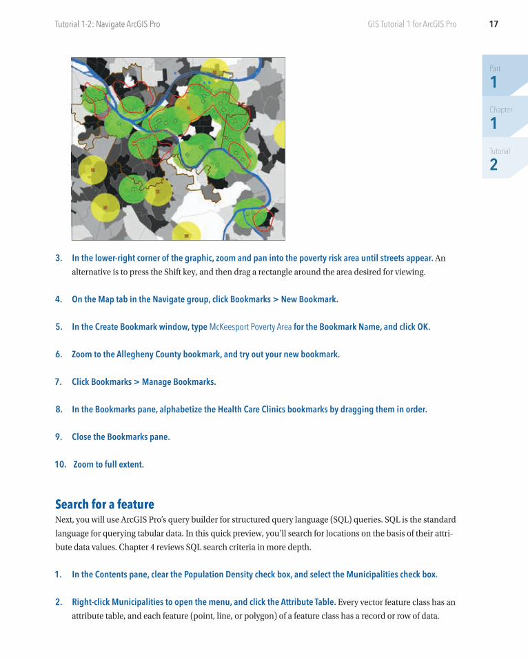
3. In the lower-right corner of the graphic, zoom and pan into the poverty risk area until streets appear. An
alternative is to press the Shift key, and then drag a rectangle around the area desired for viewing.
4. On the Map tab in the Navigate group, click Bookmarks > New Bookmark.
5. In the Create Bookmark window, type McKeesport Poverty Area for the Bookmark Name, and click OK.
6. Zoom to the Allegheny County bookmark, and try out your new bookmark.
7. Click Bookmarks > Manage Bookmarks.
8. In the Bookmarks pane, alphabetize the Health Care Clinics bookmarks by dragging them in order.
9. Close the Bookmarks pane.
10. Zoom to full extent.
Search for a featureNext, you will use ArcGIS Pro’s query builder for structured query language (SQL) queries. SQL is the standard
language for querying tabular data. In this quick preview, you’ll search for locations on the basis of their attri-
bute data values. Chapter 4 reviews SQL search criteria in more depth.
1. In the Contents pane, clear the Population Density check box, and select the Municipalities check box.
2. Right-click Municipalities to open the menu, and click the Attribute Table. Every vector feature class has an
attribute table, and each feature (point, line, or polygon) of a feature class has a record or row of data.
Part
1Chapter
1Tutorial
2
18 Chapter 1: The ArcGIS platformGIS Tutorial 1 for ArcGIS Pro
3. On the Map tab in the Selection group, click the Select by Attributes button . The Geoprocessing pane
opens. Municipalities is already selected as the input feature class.
4. Click the Add Clause button .
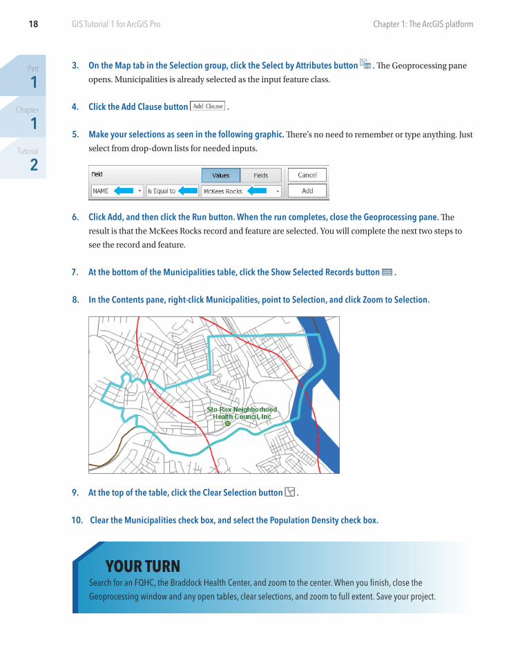
5. Make your selections as seen in the following graphic. There’s no need to remember or type anything. Just
select from drop-down lists for needed inputs.
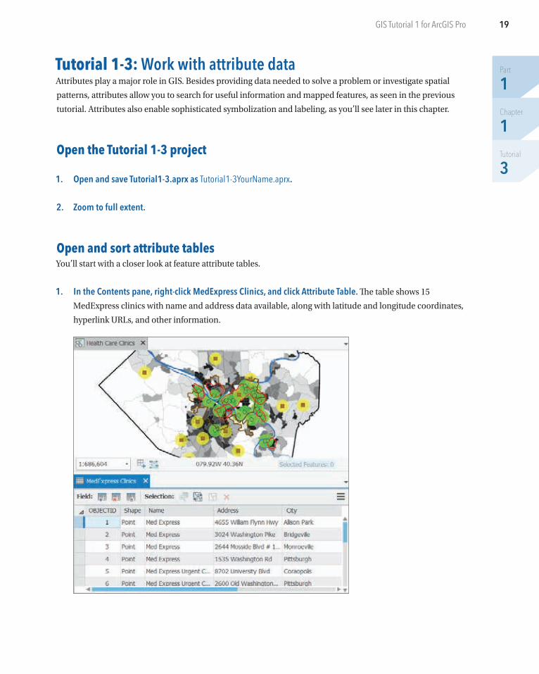
6. Click Add, and then click the Run button. When the run completes, close the Geoprocessing pane. The
result is that the McKees Rocks record and feature are selected. You will complete the next two steps to
see the record and feature.
7. At the bottom of the Municipalities table, click the Show Selected Records button .
8. In the Contents pane, right-click Municipalities, point to Selection, and click Zoom to Selection.
9. At the top of the table, click the Clear Selection button .
10. Clear the Municipalities check box, and select the Population Density check box.
YOUR TURNSearch for an FQHC, the Braddock Health Center, and zoom to the center. When you finish, close the Geoprocessing window and any open tables, clear selections, and zoom to full extent. Save your project.
19
Part
1Chapter
1Tutorial
3
GIS Tutorial 1 for ArcGIS Pro
Tutorial 1-3: Work with attribute data Attributes play a major role in GIS. Besides providing data needed to solve a problem or investigate spatial
patterns, attributes allow you to search for useful information and mapped features, as seen in the previous
tutorial. Attributes also enable sophisticated symbolization and labeling, as you’ll see later in this chapter.
Open the Tutorial 1-3 project
1. Open and save Tutorial1-3.aprx as Tutorial1-3YourName.aprx.
2. Zoom to full extent.
Open and sort attribute tablesYou’ll start with a closer look at feature attribute tables.
1. In the Contents pane, right-click MedExpress Clinics, and click Attribute Table. The table shows 15
MedExpress clinics with name and address data available, along with latitude and longitude coordinates,
hyperlink URLs, and other information.
Part
1Chapter
1Tutorial
3
20 Chapter 1: The ArcGIS platformGIS Tutorial 1 for ArcGIS Pro
2. If necessary, adjust the column widths in the table so that you can read the full cell contents by position-ing the cursor between columns on the top row with column names until the cursor becomes a two-headed arrow, and then click and adjust by moving left or right. You can also double-click when you see
the two-headed arrow to automatically resize the column widths.
3. In the table, drag the Website column after ZIP Code.
4. Right-click the City column heading, and click Sort Ascending. Now, records are sorted by city name. If you
scroll down, you can see that eight of the MedExpress clinics are in Pittsburgh.
5. Right-click City, and click Custom Sort. With this option, you can sort more than one column. Next, you’ll
sort by city and then an address within city.
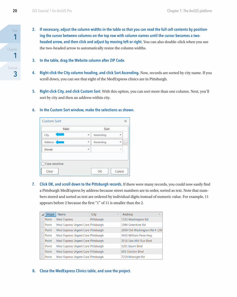
6. In the Custom Sort window, make the selections as shown.
7. Click OK, and scroll down to the Pittsburgh records. If there were many records, you could now easily find
a Pittsburgh MedExpress by address because street numbers are in order, sorted as text. Note that num-
bers stored and sorted as text are ordered by individual digits instead of numeric value. For example, 11
appears before 2 because the first “1” of 11 is smaller than the 2.
8. Close the MedExpress Clinics table, and save the project.
21
Part
1Chapter
1Tutorial
3
Tutorial 1-3: Work with attribute data GIS Tutorial 1 for ArcGIS Pro
YOUR TURNOpen the attribute table for Population Density. GeoID is a geocode (unique identifier or primary key) assigned to census tracts by the US Census Bureau. Attributes of interest are Pop (2010 population), Area (square miles), and PopDensity = Pop/Area (persons per square mile). Using sorting, find the tract with the highest population density, 29,835 persons per square mile. Select that record (click the gray square on its left) and find it on the map (cyan area in the middle of the map). To get a better look at the selected census tract, zoom partway to that polygon, to the extent that Population Density’s display stays on. Click the Clear Selection button at the top, middle of the table. Close the table when finished, and zoom to full extent.
Work with the field view of an attribute tableYou can change the order of attributes (columns) in a table, change the names and displayed names (aliases)
of attributes, see the data type of attributes, and make only certain attributes visible to the user—all using the
field view of a table.
1. In the Contents pane, turn on Tract Centroids.
2. Open this feature class’s attribute table. Four attributes of this feature class are indicators of poverty:
FemHseHld is the number of female-headed households with children, Unemp is the number of unem-
ployed persons age 16 and older who are in the workforce, PopNHighSc is the population age 24 or older
that did not attain a high school education, and PopPov is the number of persons below the income
poverty level.
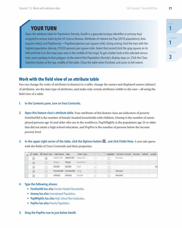
3. In the upper-right corner of the table, click the Options button , and click Fields View. A new tab opens
with the fields of Tract Centroids and their properties.
4. Type the following aliases:• FemHseHld has alias Female Headed Households.• Unemp has alias Unemployed Population.• PopNHighSc has alias High School Non-Graduates.• PopPov has alias Poverty Population.
5. Drag the PopPov row to just below GeoID.
Part
1Chapter
1Tutorial
3
22 Chapter 1: The ArcGIS platformGIS Tutorial 1 for ArcGIS Pro
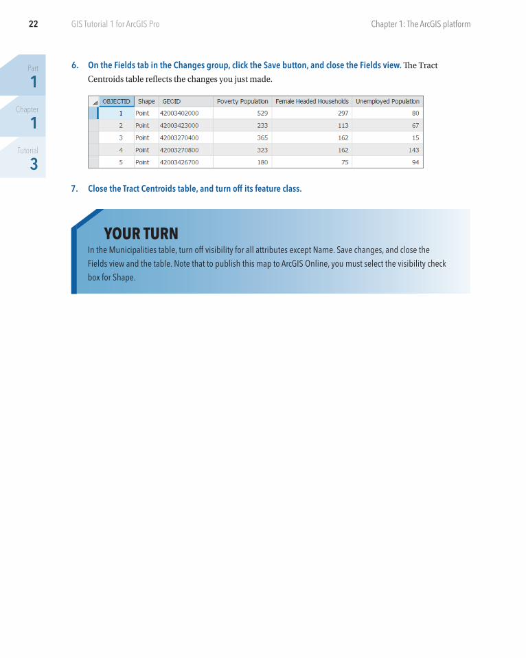
6. On the Fields tab in the Changes group, click the Save button, and close the Fields view. The Tract
Centroids table reflects the changes you just made.
7. Close the Tract Centroids table, and turn off its feature class.
YOUR TURNIn the Municipalities table, turn off visibility for all attributes except Name. Save changes, and close the Fields view and the table. Note that to publish this map to ArcGIS Online, you must select the visibility check box for Shape.
23
Part
1Chapter
1Tutorial
3
Tutorial 1-3: Work with attribute data GIS Tutorial 1 for ArcGIS Pro
Select records and features of a map feature class
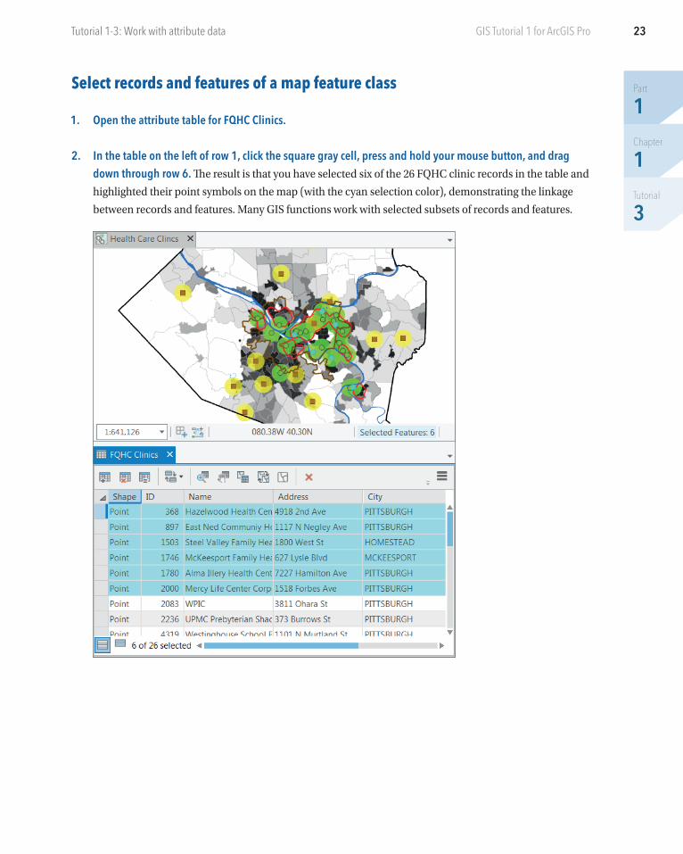
1. Open the attribute table for FQHC Clinics.
2. In the table on the left of row 1, click the square gray cell, press and hold your mouse button, and drag down through row 6. The result is that you have selected six of the 26 FQHC clinic records in the table and
highlighted their point symbols on the map (with the cyan selection color), demonstrating the linkage
between records and features. Many GIS functions work with selected subsets of records and features.
Part
1Chapter
1Tutorial
3
24 Chapter 1: The ArcGIS platformGIS Tutorial 1 for ArcGIS Pro
3. At the top of the attribute table, click the Clear Selection button.
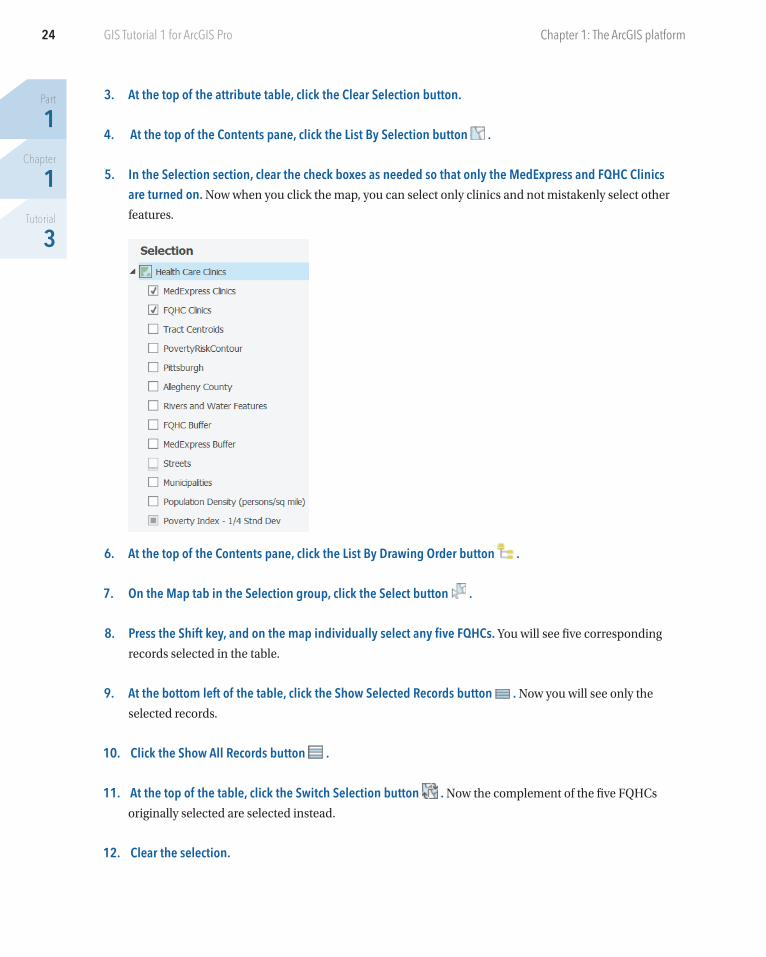
4. At the top of the Contents pane, click the List By Selection button .
5. In the Selection section, clear the check boxes as needed so that only the MedExpress and FQHC Clinics are turned on. Now when you click the map, you can select only clinics and not mistakenly select other
features.
6. At the top of the Contents pane, click the List By Drawing Order button .
7. On the Map tab in the Selection group, click the Select button .
8. Press the Shift key, and on the map individually select any five FQHCs. You will see five corresponding
records selected in the table.
9. At the bottom left of the table, click the Show Selected Records button . Now you will see only the
selected records.
10. Click the Show All Records button .
11. At the top of the table, click the Switch Selection button . Now the complement of the five FQHCs
originally selected are selected instead.
12. Clear the selection.
25
Part
1Chapter
1Tutorial
3
Tutorial 1-3: Work with attribute data GIS Tutorial 1 for ArcGIS Pro
Get summary statistics using a toolArcGIS has hundreds of tools, each with inputs and algorithms that transform the inputs into outputs. You
can easily search for a tool, fill out its form to specify inputs, set parameters that control algorithm behavior,
and name and specify where to store outputs. The Summary Statistics tool computes common statistics (for
example, minimum, maximum, mean, and standard deviation) and writes results to a new table. Obtaining
and studying summary statistics for attributes of interest are among the first steps of any analysis.
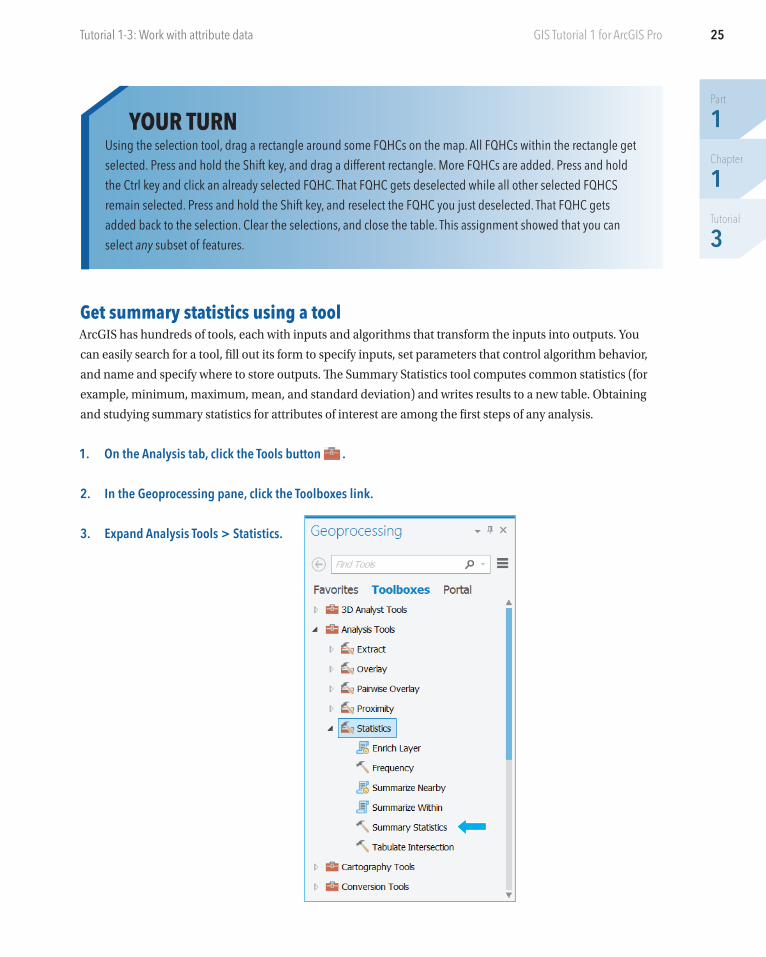
1. On the Analysis tab, click the Tools button .
2. In the Geoprocessing pane, click the Toolboxes link.
3. Expand Analysis Tools > Statistics.
YOUR TURNUsing the selection tool, drag a rectangle around some FQHCs on the map. All FQHCs within the rectangle get selected. Press and hold the Shift key, and drag a different rectangle. More FQHCs are added. Press and hold the Ctrl key and click an already selected FQHC. That FQHC gets deselected while all other selected FQHCS remain selected. Press and hold the Shift key, and reselect the FQHC you just deselected. That FQHC gets added back to the selection. Clear the selections, and close the table. This assignment showed that you can select any subset of features.
Part
1Chapter
1Tutorial
3
26 Chapter 1: The ArcGIS platformGIS Tutorial 1 for ArcGIS Pro
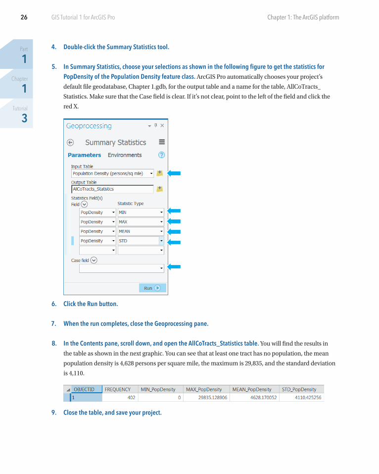
4. Double-click the Summary Statistics tool.
5. In Summary Statistics, choose your selections as shown in the following figure to get the statistics for PopDensity of the Population Density feature class. ArcGIS Pro automatically chooses your project’s
default file geodatabase, Chapter 1.gdb, for the output table and a name for the table, AllCoTracts_
Statistics. Make sure that the Case field is clear. If it’s not clear, point to the left of the field and click the
red X.
6. Click the Run button.
7. When the run completes, close the Geoprocessing pane.
8. In the Contents pane, scroll down, and open the AllCoTracts_Statistics table. You will find the results in
the table as shown in the next graphic. You can see that at least one tract has no population, the mean
population density is 4,628 persons per square mile, the maximum is 29,835, and the standard deviation
is 4,110.
9. Close the table, and save your project.
27
Part
1Chapter
1Tutorial
4
GIS Tutorial 1 for ArcGIS Pro
Tutorial 1-4: Symbolize mapsThis tutorial will introduce you to symbolizing maps. You’ll change the point symbol of feature classes, includ-
ing type of symbol, color, and size. You’ll label features with their name, choose a font and size, and place a
halo around labels to improve readability. You’ll add map feature classes to the map from your hard drive,
symbolize them, and remove them from your map. Finally, you’ll add aerial imagery to your map from ArcGIS
Online as a map service. Chapter 2 goes into depth on symbolization.
Open the Tutorial 1-4 project
1. Open and save Tutorial1-4.aprx as Tutorial1-4YourName.aprx.
2. Use the Allegheny County bookmark.
Symbolize feature classesNow take a look at how ArcGIS Pro lets you choose symbols for vector feature classes.
1. In the Contents pane, right-click FQHC Clinics, and click Symbology. The Symbology pane opens. Here you
see that symbology is Single Symbol, the current symbol is a green circle with a dark-gray boundary, and
you see fields for typing a new label and description for the Contents pane and layout legend if desired.
2. In the Symbology pane, click the current symbol (the green circle). A gallery of symbols opens.
3. Click Circle 4. The FQHC symbols on the map immediately change to Circle 4.
4. At the top of the Symbology pane, click Properties.
5. In the Symbology pane under Appearance, change the color to Leaf Green (seventh column, fifth row), change size to 8 pt, click Apply, and close the Symbology pane.
Part
1Chapter
1Tutorial
4
28 Chapter 1: The ArcGIS platformGIS Tutorial 1 for ArcGIS Pro
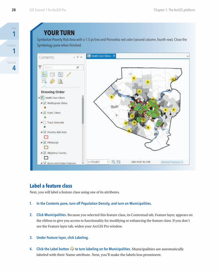
YOUR TURNSymbolize Poverty Risk Area with a 1.5 pt line and Poinsettia red color (second column, fourth row). Close the Symbology pane when finished.
Label a feature classNext, you will label a feature class using one of its attributes.
1. In the Contents pane, turn off Population Density, and turn on Municipalities.
2. Click Municipalities. Because you selected this feature class, its Contextual tab, Feature layer, appears on
the ribbon to give you access to functionality for modifying or enhancing the feature class. If you don’t
see the Feature layer tab, widen your ArcGIS Pro window.
3. Under Feature layer, click Labeling.
4. Click the Label button to turn labeling on for Municipalities. Municipalities are automatically
labeled with their Name attribute. Next, you’ll make the labels less prominent.
29
Part
1Chapter
1Tutorial
4
Tutorial 1-4: Symbolize maps GIS Tutorial 1 for ArcGIS Pro
5. Click the Text Symbol button , change the font to size 7, and select a dark-gray color. If you don’t see
the Text Symbol button, make the ArcGIS Pro window wider.
6. Click the Text Symbol button again, and in the lower-right corner of the text window, click the Dialog Launcher button .
7. In the Label Class pane, scroll down if necessary, click Halo > the white square for Halo, symbol > No Color for Outline color, and for Halo size type 0.75 pt.
8. Click Apply, and close the Label Class panel. In effect, the halo erases nearby features so that the full label
is easy to read.
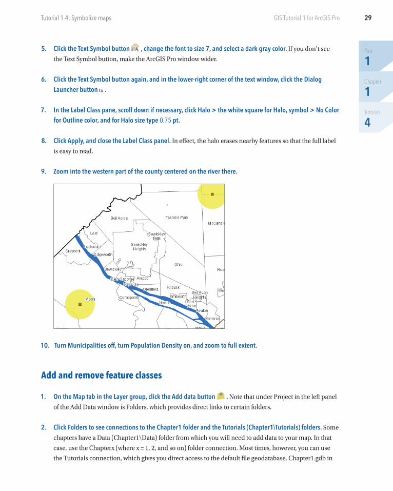
9. Zoom into the western part of the county centered on the river there.
10. Turn Municipalities off, turn Population Density on, and zoom to full extent.
Add and remove feature classes
1. On the Map tab in the Layer group, click the Add data button . Note that under Project in the left panel
of the Add Data window is Folders, which provides direct links to certain folders.
2. Click Folders to see connections to the Chapter1 folder and the Tutorials (Chapter1\Tutorials) folders. Some
chapters have a Data (Chapter1\Data) folder from which you will need to add data to your map. In that
case, use the Chapterx (where x = 1, 2, and so on) folder connection. Most times, however, you can use
the Tutorials connection, which gives you direct access to the default file geodatabase, Chapter1.gdb in
Part
1Chapter
1Tutorial
4
30 Chapter 1: The ArcGIS platformGIS Tutorial 1 for ArcGIS Pro
this case. Note that if your project does not have a useful connection, you can always use the Computer
portion of the left panel of the Add Data pane and browse in the C or other letter drive to the location of
the needed data.
3. Double-click the Tutorials connection, double-click Chapter1.gdb, and double-click Parks. Doing that adds
Parks to the Contents pane of your map and displays the layer with an arbitrary color fill.
4. In the Contents pane, click the Parks symbol (rectangle under Parks) to open the Symbology pane.
5. In the Symbology pane, in the Gallery, scroll down, and double-click the Park symbol (light green with no boundary).
6. Close the Symbology pane.
7. Turn off the buffer and Population Density feature classes to get a better look at Parks.
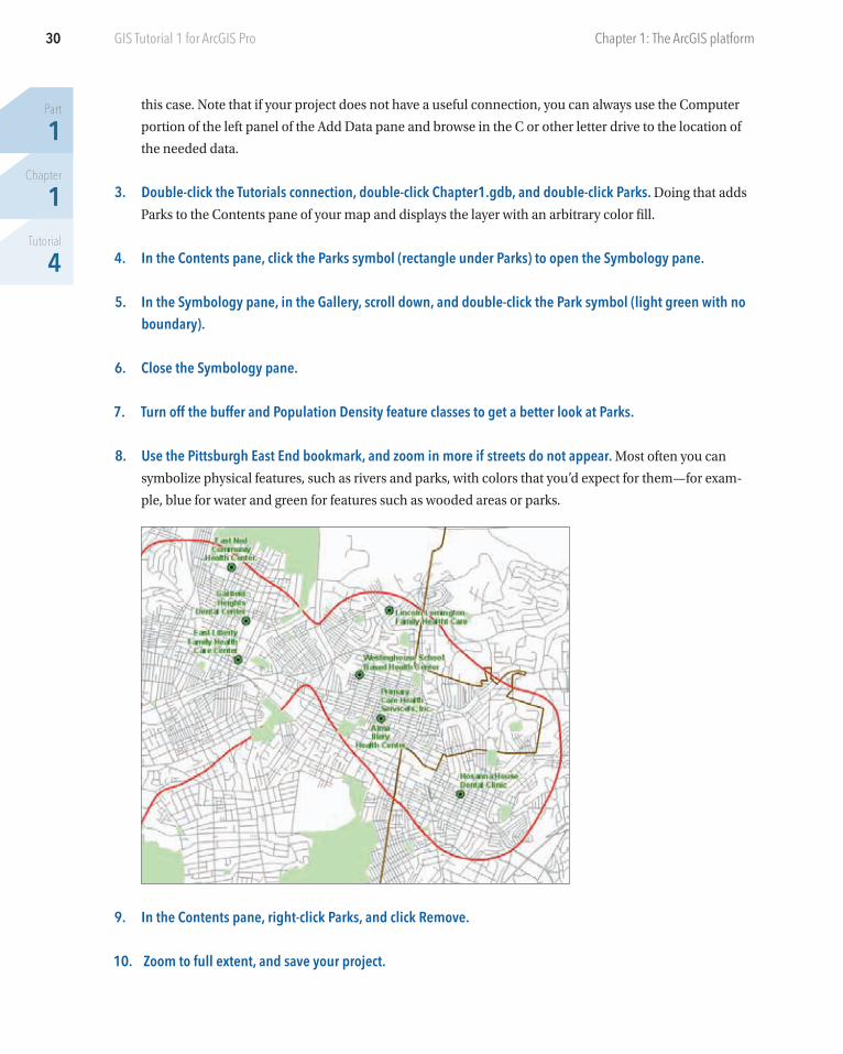
8. Use the Pittsburgh East End bookmark, and zoom in more if streets do not appear. Most often you can
symbolize physical features, such as rivers and parks, with colors that you’d expect for them—for exam-
ple, blue for water and green for features such as wooded areas or parks.
9. In the Contents pane, right-click Parks, and click Remove.
10. Zoom to full extent, and save your project.
31
Part
1Chapter
1Tutorial
4
Tutorial 1-4: Symbolize maps GIS Tutorial 1 for ArcGIS Pro
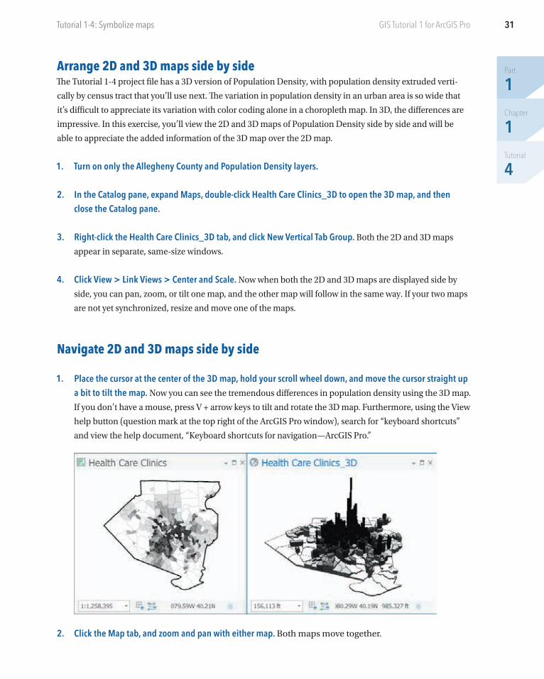
Arrange 2D and 3D maps side by sideThe Tutorial 1-4 project file has a 3D version of Population Density, with population density extruded verti-
cally by census tract that you’ll use next. The variation in population density in an urban area is so wide that
it’s difficult to appreciate its variation with color coding alone in a choropleth map. In 3D, the differences are
impressive. In this exercise, you’ll view the 2D and 3D maps of Population Density side by side and will be
able to appreciate the added information of the 3D map over the 2D map.
1. Turn on only the Allegheny County and Population Density layers.
2. In the Catalog pane, expand Maps, double-click Health Care Clinics_3D to open the 3D map, and then close the Catalog pane.
3. Right-click the Health Care Clinics_3D tab, and click New Vertical Tab Group. Both the 2D and 3D maps
appear in separate, same-size windows.
4. Click View > Link Views > Center and Scale. Now when both the 2D and 3D maps are displayed side by
side, you can pan, zoom, or tilt one map, and the other map will follow in the same way. If your two maps
are not yet synchronized, resize and move one of the maps.
Navigate 2D and 3D maps side by side
1. Place the cursor at the center of the 3D map, hold your scroll wheel down, and move the cursor straight up a bit to tilt the map. Now you can see the tremendous differences in population density using the 3D map.
If you don’t have a mouse, press V + arrow keys to tilt and rotate the 3D map. Furthermore, using the View
help button (question mark at the top right of the ArcGIS Pro window), search for “keyboard shortcuts”
and view the help document, “Keyboard shortcuts for navigation—ArcGIS Pro.”
2. Click the Map tab, and zoom and pan with either map. Both maps move together.
Part
1Chapter
1Tutorial
4
32 Chapter 1: The ArcGIS platformGIS Tutorial 1 for ArcGIS Pro
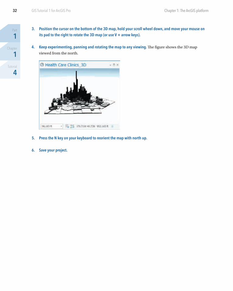
3. Position the cursor on the bottom of the 3D map, hold your scroll wheel down, and move your mouse on its pad to the right to rotate the 3D map (or use V + arrow keys).
4. Keep experimenting, panning and rotating the map to any viewing. The figure shows the 3D map
viewed from the north.
5. Press the N key on your keyboard to reorient the map with north up.
6. Save your project.
33
Part
1Chapter
1Tutorial
5
GIS Tutorial 1 for ArcGIS Pro
Tutorial 1-5: Publishing maps to ArcGIS OnlineGenerally, you’ll use ArcGIS Pro as your map authoring package. With feature classes prepared and added,
symbolization completed, and so on, you can share your interactive map with others. You can simply click a
button and publish your map to ArcGIS Online. Once online, you can modify your map’s configuration as well
as use many map navigation and query tools. You can keep your map private or share your map with a group
or publicly for anyone to view.
Share your map onlineMaps for publishing to ArcGIS Online must have a basemap added. Also, feature classes for publication
benefit from having a particular coordinate system (projection)—WGS 1984 Web Mercator Auxiliary Sphere—
which is the one used in ArcGIS Online. The maps for sharing in this chapter all have the Web Mercator
coordinates. Using this projection guarantees that feature classes will work online. Chapter 5 reviews map
coordinates and projections.
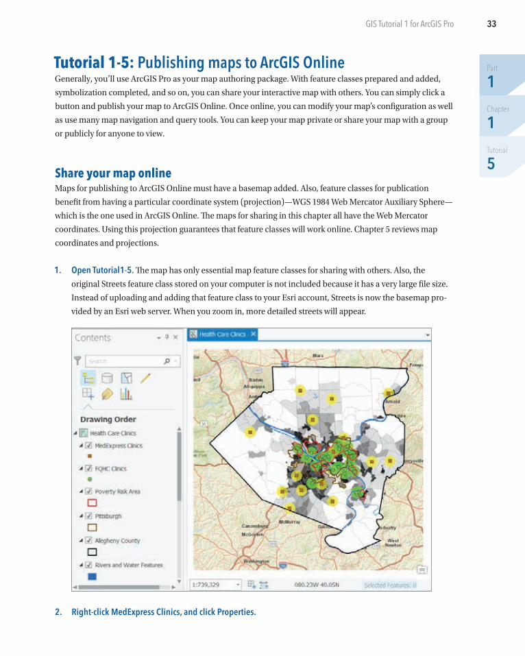
1. Open Tutorial1-5. The map has only essential map feature classes for sharing with others. Also, the
original Streets feature class stored on your computer is not included because it has a very large file size.
Instead of uploading and adding that feature class to your Esri account, Streets is now the basemap pro-
vided by an Esri web server. When you zoom in, more detailed streets will appear.
2. Right-click MedExpress Clinics, and click Properties.
Part
1Chapter
1Tutorial
5
34 Chapter 1: The ArcGIS platformGIS Tutorial 1 for ArcGIS Pro
3. In the Layer Properties: MedExpress Clinics window, click Source. In the table under Data Source, you will
see the Database row. The source is a feature class, MedExpress, stored in Chapter1.gdb, a file geodata-
base on your computer. You’ll upload MedExpress and other feature classes to your account in ArcGIS
Online.
4. Scroll down and expand Spatial Reference to see that the feature class’s projection is WGS 1984 Web Mercator Auxiliary Sphere.
5. Click Cancel.
6. Using steps 2–4, look at the source for World Street Map. An Esri website provides the ArcGIS map
service. The map service projection is Web Mercator.
7. On the Share tab in the Share As group, click the Web Map button .
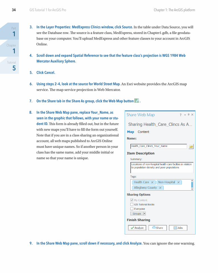
8. In the Share Web Map pane, replace Your_Name, as seen in the graphic that follows, with your name or stu-dent ID. This form is already filled out, but in the future
with new maps you’ll have to fill the form out yourself.
Note that if you are in a class sharing an organizational
account, all web maps published to ArcGIS Online
must have unique names. So if another person in your
class has the same name, add your middle initial or
name so that your name is unique.
9. In the Share Web Map pane, scroll down if necessary, and click Analyze. You can ignore the one warning.
35
Part
1Chapter
1Tutorial
5
Tutorial 1-5: Publishing maps to ArcGIS Online GIS Tutorial 1 for ArcGIS Pro
10. Click Share, and leave the Share Web Map pane open. Because you are logged into your ArcGIS account,
ArcGIS Pro knows where to publish your map and web layers; namely, to the My Content folder of your
ArcGIS Online account. Your map may take a few minutes to publish. When ArcGIS Pro finishes, you will
get a message that you successfully shared your web map.
Open your map in ArcGIS Online
1. In the Share Web Map pane, at the bottom, click Manage the web map to open ArcGIS Online in your web browser.
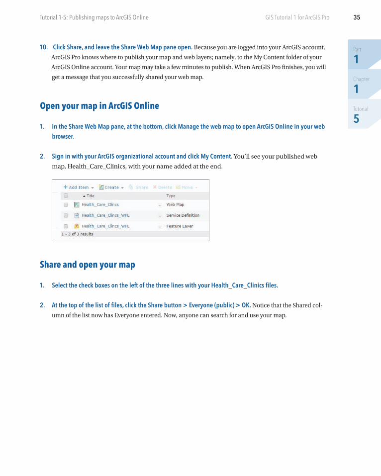
2. Sign in with your ArcGIS organizational account and click My Content. You’ll see your published web
map, Health_Care_Clinics, with your name added at the end.
Share and open your map
1. Select the check boxes on the left of the three lines with your Health_Care_Clinics files.
2. At the top of the list of files, click the Share button > Everyone (public) > OK. Notice that the Shared col-
umn of the list now has Everyone entered. Now, anyone can search for and use your map.
Part
1Chapter
1Tutorial
5
36 Chapter 1: The ArcGIS platformGIS Tutorial 1 for ArcGIS Pro
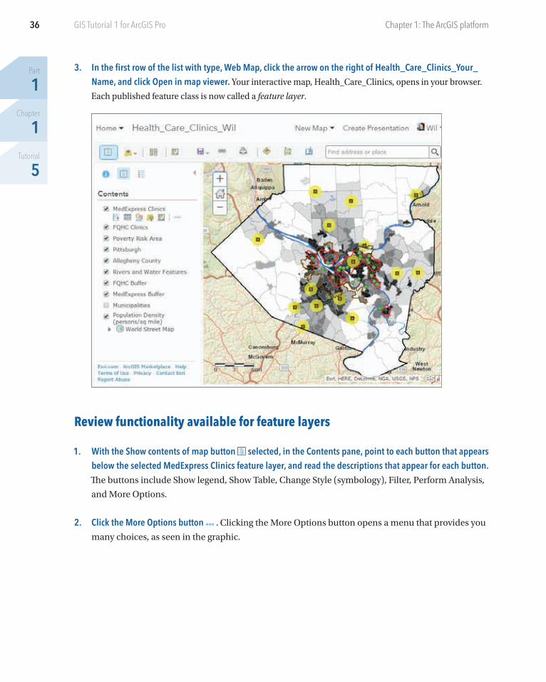
3. In the first row of the list with type, Web Map, click the arrow on the right of Health_Care_Clinics_Your_Name, and click Open in map viewer. Your interactive map, Health_Care_Clinics, opens in your browser.
Each published feature class is now called a feature layer.
Review functionality available for feature layers
1. With the Show contents of map button selected, in the Contents pane, point to each button that appears below the selected MedExpress Clinics feature layer, and read the descriptions that appear for each button. The buttons include Show legend, Show Table, Change Style (symbology), Filter, Perform Analysis,
and More Options.
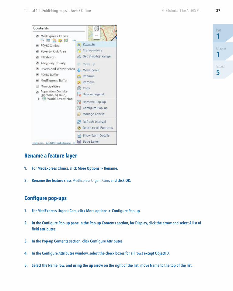
2. Click the More Options button . Clicking the More Options button opens a menu that provides you
many choices, as seen in the graphic.
37
Part
1Chapter
1Tutorial
5
Tutorial 1-5: Publishing maps to ArcGIS Online GIS Tutorial 1 for ArcGIS Pro
Rename a feature layer
1. For MedExpress Clinics, click More Options > Rename.
2. Rename the feature class MedExpress Urgent Care, and click OK.
Configure pop-ups
1. For MedExpress Urgent Care, click More options > Configure Pop-up.
2. In the Configure Pop-up pane in the Pop-up Contents section, for Display, click the arrow and select A list of field attributes.
3. In the Pop-up Contents section, click Configure Attributes.
4. In the Configure Attributes window, select the check boxes for all rows except ObjectID.
5. Select the Name row, and using the up arrow on the right of the list, move Name to the top of the list.
Part
1Chapter
1Tutorial
5
38 Chapter 1: The ArcGIS platformGIS Tutorial 1 for ArcGIS Pro
6. Move Hyperlink to the bottom of the list.
7. Select Latitude, change the format to 6 decimal places, and do the same for Longitude.
8. Click OK.
9. In the Configure Pop-up pane, click OK.
10. On the ribbon, click the Save Map button, and select Save.
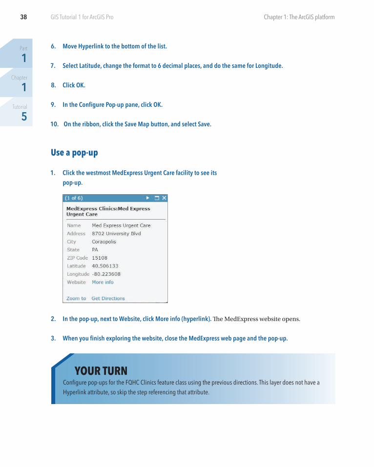
Use a pop-up
1. Click the westmost MedExpress Urgent Care facility to see its pop-up.
2. In the pop-up, next to Website, click More info (hyperlink). The MedExpress website opens.
3. When you finish exploring the website, close the MedExpress web page and the pop-up.
YOUR TURNConfigure pop-ups for the FQHC Clinics feature class using the previous directions. This layer does not have a Hyperlink attribute, so skip the step referencing that attribute.
39
Part
1Chapter
1Tutorial
5
Tutorial 1-5: Publishing maps to ArcGIS Online GIS Tutorial 1 for ArcGIS Pro
Change style
1. In the Contents pane, for MedExpress Urgent Care, click the Change Style button .
2. For Select a drawing style, click Options.
3. In the Change style pane, click Symbols.
4. Click the orange square symbol in the fourth row, change the size to 14, and click OK.
5. In the Change Style pane, click OK > Done.
Label a feature layer
1. For FQHC Clinics, click More options > Create labels. If you do not see the option to create labels, you can
use Manage Labels. ArcGIS Online automatically selects Name for the label.
2. In the Label Features pane, make sure that Label Features is on.
3. Change the size to 11, change the color to sienna (fourth column, second row from the bottom row of color chip array), and make sure that Halo is on.
4. Click OK.
Show an attribute table
1. In the Contents pane, for Population Density, click the Show Table button .
2. In the table, click the PopDensity heading, and click Sort descending.
3. Select the top row, with 29835.13 population density. Selecting this row also selects the tract on the
map with maximum population density in Allegheny County.
YOUR TURNChange the outline for Poverty Risk Area to a darker red.
Part
1Chapter
1Tutorial
5
40 Chapter 1: The ArcGIS platformGIS Tutorial 1 for ArcGIS Pro
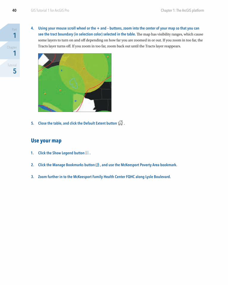
4. Using your mouse scroll wheel or the + and – buttons, zoom into the center of your map so that you can see the tract boundary (in selection color) selected in the table. The map has visibility ranges, which cause
some layers to turn on and off depending on how far you are zoomed in or out. If you zoom in too far, the
Tracts layer turns off. If you zoom in too far, zoom back out until the Tracts layer reappears.
5. Close the table, and click the Default Extent button .
Use your map
1. Click the Show Legend button .
2. Click the Manage Bookmarks button , and use the McKeesport Poverty Area bookmark.
3. Zoom further in to the McKeesport Family Health Center FQHC along Lysle Boulevard.
41
Part
1Chapter
1Tutorial
5
Tutorial 1-5: Publishing maps to ArcGIS Online GIS Tutorial 1 for ArcGIS Pro
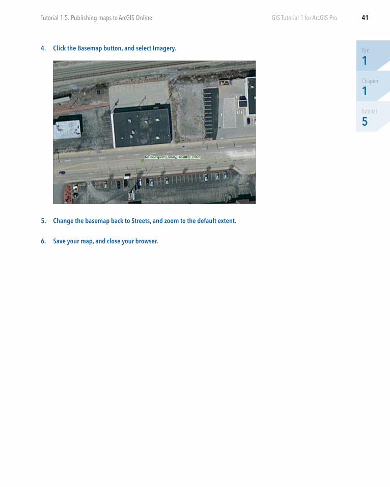
4. Click the Basemap button, and select Imagery.
5. Change the basemap back to Streets, and zoom to the default extent.
6. Save your map, and close your browser.
Part
1Chapter
1Tutorial
6
42 GIS Tutorial 1 for ArcGIS Pro Chapter 1: The ArcGIS platform
Tutorial 1-6: Use Explorer for ArcGIS on your tablet or smartphone
Suppose that you have prepared the map with FQHCs for a nonprofit organization that promotes inexpen-
sive health care for disadvantaged populations in Allegheny County and that now you must provide the map
to staff members of all FQHCs. How would you get the map to them in interactive form? Assuming that you
have an email distribution list for FQHC staff members, you could easily email a link to use or install the free
Explorer for ArcGIS app as a simple map viewer that you’ll use in this tutorial. The app, which is available
from the Apple App Store, Google Play, and Amazon Appstore, provides access to your ArcGIS Online maps.
If you have an iPhone, iPad, iPod touch device, Android phone, or Android tablet, you will use the following
instructions to install and use Explorer for ArcGIS. You’ll finish the tutorial by sending yourself an email with
the link to your map.
Install and start using Explorer
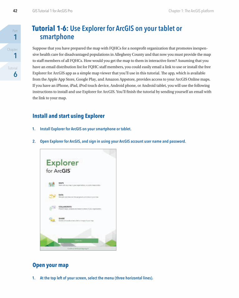
1. Install Explorer for ArcGIS on your smartphone or tablet.
2. Open Explorer for ArcGIS, and sign in using your ArcGIS account user name and password.
Open your map
1. At the top left of your screen, select the menu (three horizontal lines).
43
Part
1Chapter
1Tutorial
6
Tutorial 1-6: Use Explorer for ArcGIS on your tablet or smartphone GIS Tutorial 1 for ArcGIS Pro
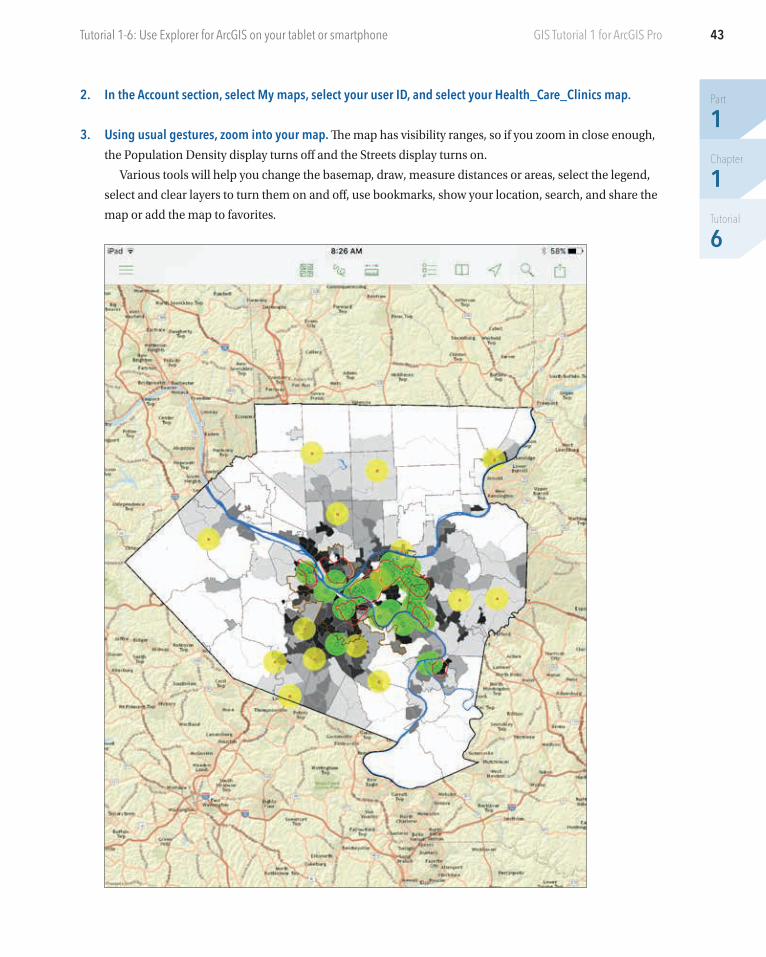
2. In the Account section, select My maps, select your user ID, and select your Health_Care_Clinics map.
3. Using usual gestures, zoom into your map. The map has visibility ranges, so if you zoom in close enough,
the Population Density display turns off and the Streets display turns on.
Various tools will help you change the basemap, draw, measure distances or areas, select the legend,
select and clear layers to turn them on and off, use bookmarks, show your location, search, and share the
map or add the map to favorites.
Part
1Chapter
1Tutorial
6
44 Chapter 1: The ArcGIS platformGIS Tutorial 1 for ArcGIS Pro
AssignmentsNow that you’ve successfully worked through this chapter’s tutorials and Your Turn assignments, you can
try out your new knowledge and skills in the assignments found on this book’s resource web page at esri.com
/gist1arcgispro. Two assignments and their ArcGIS projects and data are available for download:
• Assignment 1-1: Analyze the change in population from 2000 to 2010 by county in the United States.• Assignment 1-2: Produce a neighborhood block watch crime map.
YOUR TURNTry out all the buttons just described. When you get to sharing, send yourself an email message with the link to the map. When you open the message, you’ll have the option to open the map in Explorer, install Explorer, or open the map in ArcGIS Online. You can also share the map through a message. When you want to share a map, Explorer offers many good options. When you finish, close Explorer.