Embed Size (px)
Citation preview
Gupta et al. Mashups for Information Visualization
Proceedings of the 7th International ISCRAM Conference – Seattle, USA, May 2010 1
Building Geospatial Mashups to Visualize Information for Crisis Management
Shubham Gupta and Craig A. Knoblock University of Southern California
Information Sciences Institute 4676 Admiralty Way, Marina del Rey, CA 90292, USA
shubhamg, [email protected]
ABSTRACT
In time-sensitive environments such as disaster management, decision-making often requires rapidly gathering the information from diverse data sources and then visualizing the collected information to understand it. Thus, it is critical to reduce the overhead in data integration and visualization for efficient decision-making. Geospatial mashups can be an effective solution in such environments by providing an integrated approach to extract, integrate and view diverse information. Currently, mashup building tools exist for creating mashups, but none of them deal with the issue of data visualization. An improper visualization of the data could result in users wasting precious time to understand the data. In this paper, we introduce a programming-by-demonstration approach to data visualization in geospatial mashups that allows the users to customize the data visualization.
Keywords
Mashups, data integration, data visualization, crisis management.
INTRODUCTION
Effective and judicious decision-making requires information about the parameters and circumstances that affect the decision. With the recent advancements in information technology and the Internet, the amount of information available to a user continues to proliferate. Methods of accessing and representing the information also continue to diversify at a rapid rate. This diversity often leads to situations where the information that a user needs to make a decision is scattered among several data sources or is not present in the desired form, which requires the user to spend unwarranted time in manually accessing and understanding each data source separately. In time-sensitive environments, such as crisis management, such delays could have a negative effect on the decision-making.
Tools for building mashups, which are applications constructed from multiple sources, can provide a single integrated view of diverse data irrespective of the heterogeneity present in the data sources. Mashups are implemented as web applications that combine content from multiple data sources to suit a user’s situational needs. Geospatial mashups are applications that use the medium of maps for displaying the integrated information interactively using the API services of an online mapping service, such as Google Maps. This approach is an effective method for visualizing any geographical data that may be present in the integrated data sources. Some interesting examples of geospatial mashups are WikiMapia (wikimapia.org) and Zillow (zillow.com). Currently, various geospatial mashup building tools exist, such as Yahoo’s Pipes (pipes.yahoo.com), Intel’s MashMaker (mashmaker.intel.com), etc. Most of these solutions employ a widget paradigm, where widgets correspond to the complex information integration operations such as data cleaning, fetching data, etc that are involved in building mashups. Since widgets act as a substitute for the programming constructs, understanding the programming concepts is still required to build a mashup, which an average end-user generally lacks. Also, none of these existing tools currently support the customization of the final mashup output display and it is left for the user to write a program for any type of customization for data visualization.
Emergency management exemplifies the situation where multiple data sources with heterogeneous data access methods and data representation types are employed for rapid decision-making and ad-hoc situation analysis. Analysts use various data visualization techniques such as timeline charts, tables, etc. for better and efficient understanding of the data. As described earlier, geospatial mashups can expedite the decision making process in such scenarios by providing an integrated single view of the multiple data sources. However, most of the current mashup building tools are not suitable for such time-sensitive environments for two reasons. First, the current
Gupta et al. Mashups for Information Visualization
Proceedings of the 7th International ISCRAM Conference – Seattle, USA, May 2010 2
tools require the knowledge of programming constructs and widgets, neither of which is expected to be an area of expertise of an average analyst. Second, none of the existing tools support the customization of the final mashup output and thus fail to utilize the benefits of data visualization techniques. Investing the time in training the analyst about programming constructs and customizing the data visualization would cause further delay in decision making. Based on these ideas, we developed a programming-by-demonstration approach to mashup construction, which enables a user to create mashups without writing code or understanding programming concepts (Tuchinda, Szekely and Knoblock, 2008). The user indirectly solves the issues involved in the mashup building process by providing only examples. In this paper, we address the problem of data visualization in mashups by introducing a programming-by-demonstration approach to data visualization. We will highlight the significant role that geospatial mashups can play in assisting with crisis and disaster management by motivating it with examples throughout this paper.
In the remainder of this paper: we first describe our motivating example, which illustrates the data integration and visualization requirements in a crisis scenario. Then, we describe the programming-by-demonstration approach and briefly describe the details of its implementation to solve issues of data retrieval, source modeling, data cleaning, and data integration during geospatial mashup building. Next, we present the visualization by demonstration approach and describe its benefits in data visualization. Finally we discuss our contributions, cover related work in geospatial mashup building, and describe our plans for future work.
MOTIVATING EXAMPLE
Consider an earthquake relief scenario in Los Angeles County, where evacuation centers have been setup in different cities for accelerated medical assistance. Each evacuation center has its own requirements for medical equipment, medical experts, relief funds, etc., depending on factors such as proximity to the earthquake’s epicenter, the size of the population affected in nearby areas, the level of destruction, etc. Thus, for an analyst to make judicious decisions fulfilling these requirements, he needs to collect and integrate information regarding these factors and current circumstances surrounding each evacuation center. He refers to different data sources to achieve this task and these data sources may have heterogeneous data access methods and formats as described below.
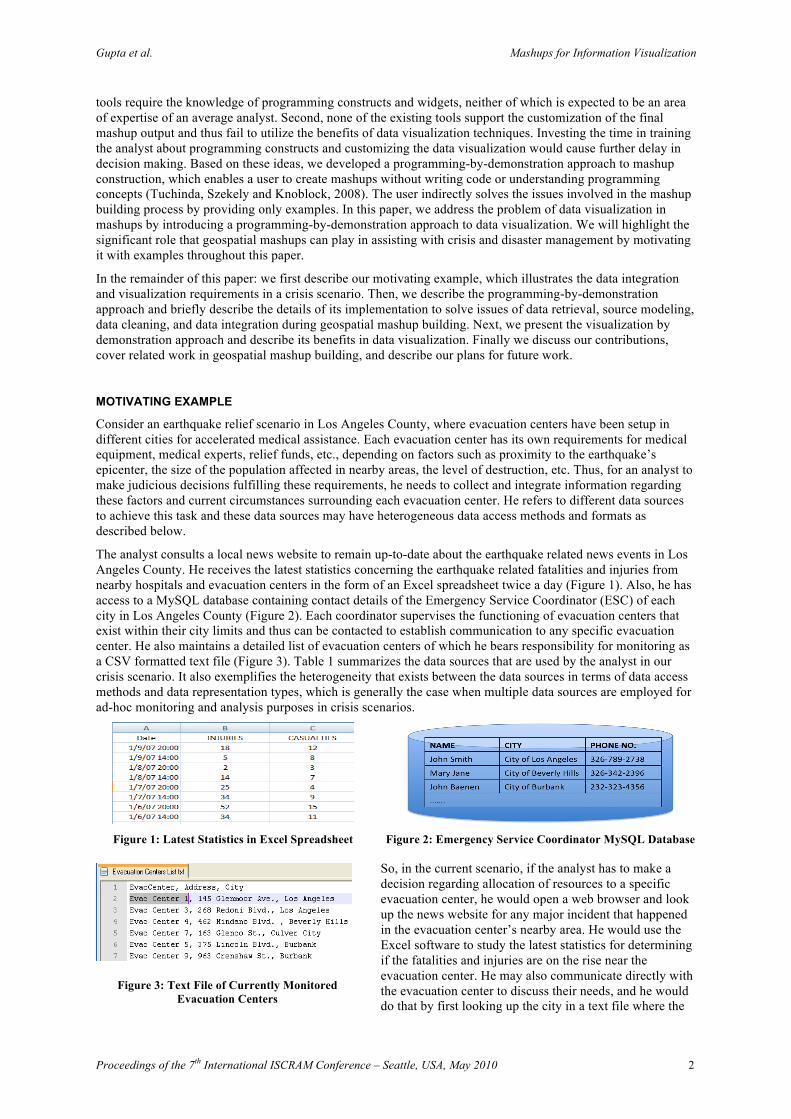
The analyst consults a local news website to remain up-to-date about the earthquake related news events in Los Angeles County. He receives the latest statistics concerning the earthquake related fatalities and injuries from nearby hospitals and evacuation centers in the form of an Excel spreadsheet twice a day (Figure 1). Also, he has access to a MySQL database containing contact details of the Emergency Service Coordinator (ESC) of each city in Los Angeles County (Figure 2). Each coordinator supervises the functioning of evacuation centers that exist within their city limits and thus can be contacted to establish communication to any specific evacuation center. He also maintains a detailed list of evacuation centers of which he bears responsibility for monitoring as a CSV formatted text file (Figure 3). Table 1 summarizes the data sources that are used by the analyst in our crisis scenario. It also exemplifies the heterogeneity that exists between the data sources in terms of data access methods and data representation types, which is generally the case when multiple data sources are employed for ad-hoc monitoring and analysis purposes in crisis scenarios.
So, in the current scenario, if the analyst has to make a decision regarding allocation of resources to a specific evacuation center, he would open a web browser and look up the news website for any major incident that happened in the evacuation center’s nearby area. He would use the Excel software to study the latest statistics for determining if the fatalities and injuries are on the rise near the evacuation center. He may also communicate directly with the evacuation center to discuss their needs, and he would do that by first looking up the city in a text file where the
Figure 1: Latest Statistics in Excel Spreadsheet Figure 2: Emergency Service Coordinator MySQL Database
Figure 3: Text File of Currently Monitored Evacuation Centers
Gupta et al. Mashups for Information Visualization
Proceedings of the 7th International ISCRAM Conference – Seattle, USA, May 2010 3
evacuation center lies and then querying the MySQL database to retrieve the contact details of the Emergency Service Coordinator corresponding to that city.
A significant drawback that emerges out of this approach is that a lot of time would be consumed in switching back and forth between querying the data sources, analyzing the data, and using the various software packages. Also, there is no way to provide an integrated visualization of the data, which may hinder his understanding of the data. As an example, the analyst might be interested in viewing the statistical data as a timeline chart to gauge the impact of a disaster over time rather than as an Excel table, since relationships in a large amount of data can be understood more clearly and rapidly with charts.
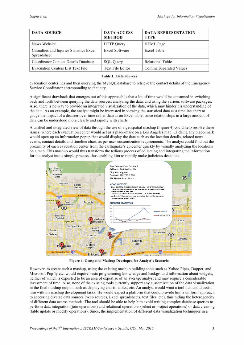
A unified and integrated view of data through the use of a geospatial mashup (Figure 4) could help resolve these issues, where each evacuation center would act as a place-mark on a Los Angeles map. Clicking any place-mark would open up an information popup that would display the data such as the location details, related news events, contact details and timeline chart, as per user-customization requirements. The analyst could find out the proximity of each evacuation center from the earthquake’s epicenter quickly by visually analyzing the locations on a map. This mashup would thus transform the tedious process of collecting and integrating the information for the analyst into a simple process, thus enabling him to rapidly make judicious decisions.
Figure 4: Geospatial Mashup Developed for Analyst’s Scenario
However, to create such a mashup, using the existing mashup building tools such as Yahoo Pipes, Dapper, and Microsoft Popfly etc, would require basic programming knowledge and background information about widgets, neither of which is expected to be an area of expertise of an average analyst and may require a considerable investment of time. Also, none of the existing tools currently support any customization of the data visualization in the final mashup output, such as displaying charts, tables, etc. An analyst would want a tool that could assist him with his mashup development tasks. He would expect a platform that could provide him a uniform approach to accessing diverse data sources (Web sources, Excel spreadsheets, text files, etc), thus hiding the heterogeneity of different data access methods. The tool should be able to help him avoid writing complex database queries to perform data integration (join operations) and relational operations (select or project operations) or data cleaning (table update or modify operations). Since, the implementation of different data visualization techniques in a
DATA SOURCE DATA ACCESS METHOD
DATA REPRESENTATION TYPE
News Website HTTP Query HTML Page Casualties and Injuries Statistics Excel Spreadsheet
Excel Software Excel Table
Coordinator Contact Details Database SQL Query Relational Table Evacuation Centers List Text File Text File Editor Comma Separated Values
Table 1. Data Sources
Gupta et al. Mashups for Information Visualization
Proceedings of the 7th International ISCRAM Conference – Seattle, USA, May 2010 4
single mashup requires significant programming effort on the front-end with programming languages such as HTML, JavaScript, and Google APIs etc, the tool should be able to provide a simple approach for such data visualization tasks that does not require programming at any level. Based on these ideas, we introduce some novel capabilities to our previously developed model (Tuchinda et al., 2008) to address the issue of data visualization in geospatial mashups.
PROGRAMMING-BY-DEMONSTRATION APPROACH
The programming-by-demonstration (PBD) approach enables a user to write programs by simply demonstrating the application on one or more concrete examples through its user interface. From this sequence of user actions and examples provided, a PBD system infers a program that is consistent with observed actions and generalizes to new instances of the task. Thus, it empowers the user to construct a program for automating repetitive tasks on an application without actually learning the use of its Application Programming Interface (API) and programming constructs. This approach is especially appropriate in the circumstances where a user has inadequate time for writing a program manually since no time would have to be spent in training the user about related programming concepts, and minimal time is required to generate a program through the PBD approach. Also, it enables the user to spend more time on studying and analyzing the output rather than constructing a program that generates that output. Therefore, a tool based on such a PBD paradigm appears to be a good solution for the analyst’s scenario described above, as it will enable him to construct a program (i.e. a geospatial mashup) in an expedited manner without requiring programming knowledge. The rest of this section describes how the analyst would interact with Karma, our geospatial mashup building framework that incorporates the concept of PBD, to construct geospatial mashups.
Karma
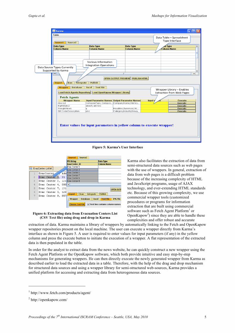
The basic issues involved in the mashup creation process are data retrieval, source modeling, data cleaning, data integration, and data visualization. Each of these issues is an area of research in its own and our goal is to prevent the end-user from delving into these underlying complexities during the mashup building process. With Karma, all of these issues are addressed in one seamless interactive process and the user indirectly solves each issue by providing only examples. Figure 5 shows the user interface of Karma. The upper area contains a dynamic spreadsheet that acts as a single interaction platform for working on the data retrieved during the mashup construction process. The lower area shows multiple tabs corresponding to the different operations in information integration and each tab provides further options from which the user can select. The user is free to switch back and forth between these modes allowing him to undo any undesired action. We now describe the details of the analyst’s interaction with Karma. Since the first four issues of data retrieval, source modeling, data cleaning and data integration were dealt with in our earlier work (Ives, Knoblock, Minton, Jacob, Talukdar, Tuchinda, Ambite, Muslea and Gazen, 2009; Tuchinda, Szekely and Knoblock, 2007, 2008), we limit ourselves to a short description of the underlying concepts and describe how the analyst would use the system.
Data Retrieval
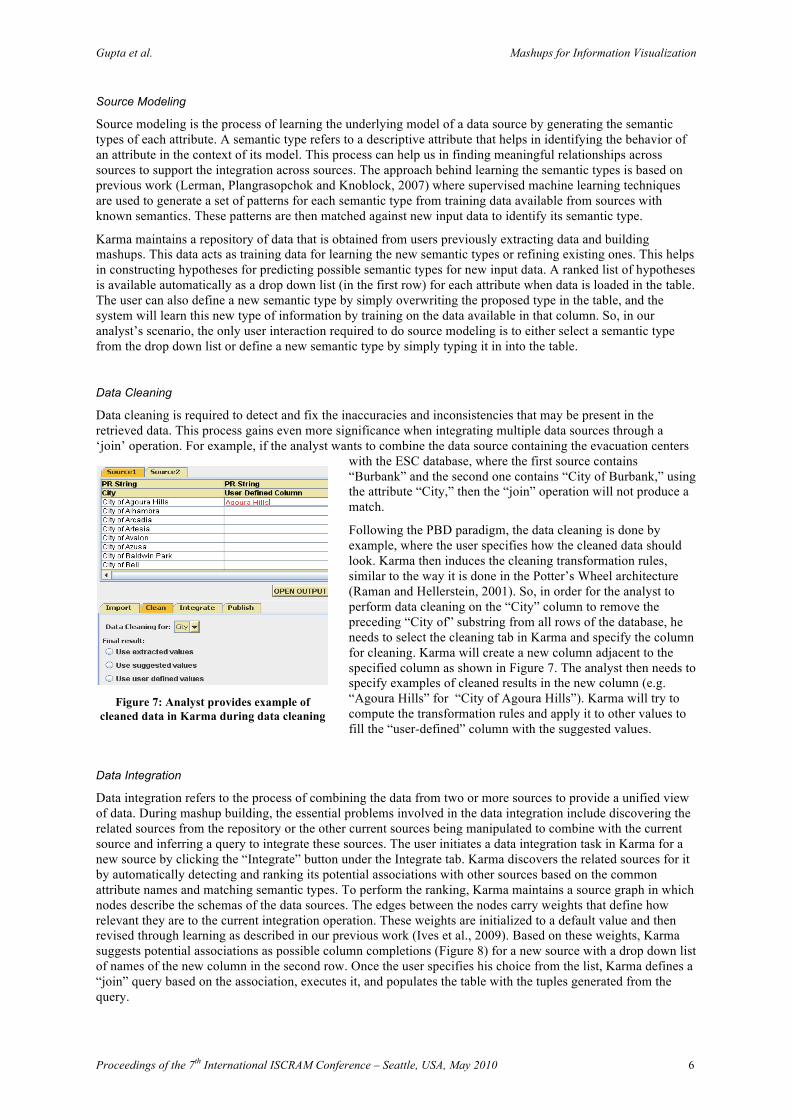
Karma enables retrieval of data from structured data-sources, such as Excel spreadsheets and CSV formatted text files, through a drag and drop mechanism. The user is only required to select a sample data-element from the data that the user wants to extract and drop it into Karma’s data table. Karma then constructs a hypothesis regarding the path to the similar and parallel data-elements, generates a query based on it, and executes it to automatically populate the extracted data into the data table. Thus, Karma is able to automatically resolve the data retrieval issue with some aid from example data elements, exploiting the PBD paradigm.
So, if the analyst wants to extract evacuation centers list from the CSV formatted text file (Figure 3), he would select the text file tab under import tab to specify the data source type as text file. He would then input the file path interactively via a dialog box through Karma’s interface to open the text file. He then needs to select a sample data element (e.g. “Evac Center 1” to extract the first column) and drop it into Karma’s table. Karma will automatically fill the table’s first column with the rest of the data as shown in Figure 6. He can do the same for extracting other desired columns. Similarly, he can extract current statistics data from the Excel spreadsheet by opening up a new source tab to create a new empty table and drag and drop the example data (e.g. “18,5,2” for the second column) for data retrieval. The analyst can also load the ESC MySQL database in Karma by opening up a new table, selecting the database as the data source type, and interactively providing the schema’s location, username and password. Karma will then create a new connection to the schema location and load the table into the interface.
Gupta et al. Mashups for Information Visualization
Proceedings of the 7th International ISCRAM Conference – Seattle, USA, May 2010 5
Figure 5: Karma's User Interface
Karma also facilitates the extraction of data from semi-structured data sources such as web pages with the use of wrappers. In general, extraction of data from web pages is a difficult problem because of the increasing complexity of HTML and JavaScript programs, usage of AJAX technology, and ever-extending HTML standards etc. Because of this growing complexity, we use commercial wrapper tools (customized procedures or programs for information extraction that are built using commercial software such as Fetch Agent Platform1 or OpenKapow2) since they are able to handle these complexities and offer robust and accurate
extraction of data. Karma maintains a library of wrappers by automatically linking to the Fetch and OpenKapow wrapper repositories present on the local machine. The user can execute a wrapper directly from Karma’s interface as shown in Figure 5. A user is required to enter values for input parameters (if any) in the yellow column and press the execute button to initiate the execution of a wrapper. A flat representation of the extracted data is then populated in the table.
In order for the analyst to extract data from the news website, he can quickly construct a new wrapper using the Fetch Agent Platform or the OpenKapow software, which both provide intuitive and easy step-by-step mechanisms for generating wrappers. He can then directly execute the newly generated wrapper from Karma as described earlier to load the extracted data in a table. Therefore, with the help of the drag and drop mechanism for structured data sources and using a wrapper library for semi-structured web-sources, Karma provides a unified platform for accessing and extracting data from heterogeneous data sources.
1 http://www.fetch.com/products/agent/ 2 http://openkapow.com/
Figure 6: Extracting data from Evacuation Centers List (CSV Text file) using drag and drop in Karma
Gupta et al. Mashups for Information Visualization
Proceedings of the 7th International ISCRAM Conference – Seattle, USA, May 2010 6
Source Modeling
Source modeling is the process of learning the underlying model of a data source by generating the semantic types of each attribute. A semantic type refers to a descriptive attribute that helps in identifying the behavior of an attribute in the context of its model. This process can help us in finding meaningful relationships across sources to support the integration across sources. The approach behind learning the semantic types is based on previous work (Lerman, Plangrasopchok and Knoblock, 2007) where supervised machine learning techniques are used to generate a set of patterns for each semantic type from training data available from sources with known semantics. These patterns are then matched against new input data to identify its semantic type.
Karma maintains a repository of data that is obtained from users previously extracting data and building mashups. This data acts as training data for learning the new semantic types or refining existing ones. This helps in constructing hypotheses for predicting possible semantic types for new input data. A ranked list of hypotheses is available automatically as a drop down list (in the first row) for each attribute when data is loaded in the table. The user can also define a new semantic type by simply overwriting the proposed type in the table, and the system will learn this new type of information by training on the data available in that column. So, in our analyst’s scenario, the only user interaction required to do source modeling is to either select a semantic type from the drop down list or define a new semantic type by simply typing it in into the table.
Data Cleaning
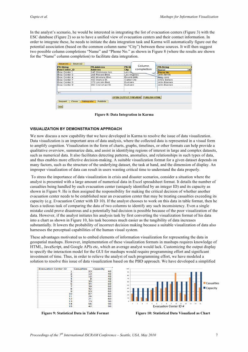
Data cleaning is required to detect and fix the inaccuracies and inconsistencies that may be present in the retrieved data. This process gains even more significance when integrating multiple data sources through a ‘join’ operation. For example, if the analyst wants to combine the data source containing the evacuation centers
with the ESC database, where the first source contains “Burbank” and the second one contains “City of Burbank,” using the attribute “City,” then the “join” operation will not produce a match.
Following the PBD paradigm, the data cleaning is done by example, where the user specifies how the cleaned data should look. Karma then induces the cleaning transformation rules, similar to the way it is done in the Potter’s Wheel architecture (Raman and Hellerstein, 2001). So, in order for the analyst to perform data cleaning on the “City” column to remove the preceding “City of” substring from all rows of the database, he needs to select the cleaning tab in Karma and specify the column for cleaning. Karma will create a new column adjacent to the specified column as shown in Figure 7. The analyst then needs to specify examples of cleaned results in the new column (e.g. “Agoura Hills” for “City of Agoura Hills”). Karma will try to compute the transformation rules and apply it to other values to fill the “user-defined” column with the suggested values.
Data Integration
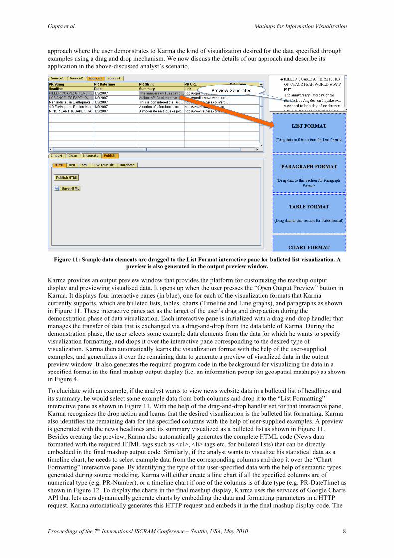
Data integration refers to the process of combining the data from two or more sources to provide a unified view of data. During mashup building, the essential problems involved in the data integration include discovering the related sources from the repository or the other current sources being manipulated to combine with the current source and inferring a query to integrate these sources. The user initiates a data integration task in Karma for a new source by clicking the “Integrate” button under the Integrate tab. Karma discovers the related sources for it by automatically detecting and ranking its potential associations with other sources based on the common attribute names and matching semantic types. To perform the ranking, Karma maintains a source graph in which nodes describe the schemas of the data sources. The edges between the nodes carry weights that define how relevant they are to the current integration operation. These weights are initialized to a default value and then revised through learning as described in our previous work (Ives et al., 2009). Based on these weights, Karma suggests potential associations as possible column completions (Figure 8) for a new source with a drop down list of names of the new column in the second row. Once the user specifies his choice from the list, Karma defines a “join” query based on the association, executes it, and populates the table with the tuples generated from the query.
Figure 7: Analyst provides example of
cleaned data in Karma during data cleaning
Gupta et al. Mashups for Information Visualization
Proceedings of the 7th International ISCRAM Conference – Seattle, USA, May 2010 7
In the analyst’s scenario, he would be interested in integrating the list of evacuation centers (Figure 3) with the ESC database (Figure 2) so as to have a unified view of evacuation centers and their contact information. In order to integrate these, he needs to initiate the data integration task and Karma will automatically figure out the potential association (based on the common column name “City”) between these sources. It will then suggest two possible column completions “Name” and “Phone No.” as shown in Figure 8 (where the results are shown for the “Name” column completion) to facilitate data integration.
Figure 8: Data Integration in Karma
VISUALIZATION BY DEMONSTRATION APPROACH
We now discuss a new capability that we have developed in Karma to resolve the issue of data visualization. Data visualization is an important area of data analysis, where the collected data is represented in a visual form to amplify cognition. Visualization in the form of charts, graphs, timelines, or other formats can help provide a qualitative overview, summarize data, and assist in identifying regions of interest in large and complex datasets, such as numerical data. It also facilitates detecting patterns, anomalies, and relationships in such types of data, and thus enables more effective decision-making. A suitable visualization format for a given dataset depends on many factors, such as the structure of the underlying dataset, the task at hand, and the dimension of display. An improper visualization of data can result in users wasting critical time to understand the data properly.
To stress the importance of data visualization in crisis and disaster scenarios, consider a situation where the analyst is presented with a large amount of numerical data in Excel spreadsheet format. It details the number of casualties being handled by each evacuation center (uniquely identified by an integer ID) and its capacity as shown in Figure 9. He is then assigned the responsibility for making the critical decision of whether another evacuation center needs to be established near an evacuation center that may be treating casualties exceeding its capacity (e.g. Evacuation Center with ID 10). If the analyst chooses to work on this data in table format, then he faces a tedious task of comparing the data of two columns to identify any such inconsistency. Even a single mistake could prove disastrous and a potentially bad decision is possible because of the poor visualization of the data. However, if the analyst initiates his analysis task by first converting the visualization format of his data into a chart as shown in Figure 10, his task becomes much easier as the tangibility of data increases substantially. It lowers the probability of incorrect decision making because a suitable visualization of data also harnesses the perceptual capabilities of the human visual system.
These advantages motivated us to embed elements of information visualization for representing the data in geospatial mashups. However, implementation of these visualization formats in mashups requires knowledge of HTML, JavaScript, and Google APIs etc, which an average analyst would lack. Customizing the output display to specify the interaction model for the GUI for mashups would require programming effort and significant investment of time. Thus, in order to relieve the analyst of such programming effort, we have modeled a solution to resolve this issue of data visualization based on the PBD approach. We have developed a simplified
Figure 9: Statistical Data in Table Format Figure 10: Statistical Data Visualized as Chart
Gupta et al. Mashups for Information Visualization
Proceedings of the 7th International ISCRAM Conference – Seattle, USA, May 2010 8
approach where the user demonstrates to Karma the kind of visualization desired for the data specified through examples using a drag and drop mechanism. We now discuss the details of our approach and describe its application in the above-discussed analyst’s scenario.
Figure 11: Sample data elements are dragged to the List Format interactive pane for bulleted list visualization. A
preview is also generated in the output preview window.
Karma provides an output preview window that provides the platform for customizing the mashup output display and previewing visualized data. It opens up when the user presses the “Open Output Preview” button in Karma. It displays four interactive panes (in blue), one for each of the visualization formats that Karma currently supports, which are bulleted lists, tables, charts (Timeline and Line graphs), and paragraphs as shown in Figure 11. These interactive panes act as the target of the user’s drag and drop action during the demonstration phase of data visualization. Each interactive pane is initialized with a drag-and-drop handler that manages the transfer of data that is exchanged via a drag-and-drop from the data table of Karma. During the demonstration phase, the user selects some example data elements from the data for which he wants to specify visualization formatting, and drops it over the interactive pane corresponding to the desired type of visualization. Karma then automatically learns the visualization format with the help of the user-supplied examples, and generalizes it over the remaining data to generate a preview of visualized data in the output preview window. It also generates the required program code in the background for visualizing the data in a specified format in the final mashup output display (i.e. an information popup for geospatial mashups) as shown in Figure 4.
To elucidate with an example, if the analyst wants to view news website data in a bulleted list of headlines and its summary, he would select some example data from both columns and drop it to the “List Formatting” interactive pane as shown in Figure 11. With the help of the drag-and-drop handler set for that interactive pane, Karma recognizes the drop action and learns that the desired visualization is the bulleted list formatting. Karma also identifies the remaining data for the specified columns with the help of user-supplied examples. A preview is generated with the news headlines and its summary visualized as a bulleted list as shown in Figure 11. Besides creating the preview, Karma also automatically generates the complete HTML code (News data formatted with the required HTML tags such as <ul>, <li> tags etc. for bulleted lists) that can be directly embedded in the final mashup output code. Similarly, if the analyst wants to visualize his statistical data as a timeline chart, he needs to select example data from the corresponding columns and drop it over the “Chart Formatting” interactive pane. By identifying the type of the user-specified data with the help of semantic types generated during source modeling, Karma will either create a line chart if all the specified columns are of numerical type (e.g. PR-Number), or a timeline chart if one of the columns is of date type (e.g. PR-DateTime) as shown in Figure 12. To display the charts in the final mashup display, Karma uses the services of Google Charts API that lets users dynamically generate charts by embedding the data and formatting parameters in a HTTP request. Karma automatically generates this HTTP request and embeds it in the final mashup display code. The
Gupta et al. Mashups for Information Visualization
Proceedings of the 7th International ISCRAM Conference – Seattle, USA, May 2010 9
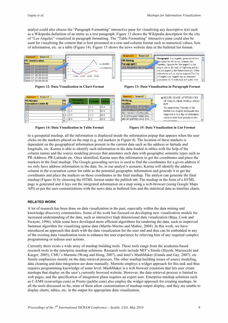
analyst could also choose the “Paragraph Formatting” interactive pane for visualizing any descriptive text such as a Wikipedia definition of an entity as a text paragraph. Figure 13 shows the Wikipedia description for the city of “Los Angeles” visualized in paragraph formatting. The “Table Formatting” interactive pane could also be used for visualizing the content that is best presented in a row-and-column format such as numerical values, lists of information, etc. as a table (Figure 14). Figure 15 shows the news website data in the bulleted list format.
Figure 12: Data Visualization in Chart Format Figure 13: Data Visualization in Paragraph Format
Figure 14: Data Visualization in Table Format Figure 15: Data Visualization in List Format
In a geospatial mashup, all the information is displayed inside the information popup that appears when the user clicks on the markers placed on the map (e.g. red markers in Figure 4). The location of these markers is dependent on the geographical information present in the current data such as the address or latitude and longitude, etc. Karma is able to identify such information in the data loaded in tables with the help of the column names and the source modeling process that annotates such data with geographic semantic types such as PR-Address, PR-Latitude etc. Once identified, Karma uses this information to get the coordinates and place the markers in the final mashup. The Google geocoding service is used to find the coordinates for a given address if we only have address information in the data. So, in our analyst’s scenario, Karma will identify the address column in the evacuation center list table as the potential geographic information and geocode it to get the coordinates and place the markers on those coordinates in the final mashup. The analyst can generate the final mashup (Figure 4) by choosing the HTML format under the publish tab. The mashup in the form of a HTML page is generated and it lays out the integrated information on a map using a web-browser (using Google Maps API) as per the user-customizations with the news data as bulleted lists and the statistical data as timeline charts.
RELATED WORK
A lot of research has been done on data visualization in the past, especially within the data mining and knowledge discovery communities. Some of the work has focused on developing new visualization models for increased understanding of the data, such as interactive high dimensional data visualization (Buja, Cook and Swayne, 1996), while some have developed more efficient algorithms for rendering the data, such as improved Sammon algorithm for visualizing sparse data (Martín-Merino and Muñoz, 2004). In this work, we have introduced an approach that deals with the data visualization for the user end and thus can be embedded in any of the existing data visualization tools to enhance the user experience by relieving him of any required complex programming or tedious user actions.
Currently there exists a wide array of mashup building tools. These tools range from the academia-based research tools to the enterprise mashup solutions. Research tools include MIT’s Simile (Huynh, Mazzocchi and Karger, 2005), CMU’s Marmite (Wong and Hong, 2007), and Intel’s MashMaker (Ennals and Gay, 2007), etc. Simile emphasizes mainly on the data retrieval process. The other mashup building issues of source modeling, data cleaning and data integration are done manually. Marmite employs a widget approach for this task and thus requires programming knowledge of some level. MashMaker is a web browser extension that lets user create mashups that display on the user’s currently browsed website. However, the data retrieval process is limited to web pages, and the specification of integration plans requires an expert user. Enterprise mashup solutions such as C-EMS (convertigo.com) or Presto (jackbe.com) also employ the widget approach for creating mashups. In all the tools discussed so far, none of them allow customization of mashup output display, and they are unable to display charts, tables, etc. in the output for appropriate data visualization.
Gupta et al. Mashups for Information Visualization
Proceedings of the 7th International ISCRAM Conference – Seattle, USA, May 2010 10
CONCLUSION AND FUTURE WORK
Our contribution in this paper is a programming-by-demonstration approach to data visualization that lets the user customize the geospatial mashup output display without requiring any knowledge of widgets or programming. This approach can be extended to any existing data visualization tools to improve the user experience. With this capability in Karma, the user can create a geospatial mashup in one seamless interactive process, solving each issue involved in the information integration, including data visualization, by only providing examples of how the output should look.
In terms of future work, we plan to integrate more visualization formats such as scatter plots, 2D/3D isosurfaces, etc. to enhance the data visualization experience and increase the effectiveness of mashups as a data analysis tool. We plan to have the capability of reading the geospatial data to integrate with in Karma. To assist the user in choosing the appropriate visualization for their data, we plan to have the capability to let users try out several visualization formats and specify their final choice for the final mashup output. We also plan to be able to save the plans for extracting and integrating the data so that they can be applied to the new data as it becomes available, thus pushing the real time updates of data to the geospatial mashups. This requires an explicit plan language and an execution system that can then execute these plans within Karma.
ACKNOWLEDGEMENT
This research is based upon work supported in part by the United States Air Force, Air Force Research, and Office of Scientific Research under contract number FA9550-08-C-0010, in part by the National Science Foundation under award number CMMI-0753124, and in part by Chevron Corp. under the joint project Center for Interactive Smart Oilfield Technologies (CiSoft) at the University of Southern California.
The U.S. Government is authorized to reproduce and distribute reports for Governmental purposes any copyright annotation thereon. The views and conclusions contained herein are those of the authors and should not be as necessarily representing the official policies or endorsements, either expressed or implied, of any of the above organizations or any person connected with them.
REFERENCES
1. Buja, Cook, A. and Swayne, D. F. (1996) Interactive High-Dimensional Data Visualization, Journal of computational and graphical statistics, 5, 1, 78-99.
2. Ennals, R. and Gay, D. (2007) User Friendly Fuctional Programming for Web Mashups, In proceedings of twelfth ACM ICFP, Freiburg, Germany.
3. Huynh, D., Mazzocchi, S., and Karger, D. (2005) Piggy Bank: Experience the Semantic Web Inside Your Web Browser, In Proc. of ISWC, Galway, Ireland.
4. Ives, Z. G., Knoblock, C. A., Minton, S., Jacob, M., Talukdar, P. P., Tuchinda, R., Ambite, J. L., Muslea, M. and Gazen, C. (2009) Interactive Data Integration Through Smart Copy &Paste, In Proceedings of Biennial Conference on Innovative Data Systems Research (CIDR), Pacific Grove, CA, USA.
5. Lerman, K., Plangrasopchok, A. and Knoblock, C. A. (2007) Semantic Labeling of Online Information Sources, International Journal on Semantic Web and Information Systems, 3(3): 36-56.
6. Martín-Merino, M. and Muñoz, A. (2004) A new Sammon algorithm for sparse data visualization, International Conference on Pattern Recognition (ICPR), Cambridge, UK.
7. Raman, V. and Hellerstein, J. M. (2001) Potter's Wheel: An Interactive Data Cleaning System, In Proceedings of VLDB, Roma, Italy.
8. Tuchinda, R., Szekely, P. and Knoblock, C. A. (2007) Building Data Integration Queries by Demonstration, In Proceedings of International Conference on Intelligent User Interfaces, Honolulu, Hawaii, USA.
9. Tuchinda, R., Szekely, P. and Knoblock, C. A. (2008) Building Mashups by Example, In Proceedings of International Conference on Intelligent User Interfaces, Gran Canaria, Canary Islands, Spain.
10. Wong, J. and Hong, J.I. (2007) Making Mashups with Marmite: Re-purposing Web Content through End-User Programming, In Proc. of ACM Conference on Human Factors in Computing Systems, CHI Letters, 9,1, 1435-1444.