Embed Size (px)
Citation preview
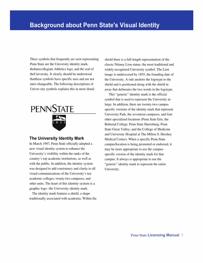
Background about Penn State's Visual Identity
Penn State Licensing Manual 7
shield there is a full-length representation of the
classic Nittany Lion statue, the most traditional and
widely recognized University symbol. The Lion
image is underscored by 1855, the founding date of
the University. A rule anchors the logotype to the
shield and is positioned along with the shield in
away that delineates the two words in the logotype.
This “generic” identity mark is the official
symbol that is used to represent the University at-
large. In addition, there are twenty-two campus
specific versions of the identity mark that represent
University Park, the seventeen campuses, and four
other specialized locations (Penn State Erie, the
Behrend College; Penn State Harrisburg; Penn
State Great Valley; and the College of Medicine
and University Hospital at The Milton S. Hershey
Medical Center). When a specific Penn State
campus/location is being promoted or endorsed, it
may be more appropriate to use the campus-
specific version of the identity mark for that
campus. It always is appropriate to use the
“generic” identity mark to represent the entire
University.
Three symbols that frequently are seen representing
Penn State are the University identity mark,
theIntercollegiate Athletics logo, and the seal of
theUniversity. It clearly should be understood
thatthese symbols have specific uses and are not
inter-changeable. The following descriptions of
Univer-sity symbols explains this in more detail.
The University Identity MarkIn March 1987, Penn State officially adopted a
new visual identity system to enhance the
University’s visibility within the ranks of the
country’s top academic institutions, as well as
with the public. In addition, the identity system
was designed to add consistency and clarity to all
visual communications of the University’s ten
academic colleges, twenty-two campuses, and
other units. The heart of this identity system is a
graphic logo -the University identity mark.
The identity mark features a shield, a shape
traditionally associated with academia. Within the
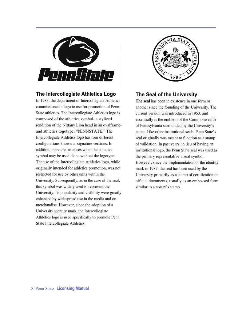
The Intercollegiate Athletics LogoIn 1983, the department of Intercollegiate Athletics
commissioned a logo to use for promotion of Penn
State athletics. The Intercollegiate Athletics logo is
composed of the athletics symbol- a stylized
rendition of the Nittany Lion head in an ovalframe-
and athletics logotype, “PENNSTATE.” The
Intercollegiate Athletics logo has four different
configurations known as signature versions. In
addition, there are instances when the athletics
symbol may be used alone without the logotype.
The use of the Intercollegiate Athletics logo, while
originally intended for athletics promotion, was not
restricted for use by other units within the
University. Subsequently, as in the case of the seal,
this symbol was widely used to represent the
University. Its popularity and visibility were greatly
enhanced by widespread use in the media and on
merchandise. However, since the adoption of a
University identity mark, the Intercollegiate
Athletics logo is used specifically to promote Penn
State Intercollegiate Athletics.
The Seal of the UniversityThe seal has been in existence in one form or
another since the founding of the University. The
current version was introduced in 1953, and
essentially is the emblem of the Commonwealth
of Pennsylvania surrounded by the University’s
name. Like other institutional seals, Penn State’s
seal originally was meant to function as a stamp
of validation. In past years, in lieu of having an
institutional logo, the Penn State seal was used as
the primary representative visual symbol.
However, since the implementation of the identity
mark in 1987, the seal has been used by the
University primarily as a stamp of certification on
official documents, usually as an embossed form
similar to a notary’s stamp.
8 Penn State Licensing Manual
Penn State Licensing Manual 9
PSU, Penn State, andThe Pennsylvania State UniversityThe University’s name also is controlled when it
appears as part of a design on merchandise or in
association with promotions or businesses. The
University name is registered, including all variants
such as Penn State, and The Pennsylvania State
University. Selection of the appropriate name
variation for application on a product should be
made carefully. The formal name of the University,
“The Pennsylvania State University,” is used for
formal, legal, or scholarly applications. The com-
municative name, “Penn State,” has wide public
recognition and is more appropriate for application
on merchandise. “PSU,” like other institutional
acronyms, is popular as a succinct, abbreviated way
of representing the University. “Penn State
University” -a combination of the communicative
and formal name- generally is not endorsed for
any use; “Pennsylvania State University” is
considered incorrect.
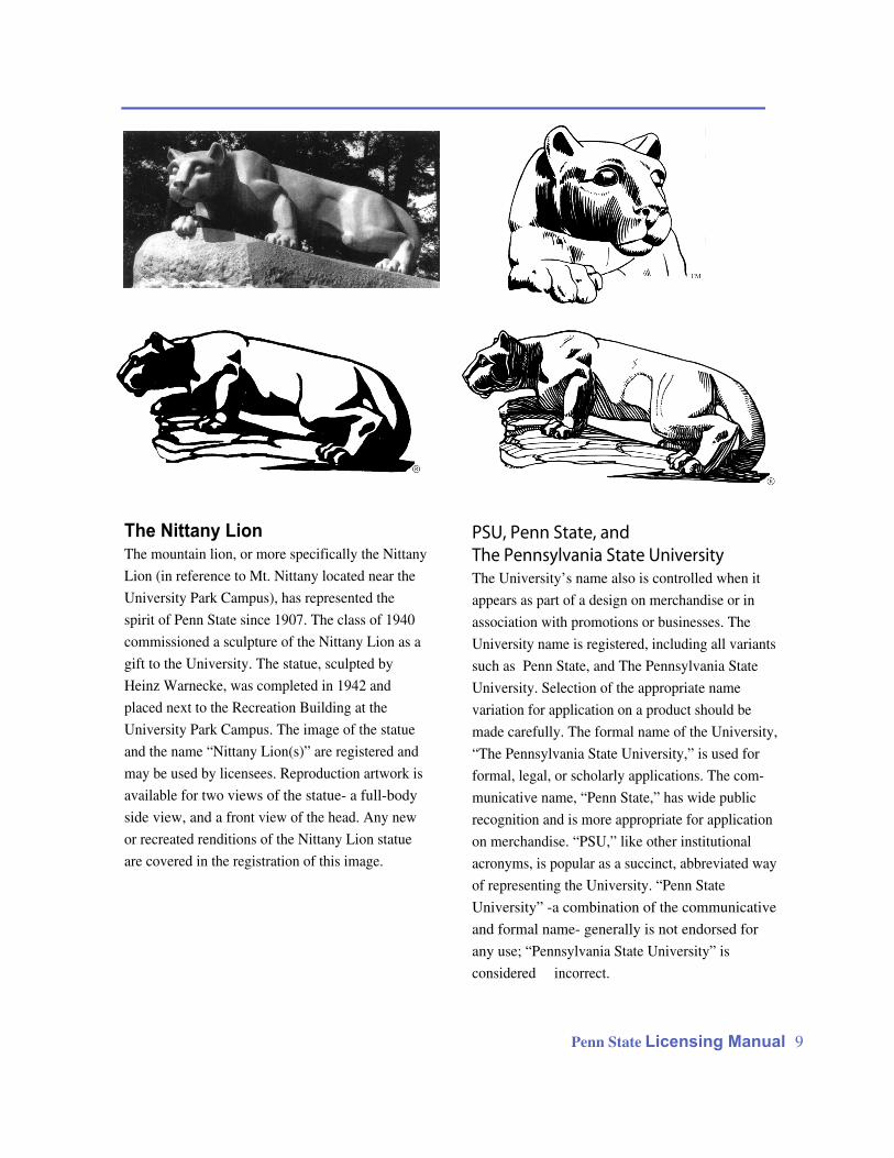
The Nittany LionThe mountain lion, or more specifically the Nittany
Lion (in reference to Mt. Nittany located near the
University Park Campus), has represented the
spirit of Penn State since 1907. The class of 1940
commissioned a sculpture of the Nittany Lion as a
gift to the University. The statue, sculpted by
Heinz Warnecke, was completed in 1942 and
placed next to the Recreation Building at the
University Park Campus. The image of the statue
and the name “Nittany Lion(s)” are registered and
may be used by licensees. Reproduction artwork is
available for two views of the statue- a full-body
side view, and a front view of the head. Any new
or recreated renditions of the Nittany Lion statue
are covered in the registration of this image.
Other Images Associated with the
UniversityIn addition to the University’s registered indicia,
there are other images associated with Penn State
such as likenesses of the Nittany Lion mascot,
caricatures of the Nittany Lion, paw prints, and
likenesses and caricatures of personalities such as
Joe Paterno. The Licensing Programs Office
maintains guidelines for acceptable representations
of these images, and must approve any designs that
(1) feature registered University indicia with these
images, or (2) feature these images as representing
Penn State in any way. Information regarding
likenesses of University personnel may be found on
page 4 of the print version of this document and
guidelines for using Penn State images maybe found
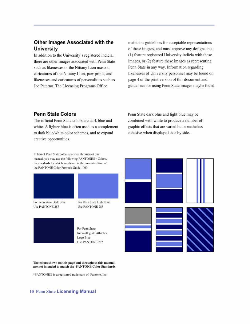
Penn State ColorsThe official Penn State colors are dark blue and
white. A lighter blue is often used as a complement
to dark blue/white color schemes, and to expand
creative opportunities.
Penn State dark blue and light blue may be
combined with white to produce a number of
graphic effects that are varied but nonetheless
cohesive when displayed side by side.
In lieu of Penn State colors specified throughout this manual, you may use the following PANTONE®* Colors, the standards for which are shown in the current edition of the PANTONE Color Formula Guide 1000.
For Penn State Dark BlueUse PANTONE 287
For Penn State Light BlueUse PANTONE 285
For Penn StateIntercollegiate AthleticsLogo BlueUse PANTONE 282
*PANTONE® is a registered trademark of Pantone, Inc.
The colors shown on this page and throughout this manual
are not intended to match the PANTONE Color Standards.
10 Penn State Licensing Manual
a.
b.
c.
d.h.
g.
f.
e.
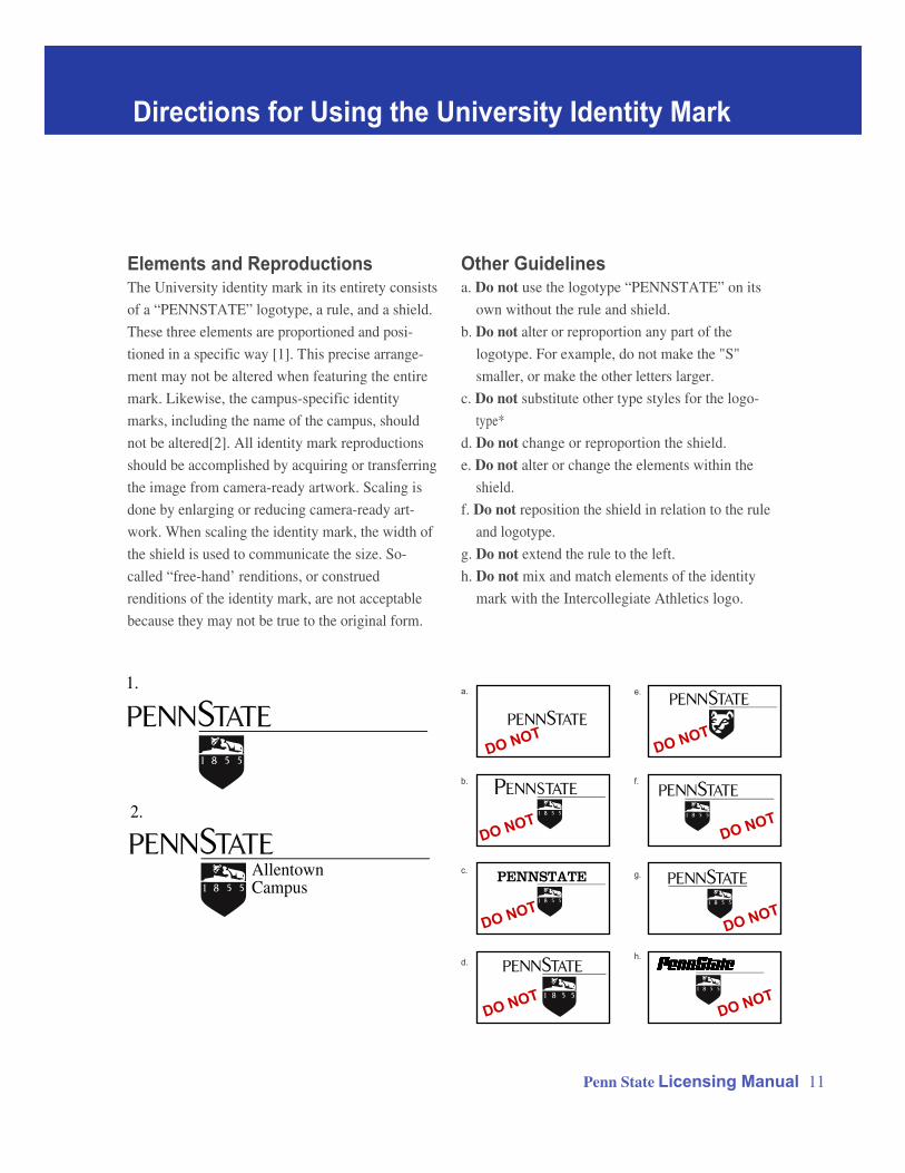
Elements and ReproductionsThe University identity mark in its entirety consists
of a “PENNSTATE” logotype, a rule, and a shield.
These three elements are proportioned and posi-
tioned in a specific way [1]. This precise arrange-
ment may not be altered when featuring the entire
mark. Likewise, the campus-specific identity
marks, including the name of the campus, should
not be altered[2]. All identity mark reproductions
should be accomplished by acquiring or transferring
the image from camera-ready artwork. Scaling is
done by enlarging or reducing camera-ready art-
work. When scaling the identity mark, the width of
the shield is used to communicate the size. So-
called “free-hand’ renditions, or construed
renditions of the identity mark, are not acceptable
because they may not be true to the original form.
Directions for Using the University Identity Mark
Penn State Licensing Manual 11
Other Guidelinesa. Do not use the logotype “PENNSTATE” on its
own without the rule and shield.
b. Do not alter or reproportion any part of the
logotype. For example, do not make the "S"
smaller, or make the other letters larger.
c. Do not substitute other type styles for the logo-
type*
d. Do not change or reproportion the shield.
e. Do not alter or change the elements within the
shield.
f. Do not reposition the shield in relation to the rule
and logotype.
g. Do not extend the rule to the left.
h. Do not mix and match elements of the identity
mark with the Intercollegiate Athletics logo.
AllentownCampus
1.
2.
DO NOT
DO NOT
DO NOT
DO NOTDO NOT
DO NOT
DO NOT
DO NOT
PENNSTATE
12 Penn State Licensing Manual
Use of the Shield OnlyIn some cases, use of the shield only, without the
rule or logotype, may be appropriate. Use of the
shield only on an item is an understatement- it’s a
subtle endorsement of the University. Without the
logotype, the recognition value for the University is
in the shield itself without the name spelled out.
However, keep in mind that if you are using the
shield alone, it must stand alone. Do not add the
name of the University or any other type, such as a
line underneath or encircling the shield, when using
the shield alone- this would constitute a recreated
identity mark. If it is necessary to spell out the name
of the University, then the whole identity mark
should be used. Licensees may opt to use the shield
alone on small items with a limited surface area
such as pins, key chains, buttons, or earrings. The
shield alone also can be repeated to form a
decorative pattern, as would be used for a tie or
textile product.
Position and Length of RuleThe thickness and position of the rule between the
logotype and shield are prescribed. The left end of
the rule is fixed in an aligmnent with the"S"
in“State” and the left side of the shield. The right end
of the rule however, is flexible- it may be extended
to the right as far as is needed for a given situation.
If you look at the identity mark as visually balancing
on the point of the shield, the extended rule acts as a
lever to offset the left-hanging portion of the
logotype (“Penn”). The extent to which you extend
the rule is a judgment call. If the mark looks like it is
“tipping” to the left, or strikes you as off-balance, it
may be that the rule is too short. Also, as a rule of
thumb, the rule always should extend somewhat
beyond the right end of logotype- it shouldn’t be
trimmed even with the logotype. With campus-
specific marks, the rule should extend beyond the
name of the campus.
Delaware CountyCampus
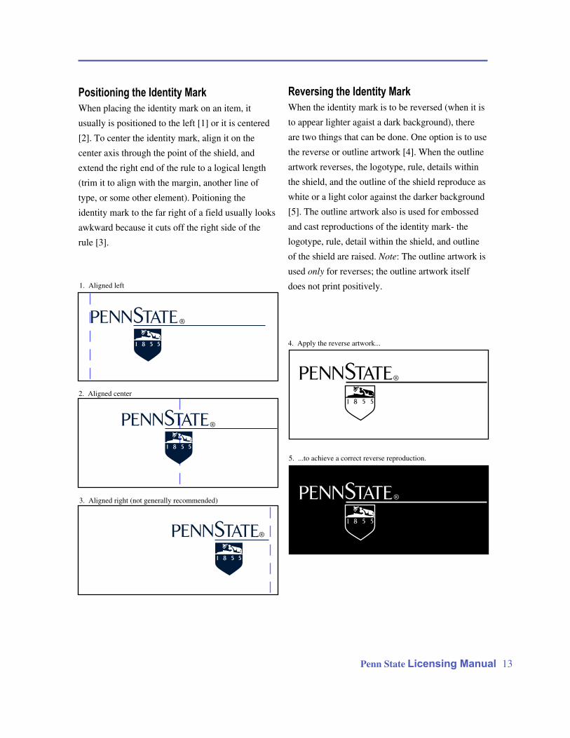
Positioning the Identity Mark
When placing the identity mark on an item, it
usually is positioned to the left [1] or it is centered
[2]. To center the identity mark, align it on the
center axis through the point of the shield, and
extend the right end of the rule to a logical length
(trim it to align with the margin, another line of
type, or some other element). Poitioning the
identity mark to the far right of a field usually looks
awkward because it cuts off the right side of the
rule [3].
Reversing the Identity Mark
When the identity mark is to be reversed (when it is
to appear lighter agaist a dark background), there
are two things that can be done. One option is to use
the reverse or outline artwork [4]. When the outline
artwork reverses, the logotype, rule, details within
the shield, and the outline of the shield reproduce as
white or a light color against the darker background
[5]. The outline artwork also is used for embossed
and cast reproductions of the identity mark- the
logotype, rule, detail within the shield, and outline
of the shield are raised. Note: The outline artwork is
used only for reverses; the outline artwork itself
does not print positively.
Penn State Licensing Manual 13
4. Apply the reverse artwork...
1. Aligned left
2. Aligned center
3. Aligned right (not generally recommended)
5. ...to achieve a correct reverse reproduction.
®
®
®
®
®
DO NOT
DO NOT
DO NOT
DO NOT
DO NOT
®
®
®
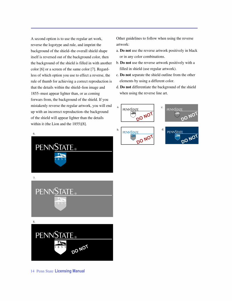
A second option is to use the regular art work,
reverse the logotype and rule, and imprint the
background of the shield–the overall shield shape
itself is reversed out of the background color, then
the background of the shield is filled in with another
color [6] or a screen of the same color [7]. Regard-
less of which option you use to effect a reverse, the
rule of thumb for achieving a correct reproduction is
that the details within the shield–lion image and
1855–must appear lighter than, or as coming
forwars from, the background of the shield. If you
mistakenly reverse the regular artwork, you will end
up with an incorrect reproduction–the background
of the shield will appear lighter than the details
within it (the Lion and the 1855)[8].
Other guidelines to follow when using the reverse
artwork:
a. Do not use the reverse artwork positively in black
or in any color combinations.
b. Do not use the reverse artwork positively with a
filled in shield (use regular artwork).
c. Do not separate the shield outline from the other
elements by using a different color.
d. Do not differentiate the background of the shield
when using the reverse line art.
14 Penn State Licensing Manual
6.
a.
b.
c.
d.
7.
8.
® ®
® ®
® ®
® ®
1.
2.
3.
4.
5.
6.
7.
8.
Penn State Licensing Manual 15
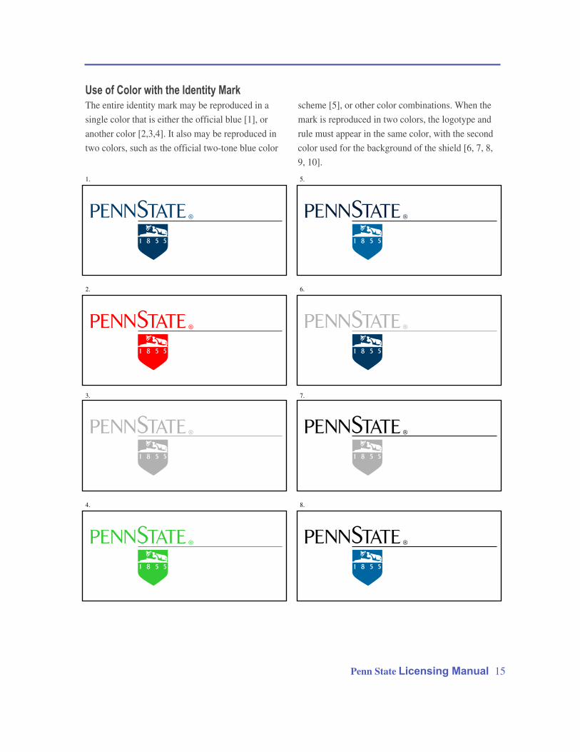
Use of Color with the Identity MarkThe entire identity mark may be reproduced in a
single color that is either the official blue [1], or
another color [2,3,4]. It also may be reproduced in
two colors, such as the official two-tone blue color
scheme [5], or other color combinations. When the
mark is reproduced in two colors, the logotype and
rule must appear in the same color, with the second
color used for the background of the shield [6, 7, 8,
9, 10].
®
9.
®
9.
DO NOT
b.
DO NOT
a.
DO NOT
c.
DO NOT
d.
DO NOT
e.
DO NOT
f.
DO NOT
g.
16 Penn State Licensing Manual
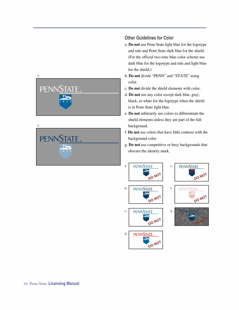
Other Guidelines for Color
a. Do not use Penn State light blue for the logotype
and rule and Penn State dark blue for the shield.
(For the official two-tone blue color scheme use
dark blue for the logotype and rule and light blue
for the shield.)
b. Do not divide “PENN” and “STATE” using
color.
c. Do not divide the shield elements with color.
d. Do not use any color except dark blue, gray,
black, or white for the logotype when the shield
is in Penn State light blue.
e. Do not arbitrarily use colors to differentiate the
shield elements unless they are part of the full
background.
f. Do not use colors that have little contrast with the
background color.
g. Do not use competitive or busy backgrounds that
obscure the identity mark.