Embed Size (px)
Citation preview
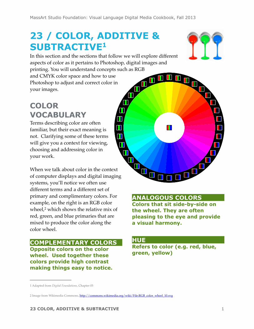
23 / COLOR, ADDITIVE & SUBTRACTIVE1
In this section and the sections that follow we will explore different aspects of color as it pertains to Photoshop, digital images and printing. You will understand concepts such as RGB and CMYK color space and how to use Photoshop to adjust and correct color in your images.
COLOR VOCABULARYTerms describing color are often familiar, but their exact meaning is not. Clarifying some of these terms will give you a context for viewing, choosing and addressing color in your work.
When we talk about color in the context of computer displays and digital imaging systems, you’ll notice we often use different terms and a different set of primary and complimentary colors. For example, on the right is an RGB color wheel,2 which shows the relative mix of red, green, and blue primaries that are mixed to produce the color along the color wheel.
COMPLEMENTARY COLORSOpposite colors on the color wheel. Used together these colors provide high contrast making things easy to notice.
ANALOGOUS COLORSColors that sit side-by-side on the wheel. They are often pleasing to the eye and provide a visual harmony.
HUERefers to color (e.g. red, blue, green, yellow)
MassArt Studio Foundation: Visual Language Digital Media Cookbook, Fall 2013
23 COLOR, ADDITIVE & SUBTRACTIVE 1
1 Adapted from Digital Foundations, Chapter 05
2 Image from Wikimedia Commons, http://commons.wikimedia.org/wiki/File:RGB_color_wheel_10.svg
SATURATIONIntensity, chroma and brilliance all refer to how vivid a color is. Traditionally this referred to the amount of pigment used in creating the color.
VALUEIs measured by how much white or black is mixed with a hue, or, it can be registered as the grayscale equivalent of a color.
SHADESA hue mixed with black.
TINTSA hue mixed with white.
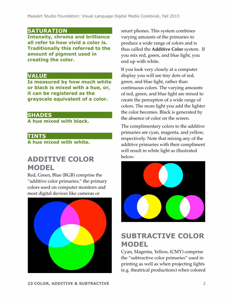
ADDITIVE COLOR MODELRed, Green, Blue (RGB) comprise the “additive color primaries,” the primary colors used on computer monitors and most digital devices like cameras or
smart phones. This system combines varying amounts of the primaries to produce a wide range of colors and is thus called the Additive Color system. If you mix red, green, and blue light, you end up with white.If you look very closely at a computer display you will see tiny dots of red, green, and blue light, rather than continuous colors. The varying amounts of red, green, and blue light are mixed to create the perception of a wide range of colors. The more light you add the lighter the color becomes. Black is generated by the absence of color on the screen. The complimentary colors to the additive primaries are cyan, magenta, and yellow, respectively. Note that mixing any of the additive primaries with their compliment will result in white light as illustrated below:
SUBTRACTIVE COLOR MODELCyan, Magenta, Yellow, (CMY) comprise the “subtractive color primaries” used in printing as well as when projecting lights (e.g. theatrical productions) when colored
MassArt Studio Foundation: Visual Language Digital Media Cookbook, Fall 2013
23 COLOR, ADDITIVE & SUBTRACTIVE 2
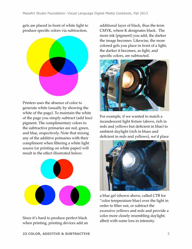
gels are placed in front of white light to produce specific colors via subtraction.
Printers uses the absence of color to generate white (usually by showing the white of the page). To maintain the white of the page you simply subtract (add less) pigment. The complimentary colors to the subtractive primaries are red, green, and blue, respectively. Note that mixing any of the additive primaries with their compliment when filtering a white light source (or printing on white paper) will result in the effect illustrated below:
Since it’s hard to produce perfect black when printing, printing devices add an
additional layer of black, thus the term CMYK, where K designates black. The more ink (pigment) you add, the darker the image becomes. Likewise, the more colored gels you place in front of a light, the darker it becomes, as light, and specific colors, are subtracted.
For example, if we wanted to match a incandescent light fixture (above, rich in reds and yellows but deficient in blue) to ambient daylight (rich in blues and deficient in reds and yellows), we’d place
a blue gel (shown above, called CTB for “color temperature blue) over the light in order to filter out, or subtract the excessive yellows and reds and provide a color more closely resembling daylight, albeit with some loss in intensity.
MassArt Studio Foundation: Visual Language Digital Media Cookbook, Fall 2013
23 COLOR, ADDITIVE & SUBTRACTIVE 3
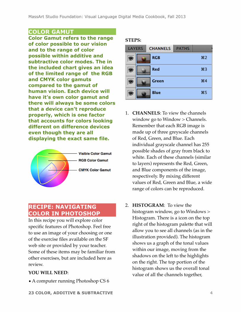
COLOR GAMUTColor Gamut refers to the range of color possible to our vision and to the range of color possible within additive and subtractive color modes. The in the included chart gives an idea of the limited range of the RGB and CMYK color gamuts compared to the gamut of human vision. Each device will have it’s own color gamut and there will always be some colors that a device can’t reproduce properly, which is one factor that accounts for colors looking different on difference devices even though they are all displaying the exact same file.
RECIPE: NAVIGATING COLOR IN PHOTOSHOPIn this recipe you will explore color specific features of Photoshop. Feel free to use an image of your choosing or one of the exercise files available on the SF web site or provided by your teacher. Some of these items may be familiar from other exercises, but are included here as review.YOU WILL NEED:
• A computer running Photoshop CS 6
STEPS:
1. CHANNELS: To view the channels window go to Window > Channels. Remember that each RGB image is made up of three greyscale channels of Red, Green, and Blue. Each individual grayscale channel has 255 possible shades of gray from black to white. Each of these channels (similar to layers) represents the Red, Green, and Blue components of the image, respectively. By mixing different values of Red, Green and Blue, a wide range of colors can be reproduced.
2. HISTOGRAM: To view the histogram window, go to Windows > Histogram. There is a icon on the top right of the histogram palette that will allow you to see all channels (as in the illustration provided). The histogram shows us a graph of the tonal values within our image, moving from the shadows on the left to the highlights on the right. The top portion of the histogram shows us the overall tonal value of all the channels together,
MassArt Studio Foundation: Visual Language Digital Media Cookbook, Fall 2013
23 COLOR, ADDITIVE & SUBTRACTIVE 4
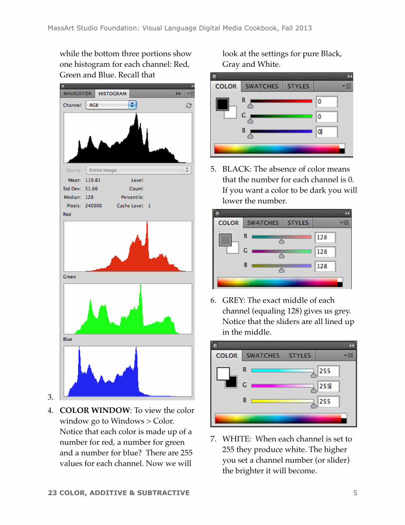
while the bottom three portions show one histogram for each channel: Red, Green and Blue. Recall that
3.4. COLOR WINDOW: To view the color
window go to Windows > Color. Notice that each color is made up of a number for red, a number for green and a number for blue? There are 255 values for each channel. Now we will
look at the settings for pure Black, Gray and White.
5. BLACK: The absence of color means that the number for each channel is 0. If you want a color to be dark you will lower the number.
6. GREY: The exact middle of each channel (equaling 128) gives us grey. Notice that the sliders are all lined up in the middle.
7. WHITE: When each channel is set to 255 they produce white. The higher you set a channel number (or slider) the brighter it will become.
MassArt Studio Foundation: Visual Language Digital Media Cookbook, Fall 2013
23 COLOR, ADDITIVE & SUBTRACTIVE 5
WHITE AS BRIGHT In digital imagery it is useful to think of white as a the highest possible level of brightness, instead of just a color.
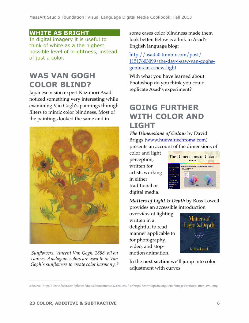
WAS VAN GOGH COLOR BLIND?Japanese vision expert Kazunori Asad noticed something very interesting while examining Van Gogh’s paintings through filters to mimic color blindness. Most of the paintings looked the same and in
Sunflowers, Vincent Van Gogh, 1888, oil on canvas. Analogous colors are used to in Van Gogh's sunflowers to create color harmony. 3
some cases color blindness made them look better. Below is a link to Asad’s English language blog:http://asada0.tumblr.com/post/11517603099/the-day-i-saw-van-goghs-genius-in-a-new-lightWith what you have learned about Photoshop do you think you could replicate Asad’s experiment?
GOING FURTHER WITH COLOR AND LIGHTThe Dimensions of Colour by David Briggs (www.huevaluechroma.com) presents an account of the dimensions of color and light perception, written for artists working in either traditional or digital media. Matters of Light & Depth by Ross Lowell provides an accessible introduction overview of lighting written in a delightful to read manner applicable to for photography, video, and stop-motion animation.In the next section we’ll jump into color adjustment with curves.
MassArt Studio Foundation: Visual Language Digital Media Cookbook, Fall 2013
23 COLOR, ADDITIVE & SUBTRACTIVE 6
3 Source: http://www.flickr.com/photos/digitalfoundations/2229001807/ or http://en.wikipedia.org/wiki/Image:Farbkreis_Itten_1961.png