Embed Size (px)
Citation preview
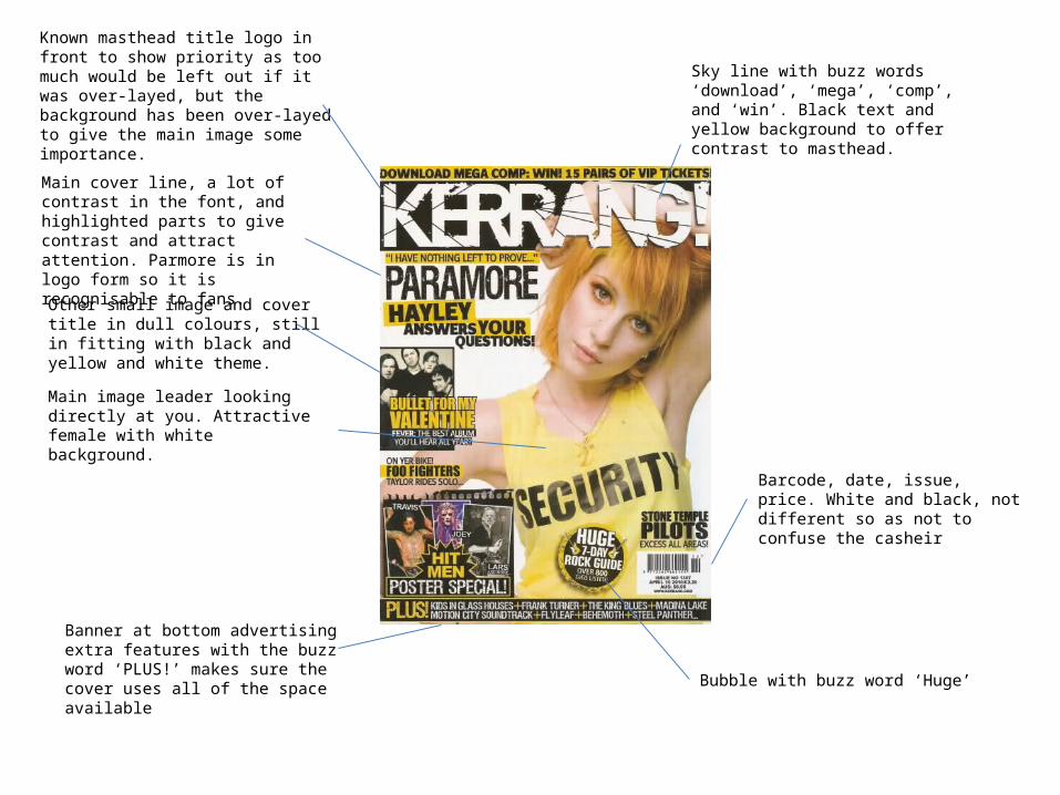
Known masthead title logo in front to show priority as too much would be left out if it was over-layed, but the background has been over-layed to give the main image some importance.
Main cover line, a lot of contrast in the font, and highlighted parts to give contrast and attract attention. Parmore is in logo form so it is recognisable to fans.
Other small image and cover title in dull colours, still in fitting with black and yellow and white theme.
Main image leader looking directly at you. Attractive female with white background.
Banner at bottom advertising extra features with the buzz word ‘PLUS!’ makes sure the cover uses all of the space available
Sky line with buzz words ‘download’, ‘mega’, ‘comp’, and ‘win’. Black text and yellow background to offer contrast to masthead.
Barcode, date, issue, price. White and black, not different so as not to confuse the casheir
Bubble with buzz word ‘Huge’

Skyline showing bands included within magazine. Shows readers if their bands are in there without them having to open it, and draws fans of these bands.
Buzzword ‘free’ in yellow splatter. Overlays title to show importance.
Well known title so it can be overlapped without confusion. Still large and obvious.
Main image of lead singer chained up to represent the off the wall, ‘crazy’ style of the magazine. Large image over laps title to show importance and to give the image a more dramatic effect.
Main cover line relating to main image. Large, red font with un-ordered messy text showing non-conformity.
‘F*ck’ rehab cover line that looks like tag line to show a disregard for the rules the magazine has, making it appeal to younger viewers and it’s target audience.
Cover line ’25 wildest tales in metal’ including buzzwords ‘fights’, ‘drugs’ and ‘prisons’, again showing a rebellious side and appealing to the target audience interests.
3 more bands listed a long with a small image cut-out of band member of one of the listed. In yellow splatter like the ‘free’ signs. This creates emphasis on the 3 points making them seem important over the other cover titles, apart from the main cover line, as it is largest and relates to the main image.
The colour scheme red, yellow and white represent the theme of the magazine and all fit in together apart from the yellow, causing the yellow to stand out more.
3 more titles fitted in to make further use of all the space on the cover. Another cut out image is there to illustrate the tiles without distracting from the main image.
Date, barcode, publisher
Buzzword ‘Win’ along with the logo of the band slayer. It is well known and would attract their fans, who are a part of their target audience.
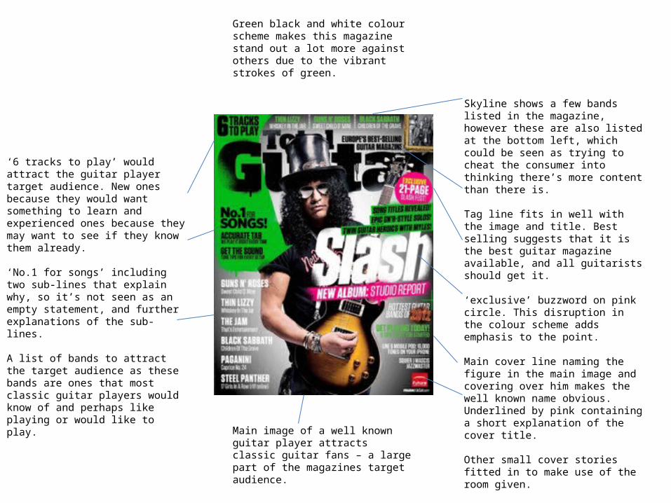
Green black and white colour scheme makes this magazine stand out a lot more against others due to the vibrant strokes of green.
‘6 tracks to play’ would attract the guitar player target audience. New ones because they would want something to learn and experienced ones because they may want to see if they know them already.
‘No.1 for songs’ including two sub-lines that explain why, so it’s not seen as an empty statement, and further explanations of the sub-lines.
A list of bands to attract the target audience as these bands are ones that most classic guitar players would know of and perhaps like playing or would like to play.
Skyline shows a few bands listed in the magazine, however these are also listed at the bottom left, which could be seen as trying to cheat the consumer into thinking there’s more content than there is.
Tag line fits in well with the image and title. Best selling suggests that it is the best guitar magazine available, and all guitarists should get it.
‘exclusive’ buzzword on pink circle. This disruption in the colour scheme adds emphasis to the point.
Main cover line naming the figure in the main image and covering over him makes the well known name obvious. Underlined by pink containing a short explanation of the cover title.
Other small cover stories fitted in to make use of the room given.
Publisher
Main image of a well known guitar player attracts classic guitar fans – a large part of the magazines target audience.
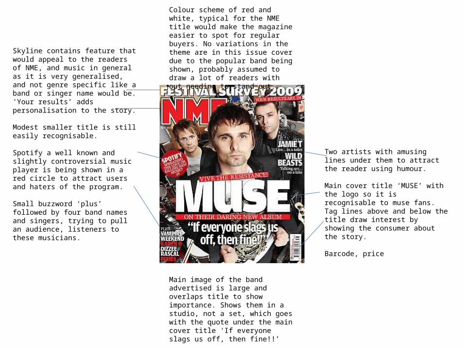
Colour scheme of red and white, typical for the NME title would make the magazine easier to spot for regular buyers. No variations in the theme are in this issue cover due to the popular band being shown, probably assumed to draw a lot of readers with out needing to stand out.
Skyline contains feature that would appeal to the readers of NME, and music in general as it is very generalised, and not genre specific like a band or singer name would be. ‘Your results’ adds personalisation to the story.
Modest smaller title is still easily recognisable.
Spotify a well known and slightly controversial music player is being shown in a red circle to attract users and haters of the program.
Small buzzword ‘plus’ followed by four band names and singers, trying to pull an audience, listeners to these musicians.
Main image of the band advertised is large and overlaps title to show importance. Shows them in a studio, not a set, which goes with the quote under the main cover title ‘If everyone slags us off, then fine!!’
Two artists with amusing lines under them to attract the reader using humour.
Main cover title ‘MUSE’ with the logo so it is recognisable to muse fans. Tag lines above and below the title draw interest by showing the consumer about the story.
Barcode, price
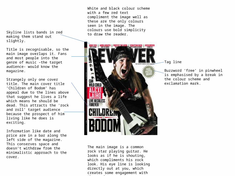
White and black colour scheme with a few red text compliment the image well as these are the only colours seen in the image. The colours use bold simplicity to draw the reader.
Skyline lists bands in red making them stand out slightly.
Title is recognisable, so the main image overlaps it. Fans and most people into the genre of music –the target audience- would know the magazine.
Strangely only one cover title. The main cover title ’Children of Bodom’ has appeal due to the lines above that suggest he lives a life which means he should be dead. This attracts the ‘rock and roll’ target audience because the prospect of him living like he does is exciting.
Information like date and price are in a bar along the left side of the magazine. This conserves space and doesn’t withdraw from the minimalistic approach to the cover.
Tag line
Buzzword ‘free’ in pinwheel is emphasised by a break in the colour scheme and exclamation mark.
The main image is a common rock star playing guitar. He looks as if he is shouting, which compliments his rock look. His eye line is looking directly out at you, which creates some engagement with the reader.

Colour scheme is basic. Grey background and black text makes the yellow titles and page numbers stand out a lot more and add contrast. There is also a red box at the bottom. This is to show it is a separate topic to the rest of the page.
Editors note next to an image of what is probably the cover giving a small introduction to the magazine, with a signature to add a personal touch.
Pictures that represent what is on each page along with a sentence explaining what is on them in a grid set up. The name of the band or feature is in bold. The page number is yellow with a page number in yellow. This show priority of information.
Main story’s picture is bigger, at sticks out a little from the grid line out from the rest of the page story pictures. The image stands out as there is no evidence of music or rock stars, instead zombies. This contrast is supposed to interest readers.
Title ‘Contents’ is in a black drop-down box from the top in yellow. It is the largest font on the page. It contrasts from it’s black background more than the contents sub-titles because it is loose-fitting inside it’s box.
Pull quote is humours and would probably make the reader want to read on. ‘confessions’ on page 41.
Titles are bold and in yellow/black to separate from the contents pages to make it easier to read through. Numbers are in bold and titles not, again to show priority.
A red box at the bottom breaks the colour scheme because it is separate from the rest of the page. It is a subscription offer, so they want it to be easy to find, so it’s on the front page.

Grey, black and red colour scheme goes along with the metal theme of the magazine. There are is only one slightly bright picture, that hardly breaks the colour scheme.Metal hammer logo just above ‘Contents’
title in a gothic font, which is underlined, but with the date in the middle of the line, typical of the gothic style.
Red sub-titles so they contrast from the title. They are not as bold, but in the same font.The small page numbers are just in front of the titles. They are in front and in red so they are not missed.Titles are black and gothic, and list bands included. They are not small so the reader can open and quickly see all bands included.
Black box with white titles that stand out more, and two images that edge out of the box slightly and over lap the red in-line.
Two more features in a red box with two images of magazines. The yellow numbers don’t stand out due to a chromatically similar background.
![Presentation1.ppt [โหมดความเข้ากันได้] · Title: Microsoft PowerPoint - Presentation1.ppt [โหมดความเข้ากันได้]](https://img.pdfslide.us/doc/110x75/5ec776d210d7bd5f6f00774b/aaaaaaaaaaaaaaaaaa-title-microsoft-powerpoint.jpg)